ITC Benguiat pairs great with ITC Avant Garde Gothic, Helvetica and Akzidenz Grotesk. All 15 pairings are shown below in real rendered specimens, with the reason each one works.
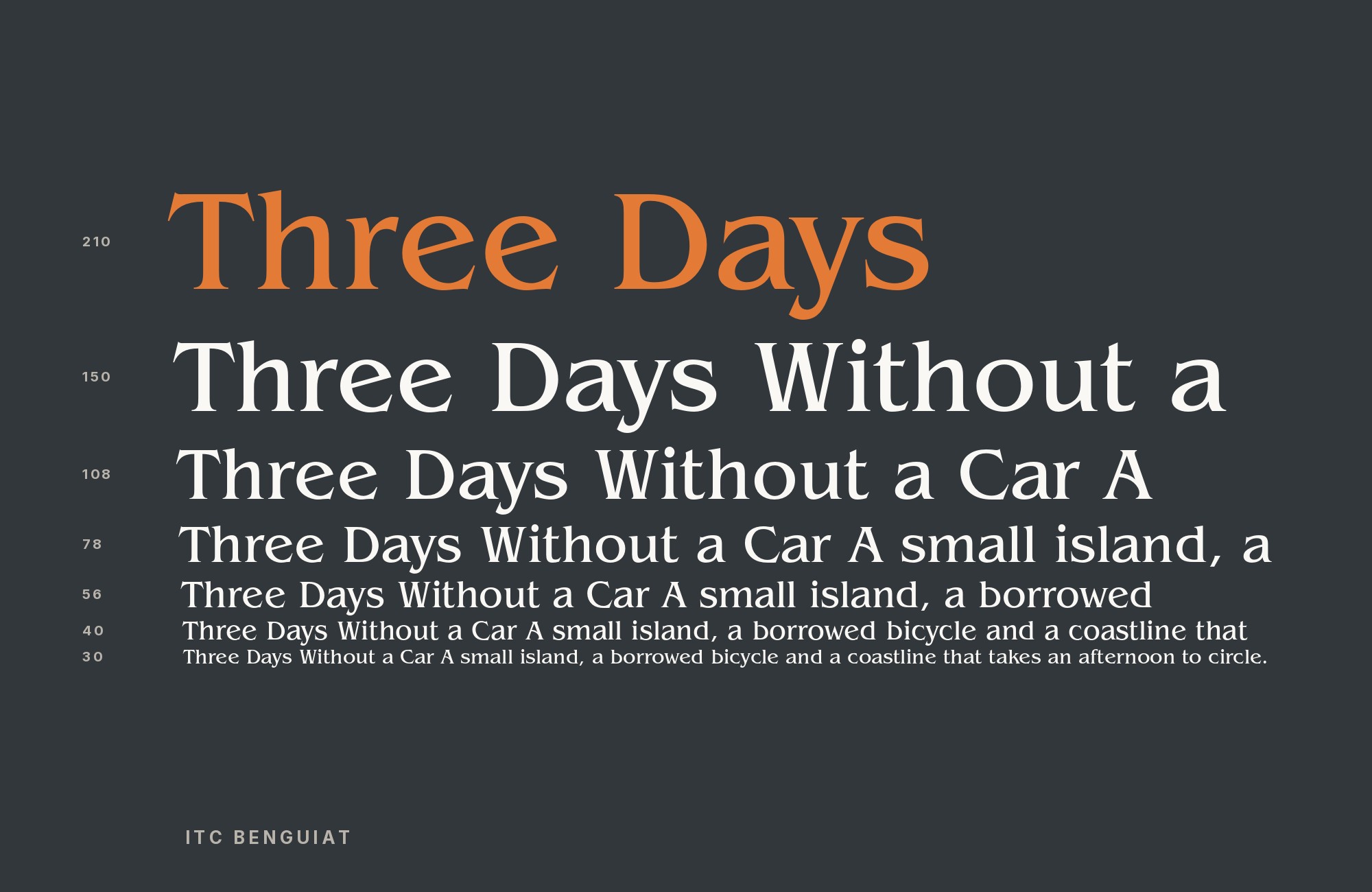
What fonts go with ITC Benguiat? Start from the job the serif is already doing. It is a glyphic display face with flared serifs and high-waisted capitals, loud enough that a second decorative alphabet usually muddies the page. The useful companion is the one that can carry credits, dates, packaging copy, or a paragraph without trying to match that atmosphere.
Ed Benguiat designed the face for the International Typeface Corporation. Fonts In Use records that it was announced in 1977 and publicly released in January 1978, with condensed styles later that year; Wikipedia and Typewolf date the family 1977. ITC turned the design down on first submission, then approved a 1976 resubmission of sketches that had begun as a friend’s logo. What survived is an Art Nouveau-influenced serif with an extremely high x-height, open counters, and original ligatures the digital family does not fully restore. MyFonts lists twelve styles. ITC Benguiat Gothic (1979) is a separate sans, not a substitute for this serif.
Pairing it well means spending the display character on a short line and giving everything else a different construction. Geometric and neo-grotesque sans faces do that job most often in published work; Gill Sans adds humanist lettering, Sabon takes reading, and OCR-B or Friz Quadrata are special-purpose accents. Co-usage shows that two families shared a job, not that every hierarchy on the artifact should be copied. Here are 15 fonts that pair with ITC Benguiat.
1. ITC Avant Garde Gothic

Herb Lubalin and Tom Carnase drew ITC Avant Garde Gothic from the Avant Garde magazine mark; ITC released the family across 1970–1977, and Ed Benguiat himself added the condensed cuts in 1974. Circular bowls, near-even stroke weight, and tightly fitted capitals are the structural opposite of Benguiat’s flared, high-contrast serifs, which is why Typewolf’s suggested pairing is this one rather than another serif. Fonts In Use records both families on the 2016 Stranger Things titles. Keep Benguiat on the word that has to feel period-display, and set Avant Garde in a lighter weight or a smaller size for a subtitle or a generator-style lockup. Discretionary ligatures in Avant Garde will turn a supporting line into a second logo if they are left on for every word; test the actual title with and without them, because a two-word sample hides the collision that a wrapped heading will show.

Unlimited fonts from $16.50/mo.
29 million fonts, templates and stock assets. One subscription, unlimited downloads.
See the plan2. Helvetica

Max Miedinger and Eduard Hoffmann released Helvetica in 1957 at the Haas Type Foundry as Neue Haas Grotesk, a neo-grotesque with a high x-height, strokes that terminate on horizontal or vertical lines, and unusually tight letter spacing. That dense, even texture is what Benguiat withholds: the serif wants air around its flared terminals, while Helvetica can pack credits and catalog lines into a dark, stable strip. Fonts In Use is explicit about the combination on the US sleeve of The Human League’s Crash (1986): ITC Benguiat Condensed Medium paired with Helvetica Extra Bold. Use a condensed Benguiat for the band or title and a heavy Helvetica for the album name or supporting type, then check quotation marks and numerals at the size they will actually print. This evidence is for Helvetica; Helvetica Now and the separately tagged Helvetica Condensed use have their own evidence elsewhere.

3. Akzidenz Grotesk

Berthold released Akzidenz Grotesk in 1898 as a jobbing sans for tickets, forms, and publicity — Akzidenz in the commercial sense, not a later Swiss redesign of Helvetica. Its proportions are less regularized, so the texture next to Benguiat is older and slightly mechanical rather than corporate-neutral. Typewolf records the pairing on PLUME (29 August 2018), and Fonts In Use lists both families on The Anatomy of Thoughts, a student publication. Give Benguiat the cover word or the chapter ornament and let Akzidenz Grotesk handle captions, folios, and the interior text if the project can live with a nineteenth-century grotesque instead of a contemporary UI sans. At identical size and weight the two will fight; drop the sans a step and keep the serif larger and shorter.

4. Gill Sans

Eric Gill designed Gill Sans for Monotype, which released it in 1928 as a humanist sans based on Edward Johnston’s London Underground alphabet. Differentiated capital widths and calligraphic details give it a handmade rhythm Helvetica never claims, which is useful beside Benguiat’s already ornamental serifs: one face can look drawn without both looking decorated. Fonts In Use documents the two on the V&A’s Art Nouveau 1890–1914 exhibition materials (2000), a historically apt meeting given Benguiat’s Art Nouveau influence. Set Gill Sans for wall text, captions, or a catalog essay and keep Benguiat on the exhibition title. The sans lowercase sits in a different optical register from Benguiat’s large x-height, so matching point sizes will look accidental; proof a heading, a deck, and a paragraph together before locking the sizes.

5. Futura

The Bauer foundry released Paul Renner’s Futura in 1927. Renner reduced its construction to circles, triangles, and squares, with strokes of near-even weight. Single-storey a and g and tall ascenders change the apparent scale of mixed-case lines, so Futura set at Benguiat’s point size will look timid or shrill depending on the weight. The 1986 Petr Kotik concert poster at Petőfi Csarnok, documented by Fonts In Use, puts Futura on the same sheet as ITC Benguiat, along with Univers and Helvetica. Take Futura for a short geometric line — a venue, a date, a repeated label — and leave Benguiat the proper name. Pointed joins and circular bowls will read as a different decade of modernism from Benguiat’s 1970s display serif; that gap is the point, provided the poster does not also ask Futura to carry a paragraph.

6. Univers

Adrian Frutiger designed Univers for Deberny & Peignot, which released the family in 1957 as a coordinated series of weights and widths. That systematic width range is the practical reason to pair it with Benguiat: condensed or extended cuts can fit a schedule or a list under a flared title without inventing a second display face. The same Petr Kotik poster that uses Futura also lists Univers. Assign Univers the supporting block — times, program notes, a stacked address — and keep Benguiat off that block. Because the poster already contains Helvetica and Futura, a working recreation should pick one grotesque partner rather than restaging every family on the artifact. Univers’s even color at text sizes is what Benguiat cannot provide; do not thicken the serif to compete with it.

7. Inter

Rasmus Andersson designed Inter as a free neo-grotesque for interface text and released it on 22 August 2017, with a tall x-height and open apertures aimed at small screens. That UI brief is useful under a Benguiat headline: Inter will hold captions, modest pull quotes, and navigation that Benguiat’s distinctive glyphs would clog. Fonts In Use lists both on Famous for My Dinner Parties issue 002; the issue also uses other display faces, so the lesson is role, not a five-family stack. Set Inter for the reading column and any chrome, keep Benguiat on the issue title, and use Inter’s true italic for emphasis inside the sans so the serif never drops into a sentence.

8. Nimbus Sans

URW++ released Nimbus Sans in 1999 as a Helvetica-derived neo-grotesque with optical sizes labelled for text, display, and poster. Typ.io records it with ITC Benguiat on mas-oyama.com. The pairing logic is close to Helvetica’s — a quiet grotesque under a loud serif — but the evidence names Nimbus Sans, and the local file is Nimbus Sans, so this is not a Helvetica substitute and not a claim that the Japanese site used Haas Helvetica. Use Nimbus Sans for body copy and captions on a site that already licenses it, and keep Benguiat in the header or a featured title. Tighter display cuts of Nimbus will start to look like poster Helvetica from the phototype years; if that crowding collides with Benguiat’s flared serifs, switch to a text-labelled cut and add tracking on the serif instead of compressing both.

“My clients will build their own sites with their own AI.”
How are you supposed to navigate this?
Find Out How9. Eurostile

Aldo Novarese designed Eurostile in 1962 for Nebiolo as a lowercase-bearing successor to Microgramma: squared bowls with rounded corners, built for headings and signs more than books. That architectural, slightly science-fiction rhythm is a different kind of display from Benguiat’s organic serifs, so the two can share a shopfront if one face is the trade name and the other is the generic (pharmacy, hours, street). Fonts In Use documents both on Farmacia dell’Annunziata in Ginosa. Eurostile’s wide, superelliptical O will dominate a line of Benguiat if they sit at the same size; make the serif larger and shorter, or put Eurostile in a lighter weight for the supporting words. Distortion and type-fit-to-shape on that shopfront are local sign-painting moves, not a license to stretch either family in print.

10. Sabon

Jan Tschichold designed Sabon between 1964 and 1967; Linotype, Monotype, and Stempel released the old-style serif jointly in 1967, with a roman based on Garamond types. Bracketed serifs and a literary paragraph texture are everything Benguiat’s display skeleton is not, which is why the combination only works as title-plus-reading, never as two competing headlines. Fonts In Use lists both on the Hollywood Guys & Dolls CD series (1994), a sheet that also includes Broadway and Helvetica; take Sabon for liner notes or a biography paragraph and leave Benguiat on the series title. Sabon’s x-height is lower than Benguiat’s ITC-formula lowercase, so the reading size will need to be larger than a naive match. Keep Sabon’s italic inside the serif text; mixing Benguiat italic into a Sabon paragraph reads as a font error.

11. OCR-B

Adrian Frutiger developed OCR-B in 1968 for Monotype to meet a European optical-character-recognition standard; it became a world standard in 1973 and remains easier for human readers than OCR-A. Fixed advances and deliberately differentiated shapes mark a different class of information — a running time, a catalog number, a barcode caption — beside Benguiat’s decorative title. Fonts In Use lists both on a 1991 VHS sleeve for the 1977 Hobbit film, along with Stymie and Helvetica Condensed. Use OCR-B only for the machine-facing line, and do not promote Helvetica Condensed from that sleeve into the Helvetica pairing above. Tracking that suits Benguiat’s display capitals will pull OCR-B’s letters apart until they stop looking like a code font; leave the monospace at default spacing and change size instead.

12. Helvetica Now

Monotype introduced Helvetica Now on 9 April 2019 as a 48-style family in Micro, Text, and Display optical sizes, with every character redrawn and refit under Charles Nix and a Monotype Studio team. The foundry is explicit that this is not a revival of 1957 Helvetica. MyFonts’ Font Field Guide lists Helvetica Now among Perfect Pairings for ITC Benguiat; Classic Grotesque, DIN Next, and Gill Sans Nova appear on the same list but have no verified local files here, so they are omitted. Use a Display cut of Helvetica Now for a contemporary subtitle under Benguiat, or a Text/Micro cut for UI and captions, and keep the combination distinct from the 1986 Crash pairing with Helvetica Extra Bold. Optical-size mismatches — Display Now at 12 point, or Micro Now at poster size — will flatten the reason for choosing this family over the older one.

13. Friz Quadrata

Ernst Friz and Victor Caruso designed Friz Quadrata for Visual Graphics Corporation in 1966 as a glyphic serif with incised, almost inscriptional details. It is another display serif, so pairing it with Benguiat is a two-headline problem, not a text solution. Fonts In Use records both on a Berlin street sign, Platz der Currywurst. Give one family the proper name and the other a short generic (platz, wurst, hours), with a clear size gap and no body copy in either face. Wedge-like serifs and broad forms will crowd Benguiat’s flared terminals if the two lines sit on the same baseline at similar weight; stack them, or contrast a lighter Friz against a bolder Benguiat. This is a sign and label pairing, not a book pairing.

14. FF DIN

Albert-Jan Pool designed FF DIN in 1995 for FontShop, expanding the German DIN 1451 lettering standard into a grotesque with a high x-height and an unadorned appearance. That lack of decoration is the reason it works under Benguiat on packaging: the serif can be the flavor, the grotesque the facts. Fonts In Use lists both on Hacendado Queso Cremoso. Set FF DIN for ingredients, weights, and a stacked product descriptor, and keep Benguiat on the brand word. This is not DIN Next from the Field Guide — that name did not resolve to a local file and is not treated as the same family. All-caps DIN next to high-waisted Benguiat capitals can look like two posters taped together; mix case in the grotesque, or drop its size until it reads as data rather than a second logo.

15. American Typewriter

Typewolf names ITC Benguiat as its suggested pairing for American Typewriter, giving this combination direct editorial support rather than resemblance alone. The slab’s rounded terminals and gently mechanical rhythm share Benguiat’s warm 1970s character, while its steadier texture creates a usable supporting layer beneath the flared display serif. Put Benguiat on a short title and American Typewriter on a deck, caption, or compact invitation line. Avoid long paragraphs in either face when the page needs neutral reading text. Because both have strong personalities, the hierarchy must be explicit: a large Benguiat word above smaller, lighter typewriter copy works better than two equal headline lines.

Conclusion
ITC Benguiat is almost always the expressive element, not one voice among equals. The documented pattern is a short Benguiat title against one quieter companion: a geometric or neo-grotesque sans for information, Gill Sans when the subject wants humanist lettering, Sabon when the page actually has to be read, OCR-B when a line must look machine-made, Friz Quadrata only when a second inscriptional display job exists.
Keep the evidence for Helvetica, Helvetica Now, Nimbus Sans, and Helvetica Condensed separate. Treat ITC Benguiat Gothic as a different typeface. Set a heading and a real supporting block at the sizes you intend to publish, and judge the pairing by whether the serif still reads as the title once the second face is doing its job. For more worked examples of display-and-text splits, see The Big Book of Font Combinations.
Sources
- Wikipedia ITC Benguiat
- Wikipedia Ed Benguiat
- Fonts In Use typeface
- Typewolf
- Typewolf PLUME
- Typewolf Style Capsule
- Typ.io
- Typ.io Nimbus pairing
- Adobe Fonts
- Fonts.com
- Fast Company
- Identifont
- Fontpair
- Fonts In Use Human League
- Fonts In Use V&A
- Fonts In Use Petr Kotik
- Fonts In Use Dinner Parties
- Fonts In Use Farmacia
- Fonts In Use Hollywood CDs
- Fonts In Use Hobbit VHS
- Fonts In Use Currywurst
- Fonts In Use Stranger Things
- Fonts In Use Anatomy
- Fonts In Use Hacendado
- Fonts In Use BellaCasara
- Fonts In Use Pulp Fiction
- Fonts In Use Pan sweets
- Fonts In Use Style Capsule
- Fonts In Use CYOA
- Fonts In Use Photo-Lettering ad
- Wikipedia Helvetica
- Wikipedia ITC Avant Garde
- Wikipedia Akzidenz-Grotesk
- Wikipedia Gill Sans
- Wikipedia Futura
- Wikipedia Univers
- Wikipedia Inter
- Wikipedia Eurostile
- Wikipedia Sabon
- Wikipedia OCR-B
- Wikipedia Friz Quadrata
- Wikipedia Nimbus Sans
- Wikipedia FF DIN
- Google Fonts Inter
- Adobe Helvetica
- Adobe ITC Avant Garde Gothic
- Adobe Univers
- Adobe Eurostile
- Adobe Sabon
- Monotype Helvetica Now PR
- Monotype Helvetica Now
