
Fjalla One pairs great with Open Sans, Archivo Narrow and Libre Baskerville. All 15 pairings are shown below in real rendered specimens, with the reason each one works.
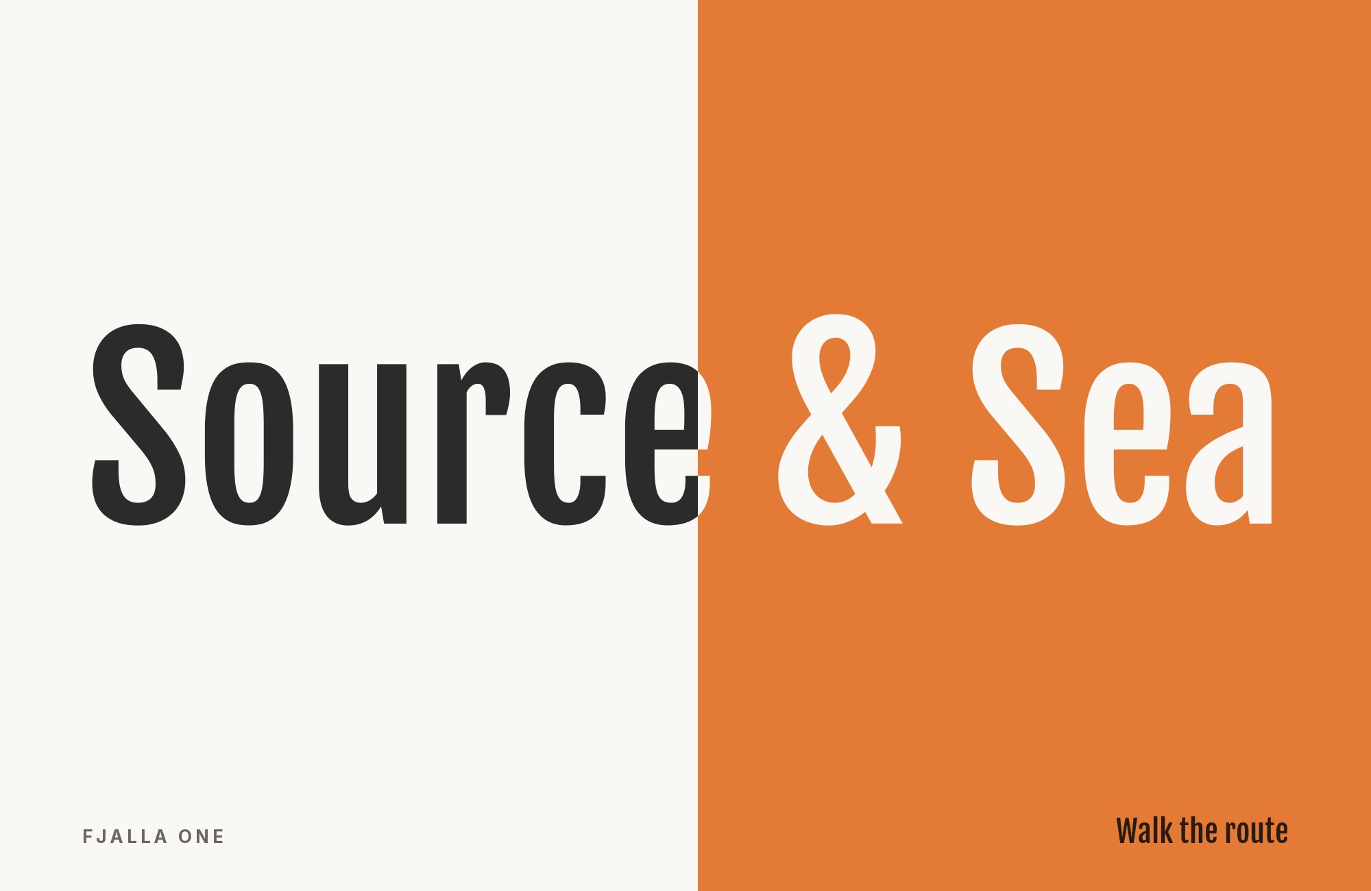
What fonts go with Fjalla One? The honest answer starts with a constraint rather than a taste question: Fjalla One ships in exactly one style, weight 400, with no italic and no variable axes. Whatever you pair it with is not a supporting act. It is the entire text system.
Irina Smirnova drew Fjalla for Sorkin Type, a foundry founded in 2011, and the single style released under the SIL Open Font License in 2012 is the one everybody knows as Fjalla One. Google Fonts classifies it as a medium-contrast display sans and notes it was tuned against the restrictions of the screen; a March 2023 revision widened its Latin language coverage and opened up the horizontal spacing for readability. The letterforms are a condensed grotesque: flat-sided bowls, short vertical terminals, tall compressed capitals, and a narrow set width that lets a long headline fit on one line without shrinking. Typewolf puts the limitation plainly — one weight, one style, not the most flexible typeface on Google Fonts.
That single cut dictates the whole pairing logic. A normal display pairing asks which text face contrasts nicely. A Fjalla One pairing has to ask which text face can carry light, regular, medium, semibold, bold, italic, captions, labels and long-form body copy on its own, because Fjalla One will never help with any of it. The productive move is role separation by width: Fjalla One compresses at large sizes, and the partner relaxes at small ones. The unproductive move is looking for another condensed face, which produces a collision instead of a system. Here are 15 fonts that pair with Fjalla One.
1. Open Sans

Steve Matteson designed Open Sans under commission from Google and released it in 2011 as a humanist sans with a large x-height, open forms and low stroke contrast built for small sizes. The Prince of Wales Hospital Foundation brand guidelines, documented on Fonts In Use, assign Open Sans to body copy and long-form material explicitly because the family ships in several weights, and name Fjalla One as the secondary display face for headings, subheadings and infographics. The guideline text states that Fjalla contrasts well with Open Sans. That is the pairing’s real argument. Open Sans is wider, rounder, lighter in color on the page and available in every weight a document needs, so it absorbs the full text load that Fjalla One’s one cut cannot touch.

“AI builds anything, so what do I sell?”
Taste is the answer. Own your stack and automate your own CMS.
Find Out How2. Archivo Narrow

Omnibus-Type published Archivo Narrow as the condensed branch of the Archivo family, drawn from late-nineteenth-century American grotesque models. Typewolf’s Site of the Day entry for The Kings of Summer lists it beside Fjalla One on a shipped site, which makes it the rare documented co-usage rather than a style-guide suggestion. The reason it works is unusual: it is condensed too, but it arrives with a 400 to 700 weight range and true italics, so it can hold the narrow column rhythm Fjalla One establishes while carrying decks, subheads and captions at sizes Fjalla One should never be set at. Use Fjalla One for the primary headline and Archivo Narrow for everything in the same vertical family of sizes below it, then hand body copy to a wider face.

3. Libre Baskerville

Pablo Impallari drew Libre Baskerville from the 1941 American Type Founder’s Baskerville, then rebuilt it for screens: taller x-height, wider counters, and deliberately reduced stroke contrast compared with a print Baskerville. Every one of those adjustments is a direct answer to what Fjalla One is missing. The display face compresses, darkens and tightens; the serif opens, widens and lightens. Two independent pairing references arrive at this same combination, filing it as the classic condensed-sans headline over a transitional serif text face. Set Fjalla One large and Libre Baskerville at a comfortable text size with generous line height, and the page reads as editorial rather than promotional — a good fit for long-form articles, reports and any layout where the headline has to shout once and then get out of the way.

4. Cantarell

Dave Crossland designed Cantarell as a contemporary humanist sans, and it became the GNOME desktop’s interface typeface — a job that demands readability at small sizes above all else. Figma’s own pairing library runs Fjalla One and Cantarell as a recommended combination, and the structural case is width. Fjalla One’s compressed capitals push a headline into a tight, high-tension block; Cantarell’s open apertures and unhurried proportions release that tension in the paragraph below. The two faces share an unornamented, modern register, so the system never feels mismatched, only staged. This is the pairing to reach for when the layout is dense and the reading happens on a phone, because Cantarell was tuned for exactly those conditions and keeps its counters open where a narrower face would close up.

5. Source Sans 3

Paul D. Hunt designed Source Sans Pro for Adobe in 2012 as the company’s first open-source typeface, and it was renamed Source Sans 3 when the family moved to variable format. Its skeleton comes from early twentieth-century American gothics, cleaned of idiosyncrasy and tuned for user interfaces, which makes it the neutral workhorse under an assertive display line. Fjalla One does its best work set in uppercase, where the flat sides and tall caps lock into a solid mass; Source Sans 3 then handles subheads, paragraphs, captions and form labels across its full weight range without ever proposing a personality of its own. Pair them for documentation, dashboards, product marketing and anywhere the headline needs to be loud exactly once per screen.

6. Roboto

Christian Robertson designed Roboto in-house at Google and released it in 2011 as Android’s system font, built on a mechanical grotesque skeleton with open, friction-free curves. Against Fjalla One, its value is almost arithmetic: Roboto has a 100 to 900 weight range with matching italics, so a single partner covers the nine or ten text styles a real interface needs, and Fjalla One never has to be faked into a weight it does not have. The width difference does the visual work — Roboto sits at normal proportions and reads evenly in a paragraph, while Fjalla One’s narrow set width makes the headline above it look compressed by intent rather than by accident. It is a practical default for mobile, web or general product interfaces, because Roboto already covers the range those UIs need.

7. Lora

The Cyreal studio designed Lora, added to Google Fonts in 2011, as a contemporary serif with brush-drawn roots and moderate stroke contrast built for comfortable reading at text sizes. It supplies the single quality a condensed grotesque cannot manufacture: a visible human hand. Fjalla One’s strokes are flat, engineered and impersonal by design, which is what makes it effective on a poster and cold in a paragraph. Lora’s calligraphic stress and slightly brushed terminals warm the body copy without softening the headline. Reach for this combination on lifestyle, food, culture and editorial projects where the display type should feel confident and current but the reading experience should feel written rather than manufactured. Keep Lora at a true text size, where its contrast holds without thinning.

8. Merriweather Sans

Eben Sorkin designed Merriweather Sans as the sans companion to his Merriweather family, which means it shares a foundry and a construction philosophy with Fjalla One itself — Sorkin Type, where Irina Smirnova drew Fjalla One, also publishes Merriweather Sans. An archived pairing guide sets Fjalla One in headlines and Merriweather Sans in body text. That shared lineage is the interesting part: the two faces resolve curves and terminals with the same logic, so they feel related, while their widths diverge sharply. Merriweather Sans is only semi-condensed, with slightly rounded letterforms and a weight range running from Light to ExtraBold, so it stays legible at small sizes where Fjalla One would close up entirely. The result is a system with family resemblance and no redundancy — rare when the display face has one cut. Use it when a brand wants a coherent typographic voice rather than a deliberate clash between headline and text.

9. Lato

Łukasz Dziedzic designed Lato and released it in December 2010 as a humanist sans with semi-rounded details that sit between a neutral grotesque and something warmer. A page set entirely in condensed type develops a hard, insistent vertical rhythm; Lato’s softer curves and slightly wider proportions break that rhythm without introducing a competing display voice. Its weight range covers caption, body, subhead and emphasis, which is the minimum requirement for any Fjalla One partner. This pairing suits organisations that need the headline to carry urgency — events, campaigns, sports, nonprofits — while the supporting text stays approachable. Set Fjalla One in uppercase for the headline, then drop to Lato in sentence case immediately, so the tonal shift is obvious and deliberate.

10. Noto Sans

Google’s larger Noto project covers roughly 1,000 languages and 162 writing systems so fewer characters render as blank “tofu” boxes. Noto Sans brings that multilingual system to the sans layer and answers Fjalla One’s second limitation directly. The display face carries Latin, extended Latin and Vietnamese in one weight, which is enough for a headline and nothing more; Noto Sans brings a much broader multilingual system with a useful weight range. Structurally it is a quiet humanist grotesque with an x-height close to Fjalla One’s own, so the two sit at matching apparent sizes without optical adjustment. This is the pairing for multilingual blogs, documentation sites and landing pages where a single condensed Latin display face has to sit on top of genuinely international text.

11. Karla

Jonny Pinhorn designed Karla as a grotesque with mildly unconventional proportions — slightly irregular widths and a few quirks in the lowercase that stay invisible at reading size and give the face a faint warmth in a block of text. Against a display font as assertive as Fjalla One, that restraint is the whole point. Karla holds the reader’s attention through a paragraph without proposing a second opinion about the brand’s voice, which is what happens when two expressive faces share a page. The pairing appears as a worked example in published pairing guides for precisely this reason. Use Fjalla One for headings and Karla for body copy and interface labels, and let the contrast between compressed and normal width carry the hierarchy on its own.

12. Inter

Rasmus Andersson designed Inter and released it in 2017 with one goal: vanish at small sizes on a screen. Tall x-height, open apertures, near-mechanical forms, tuned spacing for UI legibility — every decision runs opposite to Fjalla One’s compressed, high-impact display construction. That opposition is why the pairing keeps surfacing in storefront and product recommendations. Fjalla One takes the hero headline, category titles and short promotional lines where narrow, uppercase type reads as confident; Inter runs every button, price, label, form field and paragraph below it without competing. It is the low-risk Fjalla One system for a storefront or product page: the headline supplies the character and Inter supplies the labels, prices and paragraphs.

13. Merriweather

Sorkin Type designed Merriweather for screen reading, giving it a tall x-height, sturdy low-contrast serifs and slightly condensed proportions so dense text stays sharp at small sizes. The same archived guide suggests Merriweather as the serif alternative in its Fjalla One pairing. It shares the same Sorkin Type origin as Fjalla One. The serifs add historical weight that a 2012 condensed grotesque deliberately refuses, which is useful when the subject matter is serious — institutional reporting, research summaries, membership publications, annual reviews. Because Merriweather is already a little narrow for a serif, keep the size differential large: Fjalla One well above the text scale for the headline, Merriweather at a comfortable reading size, so the compression contrast still registers clearly.

14. Yellowtail

Astigmatic designed Yellowtail, a flat-brush script with the loose, slightly retro feel of hand-painted signage. It belongs here as the third font in a documented three-font system — Fjalla One for headlines, a neutral sans for paragraphs, Yellowtail for accents — and it fills a slot that Fjalla One’s rigid single cut structurally cannot. A display face with one weight has no way to signal a change of tone; a script does it instantly. The same pattern appears in the Prince of Wales Hospital Foundation guidelines, where a hand-drawn face is reserved for pull quotes and select words to keep a corporate document from reading as clinical. Use Yellowtail for callouts, pull quotes and a word or two of emphasis only, never for running text.

15. Georgia

Love146’s style guide puts Fjalla One in titles and headers and uses Georgia for body copy. The role split is unusually clear: Fjalla One compresses the top line into a firm vertical block, while Georgia opens the paragraph with wide counters, bracketed serifs, and visible stroke modulation. Keep Fjalla One short and large, preferably one or two lines, then give Georgia a comfortable measure and ordinary sentence case. Georgia’s strong screen texture can compete if the heading is too light, so let the condensed face own scale while the serif owns duration. This pair works especially well for nonprofit campaigns, public information, and event pages that need forceful calls to action above familiar, readable prose.

Conclusion
Fjalla One is not a flexible typeface and no pairing makes it one. It is a single 400-weight condensed display cut that solves one specific problem extremely well — fitting a long, loud headline into a narrow measure without reducing the point size — and every good combination on this list begins by accepting that and handing the entire text system to the partner. The practical test for any candidate is not whether it looks nice alongside Fjalla One in a specimen. It is whether it ships enough weights, an italic, and sufficient language coverage to run a whole site by itself.
Within that constraint there are three workable directions. The neutral-sans route (Open Sans, Source Sans, Roboto, Cantarell, Inter, Karla, Lato, Noto Sans) offers several body-text choices. Open Sans has published guideline evidence; Love146’s guide also shows the serif route with Georgia. The serif route — Libre Baskerville, Lora, Merriweather — buys an editorial register and a warmer reading experience, and works best when the size differential between headline and text is large. The width-conscious route uses Archivo Narrow to preserve the compressed rhythm below the headline without forcing Fjalla One into text sizes. Choose the direction from the text requirements first; if the body face cannot carry a caption, a subhead and a paragraph on its own, it is the wrong partner no matter how the headline looks.
Sources
- Typewolf (Fjalla One)
- Typewolf (The Kings of Summer)
- Fonts In Use (Fjalla typeface page)
- Fonts In Use (Prince of Wales Hospital Foundation)
- Fonts In Use (Singapore Food Festival 2022)
- Google Fonts (metadata API)
- Figma resource library
- Vandelay Design
- Pagecloud
- Leadpages (Staci Carpenter)
- Love146 Style Guide
- Font & Swatch (Sydney branding agency)
- Easil
- WP Amelia
- Design Wizard
- EComposer
- Creatopy (2021 Wayback snapshot, Amalia Madalina Pop)
