Bungee pairs great with Montserrat, Source Sans Pro and Helvetica. All 10 pairings are shown below in real rendered specimens, with the reason each one works.

What fonts go with Bungee? Start from the job it was drawn to do: not a paragraph, not a user interface, not even a quiet headline — a sign, stacked or layered, the kind of word that has nowhere to go but up.
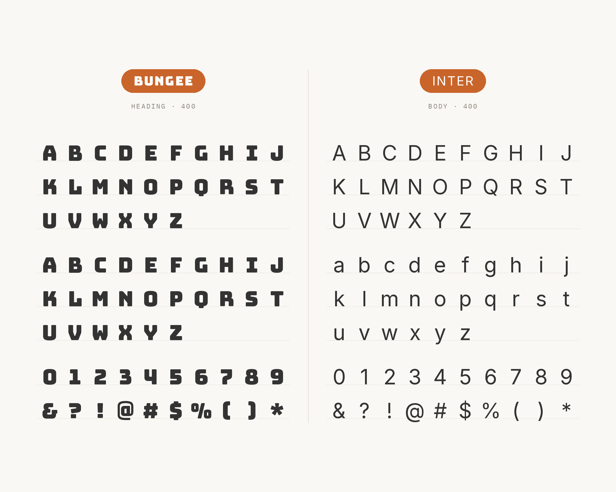
David Jonathan Ross designed Bungee, and Google Fonts added it in June 2016. It is released under the SIL Open Font License, with support from Google and The Font Bureau, so the chromatic layers are free everywhere, including on Google Fonts. The brief is the urban sign: from crummy liquor stores to majestic theaters, vertical signage that stacks the Latin alphabet one letter on top of the other to make dramatic use of limited space. The family ships Regular plus Hairline, with chromatic layers — Inline, Outline, Shade — that stack into color type, plus true OpenType color fonts, vertical kerning, and stylistic alternates that include simplified Deco forms. Typographica named it among the typefaces of 2016. The drawing is blocky, slightly friendly, and unapologetically display-only. Set it at text size and the layers clog, the vertical metrics look like a mistake, and a sign becomes a paragraph nobody finishes.
Pairing Bungee is therefore a role split, not a family reunion. The face has one Regular in the Google Fonts cut that most people will actually load, no italic, and no text optical size. Every partner has to supply mixed-case reading, a weight range, and the calm Bungee’s stacked capitals refuse to provide. Real productions in the Fonts In Use archive converge on a quiet geometric or grotesque sans underneath — Montserrat, Helvetica, Roboto, Avenir Next. Supported pairing guidance adds DM Sans and Space Grotesk. A live Typ.io sample puts Adobe’s Source Sans Pro under a 96-pixel Bungee header. The test that matters is the same for all of them: keep Bungee large, keep the partner at reading size, and do not ask the signage face to set a sentence. Here are 10 fonts that pair well with Bungee, all local and all cited.
1. Montserrat
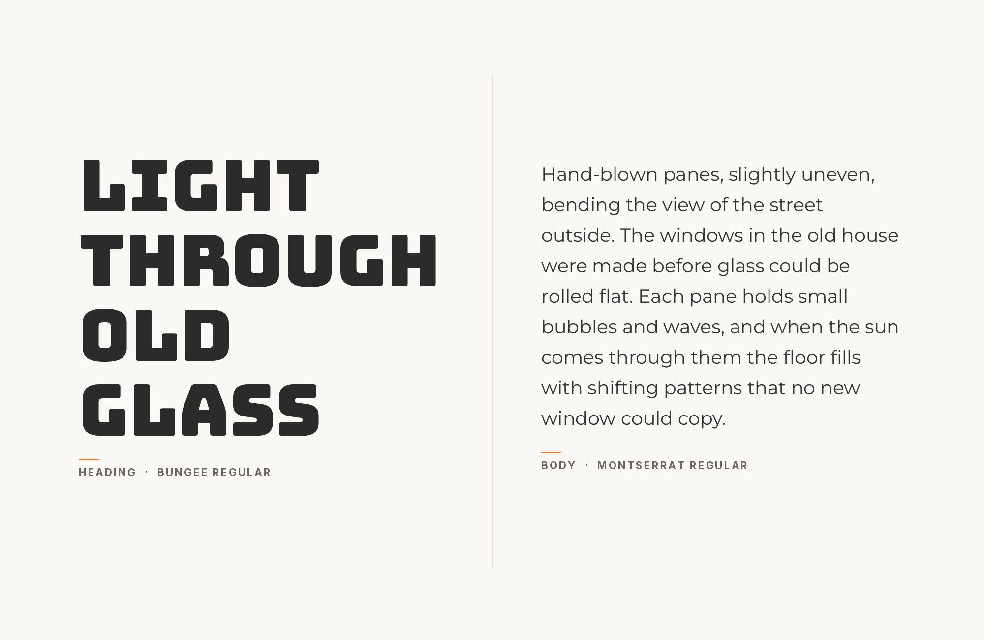
The old posters and signs of the Montserrat neighborhood of Buenos Aires inspired Julieta Ulanovsky to design Montserrat, and she set it free under the SIL Open Font License. The result is a wide, urban geometric sans with a large x-height and even stroke weight. That evenness is what Bungee does not have and does not want. Bungee’s capitals are built to stack, to take chromatic layers, to occupy a vertical strip of a facade; Montserrat is built to set mixed-case sentences at a steady color. Four separate productions in the Fonts In Use archive put the two together (the Every Woman Super Woman zines, Cantrip Seltzer packaging, the Waco Health Camp identity and the Coimbra historical-center archive), which is the strongest co-usage evidence on this list. Give Bungee the nameplate, the poster word, the stacked festival title. Set Montserrat Regular or Medium at 16–18px for menus, captions, about-copy and any paragraph that has to survive a phone. Food brands, zines and festivals want a loud urban display over a geometric sans that still feels like a city rather than a spreadsheet. Do not match the point sizes. Montserrat at display size next to Bungee is two signs, not a system.
Build free, plus 500 AI credits.
Design and publish a site at no cost. Paid plans double your credits the first month.
Start free2. Source Sans Pro
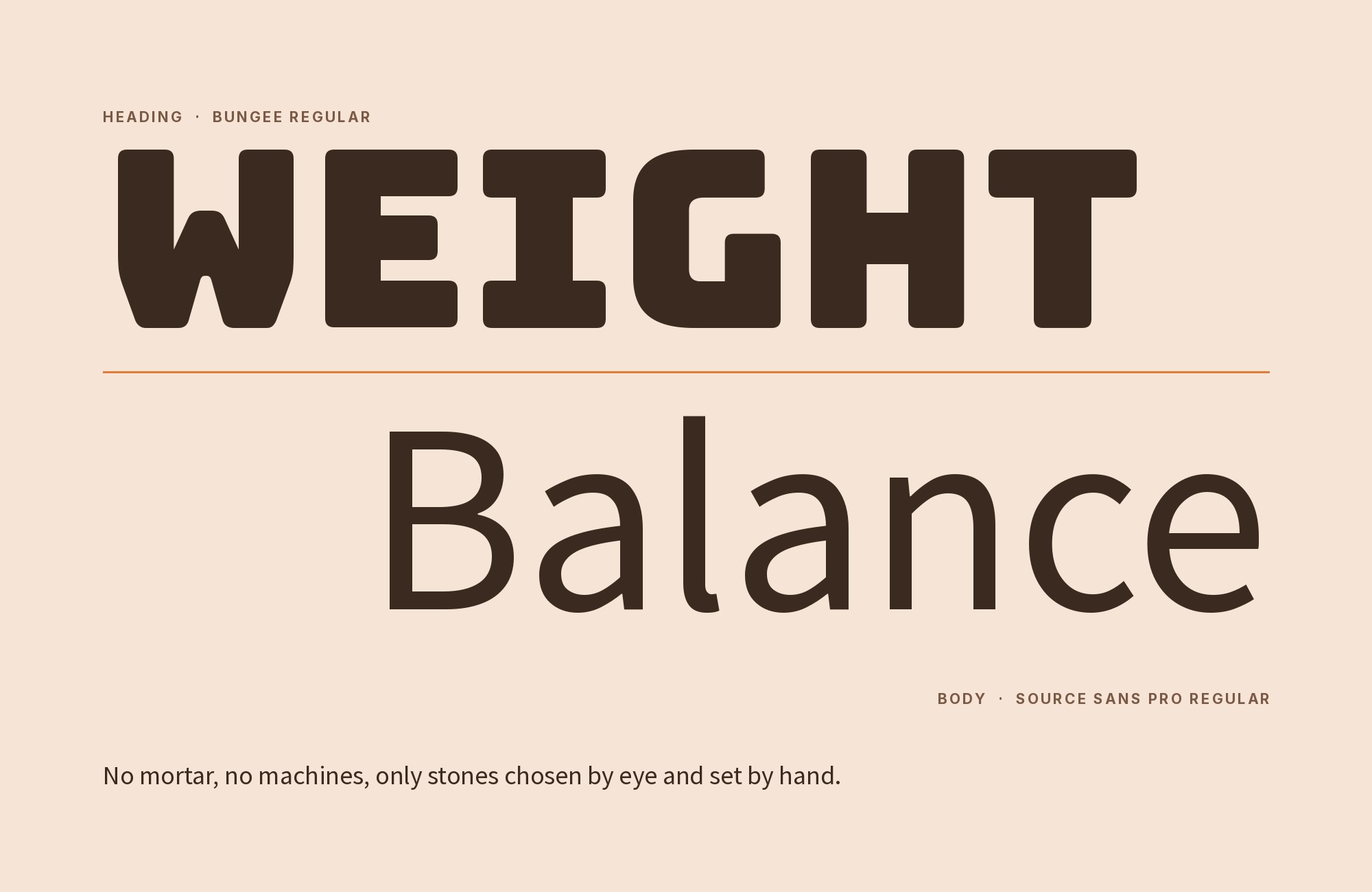
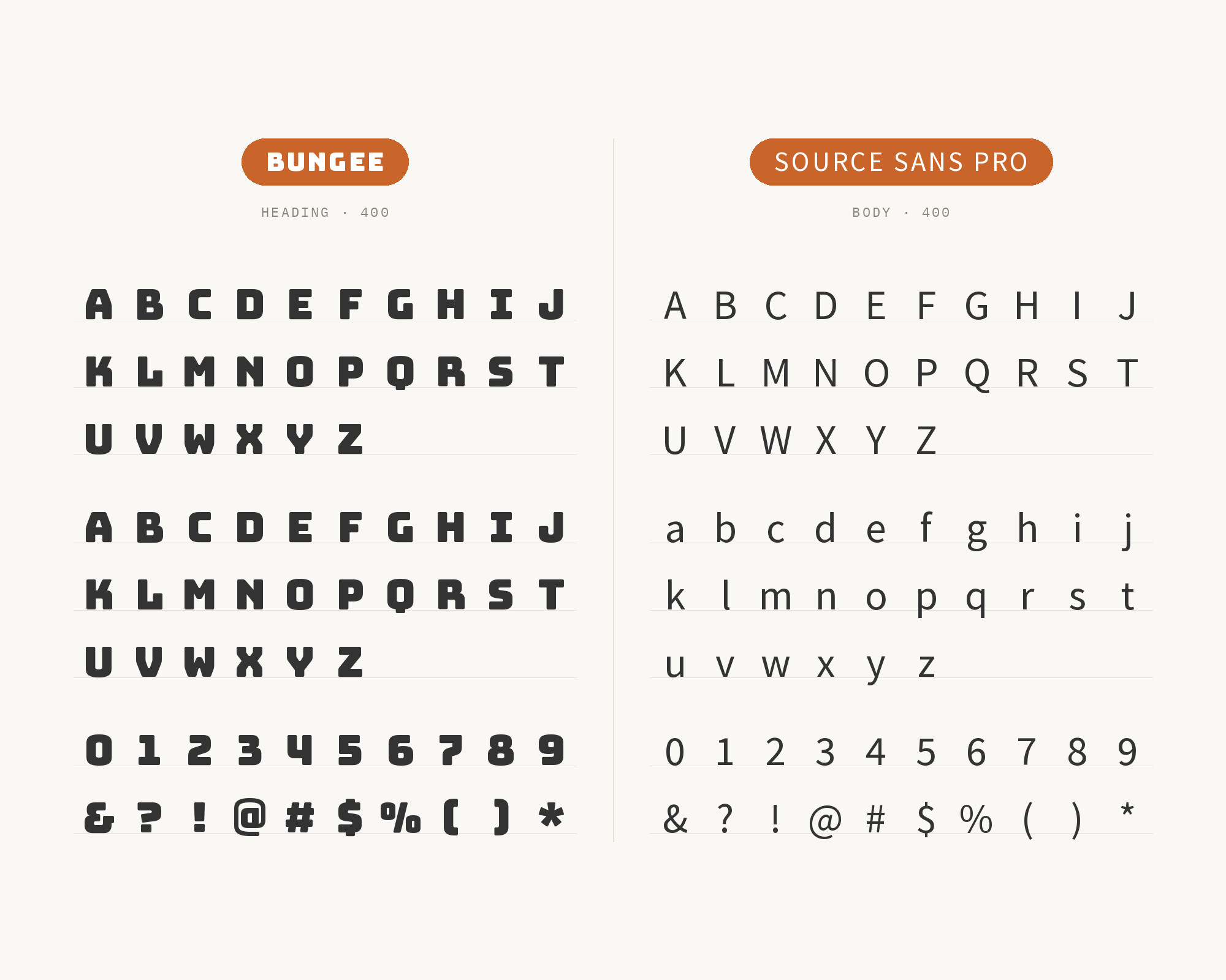
Paul D. Hunt created Source Sans Pro, released by Adobe in 2012 as the first open-source font family from Adobe. It is a sans serif intended to work well in user interfaces, with a larger x-height and a more consistent color on the page than the News Gothic it is based on, so it holds up in panels, captions and documentation. Typ.io’s live Bungee sample is walkiebot.co, which runs Bungee at 96px, 86px line-height, for the header, and Source Sans Pro at 24–25px for the content. It is a chatbot and testing site that needs a sign for the name and a readable sans for everything a user actually has to finish. That size split is the pairing. Bungee’s chromatic, vertical-ready display cannot hold a help article or a settings label; Source Sans Pro was drawn for exactly those jobs. Use Bungee for the product name and a short hero line. Let Source Sans Pro Regular carry body, Source Sans Pro Bold the subheads, and do not introduce a third family until the page is already working. Reach for it on product sites and internal tools, where a piece of street signage in the masthead should not make the rest of the interface feel like a carnival. If you have Source Sans 3, the current variable cut, use that; the pairing logic is the same.
Pro from $14/mo, save $60 yearly.
Premium templates, vector export, and a commercial license on every paid plan.
See plans3. Helvetica
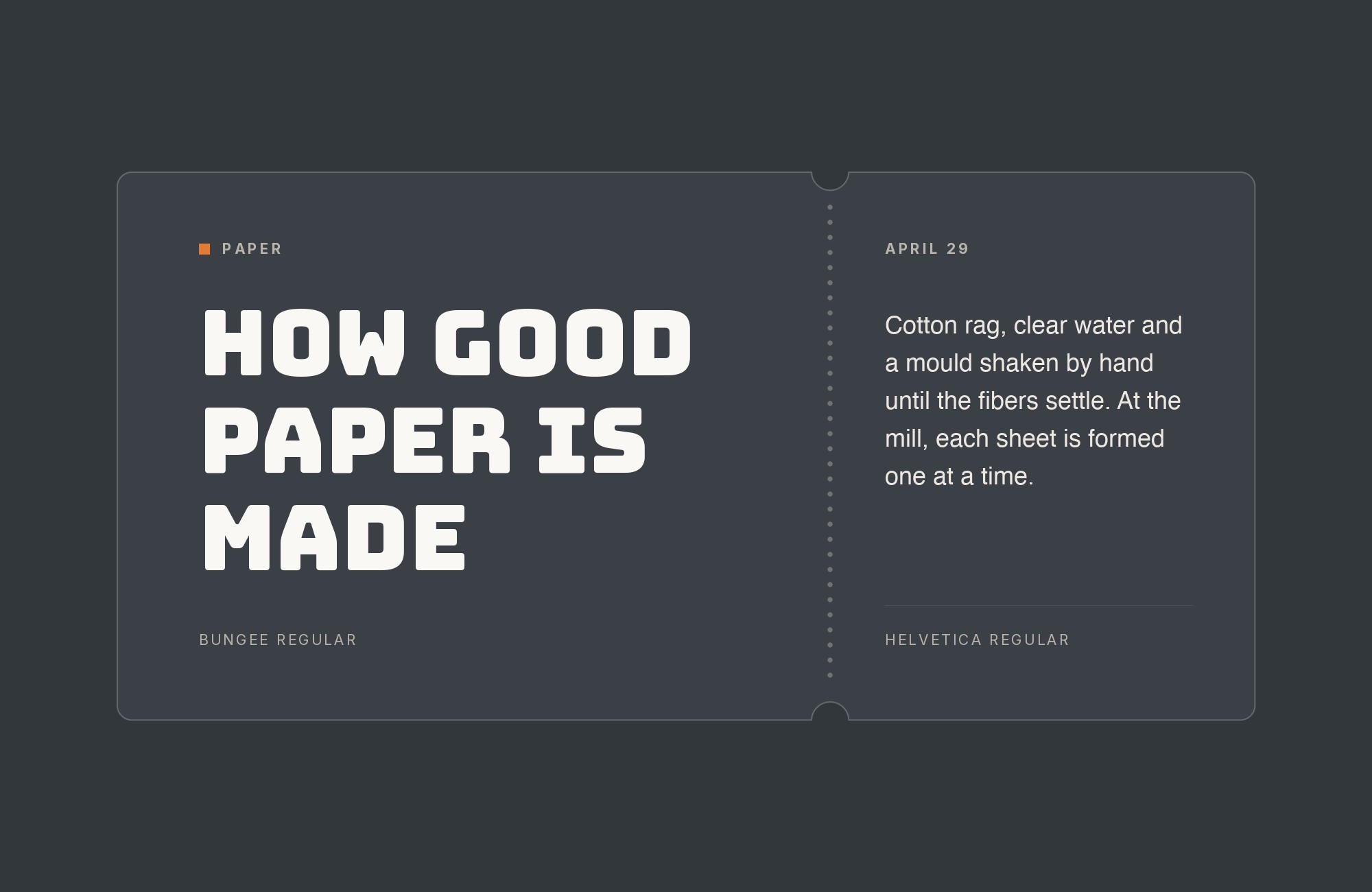
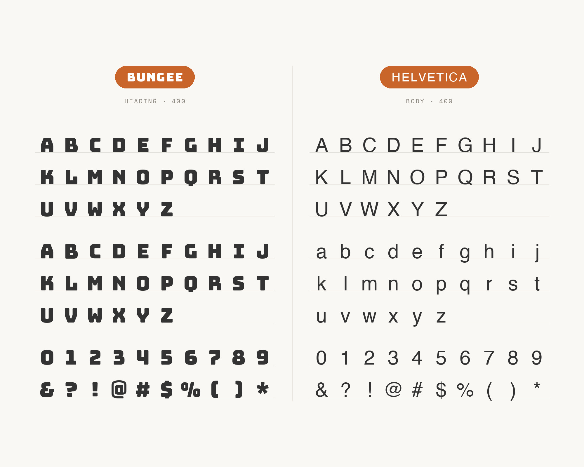
Max Miedinger designed Helvetica in 1956-1957 under the direction of Eduard Hoffmann. It was originally named Neue Haas Grotesk, and in 1959 it was adapted for Linotype typesetting machines and renamed Helvetica. It is a strict, squared-off grotesque with almost no built-in personality. That neutrality is the point next to Bungee. Fonts In Use documents the combination twice: the Every Woman Super Woman issues, which also run Montserrat, and the Is it Cake? protein-supplement packaging, a clean two-voice design of Bungee plus Helvetica. In both cases the grotesque absorbs the reading — ingredients, credits, supporting copy — while Bungee’s layered, slightly friendly signage forms keep the brand shout. Use Helvetica Regular or Neue Regular for body and captions; keep Bungee off the paragraph. Packaging, editorial sidebars and any layout that needs a famous, load-bearing sans under an un-famous-looking display word will land here. Helvetica’s even vertical stress and closed-ish apertures sit at a different construction from Bungee’s blocky, open, vertical-ready capitals, so the two do not blur into one gothic. Watch the weight: Helvetica Bold next to Bungee Regular is two heavy voices. Regular under display is the split that the productions actually use.
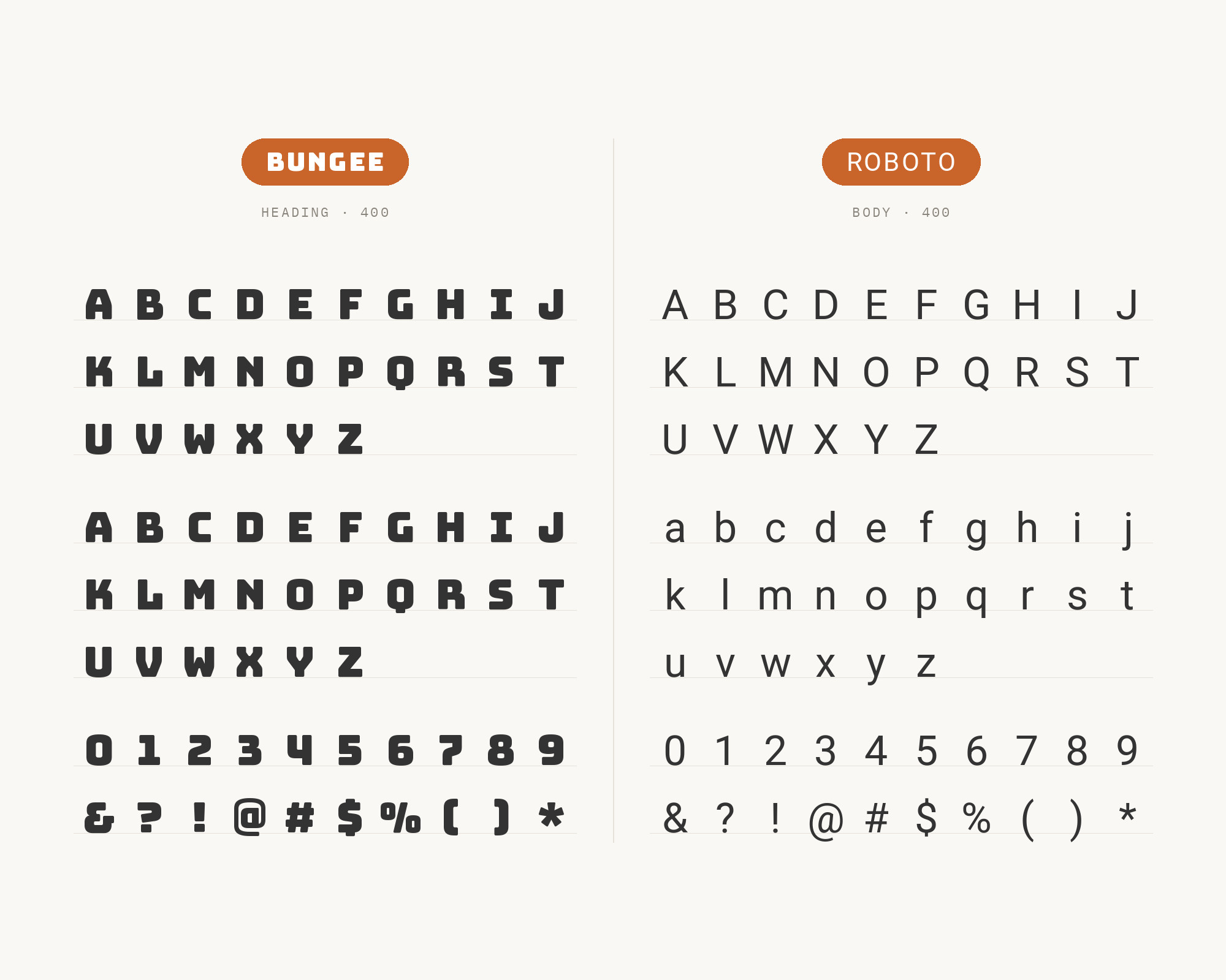
4. Roboto
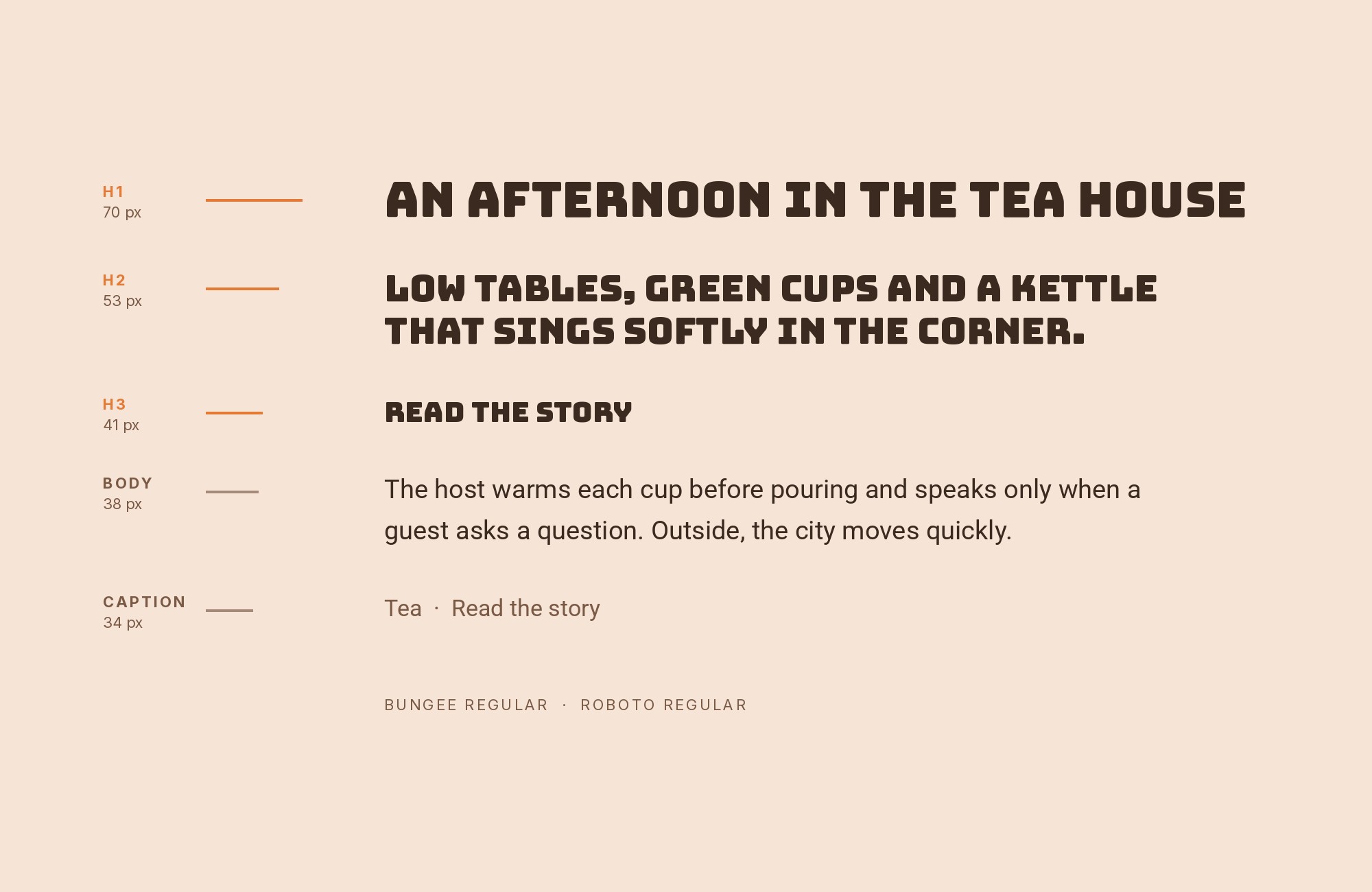
Christian Robertson designed Roboto in-house at Google, releasing it in 2011 as Android’s system font. It has a mechanical skeleton and largely geometric forms, softened by friendly and open curves. That combination of mechanical bones and open curves makes Roboto neutral enough to recede at body and label sizes without feeling as cold as Helvetica, which is useful when Bungee’s stacked display is already doing all the shouting. Fonts In Use records the pair on the Guta Cafe Vietnam identity and again on Cantrip Seltzer, both food-and-drink productions that need a friendly paragraph under a loud name. Set Roboto Regular at 16px for menus, about-copy and packaging backs; use Roboto Medium for short labels; leave Bungee for the name and a single stacked line. For cafes, consumer packaging and Android-adjacent brands, Roboto’s familiarity is half the argument. Because both families are ubiquitous, the risk is blandness rather than clash — keep Bungee’s size and color (or chromatic layers) decisive enough that the page still reads as a sign over a system, not as two Google Fonts in a default stack.
Turn your ideas into repeatable creative workflows - no code required. Create with ready-made templates and AI-powered tools in Picsart Flow.
See details5. Avenir Next
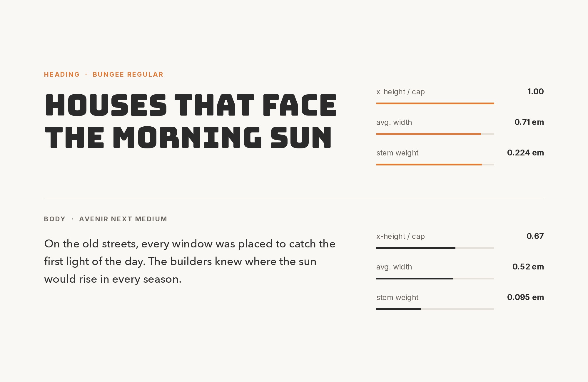
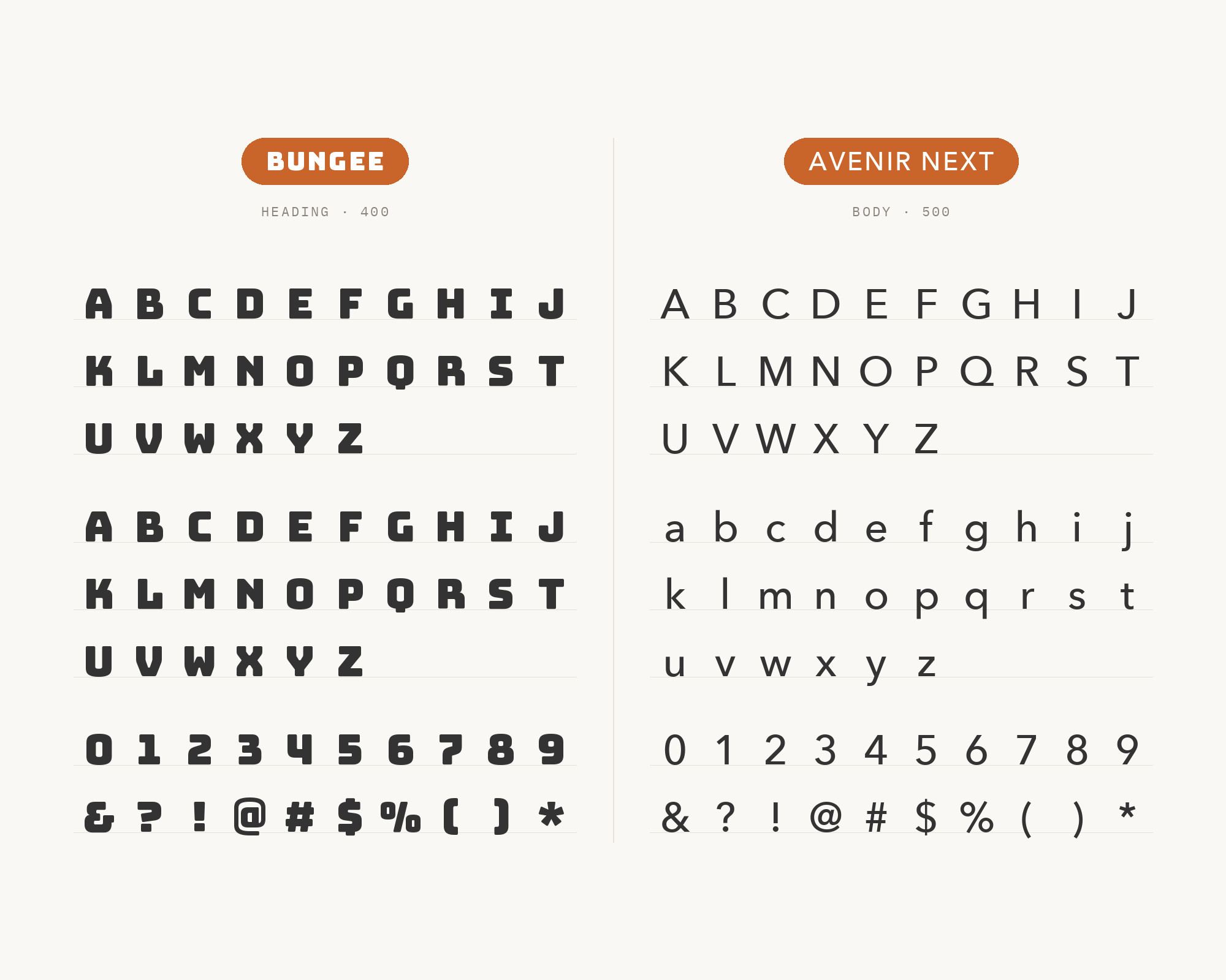
Adrian Frutiger drew Avenir in 1987 as a more organic interpretation of the circle-based geometric sans; between 2004 and 2007 he reworked it with Akira Kobayashi into the expanded Avenir Next family. Fonts In Use documents Top Rope Brewing running Bungee with Avenir Next — a brewery name as a sign, the rest of the system in a warmer geometric sans. That warmth is the separation. Bungee’s capitals are blocky, slightly industrial, built for vertical stacking and chromatic layering; Avenir Next’s curves are softer and more humanist, which is enough to let it hold menus, hours, tap lists and supporting copy without competing for the same industrial register. Use Avenir Next Regular or Book for body, Demi for subheads, and keep Bungee at display size only. This is a hospitality, beer and coffee pairing: street-sign energy in the wordmark, a rounder and more European geometric underneath. If you only have the original Avenir, the logic holds; Next’s extra weights just make the hierarchy easier to tune. Avenir Next Heavy has no role here; Bungee already holds the display job.
6. DM Sans
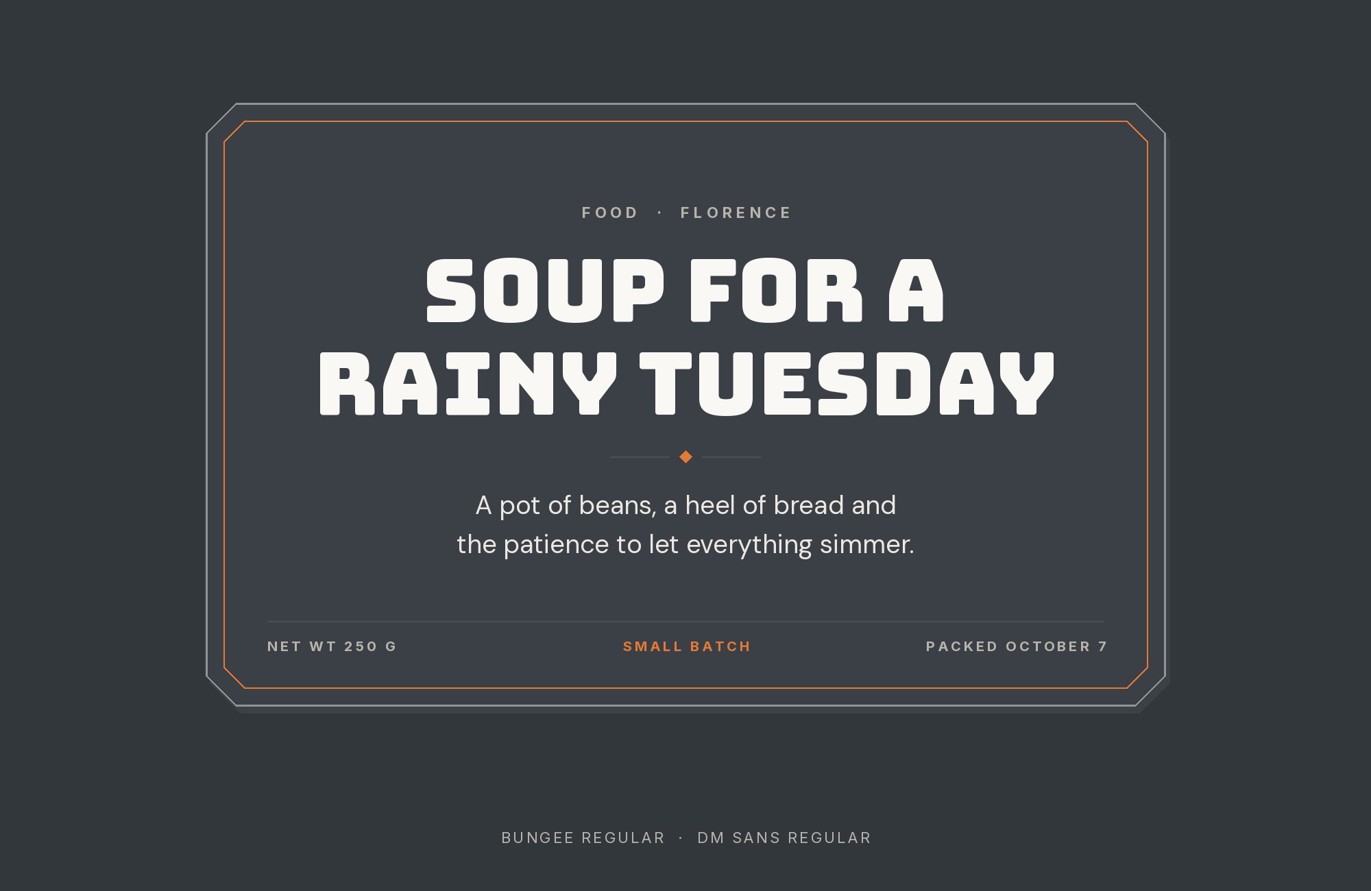
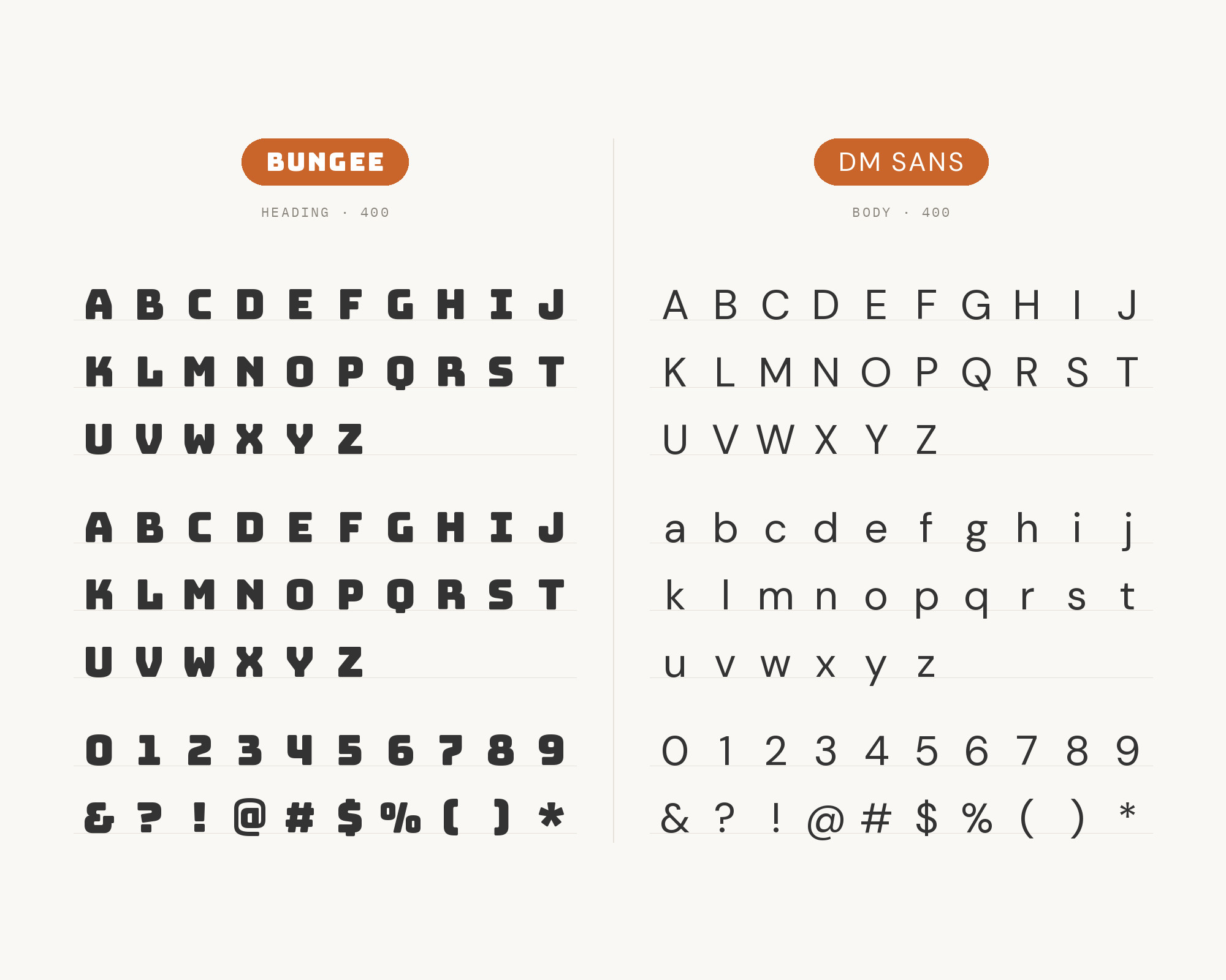
Colophon Foundry designed DM Sans, starting from the Latin of Poppins, as a low-contrast geometric sans intended for smaller text sizes. It has even color, a useful weight range, and none of Bungee’s stacked, chromatic, vertical-ready construction. ForgeDock publishes the combination as a curated “Layered Display” card: Bungee for the layered, playful-bold headline, DM Sans for the body that has to hold up underneath. The geometries are related enough — both are built from simple, slightly friendly sans forms — that the pairing feels considered rather than random, but the contrast and the role are different enough that they do not blur. Give Bungee the stacked word and any chromatic lockup. Set DM Sans Regular for body, Medium for navigation, Bold for buttons. Product marketing and playful consumer brands are the natural home — a signage display over a contemporary geometric that can also run an interface.
7. Space Grotesk
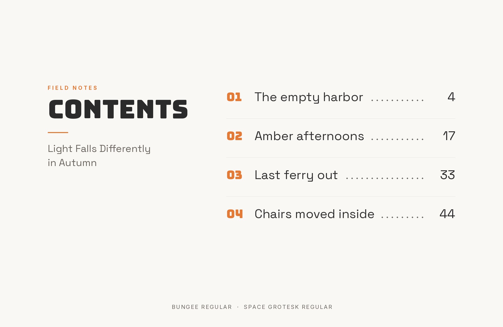
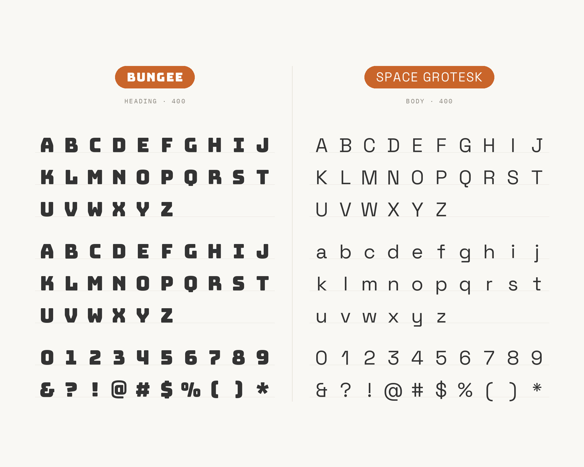
Florian Karsten designed Space Grotesk in 2018 as a proportional variant of Colophon Foundry’s fixed-width Space Mono. It retains the monospace’s idiosyncratic details while being tuned for reading at non-display sizes. ForgeDock’s “Playful Tech” card pairs it with Bungee. That is the register shift this list has been missing: not another civic or product grotesque, but a slightly mechanical, developer-adjacent sans under a face that celebrates liquor-store verticals and theater marquees. Bungee’s stacked urban display supplies warmth and street; Space Grotesk supplies a grid. Use Space Grotesk Regular for body and short technical copy, Medium for labels, and keep Bungee on the name and a single display line. Developer tools and festival sites get the signage shout without pretending the rest of the page is a restaurant menu. Short data looks native in it; for long literary paragraphs, use the supported Source Sans Pro pairing.
8. Exo
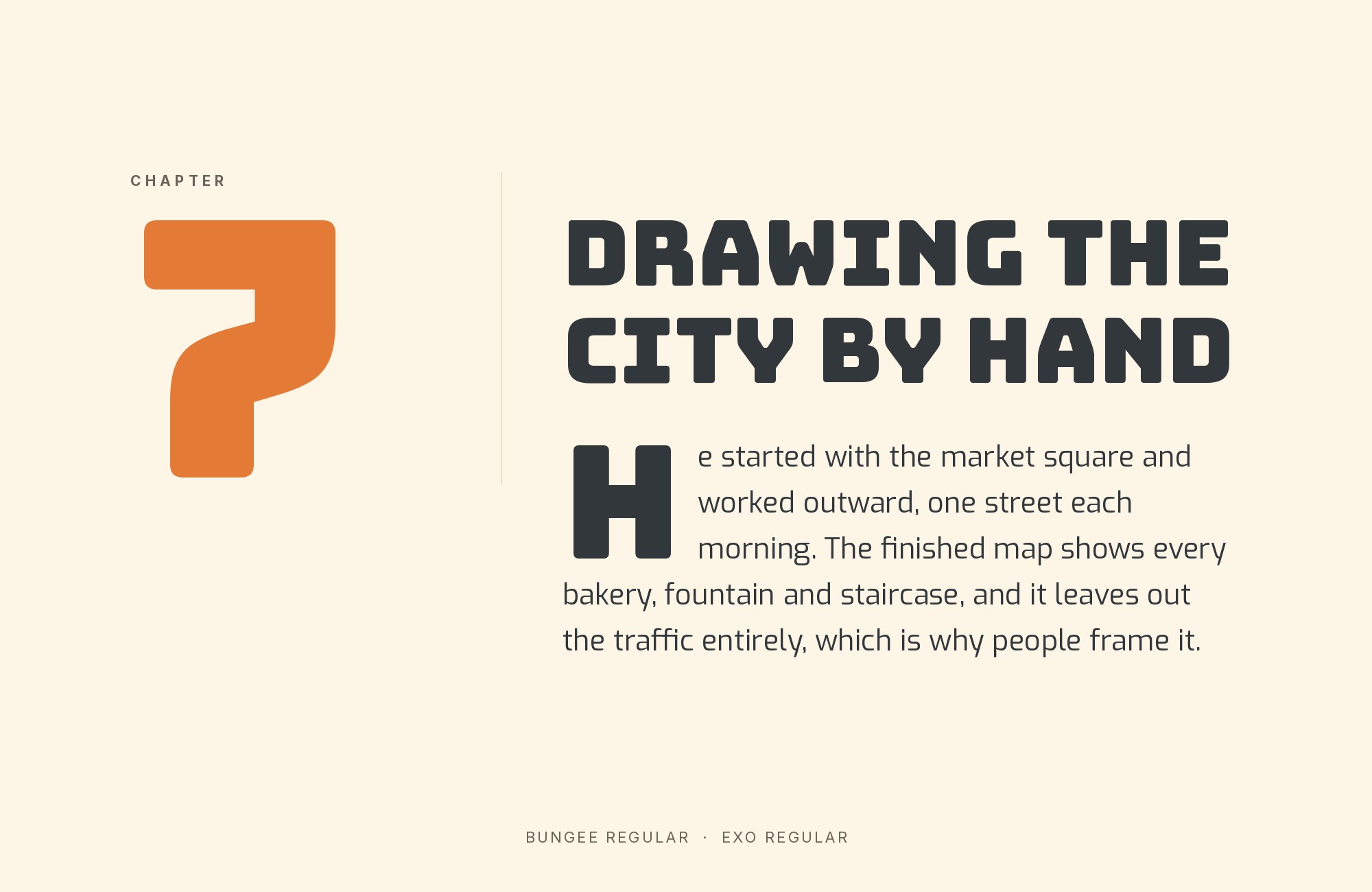
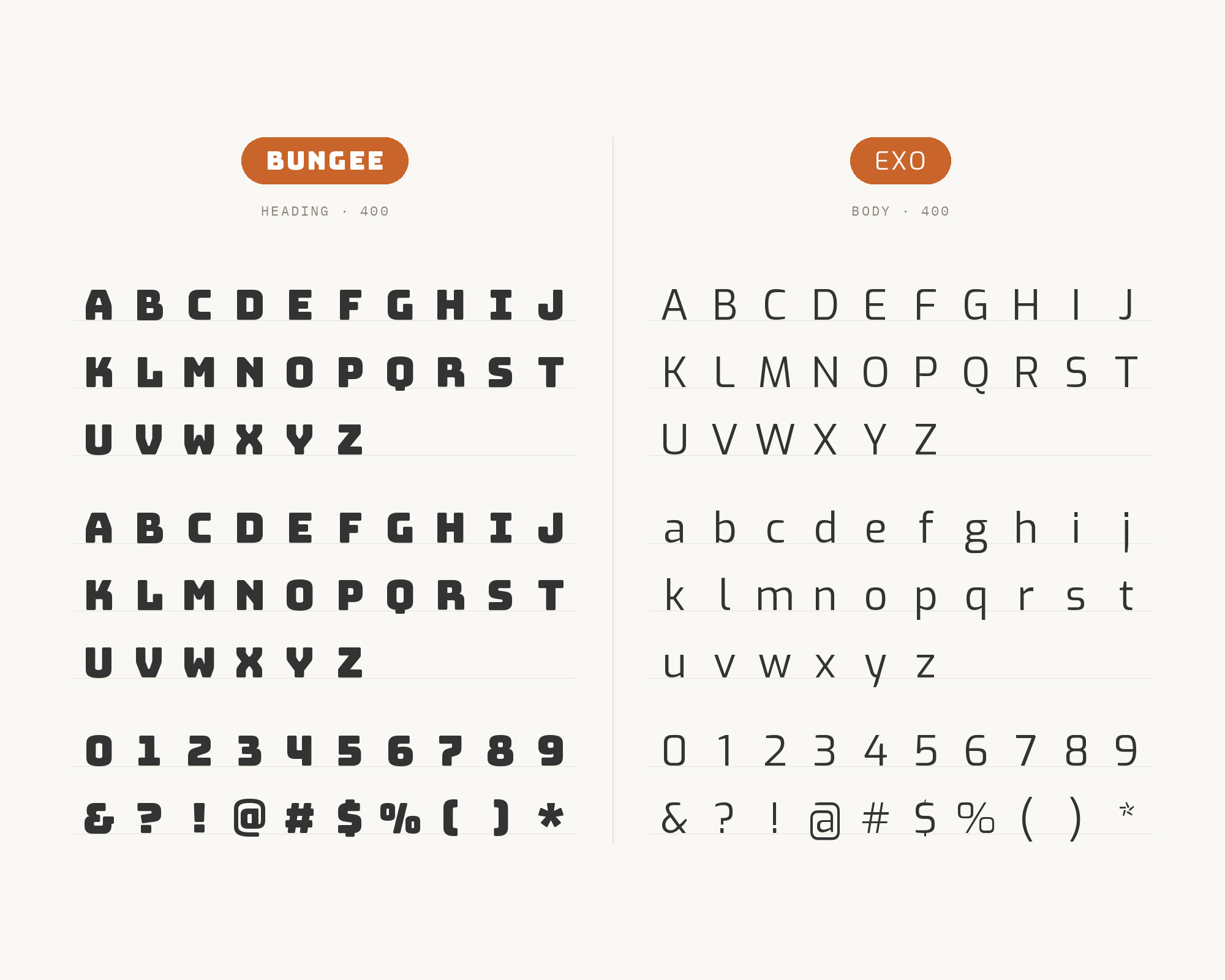
Ten Square Games’ 2022 brand book names Bungee as its primary title, header and slogan face, then names Exo Regular as the font that supplements Bungee in less-important content under the main slogan. Exo Black is reserved for highlights, and the guide says all three may appear on the same graphic. That is unusually direct evidence for this pairing: Bungee owns the large, stacked announcement while Exo supplies the quieter supporting line. Use Exo Regular for captions, subheads and explanatory copy, and keep Exo Black to short emphasis. Give the lighter text enough size to remain distinct beneath Bungee’s heavy capitals.
9. Open Sans
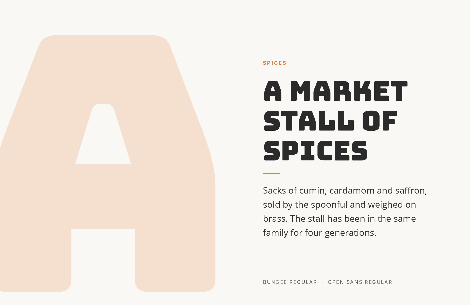
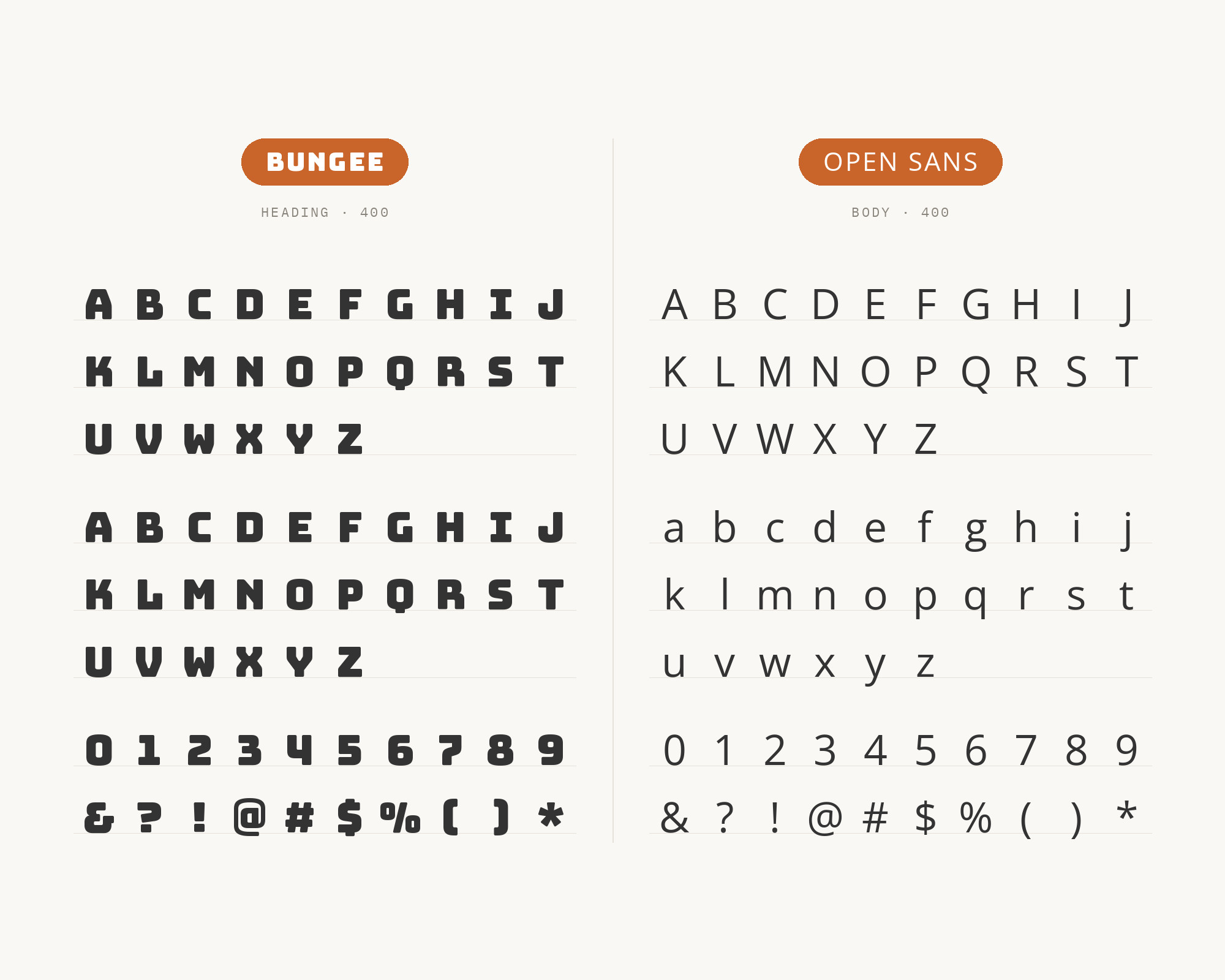
Looka demonstrates Bungee with Open Sans in a social-ad example, using the display face for the headline and the sans serif for supporting copy. The useful contrast is density: Bungee compresses a great deal of visual weight into a short announcement, while Open Sans gives the explanation a more open, even rhythm. Keep the headline brief and allow a visible gap before the smaller text. Open Sans can handle a button label or a practical detail without repeating the announcement’s force. If every line feels equally loud, reduce the supporting weight before adding another color or decorative treatment.
10. Inter
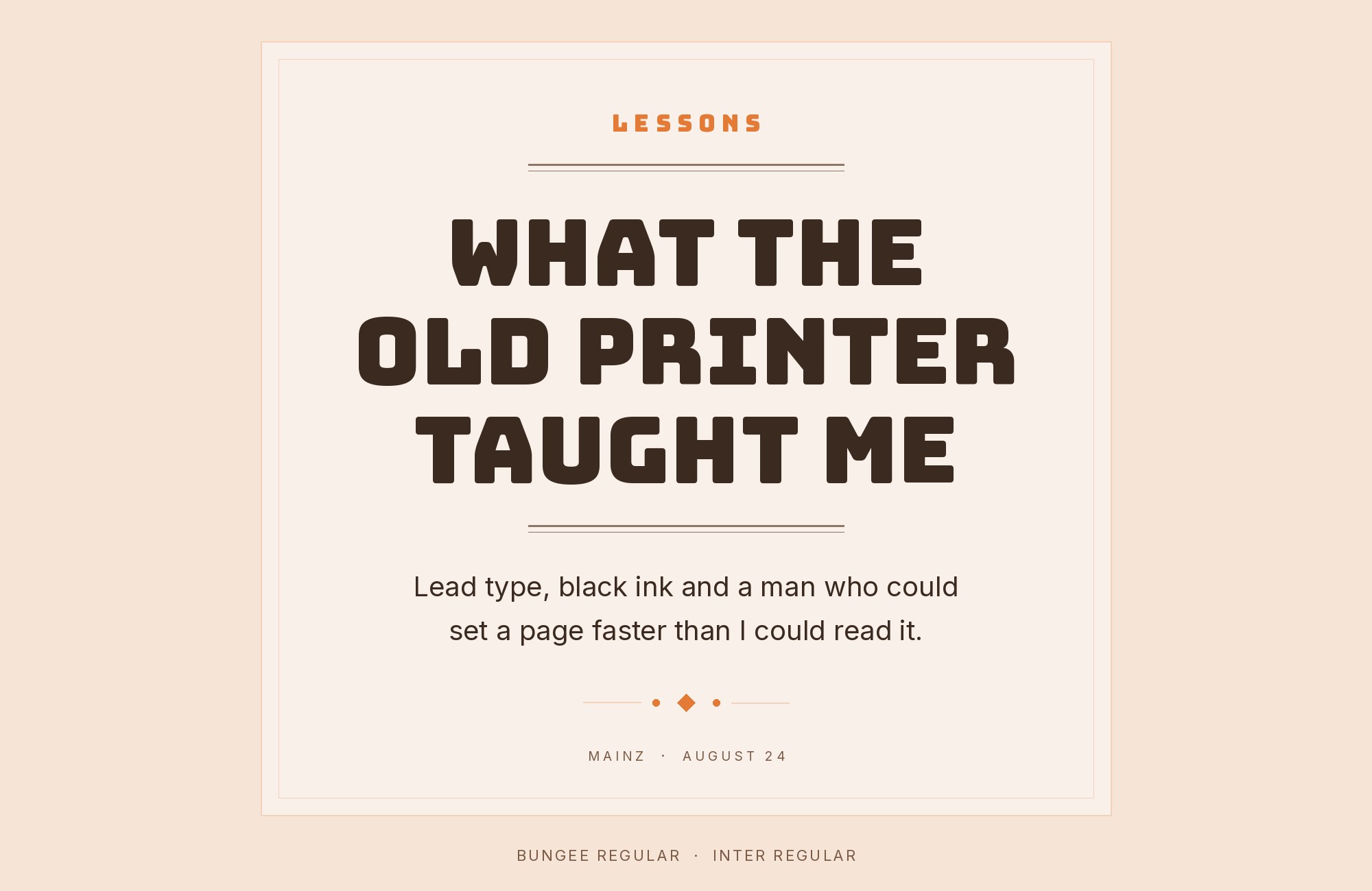
Jukebox Print demonstrates Inter beneath a Bungee display and explicitly assigns the two faces different jobs: Bungee supplies personality and headlines while Inter carries body copy, captions and supporting text. That is the useful version of this pairing. Inter’s open counters and broad range of weights can build an entire reading hierarchy without asking Bungee to stretch beyond one short announcement. Start with Inter Regular for paragraphs and Medium for controls; reserve Bungee for a compact title at a decisive size. The combination works best when the supporting copy stays visually even and the headline remains short enough for Bungee’s distinctive shapes to read at a glance.
Conclusion
Bungee is a signage display, and the working pattern in real productions is the same one the pairing tools independently recommend: Bungee for the nameplate, one quiet sans for everything else. The archive evidence clusters on Montserrat, Helvetica, Roboto and Avenir Next. The supported advice literature adds DM Sans and Space Grotesk. A live Typ.io sample puts Source Sans Pro under a 96-pixel header. All ten partners are supported by cited examples or guidance; DM Sans and Space Grotesk are supported by ForgeDock pairing cards.
The family layers — Inline, Outline, Shade — are not pairings. They are Bungee talking to itself in color. Because Bungee itself is free, favor partners that are free as well, set real copy at the sizes you intend to publish, and judge the combination by whether the stacked signage still reads as the only display voice once the body text is on the page.
