
Public Sans pairs great with Libre Baskerville, Open Sans and Helvetica. All 13 pairings are shown below in real rendered specimens, with the reason each one works.
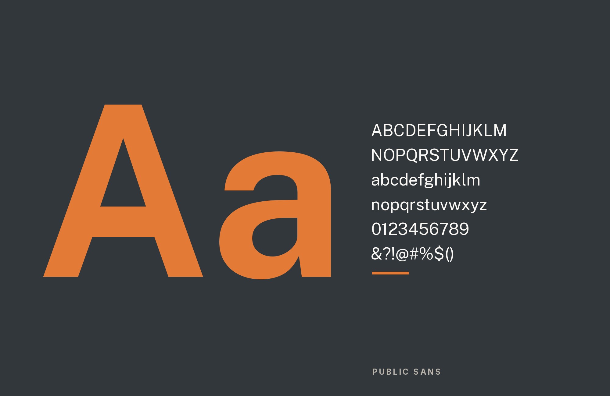
What fonts go with Public Sans? Start with the job it was hired to do: disappear into government forms, product interfaces and long stretches of civic reading, while still sitting close enough to Helvetica, Arial and SF Pro Text that a page does not jump when the webfont fails.
The United States Web Design System drew Public Sans as a fork of Impallari Type’s Libre Franklin and released it as an open-source family — nine weights with matching italics, plus a variable weight axis. The design is a Franklin grotesque: two-story g, regularized stroke, angled non-rounded vertices, a hooked lowercase l for disambiguation, and tabular figures for data. It is about two percent shorter than its parent, narrower in the rounds, and looser in default spacing, with a large x-height that holds at caption sizes. The README is explicit about the metric brief: size and appearance sit somewhere between Apple’s SF Pro Text and Google’s Roboto, so Public Sans can ride in a system-font stack as progressive enhancement rather than as a foreign object.
That construction dictates the pairings. Public Sans is a neutral UI grotesque on purpose — “as few quirks as possible” is one of the project’s own design principles — so a partner has to either share that neutrality or supply the personality the face refuses to carry. First-party documentation points at the metric-compatible route, while university and government systems add role-based display and serif companions. Here are 13 fonts that pair with Public Sans.
1. Libre Baskerville

Impallari Type drew Libre Baskerville from American Type Founders’ 1941 Baskerville — itself a descendant of the transitional serif John Baskerville designed in 1757 — giving it a taller x-height, wider counters and a little less contrast than its model so the face survives at paragraph sizes on a screen. Typewolf makes this its single suggested pairing for Public Sans, and the contrast is the whole argument: bracketed serifs, moderate stroke contrast and a literary rhythm against Public Sans’s even, Franklin-derived grotesque. Set Public Sans for navigation, labels, buttons and the unglamorous sentences of a government or institutional interface, and let Libre Baskerville take the reading — articles, reports, pull quotes, anything a citizen is meant to linger over. The reverse also holds: Baskerville headlines over Public Sans body copy, useful when an editorial brand wants historical weight up top and civic calm underneath. Both families were drawn for screens, so you are not mixing a print book face with a UI sans and hoping the sizes agree. Keep Baskerville’s bold for short display lines; its contrast is moderate, not Didone, and it will not shout over Public Sans unless you force the size.

Paid prompt-to-site tools are going to lock you in.
How can your studio escape this?
Find Out How2. Open Sans

Steve Matteson designed Open Sans under commission from Google, releasing it in 2011 as a humanist sans with a notably large x-height, simple upright stress and open apertures built for small-size legibility. The Public Sans README names it first among the faces a site might already be using: Public Sans is “a good option” for projects currently on Open Sans, which is substitution language that doubles as pairing logic. The two agree on the decisions that matter at caption size — open apertures, tall x-height, low contrast, no decorative agenda — so you can introduce Public Sans as a webfont without retuning a dozen type tokens. Public Sans is slightly narrower, more regularized in stroke, and more Franklin than humanist, which is enough separation to let it take headings and identity while Open Sans remains the quieter body, or the reverse if the product is already committed to Open Sans in the interface. This is the lowest-risk Google Fonts companion on the list, and the one to reach for when a civic or healthcare site needs a humanist sans that will not fight Public Sans’s metrics.

3. Helvetica

Max Miedinger and Eduard Hoffmann designed Helvetica — released as Neue Haas Grotesk in 1957, then renamed Helvetica in 1959 for Linotype typesetting machines — as a strict, squared-off grotesque with almost no built-in personality. That is the same job Public Sans was given, executed in a different national register: Swiss international style against American Franklin gothic. The Public Sans README lists Helvetica among the faces the family can stand in for, because the vertical metrics were drawn to sit near common system grotesques rather than to announce a new size. In practice that makes Helvetica the cooler cousin and the load-bearing fallback. Run Public Sans where the webfont loads — web, apps, anything you control — and let Helvetica cover email, PDFs, unstyled HTML, and the documents that will be opened on machines that never installed a Google Font. Do not try to make them contrast; they are too close in color. Use weight and size for hierarchy, and treat Helvetica as the system shadow of Public Sans rather than as a second voice.

Pro from $14/mo, save $60 yearly.
Premium templates, vector export, and a commercial license on every paid plan.
See plans4. Arial

Robin Nicholas designed Arial at Monotype in 1982 as a sans for low-resolution laser printers; Patricia Saunders later developed it into a full family, which Microsoft licensed as a core Windows 3.1 font in 1992. It is on the same README list as Helvetica and Open Sans: a face Public Sans can replace, and therefore a face it can sit beside without an optical jump. Its value is practical. TrueType Arial has shipped with Windows since 3.1, so it becomes the stand-in wherever Public Sans cannot be embedded — intranet Word files, PowerPoint decks, plain-text systems, vendor portals. Close enough in weight and proportion to hold a type system together, not close enough to be interesting. Treat this as a load-bearing fallback, the way you would treat Arial under any distinctive web grotesque: Public Sans everywhere it can render, Arial quietly covering the gaps. If the brand’s tone is warmer than a hard corporate grotesque wants to sound, Calibri is the softer Office-world alternative, but Arial is the one the README actually names.

5. Libre Franklin

Impallari Type drew Libre Franklin as an open-source interpretation of Morris Fuller Benton’s Franklin Gothic, and Public Sans is a modified fork of that family under the SIL Open Font License. The README spends more words on the differences than on the kinship, which is useful pairing information: Public Sans is about two percent shorter, narrower especially in characters like the lowercase e, looser in letterspacing, with regularized stroke, non-rounded vertices, a tailed l, and a smoother counter shape. What they still share is the Franklin skeleton — most visible in the two-story g — so a page that runs both during a redesign, or a print piece set in Libre Franklin beside a web UI in Public Sans, reads as one family of forms rather than as two unrelated grotesques. Give Libre Franklin the slightly more compact, historical display role if you need one; keep Public Sans for UI, data and long-form screen reading, which is the brief it was redrawn for. Optional untailed l in Public Sans exists if you need the two lowercase els to match.

6. Karla

Jonny Pinhorn designed Karla as a grotesque sans, with a warmth and handmade irregularity that a strict neo-grotesque would sand off. Fonts In Use documents the combination in production, twice: the HoodieHut website in 2021 and again in 2025, both times setting Public Sans with Karla (the later record also includes Druk Wide). That repetition is the evidence. Public Sans was designed to have as few quirks as possible; Karla is the quirk. Use Karla for brand lines, campaign headlines and anything that should feel like a shop rather than a portal, and keep Public Sans for the interface — carts, forms, policies, the sentences nobody is meant to notice. At small sizes Karla needs a touch more tracking than Public Sans; do not set them at the same size and expect the color to match. The split is personality versus civic calm, not serif versus sans: two grotesques, one withholds, one supplies.

Build free, plus 500 AI credits.
Design and publish a site at no cost. Paid plans double your credits the first month.
Start free7. Merriweather

The NIAID Design System’s theme builder lists Merriweather among its heading fonts, alongside Public Sans, Roboto and Martel, while its body fonts are Public Sans and Roboto. That makes Merriweather headings over Public Sans body copy a sanctioned combination in a federal design system. The USWDS describes Merriweather as an open-source serif designed for on-screen reading, with a tall x-height that stays compact. That is a useful civic split: Public Sans supplies the neutral, large-x-height interface layer, while Merriweather’s sturdy serif texture gives an academic or editorial heading a stronger voice. Keep the serif to titles, subheads, and short reading passages unless the layout gives its heavier color enough room.

8. Source Serif 4

The Workbench, a site by the ODERSA association, credits Source Serif 4 for its headings and figures and Public Sans for body text, labels, and tables. The pairing is structurally restrained: Source Serif 4 supplies bracketed serif contrast and a reading texture, while Public Sans keeps forms, navigation, and utility text neutral. Let the serif establish the page’s voice in headings or longer copy, then test the lowercase sizes independently rather than assuming the two families share metrics.

9. Lexend

Rossul’s 2024 pairing guide assigns Lexend to headings and Public Sans to body text. Lexend’s expanded spacing and broad shapes create a visible scanning layer above the more conventional civic grotesque. Use it for page titles, feature numbers, or short section headings, then let Public Sans handle paragraphs, navigation, and form labels. The two families are both open and legible, so the hierarchy should come from size and role rather than from heavy weights everywhere. This combination fits education, accessibility-focused products, and public information sites where headings must be found quickly but the body still needs a neutral, space-efficient texture.

10. Barlow Condensed

Resolve to Save Lives assigns Barlow Condensed to the folio and H1, then uses Public Sans for lower headings and body copy. The narrow display face packs urgency into a short top line; Public Sans opens the rest of the document into normal-width reading. Track the condensed capitals carefully and avoid using them for paragraphs. Public Sans can then carry lists, tables, explanations, and calls to action without competing. Because both are low-contrast sans serifs, the width change is the primary signal. This system works especially well for reports, health campaigns, and advocacy materials where the first message must be forceful and every detail underneath must remain plain and dependable.

11. Roboto

NIAID’s official design system offers Roboto and Public Sans as both heading and body choices in its theme builder, so Roboto headings over Public Sans body text, or the reverse, are both available. That flexibility reflects how closely both families serve screen interfaces, but the two still need a clear role split. Use the heading face at a larger size or stronger weight and keep the body face regular; avoid alternating them at neighboring sizes, where the distinction disappears. Roboto’s mechanical geometry feels slightly tighter, while Public Sans retains its Franklin-derived civic texture. The combination suits federal and health information systems that need an approved neutral palette and must support multiple site themes without introducing a decorative display family.

12. Martel

NIAID’s theme builder also offers Martel as a heading font, with Public Sans among its body fonts. Martel supplies modulated serif strokes and a more formal, multilingual display voice, while Public Sans carries navigation, explanations, forms, and supporting text. Keep Martel at headline size so its serif details remain clear, and use Public Sans at regular weight beneath it. The category contrast is strong enough that neither family needs an extreme weight. This pairing works for research, public health, institutional reports, and science communication where a title should feel authoritative without making the body look literary. It is especially useful when a design system needs both Latin and Devanagari-aware typography within a controlled set of sanctioned fonts.

13. Lato

The GreenSCENT project’s communication plan selects Public Sans and Lato as its typefaces and uses them in its slide templates. Lato’s softly rounded terminals and humanist curves add warmth where Public Sans stays intentionally plain, but both maintain a large x-height and even text color. Give Public Sans the interface labels, navigation, or firm headline, then let Lato carry explanatory copy at regular weight. Because both are low-contrast sans serifs, size and weight must do visible hierarchy work; avoid setting them identically. The pair fits public-interest campaigns, education products, and service sites that need civic clarity without making every paragraph feel institutional.

Conclusion
Public Sans is a Franklin grotesque drawn to be strong, neutral and interchangeable with the system fonts a user already has. The documented pairing evidence follows that brief. The first-party README points at metric-compatible companions and fallbacks — Open Sans, Helvetica, Arial, the parent Libre Franklin — which is the stack you want when the webfont is a progressive enhancement and the page must still look intended if it never loads. Typewolf points the other way, toward serif contrast: Libre Baskerville as the suggested editorial partner. Karla fills the remaining sans job: quirkier, and live on a real site.
Choose by the second font’s job, not by mood-board affinity. If Public Sans is the interface, pick a serif for the reading or a quieter grotesque for the chrome. If Public Sans is the reading, pick a display voice — Karla, or Libre Baskerville at large sizes — and keep the civic sans underneath. Set real copy at the sizes you intend to publish, and judge the pairing by whether Public Sans still recedes into the UI once the partner is on the page. That receding is the feature.
Sources
- Typewolf
- GitHub README (uswds/public-sans)
- Fonts In Use (typeface page)
- Fonts In Use (HoodieHut website, 2025)
- Fonts In Use (HoodieHut website, 2021)
- Jukebox Print
- USWDS typography component
- Google Fonts About / METADATA
- Wikipedia (Franklin Gothic § Public Sans)
- AIGA Eye on Design
- Typewolf (Andrew Tarcon)
- Typewolf (HETIME)
- GreenSCENT visual guidelines
