Gilroy pairs great with Helvetica, Times New Roman and Noto Sans. All 14 pairings are shown below in real rendered specimens, with the reason each one works.
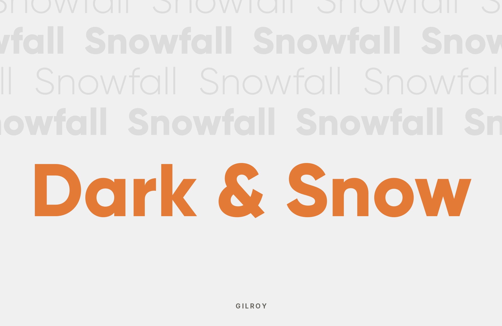
What fonts go with Gilroy? Start by asking what kind of sans it actually is: rounder and friendlier than a strict grotesque, but built from the same compass-and-straightedge logic as a geometric face, which is exactly the tension a partner font needs to resolve.
Radomir Tinkov designed Gilroy and published it on Behance in July 2016, arriving in ten upright weights plus matching italics. The Light and ExtraBold weights are free. The letterforms carry a geometric skeleton softened at the joints, with rounder bowls and a tighter, more mechanical curve construction than a true grotesque, which gives headlines and logotype a friendly, engineered character rather than a cold one.
Gilroy can carry an expressive geometric headline while a quieter neutral sans handles longer copy. Brand guides and design case studies show that division with partners such as Inter, Roboto, Open Sans, Noto Sans, Arial and Calibri. Serif contrast offers another direction: Lora, Source Serif 4, Playfair Display and Times New Roman give Gilroy a more editorial setting. Use these pairings as a starting point, then test them with your own copy.
1. Helvetica

Max Miedinger and Eduard Hoffmann designed Helvetica, released as Neue Haas Grotesk in 1957 by Switzerland’s Haas Type Foundry and then adapted for Linotype machines and renamed Helvetica in 1959. They drew it as a strict, squared-off grotesque with almost no built-in personality. That neutrality is what makes it work with Gilroy: both are geometric-leaning grotesques, but Gilroy’s rounder bowls and tighter, more mechanical curve construction give it a distinct voice that Helvetica’s stricter forms never claim. Run Gilroy in headlines and logotype, where its character shows, and let Helvetica carry body copy and interface text with its familiar, load-bearing calm.

Don't start with a blank page. Shutterstock Unlimited: endless downloads of premium human-made assets plus powerful AI tools.
Sign Up2. Times New Roman

Stanley Morison directed the design and Victor Lardent drew the letterforms of Times New Roman, commissioned by The Times of London and published in 1932 as a transitional serif tuned for dense newsprint columns. Its bracketed serifs and moderate stroke contrast are everything Gilroy’s uniform, monoline geometric strokes are not, and that gap is the point: a newspaper serif against a rounded geometric sans reads as old-meets-new rather than mismatched. Set Times New Roman for long-form body copy or a pull quote, and reserve Gilroy for headlines and short display lines.

3. Noto Sans

Google built Noto Sans as one branch of its larger Noto family, added to Google Fonts in 2013 and designed to cover roughly 1,000 languages and 162 writing systems so no script renders as a blank “tofu” box. It carries a humanist-leaning grotesque skeleton with an x-height close enough to Gilroy’s own that the two sit at the same apparent size without adjustment. That closeness is why it works underneath Gilroy: Noto Sans stays quiet at body and label sizes, letting Gilroy’s rounder geometric headlines hold the personality, while its enormous script coverage keeps a multilingual product working far outside Latin text.
Altia’s brand guide selects Noto Sans as a secondary face to Gilroy for language coverage.

4. Inter

Rasmus Andersson designed Inter and released it in 2017 with one job in mind: disappear at small sizes on a screen. Its tall x-height, open apertures and neutral, near-mechanical forms were tuned for UI legibility rather than expression — the opposite job from Gilroy’s rounder, more decorative geometric curves. That division of labor is why the pairing shows up in real interfaces such as pulumi.com: Gilroy carries marketing headlines and logotype, where its personality earns its keep, while Inter runs every button, label and paragraph beneath it without competing for attention. It is the clearest quiet-neutral partner on this list.

“My clients will build their own sites with their own AI.”
How are you supposed to navigate this?
Find Out How5. Avenir Next

Adrian Frutiger drew Avenir in 1987 as a more organic interpretation of the geometric sans, and Linotype released it in 1988; between 2004 and 2007 he reworked it with type director Akira Kobayashi into the expanded Avenir Next family used today. Both Avenir Next and Gilroy trace to that same geometric lineage, so setting them together keeps a whole system in one typographic family rather than mixing philosophies. The difference is warmth: Avenir Next’s curves are slightly softer and more humanist than Gilroy’s tighter, more engineered geometry, which is enough separation to let it hold body copy and secondary headings while Gilroy keeps the primary display role.
Termene’s brand manual names Gilroy as its primary font and Avenir Next as its secondary font.

6. Lora

The Cyreal studio designed Lora, added to Google Fonts in 2011, as a calligraphic serif with roots in brush lettering and moderate stroke contrast built for comfortable body-text reading. Its warmth is the reason to pair it with Gilroy: Gilroy’s engineered, monoline geometry is confident but deliberately withholds any handwritten quality, and Lora supplies exactly that missing warmth without the stiffness of a formal book serif. This combination suits consumer and lifestyle brands that want a geometric, contemporary logotype up top but a friendlier, more human voice carrying the paragraphs underneath it.

7. Source Serif 4

Frank Grießhammer designed Source Serif 4 for Adobe in 2014 as a text companion to the Source Sans family, giving it restrained, structural strokes with none of Lora’s calligraphic flourish. That coolness separates it from Lora as a Gilroy partner: Source Serif 4 reads as precise and credible rather than warm, which suits B2B, technical or financial positioning where Gilroy’s geometric confidence needs a serious counterpart instead of a soft one. Set it for body copy and documentation at reading sizes, and keep Gilroy for headlines and product names.

Build free, plus 500 AI credits.
Design and publish a site at no cost. Paid plans double your credits the first month.
Start free8. Playfair Display

Claus Eggers Sørensen designed Playfair Display, added to Google Fonts in 2011, as a high-contrast, Didone-influenced display serif built from the sharp hairline-to-heavy-stroke transitions of late-18th-century transitional type. That extreme contrast is the structural opposite of Gilroy’s uniform, monoline geometry, which is why swapping the two — Playfair as headline, Gilroy carrying supporting text — creates deliberate editorial drama rather than an accidental clash. Fonts In Use has documented the two together in a real branding project (Tenth Muse, 2016). Keep Playfair at display sizes, where its hairlines hold and don’t vanish.

9. Space Mono

Colophon Foundry designed Space Mono for Google Design; it landed on Google Fonts in 2016 as a fixed-width family with a geometric foundation, grotesque details and a nod to 1960s headline faces. Pairing it under a Gilroy headline signals technical or data-driven contexts — crypto products, developer tools, dashboards — where a monospace grid reads as credible and precise. Gilroy’s rounder curves keep the system from feeling as cold as a monospace-only page would, supplying warmth Space Mono’s mechanical rhythm lacks on its own. Use it sparingly, for labels, data or code, and let Gilroy keep the display type.

10. Arial

Robin Nicholas designed Arial at Monotype in 1982, later expanded into a full family with Patricia Saunders, originally for low-resolution laser printers before Microsoft licensed it for Windows 3.1 in 1992. Its value next to Gilroy is practical, not stylistic: Arial is installed on nearly every computer, so it becomes the pragmatic stand-in wherever Gilroy can’t be embedded — Office documents, email, plain-text systems — close enough in weight and proportion to hold a brand’s type system together. Treat this as a load-bearing fallback rather than a design choice: use Gilroy everywhere it can render, and let Arial quietly cover the gaps.

11. Open Sans

Steve Matteson designed Open Sans under commission from Google, releasing it in 2011 as a humanist sans with a notably large x-height and simple, upright, low-contrast letterforms built for legibility at small sizes. That large x-height keeps Open Sans readable in body copy and interface labels even set well below the size Gilroy’s headlines use, which is exactly its role here: Gilroy’s more expressive geometric curves stay reserved for headlines and logotype, where the personality actually registers, while Open Sans carries everything smaller without strain — a common, low-risk choice under a distinctive display font.

12. Roboto

Christian Robertson designed Roboto in-house at Google, releasing it in 2011 as Android’s system font with a mechanical-skeleton grotesque structure softened by open, friction-free curves. That combination of mechanical bones and open curves makes Roboto neutral enough to recede at body and label sizes without feeling cold, so Gilroy’s tighter, rounder geometric headlines keep all the visual character while Roboto carries legibility at scale across an interface. The pairing suits any general product UI where Gilroy sets the brand voice.
One published app design study used Gilroy for headings and Roboto for main text.

13. Calibri

Lucas de Groot designed Calibri in 2004, and Microsoft published it in 2007 as the default Office typeface — a sans-serif with rounded stroke terminals that give it a comfortable, friendly feel despite an otherwise traditional letterform structure. Those rounded terminals separate Calibri from a harder grotesque like Arial as a Gilroy fallback: its soft curves echo Gilroy’s own rounded geometric bowls more closely, making it a gentler substitute for day-to-day documents and presentations. Use it exactly like Arial — wherever Gilroy can’t be embedded — but reach for Calibri when the brand’s tone is warmer than a hard corporate grotesque wants to sound.

14. Lato

Łukasz Dziedzic designed Lato and released it in December 2010 as a humanist sans whose semi-rounded details feel warm without losing structure. That warmth is why it bridges Gilroy’s strict engineered geometry and the need for approachable, easy-to-scan body text — a friendlier neutral than Arial, Roboto or Open Sans without giving up legibility. Set Lato’s calm body text against Gilroy’s more expressive display type whenever a brand needs to feel human rather than purely technical.
In one brand system, Gilroy serves as the display face and Lato as the text face. Another design case study records Gilroy and Lato together.

Conclusion
Gilroy works well as the expressive element in a system, with a quieter partner handling longer copy. Several brand guidelines use Gilroy with a neutral sans such as Open Sans, Noto Sans, Arial or Calibri, according to the medium and language needs.
Serif contrast is another route when a brand wants an editorial or literary register. Fonts In Use documents Gilroy with Playfair Display in a real branding project. Since only Gilroy’s Light and ExtraBold weights are free, consider the cost of any additional weights you need. Set real copy at the sizes you intend to publish, and judge the pairing by whether Gilroy’s rounder geometry still reads as the headline voice once the body text is in place.
Sources
- identityforge.io
- Creative Market
- PHA Group (brand guideline)
- GreenShield (brand toolkit)
- Paradigm Windows (brand guidelines)
- PPDS (brand guidelines)
- Behance (Ramotion)
- Ukrainian Academy of Printing app design study
- City of Morgantown brand packet
- Tyler Trotter app redesign
- Devabit Old Lion project
- Cheryl Atkins Altia brand strategy
- Termene brand manual
