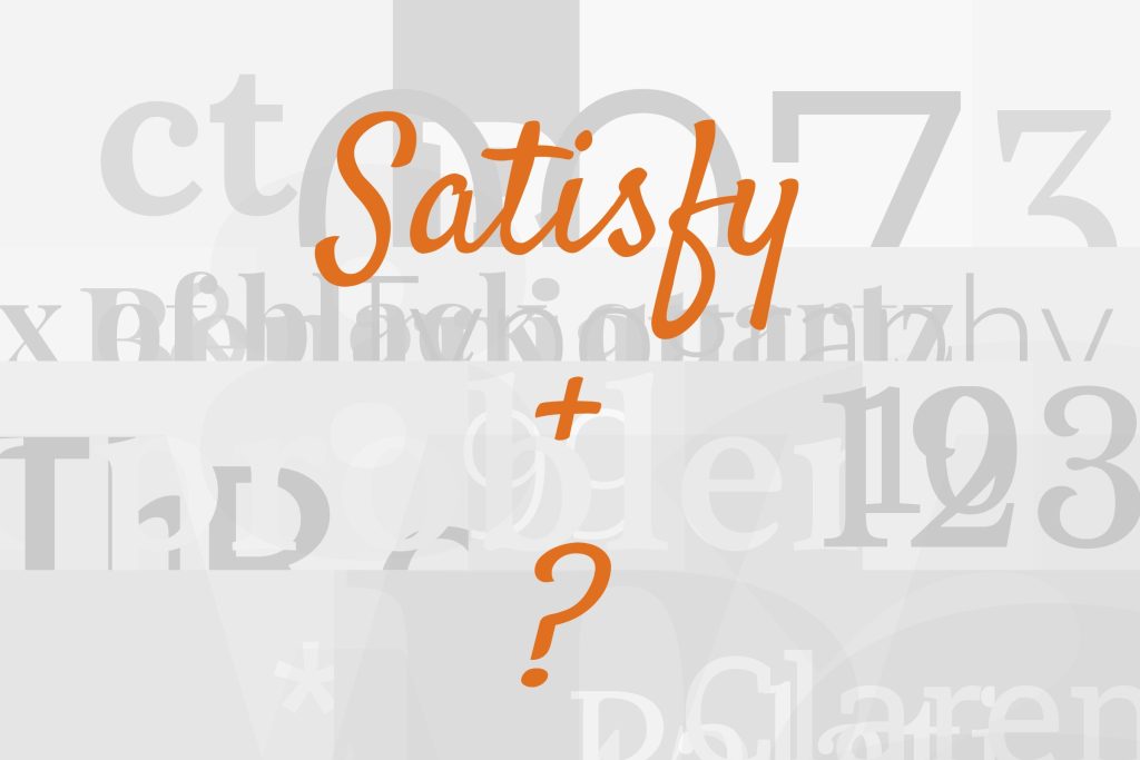
Satisfy pairs great with Lora, Roboto and Open Sans. All 15 pairings are shown below in real rendered specimens, with the reason each one works.

What fonts go with Satisfy? Start from what it is not: Satisfy is not a text face, has no second weight, and cannot carry more than a line or two before the joins and the bounce of a brush hand wear the reader out. Every good partner for it is therefore a font that does the reading job Satisfy declines to do.
Satisfy arrived on Google Fonts in October 2011 under the Sideshow label, with the copyright held by Font Diner and the files released under the Apache 2.0 licence rather than the more common SIL Open Font License. The design credit is genuinely muddled across the vendors — Google’s own description names the designer as Squid, Adobe Fonts credits Stuart Sandler, and Fonts In Use lists both — so it is safer to say the face came out of the Font Diner and Sideshow circle than to name one hand. What is not in doubt is the drawing itself: a connected brush script with a single Regular weight, a loose, slightly bouncing baseline, long looped ascenders and a stroke that thickens and thins the way a loaded brush does. Google classifies it as both display and handwriting, which is an accurate description of where it belongs. The face has no small caps, no alternates and no swash set, so everything it can do is visible in a single line of text.
The face is used far more than it is written about. Google’s serving data shows it is requested millions of times a day, yet the pairing literature is thin: the archives that normally settle a question like this have no Satisfy page at all, and Fonts In Use records one project. The BELAY brand guide adds a documented identity system. What does exist points in one direction. Vendor guides, template libraries and the single documented production job all put Satisfy in the headline or accent role and hand everything else to a plain text face — a humanist or geometric sans, or a calm serif with enough contrast to feel different from the script. Here are 15 fonts that pair with Satisfy, ordered by how well the evidence supports them.
1. Lora

The Cyreal studio designed Lora, added to Google Fonts in 2011, as a calligraphic serif with roots in brush lettering and moderate stroke contrast built for comfortable reading at paragraph size. Three independent sources name it with Satisfy, which makes it the best-corroborated partner on this list, and the reason is structural: both faces descend from a written stroke, so their curves agree, but Lora sits in a bookish, even-coloured register that Satisfy cannot reach. That shared origin keeps the pairing from feeling like a script bolted onto a stranger, while the difference in register keeps the two from competing. Set Satisfy for the headline or the signature line and let Lora carry every sentence beneath it, at any length. Lora’s italic is the useful extra here: it is genuinely cursive rather than a slanted roman, so a pull quote or a caption in Lora Italic sits between the two voices without introducing a third.

2. Roboto

Christian Robertson designed Roboto in-house at Google and released it in 2011 as Android’s system font — a grotesque with a mechanical skeleton softened by open, friction-free curves. It turns up with Satisfy in three separate places, including a working web example that sets Satisfy headers over Roboto Light and a template library that uses the pair on social graphics. Roboto’s value here is its neutrality: at body and label sizes it recedes without turning cold, so the brush script keeps all of the visual character while Roboto keeps the interface or the poster legible. The Light weight is the one worth trying first, because its thinner strokes stay well clear of Satisfy’s heavier brush thicks and the contrast between the two reads as deliberate. For anything that has to work on Android as well as on the web, it is also the partner that ships with the platform, which removes one font download from the page.

3. Open Sans

Steve Matteson designed Open Sans under commission from Google, releasing it in 2011 as a humanist sans with a notably large x-height and simple, upright, low-contrast letterforms built for legibility at small sizes. Three sources name it beside Satisfy, one of them in the same breath as Roboto. The large x-height is the point: Open Sans stays readable well below the size at which Satisfy’s joins and loops start to close up, which is exactly the division of labour a display-only script requires. It is neutral enough to disappear under a hero line and warm enough, thanks to its humanist bones, not to feel clinical beside a hand-drawn stroke. This is the low-risk, general-purpose answer for a website or a set of templates. Its wide language coverage also matters for the kind of small-business site that tends to reach for Satisfy: menus, price lists and contact pages in more than one language all stay in one family.

4. Montserrat

Julieta Ulanovsky designed Montserrat in 2011, drawing on the painted and lettered signage of her Buenos Aires neighbourhood, a geometric sans family on Google Fonts. Three sources put it with Satisfy, and the logic is contrast by construction: Montserrat’s wide, circular bowls and even stroke weight are the structural opposite of a connected brush script, so the split reads as modern-versus-handmade rather than as two decorative voices fighting for the same line. The wide set width also matters underneath a script — it gives body text and subheads a steady, regular rhythm beneath a headline whose baseline bounces. Use Montserrat’s medium and semibold weights for subheads; the lighter cuts get lost against Satisfy’s thicks. All-caps Montserrat with wide tracking under a Satisfy headline is the classic café and boutique layout, and it works because the capitals are as regular as the script is loose.

Webflow. Framer. Squarespace. Wix. Lovable. Not your future.
Your own AI CMS agent is.
Find Out More5. Lato

Łukasz Dziedzic designed Lato and released it in December 2010 as a humanist sans with semi-rounded terminals and details that sit between a pure grotesque and a serif in tone — the name is Polish for summer. Book Brush lists Satisfy with Lato as a romance-genre pairing for book covers, which is a useful signal about where this combination lives: personal and warm rather than corporate. Lato is friendlier than Roboto or Open Sans without giving up legibility, so it reads as approachable under the brush hand while never becoming a second decorative voice. Because Satisfy has one weight, Lato’s full range from Thin to Black also does the hierarchy work — a light subtitle, a bold call to action — that the script cannot do for itself. On a cover, that means Satisfy for the title, Lato Bold for the author’s name and Lato Regular for the tagline, all from two families.

6. Trade Gothic

Jackson Burke drew Trade Gothic for Mergenthaler Linotype in 1948 as a slightly irregular, narrow gothic in the American newspaper tradition; Akira Kobayashi and Tom Grace redrew and expanded it as Trade Gothic Next in 2008. It is the vendor’s own recommendation: the pairing panel on Adobe Fonts sets Satisfy Regular with Trade Gothic Next Soft Rounded (listed there as Trade Gothic Next SR Pro Regular). The specimens on this page use the original 1948 Trade Gothic, the un-rounded ancestor of that recommendation — a harder, more irregular gothic with plain terminals, not the Soft Rounded cut Adobe actually names. Its value is edge. Roboto and Open Sans soften Satisfy; Trade Gothic hardens it, giving the brush script a plain-spoken, editorial counterweight in condensed all-caps subheads and captions. This is the pairing for packaging, menus and posters that want the script to feel handmade against something workmanlike rather than something polite. The Bold Condensed No. 20 cut is the one designers reach for, and it holds its own beside the script at any size.

7. Allura

Rob Leuschke of TypeSETit designed Allura, added to Google Fonts in 2012, as a formal, flowing script in the pointed-pen tradition, with high stroke contrast and elegant, extended capitals. It is the only documented real-world companion for Satisfy: Fonts In Use records Cobra Studio’s Crackers packaging for Romagna Piada, where the two scripts share the pack. A script beside a script normally fails, and this one succeeds only because the two hands come from different traditions — Satisfy’s loaded brush against Allura’s fine nib — so they read as two distinct voices rather than as one voice with a mistake in it. Treat it as a specialist move for packaging and labels, keep each script to a single line, and let a plain sans handle any information that has to be read quickly. Give the two scripts clearly different sizes as well as different jobs — a product name in Satisfy, a small descriptor in Allura — so the eye never has to decide which one is the headline.

Unlimited fonts from $16.50/mo.
29 million fonts, templates and stock assets. One subscription, unlimited downloads.
See the plan8. Roboto Slab

BELAY’s brand guidelines place Roboto Slab in the headline role, with Semibold, Regular and Light cuts specified. That makes it a practical counterweight to Satisfy’s single brush weight: Roboto Slab can carry the structured title while Satisfy remains a small handwritten accent. Use Roboto Slab for the main heading and reserve Satisfy for a short sign-off or highlighted phrase. The pairing is documented inside one real identity system, but its strength depends on restraint: give the slab room to establish the message before introducing a handwritten accent.

9. Roboto Condensed

The BELAY guide assigns Roboto Condensed to subheads, with Bold and Regular cuts shown in uppercase and tracked settings. Under a Roboto Slab headline, it creates a compact information layer; beside Satisfy, it gives the brush accent a narrow, disciplined frame. Use Satisfy sparingly for the accent phrase, then let Roboto Condensed handle labels and subheads where its width saves space. The source does not make Satisfy and Roboto Condensed interchangeable: it documents them as separate roles in the same typography system.

10. Source Sans Pro

BELAY’s page-11 typography grid assigns Source Sans Pro to body copy, listing Bold, Regular and Light cuts with sentence-case settings. That is the reading layer Satisfy cannot provide. Keep Satisfy to a short accent or signature line and let Source Sans Pro carry paragraphs, captions and supporting explanations. Its weight range gives the system hierarchy without forcing the brush script into small text. This pairing is grounded in the same brand guide as the other BELAY roles, where the script’s movement contrasts with the sans serif’s even texture.

11. Poppins

The BELAY guide assigns Poppins a headline-and-body role within the same typography system that contains Satisfy. It also identifies Satisfy Regular as a separate accent font used sparingly. That gives the pair a clear use: Poppins supplies the main hierarchy and readable interface copy, while Satisfy contributes one expressive accent line. Keep Poppins in the body or headline role according to the layout and avoid stacking multiple decorative lines. The source’s explicit accent instruction matters because Satisfy’s single brush cut should remain rare and large.

12. Raleway

A published designer’s handbook lists Satisfy with Raleway under creative and artistic branding. Raleway’s thin-to-bold range creates a flexible hierarchy around Satisfy’s single brush weight, while its clean vertical strokes keep the page from becoming overly ornamental. The contrast is strongest when Satisfy stays short: use it for a name, invitation line or compact headline, then set Raleway Medium for subheads and Raleway Regular for details. Give the script generous space and avoid setting long all-caps lines in Raleway beside it, since both treatments can compete for display attention.

13. Marcellus SC

Piktochart’s typography guide names Satisfy and Marcellus SC together as fonts for wedding imagery. The small-cap Roman face gives Satisfy an unusually formal partner: Marcellus SC supplies carved, upright structure while the script contributes movement and a personal signature. That makes the combination useful for invitations, menus and heritage-themed identities that need warmth without losing ceremony. Set Marcellus SC for short titles, dates or section labels and reserve Satisfy for one emphasized phrase. Because both fonts attract attention, the body copy should remain in an existing neutral face from the wider system; within this pair, keep the roles narrow and the number of competing sizes low.

14. Oswald

Silhouette School’s illustrated pairing lesson sets Satisfy with Oswald and explains that the script’s effortless curves contrast with the simple all-caps sans. Oswald’s condensed construction gives the combination a strong vertical display rhythm without imitating Satisfy’s brush movement. Use Oswald Medium for compact headings, dates or supporting labels and reserve Satisfy for the personal phrase that needs motion. Since both can become forceful at large sizes, establish one clear lead rather than stacking them at equal scale. This pairing works especially well on cards, event graphics and compact promotional layouts where the narrow sans creates room for the wider script to breathe.

15. Georgia

RunSignup’s published website training documents a theme that uses Satisfy for the header and Georgia for body and button text. The roles suit each family: Satisfy supplies a distinctive handwritten opening, while Georgia’s sturdy screen serifs carry longer reading and small interface labels with familiar clarity. Use the script for one short page title or event name, then move immediately to Georgia Regular for paragraphs and Georgia Bold for buttons. Their shared warmth keeps the transition friendly, while the difference between connected brush strokes and upright serifs makes the hierarchy obvious. Avoid repeating Satisfy across navigation, where its joins slow scanning and weaken the single accent.

Conclusion
Satisfy is the one expressive element in every combination that has been documented for it, never one voice among equals. It has a single weight and a brush hand that stops being legible below display sizes, so the practical rule is fixed: Satisfy takes the headline, the signature line or the accent word, and one plain text face takes everything else. The best-supported version of that rule uses a humanist or geometric sans — Roboto, Open Sans, Montserrat, Lato or the BELAY guide’s Source Sans Pro and Poppins — chosen by platform and tone rather than by mood.
The supported serif path is Lora, the choice when a brand wants the script’s warmth alongside a bookish reading voice rather than a product feel. The BELAY guide documents Roboto Slab for headlines and Roboto Condensed for subheads; Trade Gothic and Allura remain specialist choices, one for edge and one for a deliberate script-on-script effect. Because Satisfy and most of these partners are free, the test costs nothing: set real copy at the sizes you intend to publish, and judge the pairing by whether the brush script still reads as the headline voice once the body text is in place.
Sources
- Google Fonts repo METADATA.pb
- Google Fonts repo DESCRIPTION
- Jukebox Print (Satisfy)
- htmlfonts (Satisfy guide)
- ForgeDock font pairing tool
- Easil font pairing guide
- Fonts In Use (typeface 8124)
- Fonts In Use (Crackers by Romagna Piada)
- Fonts In Use (quoted search)
- Adobe Fonts (Satisfy)
- Typekit JSON API
- 1001 Fonts
- Book Brush genre pairings
- ThePixelPixie
- DocHipo font pairings
- Wavoto font pairing guide
- Looka font pairs
- Digital Silk
- BELAY Brand Guidelines 2022, page 11
- Avida2C — Designer’s Handbook
- Piktochart typography guide
- Silhouette School font pairing lesson
- RunSignup Websites V2 training
