Kabel pairs great with Cooper Black, Futura and Helvetica. All 9 pairings are shown below in real rendered specimens, with the reason each one works.

What fonts go with Kabel? Start with the fact that it was almost never meant to carry a paragraph. Rudolf Koch drew this geometric sans in 1927 for the Klingspor foundry, and across a century of real-world use it keeps landing in the same role: the headline, never the body.
Kabel belongs to the same design moment as Futura and Erbar — the mid-1920s rush to build a sans face from pure geometry, compass and ruler, instead of the broad-nib pen. Koch’s version is looser and more personal than its rivals: a tilted e, a looped lowercase g, and wide, almost circular capitals give it a warmth that stricter geometric sans faces never allow. Its small x-height and generous sidebearings work beautifully at display sizes but turn thin and hard to read once the type drops below headline scale, which is why nearly every real project that uses Kabel pairs it with a second, quieter face for the running text.
That single fact — Kabel as a display-only voice — should drive every pairing decision below. Some partners here are period-accurate rivals from the same 1920s geometric-sans movement; others are early-twentieth-century workhorses built to disappear into small, dense text. Both strategies show up again and again across more than a hundred documented real-world uses, from a 1930s exhibition brochure to a 1980s board game box, and the pattern is consistent: Kabel supplies the period contrast or the personality, its partner supplies the legibility Kabel was never built to provide. Here are the 9 fonts most worth pairing it with.
1. Cooper Black
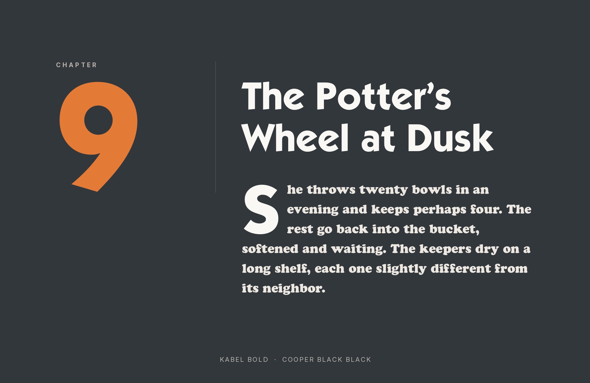
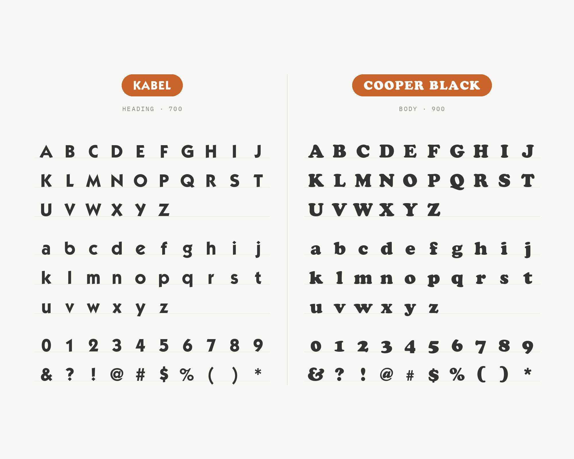
Cooper Black is the one recommendation on this list built entirely on contrast rather than kinship. Oswald Bruce Cooper designed it for the Barnhart Brothers & Spindler foundry in 1922, five years before Kabel existed, and its warm, rounded, ink-trap-softened letterforms come from an entirely different design tradition — hand lettering, not the compass and ruler. Set beside Kabel’s crisp geometric strokes, that warmth reads as a friendly counterweight, keeping a display-weight humanist face from feeling cold next to Kabel’s mechanical skeleton. Typewolf lists Kabel + Cooper as its suggested pairing — a period-appropriate combination across two very different design philosophies of the same interwar decade.
Paid prompt-to-site tools are going to lock you in.
How can your studio escape this?
Find Out How2. Futura
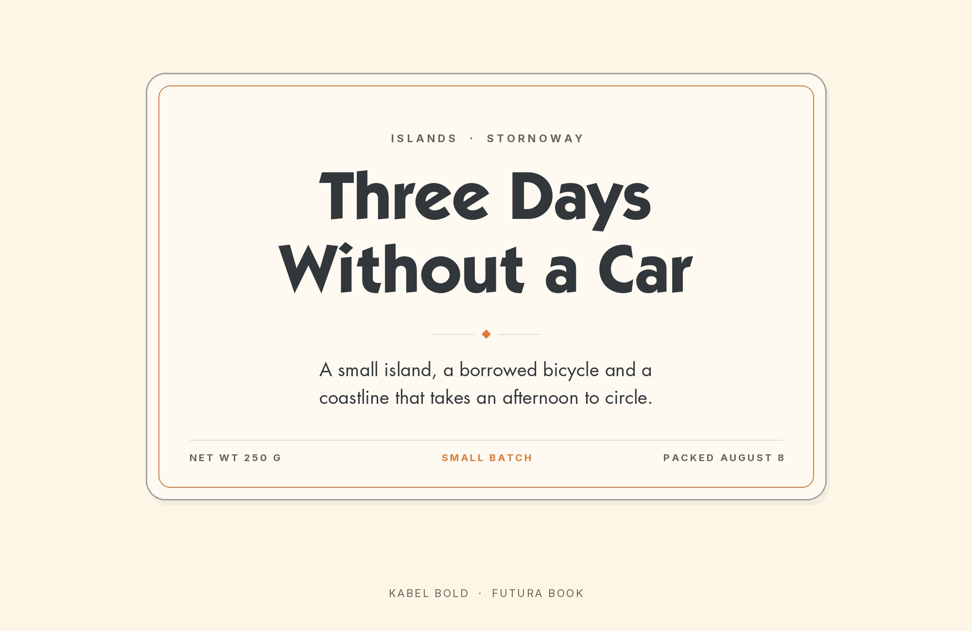
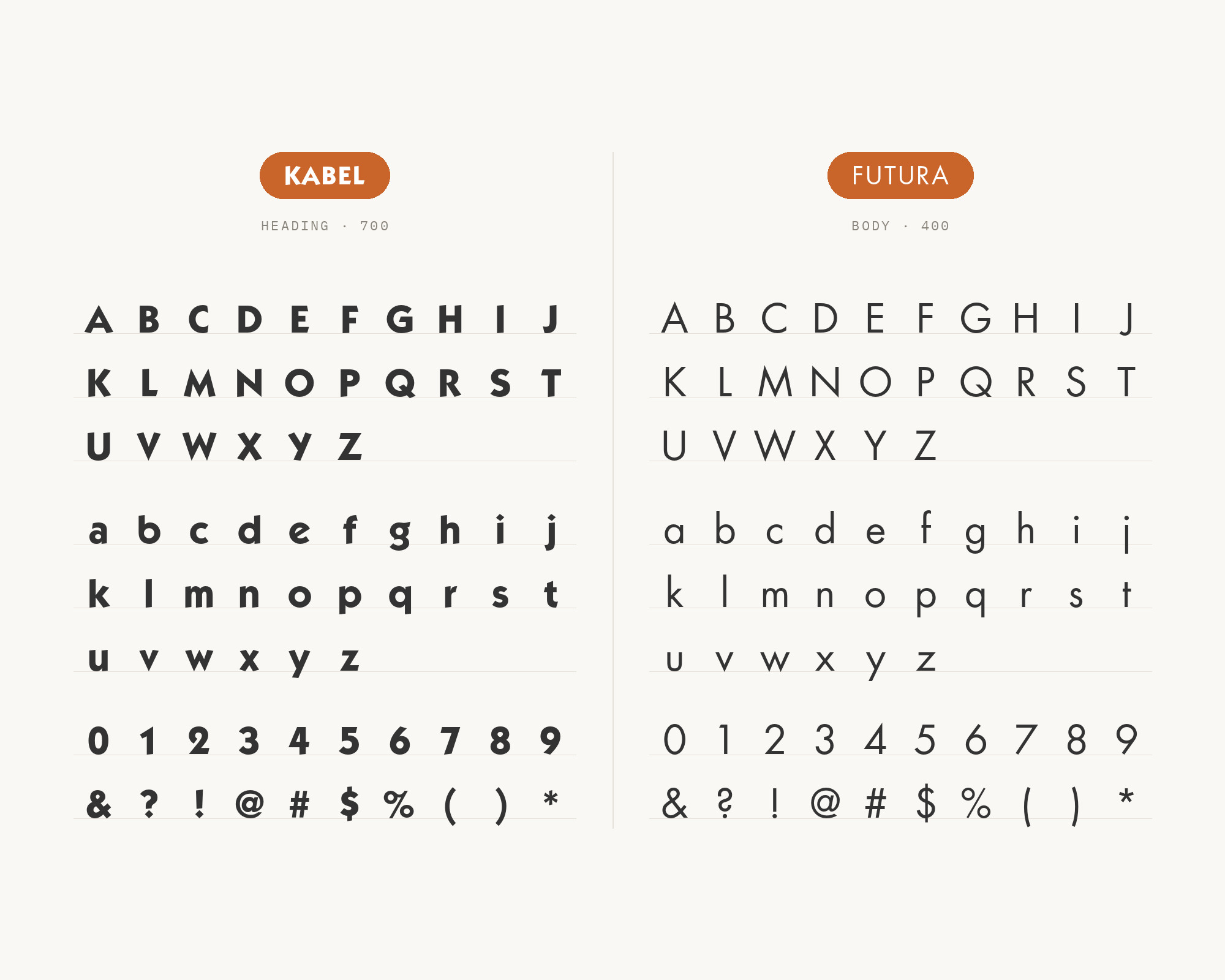
Paul Renner designed Futura in the same year as Kabel, 1927, answering the same geometric-sans brief, which makes this less a pairing than a rematch. Futura is the stricter of the two: circular bowls, a true geometric skeleton, none of Kabel’s tilted e or looped g. Setting them together reads like two answers to one question rather than a clash, and real designers have reached for exactly this combination more than once — Fonts In Use documents it on the 1985 Monopoly board, the Velvet Underground’s 1968 White Light/White Heat sleeve, and a 1941 Henry Miller book jacket. Use Futura where the strict geometry needs to lead and Kabel where a warmer, more human geometric voice is the better fit.
3. Helvetica
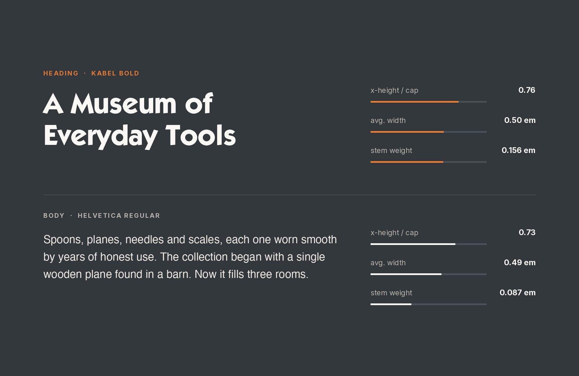
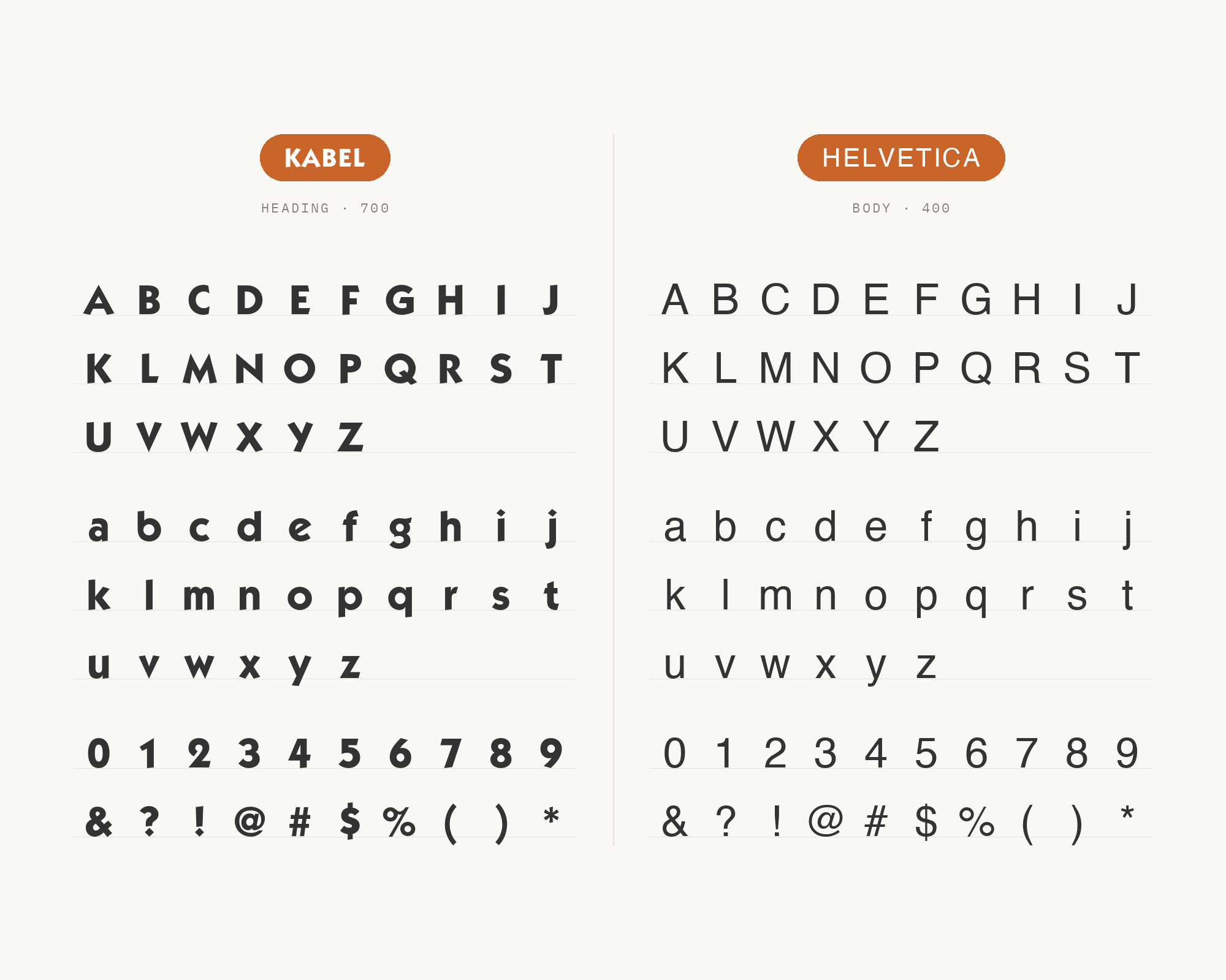
Helvetica came three decades after Kabel, out of 1950s Switzerland and the hand of Max Miedinger, and it solves the opposite problem: total neutrality instead of personality. Its quietly regularized letterforms carry restrained body text without asking for attention, which is exactly what makes Kabel’s odd tilted e and looped g stand out as the more expressive voice on the page. Fonts In Use records the pair twice: Black Sabbath’s 1972 Vol 4 sleeve and Paul Simon’s 1980 One-Trick Pony album art and movie poster. Keep Helvetica in body copy and captions, and reserve Kabel for the headline that has to stand out.
Build free, plus 500 AI credits.
Design and publish a site at no cost. Paid plans double your credits the first month.
Start free4. News Gothic
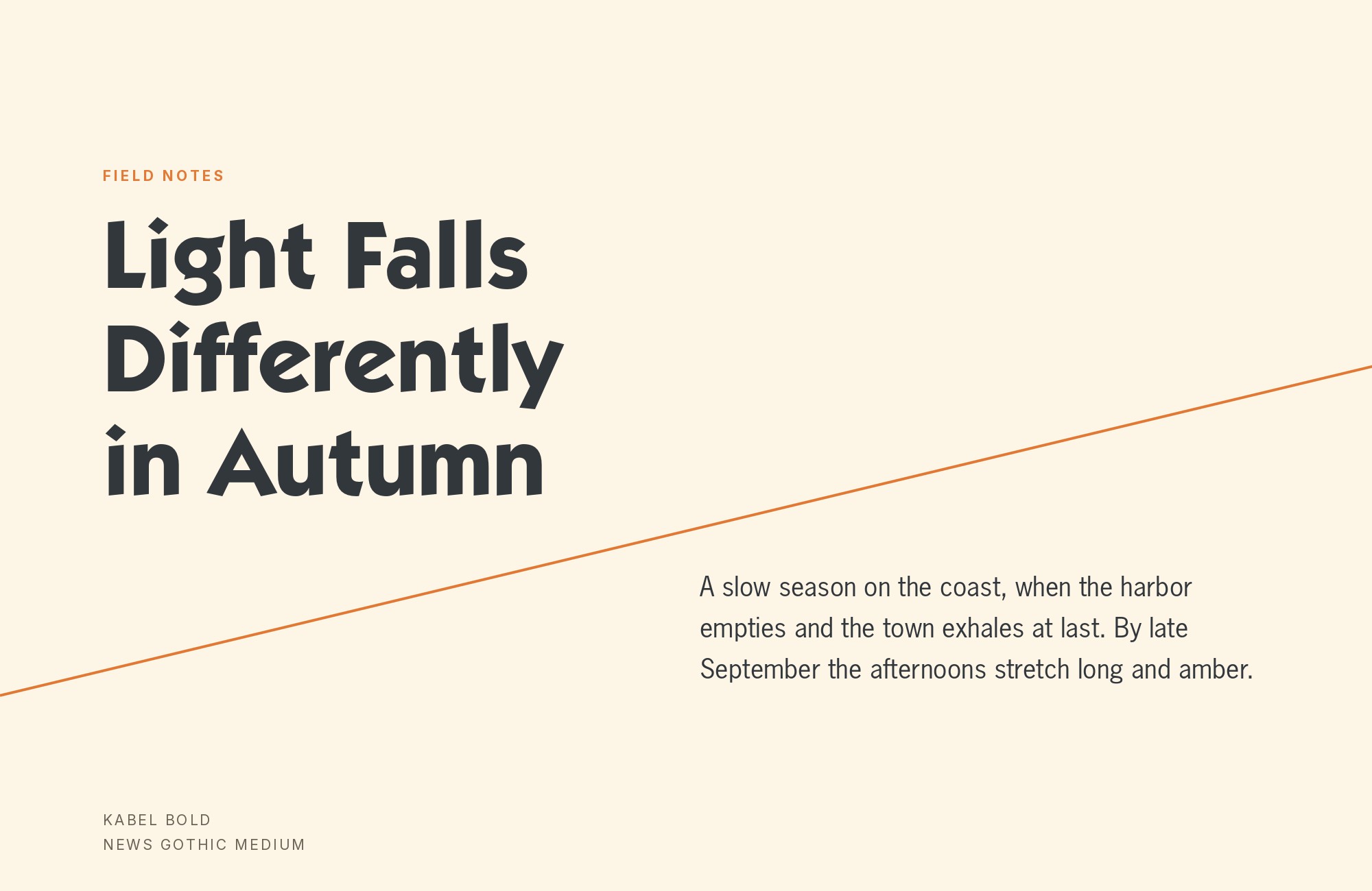
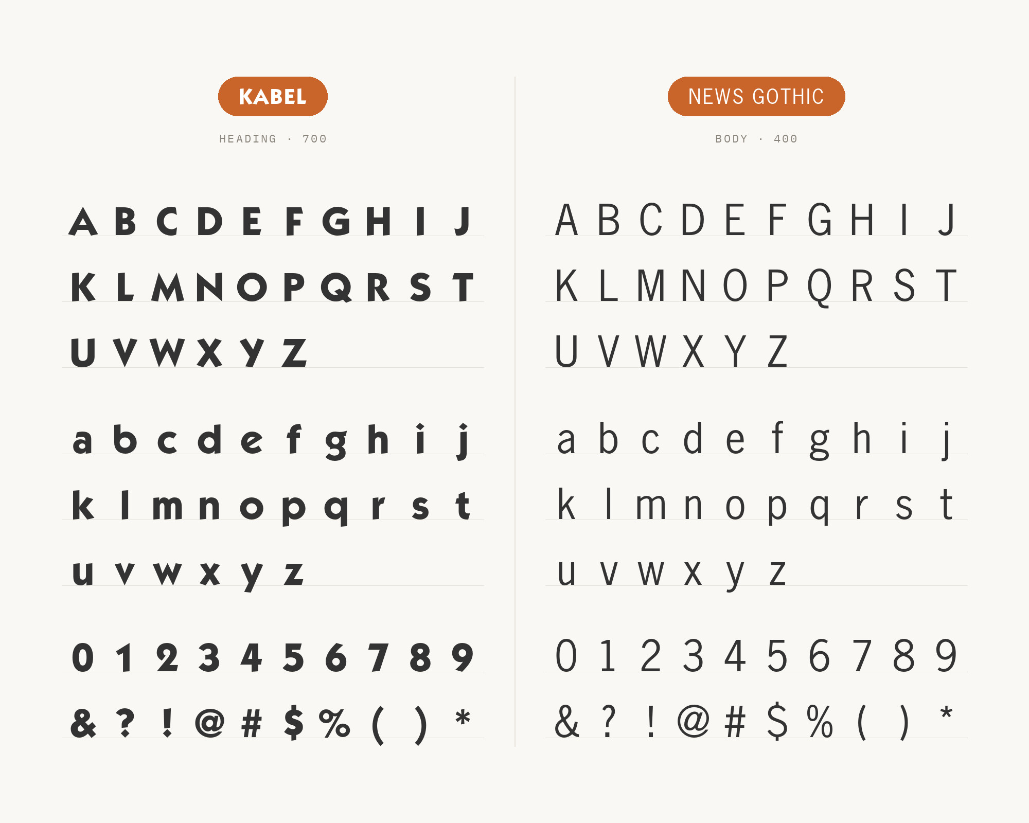
Morris Fuller Benton designed News Gothic for American Type Founders in 1908, and it is one of the most-repeated partners in Kabel’s real-world archive. The reason is structural, not stylistic: News Gothic is a narrow, low-contrast American gothic with tight apertures and a small, even color, built to set dense text quietly at small sizes. That leaves Kabel’s wide, circular geometric capitals the entire display job, with neither face competing for the same size range. Fonts In Use documents the pairing across three separate projects spanning four decades — Eric Burdon & The Animals’ 1969 Greatest Hits, a 1967 travel book called Mexico and the Caribbean, and the 1931 wall chart The Histomap: Four Thousand Years of World History. It is the safest, most-tested text partner on this list.
5. Franklin Gothic
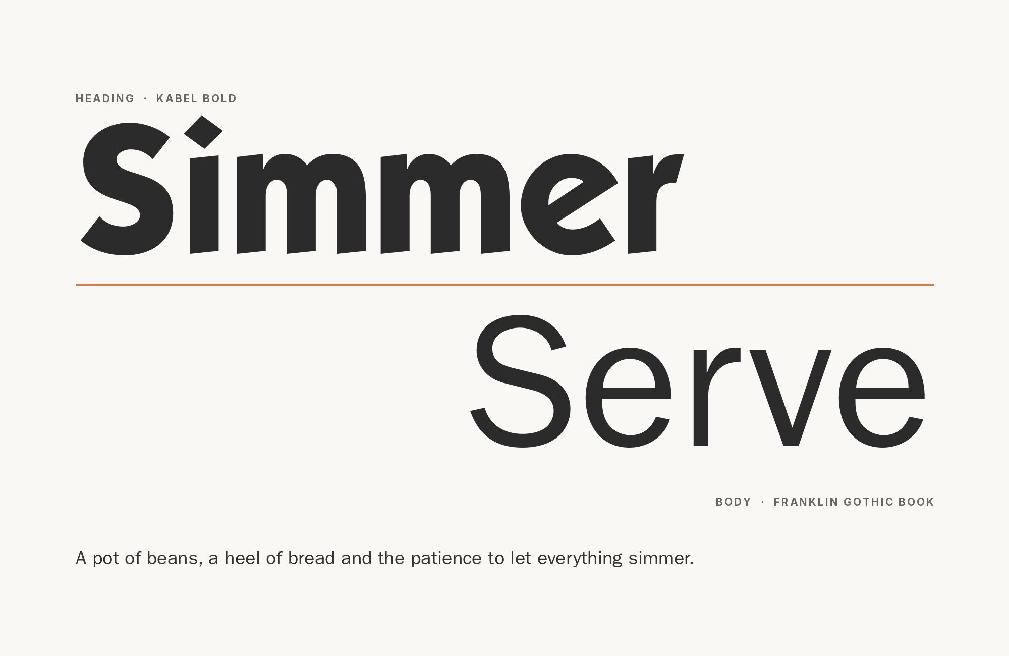
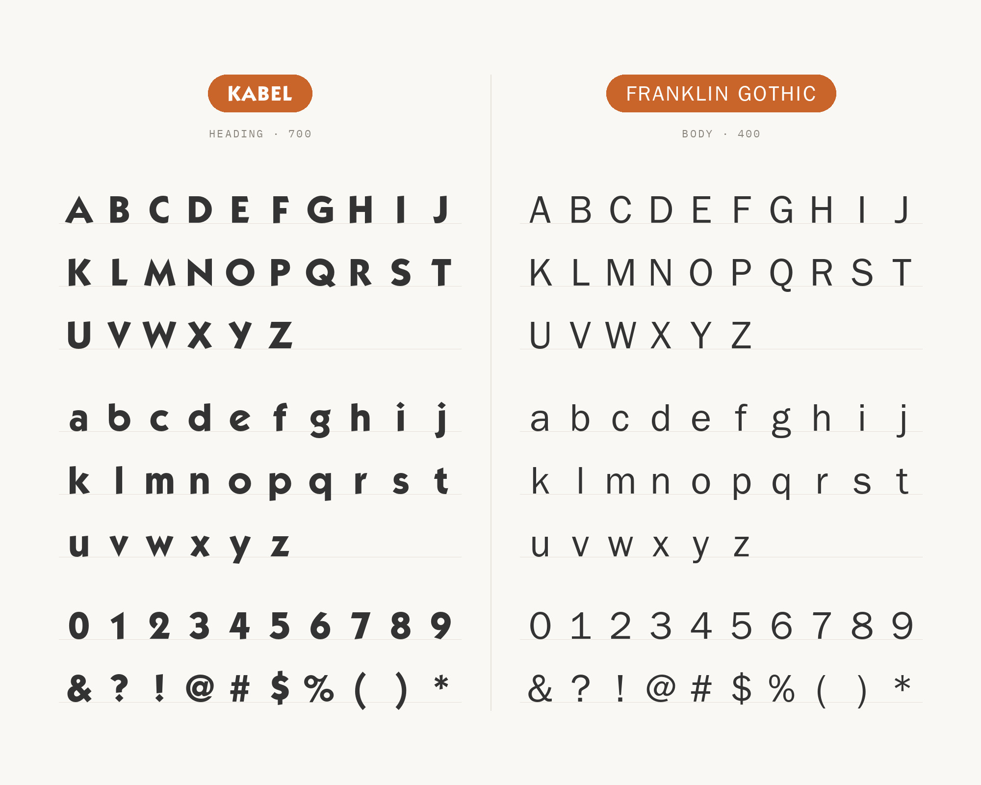
Franklin Gothic is also a Morris Fuller Benton design for American Type Founders, but released in 1902, six years before News Gothic — a heavier, more textured early-1900s grotesque next to Kabel’s lighter, more decorative 1920s geometry. That gap is the whole point: an old-versus-new sans pairing that happens to mirror how far apart the two typefaces’ real design lineages actually sit. Fonts In Use ties the combination to three documented projects — the Futurama: Highways and Horizons exhibition brochure from the 1939 World’s Fair, the first US edition of George Orwell’s Animal Farm in 1946, and a set of sea-vessel illustrations run in Amazing Stories in 1938–39. Franklin Gothic’s weight gives Kabel’s lighter strokes something solid to sit against.
“AI builds anything, so what do I sell?”
Taste is the answer. Own your stack and automate your own CMS.
Find Out How6. ITC Avant Garde Gothic
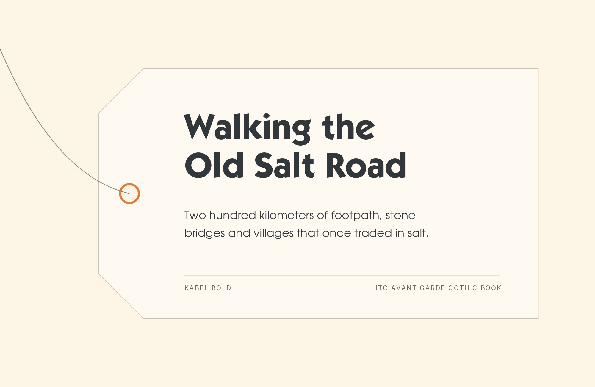
Herb Lubalin and Tom Carnase designed ITC Avant Garde Gothic in 1970, a geometric sans from the opposite end of the century from Kabel, which is exactly what makes the pairing work. Avant Garde’s very large x-height, tight fitting, and famous ligature-heavy capitals are aggressively 1970s; Kabel’s small x-height, generous sidebearings, and quirky tilted e are unmistakably 1920s. Setting one over the other produces period contrast without leaving the geometric idiom, so the page stays visually coherent while the hierarchy stays obvious. Fonts In Use records it in a set of chess books published by Edition Olms around 1981, and — in its related Avant Garde Latin form — on Paul Simon’s 1980 One-Trick Pony release, the same project that also pairs Kabel with Helvetica.
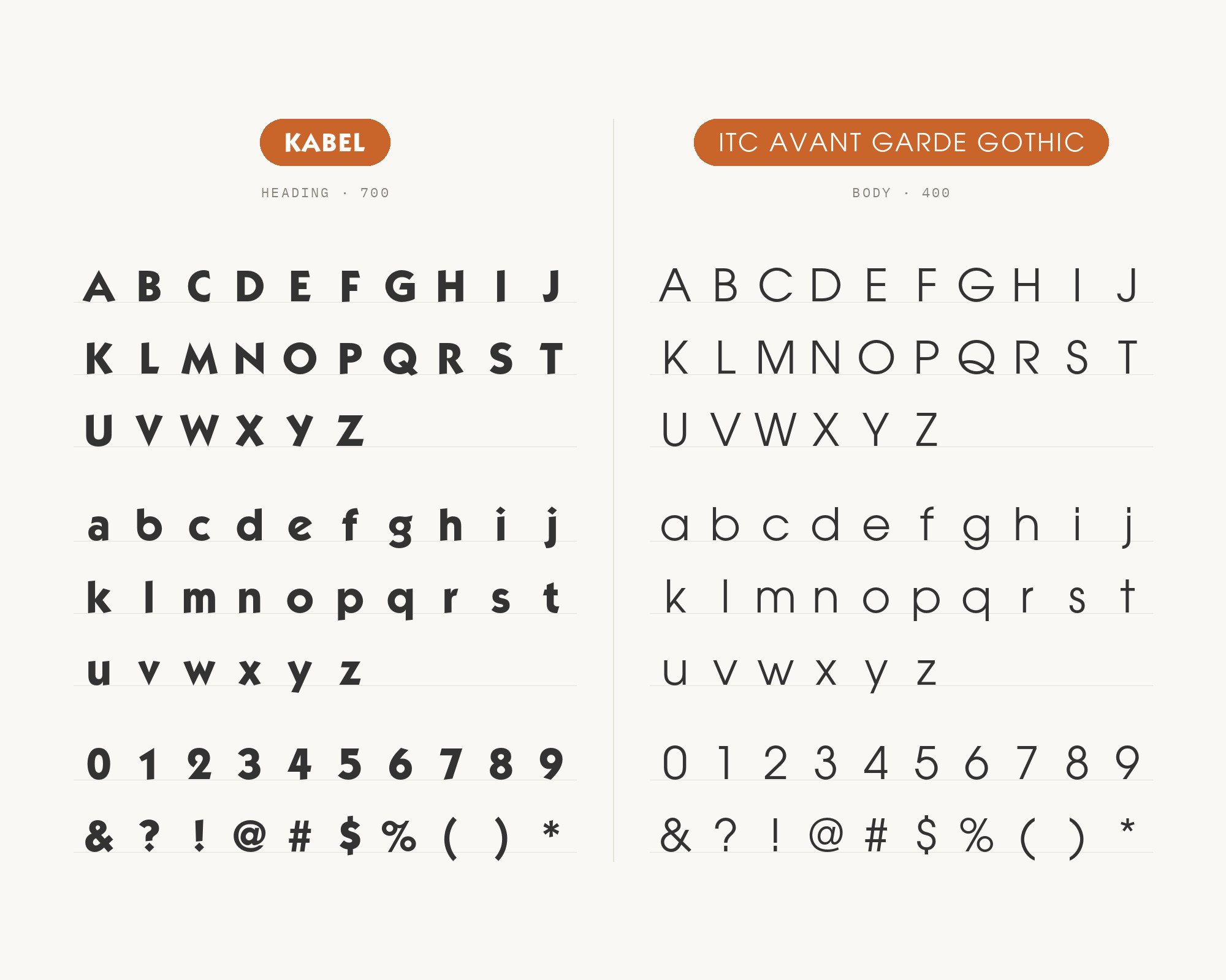
7. Abril Fatface
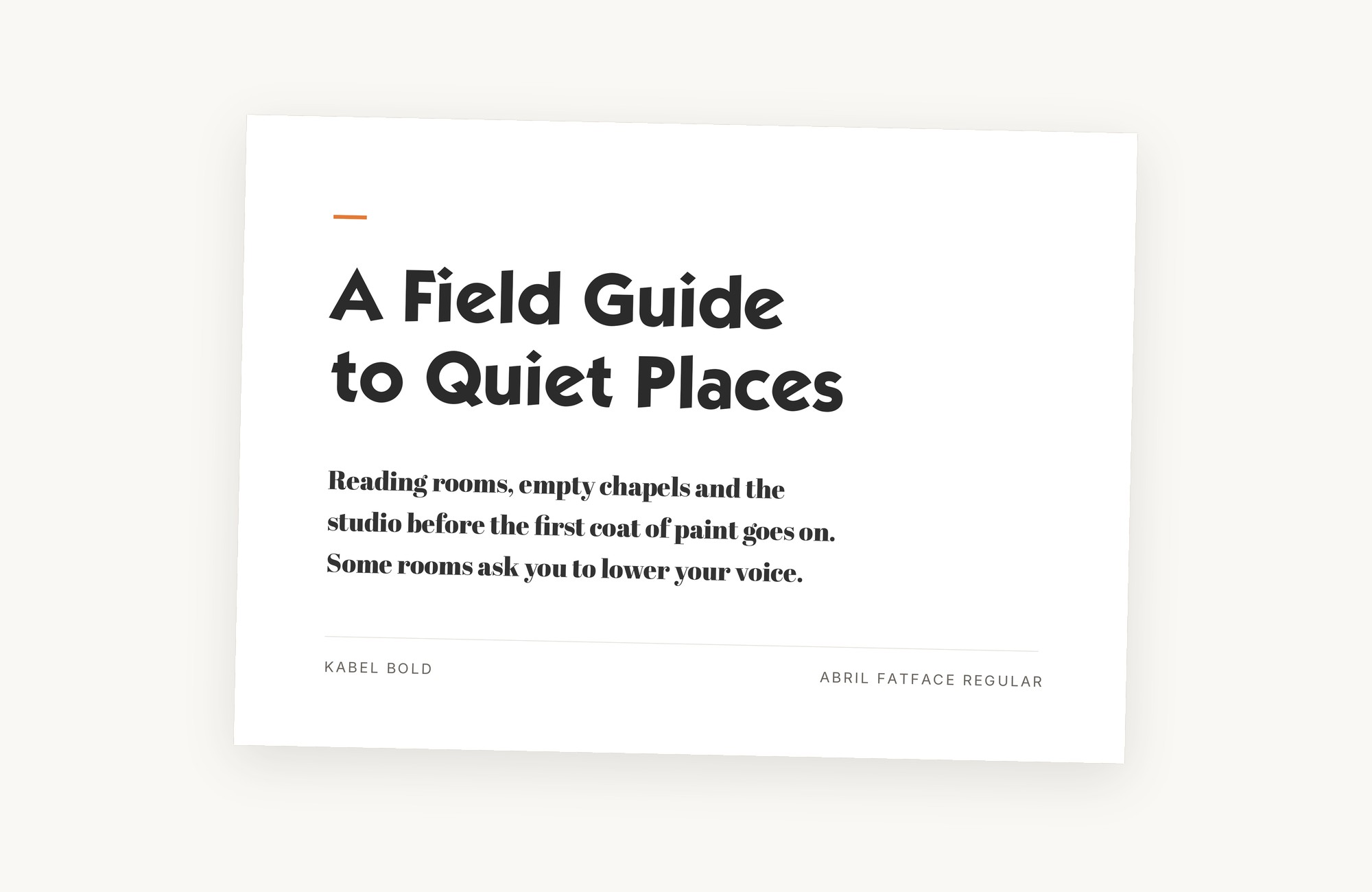
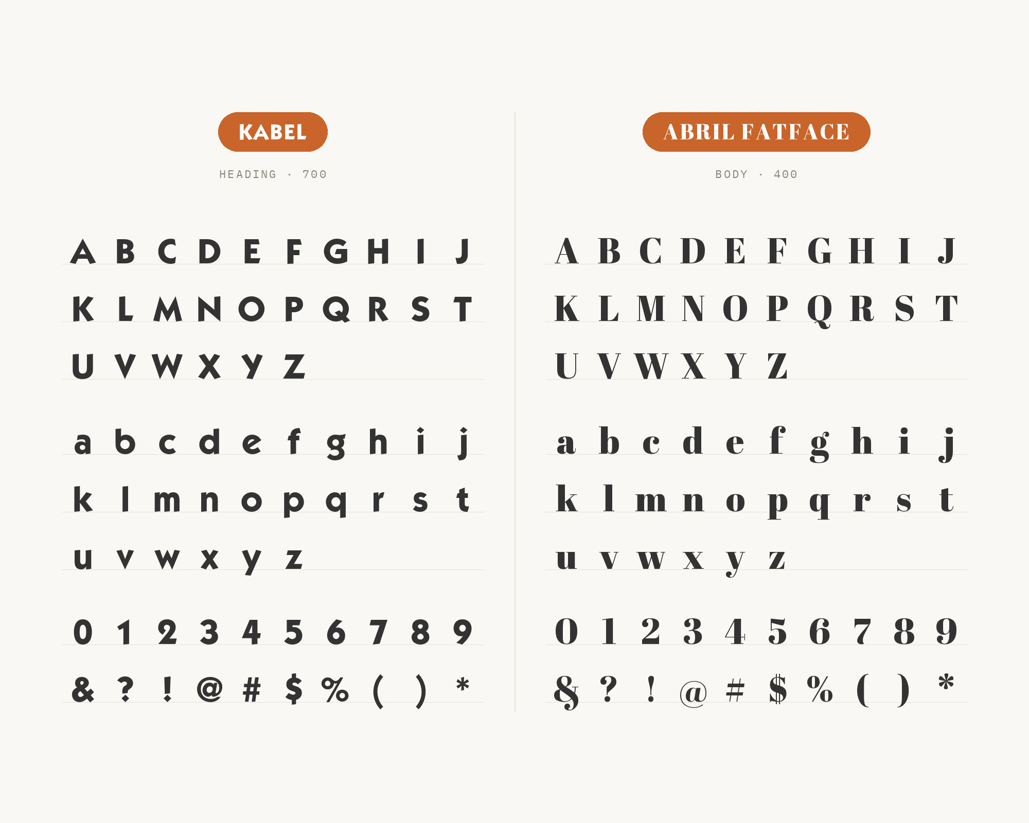
Abril Fatface, released by the studio TypeTogether in 2011, is a maximum-contrast pairing in the most literal sense. Its fat vertical stems collapse into hairline serifs — about the loudest stroke modulation a Didone display face can offer — set directly against Kabel’s near-monoline geometric strokes, which barely modulate at all. Both faces still keep flat, rational baselines and a vertical stress, so despite the eight decades separating a 1920s geometric sans from a 21st-century display serif, the combination reads as deliberate rather than random. Use Abril Fatface where a page needs one loud, editorial gesture and Kabel where it needs a calmer geometric counterpoint — the weight and construction do the work, and neither face has to compete for attention.
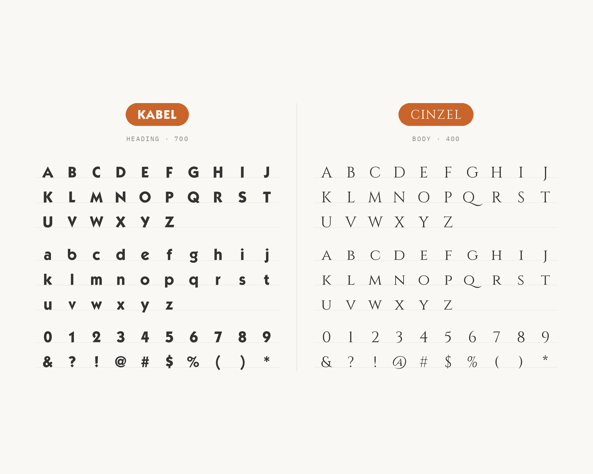
8. Cinzel
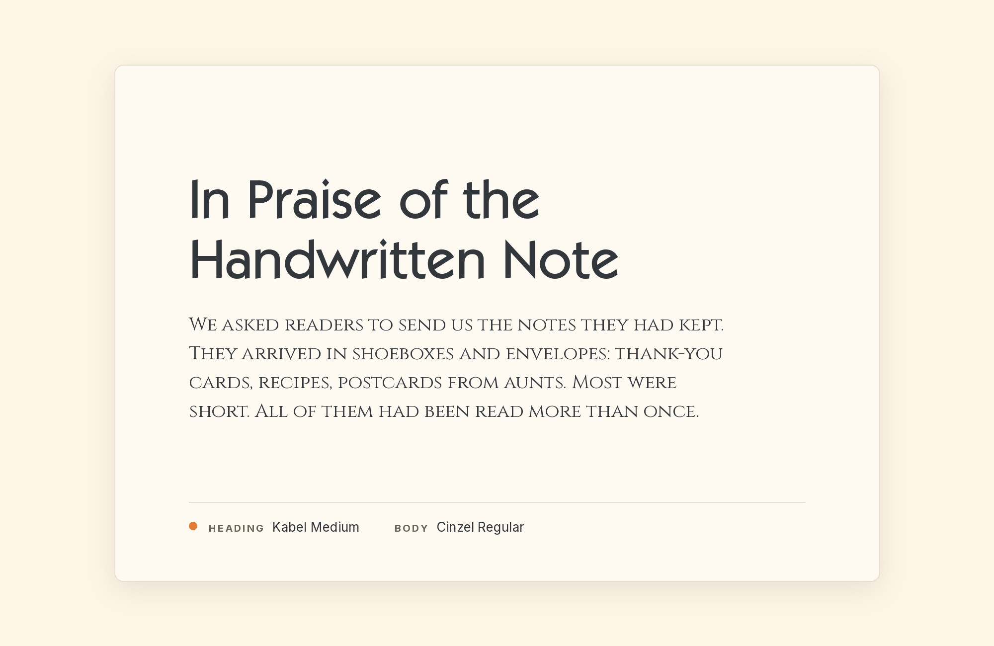
Natanael Gama designed Cinzel, added to Google Fonts in 2012, drawing its capitals from Roman inscriptional lettering — carved serifs, generous stroke contrast, and a monumental character with no trace of Kabel’s soft, compass-drawn curves. Set as a subhead or a title-case accent, Cinzel brings classical formality against Kabel’s warmer 1920s geometric personality, a pairing of two very different eras of engineered letterforms: one cut in stone two thousand years ago, one drawn with a ruler in Weimar-era Germany. Keep Cinzel to headline-scale capitals — it was not built for extended lowercase reading, and its all-caps-first design starts to strain in long lines. Let Kabel carry everything below that, where its rounder, friendlier forms are easier to read at length.
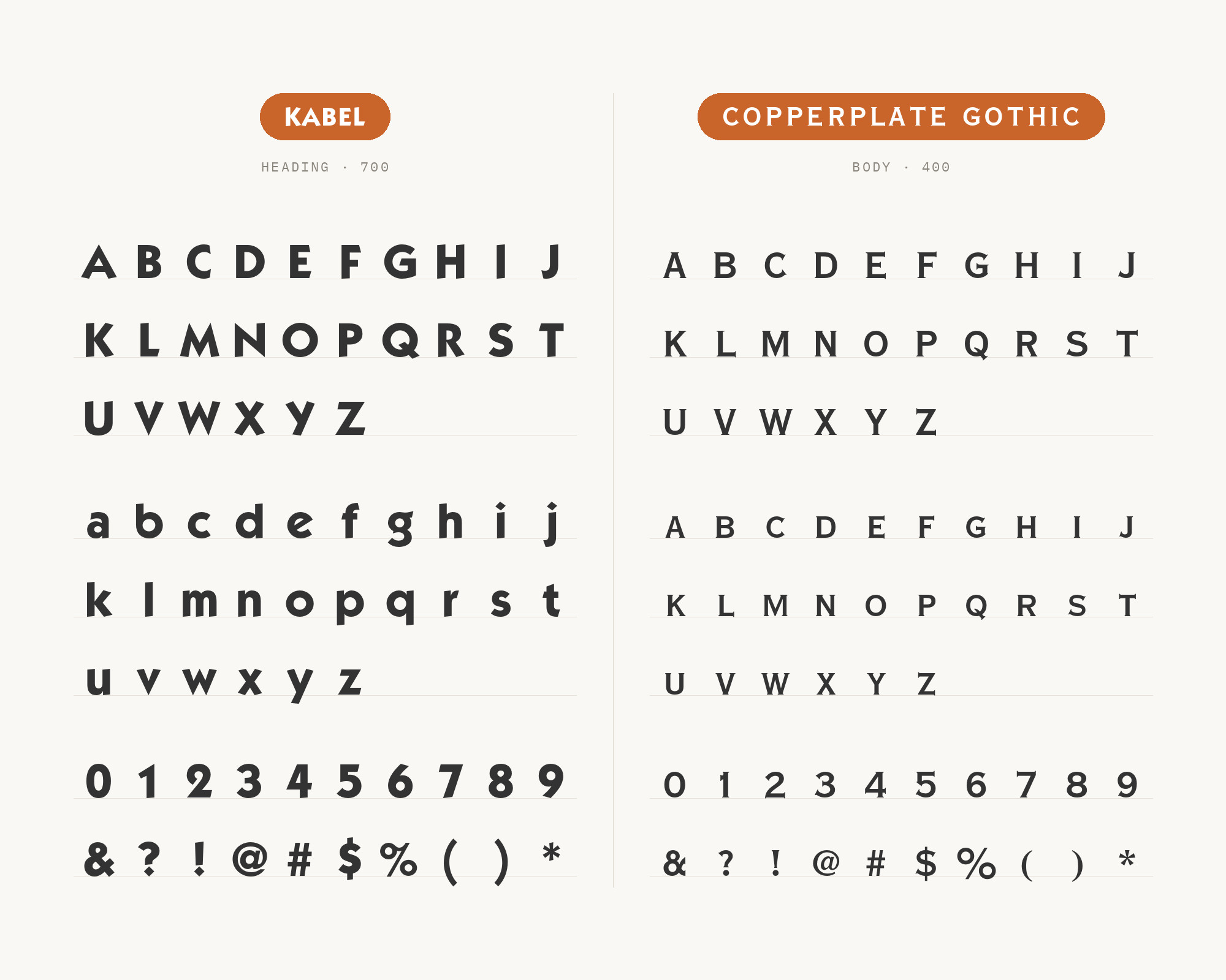
9. Copperplate Gothic
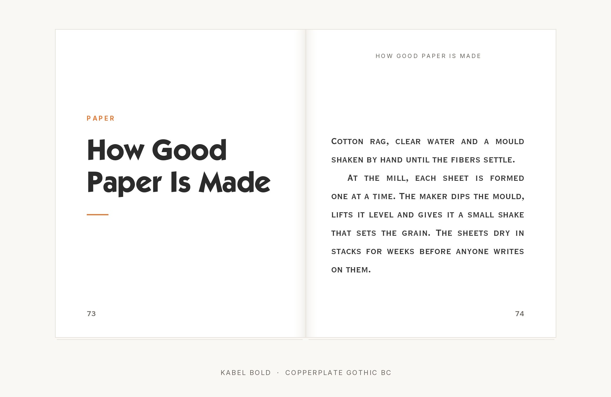
Frederic W. Goudy designed Copperplate Gothic for American Type Founders in 1901, and it solves a problem no other font on this list even attempts: it is all-caps only, tiny-serifed, and horizontally stretched, so it cannot set body text and does not try to. That makes it a clean complement rather than a competitor. Its flared stem endings and engraved formality give small caps, rules, and labels an official, printed-certificate authority, while Kabel handles everything that needs a lowercase. The two appear together, along with Futura, on the 1985 Monopoly board game — a three-way system where each face has one job and none of them overlap. It is a pairing built entirely around division of labor rather than visual contrast.
Conclusion
Kabel is a font with a documented identity: across more than a hundred real projects, it almost never carries the paragraph. Its small x-height and idiosyncratic tilted e are a liability in long text and an asset in a headline, so the strongest pairings on this list all follow the same logic — give Kabel the display line and hand the reading to something built for the job, whether that is a contemporary geometric rival like Futura, a purpose-built workhorse like News Gothic or Franklin Gothic, or a specialist like Copperplate Gothic that never tries to set text at all.
The other strategy, seen in Cooper Black, Abril Fatface, and Cinzel, is straightforward contrast: a completely different construction — hand lettering, a high-contrast Didone, carved Roman capitals — set beside Kabel’s compass-and-ruler geometry so nobody mistakes which face is doing which job. Most of these pairings are backed by real, dated, verifiable use rather than a stylist’s guess, so start with whichever one matches the mood of the project, set real copy at the sizes you intend to publish, and judge the pairing on the page, which is where Kabel has always done its work.
Sources
- Fonts In Use (page 1)
- Fonts In Use (page 2)
- Typewolf
- Fonts In Use (search)
- Fonts In Use (search, second pass)
- Fonts In Use journal
- Klingspor Museum
- Letterform Archive
- Luc Devroye type archive
- Typographica
- It’s Nice That
- Print Mag
- Linotype (first-party domain)
- I Love Typography
- Google Fonts Knowledge
- typ.io
- Monotype enterprise collections
- Kittl × Monotype cheatsheet
- MyFonts
- fonts.com
- Adobe Fonts
- Vandelay Design
- We And The Color
- Canva
- Wikipedia (fourth pass)
