Didot pairs great with Futura, Avenir and Montserrat. All 11 pairings are shown below in real rendered specimens, with the reason each one works.
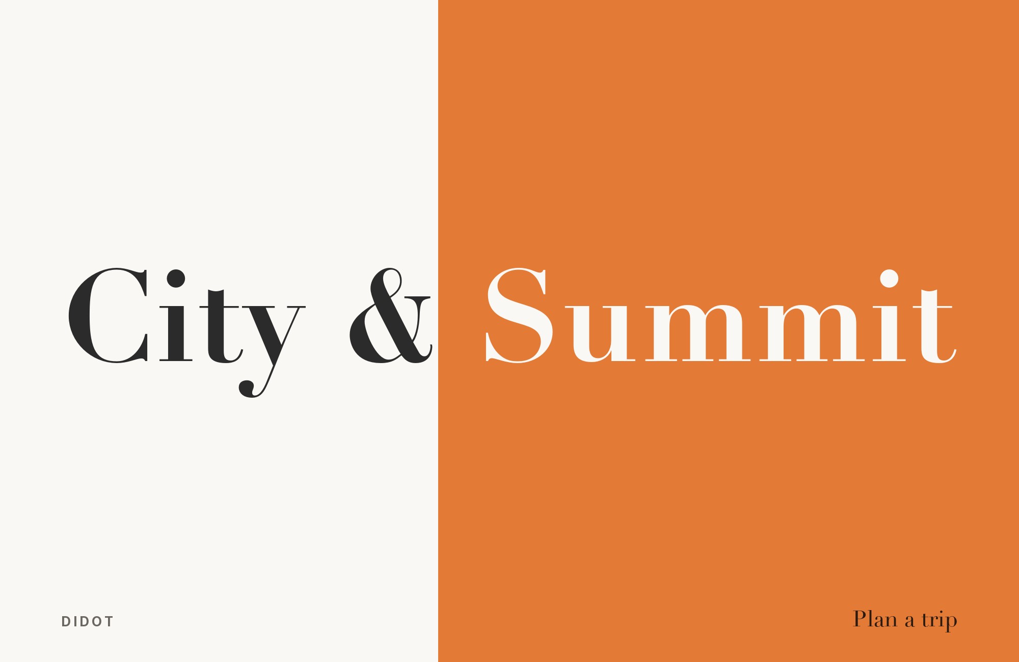
What fonts go with Didot? Fashion editorial’s default display face has razor-thin hairline serifs and the most extreme stroke contrast of any typeface on this site — gorgeous at masthead size, and effectively unreadable the moment it drops below display scale.
Didot takes its name from the Didot family of Parisian printers and typefounders, whose late-eighteenth-century designs pushed serif construction toward its logical extreme: an abrupt, near-vertical shift from very thick strokes to hairline-thin ones, flat unbracketed serifs, and closed, perfectly circular bowls. Type historians classify this as Didone construction, a category Didot shares with Bodoni — the two are frequently confused, and for good reason, since both descend from the same late-1700s push toward mathematical, engraved-looking letterforms. The distinction that matters in practice is degree: Didot generally carries even sharper contrast and flatter, more austere detailing, which is exactly why it, rather than Bodoni, became Vogue‘s house display face and the default choice for fashion mastheads.
That extremity is also the whole pairing problem. Didot’s hairlines are structural, not decorative — they thin out until they visually disappear well before body-text sizes, which means almost no pairing decision here is really about taste. It is about where the reading happens. Every combination below hands Didot the display role it excels at and gives a calmer, evenly weighted partner everything else: captions, navigation, body copy, and anything a reader is expected to actually finish.
1. Futura

Paul Renner’s 1927 geometric sans is built from true circles and triangles, with almost no stroke modulation — the structural opposite of Didot’s razor-thin, high-contrast forms. That neutrality is exactly the point: next to Didot’s drama, Futura recedes into captions, navigation and body copy without competing for attention. It is the pairing Typewolf names outright, and Typewolf’s own site list shows both faces together on the Girlboss site. Keep Didot for mastheads and pull quotes above roughly 24 pixels, where the hairlines still register, and let Futura carry everything smaller. Below that size, Didot’s strokes thin out until they vanish.

2. Avenir

Adrian Frutiger’s humanist-geometric sans softens what Futura leaves cold. Its lowercase carries gentle optical correction and a steady x-height, so long stretches of editorial copy read calmly underneath a Didot headline built from extreme thick-thin contrast. Where Futura is severe, Avenir is warm without losing discipline — a combination that has shown up in real production on fashion sites, not just in specimens. Set Avenir at 16–18 pixels for body, captions and standfirsts, where its optical correction and steady x-height stay even under Didot’s thick-thin headlines.

Unlimited fonts from $16.50/mo.
29 million fonts, templates and stock assets. One subscription, unlimited downloads.
See the plan3. Montserrat

Montserrat is a free Google Fonts geometric sans with even strokes and a tall x-height, which makes it the easiest version of the Futura relationship to actually deploy on a web project. Where Didot is licensed and historically rooted, Montserrat costs nothing and loads instantly — a practical reason this split shows up so often in production. Montserrat handles navigation, body copy and UI chrome without strain, while Didot’s hairlines are illegible at every one of those sizes — which is what confines it to masthead and headline scale.

4. Gill Sans

Eric Gill’s humanist sans carries a quiet warmth that keeps it from fighting Didot for attention — its calligraphic proportions and rounded terminals feel handmade next to Didot’s engineered geometry. It ships with macOS as Gill Sans, and Microsoft bundles Gill Sans MT with Office (not with Windows itself); Gill Sans Nova is an optional Windows supplemental font. That still makes the pairing available without licensing a second retail face on those platforms. Gill Sans is comfortable in captions, sidebars and long stretches of supporting copy, where its humanist proportions stay legible at exactly the sizes Didot’s engraved contrast collapses at.

5. Avenir Next

Avenir Next, Frutiger’s 2004-2007 rework of Avenir with Akira Kobayashi, has wide counters, a consistent stroke width and a tall x-height. Against Didot’s ornamental ball terminals and teardrop finials — details built for drama rather than function — Avenir Next supplies the calm, humanist-geometric neutrality that makes fashion reports, brand narratives and premium product pages readable underneath a dramatic masthead. It ships alongside Didot on Apple systems and through Adobe Fonts, so the two are easy to source together. Avenir Next carries the reading at every size below the headline, and its wider counters hold that clarity down to caption scale.

Junior work is now a prompt. The biggest profit center in your studio is vanishing.
How to fix this?
Find Out How6. Gotham

Gotham’s engineered, humanist-geometric letterforms read as confident and contemporary next to Didot’s eighteenth-century French refinement — old-world drama over new-world discipline. Two unrelated sites in Typewolf’s list, Carolina Herrera Confidential and Rey+Naranjo, set Gotham beside Didot, which suggests the combination solves a real problem rather than following a trend. Gotham is a Hoefler & Co. exclusive, so licensing takes more effort than a Google Fonts pick, but the contemporary polish it adds is hard to match elsewhere. Keep it in supporting roles; Didot still owns the display type.

7. Frutiger

Adrian Frutiger drew this face for legibility at a distance and at small sizes — airport wayfinding was its original brief — which makes it a dependable, self-effacing workhorse for body copy and UI text underneath Didot’s high-contrast, low-legibility display forms. Where Didot performs, Frutiger simply functions, and that division of labor is the whole relationship. It suits signage-adjacent design work, technical documentation, and any layout where Didot supplies a single dramatic flourish above paragraphs that need to be read without effort. It is a commercial Linotype face rather than a free download.

8. Akzidenz Grotesk

Akzidenz Grotesk’s plain, almost anonymous nineteenth-century grotesque forms sit at the opposite pole from Didot’s ornamental ball terminals and teardrop finials, so the eye never confuses which face is doing which job. It has no warmth, no geometric flourish and no historical drama of its own — precisely why it works as a foundation under a face that supplies all three. One documented site, What Matters, uses the two faces together. It is a Berthold typeface without a Google Fonts equivalent, so budget for licensing before committing a layout to it.

9. DIN

DIN comes out of a German industrial-signage tradition that has nothing to do with Didot’s ballroom-and-boudoir origins, and that distance is the point. Its narrow, constructed letterforms and mechanical regularity read as technical and neutral against a headline that is doing all the emoting — labels, captions and metadata set in DIN never try to compete with Didot’s theatrics. Kept separate, the two never blur; mixed at the same size, Didot loses the hairlines that were the reason for choosing it. Like Didot, DIN is a licensed face, so weigh that against the free alternatives if budget is a concern.

10. Georgia

This pairing carries a caveat worth stating plainly: it comes from Google’s own documentation for Playfair Display, a free high-contrast display serif often used as a Didot look-alike, not from licensed Didot itself. Matthew Carter drew Georgia specifically for screen legibility at small sizes — chunky serifs, a large x-height, open apertures — which is the exact opposite of Didot’s hairline-driven drama and exactly why it works underneath it. If a project uses Playfair Display as a free Didot substitute, Georgia is the documented, sourced choice for body text beneath it. For licensed Didot itself, treat this as a well-reasoned analogy rather than a confirmed pairing.

11. Gelasio

Gelasio, an open-source Google Fonts family by Eben Sorkin, is metric-compatible with Georgia, named in that same official Playfair Display documentation for the same reason: a quiet, screen-legible body serif under a Didot-style high-contrast headline. Like the Georgia pairing above, this recommendation is documented for Playfair Display, the free substitute for Didot’s look, not for licensed Didot itself — worth keeping that distinction visible rather than blurring the two together. Its appeal is practical rather than aesthetic: an all-Google-Fonts stack, zero licensing, and a body face metrically interchangeable with Georgia. Reserve it for web projects built entirely on free fonts, with Didot or Playfair Display strictly at display sizes.

Conclusion
Pairing Didot is less about rules than about recognizing what it cannot do. Its hairlines and extreme contrast make it one of the most beautiful display faces available and one of the least forgiving body faces — there is no size at which it does both jobs well. Every combination on this list works by giving Didot a partner that quietly does the reading work it was never built for.
Test the pairing at the sizes you will actually publish, not in a specimen. Didot that looks stunning at 60 pixels can disappear entirely at 14, and the only way to know where that line falls for a given screen or paper stock is to set real copy and look at it.
