Sabon pairs great with Poppins, Akzidenz Grotesk and Helvetica Neue. All 7 pairings are shown below in real rendered specimens, with the reason each one works.
What fonts go with Sabon? The honest answer starts with an admission: this is not a font that design blogs argue over. Sabon is a licensed book and print workhorse, and the pairing sites that generate instant answers for typefaces like Helvetica or Futura have almost nothing written down about it. The useful clues come from documented projects and graphic standards that show which typeface takes the headline and which carries the paragraph.
A coalition of German printers commissioned Sabon in the early 1960s, and Jan Tschichold designed it between 1964 and 1967 to solve a problem that had nothing to do with taste. The printers needed one Garamond revival that would look identical whether composed by hand, cast on a Monotype machine, or run through a Linotype’s matrices, and Stempel, Linotype and Monotype released it jointly, so a single manuscript could move between all three systems without a visible seam. Tschichold held the whole family inside that duplex-width constraint (every Linotype matrix casting two related characters at one fixed width), based the roman on the Egenolff-Berner specimen sheet long attributed to Claude Garamond, and modeled the italic on the work of Garamond’s contemporary Robert Granjon. Even the name is a piece of that history: it honors Jacques Sabon, the Frenchman who bought some of Garamond’s type after the punchcutter’s death and carried it into German printing. The result reads as warm and textured rather than engineered: a moderate-contrast old-style face with calligraphic curves built to carry long paragraphs without fatigue, which is exactly the job it was designed to do.
That production-first history shapes how Sabon pairs. Its old-style texture contrasts with plain twentieth-century grotesques, and institutions have also brought it into their brand identity systems beside a sans. The pairings below have documented examples or recommendations, including a print guideline that spells out exactly how Poppins and Sabon work together.
1. Poppins

Hylte Municipality’s graphic profile assigns Poppins to print ad headlines and subheads, with Sabon in body text. The Indian Type Foundry developed Poppins, with Jonny Pinhorn designing the Latin and Ninad Kale designing the companion Devanagari. Its Latin glyphs have a constructed, rationalist character, with nearly monolinear strokes and an elevated x-height. That gives Sabon’s old-style curves a plain, contemporary counterpoint: a heading face carrying almost no period signature, set above body text that carries plenty of it. Poppins is free on Google Fonts, making this a practical choice wherever Sabon needs a modern headline partner.

2. Akzidenz Grotesk

Typewolf names Akzidenz Grotesk as its own suggested pairing for Sabon, the most direct single endorsement in the record. Berthold released the original in 1898, and no single designer gets sole credit; it seems to derive from an 1896 Bauer & Co. face called Schattierte Grotesk, stripped of its shadow effect, which makes it one of the oldest surviving grotesque families still in production anywhere. The linked digital cut, Akzidenz-Grotesk Next, is Monotype’s later reworking of the proportions by Bernd Möllenstädt and Dieter Hofrichter. Its plain, unadorned letterforms carry no calligraphic trace at all, giving Sabon’s more expressive curves a structural counterpoint in supporting text.

3. Helvetica Neue

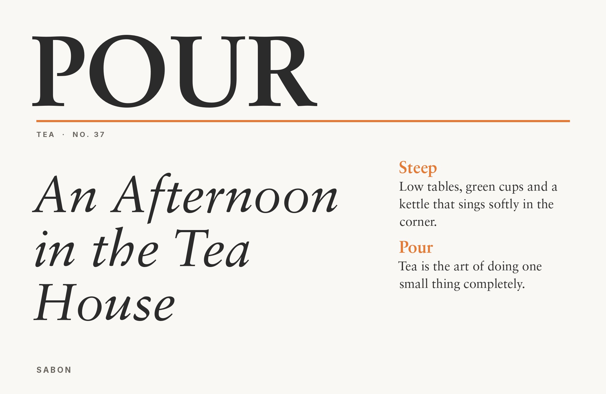
Helvetica Neue is the tighter, more systematic descendant of the sans Max Miedinger drew in 1957 for the Haas Type Foundry under Eduard Hoffmann’s art direction; D. Stempel AG, Linotype’s subsidiary, restructured it into a consistent weight system in 1983, with Erik Spiekermann consulting on the project. Typewolf’s Site of the Day archive documents the pair on a real production site. In this specimen, Sabon’s textured, calligraphic title supplies the warmth while Helvetica Neue keeps the supporting lines calm and neutral. It is a quiet pairing, and that quietness is the entire point.

No more mockups or code. The Elementor MCP lets your AI build real, editable structure directly on your site.
See Details4. Franklin Gothic

Morris Fuller Benton designed Franklin Gothic in 1902 for American Type Founders, and it remains one of the heaviest, most confident American grotesques ever put into wide production. The digital version linked here, ITC Franklin Gothic, adds the extra weights Victor Caruso drew for the family starting in 1979, now issued through Monotype as part of its standing library. Documented alongside Sabon in Typewolf’s real-use archive, it lends density and confidence to the supporting copy beneath a quieter Sabon title. That difference in texture is the whole point of the pairing.

5. Univers

Adrian Frutiger designed Univers for the Deberny & Peignot foundry in 1957, a decade before Sabon, but both belong to the same mid-century modernist moment that prized engineered, systematic type over individual expression. Univers was one of the first type families built as a numbered, related system across weights and widths rather than a single cut with a bold bolted on later, a rational sans structure with a less-rounded lowercase “a,” a “G” drawn without the usual arrow-head spur, and obliques set at a deliberate slant instead of a drawn italic. Beneath a Sabon title, its systematic forms create the period-appropriate contrast Typewolf’s real-use data records: a rigorous modernist supporting voice under a warmer, Renaissance-rooted serif.

6. Trade Gothic

Jackson Burke designed Trade Gothic for Linotype in 1948 as a working-press American grotesque, slightly irregular and less mechanical than Univers or Helvetica, built for practical trade printing rather than Swiss rigor. Örebro University uses Sabon together with Trade Gothic, as Sabon’s Wikipedia history records. That is real evidence Sabon pairs inside official administrative identity systems, not only editorial layouts. The linked Trade Gothic Next expands Burke’s original into a fuller family, later developed by Akira Kobayashi and Tom Grace. It is a dependable choice anywhere a brand needs a plainspoken sans beside Sabon’s more textured forms.

7. Neue Haas Grotesk

Neue Haas Grotesk is Christian Schwartz’s digital restoration of the original 1957 Miedinger and Hoffmann design, built from the metal type’s own settings, completed in 2010 and released jointly by Font Bureau and Linotype in 2011. MIT’s public brand guide names it the university’s primary typeface and lists Sabon among the brand typefaces approved to sit beside it, a rare case of this exact pairing written directly into a live institutional system rather than chosen ad hoc. Try Sabon for a title and let the sans handle supporting copy with a quieter, more even rhythm.

Conclusion
There are no fixed rules for pairing Sabon, only a thin but unusually solid trail of evidence. The documented choices above give you defensible starting points, from institutional type systems to Typewolf’s direct recommendation. Use them when a pairing needs to be explained in writing as well as judged by eye.
The pairings work through contrast rather than a matched set. Univers and Franklin Gothic bring mid-century engineering and American density against Sabon’s Renaissance-derived warmth; Helvetica Neue and Poppins bring neutral or geometric voices over a text face built for hand composition and hot metal. What holds the list together is Sabon’s restraint: almost any sans with real character reads as a clear second voice above it. Set real copy at the sizes you intend to publish, check that the sans does not overpower Sabon’s moderate contrast at body sizes, and lean on the institutional pairings first when the choice needs to be defended in writing, not only admired on screen.
Sources
- Hylte Municipality graphic profile (2026)
- Typewolf (main page + Site of the Day archive)
- Typ.io
- Wikipedia, Sabon typeface
- MIT Brand Guide
- Fonts In Use
- Adobe Fonts
- MyFonts / fonts.com
- Practical Typography
- Design Observer
