Abel pairs great with Roboto, Oswald and Titillium Web. All 12 pairings are shown below in real rendered specimens, with the reason each one works.

What fonts go with Abel? The useful answer starts with an admission about the font itself: Abel ships in exactly one weight, with no italic and no bold, which means it cannot build a hierarchy on its own. Whatever you pair with it is not a decorative companion. It is the half of the system that does the work Abel structurally cannot do.
Matthew Desmond drew Abel under his MADType imprint and it entered the Google Fonts library on 3 August 2011. His own description is the most accurate one available: a modern interpretation of the condensed flat-sided sans serif, a style that came out of newspaper headlines and poster work. The flat sides are literal — the bowls of the b, d, p and q run as near-straight verticals before they turn, which is how the face packs so many characters into so little measure. Two details keep it from reading as a generic compressed gothic: angled terminals, cut on a slant rather than squared off, and slightly spiked stems. The stroke weight is effectively monolinear, so Abel holds its colour at small sizes better than most condensed faces, which is why Desmond claims it for web text as well as display.
That single weight defines the whole pairing problem. A partner for Abel has to supply three things Abel withholds: horizontal room, because Abel’s narrow fit tires a reader across a full measure; a weight range, because contrast between a heading and a paragraph has to come from somewhere; and, usually, a second stylistic register. The supported Abel pairings resolve the same way — Abel above as the compressed display line, one normal-width text face below carrying everything else. Here are 12 fonts that pair with Abel.
1. Roboto
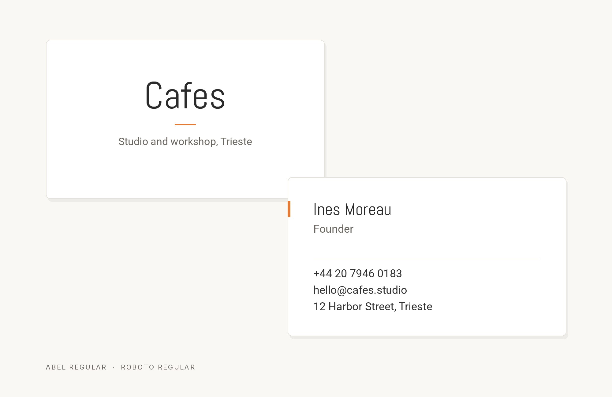
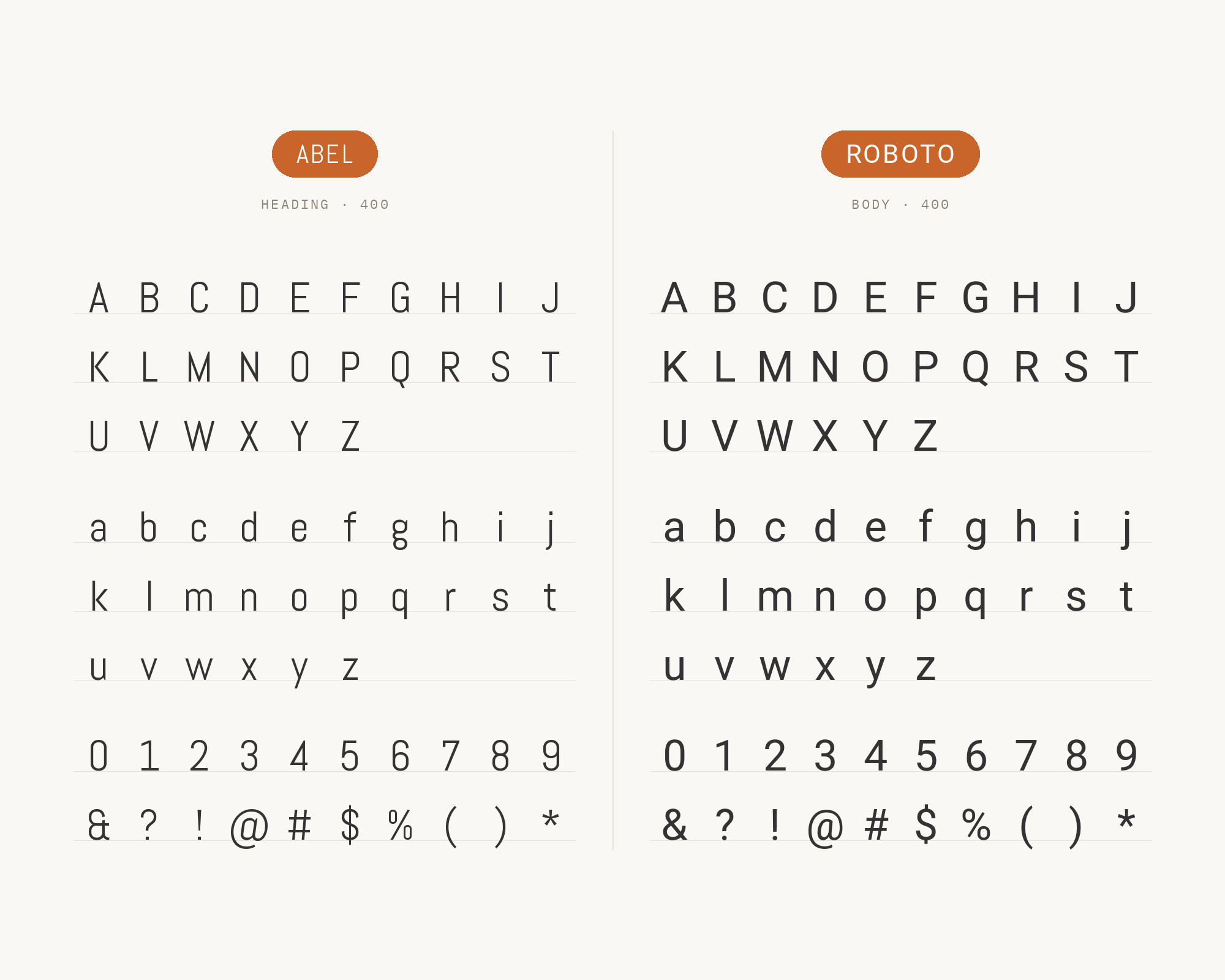
Christian Robertson designed Roboto in-house at Google and shipped it as Android’s system typeface. It is the best-supported Abel pairing on this list, and the only one confirmed from two independent directions: a live production website runs Abel and Roboto as its entire two-font system, and an editorial review of Abel names Roboto first among its recommended partners. The structural reason is width. Roboto’s design principle is that letters settle into their natural width rather than being forced into a rigid rhythm, so it gives back precisely the horizontal room Abel’s condensed skeleton removes. Roboto’s mechanical skeleton with open curves also stays neutral enough that Abel’s angled terminals remain the only distinctive gesture on the page. Set Abel for headings and Roboto for body, captions and interface labels.
2. Oswald
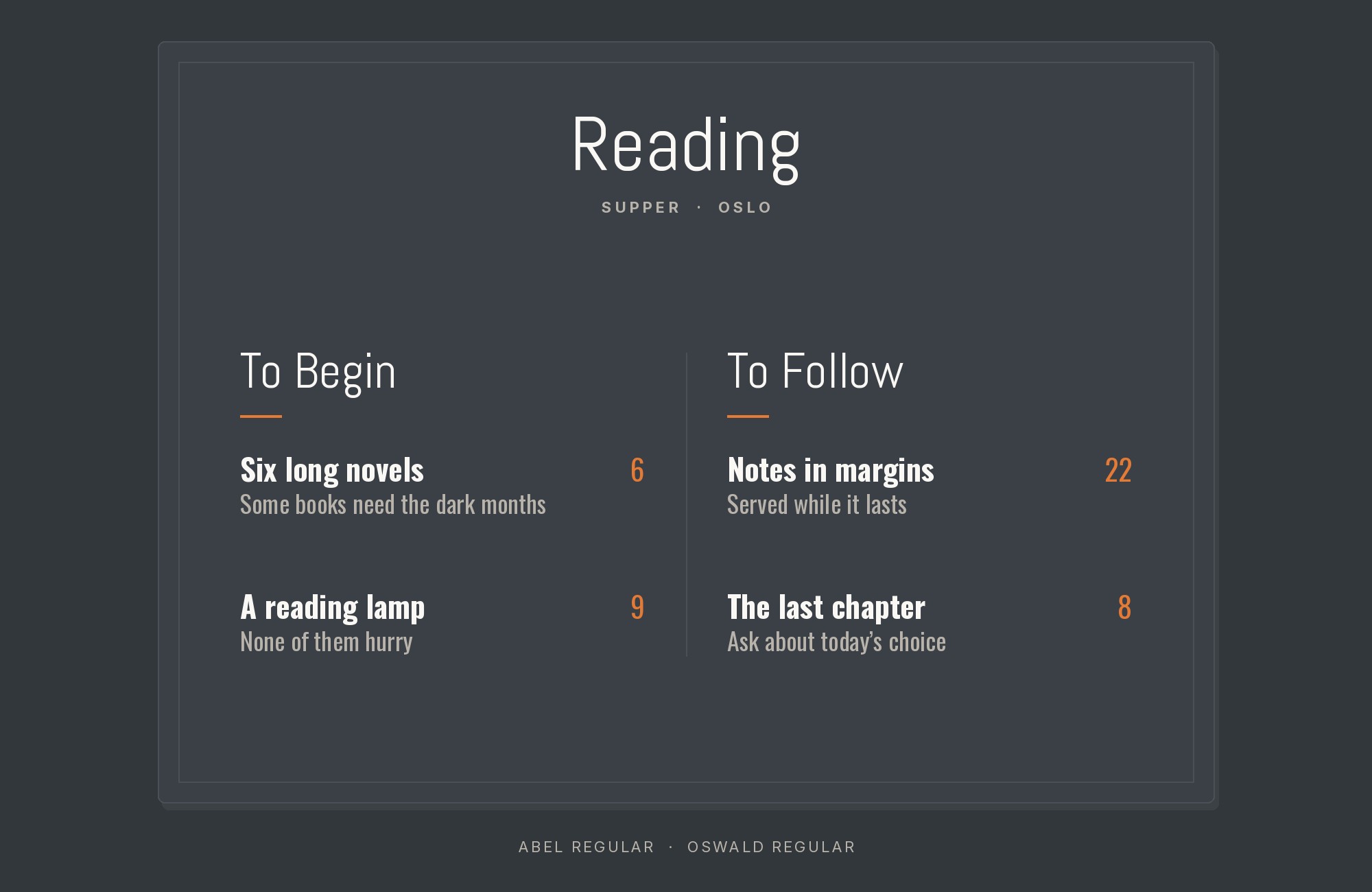
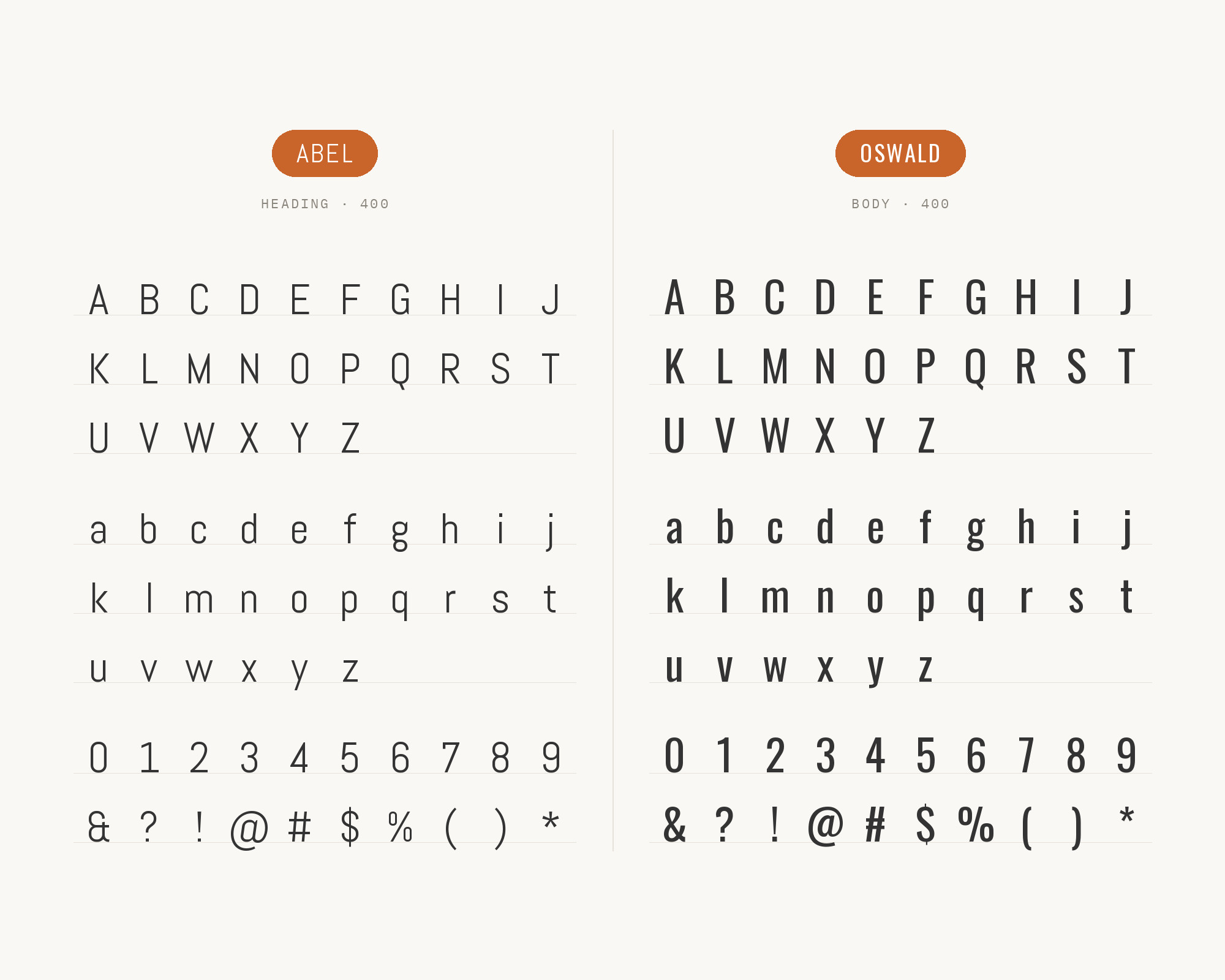
Vernon Adams began Oswald in 2011 as a reworking of the Alternate Gothic style, redrawn to sit correctly on the pixel grid of standard screens, and Kalapi Gajjar and Cyreal extended it after him. Pairing two condensed gothics sounds like a mistake, and normally it is — but this one is documented on a real site and repeated as a recommendation elsewhere, and the logic holds. Oswald ships in a full weight range from Light through Bold. Abel does not. So the contrast that a one-weight family cannot generate internally comes from the partner instead: Oswald Bold or SemiBold takes the headline with real mass, and Abel drops underneath as the lighter running voice at the same compressed proportion. The system stays narrow throughout, which suits dense editorial layouts, event posters and tightly gridded multi-column pages where horizontal space is genuinely scarce.
3. Titillium Web
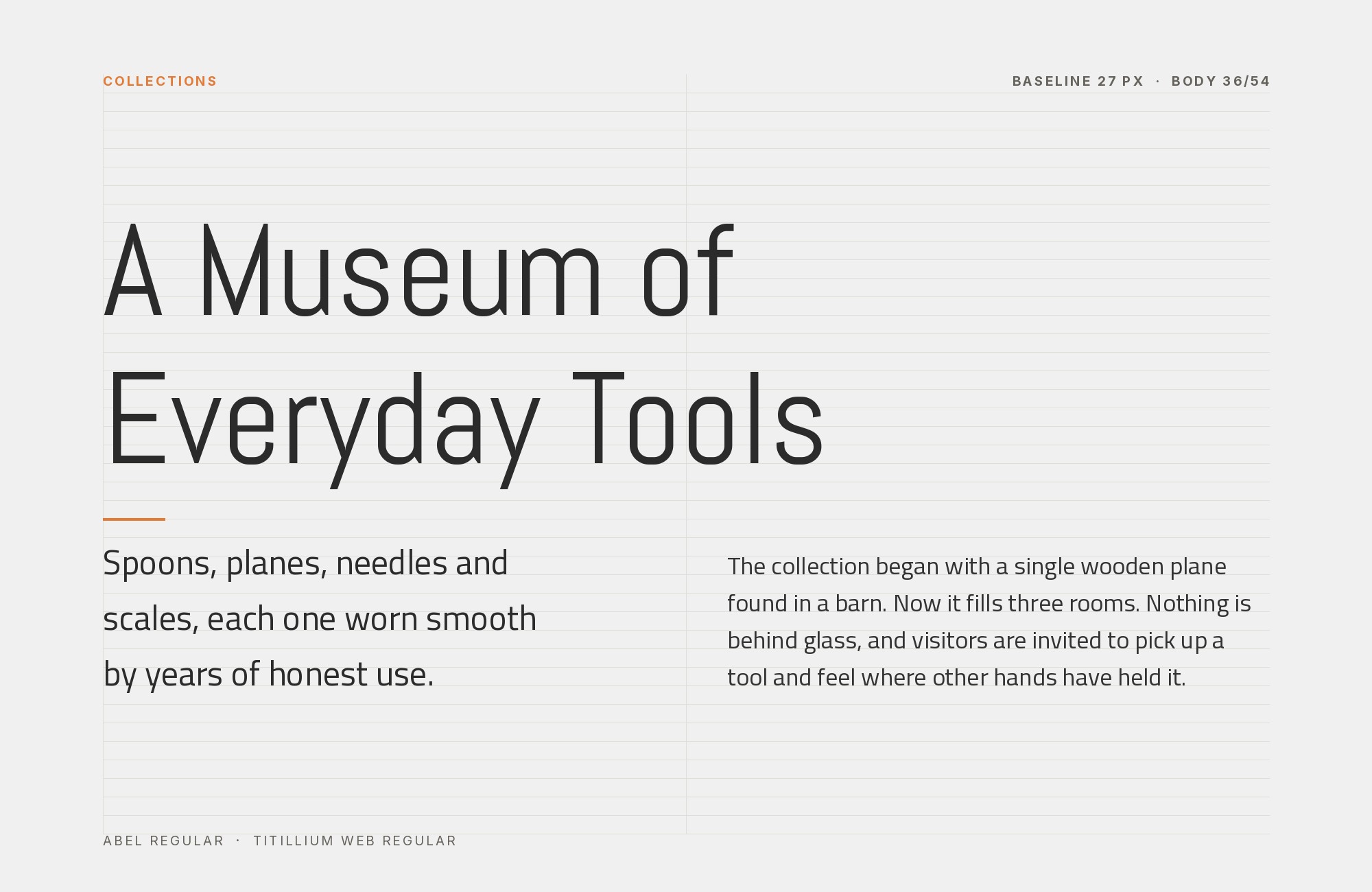
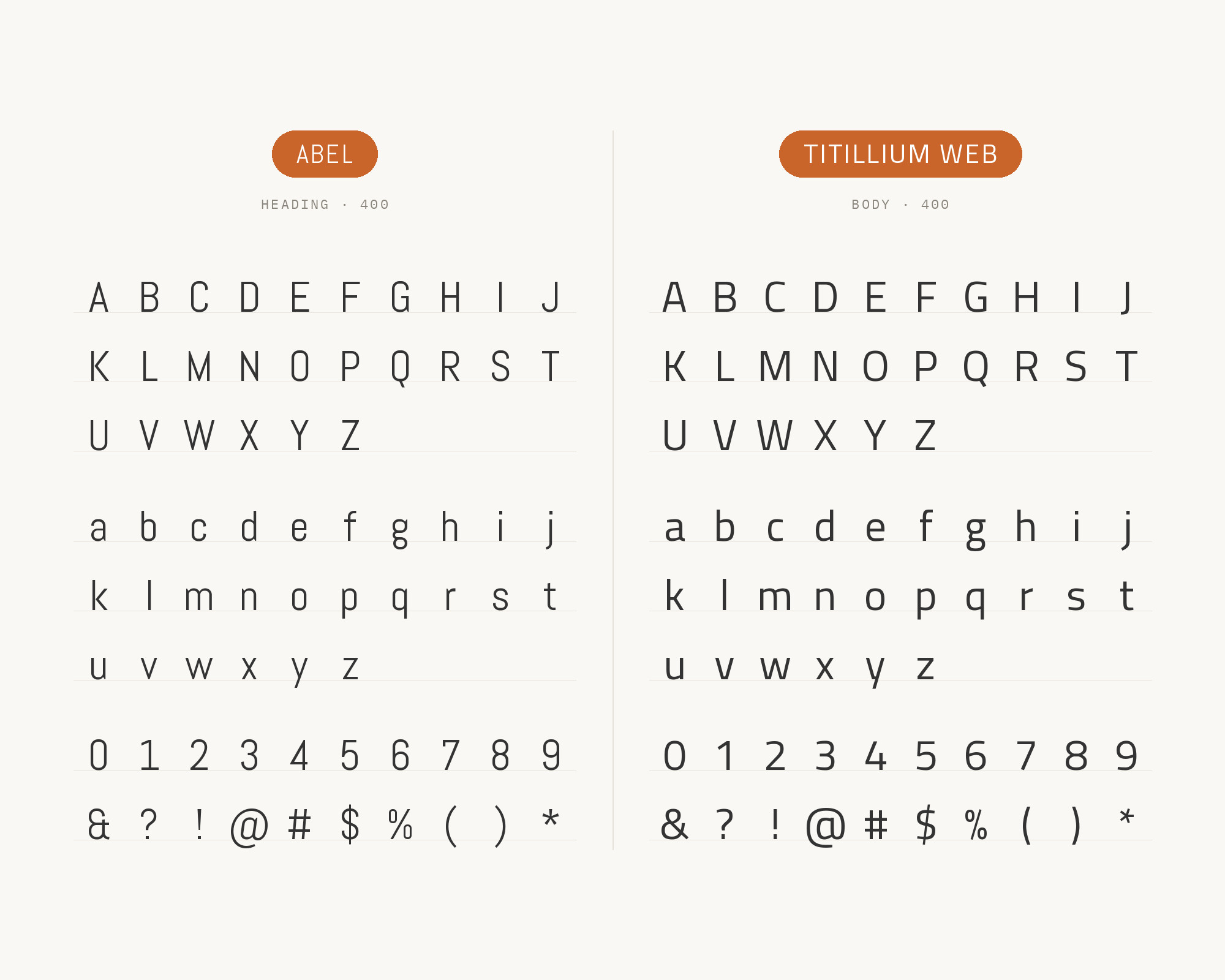
Titillium Web came out of the Accademia di Belle Arti di Urbino as a collective teaching project, with each year’s cohort of students extending and correcting the family under an open licence. It is the only Abel partner documented inside a real production: the 2013 MoTyF international student moving-type festival in Warsaw set its website in Abel while its poster and header used Titillium. The pairing works on aperture and fit. Titillium is a humanist sans of normal width with open, generous counters and a large x-height, so it reads comfortably in paragraphs at sizes where Abel’s tight sidebearings start to close up. Its faintly technical, squared-off character also keeps it in the same contemporary register as Abel rather than pulling the page toward warmth. Use Titillium Web for body copy and navigation under Abel headlines.
Try Semrush free. No credit card.
Start on the $0 plan. Paid plans from $117/mo billed annually.
Try for free4. PT Serif
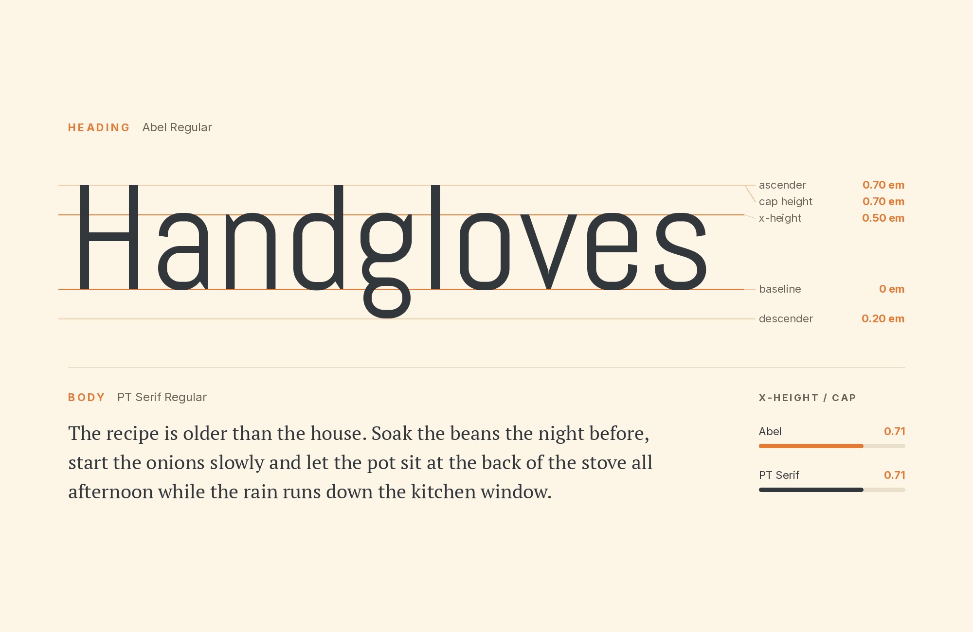
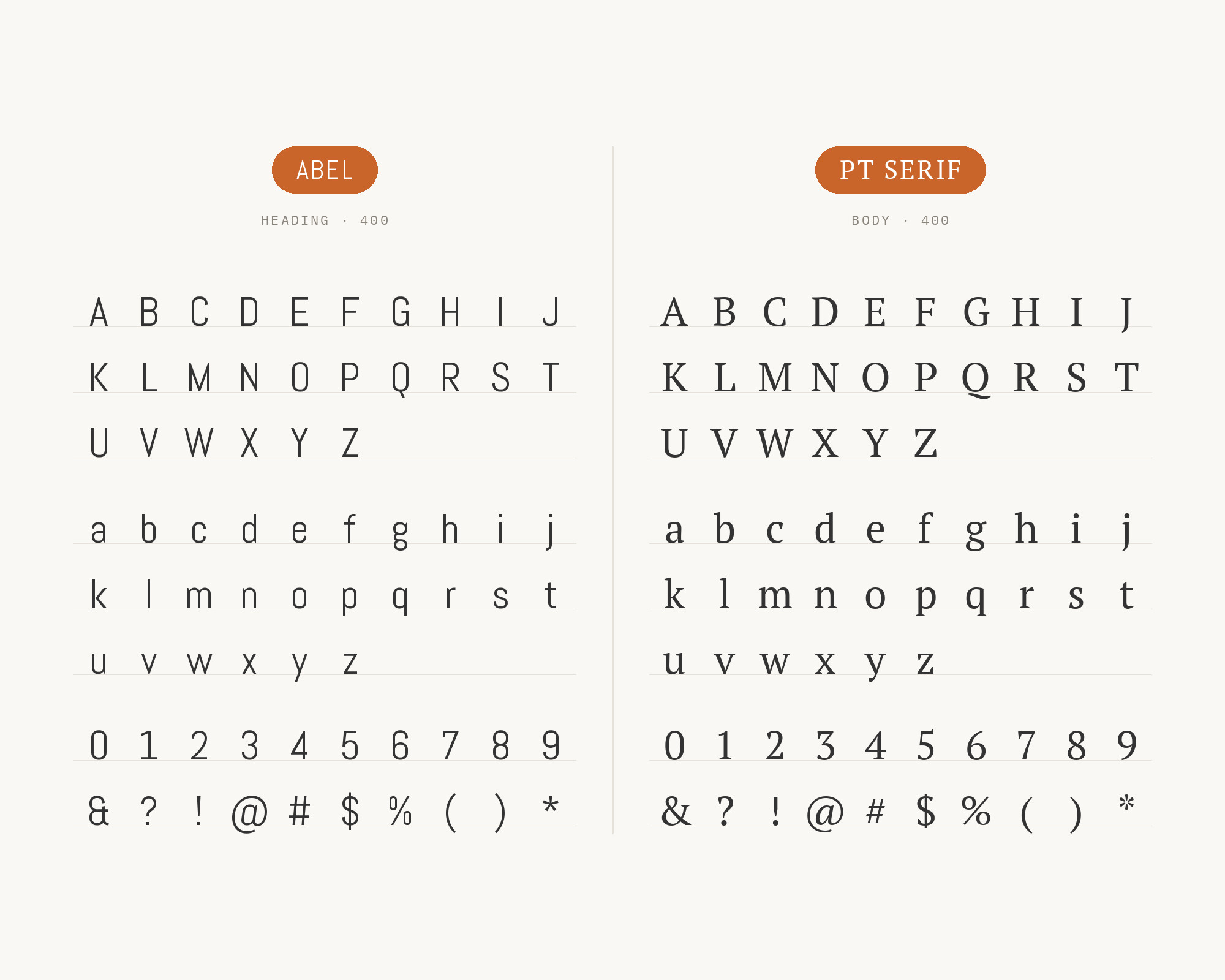
ParaType released PT Serif in 2011 as the second family in the Public Types of the Russian Federation project, a state-supported effort to give every language of Russia a properly engineered libre typeface. It is a transitional serif with low-to-moderate contrast, broad proportions and sturdy, unfussy serifs — engineered for legibility across a huge character set rather than for elegance. That plainness is exactly its value beside Abel. A curated headline-and-body recommendation pairs the two and points at a specific detail: Abel’s unusual lowercase terminals, the ‘a’ in particular, only register as character when the text face around them is quiet enough not to compete. PT Serif’s width is the proportional opposite of Abel’s compression, and its serifs mark the category break clearly. Reach for it on editorial sites, reports and any layout with real paragraph length.
5. Merriweather
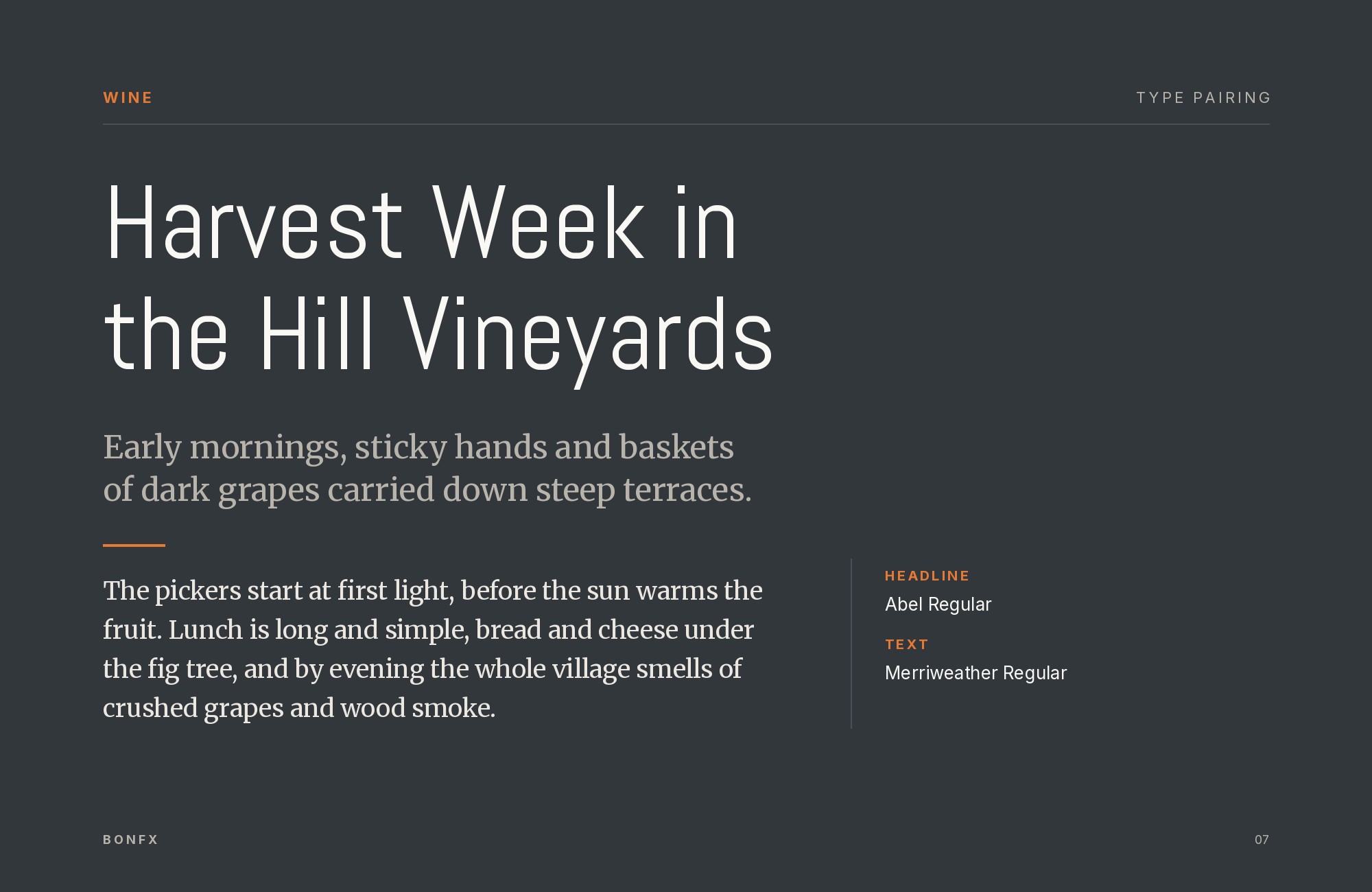
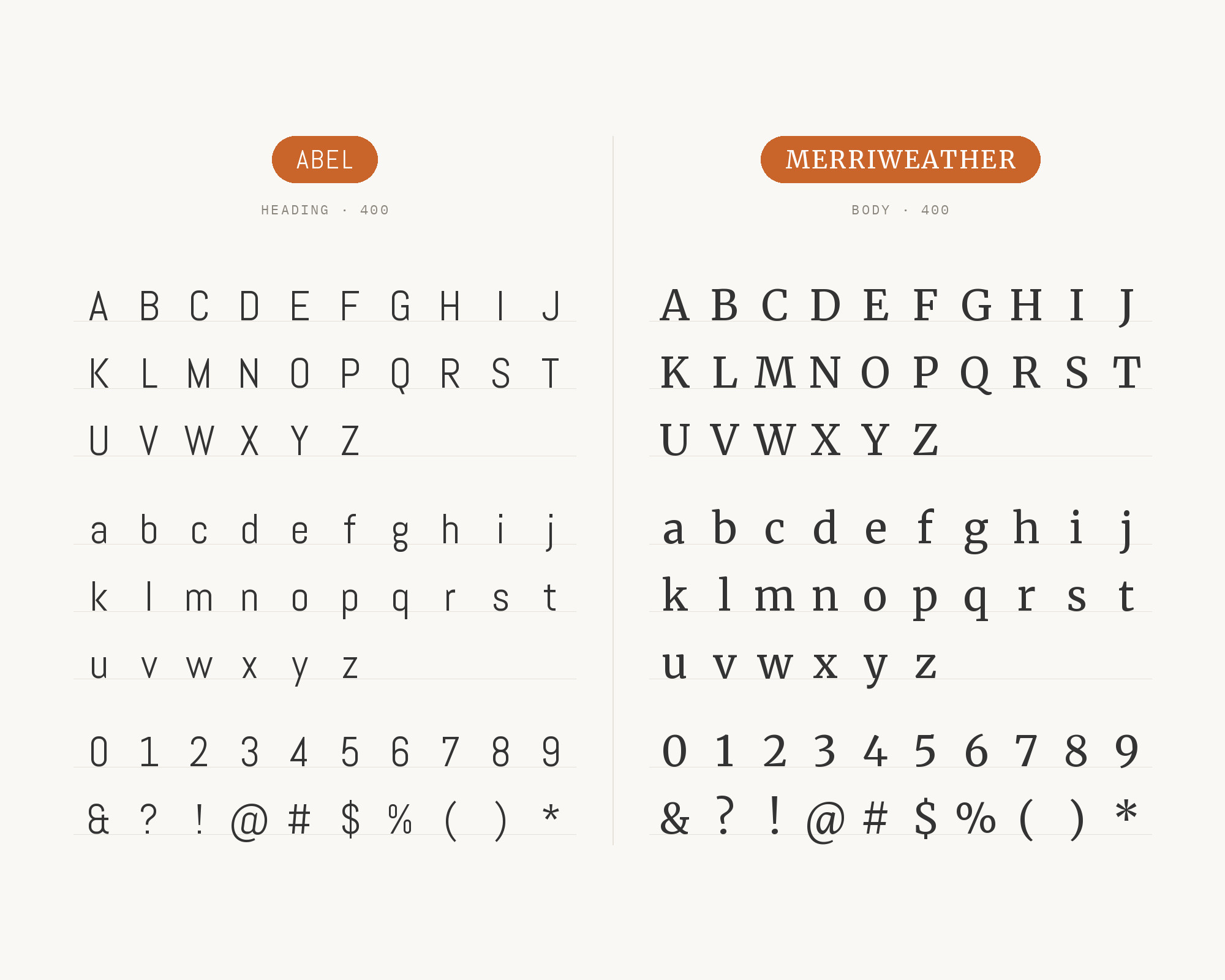
Eben Sorkin’s Sorkin Type foundry designed Merriweather specifically to be pleasant to read on screens, and its specification reads like a checklist of everything Abel withholds: a very large x-height, mild diagonal stress, sturdy serifs and open forms. It is the serif partner named in an independent review of Abel, and the contrast operates on two axes at once — category, sans against serif, and proportion, compressed against generous. There is one useful complication worth knowing. Merriweather’s own letterforms are slightly condensed, which means it is not the maximum-width answer that PT Serif is; the relationship reads as a family resemblance in proportion with a hard break in category. That makes it the better choice when you want the pairing to feel deliberately coordinated rather than starkly opposed. Set Merriweather at reading sizes under Abel display lines.
6. Lato
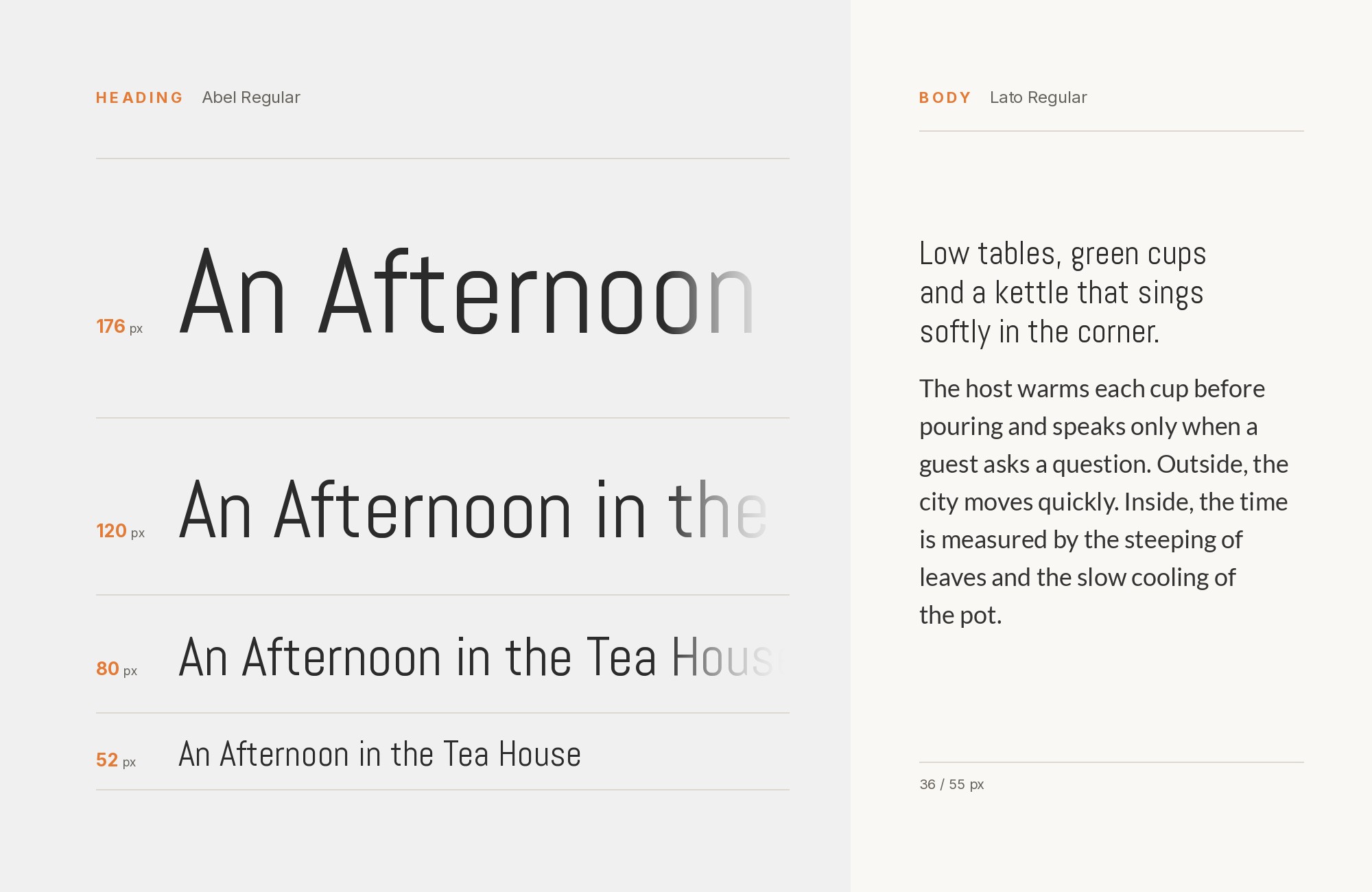
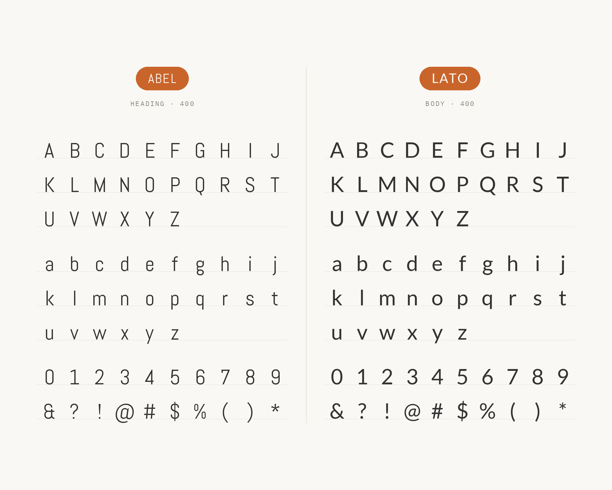
Łukasz Dziedzic started Lato in Warsaw in the summer of 2010 — lato is Polish for summer — originally as part of a corporate identity that went another direction. He built it around a deliberate tension: transparent and unobtrusive in body text, but with enough original character to survive at display sizes. As an Abel partner, named in the same editorial review, its contribution is humanist warmth. Abel’s flat sides, monolinear strokes and newspaper lineage make for a cool, utilitarian voice, and Lato’s classical proportions and semi-rounded details soften that without introducing a competing personality. Lato also sits at normal width with an even text colour, so it never contests the condensed display role. Use it when a brand needs Abel’s efficiency in headlines but wants the paragraphs beneath to read as approachable rather than institutional.
Junior work is now a prompt. The biggest profit center in your studio is vanishing.
How to fix this?
Find Out How7. Ubuntu
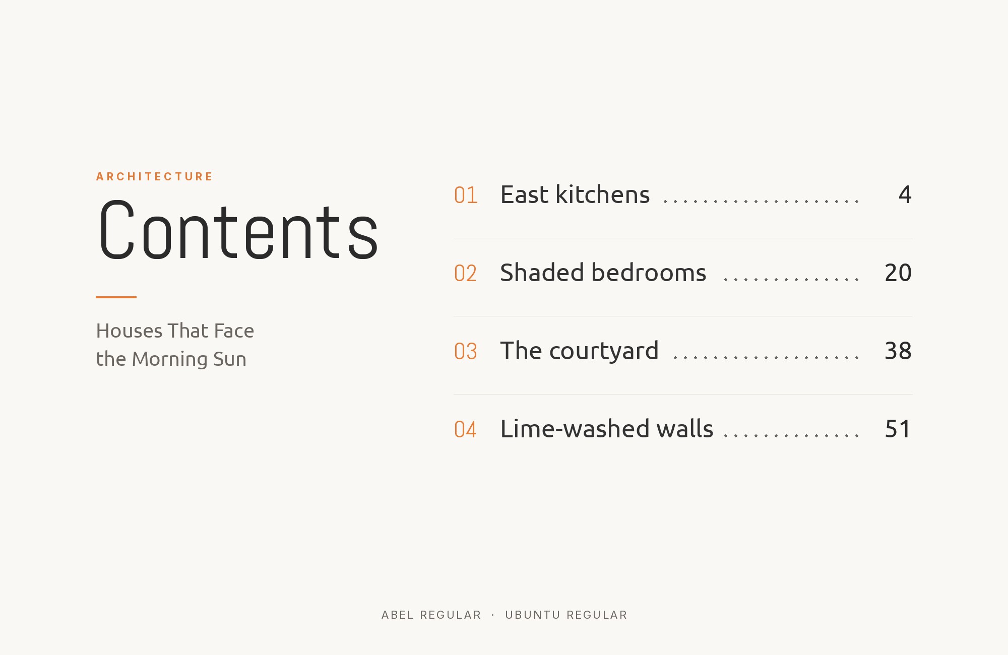
Dalton Maag designed the Ubuntu font family on commission from Canonical, releasing it in 2010–2011 as the system face of the Ubuntu operating system and an open-licence family engineered by a commercial foundry for a large OS vendor. It is the most sympathetic pairing on this list rather than the most contrasting. Ubuntu’s humanist skeleton carries angled, slightly flared terminals that rhyme directly with Abel’s own slanted cuts, so the two faces share a detail language even though their widths diverge sharply. The result reads as a related pair, not a collision. Ubuntu’s full weight range then covers the hierarchy Abel’s one weight cannot build, and its wider fit handles running text. Use this pairing where the brand should feel engineered and friendly at once — technical documentation, developer tooling, civic and open-source projects.
8. Helvetica Neue
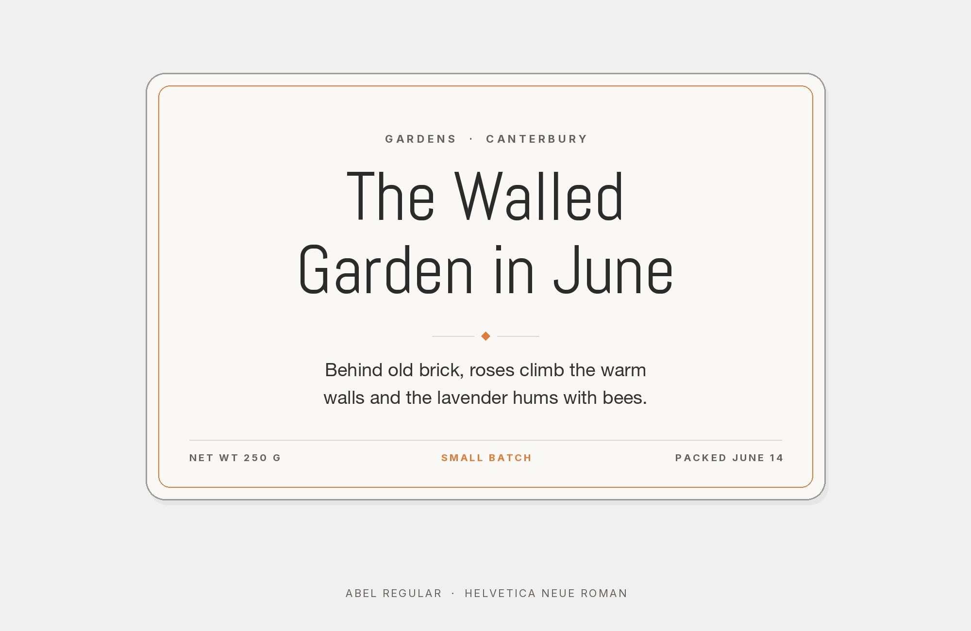
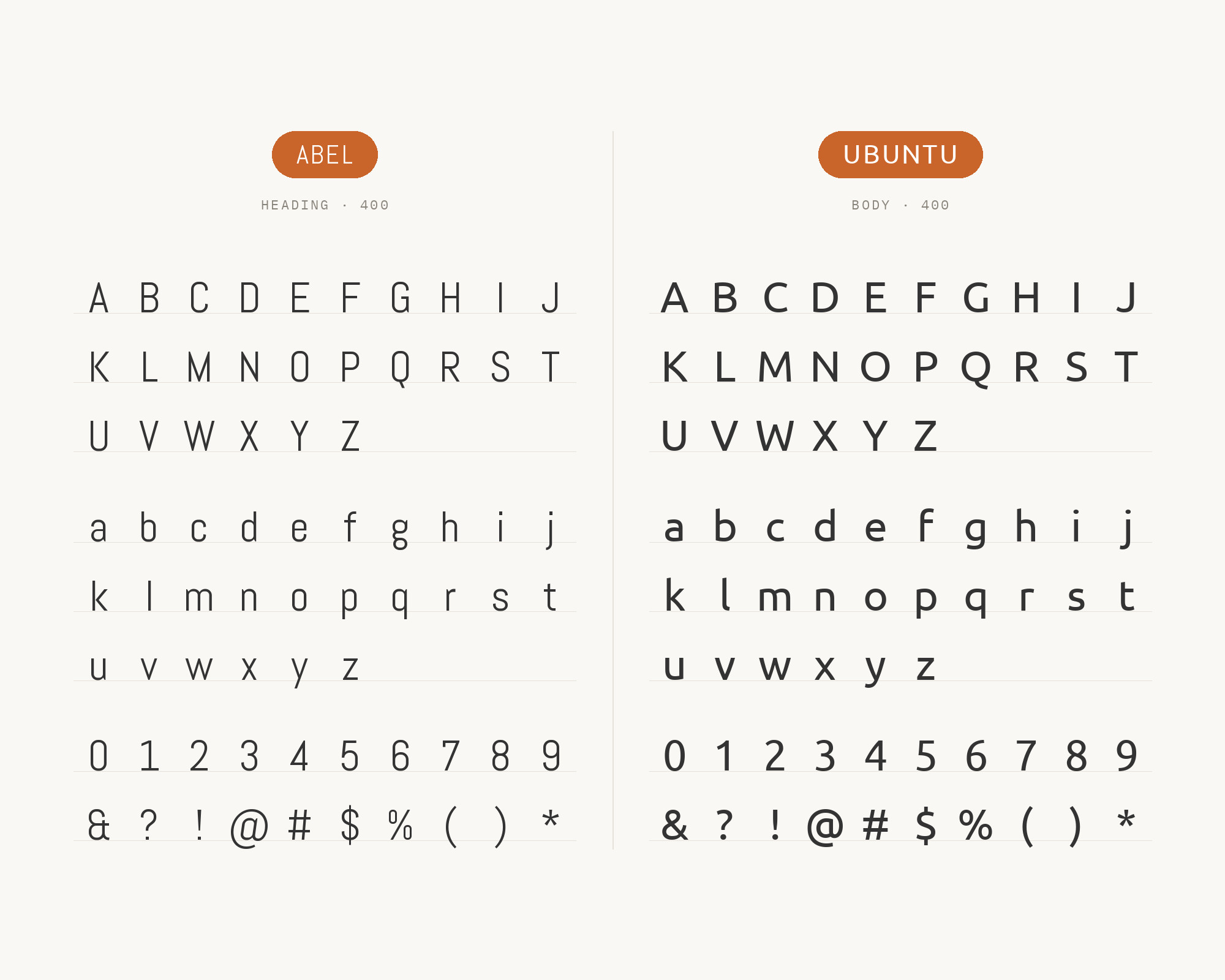
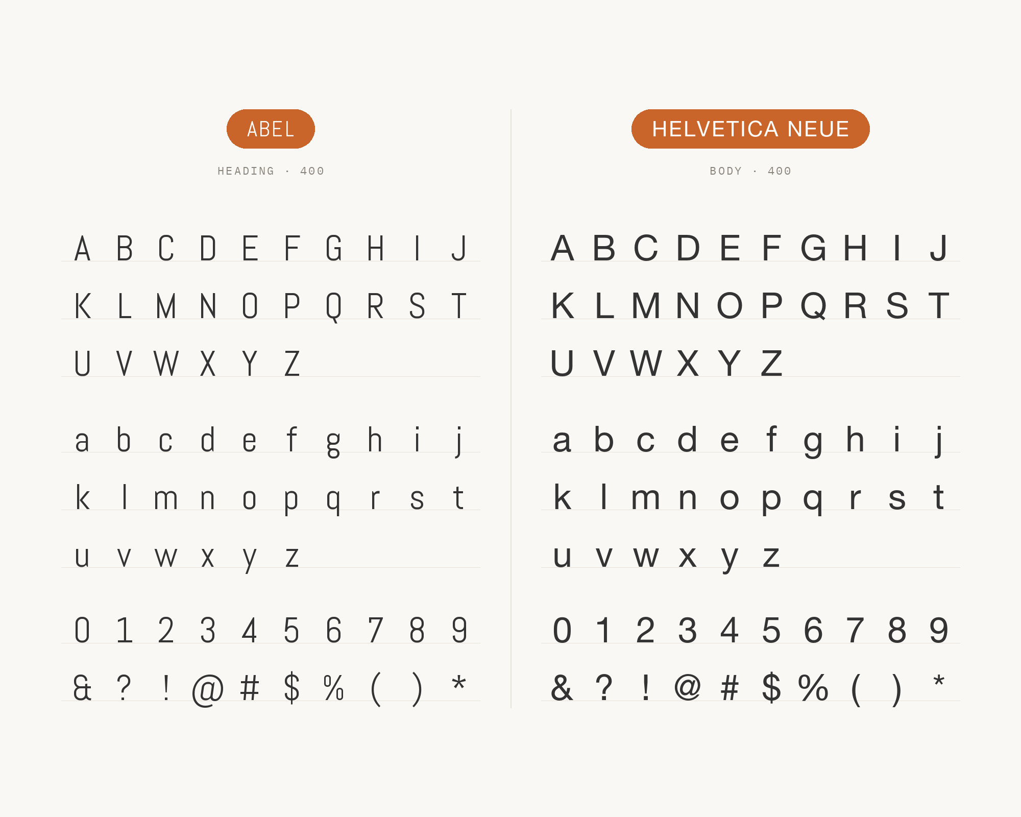
Linotype’s 1983 redrawing of Helvetica produced Helvetica Neue, rationalising the original’s inconsistent weights into a numbered, systematically related family. It appears beside Abel in a live site’s type system, and it is also the textbook structural answer to a condensed display gothic. Helvetica Neue is a normal-width grotesque with closed apertures, uniform stroke weight and a deliberate refusal of personality, which makes it the safest possible text partner: it adds nothing that competes with Abel’s angled terminals and spiked stems, so the condensed headline stays the only voice in the layout. The relationship is also historically coherent, since both faces descend from the same grotesque tradition, Abel via American newspaper condensed styles and Helvetica Neue via the Swiss line. Use it for restrained corporate, architectural and editorial work.
9. Arial
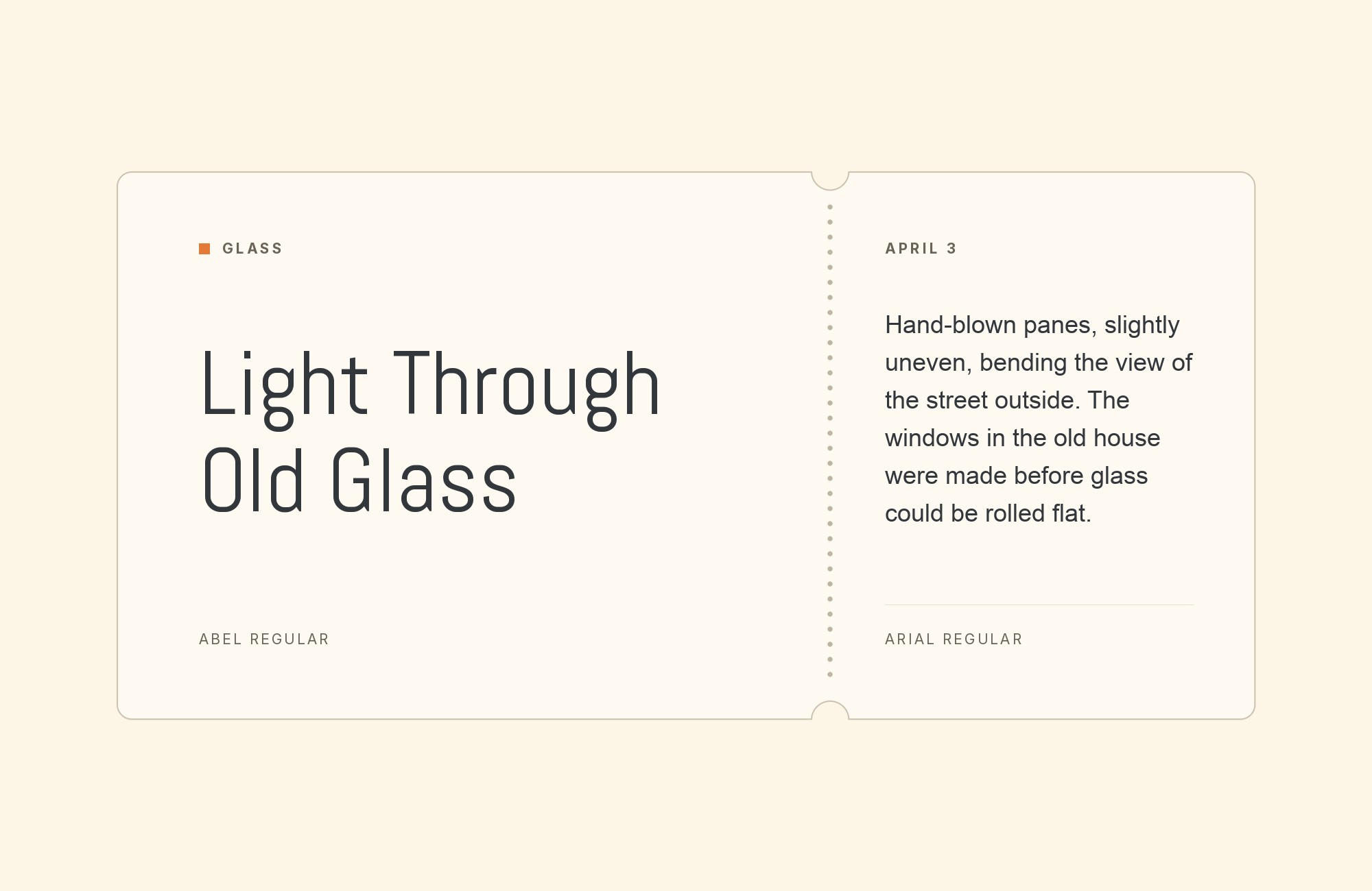
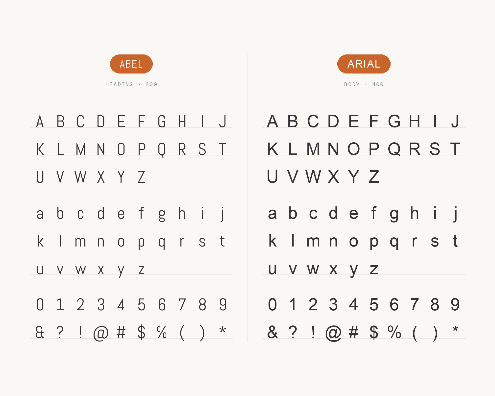
Robin Nicholas and Patricia Saunders designed Arial at Monotype in 1982 for low-resolution laser printers, and Microsoft’s decision to ship it with Windows made it one of the most widely installed typefaces ever drawn. Its value beside Abel is logistical rather than aesthetic, and it is worth being plain about that. Abel is a webfont in nearly every workflow — Google Fonts for the single free weight, MyFonts for the commercial Abel Pro — so any context that cannot load a webfont loses it entirely. Arial is the normal-width grotesque that is already present in Office documents, email clients and plain-text systems, close enough in tone to Helvetica Neue to hold a brand’s type system together in those gaps. It is documented in a live type stack alongside Abel. Treat it as a load-bearing fallback.
10. Lucida Grande
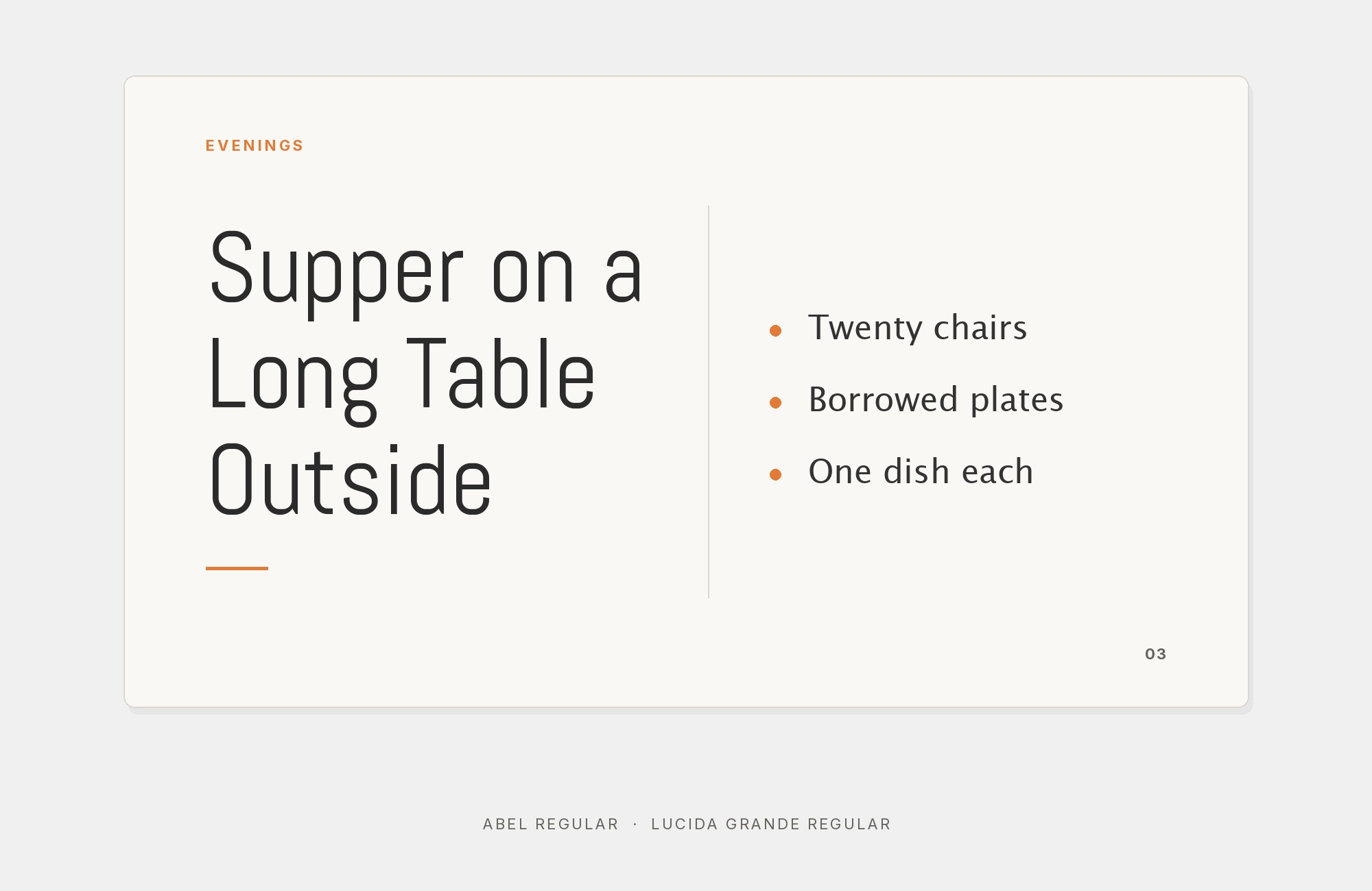
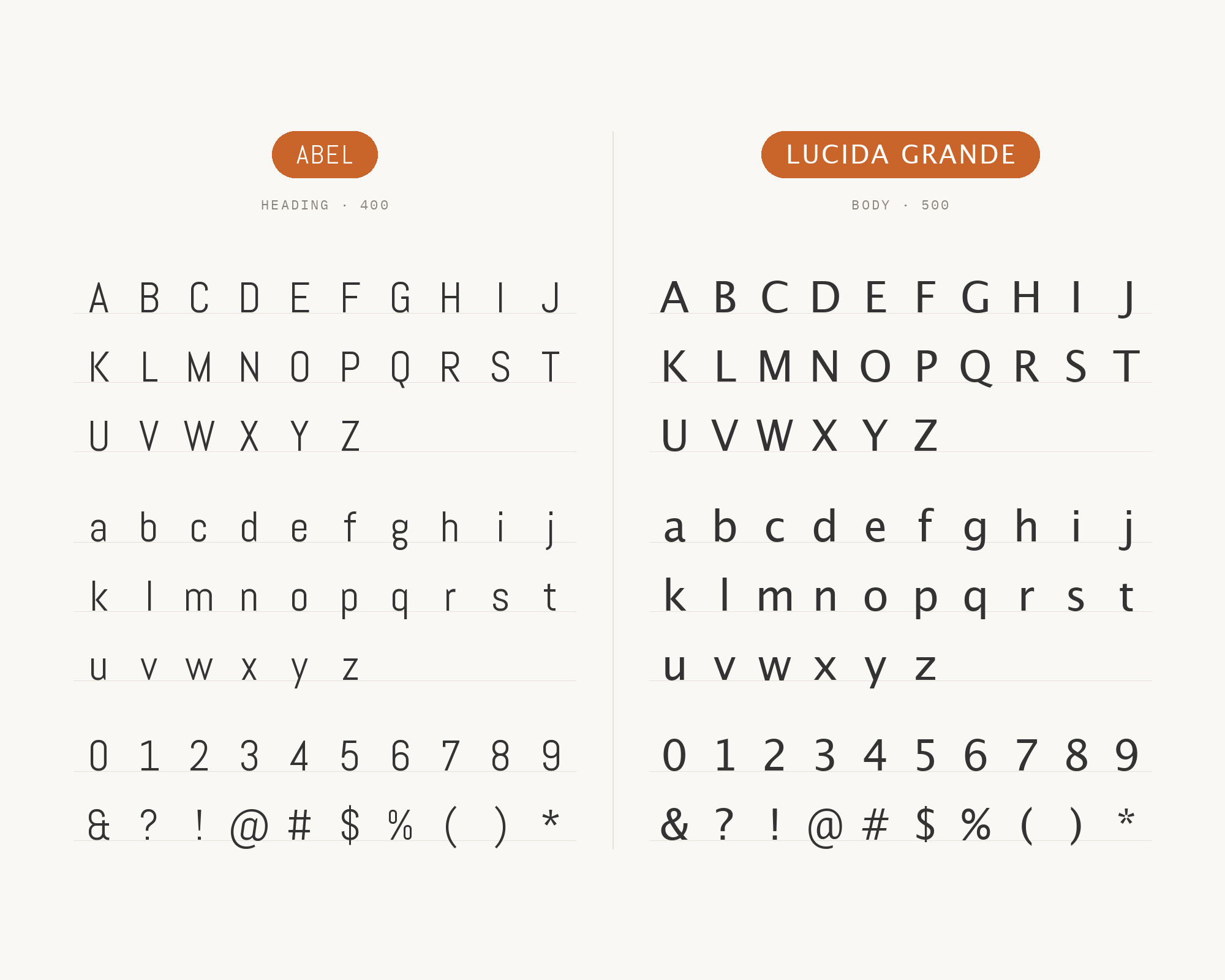
Typ.io records Lucida Grande with Abel in the live type system on brettterpstra.com, alongside Oswald, Arial, and Helvetica Neue. Lucida Grande’s open counters, generous width, and screen-oriented texture give back the reading comfort Abel’s compressed forms withhold. Use Abel for a narrow heading or navigation label, then let Lucida Grande carry paragraphs and explanatory copy. The system face has enough character to avoid looking like a fallback, but it should stay quieter through weight and size. A regular Lucida paragraph beneath a larger Abel line makes the width contrast visible without turning the page into a comparison specimen.
11. Source Code Pro
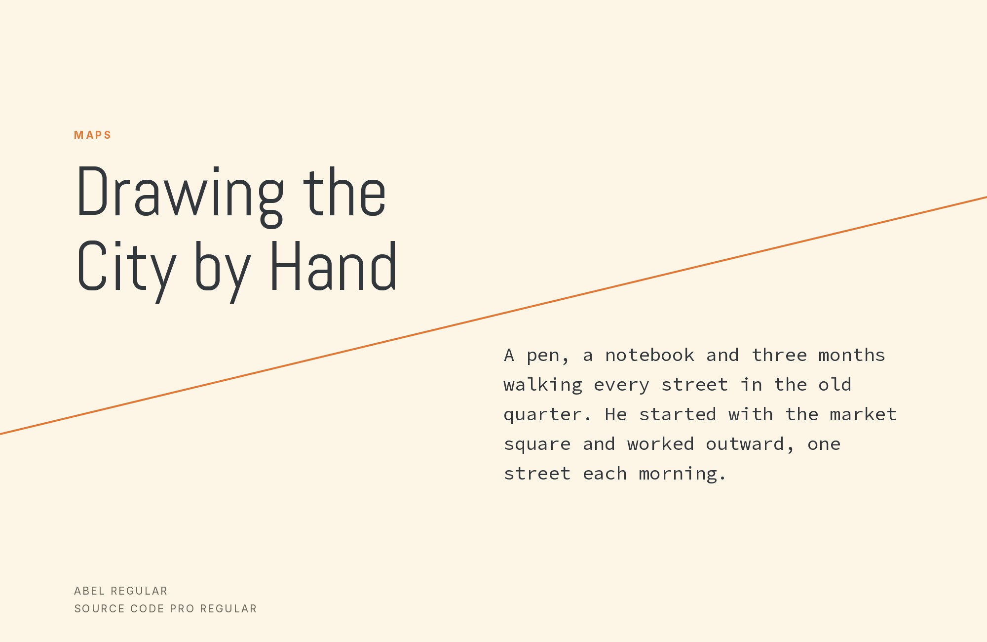
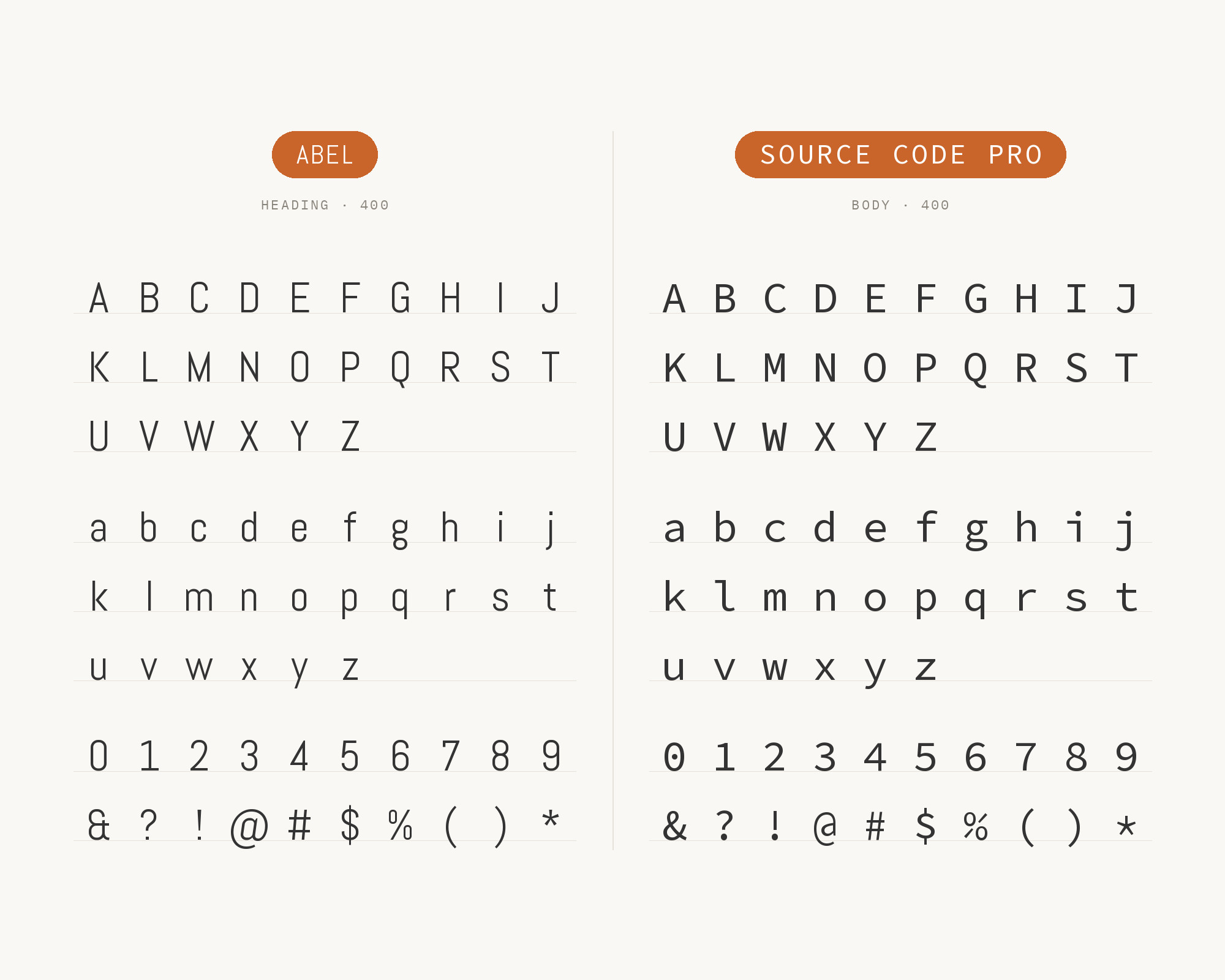
Jonathan Tilley’s Personal Branding Studio explicitly pairs Abel with Source Code Pro and assigns Abel to the logo and main headings while the monospace family handles subheads and body copy. The combination works through width and rhythm: Abel is narrow but proportional, while Source Code Pro gives every character equal space, making the supporting layer feel technical and deliberate. Keep the monospace text at a comfortable size and generous line height; dense code-like texture can tire quickly in long paragraphs. This pairing fits developer portfolios, technical workshops, and personal brands where a condensed display voice needs a precise, functional counterweight.
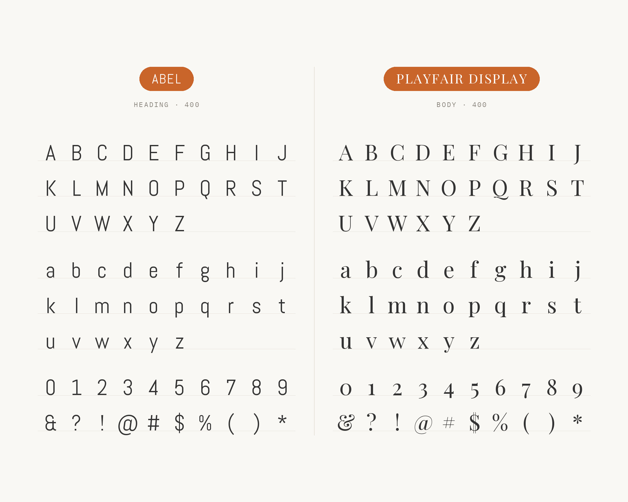
12. Playfair Display
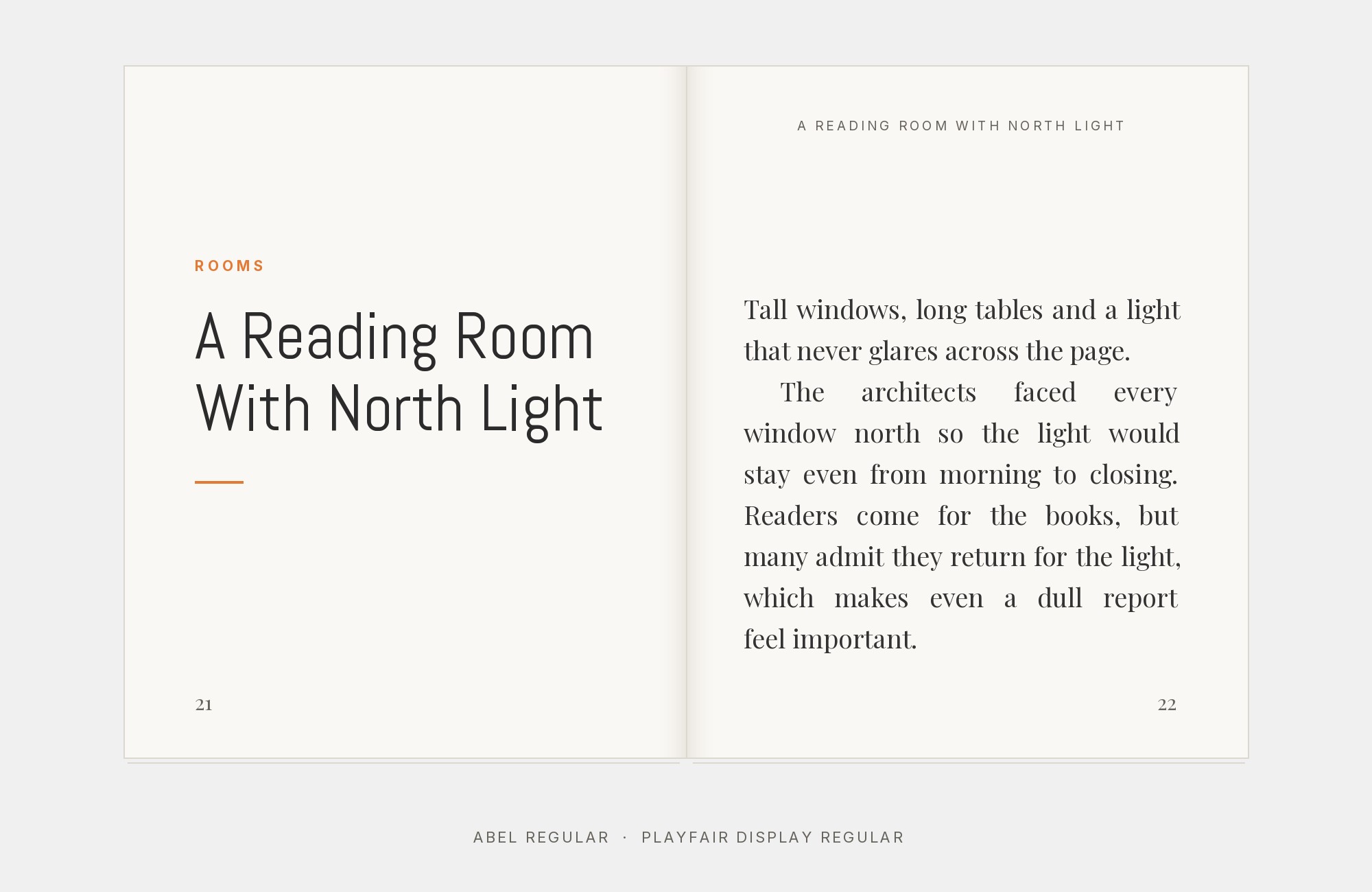
A published brand-identity study documents Playfair Display as the accent serif with Abel used for supporting text. This reverses Abel’s usual headline job. Playfair’s high stroke contrast and broad, elegant capitals take the display role, while Abel’s narrow, even strokes keep labels and short body passages visually quiet. Give Playfair Display plenty of size so its hairlines survive, and avoid shrinking Abel into a tightly packed paragraph; its condensed fit still needs open leading. The pair suits beauty, fashion, and editorial identities where a classical title should lead into a cleaner modern layer without introducing a second ornate voice.
Conclusion
Abel’s one weight is not a limitation to work around; it is the specification that decides the pairing. Every combination above resolves into the same structure — Abel compresses the display line, and a normal-width partner with a real weight range carries the text — and the strongest evidence points the same way. Roboto is the only Abel pairing confirmed both by a live production site and by independent editorial recommendation, which makes it the default rather than a compromise. Titillium Web is the only partner documented inside a real finished project. Those two carry the most weight on the list precisely because they were tested in public rather than proposed in a style guide.
The remaining choices sort by what a layout actually needs. When the measure is generous and the text runs long, take the full width contrast: PT Serif, Merriweather or Lato. When the grid is tight and horizontal space is the constraint, stay narrow and let Oswald supply weight instead of width. When Abel simply cannot render, Arial and Helvetica Neue hold the shape of the system until it can. Set Abel at the size you will actually publish before committing, because its angled terminals and tight sidebearings behave very differently at 14px and at 72px, and the partner that looked right in a specimen may be solving the wrong problem on the page.
Sources
- Typ.io (Abel)
- Fonts In Use (Abel typeface page, by numeric ID)
- Fonts In Use (MoTyF festival website)
- Typogram FontDiscovery (Abel)
- Raindrops Insider (16 Google font combinations)
- Think360 Studio (Google font combinations)
- K Design Co (27 Google font pairings)
- MADType (Google Fonts page)
- Google Fonts metadata (Abel)
- Jonathan Tilley — Personal Branding Studio
- KNUTD brand-identity study
