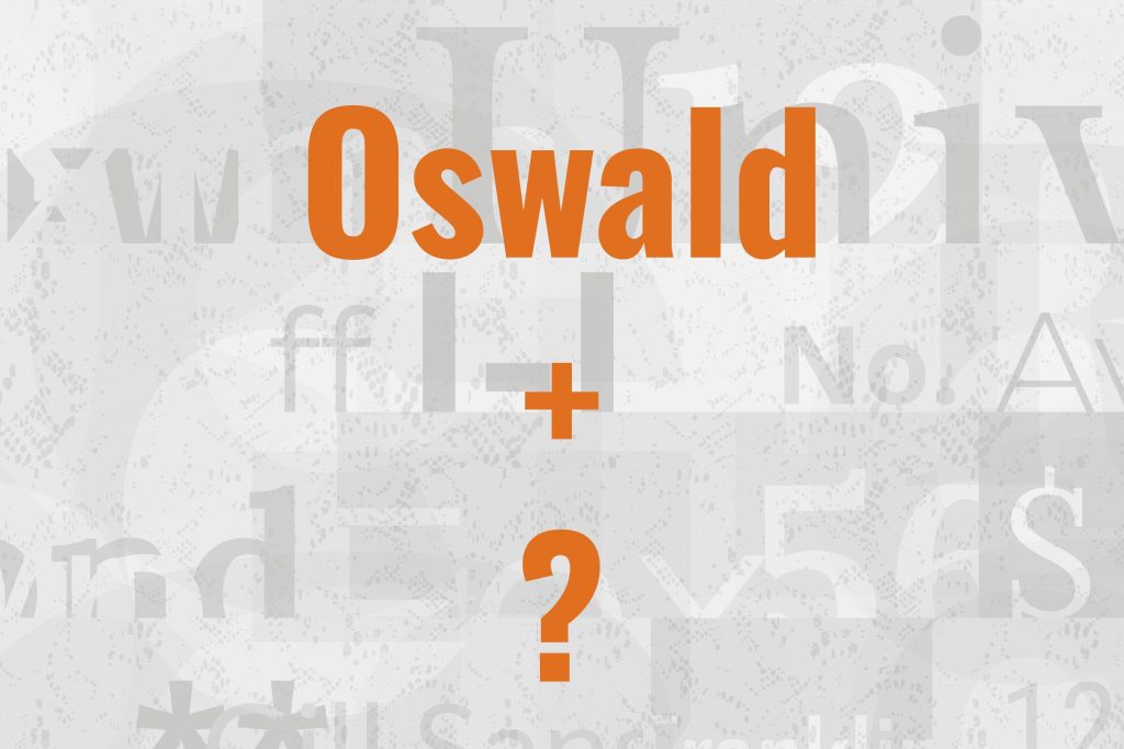
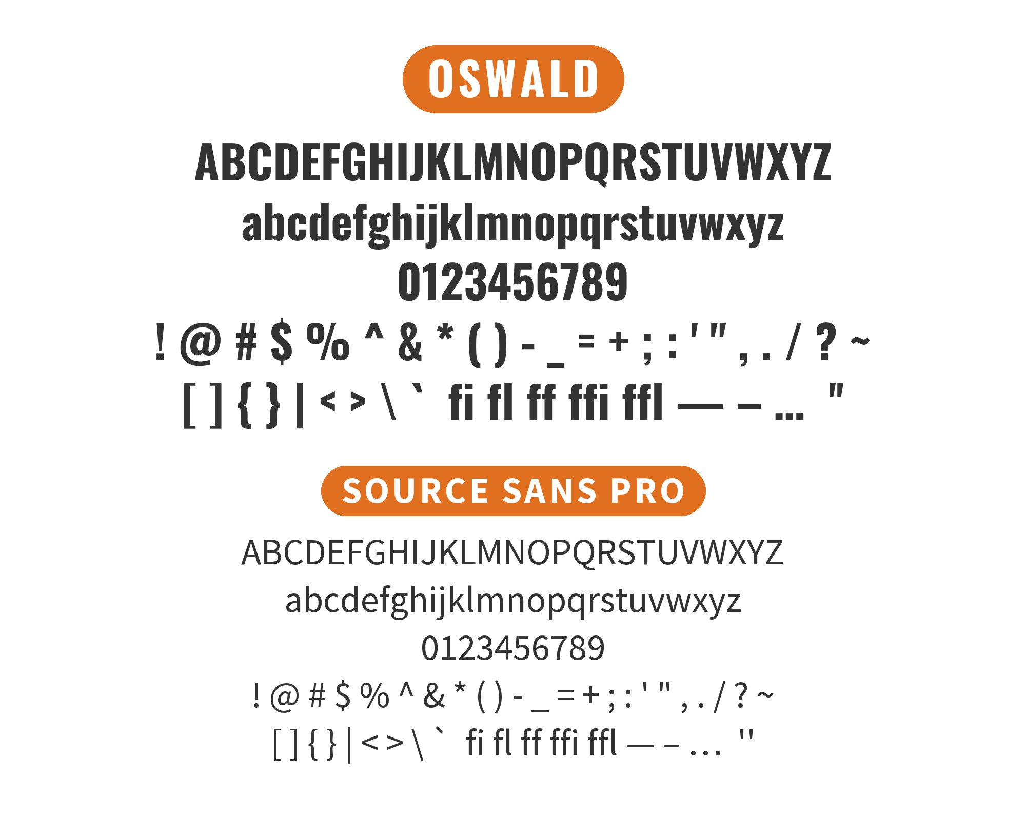
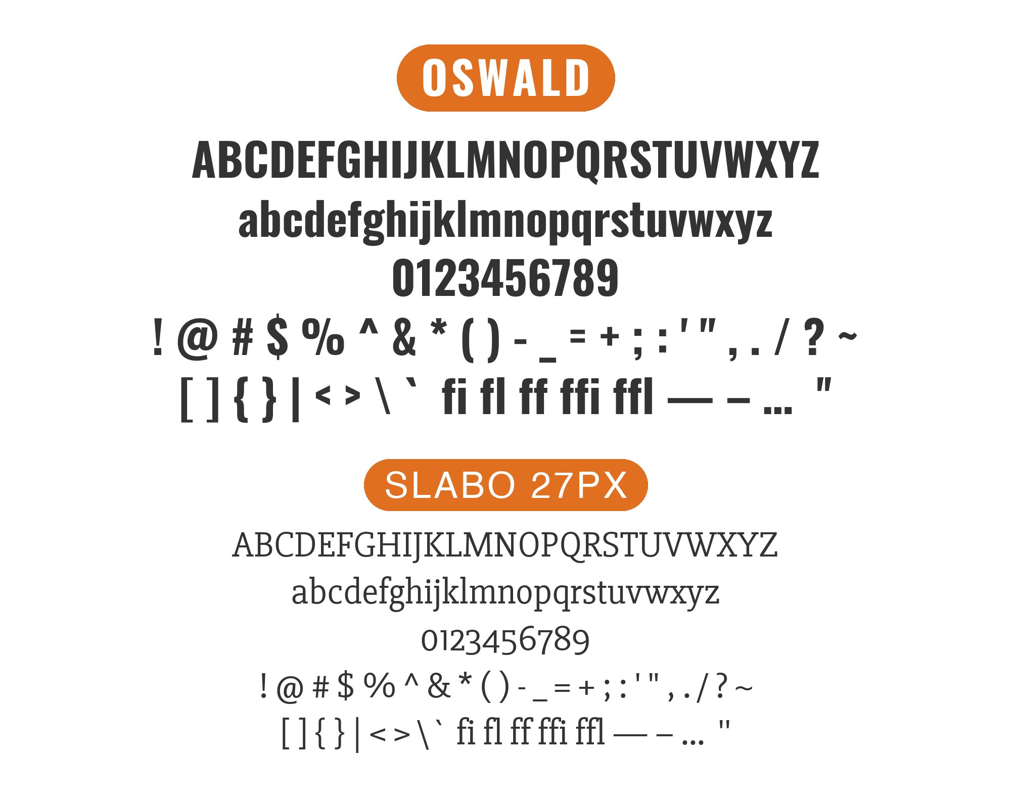
What fonts go with Oswald? This bold condensed sans-serif brings high-impact headlines energy that demands equally considered companions for supporting text roles.
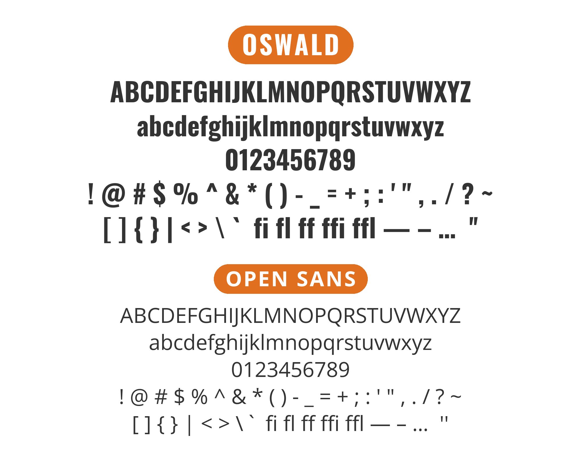
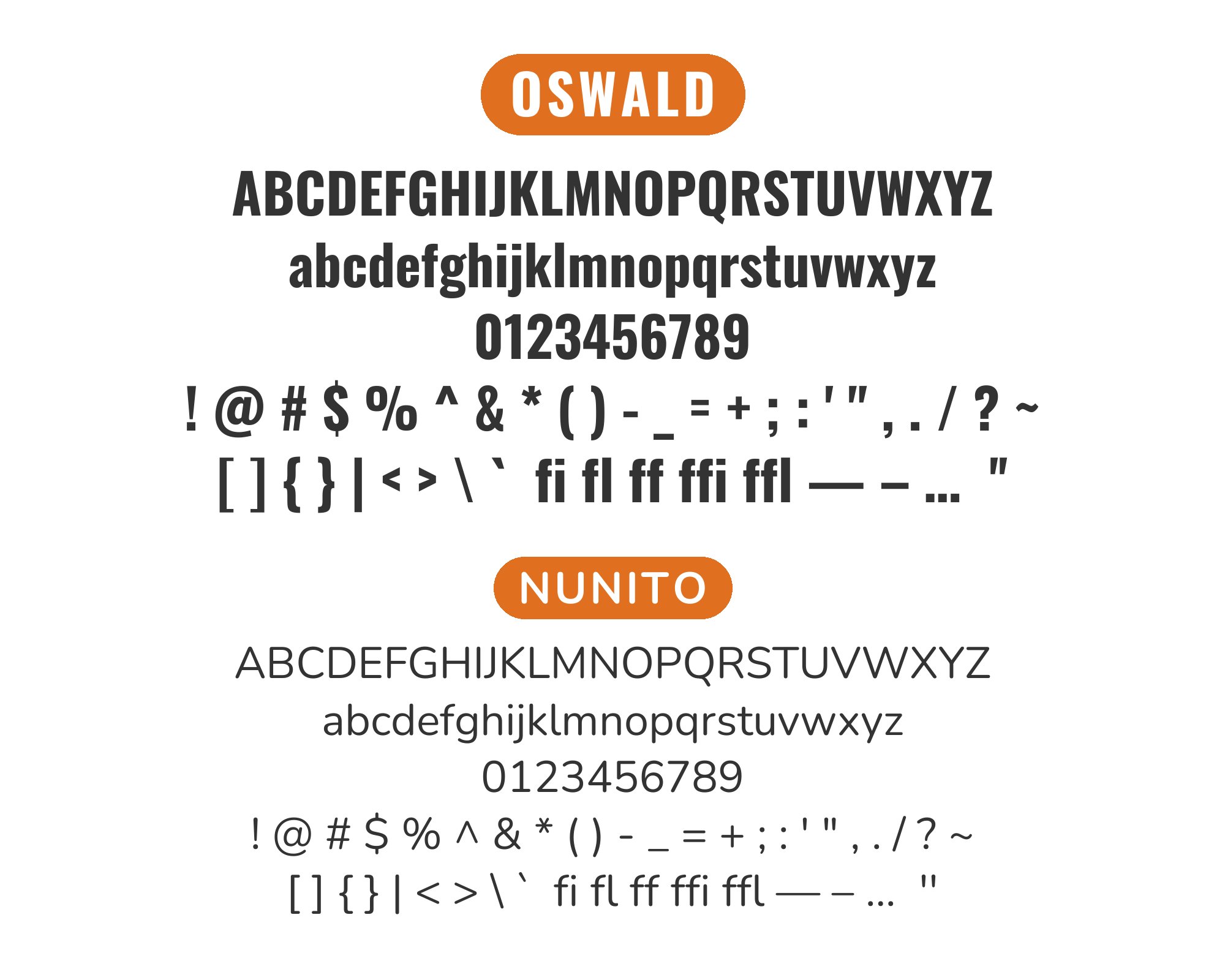
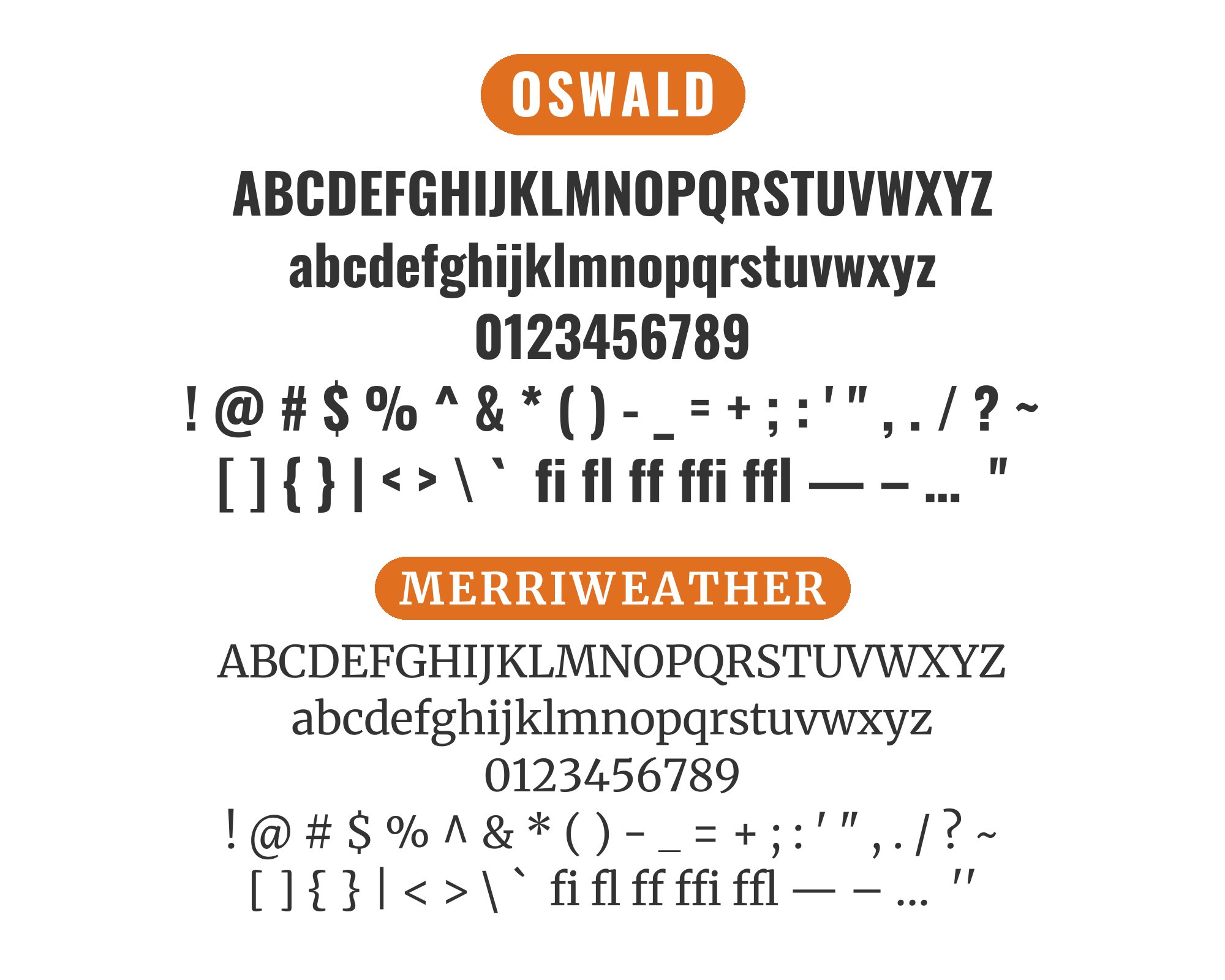
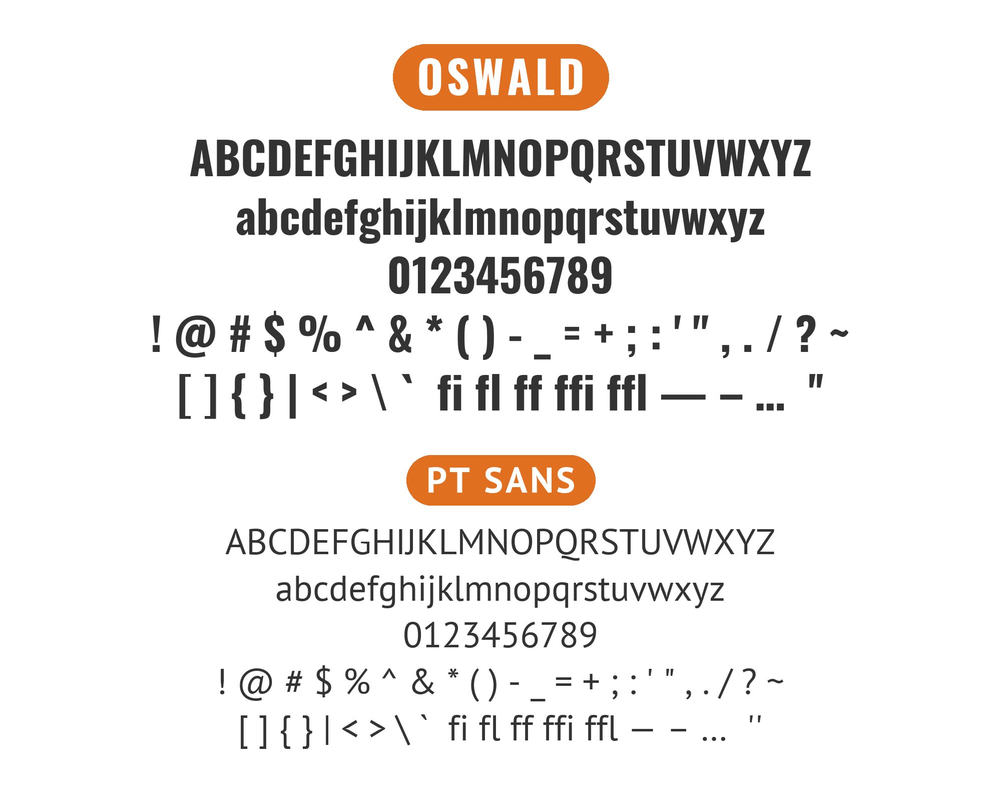
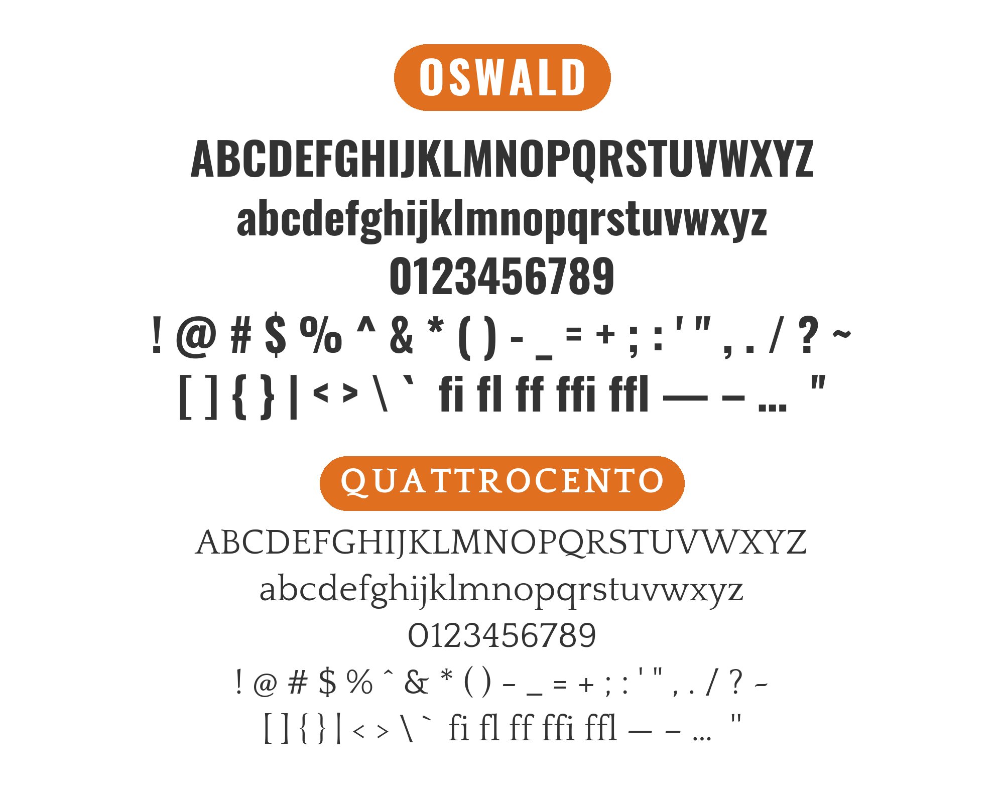
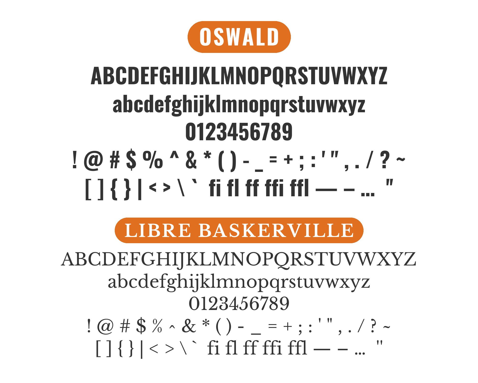
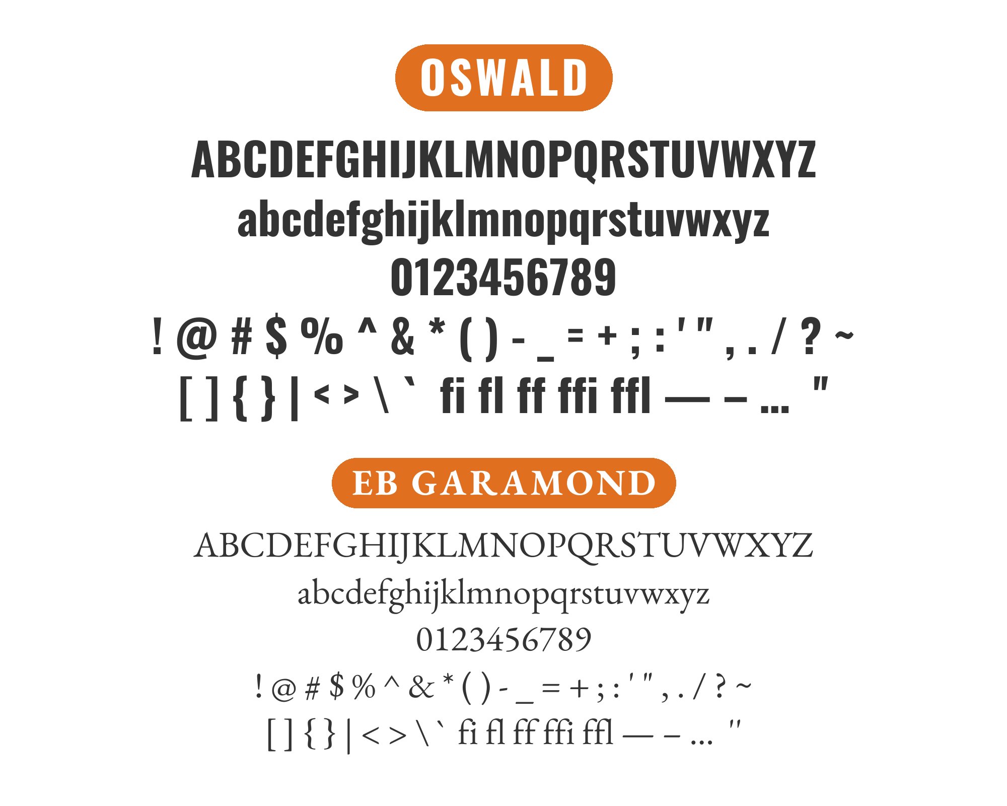
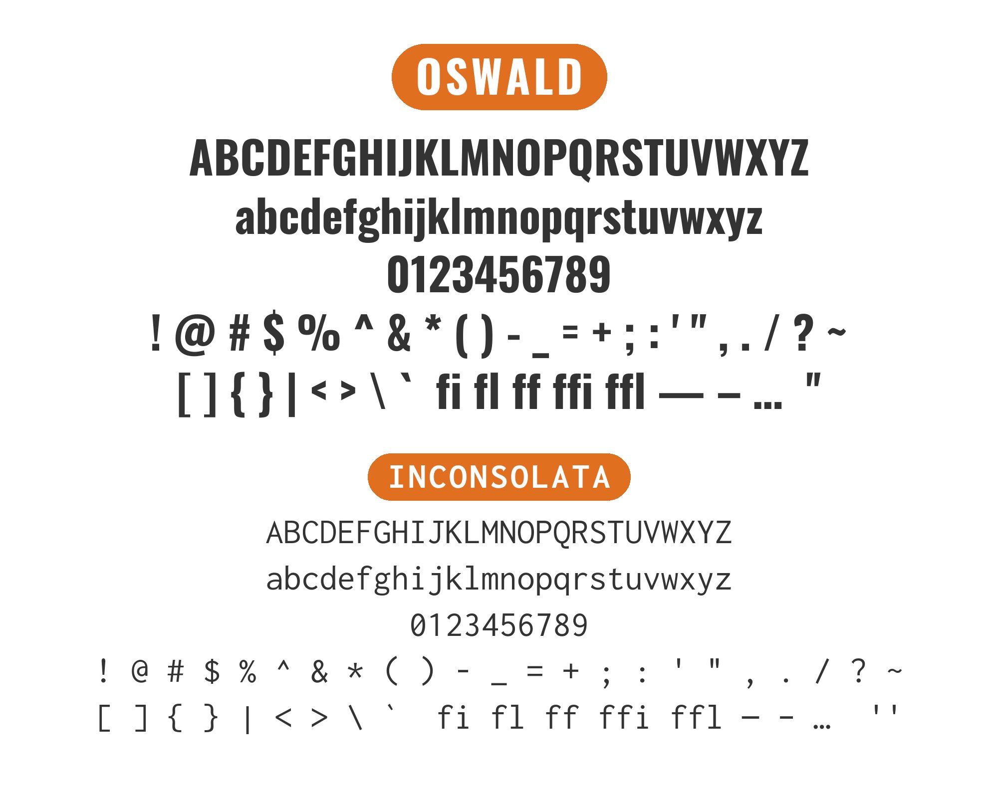
Oswald, designed by Vernon Adams (and later expanded by Kalapi Gajjar and Cyreal), reimagines the classic gothic sans-serif tradition for the web. Its condensed proportions and strong vertical emphasis make it perfect for attention-grabbing headlines that need to fit tight spaces while maintaining presence. The typeface’s even stroke weight and open counters ensure legibility even at large sizes, while its distinctive geometry gives it immediate recognition. Oswald has found particular popularity in news, sports, and entertainment design where its commanding presence fits naturally.
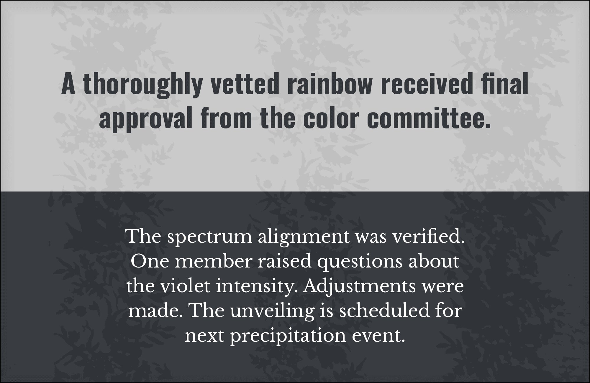
Pairing with Oswald is largely about contrast. Its strong personality overwhelms timid companions, but the right serif or humanist sans can create powerful interplay between impact and readability. The key is finding body text fonts with enough quiet confidence to complement without competing. Here are 15 fonts that pair well with Oswald, each chosen for how they create dynamic tension with this high-impact headline face.
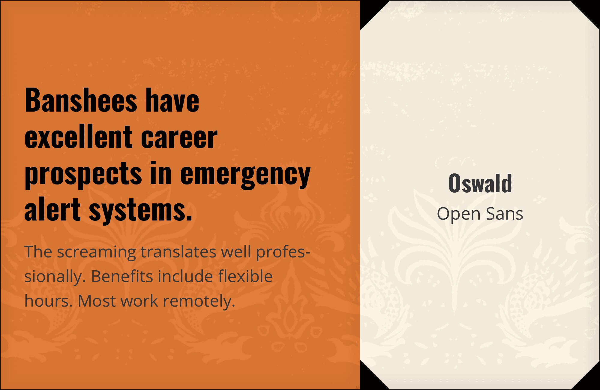
1. Open Sans
Oswald’s condensed verticality towers over Open Sans like a skyscraper beside a comfortable brownstone. The pairing works because Open Sans brings humanist warmth to counter Oswald’s industrial boldness. That generous x-height in Open Sans ensures body text remains effortlessly readable beneath those commanding headlines. Perfect for news sites, sports platforms, or any design that needs to shout headlines while whispering paragraphs. The contrast in width creates natural hierarchy without competing energies.
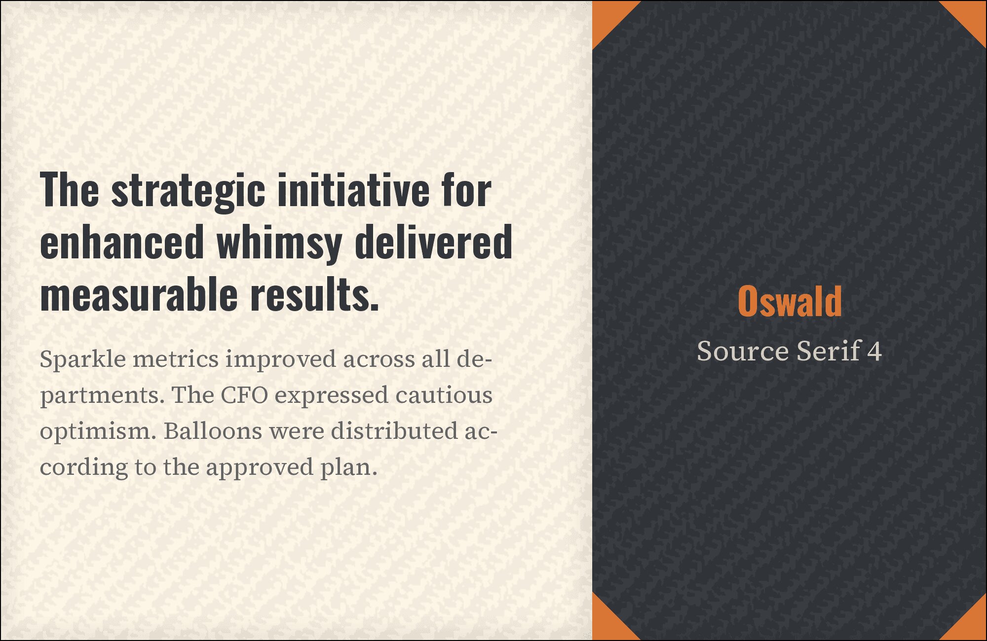
2. Source Serif 4
This pairing is a masterclass in typographic contrast. Oswald’s compressed letterforms snap with headline urgency while Source Serif 4 unfolds gracefully below, its refined bracketed serifs lending scholarly gravitas. The weight differential creates visual rhythm that guides the eye downward. Ideal for editorial layouts, longform journalism, or brand materials that need to balance authority with accessibility. Think newspaper broadsheets reimagined for digital screens.
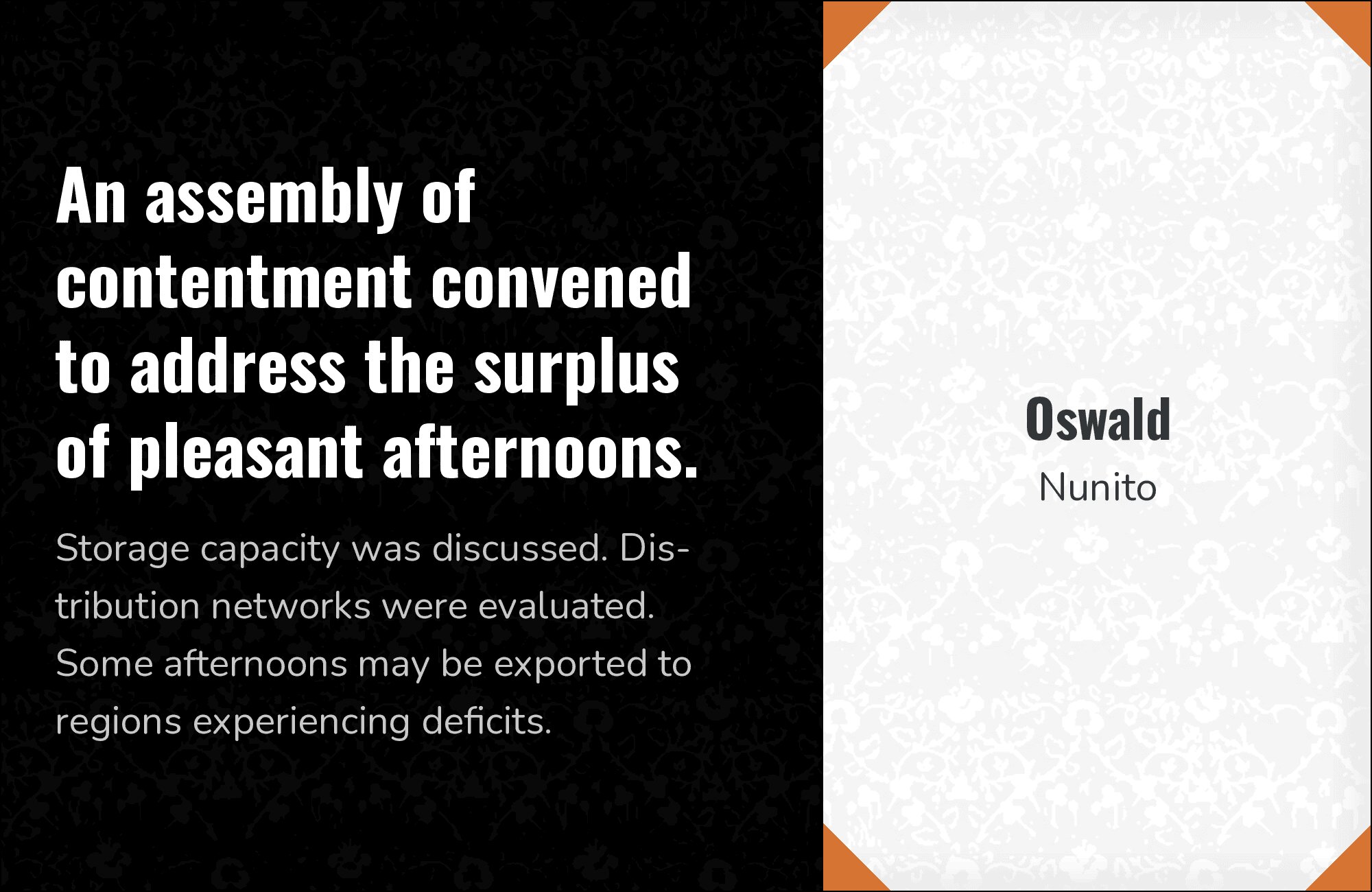
3. Nunito
Nunito‘s rounded terminals act like a diplomatic envoy, softening Oswald’s sharp-edged militancy into something more approachable. The geometric underpinnings of both fonts create subtle kinship, while Nunito’s fuller letterforms provide breathing room beneath those dense headlines. This combination works beautifully for educational platforms, family-oriented brands, or anywhere you need strength without severity. The rounded-meets-angular dynamic keeps things lively without chaos.
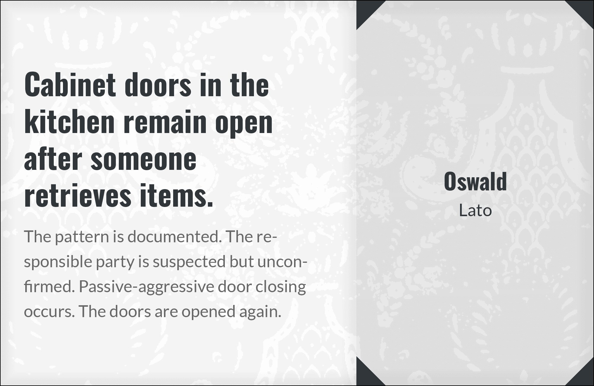
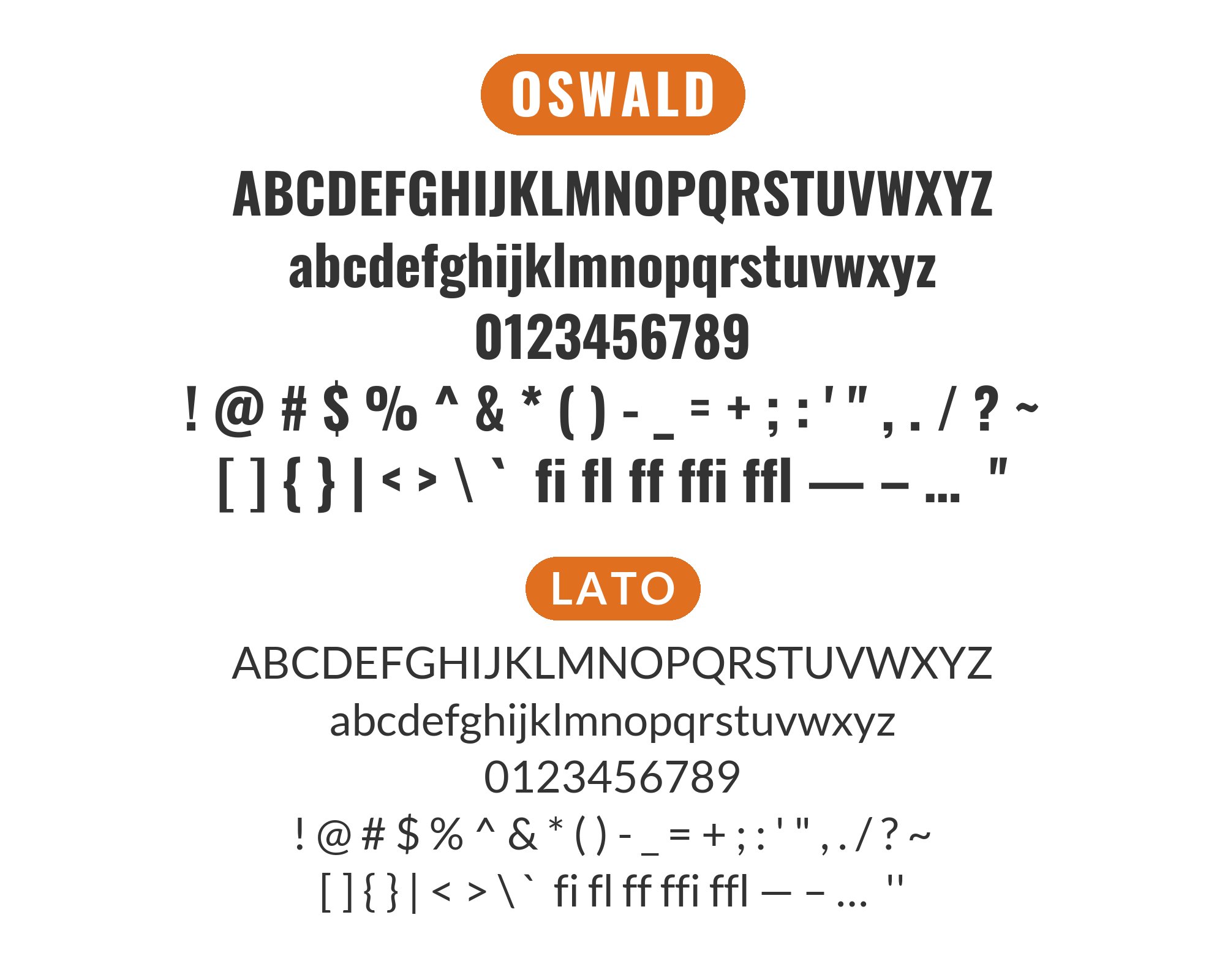
4. Lato
Lato operates as the consummate supporting actor here, its semi-rounded details and stable x-height creating calm beneath Oswald’s typographic thunder. Both fonts share Polish design DNA through Lukasz Dziedzic’s humanist sensibilities meeting Oswald’s Alternate Gothic roots. The pairing reads as confidently corporate without feeling cold. Deploy this for tech startups, portfolio sites, or professional services where approachability matters as much as authority.
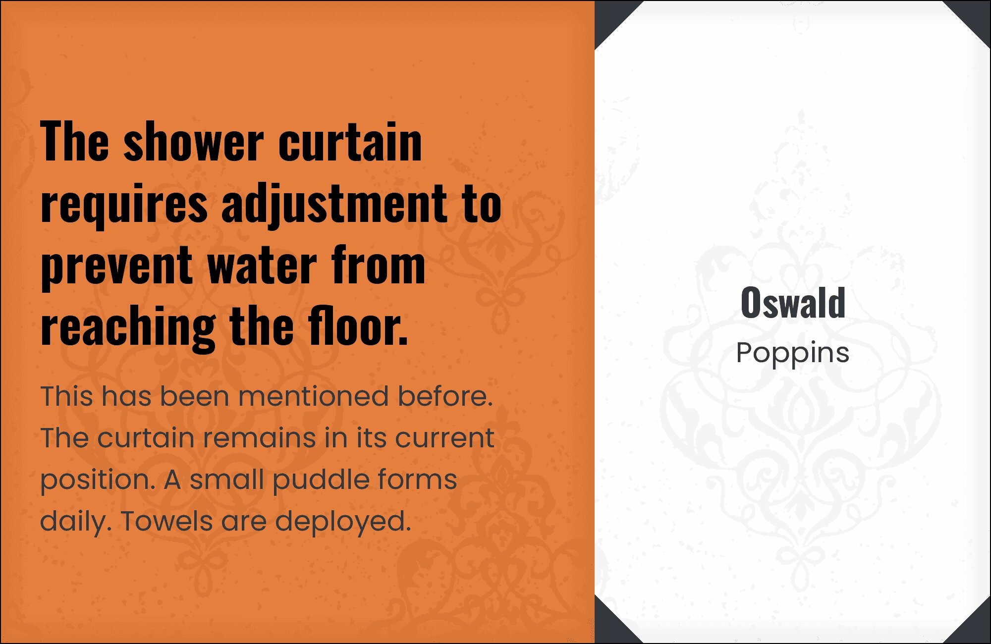
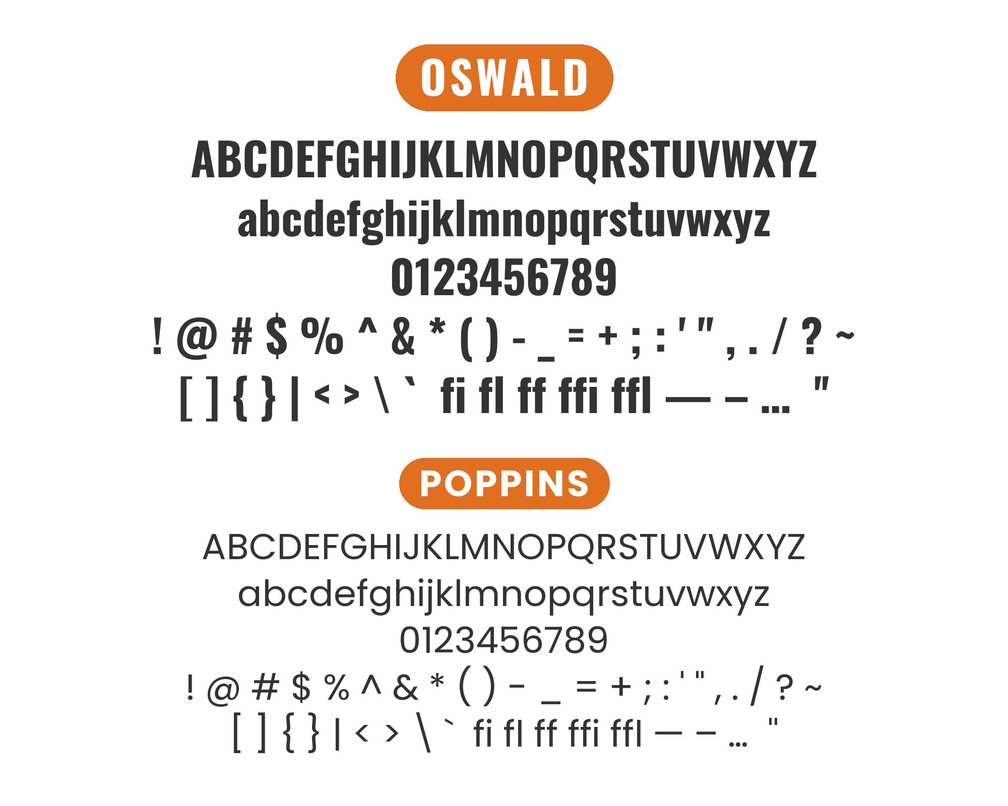
5. Poppins
Geometric collision creates unexpected harmony. Poppins brings perfectly circular counters and even stroke weight that somehow complements Oswald’s narrow, high-contrast letterforms. The tension between Poppins’ playful geometry and Oswald’s serious condensed style generates visual energy without discord. This pairing thrives in modern web applications, creative agency sites, or anywhere contemporary aesthetics need an anchor of typographic weight.
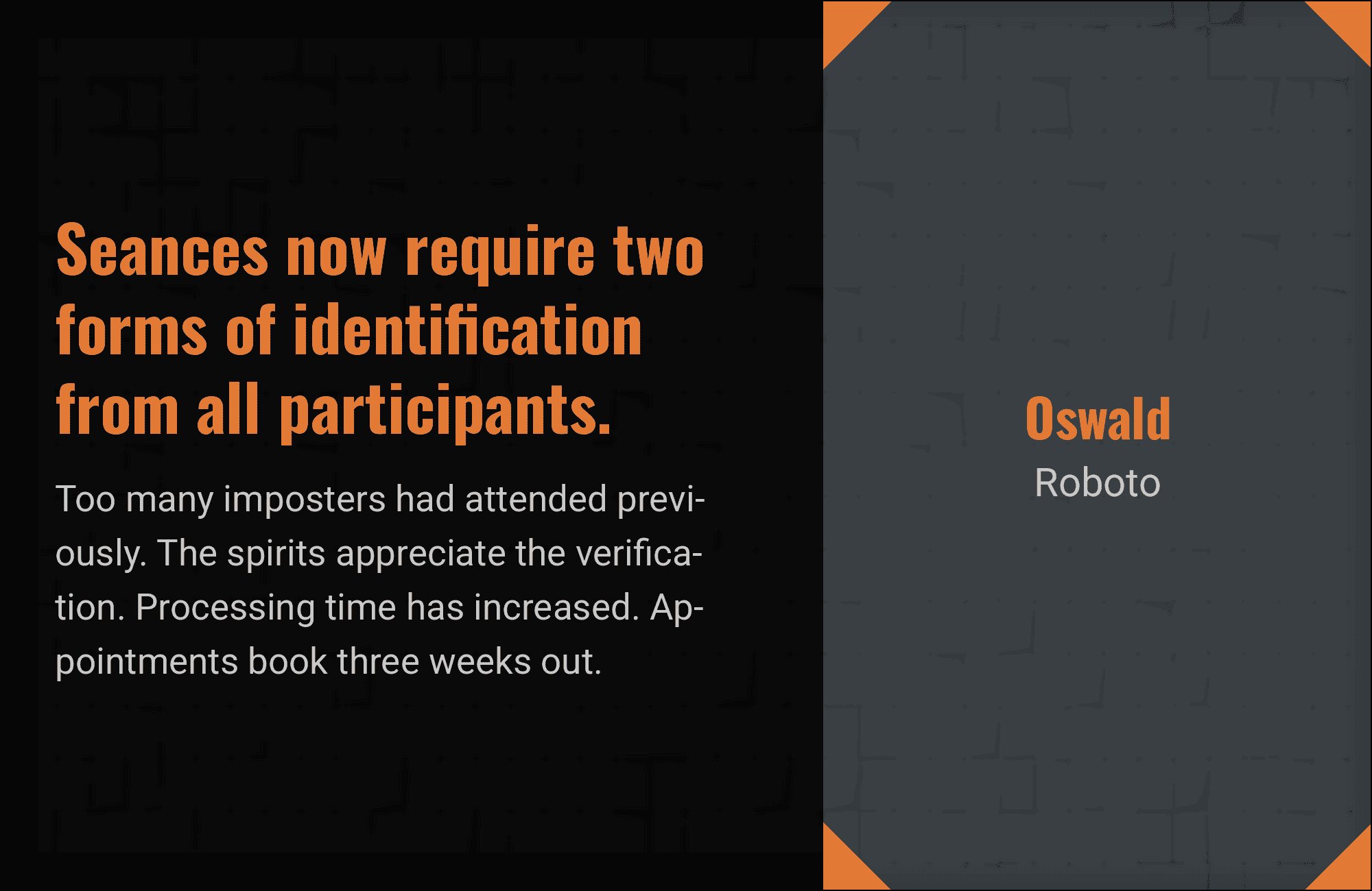
6. Roboto
Google’s workhorse meets headline heavyweight in this reliable pairing. Roboto‘s neutral demeanor and optimized screen rendering make it the perfect foil for Oswald’s bold proclamations. The combination has become something of a modern classic, seen across countless material design implementations and Android interfaces. Use this when you need guaranteed legibility at any size with headlines that command attention without trying too hard.


You'll love this article!
A visual guide for designers.
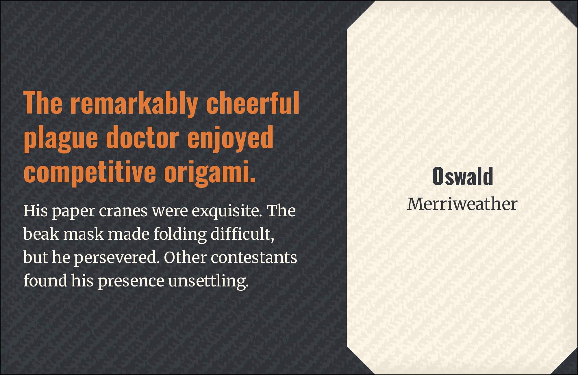
7. Merriweather
Old-world elegance meets new-world efficiency. Merriweather‘s tall x-height and soft serif detailing provide literary warmth beneath Oswald’s industrial headlines. The contrast between condensed sans and expanded serif creates powerful visual hierarchy while maintaining readability across extended text. This pairing excels in blog layouts, book promotion sites, and editorial contexts where the content deserves both impact and intimacy.
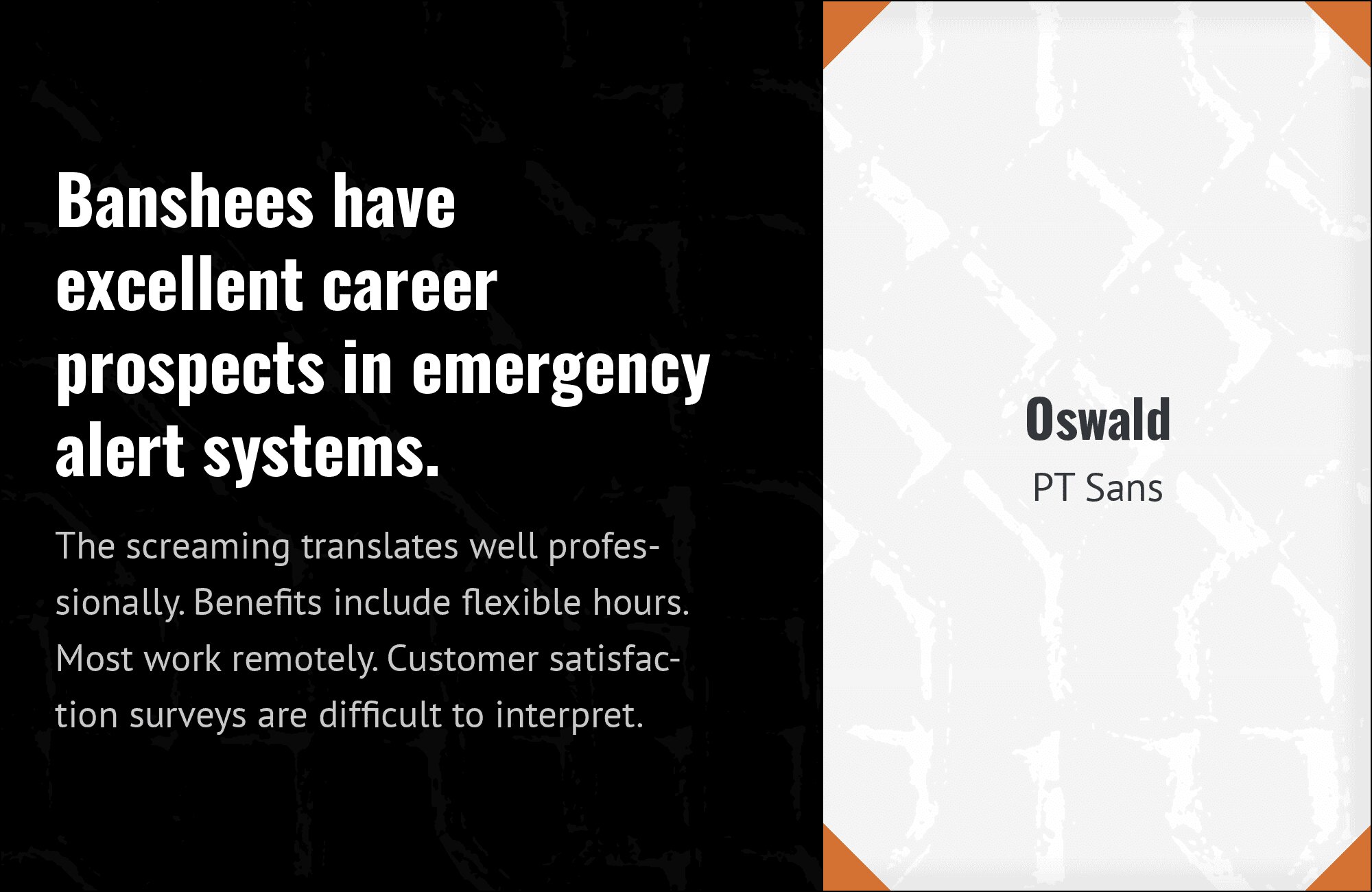
8. PT Sans
Two fonts that understand the assignment: communicate clearly at any weight. PT Sans brings Russian design heritage with its sturdy letterforms and excellent Cyrillic support, while Oswald delivers headline impact rooted in American Gothic tradition. Together they span continents while maintaining consistent typographic tone. Ideal for international brands, news platforms, or any project requiring multilingual support with personality.
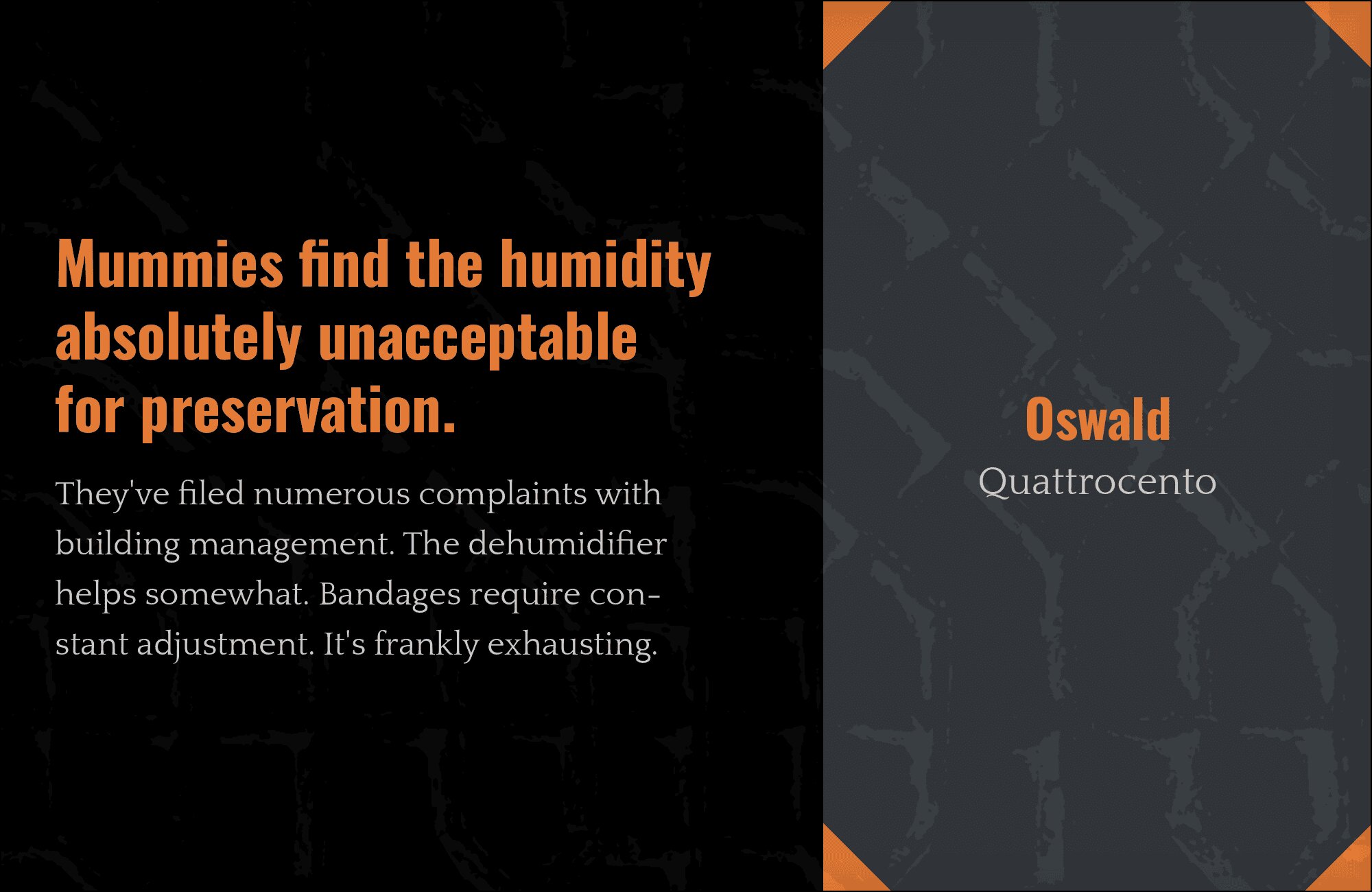
9. Quattrocento
Classical meets contemporary in this unexpected alliance. Quattrocento‘s Renaissance-inspired serifs and calligraphic stroke modulation create sophisticated contrast against Oswald’s modernist compression. The pairing suggests a cultural institution that knows its history but lives in the present. Perfect for museum websites, architectural firms, or luxury brands that want heritage without stuffiness.
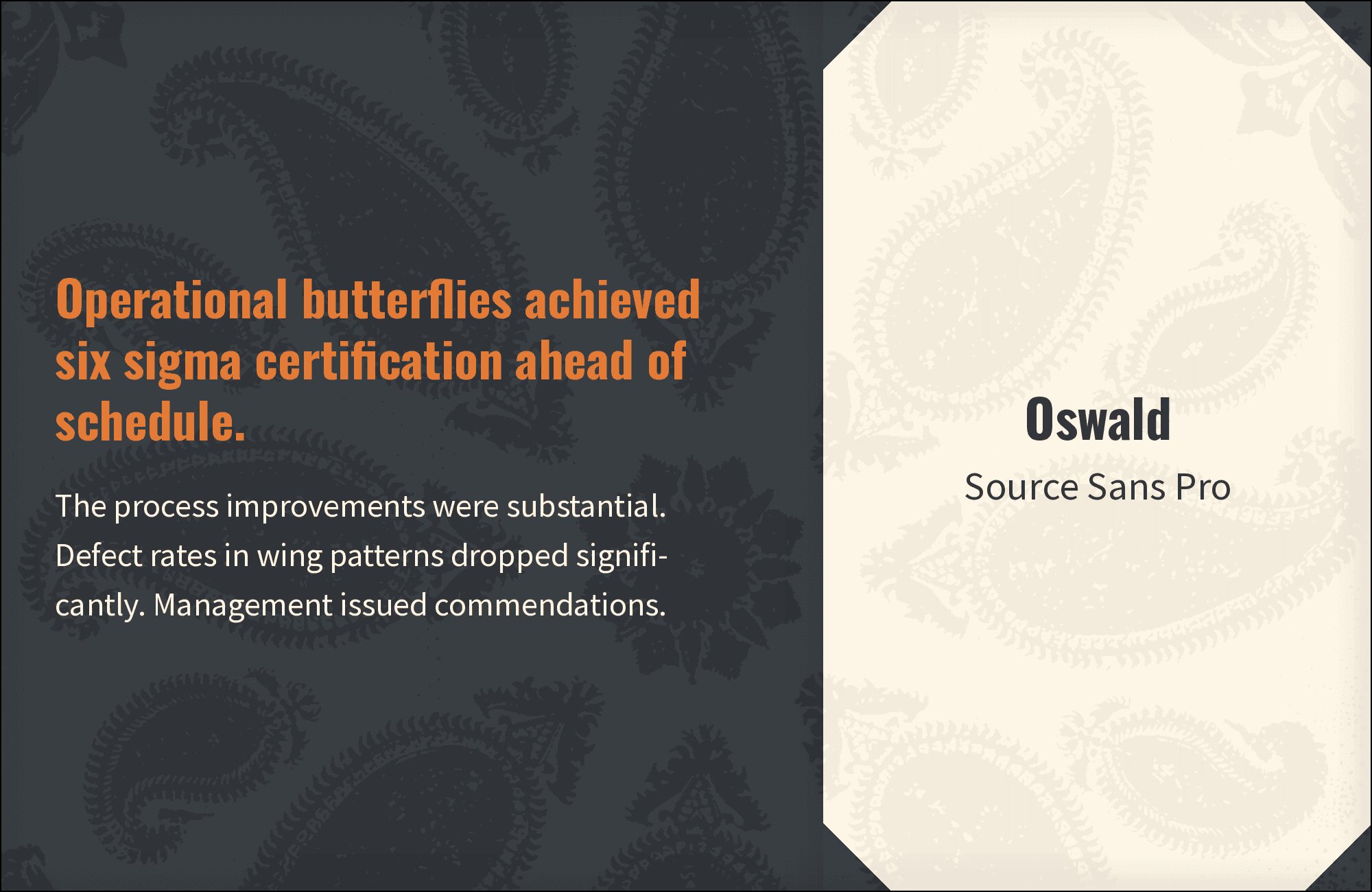
10. Source Sans Pro
Adobe’s humanist workhorse provides stable ground for Oswald’s bold declarations. Source Sans Pro‘s friendly letterforms and exceptional hinting ensure crisp body text at any size, while its neutral character never competes with Oswald’s dominant headlines. This combination serves UI-heavy applications, documentation sites, and dashboard interfaces where clarity trumps personality but headlines still need punch.
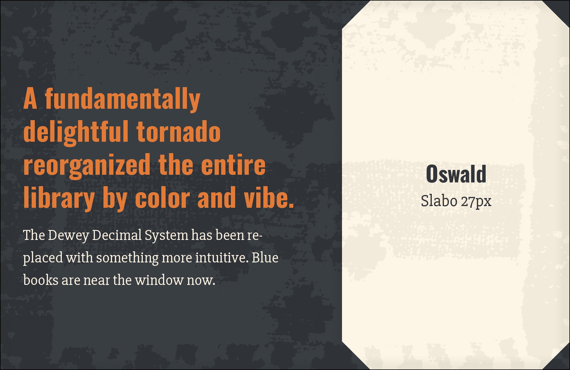
11. Slabo 27px
Slab serif swagger meets condensed sans power. Slabo‘s sturdy rectangular serifs create visual weight that echoes Oswald’s boldness while offering textural contrast. The chunky, confident personality of both fonts creates a cohesive voice with enough variation to establish hierarchy. This pairing works for craft breweries, construction companies, or any brand that wants to project solidity and strength.
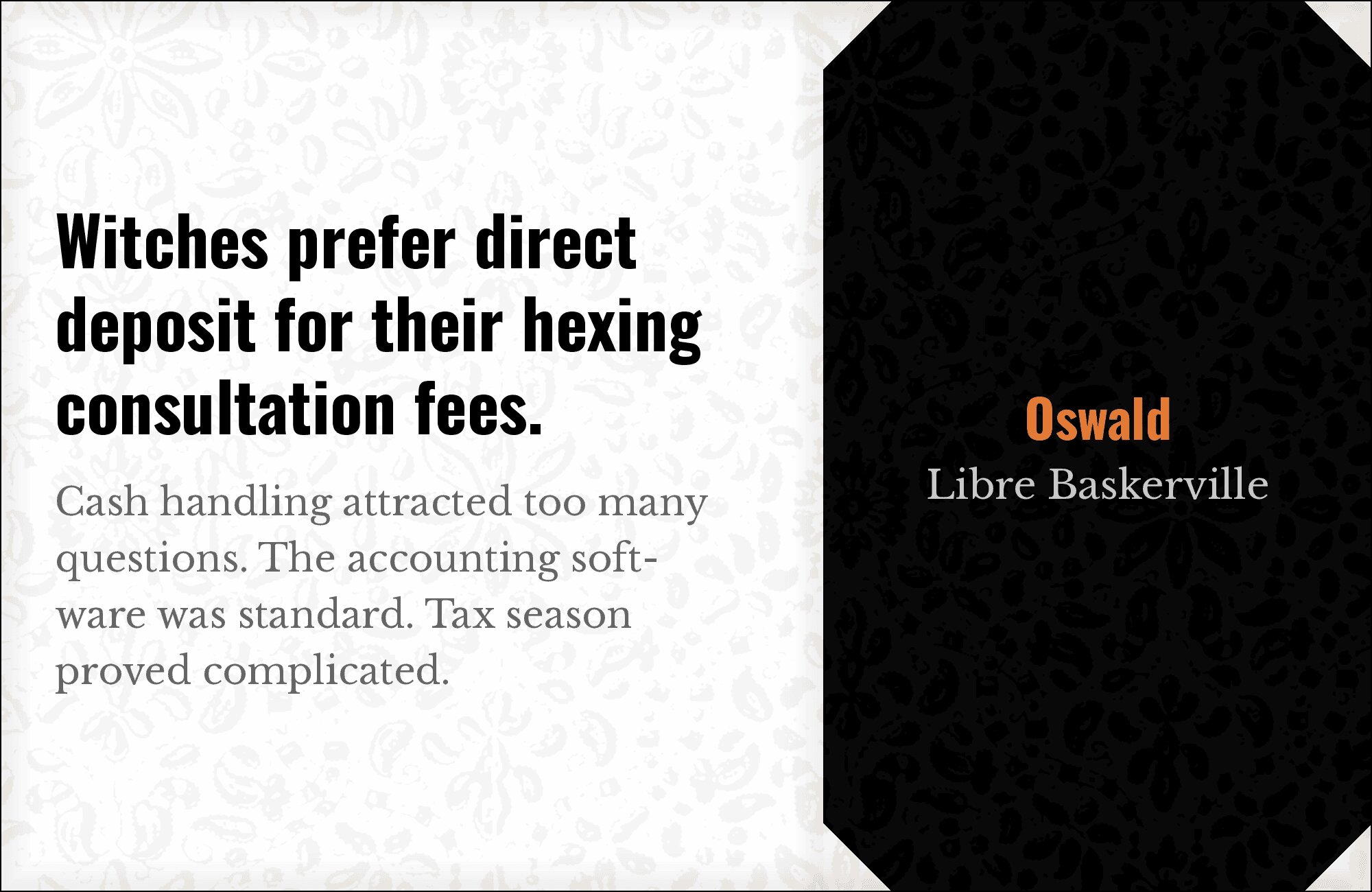
12. Libre Baskerville
Eighteenth-century elegance anchors twenty-first-century headlines. Libre Baskerville‘s refined stroke contrast and classical proportions bring dignified presence to body text, while Oswald punches through with contemporary urgency above. The historical distance between these designs creates dynamic tension that reads as sophisticated rather than conflicted. Deploy for law firms, publishers, or prestige brands.
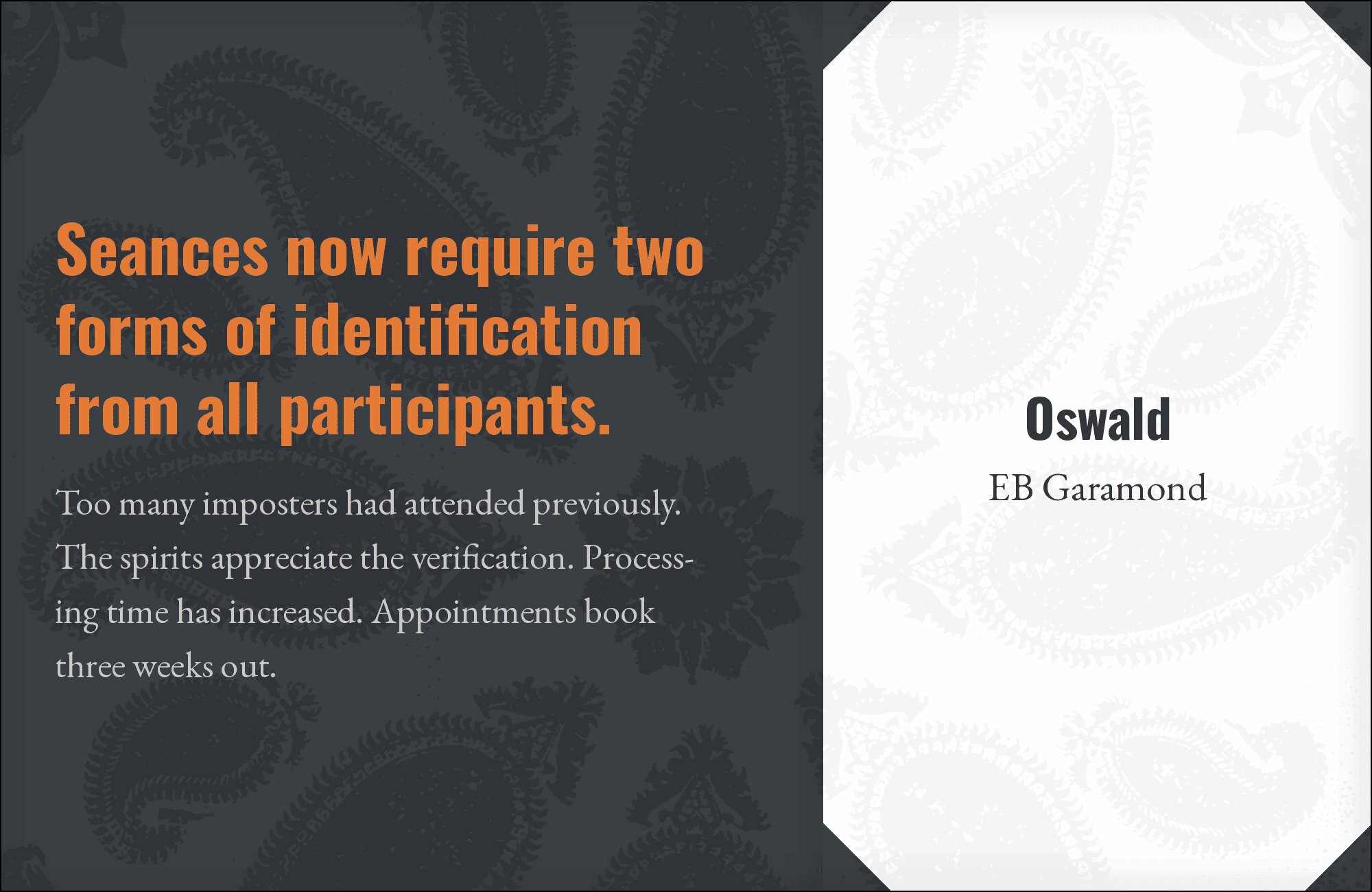
13. EB Garamond
Claude Garamont’s sixteenth-century masterpiece finds an unlikely partner in Oswald’s condensed modernity. EB Garamond‘s delicate serifs and old-style figures create intimate reading experiences beneath bold contemporary headlines. The extreme temporal contrast actually unifies through shared emphasis on vertical stress. Perfect for literary magazines, academic journals, or cultural commentary that bridges eras.
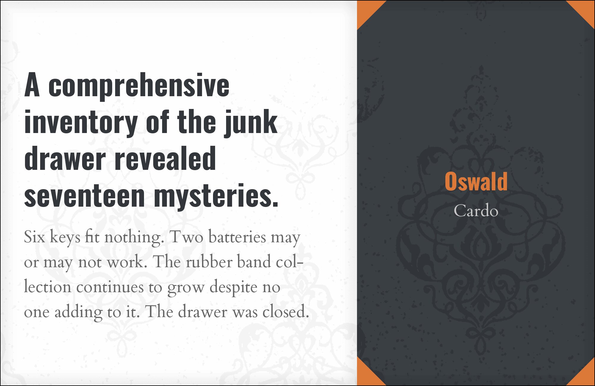
14. Cardo
Scholarly precision meets headline efficiency. Cardo was designed for classicists and medievalists, bringing expert-level character support and subtle typographic refinement. Paired with Oswald’s straightforward boldness, it creates an academic aesthetic that remains accessible. Ideal for university websites, research publications, or educational platforms where authority must coexist with modern usability.
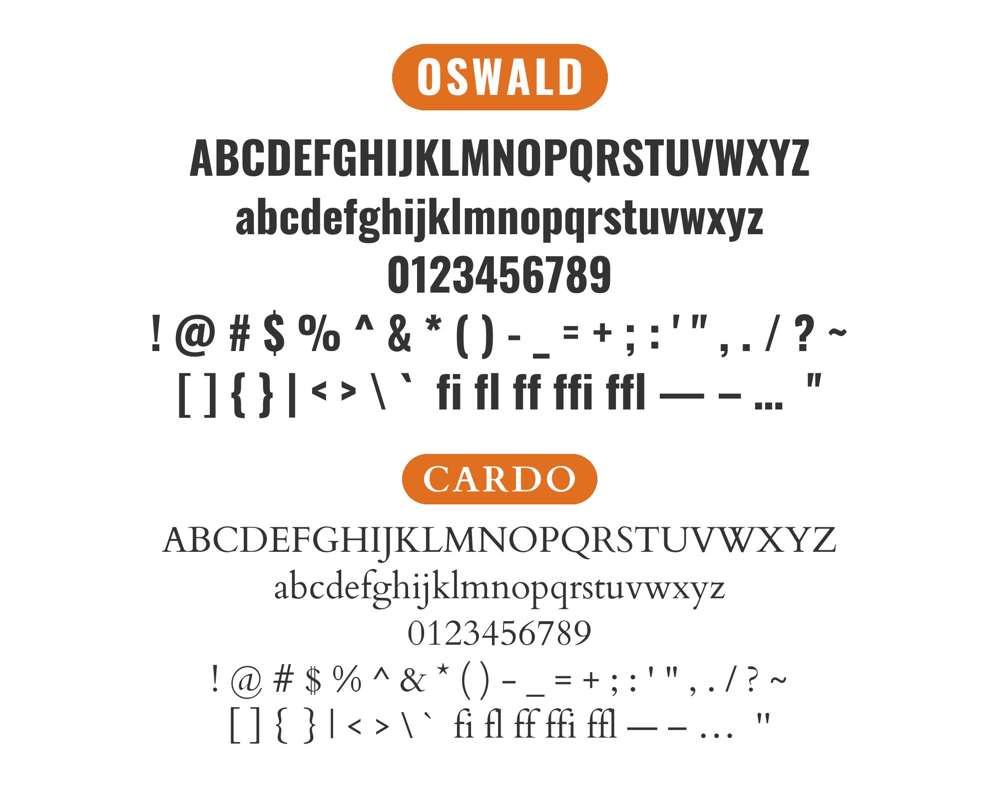
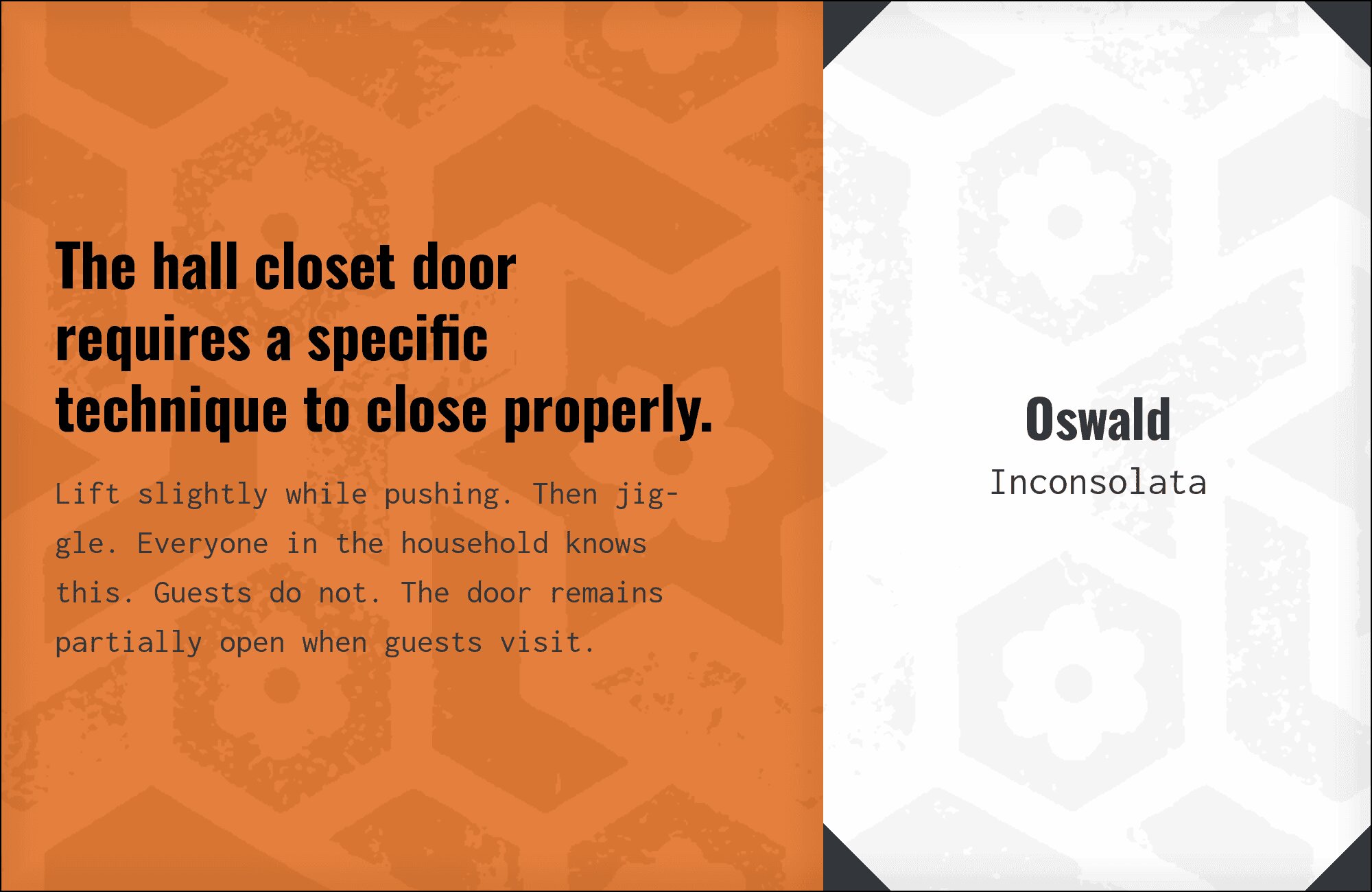
15. Inconsolata
Monospace meets condensed sans in this surprisingly effective technical pairing. Inconsolata‘s even letterforms and programming-friendly design bring systematic clarity to code blocks and technical content, while Oswald provides punchy section headers. The combination suggests efficiency and precision. Perfect for developer documentation, tech blogs, or any context where code and prose must coexist elegantly.
Conclusion
There are no absolute rules for font pairing, just principles to guide you. The key is contrast—in weight, in style (serif vs. sans-serif), or in personality. Oswald is versatile enough to play well with many different typefaces.
Trust your eye, experiment freely, and remember that the best pairing is the one that serves your content and audience. Typography should enhance communication, not complicate it.