BonFX

Typography & Graphic Design Blog

  • Blog
  • Books
    • The Preposterously Huge Book of Google Font Combinations
    • The Big Book of Font Combinations (Classic Fonts Edition)
  • Gallery
    • Monster Alphabet
    • Pen and Ink Cartoons
    • The Algorithm FX
  • Services
  • About
  • Contact
You are here: Home / Graphic Design / What Fonts Go With Karla?

The BonFX Letter

One good pairing.
Every Tuesday.

2-minute read · free

This week — no. 14

Quiet authority

Merriweather sets the tone in one line. Lato stays out of the way and lets it.

MERRIWEATHER 700  +  LATO 400

A font specimen, a pairing that works, and one line on why it works. That is the whole email.

Free. One click to unsubscribe. No sharing, ever.

What Fonts Go With Karla?

What Fonts Go With Karla?

August 3, 2026 by Douglas Bonneville

Karla pairs great with Spectral, Francois One and Inconsolata. All 15 pairings are shown below in real rendered specimens, with the reason each one works. Every pairing below is checked against 6 published typography sources.

What fonts go with Karla? This friendly grotesque brings a distinctive quirkiness that calls for pairings equally comfortable with personality over polish.

Karla, designed by Jonny Pinhorn for Google Fonts, takes the traditional grotesque genre and infuses it with warmth and character. Its slightly condensed proportions and angular terminals give it an almost handmade quality, while maintaining enough geometric consistency to work as a functional workhorse. The font’s personality shows through in details like its distinctive lowercase ‘g’ and the subtle irregularities that keep text from feeling sterile. Originally released in Regular and Bold, its expansion to a variable font with italic styles has made it even more versatile.

Pairing Karla means embracing rather than fighting its character. Overly formal serifs can feel at odds with its approachable nature, while generic sans-serifs miss the opportunity to build on its personality. The best companions either share its humanist warmth or provide classical contrast that makes Karla’s friendliness shine brighter. Here are 15 fonts that pair well with Karla, selected for their ability to create harmonious or meaningfully contrasting relationships.

Font Pairings for Karla

  1. Spectral
  2. Francois One
  3. Inconsolata
  4. Lora
  5. Merriweather
  6. Playfair Display
  7. Libre Baskerville
  8. Open Sans
  9. Source Sans Pro
  10. PT Serif
  11. Crimson Text
  12. Cardo
  13. EB Garamond
  14. Roboto
  15. Inter

1. Spectral

Karla paired with Spectral - Style A showing headline and body text

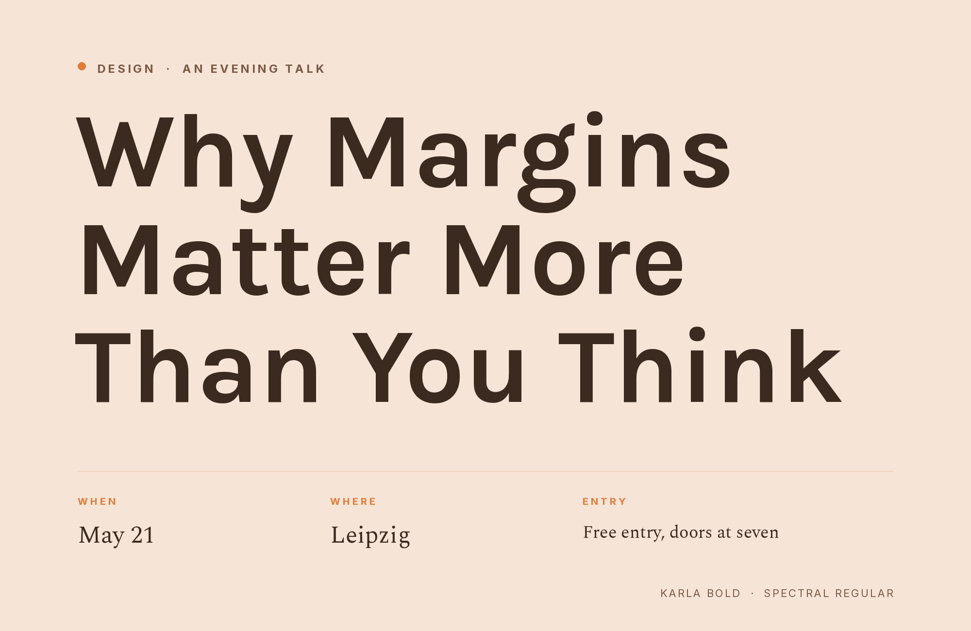
Spectral‘s refined serifs bring crystalline clarity to headlines while Karla’s quirky grotesque forms handle body text with unexpected personality. The serif’s vertical stress and sharp wedge serifs feel almost algorithmic, which paradoxically pairs well with Karla’s hand-drawn irregularities. This combination works for design studios, cultural publications, or tech companies that want to signal creativity. The contrast in temperament creates productive tension.
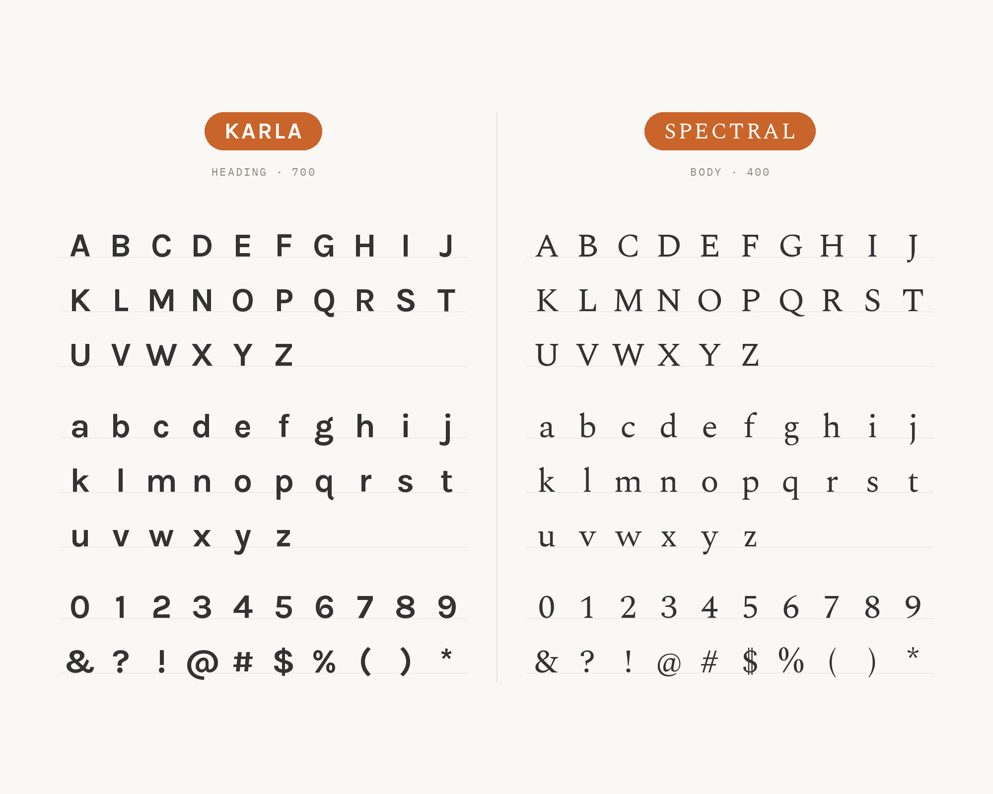
Karla and Spectral - Style B layout Character specimen showing Karla and Spectral alphabets

2. Francois One

Karla paired with Francois One - Style A showing headline and body text

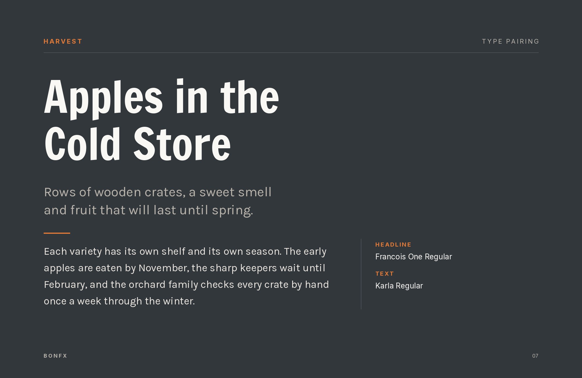
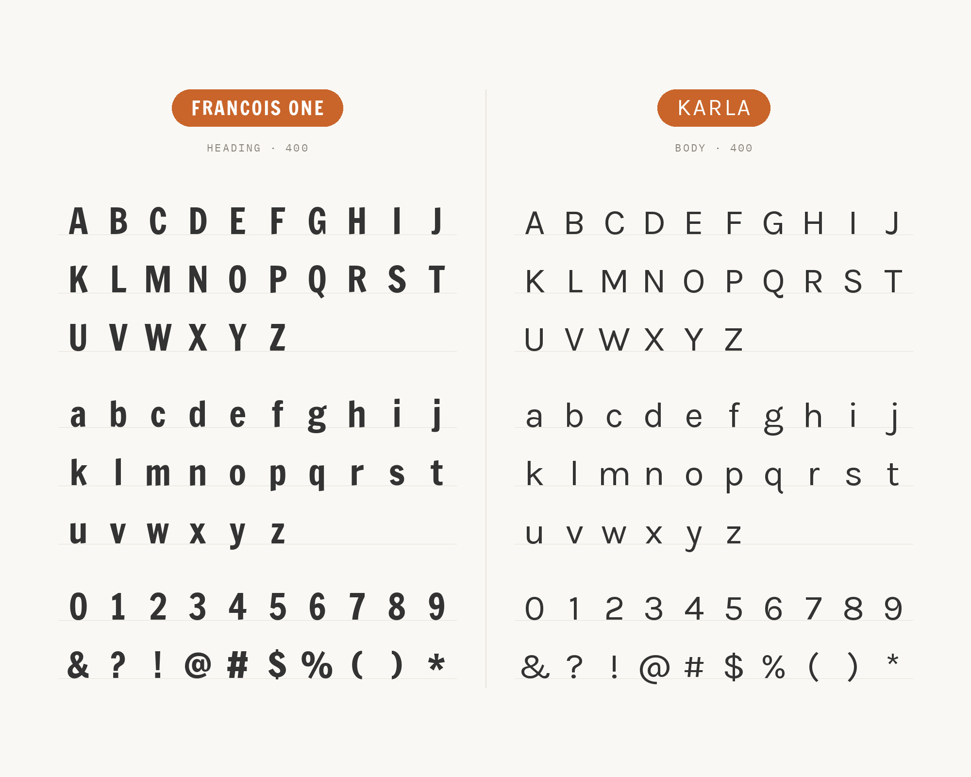
Francois One‘s all-caps construction and condensed proportions demand attention at headline sizes. Below, Karla’s lowercase forms bring friendly approachability that balances the shouting. This pairing works for music venues, event promotion, or entertainment brands. The dramatic weight contrast between the bold display and the medium body creates clear hierarchy without competing for attention. Just keep Francois One large, where its proportions sing.

Karla and Francois One - Style B layout Character specimen showing Karla and Francois One alphabets

3. Inconsolata

Karla paired with Inconsolata - Style A showing headline and body text

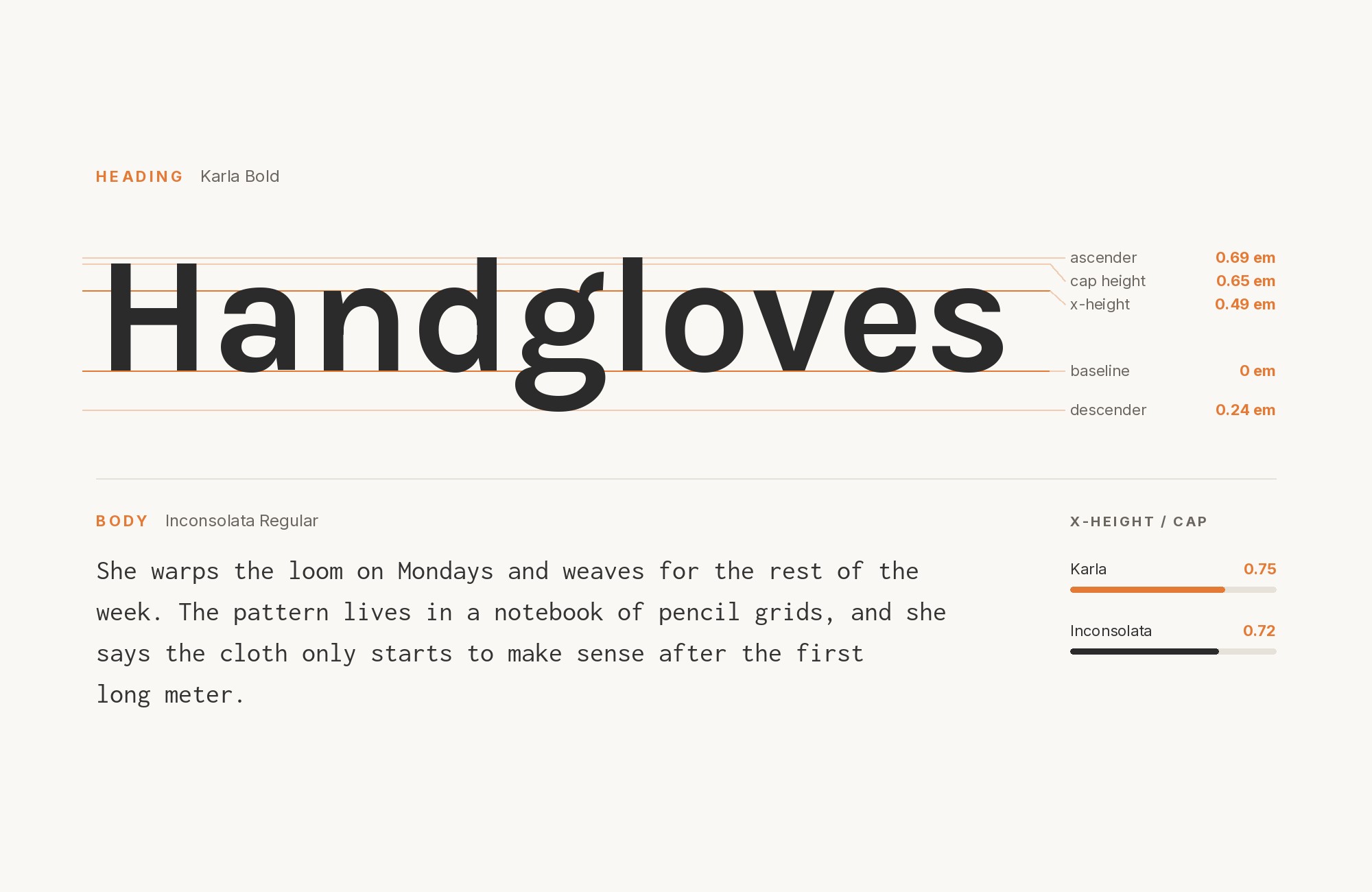
Pairing a grotesque with a monospace shouldn’t work, but here we are. Inconsolata‘s programming-culture associations bring technical credibility, while Karla’s humanist touches prevent things from feeling too sterile. This combination suits developer documentation, coding tutorials, or tech blogs. The fixed-width forms create visual rhythm in code blocks that contrasts pleasantly with Karla’s proportional spacing. Nerdy and functional.
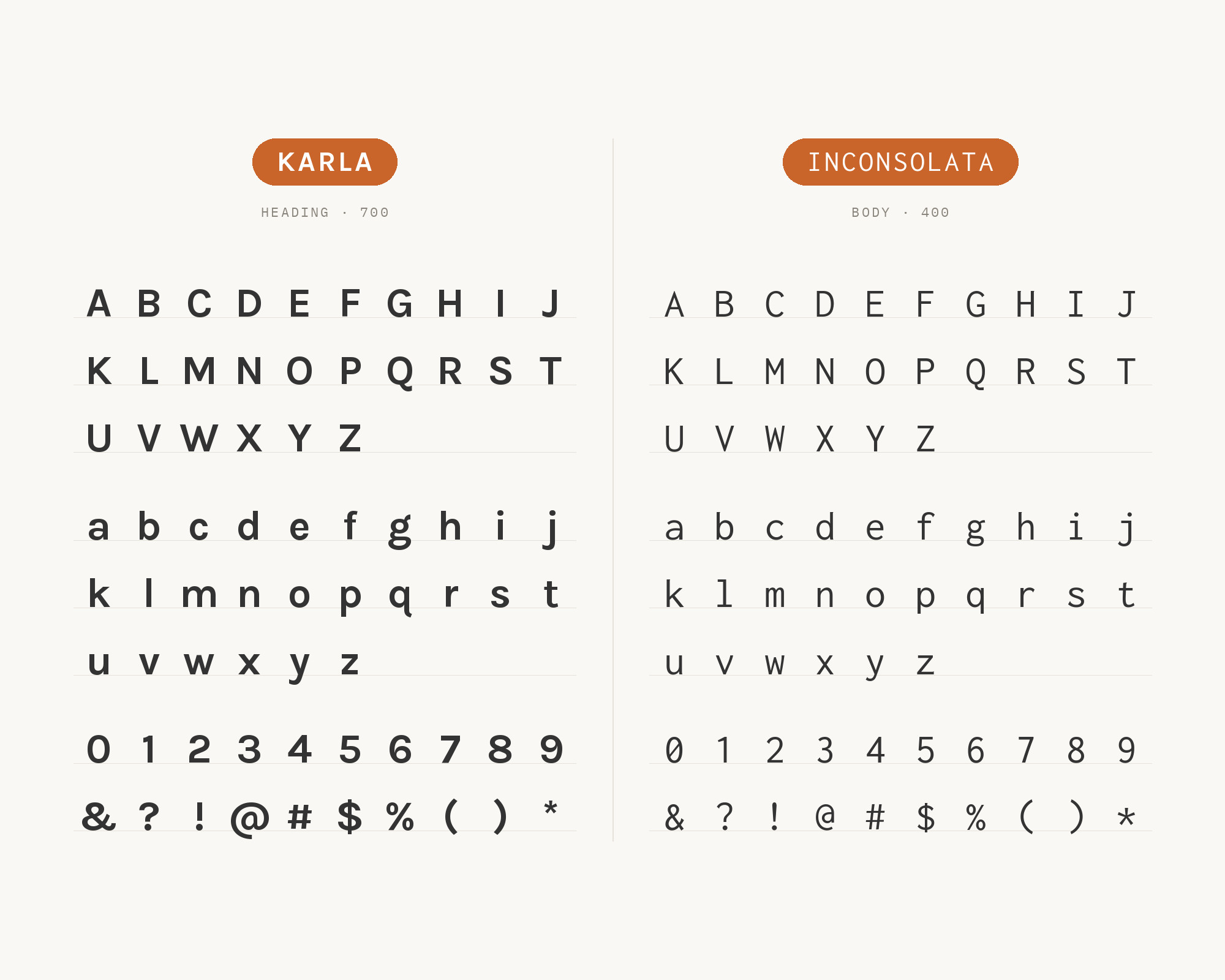
Karla and Inconsolata - Style B layout Character specimen showing Karla and Inconsolata alphabets
What Fonts Go With Karla - the book from BonFX, coming soon

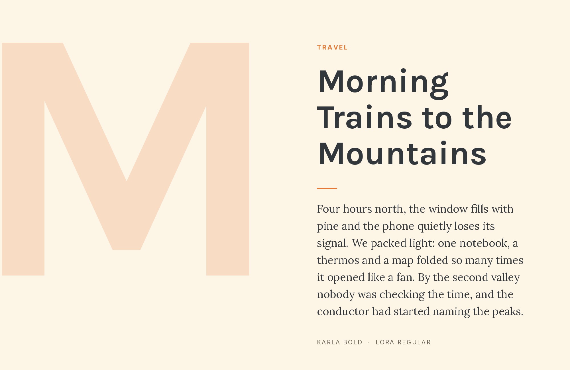
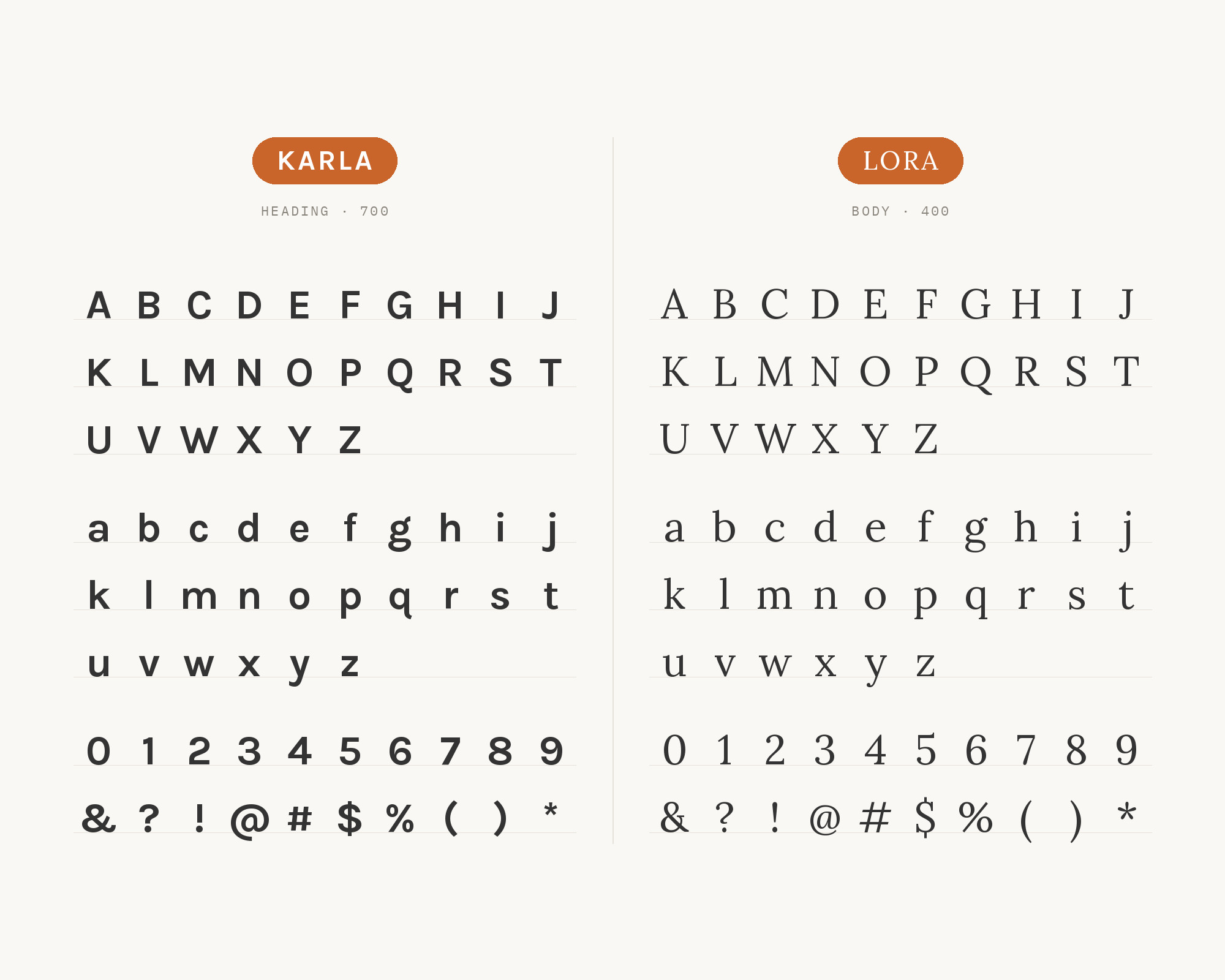
4. Lora

Karla paired with Lora - Style A showing headline and body text

Lora‘s calligraphic DNA shows in its brush-influenced curves and soft serif terminals. As a headline font, it brings warmth that Karla’s body text continues with its own brand of approachability. The combination feels like a well-curated bookshop, inviting but curated. Works for literary magazines, publishing houses, or cultural institutions. Both fonts share generous x-heights, creating comfortable reading rhythm across the hierarchy.

Karla and Lora - Style B layout Character specimen showing Karla and Lora alphabets

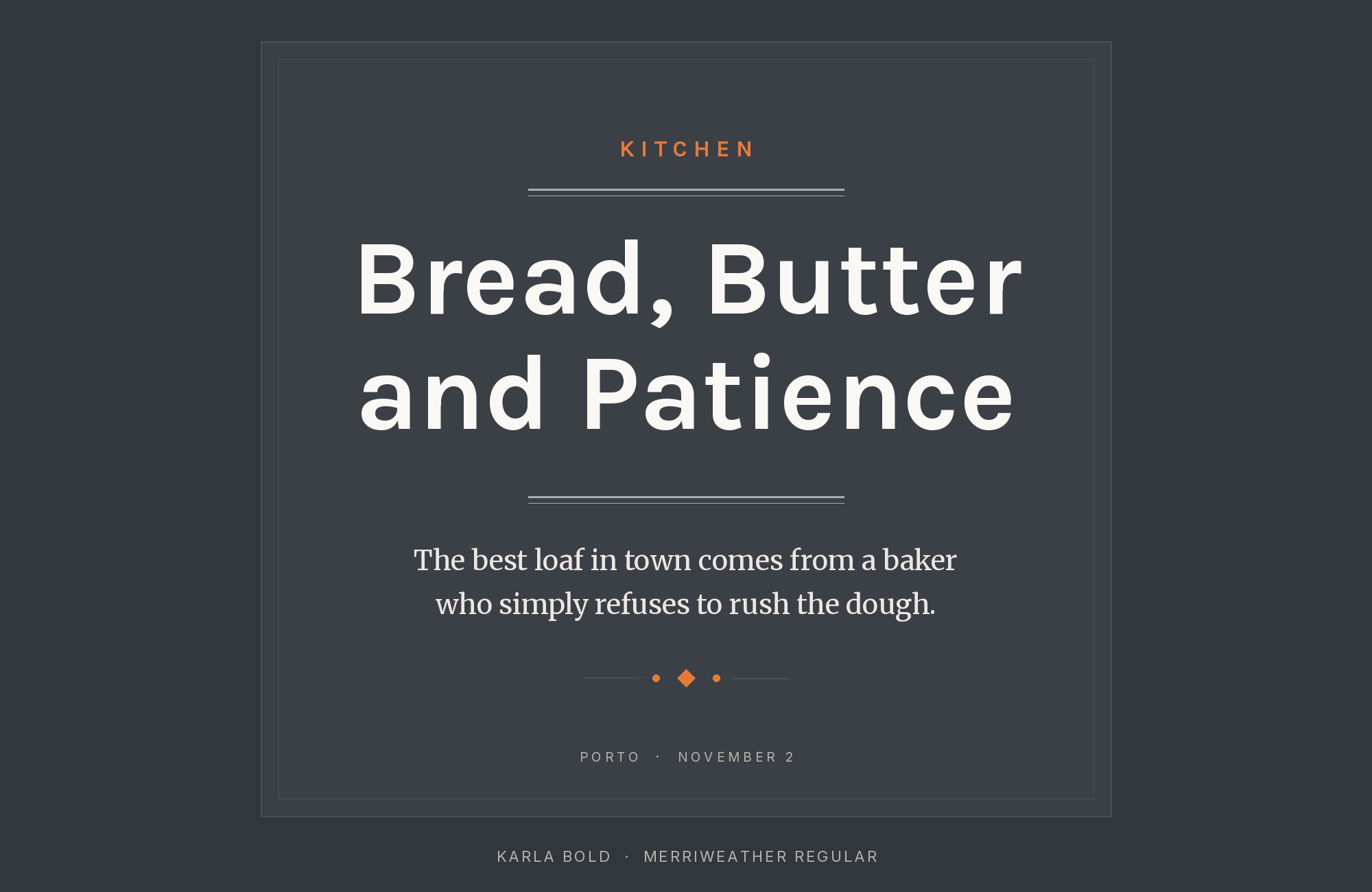
5. Merriweather

Karla paired with Merriweather - Style A showing headline and body text

Merriweather‘s thick serifs and sturdy construction create headlines with real weight and authority. Karla’s slightly offbeat proportions in body text add personality without undermining the seriousness. This pairing suits educational content, nonprofit communications, or journalistic projects. The screen-optimized designs of both fonts ensure crisp rendering across devices. The serif-to-grotesque contrast is classic but feels fresh here.
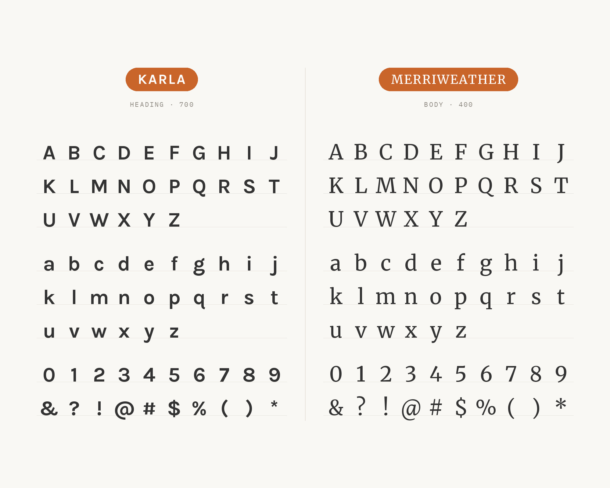
Karla and Merriweather - Style B layout Character specimen showing Karla and Merriweather alphabets

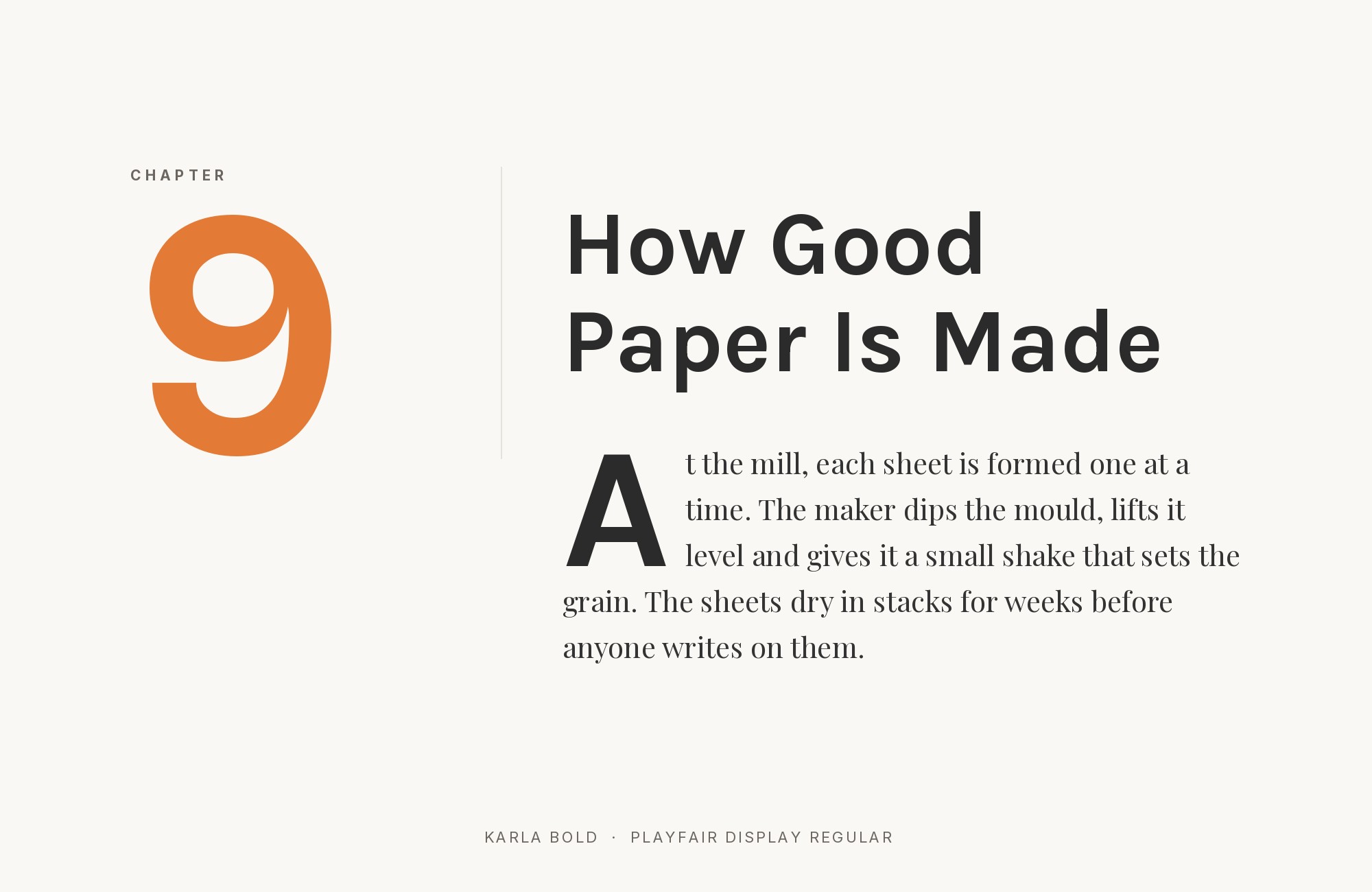
6. Playfair Display

Karla paired with Playfair Display - Style A showing headline and body text

Playfair‘s theatrical contrast and ball terminals create headlines that demand attention like an opera singer hitting a high note. Below, Karla’s understated quirks provide the supporting cast without competing. This high-low combination works for fashion editorials, luxury hospitality, or gallery openings. The dramatic difference in stroke modulation requires careful weight matching to avoid visual whiplash.
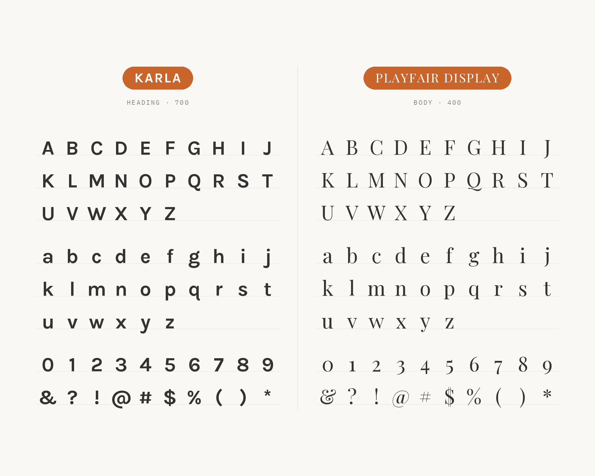
Karla and Playfair Display - Style B layout Character specimen showing Karla and Playfair Display alphabets

Free download

The Typography Primer.
Yours, right now.

Adobe's classic · PDF · free

The Typography Primer — book cover

The guide to type that everyone learned from. Subscribe and it is yours instantly. The BonFX Letter follows.

Free. One click to unsubscribe. No sharing, ever.

UX for Cats book cover
Love typography?
You'll love this article!
50 UX terms. Illustrated beautifully.
A visual guide for designers.
Read the Visual Guide

7. Libre Baskerville

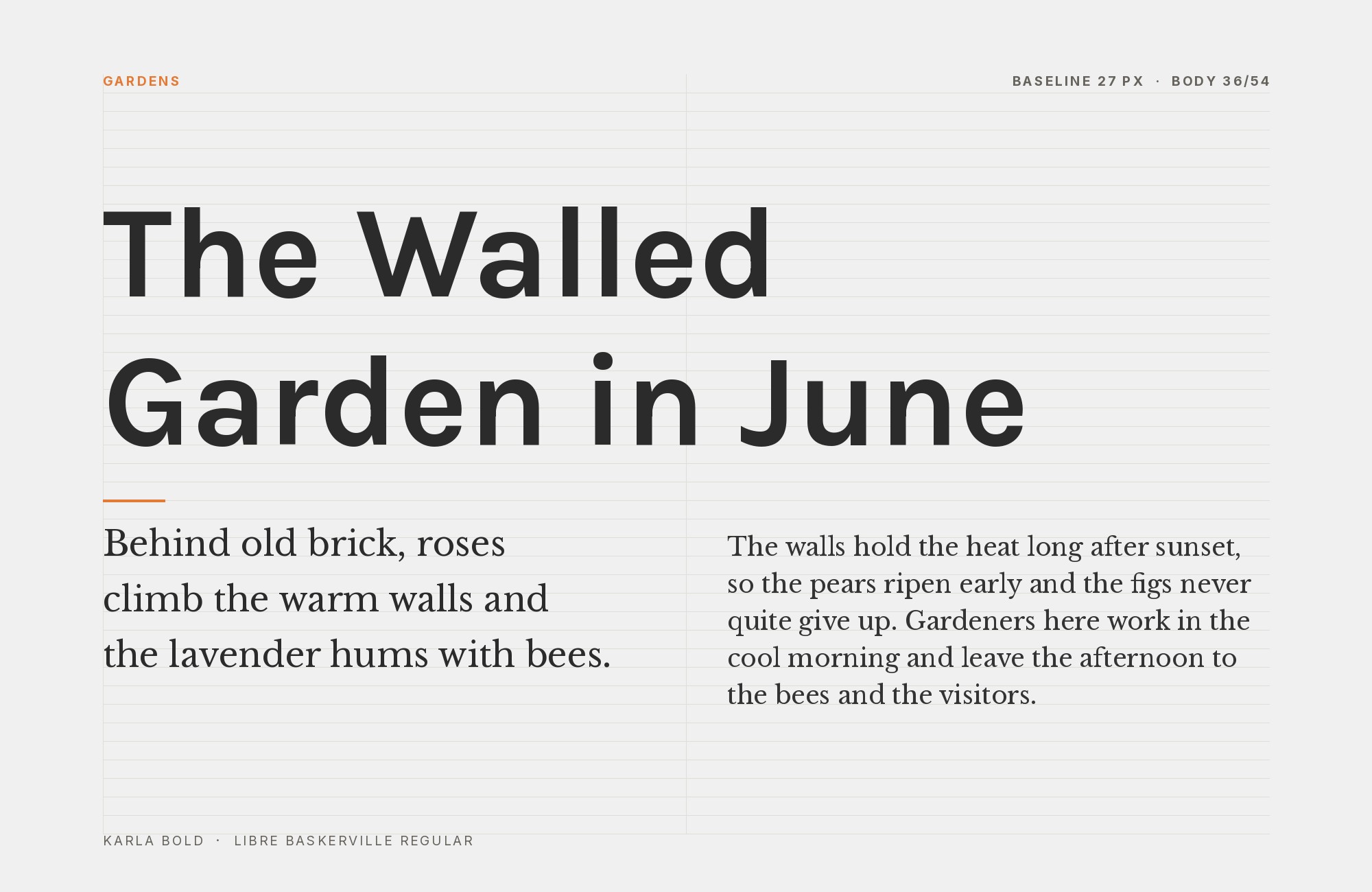
Karla paired with Libre Baskerville - Style A showing headline and body text

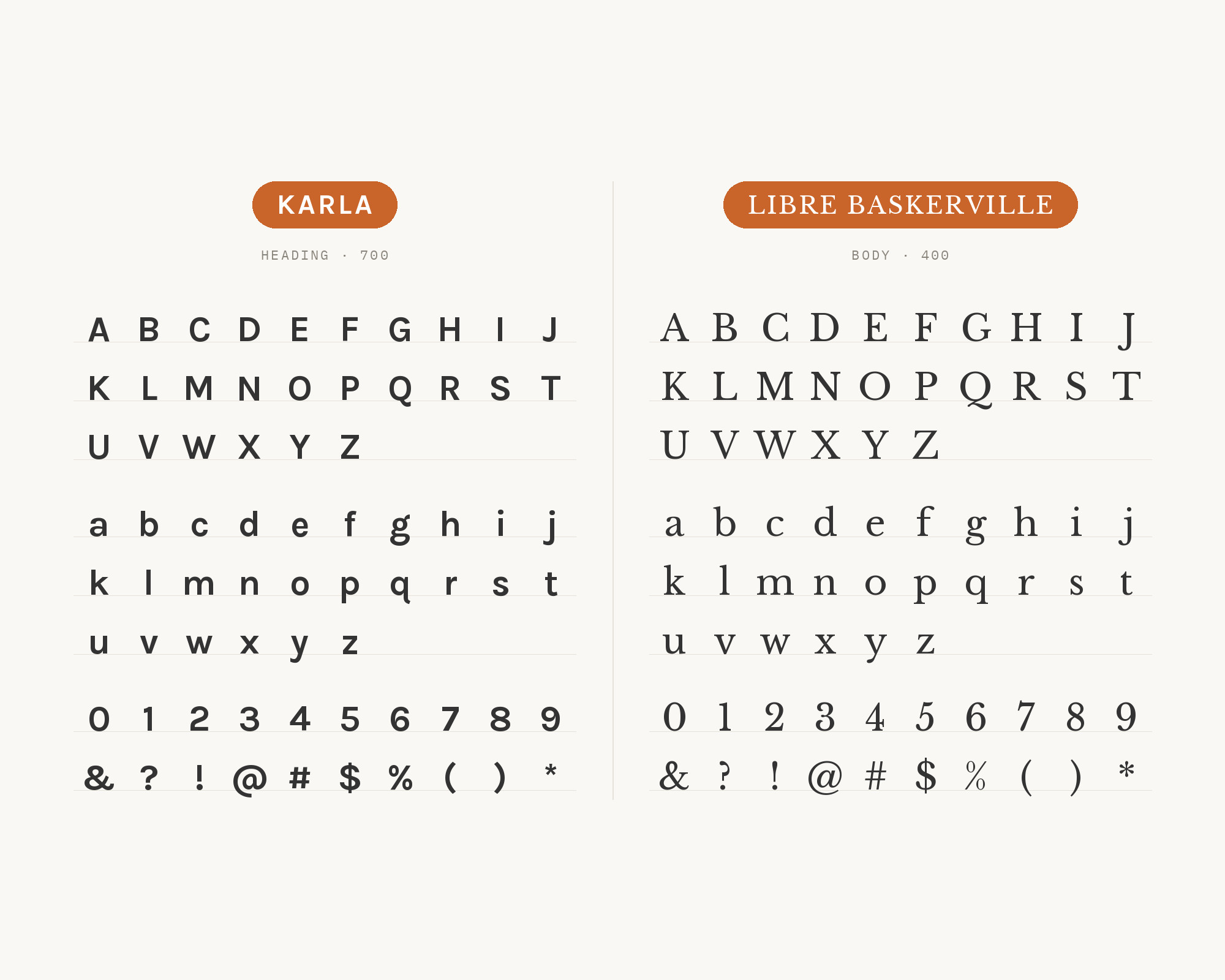
Libre Baskerville‘s transitional serif forms bring typographic tradition to headlines with genuine authority. Karla’s contemporary grotesque character provides body text that feels fresh without trying too hard. The combination spans centuries gracefully, suitable for academic publishing, museums, or heritage brands seeking modern expression. The contrast in historical reference points creates intellectual depth.

Karla and Libre Baskerville - Style B layout Character specimen showing Karla and Libre Baskerville alphabets

8. Open Sans

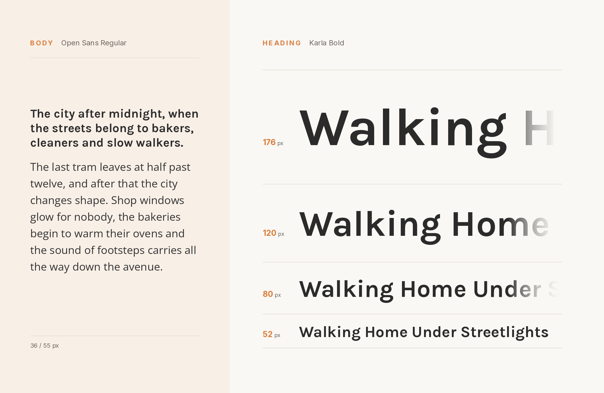
Karla paired with Open Sans - Style A showing headline and body text

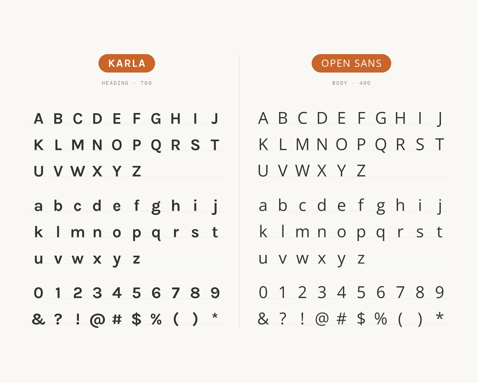
Open Sans in headlines provides the neutral foundation that lets content speak for itself. Karla’s distinctive body text then adds just enough personality to prevent sterility. This pairing works for SaaS products, documentation, or corporate communications that need accessibility without blandness. Both fonts excel at screen rendering, making this combination reliable across contexts. Sometimes one quirky font is enough.

Karla and Open Sans - Style B layout Character specimen showing Karla and Open Sans alphabets

9. Source Sans Pro

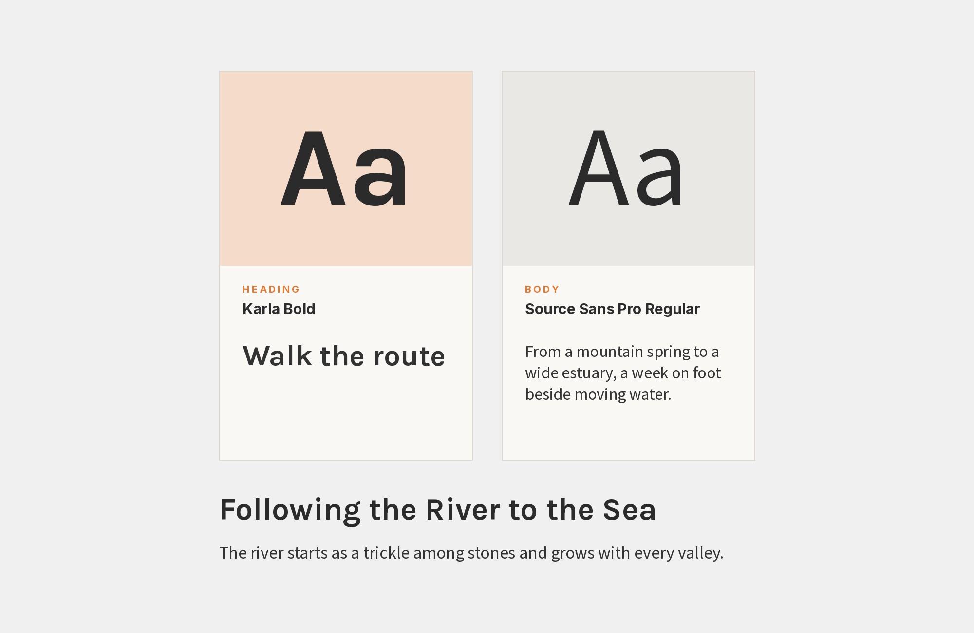
Karla paired with Source Sans Pro - Style A showing headline and body text

Source Sans Pro‘s UI-optimized clarity creates efficient headlines that Karla’s body text can follow without friction. Adobe’s open-source workhorse pairs well with Karla’s unexpected character details. This combination suits tech platforms, productivity tools, or educational applications. The shared emphasis on legibility over decoration creates professional results with subtle personality. Clean but not cold.

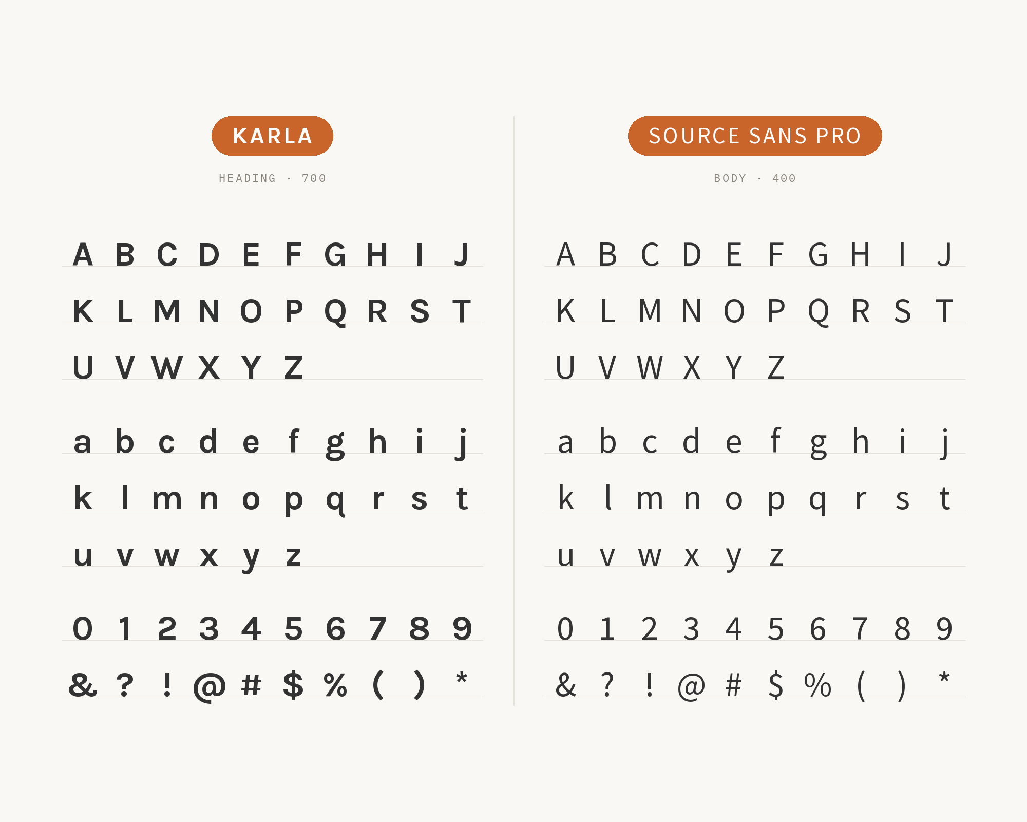
Karla and Source Sans Pro - Style B layout Character specimen showing Karla and Source Sans Pro alphabets

10. PT Serif

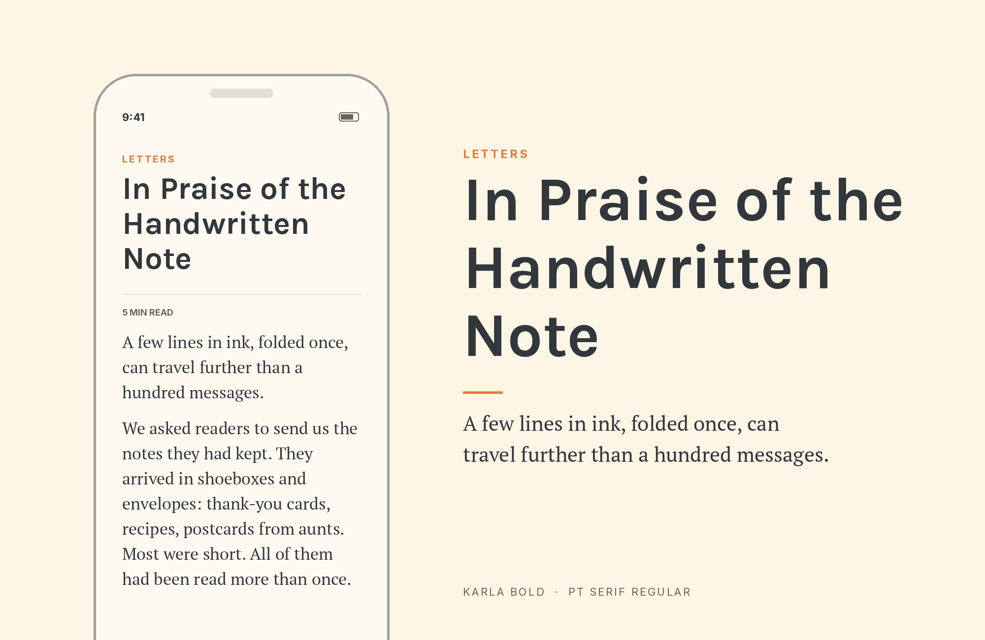
Karla paired with PT Serif - Style A showing headline and body text

PT Serif brings humanist warmth to headlines through its rounded terminals and comfortable proportions. Karla’s grotesque forms in body text create contrast that feels conversational rather than formal. This pairing works for publishing platforms, cultural journalism, or lifestyle content. The Russian typography heritage of PT Serif adds subtle distinction, while Karla’s Latin roots keep things grounded.
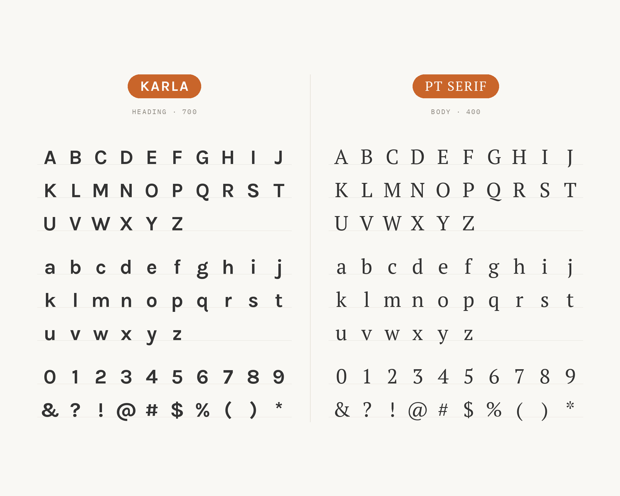
Karla and PT Serif - Style B layout Character specimen showing Karla and PT Serif alphabets

11. Crimson Text

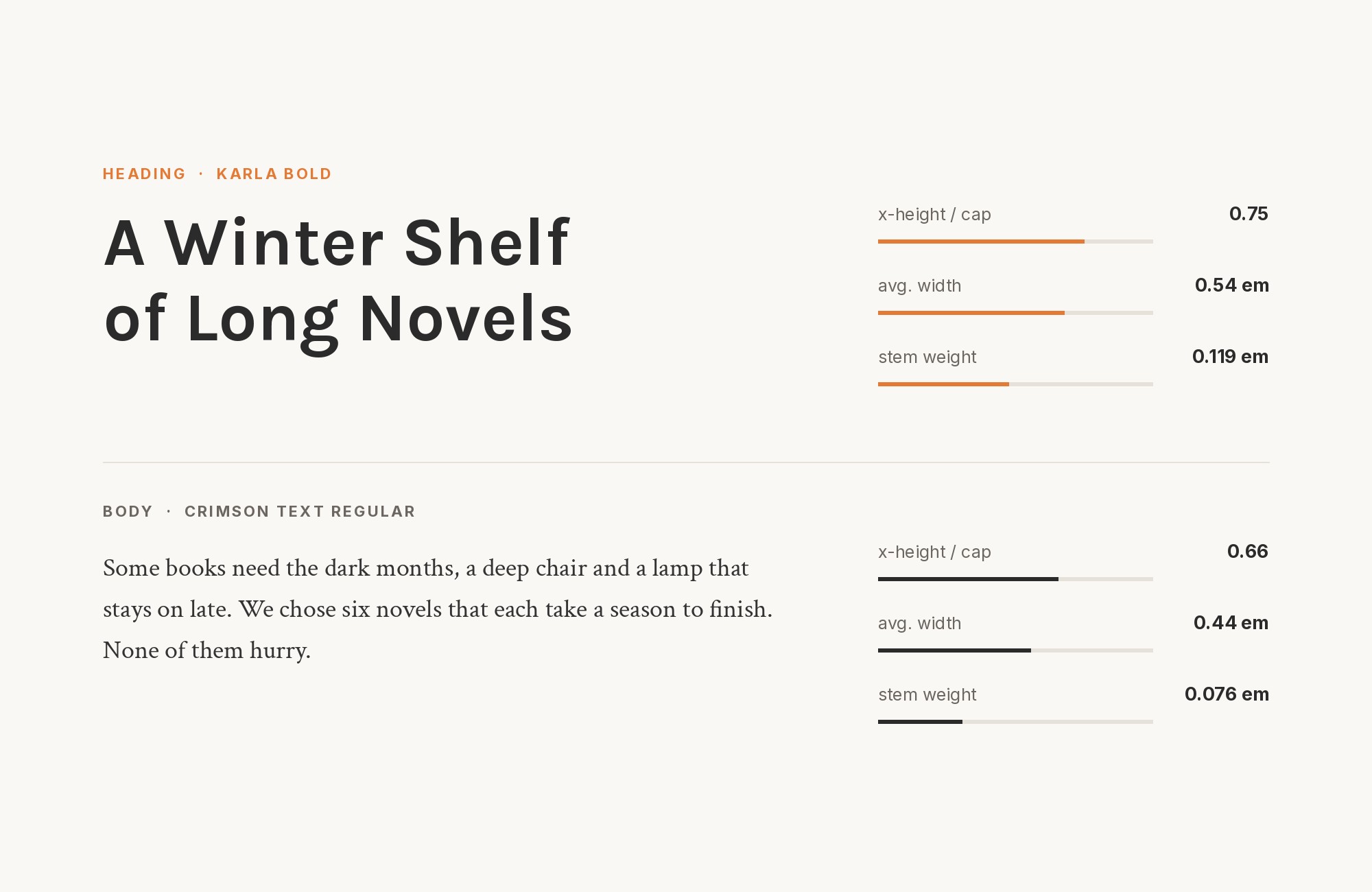
Karla paired with Crimson Text - Style A showing headline and body text

Crimson Text‘s old-style proportions and Renaissance influences create headlines with genuine typographic heritage. Karla’s modern grotesque forms in body text provide contemporary contrast that prevents stuffiness. This combination suits literary journals, book reviews, or academic commentary. The italic cuts of Crimson Text pair particularly well for quoted material within Karla’s upright body text.
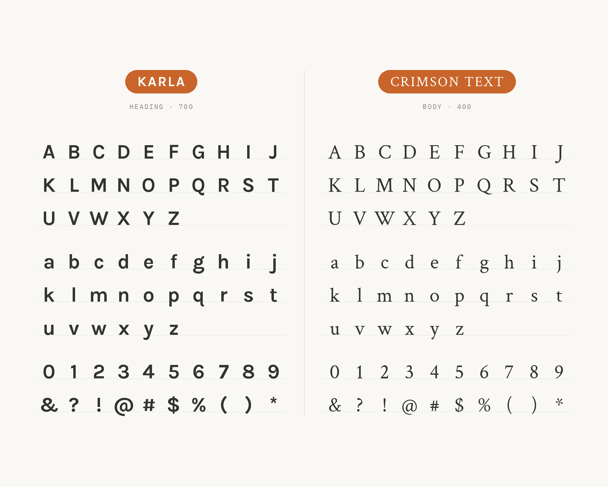
Karla and Crimson Text - Style B layout Character specimen showing Karla and Crimson Text alphabets

12. Cardo

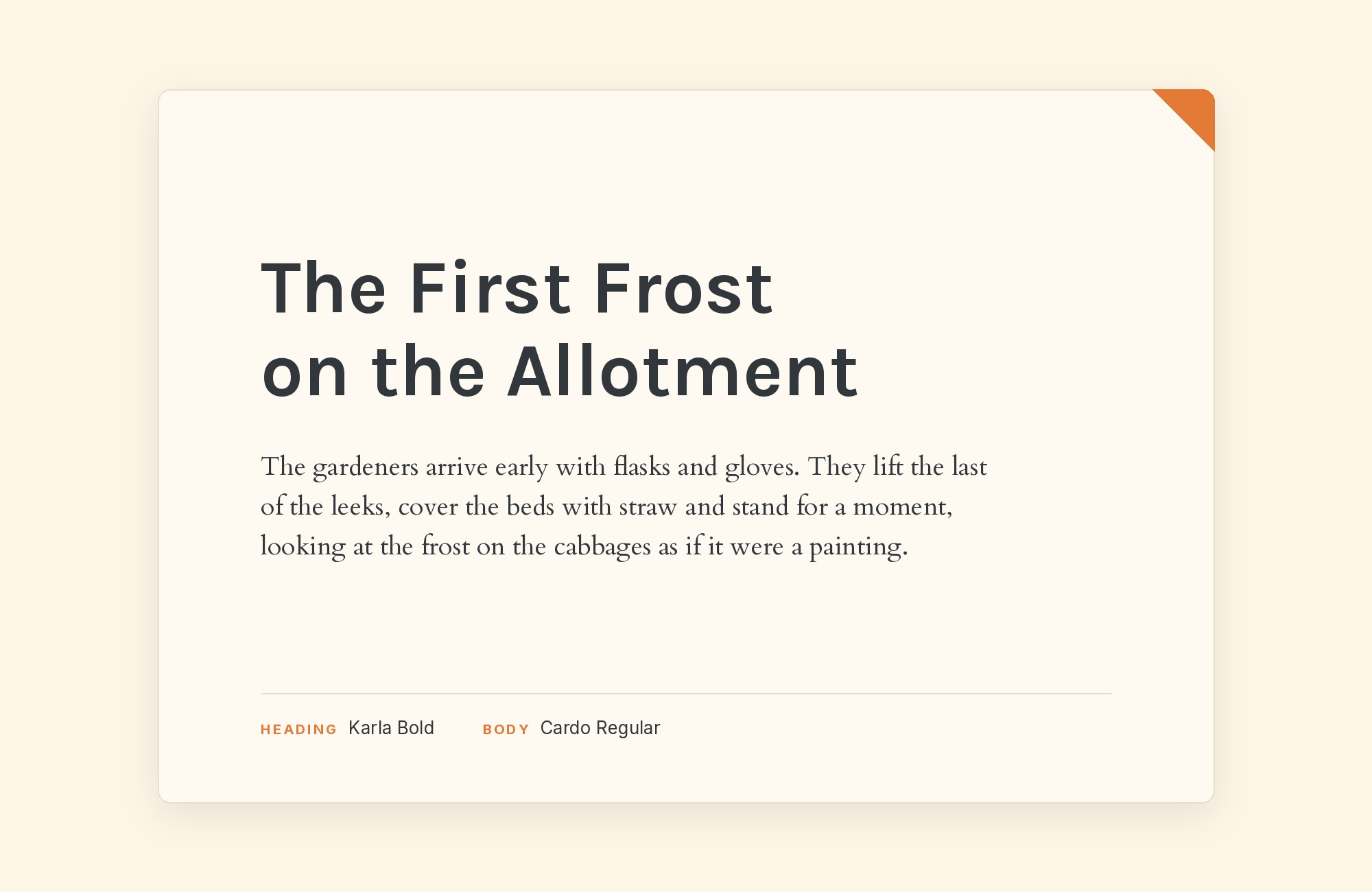
Karla paired with Cardo - Style A showing headline and body text

Cardo was designed for scholars and classicists, and that erudite character shines through in headlines. Paired with Karla’s everyday functionality, you get accessibility to academic content without intimidation. This combination works for humanities publications, university websites, or cultural commentary. Cardo’s extensive glyph coverage handles specialized terminology while Karla keeps the rest readable.
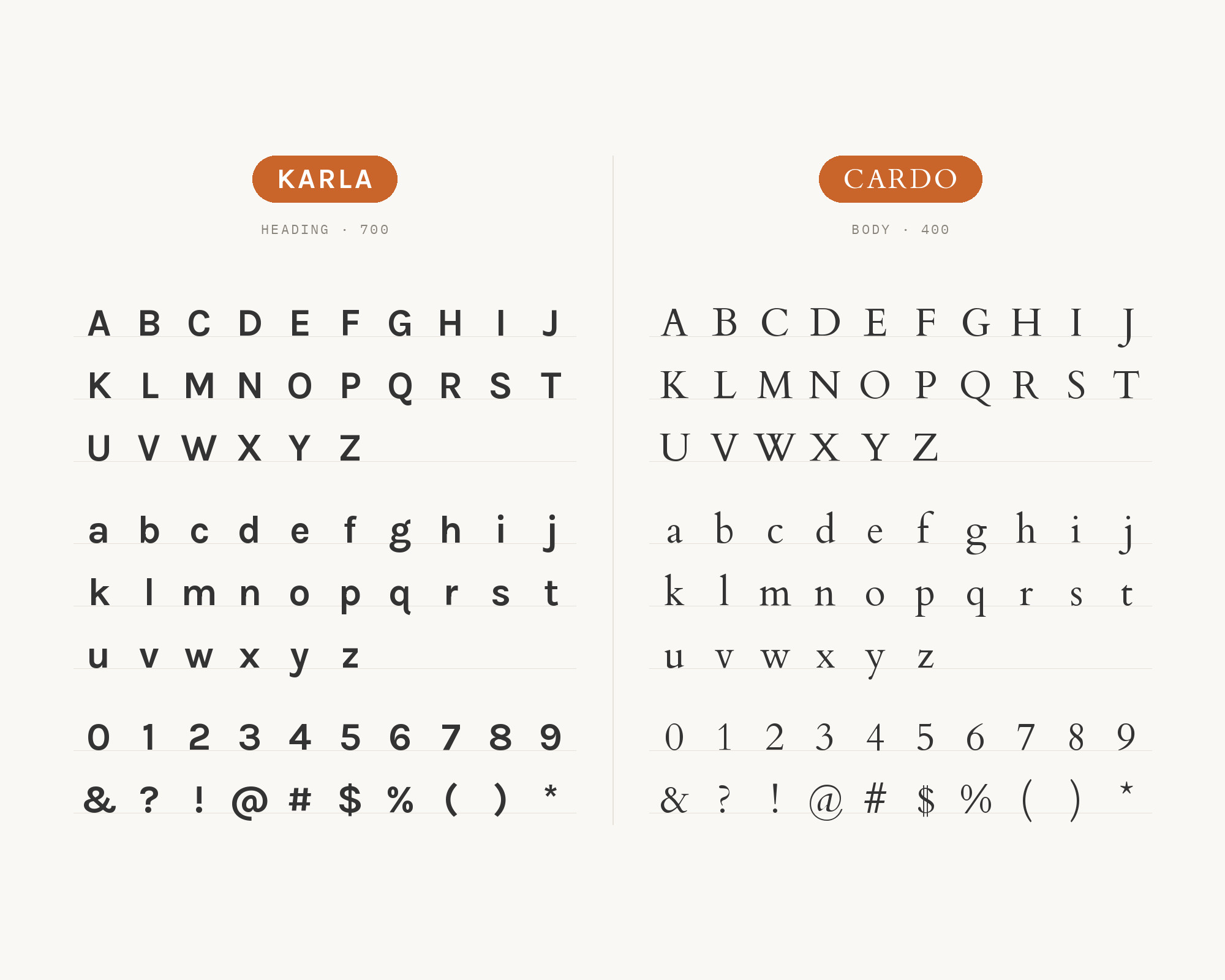
Karla and Cardo - Style B layout Character specimen showing Karla and Cardo alphabets

13. EB Garamond

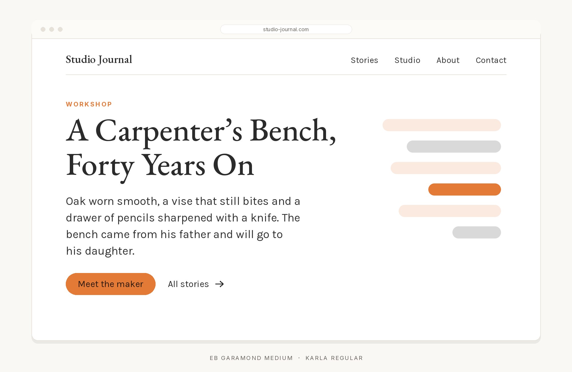
Karla paired with EB Garamond - Style A showing headline and body text

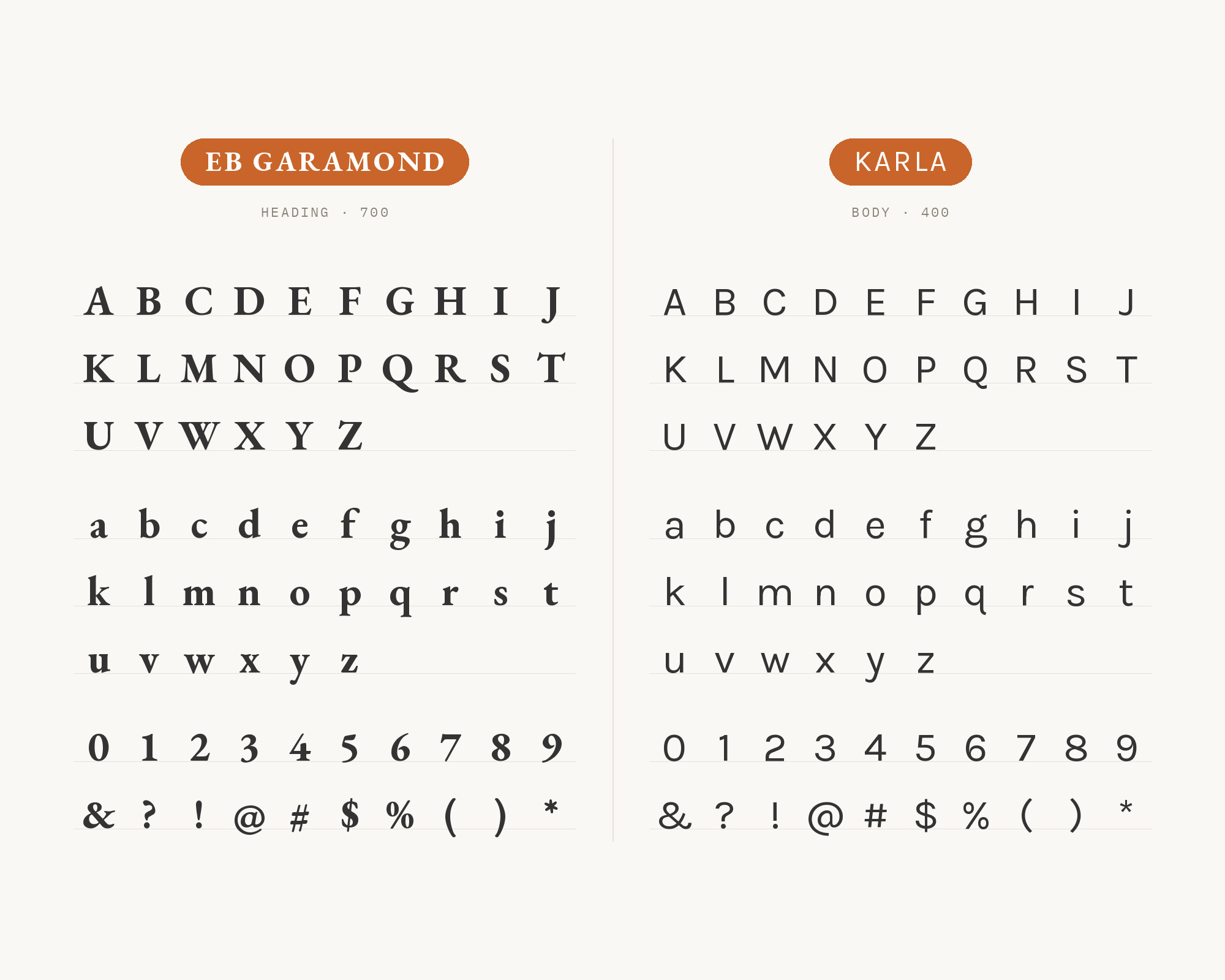
EB Garamond‘s faithful interpretation of sixteenth-century French typography brings genuine historical weight. Karla’s contemporary grotesque forms create temporal contrast that spans centuries productively. This pairing suits fine art publications, wine content, or luxury storytelling. The combination signals sophistication without pretension. EB Garamond’s beautiful italic complements Karla’s understated oblique forms.

Karla and EB Garamond - Style B layout Character specimen showing Karla and EB Garamond alphabets

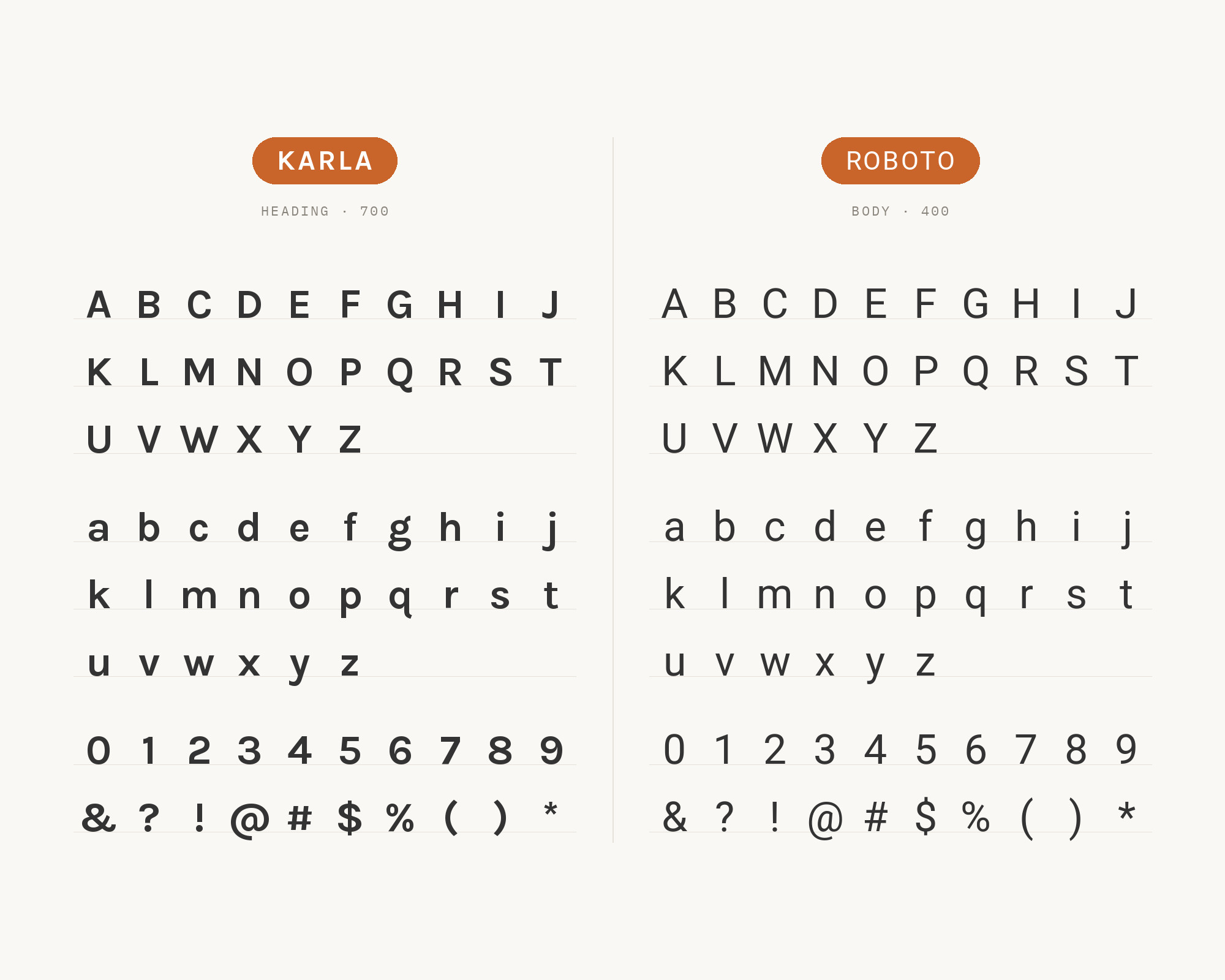
14. Roboto

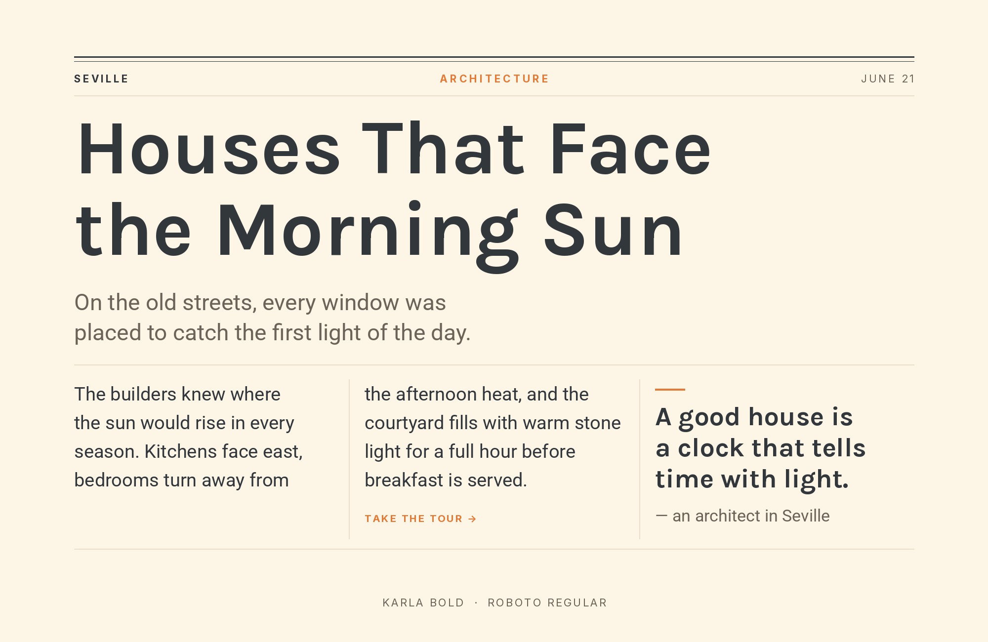
Karla paired with Roboto - Style A showing headline and body text

Roboto‘s neutral skeleton provides headlines that don’t compete with Karla’s quirky body text for attention. Google’s system font brings reliability that frees Karla to express personality where it matters most. This pairing works for Android-adjacent design, material design implementations, or any project requiring cross-platform consistency. The combination is pragmatic but not boring.

Karla and Roboto - Style B layout Character specimen showing Karla and Roboto alphabets

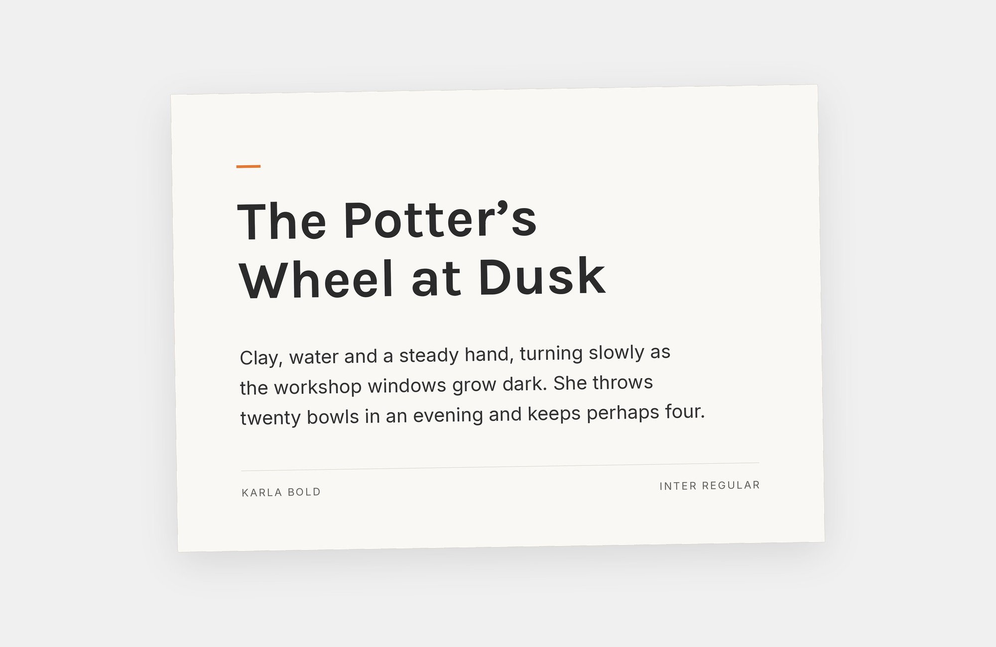
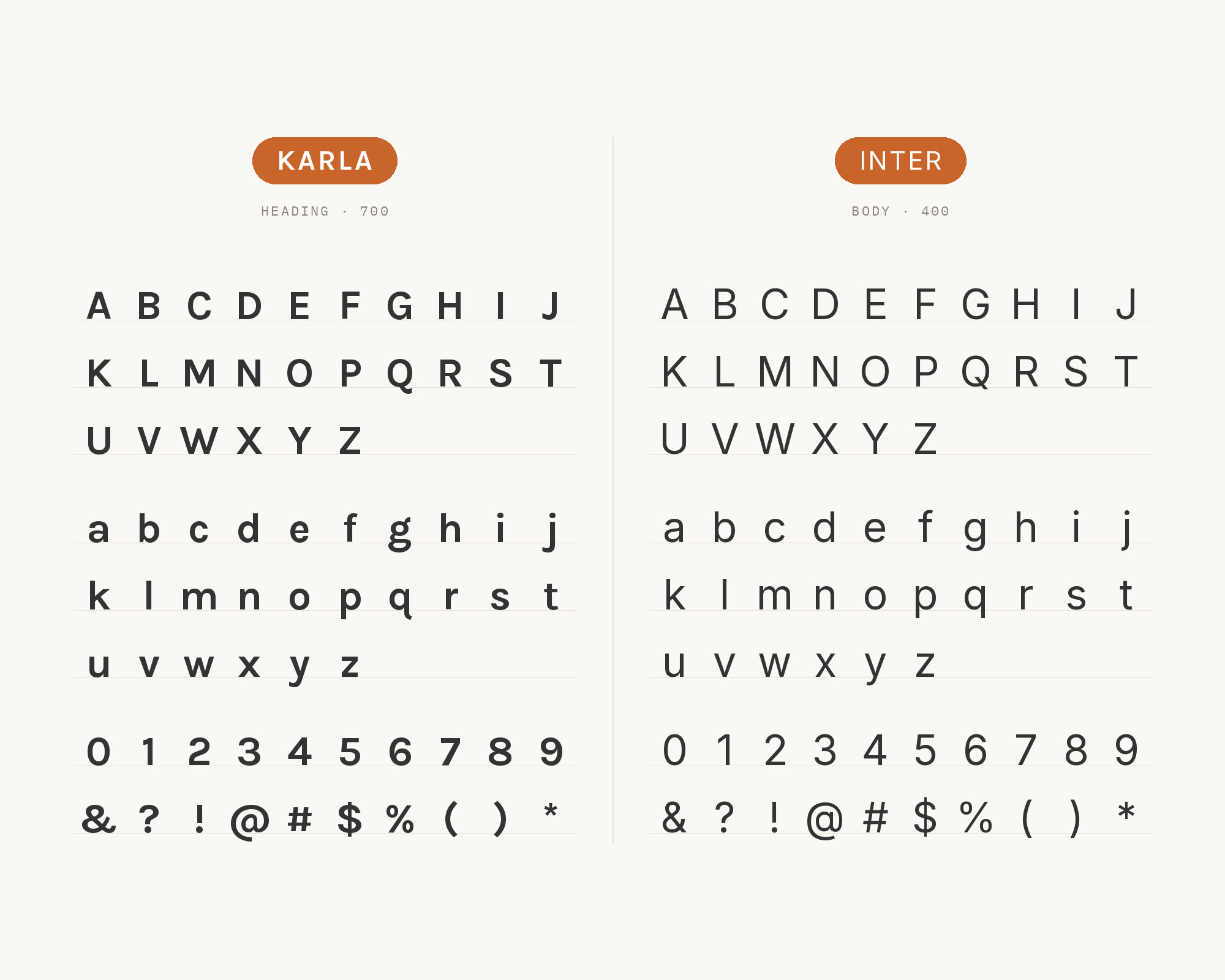
15. Inter

Karla paired with Inter - Style A showing headline and body text

Inter‘s UI-optimized construction creates headlines designed for interfaces, while Karla’s distinctive forms bring warmth to body copy. Both fonts were built for screens, making this combination crisp across devices. Works for SaaS dashboards, productivity tools, or design system documentation. Inter’s geometric precision contrasts productively with Karla’s humanist irregularities. Modern and functional.

Karla and Inter - Style B layout Character specimen showing Karla and Inter alphabets
What Fonts Go With Karla - the book from BonFX, coming soon

Conclusion

There are no absolute rules for font pairing, just principles to guide you. The key is contrast—in weight, in style (serif vs. sans-serif), or in personality. Karla is versatile enough to play well with many different typefaces.

Trust your eye, experiment freely, and remember that the best pairing is the one that serves your content and audience. Typography should enhance communication, not complicate it.

More Font Resources

  • Types of Fonts
  • Best Fonts for Designers
  • Google Font Combinations
  • Fonts That Go With Century Gothic

About the Author

Douglas Bonneville is a graphic designer and typographer since 1992. He is the author of The Big Book of Font Combinations and has contributed to numerous design publications. His work focuses on making typography accessible and practical for designers at all levels.

Sources Consulted

The Karla pairings on this page were researched against published recommendations from typography sites, type foundries and working designers. Where sources disagreed, the disagreement is noted in the text above.

  • FontPair.co
  • Typewolf
  • Typ.io
  • Elementor (Sergei Davidov)
  • Vandelay Design
  • WeAndTheColor

Frequently asked questions

What fonts go with Karla?

Karla pairs great with Spectral, Francois One and Inconsolata. All 15 pairings are shown in real rendered specimens with the reason each one works. Checked against 6 published typography sources.

Does Spectral go with Karla?

Spectral's refined serifs bring crystalline clarity to headlines while Karla's quirky grotesque forms handle body text with unexpected personality. The serif's vertical stress and sharp wedge serifs feel almost algorithmic, which paradoxically pairs well with Karla's hand-drawn irregularities. This combination works for design studios, cultural publications, or tech companies that want to signal creativity. The contrast in temperament creates productive tension.

Does Francois One go with Karla?

Francois One's all-caps construction and condensed proportions demand attention at headline sizes. Below, Karla's lowercase forms bring friendly approachability that balances the shouting. This pairing works for music venues, event promotion, or entertainment brands. The dramatic weight contrast between the bold display and the medium body creates clear hierarchy without competing for attention. Just keep Francois One large, where its proportions sing.

Does Inconsolata go with Karla?

Pairing a grotesque with a monospace shouldn't work, but here we are. Inconsolata's programming-culture associations bring technical credibility, while Karla's humanist touches prevent things from feeling too sterile. This combination suits developer documentation, coding tutorials, or tech blogs. The fixed-width forms create visual rhythm in code blocks that contrasts pleasantly with Karla's proportional spacing. Nerdy and functional.

Does Lora go with Karla?

Lora's calligraphic DNA shows in its brush-influenced curves and soft serif terminals. As a headline font, it brings warmth that Karla's body text continues with its own brand of approachability. The combination feels like a well-curated bookshop, inviting but curated. Works for literary magazines, publishing houses, or cultural institutions. Both fonts share generous x-heights, creating comfortable reading rhythm across the hierarchy.

Does Merriweather go with Karla?

Merriweather's thick serifs and sturdy construction create headlines with real weight and authority. Karla's slightly offbeat proportions in body text add personality without undermining the seriousness. This pairing suits educational content, nonprofit communications, or journalistic projects. The screen-optimized designs of both fonts ensure crisp rendering across devices. The serif-to-grotesque contrast is classic but feels fresh here.

Does Playfair Display go with Karla?

Playfair's theatrical contrast and ball terminals create headlines that demand attention like an opera singer hitting a high note. Below, Karla's understated quirks provide the supporting cast without competing. This high-low combination works for fashion editorials, luxury hospitality, or gallery openings. The dramatic difference in stroke modulation requires careful weight matching to avoid visual whiplash.

Does Libre Baskerville go with Karla?

Libre Baskerville's transitional serif forms bring typographic tradition to headlines with genuine authority. Karla's contemporary grotesque character provides body text that feels fresh without trying too hard. The combination spans centuries gracefully, suitable for academic publishing, museums, or heritage brands seeking modern expression. The contrast in historical reference points creates intellectual depth.

Does Open Sans go with Karla?

Open Sans in headlines provides the neutral foundation that lets content speak for itself. Karla's distinctive body text then adds just enough personality to prevent sterility. This pairing works for SaaS products, documentation, or corporate communications that need accessibility without blandness. Both fonts excel at screen rendering, making this combination reliable across contexts. Sometimes one quirky font is enough.

Does Source Sans Pro go with Karla?

Source Sans Pro's UI-optimized clarity creates efficient headlines that Karla's body text can follow without friction. Adobe's open-source workhorse pairs well with Karla's unexpected character details. This combination suits tech platforms, productivity tools, or educational applications. The shared emphasis on legibility over decoration creates professional results with subtle personality. Clean but not cold.

Does PT Serif go with Karla?

PT Serif brings humanist warmth to headlines through its rounded terminals and comfortable proportions. Karla's grotesque forms in body text create contrast that feels conversational rather than formal. This pairing works for publishing platforms, cultural journalism, or lifestyle content. The Russian typography heritage of PT Serif adds subtle distinction, while Karla's Latin roots keep things grounded.

About Douglas Bonneville

Douglas has been a graphic designer since 1992, in addition to software developer and author. He is a member of Smashing Magazine's "Panel of Experts" and has contributed to over 100 articles. He is the author of "The Big Book of Font Combinations", loves cats, and plays guitar.

The BonFX Letter

One good pairing.
Every Tuesday.

2-minute read · free

This week — no. 14

Quiet authority

Merriweather sets the tone in one line. Lato stays out of the way and lets it.

MERRIWEATHER 700  +  LATO 400

A font specimen, a pairing that works, and one line on why it works. That is the whole email.

Free. One click to unsubscribe. No sharing, ever.

Free download

The Typography Primer.
Yours, right now.

Adobe's classic · PDF · free

The Typography Primer — book cover

The guide to type that everyone learned from. Subscribe and it is yours instantly. The BonFX Letter follows.

Free. One click to unsubscribe. No sharing, ever.

What Fonts Go With Karla - the book from BonFX, coming soon

Still Googling UX terms?

Stop. They're all right here.

UX for Cats book cover

50 terms. Illustrated.
So simple your cat gets it.

Get the Book →

Print & ePub on Amazon

350 font combinations you can steal.

The Big Book of Font Combinations

Every pairing shown in context — web, print, headings, body. Open it, find one that works, use it.

That's it. That's the book.

In print or ePub 40% OFF on Gumroad

Scrolling Google Fonts for "the right one"?

You've been at it for 20 minutes. You'll be at it for 20 more. There are 1,500 fonts in there.

Pocket Handbook of Google Fonts Combinations

We paired every useful Google Font.
7,500 pages. Done.

Get the PDF →

Instant download on Gumroad

Recent Inspirations

  • What Fonts Go With Abril Fatface? September 4, 2026
  • What Fonts Go With Cinzel? September 4, 2026
  • What Fonts Go With Cormorant Garamond? September 4, 2026
  • What Fonts Go With Anton? September 4, 2026
  • What Fonts Go With Quicksand? September 4, 2026
  • What Fonts Go With Vollkorn? September 4, 2026
  • What Fonts Go With Dosis? September 4, 2026
  • What Fonts Go With EB Garamond? September 4, 2026
  • What Fonts Go With Bebas Neue? September 4, 2026
  • What Fonts Go With Caslon? September 3, 2026
  • What Fonts Go With Helvetica? September 2, 2026
  • What Fonts Go With Bodoni? September 1, 2026
  • What Fonts Go With Calibri? August 31, 2026
  • What Fonts Go With Avenir? August 30, 2026
  • What Fonts Go With Garamond? August 30, 2026

Copyright © 2026 · BonFX

  • Blog
  • Books
    • The Preposterously Huge Book of Google Font Combinations
    • The Big Book of Font Combinations (Classic Fonts Edition)
  • Gallery
    • Monster Alphabet
    • Pen and Ink Cartoons
    • The Algorithm FX
  • Services
  • About
  • Contact