Inconsolata pairs great with Karla, Montserrat and Playfair Display. All 15 pairings are shown below in real rendered specimens, with the reason each one works.

What fonts go with Inconsolata? This beloved monospace typeface brings programmer-friendly clarity that demands companions capable of bridging technical precision with design sophistication.
Raph Levien designed Inconsolata as a humanist monospace for printed code listings, taking particular inspiration from Luc(as) de Groot’s Consolas. Developers also favor its crisp, clear rendering on screen. Its humanist touches, including slightly curved strokes and open apertures, bring warmth unusual in monospace fonts, making it equally at home in design projects and terminal windows.
Pairing Inconsolata presents unique opportunities. Its monospace structure creates inherent contrast with proportional fonts, while its humanist character allows for harmonious combinations with similarly warm typefaces. The challenge is finding companions that acknowledge its technical heritage while enabling broader design applications. The pairings below extend its possibilities beyond the code editor.
1. Karla
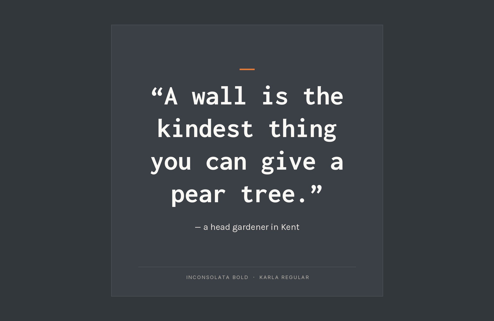
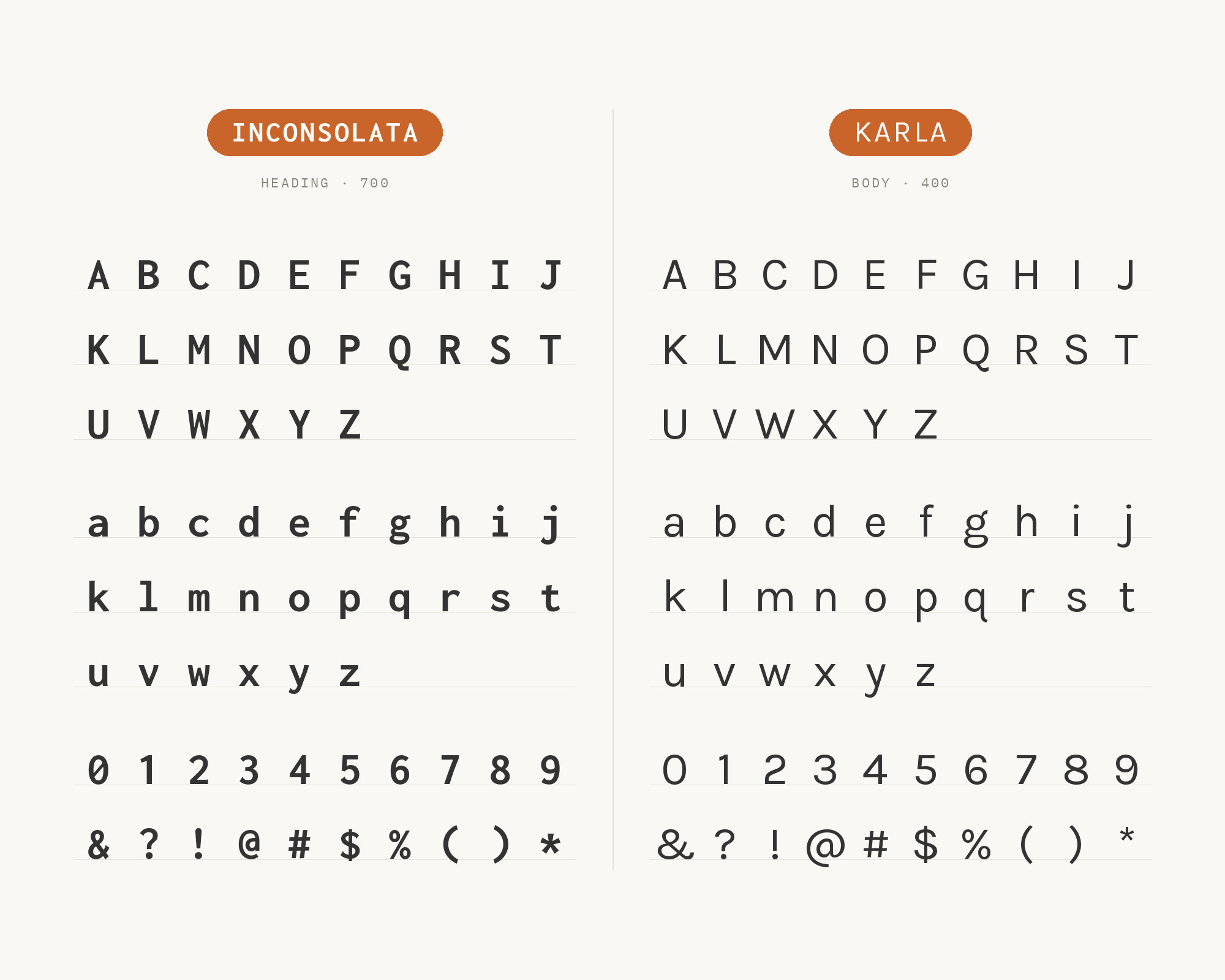
Karla shares Inconsolata’s humanist sensibility, making them natural companions. Jonny Pinhorn designed a grotesque sans-serif with slightly quirky character that complements rather than competes with Inconsolata’s monospace personality. Both fonts read as friendly and approachable, creating interfaces that feel welcoming to technical and non-technical users alike. This pairing excels in developer portfolios, tech documentation, and applications bridging code and content.
Build free, plus 500 AI credits.
Design and publish a site at no cost. Paid plans double your credits the first month.
Start free2. Montserrat
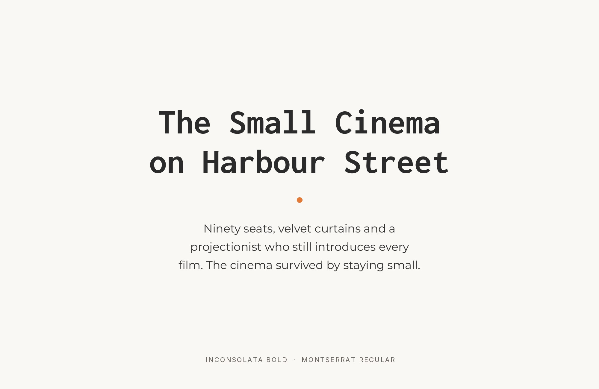
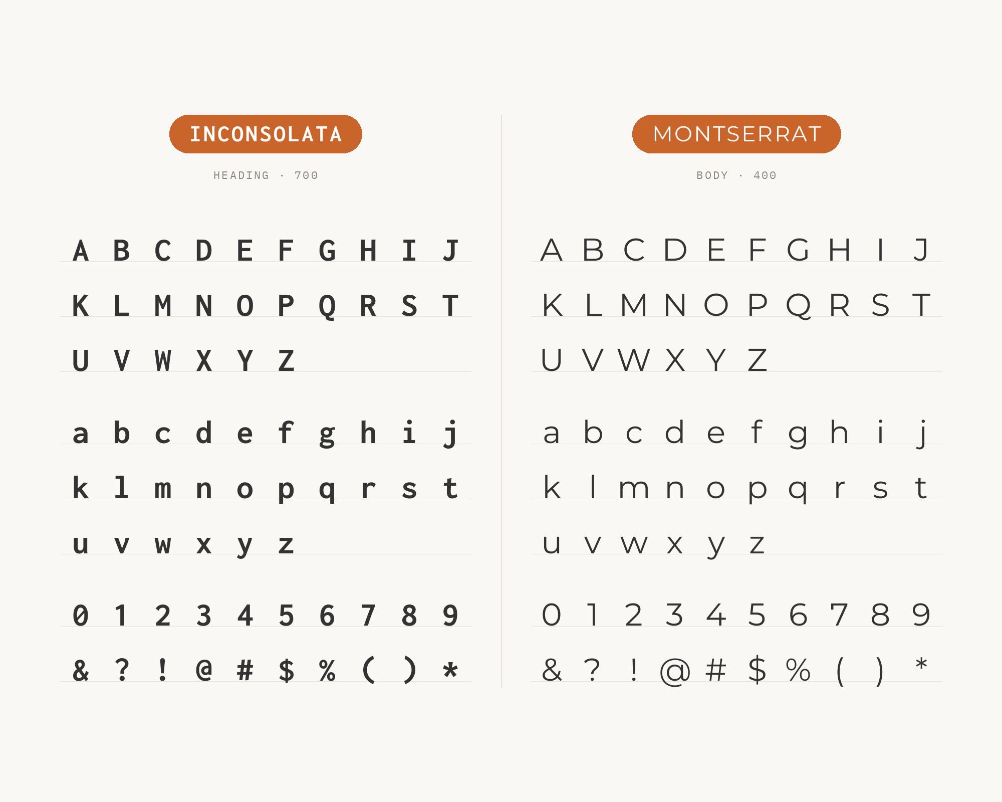
The geometric precision of Montserrat provides striking contrast against Inconsolata’s humanist monospace. Julieta Ulanovsky’s urban-inspired design brings metropolitan sophistication that elevates technical content. The difference between geometric proportional letters and humanist fixed-width ones creates visual hierarchy that guides the eye naturally. This pairing suits tech startups, design agencies, and any brand wanting to signal both technical capability and creative vision.
3. Playfair Display
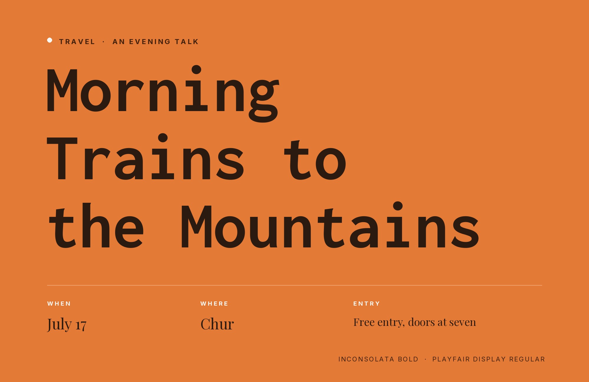
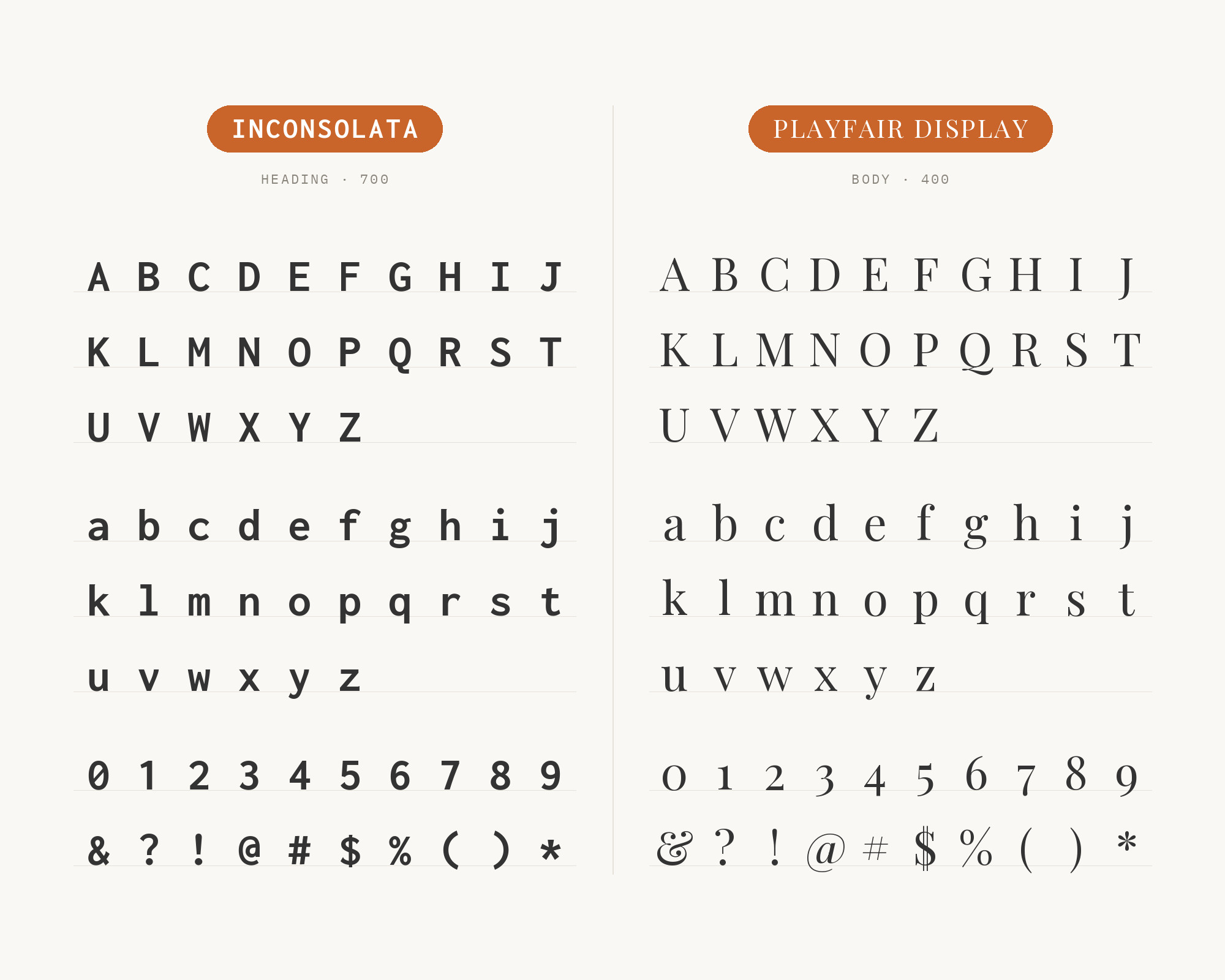
When Inconsolata needs editorial elegance, Playfair Display delivers. The high-contrast serifs create dramatic tension against Inconsolata’s uniform strokes, transforming technical layouts into something approaching art. Claus Eggers Sørensen’s transitional design, influenced by Baskerville and Scotch Roman types, brings classical gravitas to developer blogs, tech journalism, and creative coding portfolios. This unexpected pairing signals sophistication within technical spaces.
4. Fira Sans
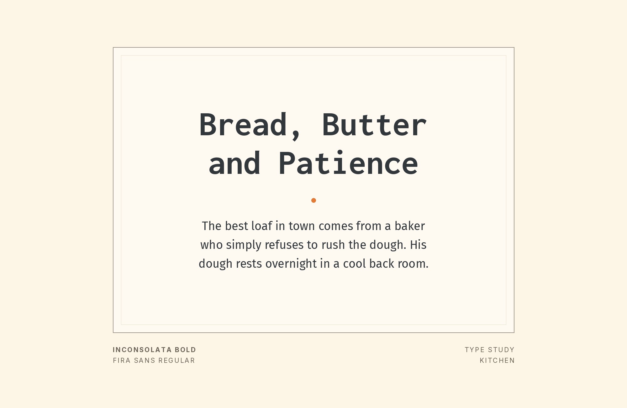
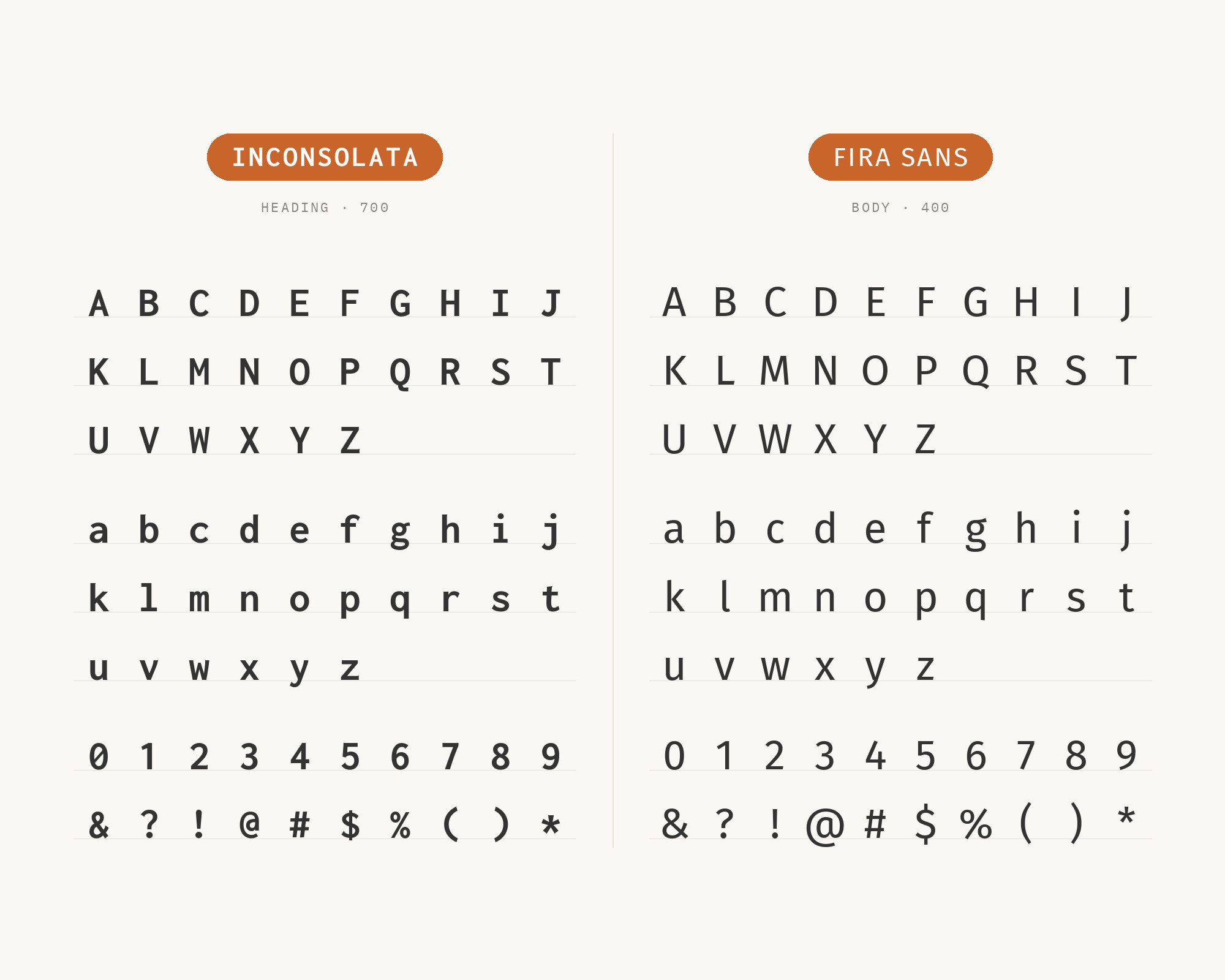
Fira Sans was designed for Mozilla’s Firefox OS, and Typ.io records it with Inconsolata on a portfolio site. Erik Spiekermann’s humanist sans brings screen-oriented clarity that complements Inconsolata’s code-friendly forms. The pairing feels intentional in developer documentation, tech blogs, and coding websites.
5. Raleway
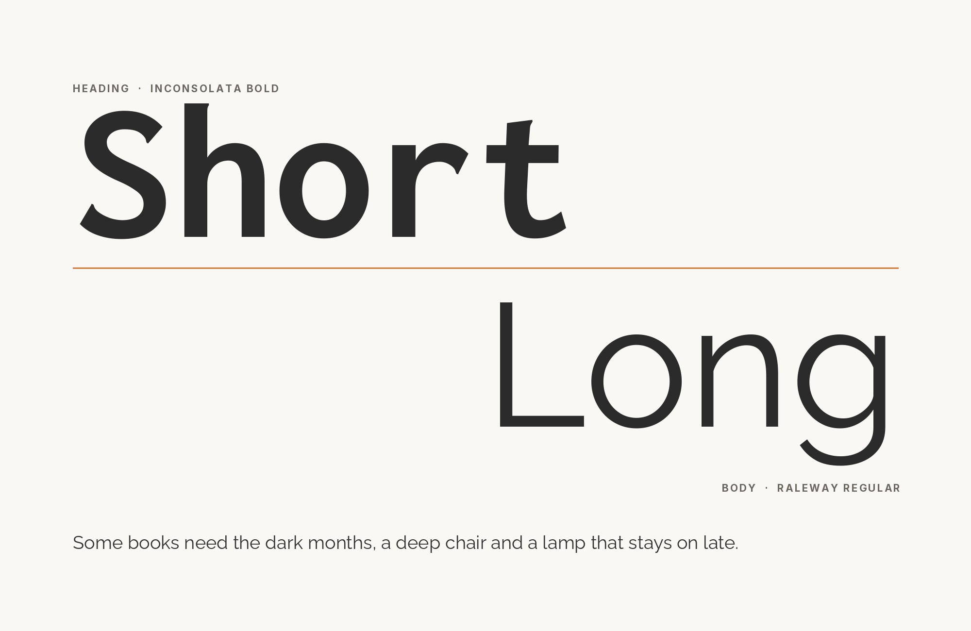
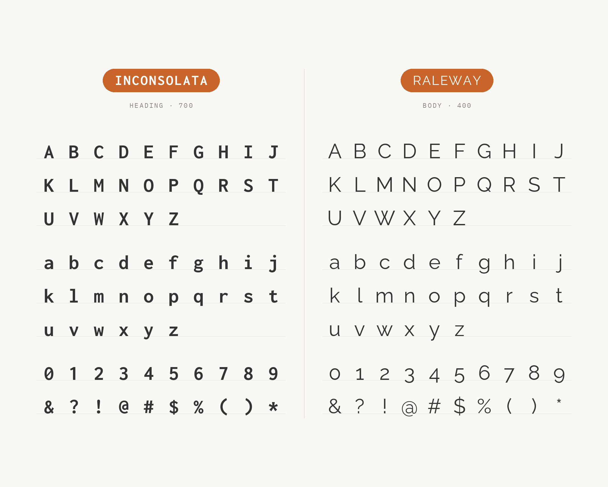
The elegant geometry of Raleway creates refined contrast with Inconsolata’s technical character. Matt McInerney’s design brings sophistication that transforms developer portfolios into design showcases. The thin weights dance beautifully with Inconsolata’s consistent stroke weight, while bolder variants anchor headlines with authority. Figma’s Google Font pairing library lists Raleway with Inconsolata. This pairing suits creative technologists, design engineers, and anyone bridging aesthetic and technical worlds.
6. Open Sans
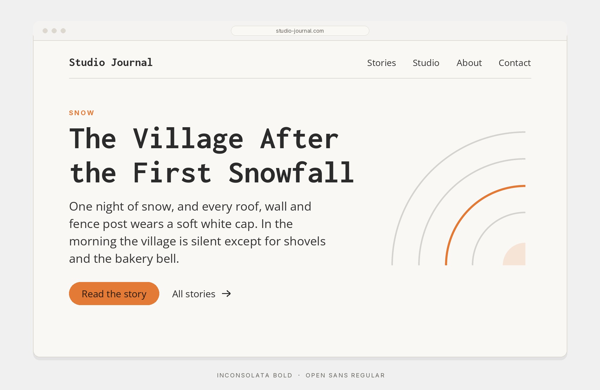
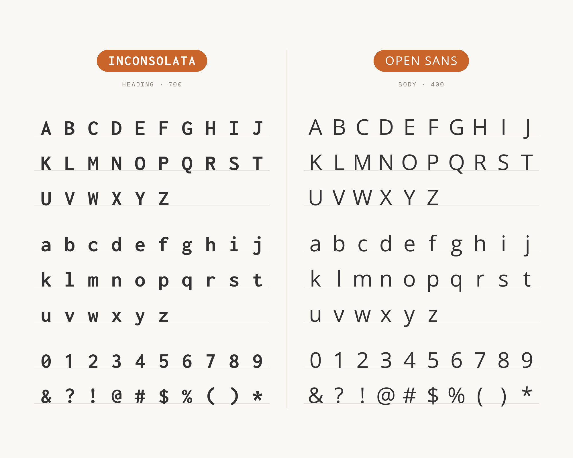
Steve Matteson’s Open Sans offers optimized neutrality that lets Inconsolata’s monospace character shine in code blocks while handling body text with democratic clarity. Obsidian’s brand guide assigns Open Sans to corporate communication and Inconsolata to developer text. The same division works for educational platforms and technical documentation that must present both prose and code.
7. Merriweather
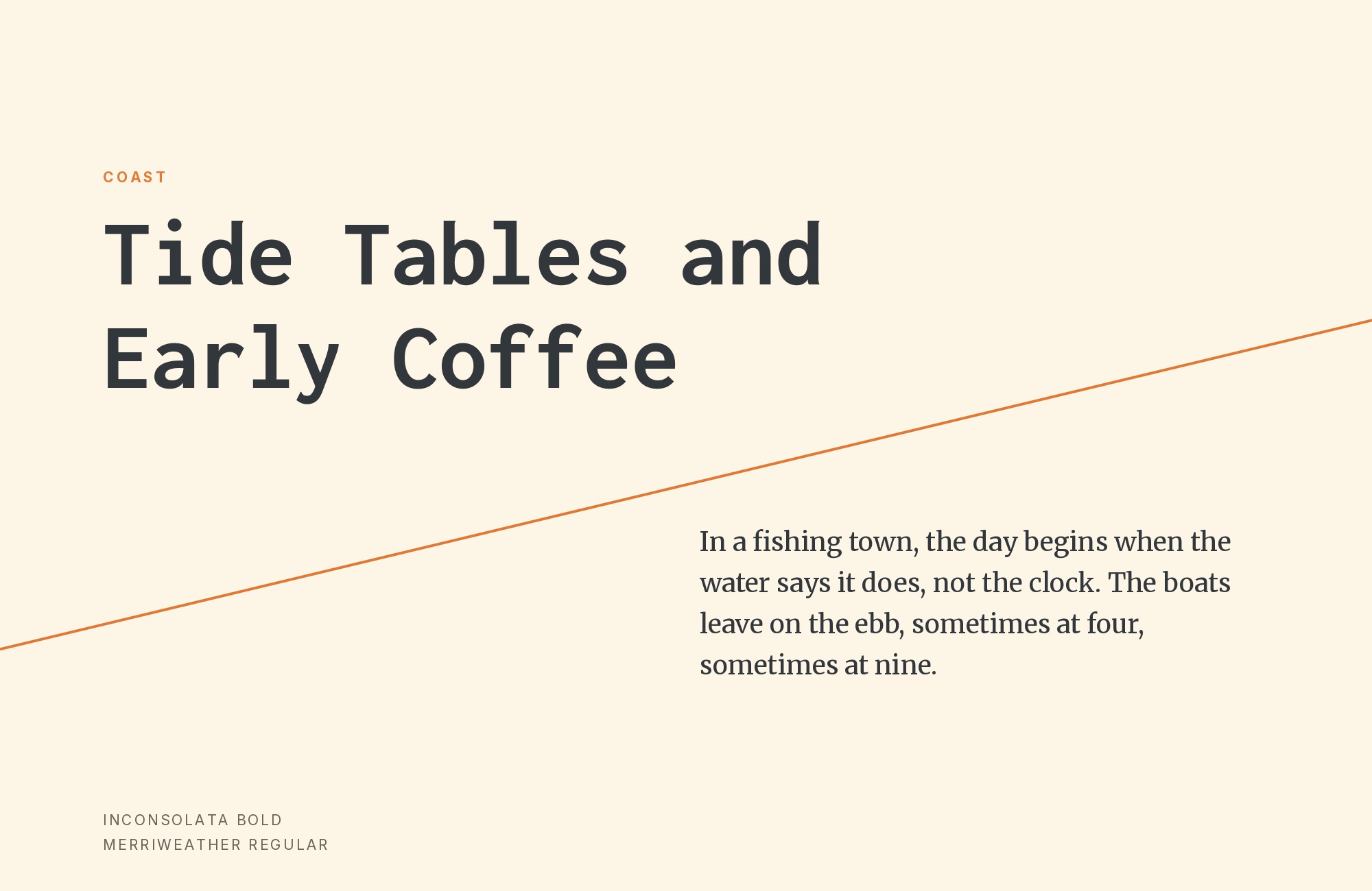
Merriweather‘s sturdy serifs bring a text face designed for screen reading into conversation with Inconsolata’s printed-code roots. The Stead Design System uses Merriweather for serif text and Inconsolata for monospaced text. Eben Sorkin’s thick serifs can anchor headlines while Inconsolata handles code examples with technical clarity. This pairing excels in technical blogs, programming tutorials, and educational content mixing explanatory prose with code.
8. Lato
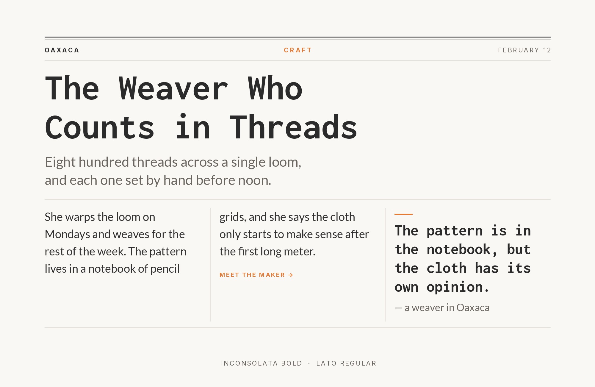
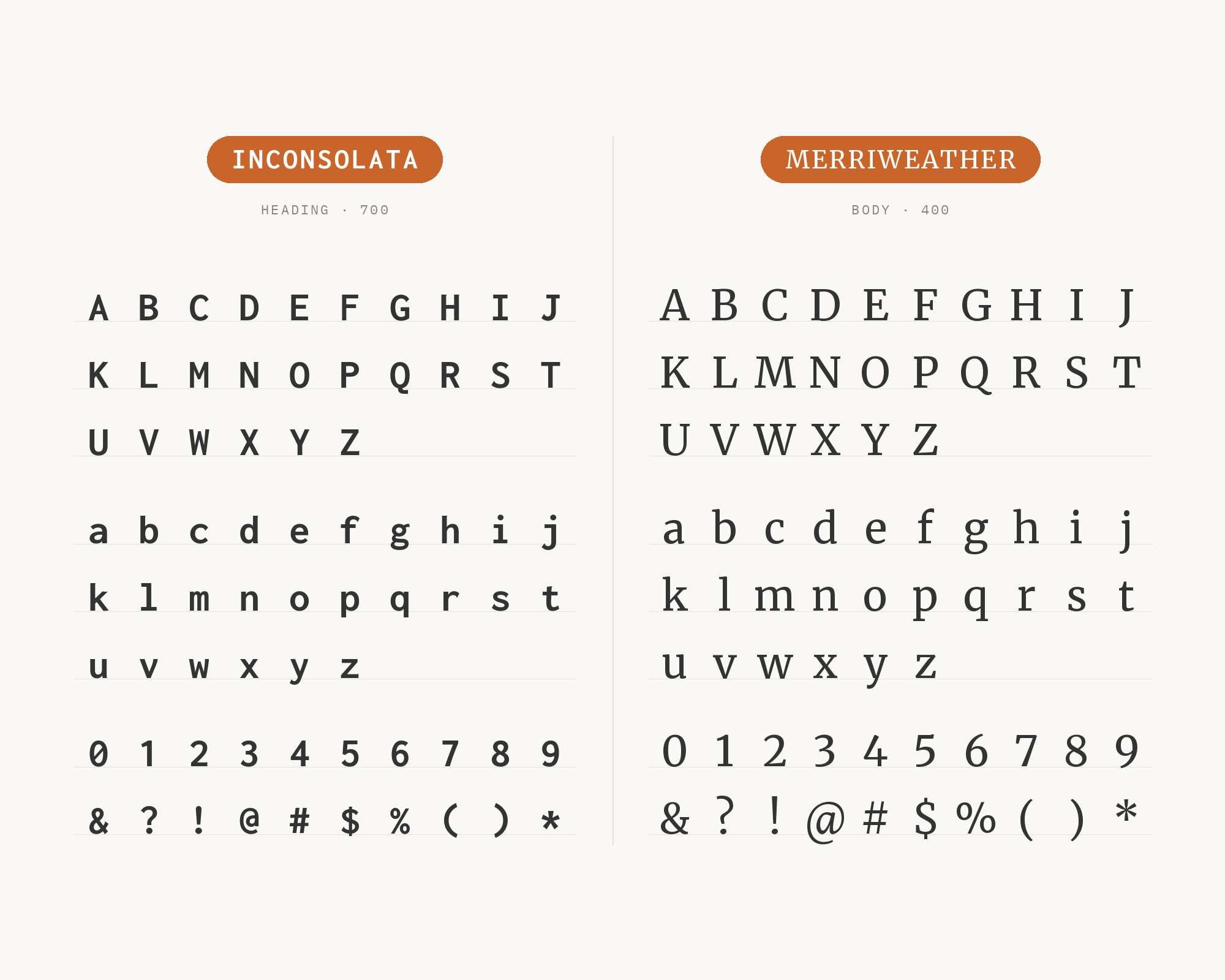
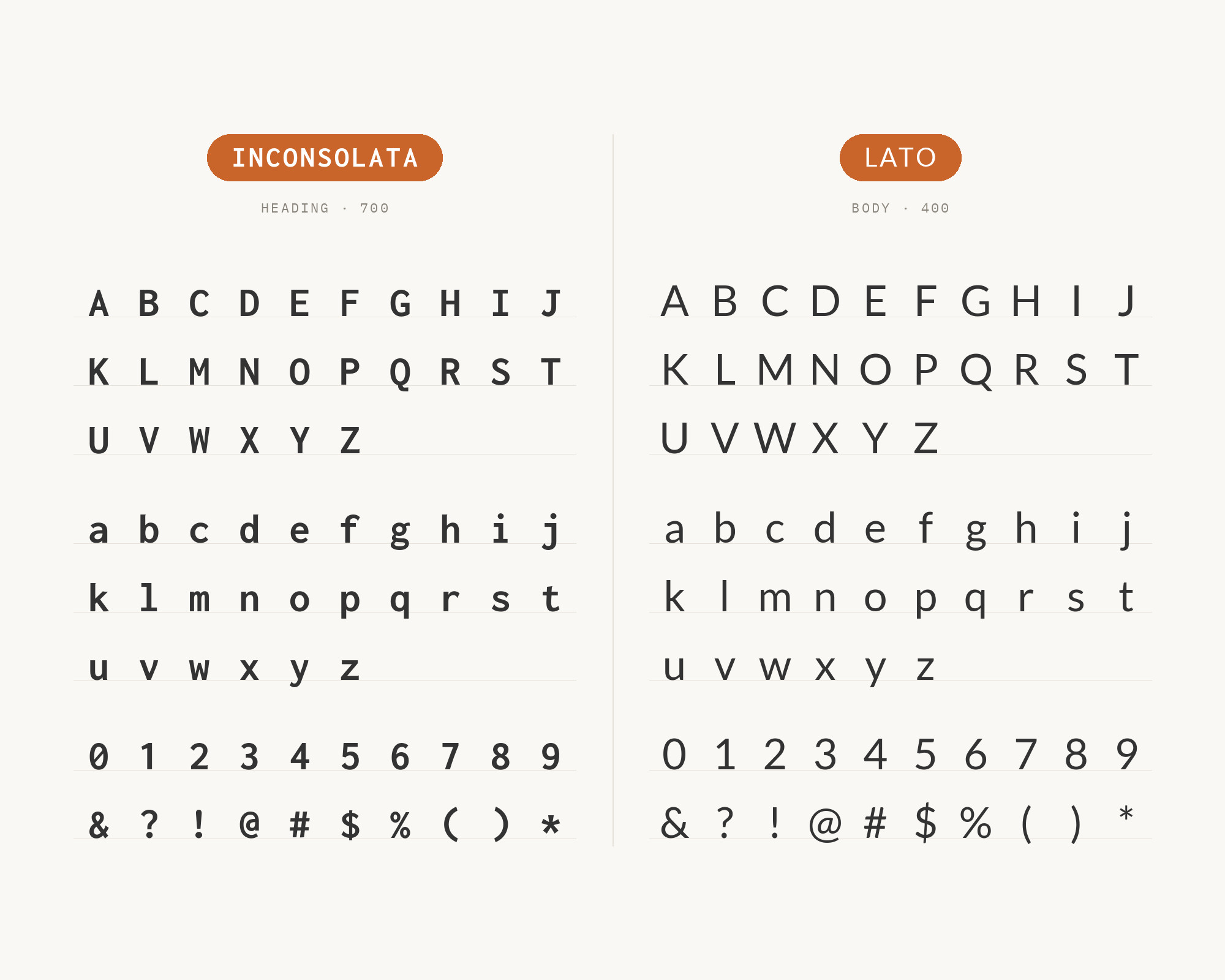
Lato brings humanist warmth that complements Inconsolata’s friendly monospace character. Łukasz Dziedzic designed semi-rounded details that soften technical layouts without sacrificing professionalism. Together they create interfaces that feel approachable to developers and designers alike, ideal for collaborative tools, creative coding platforms, and projects bridging technical and creative communities.
9. Source Sans Pro
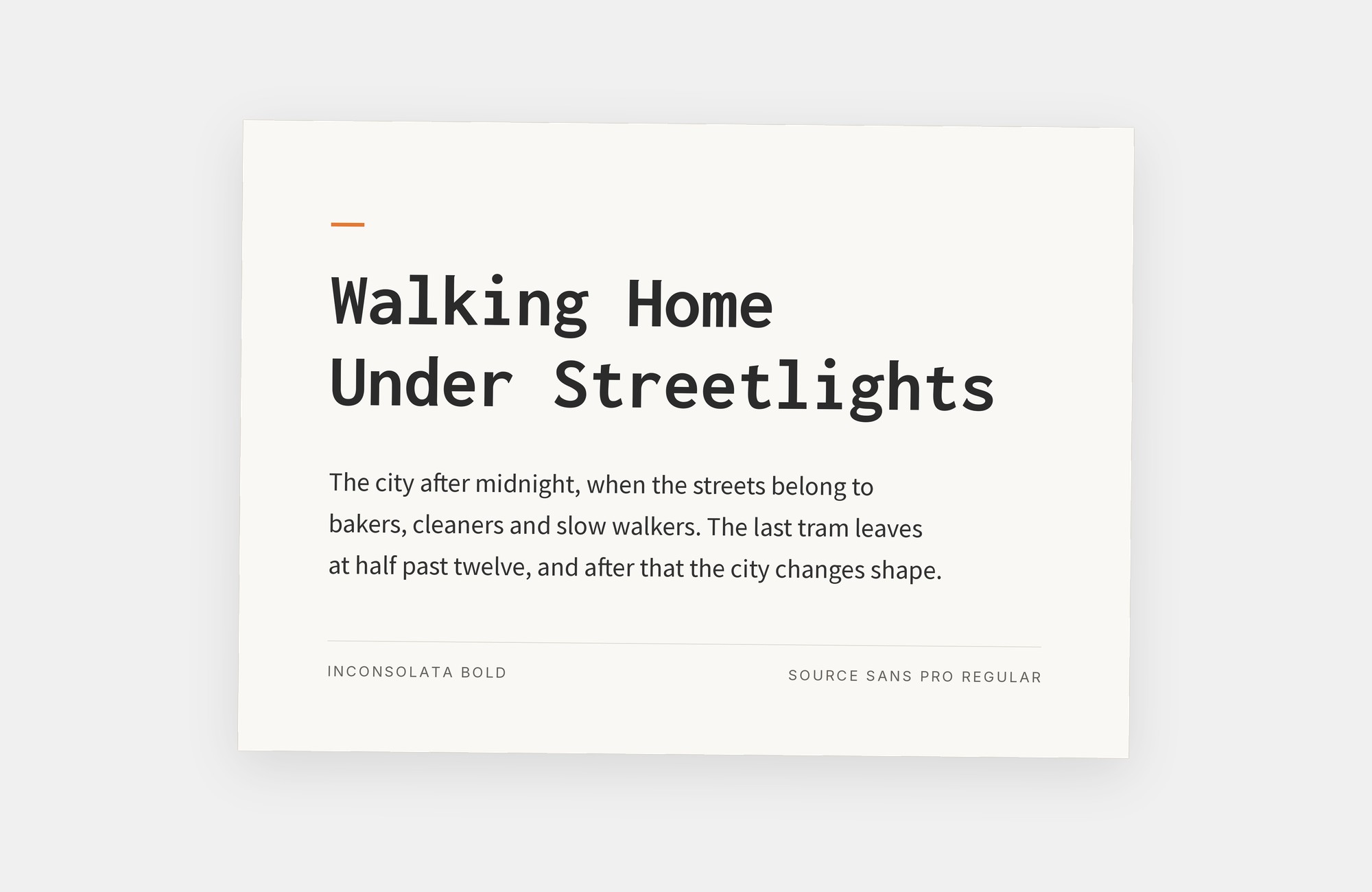
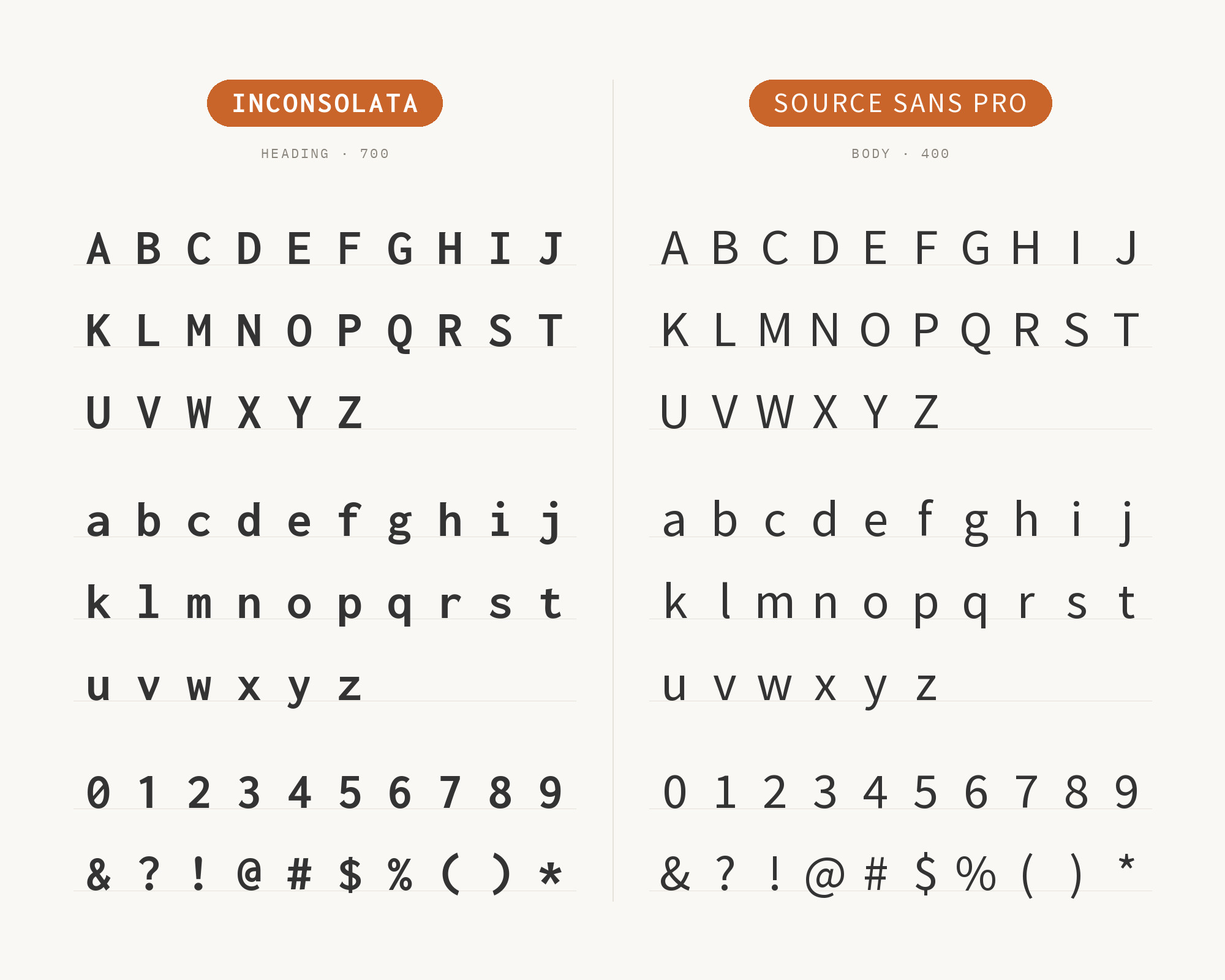
Adobe’s Source Sans Pro creates family harmony with Inconsolata-style monospace thinking. Paul D. Hunt designed a sans-serif for user interfaces. Decred’s visual toolkit uses Source Sans Pro for most text and Inconsolata for numeric values and captions. The division feels systematic, making it useful for documentation sites, developer tools, and technical platforms where consistency matters.
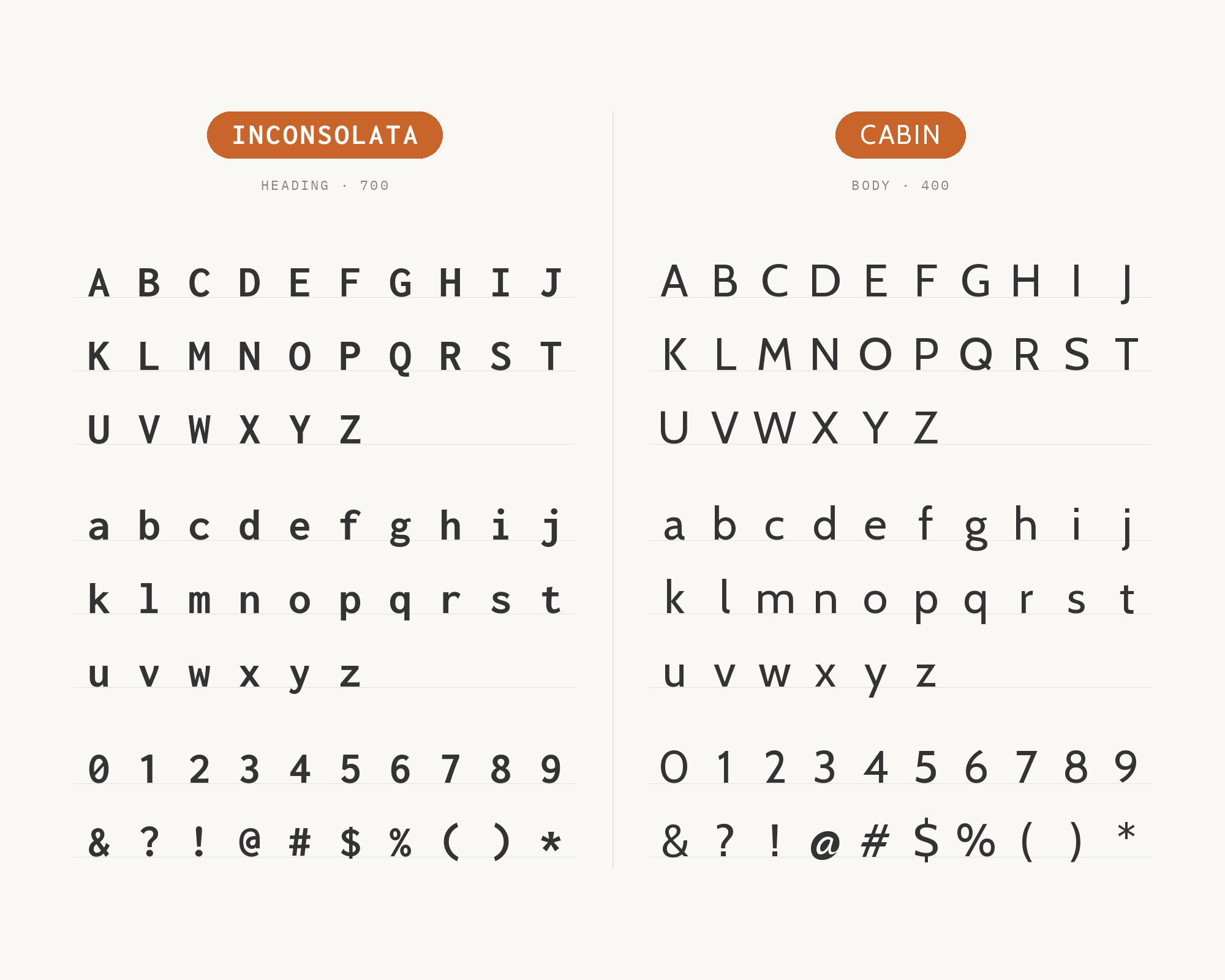
10. Cabin
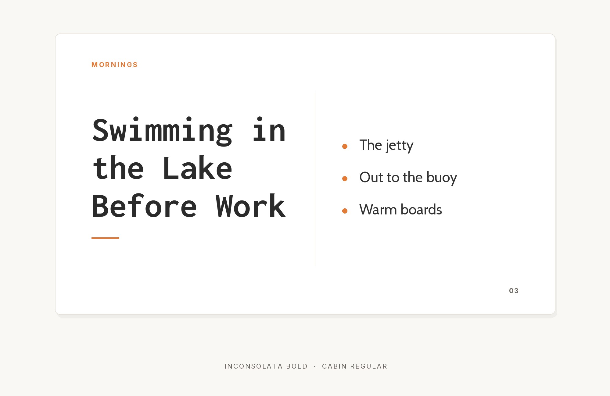
Cabin brings friendly humanist character that warms Inconsolata’s technical precision. Pablo Impallari’s design draws on Edward Johnston and Eric Gill, creating comfortable contrast with monospace uniformity. A doctoral thesis by Johan Dahlin sets its text in Cabin and its code in Inconsolata. This pairing suits applications wanting technical credibility with human warmth, from startup dashboards to creative tools.
11. Quicksand
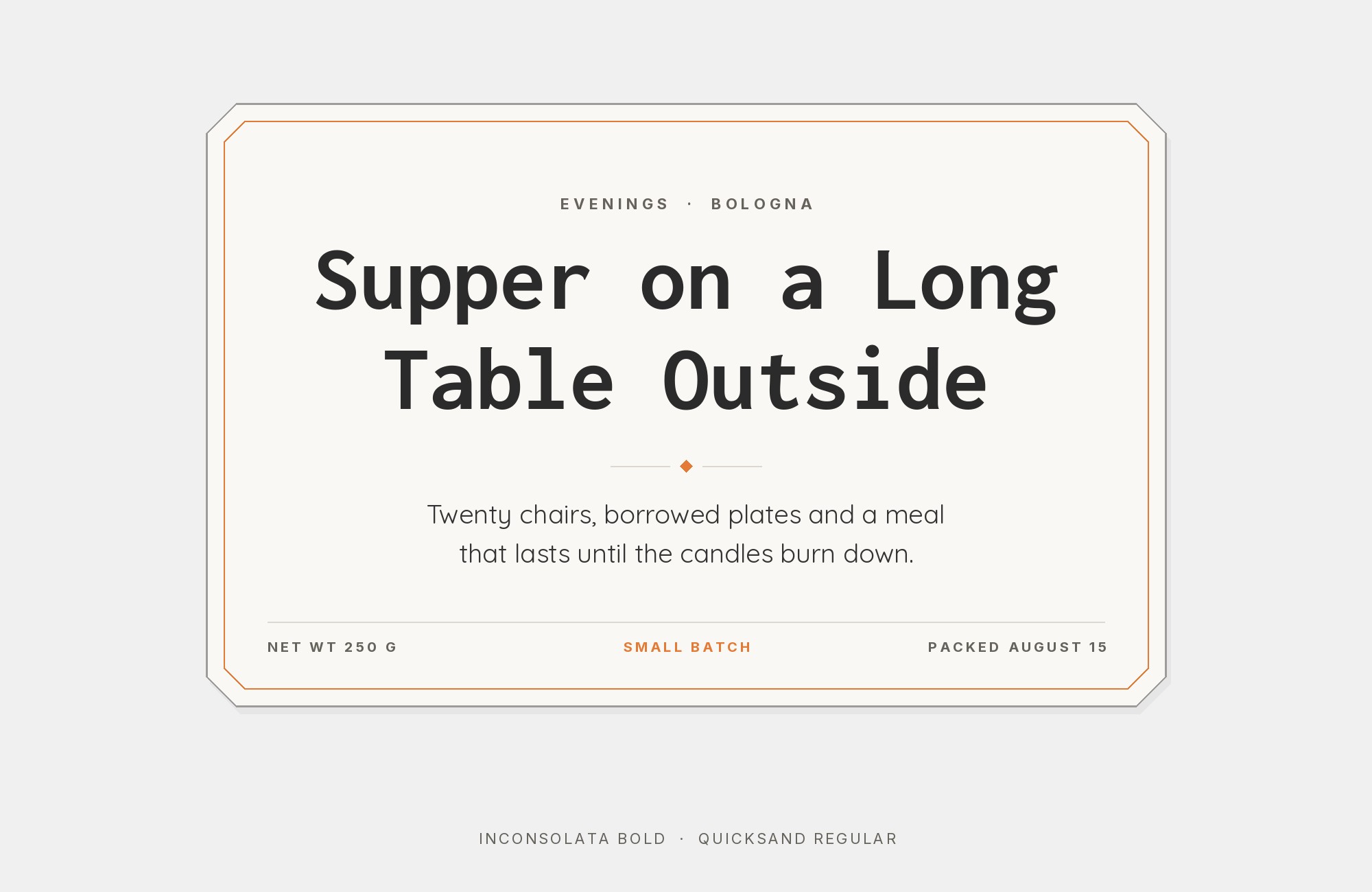
The rounded geometry of Quicksand provides friendly contrast against Inconsolata’s straighter forms. Andrew Paglinawan’s design brings approachable warmth that softens technical contexts, making code-heavy layouts more welcoming to non-technical audiences. This pairing works beautifully for educational coding platforms, creative portfolio sites, and any project wanting to make programming feel accessible.
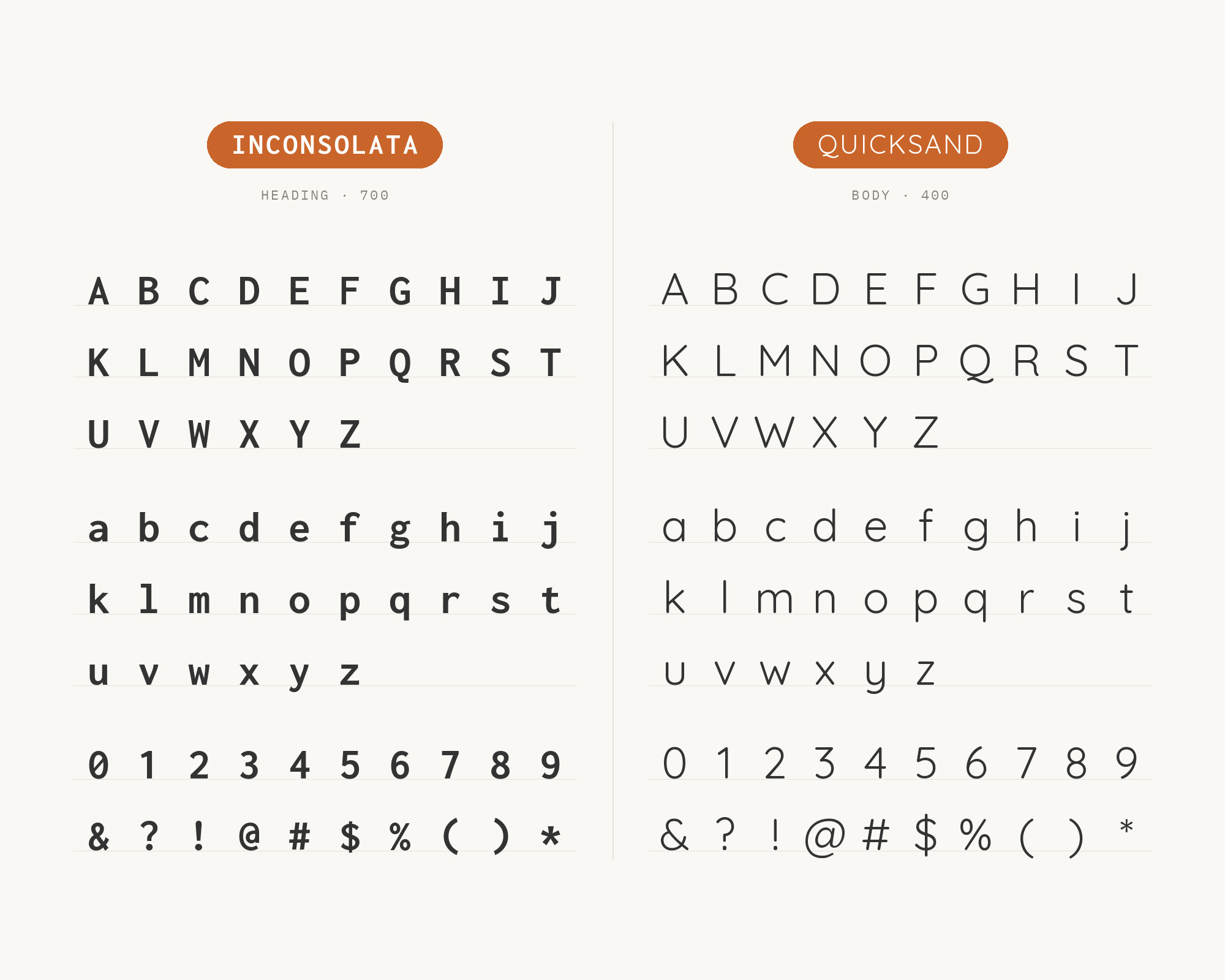
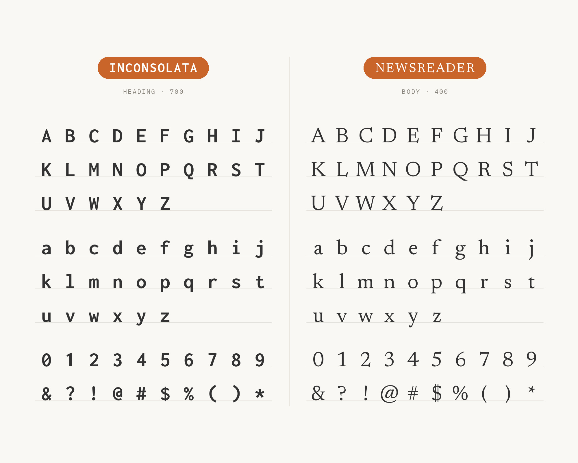
12. Newsreader
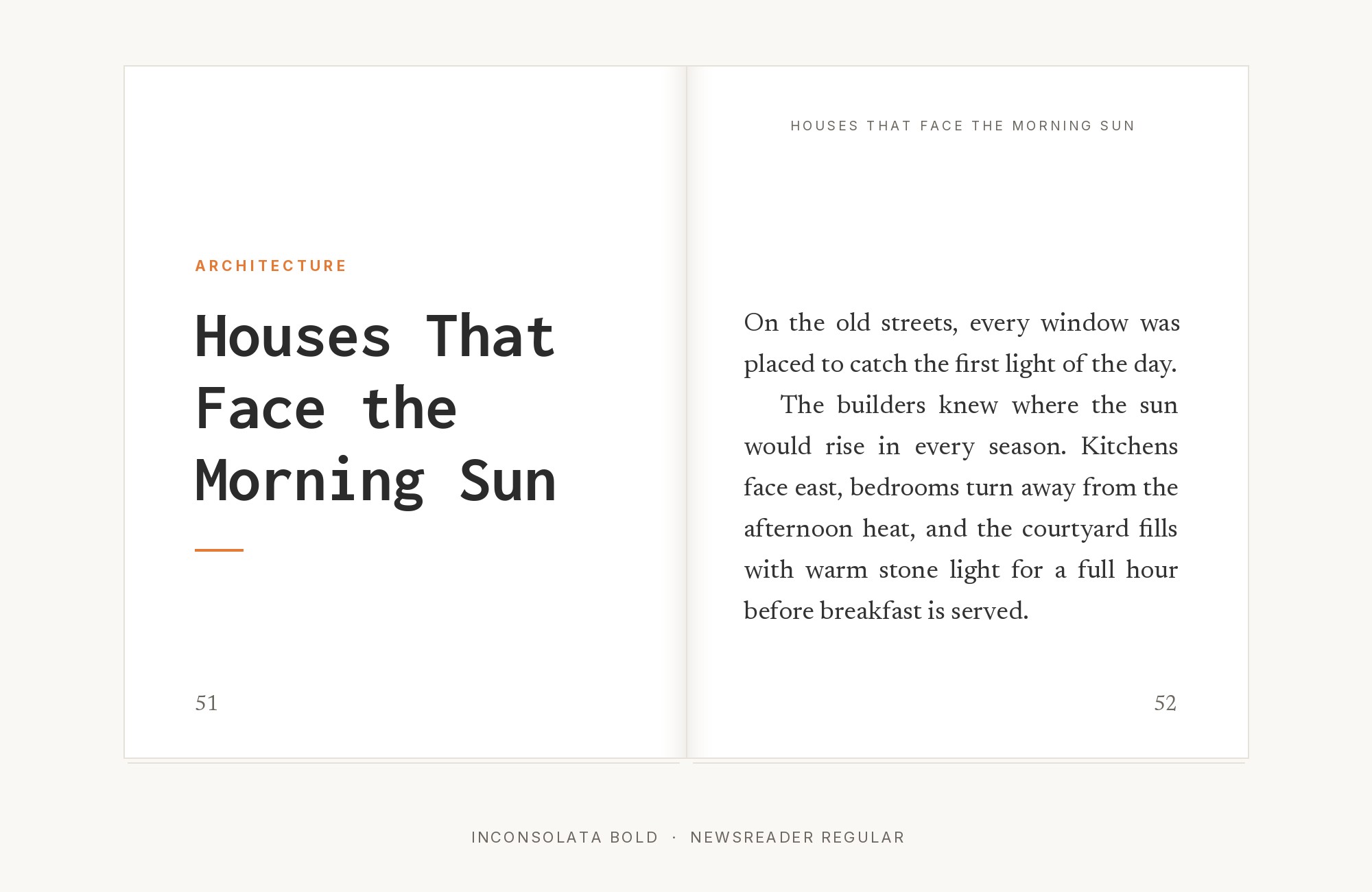
Newsreader brings editorial sophistication to Inconsolata pairings. Production Type’s design carries literary gravitas that elevates technical writing into something approaching journalism. Against Inconsolata’s pragmatic monospace, Newsreader introduces the kind of classical contrast that transforms developer blogs into publications. This pairing suits tech journalism, thoughtful technical writing, and anyone treating code as worthy of editorial presentation.
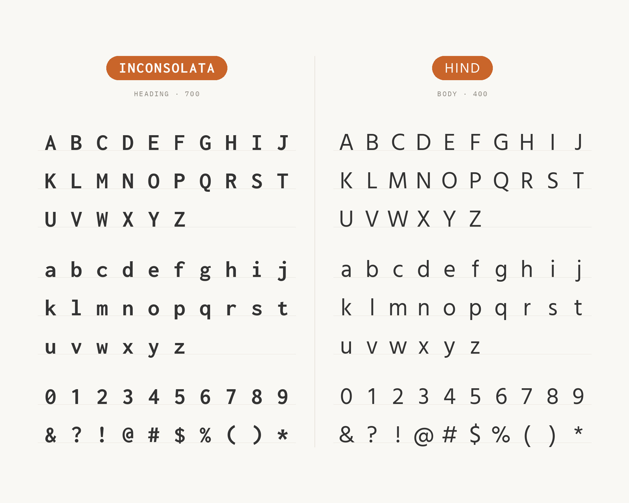
13. Hind
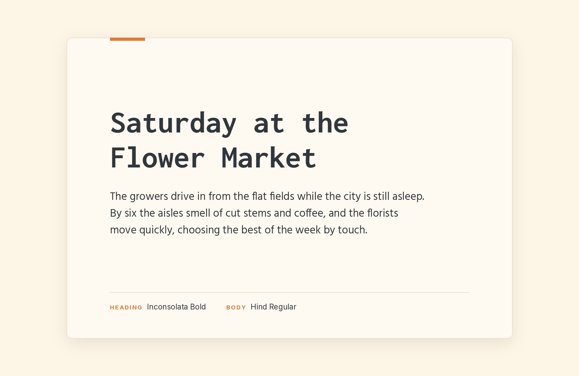
Hind supports Devanagari and Latin and was developed for user interfaces. Indian Type Foundry gave it open apertures that complement Inconsolata’s readable monospace. A published design specimen pairs Hind with Inconsolata. The result is technical content that feels welcoming across scripts, useful for international developer communities and educational platforms.
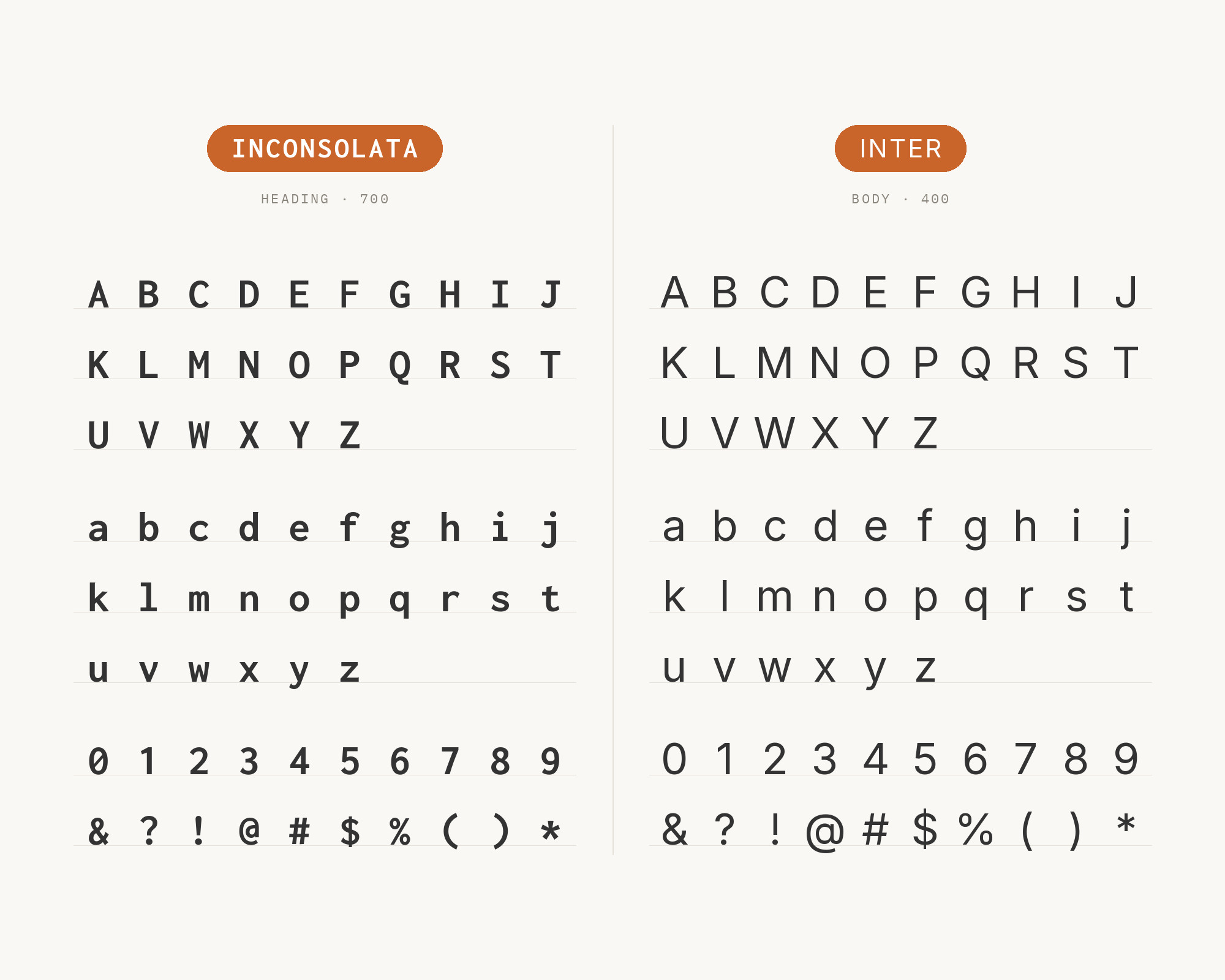
14. Inter
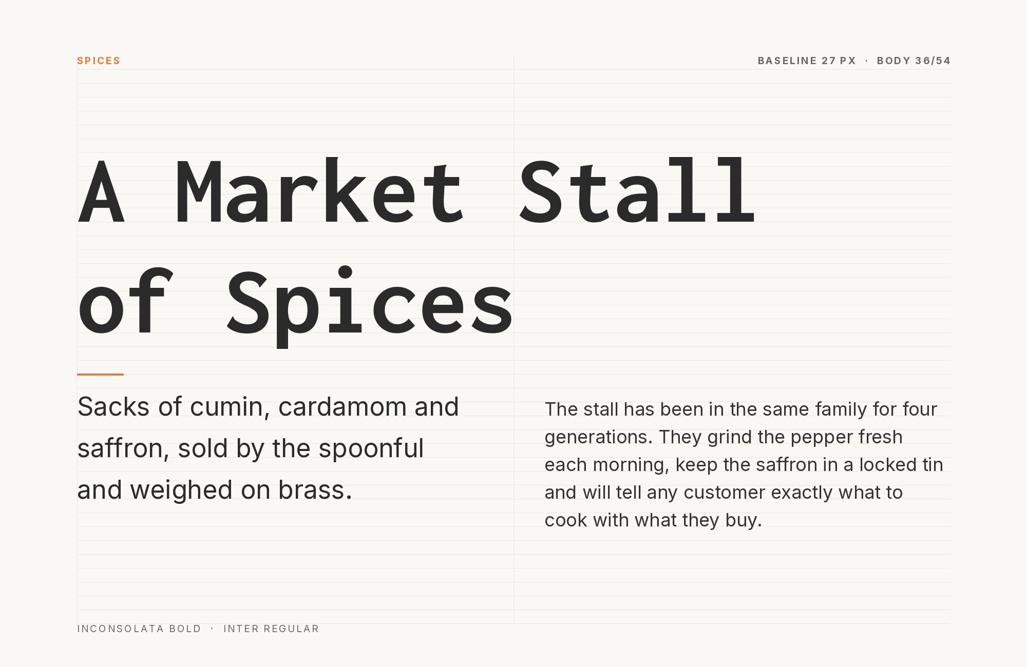
Inter brings screen-focused clarity to Inconsolata’s programmer-friendly monospace. Rasmus Andersson’s carefully drawn sans-serif creates a clean setting for Inconsolata’s fixed-width details. The Eclipse Foundation’s brand guide uses Inter for body text and Inconsolata for code. That division suits developer tools, IDE interfaces, and technical products where typographic quality signals software quality.
15. Nunito
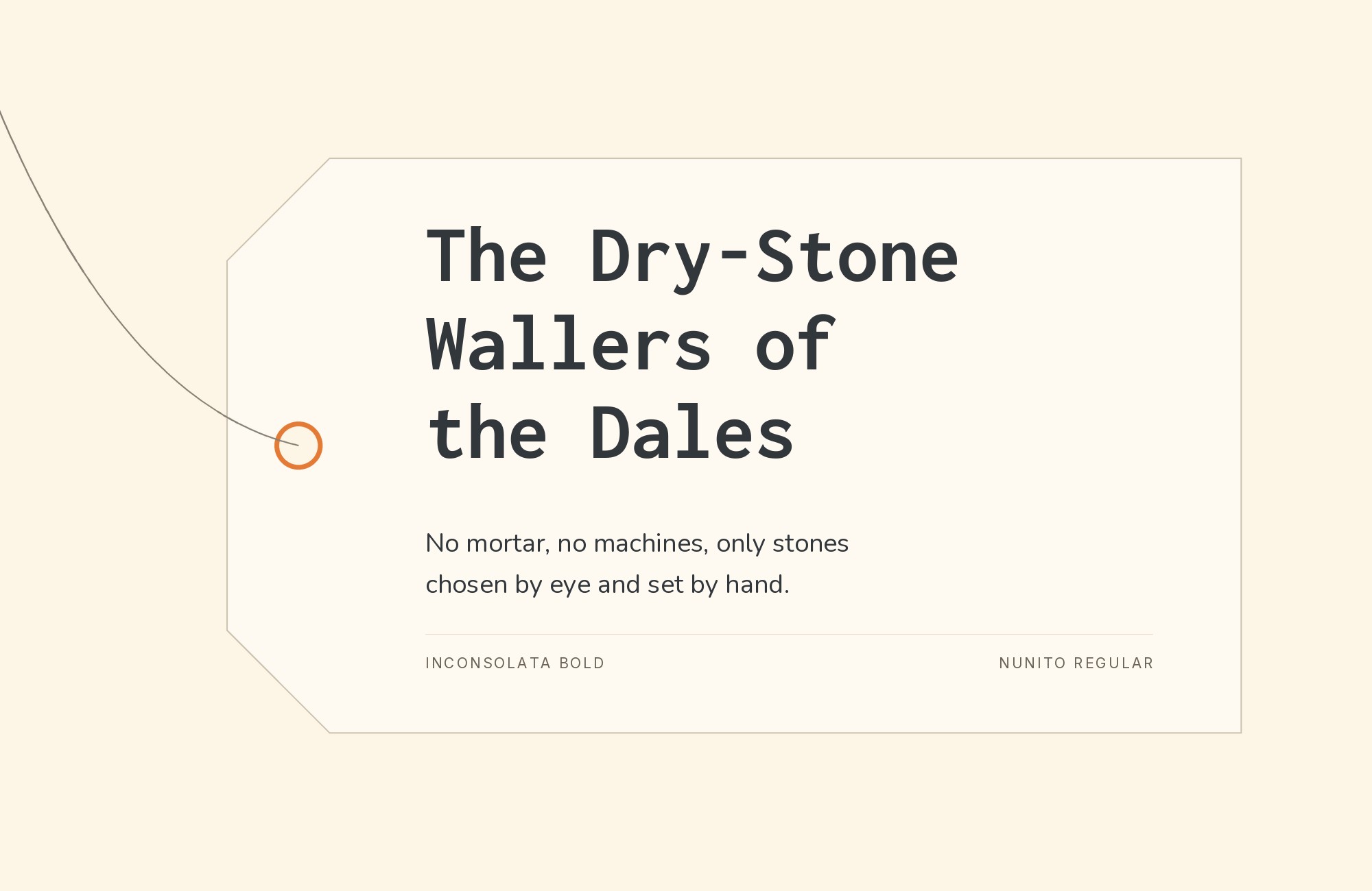
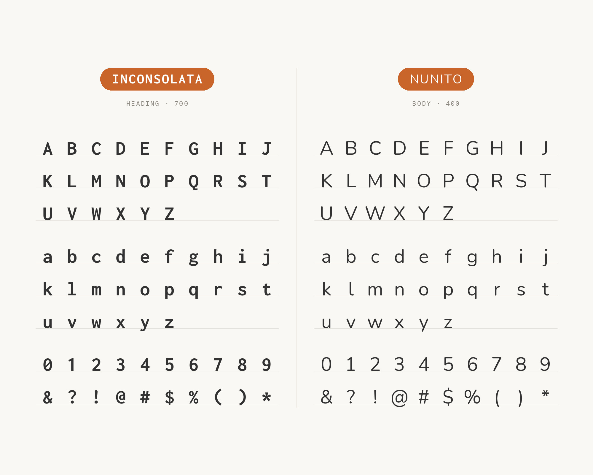
Nunito‘s rounded terminals bring friendly warmth that humanizes Inconsolata’s technical character. Vernon Adams designed a rounded-terminal sans serif for display typography, creating contrast that makes code-heavy layouts feel welcoming. The Stead Design System uses Nunito for sans-serif text and Inconsolata for monospaced text. This pairing suits educational coding platforms, children’s programming tools, and any project wanting to make technical content feel accessible to beginners.
Conclusion
There are no absolute rules for font pairing, just principles to guide you. Look for contrast in scale, proportions, or personality. Inconsolata’s monospace structure creates inherent contrast with proportional fonts, making most pairings work intuitively.
Trust your eye, experiment freely, and remember that the best pairing is the one that serves your content and audience. Typography should enhance communication, not complicate it.
Sources
- FontPair.co
- Typewolf
- Typ.io
- GitHub — googlefonts/Inconsolata
- Vandelay Design
- WeAndTheColor
- ia.net (iA Writer blog)
- Figma Google Fonts pairings
- practicaltypography.com
- Figma Google Font Pairings
- Obsidian Brand Guidelines
- Stead Design System
- Decred Visual Toolkit
- Johan Dahlin thesis
- Digital Synopsis / Milo Themes (2022-01-28 Wayback capture)
- Eclipse Foundation Brand Guidelines
- Rob Cubbon profile
- Smashing Magazine author profile
