
Georgia pairs great with Verdana, Open Sans and Montserrat. All 14 pairings are shown below in real rendered specimens, with the reason each one works.
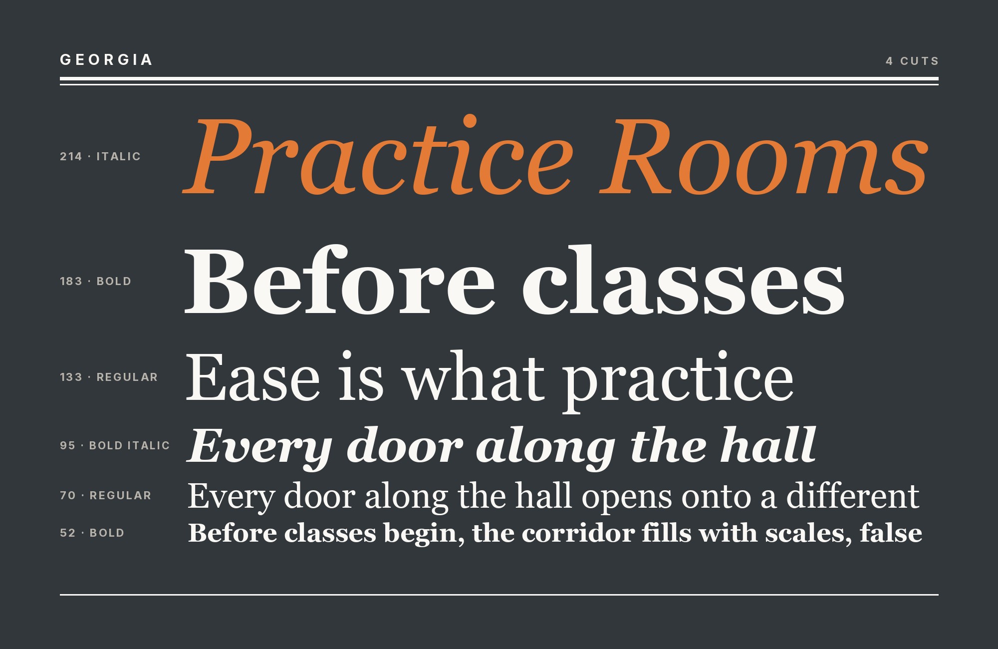
What fonts go with Georgia? Matthew Carter designed this serif in 1993 for screens that were genuinely bad at rendering type, Microsoft released it in 1996, and it has since become one of the most universally installed typefaces in existence — which means most readers reaching for it want a free, dependable serif, not a rare one.
Georgia was commissioned by Microsoft alongside Verdana as part of the same core-fonts-for-the-web project, and every decision in its construction traces back to the low-resolution screens of the mid-1990s: chunky, sturdy serifs that hold their shape when rasterized, a large x-height that keeps small text legible, and open apertures that resist blurring at low pixel densities. Carter drew on Scotch Roman letterforms for its structure — the same historical model behind his later revival Miller — and the face was carefully hinted for clarity on-screen. Screens have improved enormously since 1996, but Georgia’s proportions still make it one of the most comfortable serifs available for sustained on-screen reading.
Because Georgia’s core appeal is universal, no-cost availability rather than rarity, the strongest partners share that same property. A partner that requires a license undercuts the whole reason someone reached for Georgia in the first place. That is why free, well-built sans-serifs dominate this list, ahead of retail faces with more pedigree but less practical fit.
1. Verdana

Matthew Carter drew Verdana for the same 1996 Microsoft project, aimed at the same low-resolution screen-reading problem, which makes this less a stylistic pairing than a shared engineering pedigree. The two were never meant to look alike — Verdana is a wide, open sans with almost no stroke contrast — but using them together keeps a page’s screen-legibility logic consistent from headline to footnote. It ships on essentially every operating system, so the pairing costs nothing and needs no webfont request. Set Verdana for navigation, labels and UI chrome, and let Georgia carry the paragraphs it was built to hold.

Unlimited fonts from $16.50/mo.
29 million fonts, templates and stock assets. One subscription, unlimited downloads.
See the plan2. Open Sans

A clean, neutral humanist sans with open forms, Open Sans is free on Google Fonts and built specifically to stay out of the way of whatever it sits next to. Next to Georgia’s warm, idiosyncratic curves, it runs interface furniture and secondary text without competing for attention — the Chicago Tribune’s 2022 redesign pairs the two at the production scale of a major daily newspaper. It is the most obtainable version of the workhorse sans-and-serif split on this list, since both faces are either free or already installed. Keep Georgia in body copy and let Open Sans handle everything structural around it.

3. Montserrat

Montserrat’s even, geometric strokes and tall x-height keep navigation and captions legible at small interface sizes, while Georgia’s larger x-height and forgiving curves do the actual long-form reading underneath. The Washington Post’s The Lily ran this exact split in its 2019 redesign, using Montserrat for its brand-facing chrome and Georgia for article text. Both faces are free — Montserrat on Google Fonts, Georgia pre-installed on nearly every device — so the pairing carries no licensing cost at all. It suits editorial sites aimed at readers who expect a serif built for comfortable screen reading.

4. Inter

Inter is a quiet, well-spaced grotesque engineered specifically for interface and caption work — tall x-height, neutral proportions, tuned to disappear at small sizes. That restraint is exactly what keeps it from competing with Georgia’s serif detail when the two share a page. Inter handles labels, buttons and metadata, while Georgia carries body copy and long-form reading, where its warmer serifs and wider curves do more for the reader. Typ.io records the agency site lift.agency using Georgia and Inter together, alongside Circular. The pairing suits software documentation, blogs and any product site that wants a familiar, dependable serif without sacrificing a modern interface layer.

Try Semrush free. No credit card.
Start on the $0 plan. Paid plans from $117/mo billed annually.
Try for free5. Work Sans

Work Sans’s clean, even strokes and open apertures stay quiet next to Georgia’s idiosyncratic curves — a plain, screen-tuned grotesque suited to interface labels and secondary text while article copy stays set in Georgia’s warmer, larger-x-height forms. Google Fonts carries it at no cost, which makes it an easy default for teams that want a neutral interface face without paying for one. The pairing has no strong personality of its own to manage; it simply lets Georgia’s body text do the reading work while Work Sans keeps everything structural legible and out of the way.

6. Poppins

Poppins’s rounded geometric bowls carry enough personality to hold a masthead or pull-quote, set against Georgia’s traditional Scotch-Roman body text — a clear split between a warmer display voice and Georgia’s quieter, workhorse reading text underneath. The Google Fonts license is free, so the contrast costs nothing to test. Because Poppins has more character than most of Georgia’s other sans partners, keep it confined to headlines, buttons and short display copy; asked to carry paragraphs, its rounded forms compete with rather than support Georgia’s calmer reading experience.

7. Archivo

Archivo is a grotesque drawn in multiple widths, and its condensed, high-legibility cuts hold up well in bylines, captions and infographic labels — a plain, editorial-grade sans that stays out of the way of Georgia’s roomier, warmer body text. Free on Google Fonts, it gives editorial and publishing sites a no-cost alternative to licensed condensed grotesques built for the same job. Use a condensed Archivo cut for metadata and dense label work, and keep Georgia set at 17 to 19 pixels for the actual article text underneath it.

8. Mulish

Mulish’s minimal, slightly rounded letterforms carry more warmth than a strict grotesque, softening the transition into Georgia’s calligraphic serifs rather than fighting them. Google Fonts hosts it for free, and it works well as a quiet, contemporary sans for navigation and UI chrome around Georgia’s larger-x-height body copy. The pairing suits blogs and content sites that want something friendlier than a pure grotesque without introducing a second serif into the layout. Keep Mulish in structural roles — menus, buttons, labels — and let Georgia carry every paragraph a reader is expected to finish.

9. Playfair Display

A high-contrast display serif gives headlines the drama Georgia deliberately avoids at body sizes, so the pair splits work cleanly: Playfair Display shouts the headline, Georgia quietly carries everything underneath it. Both are free — Playfair Display on Google Fonts, Georgia pre-installed almost everywhere — which makes this an all-free, all-serif system that still reads as two distinct voices. Because Playfair Display’s hairlines thin out at small sizes the way Didot’s do, keep it strictly at display sizes and let Georgia’s chunkier, screen-tuned serifs handle every size below that.

10. Helvetica Neue

Helvetica Neue’s tight, neutral grotesque letterforms give Georgia’s wider, screen-tuned serifs somewhere plain to rest — real sites lean on this split for exactly the reason a workhorse sans-and-serif pair usually gets picked: one face runs labels and navigation, the other carries the paragraphs people actually read. It ships with Apple systems but requires a separate license elsewhere, which makes it less universally free than most of Georgia’s other partners on this list. Use it where its neutrality is already available — Apple-first products and platforms — and let Georgia’s larger x-height do the reading.

11. Franklin Gothic

A dense, no-nonsense grotesque with none of Georgia’s warmth, which is the point — Time runs this exact combination, using Franklin Gothic’s blunt weight for headlines and section labels while Georgia’s larger x-height keeps long-form text readable underneath. It is a classic American grotesque with a long editorial pedigree, though most digital cuts require licensing rather than a free download. The pairing suits news and magazine-style layouts that want authority up top and comfortable reading underneath — a proven combination rather than an experimental one.

12. Futura

Futura’s circular bowls have no serif ancestry, so they cool Georgia’s Scotch-Roman curves instead of echoing them. Fonts In Use records Politico’s 2013 site with Georgia as the text face and Futura in the Politico Magazine and Friday Cover logos — a temperature split, not a soft one. It is a licensed face without a Google Fonts equivalent, so it sits further down this list than the free sans partners above it despite the strength of the pairing. Reserve it for branding and section labels, not body text.

13. Miller

Matthew Carter was already drawing Miller, his revival of Scotch Roman, around the time Microsoft commissioned Georgia from the same source material — the two share an ancestry rather than a coincidence. The common advice is to license Miller for print once a brand has already committed to Georgia on screen, treating them as a screen-and-print pair drawn by the same hand from the same historical model. Miller is a retail text serif with no free equivalent, so this pairing suits brands with an existing print budget rather than a web-only project. Georgia stays on screen; Miller takes over in print.

14. Lucida Sans

Lucida Sans and Georgia were both drawn to survive whatever machine opens the page, so using them together reads as a screen-safe system rather than a coincidence. Archive of Our Own, the nonprofit fanfiction archive with more than eleven million registered users, has used that split since it was created in 2008: Georgia on headings and the logotype, Lucida Sans on body text and buttons. Both faces are old enough to ship on most systems by default, which makes the combination essentially free anywhere. It suits utilitarian, high-traffic sites where dependability matters more than distinctiveness.

Conclusion
Georgia’s whole reason for existing is universal availability — a serif that reads well on a bad screen and comes installed almost everywhere. The pairings that respect that logic favor free, widely available sans-serifs over premium companions, which is why Google Fonts partners dominate this list rather than retail faces with more pedigree. That is not a limitation; it is the same design principle Georgia itself was built on.
Test the combination at the sizes the project will actually ship. Georgia’s large x-height and chunky serifs hold up well small, but several of its display partners — Playfair Display, Futura at scale — need real headline sizes to look intentional rather than arbitrary. Set the actual layout before deciding.
Sources
- Typ.io
- Typ.io (lift.agency)
- Typewolf
- Wikipedia
- MyFonts
- Practical Typography (Matthew Butterick)
- A List Apart (Jason Santa Maria)
- Visme (Nayomi Chibana)
- Elementor (Sergei Davidov)
- Fonts In Use
- Microsoft Learn (Georgia font family page)
- Litmus
- Omnisend (Aistė Jočytė)
- pptx.gallery
- Adobe Fonts
- MIT MAD (design.mit.edu)
- TED Talks
- Type Network
