BonFX

Typography & Graphic Design Blog

  • Blog
  • Font Combinations
  • Books
    • The Preposterously Huge Book of Google Font Combinations
    • The Big Book of Font Combinations (Classic Fonts Edition)
  • Contact
You are here: Home / Graphic Design / What Fonts Go With Spectral?

The BonFX Letter

One good pairing.
Every Tuesday.

2-minute read · free

This week — no. 14

Quiet authority

Merriweather sets the tone in one line. Lato stays out of the way and lets it.

MERRIWEATHER 700  +  LATO 400

A font specimen, a pairing that works, and one line on why it works. That is the whole email.

Free. One click to unsubscribe. No sharing, ever.

What Fonts Go With Spectral?

What Fonts Go With Spectral?

August 19, 2026 by Douglas Bonneville

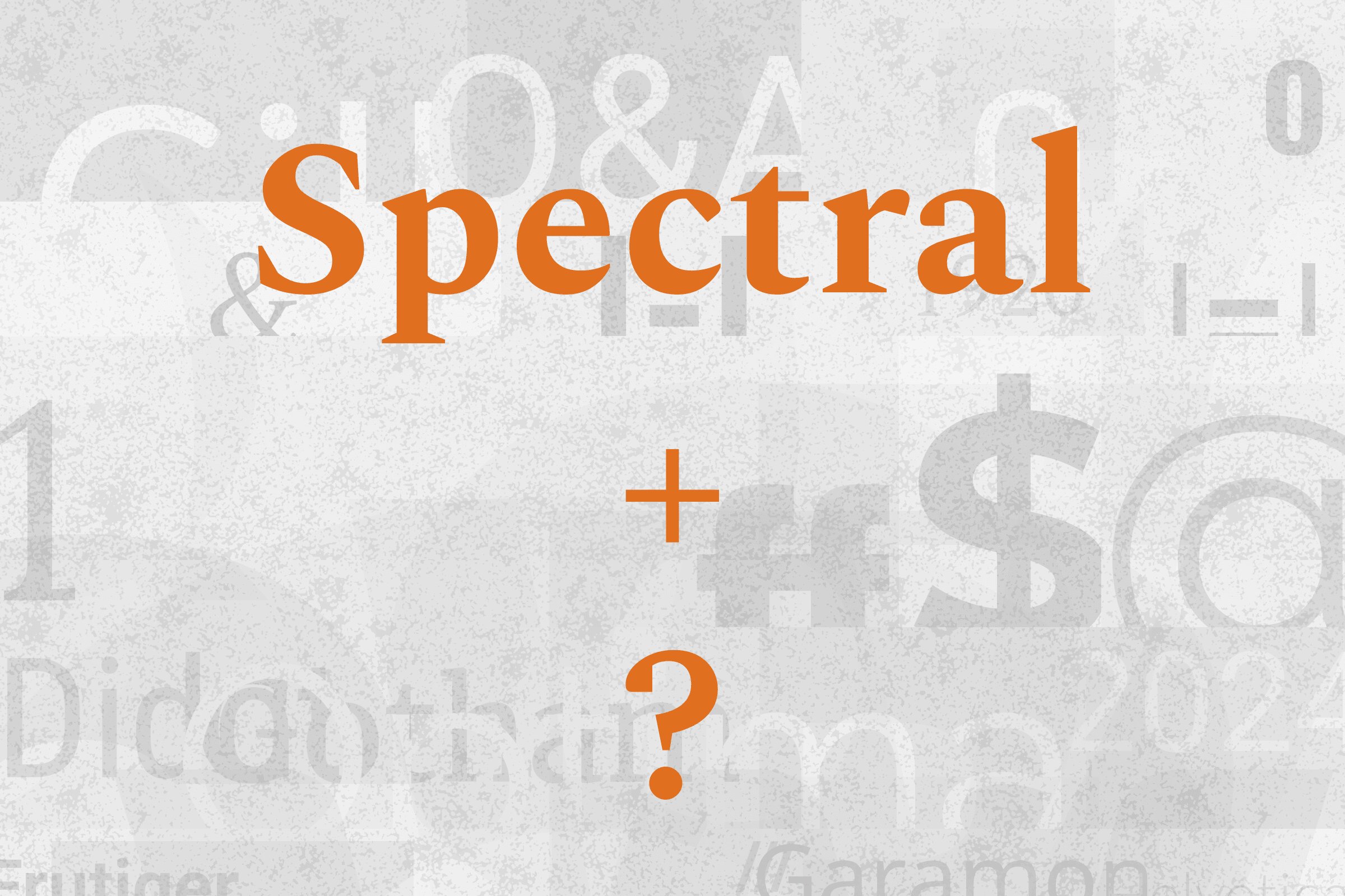
Spectral pairs great with Karla, Source Sans Pro and Open Sans. All 14 pairings are shown below in real rendered specimens, with the reason each one works.

Spectral type specimen

What fonts go with Spectral? This Google Fonts serif designed specifically for screen reading requires companions that can match its technical sophistication and excellent rendering.

Spectral, designed by Production Type for Google Fonts, represents a new generation of serif typefaces engineered from the ground up for digital reading. Production Type calls it a straightforward serif face, designed for on-screen performance and commissioned primarily to be used with Docs and Sheets, Google’s office-suite programs. What sets Spectral apart is its seven weights with matching italics, all optimized for screen display. The result is a serif that feels classical enough for long-form reading but performs flawlessly in digital contexts.

The pairing consideration with Spectral is its screen-first orientation. Companions should share its commitment to digital legibility rather than fighting against it. Sans-serifs with similar technical care create harmonious modern combinations, while more traditional designs might feel at odds with Spectral’s optimized nature. The font excels in editorial and publishing contexts where extended reading comfort matters. Here are 14 fonts that pair well with Spectral, selected for their ability to create cohesive digital typography systems.

Semrush
Featured
···
SEO has moved beyond your website
Semrush.com
Semrush.com
Try the SEO toolkit free for 7 days
No credit card required
Learn More

Font Pairings for Spectral

  1. Karla
  2. Spectral SC
  3. Source Sans Pro
  4. Open Sans
  5. Inter
  6. Work Sans
  7. Fira Sans
  8. IBM Plex Sans
  9. Poppins
  10. Roboto
  11. Lato
  12. Nunito Sans
  13. PT Sans
  14. Manrope

1. Karla

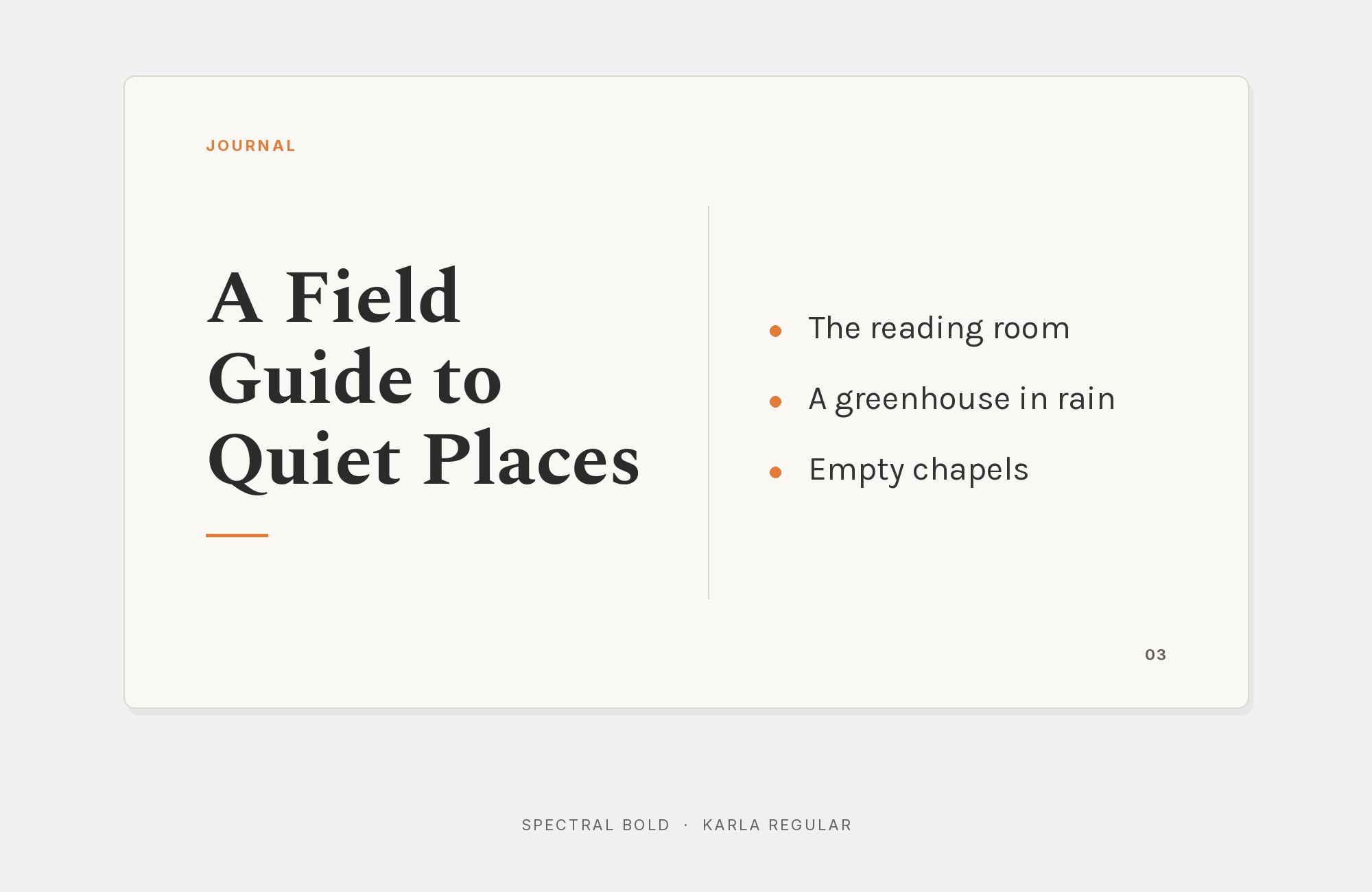
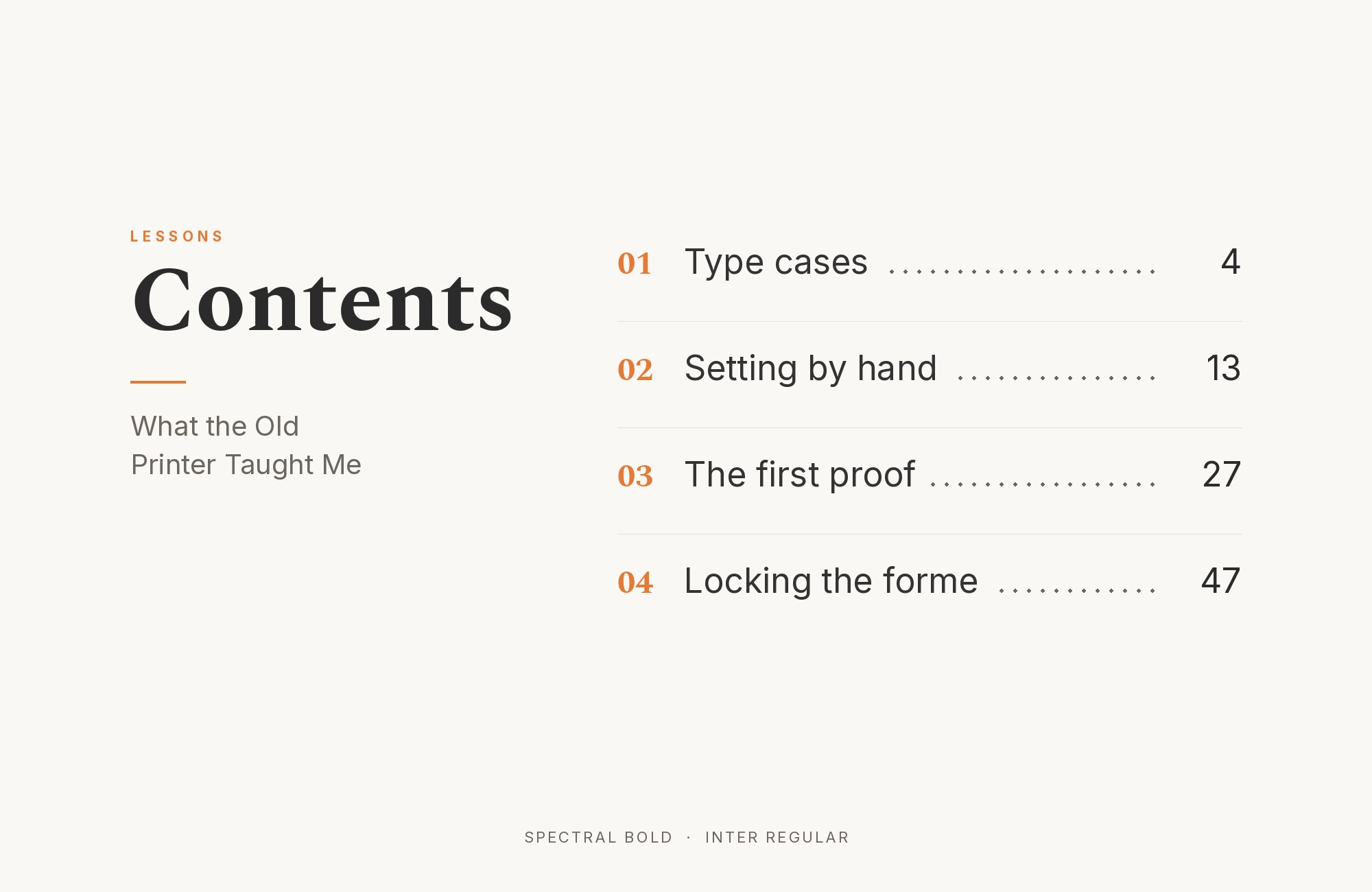
Spectral and Karla font pairing: Spectral headline with Karla body text

Spectral’s refined wedge serifs and vertical stress create headlines with algorithmic precision. Karla‘s quirky grotesque forms in body text bring unexpected personality that prevents sterility. This pairing suits design studios, tech publications, or creative agencies. The contrast between Spectral’s formal structure and Karla’s humanist irregularities creates productive tension. Sophisticated with a wink.
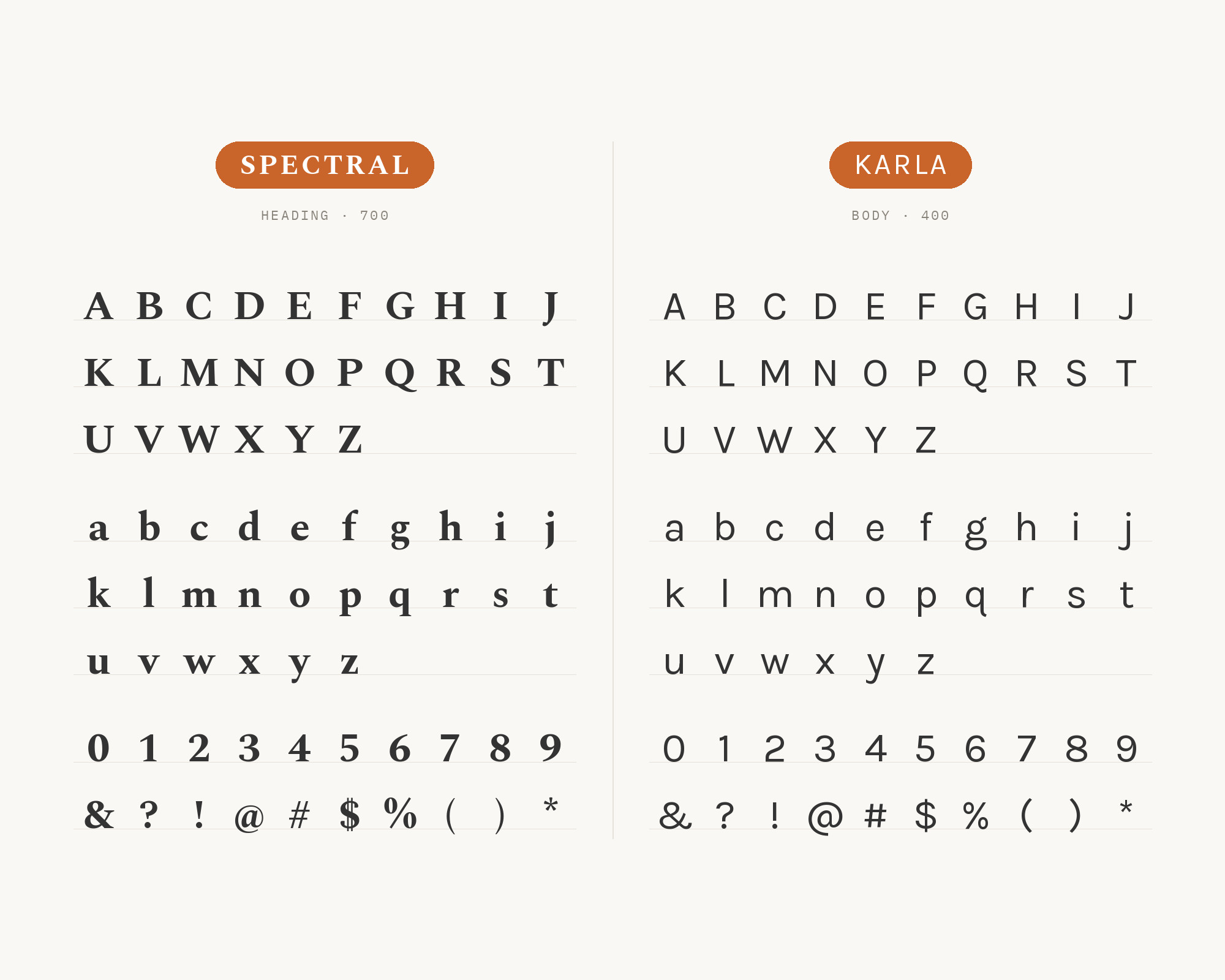
Character specimen: Spectral (heading) and Karla (body) letters, numbers and symbols side by side

2. Spectral SC

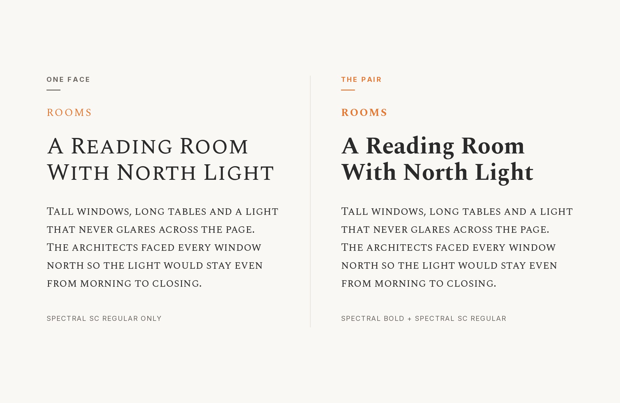
Spectral and Spectral SC font pairing: Spectral headline with Spectral SC body text

Same family, different case treatment. Spectral SC‘s small caps create subheadings with classical authority while regular Spectral handles body text. This monofamily approach ensures perfect harmony while small caps add hierarchical distinction. Works for academic publishing, legal documents, or formal communications. The shared proportions make weight matching effortless.
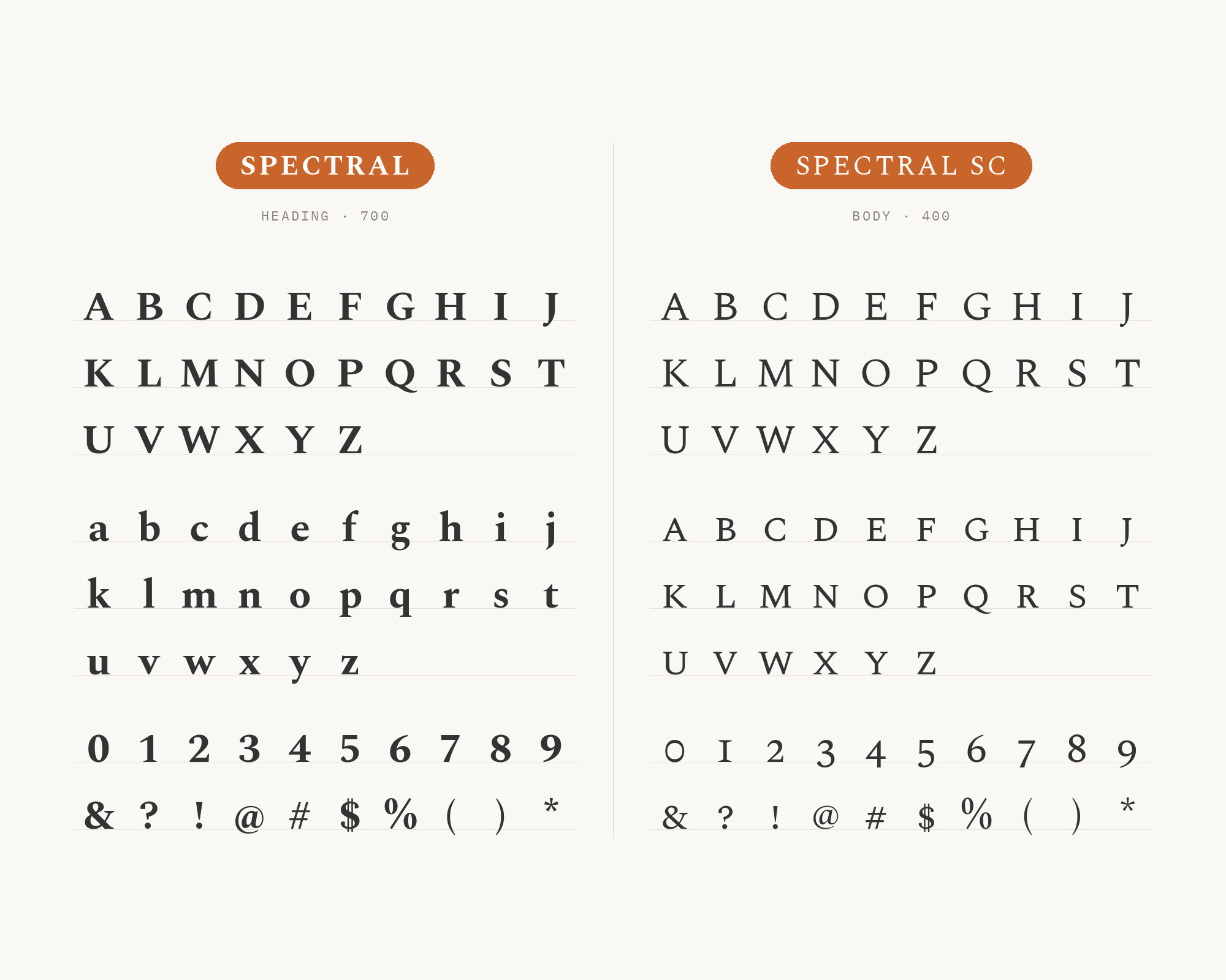
Character specimen: Spectral (heading) and Spectral SC (body) letters, numbers and symbols side by side

3. Source Sans Pro

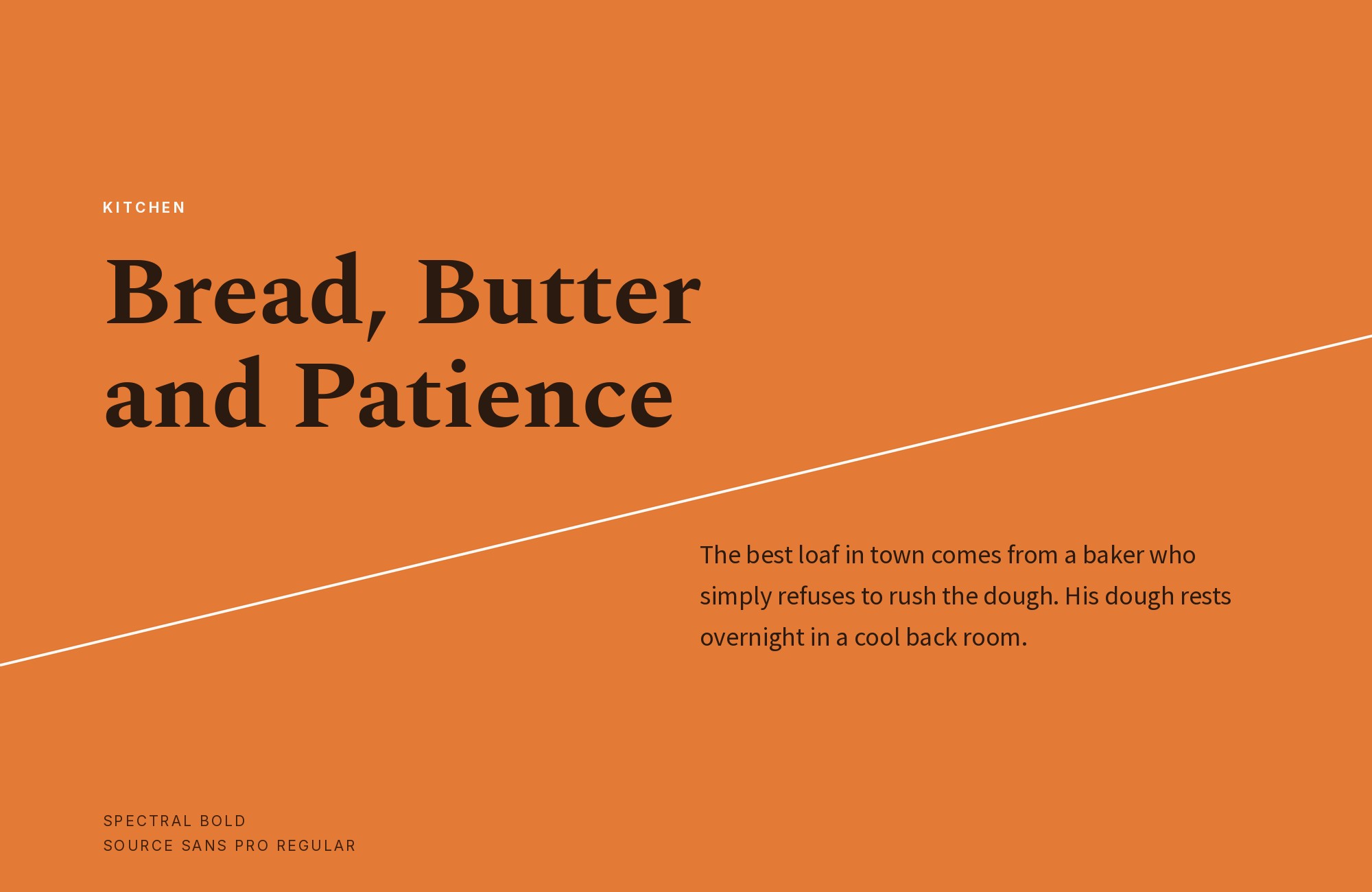
Spectral and Source Sans Pro font pairing: Spectral headline with Source Sans Pro body text

Source Sans Pro‘s UI-optimized construction creates efficient body text that Spectral’s refined serifs can lead gracefully. The combination balances digital pragmatism with typographic elegance. Works for publishing platforms, documentation, or content management systems. Both fonts emphasize readability, making this pairing reliable across contexts and devices.
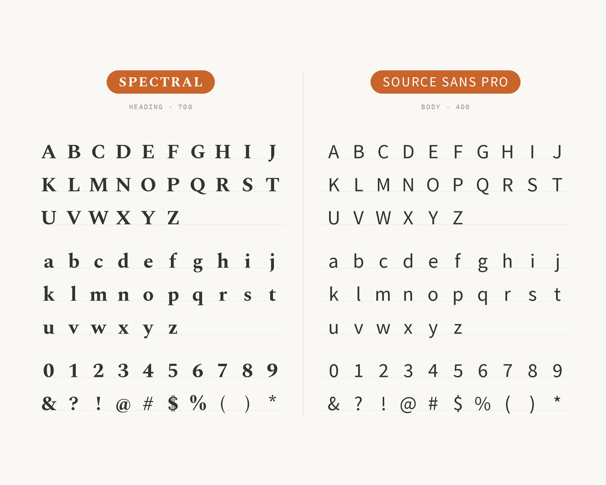
Character specimen: Spectral (heading) and Source Sans Pro (body) letters, numbers and symbols side by side
Framer
Featured
···
From idea to launch with AI, keeping full design control
Framer.com
Framer.com
AI Design Agent
Build and ship your ideas faster.
Sign Up

4. Open Sans

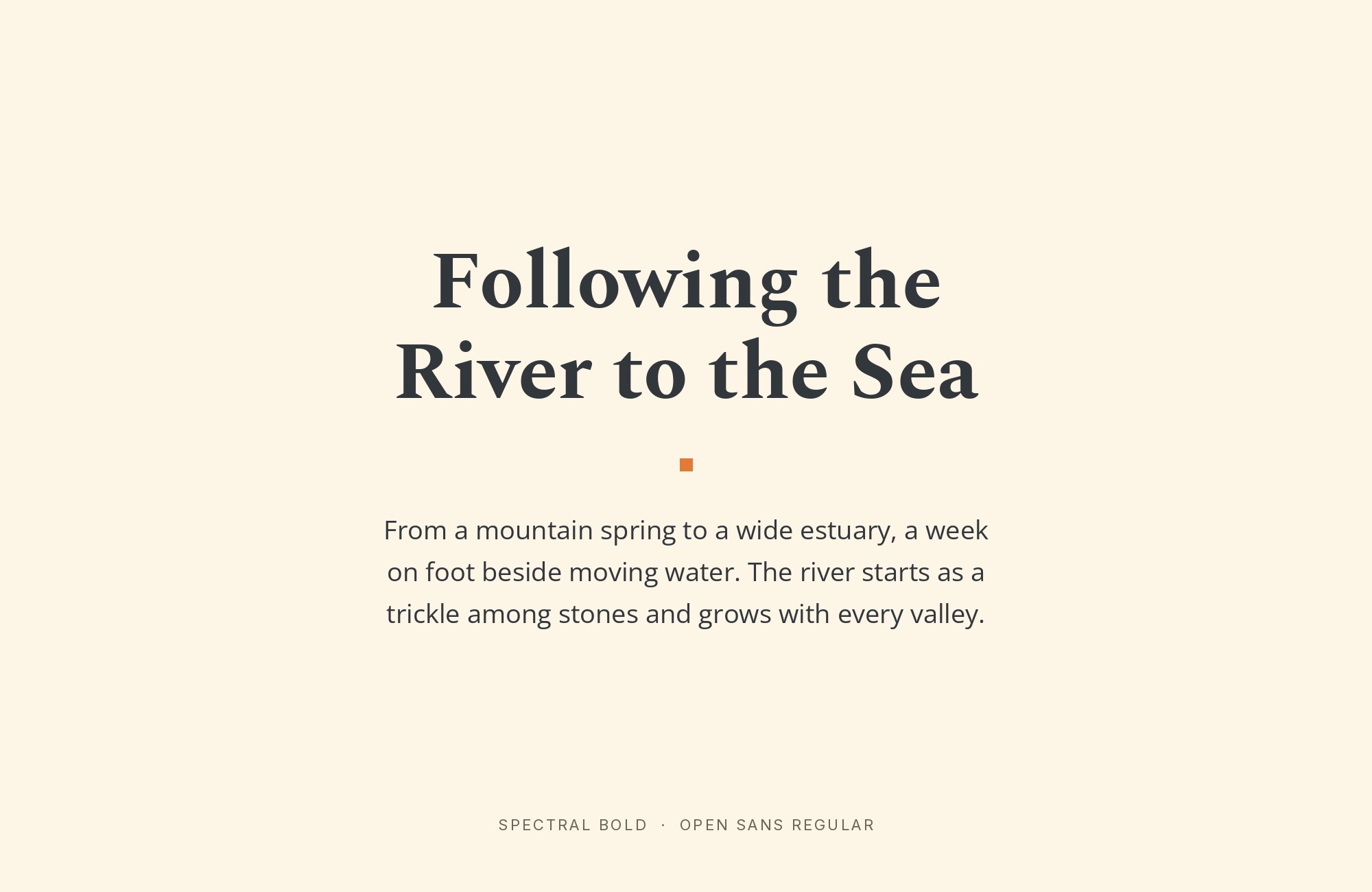
Spectral and Open Sans font pairing: Spectral headline with Open Sans body text

Open Sans‘s neutral humanist forms provide body text that never competes with Spectral’s refined headlines. The combination is the editorial equivalent of black tie with comfortable shoes. Works for corporate publishing, educational content, or long-form journalism. Open Sans handles heavy lifting while Spectral provides the visual signature.
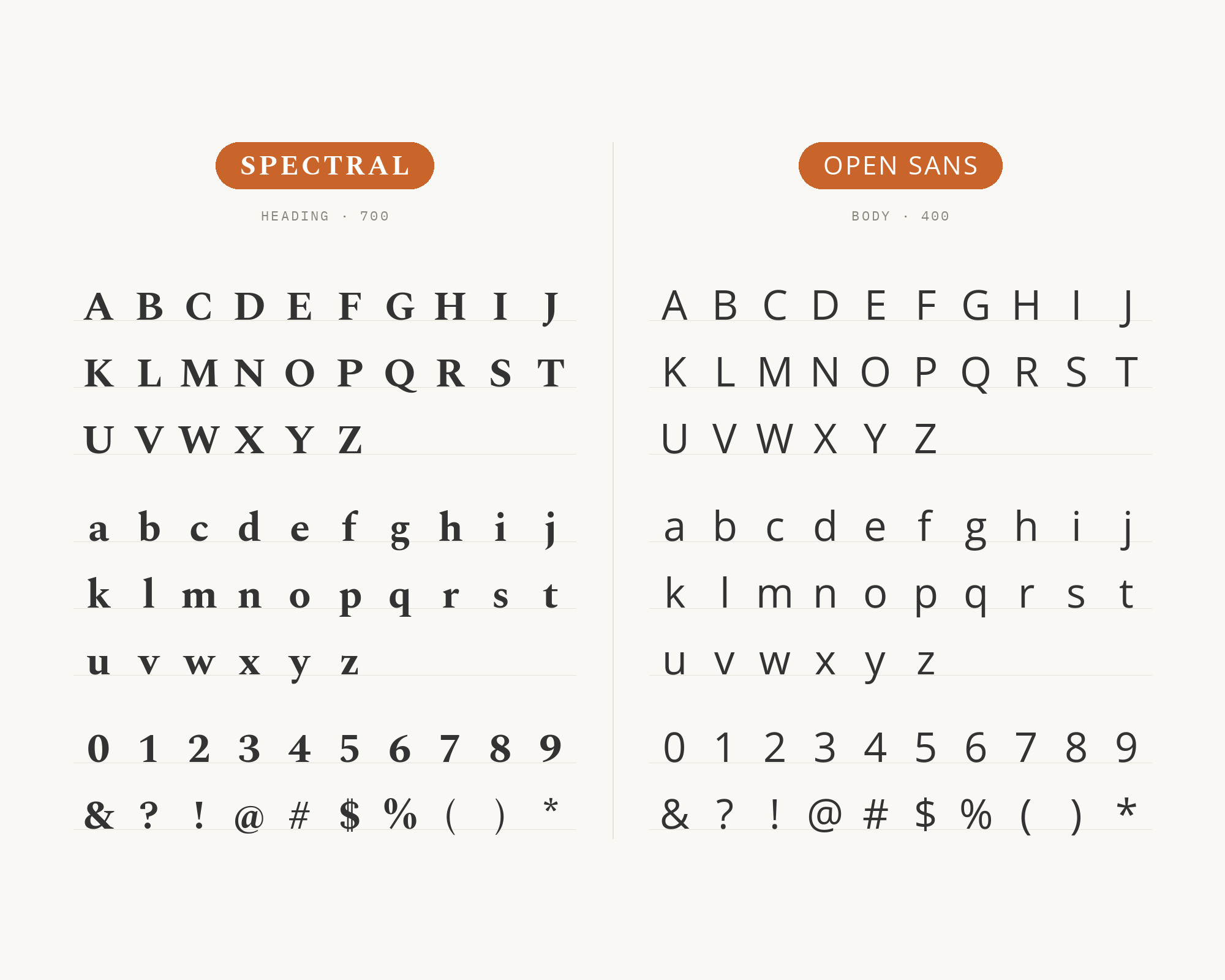
Character specimen: Spectral (heading) and Open Sans (body) letters, numbers and symbols side by side

5. Inter

Spectral and Inter font pairing: Spectral headline with Inter body text

Inter‘s screen-optimized geometry creates body text built for interfaces, while Spectral’s serifs bring editorial sophistication to headlines. This combination bridges UI and publishing aesthetics effectively. Works for content-heavy applications, reading platforms, or editorial dashboards. Both fonts render crisply across devices, ensuring consistent quality.
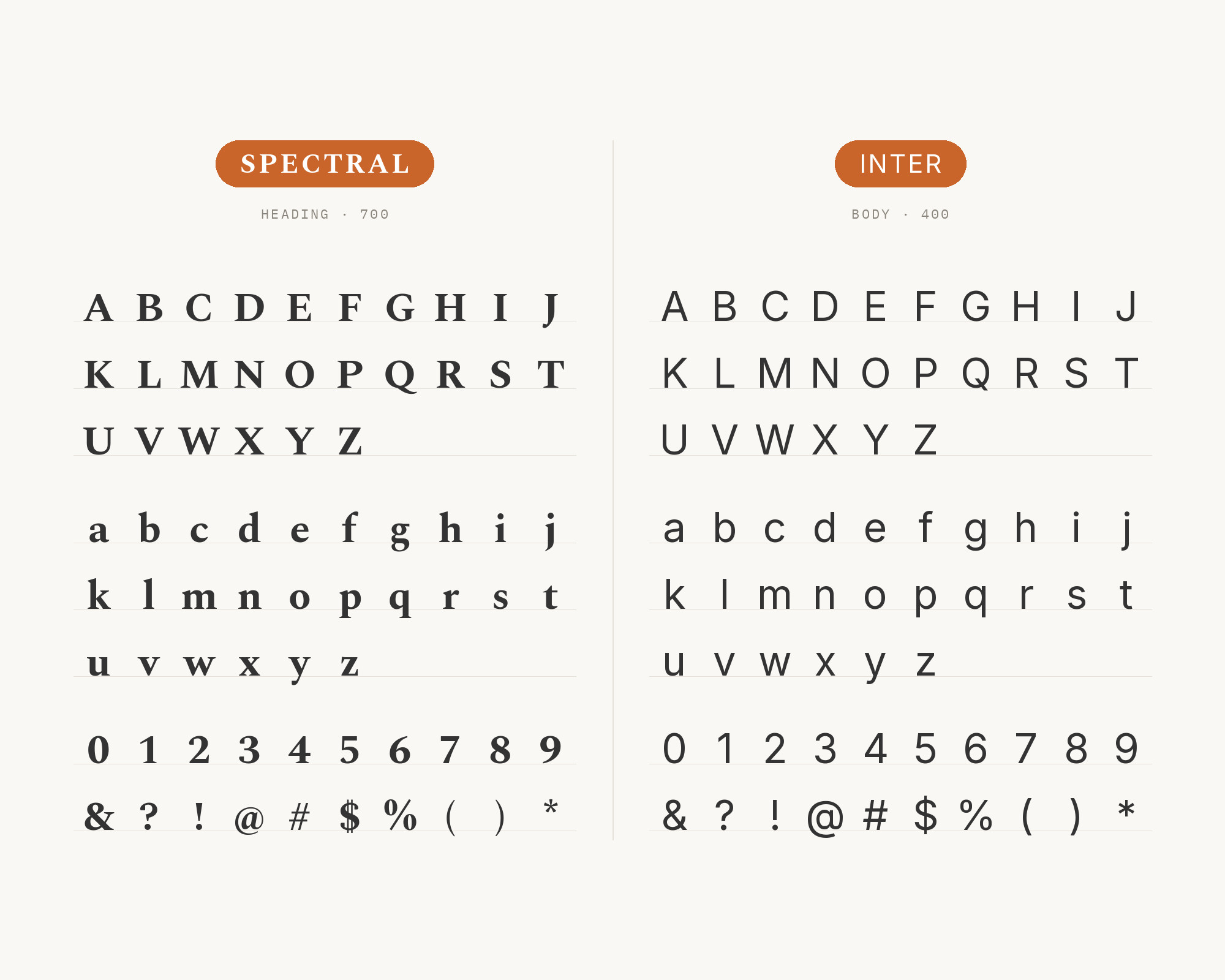
Character specimen: Spectral (heading) and Inter (body) letters, numbers and symbols side by side

6. Work Sans

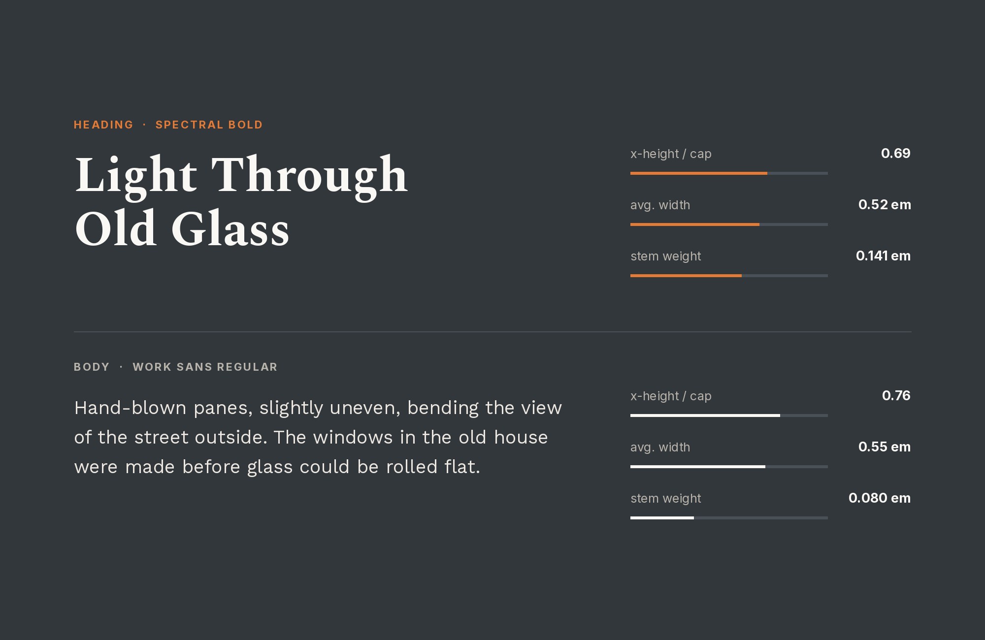
Spectral and Work Sans font pairing: Spectral headline with Work Sans body text

Work Sans‘s screen-optimized proportions create body text designed for digital reading. Spectral’s refined serifs in headlines add the typographic character that Work Sans deliberately avoids. This pairing suits SaaS content, product documentation, or editorial platforms. The sans-serif workhorse supports Spectral’s refined display forms.
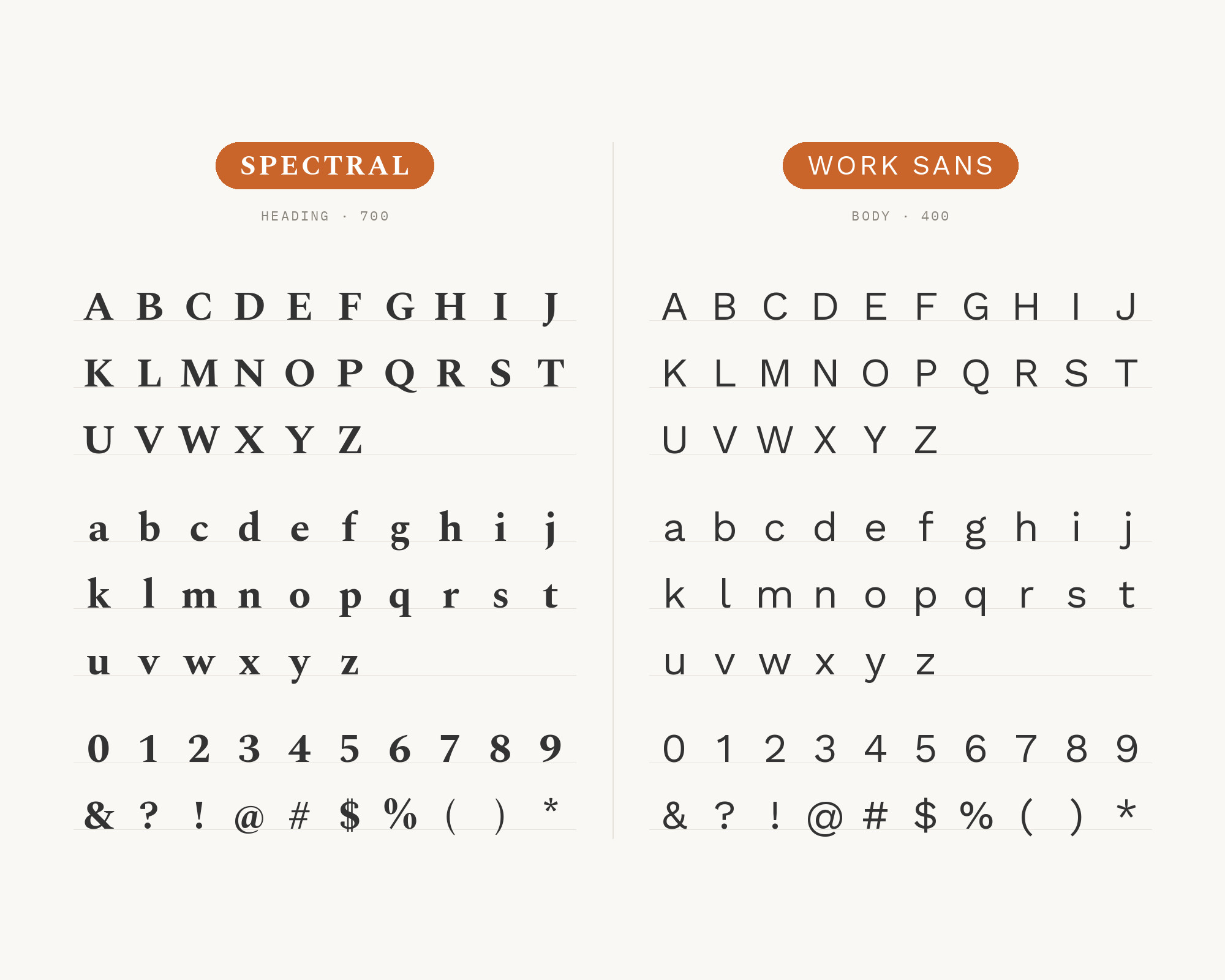
Character specimen: Spectral (heading) and Work Sans (body) letters, numbers and symbols side by side
Kittl
Featured
···
Trending Etsy niches you should jump on with Kittl
GetKittl.com
GetKittl.com
One product. 28 graphics.
You perfected the product. Kittl makes the brand catch up. Build a brand kit and on-brand assets in minutes. Free to start.
Sign up

7. Fira Sans

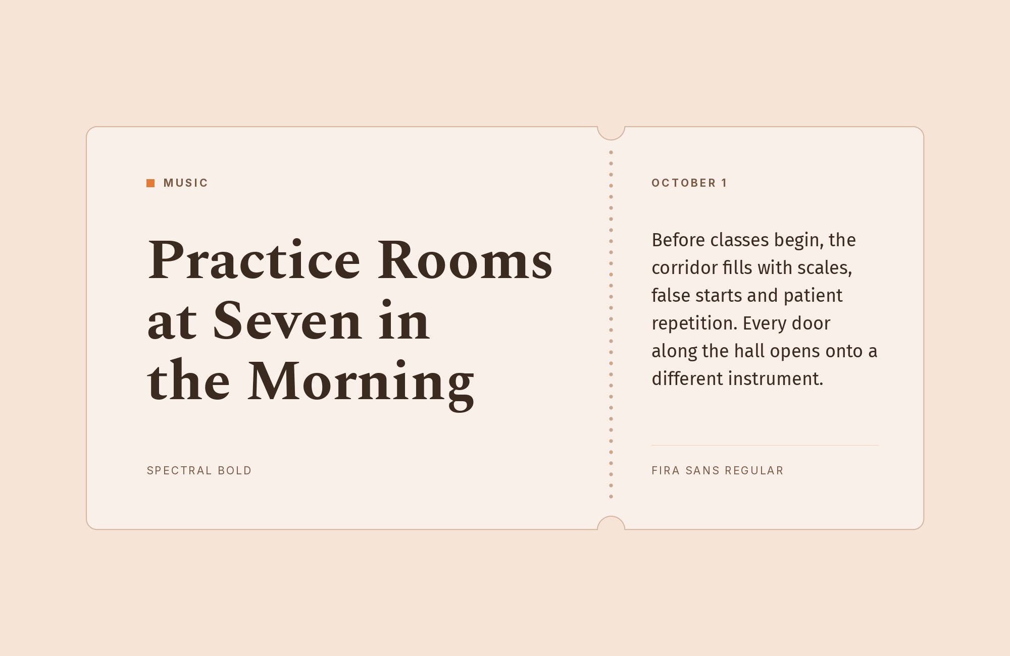
Spectral and Fira Sans font pairing: Spectral headline with Fira Sans body text

Fira Sans brings Mozilla’s design heritage to body text through its humanist proportions and technical precision. Spectral’s classical serifs in headlines create contrast between tech culture and traditional typography. This combination works for open-source documentation, developer content, or tech journalism. Both fonts emphasize clarity over decoration.
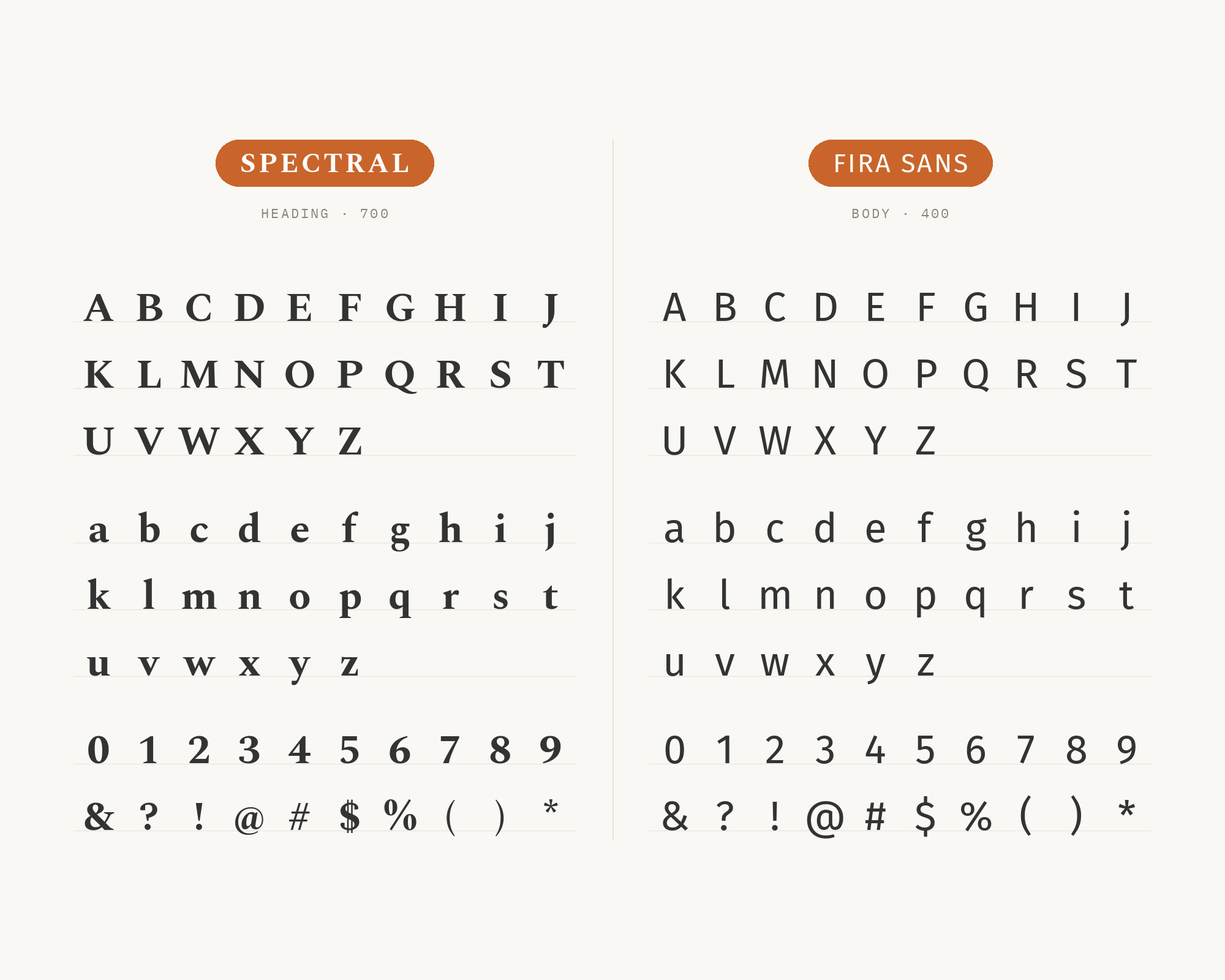
Character specimen: Spectral (heading) and Fira Sans (body) letters, numbers and symbols side by side

8. IBM Plex Sans

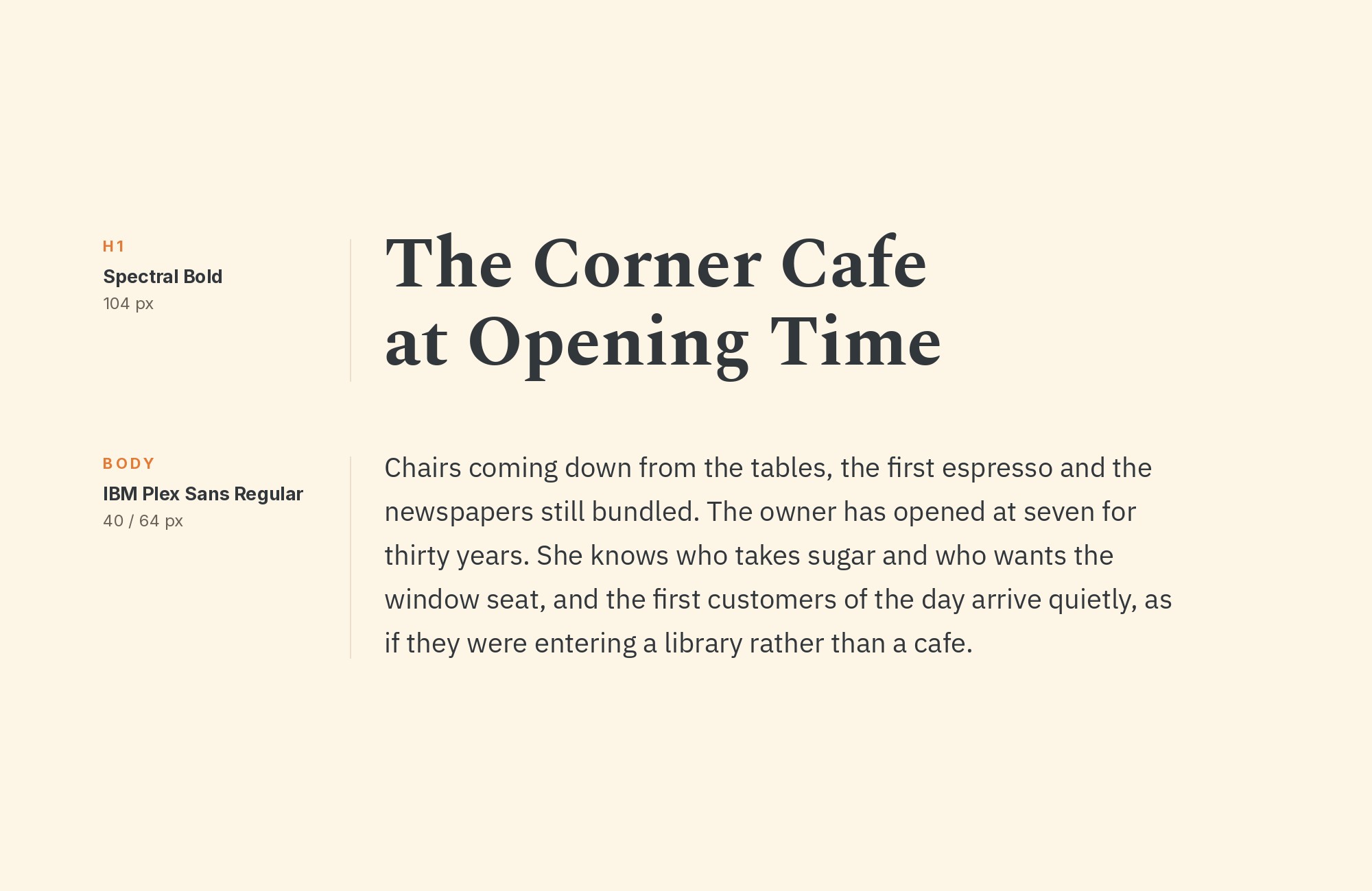
Spectral and IBM Plex Sans font pairing: Spectral headline with IBM Plex Sans body text

IBM Plex Sans‘s corporate DNA and enhanced legibility create body text with enterprise credibility. Spectral’s refined serifs in headlines add sophistication that elevates the combination. Works for business publishing, professional services, or corporate communications. The structured body text supports Spectral’s elegant display forms gracefully.
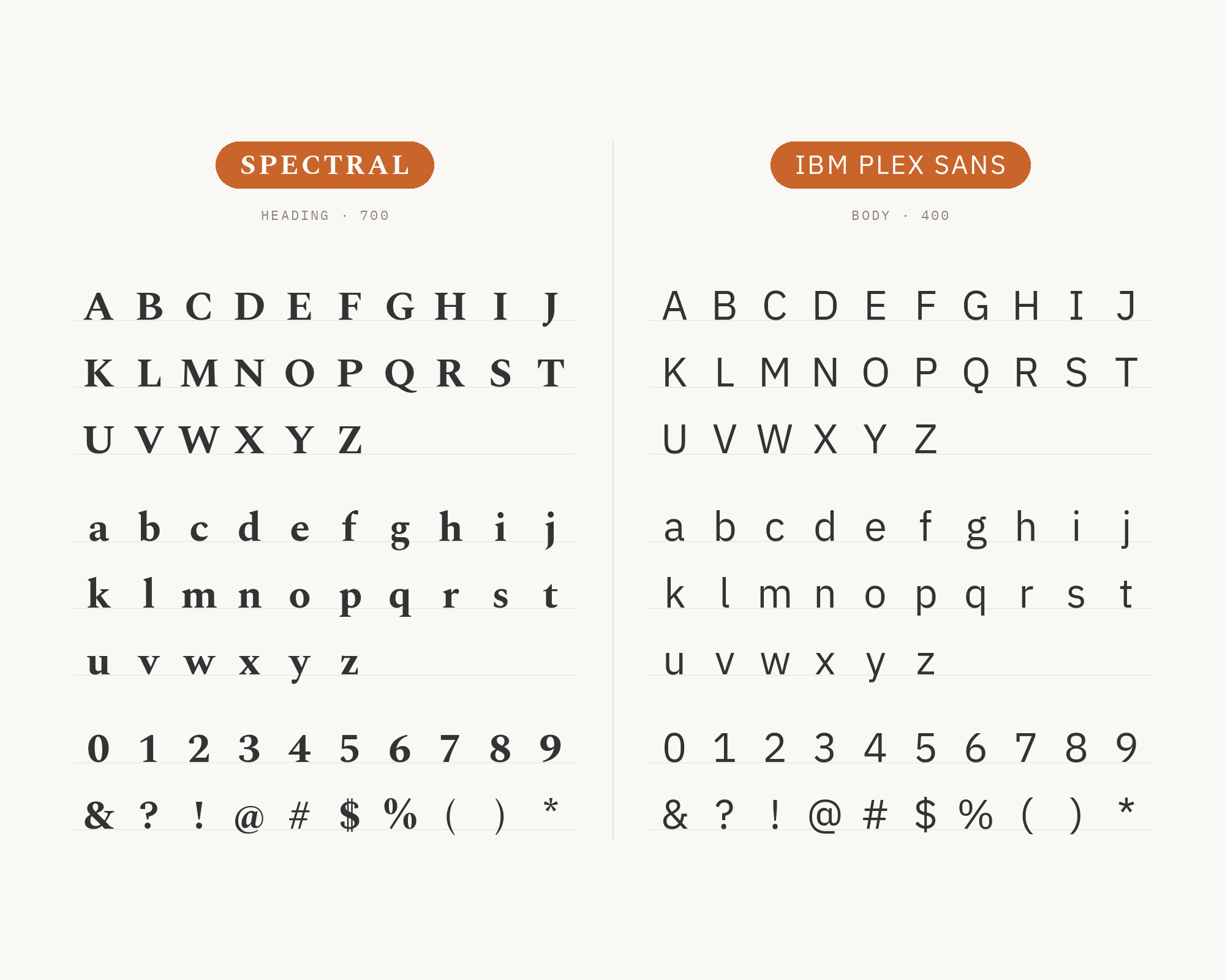
Character specimen: Spectral (heading) and IBM Plex Sans (body) letters, numbers and symbols side by side

9. Poppins

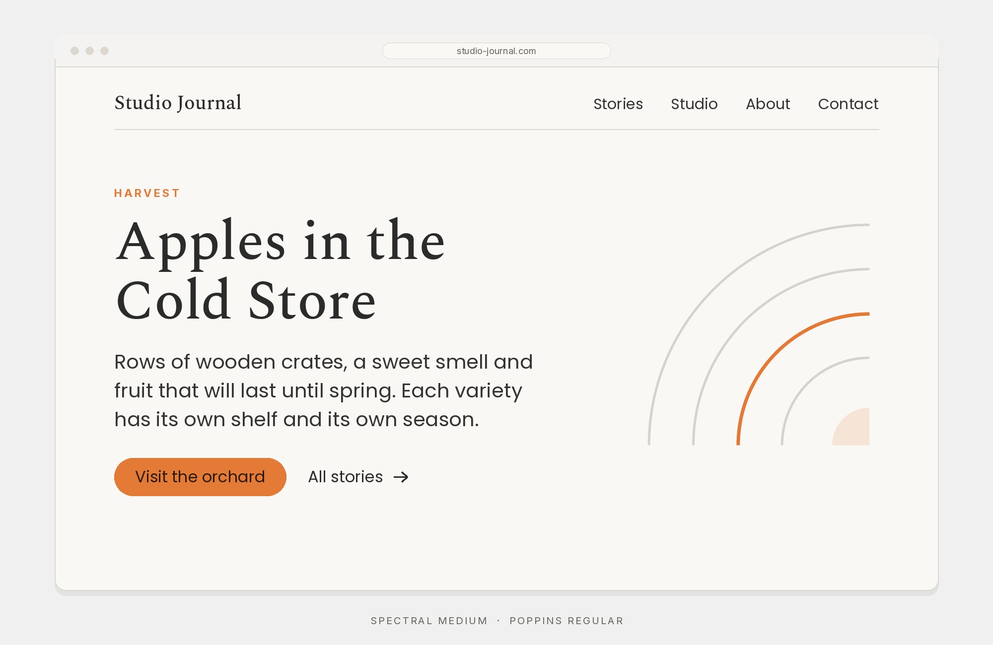
Spectral and Poppins font pairing: Spectral headline with Poppins body text

Poppins‘s geometric circles and consistent stroke weights create body text with contemporary energy. Spectral’s classical proportions in headlines provide contrast that prevents the combination from feeling too trendy. Works for lifestyle content, creative agencies, or modern editorial. The geometric-versus-traditional contrast is dramatic but cohesive.
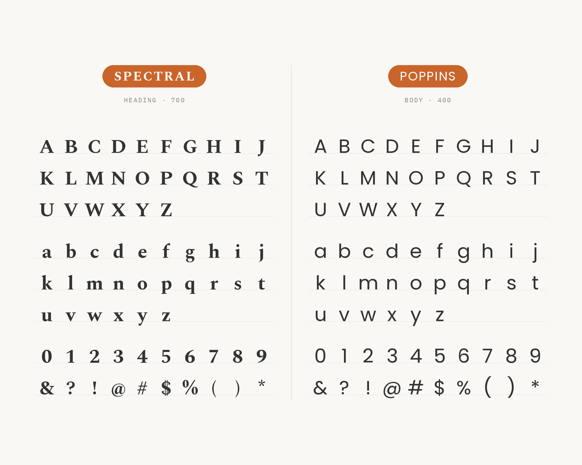
Character specimen: Spectral (heading) and Poppins (body) letters, numbers and symbols side by side

10. Roboto

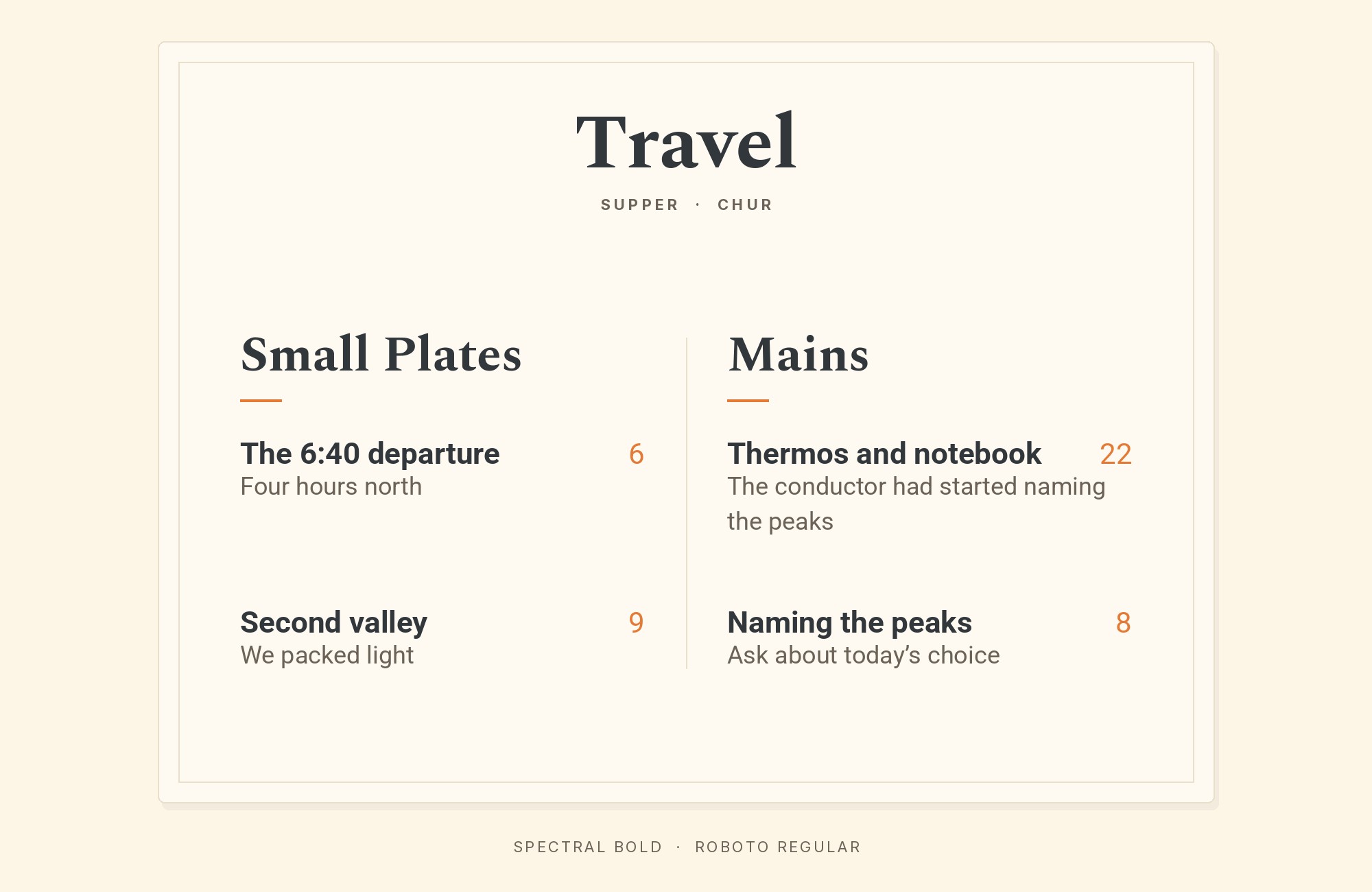
Spectral and Roboto font pairing: Spectral headline with Roboto body text

Roboto‘s neutral grotesque forms provide the reliable body text that Spectral’s refined headlines can lean on. Google’s system font handles the practical work while Spectral supplies the visual signature. This combination works for Android-adjacent design, publishing platforms, or content applications. Clean, efficient, and professional.
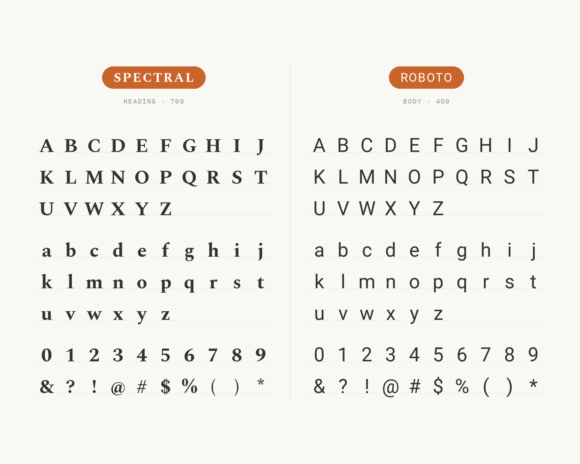
Character specimen: Spectral (heading) and Roboto (body) letters, numbers and symbols side by side

Still Googling UX terms?

Stop. They're all right here.

UX for Cats book cover

50 terms. Illustrated.
So simple your cat gets it.

Get the Book →

Print & ePub on Amazon

11. Lato

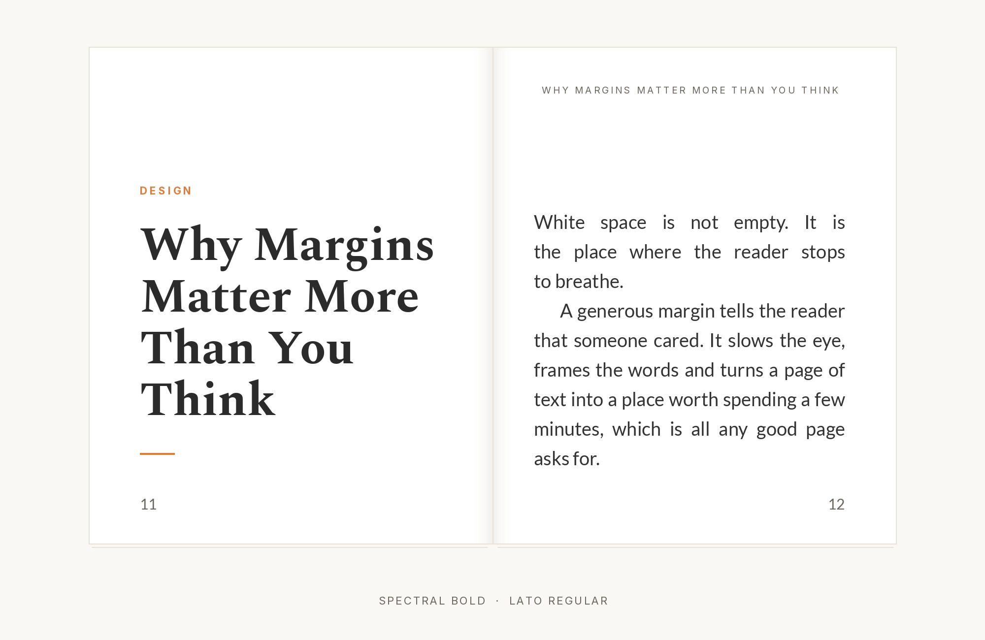
Spectral and Lato font pairing: Spectral headline with Lato body text

Lato‘s semi-rounded details and even spacing create body text with subtle warmth. Spectral’s wedge serifs in headlines add formal elegance without coldness. This pairing suits lifestyle publications, wellness content, or hospitality brands. The combination feels polished but approachable. Lato’s friendly character balances Spectral’s precision.
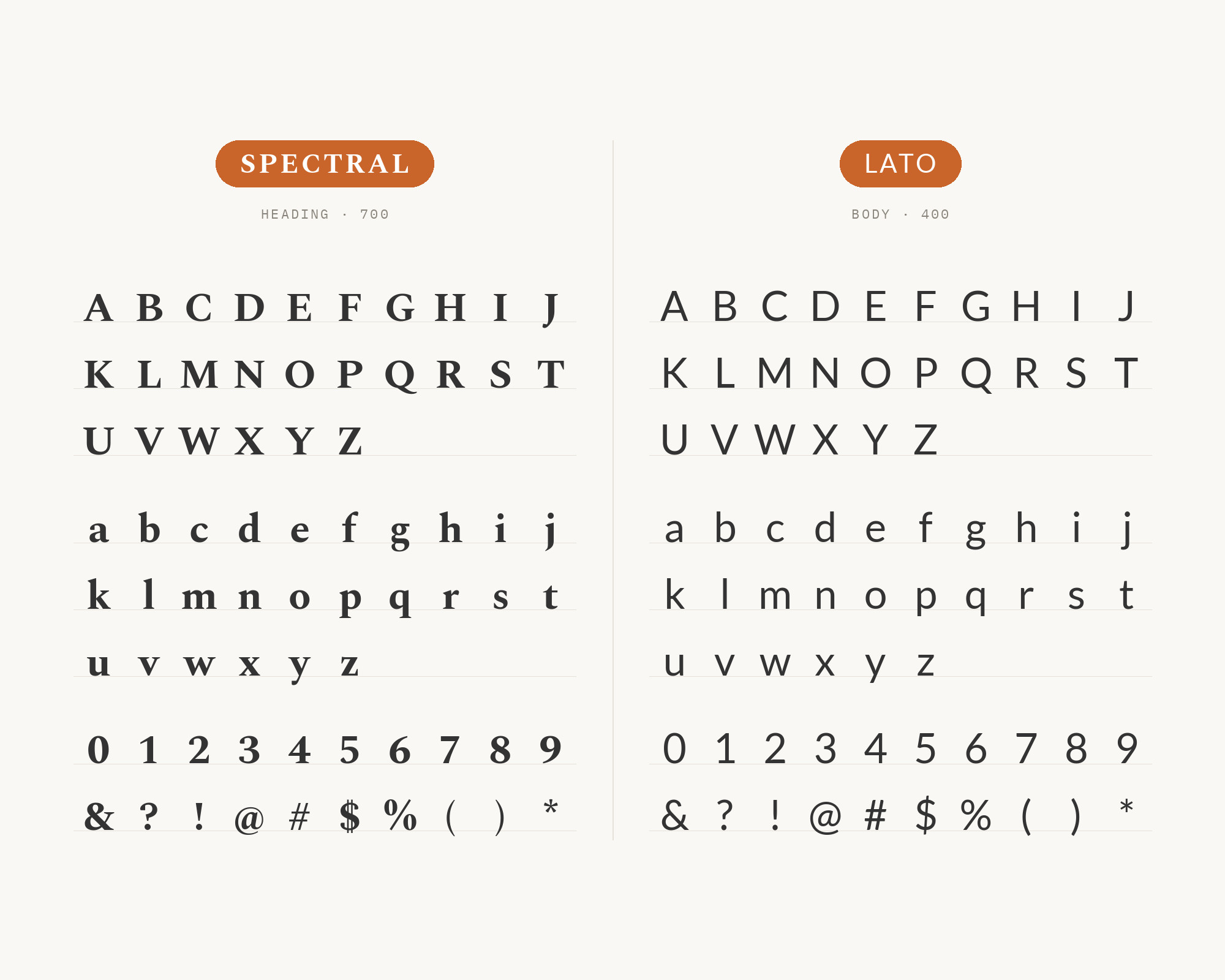
Character specimen: Spectral (heading) and Lato (body) letters, numbers and symbols side by side

12. Nunito Sans

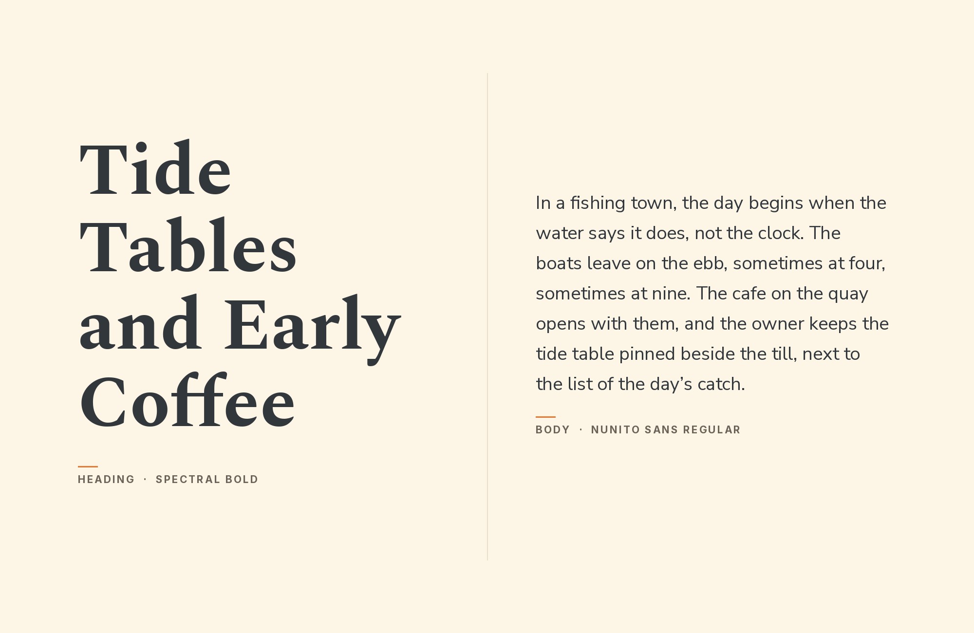
Spectral and Nunito Sans font pairing: Spectral headline with Nunito Sans body text

Nunito Sans, the non-rounded companion to Nunito, brings friendly softness to body text that contrasts productively with Spectral’s sharp serifs. The combination feels contemporary yet traditional simultaneously. Works for educational content, healthcare communications, or family-oriented publishing. Nunito Sans’s friendliness balances Spectral’s formality effectively.
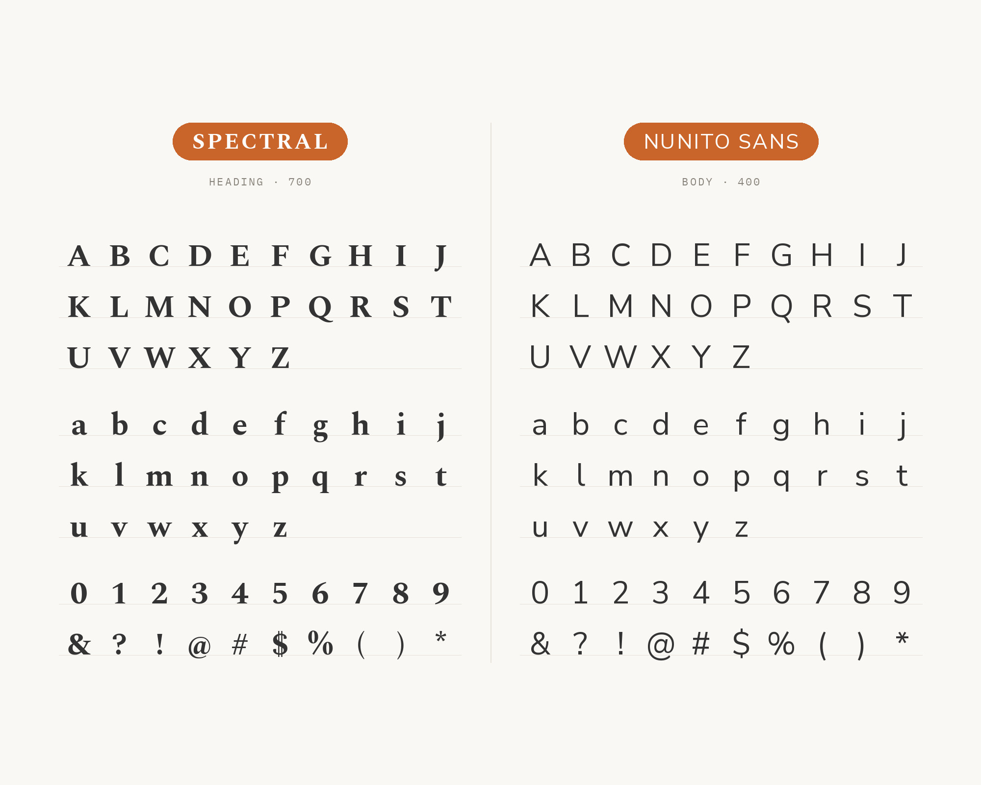
Character specimen: Spectral (heading) and Nunito Sans (body) letters, numbers and symbols side by side

13. PT Sans

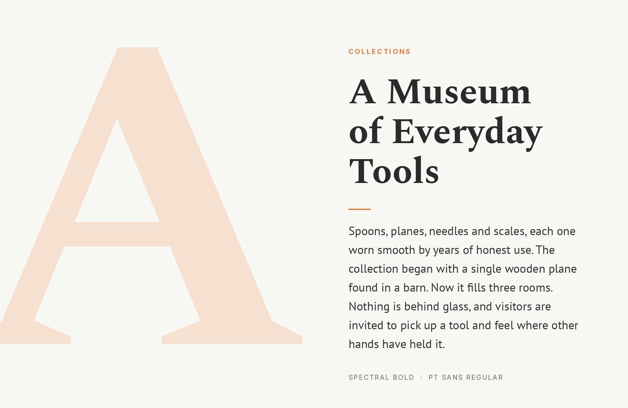
Spectral and PT Sans font pairing: Spectral headline with PT Sans body text

PT Sans‘s humanist proportions and Russian typography heritage create body text with subtle distinction. Spectral’s modern serif forms in headlines provide classical elegance. This pairing works for cultural publications, literary magazines, or heritage brands. The shared emphasis on readable proportions creates underlying cohesion.
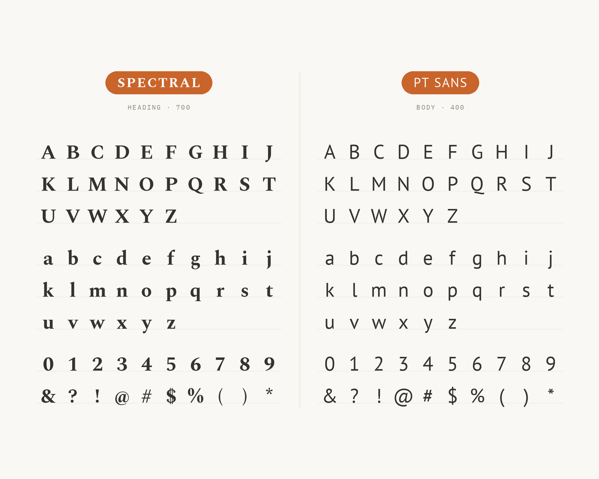
Character specimen: Spectral (heading) and PT Sans (body) letters, numbers and symbols side by side

14. Manrope

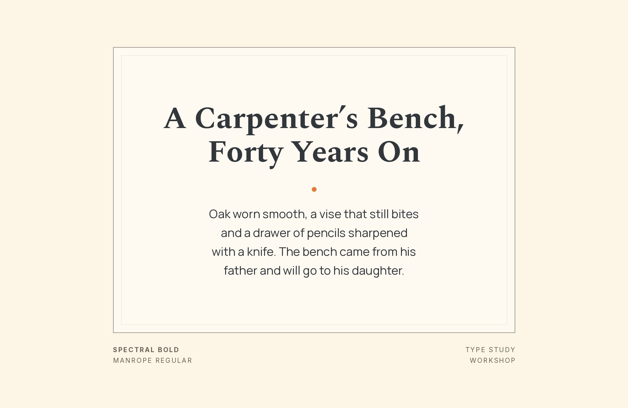
Spectral and Manrope font pairing: Spectral headline with Manrope body text

Manrope‘s geometric construction and variable font capabilities create modern body text with technical sophistication. Spectral’s traditional serifs in headlines provide contrast that grounds the combination historically. Works for tech publications, design systems, or contemporary editorial. The geometric-versus-classical contrast feels intentional and fresh.
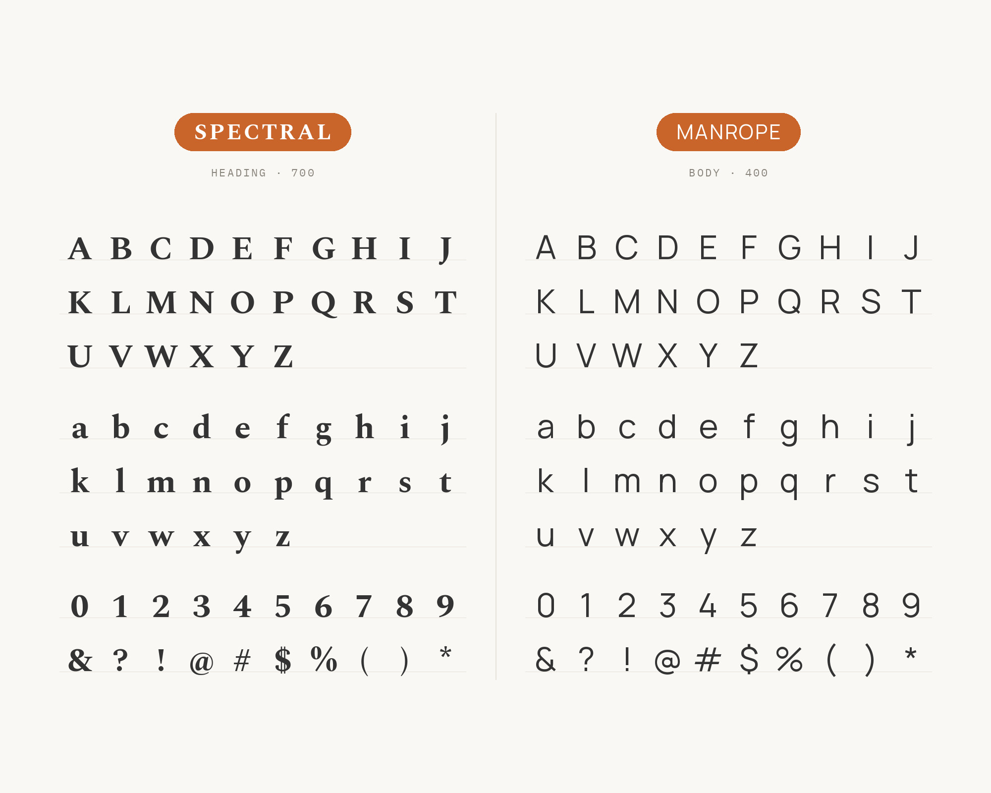
Character specimen: Spectral (heading) and Manrope (body) letters, numbers and symbols side by side

Conclusion

There are no absolute rules for font pairing, just principles to guide you. The key is contrast—in weight, in style (serif vs. sans-serif), or in personality. Spectral is versatile enough to play well with many different typefaces.

Trust your eye, experiment freely, and remember that the best pairing is the one that serves your content and audience. Typography should enhance communication, not complicate it.

Sources

  • FontPair.co
  • Typ.io
  • Elementor (Sergei Davidov)

More Font Resources

  • Font Combinations: The Complete Guide to Font Pairings
  • The Big Book of Font Combinations
  • 29 Principles for Making Great Font Combinations

About the Author

Douglas Bonneville is a graphic designer and typographer since 1992. He is the author of The Big Book of Font Combinations and has contributed to numerous design publications. His work focuses on making typography accessible and practical for designers at all levels.

Related font pairings

  • What Fonts Go With Karla?
  • What Fonts Go With Source Sans Pro?
  • What Fonts Go With Vollkorn?
  • What Fonts Go With DM Serif Display?

More font pairing guides

  • Font Combinations: The Complete Guide to Font Pairings
  • What Fonts Go With Open Sans?
  • What Fonts Go With Courier?
  • What Fonts Go With Source Serif?
  • What Fonts Go With Bitter?

About Douglas Bonneville

Douglas has been a graphic designer since 1992, in addition to software developer and author. He is a member of Smashing Magazine's "Panel of Experts" and has contributed to over 100 articles. He is the author of "The Big Book of Font Combinations", loves cats, and plays guitar.

The BonFX Letter

One good pairing.
Every Tuesday.

2-minute read · free

This week — no. 14

Quiet authority

Merriweather sets the tone in one line. Lato stays out of the way and lets it.

MERRIWEATHER 700  +  LATO 400

A font specimen, a pairing that works, and one line on why it works. That is the whole email.

Free. One click to unsubscribe. No sharing, ever.

Free download

The Typography Primer.
Yours, right now.

Adobe's classic · PDF · free

The Typography Primer — book cover

The guide to type that everyone learned from. Subscribe and it is yours instantly. The BonFX Letter follows.

Free. One click to unsubscribe. No sharing, ever.

What Fonts Go With Spectral - the book from BonFX, coming soon

Still Googling UX terms?

Stop. They're all right here.

UX for Cats book cover

50 terms. Illustrated.
So simple your cat gets it.

Get the Book →

Print & ePub on Amazon

350 font combinations you can steal.

The Big Book of Font Combinations

Every pairing shown in context — web, print, headings, body. Open it, find one that works, use it.

That's it. That's the book.

In print or ePub 40% OFF on Gumroad

Scrolling Google Fonts for "the right one"?

You've been at it for 20 minutes. You'll be at it for 20 more. There are 1,500 fonts in there.

Pocket Handbook of Google Fonts Combinations

We paired every useful Google Font.
7,500 pages. Done.

Get the PDF →

Instant download on Gumroad

Recent Inspirations

  • What Fonts Go With Utopia? September 30, 2026
  • What Fonts Go With Titillium Web? September 30, 2026
  • What Fonts Go With Sora? September 30, 2026
  • What Fonts Go With Questrial? September 30, 2026
  • What Fonts Go With Public Sans? September 30, 2026
  • What Fonts Go With Plus Jakarta Sans? September 30, 2026
  • What Fonts Go With Oxygen? September 30, 2026
  • What Fonts Go With Orbitron? September 30, 2026
  • What Fonts Go With Maven Pro? September 30, 2026
  • What Fonts Go With Lobster? September 30, 2026
  • What Fonts Go With Lexend? September 30, 2026
  • What Fonts Go With Domine? September 30, 2026
  • What Fonts Go With DM Serif Display? September 30, 2026
  • What Fonts Go With Comfortaa? September 30, 2026
  • What Fonts Go With Caveat? September 30, 2026

About BonFX

Douglas Bonneville has been a graphic designer since 1992 and has written about type here since 2009. BonFX is a blog about typography and design, and the books that came out of it.

  • The Big Book of Font Combinations
  • The Preposterously Huge Book of Google Font Combinations
  • UX for Cats

More about BonFX →

Start Here

  • Font Combinations: The Complete Guide
  • The 100 Best Fonts
  • 17 Types of Fonts
  • 29 Principles for Great Font Combinations
  • 23 Really Bad Font Choices
  • 20 Free Google Wedding Font Combinations

Contact

Questions about the books or the site? Contact us.

Follow @dbonneville on X.

The BonFX Letter: one good pairing every Tuesday, free. The signup is in the sidebar of every page.

Copyright © 2026 · BonFX

  • Blog
  • Font Combinations
  • Books
    • The Preposterously Huge Book of Google Font Combinations
    • The Big Book of Font Combinations (Classic Fonts Edition)
  • Contact