Fira Sans pairs great with Merriweather, Montserrat and Fira Mono. All 12 pairings are shown below in real rendered specimens, with the reason each one works.

What fonts go with Fira Sans? Start with what it actually is: a humanist sans drawn for small screens, with a large x-height and open apertures, and a slightly wider, calmer relative of FF Meta rather than a generic “tech” voice. A partner either has to respect those screen proportions or contrast them on purpose, and the best documented pairings do one or the other, never both at once.
Erik Spiekermann, Ralph du Carrois, Anja Meiners and Botio Nikoltchev of Carrois Type Design drew Fira Sans with Patryk Adamczyk of Mozilla, on a commission from Telefónica and Mozilla for the Firefox OS project; the name was chosen to suggest fire, light and joy without belonging to any one language. It shipped in 2013 under the Apache License and moved to the SIL Open Font License afterward, growing from four weights with italics to sixteen by May 2014, with a condensed style following in 2015. Mozilla stepped away in 2016 at version 4.2, the Berlin foundry bBox Type finished the family at 4.301, and later work moved into FiraGO, the 2018 extension for Here Technologies that adds Arabic, Devanagari, Georgian, Hebrew and Thai. Google Fonts carries nine weights with matching italics, and the family includes a monospaced sibling, Fira Mono, plus the ligature-equipped Fira Code built on top of it.
Pairing Fira Sans is a question of role. In the documented systems it is almost always the text and interface voice, so the partner is either a serif that adds reading warmth or headline drama, or a second sans or monospace that takes a fixed job beside it. The evidence splits the same way: real sites on Fonts In Use and Typ.io pair it with a screen serif like Merriweather or PT Serif, or with a display serif like Playfair Display, while product and developer work keeps it inside a sans-and-mono system with Montserrat, Lato, Roboto, Fira Mono, Fira Code, IBM Plex Mono or Inconsolata. Here are 12 fonts that pair well with Fira Sans, covering both paths.
1. Merriweather
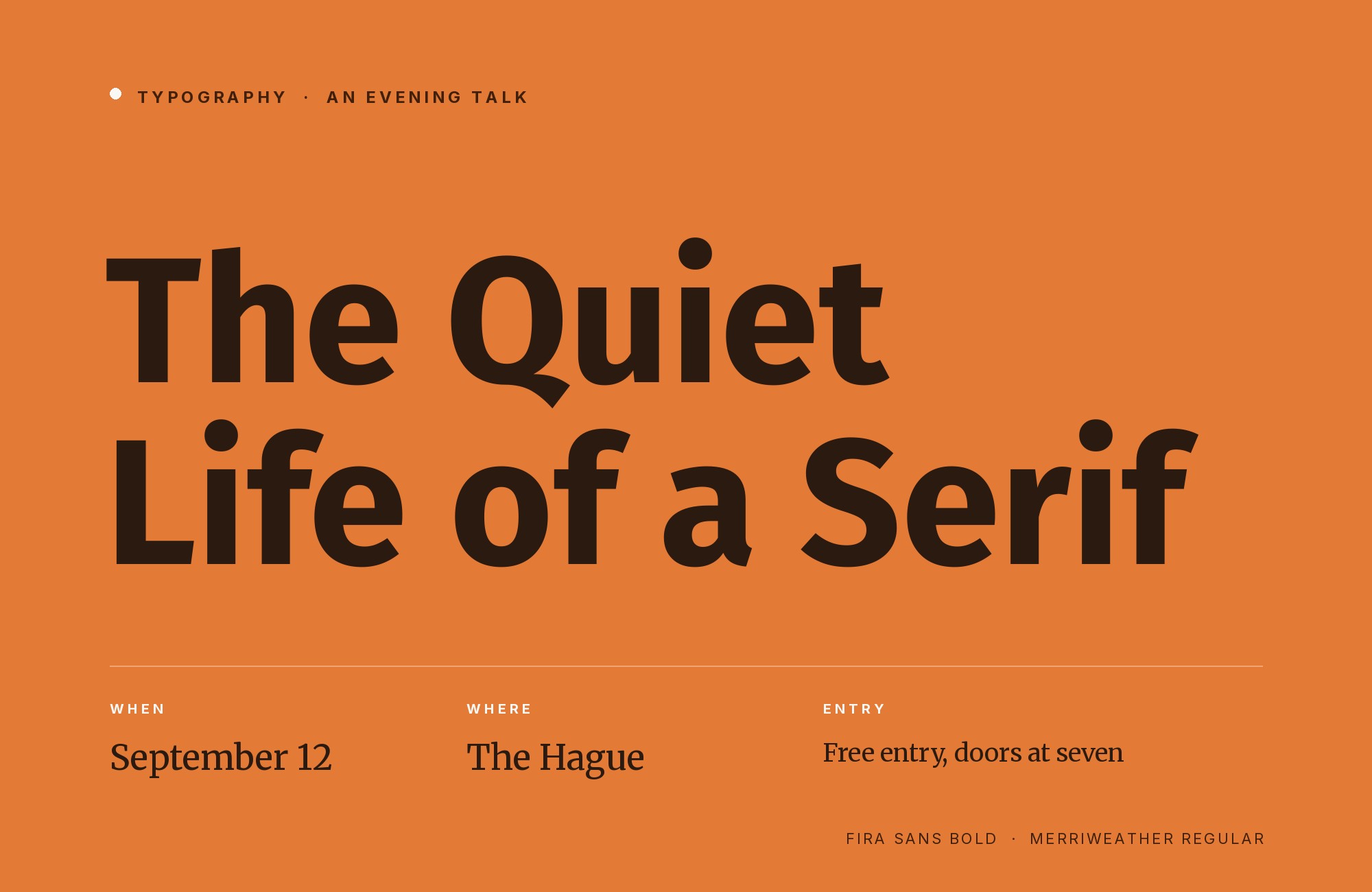
Eben Sorkin drew Merriweather at Sorkin Type and released it in 2010 as a serif made to stay readable on screens, in light, regular, bold and ultra-bold with matching italics. Its wide letterforms, moderate stroke contrast and sturdy, slab-leaning serifs give it a heavier color than most text serifs, which is why it can carry headlines as well as long paragraphs. Fira Sans answers with a taller x-height and more open apertures, so at navigation and label sizes it stays clear where Merriweather would start to clog. The cleanest role split puts Merriweather on headlines and subheads and Fira Sans on navigation and body copy. That is how the U.S. House Select Committee website on the January 6th attack was set in 2021, as recorded on Fonts In Use by Sorkin himself.
Try Semrush free. No credit card.
Start on the $0 plan. Paid plans from $117/mo billed annually.
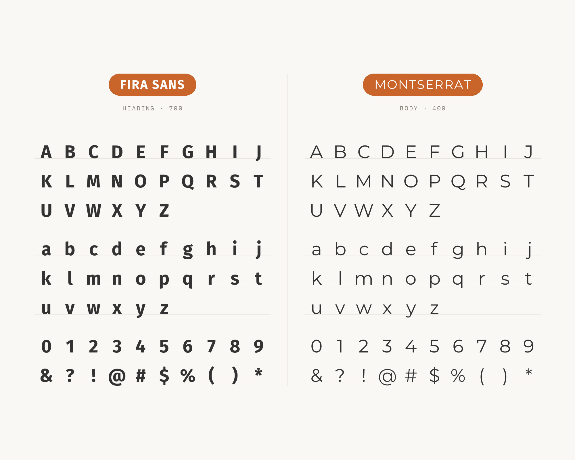
Try for free2. Montserrat
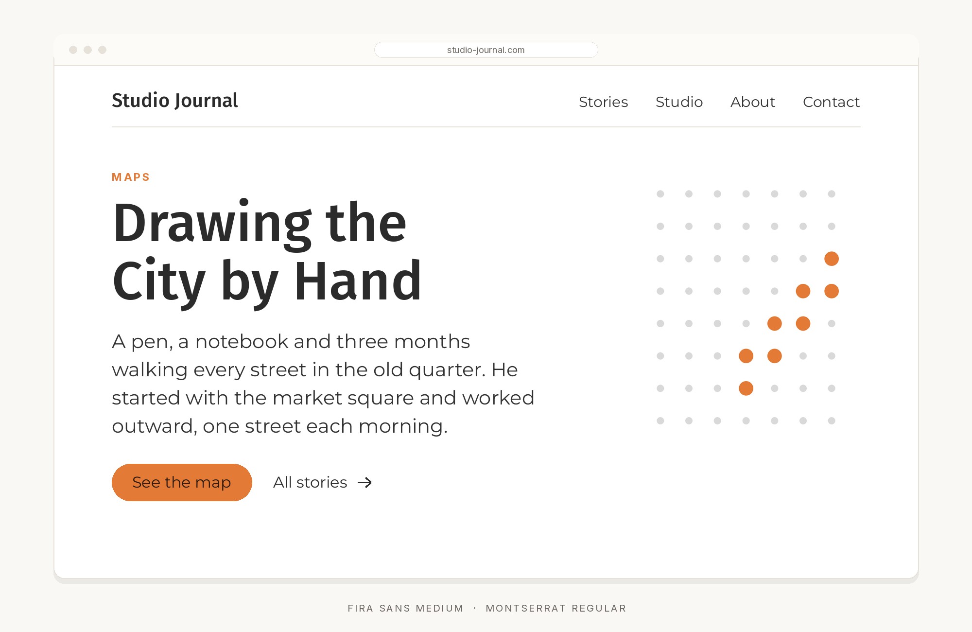
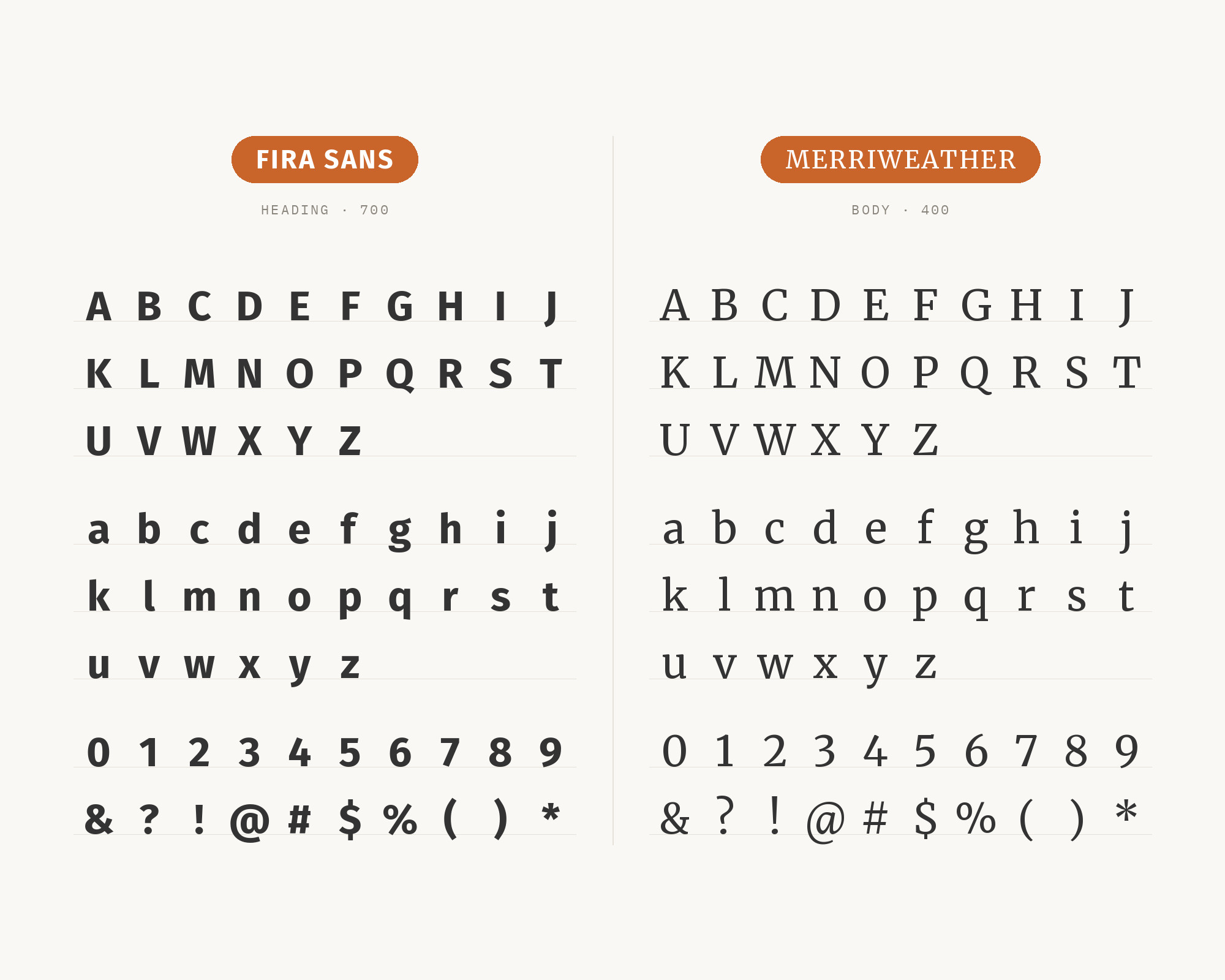
Julieta Ulanovsky began Montserrat in 2010 and released it through Google Fonts in 2011, working from the painted signs and posters of the Montserrat neighborhood in Buenos Aires; the family now runs nine weights from Thin to Black. Its geometry is the point of contrast: round bowls, cut terminals and a wide stance that look best at headline size. Fira Sans has a large x-height too, but its humanist skeleton and looser apertures keep it legible at paragraph and interface sizes where Montserrat’s wide geometric forms eat space. So Montserrat takes the display line and Fira Sans everything below it. Typ.io records the two on a live agency site, and Figma’s Montserrat pairing page lists Fira Sans among its recommended partners, which makes this one of the better-documented combinations on this list.
3. Fira Mono
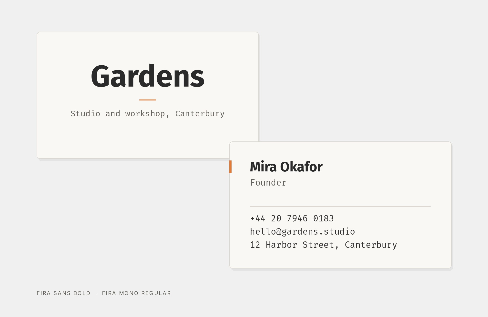
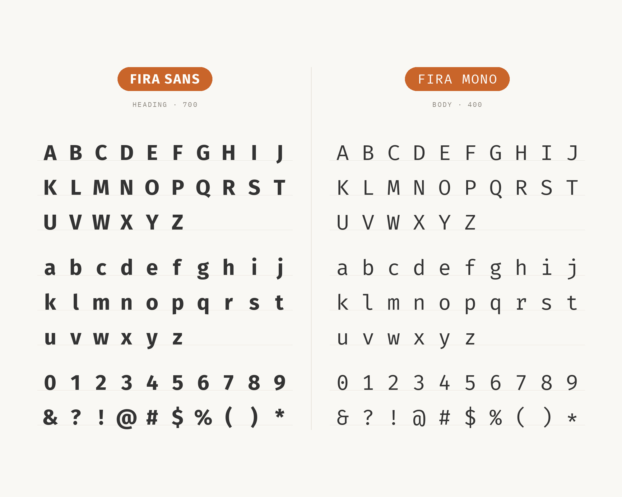
Fira Mono is the fixed-width member of the same family, released alongside Fira Sans in 2013, shipped in regular, medium and bold. Because it shares the sans’s x-height, stroke weight and general color, a line of code or a data table set in Fira Mono sits at native size beside Fira Sans body text without any optical correction. Contrast comes from rhythm alone: proportional spacing in the prose, an even grid in the mono, which is all a documentation page or dashboard needs to mark a passage as literal. Mozilla’s own specimen page shows the two families together, and Fonts In Use records a mobile game that set its whole interface in Fira Sans and reserved Fira Mono for the countdown timer. That is the pattern to copy: prose in the sans, numbers and code in the mono.
Junior work is now a prompt. The biggest profit center in your studio is vanishing.
How to fix this?
Find Out How4. Playfair Display
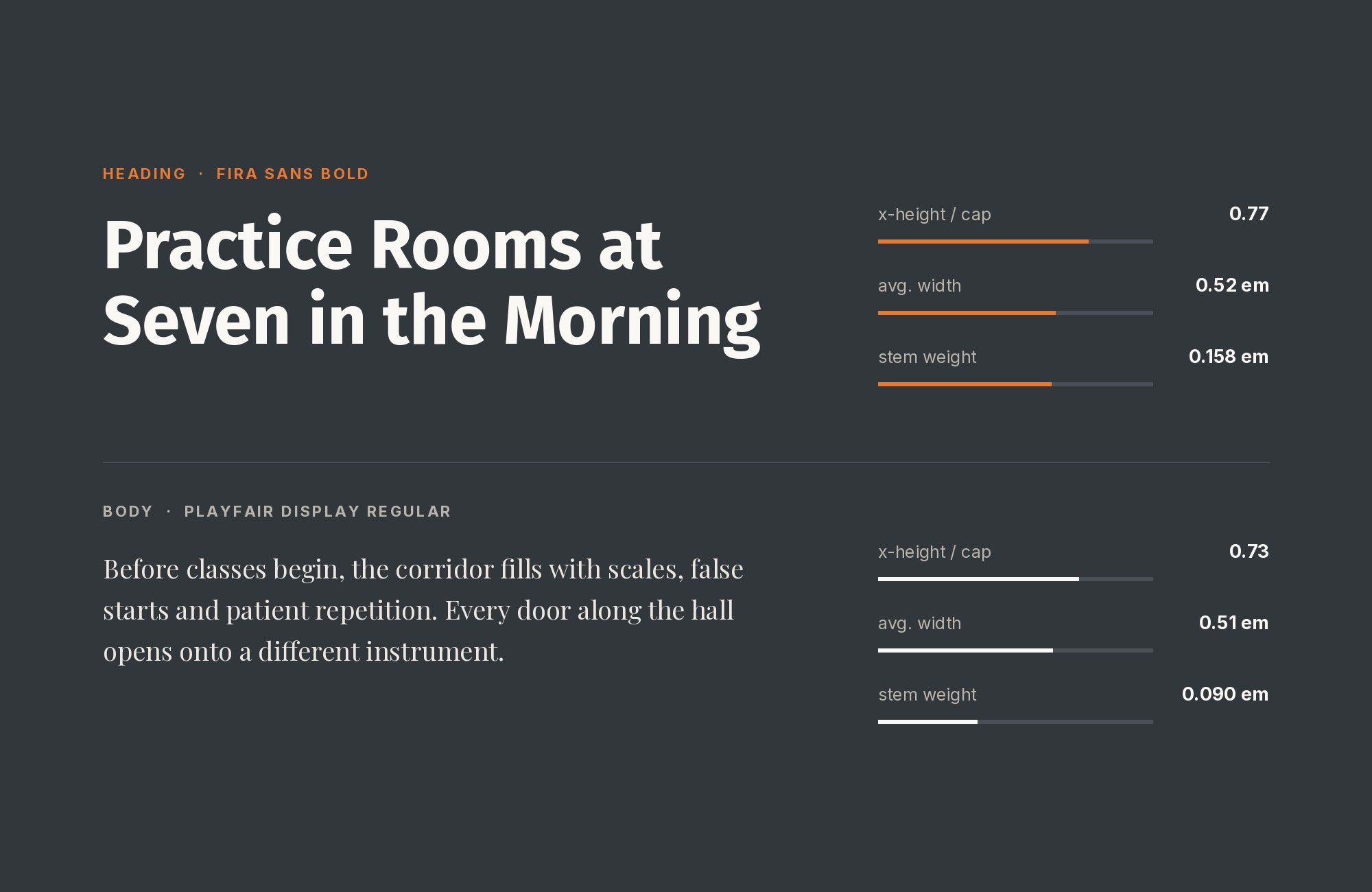
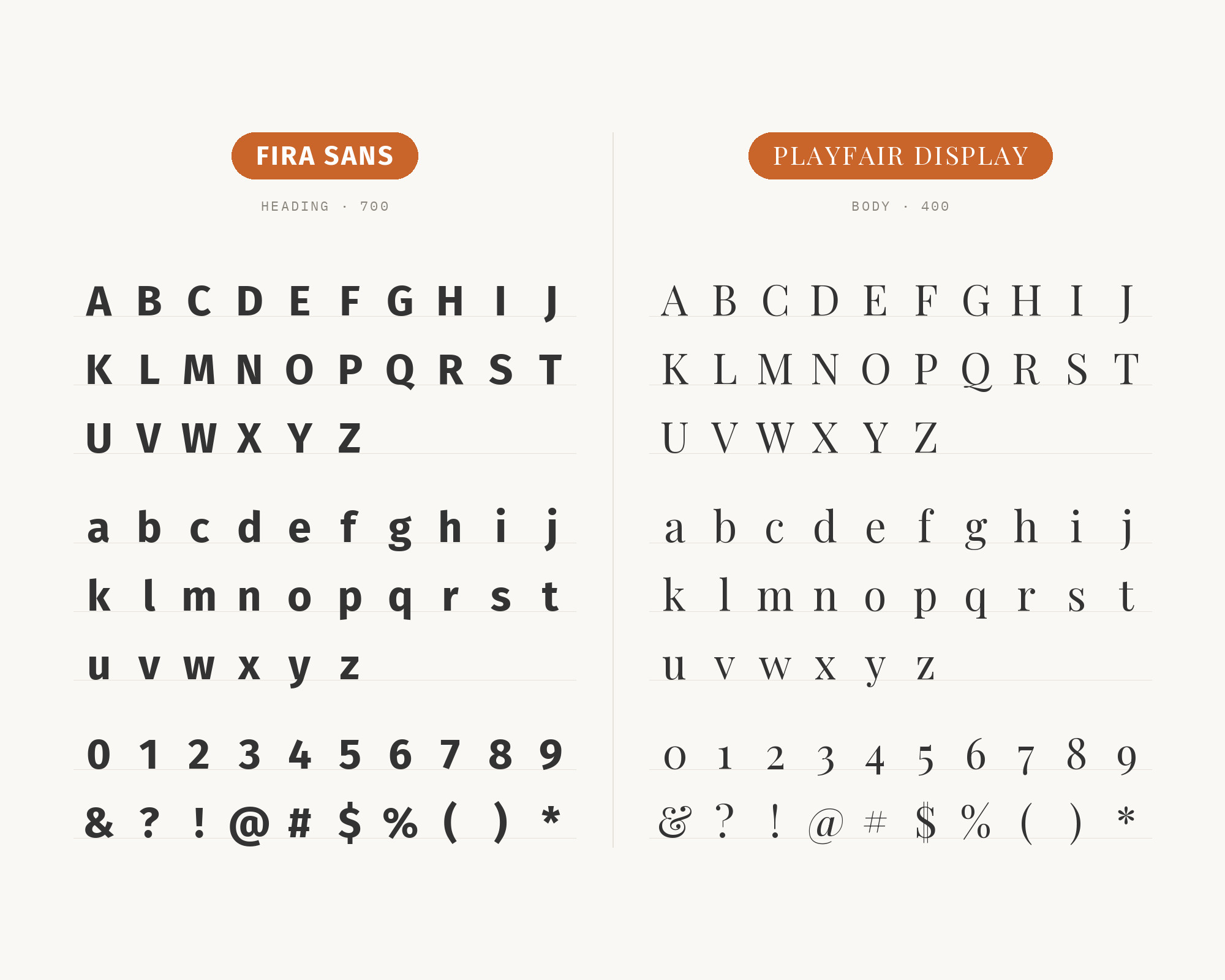
The Danish designer Claus Eggers Sørensen released Playfair Display in 2011 as an open-source transitional serif whose hairline-to-heavy stroke contrast follows mid-to-late 18th-century types such as Baskerville. That contrast is the structural opposite of Fira Sans, whose strokes stay close to a single weight from stem to bowl. Set Playfair large, where its thin strokes hold, and give Fira Sans every reading job underneath: the sans’s open apertures and steady color do the work Playfair’s hairlines cannot do at sixteen pixels. This is a display-serif-over-humanist-sans formula, and it flips the usual order of a serif for text and a sans for titles. Typ.io records the two together on a designer’s portfolio site, with Inconsolata as a third voice, and SlidesCarnival lists the same combination for editorial contrast.
5. PT Serif
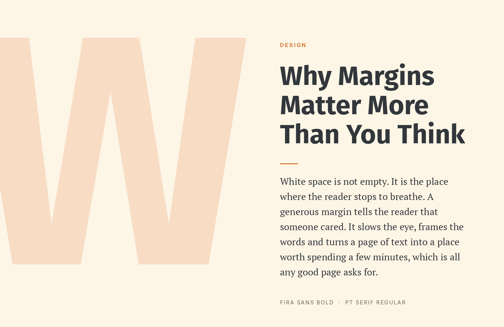
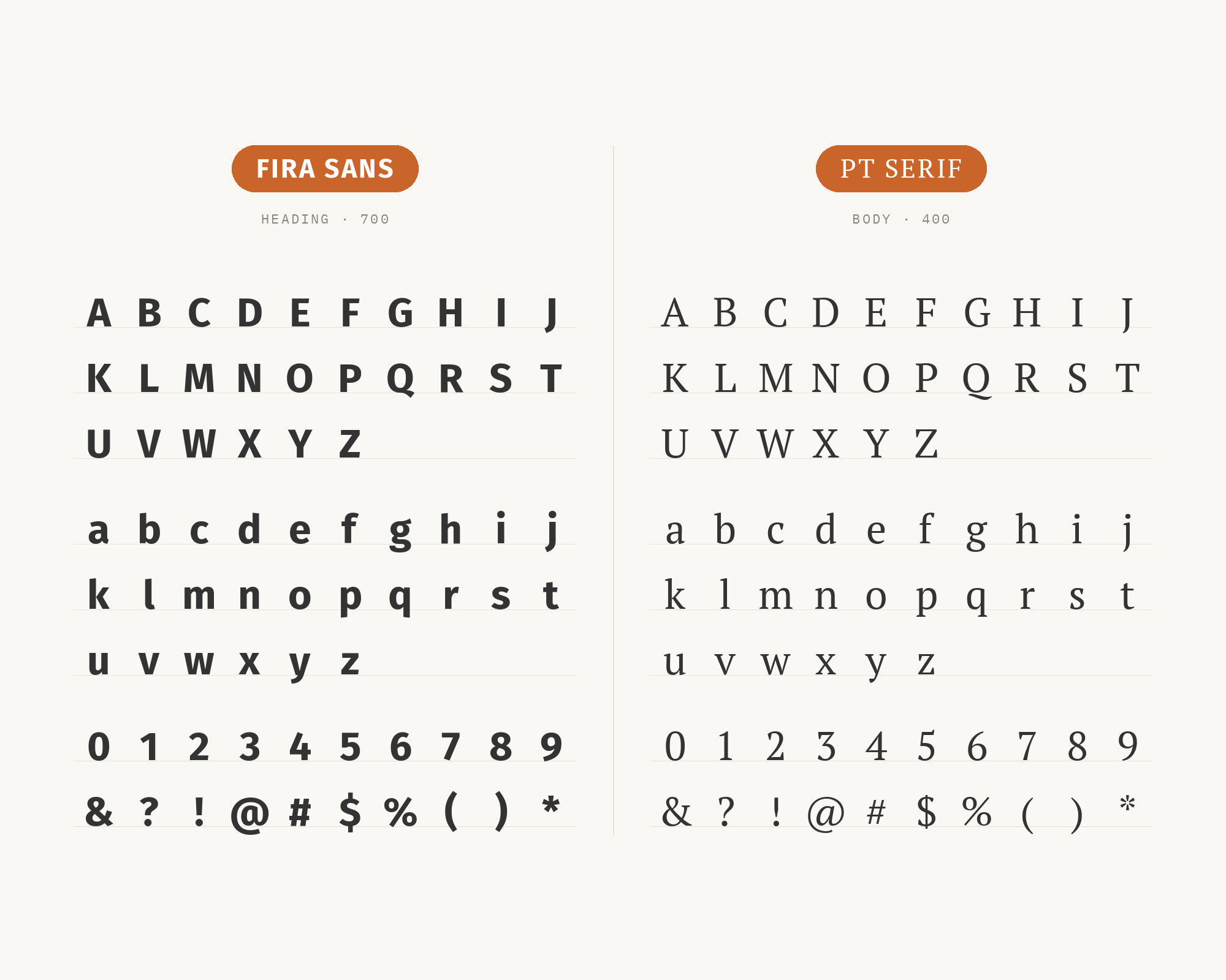
Alexandra Korolkova, Olga Umpeleva and Vladimir Yefimov designed PT Serif for ParaType, released in 2010 with funding from the Russian Federal Agency for Press and Mass Communications as part of the Public Type family with PT Sans and PT Mono. It is a transitional text serif with a large x-height and firm, plain serifs, and those screen-era proportions match Fira Sans almost line for line, so the two align at the same point size without a visual jump. Contrast then comes from stroke modulation and weight rather than from proportion: a Black or ExtraBold Fira Sans headline over PT Serif body copy reads like a newspaper front page. Sergei Davidov recommends that exact Fira Sans Black and PT Serif combination for news sites in his Elementor pairing guide, and Typ.io shows the two on the same agency site that also runs Montserrat.
6. Lato
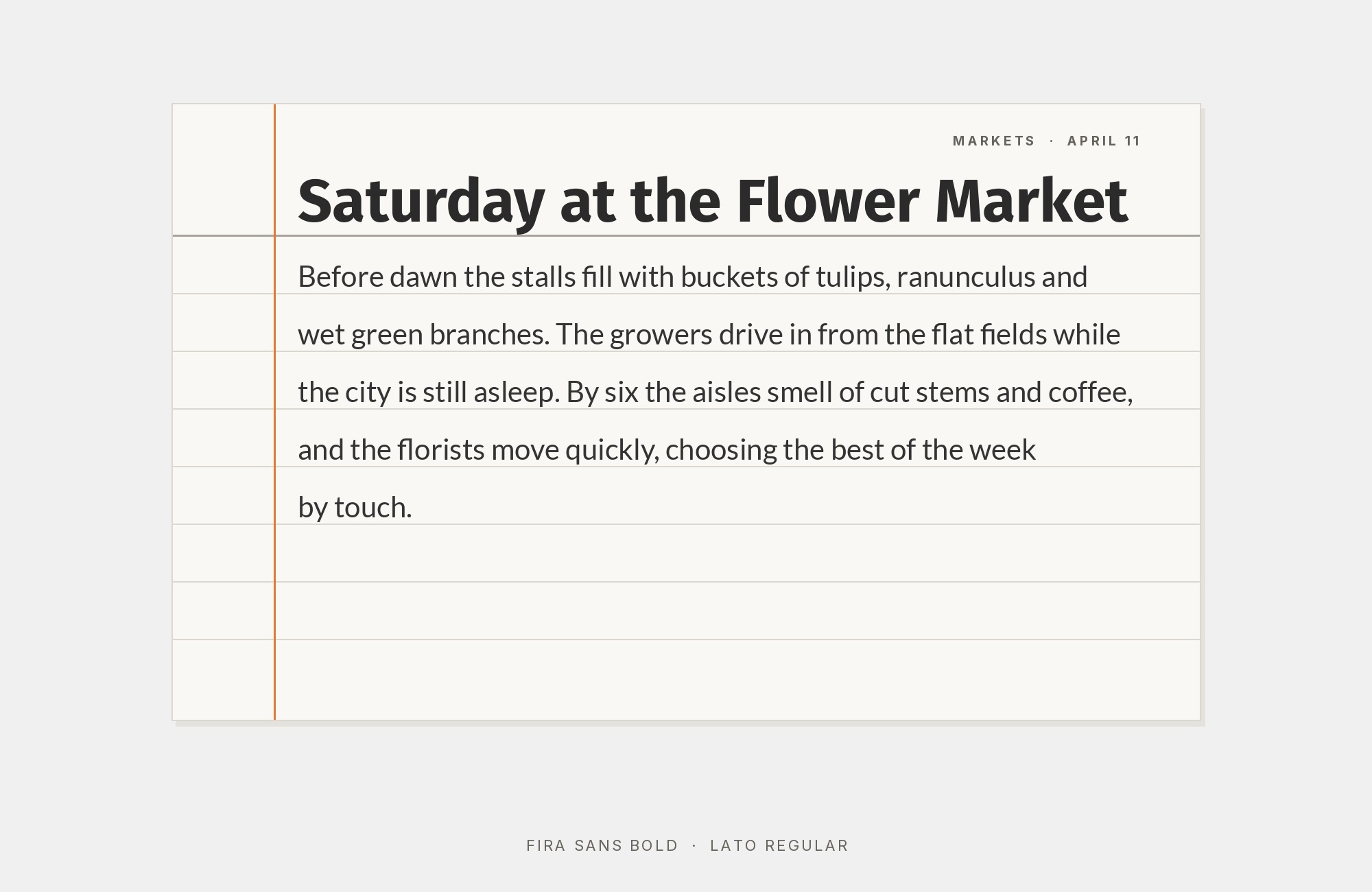
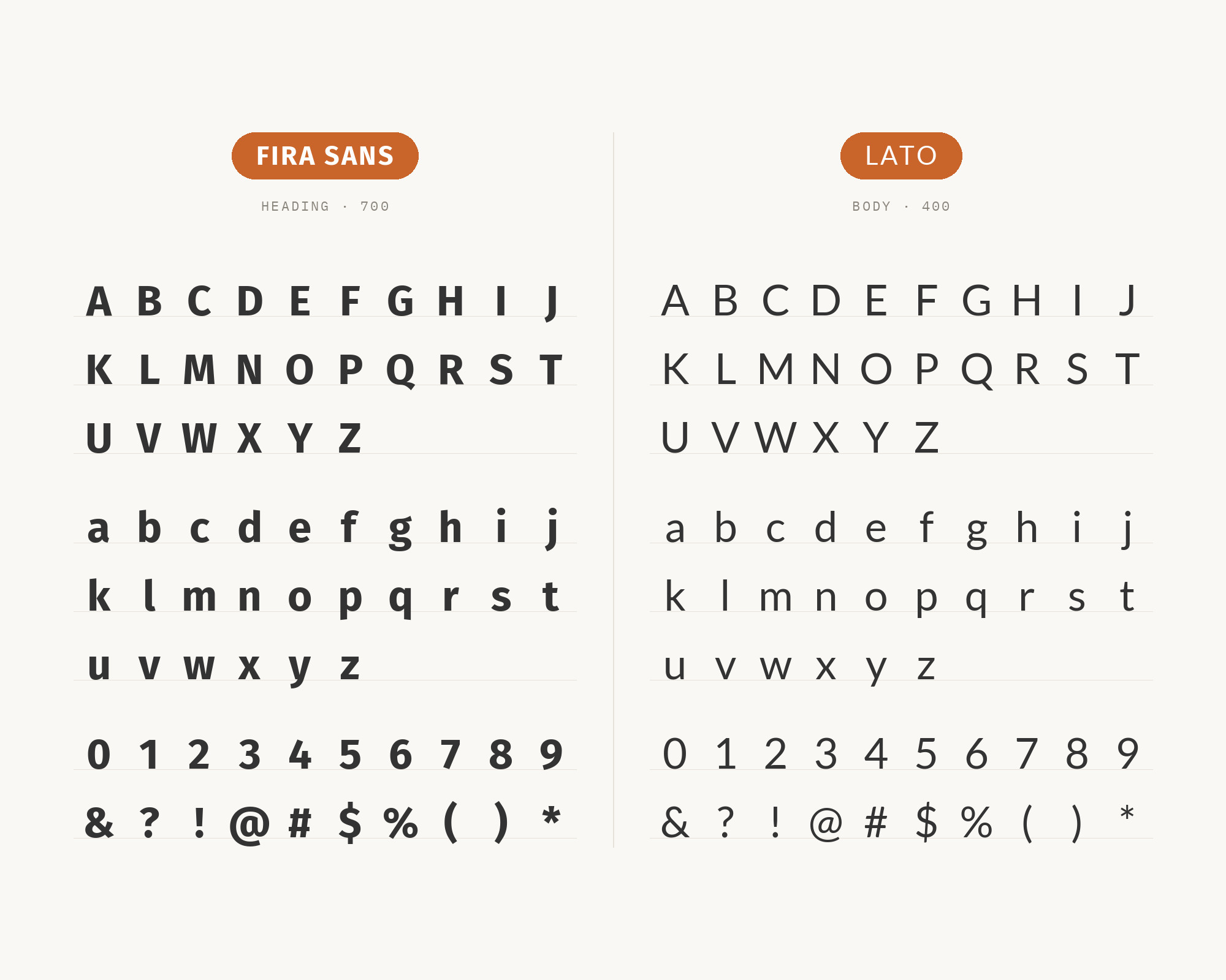
Łukasz Dziedzic drew Lato in 2010 for a Polish bank that changed direction, then released it under the Open Font License in five weights with italics; the name is Polish for summer. Lato and Fira Sans are both humanist sans faces of similar weight, so this is a warm-on-warm pairing rather than a contrast: Lato’s semi-rounded terminals soften a bold title, and Fira Sans’s slightly wider, calmer letterforms take over for subheads and paragraphs. The trick is to keep the roles fixed and the weights far apart, Lato Bold above and Fira Sans Regular below, so the reader never has to decide which sans is which. Fonts In Use documents this split on the 2025 website of the Center of Gravity, a physics center at the Niels Bohr Institute, with Lato Bold for main titles and Fira Sans for the rest.
7. Roboto
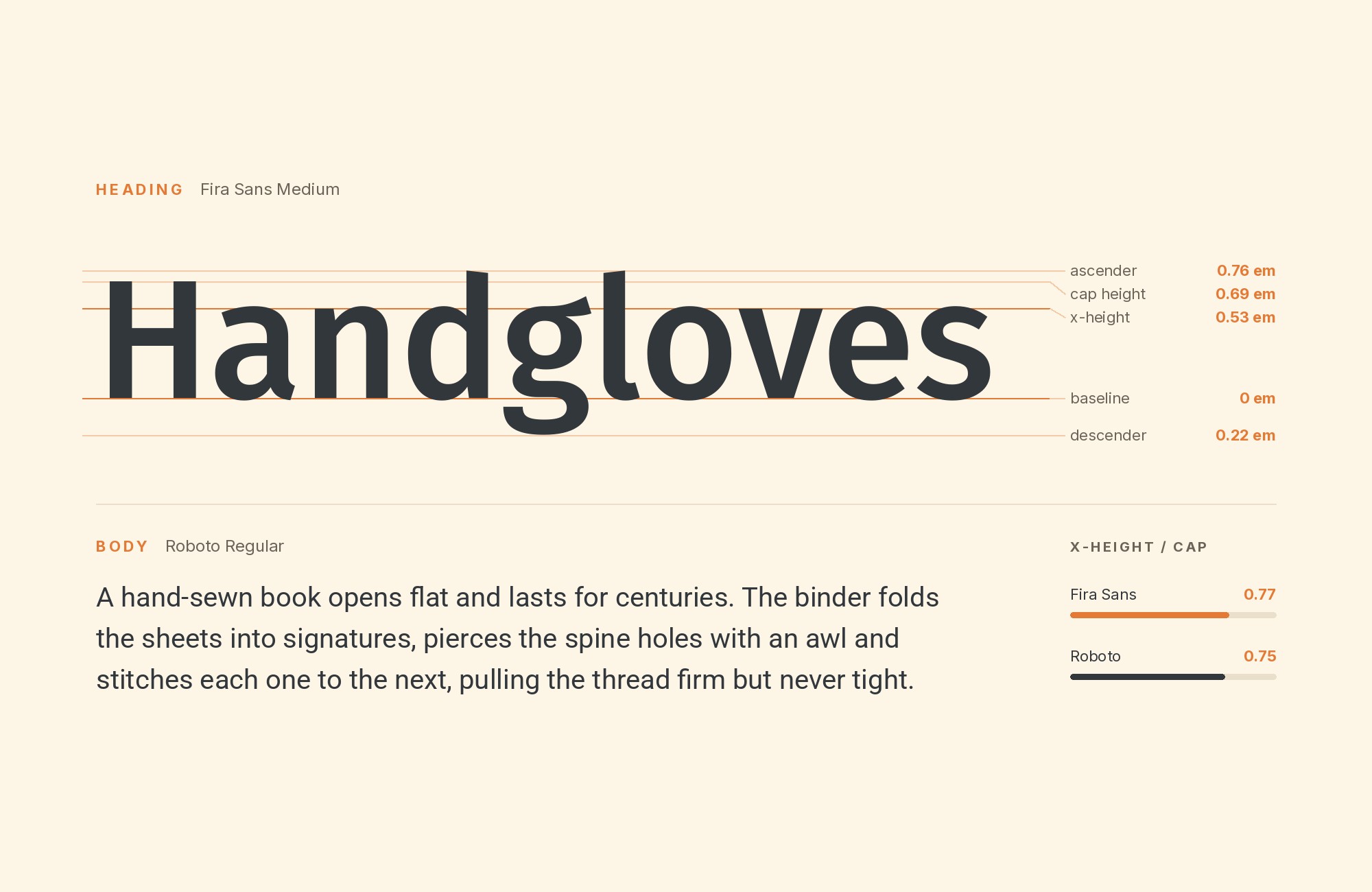
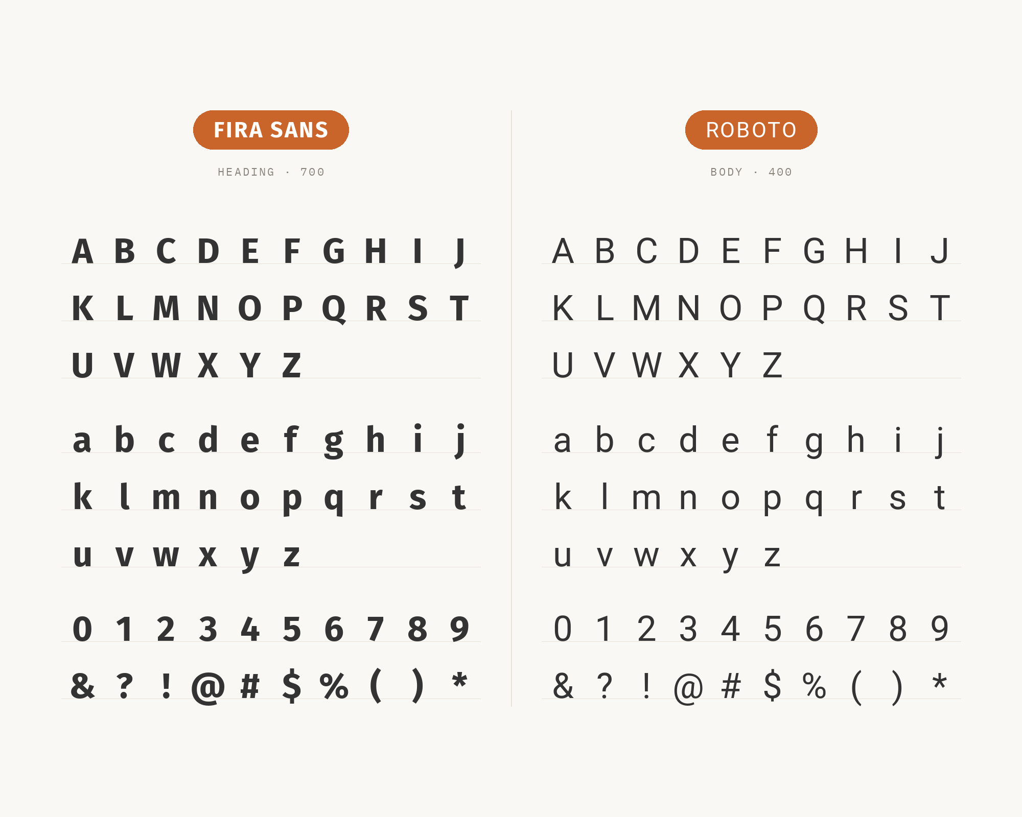
Christian Robertson designed Roboto at Google as the Android system font, released in 2011 and reworked in 2014 for Android 5.0. It is a grotesque with a mechanical skeleton and a fairly neutral voice, and neutrality is its job next to Fira Sans: the two share a screen-first x-height and similar apertures, so Roboto can carry labels, buttons and body text while Fira Sans, with its rounder humanist curves and a touch more character, takes headings one level up. Because both were tuned for phones, they match optical size at every step, which is rare in a two-sans system. On the 2024 PLAY! Bergen festival website, studio Overhaus used NaN Spaceland for the logo and paired it with Fira Sans and Roboto, as Fonts In Use records; SlidesCarnival lists the same duo for apps and documentation.
8. IBM Plex Mono
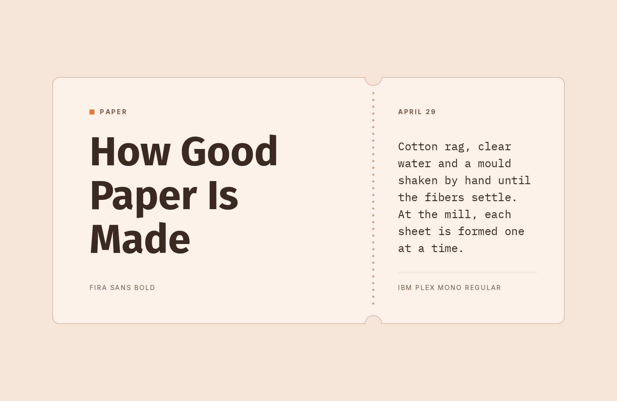
Mike Abbink designed IBM Plex at IBM with Bold Monday, and IBM Plex Mono is the fixed-width member of that 2017 superfamily, with an italic modeled on the Italic 12 element of the IBM Selectric typewriter. Its even grid and flowing italic make a graphic, technical headline voice, while Fira Sans’s proportional humanist text keeps paragraphs comfortable underneath. The x-heights sit close enough that titles and body align at one size ratio, and the monospace rhythm separates the two levels without a weight change. The Argentine foundry 27 Caracteres built its 2019 website this way, with Plex Mono for titles and Fira Sans for running text, both served from Google Fonts, and the case is on Fonts In Use. It suits any tech or foundry site that wants a machine feel without giving up readable prose.
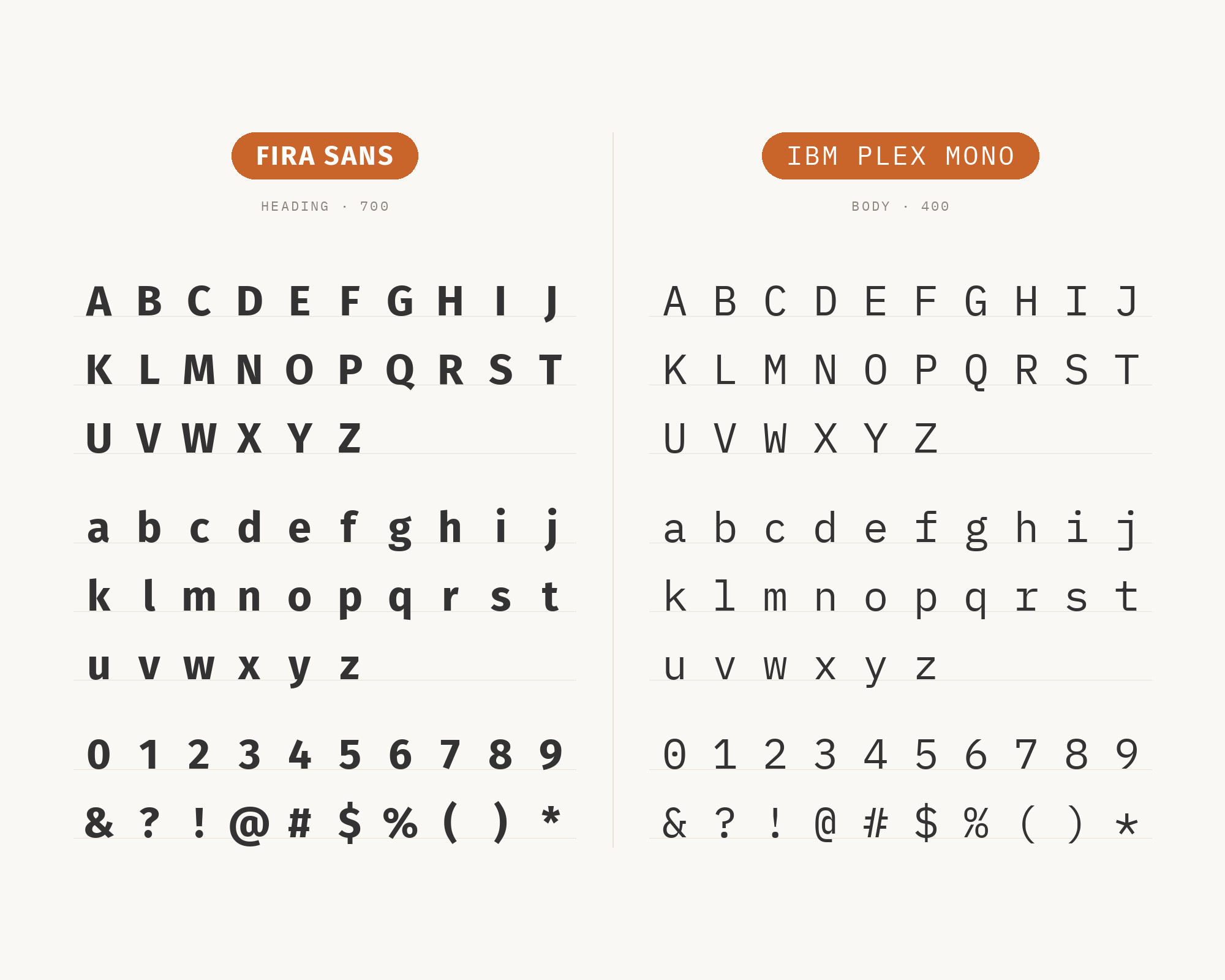
9. Arvo
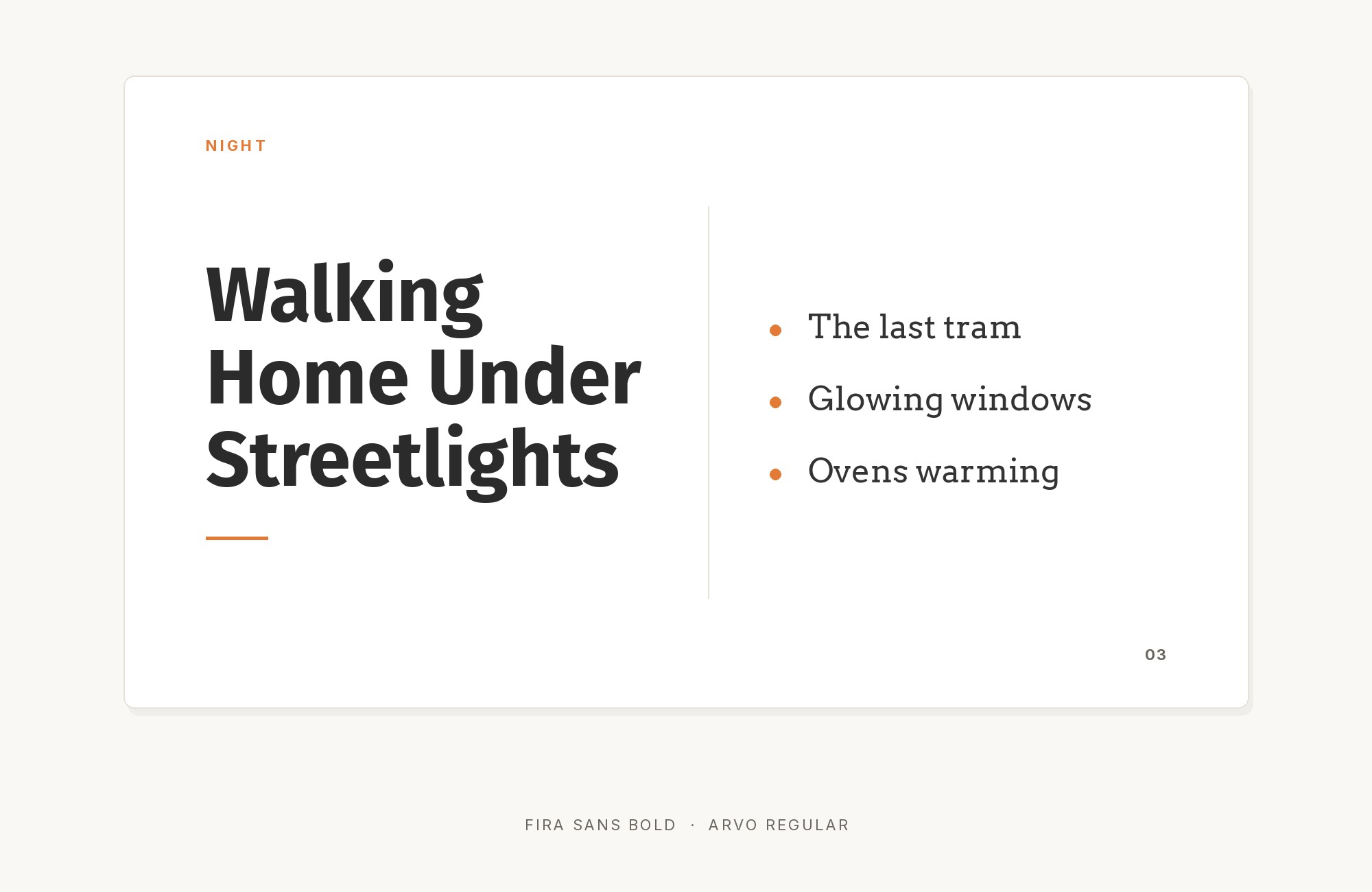
Anton Koovit, an Estonian designer, drew Arvo as an open-source geometric slab serif in regular, italic, bold and bold italic. Its slabs are heavy, even in weight and blocky at the joins, so the letterforms feel built rather than written; Fira Sans’s open counters and gently modulated humanist strokes are the opposite construction. That difference is the whole argument: an Arvo headline over Fira Sans text separates hierarchy by structure, so the two can share a size or a weight and still never blur together. Keep Arvo short and large, because its wide slabs run long in a paragraph, and let Fira Sans handle anything that runs past a line. Typ.io records Arvo and Fira Sans on internethealthreport.org, and its Arvo page lists Fira Sans first among the faces Arvo goes well with.
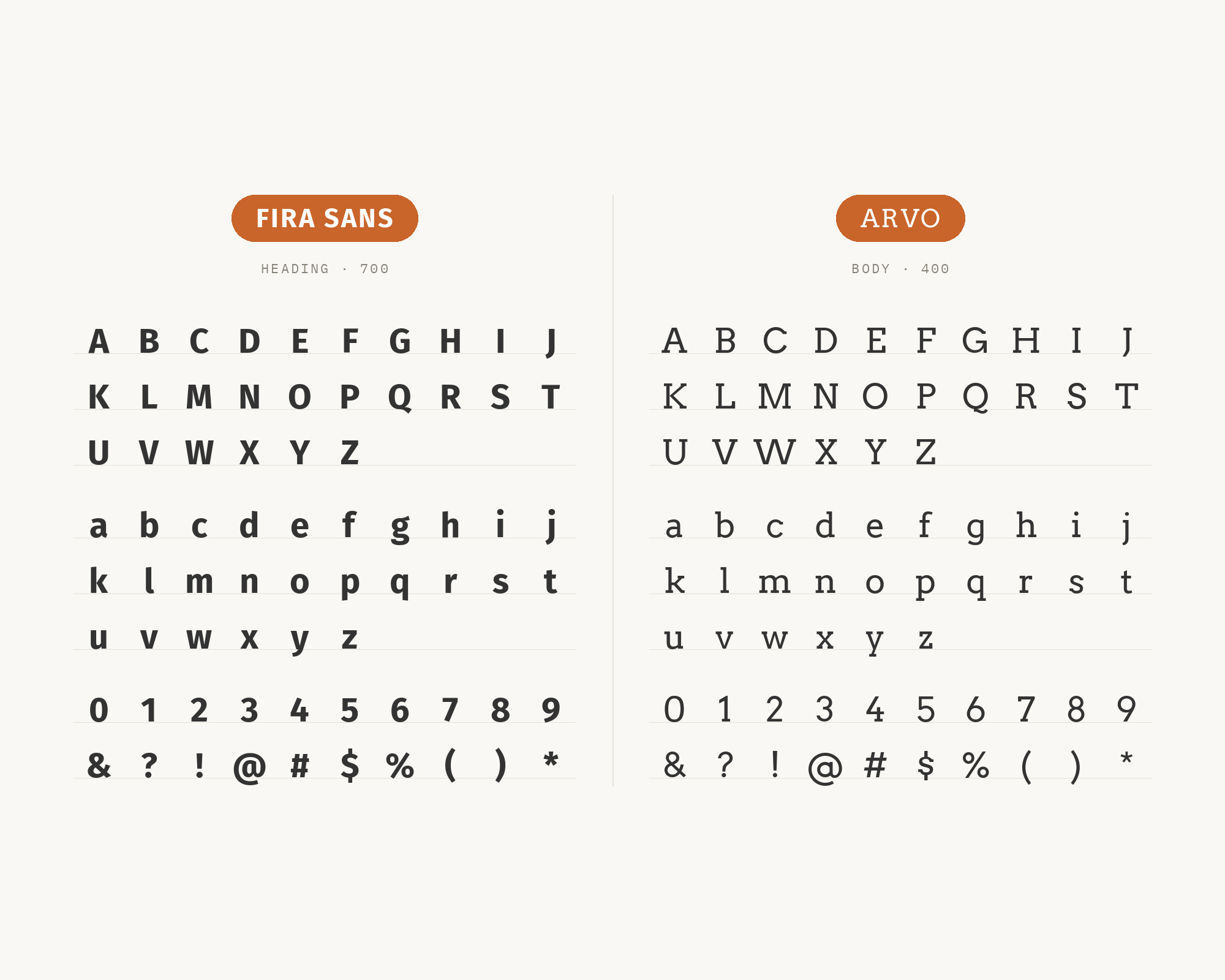
10. Inconsolata
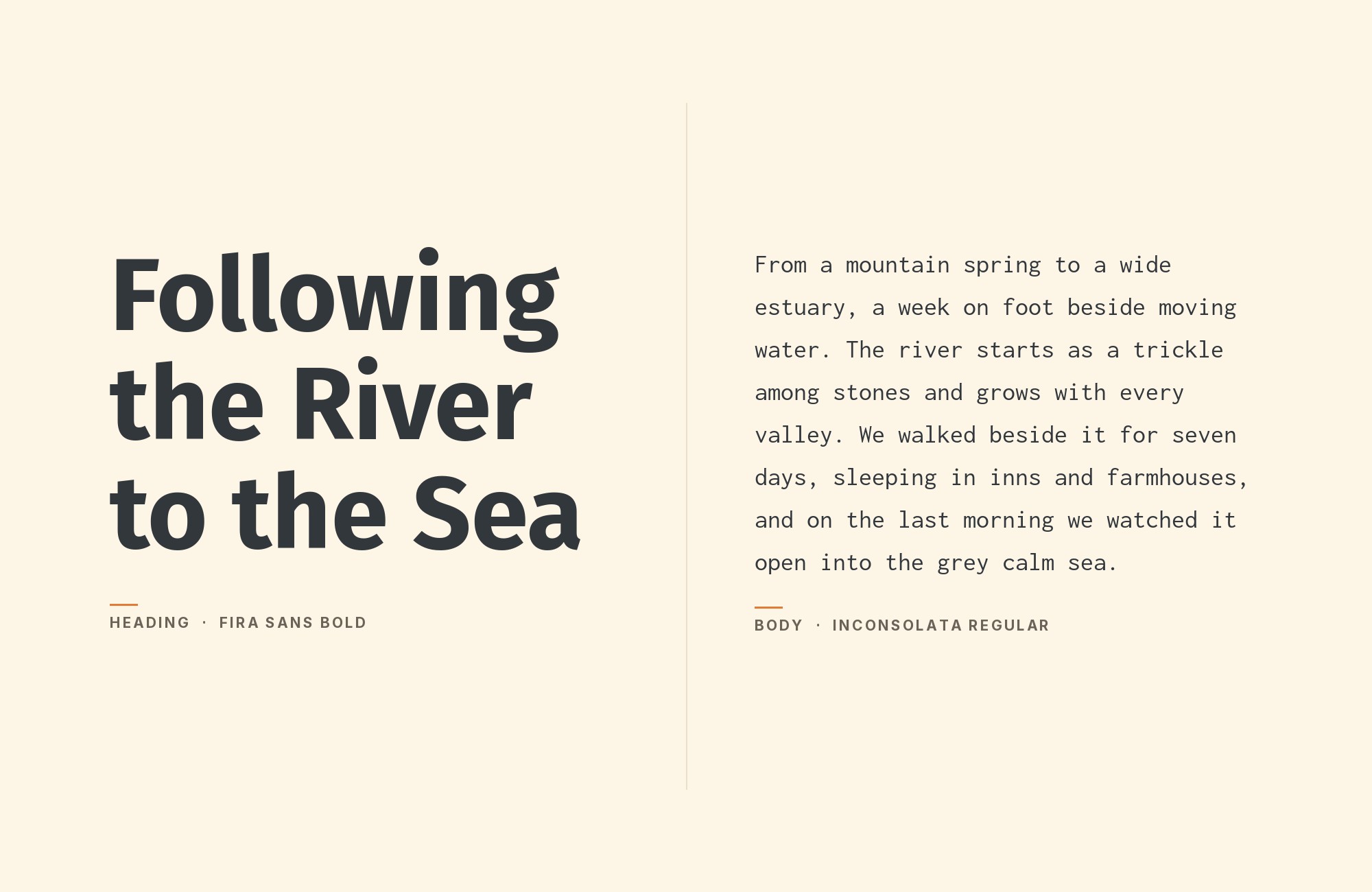
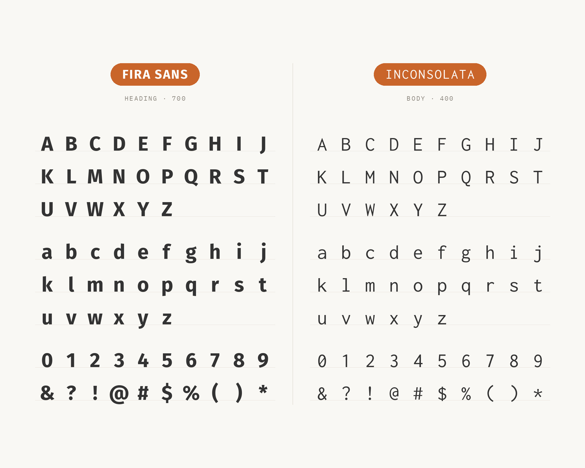
Raph Levien created Inconsolata in 2006 under the Open Font License as a humanist monospace for source code, drawing on Consolas, Avenir and Letter Gothic; a bold weight arrived when it joined Google Fonts, and it now spans eight weights without italics. Its humanist temperament is what makes it fit beside Fira Sans: both were drawn with open shapes and screen rendering in mind, so a code block in Inconsolata reads as a second voice of the same family rather than an intruder. Where Fira Mono matches the sans exactly, Inconsolata is slightly narrower and lighter, which gives code and captions a visible step down in color. Typ.io logs Fira Sans and Inconsolata on a designer’s portfolio, alongside Playfair Display, and its Inconsolata page names Fira Sans among that font’s regular companions.
11. Cormorant Garamond
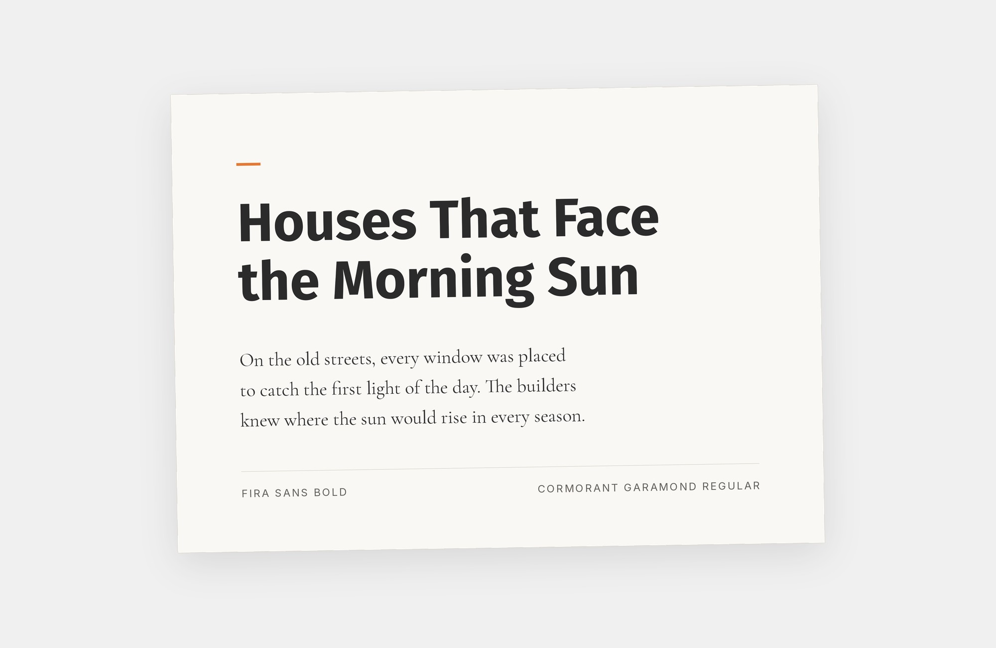
Christian Thalmann designed the open-source Cormorant family after Claude Garamond’s sixteenth-century types, and Cormorant Garamond is the variant with larger counters, meant to survive at text sizes where the display cut would not. Everything about it opposes Fira Sans: small x-height, sharp stroke contrast, long extenders and a calligraphic axis against the sans’s tall, even, screen-tuned forms. The pairing works when the size gap is wide: a bold italic Cormorant Garamond headline at display scale, then Fira Sans Regular for paragraphs, so the serif’s fine detail never has to render small. Lou Levit’s Hey Reliable collection shows that arrangement, Cormorant Garamond Bold Italic over Fira Sans Regular, with a rendered example rather than a bare recommendation. Use it for editorial or cultural work where a tech sans needs a literary counterpart.
12. Fira Code
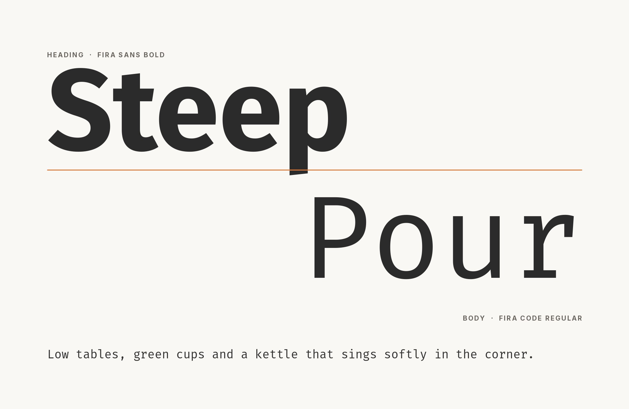
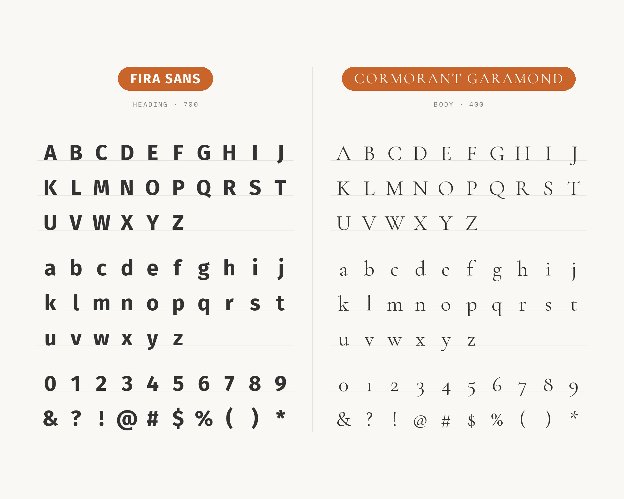
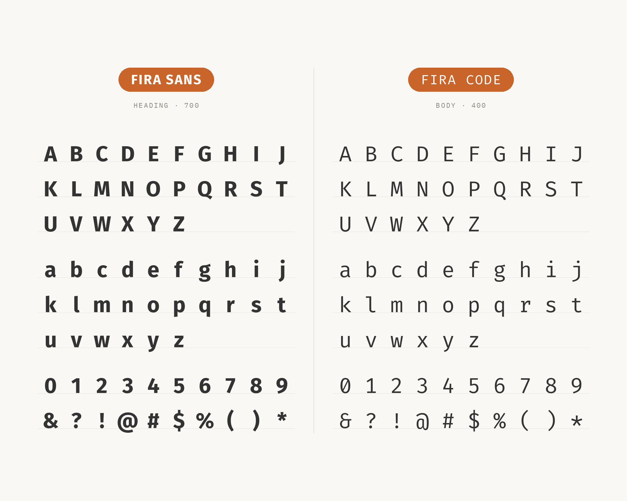
Nikita Prokopov built Fira Code on top of Fira Mono, adding ligatures that draw common programming sequences as single glyphs; it ships in light, regular, medium and bold plus a variable font. Because it inherits Fira Mono’s metrics, it pairs with Fira Sans the same way the mono does: identical x-height and stroke weight, so prose and code align without a size correction. The ligatures are the reason to choose it over Fira Mono: in developer documentation, arrows and comparison operators read as one mark, which keeps code samples calm beside Fira Sans explanations. Wikipedia’s Fira entry lists Fira Code as part of the family, and the project’s own repository credits Prokopov and names Fira Mono as its base. Reserve it for code blocks and terminal output, and let Fira Sans carry the paragraphs.
Conclusion
Fira Sans is the text and interface voice in nearly every documented system, not the display face. The working pattern from Fonts In Use, Typ.io and the designer guides splits two ways. For reading, put a serif above or around it: Merriweather or PT Serif when the serif also has to work at paragraph size, Playfair Display or Cormorant Garamond when the serif is a headline and nothing else, Arvo when you want slab weight instead of contrast. For product and code work, stay inside the sans and mono world: Montserrat, Lato or Roboto for a second sans with a fixed role, Fira Mono or Fira Code for code that matches the sans exactly, IBM Plex Mono or Inconsolata when code should read as a distinct voice.
Whichever path you take, set real copy at the sizes you plan to ship and check that Fira Sans’s open apertures are still doing the small-size work. Its wider, calmer relationship to FF Meta means it rarely needs help at text sizes; what it needs is a partner that either contrasts hard at display scale or steps quietly into a fixed role beside it.
Sources
- Fonts In Use — Fira Sans typeface page (14 uses)
- Fonts In Use — Jan 6 Committee website
- Fonts In Use — The Center of Gravity website
- Fonts In Use — PLAY! Bergen 2024
- Fonts In Use — 27 Caracteres website
- Fonts In Use — Tabuh game
- Fonts In Use — EUT+
- Fonts In Use — MuseumSRV
- Fonts In Use — Good Pictures by Kim Beil
- Typ.io — Fira Sans
- Typ.io — Arvo
- Typ.io — Inconsolata
- Typ.io — PT Serif
- Figma — Montserrat font pairings
- Elementor blog — 30 Best Font Pairings (Sergei Davidov)
- Hey Reliable — Ultimate Collection of Google Font Pairings (Lou Levit)
- Wikipedia — Fira (typeface)
- Mozilla — Fira specimen
- GitHub — tonsky/FiraCode
- SlidesCarnival — Fira Sans
- FontSwan — Fira Sans
- Fonts In Use — search
- Fonts In Use — Merriweather typeface page
- Typewolf — Montserrat, Playfair Display, PT Serif, Arvo, Inconsolata, Cormorant, Merriweather, Lato, IBM Plex Mono, Roboto
- Wikipedia — Montserrat, PT Fonts, Inconsolata, Lato, IBM Plex, Roboto
