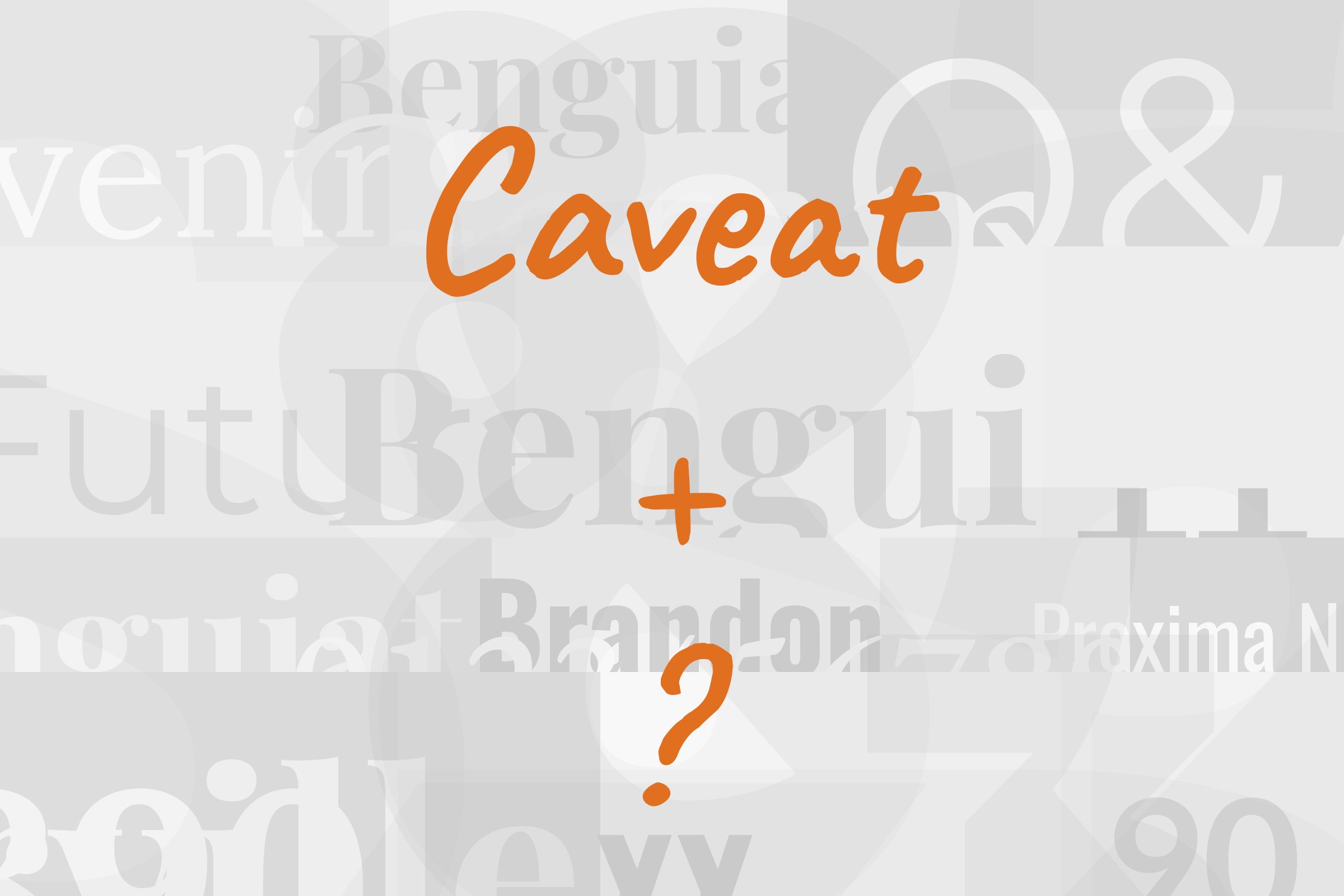
Caveat pairs great with Open Sans, Merriweather and Montserrat. All 10 pairings are shown below in real rendered specimens, with the reason each one works.

What fonts go with Caveat? Short answer: something calm. Caveat is a quick, slightly scruffy handwriting face, the kind of thing you’d scribble in a margin, and it looks its best when the rest of the page is steady enough to make that scribble feel intentional. The partner does the reading. Caveat does the talking.
Pablo Impallari designed Caveat, and the project was commissioned by Google from Impallari Type, a type design foundry in Rosario, Argentina. It was added to Google Fonts in 2015. The brief was unusual for a handwriting face: it was made for both short annotations and body text usage. The trick that keeps it believable is in the OpenType features, which let letters take slight variations according to their occurrence within a word, so a repeated letter doesn’t stamp out identical copies the way most script fonts do. It also has more range than you’d expect from a note-taking hand, with four weights from Regular through Bold. The strokes are monoline and upright, closer to a felt-tip pen than a brush, and the x-height is small against long ascenders, which is why it wants a bit of size before it reads comfortably.
That shapes the pairing problem. Caveat brings personality, irregularity and warmth, so its partner should bring the opposite: an even texture, a larger apparent x-height, and a real weight range for everything Caveat shouldn’t be asked to carry. Most of the evidence below lands on a neutral sans. A few sources argue for a sturdy serif instead, and one real website uses both. Here are 10 fonts that pair with Caveat.
1. Open Sans
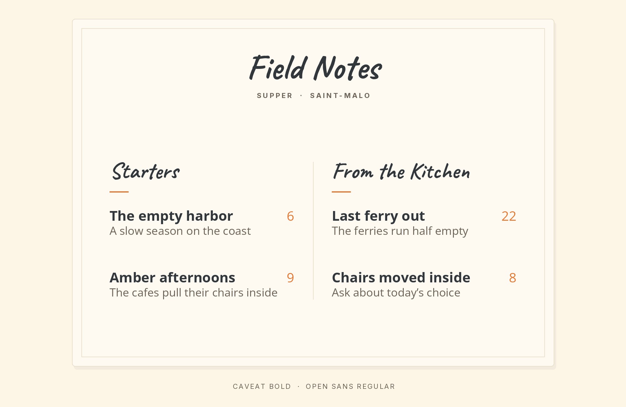
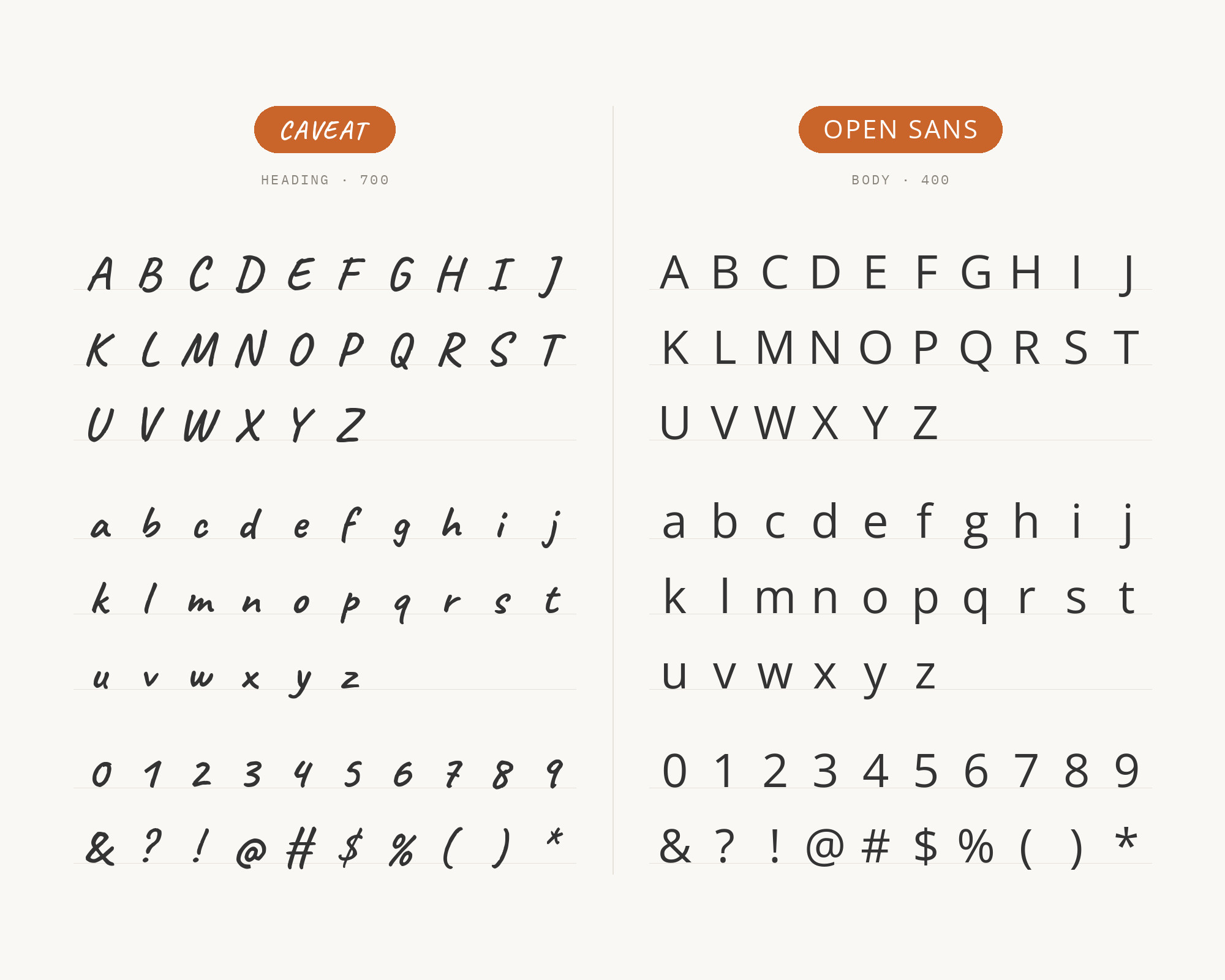
Open Sans is the best-documented Caveat partner on this list. Steve Matteson designed it as a humanist sans serif with an upright stress, open forms and a neutral, yet friendly appearance. Fonts In Use documents the website of Wemind, a French insurance company, where Open Sans handles body copy and Caveat appears in further roles. DreamHost’s font guide recommends the same move, using the clean shapes of Open Sans to balance Caveat’s uneven, organic feel. The logic is simple. Open Sans has a big, open lowercase and a steady rhythm, so it reads easily at paragraph sizes where Caveat would start to wobble. Let Caveat handle the aside, the callout, the little handwritten “new!” beside a heading. Let Open Sans do everything else.
Pro from $14/mo, save $60 yearly.
Premium templates, vector export, and a commercial license on every paid plan.
See plans2. Merriweather
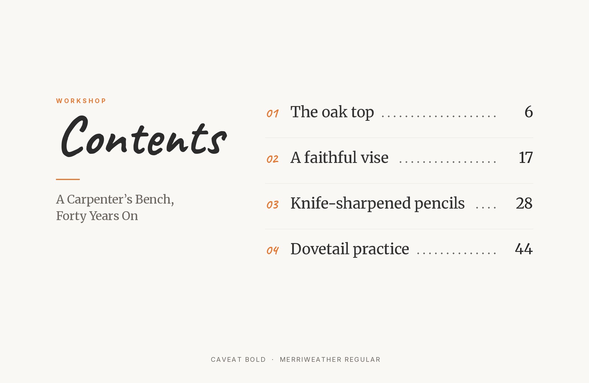
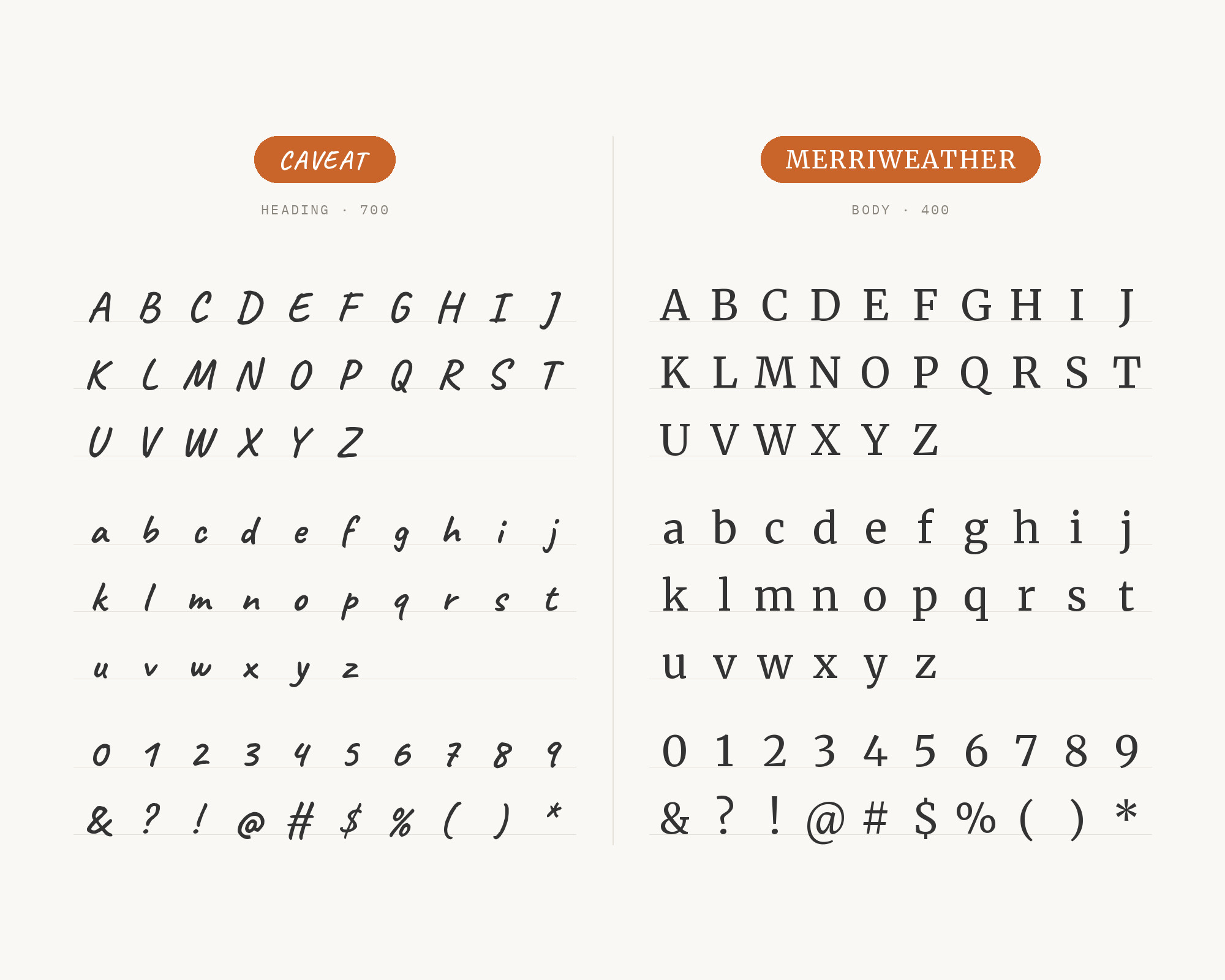
On that same Wemind website, Merriweather takes the headlines. FontAlternatives also recommends Caveat with Merriweather for rustic, outdoor wedding invitations, with Caveat on the couple’s names at display size and Merriweather on the details. Merriweather was designed to be a text face that is pleasant to read on screens, with a very large x-height, sturdy serifs and open forms. That x-height is the key. Caveat’s lowercase is small and loose; Merriweather’s is big and firm. Put them together and the contrast is instant: one looks written, the other looks built. It’s a warmer, more bookish pairing than the sans options, good for invitations, menus, recipe pages and anything with a handmade, country feel. Keep Caveat large so it doesn’t look timid next to Merriweather’s heavy serifs.
3. Montserrat
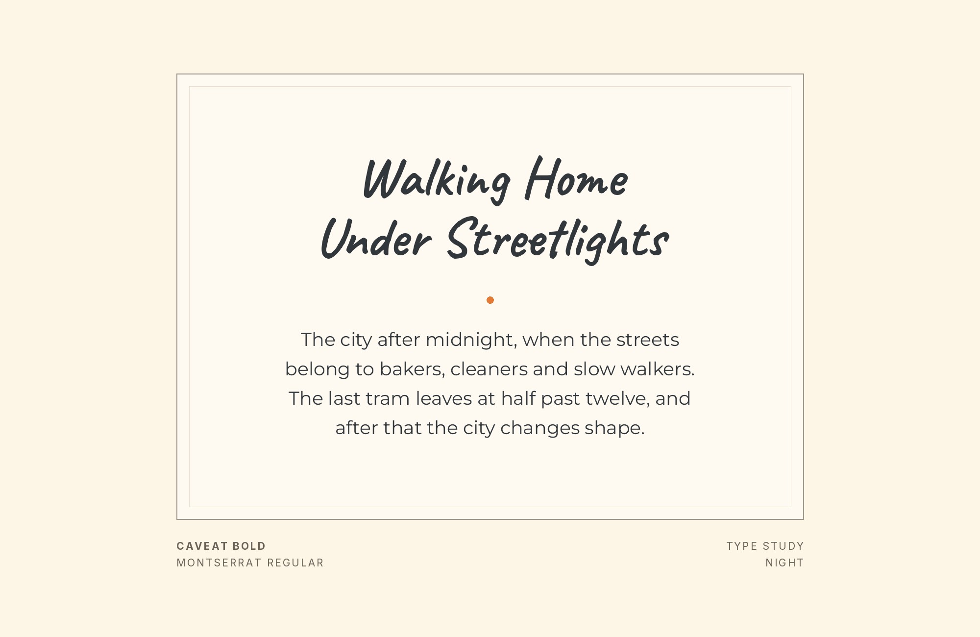
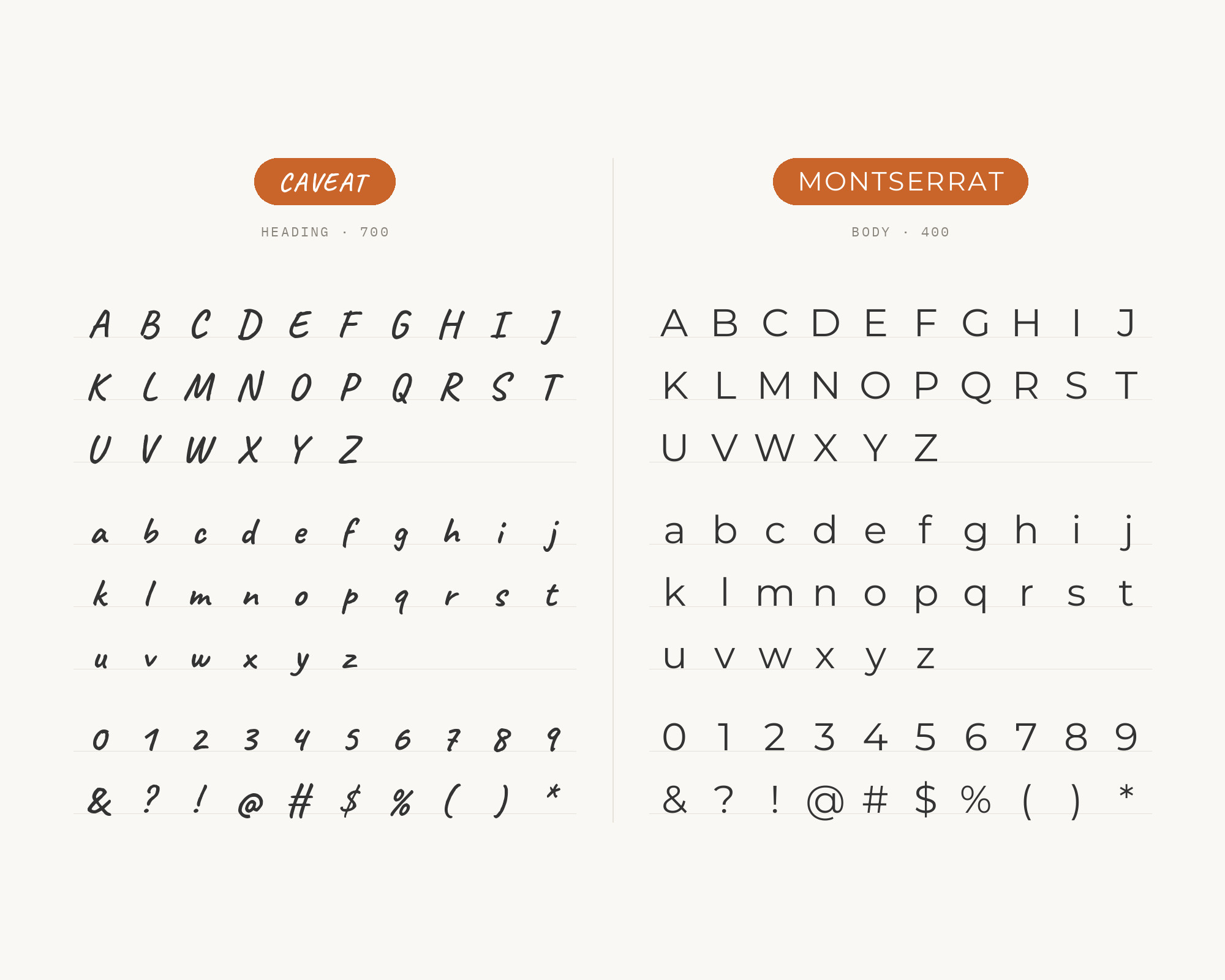
The Wemind website also uses Montserrat in further roles beside Caveat. The old posters and signs of the Montserrat neighborhood of Buenos Aires inspired Julieta Ulanovsky to design the face. Those roots give it wide, round, confident capitals. Next to Caveat, that width matters. Caveat is fairly narrow and spiky; Montserrat is broad and geometric, so the two never blur into each other. Montserrat in a bold weight makes a strong heading or button label, with Caveat tucked alongside as the personal note. Try Montserrat in all caps, lightly tracked, above a Caveat line. It’s a favorite layout for social graphics and product cards for good reason.
4. Inter
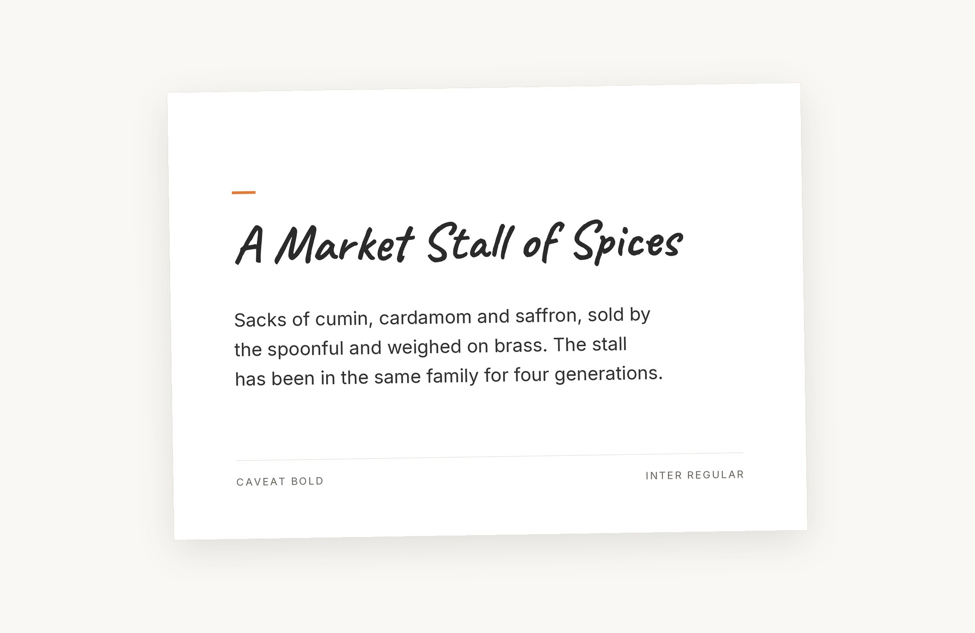
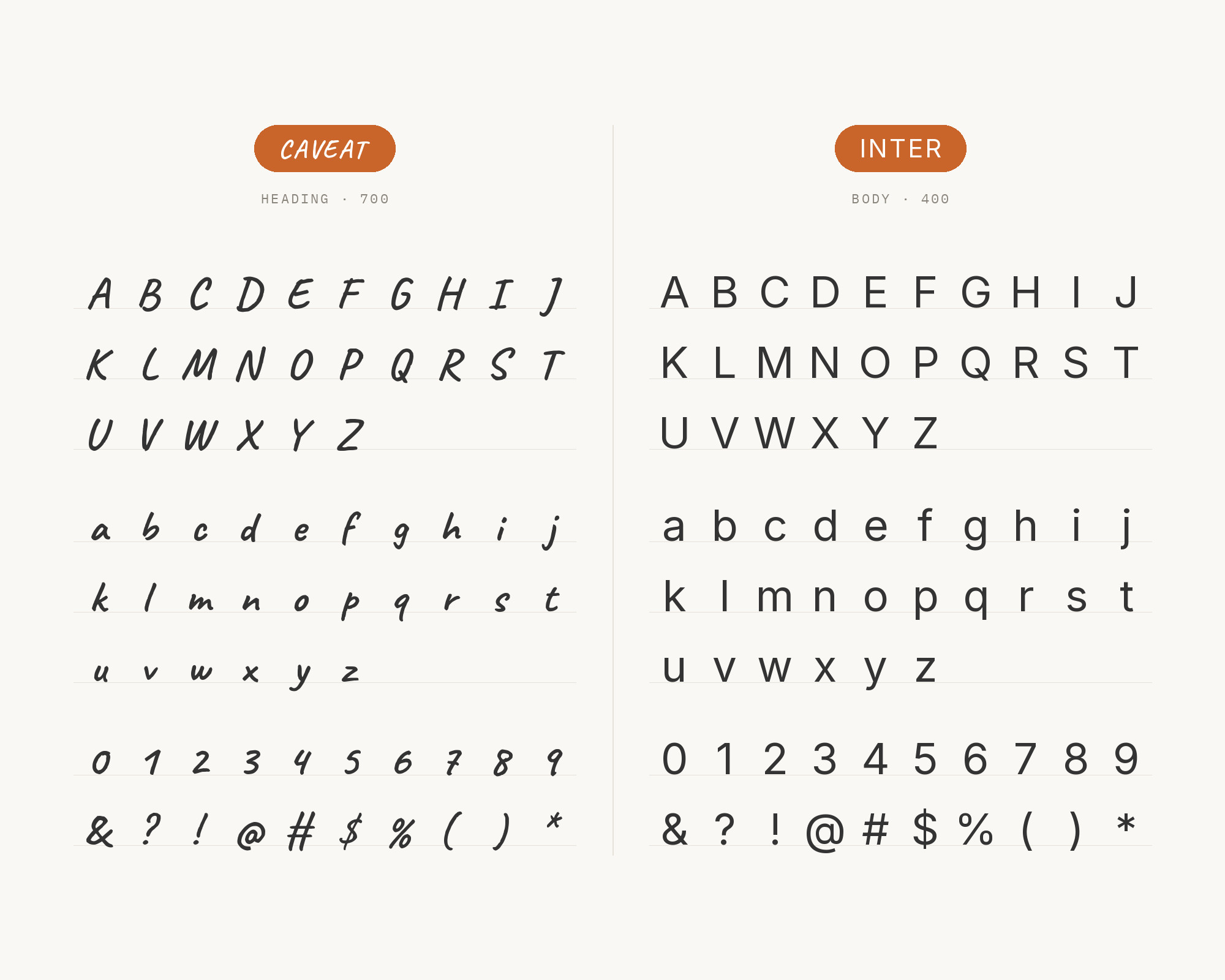
Inter is the pick for interface work. MaxiBestOf records the Frankli website setting Caveat with Inter and the serif Reckless, and Jukebox Print’s Caveat page demonstrates Caveat as the display face over Inter body text. Inter was designed for computer screens, with a tall x-height to aid readability of mixed-case and lower-case text. That makes it about as far from Caveat as a sans can get. It’s regular where Caveat is loose, compact where Caveat sprawls, and it holds up at small UI sizes. Use Caveat sparingly in a product layout: a hand-drawn arrow label, an annotation on a screenshot, a friendly empty-state message. Inter carries the actual product. Caveat’s quick, informal strokes then read as a human touch in an otherwise systematic interface.
5. Lora
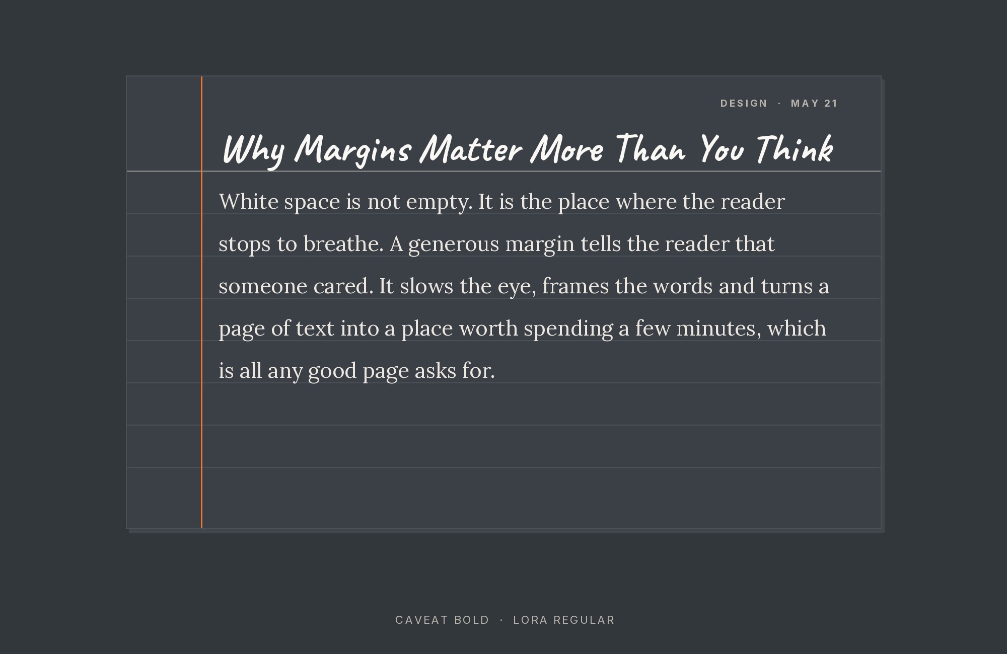
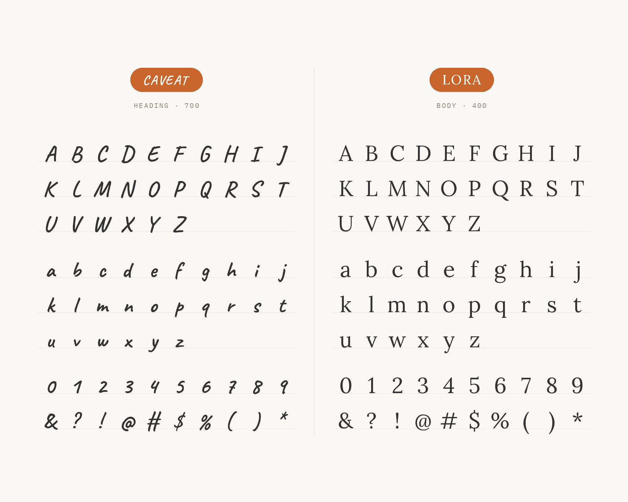
FontAlternatives suggests Lora as a more refined substitute for Merriweather in the same rustic invitation pairing, arguing that Lora’s calligraphic influences make a softer bridge between the handwritten header and the structured body text. Cyreal describes Lora as a well-balanced contemporary serif with roots in calligraphy, a text face with moderate contrast well suited for body text. Those calligraphic curves are why the pairing feels gentler than Caveat with Merriweather. Lora’s strokes already have a little movement in them, so the jump from written to typeset isn’t so abrupt. Use it for stationery, lifestyle blogs and editorial pages that want warmth without looking rustic. Lora’s italic is a nice middle step, too, when you need emphasis that isn’t Caveat.
Turn your ideas into repeatable creative workflows - no code required. Create with ready-made templates and AI-powered tools in Picsart Flow.
See details6. Futura
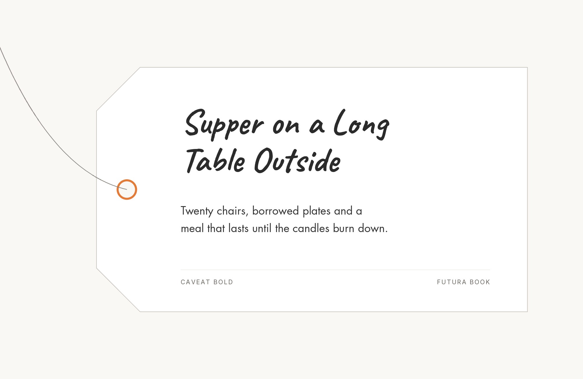
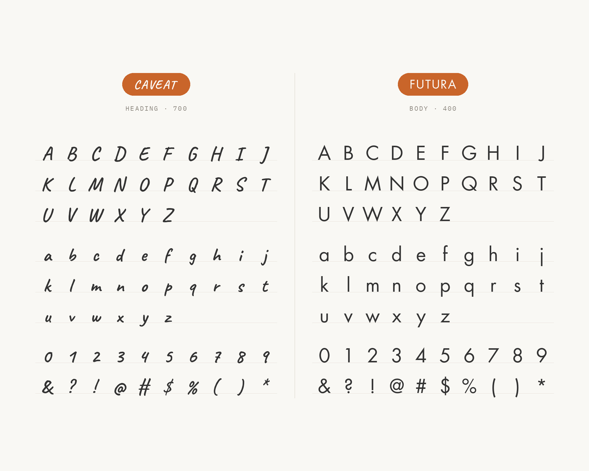
Looka’s font-pair guide recommends Futura with Caveat, contrasting Futura’s clean geometric lines with Caveat’s hand-lettered playfulness and suggesting the duo for a skincare brand, a catering business or a lifestyle blog. Futura is a geometric sans-serif typeface designed by Paul Renner and released in 1927. Its near-perfect circles and sharp apexes are the most “drawn with instruments” letters you can put next to Caveat’s freehand strokes. That gap is the whole appeal. Futura set in capitals makes a crisp, modern wordmark or heading. A Caveat line underneath, like a tagline jotted by hand, softens it right away. Keep Futura’s letterspacing generous and Caveat’s size slightly larger than you think it needs to be.
7. Karla
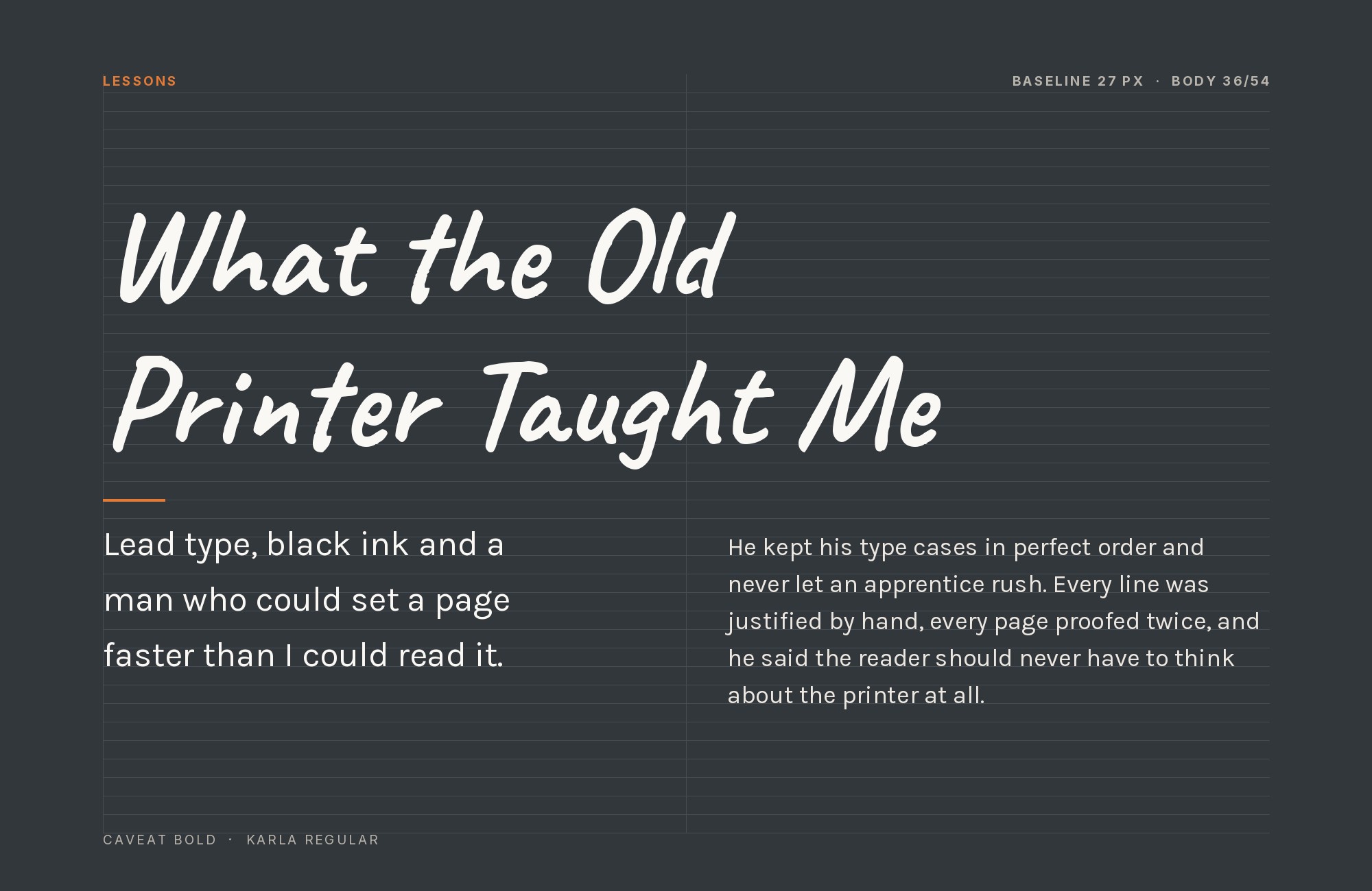
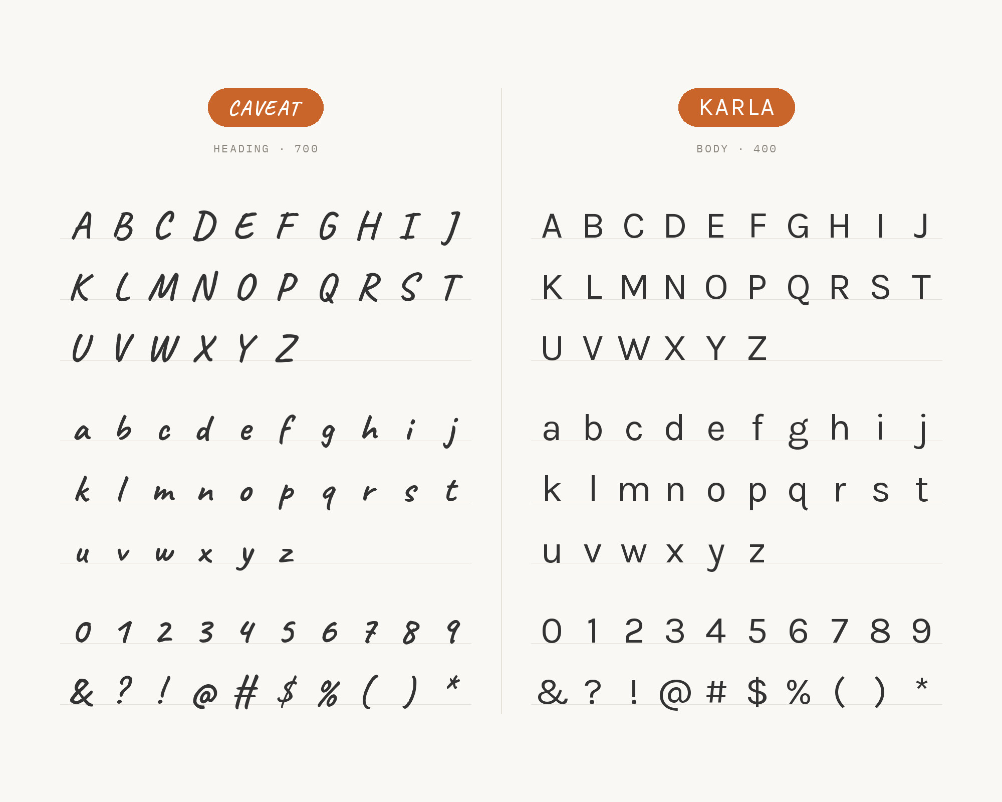
Matt Medley’s Bootcamp pairing guide recommends Karla with Caveat, with Caveat bringing warmth to headers and Karla supplying clear, grounded body text. Karla is a grotesque sans serif family, and its variable weight axis runs from ExtraLight to ExtraBold. It has a quirky, slightly squared character that sits nicely between Caveat’s looseness and a strictly neutral sans. That makes the pairing feel friendly rather than corporate. Karla is a good body face for portfolios, small-studio sites and newsletters where you want Caveat in the headings but don’t want the page to swing too far into craft-fair territory. Use Karla in a medium weight for subheads so Caveat stays the only informal voice.
8. Avenir
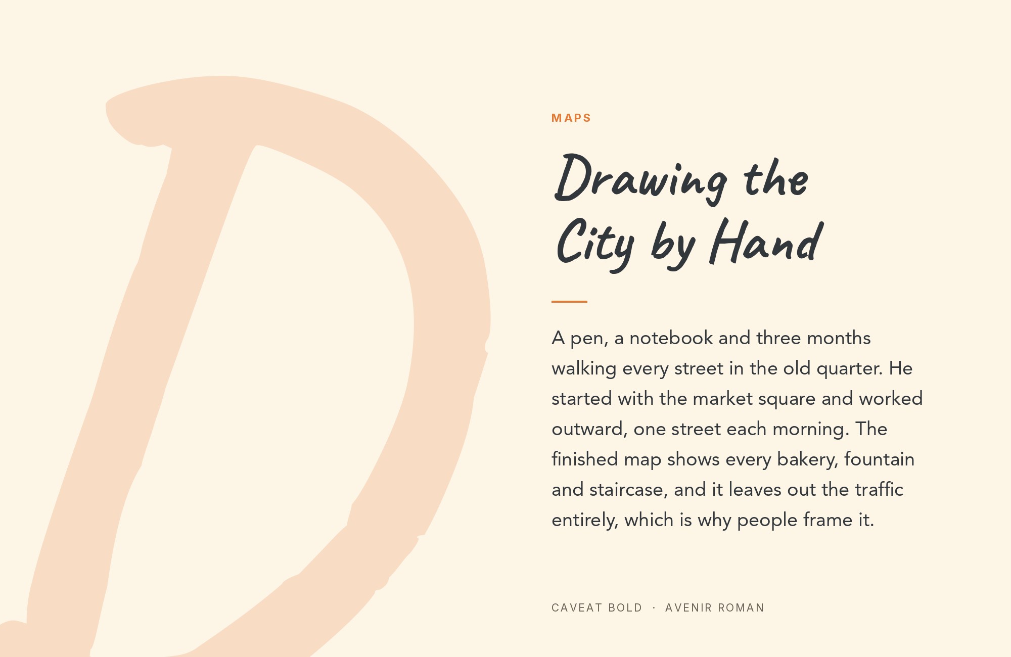
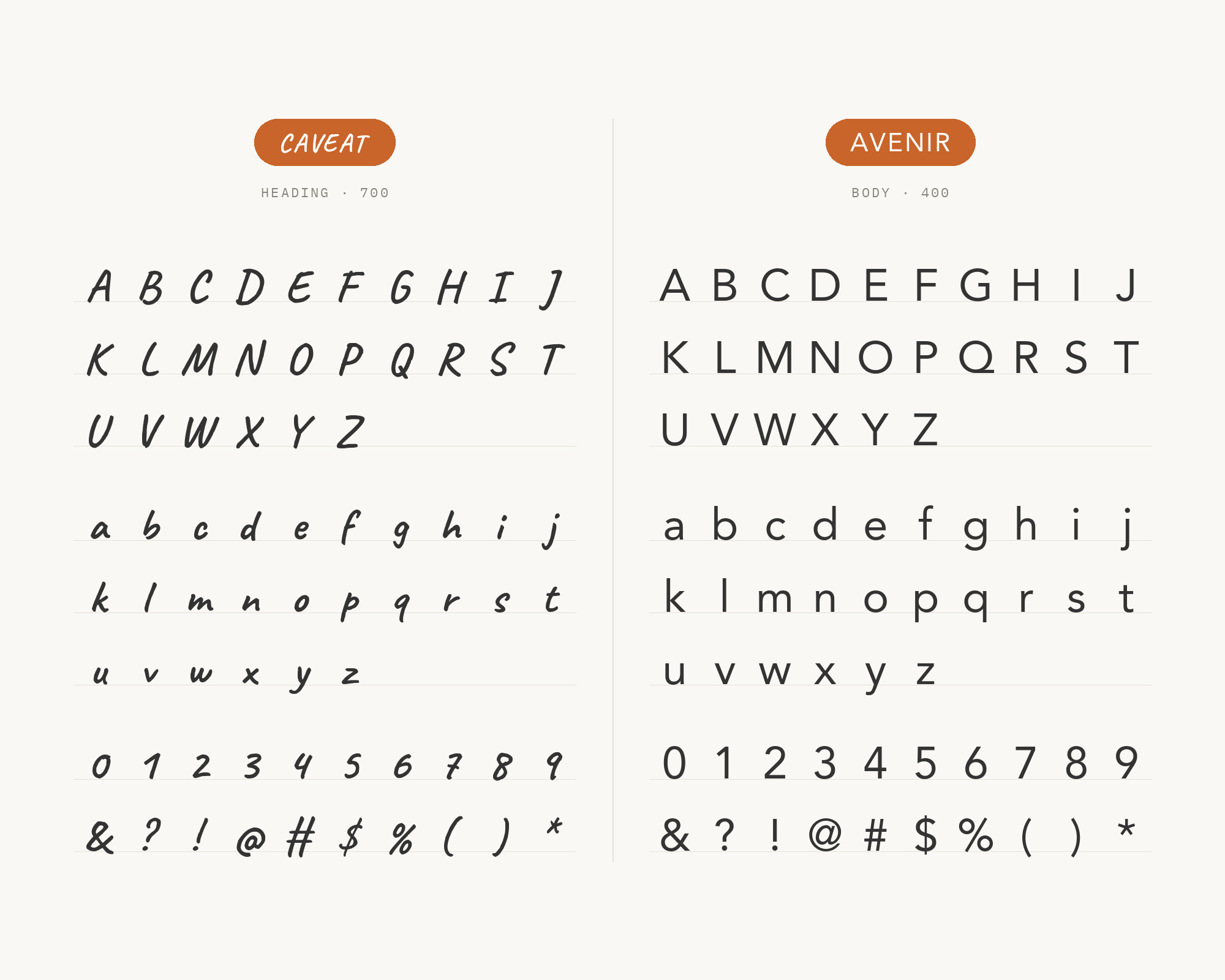
MaxiBestOf records the BrightLock website using Avenir with Caveat and Gilroy. Avenir is a geometric sans-serif typeface designed by Adrian Frutiger in 1987 and released in 1988 by Linotype. Frutiger wanted a more organic take on the geometric style, more even in colour and suitable for extended text, and that softness is what makes it a comfortable Caveat partner. It’s clean without being cold. Where Futura gives Caveat a sharp foil, Avenir gives it a polite one, better for longer reading, service businesses and brands that want a single handwritten accent inside a calm, professional system. Keep Caveat for short phrases here; a whole Caveat paragraph will fight Avenir’s even texture.
9. Nunito
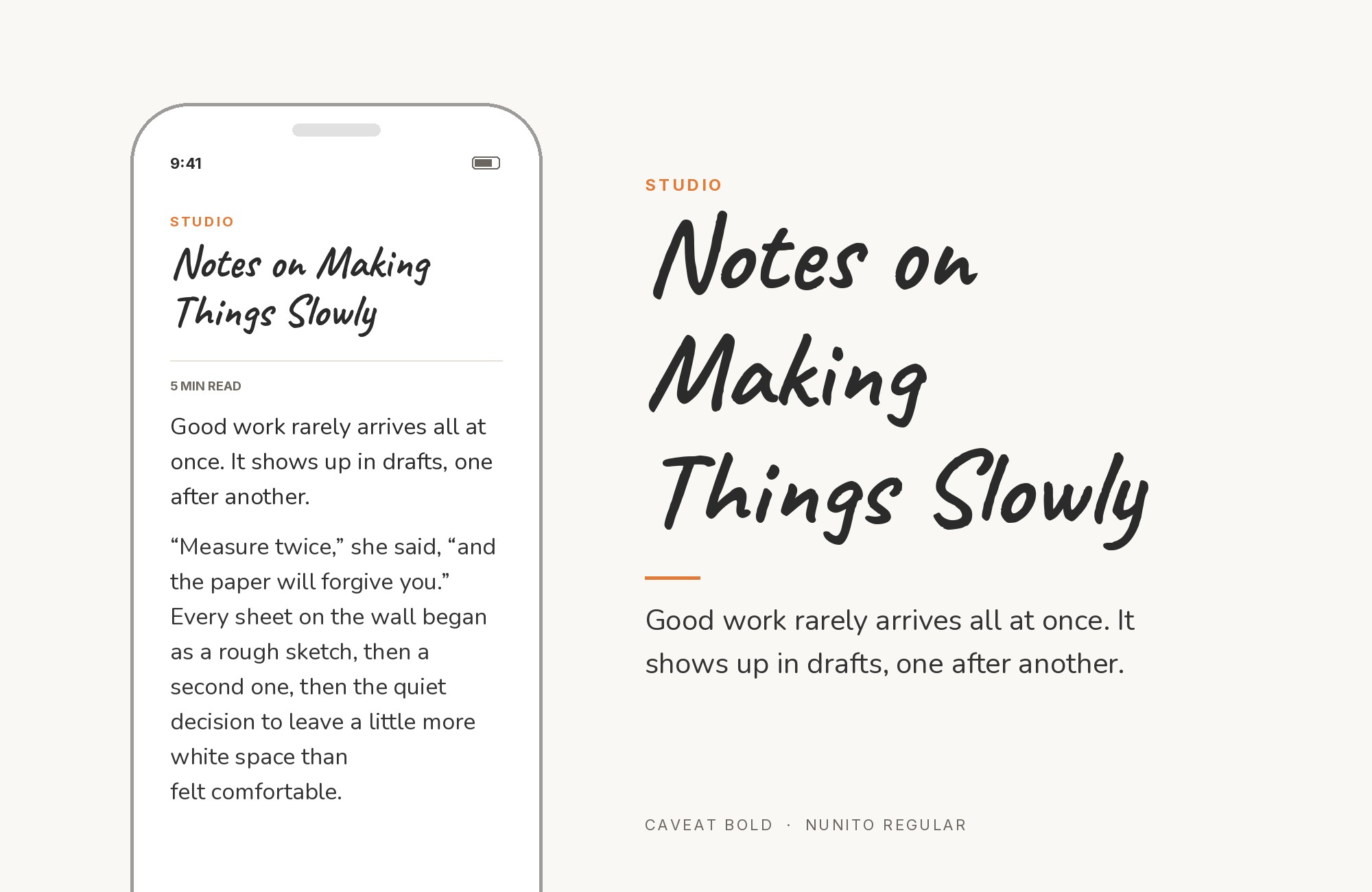
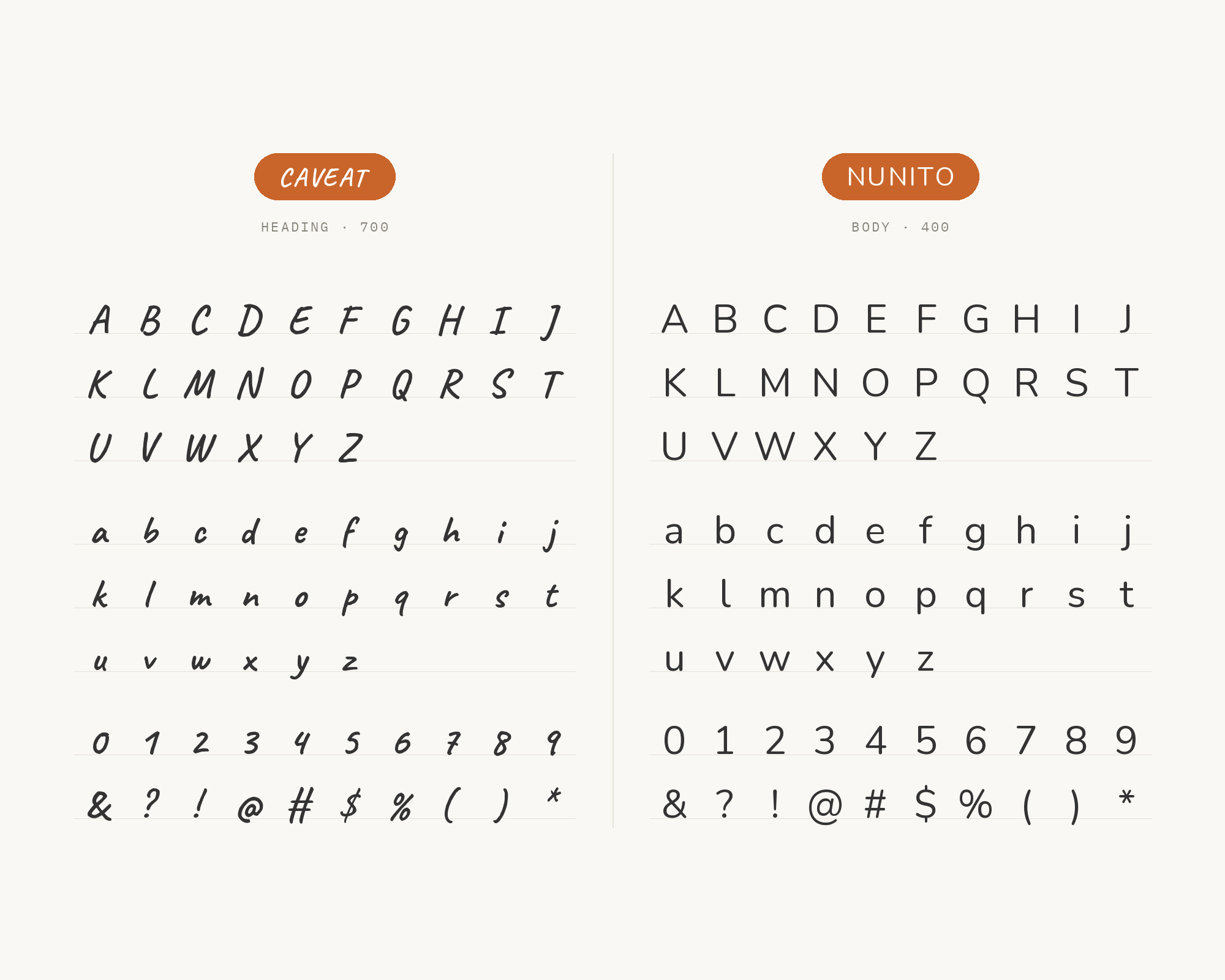
GetIllustrations’ font-pairing collection sets Caveat for headings and Nunito for body text, recommending the pair for greeting cards, personal blogs and recipes. Nunito was created by Vernon Adams as a rounded terminal sans serif for display typography, and Jacques Le Bailly later extended it to a full set of weights. Those rounded ends are the link. Caveat’s pen strokes finish with soft, blunt ends too, so the two faces share a friendly, low-contrast finish even though one is written and one is drawn. It’s a sweet pairing, maybe the sweetest on this list, so reserve it for projects that should feel cozy: kids’ content, craft instructions, cookbooks and personal sites. For anything serious, pick Inter or Open Sans instead.
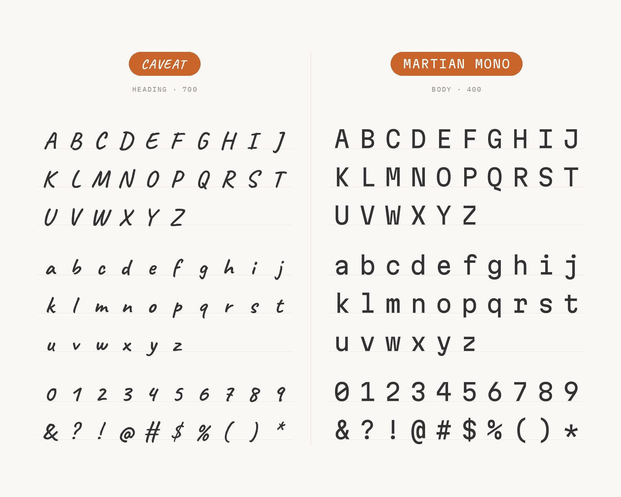
10. Martian Mono
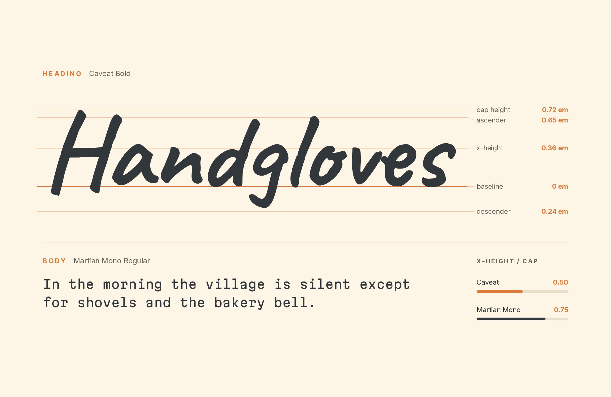
MaxiBestOf records the Plain Sight Ventures website using Caveat with Martian Mono, Office Times Sharp and SF Pro. Martian Mono is a monospaced version of the Martian Grotesk font for code style design, from Roman Shamin and Evil Martians. This is the oddball on the list, and it works because the contrast is so blunt. Monospace spacing gives every character the same width, so Martian Mono looks mechanical and gridded; Caveat looks like someone reached in with a marker and annotated it. Use Martian Mono for small labels, data, captions or navigation, and Caveat for one handwritten comment on top. It suits tech-leaning brands, developer tools and studio sites that want a human note without losing their technical edge.
Conclusion
The pattern across every source is the same. Caveat is the accent, not the system. Its best partners are faces with an even rhythm and a bigger, steadier lowercase: Open Sans, Inter and Montserrat on the sans side, Merriweather and Lora on the serif side. The Wemind website is a useful proof because it uses Merriweather, Open Sans and Montserrat together, with Caveat in a supporting role, so you can see both directions working on one real page.
Picking between them comes down to tone. For product and interface work, Inter. For general web copy, Open Sans. For invitations and anything handmade, Merriweather or Lora. For a crisp brand mark with a scribbled tagline, Futura or Montserrat. Set Caveat big enough that its irregular letters look deliberate, keep it to short phrases, and let the partner handle the reading.
Sources
- Fonts In Use (Wemind website)
- Fonts In Use (Caveat typeface page)
- DreamHost (Best Google Fonts)
- FontAlternatives (wedding invitation fonts)
- FontAlternatives (handwriting fonts 2026)
- Looka (25 font pairs)
- Bootcamp / Matt Medley (Best Google font pairings for UI design in 2025)
- Jukebox Print (Caveat)
- GetIllustrations (112 Google font pairings)
