Orbitron pairs great with Rajdhani, Inter and Roboto Slab. All 10 pairings are shown below in real rendered specimens, with the reason each one works.

What fonts go with Orbitron? Short answer: something that can read. Orbitron is the spaceship-hull font, the loading-screen font, the one every sci-fi pitch deck reaches for first. It is brilliant at that job and pretty tiring at every other one, so the partner you pick ends up doing most of the actual communicating.
Matt McInerney designed Orbitron, and Google Fonts added it in December 2010. It was first published by The League of Moveable Type. The designer’s own description calls it a geometric sans-serif typeface intended for display purposes, drawn so that designers would have an alternative to typefaces like Eurostile or Bank Gothic. The original release came in four weights, light, medium, bold and black, and the family was remastered as a variable font in 2019. The Google Fonts version runs a weight axis from 400 to 900. Look closely and you see squared bowls, wide capitals, flat terminals and almost no stroke contrast. Orbitron has no italic. Those rectangular counters are the whole personality, and they are also why a paragraph of Orbitron feels like reading a circuit board.
So pairing Orbitron is a role split. Orbitron takes the title, the logo, the mission name, the big number on the dashboard. The partner takes everything a reader has to actually finish. The evidence below comes from a documented video game, a published design system, a brand guide, a coded design reference, an app’s source code and several named pairing guides, and it lands in the same place almost every time: a calm sans (or a sturdy slab) underneath, Orbitron kept large and short on top. Here are 10 fonts that pair with Orbitron.
1. Rajdhani
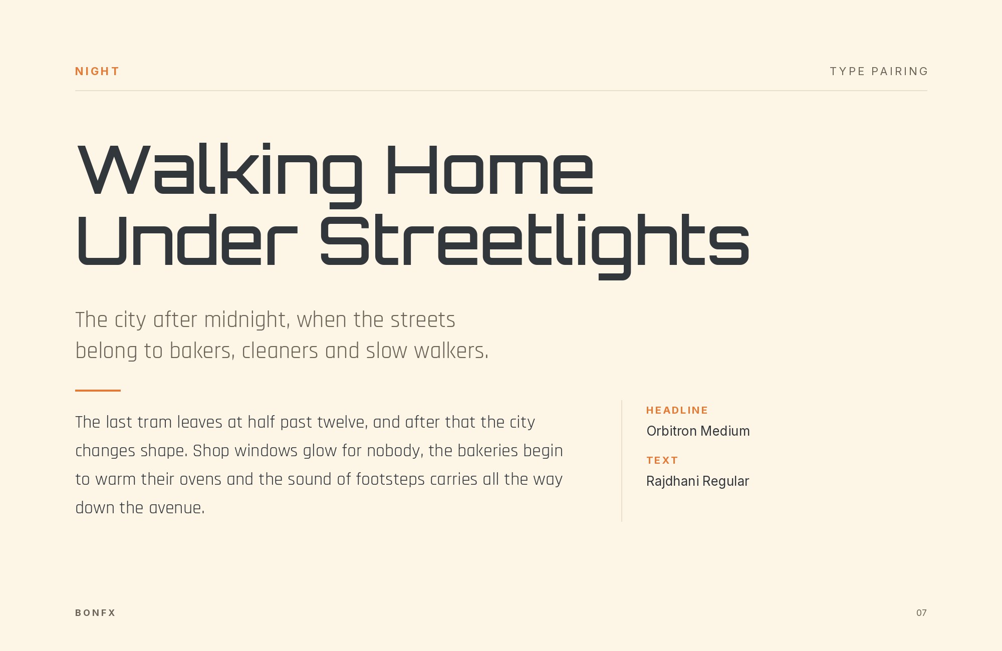
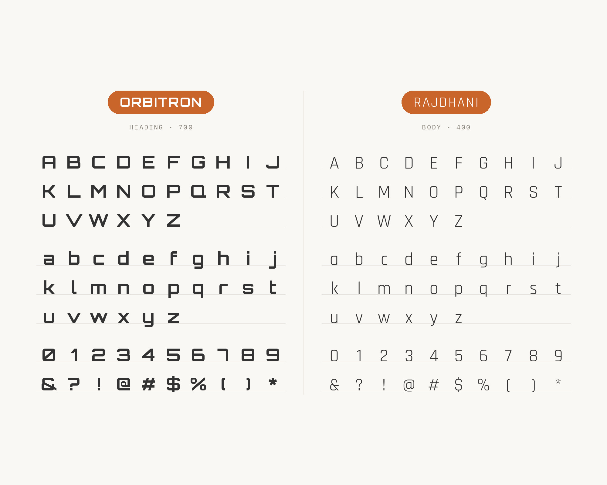
This is the pairing with the biggest real-world stage. Fonts In Use documents Orbitron in the Cyberpunk 2077 video game. There, most of the in-game user interface is set in Rajdhani, and Orbitron is used as a secondary typeface on non-important text. Indian Type Foundry published Rajdhani, with its Latin designed by Shiva Nalleperumal, and its own description says its squared and condensed appearance may be interpreted as technical or even futuristic. That shared squareness is why the two sit together so naturally. The difference is width. Orbitron is broad and slow, Rajdhani is narrow and quick, so a HUD can carry a lot of Rajdhani labels and still leave room for one wide Orbitron heading. Use Rajdhani Medium or SemiBold for interface text and short body copy, and keep Orbitron for titles and decorative readouts. It is a same-genre pairing, so let width and size do the separating, not color.
2. Inter
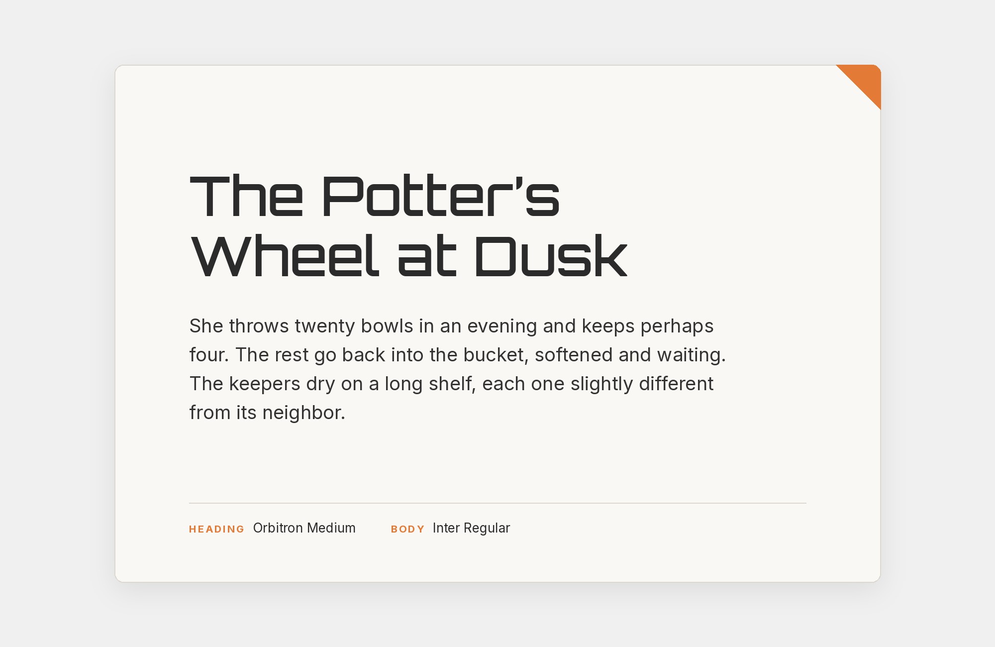
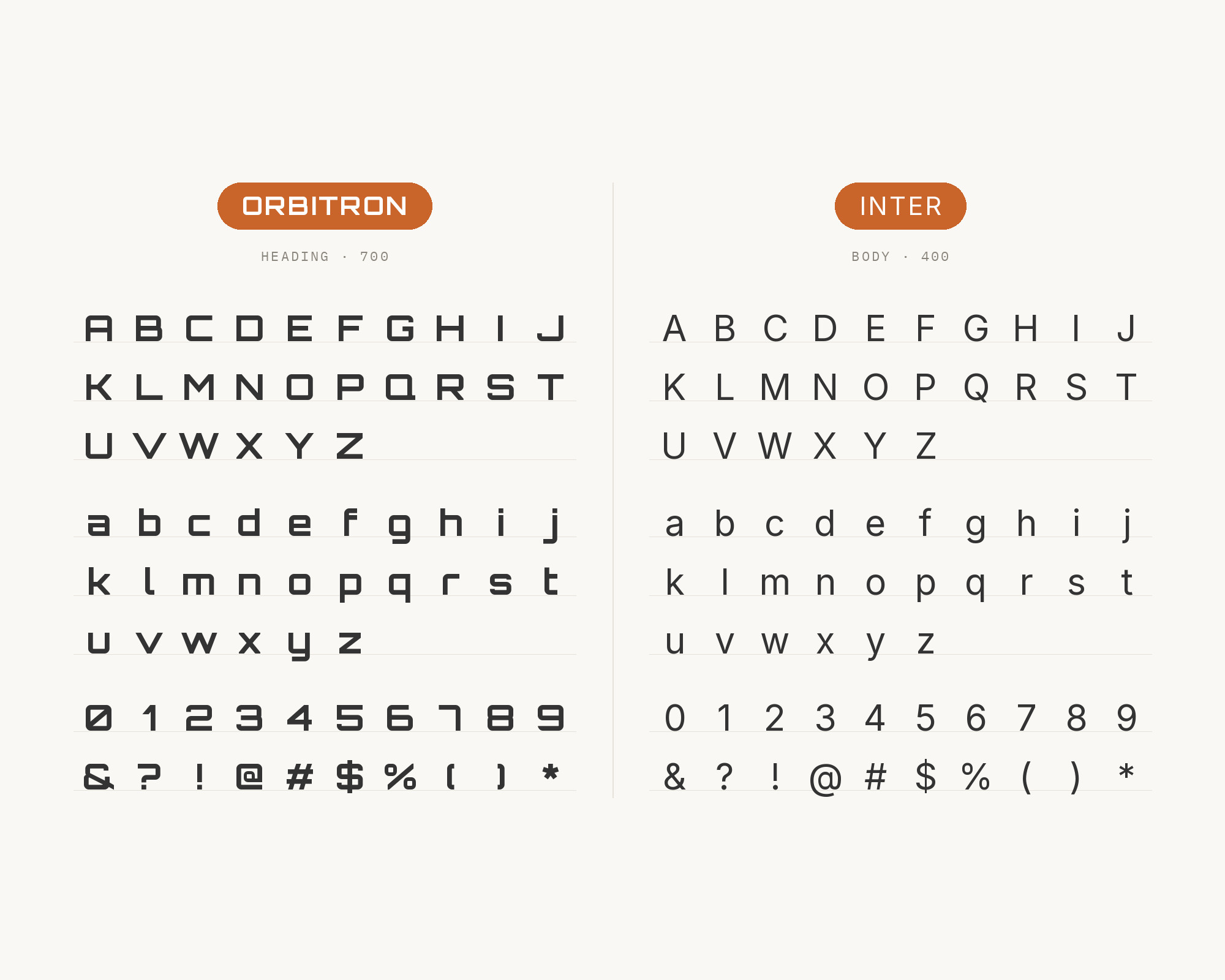
The Ride AI design system is built on Inter and Orbitron typography. Its brand page assigns Orbitron to all headings and display text and uses Inter for all body text. Rasmus Andersson leads the Inter project, and Inter features a tall x-height to aid readability. That is exactly the gap Orbitron leaves. Orbitron has wide, squared caps and a lowercase that tires the eye fast; Inter has a big, open lowercase that reads cleanly at ordinary text sizes. The split is simple and very hard to get wrong. Orbitron Bold for the product name and section headings, Inter Regular for paragraphs, Inter Medium for buttons and navigation. Ride AI works in autonomous mobility, and this is the pairing I would reach for on any tech product site where the futuristic mood should live in the headline and nowhere else.
Taking it to the next level means cinematic visuals, faster turnarounds, and work that wins clients. Create with unlimited downloads of creative stock assets, and access to powerful AI tools to fast-track your workflow!
Subscribe3. Roboto Slab
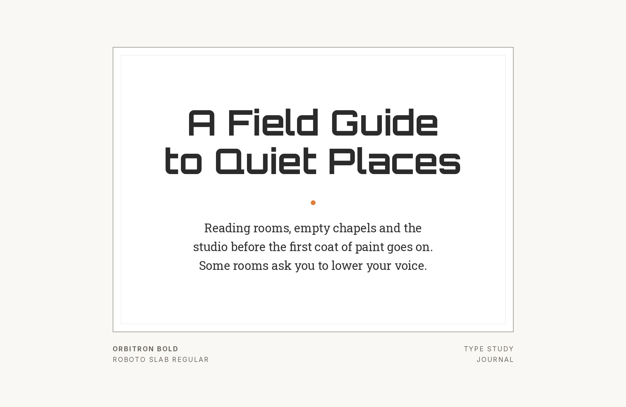
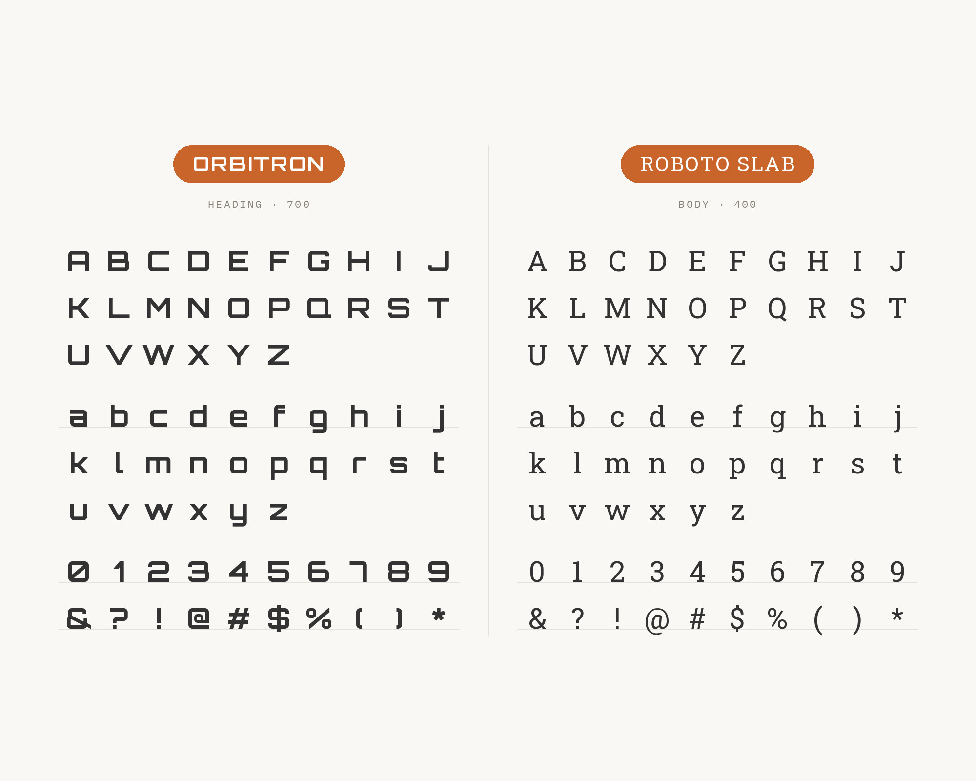
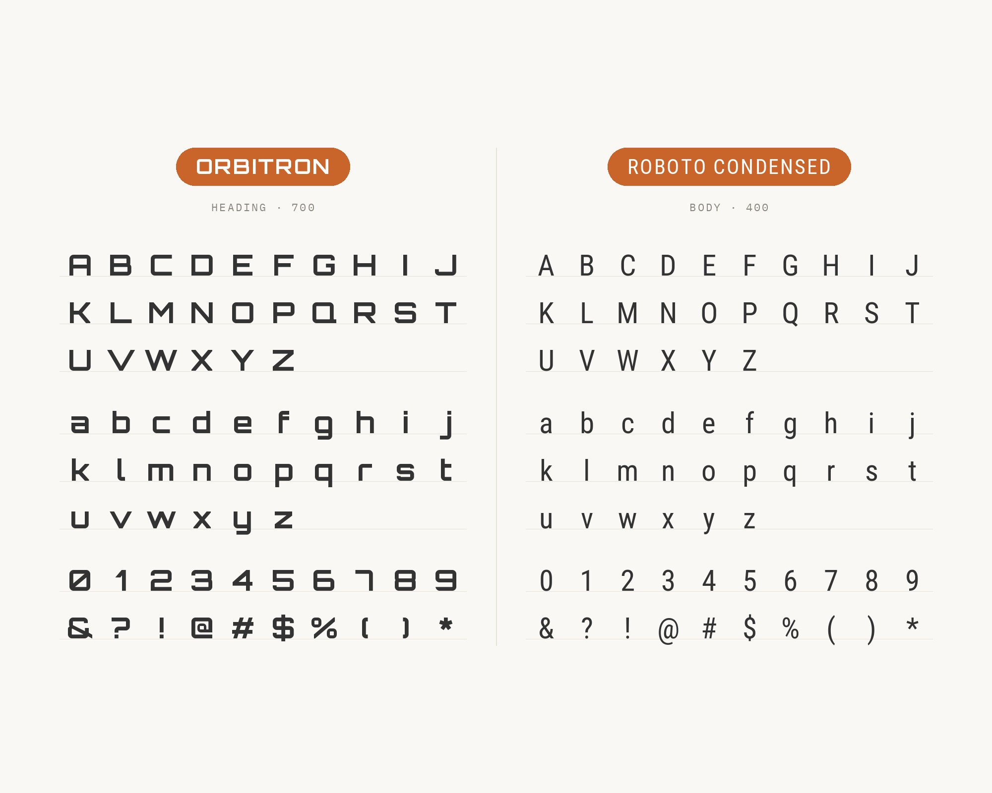
Looka’s font-pairing guide shows Orbitron in a bold weight with Roboto Slab in the body copy. Todaymade’s list of modern font pairings recommends the same combination for tech branding, gaming interfaces and promo posters. Christian Robertson designed Roboto Slab. This is the one pairing on the list that crosses category, and it is a good one. Orbitron is all hard geometry with no serifs to slow the eye; Roboto Slab adds slab serifs that give lines of text a baseline to ride on, while its mechanical skeleton keeps it in the same technical family. The slab also adds weight at body sizes, which balances Orbitron’s heavy black headlines better than a thin sans. Try it for magazine-style tech features, game studio blogs and posters with a bit of copy. Keep Orbitron in capitals and short, and let Roboto Slab carry the reading.
4. Roboto
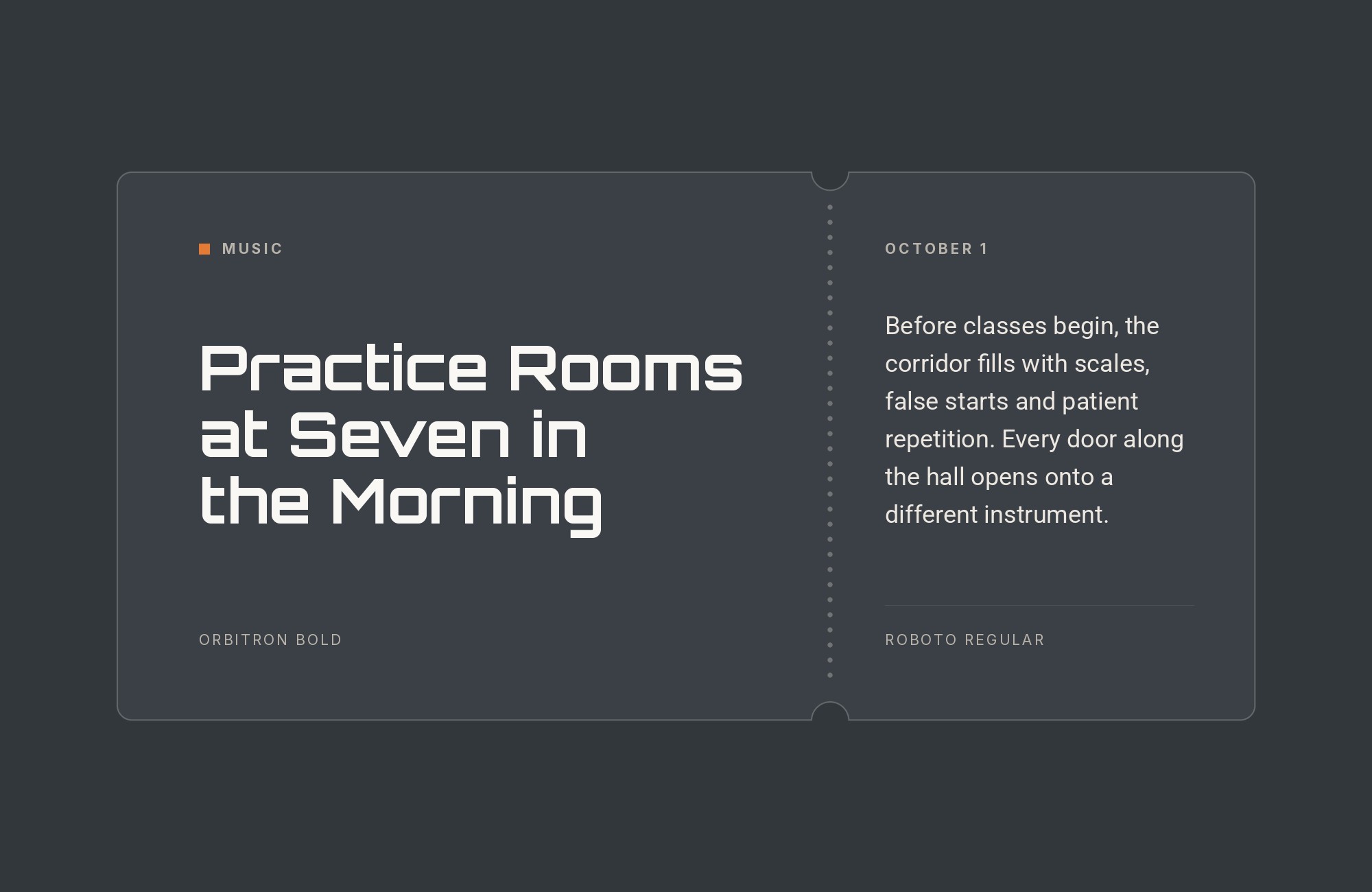
Book Brush’s guide to sci-fi book cover fonts lists Orbitron for the title and Roboto for the body among its recommended pairings. Google Fonts credits Roboto to Christian Robertson, ParaType and Font Bureau, and its own description says it has a mechanical skeleton with largely geometric forms. That shared skeleton is the reason the pair feels related, while Roboto’s friendly and open curves keep it readable where Orbitron is not. On a book cover, Orbitron carries the title and Roboto the author name, series line and tagline. On a web page, the same split applies: Orbitron for hero text, Roboto for everything else. It is the most familiar partner here, which is both the upside and the risk. Keep Orbitron big and confident so the page does not slide into a stock phone-app look.
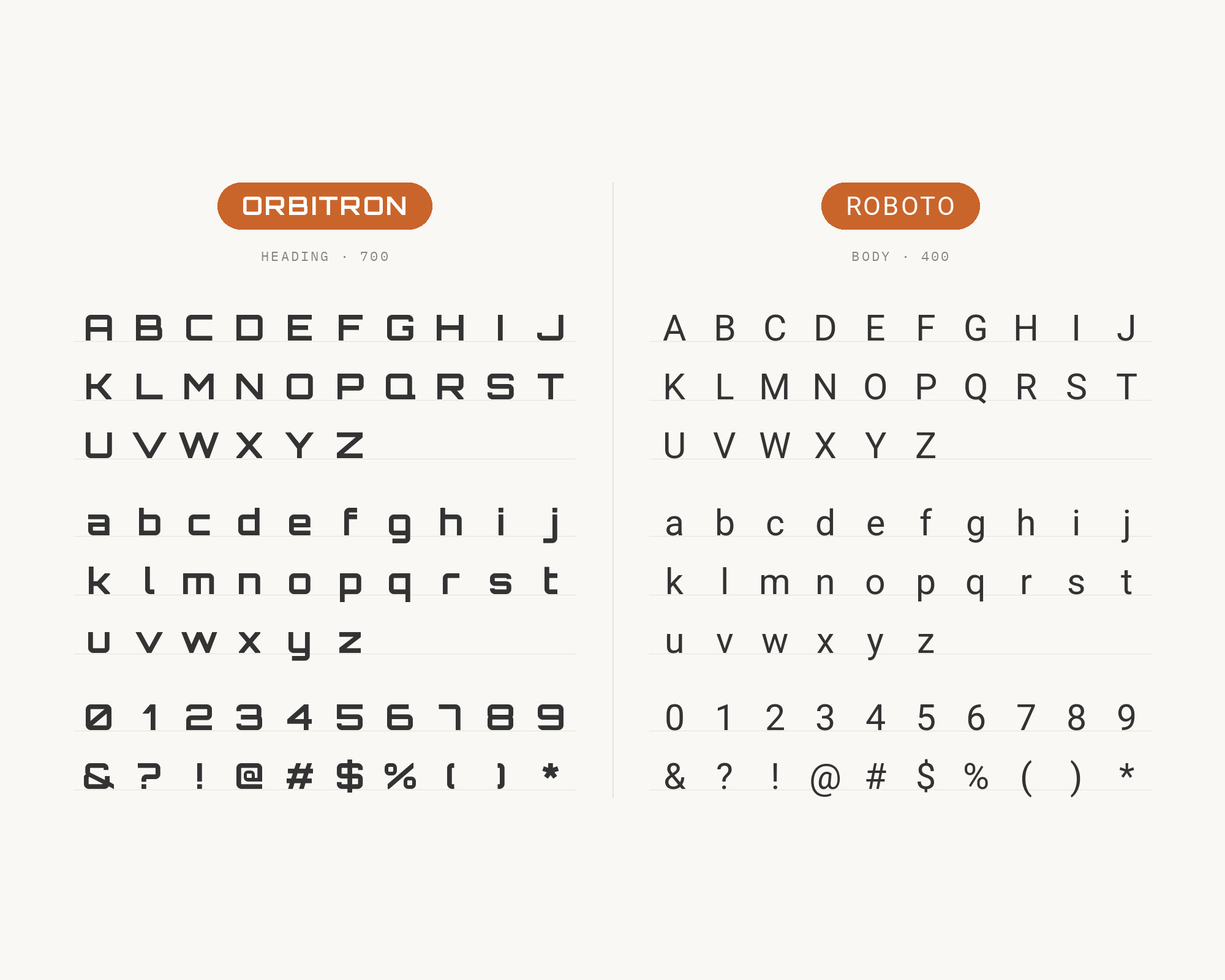
5. Roboto Condensed
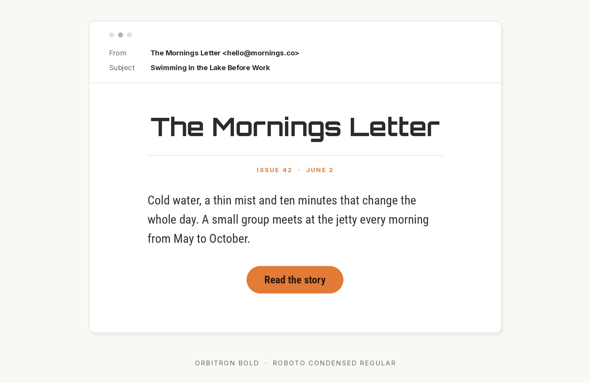
The same Book Brush guide also lists Orbitron for the title and Roboto Condensed for the body. Roboto Condensed is the narrow family designed to be used alongside the normal Roboto family, and it was upgraded to a variable font in August 2023. Why condensed? Orbitron is very wide. A wide title over a normal-width body can feel like everything is spreading sideways; a condensed body pulls the page back into columns. That makes this a great fit for covers, posters and sidebars, where space runs short and you want lots of small text under one wide name. Use Roboto Condensed Regular for blurbs and credits, Bold for short subheads, and let the width contrast do the work. On a long web article, standard Roboto is the more comfortable read.
Don't start with a blank page. Shutterstock Unlimited: endless downloads of premium human-made assets plus powerful AI tools.
Sign Up6. Share Tech Mono
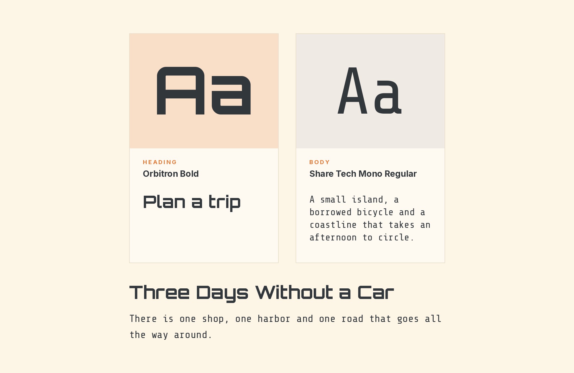
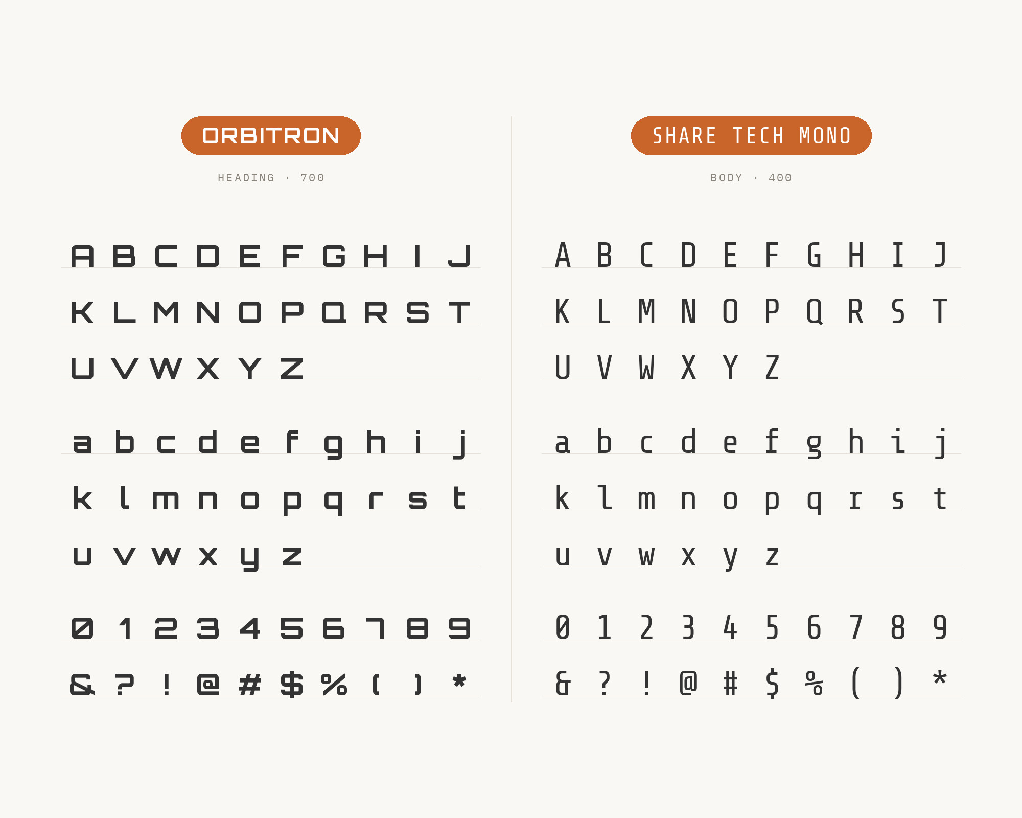
Chris Lemke’s Dark Futurism design reference is a coded aesthetic study that lists Orbitron plus Share Tech Mono as a font pairing. Its type system sets Orbitron for display and headings and Share Tech Mono for body and data text. Carrois Apostrophe designed Share Tech Mono as a monospaced sans serif based on its Share family. This is the pairing for dashboards and terminal-style interfaces. Orbitron gives the big title, and the monospace gives readouts, codes, timestamps and status lines a fixed rhythm that looks like machine output. Because every character takes the same width, numbers line up in columns without extra work. Keep the monospace to short lines, though. It is lovely for data and labels, but a long paragraph of it gets heavy fast. Pair both with a dark background and a single accent color and you are most of the way to a HUD.
7. Montserrat
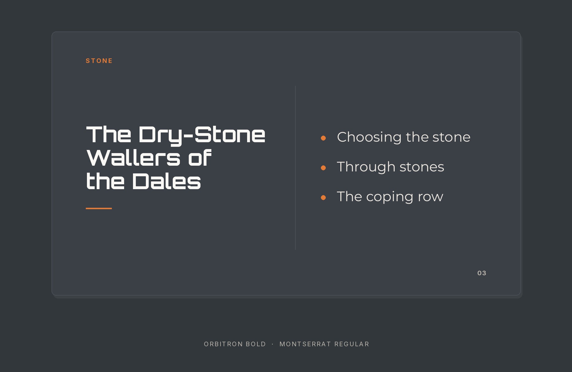
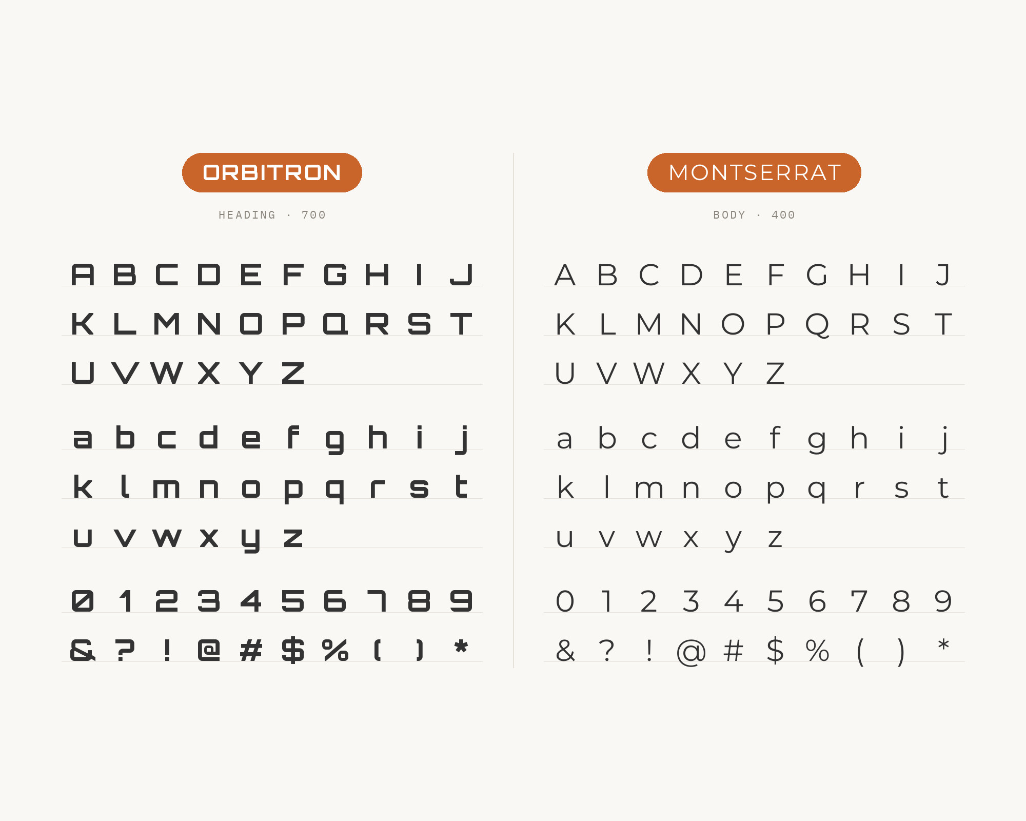
The Chargi-fi brand guide names Orbitron as the representative font of the company. In that system, Montserrat is used for subheadings. Julieta Ulanovsky designed Montserrat, inspired by old posters and signs in the Montserrat neighborhood of Buenos Aires. It is a wide geometric sans, so it matches Orbitron’s broad stance while swapping hard corners for round bowls. That is useful in a subhead slot: the line still feels wide and confident under the title, but the rounded forms read much faster. Set Montserrat SemiBold for subheads and Regular for short copy. Watch the weights, though. Two wide faces at heavy weights can shout at each other, so keep the Orbitron heading clearly larger and let Montserrat step down a size or two.
8. Bebas Neue
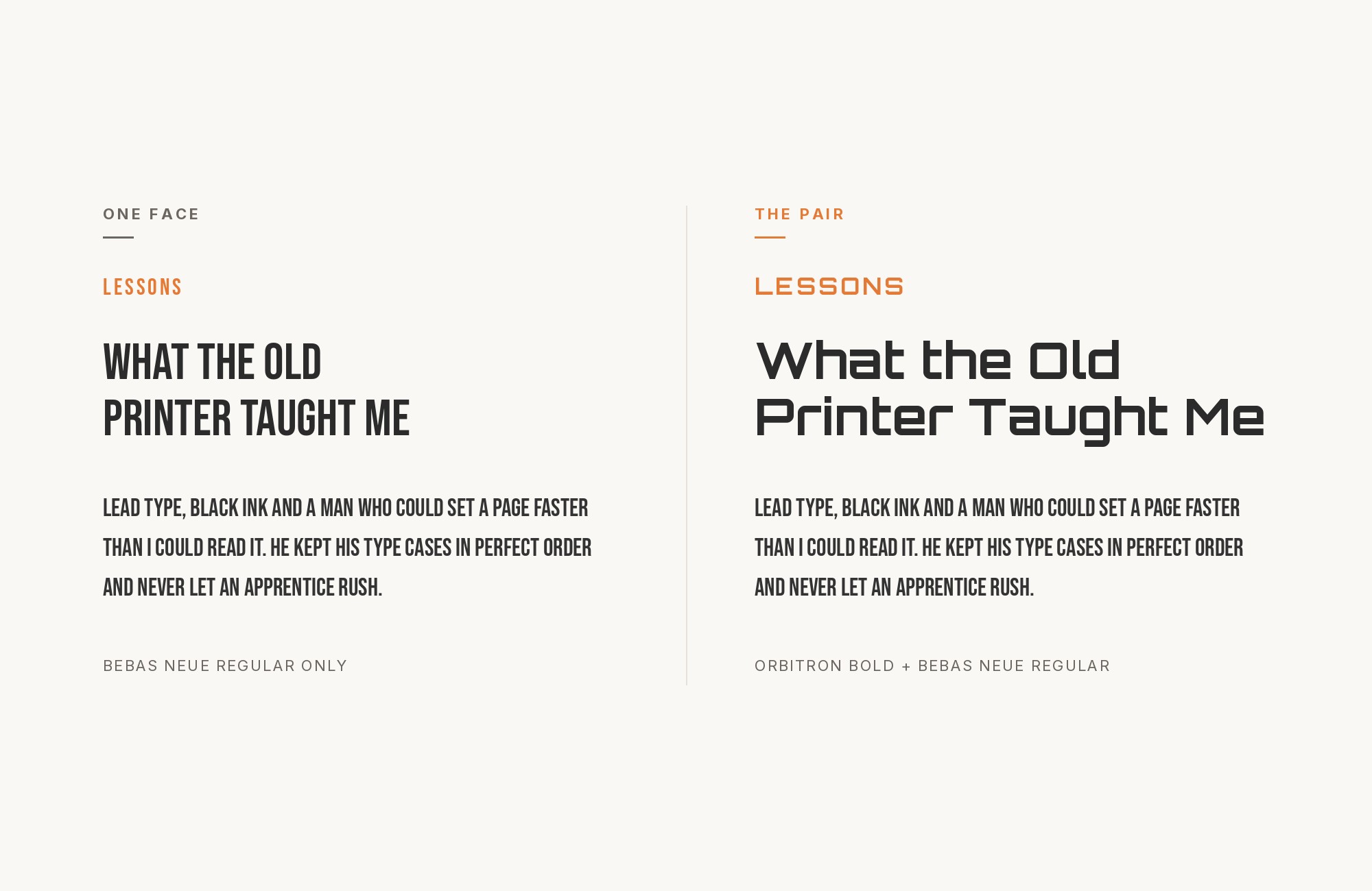
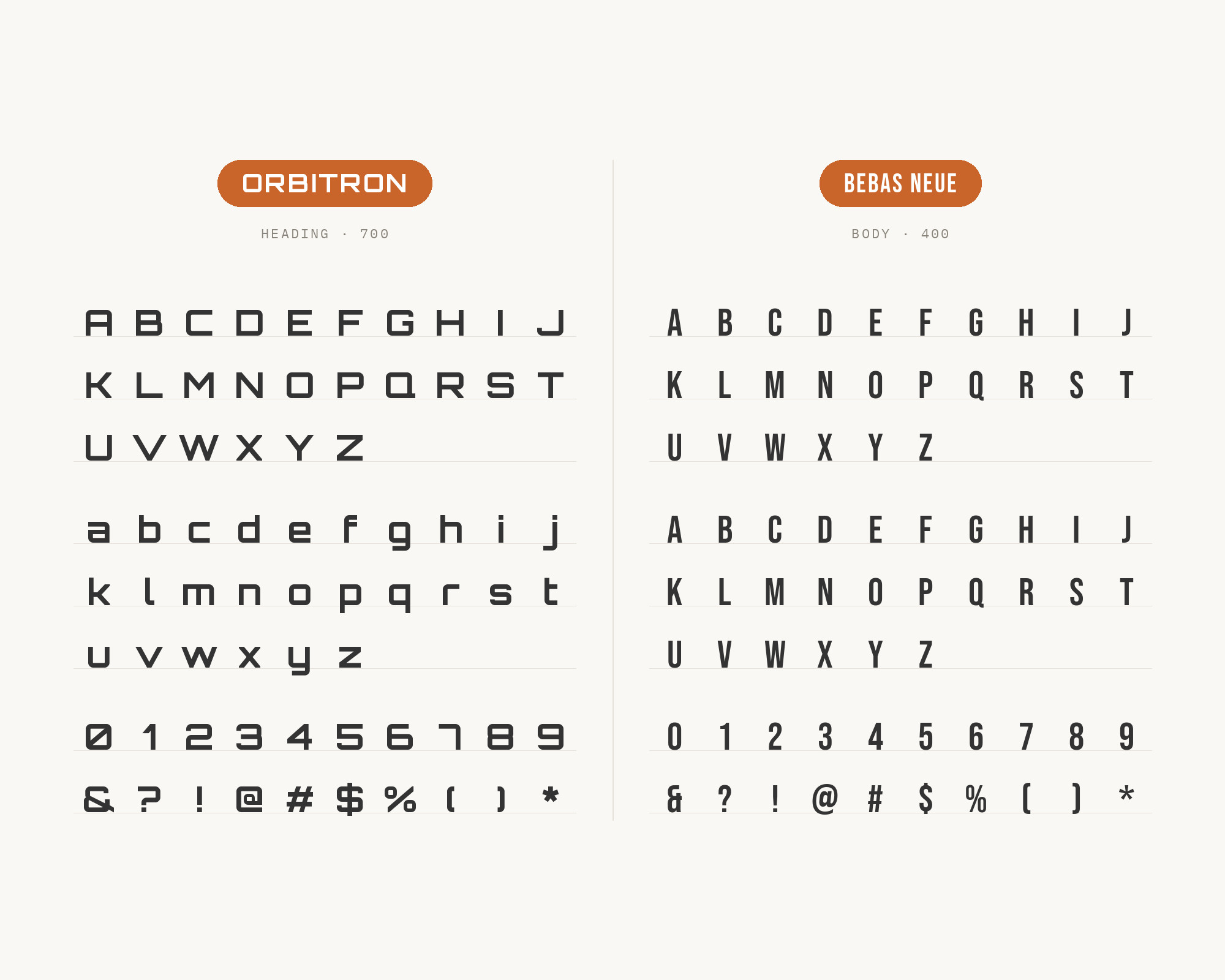
In the same Chargi-fi system, Bebas Neue is used for headers. Ryoichi Tsunekawa designed Bebas Neue as a display family suitable for headlines, captions and packaging. Two display faces is a bold move, and it only works because they are opposites in width. Orbitron is wide and squared, Bebas Neue is tall, narrow and all caps. So Orbitron stays on the logo and brand name, and Bebas Neue takes section headers that need to fit into tight columns. Neither should set a paragraph. If you use this pair, add a quiet text face for body copy (Chargi-fi does, see Aileron below) and keep the two display faces at clearly different sizes so they never compete for the same line.
9. Aileron
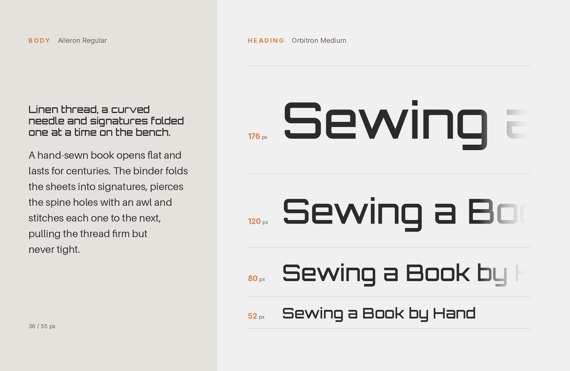
The Chargi-fi guide uses Aileron Thin for all descriptions of the company and its products. Aileron comes from the foundry dot colon, which describes it as its own interpretation of a neo-grotesque with reference to Helvetica, prepared in eight weights from UltraLight to Black. That neutrality is the whole point here. Orbitron and Bebas Neue bring all the attitude; Aileron just reads. The thin weight is a stylish choice for short descriptions on light backgrounds, and it contrasts nicely with Orbitron’s heavy black strokes. For longer body text or small sizes on screens, step up to Aileron Light or Regular so the hairlines do not disappear.
10. Raleway
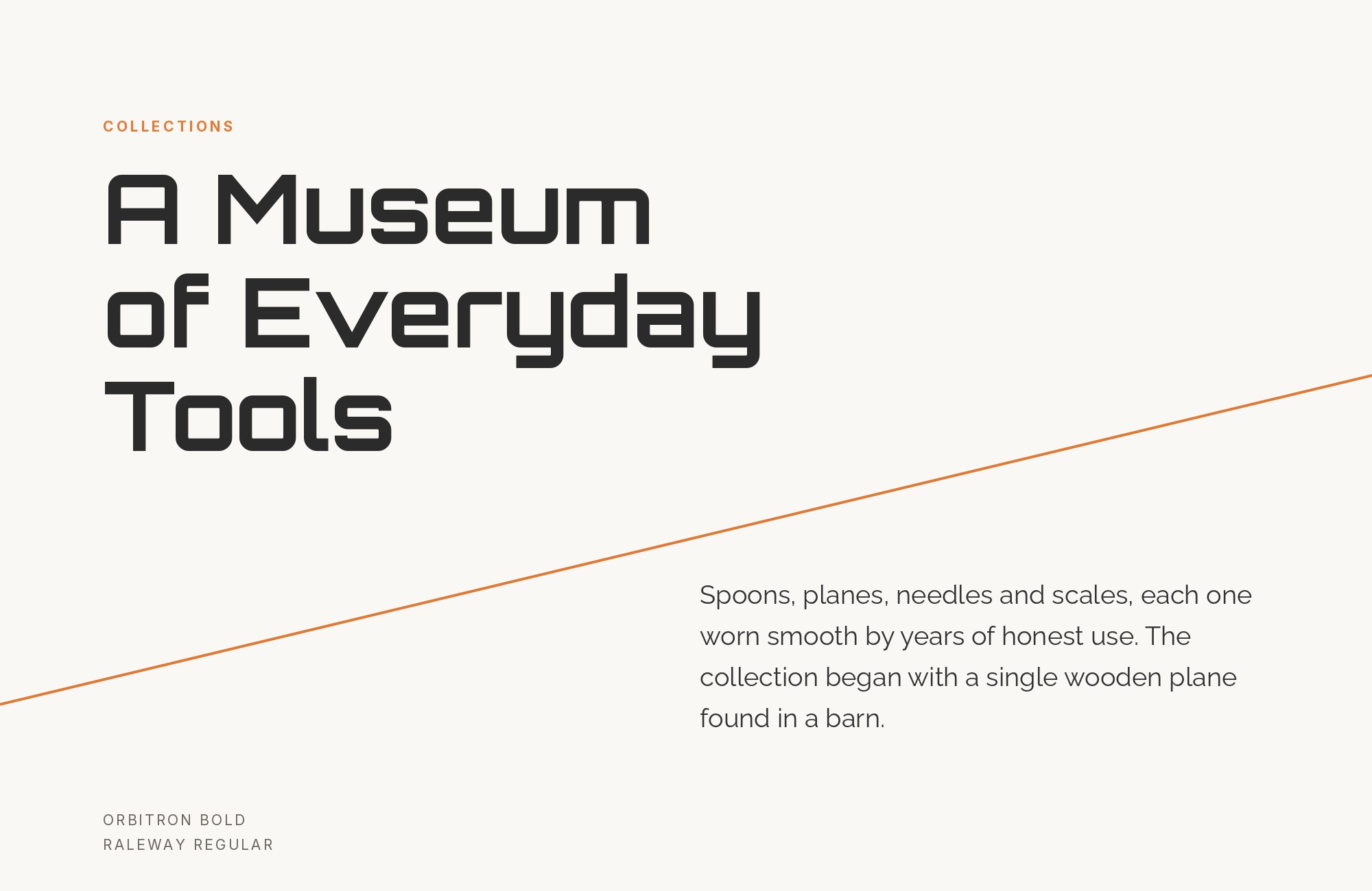
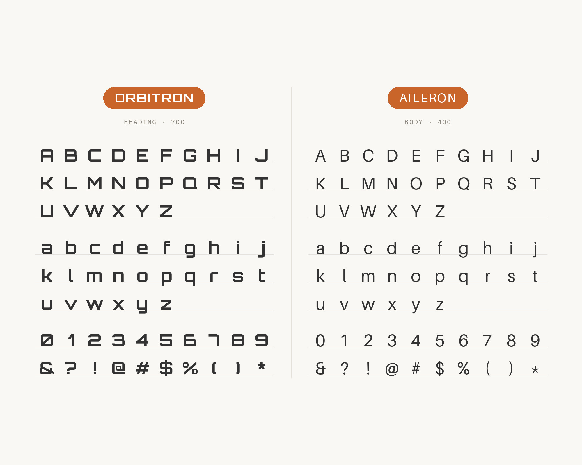
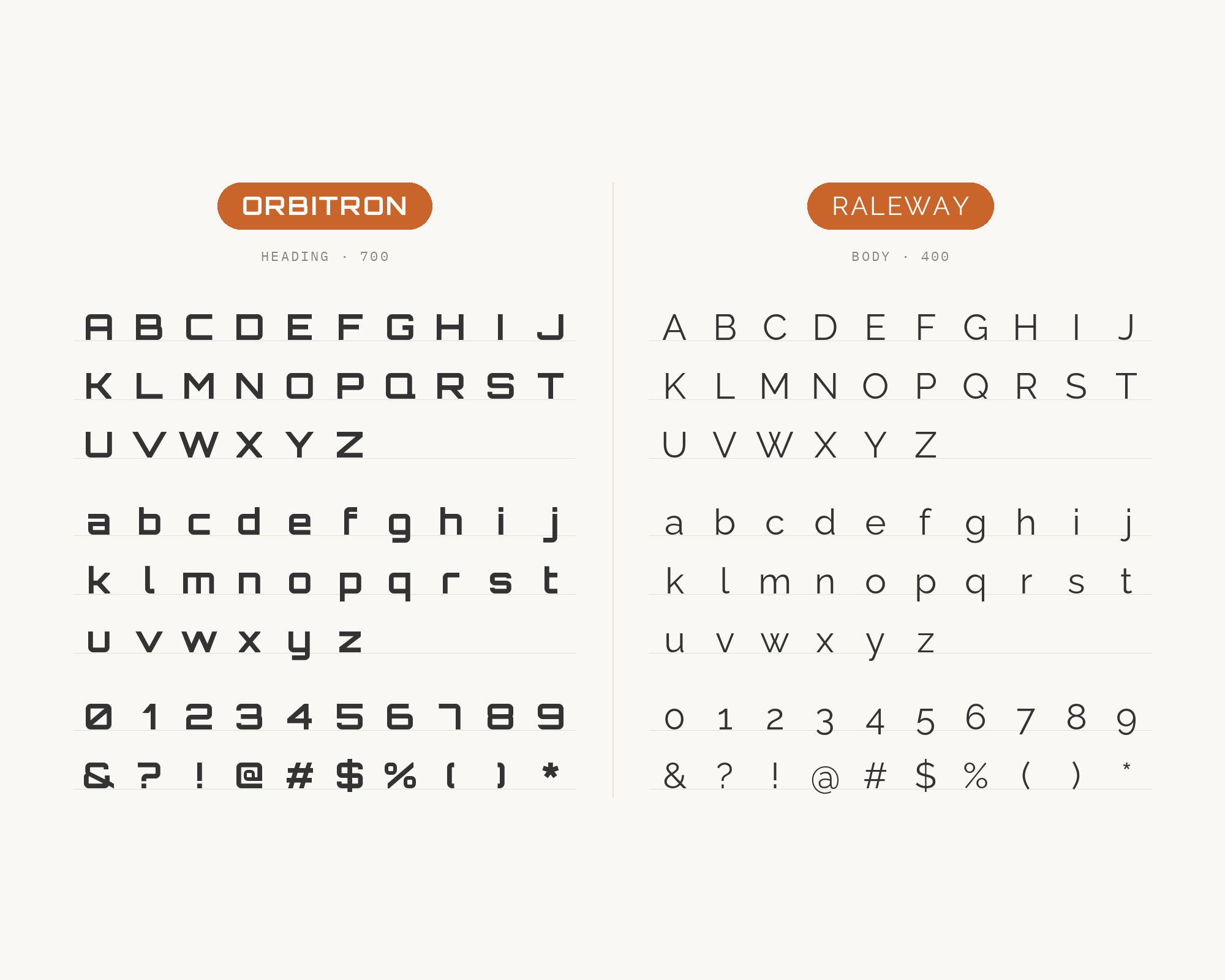
The Jelly Swipe app on GitHub uses Orbitron together with Raleway. Its stylesheet gives the two faces exclusive roles: Orbitron on a small set of display elements, Raleway for every other string of UI text. There is a fun family connection here. Raleway was initially designed by Matt McInerney as a single thin weight, before it was expanded into a nine-weight family. So both faces come from the same designer’s hand, even though they point in different directions: Orbitron to the space station, Raleway to an elegant, slightly classic sans. That shared origin keeps them from feeling like strangers. Use Orbitron for logos, card titles and big stamps, Raleway Regular for descriptions and instructions. Raleway’s lighter weights look great at display sizes, so keep body text at Regular or Medium to hold its color.
Conclusion
Every pairing above follows the same rule: Orbitron is the headline, never the paragraph. The strongest evidence says as much. In the game, Orbitron is a secondary accent next to Rajdhani. In the Ride AI system, Orbitron owns the headings and Inter owns the text. Pairing guides land on Roboto Slab, Roboto and Roboto Condensed for the same reason. They read easily where Orbitron does not.
If you want a quick starting point, choose by mood. For a HUD or game, go with Rajdhani or Share Tech Mono. For a tech product site, Inter. For a poster or editorial feature, Roboto Slab. And if you like a good story, Raleway shares a designer with Orbitron. Whatever you pick, set Orbitron large, keep it short and test the body text at the real size you will publish.
