American Typewriter pairs great with ITC Benguiat, Helvetica and Futura. All 15 pairings are shown below in real rendered specimens, with the reason each one works.
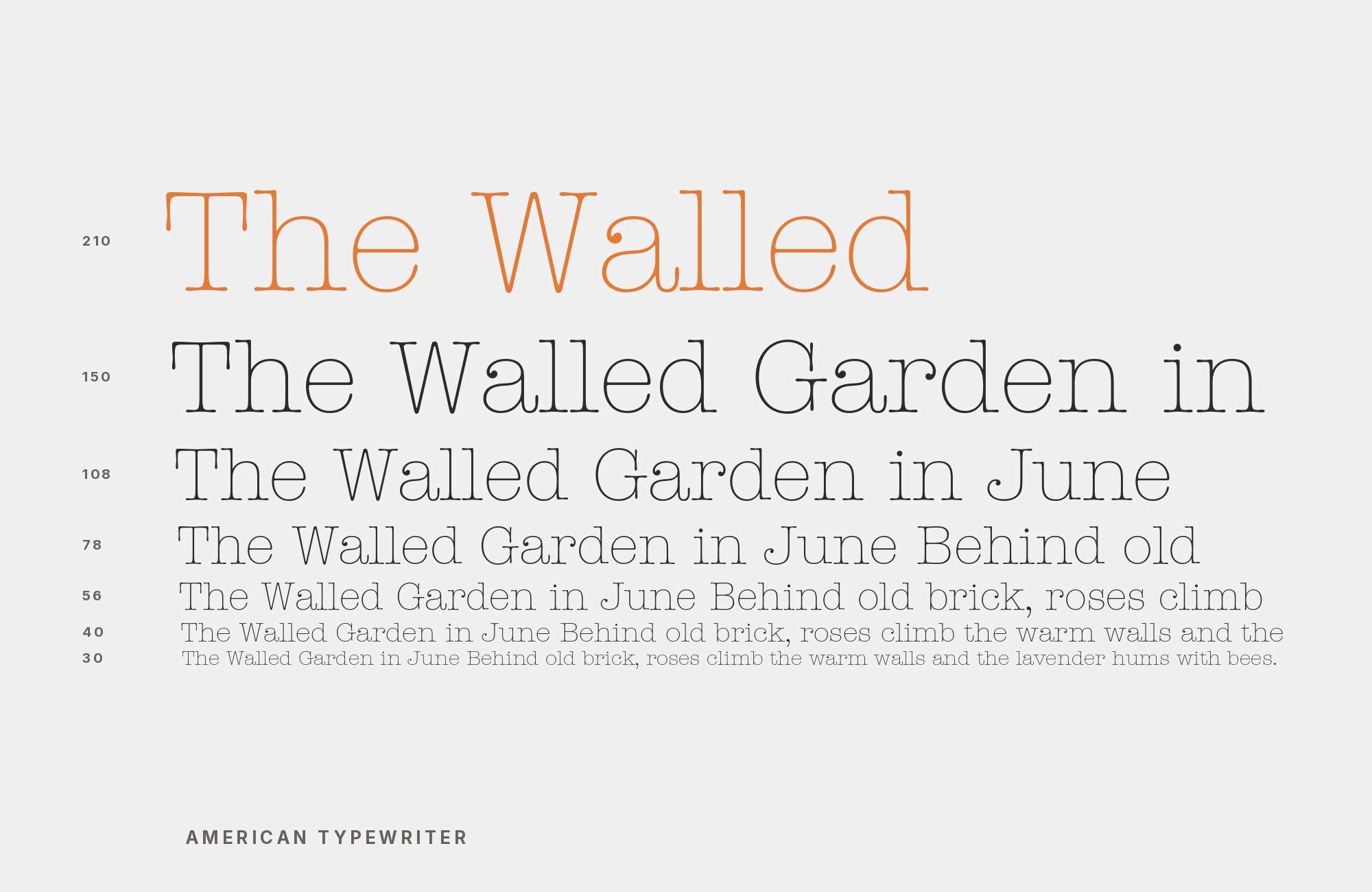
What fonts go with American Typewriter? The face looks like a machine product but behaves like a friendly humanist, and its partners have to answer the question the ball terminals keep asking: is this nostalgia, or is this warmth?
Joel Kaden and Tony Stan drew ITC American Typewriter for the International Typeface Corporation in 1974, marking the 100th anniversary of the invention of the office typewriter. The design keeps the familiarity of typewriter output while discarding its flaws: proportional spacing instead of fixed pitch, rounded slab serifs with ball terminals, and a deliberate softness no actual typewriter ever produced. It became famous setting Milton Glaser’s “I ❤ NY” logo, and its lighter weights remain genuinely readable at text sizes — the rare slab that can carry paragraphs without turning them into tickets.
The evidence for pairing it comes from real production work rather than from advice articles. Typewolf offers a curated suggestion; the Fonts In Use archive lists 90 uses of the face, from video games to DVD covers to a hardware-store identity that later replaced it; and MyFonts’ field guide documents its construction. Across those sources one pattern repeats: the typewriter slab wants either total neutrality beside it or a warm display face above it. Here are 15 fonts that pair with American Typewriter, drawn from that documented evidence.
1. ITC Benguiat

Set Benguiat large and American Typewriter small — the pairing inverts the usual slab arrangement because Benguiat’s ornament only works big. Titles at 40 points and up, typewriter text at 10 to 12 points with open leading, and the system reads as a single 1970s ITC voice at two volumes. Book covers and editorial features are its natural ground. Benguiat’s ornament thickens as the point size climbs, so the two faces want different tracking: open the typewriter text slightly and leave the display line alone.
Ed Benguiat drew ITC Benguiat in 1977, and it is Typewolf’s own suggested companion for American Typewriter. The kinship is generational: both are warm, eccentric 1970s ITC designs with generous curves and ornamental instincts, Benguiat carrying an art-nouveau inflection the typewriter slab never attempts. Set Benguiat for expressive display moments — titles, chapter openings — and let American Typewriter carry the friendly text. Two eras of the same foundry’s optimism in one system.

Unlimited fonts from $16.50/mo.
29 million fonts, templates and stock assets. One subscription, unlimited downloads.
See the plan2. Helvetica

The Tony’s Chocolonely system shows the working division: the brand’s own lettering is hand-cut and then set as Chocolateletter, most other text across the identity — including advertising and the website — is American Typewriter, and Helvetica appears on the American wrapper’s nutritional facts. Keep Helvetica in its regular weights and let the typewriter face supply every ball terminal on the shelf. Helvetica’s tight default fit suits small factual text, while the slab’s ball terminals want a wider measure, so give each face its own column.
Max Miedinger and Eduard Hoffmann’s 1957 Helvetica is the neutral reference point of Swiss typography, and its presence next to American Typewriter is documented in a real, running brand system: Tony’s Chocolonely’s archived identity, where Helvetica sets the American wrapper’s nutritional facts while the typewriter slab carries the brand’s voice. Helvetica’s even color and closed apertures give the rounded slabs nothing to argue with. This is the pragmatic default when the design wants the nostalgia to be the only personality in the room.

3. Futura

Futura’s geometric caps make it the better all-caps face of the two, so give it labels, kickers, and navigation. In the documented print work, Futura can punctuate while the slab carries the text. Watch the x-heights: Futura’s small x-height next to American Typewriter’s large one means the same point size looks smaller — adjust optically, not mathematically. Letterspace Futura in caps and leave the slab alone, because the typewriter face already builds that air into its own sidebearings.
Paul Renner’s 1927 geometric classic Futura appears beside American Typewriter in several Fonts In Use productions, among them a 1974 Syracuse University ROTC booklet. The contrast is structural: compass-drawn circles and near-mono strokes against ball terminals and rounded slabs. In practice the pairing reads as precise-versus-playful — Futura’s discipline frames the typewriter face’s easy humor without dampening it. Good fit for posters and packaging where a clean geometric voice keeps the nostalgia from going soft.

4. Cooper Black

In the documented co-usages Cooper Black takes the display lines, and the typewriter slab can explain underneath. Keep Cooper Black to names and short slogans — its warmth exhausts fast — and give American Typewriter the sentences. Together they cover the friendly-retail register no single 1970s face manages alone. Cooper Black’s counters close up as the size drops, which is the practical reason the archive keeps it above the text and never inside it.
Oswald Bruce Cooper’s 1922 display heavyweight Cooper Black shares several Fonts In Use productions with American Typewriter, among them KFC’s AFC-ZFC outdoor campaign. The shared instinct is warmth: both faces round off every hard corner and choose charm over precision, at opposite ends of the weight scale. Cooper Black supplies the full-throated display energy the typewriter slab keeps restrained, and neither face has to pretend to be serious. Children’s publishing, food packaging, and friendly retail are the natural habitat.

Don't start with a blank page. Shutterstock Unlimited: endless downloads of premium human-made assets plus powerful AI tools.
Sign Up5. Stencil

The stencil face earns its place in short industrial bursts — batch numbers, dates, location stamps — never paragraphs. Its interrupted strokes next to the typewriter slab’s roundness is a cargo-and-craft pairing the archive documents in productions such as the Atari Force Fact File, Mike Warnke’s “Hey Doc!” cassette insert, and the Group 180 Terry Riley portrait concert poster. Below about 14 points the broken strokes read as texture rather than as gaps, so keep the stencil large enough for the interruptions to stay deliberate.
The American Type Founders’ 1937 Stencil face interrupts every stroke with the gaps of a silk-screen or military crate mark, and Fonts In Use documents several productions pairing it with American Typewriter. The pairing is grit against gesture: the stencil’s industrial skeleton and broken strokes give the rounded, gentle slab a hard-edged counterweight. It works in exactly the way cargo-and-craft contexts want — workshop branding, event posters, anything that wants warmth with a work shirt on.

6. Akzidenz-Grotesk

Akzidenz-Grotesk wants to be set small and evenly — captions, tables, footnotes — where its uniform color carries caption and table text without pulling the eye off the headline. Keep the grotesque structural and the slab warm; reversing the roles flattens the contrast that makes the system work. Set the grotesque a size smaller than the slab and the page keeps two clear reading layers instead of one grey field.
Berthold’s 1898 original Akzidenz-Grotesk is the great-grandparent of nearly every neutral sans, and Fonts In Use records it alongside American Typewriter in productions such as the Demasié cookie-shop identity. The pairing maximizes sobriety against friendliness inside one system: the grotesque’s uniform, unornamented strokes frame the slab’s roundness the way a plain mat frames a bright print. Use it when the layout needs the typewriter face to be the single warm note in an otherwise factual document.

7. Times New Roman

The cookbook evidence shows the real division of labor: Cosmos is the production’s primary face — title, synopsis, and credits — with the title also using Hot Coffee, ITC American Typewriter, and an ampersand from Times New Roman, and Helvetica Black at the top. Times New Roman’s narrow fit suits the title’s mix where American Typewriter’s long serifs would link up — the exact failure MyFonts’ field guide warns about at tight settings. Set the serif a half point larger than habit, because its smaller x-height reads smaller beside the typewriter face’s generous one.
Stanley Morison and Victor Lardent’s 1932 newspaper serif Times New Roman appears in real co-usage on the Fonts In Use-documented cookbook Eat, Shrink & Be Merry, where its ampersand joins Hot Coffee and American Typewriter in the title. Both are old-machine faces — one from the pressroom, one from the office — but their registers differ completely: newsprint formality against mechanical warmth. The production documents a precise display role for Times New Roman rather than a body-copy assignment.

8. Goudy Old Style

The Do It Center case study is a strategy document in disguise: when a brand built on typewriter warmth needs to age up, Goudy Old Style is the documented destination. Set it exactly where the slab sat — same sizes, same weight roles — and the brand softens from mechanical nostalgia to literary warmth without customers noticing the seams. Give the old-style serif more leading than the slab needed, or its finer bracketed strokes close up in a dense block.
Frederic Goudy’s 1915 old-style Goudy Old Style earns its place through documented role succession rather than a single co-usage: Fonts In Use’s Do It Center case study records the brand replacing its American Typewriter Condensed Bold identity with a modified Goudy Old Style between 1998 and 2001. The trade tells you the two faces occupy the same friendly-serif register. Reach for Goudy Old Style when the typewriter nostalgia needs to age into something more literary without changing the temperature of the brand.

9. Gotham

Gotham’s even skeleton suits the body voice; the documented sighting, Hangar23, lists the two faces together. Use Gotham for interface and paragraph duty and keep American Typewriter above 14 points, where its ball terminals and rounded slabs read as warmth rather than as texture. Both faces carry large x-heights, so hierarchy has to come from weight and size; there is no difference in reading color to lean on. Interfaces, packaging back panels and long product pages are the natural fit.
Tobias Frere-Jones drew Gotham in 2000 from New York City’s vernacular lettering, and Fonts In Use documents one co-usage with American Typewriter: Hangar23, which lists Garaje Mono, ITC American Typewriter, and Gotham together. Gotham’s even, geometric-grotesque skeleton does the modern thing typewriter slabs cannot: it disappears into body text and interface labels. The pairing is the standard contemporary split — decorative mechanical warmth up top, engineered neutrality underneath — and suits product brands that want nostalgia in the headlines only.

10. Neue Helvetica

Run Neue Helvetica tight and structural against the typewriter slab’s loose warmth. Let American Typewriter stay at friendly display sizes. Where plain Helvetica feels too flat, the Neue family’s wider weight range fills the system out. Track the grotesque tight and the slab normally, and the two layers separate without any change of size.
Linotype’s 1983 reworking of the Swiss classic, Neue Helvetica, appears in recorded co-usages in the Fonts In Use archive, such as the “Play on & on & on” poster for SubTone, which lists Amelia, Neue Helvetica, and ITC American Typewriter together. It makes the same argument as Helvetica with a larger, cleaner toolset: total restraint, total neutrality, and all the roundness and ball-terminal nostalgia left to the typewriter face. For digital-era layouts that still want the 1974 warmth, this is the safest documented frame.

11. Friz Quadrata

Fonts In Use documents Friz Quadrata and ITC American Typewriter together on Duda Beat’s Te Amo Lá Fora album art. Friz Quadrata brings sharp, flared terminals and a firmer display silhouette beside the slab’s rounded mechanical warmth. For a simpler application, use Friz Quadrata for the artist, title, or one compact statement, then let American Typewriter carry short supporting lines. Keep both out of long paragraphs and separate them clearly by scale; two characterful faces at equal size become noisy. This pairing suits music, nightlife, and cultural graphics that want period flavor with distinct sharp and soft voices.

12. Arial

Fonts In Use documents Arial and American Typewriter together in Ariana Grande’s “thank u, next” lyric video, where they appear within a ransom-letter collage rather than a neutral text hierarchy. For a simpler application, use Arial for credits, timestamps, subtitles, or interface text, then let American Typewriter handle the lyric, title, or campaign phrase. Because both can look broad at equal sizes, create hierarchy with a clear jump in scale rather than a subtle weight change. The result is practical for motion graphics and social campaigns where one face needs personality and the other must remain quickly readable.

13. Impact

The DVD cover for The Clash: The Joe Strummer Story is archived by Fonts In Use with Impact and ITC American Typewriter. Impact provides the compressed, forceful headline that the friendly slab cannot, while American Typewriter gives secondary lines a more personal cadence. Keep Impact to a few words and open space around it; its dense counters become oppressive when repeated. Set the typewriter face lighter and smaller for dates, quotations, or descriptive copy. This is a useful poster and music-packaging combination when the title must hit immediately but the supporting language should still feel informal and human.

14. Baskerville

Fonts In Use records Monotype Baskerville beside ITC American Typewriter in HommeGirls magazine. Baskerville brings a formal editorial rhythm and finer stroke contrast, while American Typewriter supplies the blunt, conversational accent. Run Baskerville through essays and longer captions, then use the slab for issue labels, contributor names, or pull quotes. The faces have different apparent sizes, so tune them optically and give Baskerville more leading. This pairing works when a publication wants classical reading texture without losing a contemporary, slightly improvised voice in its furniture and display details.

15. Univers

The Group 180 Terry Riley portrait concert poster, documented by Fonts In Use, combines Univers with ITC American Typewriter. Univers gives the layout a systematic grid voice; the slab interrupts it with round terminals and mechanical warmth. Assign Univers to schedules, venue details, and repeated information, then use American Typewriter for the event title or a single thematic statement. Their contrast is strongest when Univers stays restrained in regular weights. The pairing suits cultural posters, programs, and exhibition graphics where information must align cleanly while one layer keeps the composition from feeling institutional.

Conclusion
American Typewriter pairs in two documented directions, and the archive is unusually consistent about them. The first is neutrality: Helvetica, Neue Helvetica, Akzidenz-Grotesk, and Gotham all appear in real productions as the neutral counterweight — legibility without competing warmth, while the typewriter slab supplies every degree of warmth and nostalgia in the system. The second is warmth-at-scale: Cooper Black and ITC Benguiat sit above it as display voices from the same friendly temperament, with Stencil and Futura providing the harder counterpoints when a design wants grit or precision instead.
The face’s own construction sets the boundary. Its linking serifs punish tight setting — MyFonts’ field guide warns about it directly — so give it air, keep it away from dense small copy, and let its partners do the sustained work. Every pairing above comes from documented evidence: a shipped production, a curated suggestion, or a brand that swapped one face for the other.
Sources
- Typewolf (ITC American Typewriter)
- Fonts In Use (typeface page)
- Fonts In Use (Tony’s Chocolonely)
- Fonts In Use (Eat, Shrink & Be Merry)
- Fonts In Use (Do It Center identity)
- Fonts In Use (Mike Warnke “Hey Doc!” cassette insert)
- Fonts In Use (F for Fake poster)
- Fonts In Use (Hangar23)
- Fonts In Use (“Play on & on & on” poster for SubTone)
- MyFonts Font Field Guide
- Brave Search
- Fonts In Use (Duda Beat album art)
- Fonts In Use (“thank u, next” lyric video)
- Fonts In Use (*The Clash: The Joe Strummer Story*)
- Fonts In Use (*HommeGirls*)
- Fonts In Use (Group 180 Terry Riley poster)
