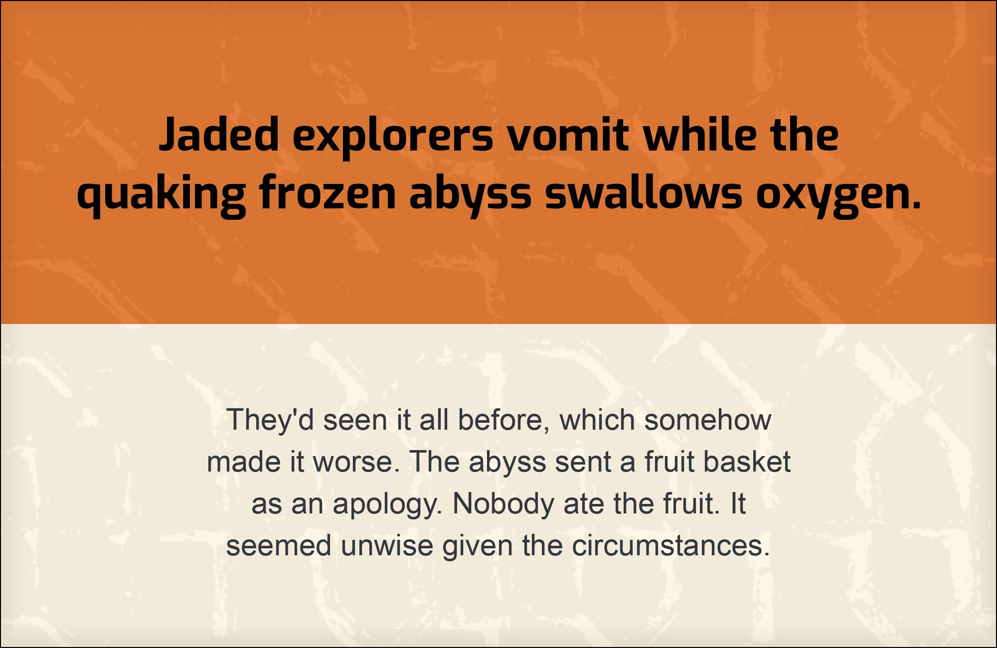
Exo pairs great with Roboto, Open Sans and Manrope. All 15 pairings are shown below in real rendered specimens, with the reason each one works. Every pairing below is checked against 20 published typography sources.
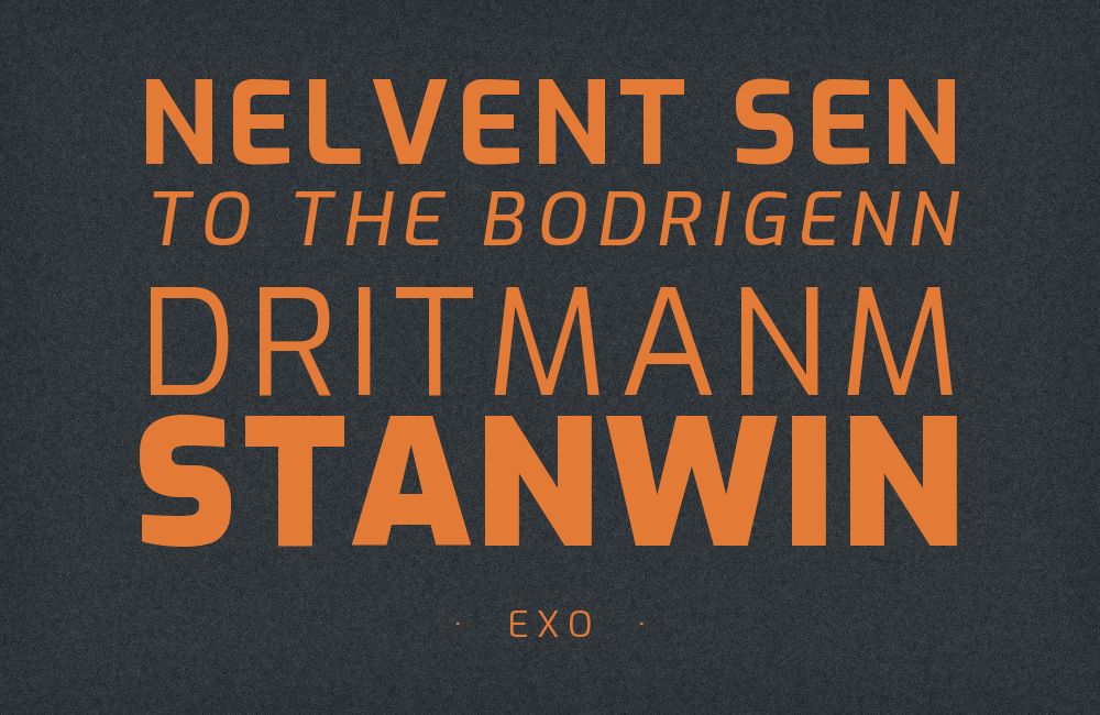
What fonts go with Exo? The useful question underneath it is what Exo is actually doing: it is a geometric sans whose curves have been flattened along their sides and whose stroke ends are cut at angles, which reads as engineered rather than drawn, and a partner font either agrees with that reading or deliberately softens it.
Natanael Gama, a Portuguese type designer, drew Exo in 2011 while still a student, funded it through Kickstarter and released it free under the SIL Open Font License. Robin Mientjes is credited on the current Google Fonts family for a 2016 spacing and proportion update, not on the 2011 Kickstarter original. The construction is compass-and-straightedge in origin but corrected away from pure circles: bowls straighten along their vertical sides, joins are tightened, and terminals are sheared at an angle instead of cut square. Stroke contrast is low and the x-height is generous, which is why Exo stays legible at interface sizes even though its personality is clearly a display personality. The family runs nine weights with true italics. In 2013 Gama redrew it completely as Exo 2, a separate Google Fonts release with more organic curves, slightly higher contrast, wider spacing and Cyrillic coverage — a different font that shares the same skeleton, and one whose evidence is noted explicitly wherever this article relies on it.
Exo’s difficulty as a headline face is that it announces a register before it announces a word. Real sites using it are gaming studios, aerospace brands, venture funds and logistics companies, and the shared pattern is a strict role split: Exo takes display, and one plain, highly legible companion takes everything else. The second legitimate approach is tempering — pairing Exo with a rounder or warmer sans that pulls the system back from sounding like an instrument panel. Here are 15 fonts that pair with Exo, covering both approaches.
1. Roboto

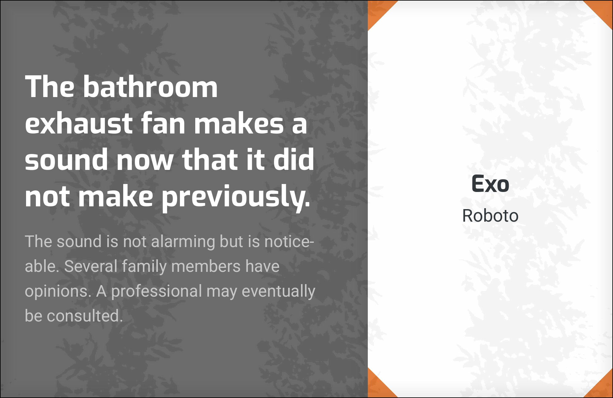
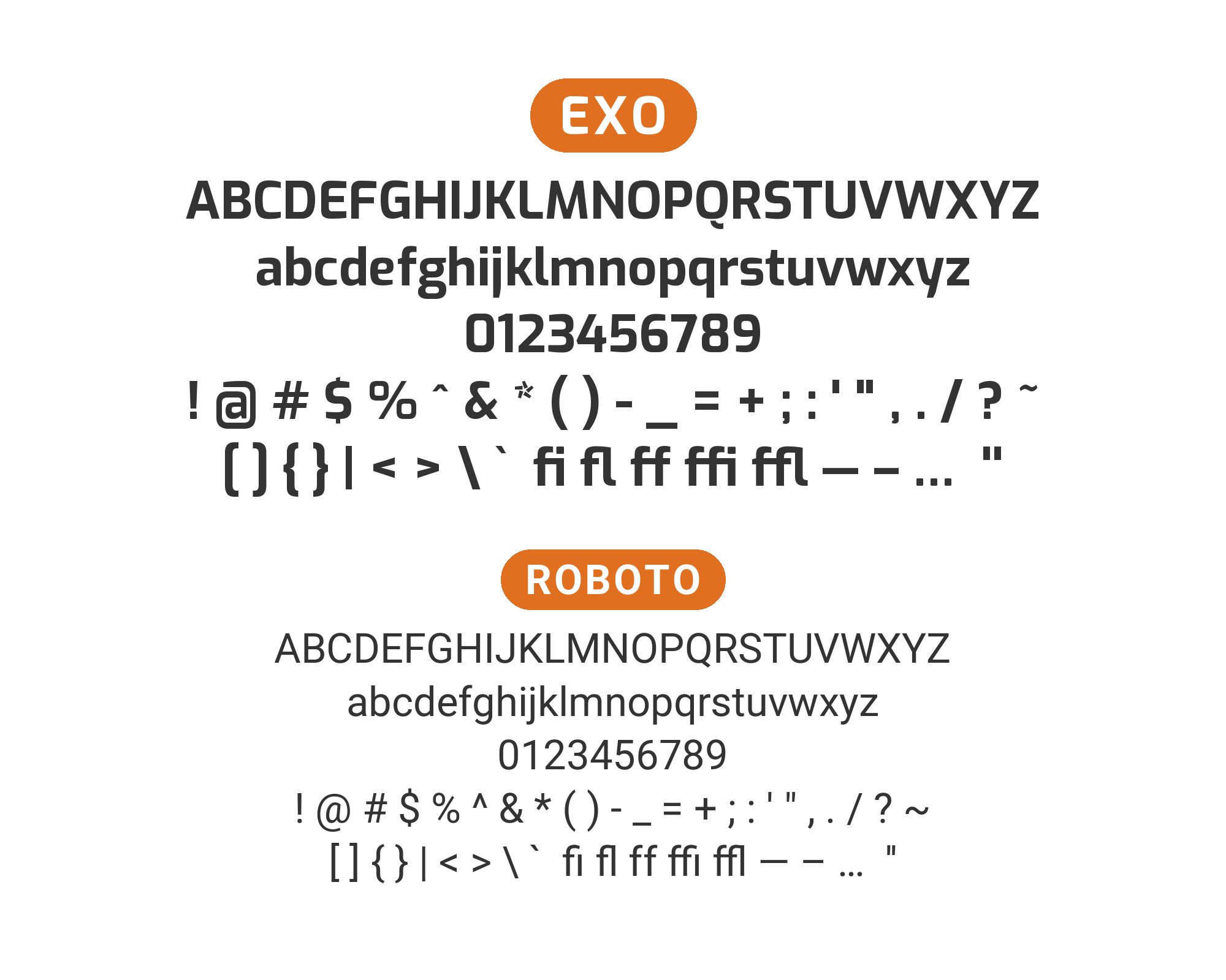
Christian Robertson designed Roboto in-house at Google and released it in 2011 as Android’s system typeface, built on a mechanical, largely grotesque skeleton whose curves were opened up to keep text moving at small sizes. A first-person heading-sans round-up names Roboto as the preferred body partner for Exo, and the reason is a clean division of labour rather than any visual kinship. Exo’s angled terminal cuts and straightened bowls are conspicuous at 40px and distracting at 14px; Roboto’s forms were tuned for exactly the opposite condition, and they recede at paragraph and label sizes while keeping a similar upright, slightly condensed rhythm. Both faces sit at comparable x-height, so a headline in Exo over body copy in Roboto needs no optical size correction to look like one system. Use it as the default answer for product interfaces, documentation and any Exo layout carrying real reading load.
2. Open Sans
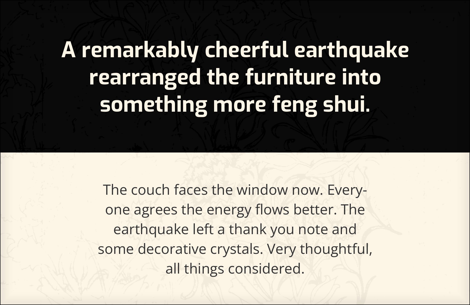
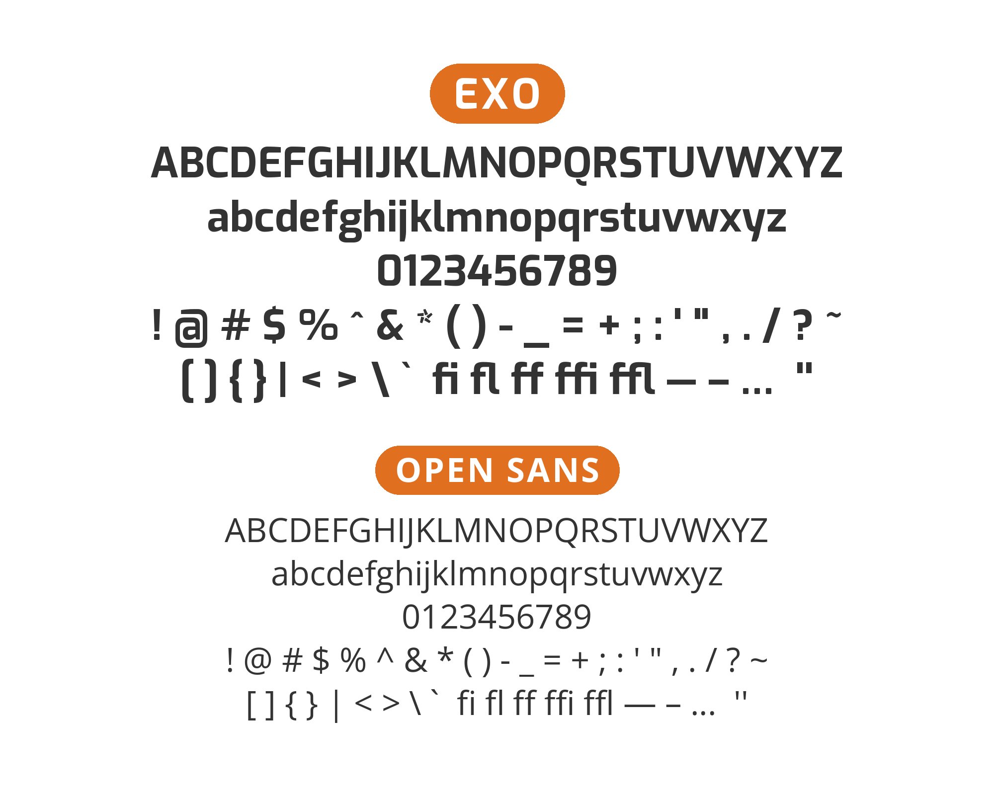
Steve Matteson designed Open Sans under commission from Google, releasing it in 2011 as a humanist sans with an unusually large x-height, open apertures and upright, low-contrast strokes drawn for small-size legibility. It is documented running under Exo on a live gaming studio site — Exo’s core territory — and the pairing works because the two disagree about origin without disagreeing about proportion. Open Sans descends from the humanist tradition, where letterforms carry traces of a broad-nib pen, so its apertures stay open where Exo’s tighten and its curves stay round where Exo’s flatten. That difference reads as warmth rather than clash at text size, and the large x-height means it holds up in captions, form labels and navigation set well below the headline. Reach for it when the page has substantial copy and Exo is doing display duty only.

3. Manrope

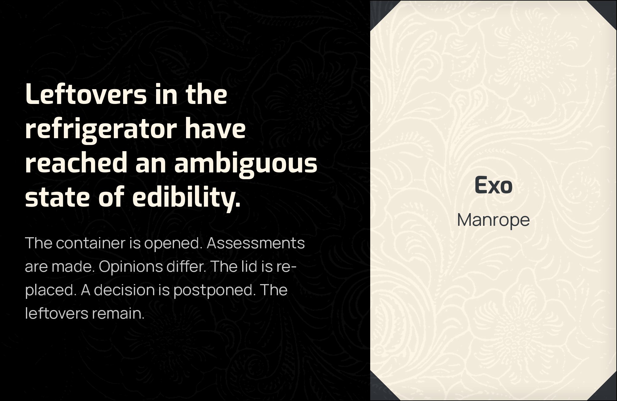
Mikhail Sharanda designed Manrope as an open-source semi-condensed sans released in 2018, deliberately positioned between a grotesque and a geometric with flattened curve sides and squared-off joins. It is the partner in the only production use of Exo documented in the Fonts In Use archive: a 2024 design agency website that sets the two together. That choice makes structural sense, because Manrope is built from the same corrected geometry as Exo — straightened bowls, tightened joins, minimal stroke contrast — but at narrower widths and with less theatrical terminals. The result is a system where both faces belong to one family of shapes and separate by degree instead of by species. Set Exo for headlines and Manrope for subheads and body, and the page reads engineered throughout rather than engineered on top of something else.

4. Montserrat

Julieta Ulanovsky designed Montserrat, released through Google Fonts in 2011, drawing on the painted signage of the Montserrat neighbourhood in Buenos Aires: wide proportions, nearly circular bowls and a large x-height. Pairing it with Exo puts two geometric sans-serifs together, which normally risks redundancy, but the finishing keeps them apart. Montserrat’s curves close as true circles and its terminals cut square to the stroke; Exo’s curves straighten along their sides and its terminals shear at an angle. Montserrat is also noticeably wider, so a line of it occupies more space at the same point size and creates a different texture on the page. Use Montserrat for subheads and short body passages beneath Exo display type when the brand wants a contemporary, obviously designed look without introducing a serif — and keep at least two weight steps between them.


5. Clear Sans
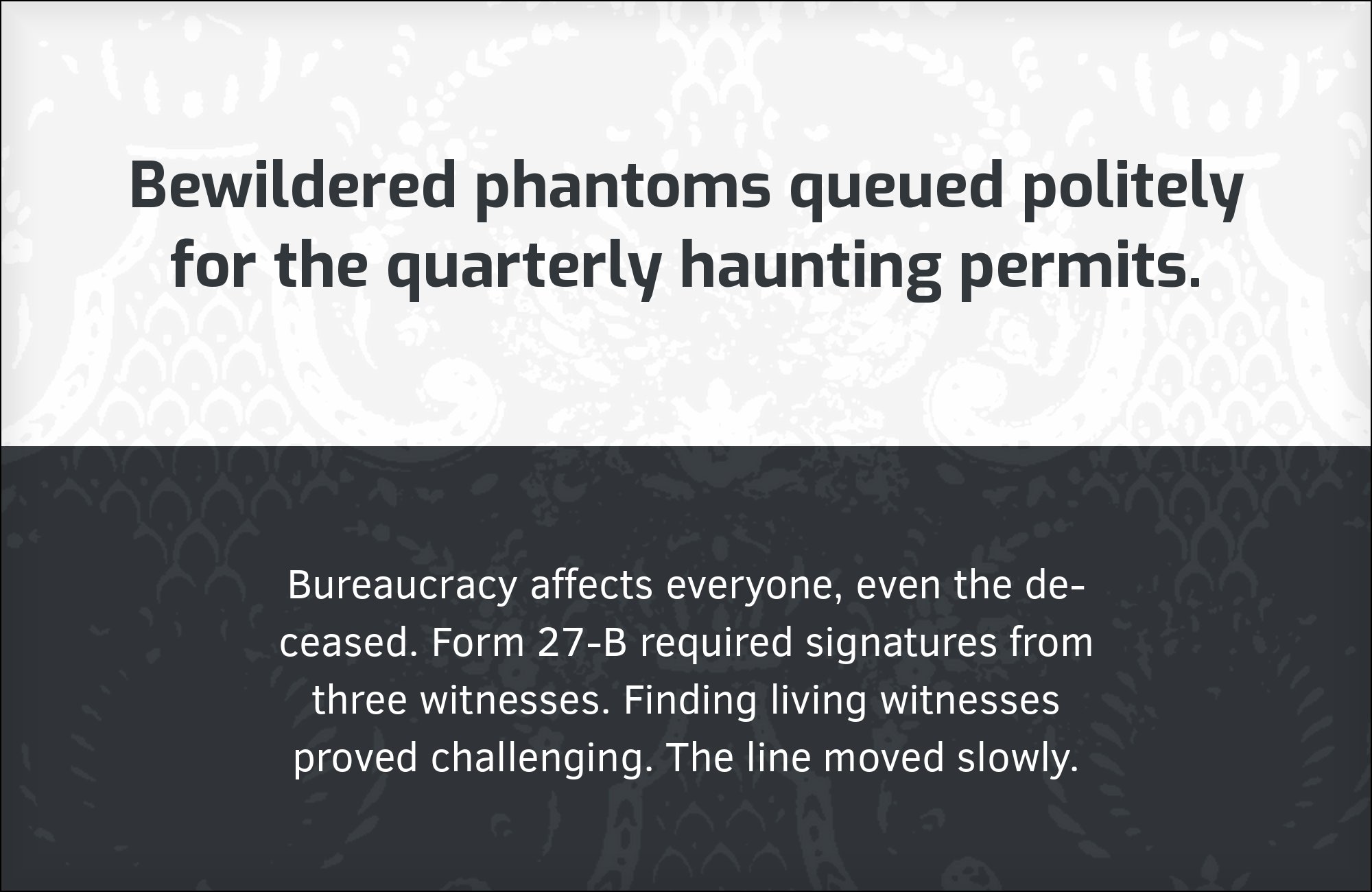
Daniel Ratighan drew Clear Sans at Monotype under the direction of Intel’s Open Source Technology Center, which released it in 2013 under an open licence, starting from an unpublished Robin Nicholas design. Its brief was disambiguation: minimise the confusable shapes — capital I, lowercase l, digit 1 — and keep proportions slightly narrow for dense interface text. That makes it an unusually disciplined partner for Exo, and the two are documented together on a supersonic aviation brand, precisely the aerospace register Exo advertises. Clear Sans concedes all expression to the headline and spends its own effort on legibility at small sizes and on screens. Choose it over a more famous neutral when the layout carries technical content — specifications, data tables, control interfaces — where a misread character costs something real.


6. Dosis
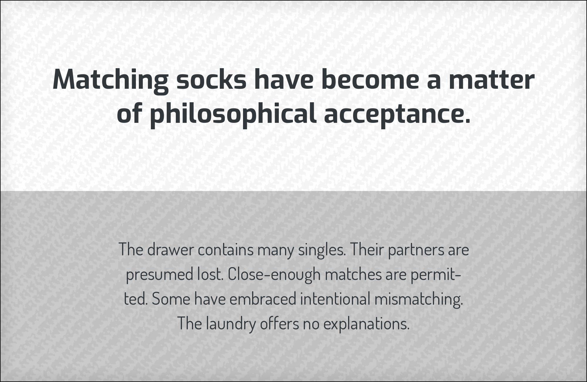
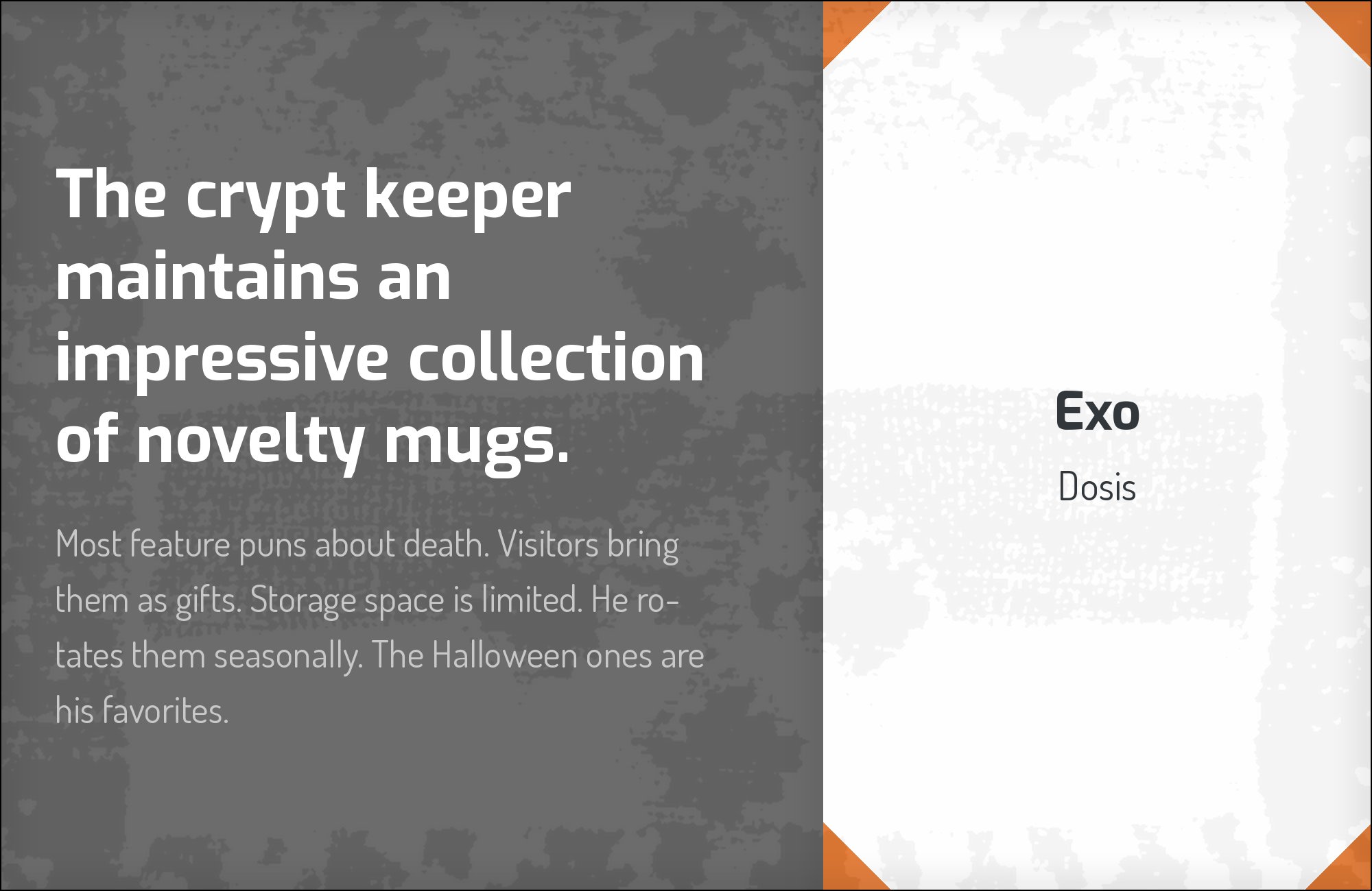
Edgar Tolentino designed Dosis, with later refinement by Pablo Impallari and spacing and kerning by Igino Marini, as a rounded geometric sans with soft terminals and very low stroke contrast. Documented alongside Exo on a venture capital site, Dosis makes the most instructive contrast on this list, because the two faces differ in one variable only. Both are built on compass geometry with monoline strokes and tight apertures; Exo shears its stroke endings at an angle while Dosis rounds them off. That single decision changes the tone completely, from instrument-panel precision to something approachable, which is why the combination suits brands that need to read as technical and welcoming at once. Set Exo for headlines and Dosis for standfirsts, pull quotes and short blocks — its light weights thin out in long paragraphs, so keep the reading load modest.

Free download
The Typography Primer.
Yours, right now.
Adobe's classic · PDF · free
The guide to type that everyone learned from. Subscribe and it is yours instantly. The BonFX Letter follows.
Free. One click to unsubscribe. No sharing, ever.
7. Alegreya Sans
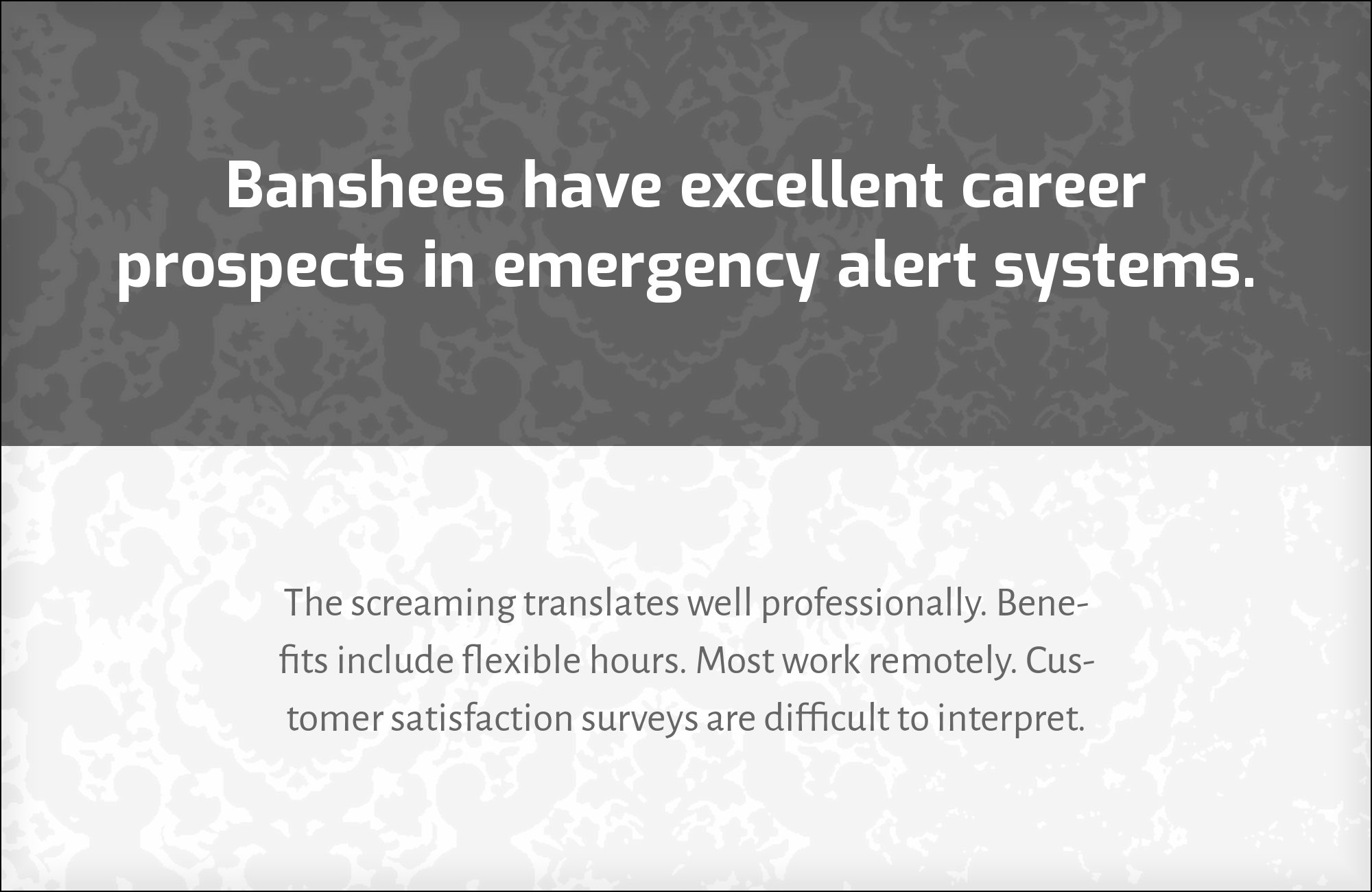
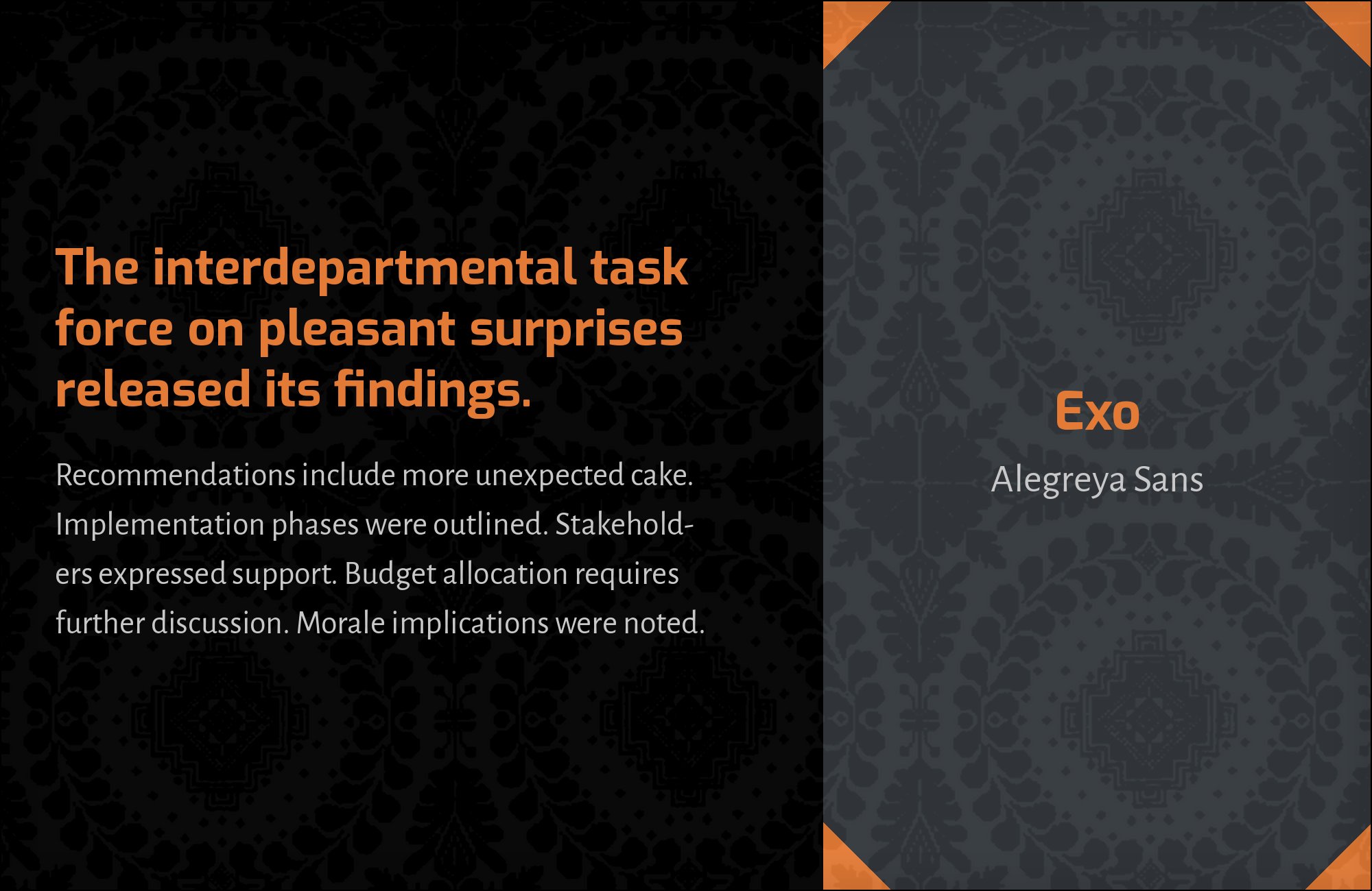
Juan Pablo del Peral designed Alegreya Sans for the Argentinian foundry Huerta Tipográfica as the sans companion to the Alegreya serif, giving it calligraphic roots, a slight lean toward the humanist model and a rhythm tuned for extended literary reading. It is recommended as a partner for Exo 2, the 2013 redrawing, on the argument that its warmth keeps a technology page from feeling purely mechanical — reasoning that transfers to Exo proper because the two families share a skeleton. Alegreya Sans carries visible modulation in its strokes, so the weight shifts where a pen would have shifted, which is the one quality Exo’s corrected geometry refuses entirely. Use it for body copy on long-form pages — research notes, engineering blogs, defence and aerospace publishing — where readers stay for several thousand words.

8. Helvetica
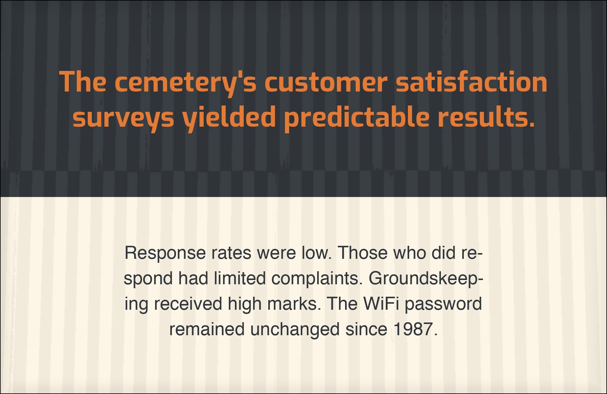
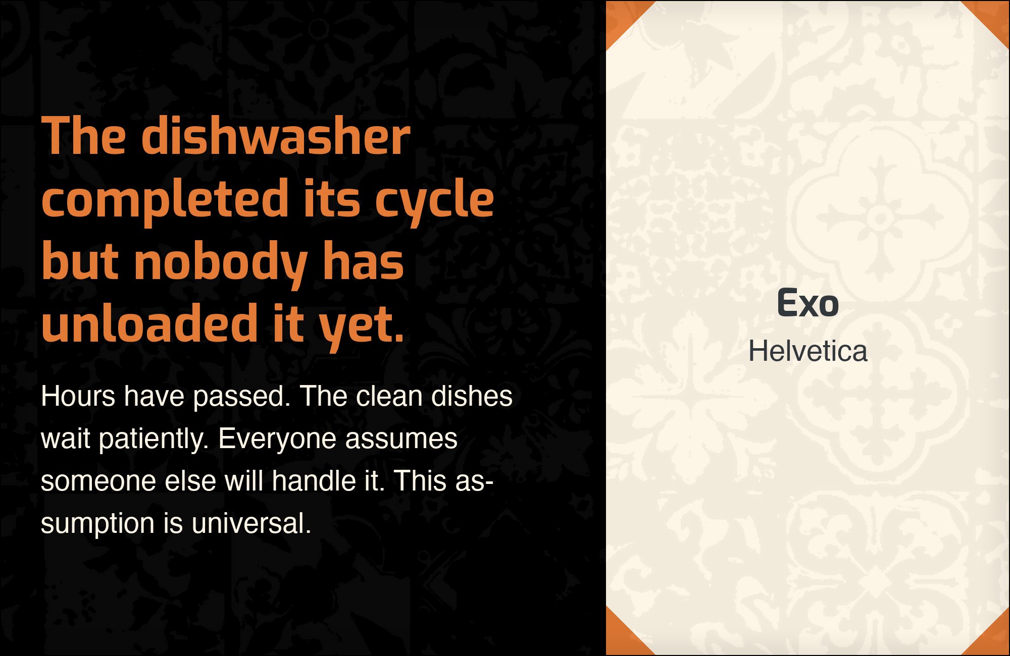
Max Miedinger and Eduard Hoffmann designed Helvetica at Switzerland’s Haas Type Foundry in 1957 as Neue Haas Grotesk, renamed for international release by Linotype in 1960, with tightly closed apertures, horizontal terminal cuts and a deliberate absence of personal voice. The Fonts In Use archive documents it set with Exo 2 in a 2014 Toronto magazine, and the logic of that choice is subtractive. Helvetica makes no claim about era, industry or mood, so every association the page carries comes from the display face alone. Against Exo’s angled shears and straightened curves, Helvetica’s squared-off neutrality reads as the plain voice reporting what the loud voice announced. It is the right choice for editorial and print work where the headline is the only element allowed to have an opinion, and a poor one where the page needs any warmth at all.

9. Arial
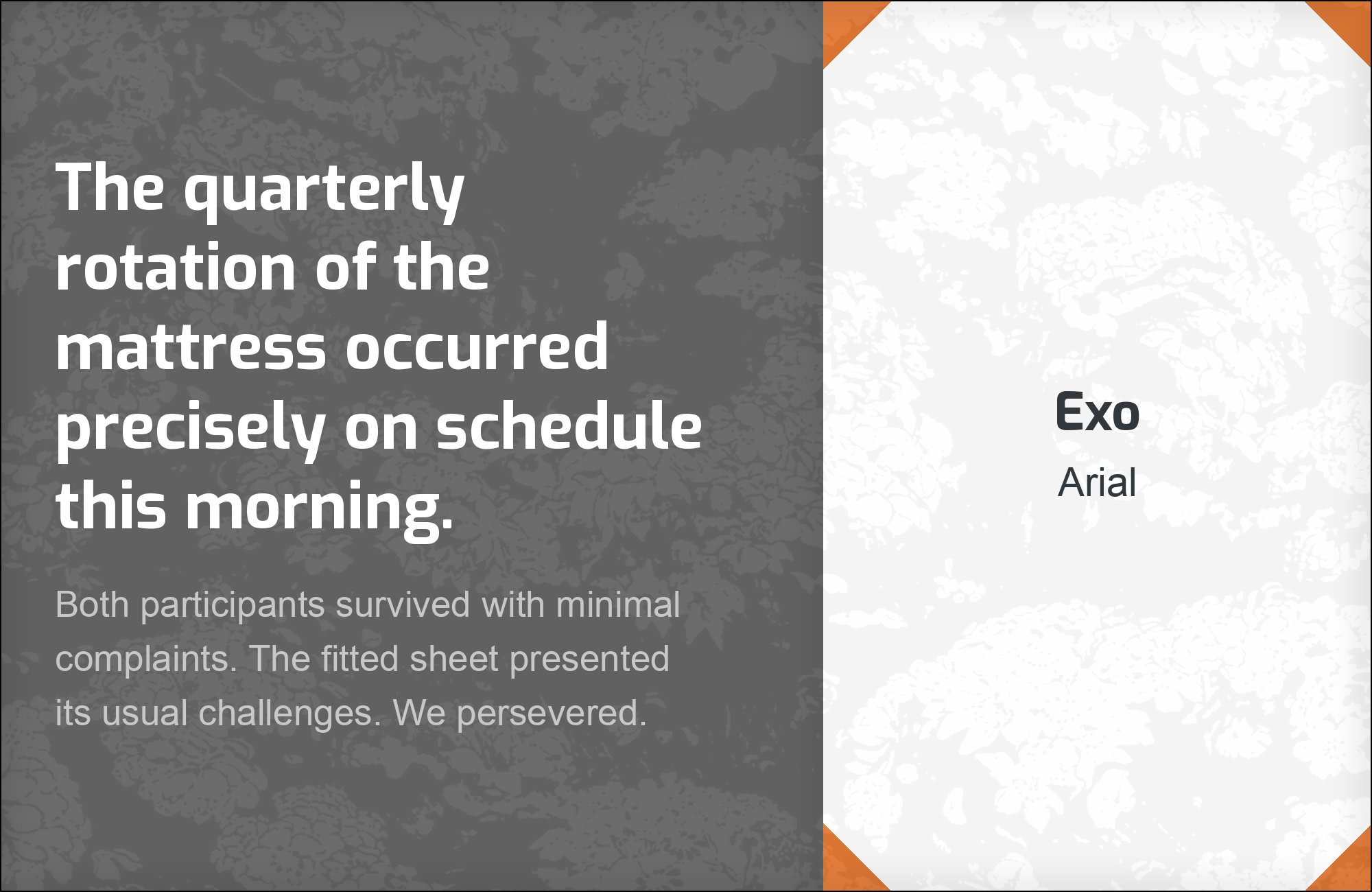
Robin Nicholas designed Arial at Monotype in 1982, later expanding it into a full family with Patricia Saunders, originally for laser printers and then licensed by Microsoft for Windows 3.1 in 1992. Its appearance alongside Exo on a live commercial site is a practical decision rather than an aesthetic one, and it should be treated that way. Arial is installed on effectively every machine, which makes it the fallback that holds a type system together in contexts where Exo cannot be embedded: Office documents, email templates, exported reports, legacy systems. Its proportions and weight are close enough to Exo’s text sizes that the substitution does not break a layout. Specify Exo everywhere it renders, name Arial explicitly as the next step in the font stack, and test how the headline behaves when it falls back.

10. Changa One

Eduardo Tunni designed Changa One as a heavy, condensed display cut — thick strokes, narrow counters, built for poster-scale type where a line has to hit hard and fit in one measure. It appears with Exo and Arial on a live packaging brand site, and the pairing is worth studying because it inverts the usual arrangement. Instead of Exo taking display and a neutral taking text, Changa One takes the loudest position and pushes Exo down into subheads, decks and secondary lines. That relieves the pressure on Exo, which is more interesting at mid-scale than most display faces and starts to feel repetitive when it carries every headline on a page. Use this three-tier arrangement — Changa One, then Exo, then a neutral — on promotional and packaging layouts with a clear hierarchy to establish.


Still Googling UX terms?
Stop. They're all right here.
50 terms. Illustrated.
So simple your cat gets it.
Print & ePub on Amazon
11. Corbel
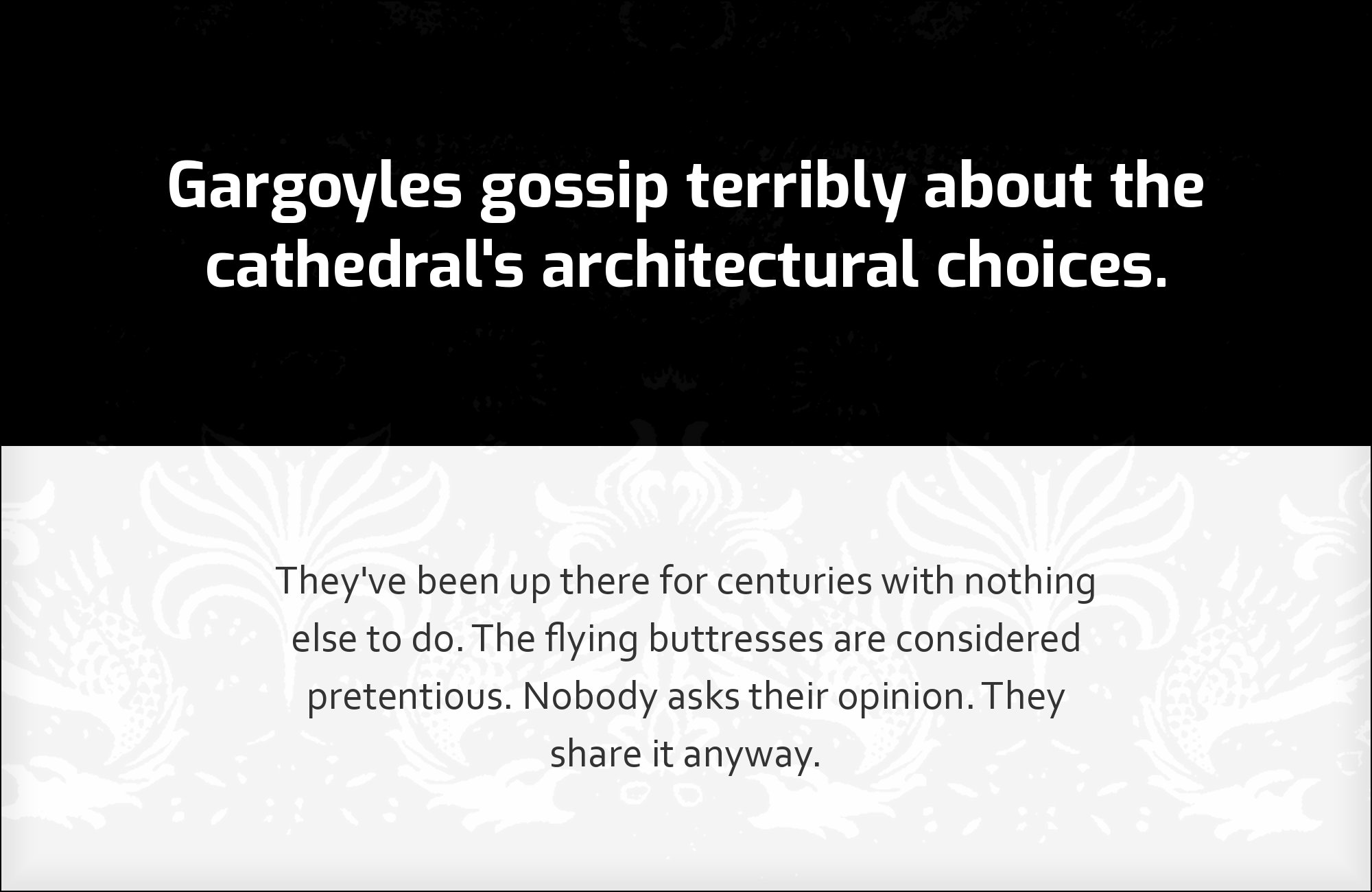
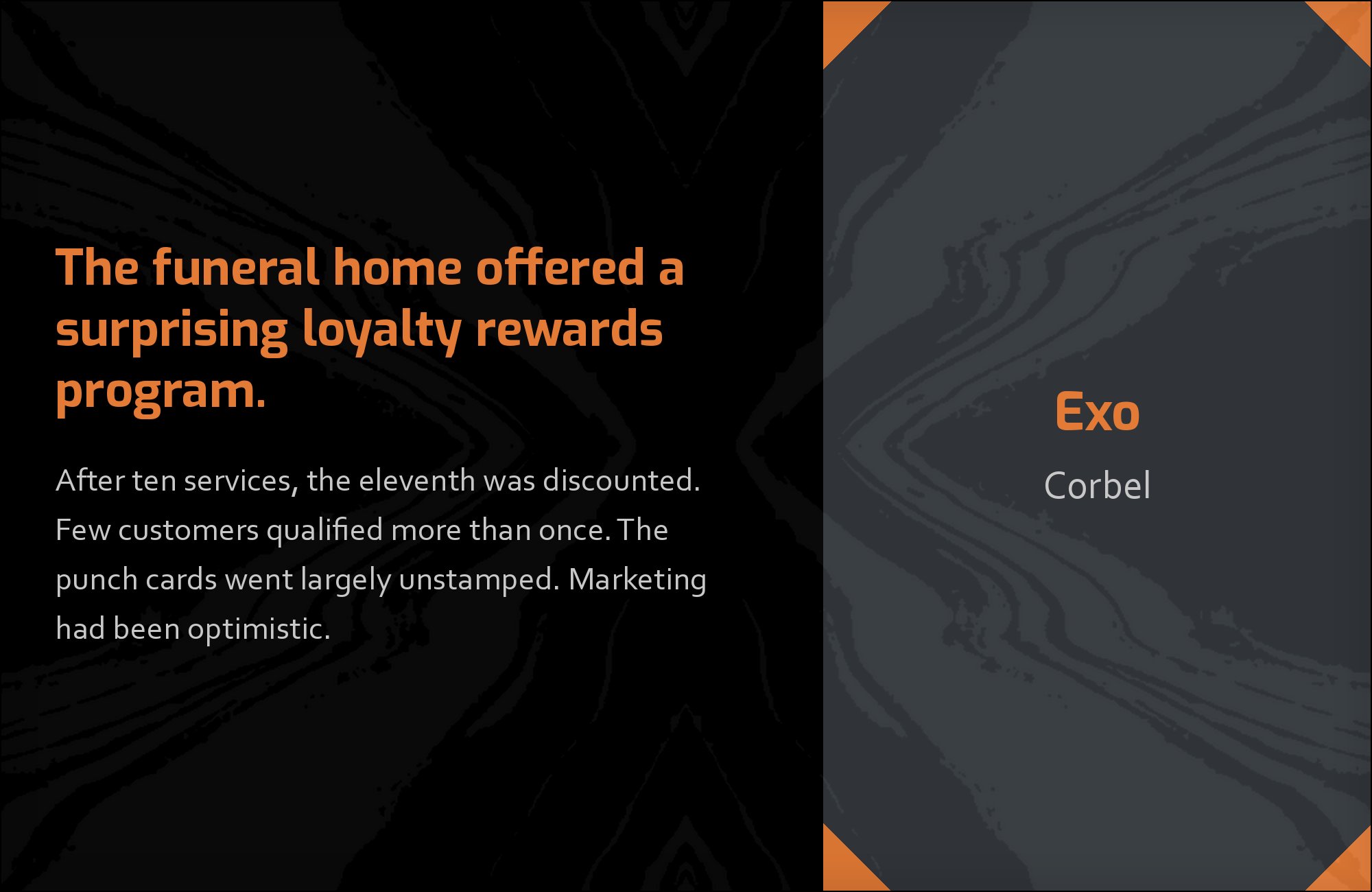
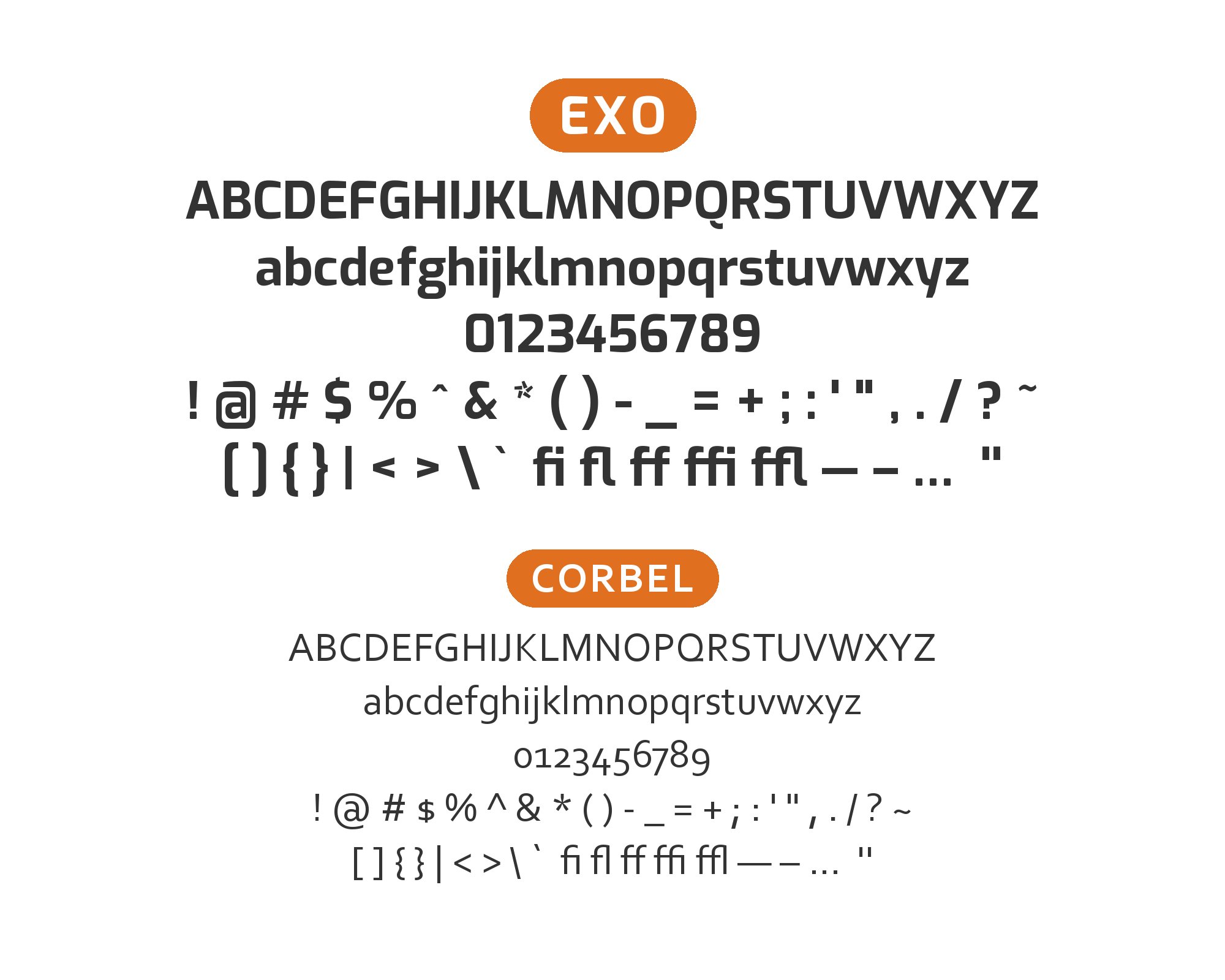
Jeremy Tankard designed Corbel for Microsoft’s ClearType collection, shipped with Windows Vista and Office 2007, as a humanist sans with open apertures, clean uncluttered forms and old-style figures by default — numerals that vary in height and sit partly below the baseline like lowercase letters. It is documented with Exo 2 and Helvetica in the same 2014 magazine production, and those old-style figures explain the choice. Pages dense with dates, page numbers, captions and tabulated data look restless when every numeral stands at cap height; Corbel’s figures settle into the line and give the text block a bookish evenness. That calm is the opposite of Exo’s squared display voice, which is the point. Use Corbel for captions, footnotes, indexes and any editorial layout where numbers appear constantly in running text.
12. Mina
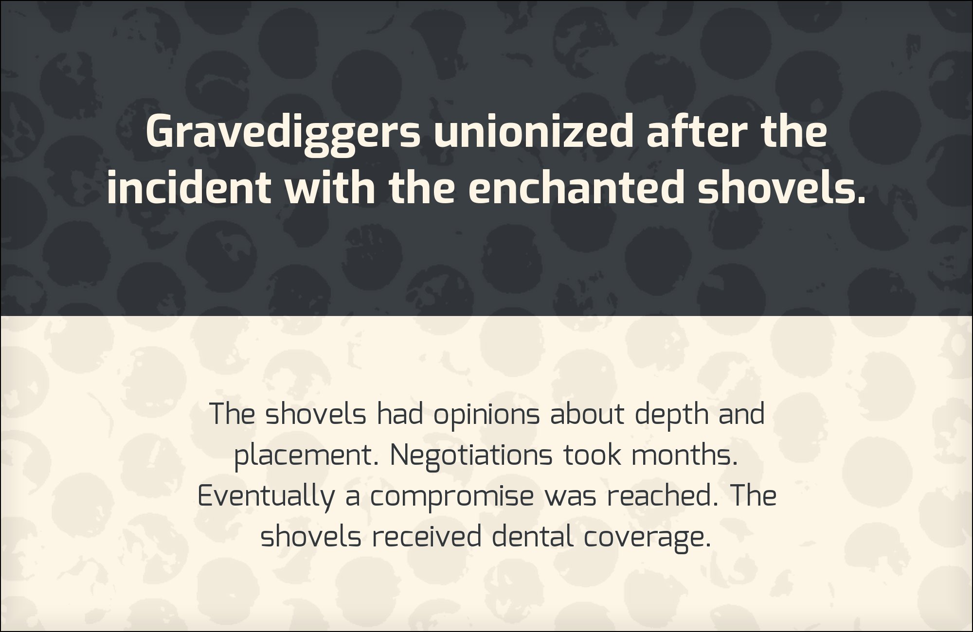
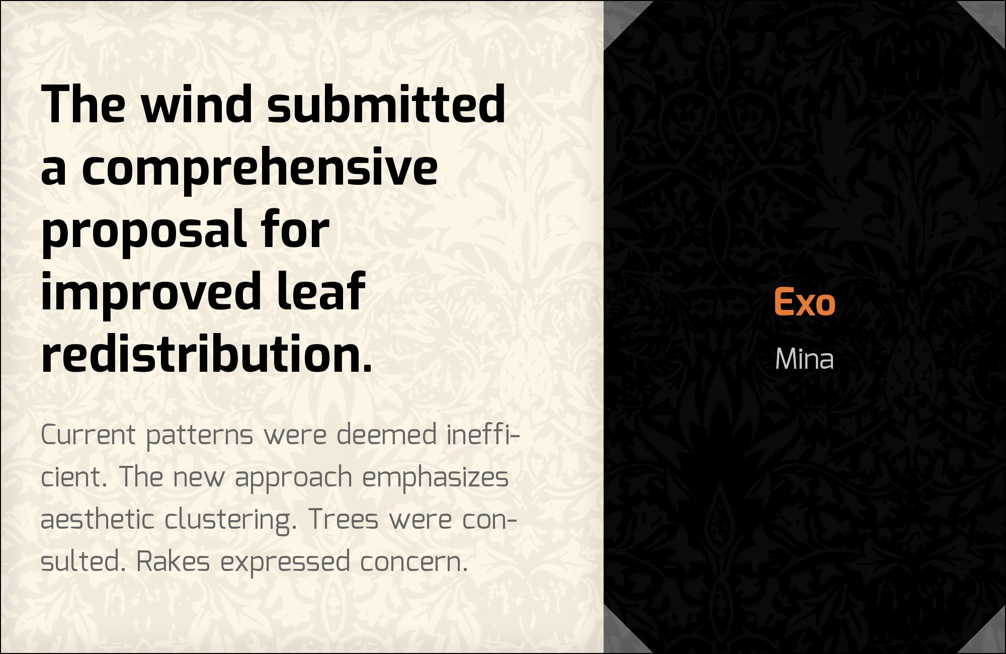
Suman Bhandary, a New Delhi designer, created Mina for Bengali readers, and Google Design’s own account of the project records that he forked it directly from Exo, using the open-source Latin family as the template for a Bengali companion. That makes this the least arbitrary pairing on the list: Mina does not merely suit Exo, it descends from it, so the two carry one construction across two writing systems. The practical use is specific. A Latin brand system built on Exo that must extend to Bengali — a language with roughly a quarter of a billion speakers and comparatively few well-made web fonts — can adopt Mina and keep the same proportions, weight and geometric character across scripts with no visible seam at the switch. For a single-script Latin project, choose one of the earlier partners instead; Mina’s value is multilingual.

13. Bungee

Ten Square Games makes this hierarchy explicit in its brandbook: Bungee carries titles and slogans, while Exo Regular supplies supporting content. That is a useful reversal of Exo’s usual display role. Bungee’s dense capitals create an unmistakable first reading level, leaving Exo’s angular details to give smaller text a technical flavor. Keep the Bungee line short and allow generous space before the Exo explanation; tightly stacked lines can turn the combination into a solid block. Exo can also handle a secondary emphasis in a heavier weight, but the main message should remain visibly dominant. The evidence is a prescribed brand system, not a claim that every size combination succeeds.


14. Verdana

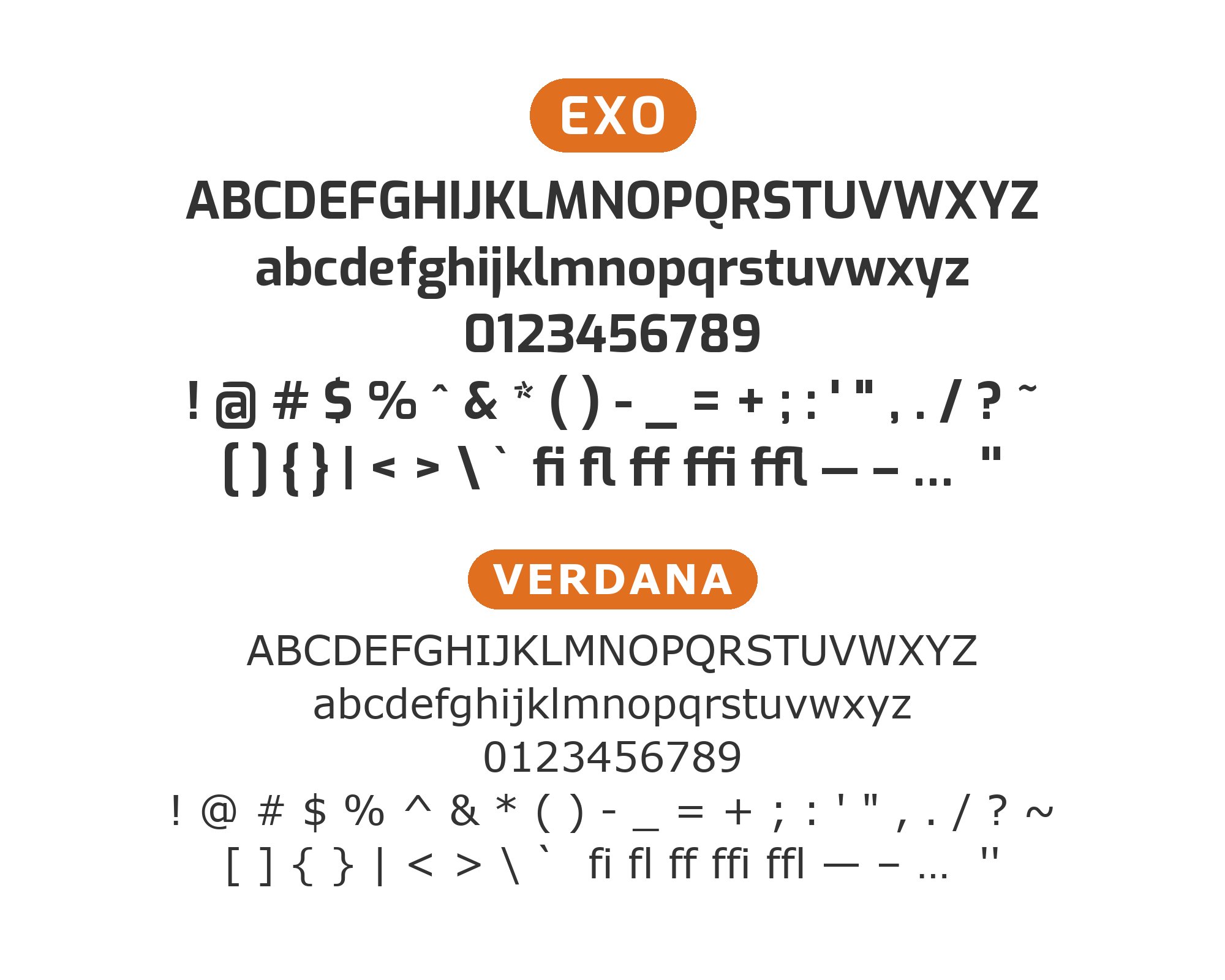
Regal’s official brand guidelines include Exo and Verdana in the same typography system, with Verdana serving as the widely available alternative for everyday communication. That operational role makes the pairing useful beyond a single polished layout. Exo provides the distinctive angular display voice when brand fonts can be embedded, while Verdana preserves clarity in email, presentations and office documents where reliability matters more than expression. Both have generous counters, but Verdana’s familiar screen proportions feel calmer and less futuristic. Use Exo for short branded headings and Verdana for paragraphs, tables and fallback contexts. Keep Exo’s decorative geometry out of dense text, where Verdana’s spacing performs better.

15. Source Sans Pro
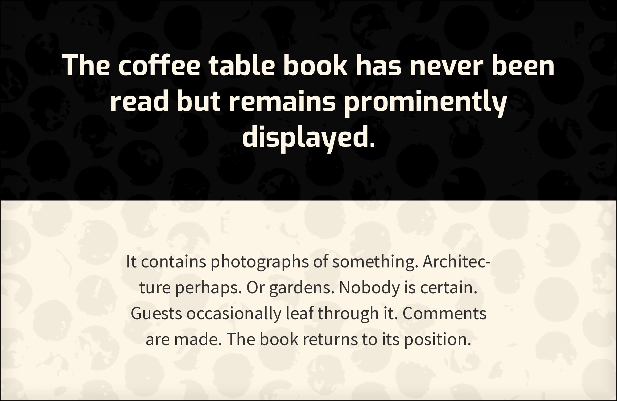
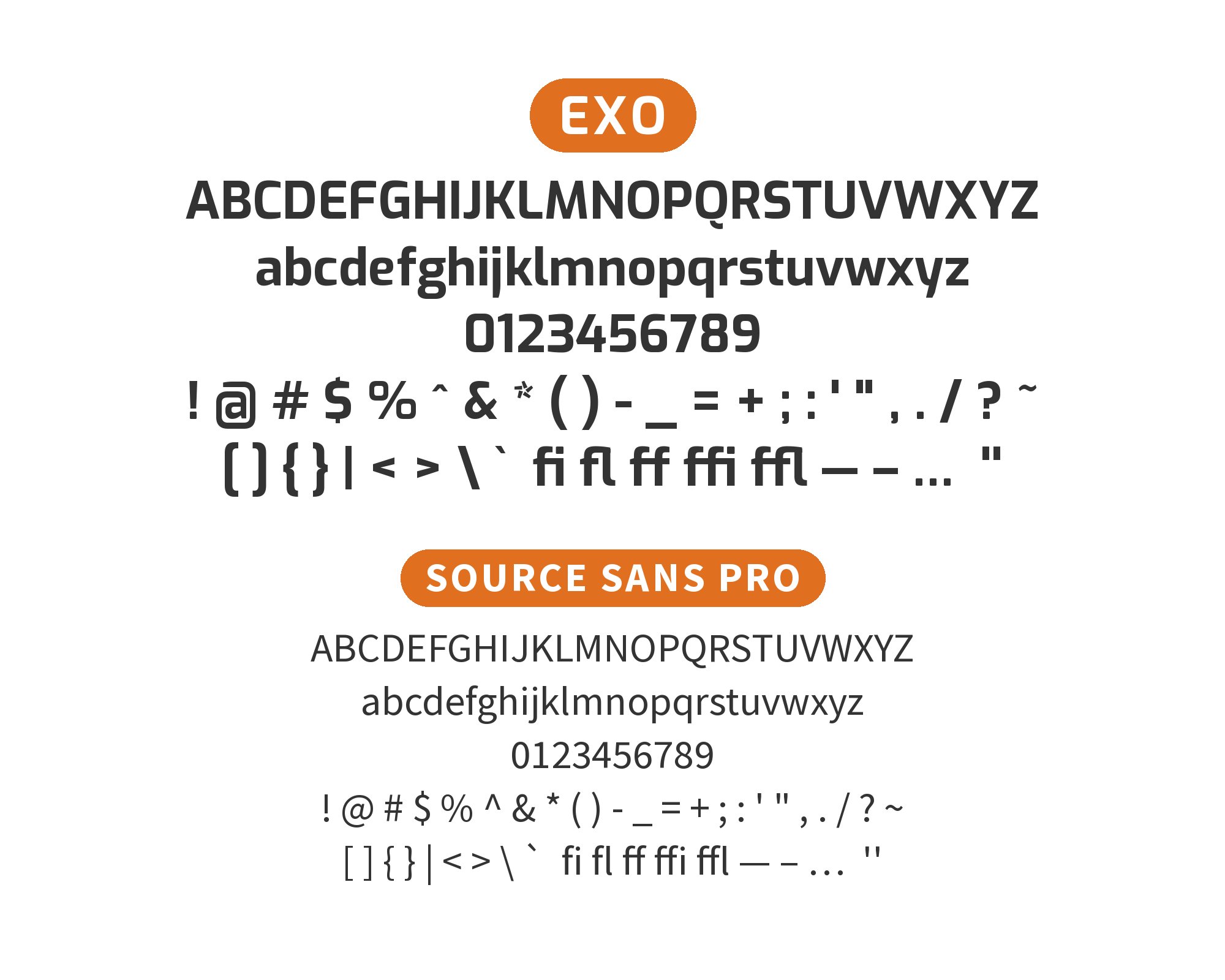
The published Scaneon identity manual documents Exo Light and Semibold for its graphic mark and applications, with Source Sans Pro Light and Semibold assigned as secondary typography. Source Sans Pro gives the angular display face a neutral, highly legible partner for supporting copy and labels. The contrast is clear without becoming abrupt: both are contemporary sans serifs, but Source Sans Pro’s humanist apertures and conventional proportions soften Exo’s squared bowls and clipped terminals. Set Exo Semibold for titles and identity moments, then Source Sans Pro Regular or Semibold for supporting information. This division preserves Exo’s technical character while keeping the secondary layer comfortable and visually quiet.

Conclusion
Exo’s construction points at a specific industrial register. The angled shears, straightened curves and tight joins all point at the same set of industries, and the evidence from live sites bears that out: gaming studios, aerospace, venture capital, logistics. That narrowness is a strength as long as Exo stays in the display position and one companion absorbs the reading load. Roboto, Open Sans and Clear Sans are the three safest answers for that job, in ascending order of technical discipline — Roboto for general product work, Open Sans when long copy needs humanist warmth at small sizes, Clear Sans when misreading a character has a real cost.
The second approach treats Exo as one voice in a wider system rather than the only expressive element. Manrope and Montserrat keep the page geometric while changing width and finishing; Dosis and Alegreya Sans deliberately soften the register; Changa One outranks Exo and frees it to work at mid-scale, where it is arguably at its best. Helvetica, Corbel and Arial each serve a defined structural need — neutrality, old-style figures in number-heavy editorial work, and universal fallback coverage — rather than a stylistic one, and Mina exists for the case where the Latin system has to cross into Bengali without a seam. Decide first which of those jobs the second font is doing, then set both at their real publication sizes and check that Exo still reads as the headline once the body text is in place.
Sources
- Typ.io (Exo)
- Typ.io (Exo as headers)
- Typ.io (Exo with Open Sans)
- Typ.io (Exo with Clear Sans)
- Typ.io (Exo with Dosis)
- Typ.io (Exo with Arial)
- Typ.io (Exo with Changa One)
- Google Fonts specimen
- Fonts In Use (Exo typeface page, by numeric ID)
- Fonts In Use (Neon Team Agency website)
- Fonts In Use (Exo 2 typeface page)
- Fonts In Use (Lab Periodical)
- ElegantThemes
- Elementor
- Slider Revolution
- Smashing Magazine
- Google Design
- Ten Square Games brandbook, typography section
- Regal Brand Guidelines
- Scaneon identity manual (CORE archive)
