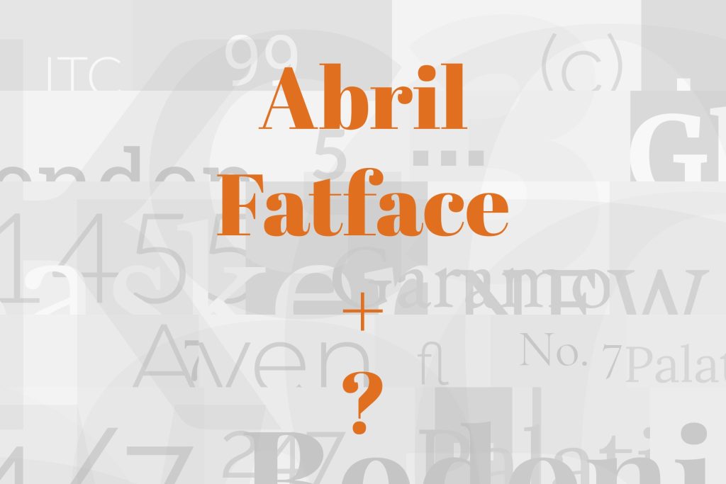
Abril Fatface pairs great with Lato, Open Sans and Roboto. All 15 pairings are shown below in real rendered specimens, with the reason each one works.
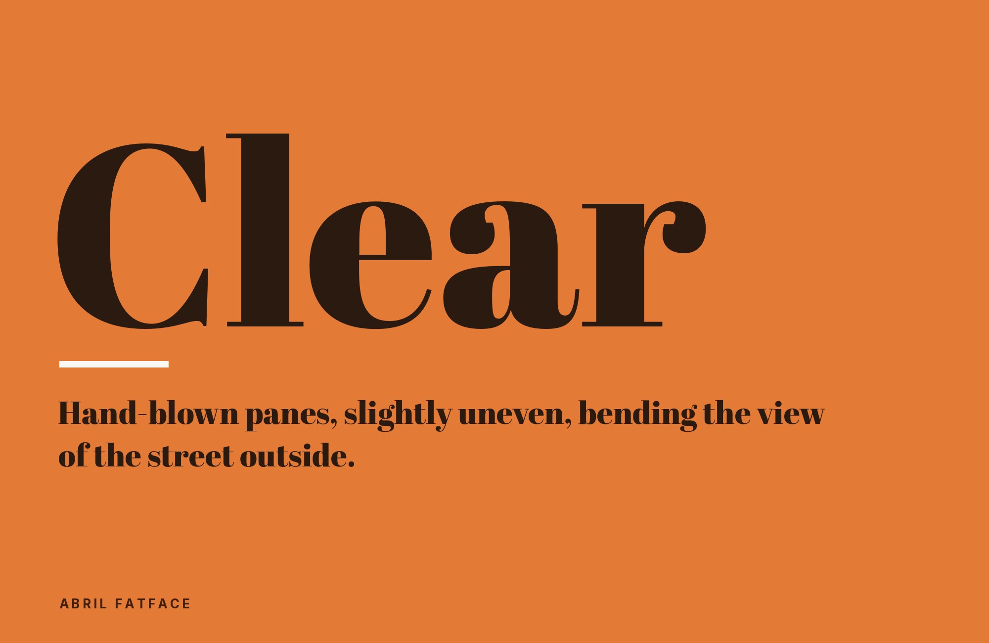
What fonts go with Abril Fatface? TypeTogether’s Didone display face pushes stroke contrast about as far as it can go before the hairlines disappear, which makes it one of the most dramatic headline faces on Google Fonts — and one of the least forgiving once you try to set it any smaller.
Veronika Burian and José Scaglione of TypeTogether designed Abril Fatface in 2011 as the display cut of the Abril superfamily, a Didone with heavy vertical stems and serifs cut down to hairlines, after the nineteenth-century European tradition of extreme thick-thin contrast. The thick-thin contrast is the entire personality of the face: at large display sizes it reads as fashion-editorial and confident, but the same hairlines that make it dramatic also make it fragile — they lose definition and can vanish altogether well before body-copy size. It is free on Google Fonts under an open-source licence, and it is made for headlines and short editorial statements.
Abril Fatface is headline-only without exception, so unlike a pairing built around two usable faces, every combination below is really answering one question: which typeface will carry the paragraphs, captions and UI text Abril Fatface cannot. Most of the strongest answers converge on the same brief — a calm, low-contrast neutral workhorse that recedes rather than competes — though a handful of pairings instead lean on shared proportions, matching Abril Fatface’s narrow uppercase rather than contrasting against it. Here are 15 fonts that pair well with Abril Fatface across web and print work.
1. Lato

Lato is a warm, slightly rounded humanist sans with enough personality to feel like a deliberate choice rather than a default, while staying calm enough to carry paragraphs under Abril Fatface’s dramatic headlines. It is one of the most cross-confirmed pairings across font-pairing tools and design resources for this face, which suggests the combination works reliably rather than just occasionally. Lato is on Google Fonts under the SIL OFL, so the pairing itself has no extra license cost. Set it at 17–19px for body copy and captions, and let Abril Fatface handle headlines exclusively at 32px and above.

Taking it to the next level means cinematic visuals, faster turnarounds, and work that wins clients. Create with unlimited downloads of creative stock assets, and access to powerful AI tools to fast-track your workflow!
Subscribe2. Open Sans

Open Sans is a humanist sans built for cross-size screen legibility, and its neutrality and friendliness balance Abril Fatface’s dramatic flair without ever fighting it for attention. Its open apertures and generous x-height keep long paragraphs comfortable at small sizes, exactly where Abril Fatface’s hairline serifs would already have become illegible. It is free on Google Fonts and one of the most widely used web fonts in existence, so licensing and rendering support are never in question. Use it as the default body and UI face in any layout built around an Abril Fatface headline.

3. Roboto

Roboto is a neutral, screen-tuned grotesque that steps back completely, letting Abril Fatface’s exaggerated stroke contrast carry all the visual drama in a headline-and-body split. Its even proportions and moderate x-height were built for interface and long-form reading rather than personality, exactly the job left over once Abril Fatface takes the headline. It is free on Google Fonts and ships as the default system font on Android, so it renders reliably across an enormous range of devices. Reserve it for body copy, captions and UI chrome beneath any Abril Fatface headline.

4. Work Sans

Work Sans sits between grotesque and humanist, tuned specifically for on-screen reading at medium sizes rather than display impact. That middle-ground character makes it a safe, versatile body partner whenever a design needs Abril Fatface’s drama up top without choosing a sans with a stronger personality of its own underneath it. Work Sans is on Google Fonts, so there is no license to budget for. The pairing suits editorial sites, blogs and marketing pages that want one clear voice at the headline and a quiet, dependable voice for everything a reader actually has to finish reading.

5. Source Sans 3

Source Sans 3 is Adobe’s open-source workhorse grotesque, low-contrast and unobtrusive by design, which lets Abril Fatface’s dramatic stroke contrast do all the talking in a headline-and-body system. It carries none of Abril Fatface’s theatrical flourish and isn’t meant to — its entire job is disappearing into comfortable, functional reading. It is free on Google Fonts despite its Adobe origins, so there is no licensing friction on either side of the pairing. Use it for body copy, forms and UI text in any layout built around an Abril Fatface headline or masthead.

6. Inter

Inter was built specifically for UI legibility at small sizes, and it disappears into body copy and interface text so completely that it leaves zero competition for Abril Fatface’s headline role. Its tall x-height and open apertures were tuned for screens rather than print, making it a particularly strong choice for web-first layouts rather than editorial print work. It is free on Google Fonts and has become one of the standard interface faces of the last several years. Reserve Abril Fatface for headlines and short statements only; Inter should carry everything else on the page.

7. PT Sans

PT Sans is a workhorse humanist sans with even, moderate proportions — plain enough that it never competes with Abril Fatface’s ornate curves, exactly the job a body font needs to do here. Drawn as part of ParaType’s broader PT type system, it holds up at small sizes without introducing any of its own display personality. ParaType released it through Google Fonts, so it costs nothing to use. The combination suits editorial and institutional layouts where Abril Fatface supplies the emotional headline and PT Sans supplies dependable, unremarkable reading underneath it.

Turn your ideas into repeatable creative workflows - no code required. Create with ready-made templates and AI-powered tools in Picsart Flow.
See details8. Poppins

Poppins is a geometric sans with warm, rounded terminals that give Abril Fatface’s dramatic thick-thin contrast a friendly, contemporary body voice. A published specimen sets Abril Fatface for the title and Poppins Light for the body. It has enough personality of its own to feel chosen rather than default, but stays even enough in weight to avoid competing with the headline above it. Poppins is a Google Fonts release, free for web and print alike. The pairing suits contemporary lifestyle, wellness and consumer brands that want Abril Fatface’s editorial drama softened by something rounder and less severe underneath it.

9. Montserrat

Montserrat is a geometric sans with clean, confident lines — modern enough to hold its own as a subhead or UI voice without overshadowing Abril Fatface’s display personality above it. Its even stroke weight and wide letterforms give it enough presence to function as a secondary headline face, not just a body font, a slightly different role than most of the pairings on this list. Montserrat is a Google Fonts release too, so the whole hierarchy stays free. Use it for subheads, navigation and pull quotes that need more weight than plain body copy but must still defer to Abril Fatface at the top of the hierarchy.

10. Nunito

Nunito’s soft, rounded terminals give a friendly, approachable body voice that tempers Abril Fatface’s formal, editorial swagger — useful whenever a brand wants warmth rather than pure luxury signalling. The rounding is subtle enough not to fight Abril Fatface’s own curves, so the two faces read as related in mood even though one is a display serif and the other a rounded sans. Nunito is another no-cost Google Fonts family. The pairing works well for food, hospitality and lifestyle brands where Abril Fatface’s drama needs softening rather than sharpening underneath it.

11. Josefin Sans

Josefin Sans shares an unusually narrow, lean uppercase and a slightly lower x-height with Abril Fatface, so despite the stark serif-versus-geometric-sans contrast, the underlying proportions rhyme. That shared narrowness is what makes the pairing read as considered rather than accidental, particularly in luxury and fashion branding where restraint matters as much as contrast. Josefin Sans is free through Google Fonts. Reserve Josefin Sans for subheads and short display lines rather than dense body copy, where its geometric letterforms are better appreciated at a larger size.

12. Lora

Pairing two serifs together is a riskier move than reaching for a neutral sans, but Lora’s moderate-contrast forms, with roots in calligraphy, read as calm body text next to Abril Fatface’s theatrical high-contrast headlines. The two share a serif family tree while sitting at completely opposite ends of its emotional register — one theatrical, one quiet. Lora is available at no cost on Google Fonts. Use Lora specifically for long-form body copy in editorial or literary contexts where an all-serif system is the goal and a sans body font would feel like an interruption.

13. EB Garamond

EB Garamond’s calligraphic diagonal stress and moderate contrast trace back to sixteenth-century old-style letterforms, giving it a quiet historical counterpoint to Abril Fatface’s nineteenth-century fat-face drama. Keeping the whole system inside the serif family separates display theatre from reading comfort without introducing a sans voice at all. Bulkington Books uses Abril Fatface for display text and EB Garamond for the body. EB Garamond is a free digitisation, distributed through Google Fonts. The pairing suits book design, literary branding and any project that wants a fully serif system with two centuries of contrast built into the choice of typefaces alone.

14. Franklin Gothic

Franklin Gothic is a blunt, industrial grotesque that reads as historically compatible with Abril Fatface. Morris Fuller Benton drew it for American Type Founders in 1902, in the tradition of the nineteenth-century grotesques, and expanded the family through 1912; Abril Fatface descends from the nineteenth-century British and French poster fat-faces. The two sit in the same advertising-type lineage, even though one is a sans and the other a Didone serif, and that lineage gives the pairing a poster-like, historically grounded authority a contemporary neutral sans cannot quite supply. Franklin Gothic is a retail face, most commonly obtained through Adobe Fonts or bundled with some Windows and Office installations rather than free. Use it for subheads and captions where that period authority matters more than pure neutrality.

15. Nimbus Sans

Nimbus Sans L, the freely licensed version of URW’s Nimbus Sans, is a Helvetica alternative with similar metrics, even stroke weights and closed apertures that stay plain by design. That mechanical neutrality gives Abril Fatface’s exaggerated thick-thin display forms a quiet, get-out-of-the-way partner for print body copy and captions, without any licensing cost attached. Its metrics follow Helvetica’s, so the letterfit stays even and unremarkable — the opposite of Abril Fatface’s swelling stems and vanishing hairlines. Use it for body copy and captions in print work specifically, where its Helvetica-like plainness carries paragraphs Abril Fatface was never built to set.

Conclusion
Abril Fatface has exactly one job on a page — the headline, set large, carrying the drama a project wants up front — and every pairing above exists to answer what happens once the reader’s eye moves past it. Most of the strongest choices are quiet on purpose: a calm, low-contrast sans that recedes rather than a second display face competing for the same attention.
Test the pairing at the size you will actually publish, not in a type specimen. Abril Fatface’s hairline serifs hold up beautifully at 32px and above and disappear well before body-copy size, so the honest way to judge any of these combinations is to set real paragraphs underneath a real headline and see where the hairlines start to vanish.
Sources
- FontPair.co
- Typ.io
- FontTest
- htmlfonts
- Figma
- Phoca Tools
- Typewolf
- Vandelay Design
- ManyPixels
- Elementor
- De la suite dans les ID
- Bulkington Books
