Minion pairs great with Montserrat, Gill Sans and Avenir. All 14 pairings are shown below in real rendered specimens, with the reason each one works.

What fonts go with Minion? It is one of the most popular serif typefaces used in books, and it has been doing that job since 1990.
Robert Slimbach designed Minion for Adobe Originals, drawing on the classical old-style serif typefaces of the late Renaissance — the same era that produced the elegant, highly readable book faces the family still echoes. Minion pairs slightly condensed letterforms and large apertures with old-style figures, generous ligatures, small caps, and true optical-size variants, all built to disappear into long stretches of reading rather than call attention to themselves. That restraint is why the kind of institution that adopts Minion tends to keep it for decades: publishing houses, university presses, and dissertation-formatting guides all lean on it as a default body face.
Pairing philosophy for Minion splits along those same institutional lines. Because Minion was drawn to be read rather than noticed, most successful partners are chosen for functional contrast — a screen-tuned sans for interface labels and navigation, or a geometric display face for headlines — rather than for shared personality. Other partners draw on designed kinship or documented use. Here are 14 fonts that pair well with Minion, spanning both approaches.
1. Montserrat
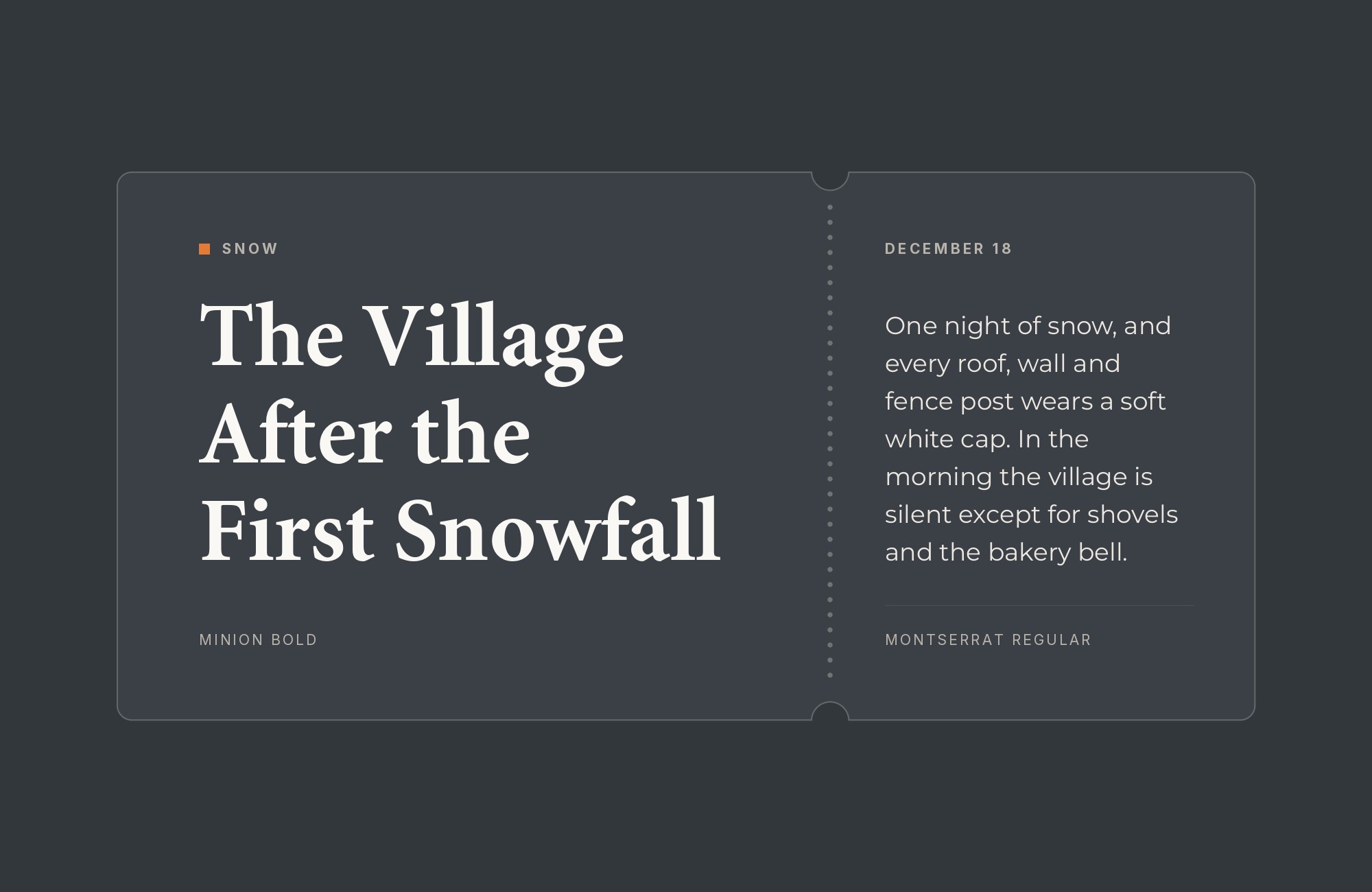
Montserrat was drawn by Argentine designer Julieta Ulanovsky, who began the project in 2010 and released it through Google Fonts in 2011, inspired by the posters, signs and painted windows from the first half of the twentieth century in Buenos Aires’ Montserrat neighborhood. That signage inspiration gives the typeface a large x-height, short descenders, and wide apertures, all of which keep it legible even at small display sizes. Set as a headline above Minion’s old-style body text, Montserrat’s even geometric weight and confident poster voice read as clearly contemporary without echoing Minion’s calligraphic curves. Mission of Hope’s print brand guide uses Montserrat as its primary font and Minion Pro for longer passages.
“My clients will build their own sites with their own AI.”
How are you supposed to navigate this?
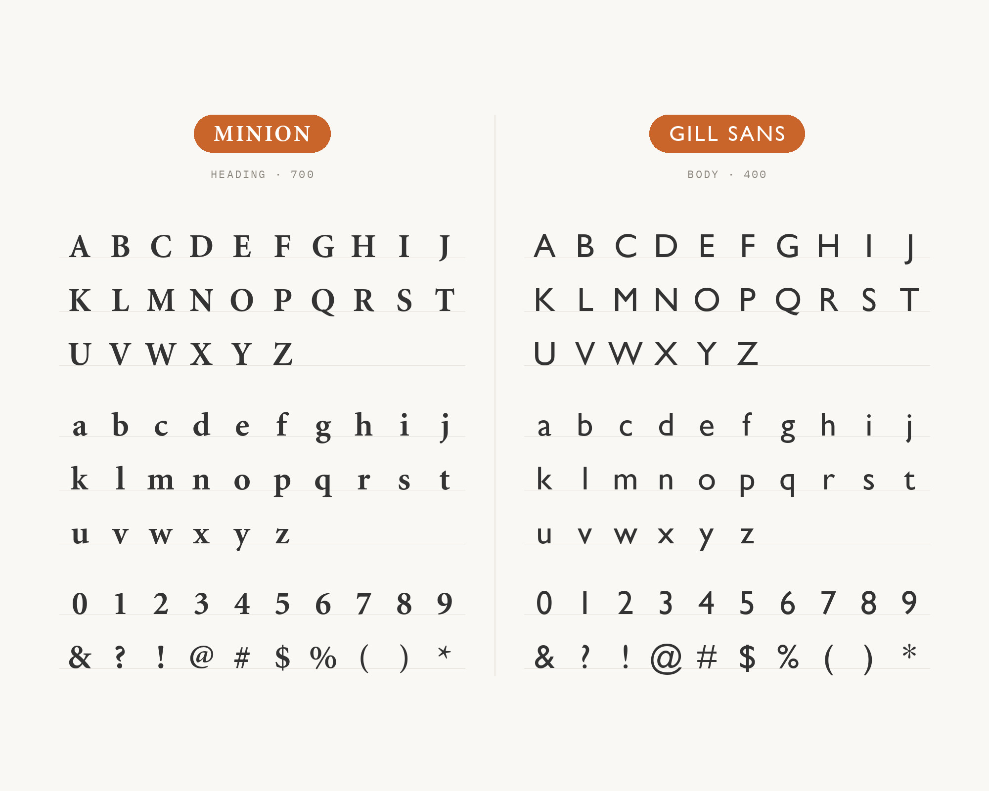
Find Out How2. Gill Sans
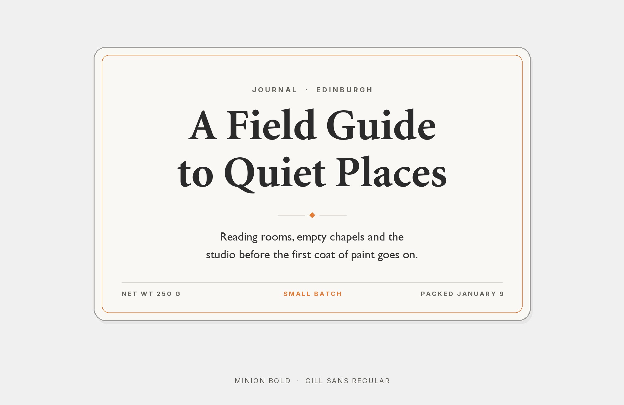
Gill Sans was designed by Eric Gill and published by Monotype in 1928, built on proportions Gill drew directly from Edward Johnston’s 1916 London Underground alphabet, a project Gill had assisted with early in his career. Its humanist, pen-drawn construction shows in details like the double-storey lowercase a and g, and an italic that borrows letterforms from the roman rather than simply slanting them — calligraphic choices that echo the pen-based logic underneath Minion’s own serifs. Because the two typefaces share that handwriting ancestry, pairing them reads as quiet kinship rather than deliberate contrast, useful whenever a project wants consistency instead of drama.
3. Avenir
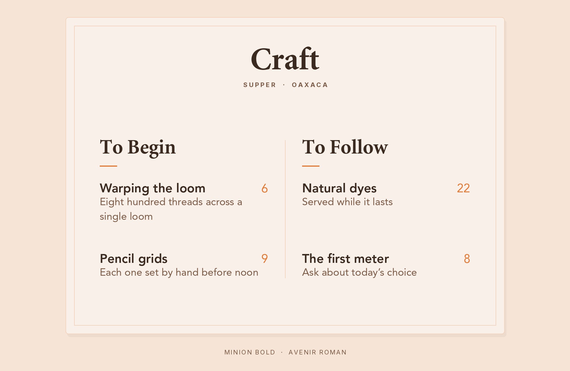
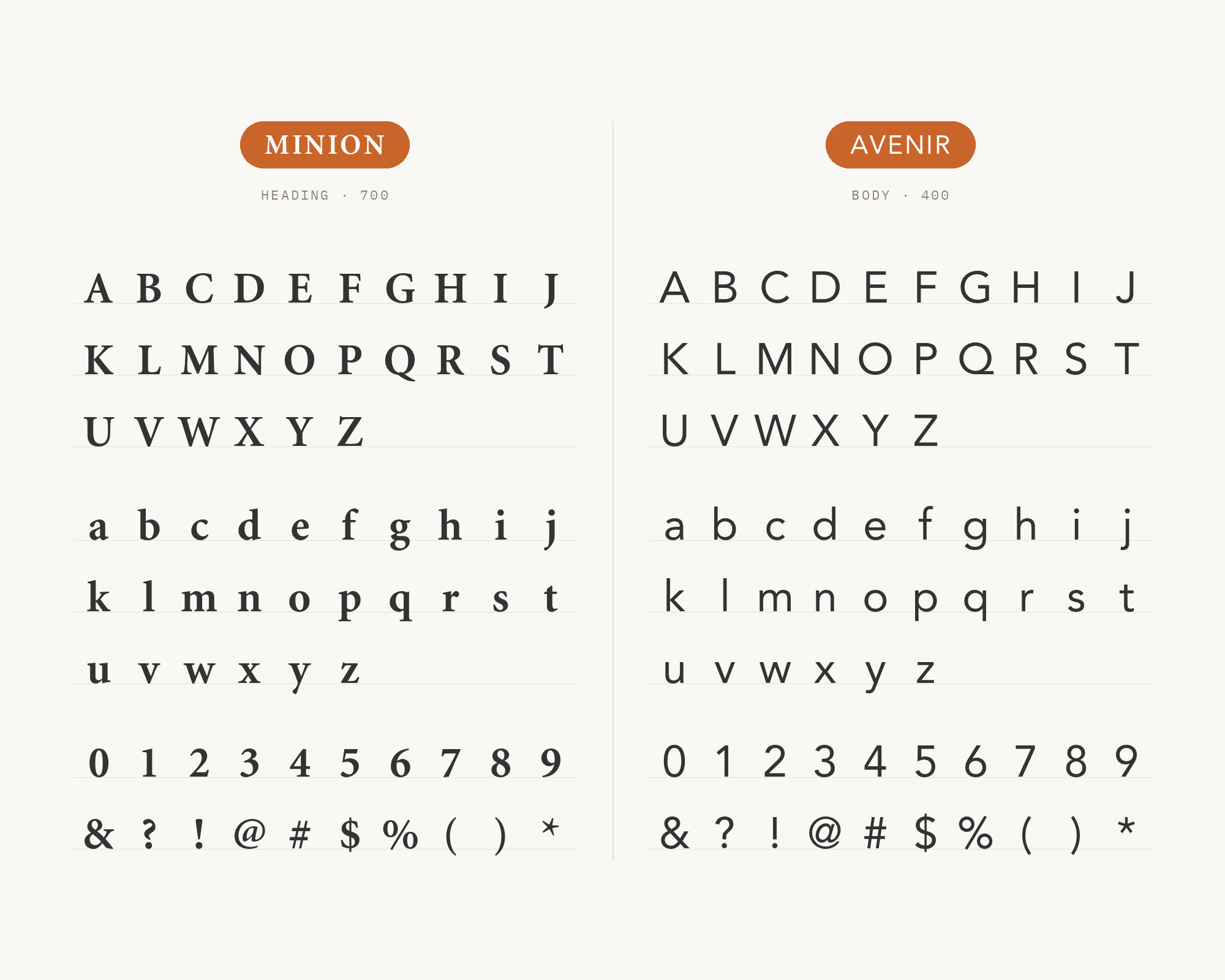
Avenir is Adrian Frutiger’s 1988 release for Linotype, a typeface he considered his finest achievement and developed entirely on his own. Frutiger built it as a geometric-humanist hybrid, reinterpreting 1920s geometric sans-serifs like Futura while adding two-story letterforms and optically corrected circles that soften the rigid geometry of its predecessors. That built-in restraint is exactly why Avenir works above Minion: its even stroke weight and neutral warmth never compete with the reading text, letting Minion’s old-style body copy carry all of a page’s character — a combination seen in production on a real design-agency portfolio site.
4. Open Sans
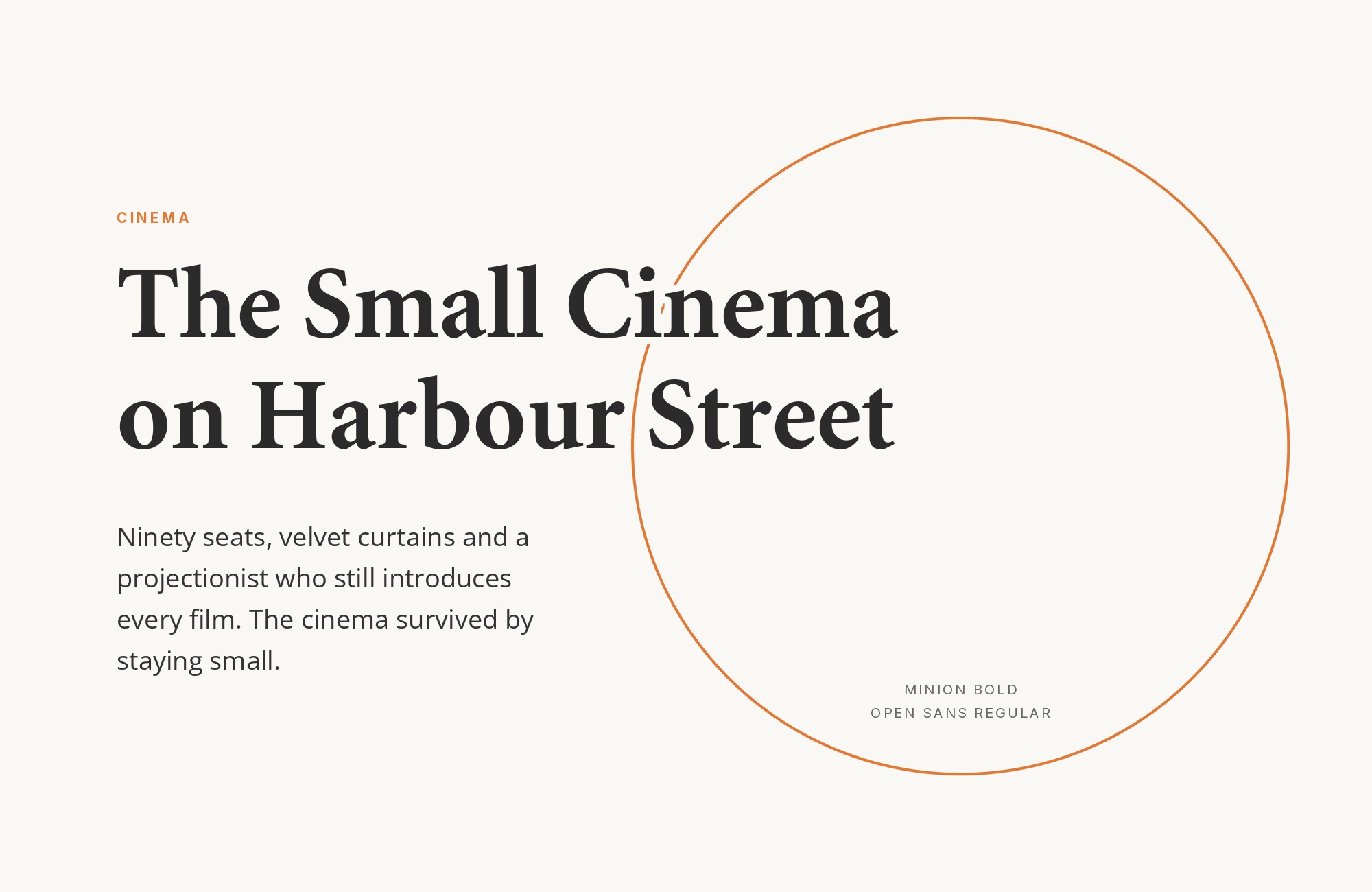
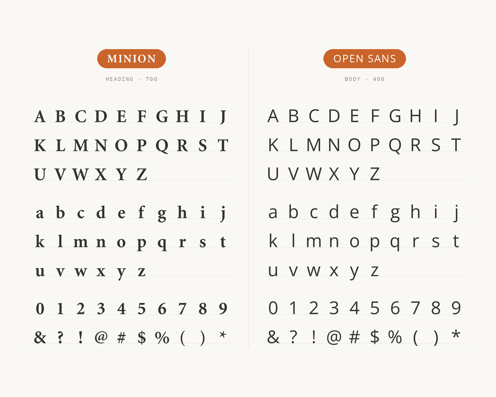
Open Sans was designed by Steve Matteson and released in 2011 under commission from Google, built with upright stress, open forms, and a neutral yet friendly appearance aimed at screen legibility. Its tall x-height and simple, screen-tuned letterforms hold up well at small sizes, which matters most in the interface chrome — captions, labels, navigation — that book-style body copy usually ignores. Seen on two independent live sites pairing the two, Open Sans handles that functional layer while Minion’s more refined curves stay reserved for long-form reading text, a clean split between screen tasks and print-style prose.
Junior work is now a prompt. The biggest profit center in your studio is vanishing.
How to fix this?
Find Out How5. Futura
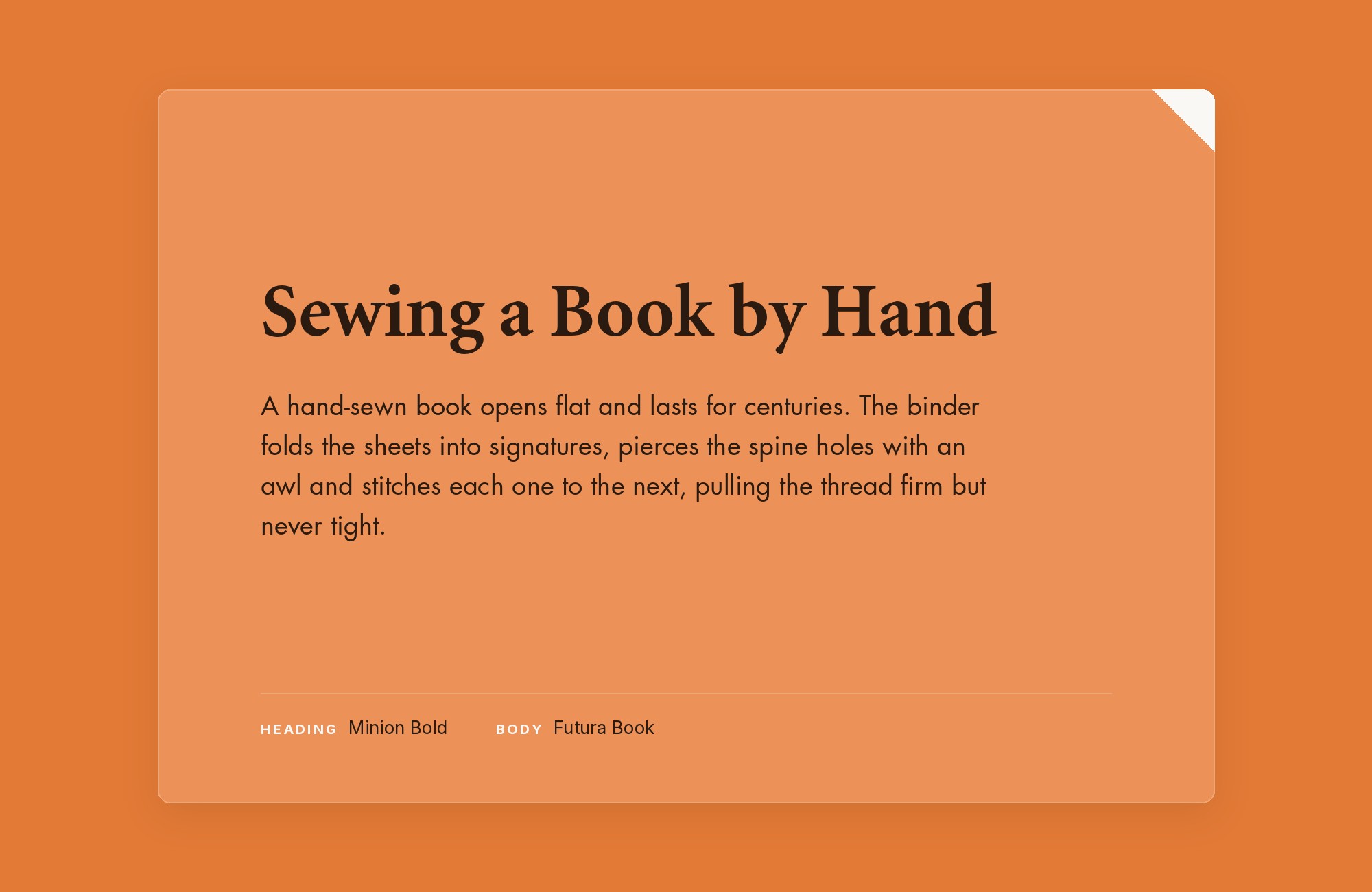
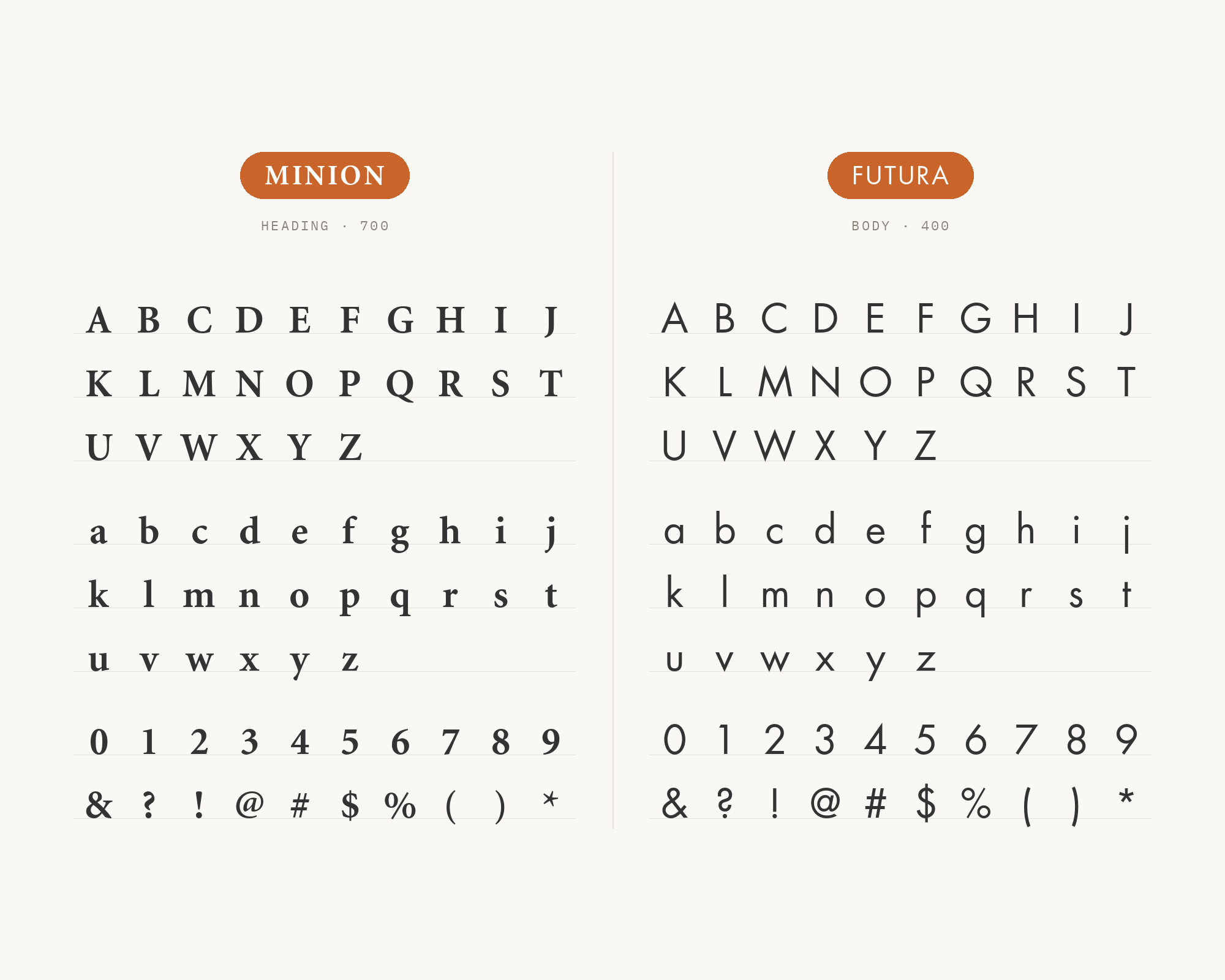
Futura is Paul Renner’s 1927 design for the Bauersche Gießerei, built almost entirely from geometric shapes — near-perfect circles, triangles, and squares — with strokes of even weight and low contrast throughout. Its lowercase has tall ascenders that rise above the cap line, which keeps it from feeling shouty even at large sizes. Set above Minion’s calligraphic curves, Futura’s engineered, compass-and-ruler construction sits at the opposite structural pole entirely, giving a headline unmistakably modern character above warm, human body text — a contrast documented in a real 2015 production site.
6. Inter
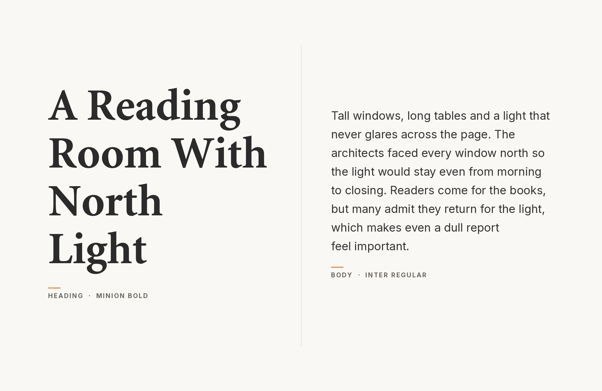
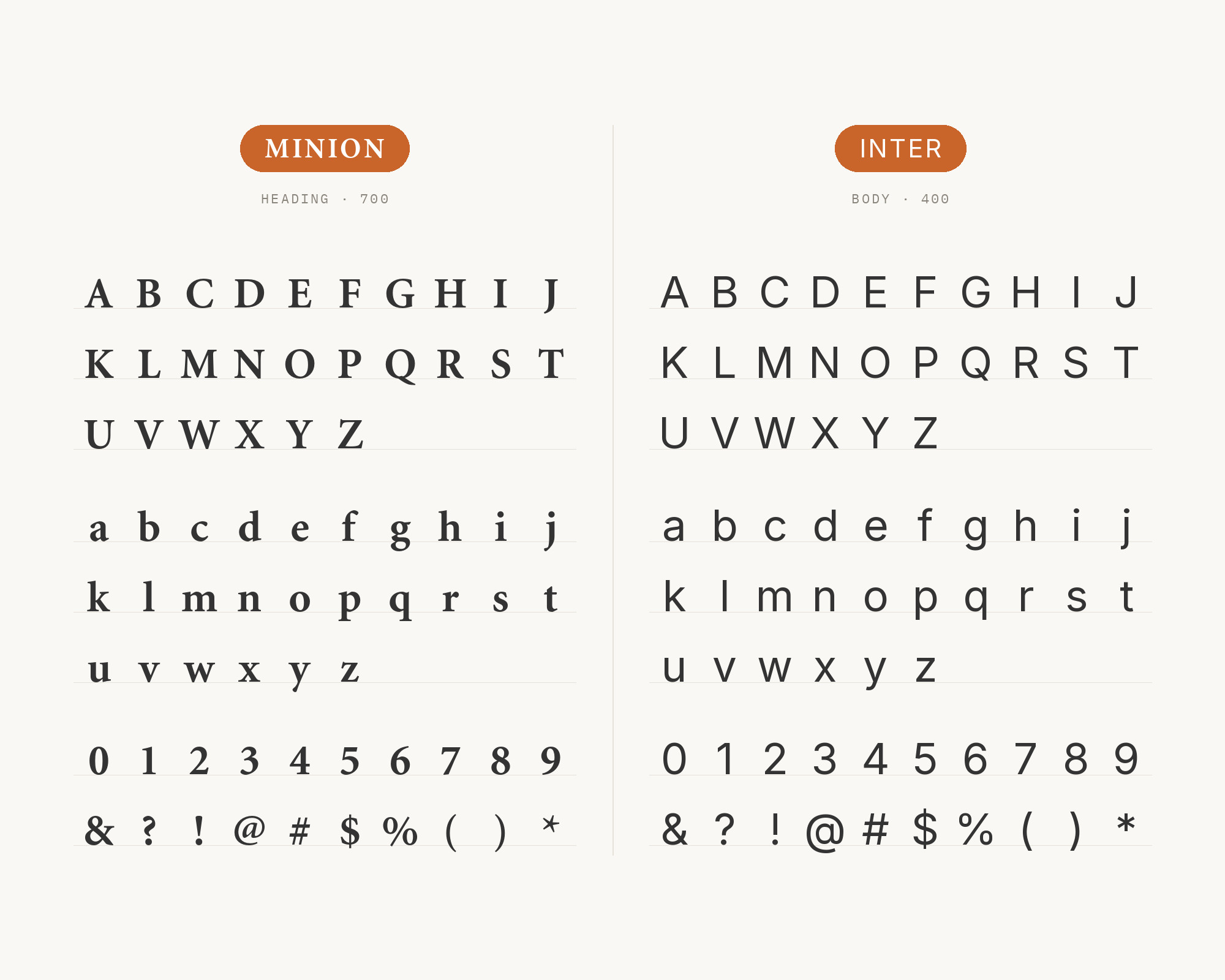
Inter was designed by Rasmus Andersson and released in August 2017 specifically to improve on-screen readability for user interface text at small sizes. It carries a notably tall x-height and open apertures, plus an optical-size axis that adjusts its proportions as text scales up or down. Keeping navigation and interface chrome in Inter while Minion’s old-style curves carry the long-form reading text follows a clean functional split that plays to what each typeface was built to do. Radford University’s brand guide explicitly pairs Minion with Inter.
7. Georgia
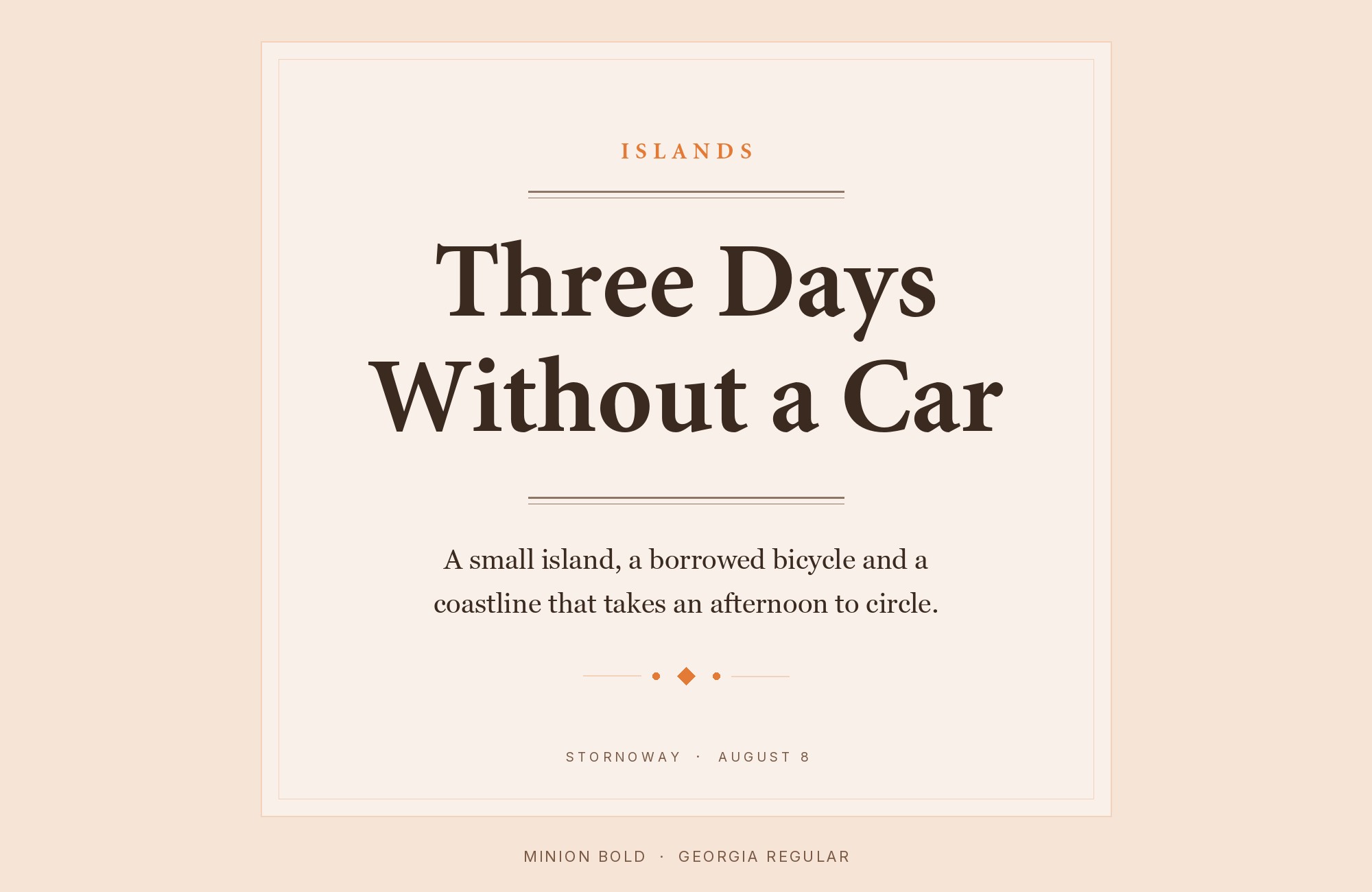
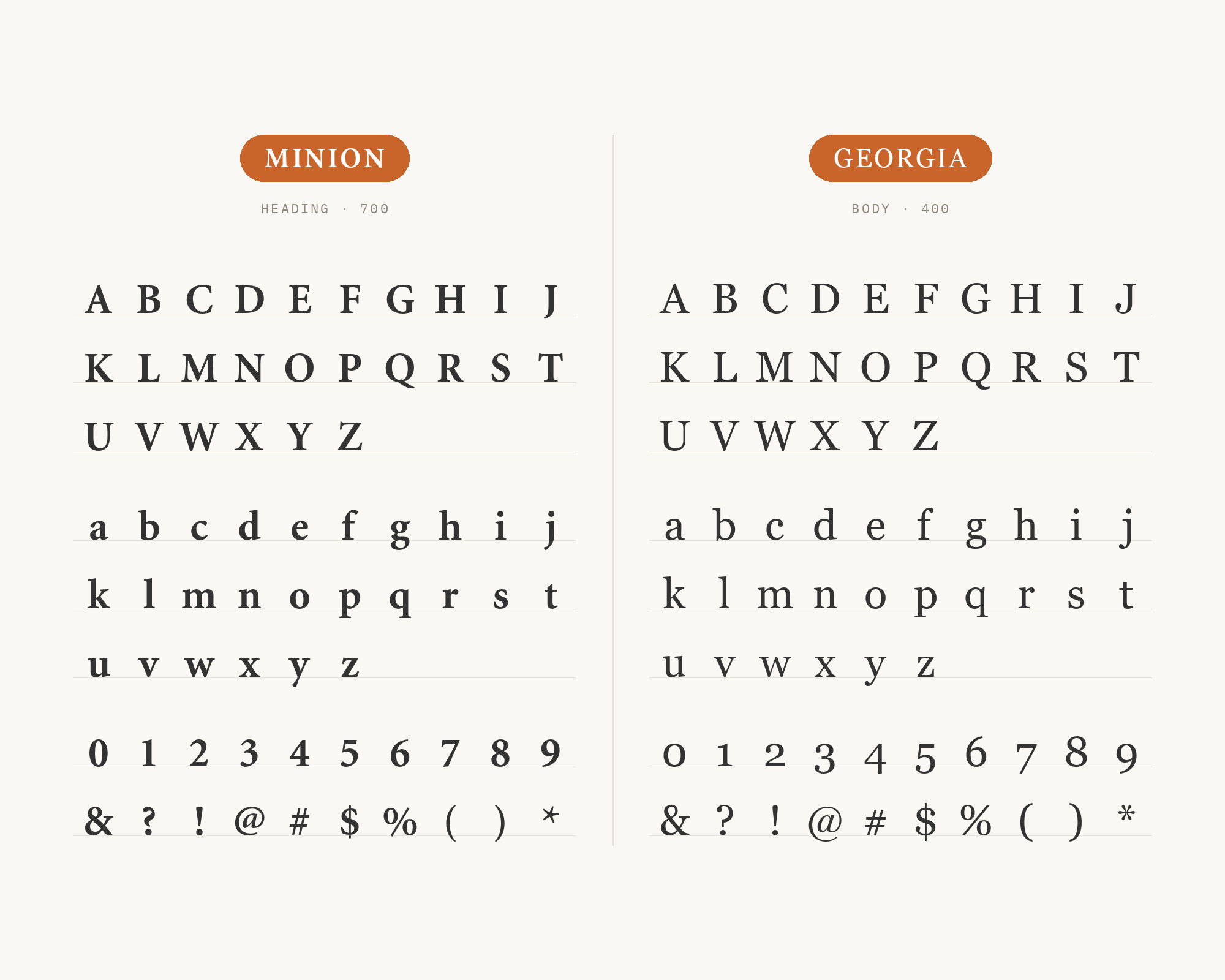
Georgia was designed by Matthew Carter for Microsoft and shipped in November 1996, purpose-built for screen legibility with a large x-height, lightened capitals, and sturdy serifs descended from Scotch Roman designs. Pairing it with Minion lets a site use Georgia for interface text — captions, navigation, small print — while Minion’s more refined old-style curves carry the long-form reading copy, so the split follows a technical, screen-versus-print logic rather than a personality clash. Both Typewolf’s Site of the Day archive and Typ.io’s crawl data independently document this pair in live production.
Turn your ideas into repeatable creative workflows - no code required. Create with ready-made templates and AI-powered tools in Picsart Flow.
See details8. Josefin Sans
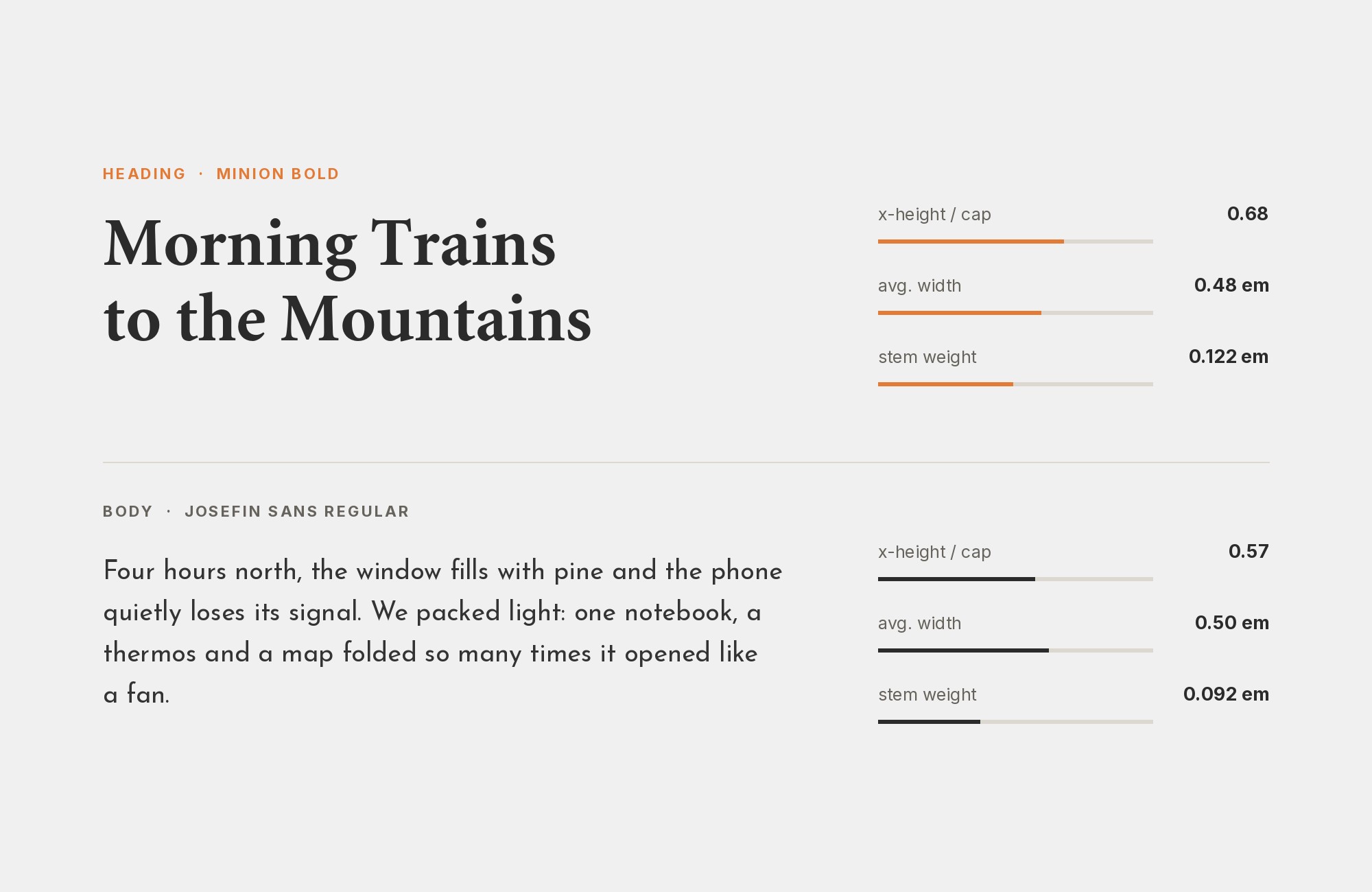
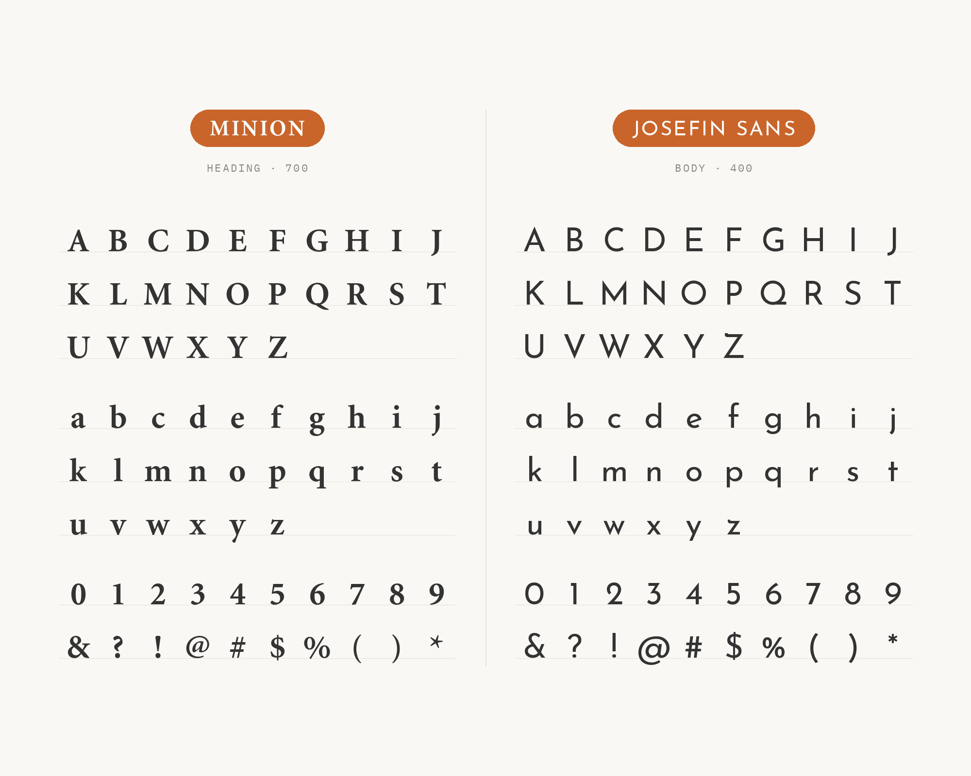
Josefin Sans, designed by Santiago Orozco for Google Fonts, is a thin-stroked geometric sans inspired by 1920s geometric designs, with an x-height set half way from baseline to cap height. That vintage-flavored geometry gives headlines a stylish, period-appropriate voice above Minion’s old-style body text. A CNS Seguridad Integral brand manual puts Josefin Sans in titles and subtitles, with Minion Pro for body copy. The pairing works best when Josefin Sans stays confined to headings and subheads, since its unusual proportions lose clarity at the small sizes where Minion is doing the actual reading work.
9. Univers
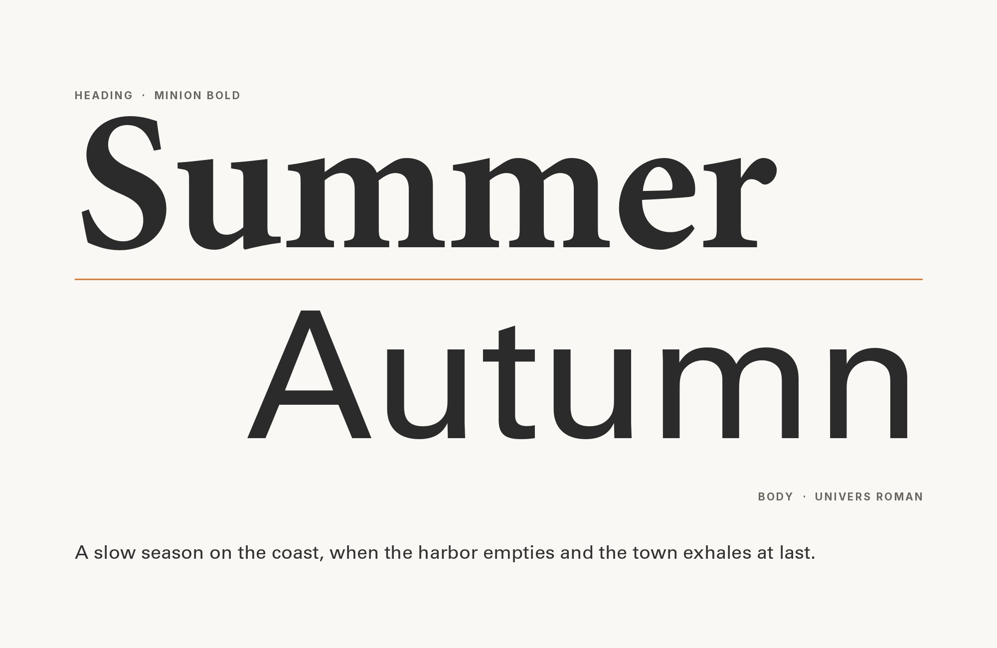
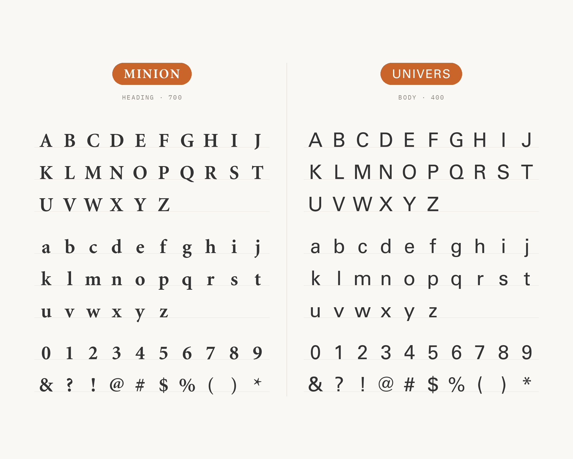
Univers is Adrian Frutiger’s 1957 typeface for Deberny & Peignot, built with what Frutiger called a “visual sensitivity between thick and thin” strokes rather than perfect geometric evenness — a deliberate Swiss preference for neutrality over artistic flourish. That mechanical evenness and total lack of stylistic flourish make Univers about as neutral a partner as a sans can be; it never competes with Minion’s calligraphic warmth, which is exactly why photobook designers reach for it when Minion needs a plain, dependable label or headline. The pairing carries institutional weight too: three separate Fonts In Use projects document it, and Wright State University’s brand guide formally pairs Minion Pro with Univers LT Standard as its official body/headline system.
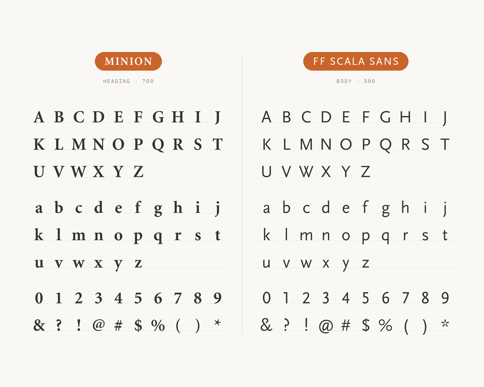
10. FF Scala Sans
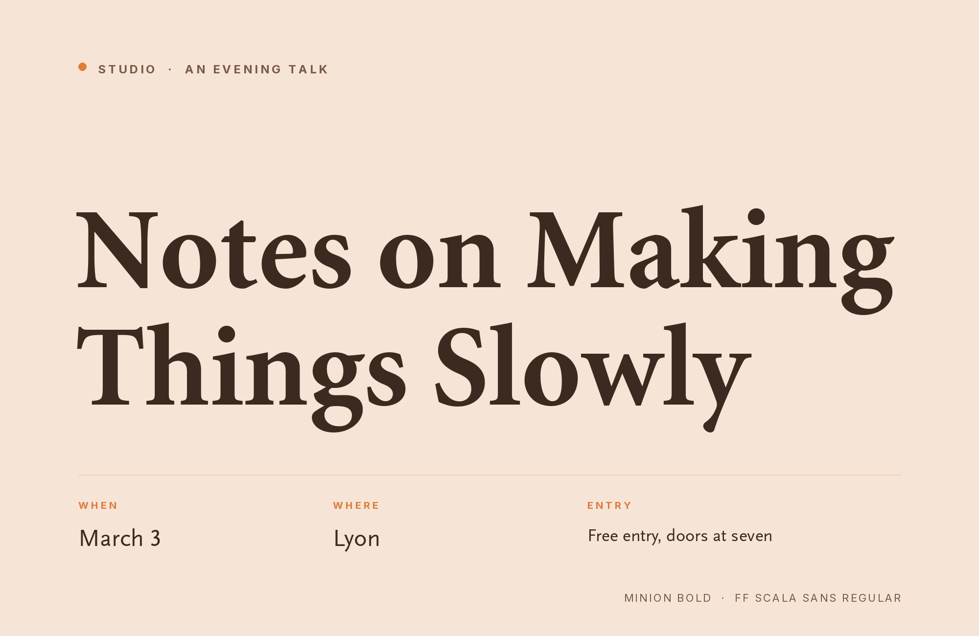
FF Scala Sans was drawn by Dutch designer Martin Majoor in 1993 for FontFont, as a companion to his own FF Scala serif from 1990 — both faces are structurally modeled on the same serif old-style proportions, the same relationship Eric Gill built between Gill Sans and its serif cousins. That shared-proportion design is why the pairing with Minion reads as disciplined variation rather than contrast: it carries unusual weight because the definitive modern book on typography sets its interior body text and layout in exactly this combination — Minion and FF Scala Sans, the typeface pair of Robert Bringhurst’s own The Elements of Typographic Style.
11. Trajan
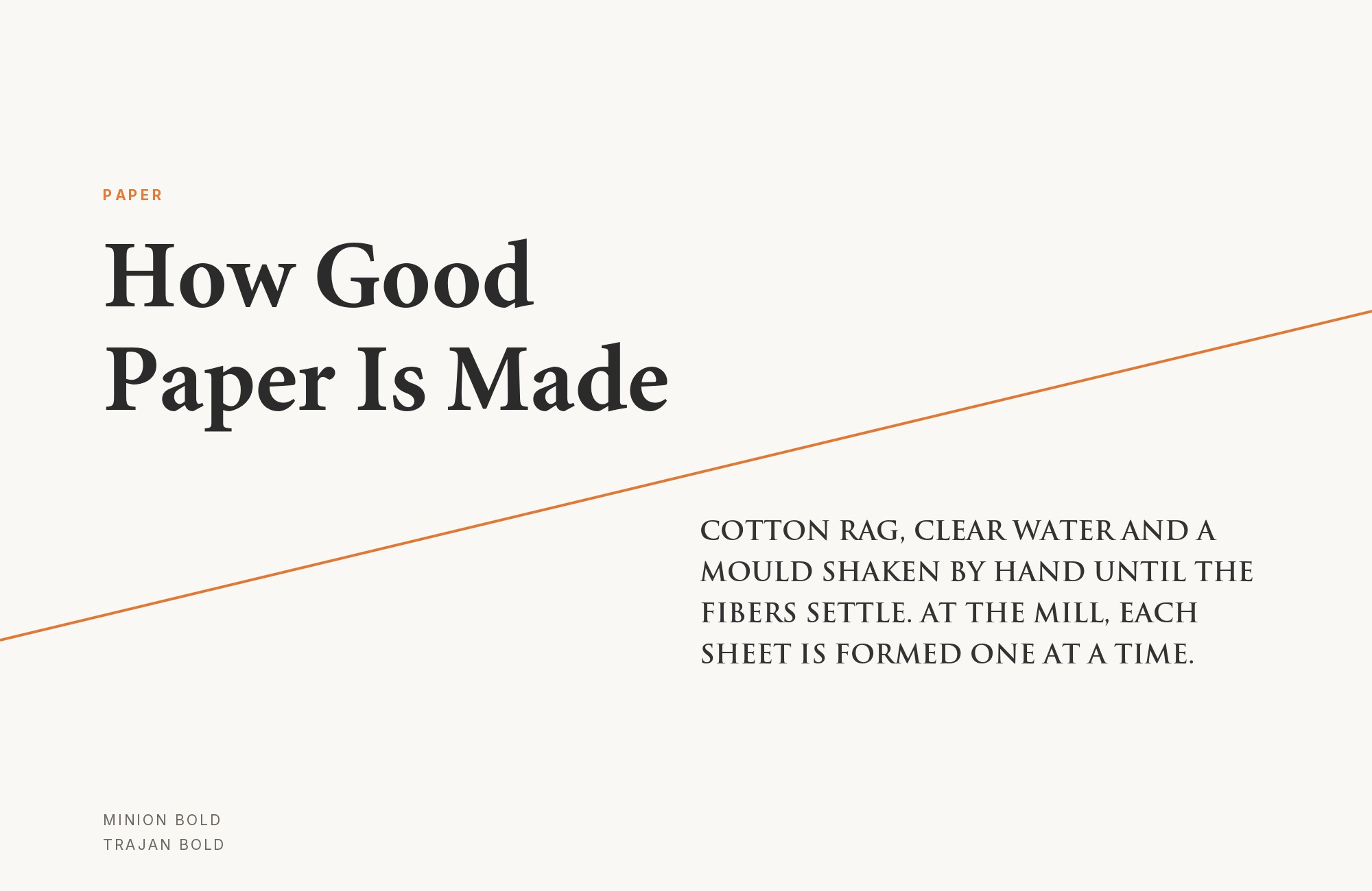
Trajan was drawn by Carol Twombly for Adobe Originals in 1989, based directly on the capitalis monumentalis carved into the base of Rome’s Trajan’s Column — a source with no lowercase at all, since the Romans never carved one for monumental inscriptions. That absence of lowercase and of any reading-length warmth is precisely what makes Trajan work as a title face: set above Minion, alongside Gill Sans in one documented case, it signals formality and permanence while leaving all of the actual reading comfort to Minion’s text below it. It belongs at display sizes only, never body copy.
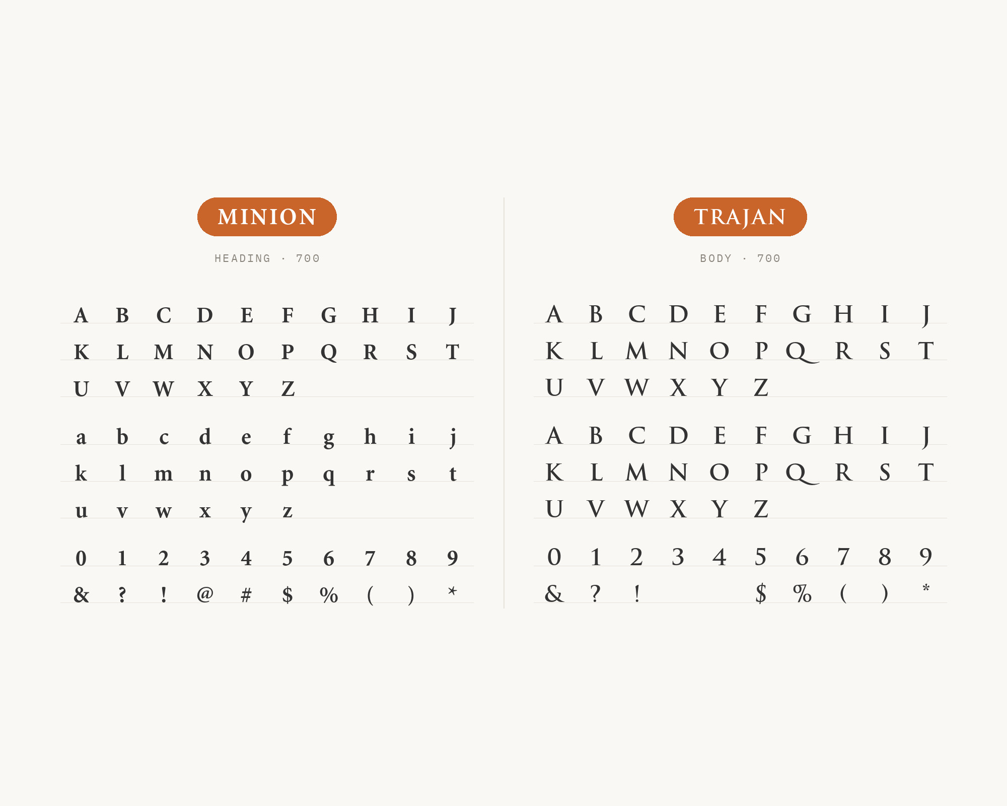
12. Akzidenz-Grotesk
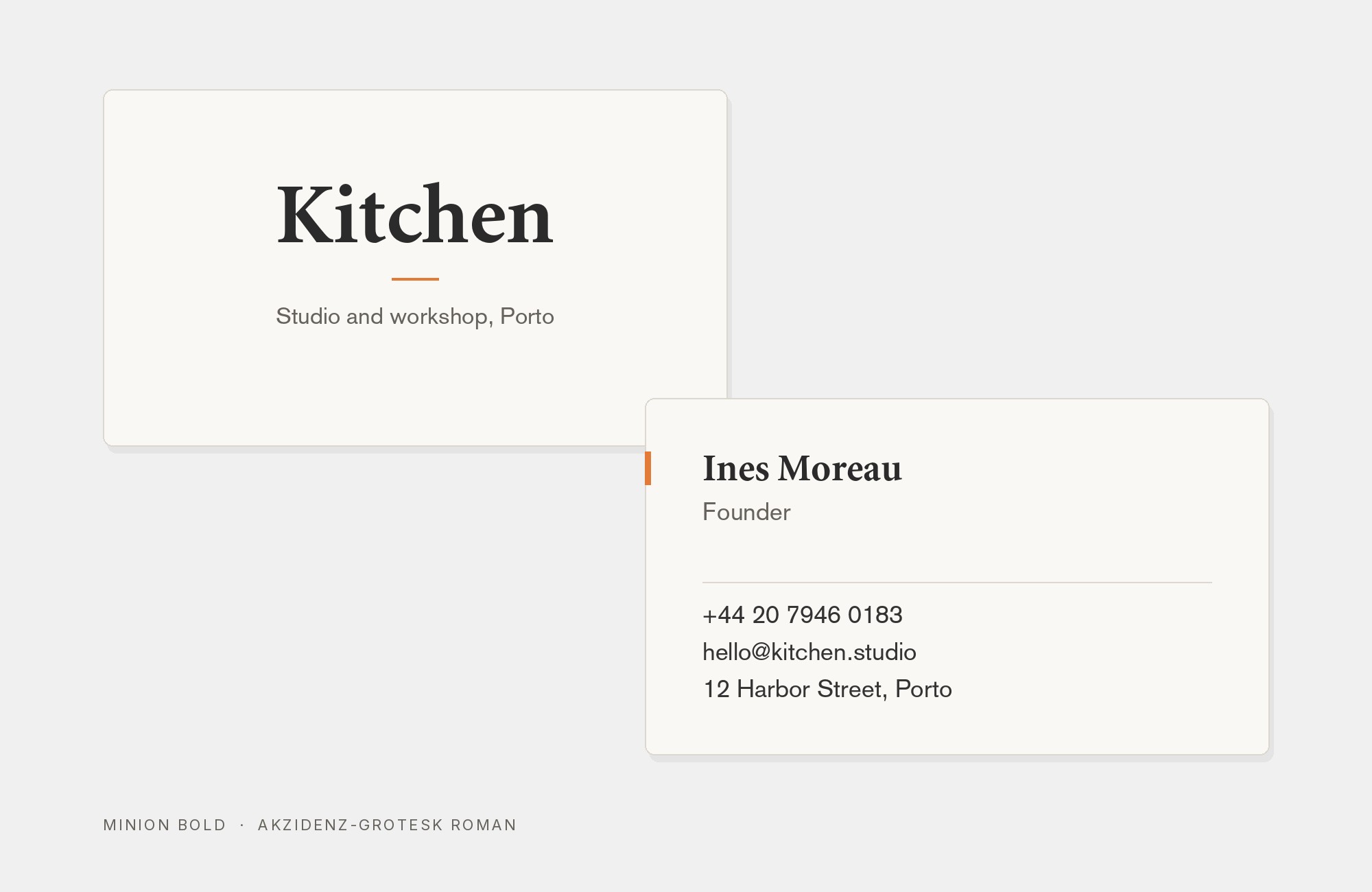
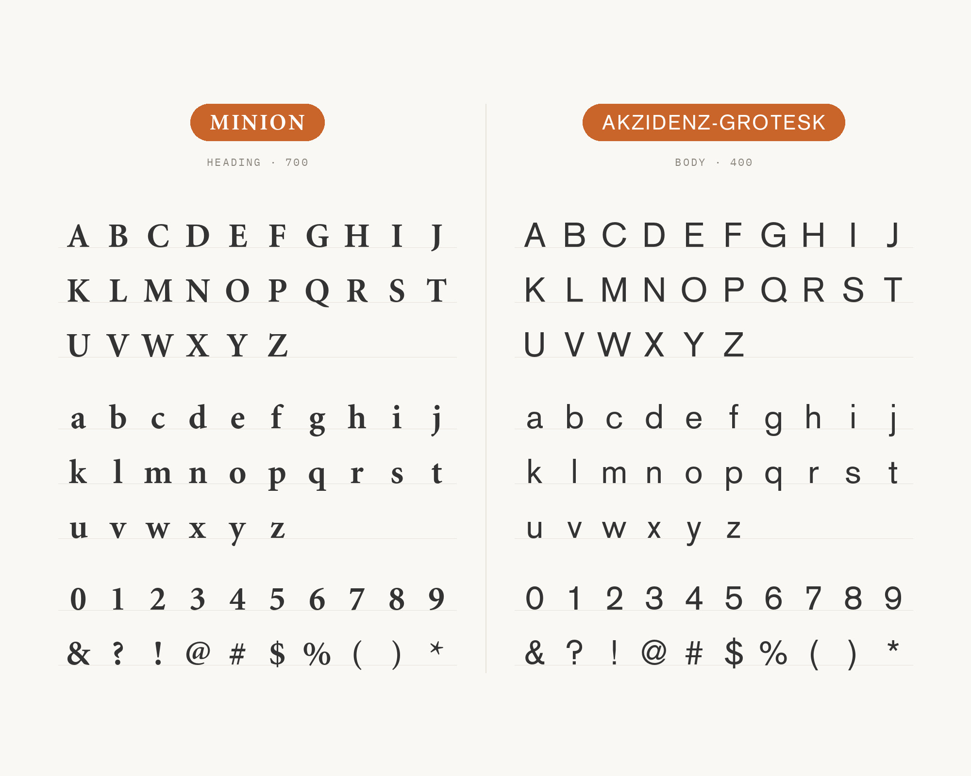
Akzidenz-Grotesk was released by the Berthold Type Foundry in 1898, rooted in the 19th-century industrial grotesque tradition its own name announces: “Akzidenz” is German for jobbing work, the commercial printing of tickets, forms, and publicity rather than fine books. Its monoline structure and folded-up apertures were built plain and unornamented on purpose, later serving as the direct model for faces like Helvetica and Univers. Pairing it with Minion sets two typefaces with genuine historical weight against each other — old-style serif against early industrial sans — rather than pairing Minion with something anonymously neutral, a combination confirmed across two separate documented projects in the Fonts In Use archive.
13. TheSans
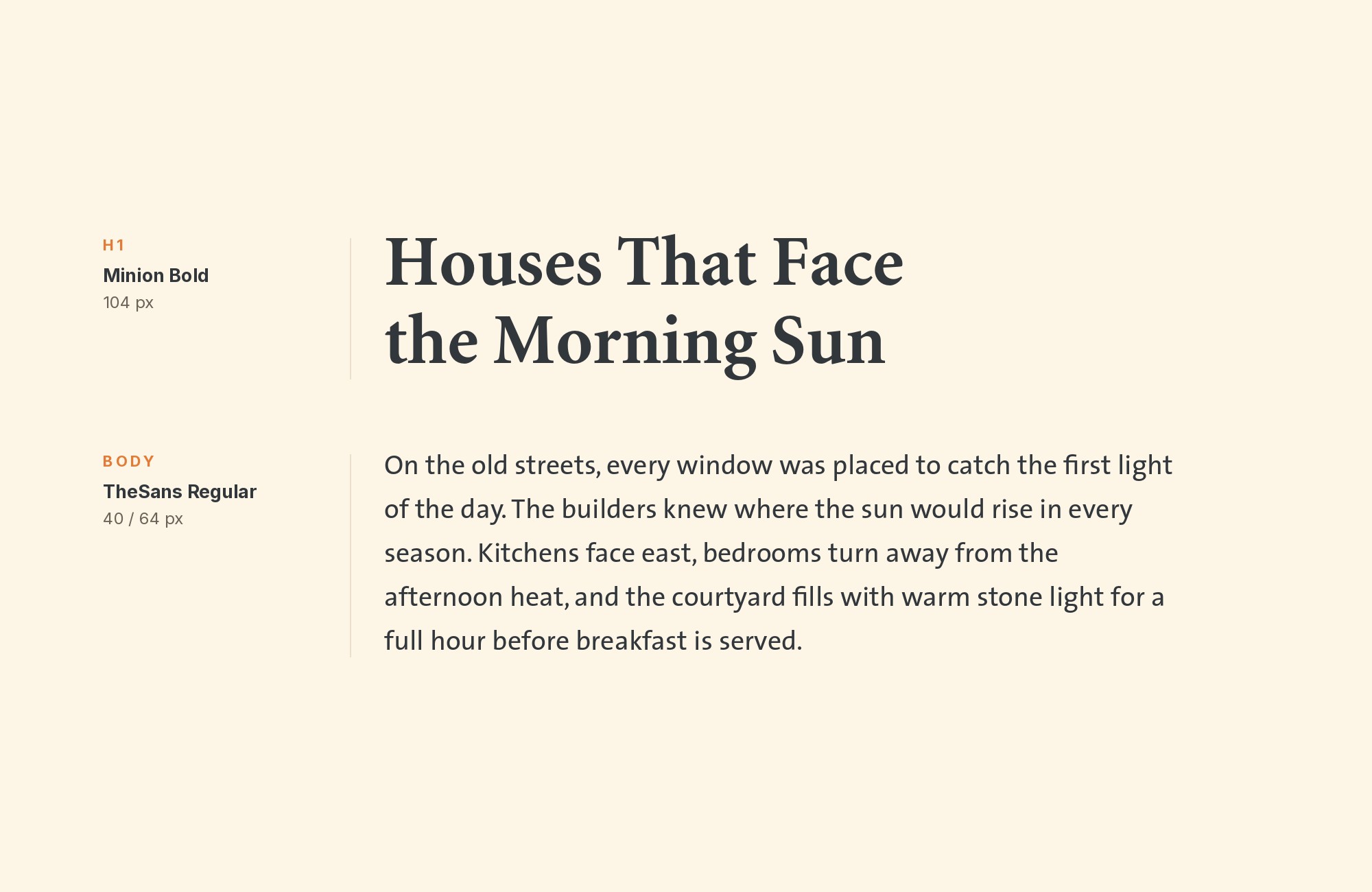
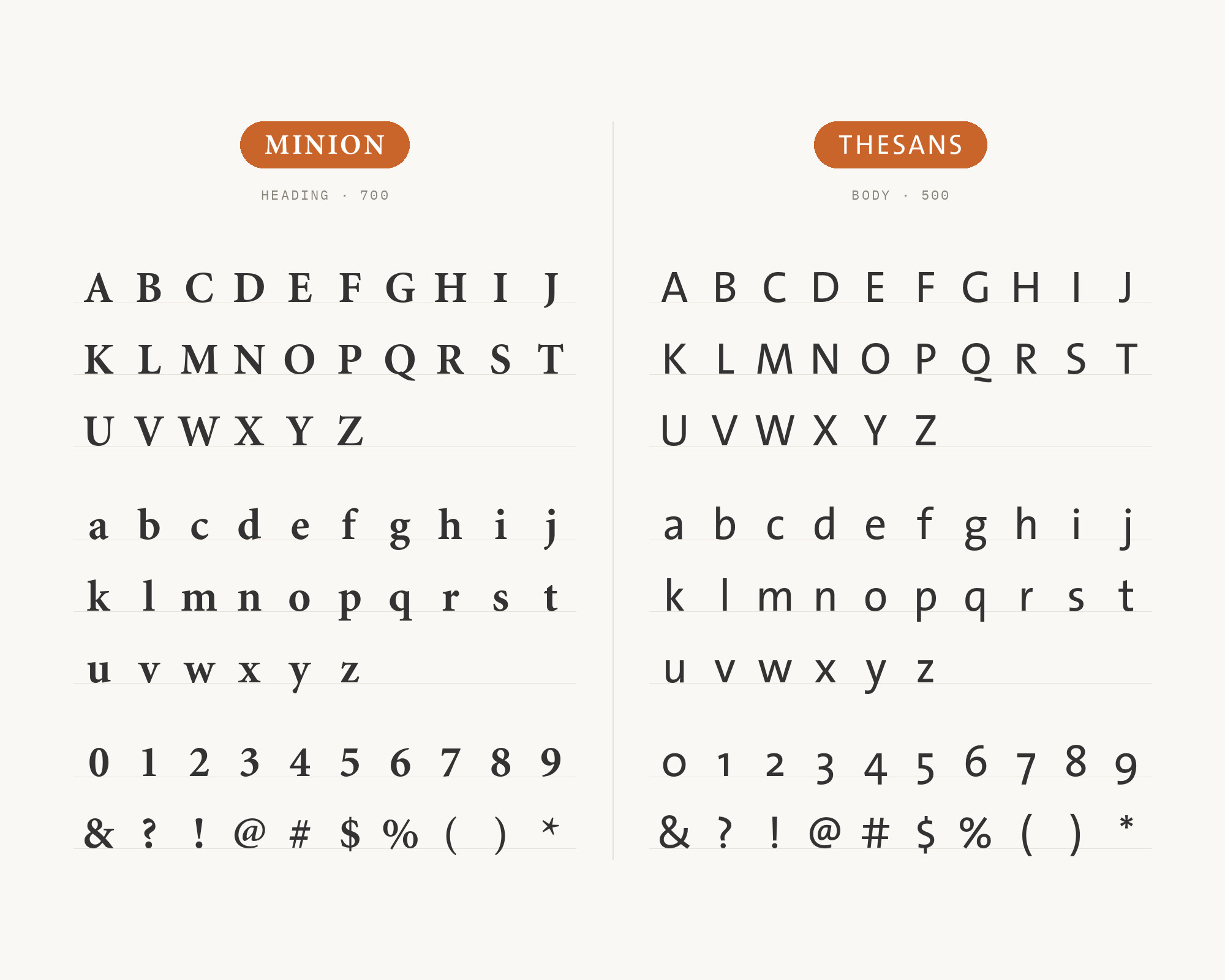
TheSans belongs to Lucas de Groot’s Thesis superfamily, developed between 1994 and 1999 and originally released through FontFont before de Groot began selling it through his own foundry, LucasFonts, in 2000. Type expert Dan Rhatigan singles out this exact pairing — Minion 3 with TheSans — because both are large, engineered type systems built to handle demanding, complex documents rather than a single display use. TheSans’s soft-cornered humanist forms and unusually wide weight range give Minion a sans partner sophisticated enough to match its own range of optical sizes, which matters most on projects that need both faces to scale cleanly from captions up to display.
14. Myriad
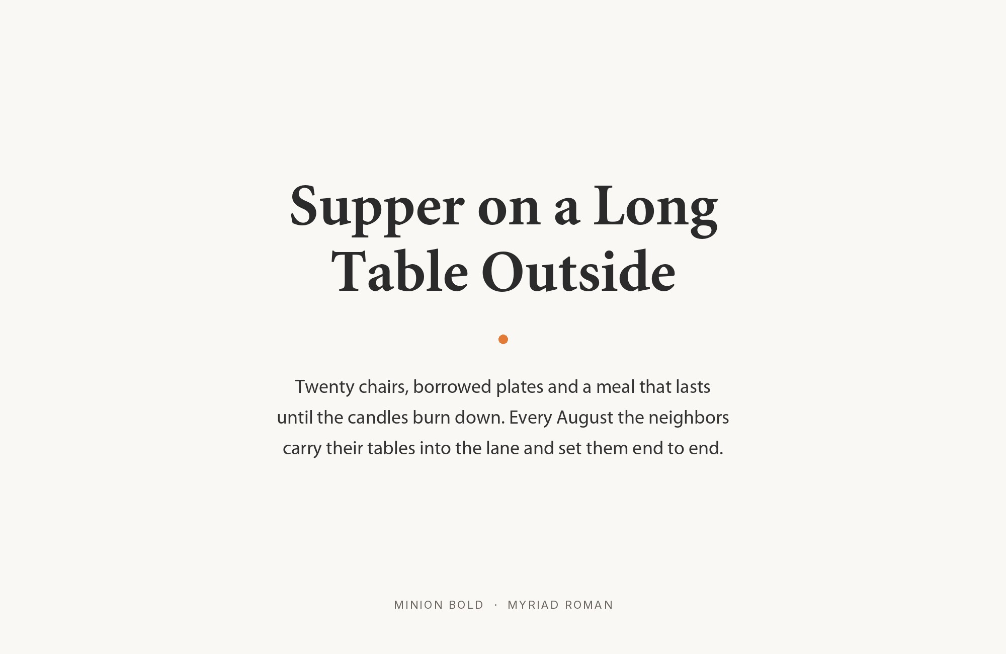
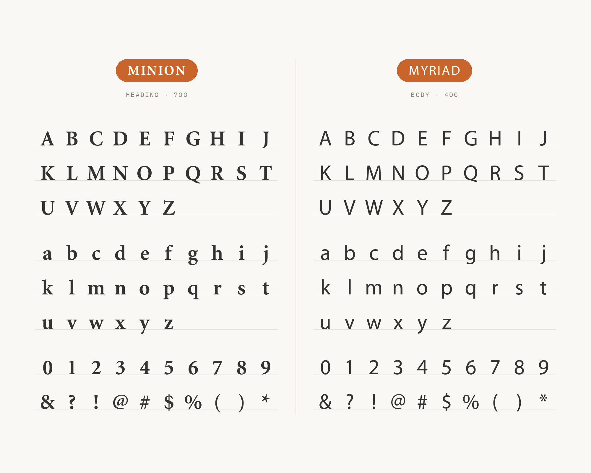
Myriad was designed by Robert Slimbach and Carol Twombly and released by Adobe in 1992, the same year as Minion MM, and not by coincidence. The two were built together as Adobe’s first pair of multiple-master text faces, designed from the outset to share a working relationship rather than being paired after the fact; Adobe’s own Typekit Blog calls Myriad MM Minion MM’s “sans text companion.” Myriad’s humanist, slightly warm sans forms echo the pen-based construction under Minion’s serifs, which is why the combination keeps reappearing decades later as the default “safe” serif/sans choice in institutional documents, including thesis-formatting guides that recommend the Minion Pro/Myriad Pro pair by name.
Conclusion
Minion rewards two different pairing instincts. The first is a functional split: a screen-tuned sans like Open Sans, Inter, or Georgia for interface chrome and navigation, while Minion’s old-style curves carry the actual reading. The second is designed kinship — Myriad, released alongside Minion MM in 1992 as its intended sans companion, or FF Scala Sans, the typeface pair of Robert Bringhurst’s own definitive modern book on typography. Between those two poles sit pairings built on shared ancestry, like Gill Sans’s calligraphic root or FF Scala Sans’s shared old-style proportions, and pairings built on plain contrast, like Trajan’s monumental capitals or Futura’s compass-drawn geometry.
The examples range from production sites and design projects to university and organizational brand guides. Start from whichever job the second typeface needs to do, whether reading, interface, or headline, and the right partner on this list follows.
Sources
- Typ.io
- Typewolf (main page + Site of the Day archive)
- Fonts In Use
- Type Network
- Adobe / Typekit Blog + minion.typekit.com microsite
- Wright State University Typography Brand Guide
- The Thesis Whisperer
- CTAN — minionpro LaTeX package + PDF docs
- Adobe Fonts (product pages)
- MyFonts
- FontPair.co
- Practical Typography (Butterick)
- Creative Bloq “20 Perfect Font Pairings”
- Mission of Hope print brand guide
- SUNY Schenectady brandbook
- Radford University graphic identity
- CNS Seguridad Integral brand manual
