Domine pairs great with Roboto, Open Sans and Nunito Sans. All 10 pairings are shown below in real rendered specimens, with the reason each one works.

What fonts go with Domine? Most of the time, a clean sans serif. Domine is a sturdy, friendly serif that was built to be read on screens, so it is happy to carry either the headline or the article. The partner just needs to take whichever job Domine is not doing, and stay out of its way.
Impallari Type designed Domine, and Google Fonts added it in November 2012. Typewolf describes it as a slab serif designed by Pablo Impallari, with teardrop terminals, that feels almost like a cross between Clarendon and ITC Clearface. Its own description says it was designed, tested and optimized for body text on the web, and that it shines at 14 and 16 px. It borrows classic elements from Clarendon, Century, Cheltenham and Clearface. Look at the details and you see why it reads so well on screens: the rounded letters are a bit squarish on the inside, which opens up the counters, and the serifs are a bit shorter than usual, which leaves more air between letters. The Google Fonts version is a variable font with a weight axis from 400 to 700. Domine has no italic.
That missing italic shapes the pairing. Oliver Schöndorfer of Pimp my Type points out that the Bold is a bit too light to stand out among the Regular, so emphasis inside Domine paragraphs is weak. A partner can fix that. Use a sans serif with a real weight range for headings, labels and emphasis, or flip it: let Domine own the headline and give the paragraphs to a sans with italics. The evidence below includes a documented email-marketing article, live websites, a typography consultant’s review and several named pairing guides. Here are 10 fonts that pair with Domine.
1. Roboto
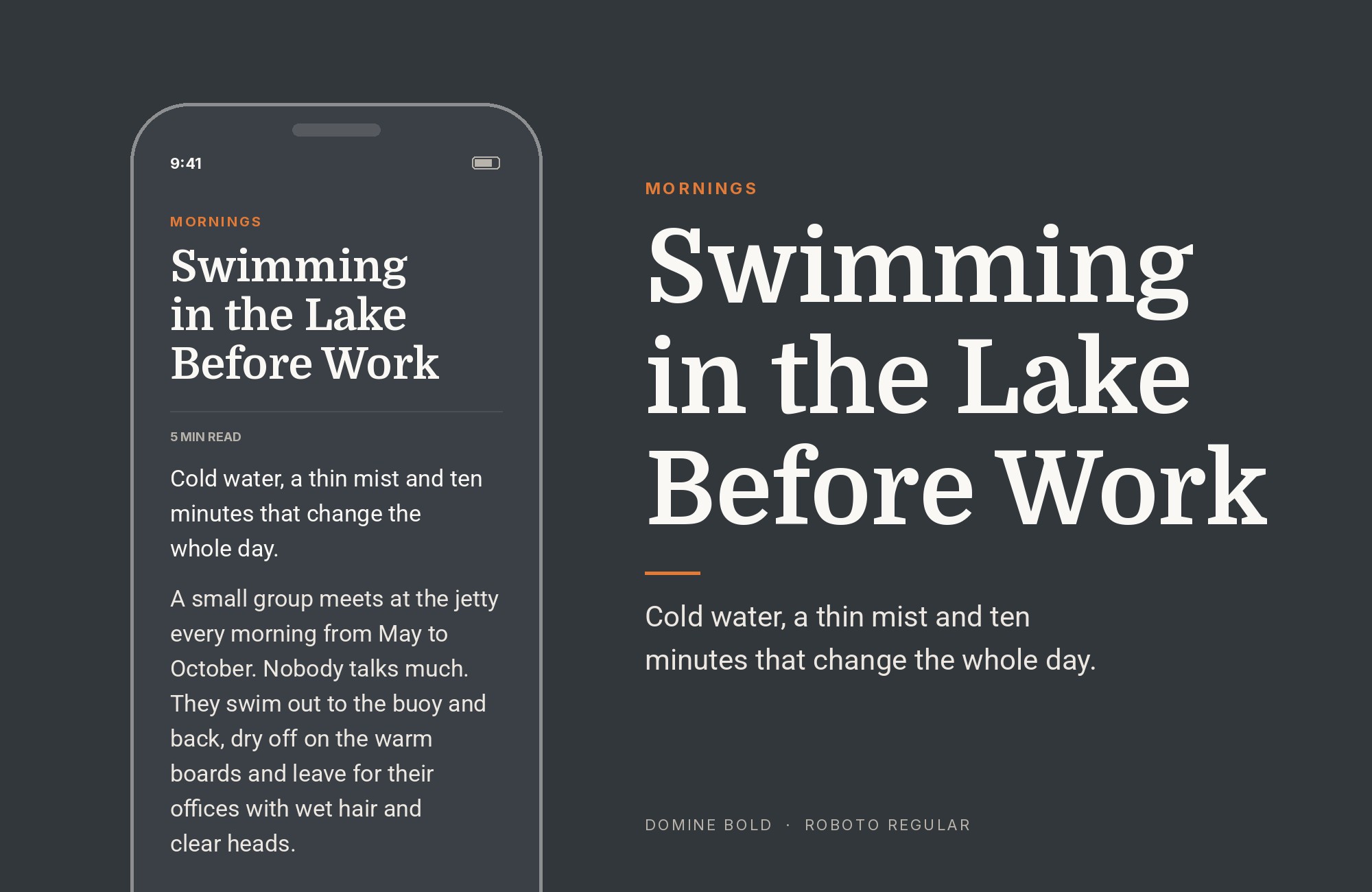
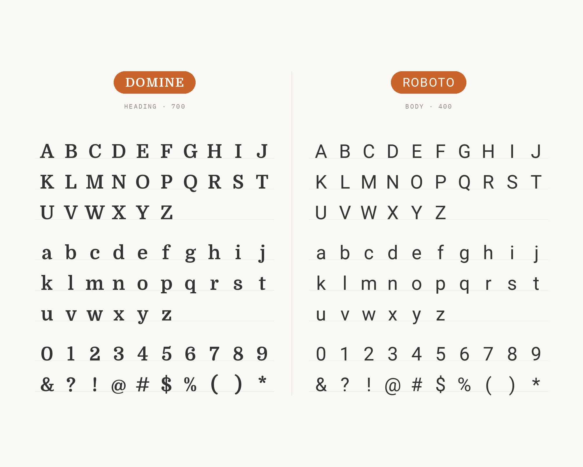
Fonts In Use documents Domine and Roboto in Campaign Monitor’s 2018 Predictions, where the typography was inspired by traditional editorial. That is the classic split. Domine brings the editorial, newspaper-like voice, and Roboto brings a neutral, modern texture that handles captions, bylines, navigation and pull-outs. Google Fonts credits Roboto to Christian Robertson, ParaType and Font Bureau, and its own description says it has a mechanical skeleton with largely geometric forms. That mechanical frame sits nicely next to Domine’s Clarendon-style slabs; both feel sturdy, but one is clearly a serif and the other clearly a sans. Use Domine for headlines and article text, Roboto for everything around the article. Add Roboto Italic whenever Domine would need one.
Webflow. Framer. Squarespace. Wix. Lovable. Not your future.
Your own AI CMS agent is.
Find Out More2. Open Sans
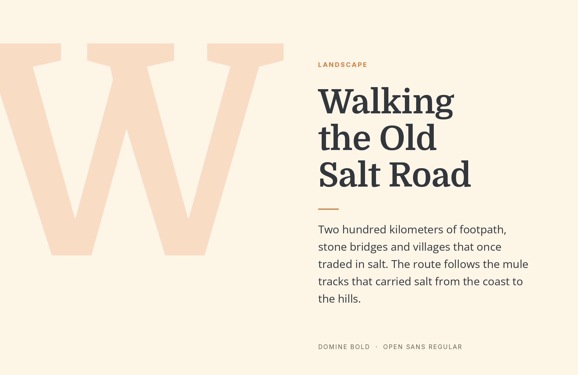
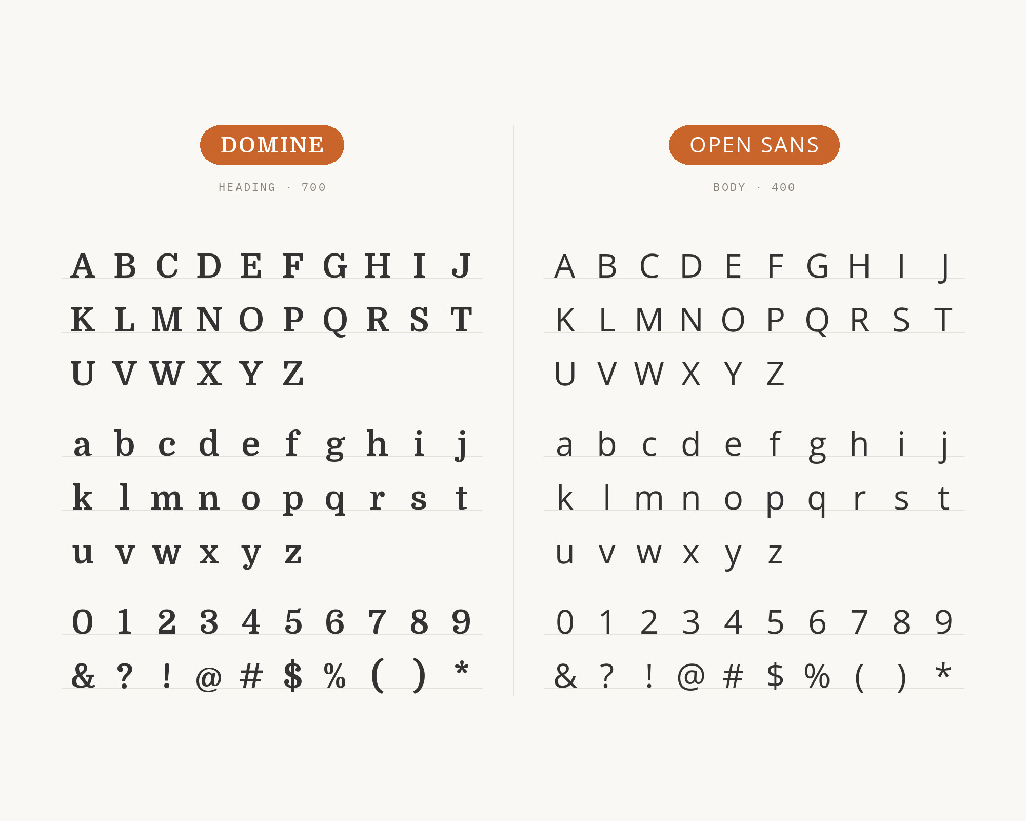
Figma’s Google Font pairings page lists Open Sans + Domine as a pairing. Vev’s guide to font combinations also recommends Open Sans with Domine, and notes that Domine was designed, tested and optimized for body text on the web. Open Sans is a humanist sans serif designed by Steve Matteson. It is open, friendly and very neutral, which makes it a practical match for Domine. Set Domine for headings or for long articles, and use Open Sans for menus, buttons, forms and small text. Because both faces were made for screens, they hold up well at small sizes. It is a safe pairing, and on content-heavy sites safe is often exactly right.
3. Nunito Sans
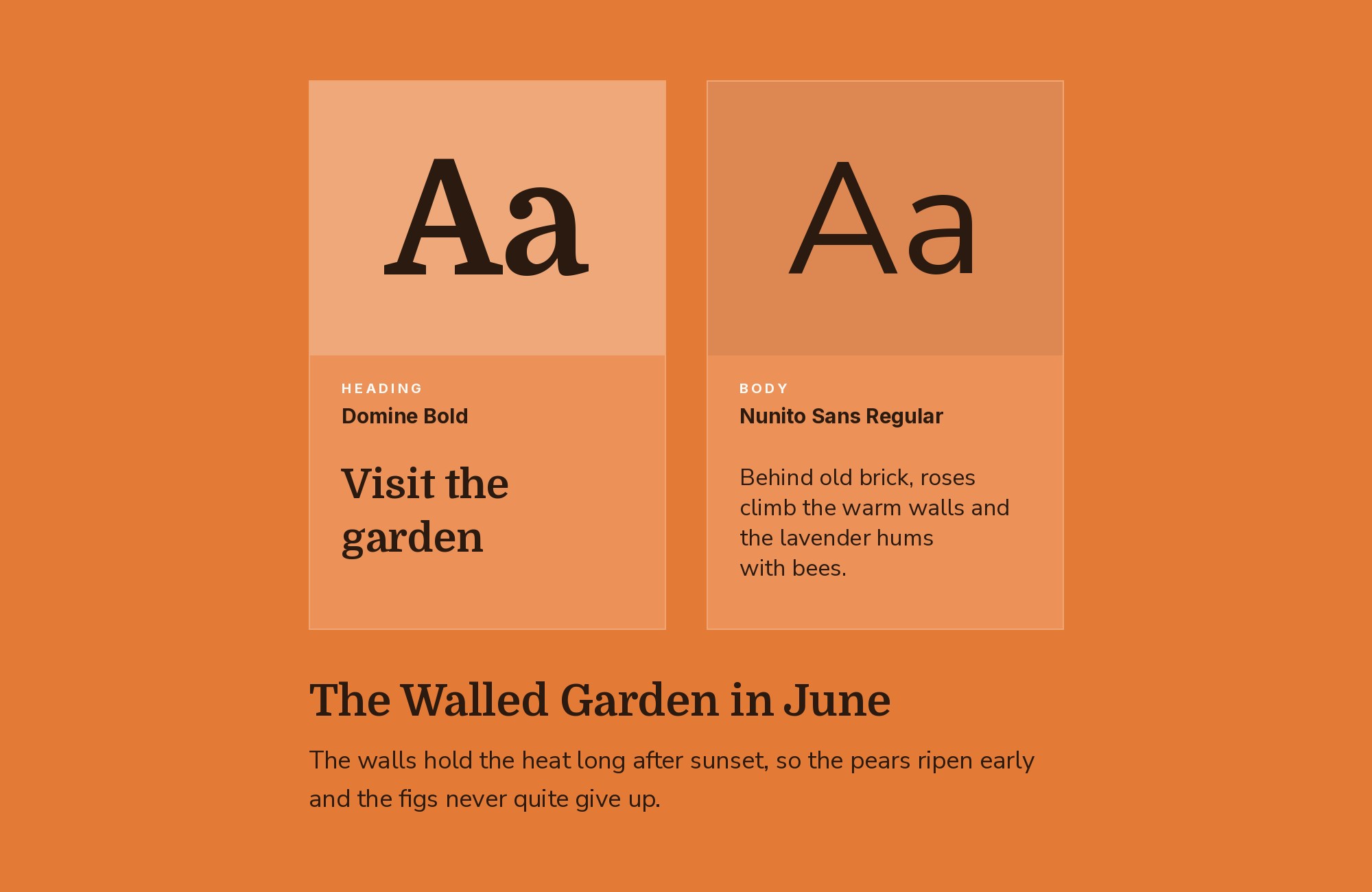
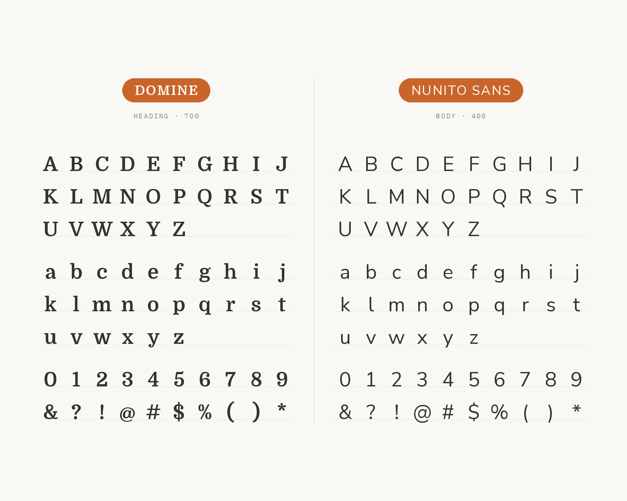
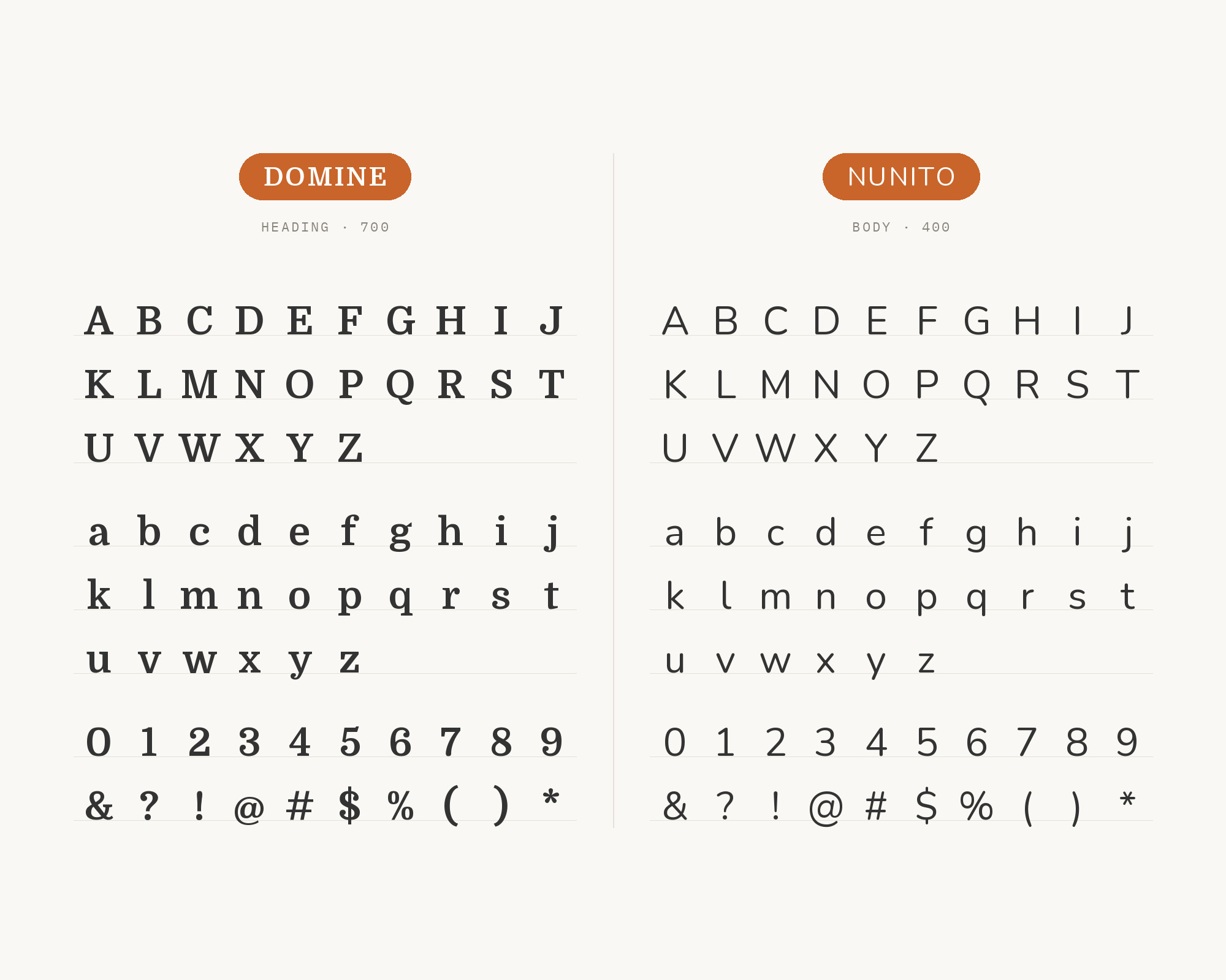
MaxiBestOf records Domine with Nunito Sans on the website Nana, together with the script font Bison. Nunito Sans is the regular, non-rounded terminal version of Nunito, extended by Jacques Le Bailly. It has a clean, slightly soft geometric feel. That softness matches Domine’s friendly curves, like the lowercase a, so the page feels consistent. Domine adds weight and warmth; Nunito Sans adds a light, open sans texture. Use Domine for headings and Nunito Sans for body and interface text, or keep Domine for article text and use Nunito Sans for everything around it. The Nunito Sans variable font also gives you widths and optical sizes if you need to tune the texture.
4. Maven Pro
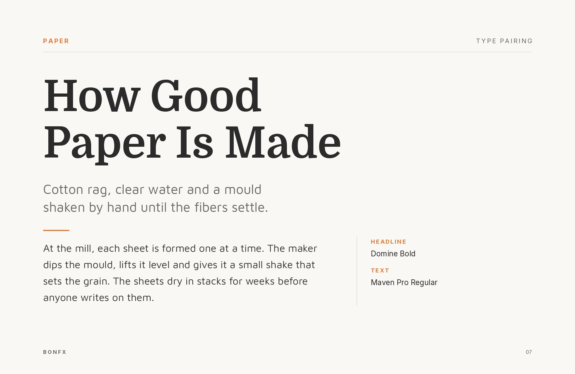
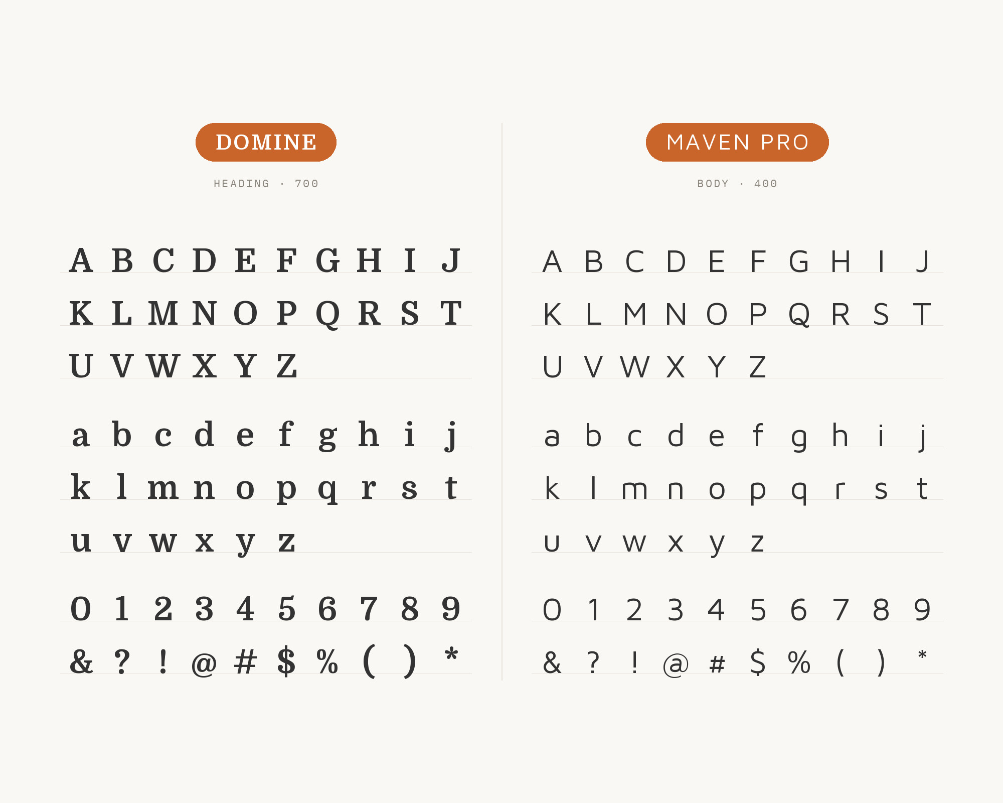
Oliver Schöndorfer’s Pimp my Type review of Domine suggests Maven Pro for headings, copy and UI text. Google Fonts credits Maven Pro to Joe Prince, and its own description calls it a sans-serif typeface with unique curvature and flowing rhythm. Those curves are the reason this works. Domine’s soft ball terminals and playful curves meet Maven Pro’s rounded, slightly squarish sans forms, so the two share a friendly mood while still giving you a clear serif and sans contrast. Use Maven Pro for headings, navigation and buttons, and Domine for the reading. Or reverse it, with a Domine headline over Maven Pro text. Either direction works well for small businesses, blogs and community sites.
5. Poppins
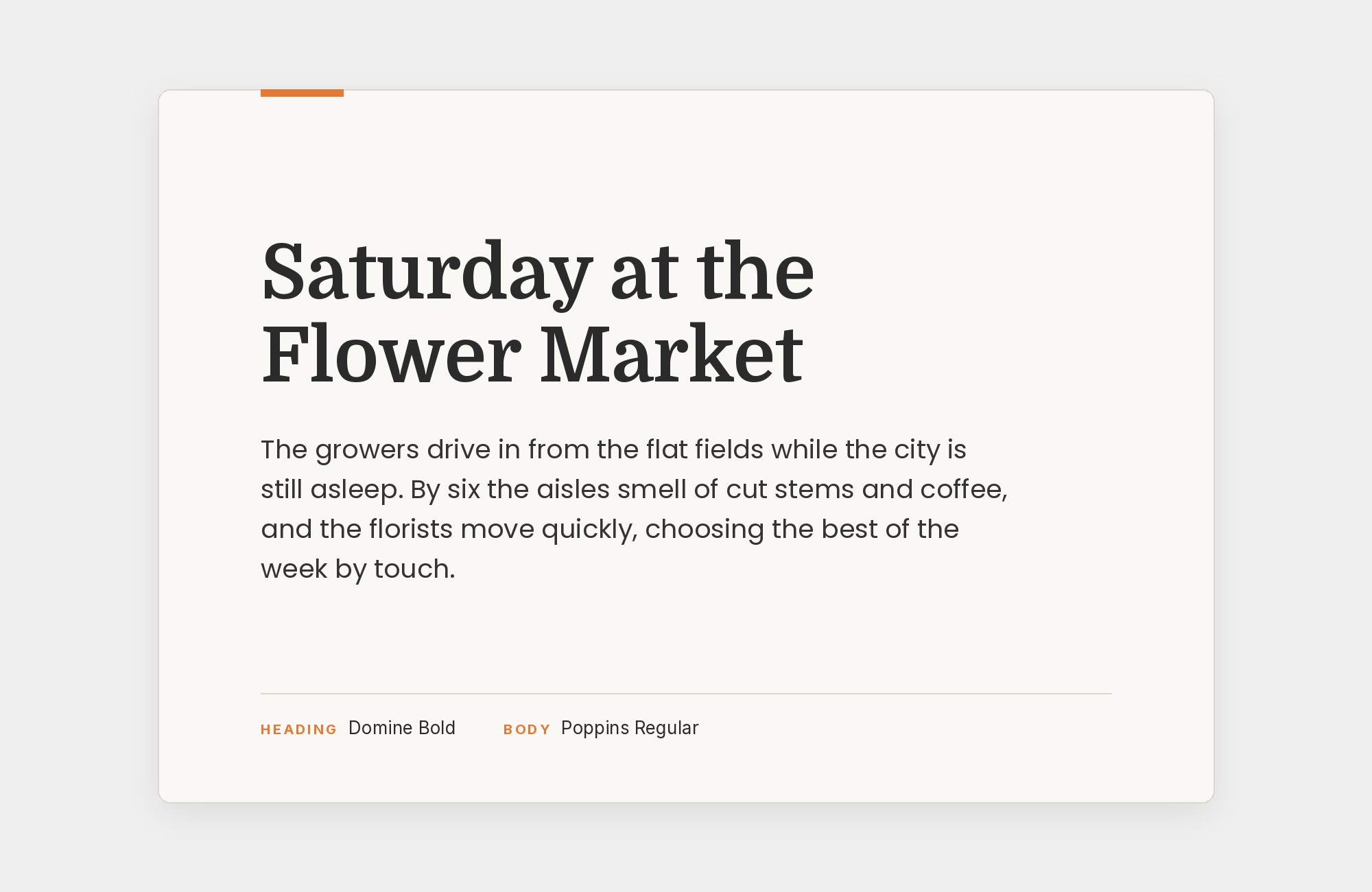
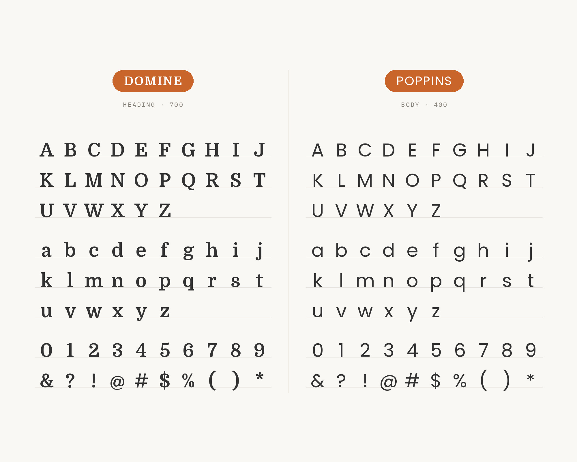
One Page Love features the landing page for Brutask, a simple task manager for small teams, and lists its typefaces as Domine and Poppins. The listing was published on 18 Dec 2020. Poppins is a geometric sans serif. Indian Type Foundry developed it, and Jonny Pinhorn initially designed the Latin. Its letters are nearly monolinear, and the Latin x-height is set rather high. That gives you a clean contrast. Domine’s sturdy slabs and soft terminals carry the personality, and Poppins’ round, even strokes keep everything around them calm and modern. Use Domine for headlines and section titles, and Poppins for paragraphs, buttons and labels. The ITF studio team later expanded Poppins to multiple weights and italics, so it can handle the emphasis that Domine lacks. Poppins’ wide, round letters take up more room than you expect, so keep its lines short and its weight light in running text. It suits startups, apps and product landing pages.
“AI builds anything, so what do I sell?”
Taste is the answer. Own your stack and automate your own CMS.
Find Out How6. Chonburi
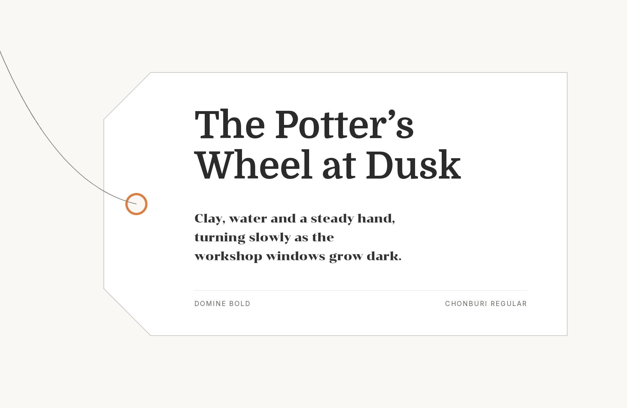
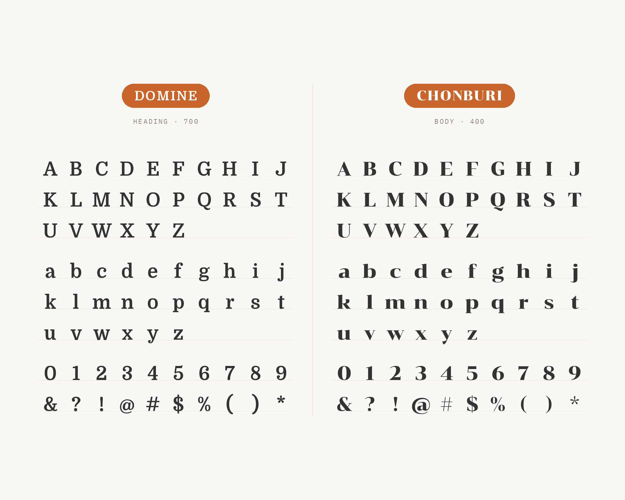
Figma’s list of 39 font pairings includes Chonburi + Domine. It suggests Chonburi for headlines and subheadings and Domine for long-form reading. Cadson Demak, a type foundry in Thailand, leads the Chonburi project, and its own description calls it a display typeface with a formal looped and serif design. This pairing keeps you in serif territory, so the contrast comes from style and weight. Chonburi is heavy, high-contrast and a bit retro, so it grabs attention in a big headline. Domine is calmer and made for paragraphs. Use Chonburi only at display sizes and only for short lines. It suits news sites, magazines and publications that want a bit of personality at the top of the page.
7. Inter
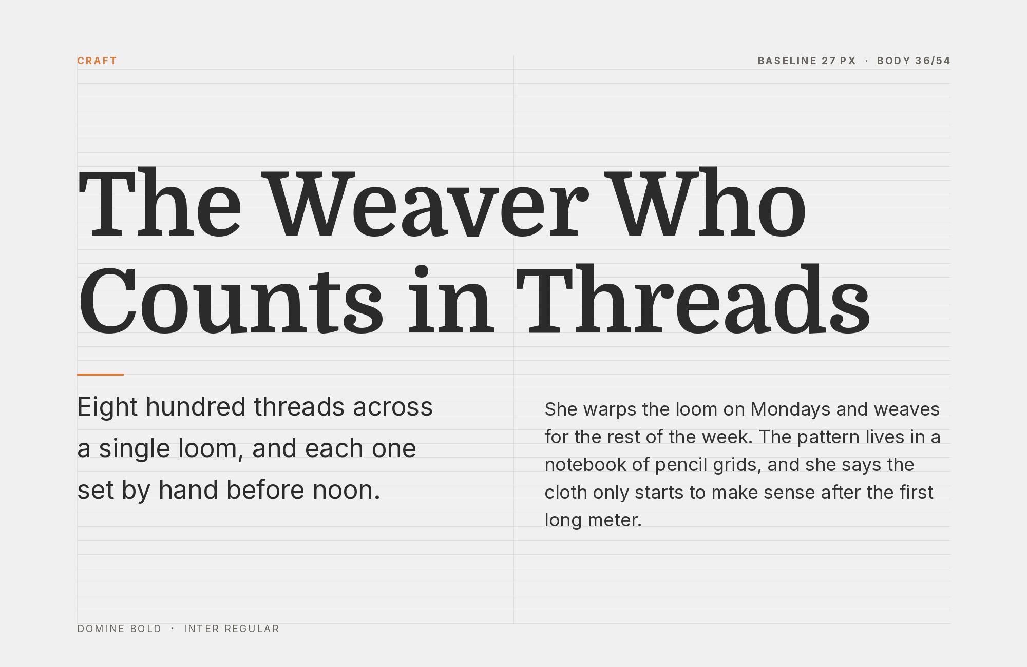
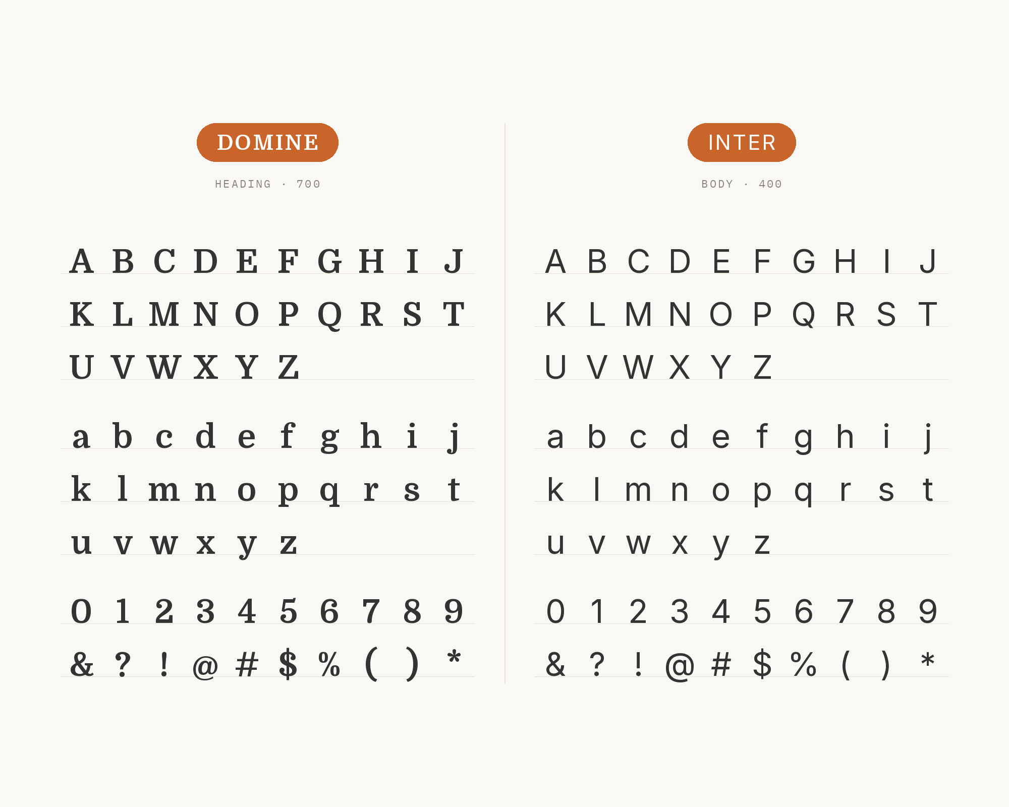
Elegant Themes’ guide to Divi fonts lists Domine among the fonts to combine with Inter. Jukebox Print’s Domine specimen page also shows the two together. Rasmus Andersson leads the Inter project, and Inter features a tall x-height to aid readability. Inter is the modern interface workhorse, so this pairing is ideal for product sites, documentation and apps with a blog. Inter handles menus, buttons, labels and dense UI text, and Domine gives articles and headlines a warmer, more editorial voice. Let Inter handle the emphasis that Domine’s paragraphs lack. Keep the two in separate jobs and the page will feel both friendly and efficient.
8. Work Sans
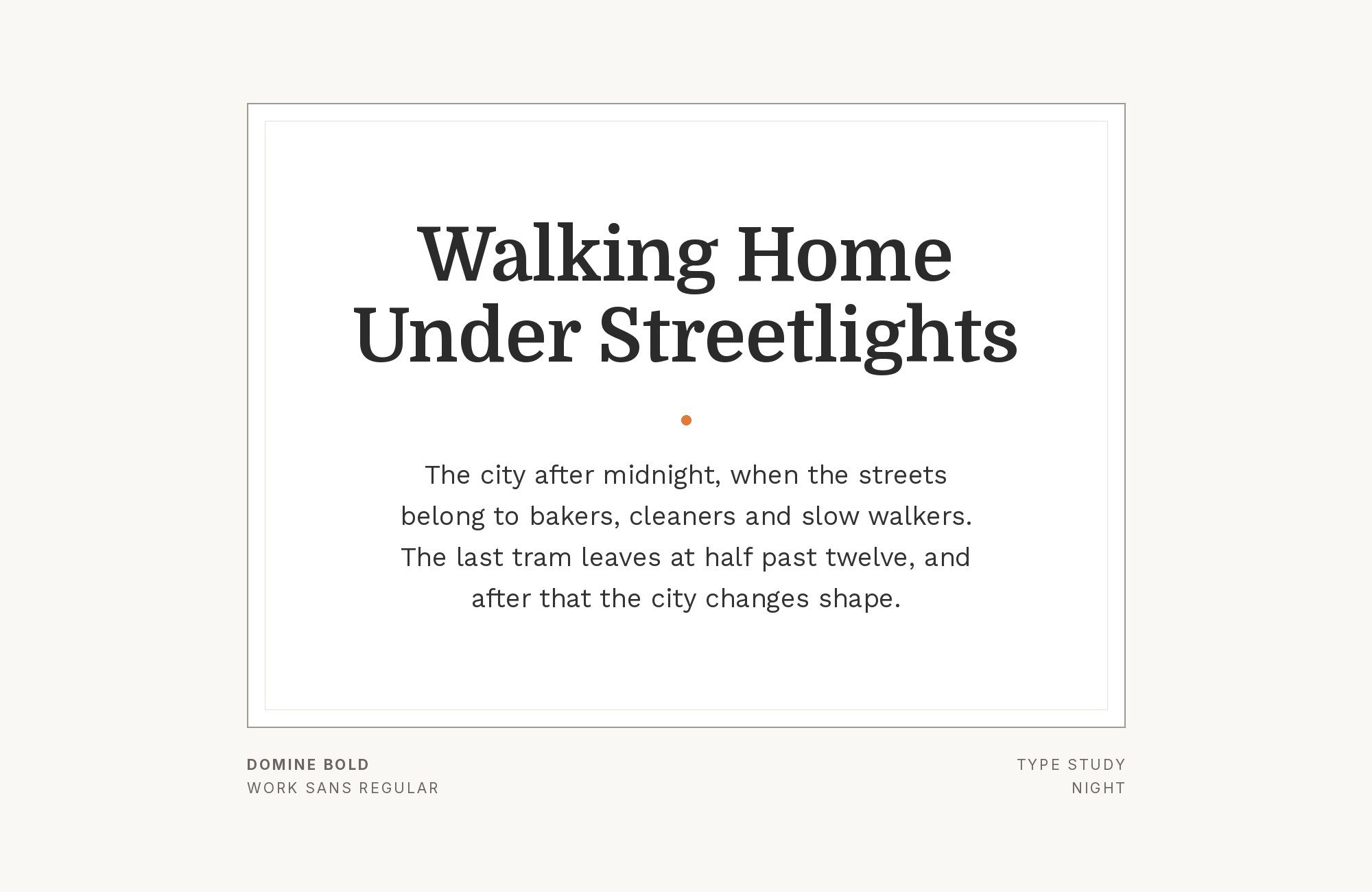
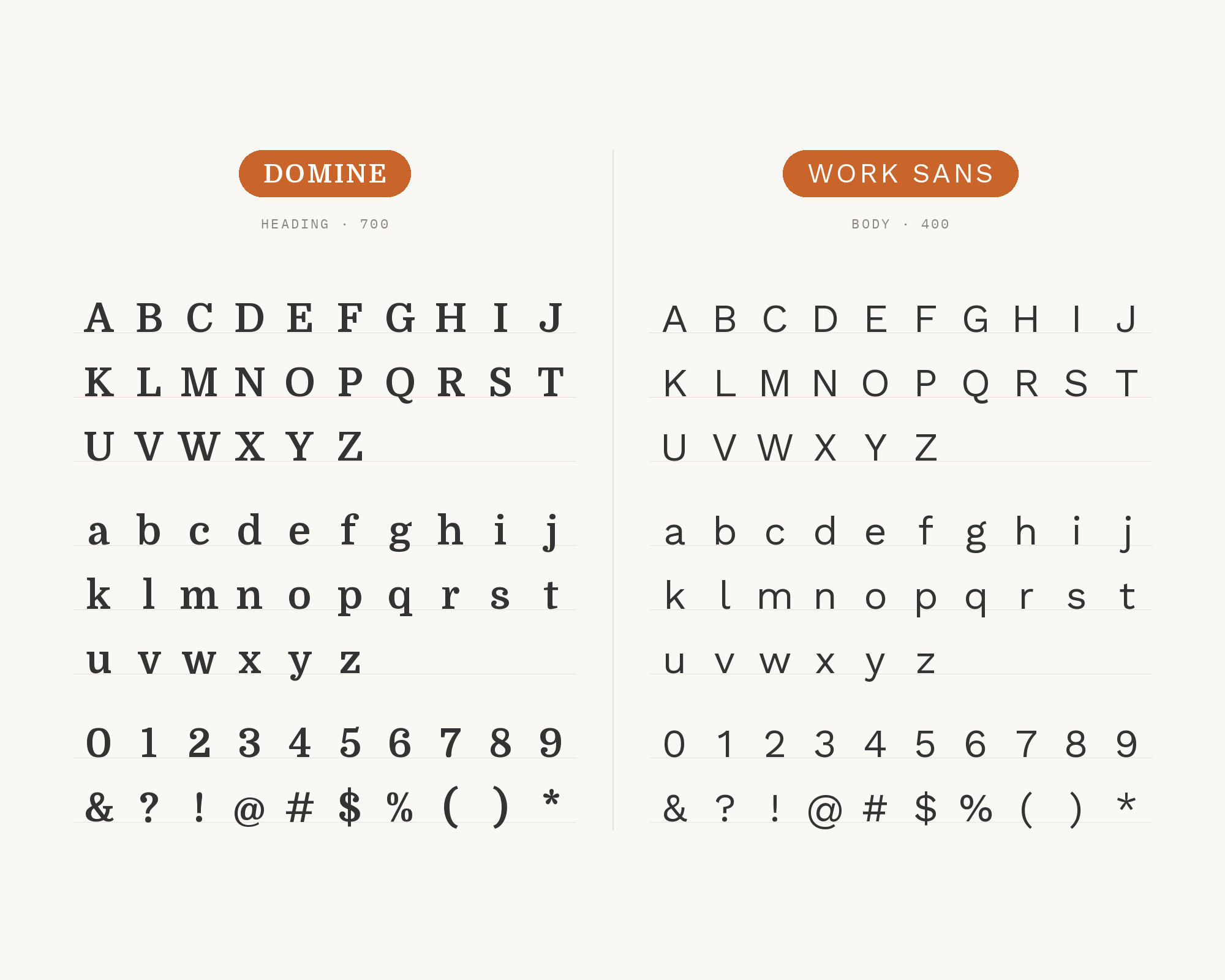
Fluxes’ guide to font pairings for blogs pairs Domine with Work Sans. It calls Domine a sturdy, screen-friendly serif for long articles, with Work Sans for footnotes, captions and pull quotes. Wei Huang designed Work Sans, loosely based on early grotesques, and its middle weights are optimised for on-screen text at medium sizes. That gives it a slightly old-fashioned sans flavor that sits well with Domine’s Clarendon and Clearface roots. Use Domine for the essay itself and Work Sans for the supporting material around it. The result feels like a thoughtful, well-edited blog rather than a generic template.
9. Montserrat
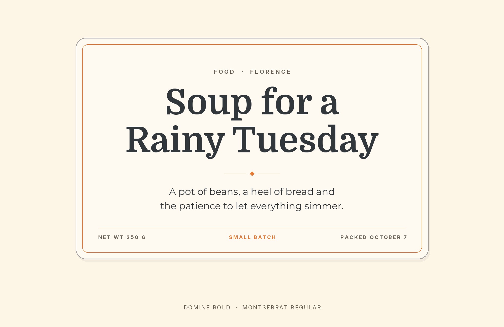
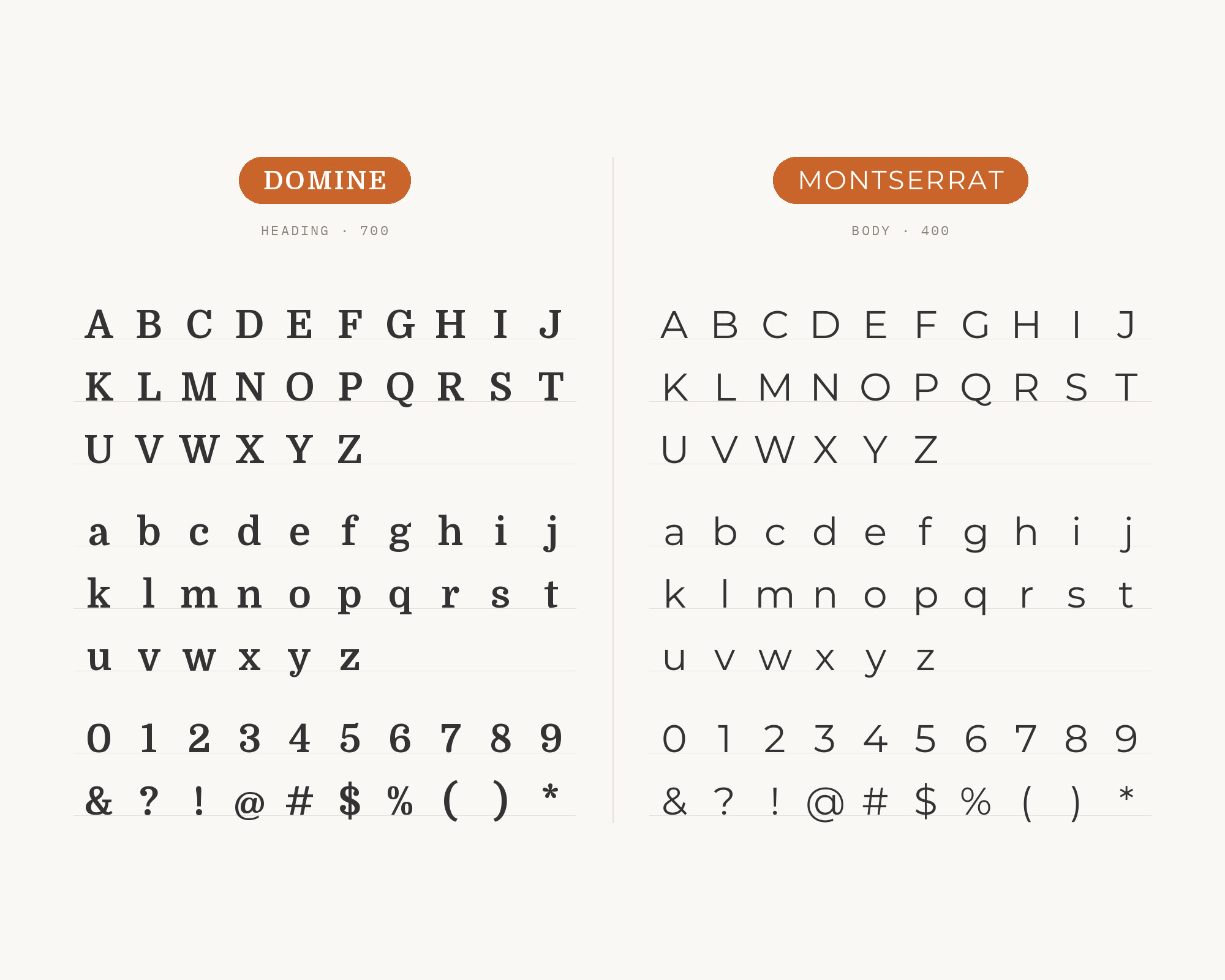
Design Bombs’ list of the best Google fonts recommends Domine for headings and notes that it pairs well with Montserrat. Julieta Ulanovsky designed Montserrat, inspired by old posters and signs in the Montserrat neighborhood of Buenos Aires. Montserrat is wide and geometric, with a strong, even texture. Next to Domine, it brings a modern urban feel. One good setup is a Domine headline with Montserrat subheads and labels in uppercase. Another is the reverse: bold Montserrat headings with Domine body text, which reads comfortably at normal sizes. Keep the weights clearly different so the two do not fight for attention.
10. Nunito
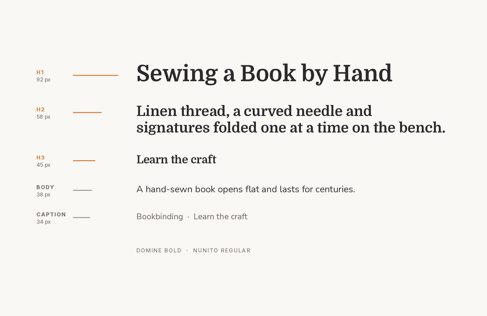
The same Elegant Themes guide lists Domine among the fonts to combine with Nunito. Vernon Adams created Nunito as a rounded terminal sans serif for display typography. The rounded ends make Nunito very soft and friendly, which suits Domine’s own gentle curves. This is the warmest pairing on the list. Try Nunito for headings, buttons and short callouts, and Domine for the text. It works well for education, kids’ content, nonprofits and lifestyle brands. If the rounded ends feel too playful, switch to Nunito Sans (see above), which keeps the same structure with regular terminals.
Conclusion
Domine is a text serif first, so every pairing here gives it a sans serif partner or a louder display face. The documented use points to a neutral sans: Roboto in the Campaign Monitor article, Nunito Sans on a live site. Pairing guides add more sans serif options. Oliver Schöndorfer adds Maven Pro, and Figma adds Chonburi for a bolder serif headline.
A quick way to choose: for content sites, Open Sans or Roboto; for product and UI, Inter; for a warm, friendly brand, Nunito or Maven Pro; for a clean startup or app landing page, Poppins. Since Domine has no italic, pick a partner that can handle emphasis, and test your body text at the real size you will publish, around 16 px, where Domine looks its best.
