Noto Serif pairs great with Noto Sans, Open Sans and Lora. All 15 pairings are shown below in real rendered specimens, with the reason each one works.
What fonts go with Noto Serif? The honest first answer is the face it was drawn next to — Noto Sans — but live sites and pairing lists do not stop there, and the useful question is which sans, or which display voice, should take the job Noto Serif is too even and too text-tuned to do alone.
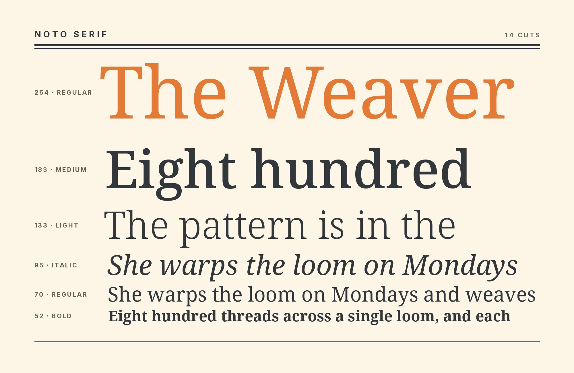
Steve Matteson designed Noto Serif for Google as the Latin, Greek and Cyrillic serif of the larger Noto project, whose name is a contraction of “no tofu” — the blank boxes that appear when a font lacks a glyph. The family launched in the early 2010s, based on his earlier Droid Serif, as a transitional serif with moderate contrast, a comfortable x-height and enough modulation to read as editorial rather than as a slab. Noto’s brief is coverage and harmony: the same stroke weight and apparent size across scripts, so a multilingual product does not change type systems mid-page. The Latin cut is now a variable family with a full weight range and italics, licensed under the SIL Open Font License.
That construction makes Noto Serif a text face first. It will carry articles, documentation and body copy without fuss, and it will not give you drama at poster size the way a Didone or a condensed gothic will. Partners therefore fall into two jobs. The designed job is the family companion: Noto Sans. The other job is everything Noto Serif withholds — geometric display, quiet UI grotesques, or a second serif with more calligraphic heat. Here are 15 fonts that pair with Noto Serif.
1. Noto Sans

Matteson also drew Noto Sans, the humanist-leaning grotesque branch of the same superfamily. The larger Noto project covers on the order of a thousand languages and more than a hundred and sixty writing systems so fewer scripts render as tofu. Typ.io lists Noto Sans among the fonts Noto Serif “goes well with” and records the pair live on playnedesign.co.uk. That is the pairing the metrics were built for. Vertical proportions, stroke weight and overall color already agree, so serif paragraphs and sans labels, navigation and captions sit at the same apparent size without a correction table. Use Noto Serif for anything meant to be read as prose — articles, about pages, long captions — and Noto Sans for the interface around it. On a multilingual product this is not a style choice so much as infrastructure: adding a second, unrelated sans would mean maintaining two coverage stories. If the brand needs more personality than Noto Sans will give, keep Noto Serif for the reading and borrow the display voice from somewhere else on this list, rather than replacing the sans companion.

Try Semrush free. No credit card.
Start on the $0 plan. Paid plans from $117/mo billed annually.
Try for free2. Open Sans

Steve Matteson designed Open Sans for Google in 2011 as a humanist sans with a large x-height, upright stress and open apertures aimed at small-size screen reading — the same designer, a related brief, a different family. Typ.io records Open Sans with Noto Serif (and Lora) on bucketlistly.com, a travel-editorial site, which is evidence of use rather than of an argument; the argument is the x-height. Open Sans and Noto Serif hold the same apparent size at the same CSS pixels, so a mixed interface does not need per-element optical correction. Let Noto Serif carry the reading and Open Sans take navigation, buttons, forms and metadata. Compared with Noto Sans, Open Sans is the more familiar web default, slightly friendlier in the rounds, and already in half the stacks a client will hand you. It is the low-risk partner when Noto coverage is not required and you want a humanist sans that will not fight the serif on size or color.

3. Lora

The Cyreal studio designed Lora, added to Google Fonts in 2011, as a contemporary serif with roots in calligraphy, brushed curves and moderate contrast. Typ.io records it on the same bucketlistly.com sample as Open Sans, sitting beside Noto Serif as a second serif rather than as a sans. That is a legitimate split if you keep the jobs distinct. Lora’s calligraphic finish and slightly more decorative serifs take display, pull quotes, section openers and any line that should feel written rather than typeset. Noto Serif’s more even, transitional text color takes the paragraphs, where Lora’s brush heritage would tire over a thousand words. Do not set them at the same size in the same role; the contrast is in stress and terminal shape, which only registers when one face is clearly the headline. Lifestyle, travel and publishing sites are the natural home. If you already have Open Sans in the chrome, this becomes a three-font system — Lora display, Noto Serif reading, Open Sans UI — which is exactly the combination Typ.io captured live.

4. Bebas Neue

Ryoichi Tsunekawa designed Bebas Neue as a display family suitable for headlines, captions and packaging, based on the original Bebas typeface; it reached Google Fonts in 2019. Typ.io records it with Noto Serif on bizzgrid.com. The pairing logic is width and case. Bebas is tall, narrow and locked to capitals, so it behaves like a masthead or a wayfinding voice beside Noto Serif’s modulated, lowercase-friendly text serif. Nothing else on this list separates the roles so bluntly. Use Bebas for kickers, event names, category labels and hero statements set large; keep Noto Serif for every sentence. At smaller sizes, drop Bebas tracking slightly so the condensed rhythm does not pinch, and never let it near body copy. The combination suits media, events, sports-adjacent editorial and any brand that wants a poster shout over a literate reading face. If Bebas feels too loud for the institution, Montserrat (below) is the geometric display alternative that still leaves Noto Serif the paragraphs.

Junior work is now a prompt. The biggest profit center in your studio is vanishing.
How to fix this?
Find Out How5. Inter

Rasmus Andersson designed Inter in 2017 as a variable grotesque whose only real assignment is UI legibility at small sizes: tall x-height, open apertures, near-mechanical forms that recede on a dashboard. FontPairings presents a worked Inter + Noto Serif specimen, and Jukebox corroborates the pair. Noto Serif supplies editorial color — the sense that someone typeset a page rather than a settings panel. Inter supplies the chrome: buttons, tables, navigation, captions, code-adjacent labels. Promote Noto Serif into headlines when you want the serif to be the brand, or keep it in the body and let Inter take titles if the product should feel like software first. The x-heights are close; you will not spend a sprint matching sizes. This is the default pairing for a documentation site, a SaaS marketing-plus-app system, or any product that must look literate in the reading and invisible in the UI.

6. DM Sans

Colophon Foundry designed DM Sans as a low-contrast geometric sans drawn from the Latin of Poppins, a product-UI face rather than a poster face. The Manus brand system uses DM Sans as its brand sans and Noto Serif for serif applications in Asian scripts; Jukebox also lists the pair. Noto Serif modulates: thick and thin, serifs, a transitional stress that still reads as writing. DM Sans does the opposite — even stroke, geometric bowls, open apertures that keep it from reading as cold as a true Futura. Set DM Sans for interface and short headlines, Noto Serif for articles and long captions, and the page splits into “product” and “publishing” without needing a third family. The pairing suits consumer tech, education products and brands that want a contemporary geometric sans without giving up a real text serif. Keep DM Sans’s heavier weights for display; its low contrast will look pale next to Noto Serif Bold if you match them pound for pound at the same size.

7. Roboto

Christian Robertson designed Roboto for Android as a broad system family with a mechanical skeleton and open curves. Pour Pas Un Rond shows Noto Serif + Roboto as an explicit specimen, and the pairing works because each face handles a different kind of density. Roboto takes controls, metadata, tables and compact supporting text; Noto Serif carries articles and longer explanations. Both can run through a large hierarchy, but keeping the sans in the structural layer prevents the page from becoming two competing editorial voices. Roboto is the pragmatic choice for products that already use Google’s interface ecosystem and need a serif reading layer without rebuilding every component. Use weight and spacing for hierarchy: a quiet Roboto regular under a stronger Noto Serif heading feels deliberate, while equal bold weights make the system look indecisive.

Don't start with a blank page. Shutterstock Unlimited: endless downloads of premium human-made assets plus powerful AI tools.
Sign Up8. Poppins

Indian Type Foundry designed Poppins as a geometric sans with wide circular forms and an extensive weight range. Pour Pas Un Rond includes an explicit Poppins + Noto Serif specimen. The geometry makes Poppins the brighter display voice: its broad bowls and monoline construction stand apart from Noto Serif’s narrower, modulated texture before color or size enter the discussion. Use Poppins for navigation, campaign headlines and section openers, then move into Noto Serif for reading. The pairing is friendlier than Bebas Neue and more emphatically geometric than Open Sans, which makes it useful for education, culture and consumer brands that need modern energy without a condensed shout. Keep the strongest Poppins weights short; the roundness becomes a wall quickly, while Noto Serif can carry the paragraph rhythm beneath it.

9. Montserrat

Julieta Ulanovsky designed Montserrat in 2011 from the painted lettering of the Buenos Aires neighborhood of the same name: a geometric sans with generous, wide capitals and a near-monoline stroke. Pour Pas Un Rond, a named-author roundup with specimen graphics, shows Montserrat + Noto Serif as a combination and also lists Noto Serif among title faces against Montserrat among text faces — two directions, one pairing. The structural reason is width. Montserrat’s circular bowls are considerably wider than Noto Serif’s text-tuned serif, so a Montserrat headline over Noto Serif body copy reads as deliberate hierarchy rather than as two faces at war. Use Montserrat large and often bold for titles, navigation and section openers; drop to Noto Serif for everything at reading size, where Montserrat’s geometry would grow monotonous. This is the display-sans route when Bebas Neue is too condensed and too loud. Lifestyle, education and cultural sites can run it without looking like a government template.

10. Source Sans Pro

Paul D. Hunt designed Source Sans Pro for Adobe in 2012 as the company’s first open-source family, drawing on Morris Fuller Benton’s American gothics; Google Fonts now ships the current family as Source Sans 3. Pour Pas Un Rond lists Noto Serif among recommended title faces and Source Sans Pro among recommended text faces, which is the working split: serif for display and reading titles, gothic sans for the paragraphs and chrome. Source Sans has a large x-height and open forms, so it holds body copy and interface labels under Noto Serif headlines without looking like a second serif. The reverse — Source Sans titles, Noto Serif body — is equally stable, and closer to how a documentation site actually ships. Compared with Noto Sans it is a different superfamily, so you lose the shared Noto metrics and script story but gain a distinctly American-gothic voice. Name it Source Sans Pro in conversation if that is how the source lists it, and load Source Sans 3 in production.

11. Barlow

Fonts In Use documents the Silent Hill 2 Remake interface using Noto Serif as its primary UI serif and Barlow for secondary prompts and credits. The serif establishes atmosphere and narrative weight; Barlow provides a narrower, low-contrast utility layer that remains easy to scan. Adapt the split by giving Noto Serif titles, substantial menu lines, or editorial passages and using Barlow for instructions, metadata, and labels. Keep the roles consistent rather than alternating for decoration. Barlow can sit slightly smaller and lighter without disappearing because its sans structure is so distinct. The pairing suits games, exhibitions, cultural archives, and immersive editorial projects where the main voice needs gravity but operational text must stay direct.

12. Lexend

Imperavi’s UI Typography guide explicitly demonstrates Lexend for headings with Noto Serif for body text. Lexend’s broad forms and generous internal space create a fast scanning layer above the serif’s more modulated reading texture. Use a strong Lexend weight for section titles and navigation, then let Noto Serif carry articles or longer explanations at regular weight. Their apparent sizes differ, so tune the heading and body by eye rather than sharing a scale formula blindly. The contrast remains friendly rather than formal because neither face relies on delicate hairlines. This combination works for education, accessibility-minded products, documentation, and public information where headings must be found quickly and the paragraph layer still benefits from serif rhythm.

13. Oxygen

ReliablePSD publishes Oxygen Light with Noto Serif Regular. The light sans adds a clean, restrained display voice while the serif supplies the darker texture needed for sustained reading. Keep Oxygen at headline or subhead size so its lighter strokes retain presence, then set Noto Serif at an ordinary reading weight with enough line height to establish the lower layer. Reversing the sizes can make the sans look fragile next to the serif. The pairing is useful for portfolios, reports, and editorial sites that want modern headings without the broad geometry of Montserrat or Poppins. It also works well in monochrome layouts, where the difference in stroke modulation remains visible without relying on color.

14. Cabin

FastRope’s brand guide assigns Cabin to H2 and Noto Serif to body text, explicitly describing the serif as a partner for the heading system. Cabin’s humanist construction makes a softer bridge into Noto Serif than a rigid geometric sans would. Use Cabin for section headings, decks, and navigation, then give Noto Serif the press release, article, or long-form passage. Their upright proportions feel compatible, while the serif modulation still produces an unmistakable category change. A medium Cabin heading over regular Noto Serif usually creates enough contrast without excessive weight. This pairing suits institutions, nonprofits, and content-heavy brands that want approachable headings and a dependable multilingual reading face.

15. Work Sans

The University of North Alabama assigns Noto Serif to headline and top-line communications and Work Sans to subheads and body copy. That reversal gives the serif authority at display scale while the sans carries practical detail. Keep Noto Serif large and concise, then use Work Sans through paragraphs, lists, captions, and calls to action. Work Sans has enough width and openness to stay calm beneath the modulated headline, especially at regular weight. Avoid using a heavy body weight, which would flatten the difference between the two voices. The combination fits universities, civic organizations, and reports where a grounded institutional headline needs to lead into contemporary, accessible information.

Conclusion
Noto Serif is a transitional text serif whose first loyalty is coverage and calm, not display. The strongest pairing on the evidence is still the one it was drawn for: Noto Sans, named by Typ.io and recorded on a live site, with metrics that already agree. Everything else on this list is a way of giving Noto Serif a job beside a face that does something it will not — shout (Bebas Neue, Montserrat, Poppins), recede into UI (Inter, DM Sans, Roboto, Open Sans, Source Sans Pro), or take a more calligraphic display line (Lora).
Pick the second font by the work the page still needs after the serif is set. If the product is multilingual, stop at Noto Sans. If it is a reading site with a geometric brand, Montserrat or Bebas Neue for titles. If it is software with articles attached, Inter or Roboto for the chrome. Set real copy at the sizes you intend to publish, and judge the pairing by whether Noto Serif still reads as the text face once the partner is in place. That is the role it was built to keep.
