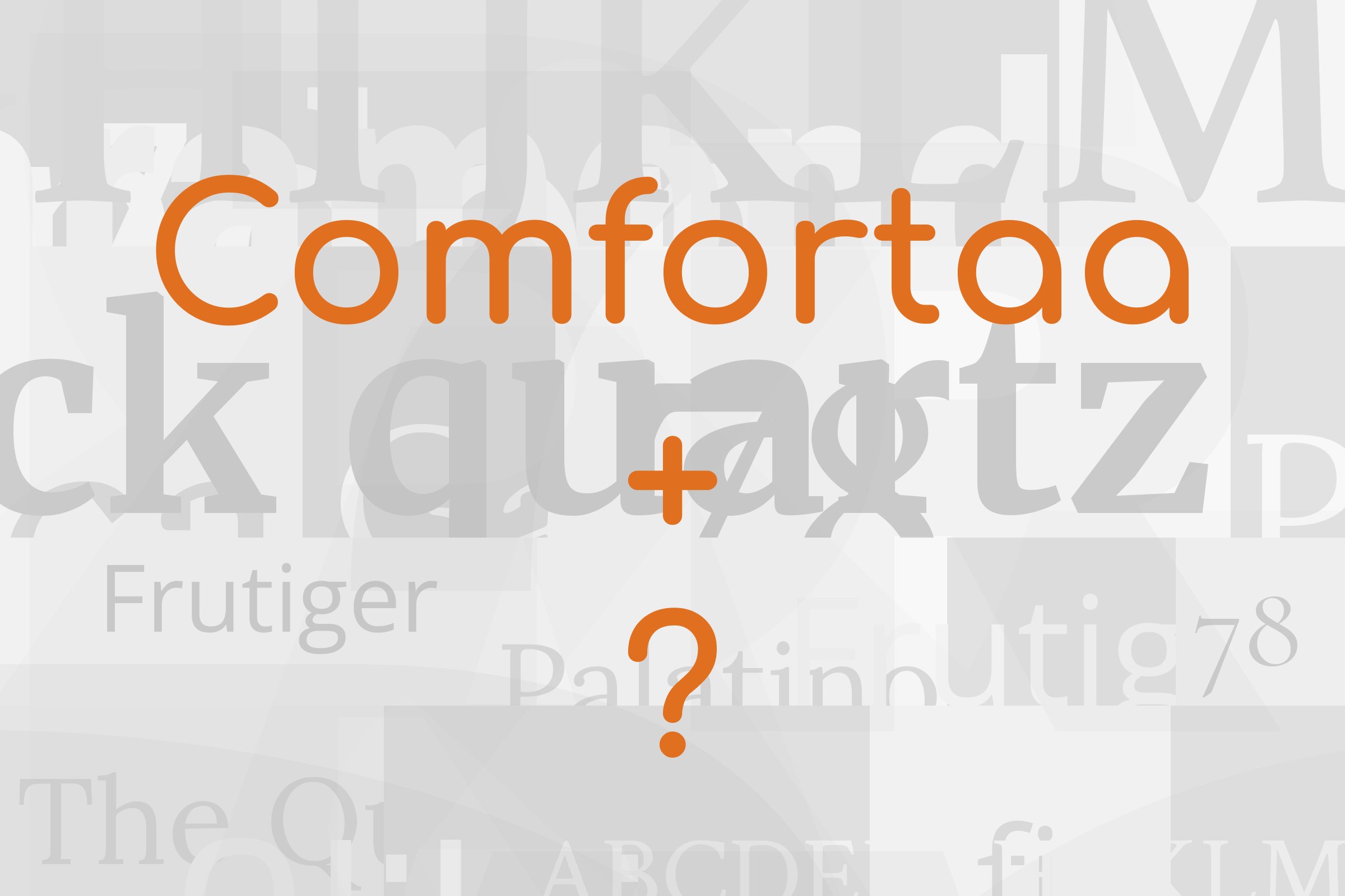
Comfortaa pairs great with Open Sans, Nunito and DM Sans. All 10 pairings are shown below in real rendered specimens, with the reason each one works.

What fonts go with Comfortaa? Start with what Comfortaa is good at. It is a friendly, perfectly round display face that looks great in a heading and gets tiring fast in a paragraph. So the partner you want is almost always the one that takes the reading work off its hands.
Johan Aakerlund designed Comfortaa, and Google Fonts added it to its library on 10 August 2011. He describes it as a rounded geometric sans-serif type design intended for large sizes, and that phrase is the whole brief. The bowls are near circles, the stroke ends are rounded off, and the letters sit wide and airy with a lot of space inside them. In 2016 Alexei Vanyashin reworked it as version 3.000, with revised spacing and larger Latin and Cyrillic character sets. The Google Fonts build ships as a variable font with a weight axis, so you can go from a thin, delicate headline to a chunky bold one without switching families. What you get is a soft geometric voice: approachable, a little playful, and very recognisable.
That recognisability is the pairing problem. Comfortaa’s wide, round letterforms are all personality, and at text sizes the circles start to blur into a pattern. The pairings with the best evidence behind them, brand guidelines written by real organisations, split the job the same way every time. Comfortaa takes titles, quotes and short callouts, and a calmer, more conventional face carries everything else. Here are 10 fonts that pair with Comfortaa.
1. Open Sans
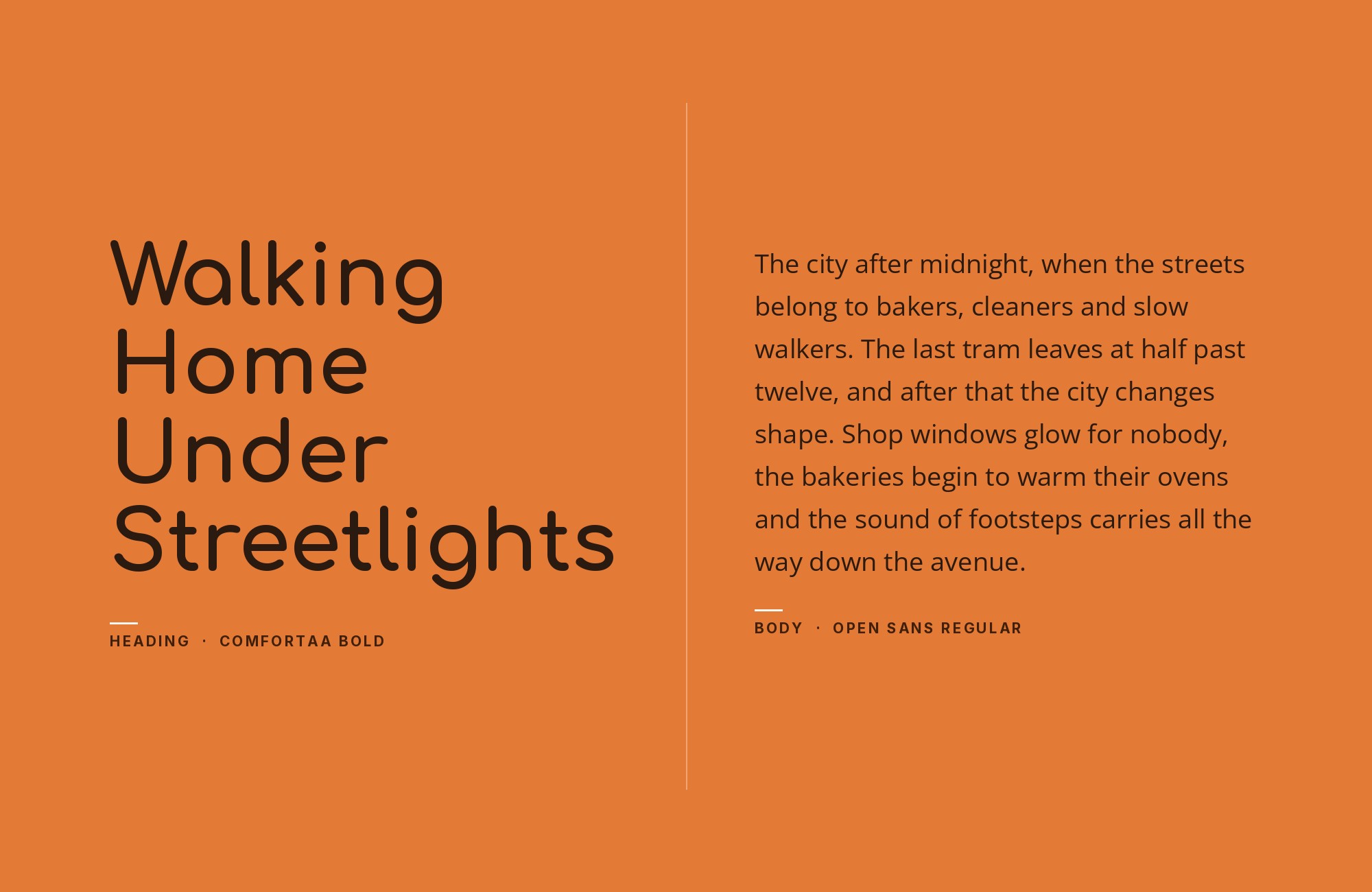
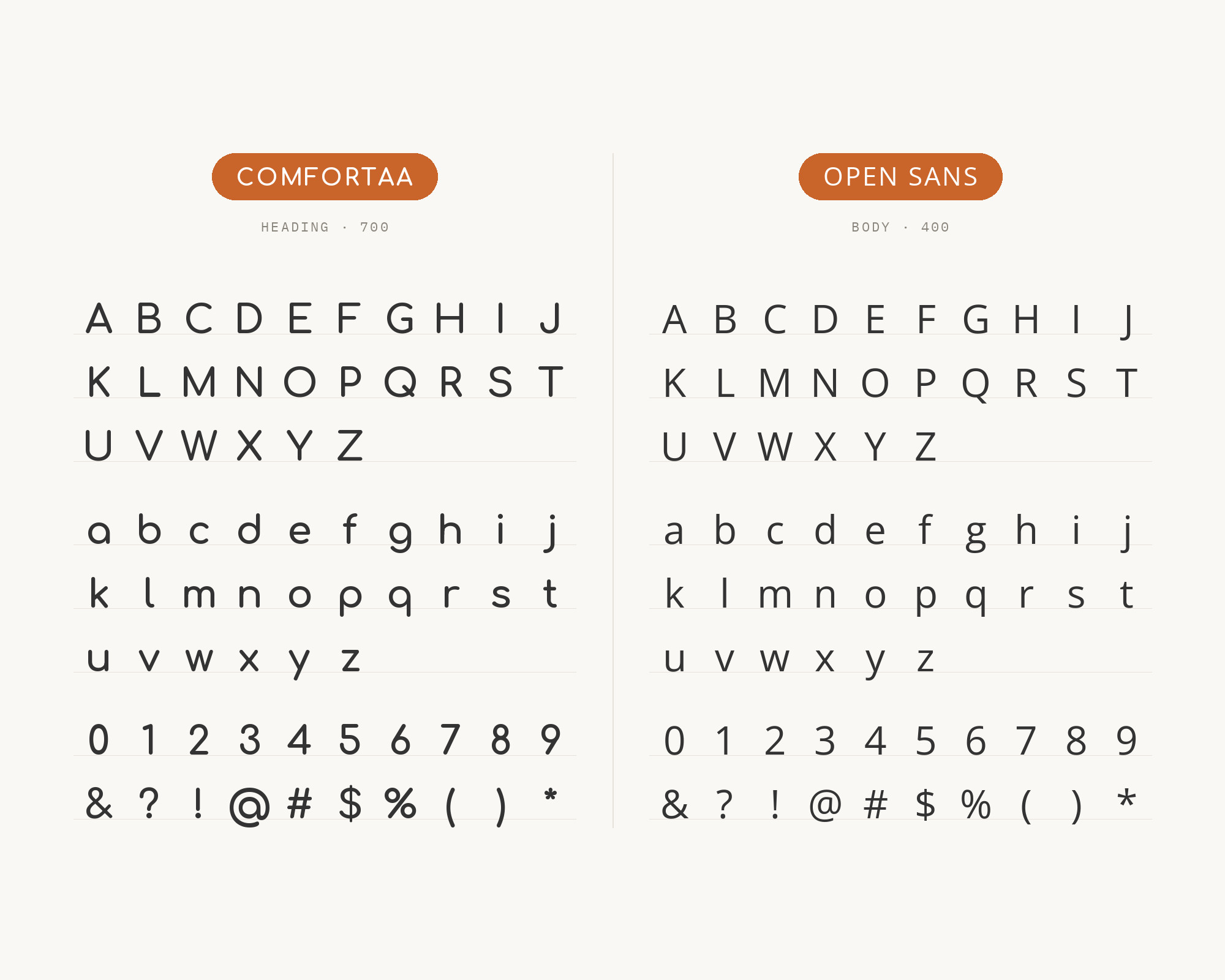
Open Sans is the most straightforward answer, and it has the paperwork to prove it. Skirting World’s brand guidelines name Comfortaa as the primary heading font and Open Sans as the body text font, with Comfortaa set bold for headers and Open Sans at regular weight for body copy. A VistaCreate guide to free modern fonts lists Open Sans among the fonts that pair well with Comfortaa, too. Steve Matteson designed Open Sans as a humanist sans serif, and that humanist structure is the point. Its letters are narrower than Comfortaa’s circles, its apertures are open, and its rhythm is steady at 16px. Comfortaa gets to be round and cheerful up top. Open Sans quietly does the reading below. It’s a safe, very useful default for small business sites, services and product pages.
Build free, plus 500 AI credits.
Design and publish a site at no cost. Paid plans double your credits the first month.
Start free2. Nunito
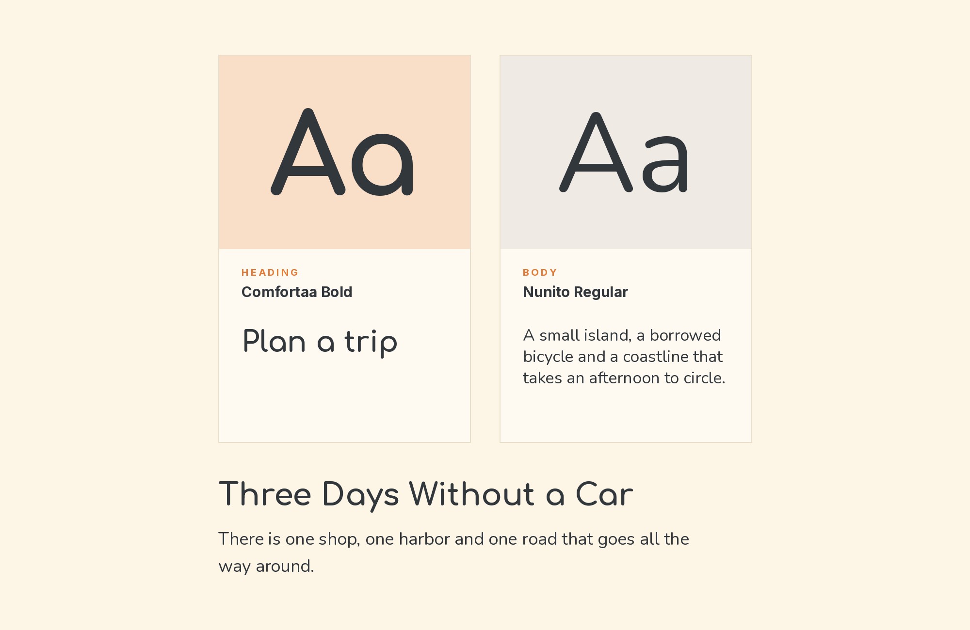
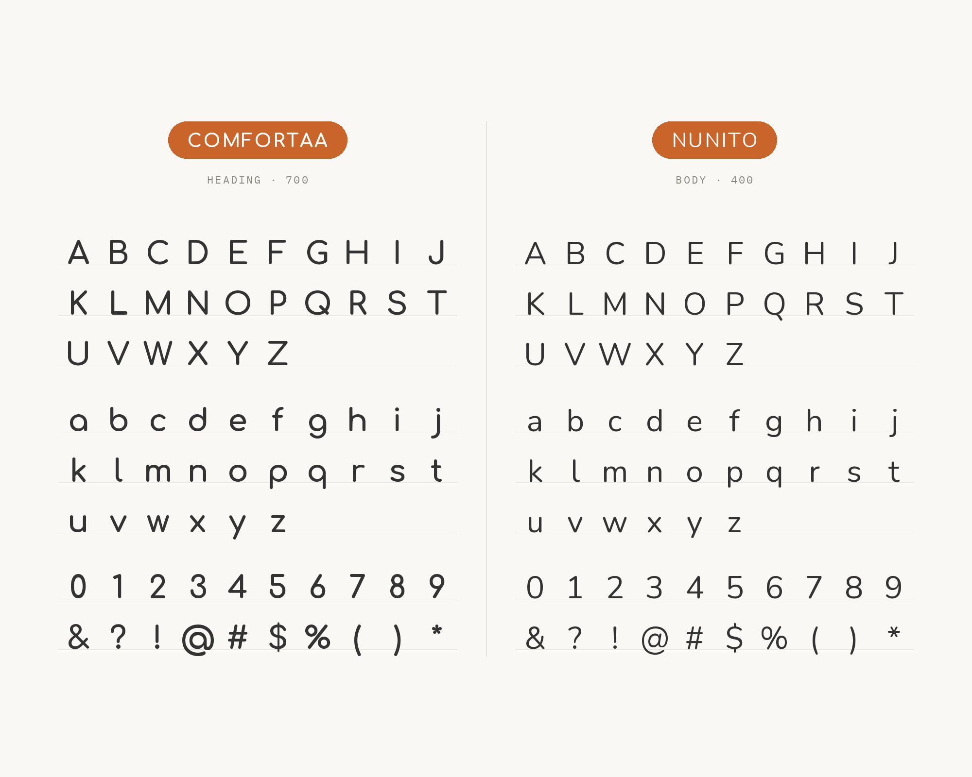
This one feels like family. The Biodiversa+ logo guidelines use Comfortaa for display type and name Nunito as the accompanying text font, and their example page sets a Comfortaa heading over Nunito body copy. Vernon Adams created Nunito as a rounded terminal sans serif for display typography, and Jacques Le Bailly extended it to a full set of weights. So both faces have soft, rounded stroke ends. The difference is in the skeleton. Nunito’s letters are more conventional in width and proportion, so it reads comfortably in a long paragraph where Comfortaa would start to feel like a string of beads. The result is a gentle, consistent page with no hard edges anywhere. Good for education, health, nonprofits and anything aimed at kids and parents.
3. DM Sans
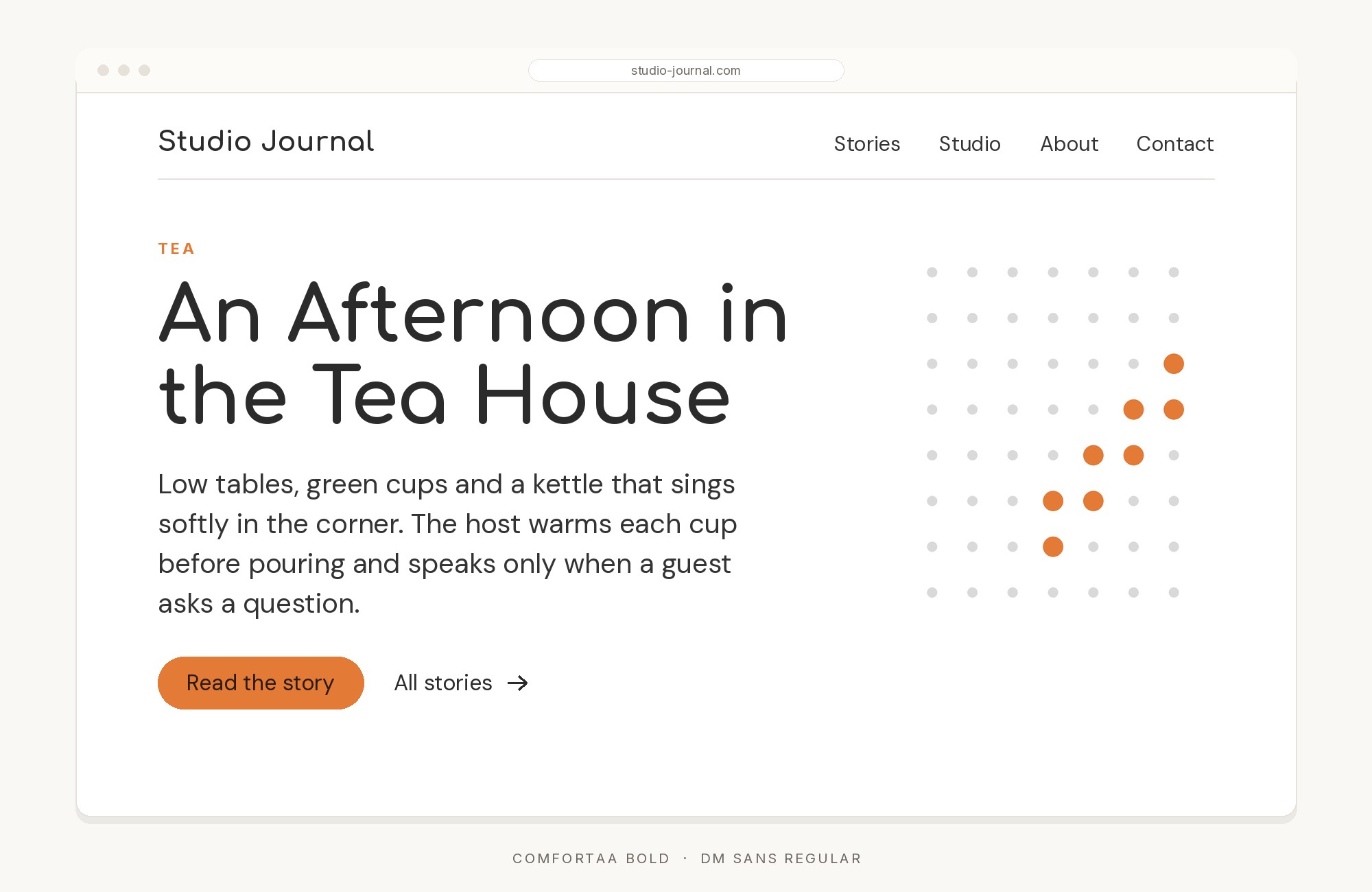
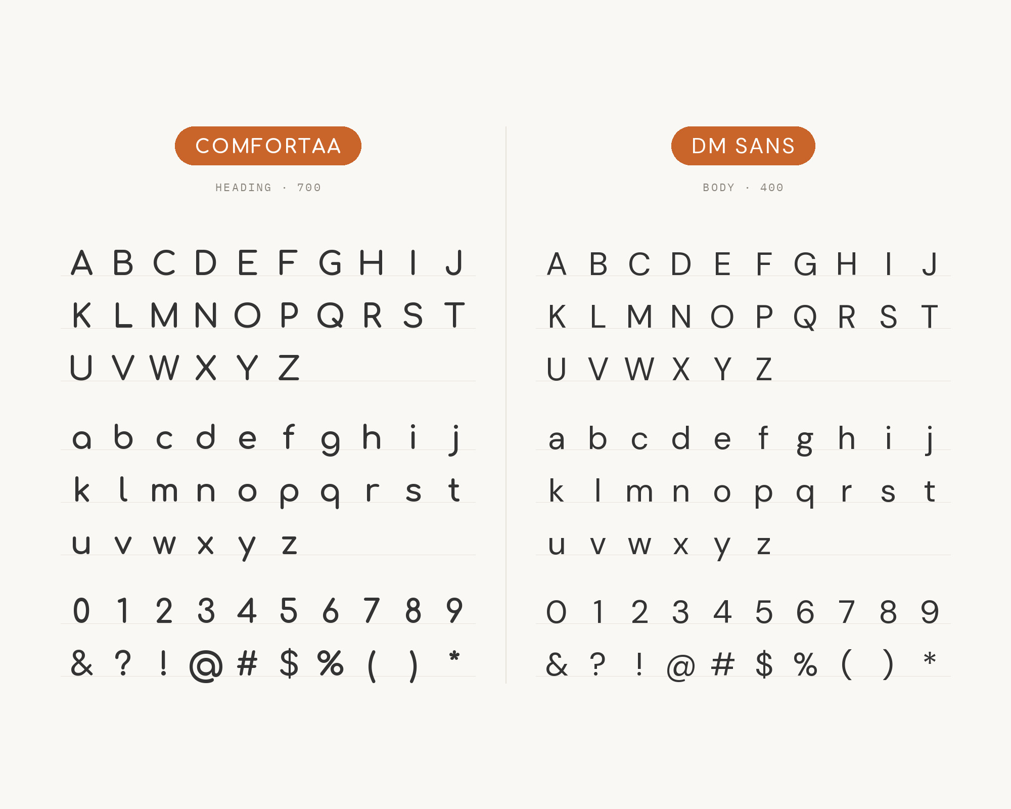
Restore4Life’s brand guidelines keep it very simple: Comfortaa for titles, DM Sans for text. That clean split works because DM Sans is a low-contrast geometric sans serif design, intended for use at smaller text sizes. It was designed by Colophon Foundry, who started from the Latin portion of Indian Type Foundry’s Poppins. So the two share a geometric family resemblance, with round o’s and simple construction, but DM Sans has squared-off stroke ends and tighter, more compact letters. That makes it feel a little more serious and technical than Comfortaa. The pair works well for environmental, scientific and civic projects that want to be friendly without looking like a toy shop.
4. Avenir
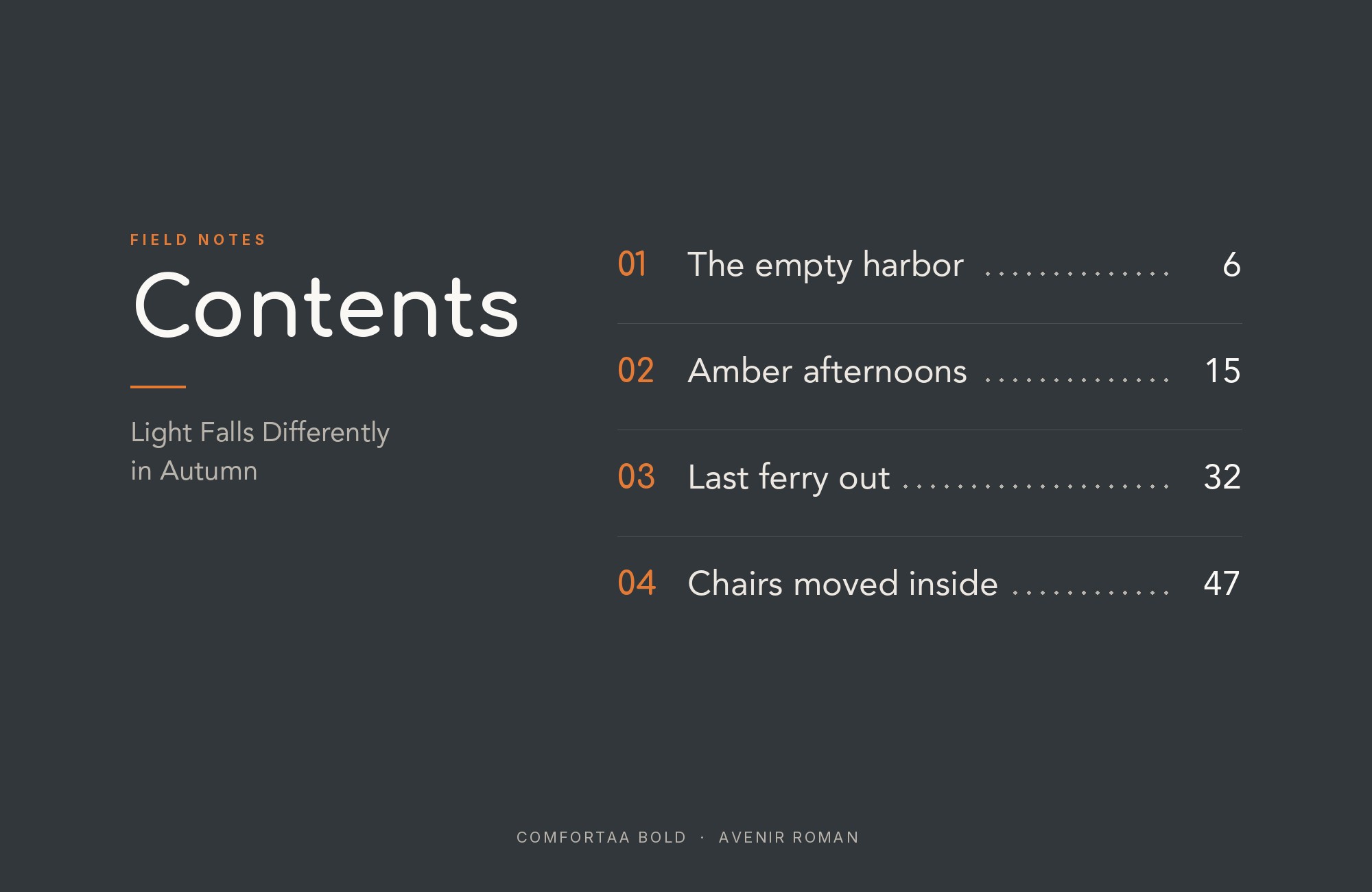
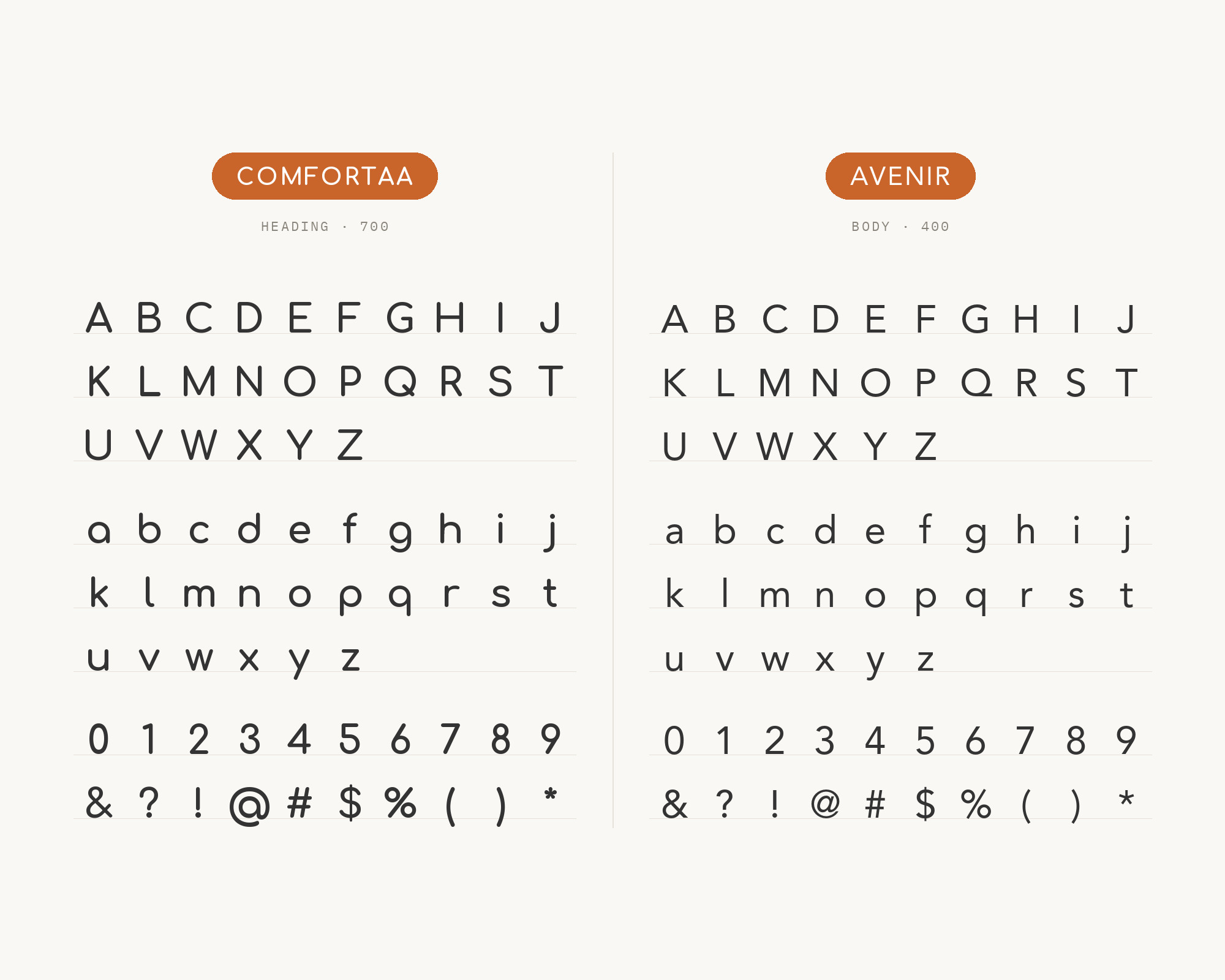
Typ.io records Avenir and Comfortaa together on gousto.co.uk, a food and cooking site. That’s real-world use, not just a recommendation. Adrian Frutiger designed Avenir in 1987, and it was released in 1988 by Linotype GmbH. It is a geometric sans too, but a very disciplined one. Its circles are optically corrected rather than perfect, and its lowercase has a two-storey a, so it reads like a text face rather than a display face. Next to Comfortaa, Avenir feels polished and grown-up. The geometric roots match, and the finish is different. Use Comfortaa for a big, warm headline or a menu section title, then let Avenir handle ingredients, descriptions and navigation.
5. DIN
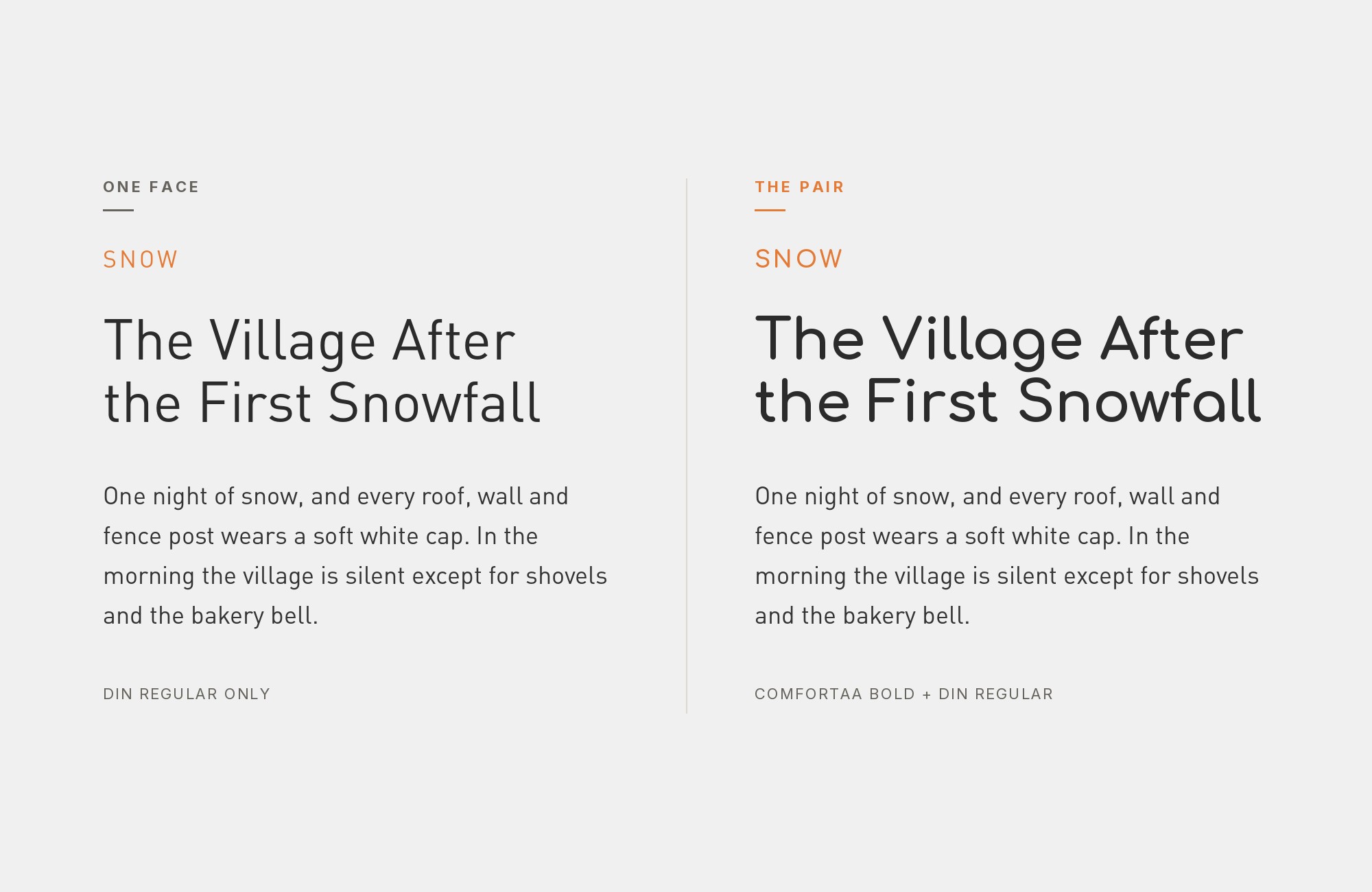
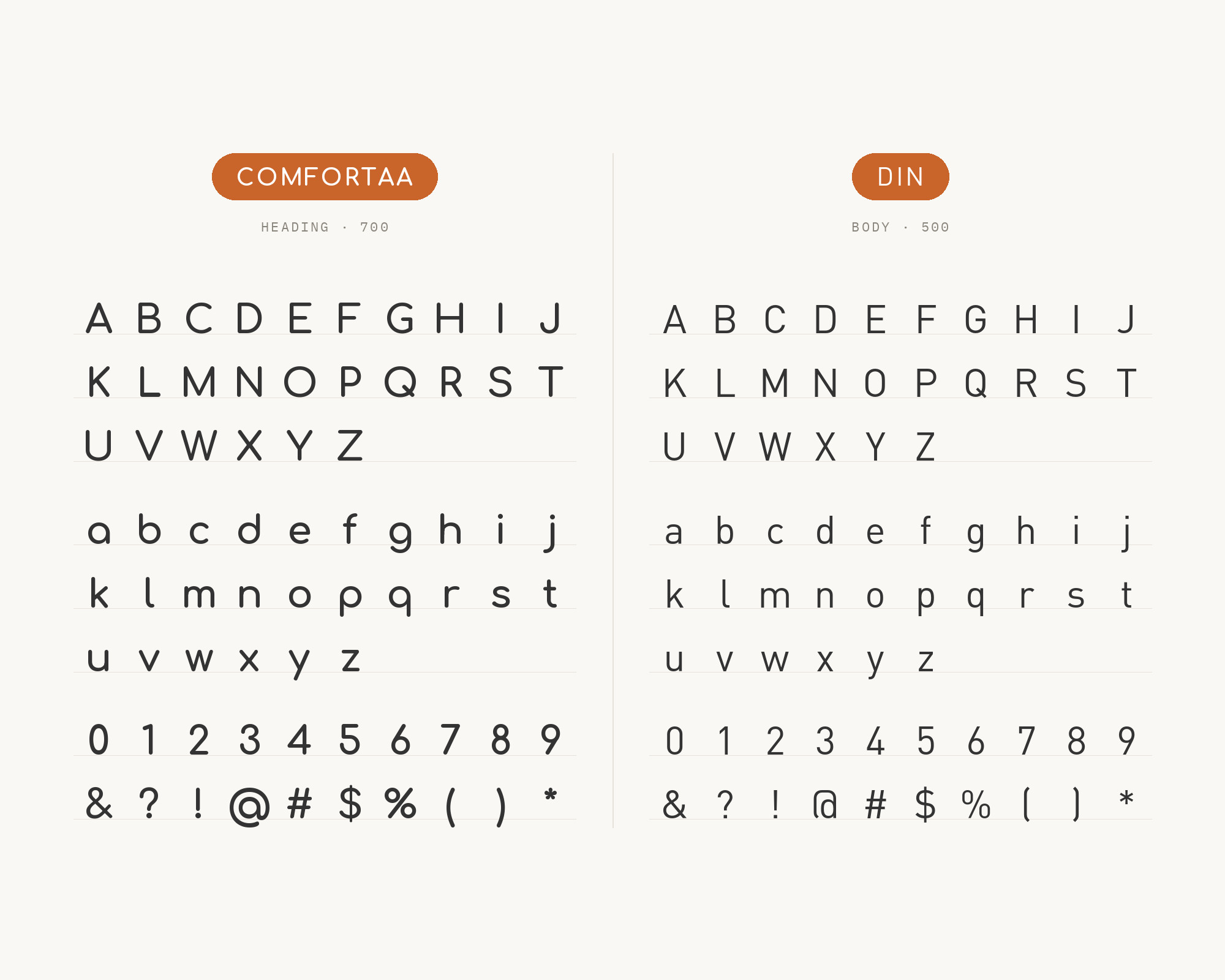
Here’s a pairing with some real contrast. Park People’s style guide uses DIN Schrift for snappy headers and gives Comfortaa the quotes, set larger than the body style. Its print family includes DIN, Comfortaa and Museo fonts. DIN comes from engineering. The DIN 1451 lettering was defined by the German standards body in 1931, and you can feel that origin in its straight, rational, slightly condensed forms. That’s the opposite of Comfortaa’s round softness. Put together, they read like fact and voice: DIN states the headline plainly, and Comfortaa brings in the human side through a quote or a pull-out. It’s a smart combination for reports, civic groups and community organisations.
Unlimited fonts from $16.50/mo.
29 million fonts, templates and stock assets. One subscription, unlimited downloads.
See the plan6. Dosis
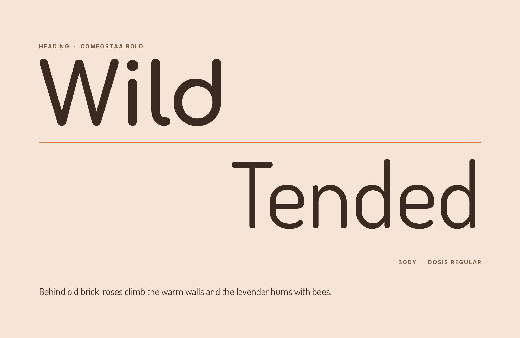
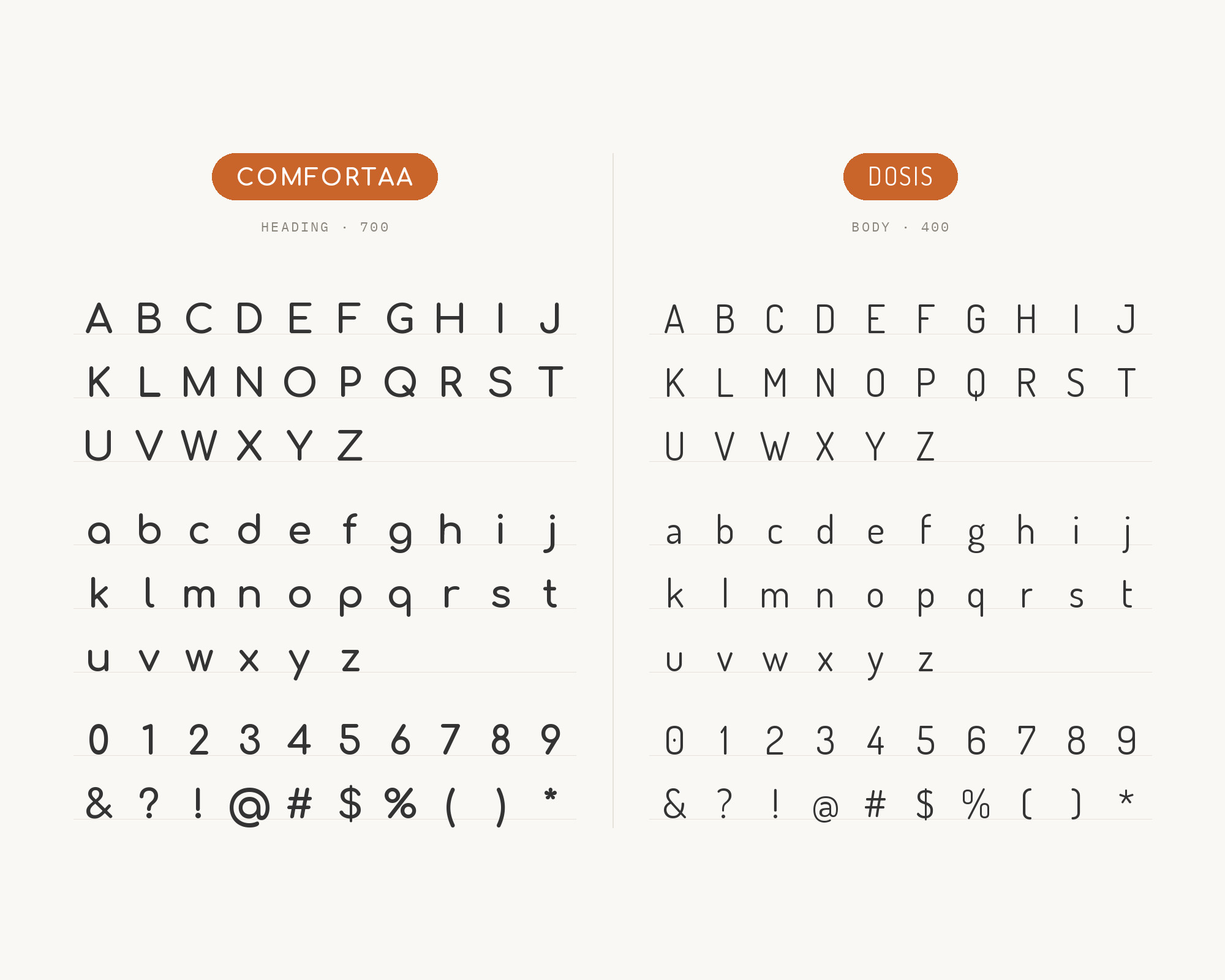
Park People again, but this time on screen. Their web family includes Comfortaa and Dosis, with Dosis used for the dashboard. Dosis is a rounded sans-serif type family, designed by Edgar Tolentino and Pablo Impallari. Both faces have rounded ends, but Dosis is narrow where Comfortaa is wide. That width difference is what makes the pair work. In a dashboard or a data-heavy interface, Dosis fits labels, numbers and table text into tight spaces, while Comfortaa gives the page its friendly headings and callouts. The page still feels like one soft system. Keep an eye on sizes, though: two rounded faces can blend together if the weights and sizes are too close.
7. Roboto
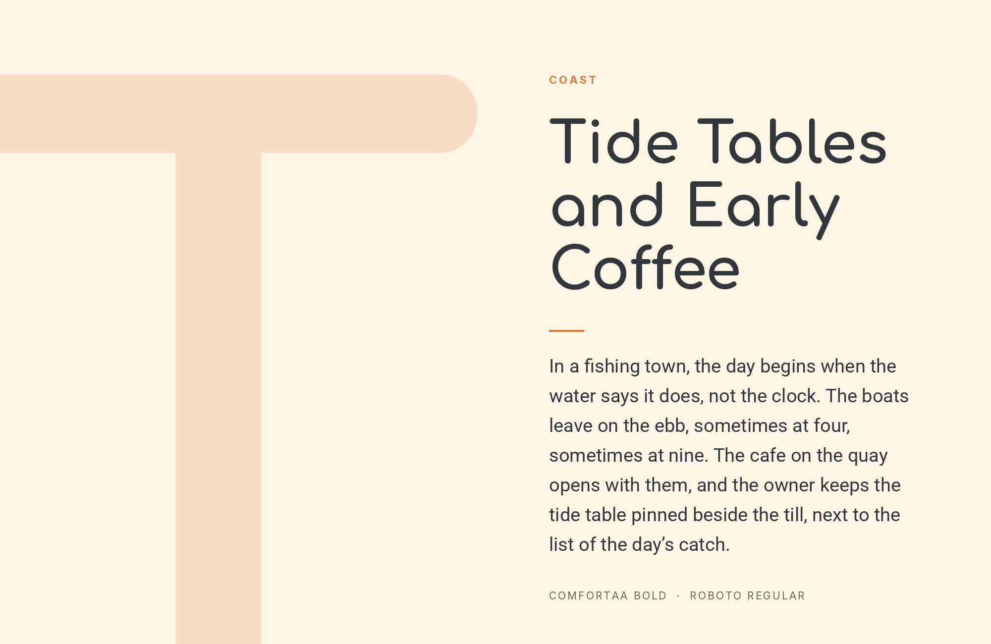
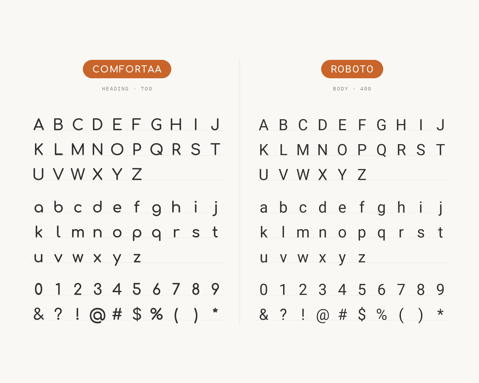
The VistaCreate guide lists Roboto as a Comfortaa partner too. Google’s description gives the reason in one line: it has a mechanical skeleton and the forms are largely geometric, while the font features friendly and open curves. That dual nature is useful next to Comfortaa. Roboto is geometric enough to match Comfortaa’s construction, and neutral enough to hold long text and interface labels without drawing attention to itself. Use Comfortaa for the brand moments, like splash screens, section heads and empty states, and let Roboto take buttons, forms and body copy.
8. Raleway
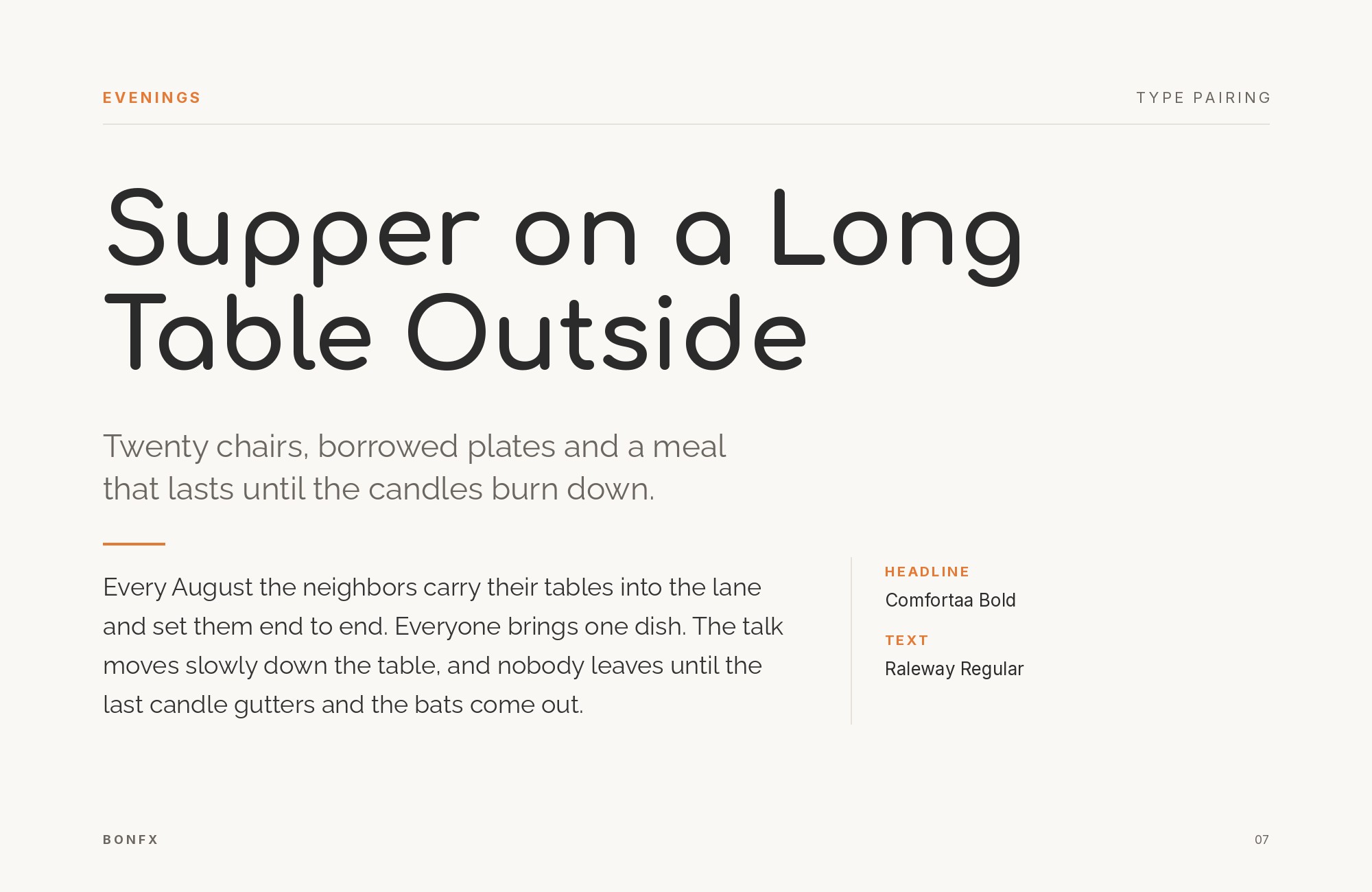
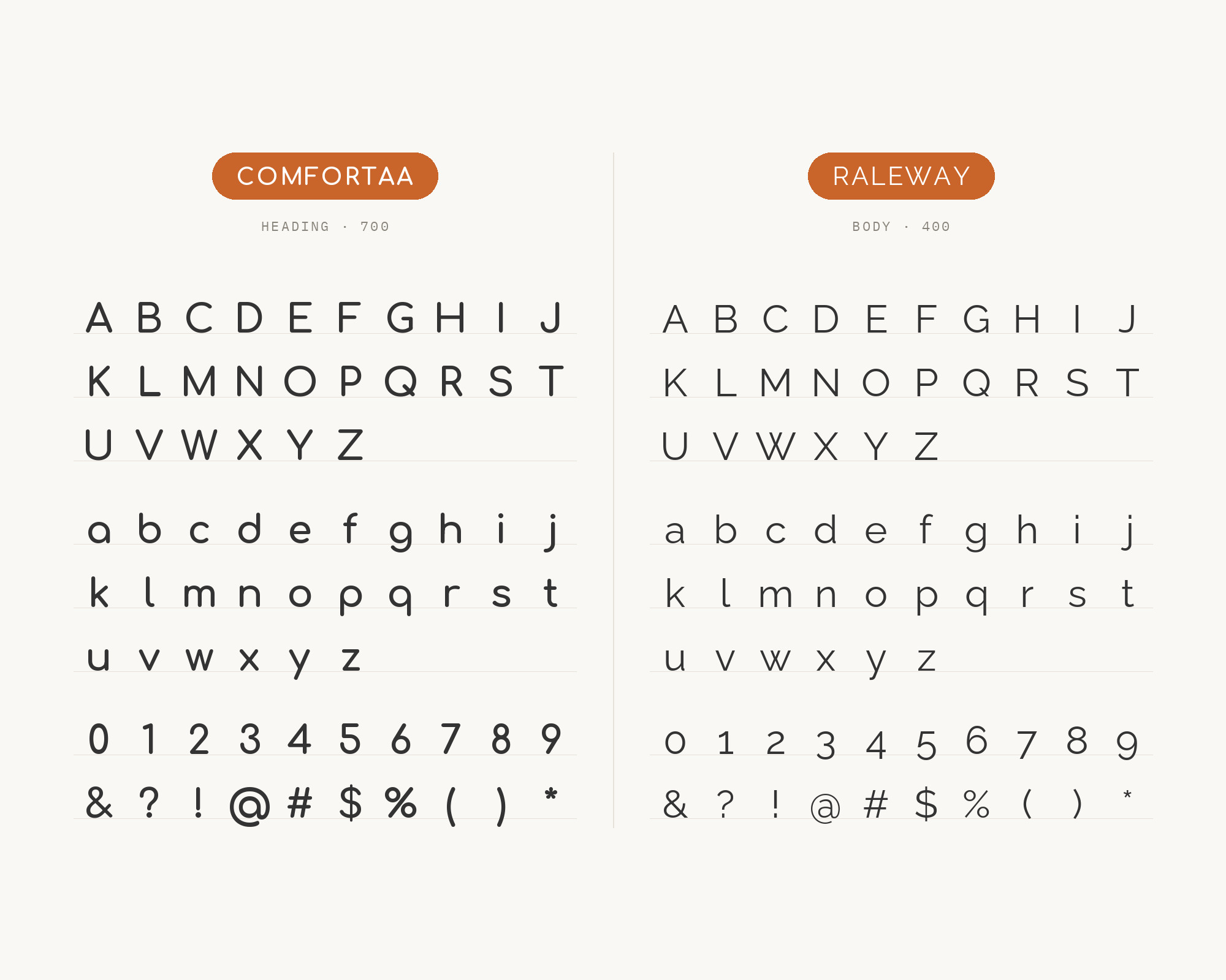
Raleway is the lighter, more elegant option, and it’s the third name on VistaCreate’s Comfortaa list. Matt McInerney first drew Raleway as a single thin weight, and Pablo Impallari and Rodrigo Fuenzalida expanded it into a 9 weight family in 2012. Raleway’s thin weights are delicate and stylish, and its proportions are a bit more refined than Comfortaa’s rounded geometry. So the pair can go two ways. Comfortaa in a bold headline with Raleway at a regular weight beneath it feels bright and modern. Raleway in a thin, spaced-out title with Comfortaa as a subhead feels lighter and more fashion-minded. Either way, test the text size, because Raleway’s lighter weights need room to breathe.
9. Paytone One
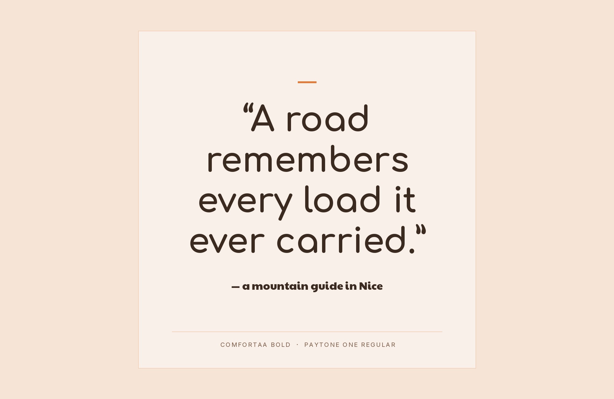
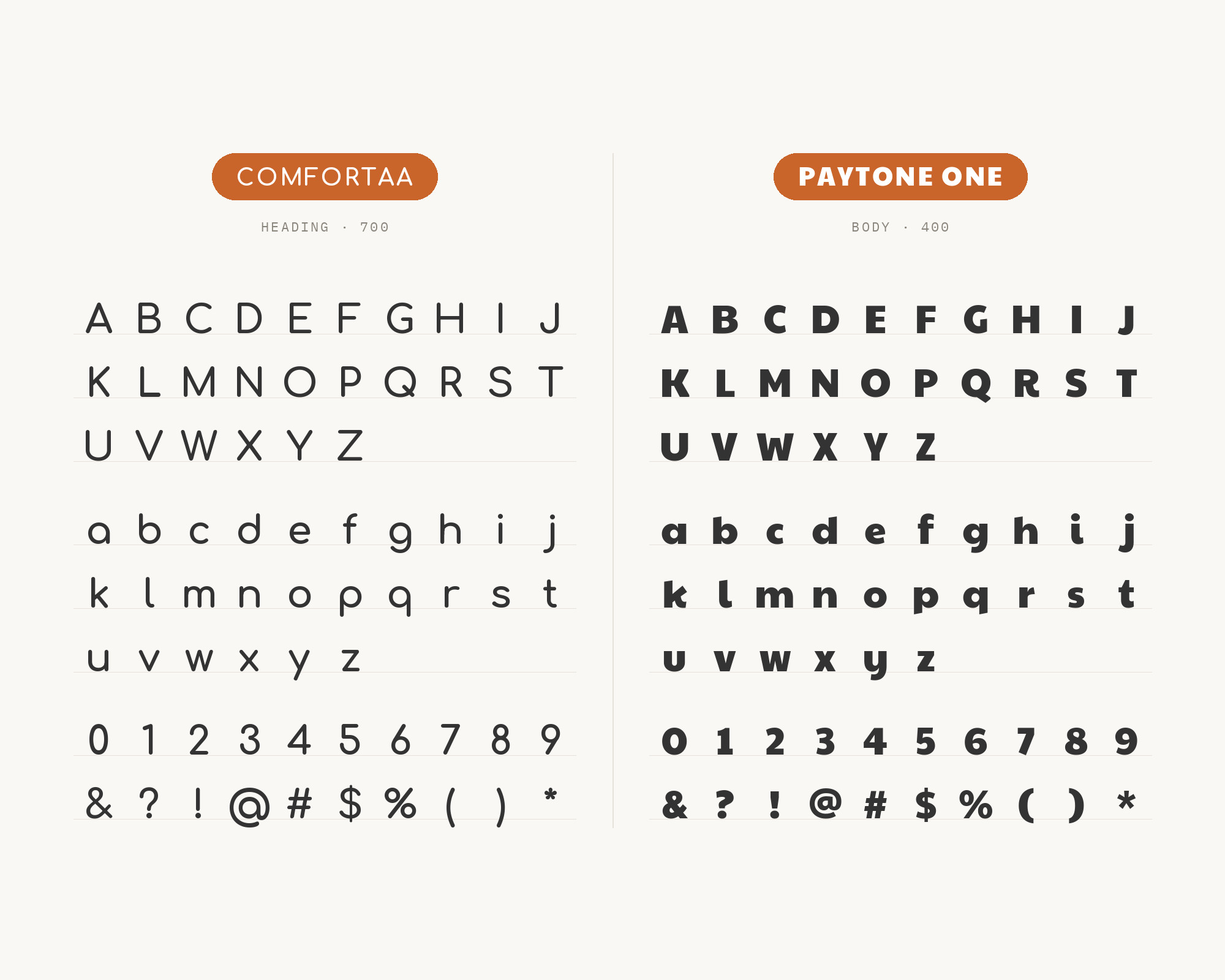
This one flips the usual roles. Kayla Scheidel at BentoBox pairs Paytone One with Comfortaa for a casual taqueria concept. Paytone One was designed as a display and headline font for modern websites. It has a casual appearance with round bowls and slanted stroke terminals. Vernon Adams designed it. Here Paytone One takes the loud, heavy headline, and Comfortaa moves down to the supporting role in subheads, menu categories and short descriptions. It works because Paytone is dense and dark while Comfortaa is open and light, so there’s clear contrast in weight even though both are friendly and round. Fun for restaurants, food trucks, event posters and anything that wants a relaxed, bold look.
10. Rubik
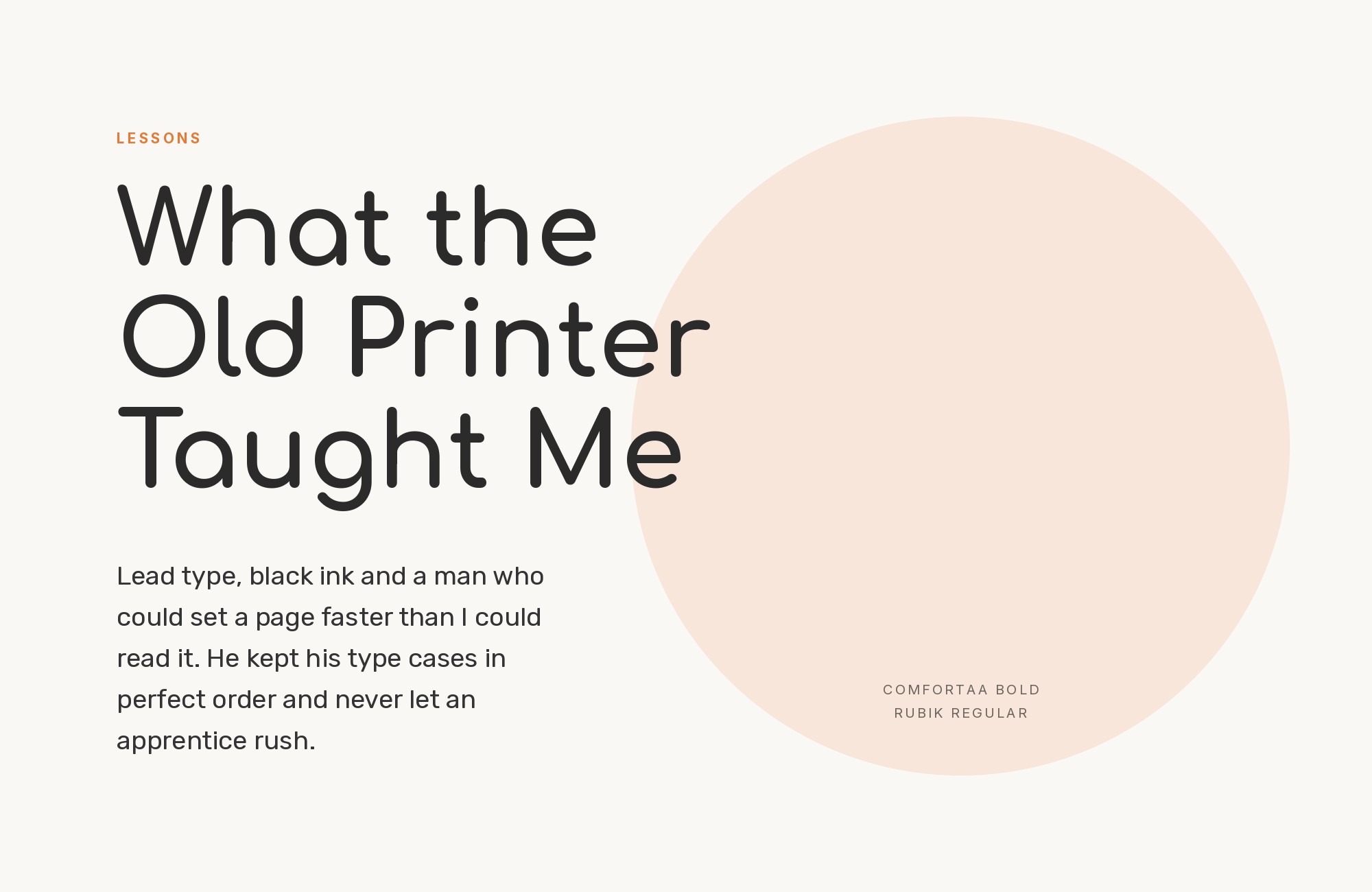
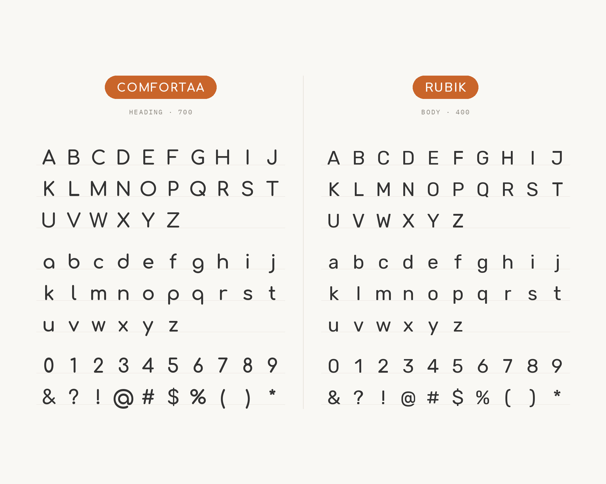
SlidesCarnival’s Persona Canvas Infographics template is set in the fonts Comfortaa and Rubik. That’s a small but real example of the two working together in a finished design. Philipp Hubert and Sebastian Fischer designed Rubik at Hubert & Fischer as part of the Chrome Cube Lab project, and it has slightly rounded corners. That’s the link. Rubik’s corners are softened, not fully round, so it sits halfway between Comfortaa’s circles and a normal sans. It’s also a bit chunkier and more compact, which helps with data labels, bullet points and short blocks of text in slides and infographics. Comfortaa leads, Rubik explains.
Conclusion
Comfortaa is a headline font. Every well-documented pairing above treats it that way, with Comfortaa on titles, quotes and callouts and a steadier face on the paragraphs. The strongest evidence comes from brand guidelines written by organisations that actually had to live with their choices. Open Sans, Nunito and DM Sans all hold the text role there, and they’re the easiest place to start.
After that, pick by how much contrast you want. If you want the page to stay soft from top to bottom, go with Nunito or Dosis. If you want a cleaner, more grown-up text layer, try Open Sans, Roboto or Avenir. If you want real tension, DIN brings a hard, engineered voice that makes Comfortaa’s warmth stand out even more. And if you need a headline louder than Comfortaa itself, let Paytone One take the top line and drop Comfortaa into the supporting role.
Sources
- Skirting World brand guidelines
- Biodiversa+ logo guidelines
- Restore4Life brand guidelines
- Park People style guide
- Typ.io (Comfortaa)
- Typ.io (Avenir with Comfortaa)
- VistaCreate (Mariia Shnyrkova)
- BentoBox Design (Kayla Scheidel, Medium)
- SlidesCarnival (Persona Canvas Infographics template)
- Google Fonts (Comfortaa METADATA + DESCRIPTION)
- Comfortaa FONTLOG (googlefonts/comfortaa)
- Google Fonts (partner METADATA + DESCRIPTION)
- Wikipedia (Avenir)
- Wikipedia (DIN 1451)
