Courier New pairs great with Cantarell, Source Sans Pro and Monaco. All 15 pairings are shown below in real rendered specimens, with the reason each one works.

What fonts go with Courier New? Start with what the name admits: this is not the original. Courier New is Monotype’s redraw of a 1950s IBM typewriter face, rebuilt as a TrueType font so Windows could show typed-looking text at any size.
The lineage runs to Howard “Bud” Kettler, who drew the original Courier for IBM’s typewriters in the mid-1950s. Microsoft says it was later revised, with input from Adrian Frutiger, for IBM’s Selectric typewriter series. When Microsoft needed a monospaced companion for its new TrueType core fonts, Monotype redrew that typewriter face as Courier New. Its defining trait is fixed pitch: every character, narrow “i” to wide “m,” occupies the same width, so text lines up in even columns instead of a natural rhythm. That constraint produces wide letterforms and a mechanical, typed texture no proportional typeface can fake.
Pairing Courier New means picking a side in a disagreement. Microsoft’s engineering history treats it as one piece of a matched system: released in 1996 alongside Arial, Times New Roman, Georgia, and Trebuchet MS as the Core Fonts for the Web, a coordinated serif-sans-mono kit. Designers and co-usage data treat it as a plain, opportunistic accent instead — a stamp of “typed” text next to whatever neutral sans is on hand. Here are 15 fonts that pair well with Courier New, starting with its matched system and moving toward fonts that get out of its way.
1. Cantarell
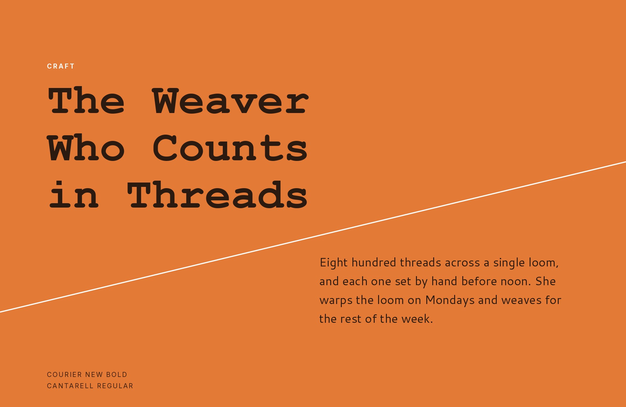
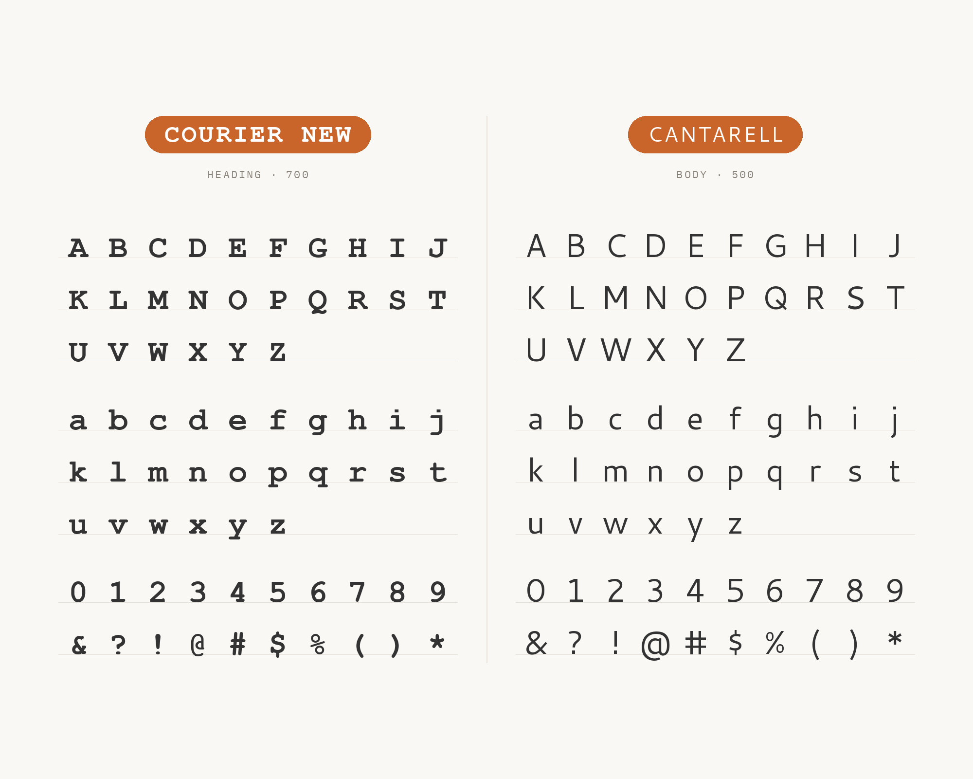
Cantarell, designed by Dave Crossland in 2009 during his MA at the University of Reading and later the default GNOME interface typeface, is a humanist sans with soft, slightly rounded terminals and an even, moderate weight built for interface text. Typ.io records it next to Courier New on a live restaurant site, and the pairing works because Cantarell has almost no personality to spend: its plain, low-contrast letterforms stay quiet while Courier New’s rigid monospace grid does the talking. That makes it an easy neutral partner — a sans that recedes so a code-flavored accent can read as deliberate, not accidental.
Try Semrush free. No credit card.
Start on the $0 plan. Paid plans from $117/mo billed annually.
Try for free2. Source Sans Pro
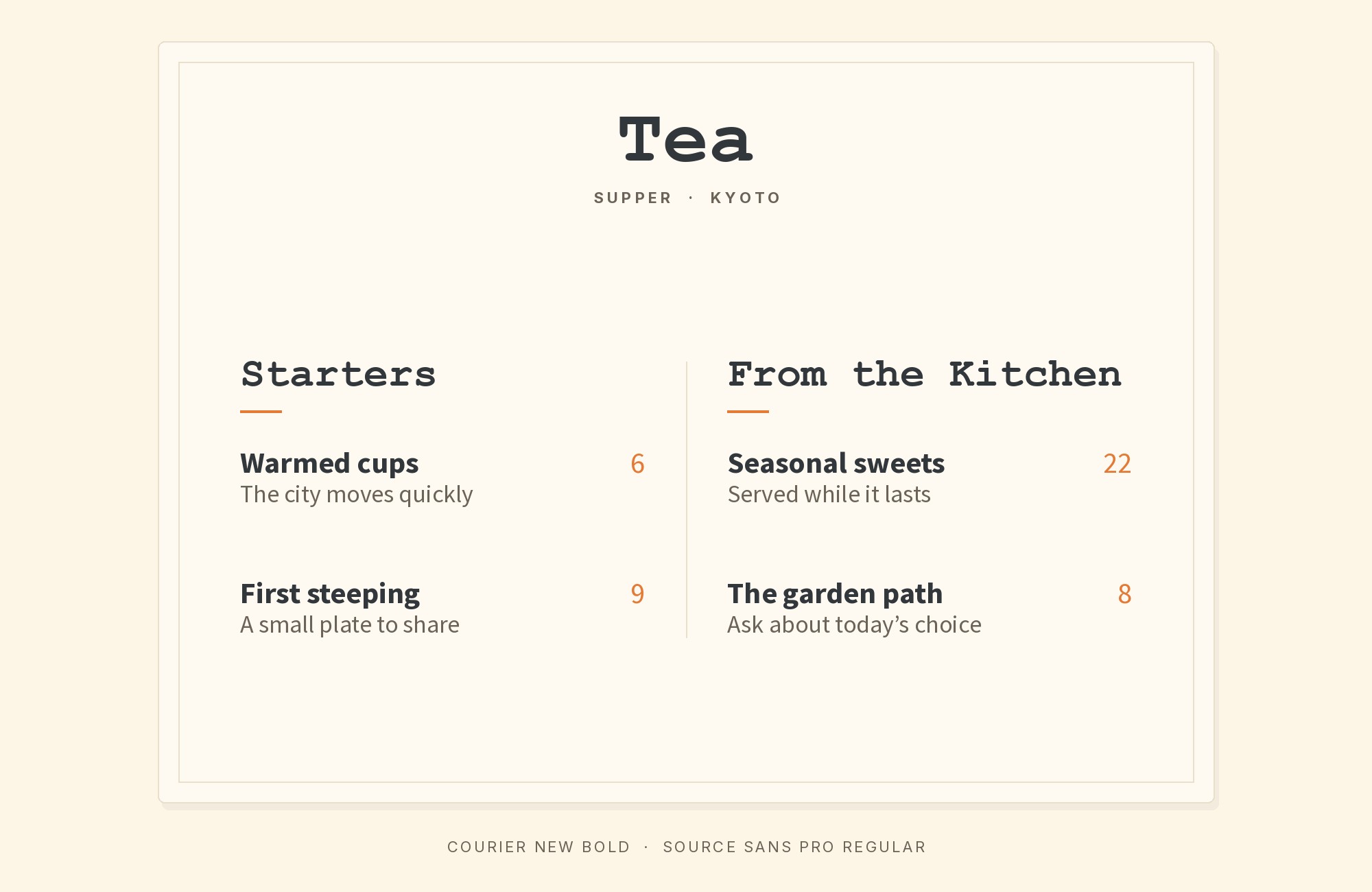
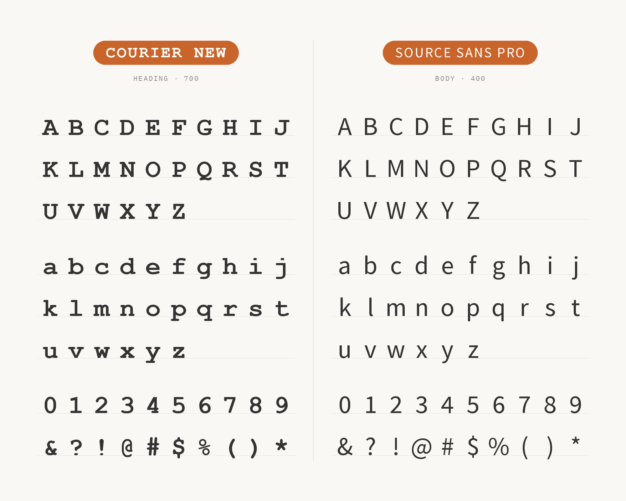
Source Sans Pro, designed by Paul D. Hunt and released by Adobe in 2012 as its first open-source typeface, was built as a neutral, professional workhorse for UI and text at small sizes. Its moderate x-height and even stroke weight give it the same unstyled presence as Cantarell, which is why Typ.io records it alongside Courier New on a live developer portfolio. The effect is a page that reads as plain, considered text with exactly one calculated accent instead of two typefaces competing for attention — a safe sans when Courier New should be the only voice with character.
3. Monaco
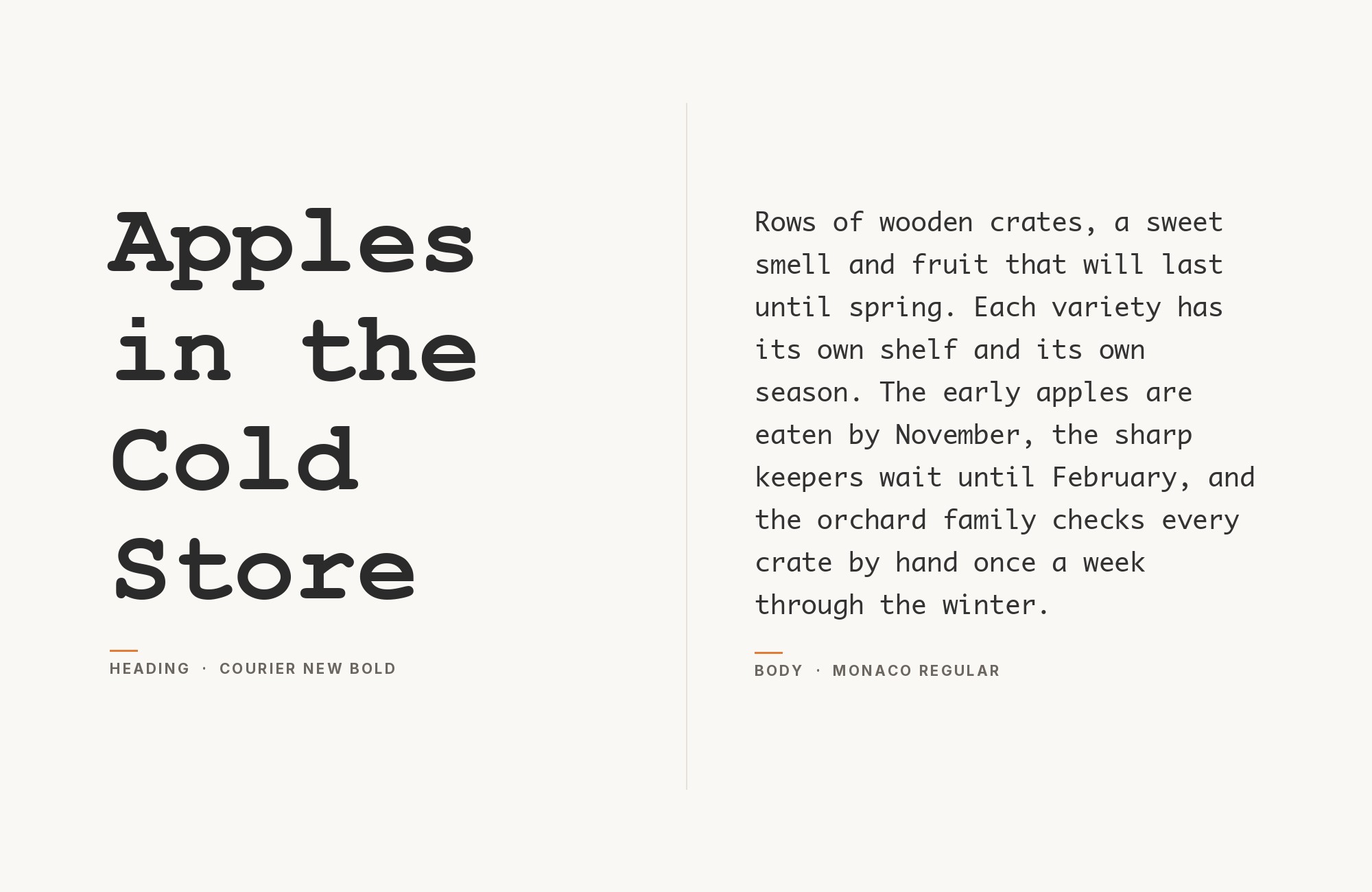
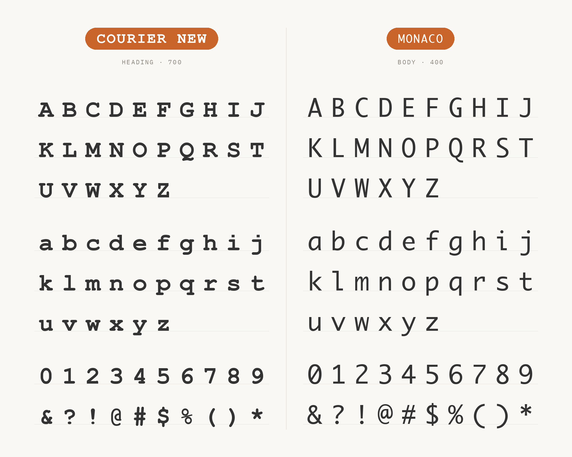
Monaco is Apple’s own screen monospace, designed by Susan Kare with Kris Holmes and Charles Bigelow and shipped with the first Macintosh in 1984, drawn so a zero and a capital O could never be mistaken on a small screen. Typ.io’s co-usage data catches it running alongside Courier New on a live blog, and the pairing works as a split of registers rather than a contrast of styles: two monospace faces, same fixed-pitch logic, different jobs. Monaco reads as the on-screen code font, sharp and system-native, while Courier New carries the typed or printed reference beside it.
4. Helvetica Neue
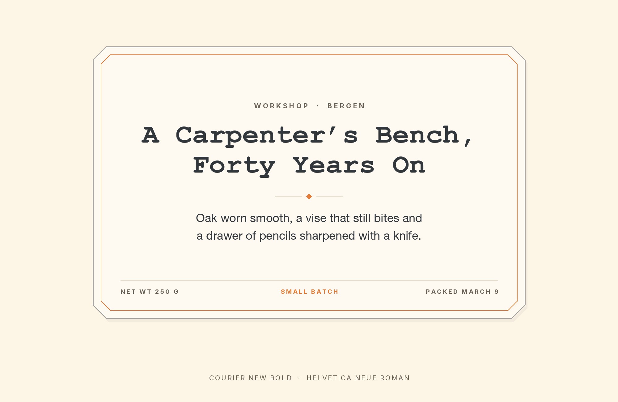
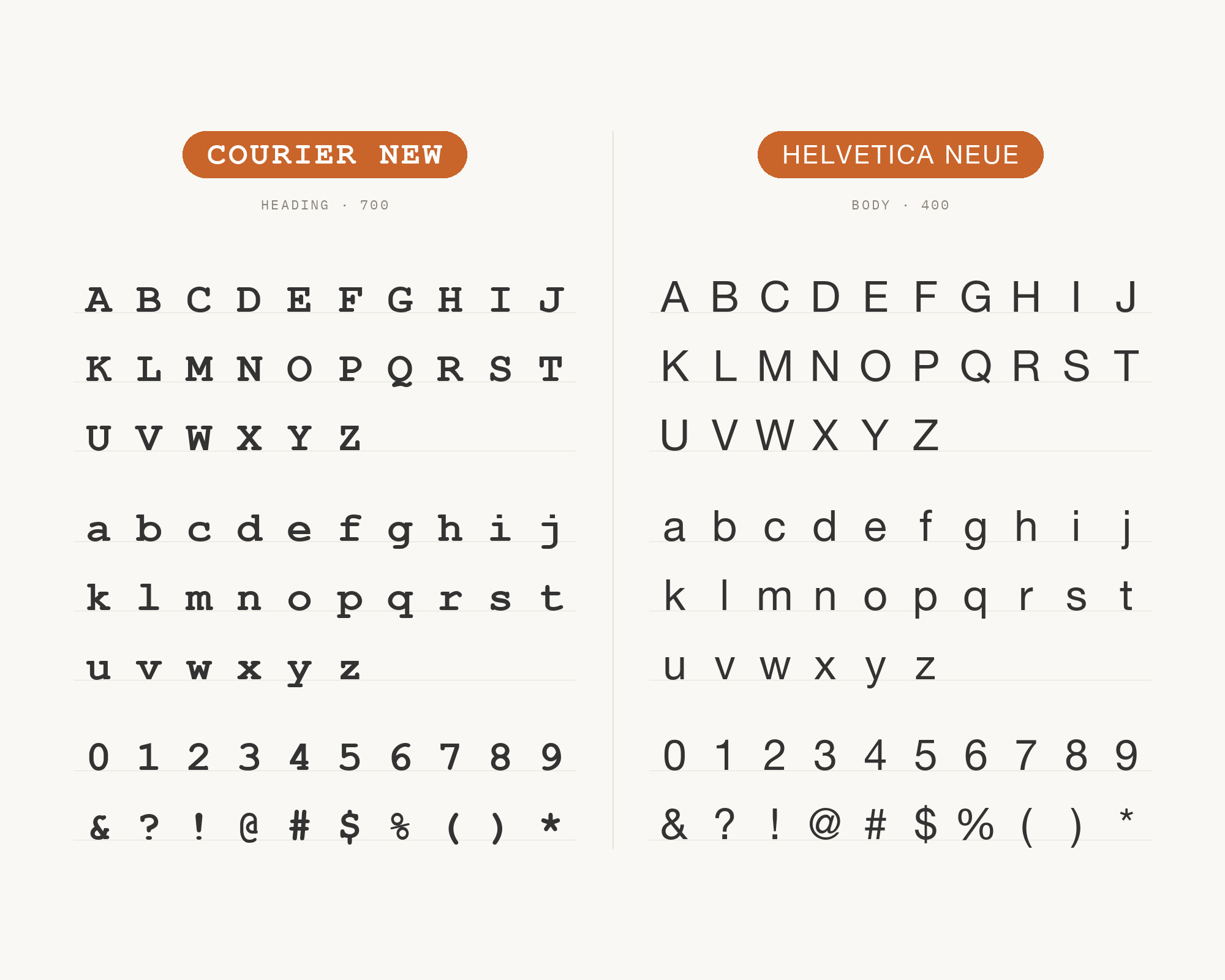
Helvetica Neue is the 1983 re-engineering of Max Miedinger’s 1957 Helvetica, redrawn onto a single unified grid of weights and widths so every cut lines up with mathematical consistency. That discipline gives headlines a crisp, controlled voice with a tighter, more even fit than the original — enough refinement to contrast cleanly with Courier New’s wide, fixed letter-spacing and mechanical rhythm. Because it is still a neutral grotesque at heart, the contrast stays quiet: a considered headline face above Courier New’s plain, typed body text, and a tighter cousin of the plainer Helvetica pairing later in this list.
Junior work is now a prompt. The biggest profit center in your studio is vanishing.
How to fix this?
Find Out How5. Arial
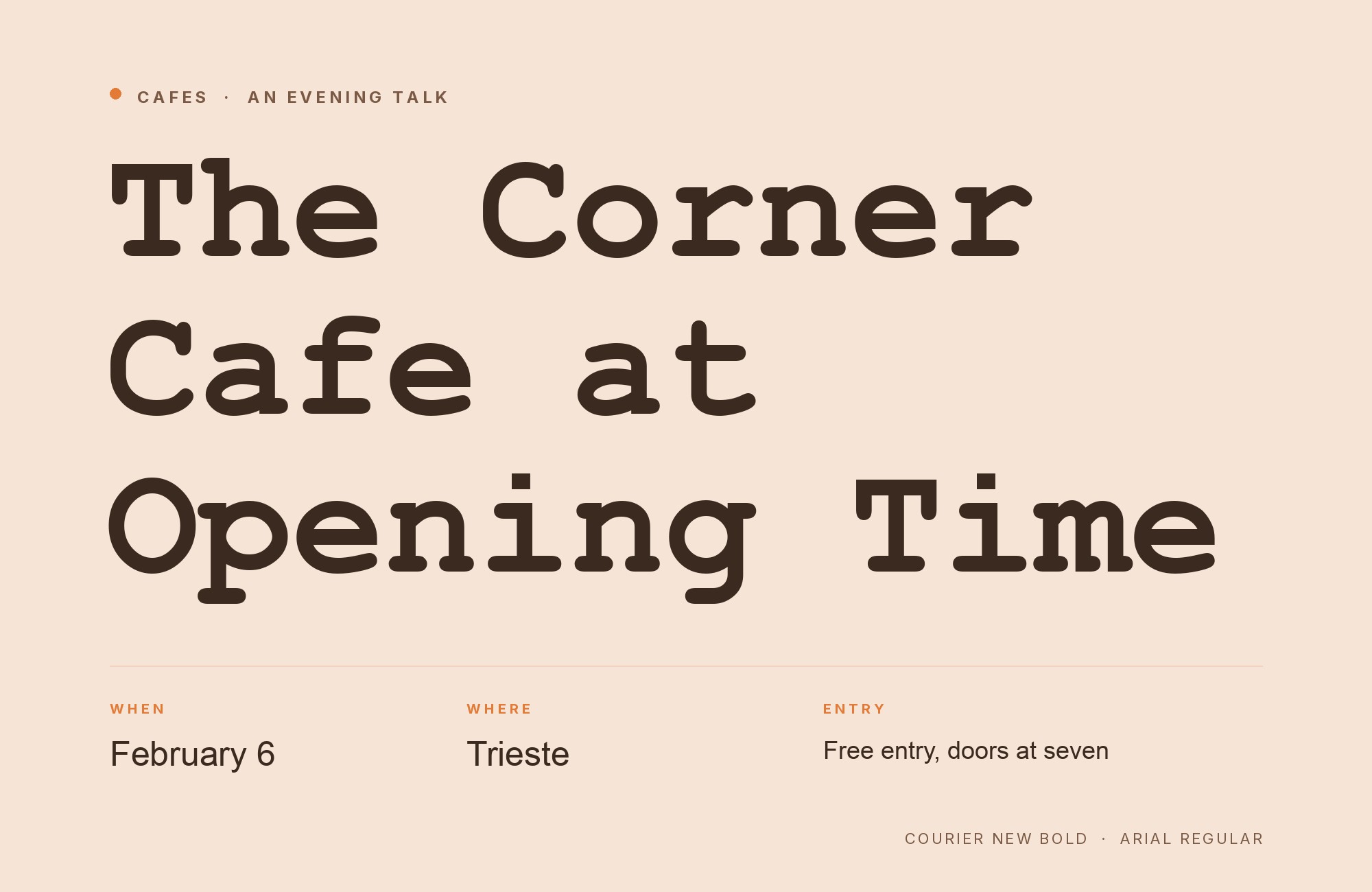
Arial, designed by Robin Nicholas and Patricia Saunders at Monotype in 1982, is a humanist grotesque with softer curves and diagonal terminal cuts than the industrial sans faces it competes against. Microsoft licensed it as a core Windows font in 1992, then shipped it beside Courier New again in 1996 in the Core Fonts for the Web package — Arial for sans, Times New Roman for serif, Courier New for monospace. Pairing them uses that brief as intended: Arial carries labels and body copy at a neutral weight, while Courier New drops in wherever the page needs to look typed instead of set.
6. Times New Roman
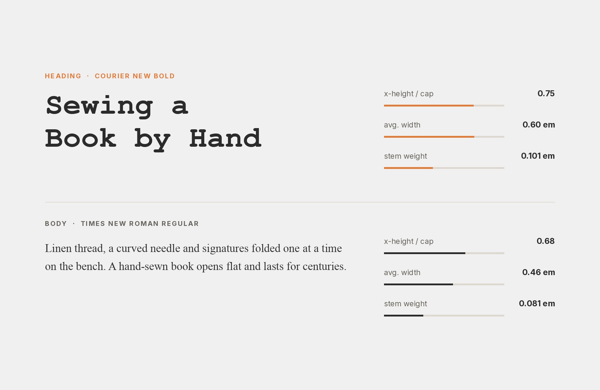
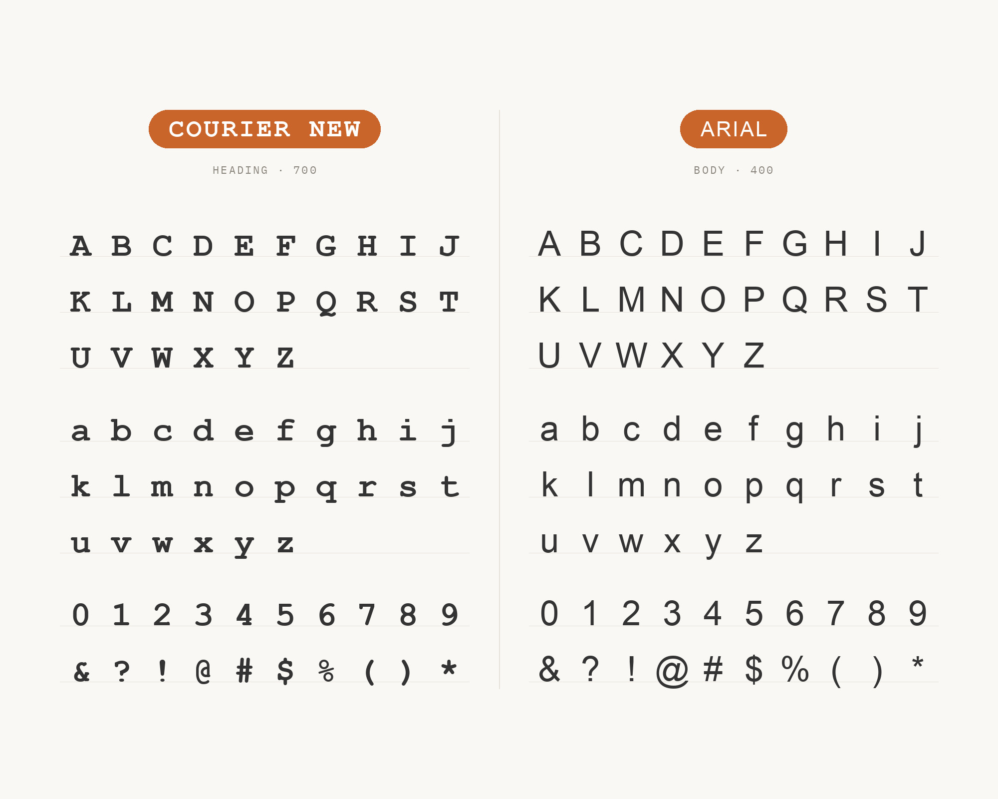
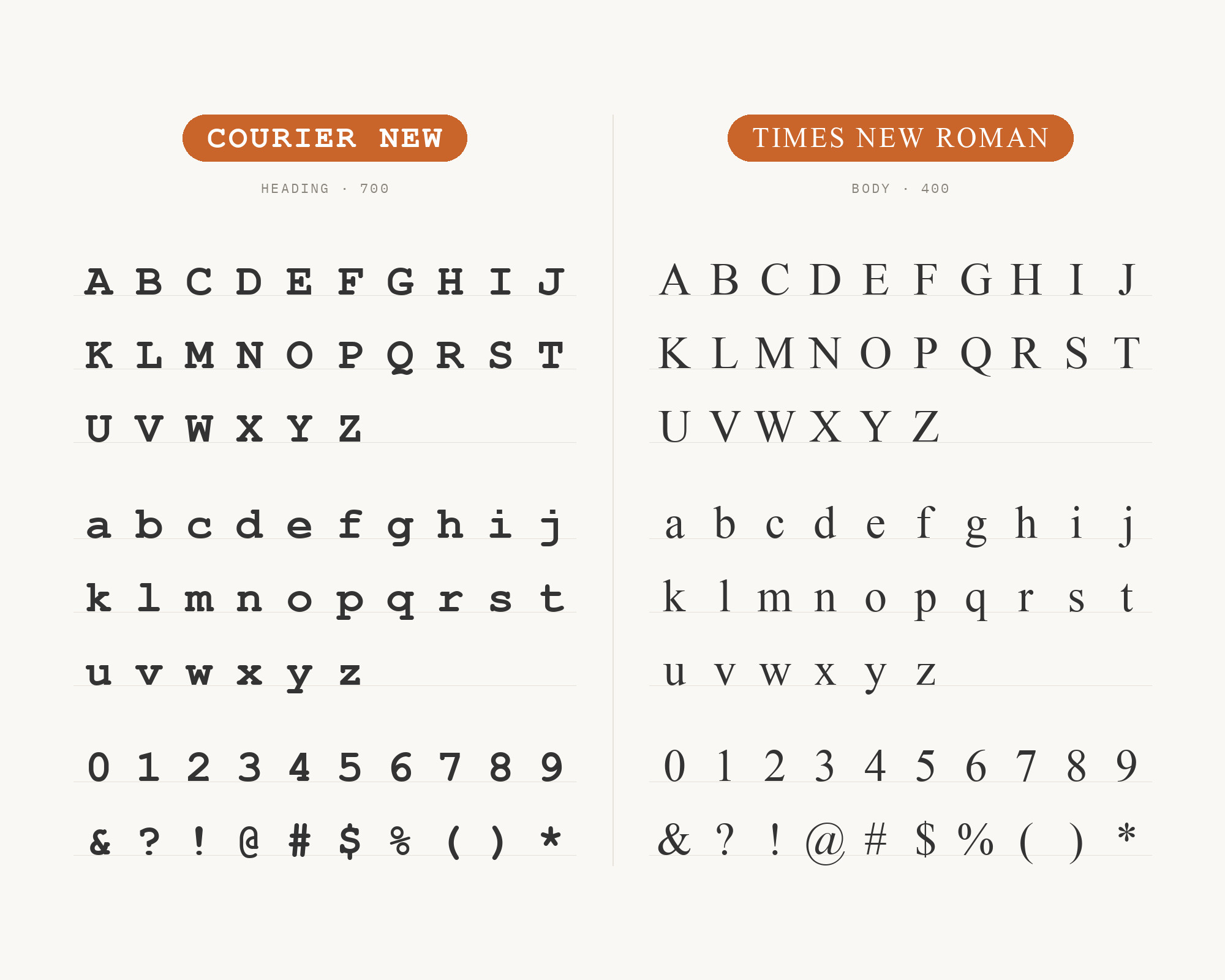
Times New Roman was drawn by Victor Lardent under Stanley Morison’s direction for The Times of London in 1932, an old-style serif built for legibility at newspaper column widths. It was part of Microsoft’s 1996 Core Fonts package, sharing that release with Courier New. The split still reads as intended: Times New Roman’s moderate contrast and calligraphic serifs carry long-form body text or headlines with formal, print-native authority, while Courier New’s flat monospace grid drops underneath as a typewritten accent, a quote block, or a code sample — Microsoft’s own coordinated system, still installed everywhere.
7. Georgia
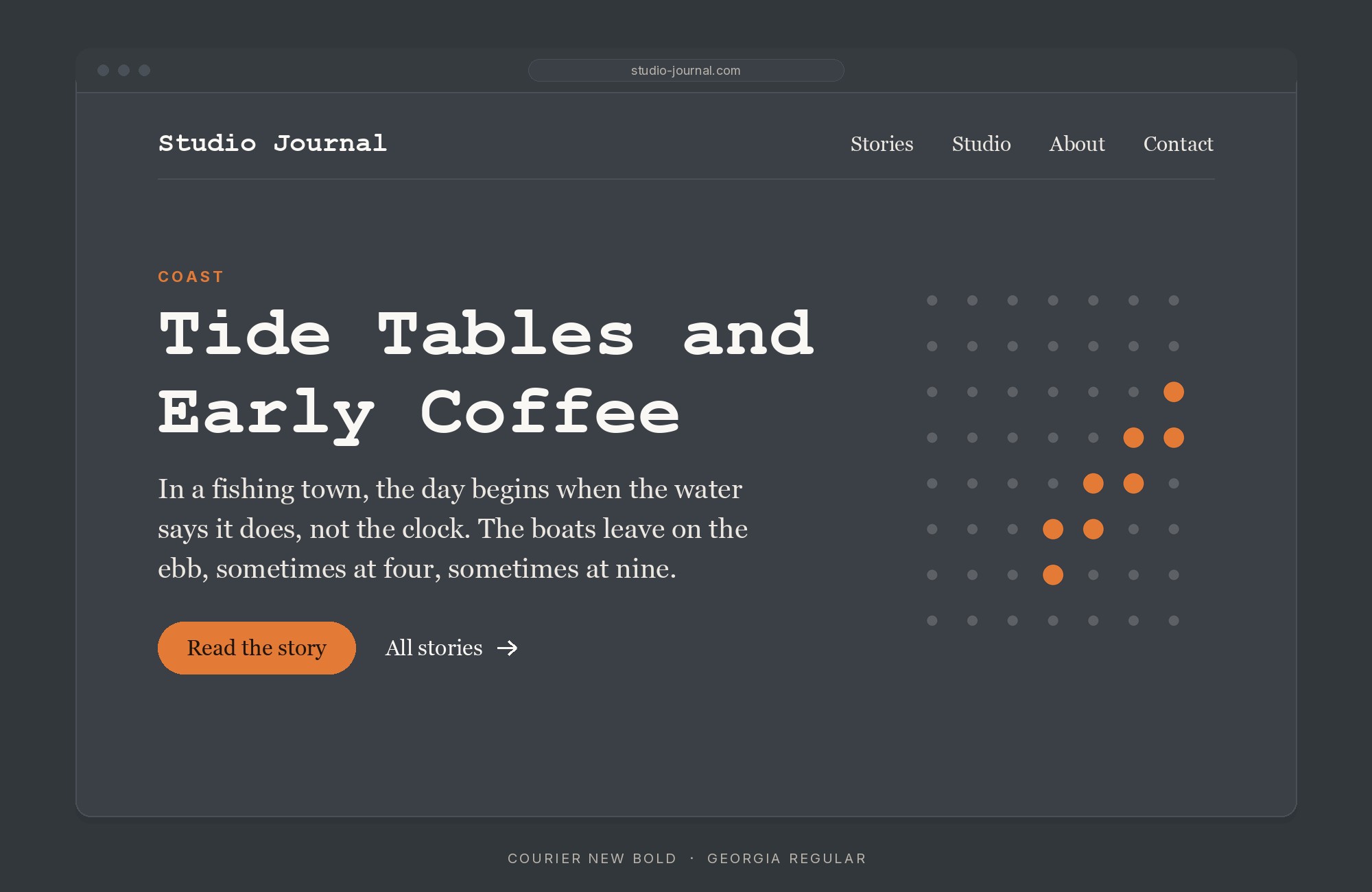
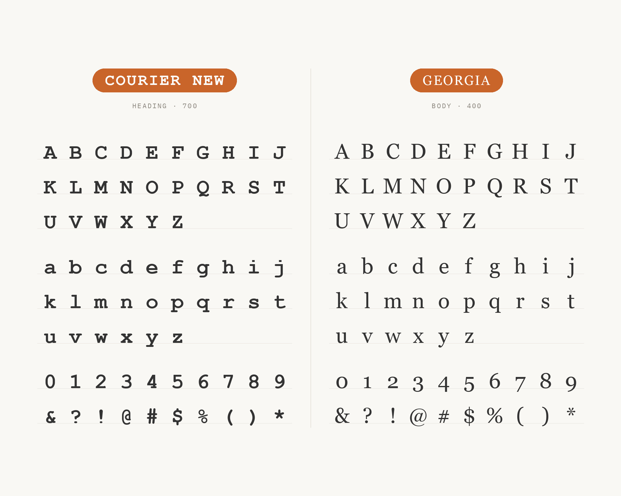
Georgia was designed by Matthew Carter for Microsoft in 1993 and released in 1996, built for clarity at low screen resolutions with a large x-height — refinements Carter drew from Scotch Roman by way of Richard Austin’s nineteenth-century cuts. It shipped in the same 1996 Core Fonts initiative as Courier New, the same screen-legibility research rather than a separate design. That shared origin makes a Georgia body paragraph feel like a considered upgrade rather than a mismatch when Courier New is reserved for labels, code, or a typewriter callout — both faces solving one problem for different jobs.
Pro from $14/mo, save $60 yearly.
Premium templates, vector export, and a commercial license on every paid plan.
See plans8. Trebuchet MS
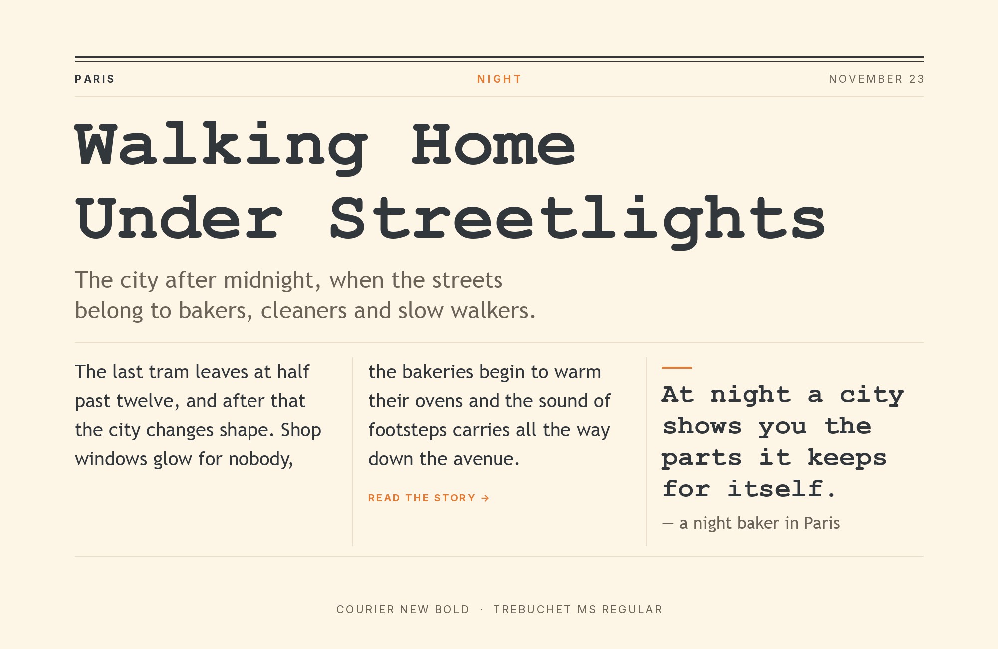
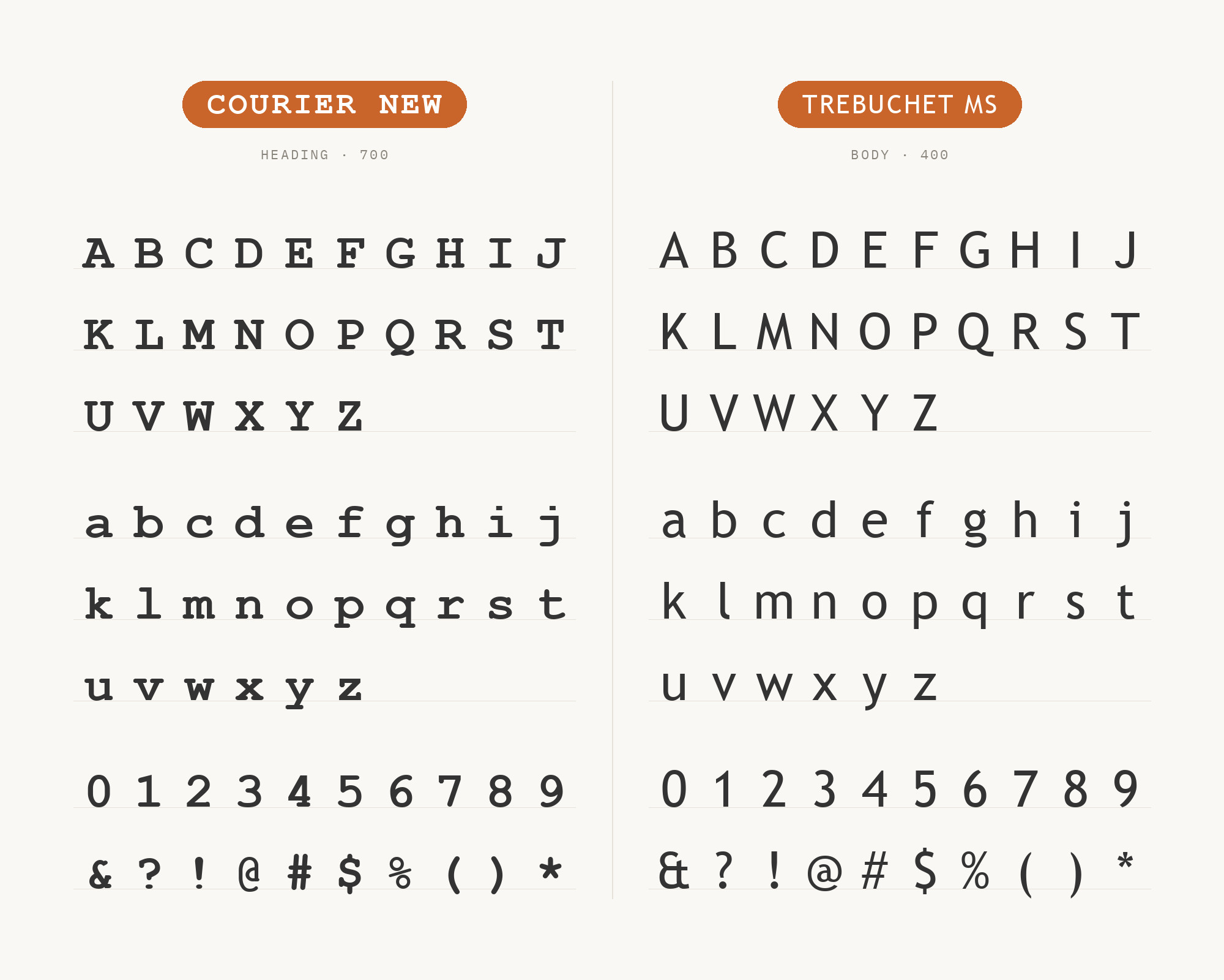
Trebuchet MS, designed by Vincent Connare for Microsoft in 1996, blends geometric and humanist sans traditions, citing American motorway signage and sans serifs like Akzidenz Grotesk and Alternate Gothic among his influences, into a face with a large x-height and enough personality to feel distinct from Verdana, Connare’s explicit goal. It joined Courier New in the same 1996 Core Fonts package; Connare aimed to give it a texture that contrasts with Verdana. Set against Courier New’s rigid, mechanical monospace grid, that curve reads as a deliberate texture contrast rather than a coincidence of shared parentage.
9. Futura
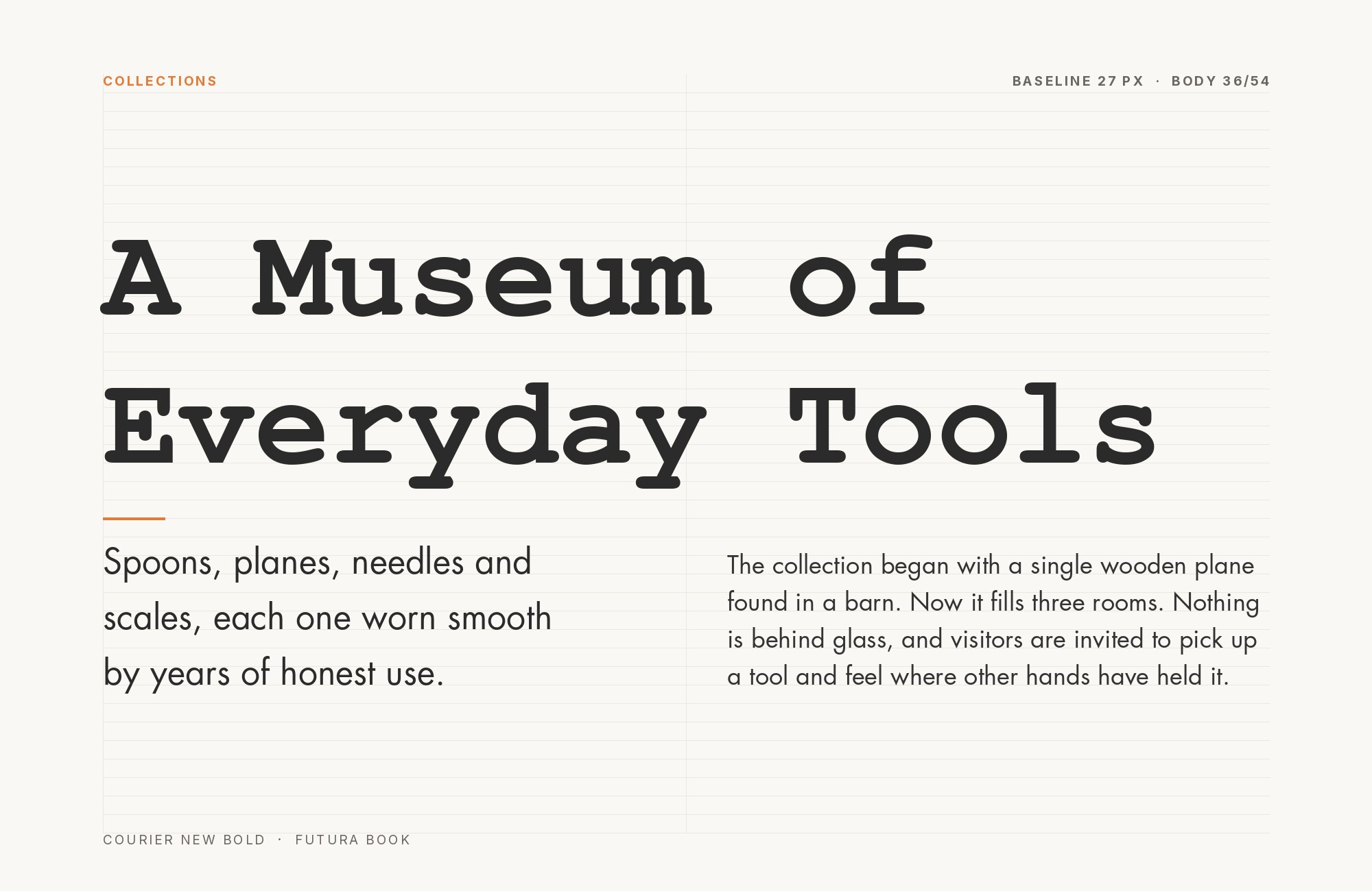
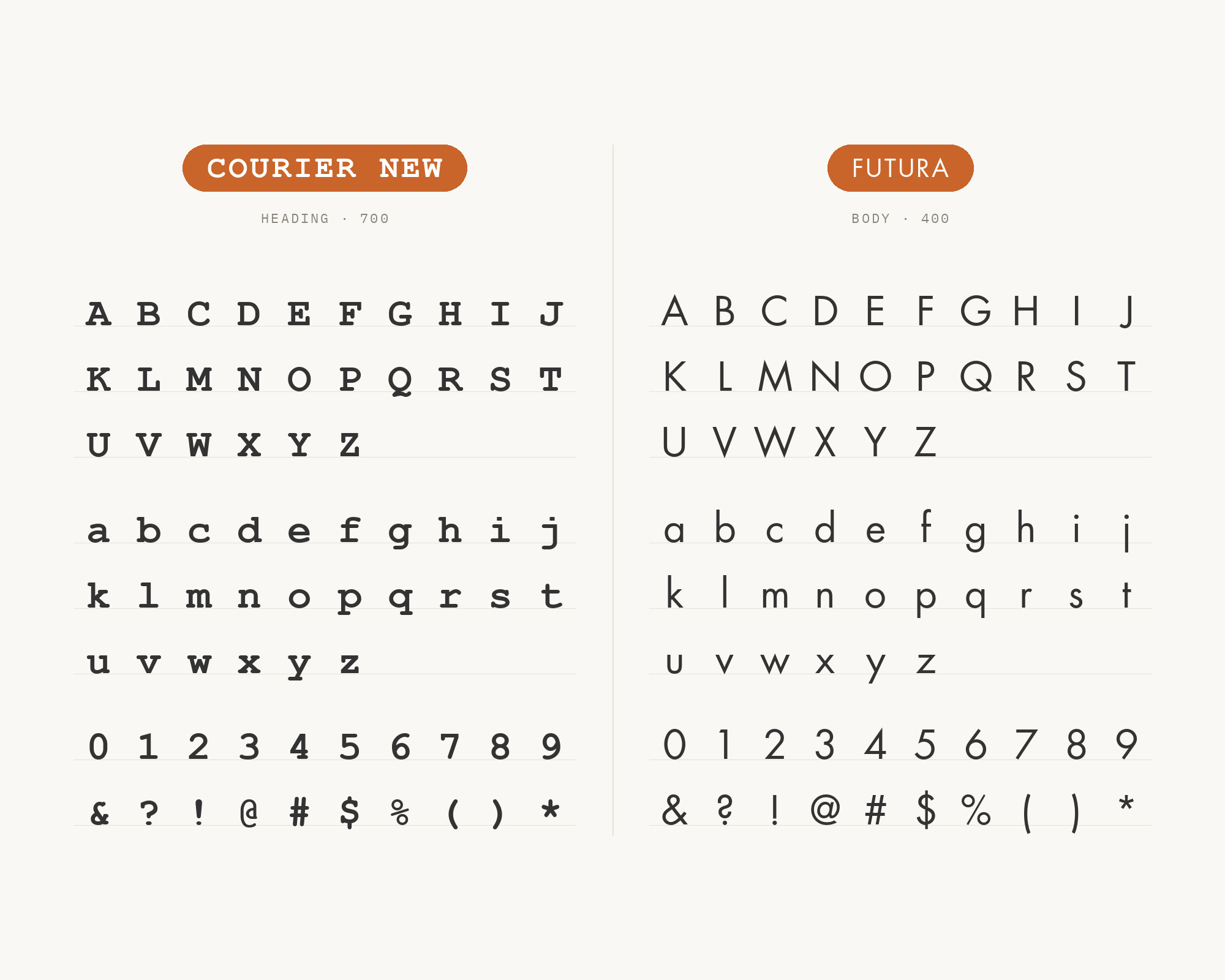
Futura, designed by Paul Renner and released by the Bauer Type Foundry in 1927, builds every letterform from the circle, the triangle, and the straight line — geometric discipline that reads as modern and confident at any size. Fonts In Use lists Futura, Courier New and Helvetica in Aaron Draplin’s 2008 Field Notes branding. The two faces sit at opposite ends of construction logic — pure geometry against a mechanical, typewriter-derived grid — letting Futura headlines feel designed while Courier New does the job of a caption.
10. Helvetica
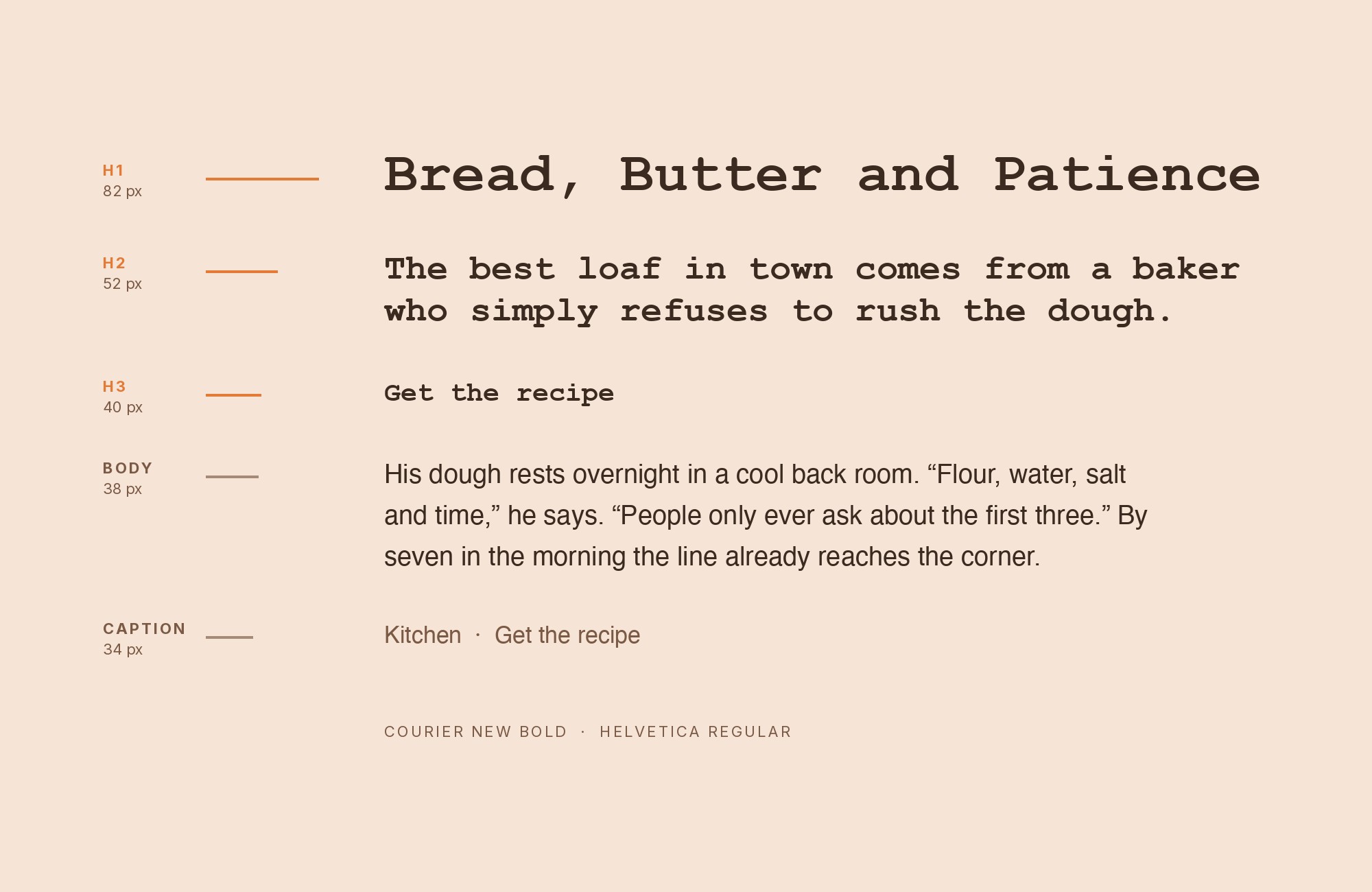
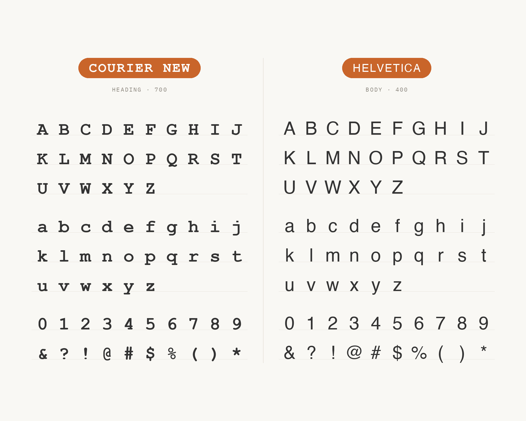
Helvetica, designed by Max Miedinger with art direction from Eduard Hoffmann and released by the Haas Type Foundry in 1957, is the neutral grotesque against which most sans faces get measured — even strokes, a large x-height, almost no personality by design. That neutrality is why it works: Fonts In Use archives the pairing twice, once in Draplin’s Field Notes branding alongside Futura, again in the 2011 project We Killed a Cheerleader. In both, Helvetica supplies clean, characterless sans text that gets out of the way, leaving Courier New’s mechanical rhythm as the only voice with real texture.
11. Avenir
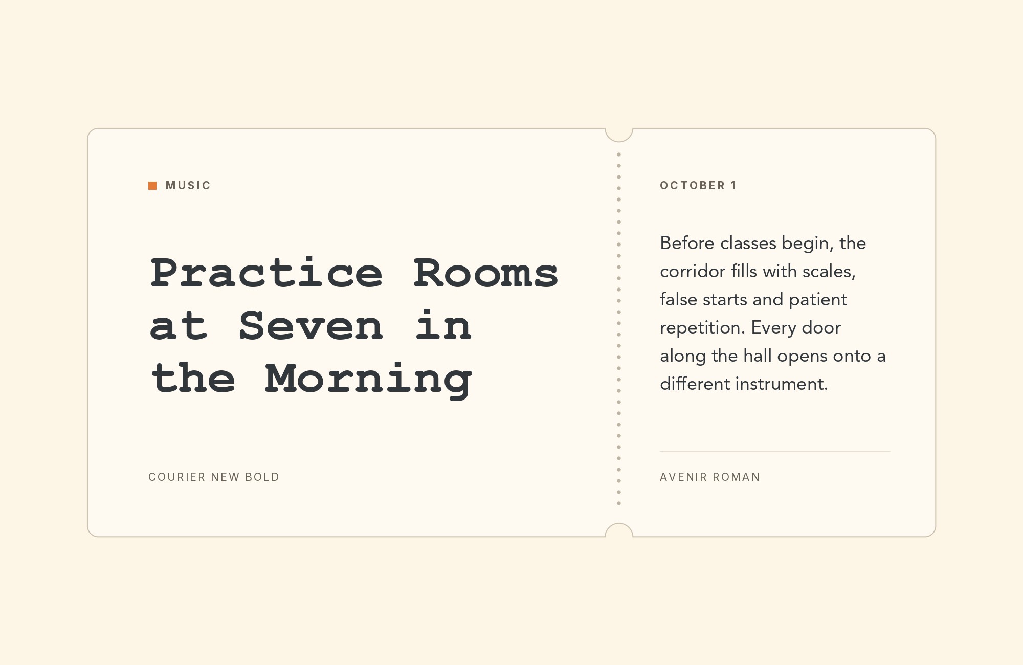
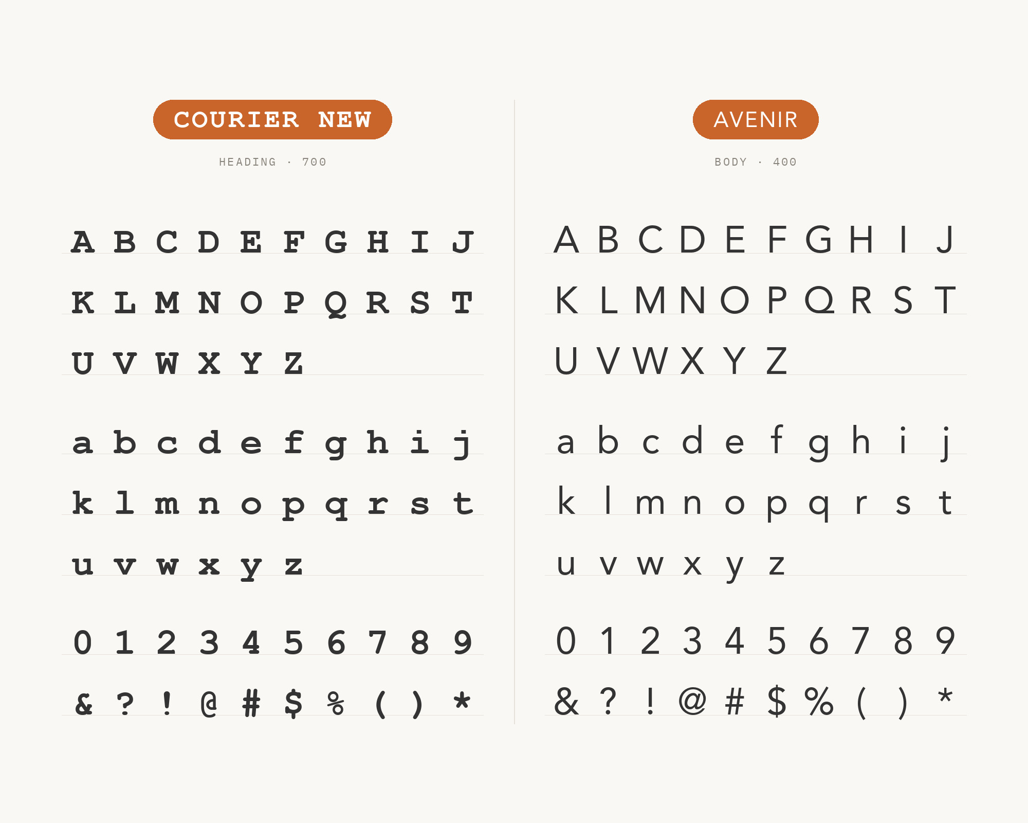
Avenir, designed by Adrian Frutiger and released by Linotype in 1988, softens the geometric sans formula Futura made famous — Frutiger rounded the strokes and adjusted proportions by eye rather than pure compass-and-ruler construction, giving the letterforms real warmth. Fonts In Use archives Tangent Café’s 2013 identity, where Avenir sets the printed text beside Prestige Elite, a typewriter face that Courier New replaces on the website, and the combination reads as approachable rather than cold, because Avenir’s humanist geometry softens what a harder grotesque like Helvetica or Futura would make feel clinical, the pairing for when a typewriter accent needs a gentler counterpart.
12. Prestige Elite
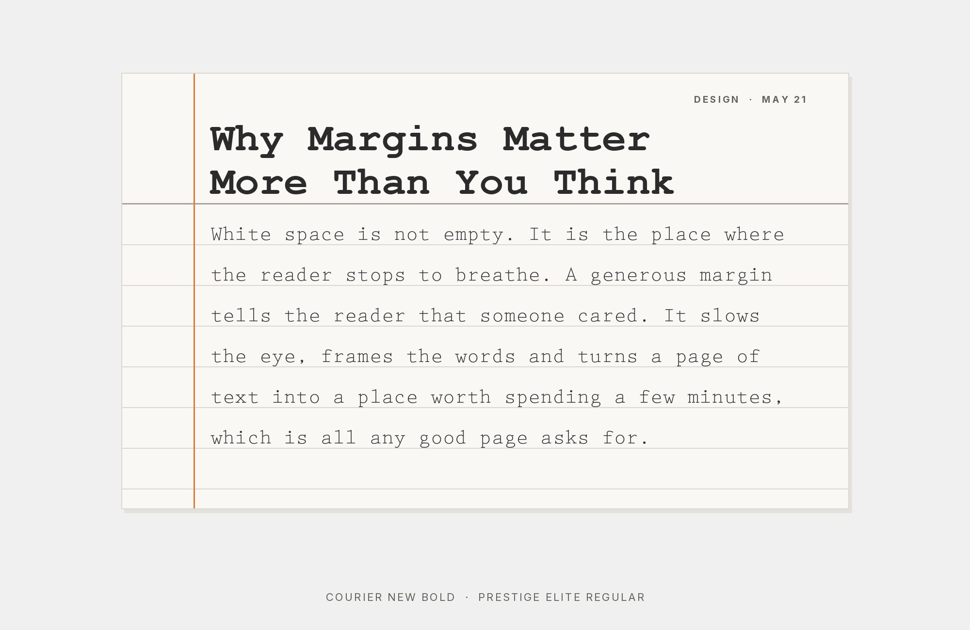
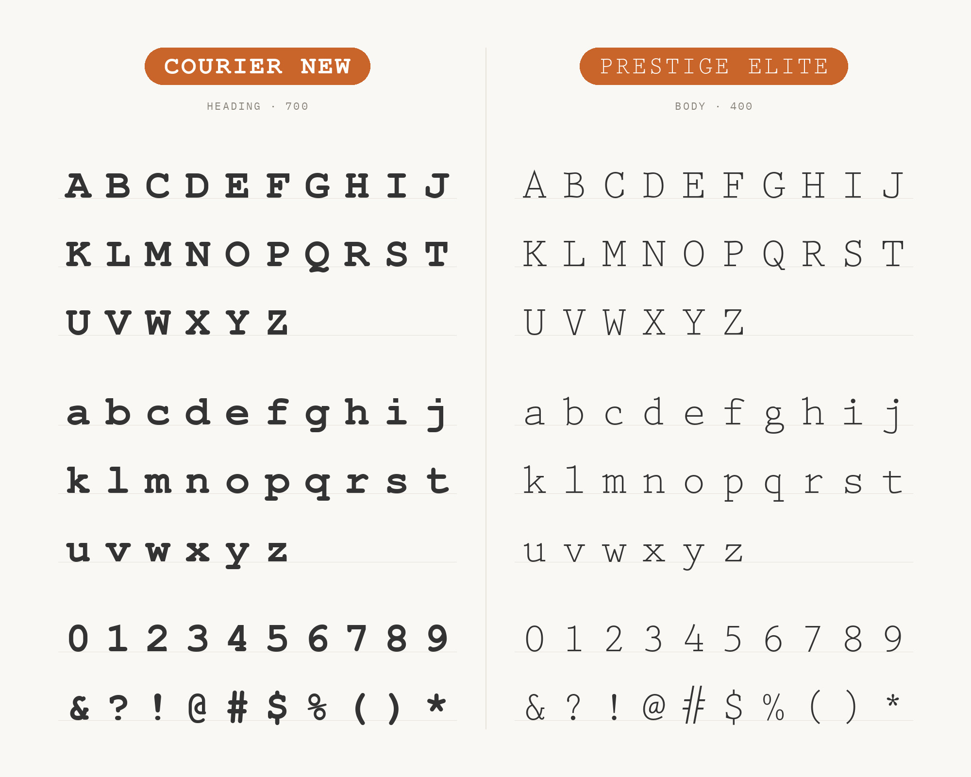
Prestige Elite is another IBM typewriter face, drawn by Clayton Smith in 1953 (MyFonts credits Howard Kettler, the designer behind the original Courier), and published through Linotype as a trademark of IBM. Where every other pairing here sets a sans or serif against Courier New for contrast, Tangent Café’s 2013 identity, archived on Fonts In Use, shows how close the two are: Prestige Elite sets the printed materials, and Courier New stands in for it on the website, one typewriter face substituting for another. The effect doubles down on the mechanical register instead of countering it, useful when a brand wants to feel thoroughly typewritten, not balanced between old and new.
13. Montserrat
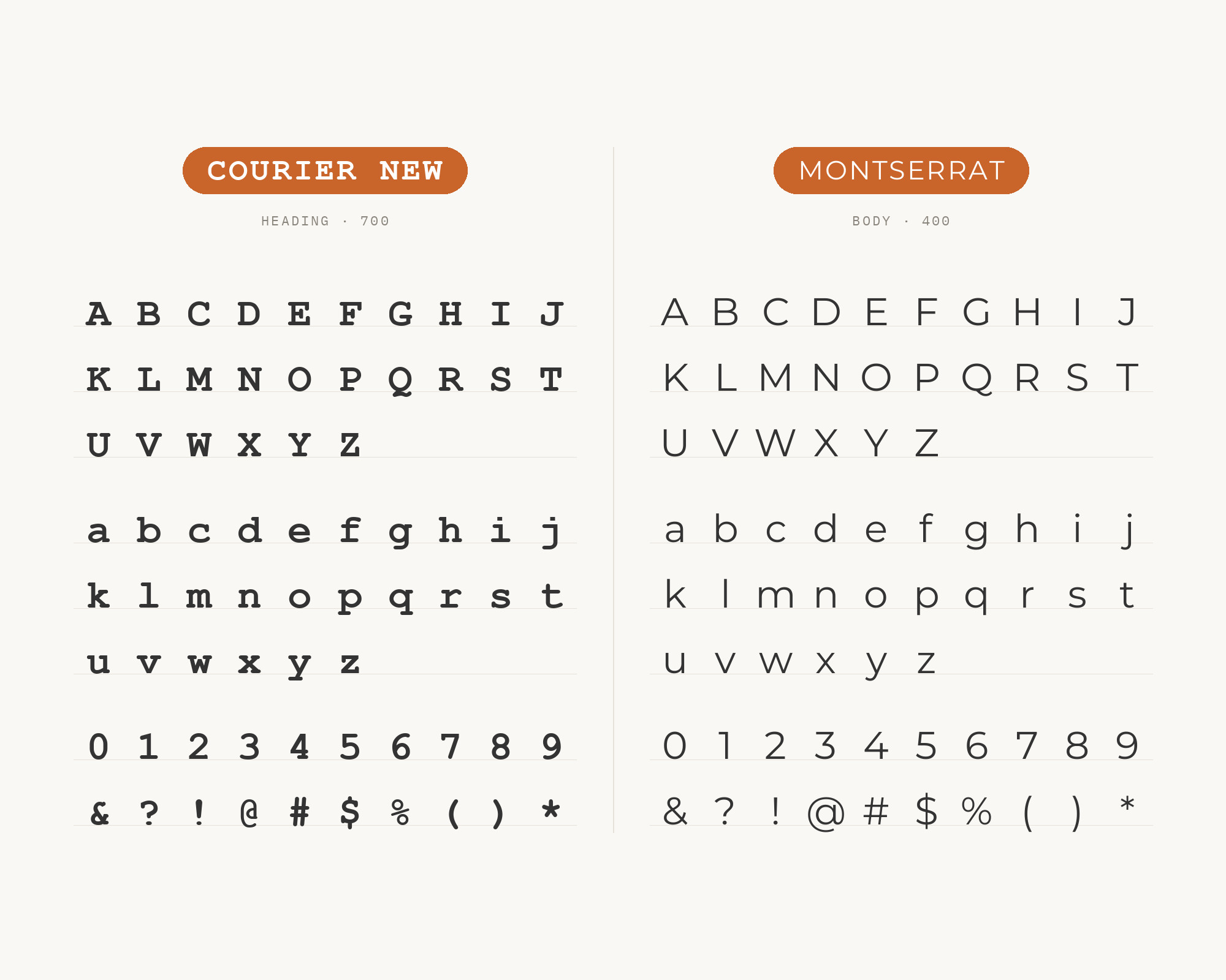
Montserrat, designed by Julieta Ulanovsky and released in 2011, draws its geometric letterforms from 1920s–1950s street signs and painted shopfronts in the Montserrat neighborhood of Buenos Aires, lettering Ulanovsky wanted to preserve before it disappeared. Drawn from the old posters and signs of Buenos Aires’s Montserrat neighborhood, with light, even strokes and true geometric circles, it offsets Courier New’s heavier, retro weight cleanly. Design roundups including digitalsynopsis.com and JustCreative independently name this combination, framing it as a deliberate old/new contrast: Montserrat’s contemporary geometry for headlines, Courier New’s typewriter texture for a retro accent underneath — the most widely repeated Courier New pairing in the research.
14. Calibri
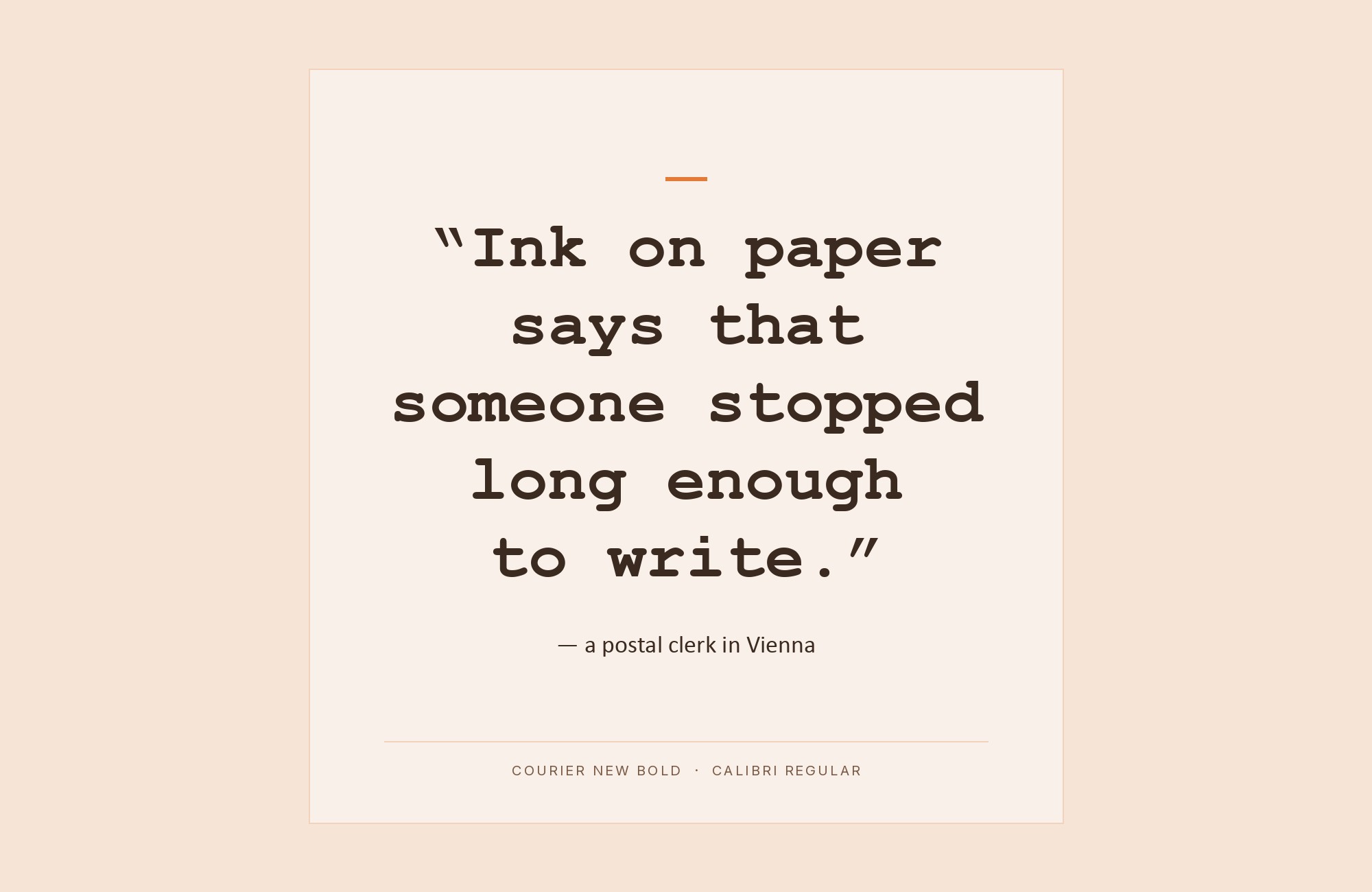
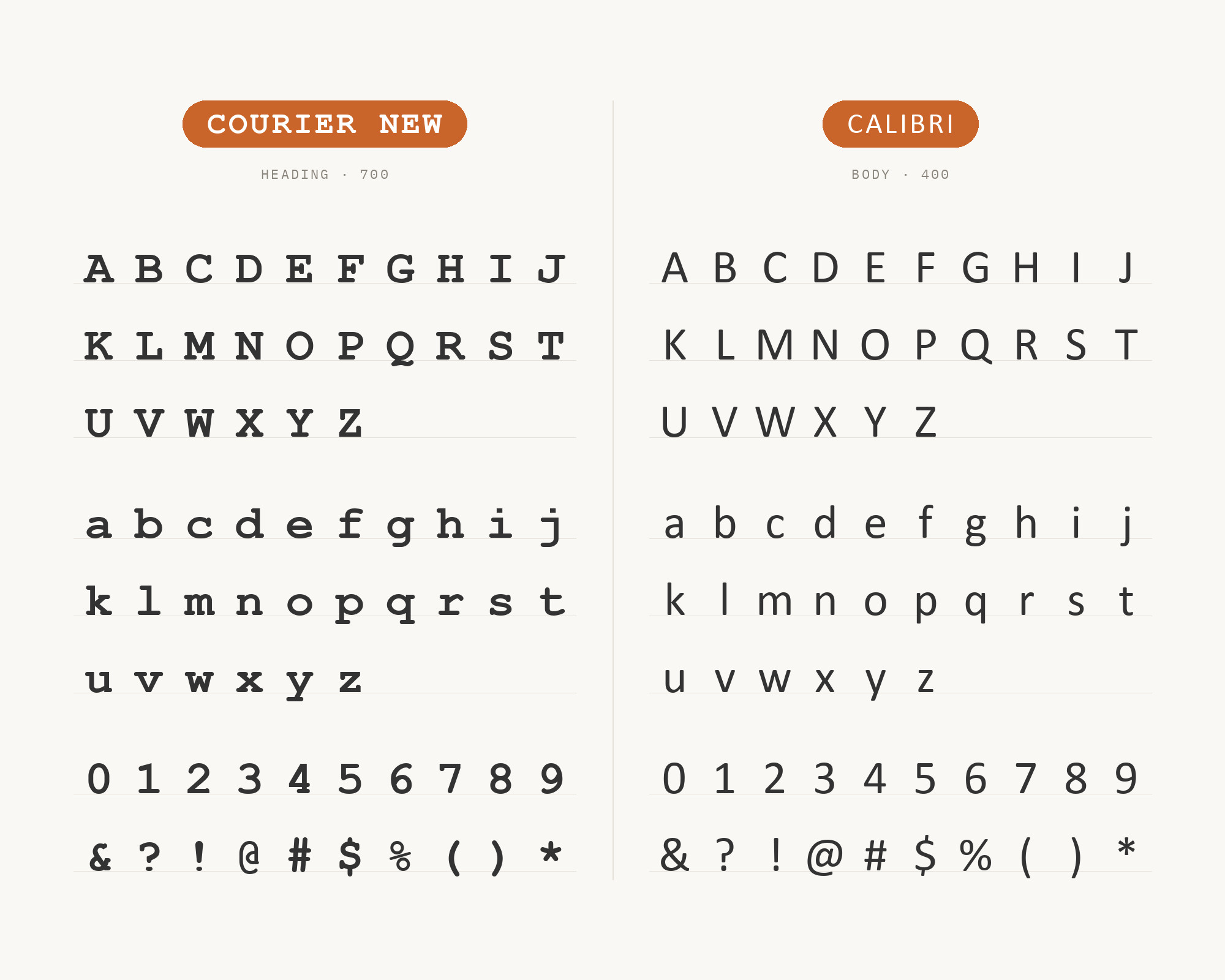
Calibri, designed by Lucas de Groot in 2004 and published in 2007 in Microsoft’s ClearType Font Collection, is a humanist sans with rounded stroke endings built for comfortable on-screen reading, and it became Office’s default body font the year it shipped. Courier New, meanwhile, still ships as one of the core Windows typefaces. An information technology syllabus recommends Calibri or Arial for document text and Courier New for code snippets. That split works here too: Calibri carries ordinary prose at a friendly weight, and Courier New drops in wherever figures or code need exact columns. Calibri was the Office default from 2007 until Aptos replaced it in 2024.
15. IBM Plex Sans
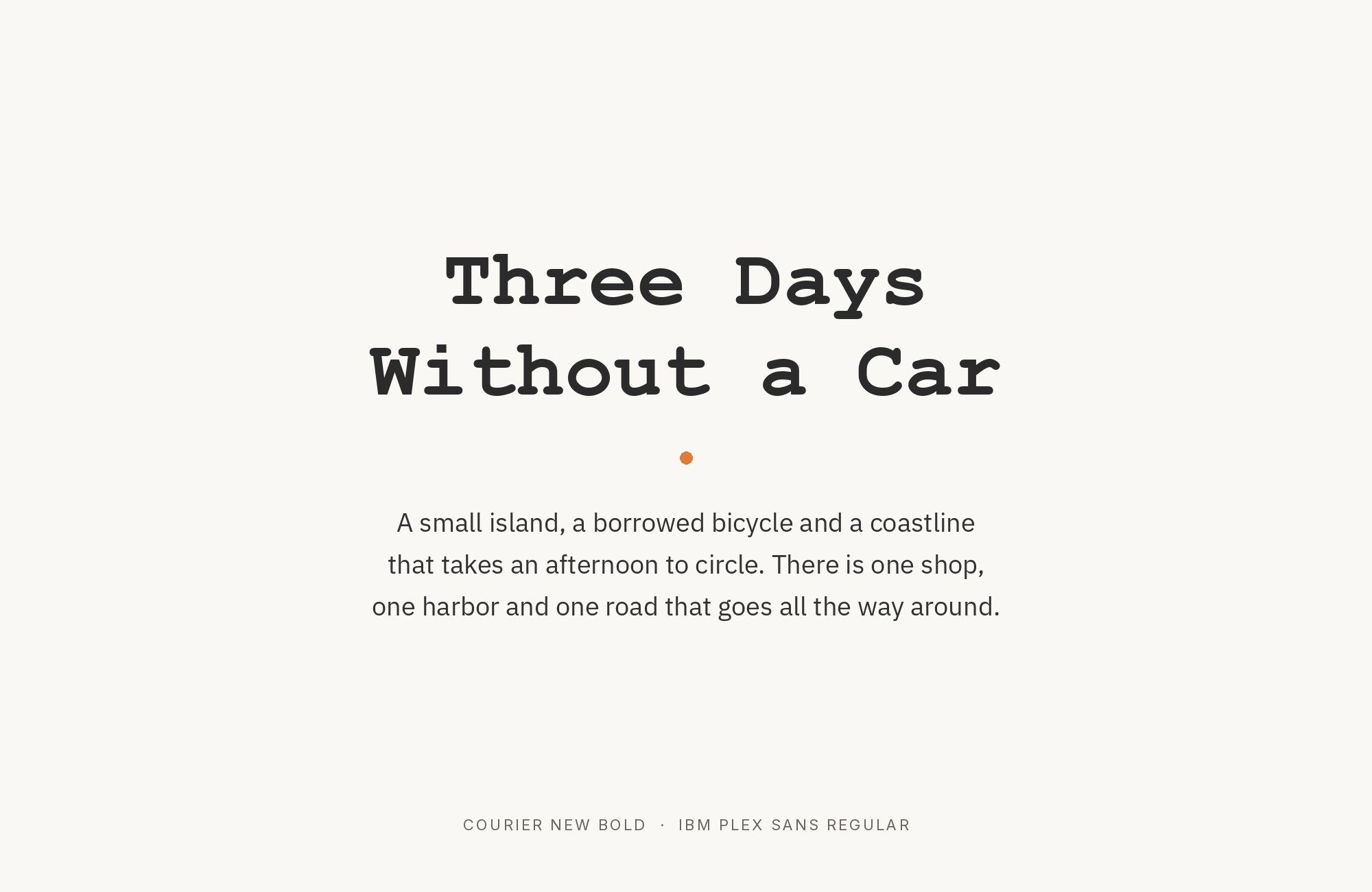
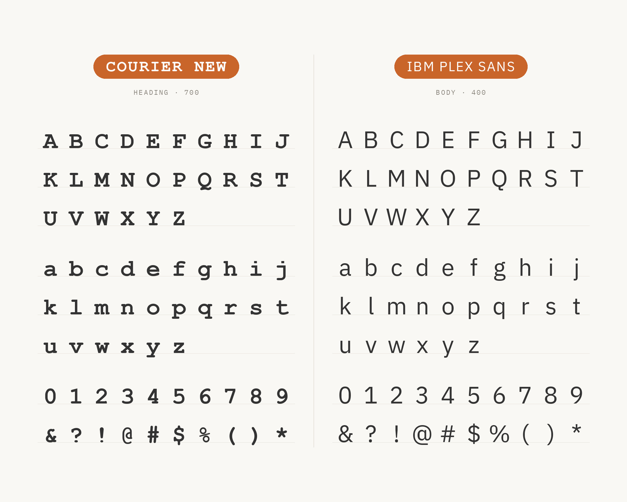
IBM Plex Sans was conceived by Mike Abbink at IBM with the foundry Bold Monday, released in 2017 to replace Helvetica as IBM’s corporate typeface and cut its licensing costs. That makes this pairing historically literal, not merely stylistic: the same company that commissioned the original Courier for its typewriters in the 1950s later built Plex Sans as its modern in-house voice. Plex Sans carries an even, engineered weight with quietly technical details that read naturally next to Courier New’s mechanical, typewriter-era texture, connecting two periods of IBM’s type history.
Conclusion
Courier New carries its own matched system built in. Arial, Times New Roman, Georgia, and Trebuchet MS were released beside it in 1996 as one coordinated Microsoft kit, so any of those four needs no justification — the brief already decided it.
Everything else here is an accent choice, earned because Courier New is so plainly mechanical: a neutral sans like Cantarell gets out of the way entirely, a geometric face like Futura or Montserrat sets up an old-versus-new contrast, and Prestige Elite does the opposite on purpose, doubling the typewriter register instead of countering it. One caution: Matthew Butterick’s Practical Typography calls Courier New “beastly,” and created Triplicate as a replacement, not a partner. For everyone else, set real copy at the size you intend to publish, and judge the rhythm on-screen.
