Frutiger pairs great with Didot, Baskerville and Rockwell. All 7 pairings are shown below in real rendered specimens, with the reason each one works.
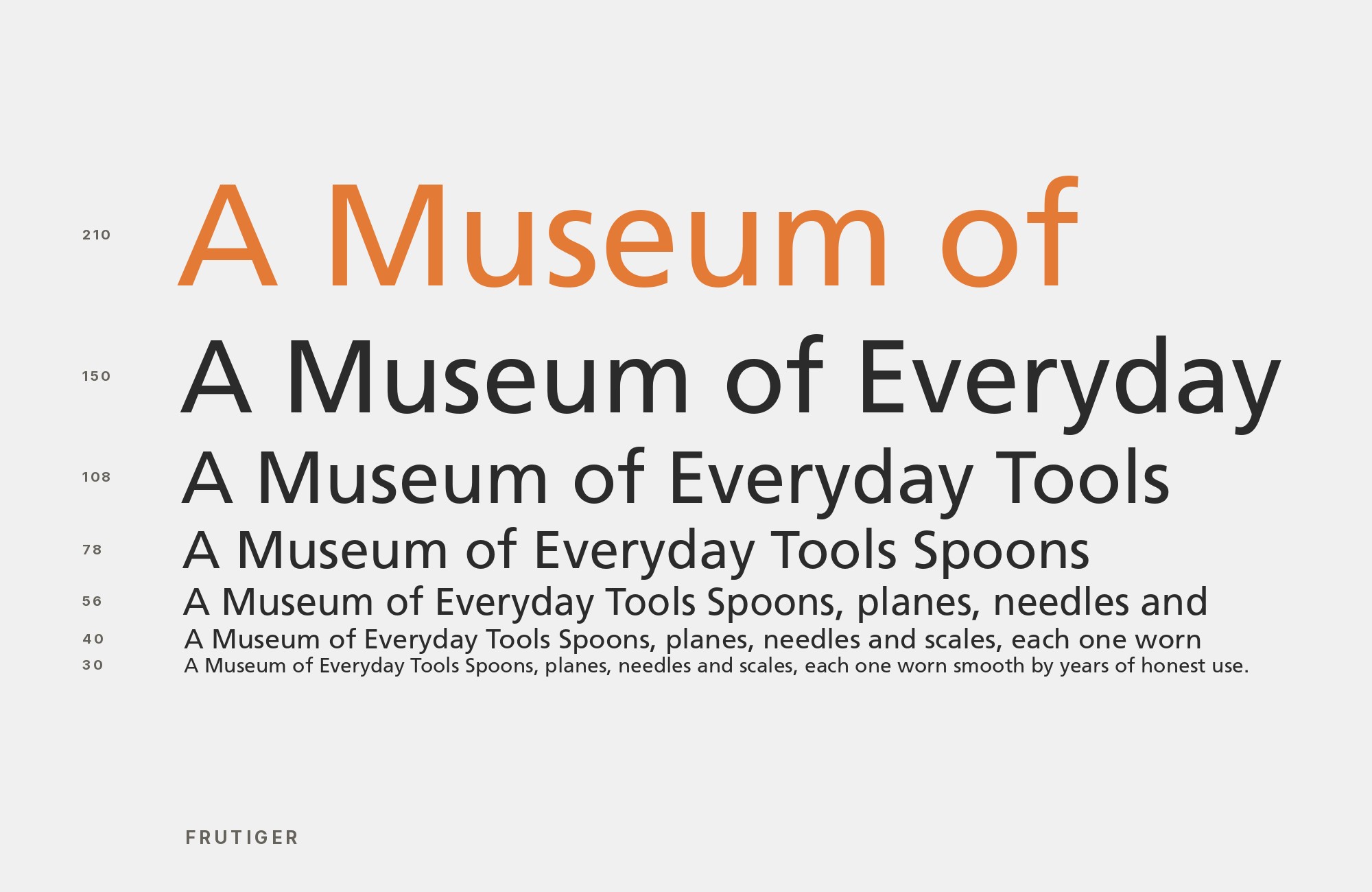
What fonts go with Frutiger? 7 pairings are shown below, each with a reason it works.
Frutiger is a working typeface, not a novelty. Where a pairing shows up in a real project, the note below says so. Here are 7 fonts that pair well with Frutiger.
1. Didot

High-contrast, thin-hairline Didone against Frutiger’s even, humanist strokes — a formal, editorial serif for headlines or captions that keeps Frutiger’s warm legibility doing the reading work in body copy.

Unlimited fonts from $16.50/mo.
29 million fonts, templates and stock assets. One subscription, unlimited downloads.
See the plan2. Baskerville

A transitional serif with generous, open counters mirrors Frutiger’s own design goal — legibility at a distance and at small sizes — so the two share a functional philosophy even though one is a serif and one a humanist sans. Real-world use backs this up on both ends: Bang & Olufsen’s 2013 website ran Frutiger with Baskerville, and a 2019 AGC Studio exhibition poster paired Frutiger with Monotype Baskerville alongside other faces.

Try Semrush free. No credit card.
Start on the $0 plan. Paid plans from $117/mo billed annually.
Try for free3. Rockwell

Kittl and Monotype pair Rockwell, a geometric slab serif, with Neue Frutiger and recommend the pair for infographics and UX-heavy layouts. Rockwell is suited to short headlines and labels. Neue Frutiger stays legible at a distance and works in body copy and captions.

4. Helvetica

Two of the most ubiquitous 20th-century sans faces sit close in weight and x-height, so real projects use Helvetica as Frutiger’s calm, neutral partner rather than a rival — seen on the packaging of VPRO’s Digitale Gids, a 1994 Dutch CD series (Frutiger with Neue Helvetica), and in Norway’s 2014–2019 banknote series (Frutiger with Helvetica). Swapping between the two reads as consistency, not clash, when a project needs one grotesque-adjacent voice at two registers.

5. Optima

Hermann Zapf’s flared, semi-serif stroke endings give Frutiger’s rounder humanist letterforms a touch of classical, calligraphic warmth. The pair was used on Wrocław’s 2015 street-sign system — a wayfinding project, which fits naturally since Frutiger itself was designed for exactly that job.

6. Univers

Univers is Adrian Frutiger’s own earlier typeface, and the two were shown side by side in A Life’s Work: Adrian Frutiger (2016), a student publication about the designer’s best-known typefaces. Pairing them reads as a deliberate lineage statement — tracing Frutiger’s own move from a stricter neo-grotesque toward the warmer, more organic proportions he later built into his namesake face.

7. Source Serif 4

Source Serif 4 is Adobe’s companion serif to Source Sans, drawn with a similarly even, legible rhythm rather than display flourish — a text serif built for screen and print reading alike. Its moderate contrast and calm proportions sit comfortably beneath Frutiger’s humanist sans forms without either voice fighting for attention.

Conclusion
There are no absolute rules for font pairing, just principles to guide you. The key is contrast—in weight, in style (serif vs. sans-serif), or in personality. Frutiger is versatile enough to play well with many different typefaces.
Trust your eye, experiment freely, and remember that the best pairing is the one that serves your content and audience. Typography should enhance communication, not complicate it.
