Optima pairs great with Helvetica, Palatino and Karla. All 15 pairings are shown below in real rendered specimens, with the reason each one works.
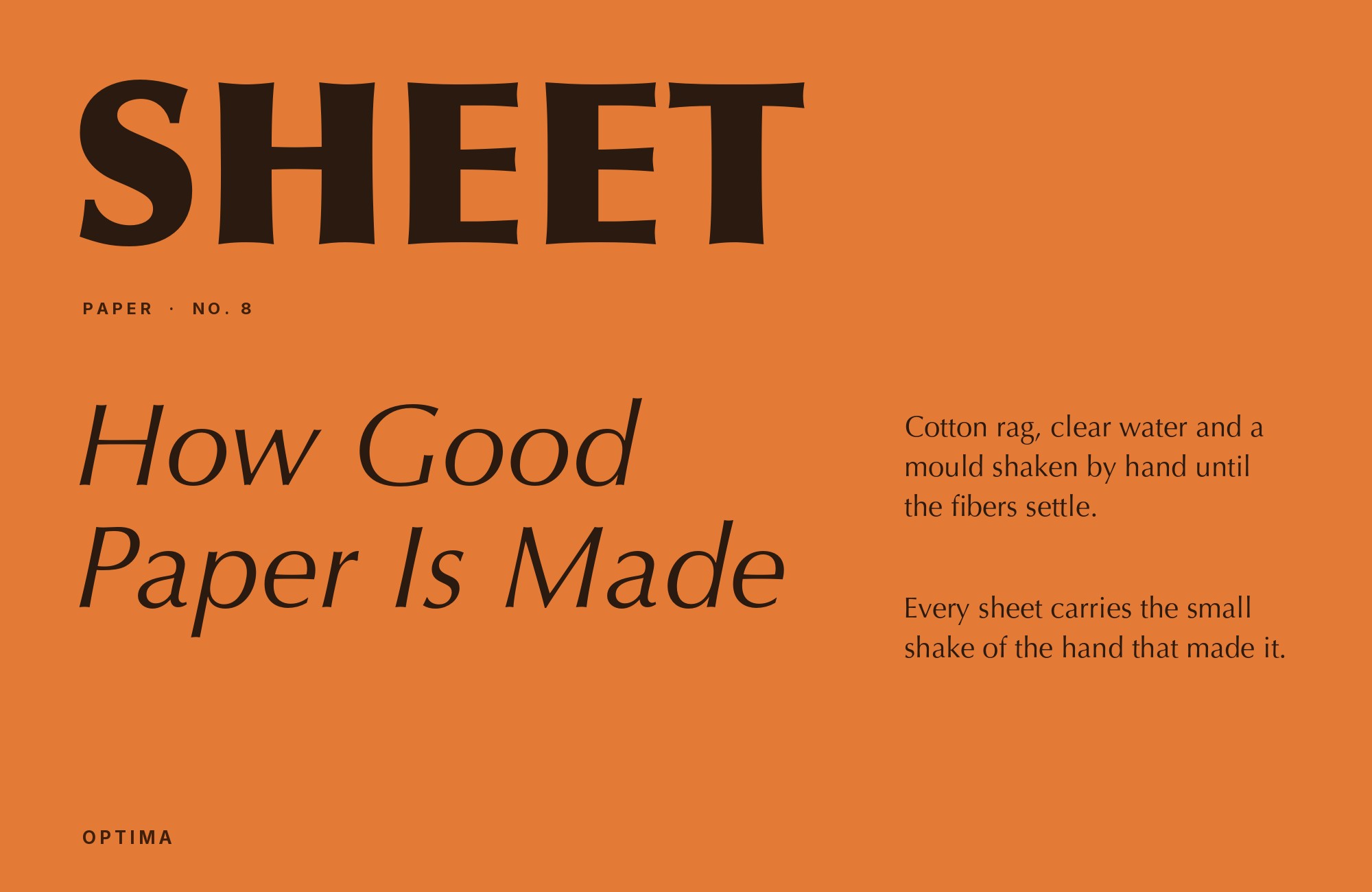
What fonts go with Optima? Hermann Zapf’s 1958 design sits in a category of one: no true serifs, but stems that flare and swell at the terminals, giving a sans-serif skeleton the warmth and weight of carved, inscriptional lettering.
Zapf drew Optima for D. Stempel AG after a trip to Florence, where Renaissance lettering carved into gravestone slabs gave him the idea of a typeface with a sans-serif structure but a calligraphic, modulated stroke — thicker at the middle of each stem, tapering toward flared ends rather than terminating flat. The result reads as neither fully sans nor fully serif, and it has carried genuine cultural weight ever since: it is the typeface cut into the Vietnam Veterans Memorial and into the bronze parapets of the National September 11 Memorial. That inscriptional gravity is built into the letterforms themselves, not added by context.
That in-between quality is exactly what makes Optima difficult to pair. A partner that is too plain — a flat, uninflected grotesque with no warmth at all — makes Optima’s flare look like an accident rather than a decision. A partner that is too decorative competes with Optima’s own structural ambiguity instead of resolving it. The fonts that work either supply a clean neutrality Optima can stand out against, or they share its warm, hand-derived lineage closely enough to read as one voice. The pairings below do one or the other, ordered from the most obtainable toward the more specialised.
1. Helvetica

Nothing about Helvetica flares, tapers, or swells — every stroke terminates flat and every proportion is rectilinear, which is precisely why it works as quiet body copy beneath an Optima headline. The grotesque’s total lack of stroke modulation throws Optima’s own calligraphic warmth into relief instead of competing with it. Helvetica ships on Apple platforms and is licensed through Adobe Fonts and Monotype. Use it for text, UI and captions; let Optima carry the display voice above it.

2. Palatino

Both faces came from Zapf’s own hand, and it shows: Palatino’s calligraphic serifs and Optima’s calligraphic-flared sans share the same broad-nib logic even though one carries serifs and the other does not. Setting them together reads as one considered voice rather than unrelated systems bolted side by side. Both ship as system fonts on macOS, so the pairing is available on Apple platforms with no license to arrange. It suits documents, formal print and any brand system that wants internal consistency more than contrast.

3. Karla

Karla is a grotesque sans with a warmth that sits close to Optima’s own, without borrowing its flare directly. That closeness lets it recede politely into long-form text under an Optima heading instead of clashing with it the way a colder grotesque might. Free on Google Fonts, it is a practical choice for web and product work that wants a humanist match at body sizes without needing to license a companion serif, and it holds up well down to normal paragraph sizes.

4. Nimbus Sans

Built as an open, metric-compatible alternative to Helvetica, Nimbus Sans carries the same flat, rectilinear terminals and offers a genuinely free path to that same neutral contrast against Optima’s flare. It is a practical substitute when a full Helvetica license is not available or not worth arranging for a smaller project. The pairing logic is identical to Helvetica’s — plain grotesque body text under a warmer, more expressive display face — just with an open-source license attached and no obtainability question left to resolve.

“AI builds anything, so what do I sell?”
Taste is the answer. Own your stack and automate your own CMS.
Find Out How5. Space Grotesk

A technical, slightly mono-leaning grotesque with quirky, engineered proportions, Space Grotesk is a deliberate foil to Optima’s organic flare rather than a match for it. That contrast makes it useful for captions, specifications and labels that should read as systematic and current next to a classical, humanist display line. Free on Google Fonts, it works best kept to smaller supporting text — its personality is distinct enough that using it at display size alongside Optima would create competing display voices.

6. Futura

Futura’s circles and triangles are drawn with a compass, not a pen, which makes it the cleanest possible opposite to Optima’s organic, brush-built stress. Set one above the other and the hierarchy reads instantly: a cool, machine-precise structure against a warm, hand-derived display face. Futura is a licensed retail face available through Adobe Fonts and other major foundries rather than a free download, so budget for that before committing a layout to the pairing. Use Futura for structural or wayfinding elements, Optima for the display voice that needs personality.

7. Charter

Matthew Carter drew Charter for clarity at small sizes and on poor-quality output, giving it sturdy, workmanlike strokes with almost nothing decorative to lose in reproduction. He drew it in 1987 for Bitstream as a sturdy transitional serif that would survive low-resolution printers. Set beside Optima’s warmer, more calligraphic letterforms, it stays calm rather than competing, which makes it a dependable choice for dense body text or documentation under an Optima heading. A Canadian booklet set its body in Bitstream Charter and its chapter numbers in Zapf Humanist, Bitstream’s version of Optima. Charter ships with macOS. The original Charter has a permissive license, while Charter BT is proprietary, so check which version a project uses.

8. Crimson Pro

A refined old-style text serif built specifically for lengthy reading, Crimson Pro’s quiet, unhurried curves match Optima’s restrained classicism rather than fighting it for attention. Jacques Le Bailly developed it from Sebastian Kosch’s Crimson designs as a Google Fonts family with a full italic, so the pairing needs no retail license. It has none of Optima’s flare, but its overall calm and moderate proportions keep the two from feeling like they belong to different projects. One course project used Optima LT Pro and Crimson Pro together in video infographics. Free on Google Fonts, it suits literary, scholarly or book-like layouts where Optima handles headings and Crimson Pro carries the actual reading at comfortable paragraph sizes.

9. Source Serif 4

Adobe’s open-source transitional serif was built as a text companion within the wider Source superfamily, and its moderate contrast and workable x-height give Optima’s more expressive display forms a quiet, neutral partner for running text. It does not try to match Optima’s warmth directly; instead it simply gets out of the way at paragraph sizes. The University of Vienna uses Optima in its wordmark. Its design manual also approves Source Serif 4 for use in the wider identity. Free and variable, it is a solid choice for editorial sites that need a dependable body serif without any flourish of its own, set at a comfortable paragraph size for extended reading.

10. Spectral

Spectral was optimised for screen reading and ships with a full weight range and true italics, which gives an Optima-based system the hierarchy options Optima’s own narrower weight range cannot provide on its own. Use Spectral wherever the same brand needs both display headlines and long stretches of body text — its range lets one typeface do work Optima alone would strain to cover. Free on Google Fonts, it pairs well in editorial and publishing contexts built around a single serif family.

11. TeX Gyre Schola

An open revival of Century Schoolbook, TeX Gyre Schola was built for classroom legibility: sturdy strokes, a large x-height, and nothing ornamental to distract a young reader. Set beneath Optima’s more expressive display use, its plain, no-frills character keeps body text straightforward rather than trying to echo the headline’s warmth. Freely licensed, it is a practical choice for instructional material, reports and textbooks where clarity matters more than personality and the reader is scanning for information, not lingering over the page.

12. Impact

Impact is a blunt, ultra-condensed grotesque built for a single loud moment, not a paragraph, and it has historically shown up alongside Optima on television title graphics for exactly that reason. Against Optima’s refinement, it reads as a deliberate tonal jolt — useful once, briefly, and never as a running text partner. It ships as a Windows system font, so it is widely available at no cost. Reserve it for a single word or short phrase where raw impact matters more than consistency with the rest of the system.

13. Century Old Style

Its generous, rounded curves echo Optima’s warmth in long-form text, so body copy feels at home when Optima is reserved for headings. Monotype and Bitstream have issued versions of the face, so check the license for the version you use. The pairing suits book design, catalogues and printed matter where a period-appropriate serif under a mid-century display face reads as intentional.

14. Cochin

A delicate French serif of 1912, based on 18th-century copperplate engravings and still bundled with macOS, Cochin has a documented history beside Optima in luxury perfume packaging from around 1992, where the two faces reinforced the same perfumed, editorial mood together. It still ships with macOS, and its ornamental detail is best reserved for display sizes in packaging or premium print rather than for setting body copy, where its delicate strokes would thin out and lose definition.

15. Peignot

A. M. Cassandre’s Art Deco display face has a documented history set beside Optima on mid-century jazz album covers, one geometric-Deco display voice next to one humanist-brush display voice, sharing an era without competing for the same job on the page. Peignot is a specialty retail face with genuinely unusual letterforms — several of its lowercase-like glyphs are actually small capitals — so it works only as a short, display-only line. Reserve it for nostalgic or period-specific branding rather than any general-purpose system.

Conclusion
Optima’s research points to different answers depending on the project. Pair it with a neutral modern grotesque — Helvetica, Karla, Nimbus Sans — and the result reads as a contemporary digital product with one warm accent on top. Pair it with a historic serif — Century Old Style, Cochin, Peignot — and the result leans into the same mid-century, inscriptional gravity Optima already carries on its own. Neither is more correct; the right one depends on whether the project is a modern interface or an editorial, heritage or luxury piece.
Test the choice at the sizes you will actually use. Impact and Peignot both work for exactly one loud moment and nowhere else, Cochin’s ornament needs room to breathe, and Optima’s own flared stems can look uneven if the partner’s x-height sits too close to its own. Set real copy before deciding the pairing is finished.
