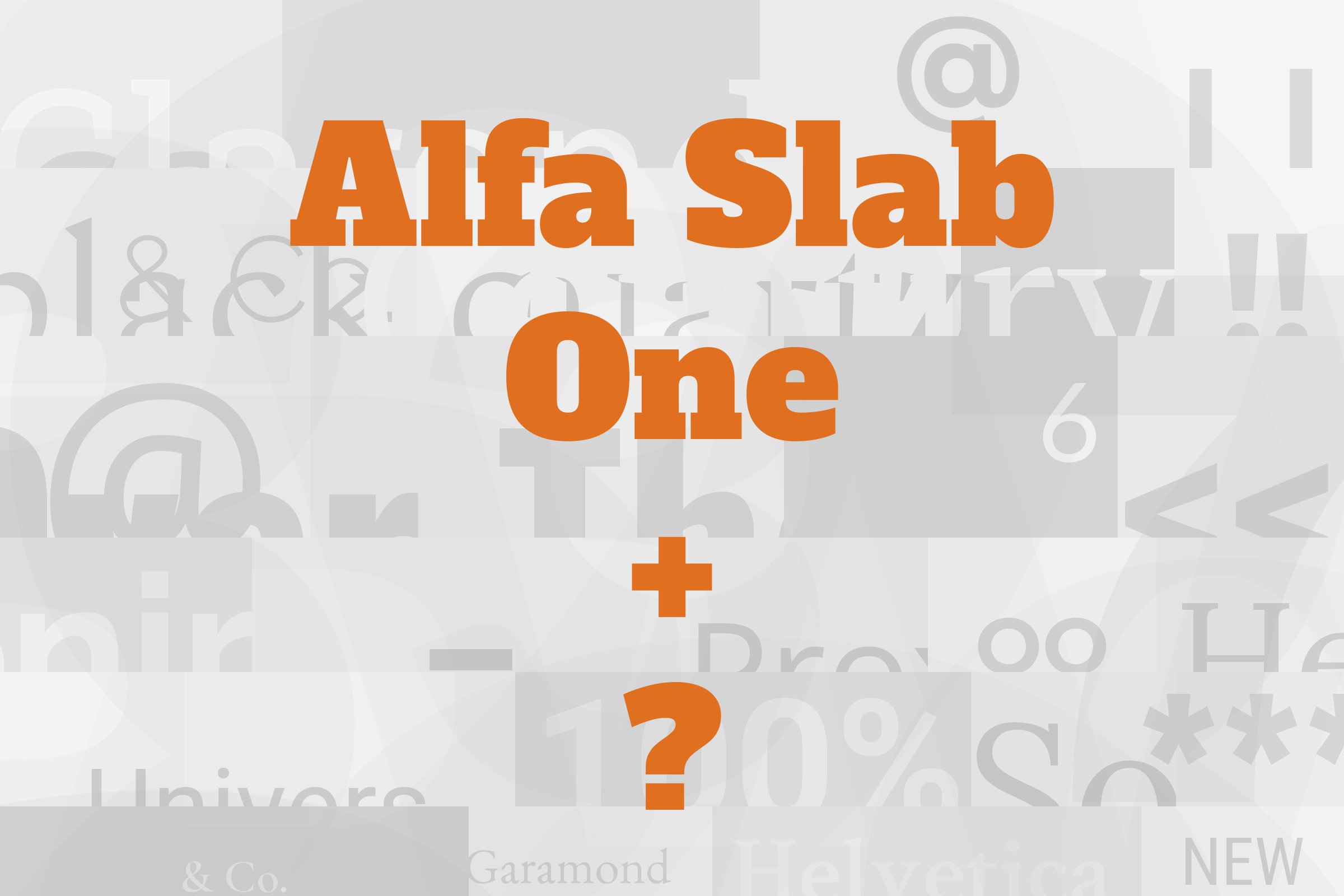
Alfa Slab One pairs great with Open Sans, Roboto and Gentium Book Basic. All 10 pairings are shown below in real rendered specimens, with the reason each one works.

What fonts go with Alfa Slab One? Start with what the font refuses to do. Alfa Slab One is a single, very black weight with no italic and no lighter sibling, so it cannot carry a paragraph and it cannot build a hierarchy by itself. Whatever you put next to it has to do all of the quiet work.
Alfa Slab One was released in a single style under the SIL Open Font License in 2011, and Google Fonts lists JM Solé as its designer. Google Fonts describes it as a contemporary take on the Six-lines Pica Egyptian created by Robert Thorne for the Thorowgood Foundry. It was designed with an extreme stem weight, big serifs, more stem contrast and gradual terminals with a single serif. The result is a slab with extreme black density: the counters are small, the serifs are heavy blocks, and a short word turns into a solid shape on the page. That is a poster voice. It is also a fairly warm one, because the gradual terminals soften what would otherwise read as a hard-edged industrial slab.
So the pairing problem is almost entirely about weight contrast and text colour. A partner has to be light enough and open enough to read comfortably at 16px, and neutral enough that it does not start a second argument with a face this loud. Most of the published advice lands on humanist and geometric sans serifs for that reason, with one sturdy book serif as the main exception. The two documented real-world uses go the other way and add a second display face. Here are 10 fonts that pair with Alfa Slab One.
1. Open Sans
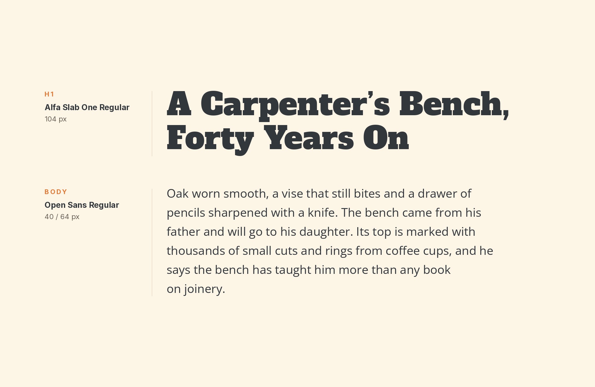
Open Sans is the most often recommended Alfa Slab One partner we found. Applet Studio pairs them for Squarespace sites. Venngage suggests the pair for infographics, reports or presentations. DocHipo pairs them for gym and fitness designs. Wix’s designers even suggest Open Sans for the body as the fix for a pairing they disliked (more on that under Lato). Steve Matteson designed it under commission from Google, and it was released in 2011. Its wide apertures and large x-height make it easy to read at small sizes, which is exactly the job Alfa Slab One hands off. The contrast is simple and strong: a solid, blocky slab headline over a light, open, upright text face. Venngage adds a useful warning: Alfa Slab can become difficult to read under about 30 pixels. Keep the slab for short, large headlines and give Open Sans everything else, including subheads. It suits posters, reports, fitness brands and portfolio sites that want a loud title with calm copy.
Junior work is now a prompt. The biggest profit center in your studio is vanishing.
How to fix this?
Find Out How2. Roboto
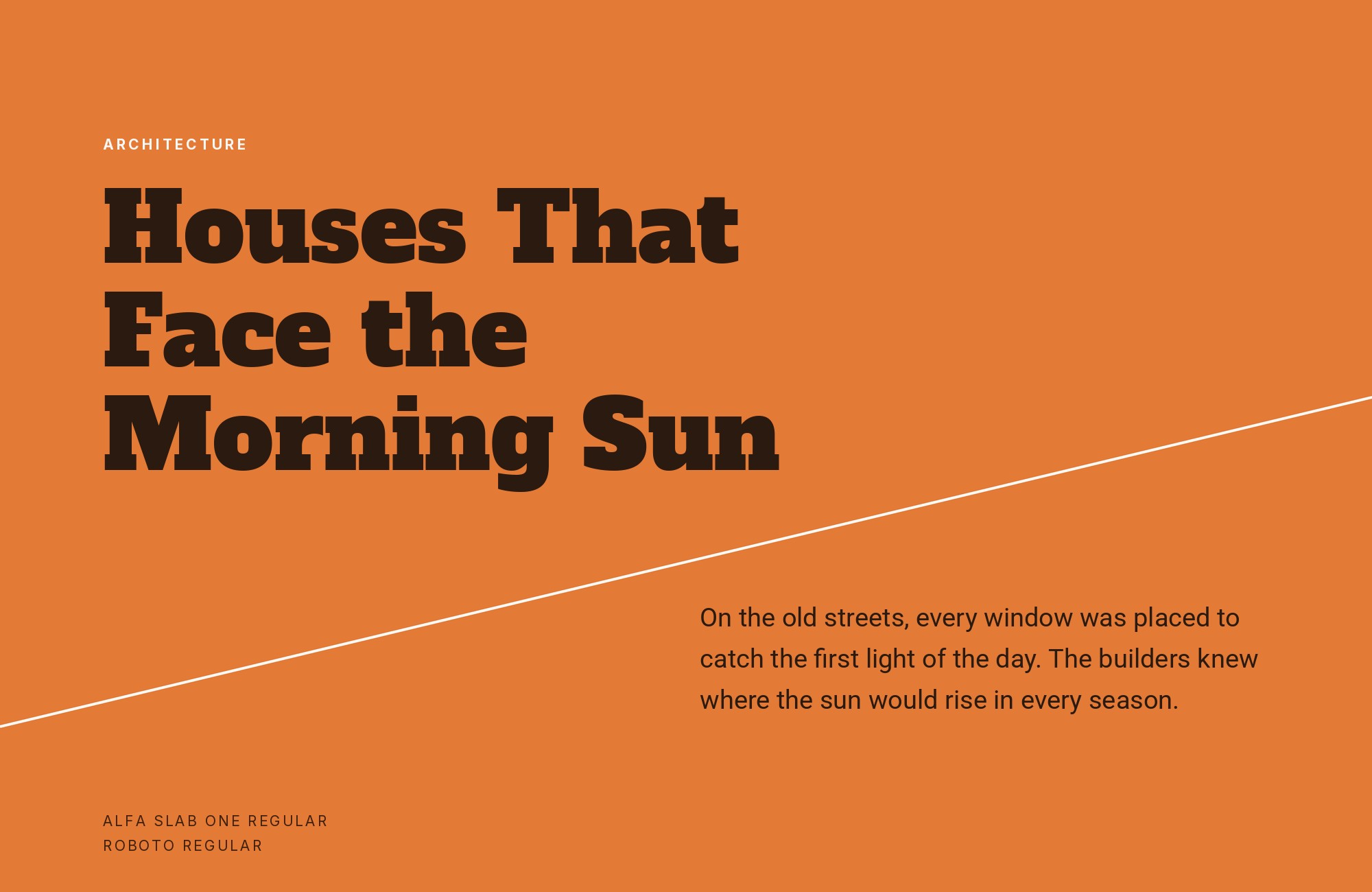
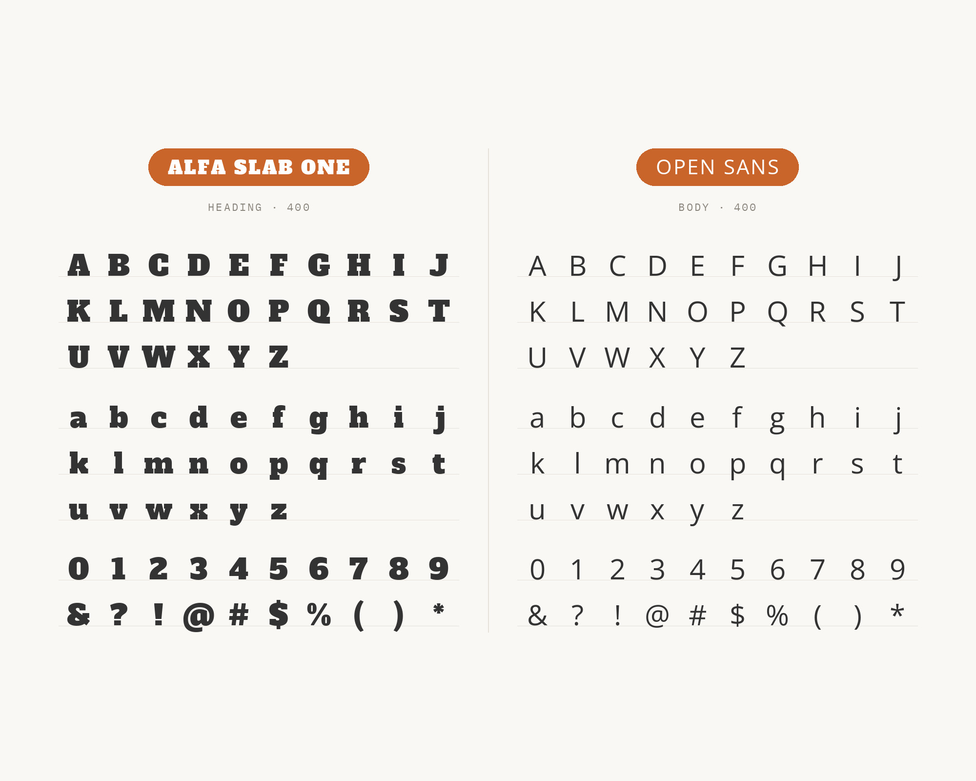
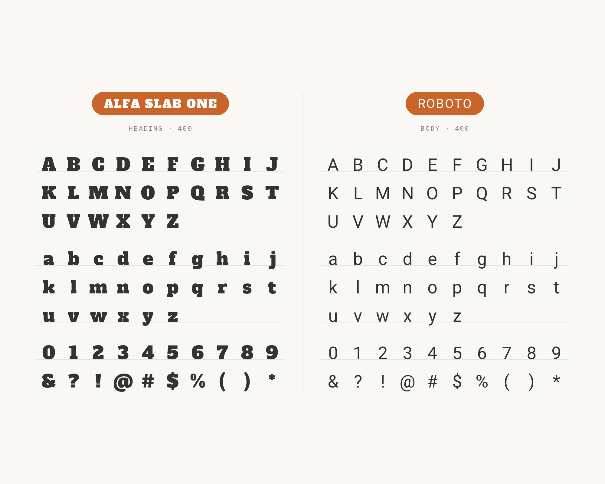
Roboto is recommended with Alfa Slab One by Vandelay Design, and Easil’s free font pairing guide names it too. Google’s description says Roboto has a mechanical skeleton and the forms are largely geometric, while the font features friendly and open curves. That split personality is useful here. The mechanical side keeps the body text crisp and businesslike under a headline that is anything but restrained, and the open curves stop the page from feeling cold. Roboto also lets letters settle into their natural width, so paragraphs have an easy rhythm. Compared with Open Sans it reads slightly tighter and more technical, so choose it for product pages, dashboards and marketing sites where the slab adds personality to an otherwise engineered interface. Set Roboto in Regular for text and Medium for labels, and let Alfa Slab One be the only heavy thing on screen.
3. Gentium Book Basic
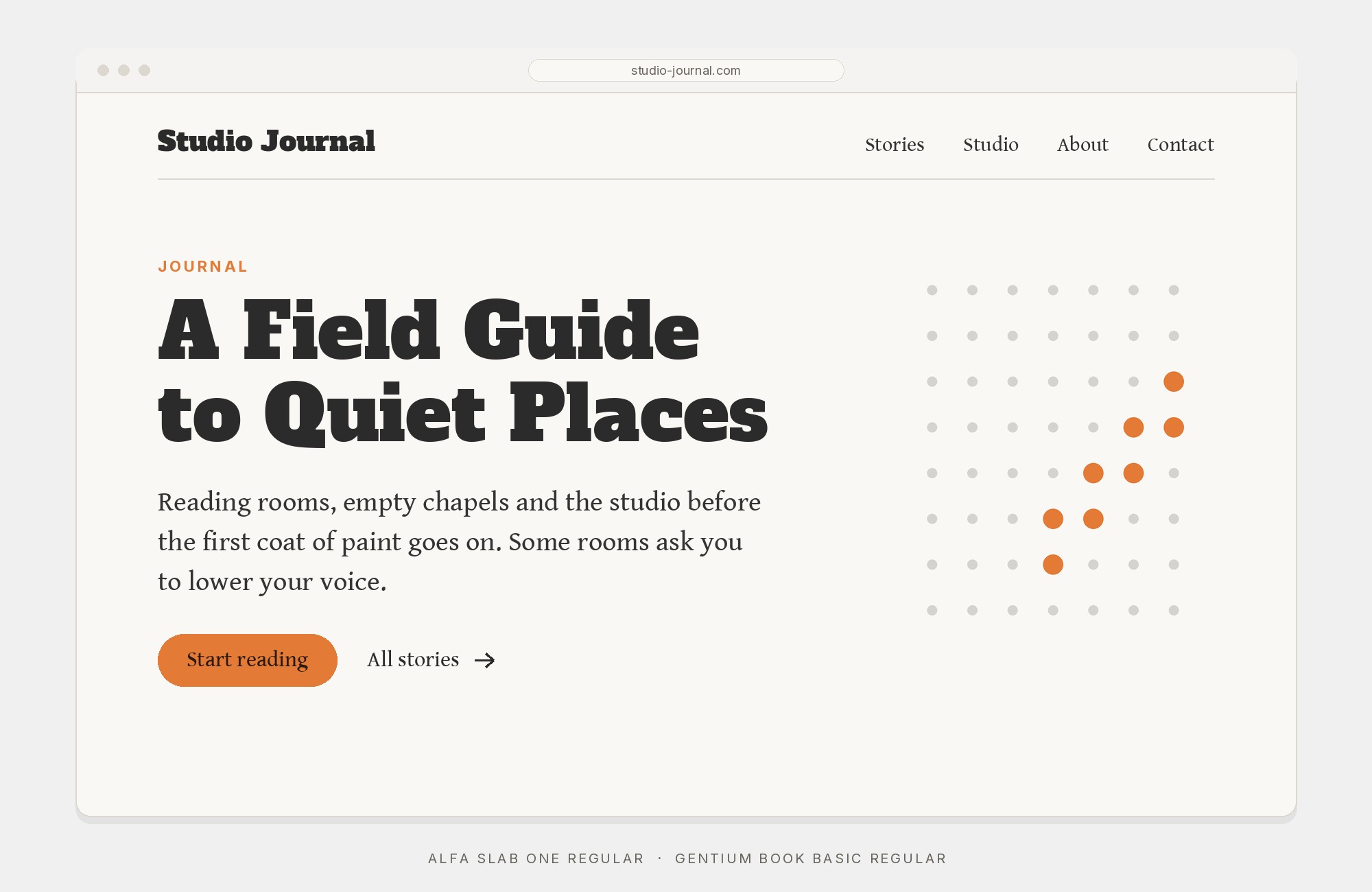
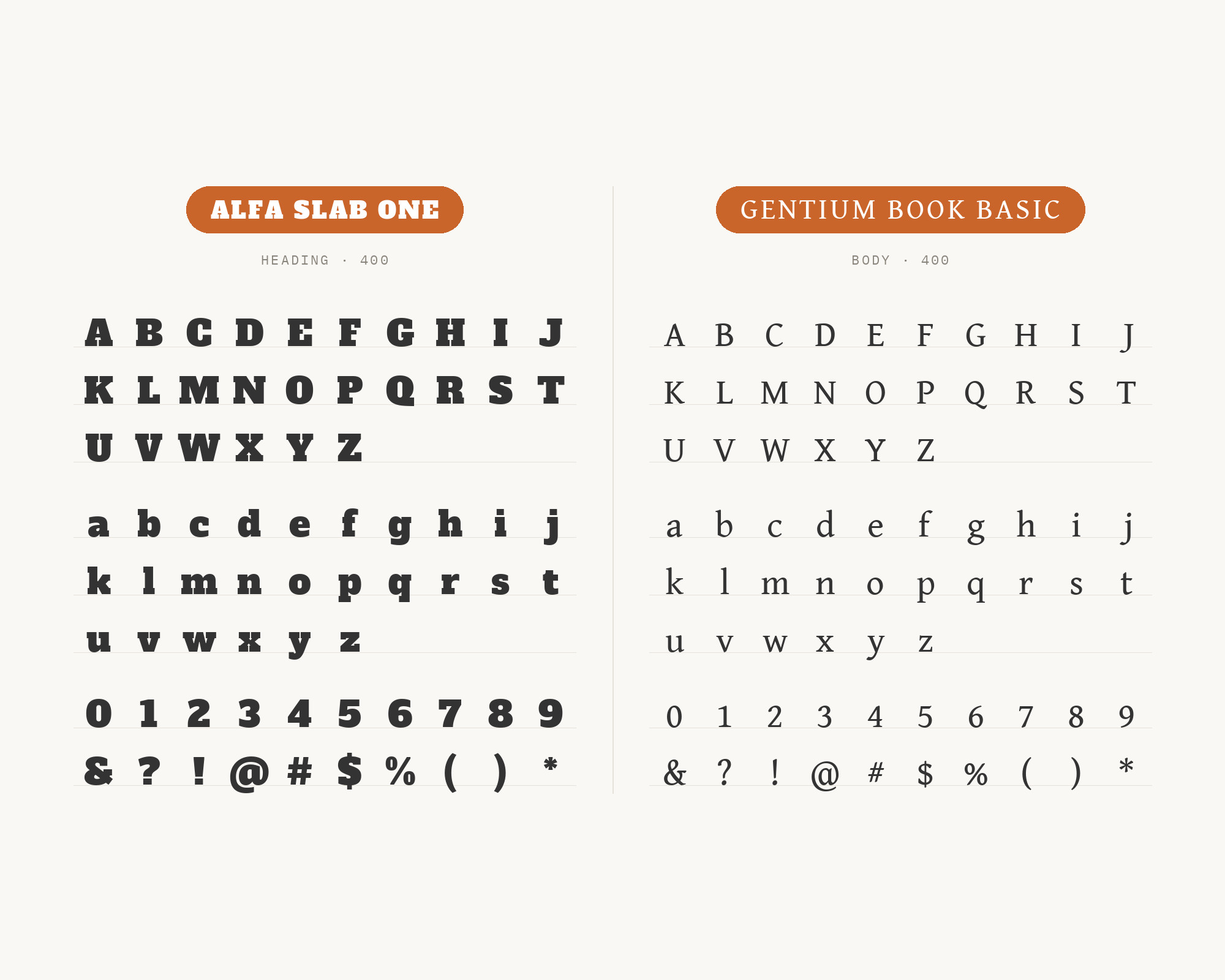
Gentium Book Basic is the one serif text face that several independent lists pair with Alfa Slab One. Raindrops Insider sets Alfa Slab One for headline and display and Gentium Book Basic for body copy. Flipsnack calls Alfa Slab One and Gentium Book Basic perfect for magazines. Hey Reliable includes Alfa Slab One and Gentium Book Basic in its collection, and eComposer’s list of Shopify font combinations recommends it too. Gentium is a serif family designed by Victor Gaultney, and Gentium Book Basic was set at a slightly heavier weight for publishing. That extra weight matters. A delicate book serif looks anaemic beside a slab this dark, but Gentium Book holds a firmer text colour. Gentium was designed for use at 10 to 11 points, with wide counters and low stroke contrast, so it stays readable in long passages. The pairing keeps the page in the serif family throughout, heavy slab above and calm book serif below, which gives magazine features and book covers a more literary tone than any of the sans partners. Gentium Book Plus is the new version of the family if you need more languages.
4. Montserrat
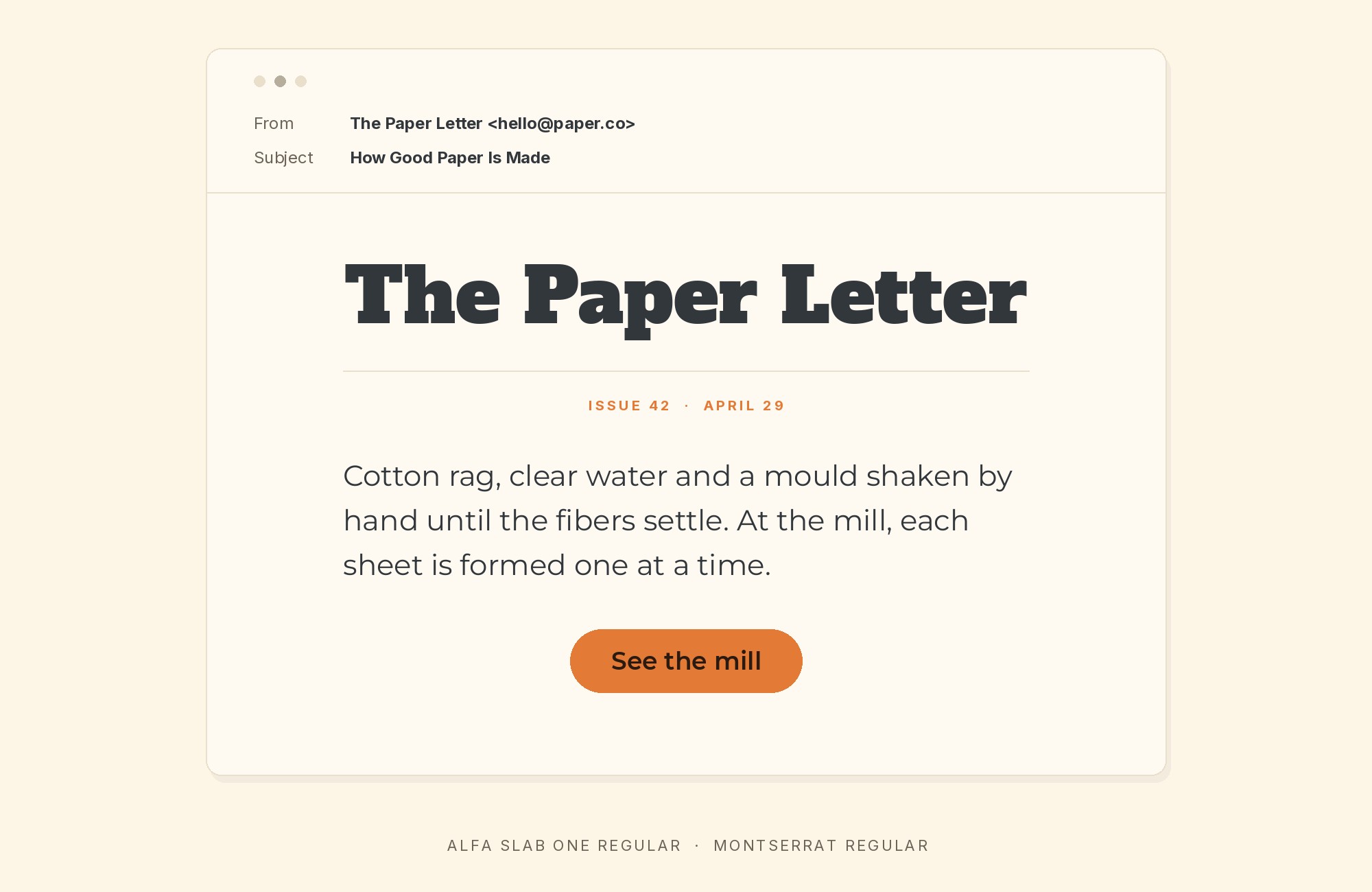
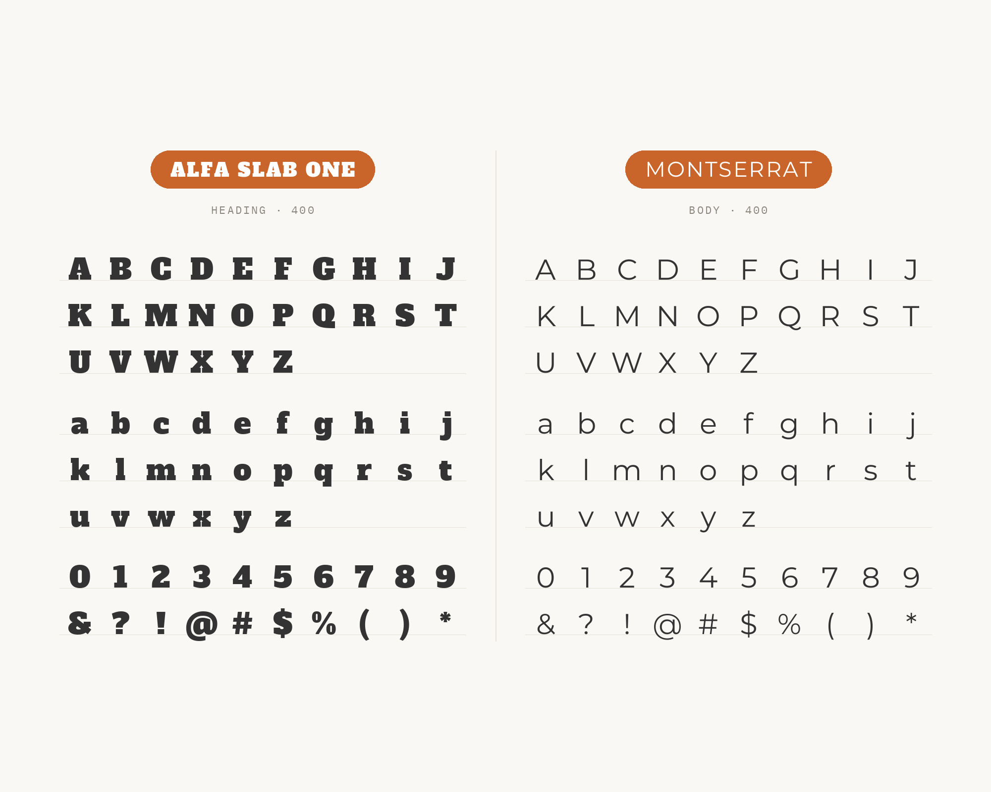
Montserrat appears in Easil’s pairing guide, which lists Montserrat and Roboto as the perfect pairing for Alfa Slab One. Julieta Ulanovsky designed it and released it in 2011, drawing on posters, signs and painted windows from the first half of the twentieth century in the Montserrat neighbourhood of Buenos Aires. That history makes it a sympathetic partner. Both faces come out of display lettering, and Montserrat’s wide, round geometric forms have some of the same poster confidence that Alfa Slab One has, without the weight. Use Montserrat in Regular or Medium for body copy and in SemiBold capitals with open tracking for small labels and buttons. The two together feel like a cafe sign or a craft brand: bold and friendly, not corporate. Avoid pairing the slab with Montserrat’s heaviest cuts, because the two heavy faces will compete for the same attention.
5. PT Sans
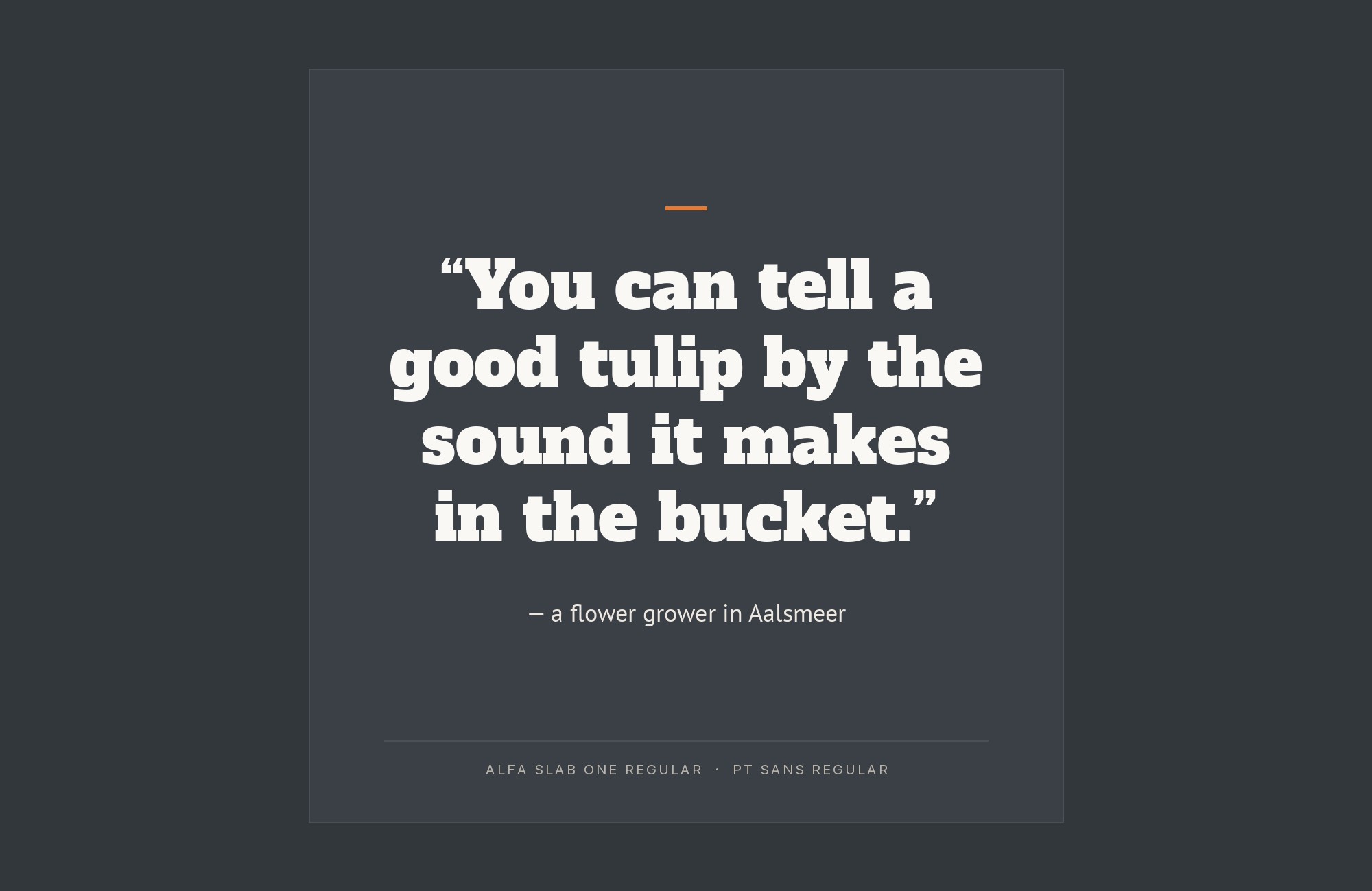
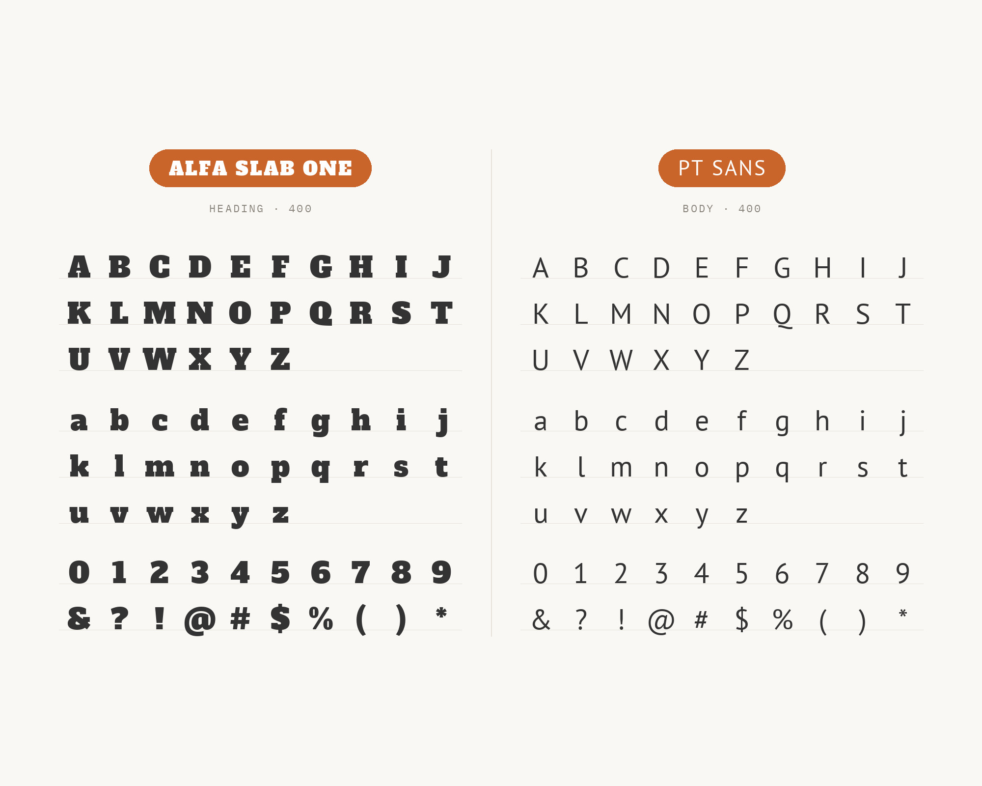
PT Sans is the partner designer Andy Chipperfield chose for Alfa Slab One in his set of Google font pairing specimens, filed under “Slab Serif + Sans Serif”. It was designed by Alexandra Korolkova, Olga Umpeleva and Vladimir Yefimov and released by ParaType in 2009. PT Sans is based on Russian sans serif types of the second part of the 20th century, with distinctive features of contemporary humanistic designs. In practice that means slightly narrow proportions, a firm, upright stance and a faintly old-fashioned warmth. That warmth is what makes it work under a nineteenth-century-style slab. It does not feel as sterile as a pure geometric face, and its narrower fit sets more words per line than Open Sans. Use it for editorial pages, museum and heritage projects, and anywhere the slab should read as history rather than fashion.
“AI builds anything, so what do I sell?”
Taste is the answer. Own your stack and automate your own CMS.
Find Out How6. Nunito Sans
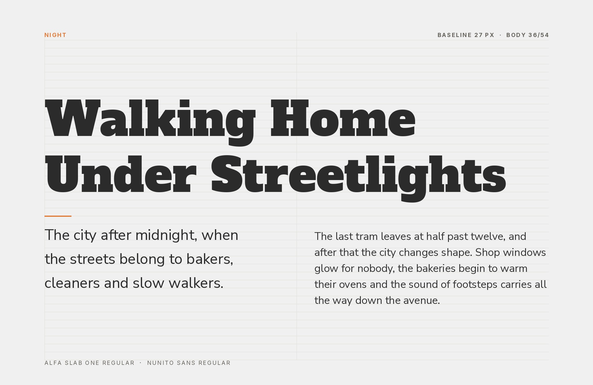
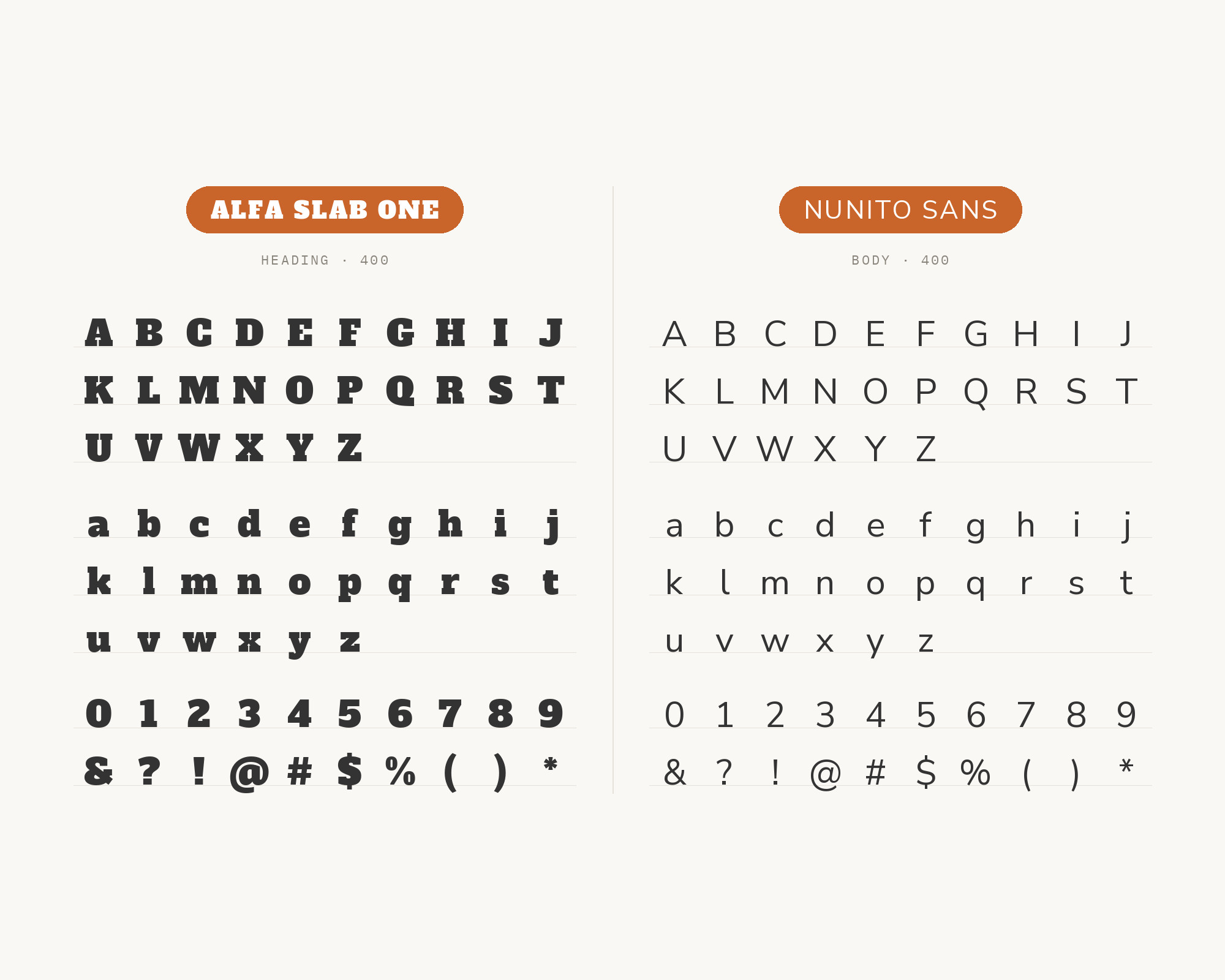
Nunito Sans is the partner in a signage example from Fluxes, which pairs the two for a bakery sign and credits Alfa Slab One’s chunky slab serifs with a bakery-sign warmth. Nunito began as a rounded terminal sans serif by Vernon Adams, and Jacques Le Bailly extended it to a full set of weights with a non-rounded companion, Nunito Sans. The sans version keeps Nunito’s soft, open shapes but loses the rounded ends, so it reads cleanly at small sizes without looking childish. Beside Alfa Slab One it brings generous spacing and a friendly tone, which suits food, hospitality and family brands where the slab should feel hearty rather than aggressive. Keep line lengths short and leading loose. Nunito Sans has a light texture, and the contrast with the black slab is what makes the pairing work.
7. Coustard
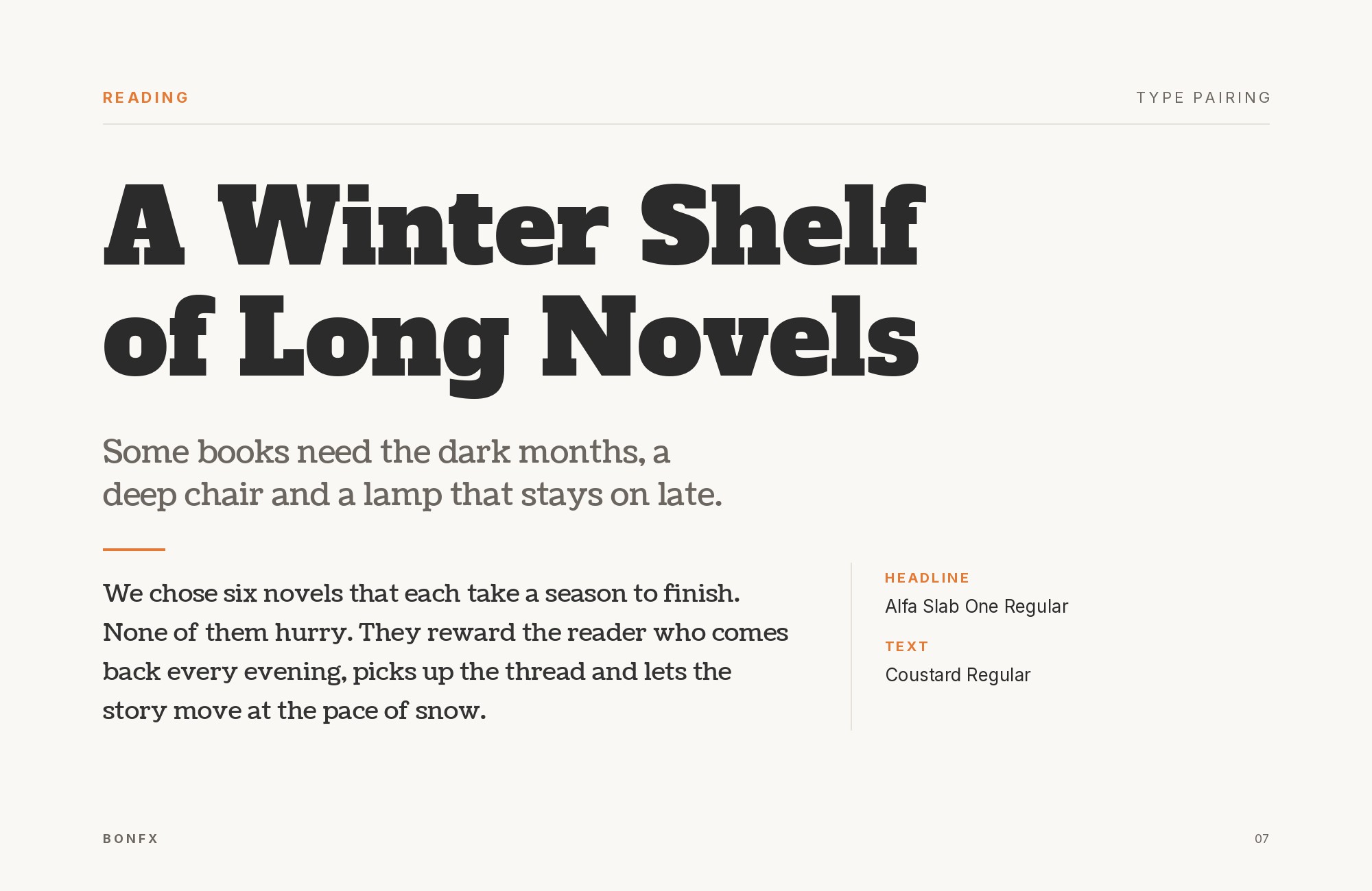
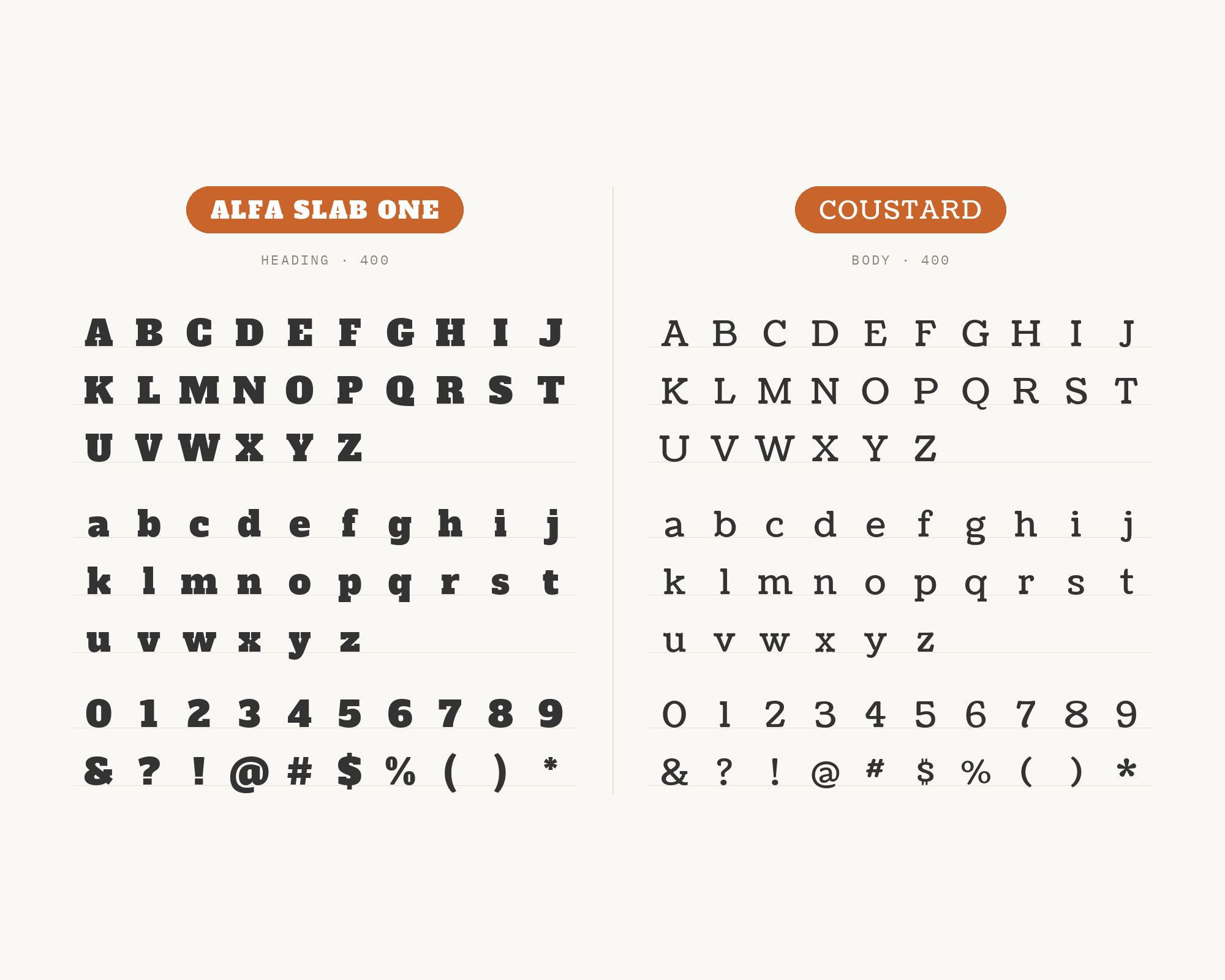
Coustard is a serif-on-serif option. Made by Melody recommends Coustard with Alfa Slab One, and Bold Web Design lists the same pair in a design example credited to Lapito House. Vernon Adams designed Coustard as a display and text serif, and it has been developed from a fork of Tienne. It is a sturdy, slightly quirky serif with visible character of its own, so this is not a neutral partnership. The two share heavy serifs and a friendly, rounded warmth, but Coustard’s lighter weight gives the page a second level of emphasis that Alfa Slab One cannot supply. Use Coustard for subheads, pull quotes and short blocks of copy under a slab title. For longer text, add a plain sans as a third face. This pair works best on posters, packaging and menus where personality matters more than neutrality.
8. Glegoo
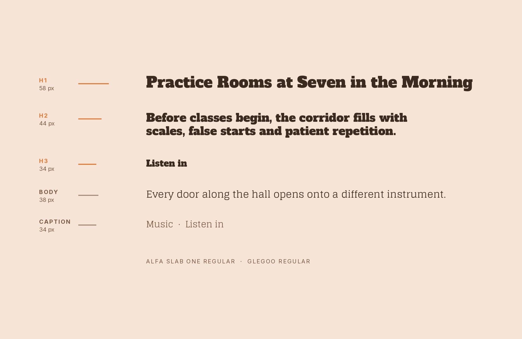
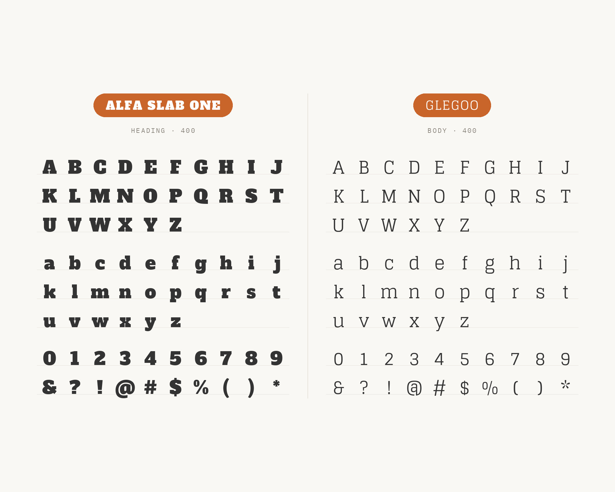
Glegoo comes from a real production. Fonts In Use records Alfa Slab One and Glegoo together, in the on-screen branding for TV5’s news programs in the Philippines. Eduardo Tunni designed Glegoo as a modern slab serif that is slightly condensed, with a large x-height, short ascenders and descenders, and large counterforms. So this is a slab-with-slab pairing, and it works because the two slabs are at opposite ends of the weight scale. Alfa Slab One carries the programme titles as dense, heavy blocks, while Glegoo’s lighter, more open slab handles names, times and secondary text in the same family of shapes. The effect is unified and very broadcast. Use it for news, sports and event graphics where you want one consistent slab voice at two different volumes.
9. ITC Machine
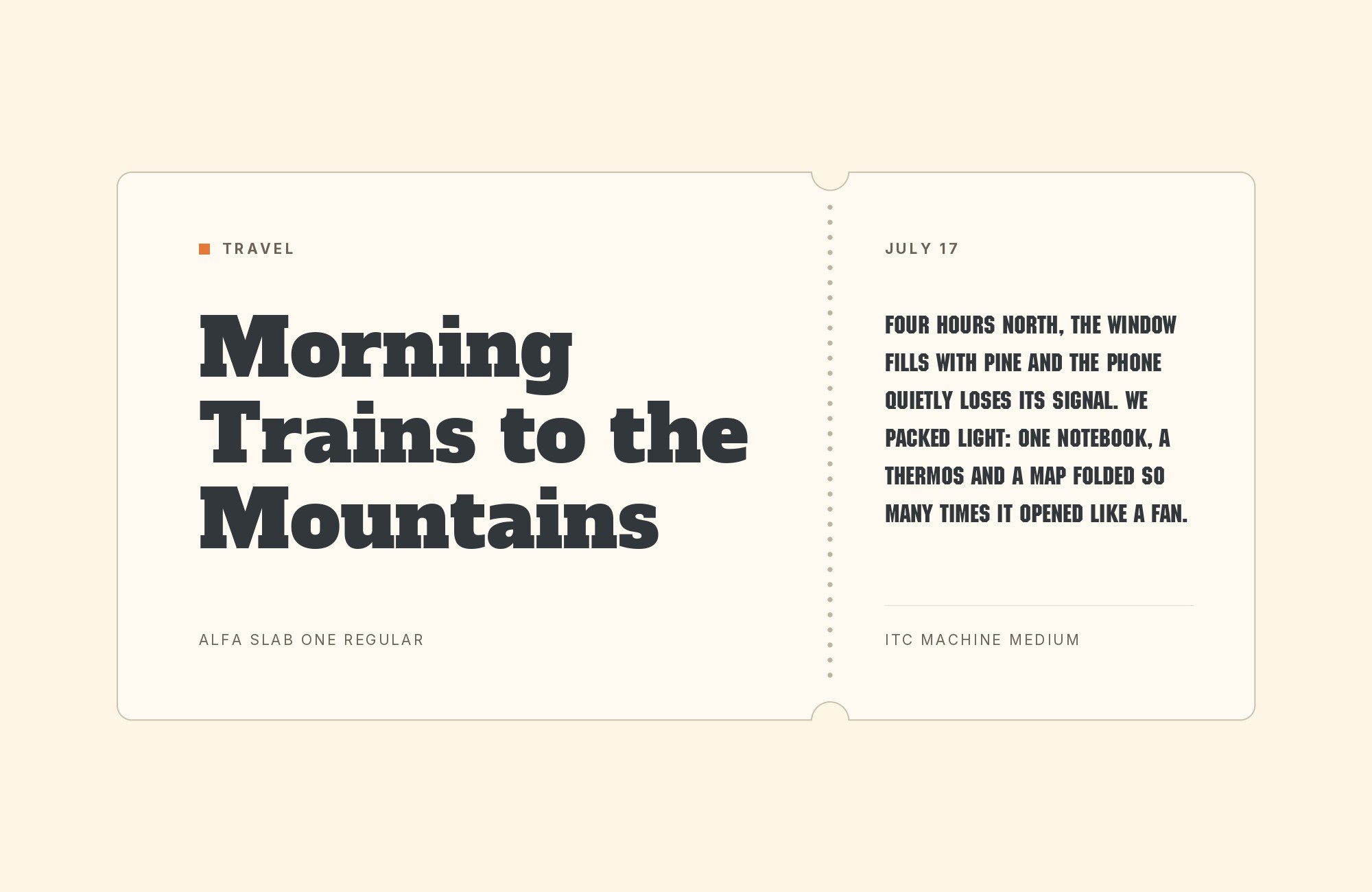
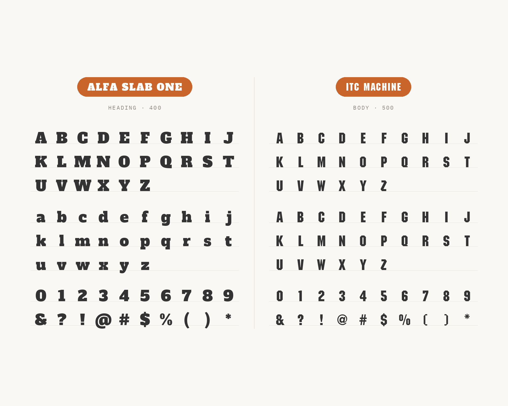
ITC Machine also comes from a real production: the posters for Saggi Phull, a Punjabi feature film from 2018. Fonts In Use records all-caps Alfa Slab One for the Latin version of the title and ITC Machine for “Coming soon 2018” on the posters. Tom Carnase and Ronné Bonder designed Machine, released in 1970, and it was among the first typefaces issued by ITC. It is an angular, all-caps display face, and the digital versions do not include the lowercase. This is a display-with-display pairing, so it only works with a clear hierarchy: Alfa Slab One for the title, Machine much smaller for a date, a tagline or a label. The octagonal, industrial cut of Machine contrasts with the slab’s heavy, bracketed curves. Keep ordinary reading text in a third, neutral face.
10. Lato
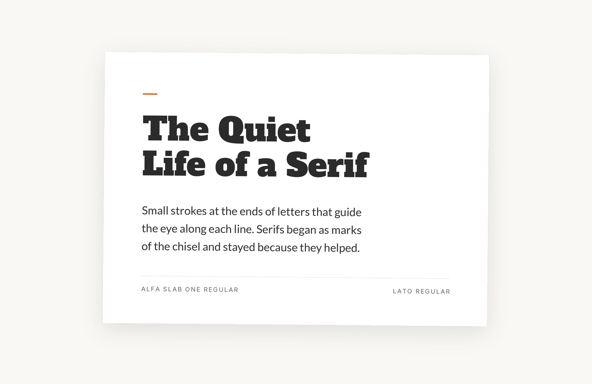
Lato is where the sources disagree. SlidesCarnival recommends it, suggesting Alfa Slab One for headings and Lato for body on landing pages. Wix’s designers put Alfa Slab One and Lato on a list of the worst website font pairings, calling the pair unbalanced. Lato was started in the summer of 2010 by Warsaw-based designer Łukasz Dziedzic. It is a warm, semi-rounded humanist sans with a light, even colour. Both sides have a point. At Lato’s Regular and Light weights, the jump from Alfa Slab One’s black slab is extreme, and short pages can feel like one element is shouting over the other. The fix is to narrow the gap: set body text in regular Lato, use its bold or black weights for subheads, and keep the slab to a single short headline. With a middle weight in place, the pairing reads as a hierarchy instead of a collision.
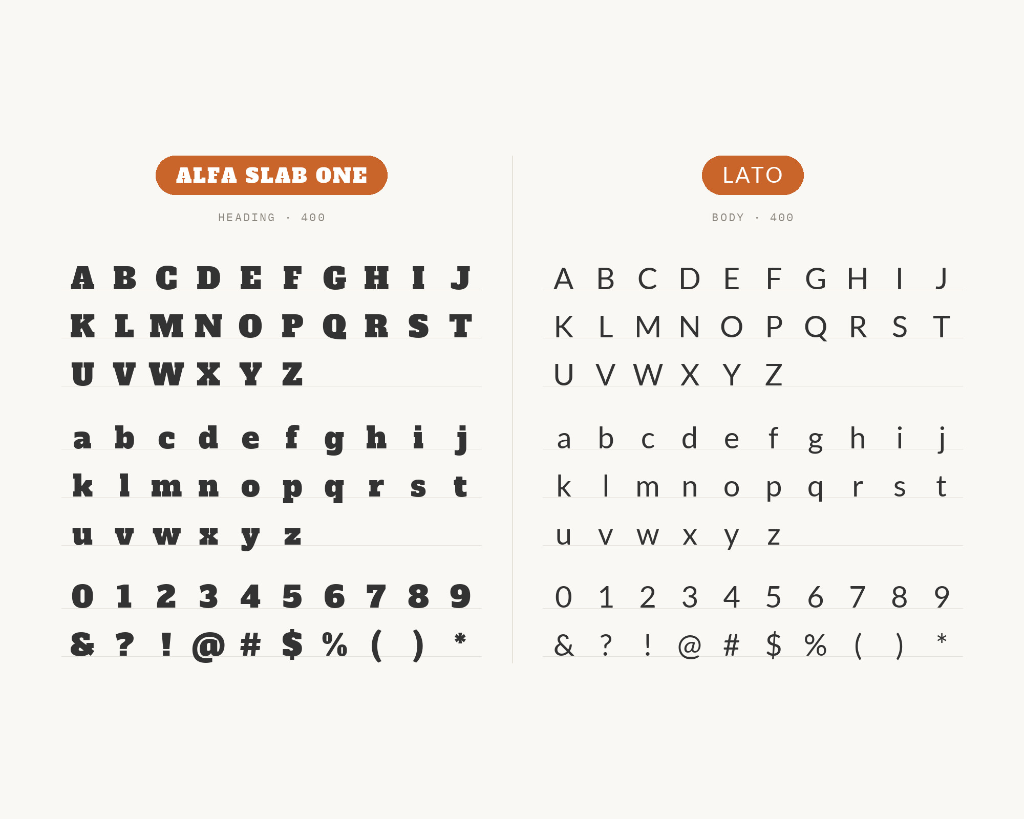
Conclusion
Alfa Slab One is a one-weight headline face, and every pairing above is really a decision about how far to step down from it. The most common answer is a clean, open sans: Open Sans and Roboto have the most support, with Montserrat, PT Sans and Nunito Sans as warmer variations. Gentium Book Basic and Coustard keep the page in serif territory, one quietly bookish and one with a personality of its own. The two real-world uses in the Fonts In Use archive, Glegoo and ITC Machine, show that the slab can also share the page with other display type, as long as the second face is clearly lighter or much smaller.
The Lato disagreement is the useful warning. The problem is rarely the partner itself. It is the size of the jump between a very black headline and a very light paragraph. Add a middle step in weight, keep the slab short and large, and test it at the size you will actually publish.
Sources
- Google Fonts (Alfa Slab One)
- Fonts In Use (Alfa Slab One)
- Fonts In Use (TV5 news programs)
- Fonts In Use (Saggi Phull posters)
- Applet Studio
- Venngage
- DocHipo
- GoVisually
- Wix Blog (worst pairings)
- Vandelay Design
- Easil
- SlidesCarnival
- Raindrops Insider
- Flipsnack (LinkedIn)
- Hey Reliable
- EComposer
- CSS Chopper
- Andy Chipperfield
- Fluxes
- Made by Melody
- Bold Web Design
- Wikipedia (Open Sans)
- Wikipedia (Gentium)
- Wikipedia (Montserrat)
- Fonts In Use (ITC Machine)
- Google Fonts (PT Sans)
