Anton pairs great with Libre Baskerville, Work Sans and Open Sans. All 5 pairings are shown below in real rendered specimens, with the reason each one works.

Almost nothing pairs with Anton, and that is by design. It is a free reworking of a traditional advertising sans serif, and Typewolf lists Impact as its closest relative: a single-weight grotesque built to fill a headline and nothing else. Below are the faces that actually hold up beside it, the split found across real sites and curated advice, and what to use instead if a project needs a full type system rather than one loud line.
Why Anton resists pairing
Anton is described in its own project documentation as a reworking of a traditional advertising sans-serif, digitized and opened up for display use on the web. It ships as one weight and one width, with no lighter or bolder sibling to build a hierarchy against. Its ascenders and descenders are only just taller than the rest of its letters, because its x-height is extremely tall, which is part of what makes it read as pure block weight rather than a normal alphabet. Like Impact, it offers nothing to react against from inside its own family, so every pairing has to import contrast, hierarchy, and readability from somewhere else entirely.
1. Libre Baskerville
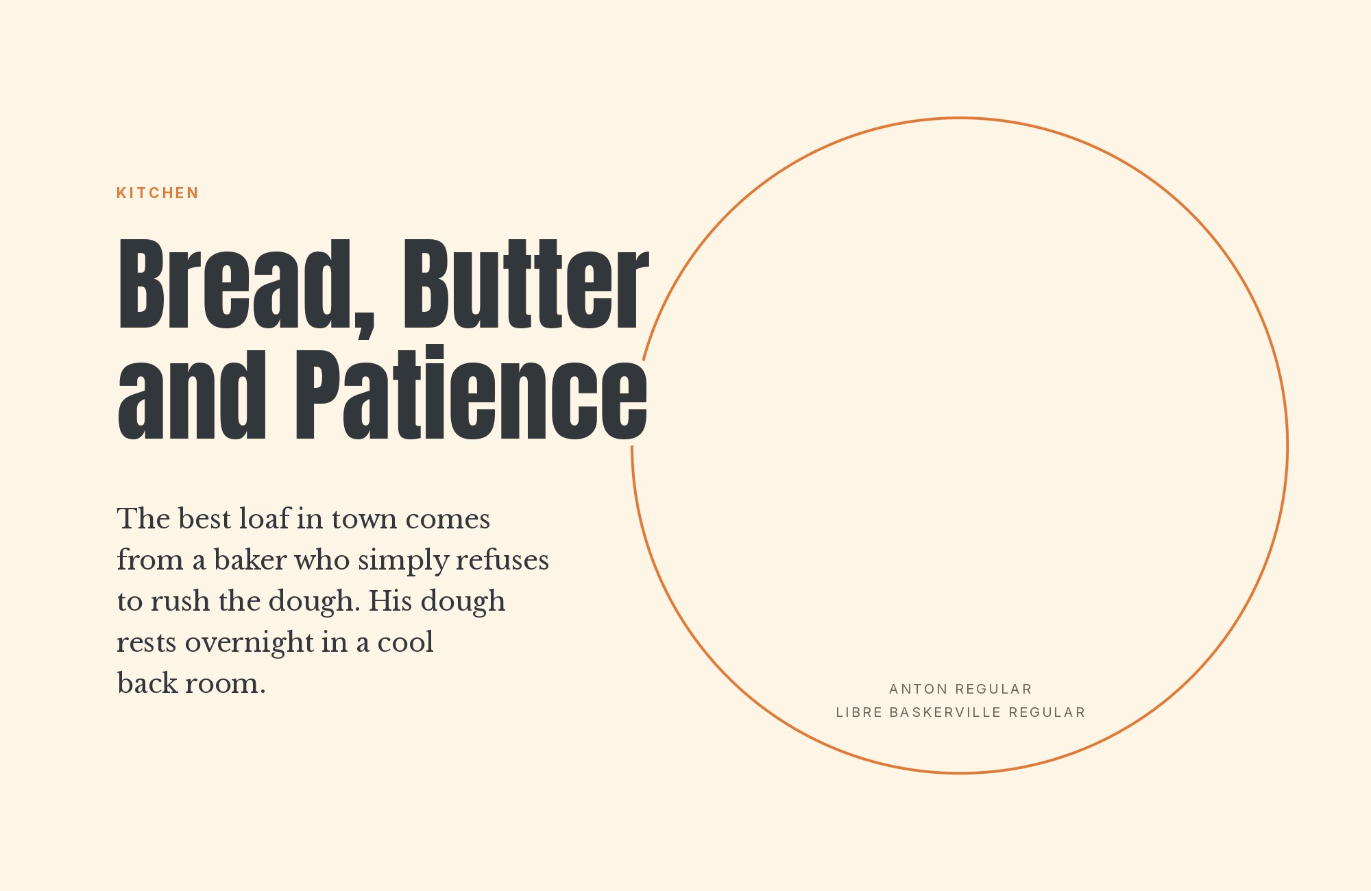
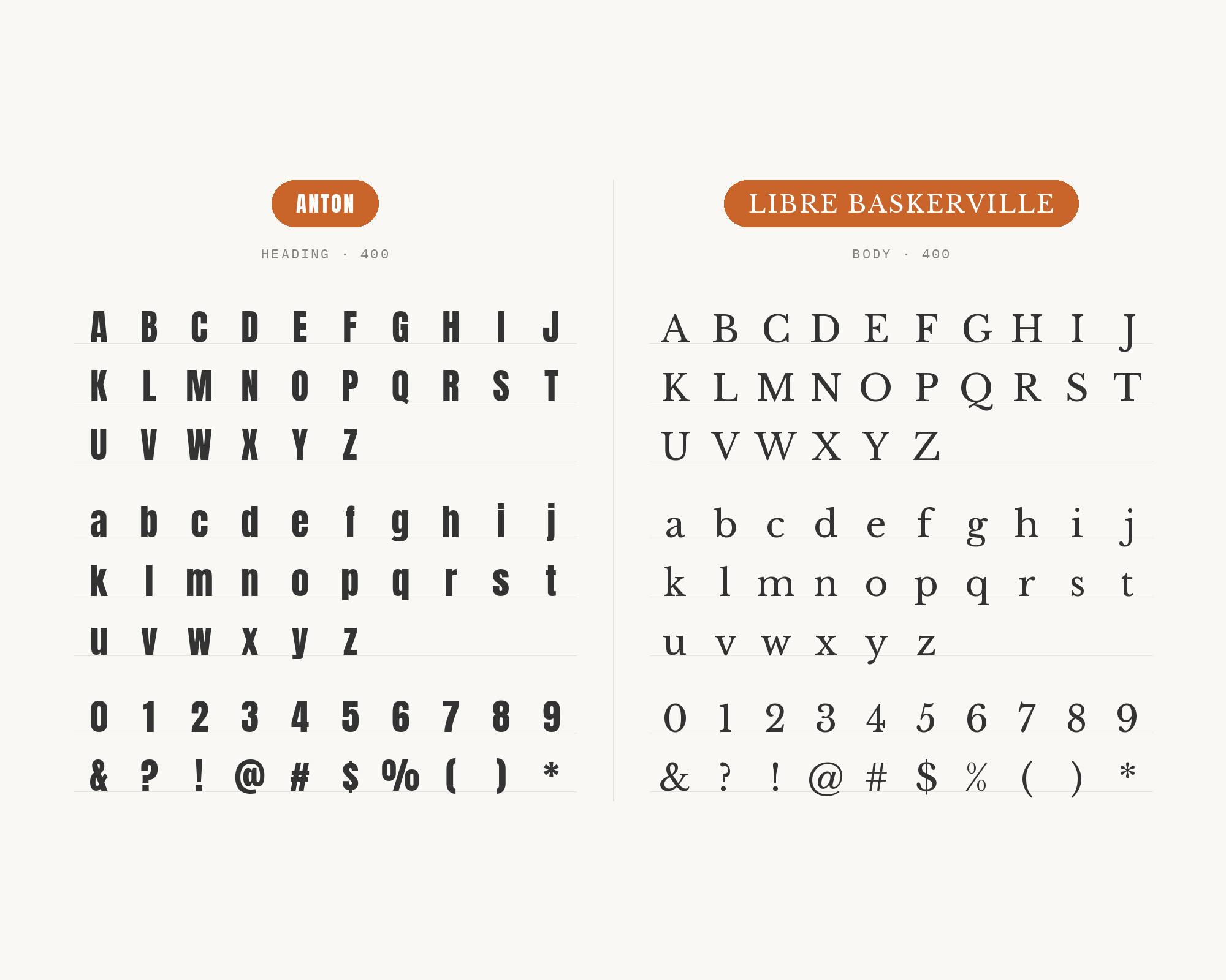
Anton’s ultra-condensed, block-heavy caps need a text face that will not compete for attention. Libre Baskerville’s moderate contrast, generous x-height, and slight old-style warmth keep long-form copy calm and readable underneath a headline that is already doing all the shouting. This is Typewolf’s own curated suggestion, and it is the one recommendation in this list that reaches for typographic contrast rather than a matching sans — a serif under a grotesque, the classic split. It works best where the body text needs to feel considered rather than purely functional.
2. Work Sans
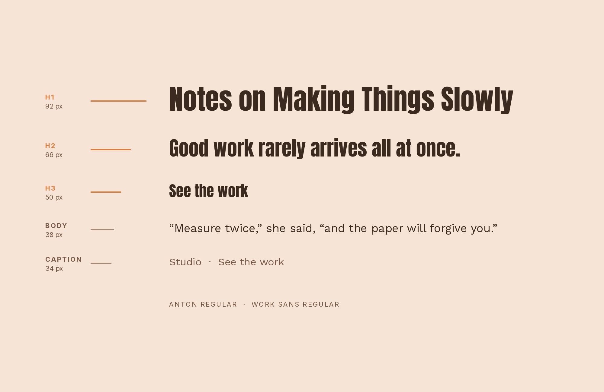
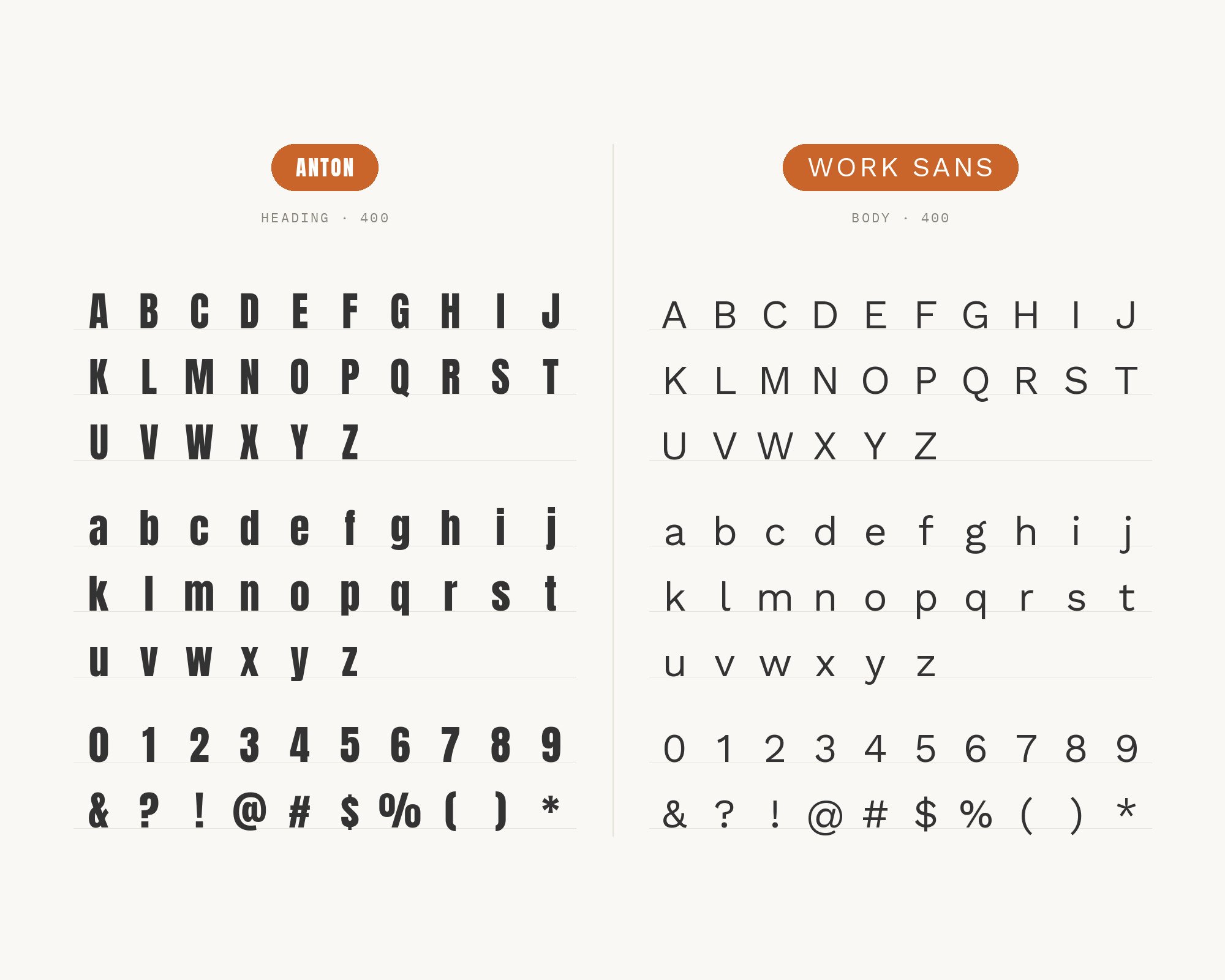
Both Anton and Work Sans are grotesque-family sans serifs, so this pairing stays in one visual register instead of mixing serif and sans. Work Sans’s lower contrast and more open counters read as the quiet version of the same idea: Anton compresses and shouts, Work Sans relaxes and explains. This combination has been seen in production: Typewolf lists Made of Millions, dated 19 October 2018, using Anton with Work Sans. It is a safe, workmanlike pairing rather than an inspired one, and that consistency is the whole point.
3. Open Sans
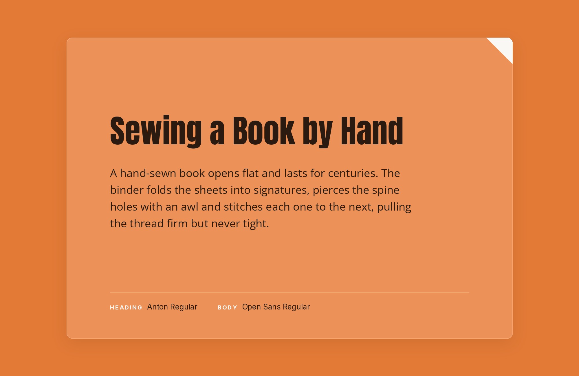
Open Sans is a workhorse humanist sans with strong small-size screen legibility, and real sites pair it with Anton for navigation and paragraph text for one simple reason: it disappears next to Anton’s compressed caps. Loud display, neutral body — the oldest trick in the book, documented here on a live production site rather than a curated recommendation. It barely counts as a design choice so much as a default, which is exactly why it shows up repeatedly wherever Anton is used for real.
4. Poppins
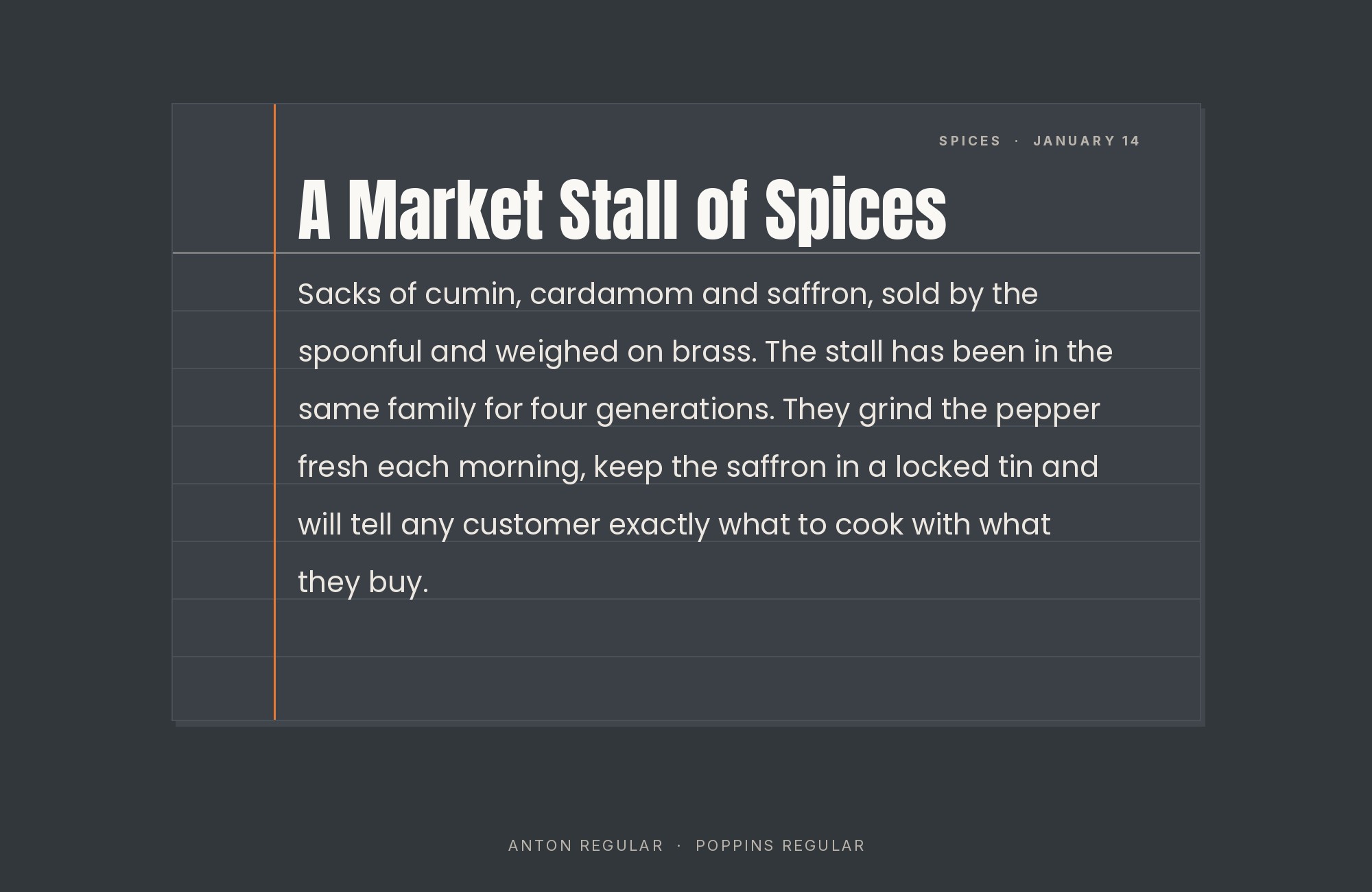
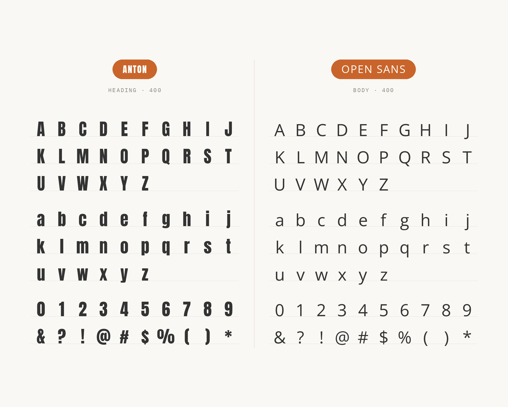
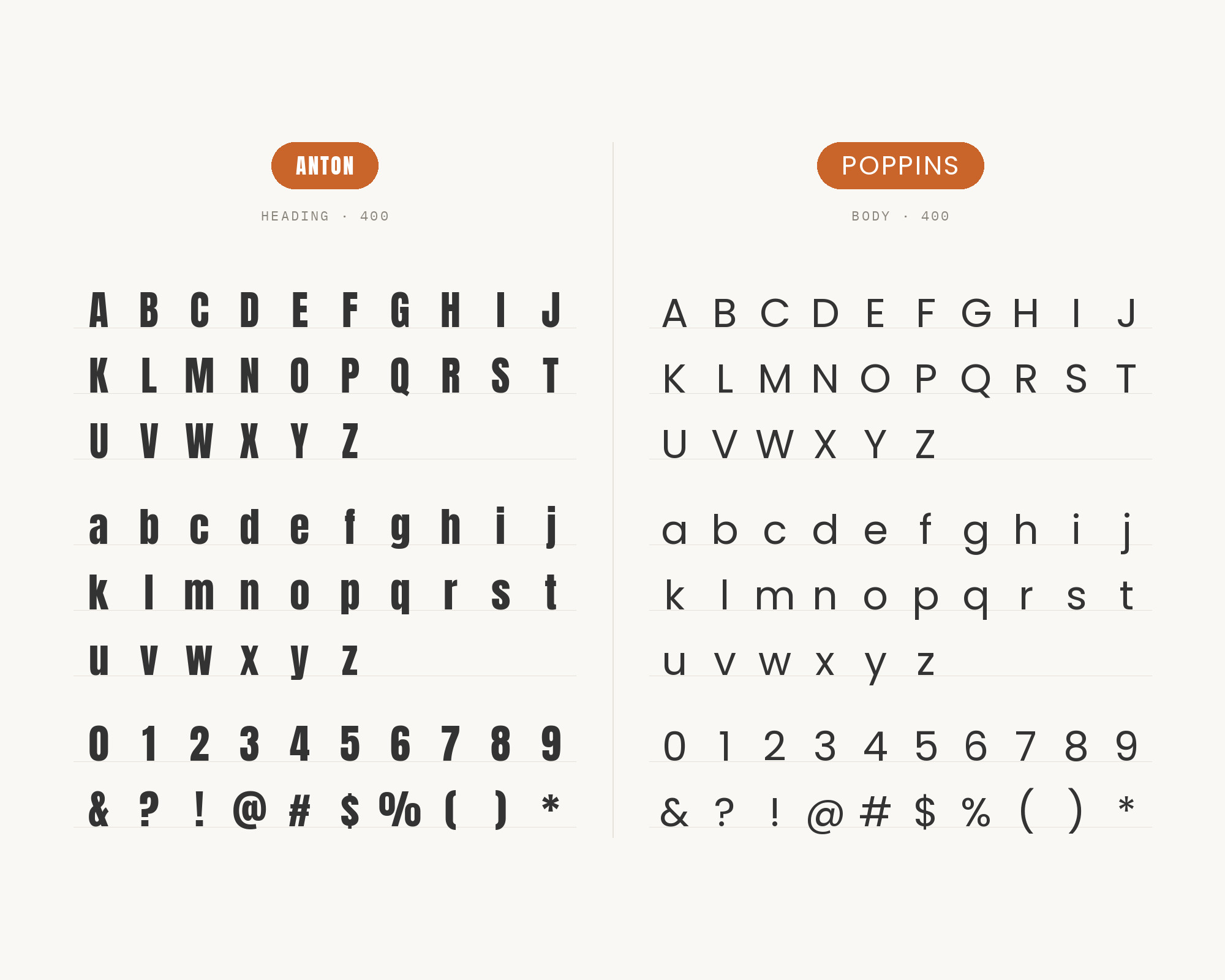
Poppins is geometric, built from true circles, which contrasts structurally with Anton’s condensed grotesque skeleton rather than just differing in weight. On a real pharmacy site found in the research, Poppins carries UI and body text while Anton takes the headline, cleanly separating geometric roundness from industrial compression. The pairing works because the contrast is structural rather than merely stylistic, though it is a subtler difference than most readers will consciously notice — it registers as “this looks fine” rather than “this looks considered.”
5. Roboto
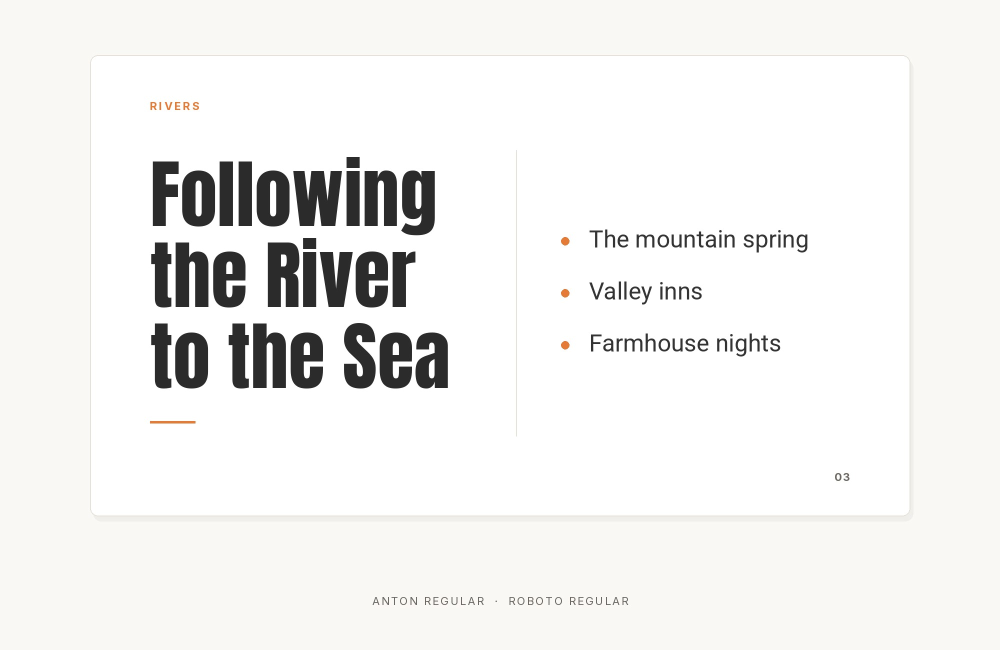
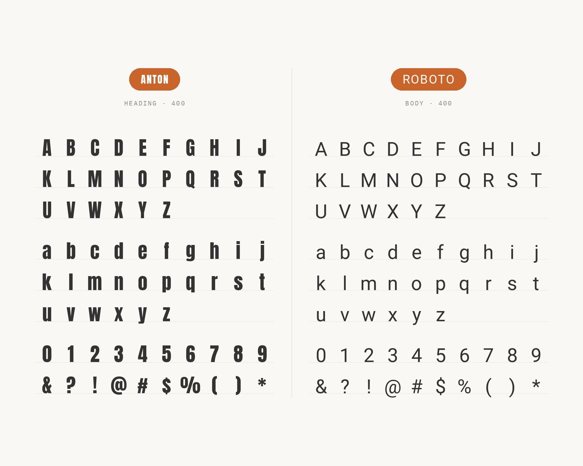
Roboto’s humanist warmth and its hybrid of mechanical and organic curves offset Anton’s rigid, advertising-poster construction. Because Anton’s ascenders and descenders are only just taller than the rest of its letters, giving it a plain humanist secondary face preserves hierarchy without introducing a second loud voice into the layout. This is the pairing a font-pairing roundup reaches for by default, and it is defensible precisely because it is unambitious: Roboto is free, ubiquitous, and legible everywhere Anton is not.
What to use instead
Every genuine use of Anton found in this research keeps it strictly as a headline and hands the rest of the system to a completely different, fully-weighted sans. If the project needs that whole system in one family instead — a real range of weights sharing one skeleton, still condensed and still forceful — Oswald is the closer fit, running from Light through Bold on the same narrow grotesque frame. Big Shoulders goes further: a condensed variable superfamily with weights from 100 to 900, created for the Chicago Design System.
Conclusion
Anton is a web reworking of the same advertising sans tradition as Impact, and it has the same limitation: one weight, one job, no internal range. The pairings above are not a matter of taste so much as a matter of what stays out of the way, and the research shows two defensible answers — a serif for editorial contrast, or a neutral sans for production sites that just need the headline to work. Either is fine. What does not work is expecting Anton to do more than announce the page and step back.
