Lobster pairs great with Oswald, Yanone Kaffeesatz and Cabin. All 11 pairings are shown below in real rendered specimens, with the reason each one works.

What fonts go with Lobster? Treat it as a nameplate, not a paragraph: a heavy connected script whose ligatures and bounce only hold at display size, so every partner has to supply the reading Lobster will not do.
Pablo Impallari drew Lobster and released it in 2010 through Impallari Type, and Google Fonts added it in May 2010: a bold, connected display script with distinctive ligatures that make letter-to-letter joins look written rather than kerned. It is a single-weight family in the original cut; Impallari later added Lobster Two as a lighter, four-style companion. The original is the one this article means: heavy, connected, and unapologetic at large sizes. The face is famous, overused, and still useful when the job is a restaurant name, a greeting, or a packaging line that should feel signed. Set it at text size and the joins clog, the bounce flattens, and a logotype becomes a paragraph nobody can finish. The technical facts that matter for pairing are the same ones that make it a bad text face: high stroke contrast in the joins, a bouncing baseline, and no italic or weight range to build hierarchy with.
Pairing it is a role split. Typ.io’s live samples put it beside condensed display sans faces; French pairing lists and Jukebox’s restaurant page independently arrive at humanist sans body copy; Nancy Atwell’s January 2026 pairing essay for WordSCR argues for either a clean, minimalist sans or a classic serif, depending on whether the brand wants a casual voice or a more traditional and elegant one. The tests that matter are the same as for any display script: x-height of the body face, so paragraphs stay large enough when Lobster is two or three times the size; weight, so two bolds do not collide; and aperture, so the partner’s counters stay open next to the script’s heavy joins. Here are 11 fonts that pair well with Lobster, all local and all cited.
1. Oswald
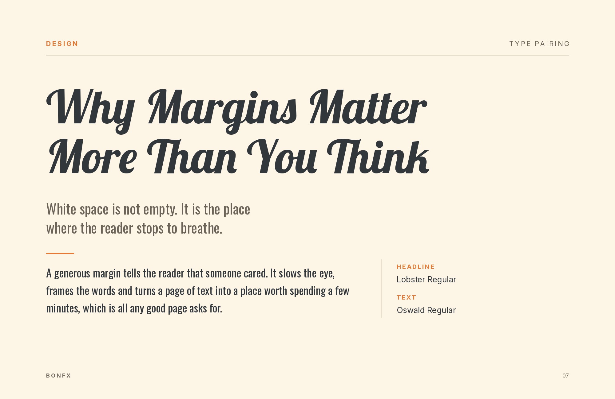
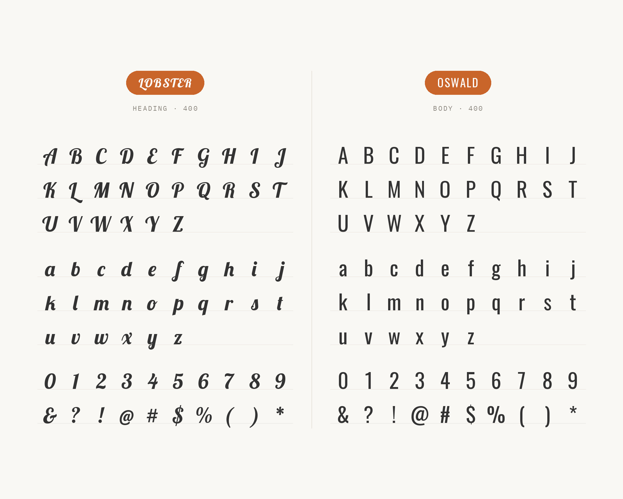
Vernon Adams started Oswald as a reworking of the classic ‘Alternate Gothic’ style; Kalapi Gajjar completed his work on the Latin family in 2016, and Google Fonts also credits Cyreal. Its tall, narrow caps are the width-and-case opposite of Lobster’s connected, bouncing script: Oswald shouts in a column, Lobster signs on a baseline that moves. Typ.io records both on antonioerrigo.it, tagged fancy / retro / script — a live site using condensed gothic for information and Lobster for personality. Use Oswald for kickers, section labels and all-caps event type; keep Lobster for the nameplate only. Oswald Medium or Bold at 20–28px under a 60px script line is the working range — closer, and you have two display faces. The pairing suits posters, food brands and any layout that needs a second display voice that is not another script. Track Oswald slightly tighter than default; leave Lobster’s ligatures at the font’s own spacing.
2. Yanone Kaffeesatz
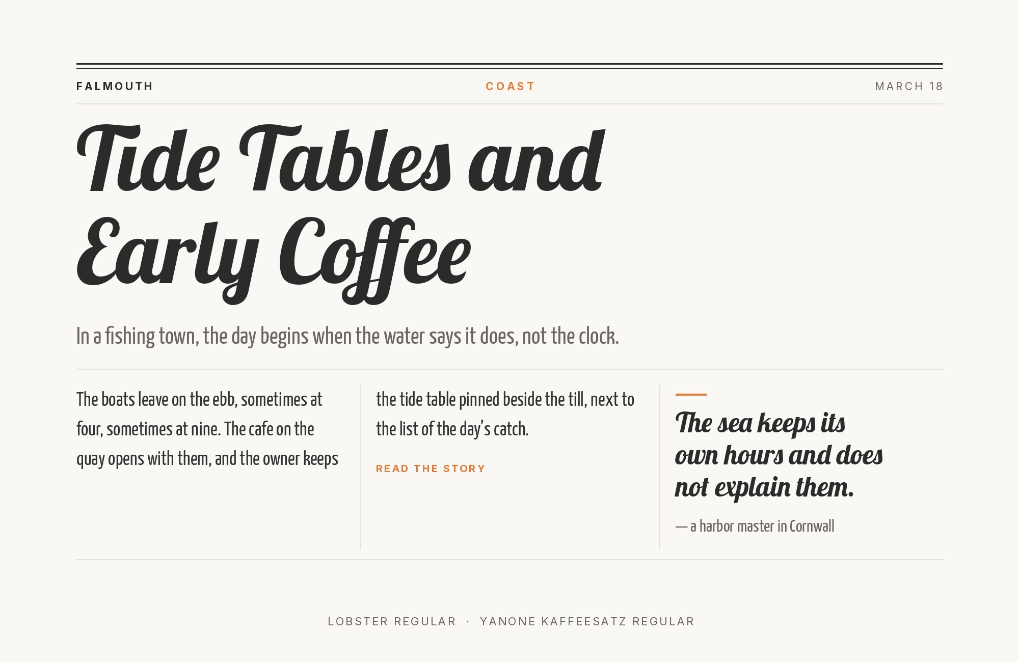
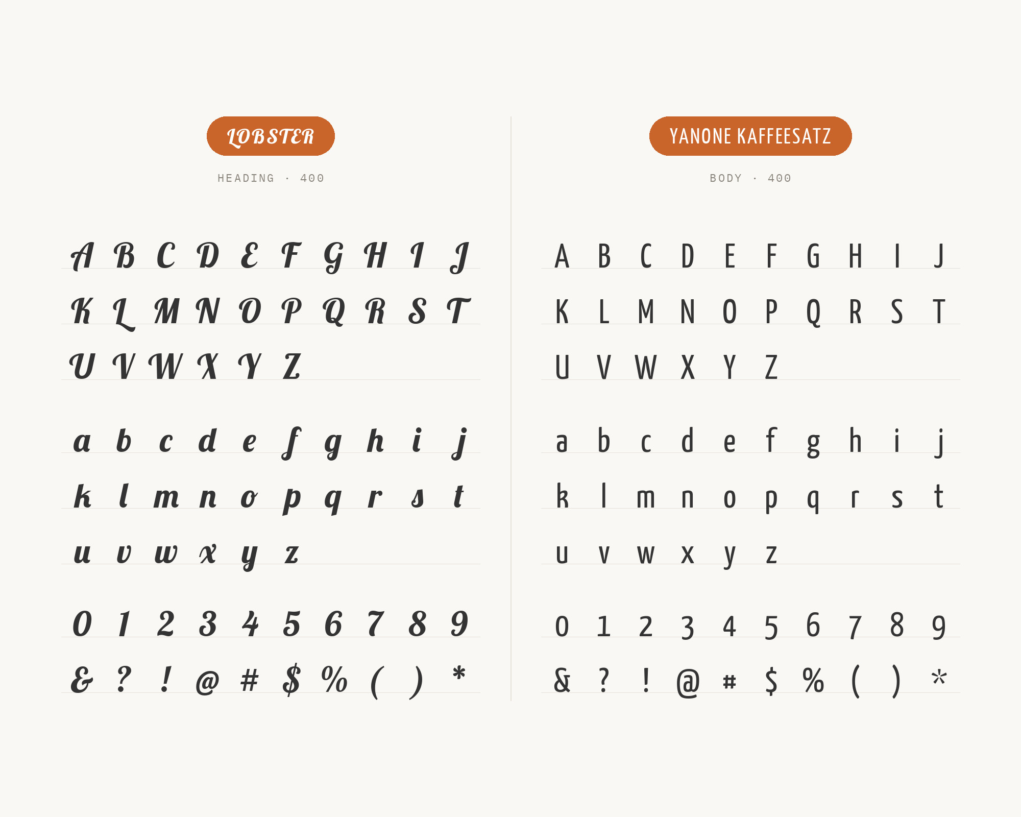
Yanone first published Yanone Kaffeesatz in 2004 as his first finished typeface, and its Bold is reminiscent of 1920s coffee house typography. It reads as a condensed, slightly rounded display sans with a poster-scale x-height. It can share a size band with Lobster without sharing its joins, so the two split headline duties by mood rather than by scale. Typ.io’s antonioerrigo.it sample runs it with Oswald and Lobster on one page. Give Kaffeesatz the informational headline (dates, places, categories) and Lobster the brand line. Kaffeesatz’s slight rounding keeps it from feeling as industrial as Oswald, which is why the two can share a page with Lobster without looking like a gothic pile-up. The pairing is for retro-flavored events and hospitality work that wants condensed energy plus a script signature. Set Kaffeesatz a step smaller than Lobster so the script remains the signature.
3. Cabin
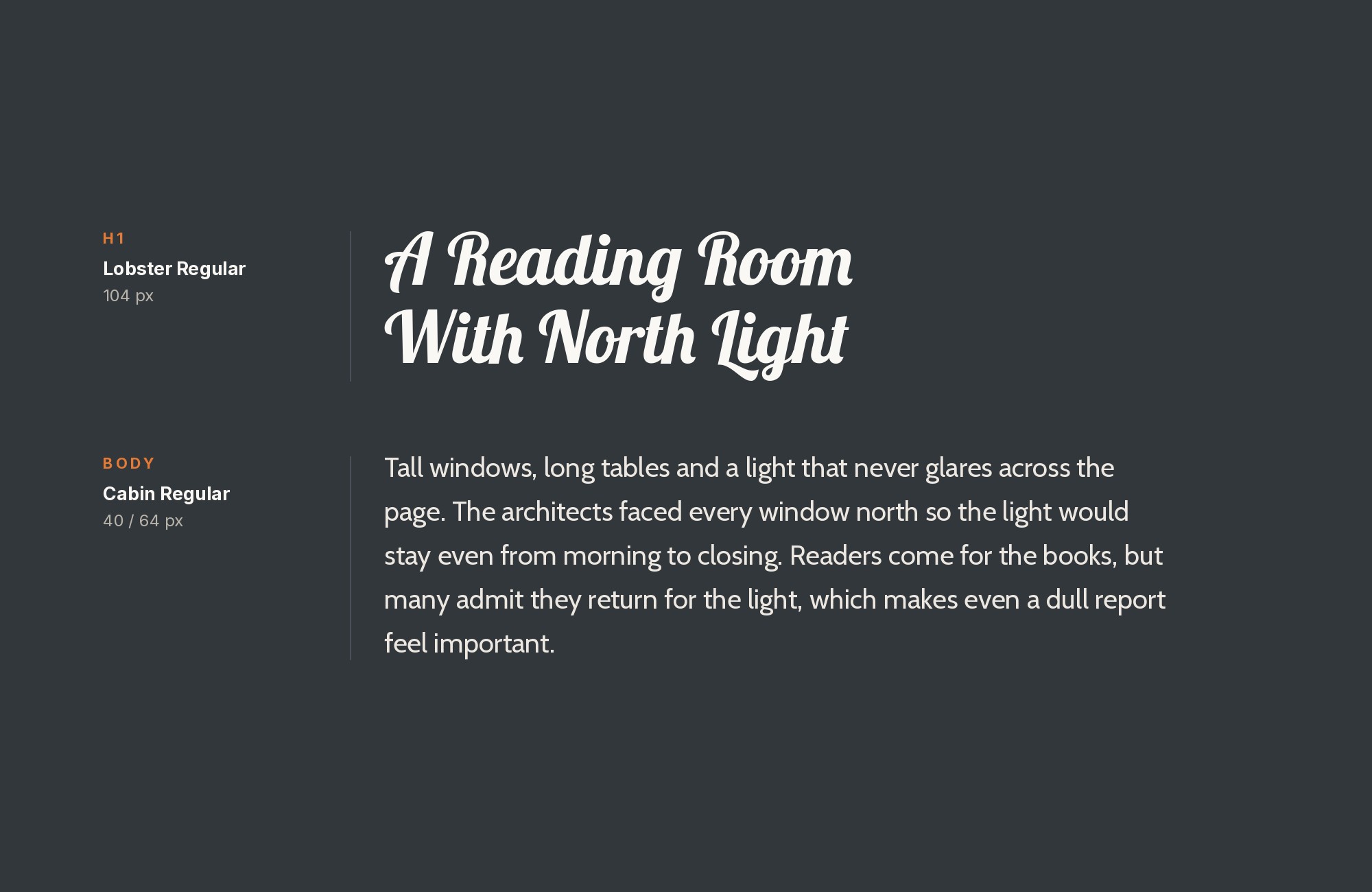
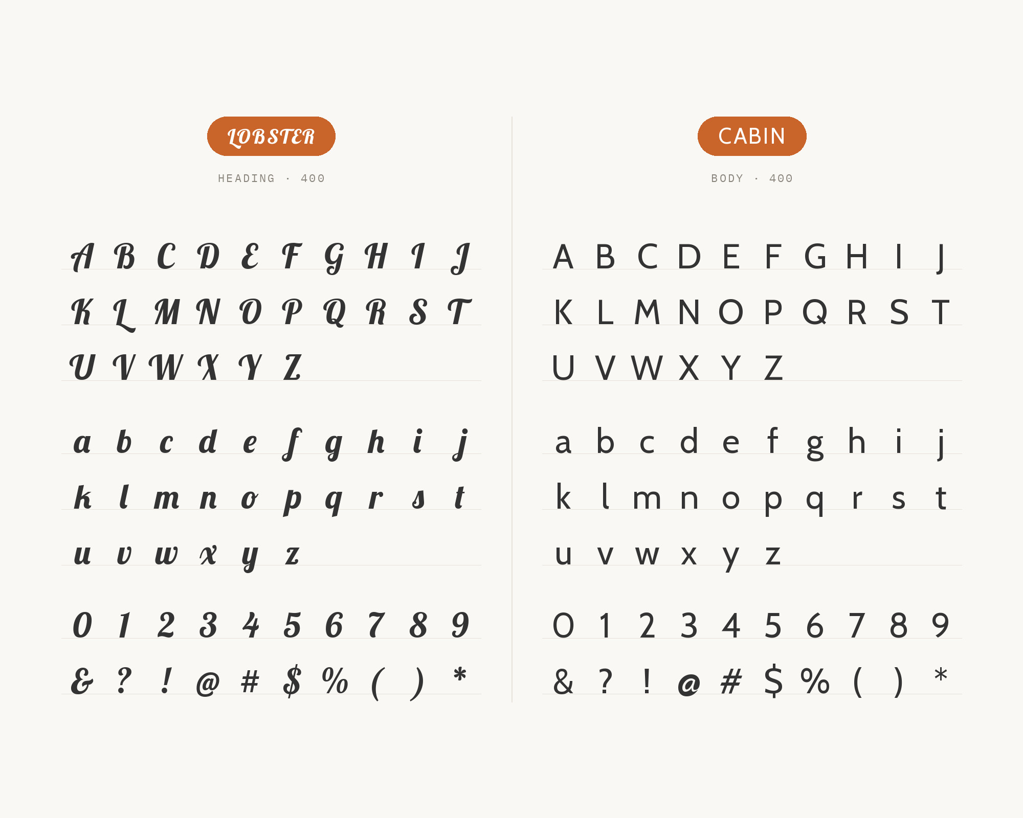
Cabin is a humanist sans from Impallari Type with modern proportions and rounded counters. Those rounded counters echo Lobster’s joins without copying the connections, which is why it keeps menus and labels readable while the script takes the name. Jukebox Print built a dedicated Lobster + Cabin pairing page around restaurant use — “the script names the place, the sans explains it” — and pourpasunrond lists the same split independently in its Google Fonts combinations. Run Cabin at reading sizes for menu items, hours and about-text; keep Lobster above 36px. Cabin Medium for section heads, Regular for the items, is enough hierarchy without a third family. This is the bistro formula on the list, and the one with the most independent confirmation. If the room is more wine-bar than diner, use the supported Helvetica pairing.
4. Open Sans
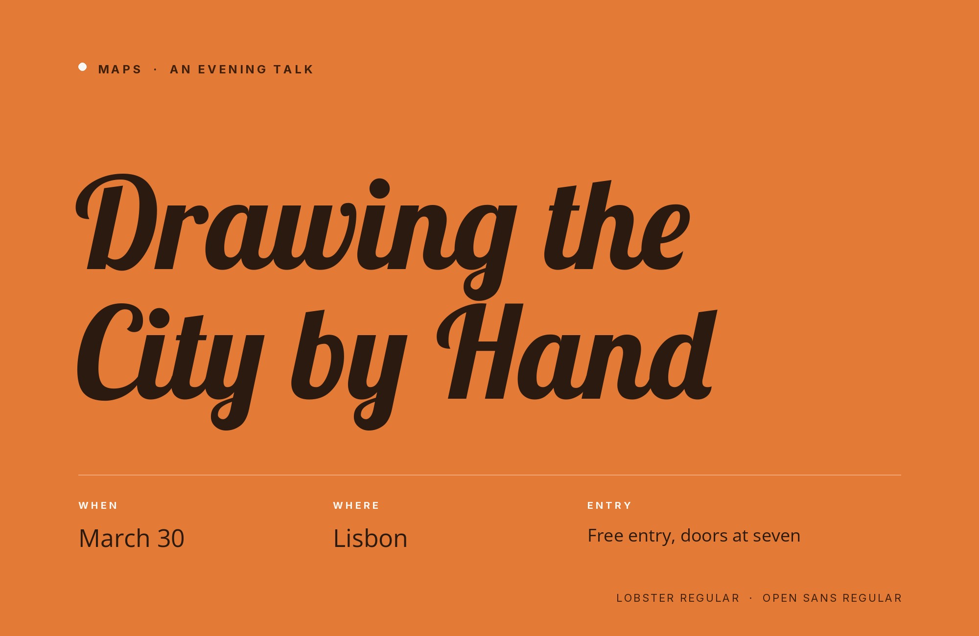
Steve Matteson designed Open Sans as a humanist sans with a large x-height and simple upright forms. That large x-height is why it works under Lobster: the script cannot carry a paragraph, and Open Sans can. Pourpasunrond lists Lobster + Open Sans among its combinations; Nancy Atwell’s WordSCR essay names Open Sans as a classic sans partner for projects targeting a wide audience. Use Open Sans for body, navigation and forms. It is the lowest-risk web-body choice under Impallari’s hand, and the one most likely to already be in the stack. Open Sans SemiBold for navigation, Regular for paragraphs, and no second display sans — Lobster spent that budget. The pairing is for sites that need to work in every locale Open Sans covers, which is most of them.
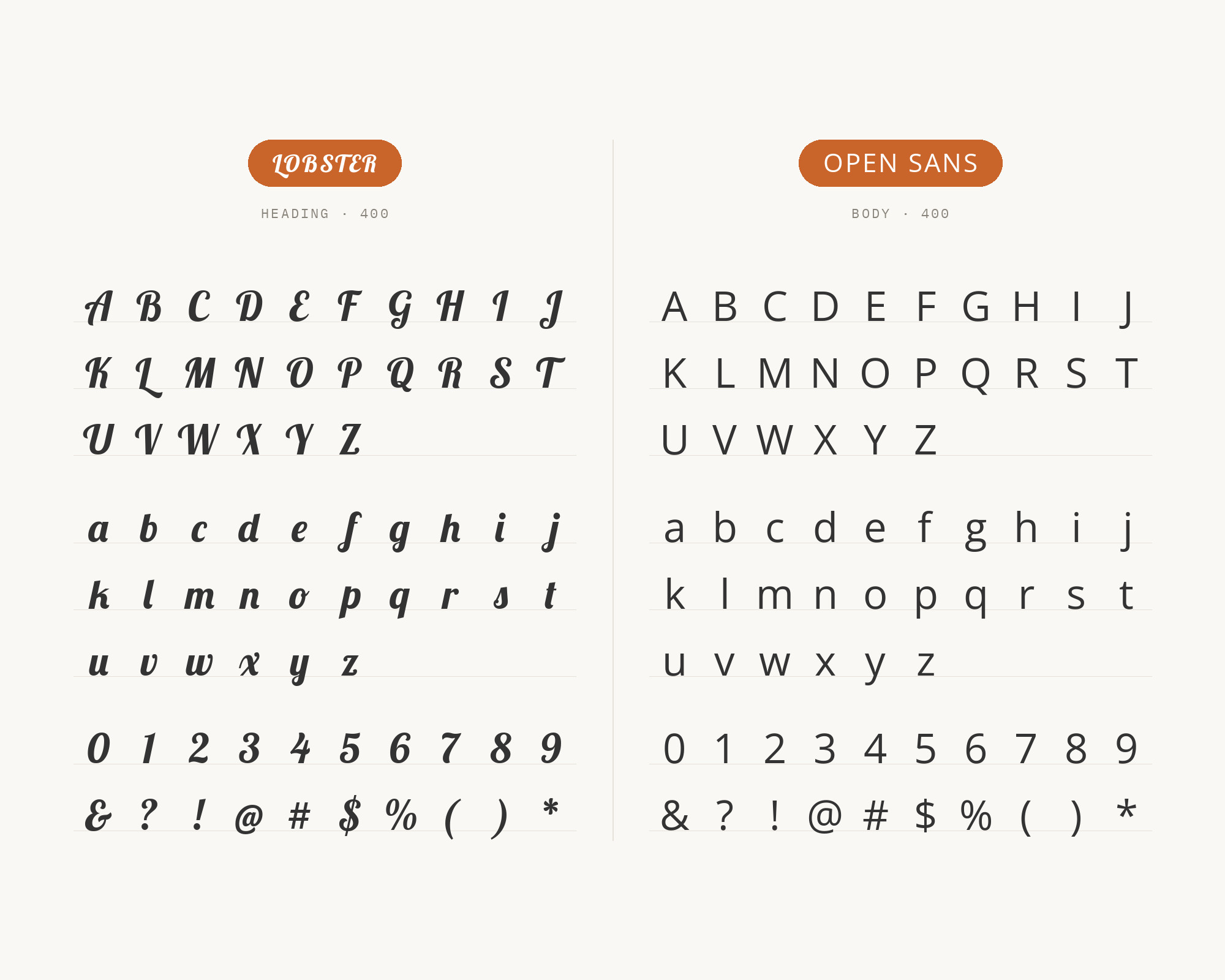
5. Roboto
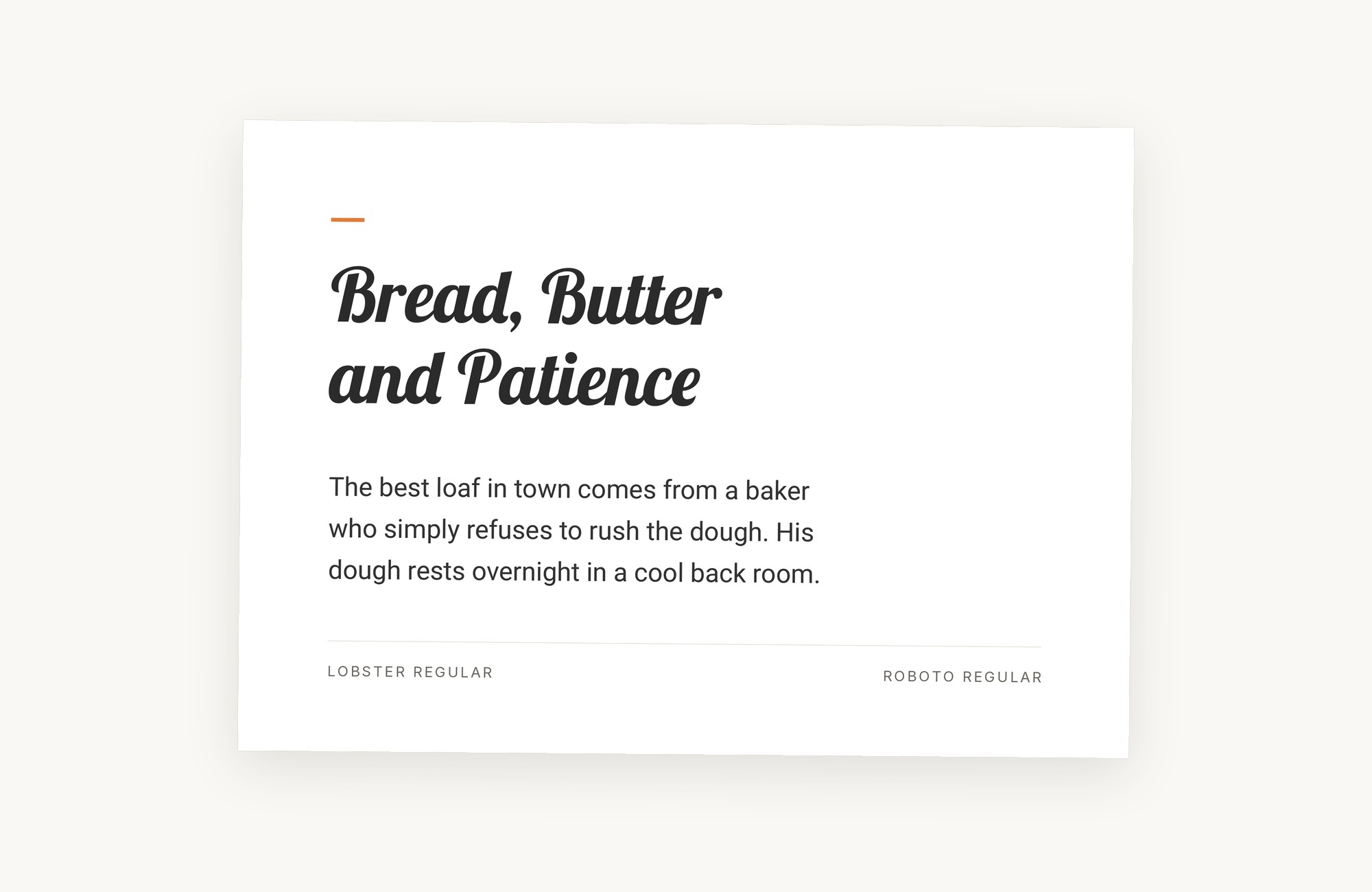
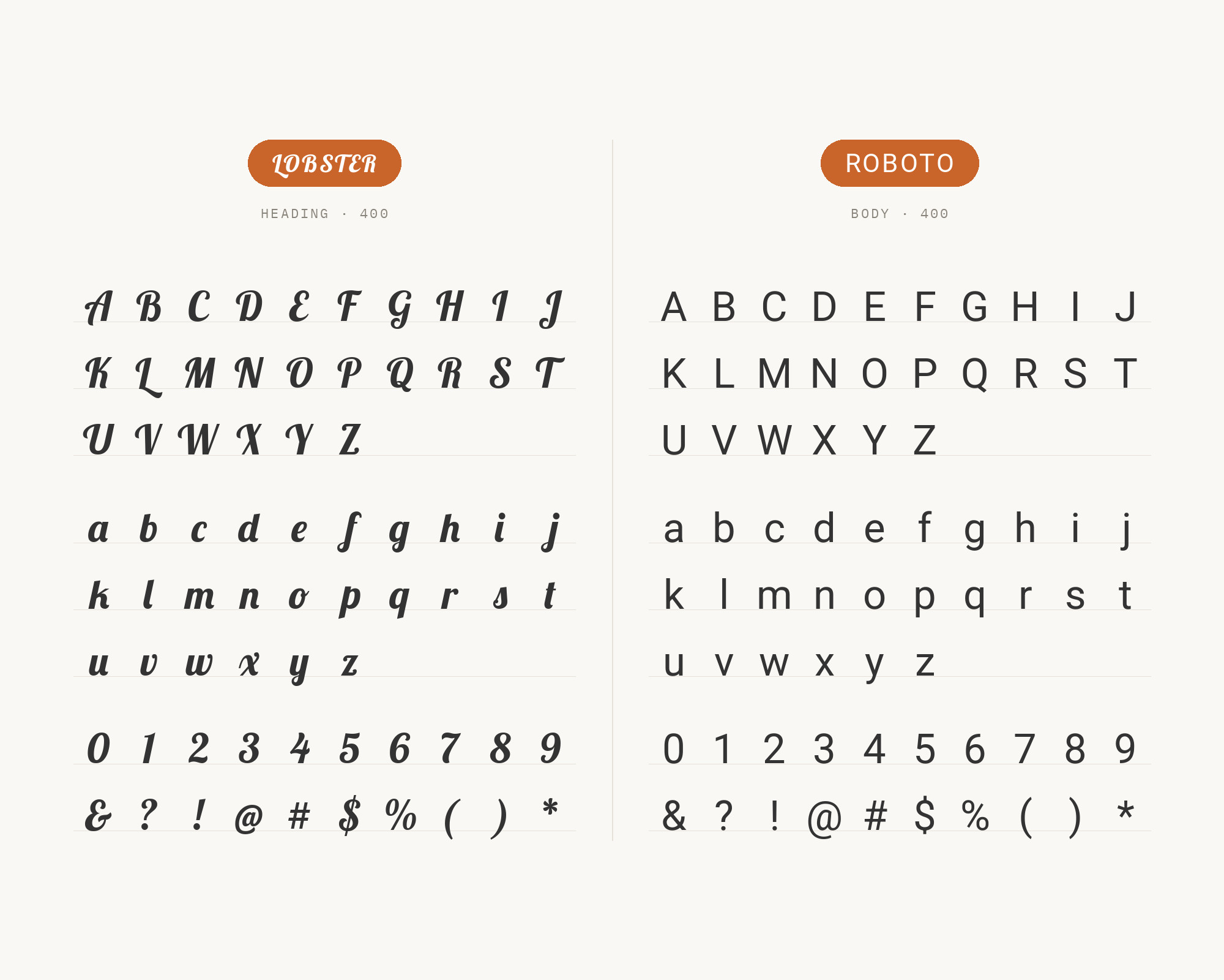
Christian Robertson designed Roboto for Google as Android’s system font: a mechanical-skeleton grotesque softened by open curves. That combination recedes at text and label sizes, leaving Lobster the only decorative voice. Pourpasunrond lists Lobster + Roboto. Use it on product and Android-adjacent interfaces that still want a script logotype — a rarer but real use than the restaurant default. Do not set them at similar sizes; the script needs a full step up or it reads as a broken italic. Use Roboto Mono if you need data — do not ask Lobster to label a table.
6. Helvetica
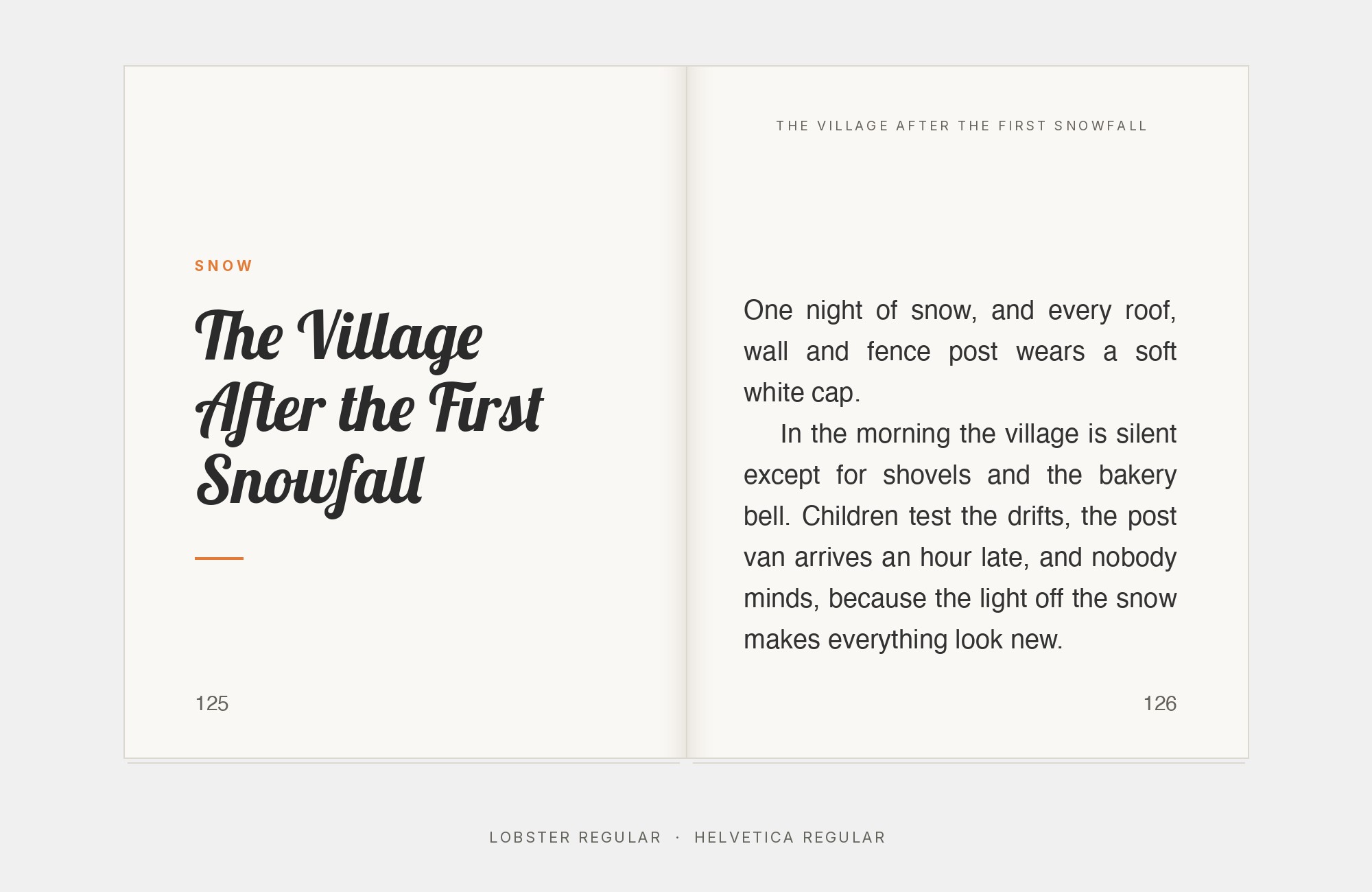
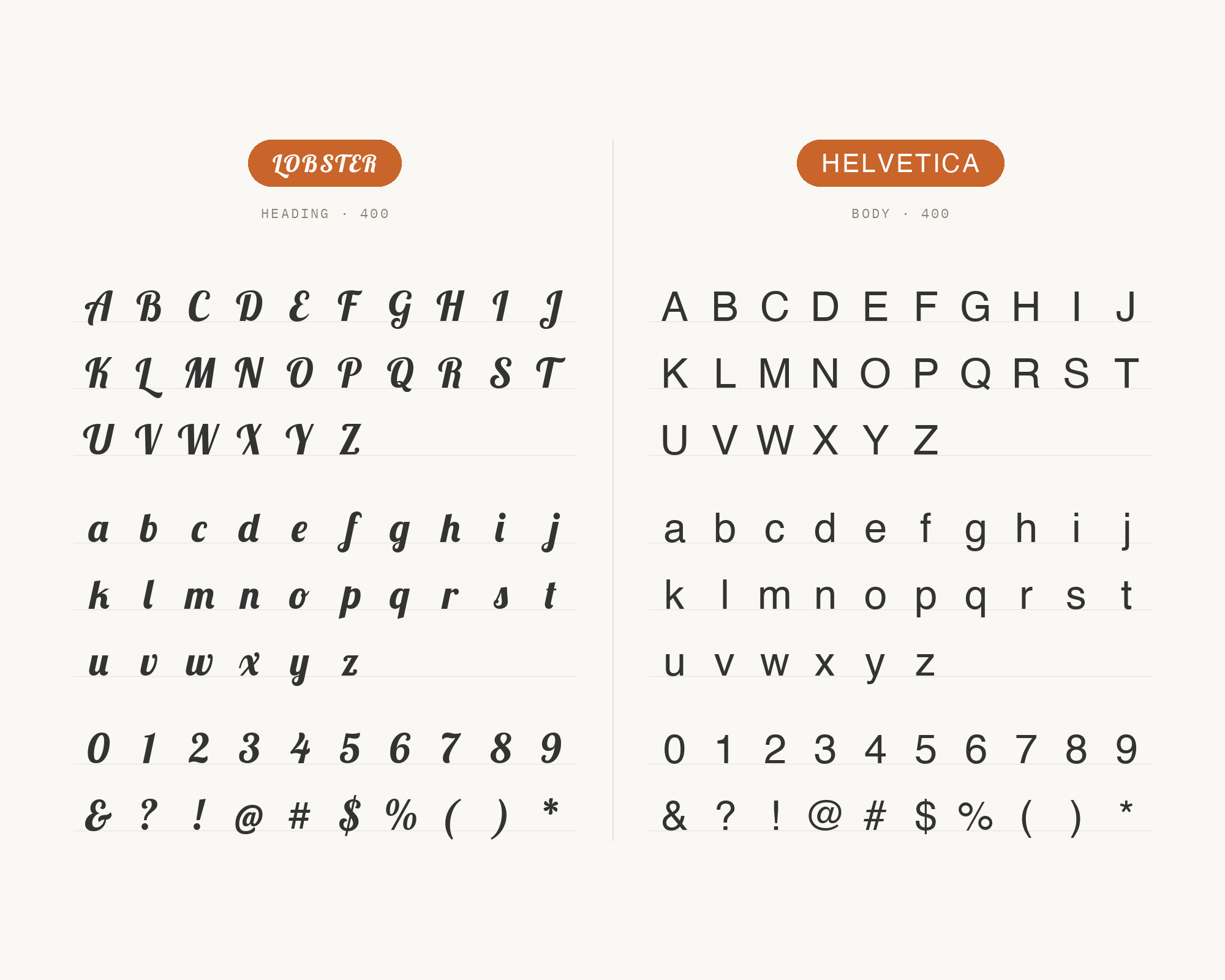
Max Miedinger and Eduard Hoffmann drew Helvetica in 1957 (first issued as Neue Haas Grotesk), and its strict, squared-off grotesque forms were built to carry no voice of their own. That absence of character is the foil Atwell names for Lobster’s organic curves — a load-bearing Swiss sans under a display script. Use Helvetica for body and UI when the brand already lives in a grotesque system, and let Lobster be the one expressive element. The pairing is more corporate-hospitality than bistro — a hotel bar rather than a diner. Do not put Helvetica Compressed next to Lobster: two condensed or decorative moves on one page is enough.
7. Playfair Display
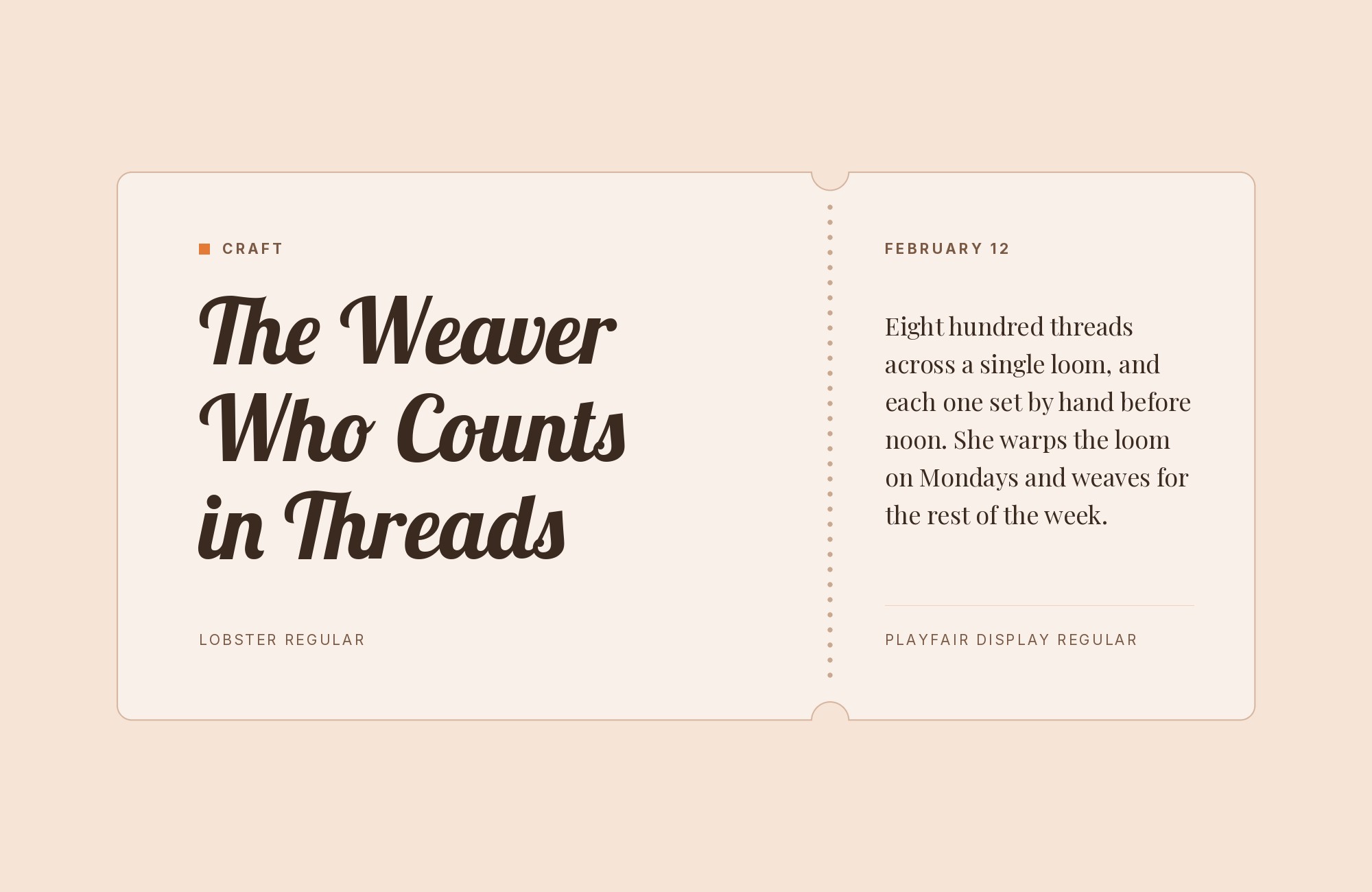
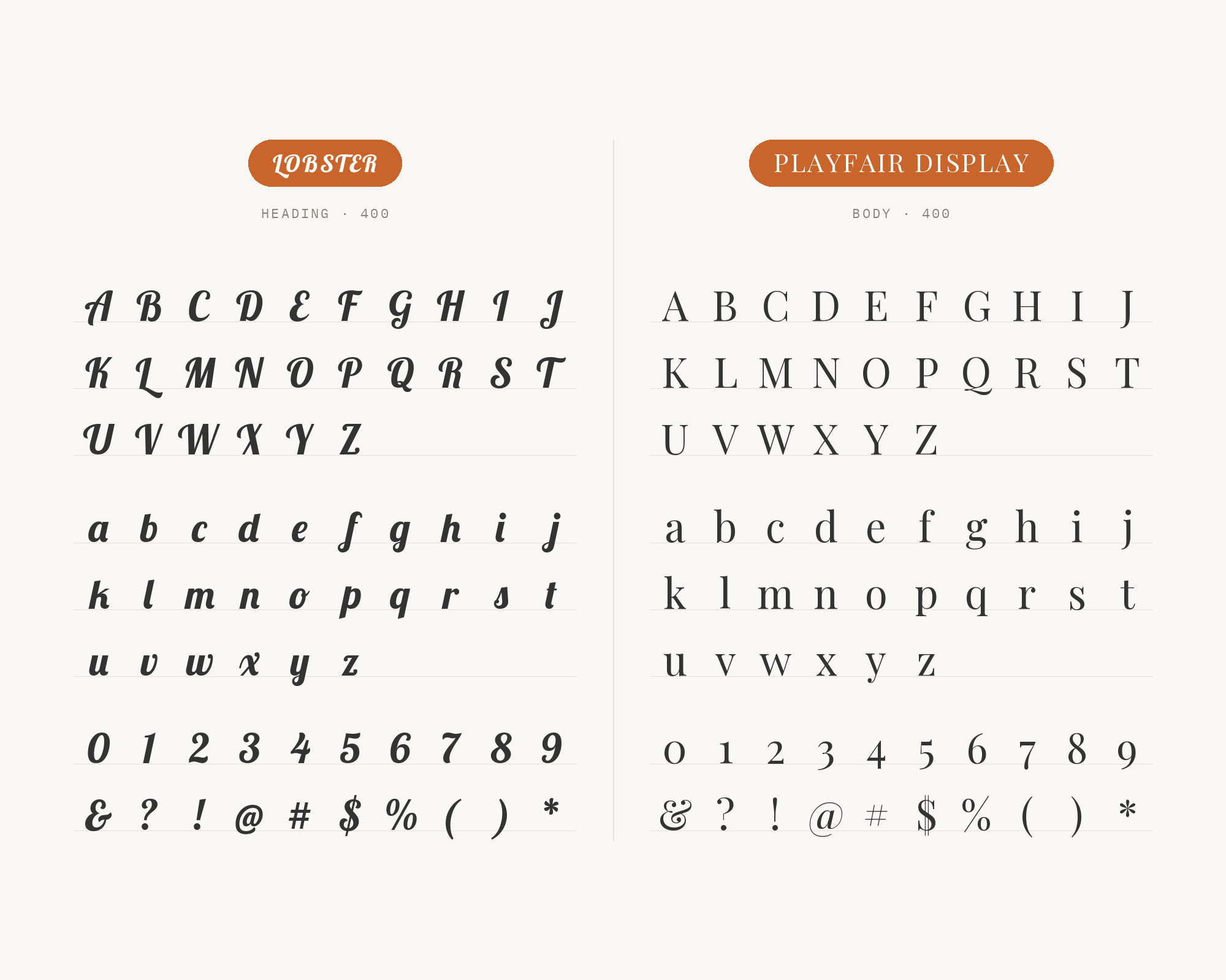
Claus Eggers Sørensen released Playfair Display in May 2011 as a high-contrast display serif: a transitional design with delicate hairlines, influenced by John Baskerville and Scotch Roman types. WordSCR recommends this serif route when Lobster needs elegance rather than a bistro sans: hairline-to-stem drama instead of another casual hand. Keep Playfair at display sizes, where its hairlines hold; do not set it as body next to a script headline, or you will have two display faces and no reading face. If both Lobster and Playfair appear, the supported Open Sans pairing can handle the paragraphs. The combination suits fashion, invitations and editorial features that want a signed kicker over a high-contrast title. Playfair Bold is usually too much color next to Lobster Regular; Playfair Regular or Medium is the cut.
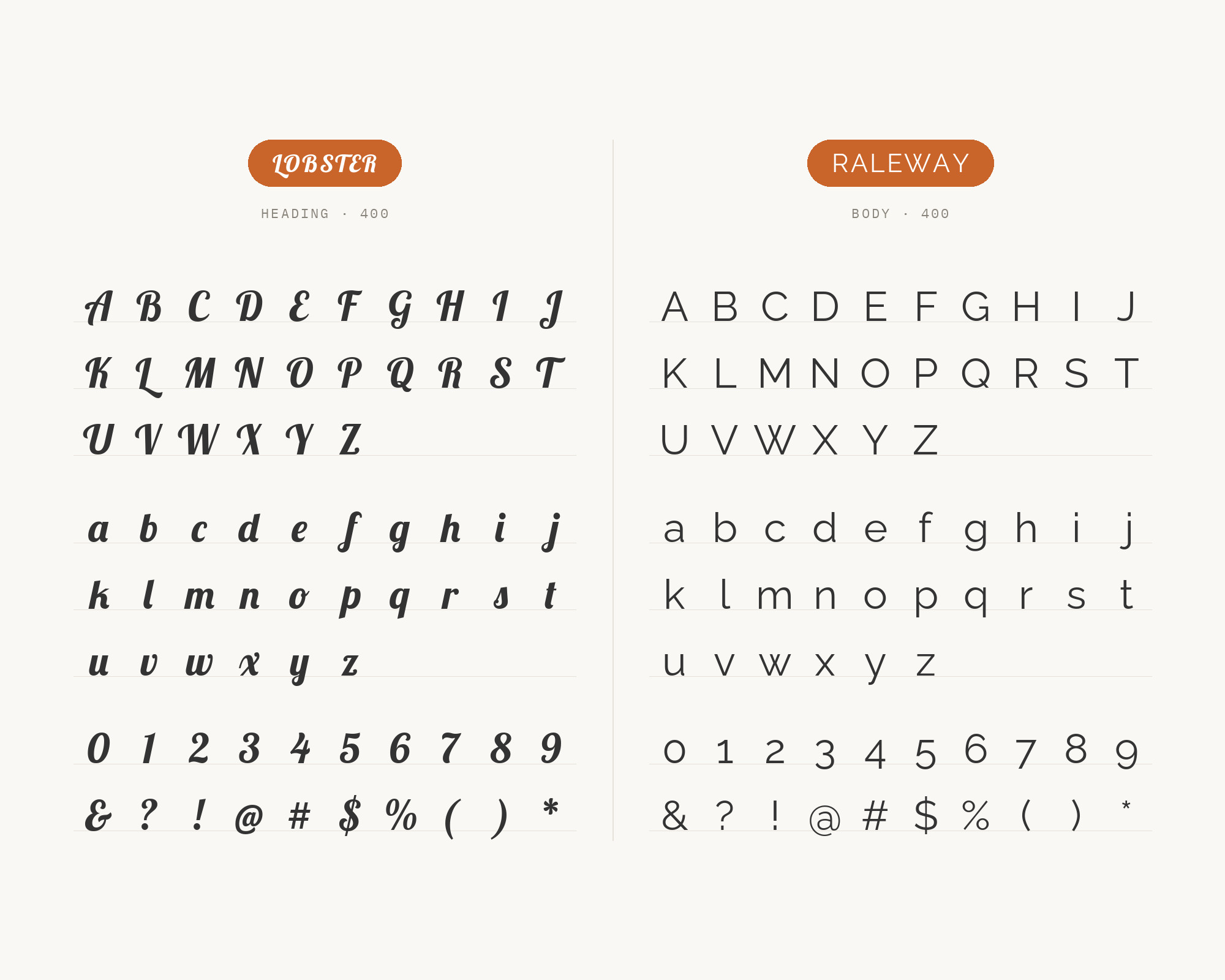
8. Raleway
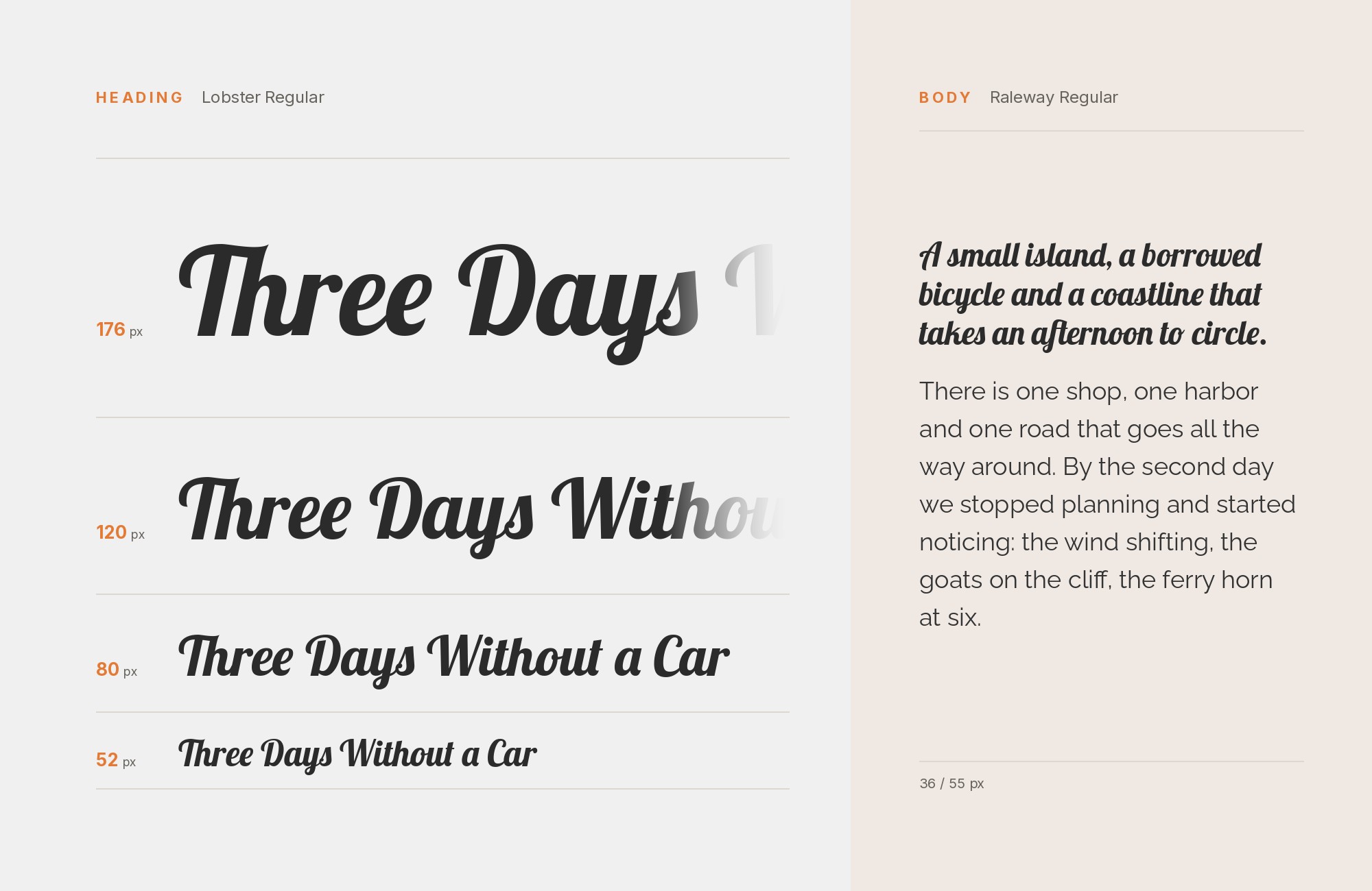
Looka explicitly recommends Raleway with Lobster, giving this combination support beyond a visual resemblance. Raleway’s upright, separate letters provide a useful pause after the dense movement of Lobster’s connected script. Keep Lobster on a short brand line, then use Raleway for the explanation, opening hours, or a restrained subtitle. Avoid choosing an extremely light sans weight merely to maximize contrast: the supporting text still needs to survive the intended size and background. A moderate weight usually gives the script a steadier frame. Judge the result with real words, because one long flourish can change the balance of an otherwise simple lockup.
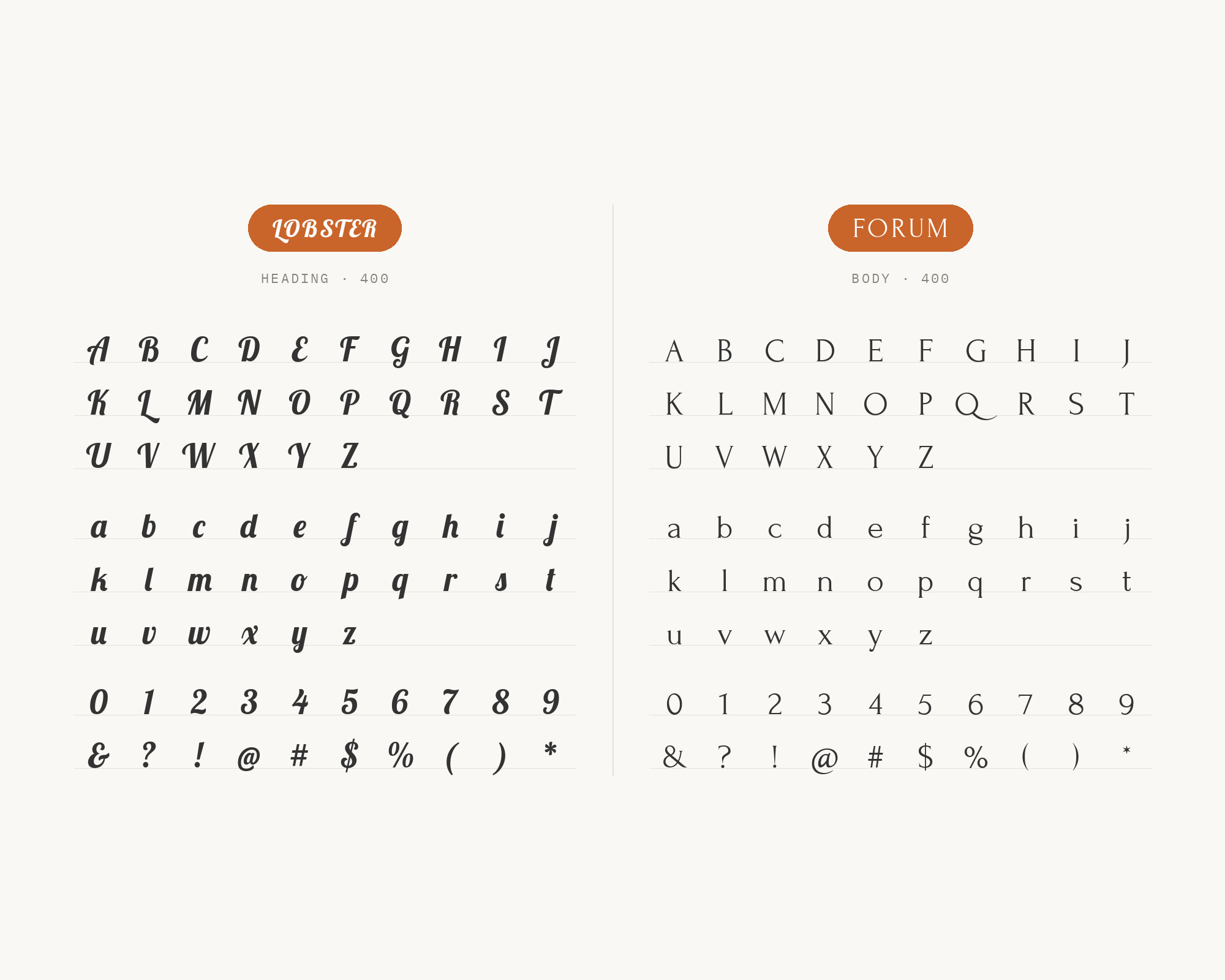
9. Forum
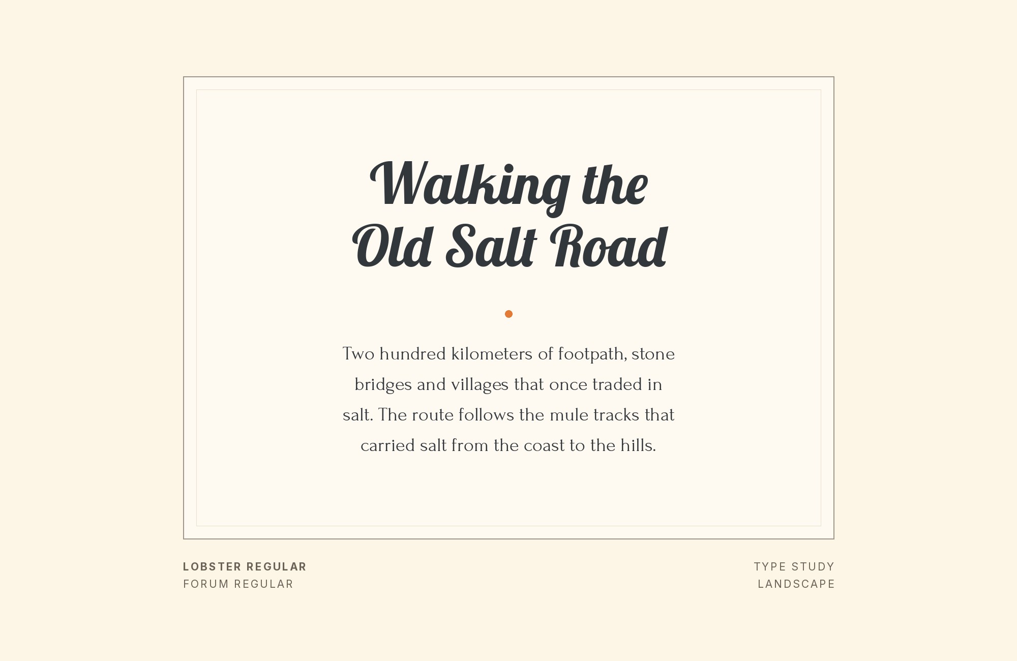
The Pop Your Career visual guide pairs Forum with Lobster and points to a specific shared trait: both faces contain flourishes, but their different line weights let those flourishes play against one another. This is a display pairing, so it still needs a separate reader for substantial copy. Use Lobster for a short name or signature and Forum for an elegant title, date or invitation line, with generous space between them. Keep Forum at a size where its thin strokes remain intact. The combination suits invitations and small editorial features better than navigation or dense product screens.
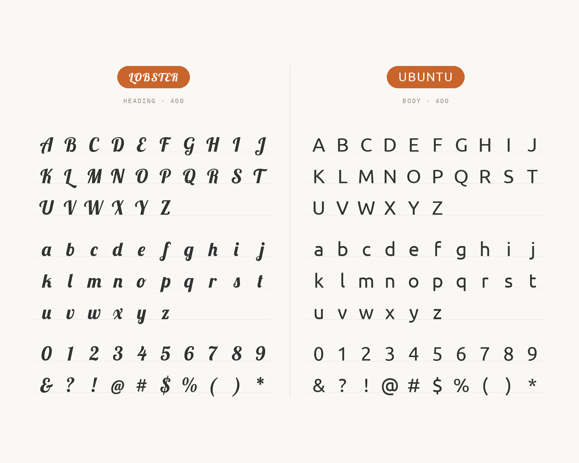
10. Ubuntu
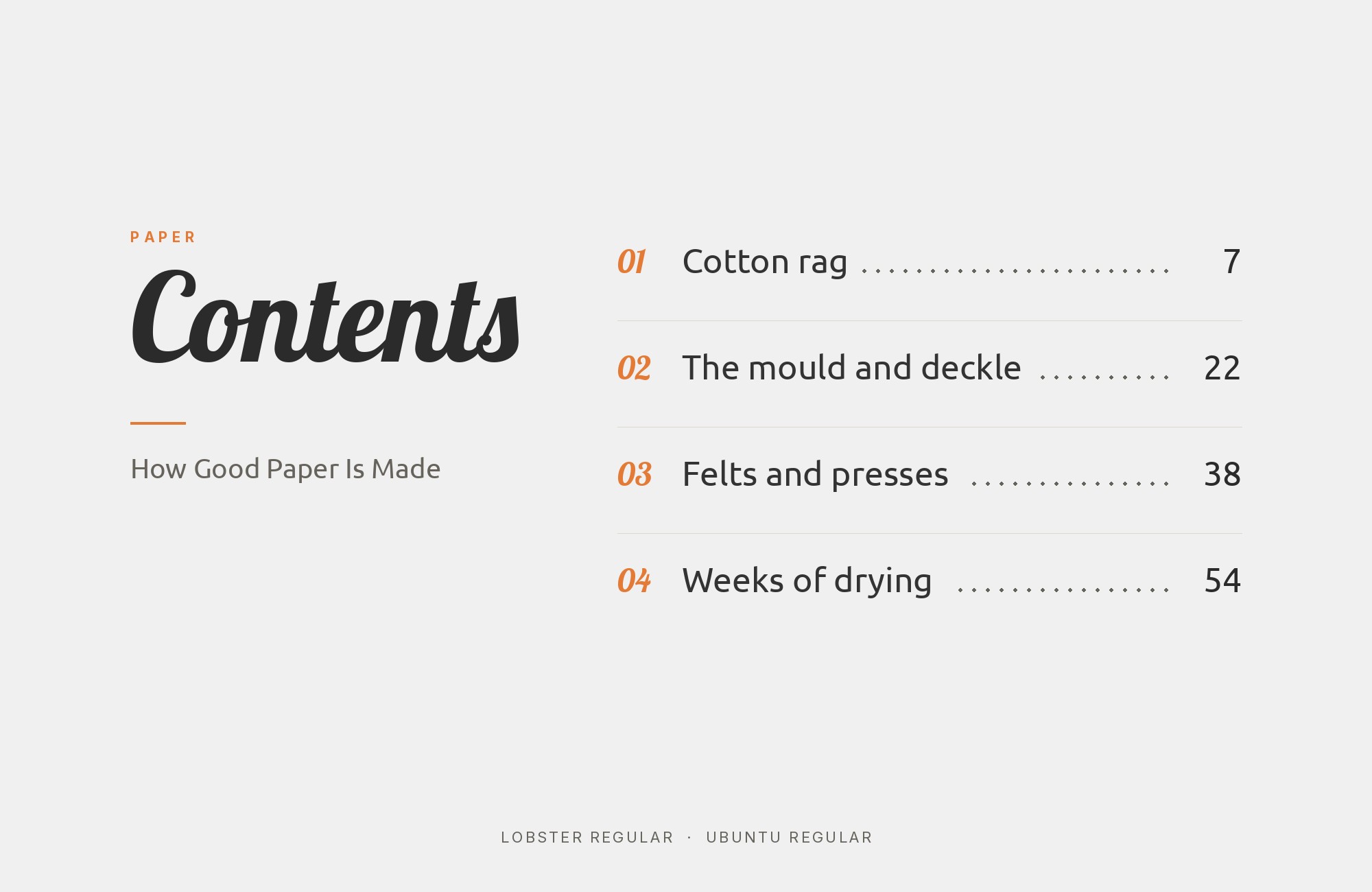
The Denver Scholarship Foundation’s primary brand standards place Ubuntu and Lobster 1.4 in one typography palette, assigning Ubuntu to all content text and Lobster to headlines. That direct role split makes Ubuntu a useful alternative to the neutral sans faces above. Its rounded joins and distinctive forms keep the system friendly, while its weight range carries paragraphs, captions and subheads that the single-weight script cannot. Use Ubuntu Regular for content and Medium or Bold for short supporting labels. Keep Lobster large and brief, so the two faces share an approachable tone without collapsing into the same level of emphasis.
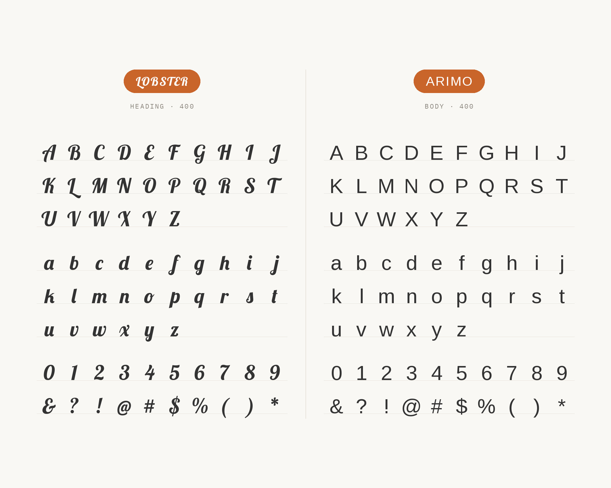
11. Arimo
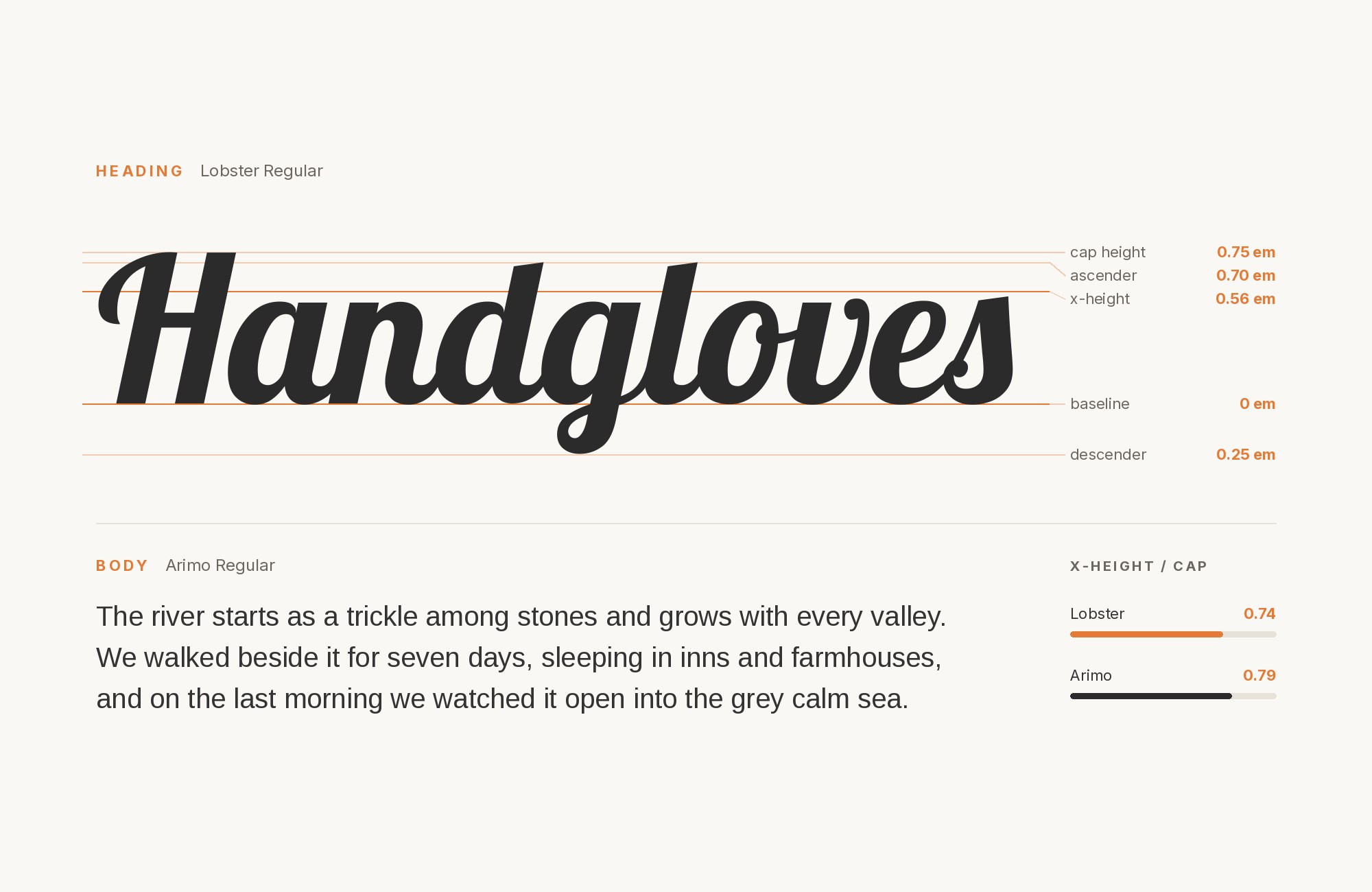
An educational typography guide published through the Digital Rhetoric Collaborative demonstrates Arimo beneath Lobster in its font-pairing chart. Arimo is useful here because it behaves like a quiet screen sans: familiar proportions, open counters and enough styles to build the reading hierarchy Lobster lacks. Put the script on a short campaign title or social graphic headline, then let Arimo handle every explanatory line, caption and call to action. Keep the sans at a moderate weight and test the pair on the actual image background. The point is dependable contrast in role, not making the supporting face decorative.
Conclusion
Lobster is a nameplate. The live-site pattern on Typ.io is condensed display sans — Oswald, Yanone Kaffeesatz — sharing the headline band; the supported text-face pattern is a humanist or quiet grotesk underneath — Cabin, Open Sans, Roboto or Helvetica. The serif route, Playfair Display, is real but rarer, and it only works if a supported text face still does the reading.
Set Lobster large, where the ligatures hold, and judge the partner at shipping size. If the script still reads as the signed line once the body is in place, the pairing is working. If you are setting paragraphs in Lobster, the roles are backwards. Two scripts on one page is almost always a conflict; one script and one reader is the system.
