Titillium Web pairs great with Open Sans, Lora and Roboto. All 12 pairings are shown below in real rendered specimens, with the reason each one works.

What fonts go with Titillium Web? It is one of those faces you have seen a hundred times without knowing its name. Squared curves, a slightly technical accent, a tidy rhythm that looks at home on a dashboard or a science site. Titillium is the main typeface of .italia, the design system Italy uses for public digital services. So the pairing question is not academic. Plenty of real teams have already answered it.
Titillium began as a teaching project at the Accademia di Belle Arti di Urbino, inside the type design course of the Master of Visual Design Campi Visivi. Each academic year, a dozen or so students picked it up, extended it and fixed what did not work. Luciano Perondi led the design and curation, Marcello Signorile coordinated, and Diego Giusti drew the first prototype. The name is a nod to the composer Arvo Pärt and his tintinnabuli technique. A first version came out in 2009. In 2012 a version called Titillium Web followed, in six roman and five italic styles. It has been in the Google Fonts library since 2012. The letters have squared shoulders and flattened curves, with a compact, upright fit that saves horizontal space. Light cuts look thin and wiry. The heaviest cut is dense and blunt. Pimp My Type put it plainly: it has a techie vibe to it, and seems modern and cool.
That technical accent is the whole pairing problem. Titillium Web carries a point of view, so the partner usually needs to be calmer, rounder or more traditional. The evidence below sorts into three moves: a neutral humanist or grotesque sans for long reading, a text serif for warmth, or a condensed display face that takes the headline and hands Titillium the smaller text. Here are 12 fonts that pair with Titillium Web.
1. Open Sans
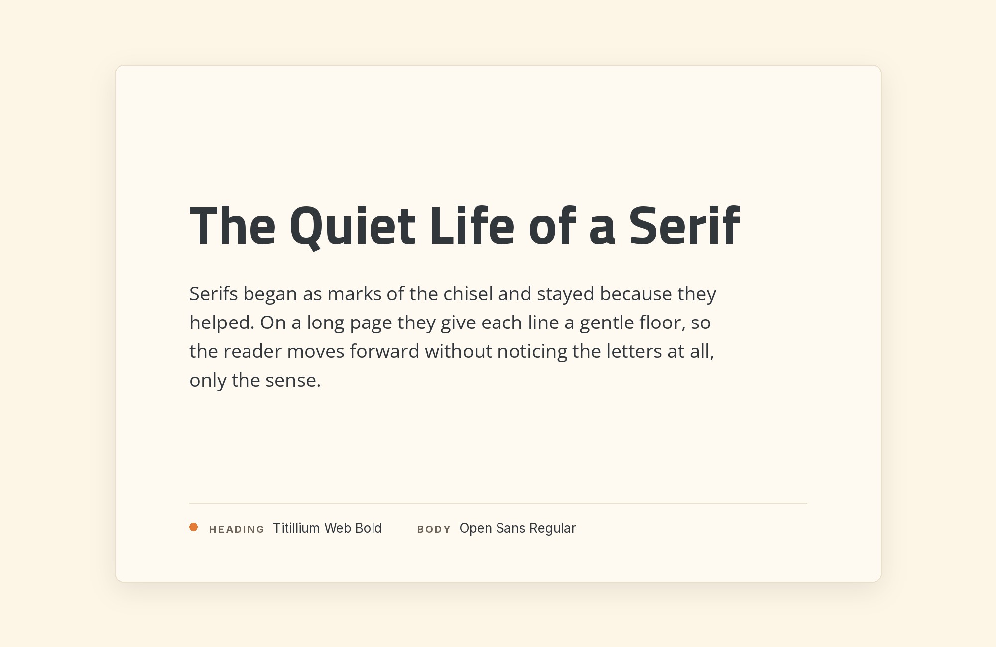
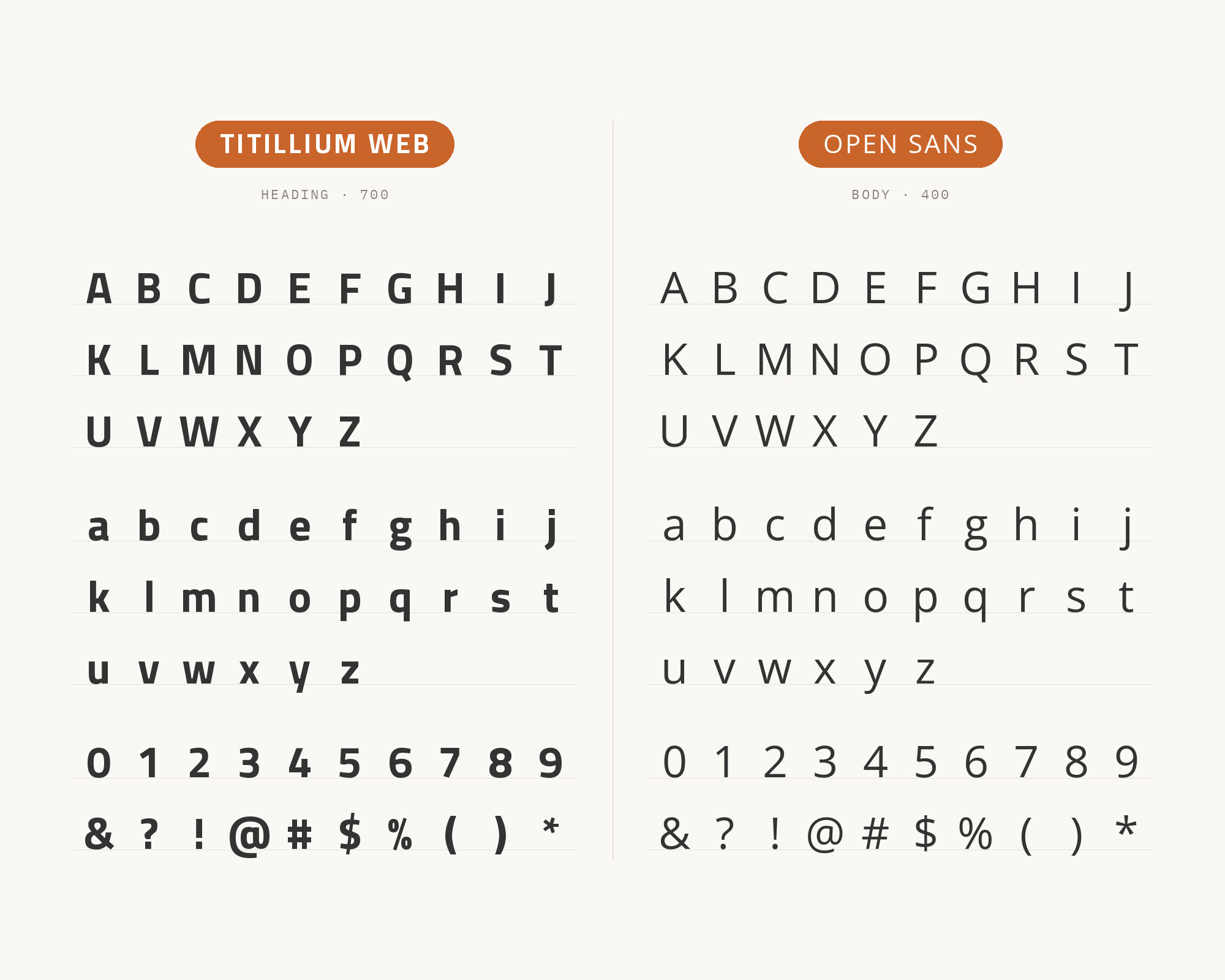
Typ.io records getpostman.com setting Titillium with Open Sans. A pairing tool at getillustrations.com assigns Titillium Web to headings and Open Sans to long-form text. That split is the natural one. Titillium’s squared bowls and tight fit give a heading some edge, while Open Sans has rounder, wider letters with open apertures and a very even color at 16px. The two share a similar x-height, so a small heading and a paragraph line up comfortably in the same column. Use Titillium Web SemiBold or Bold for headings, navigation and buttons. Put Open Sans Regular under it for paragraphs, help text and forms. It is the safe choice for software products, API documentation and technical marketing pages, where the brand wants a hint of engineering in the headlines and nothing surprising in the reading.
Junior work is now a prompt. The biggest profit center in your studio is vanishing.
How to fix this?
Find Out How2. Lora
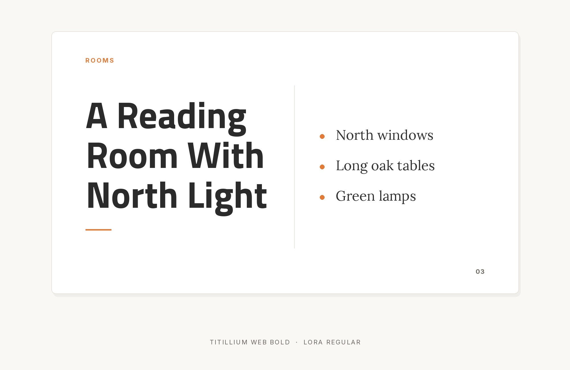
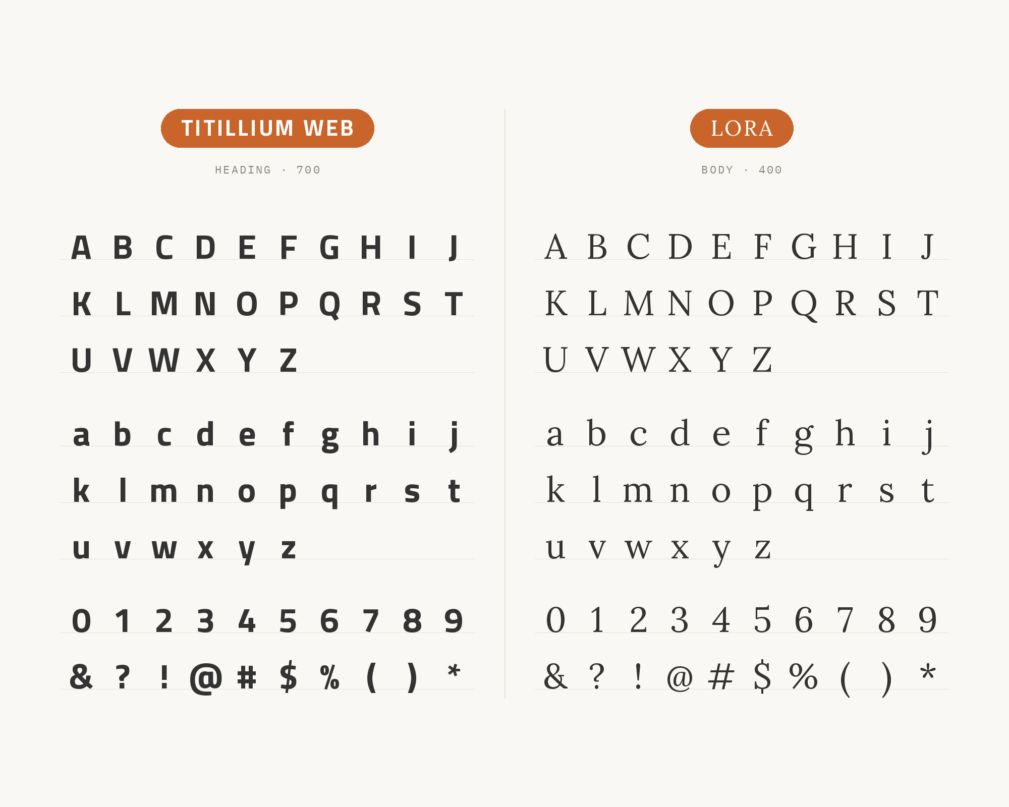
Italy’s .italia design system sets Titillium Web as its sans serif and Lora as its serif. The guidance recommends Lora for longer paragraphs of text. This is the strongest serif evidence on the list, because a national design system chose it for public services, not for a mood board. The contrast is simple. Titillium is flat, squared and cool. Lora has brushed, calligraphic curves and moderate stroke contrast, so a paragraph in Lora feels warmer and slower than one in Titillium. SlidesCarnival also suggests Titillium Web headings with Lora body on blogs and brand sites. Keep the roles strict: Titillium Web for headings, labels and interface elements, Lora for articles, explanations and anything a reader will sit with for more than a minute.
3. Roboto
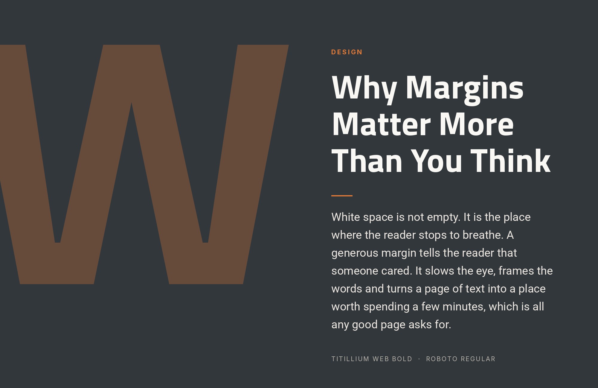
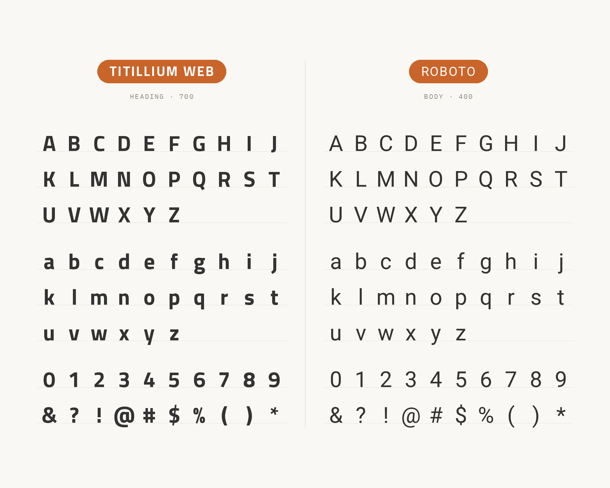
Typ.io records ka.co.kr, a science and energy site, pairing Titillium with Roboto. SlidesCarnival suggests the same split, with Titillium Web leading the headings and Roboto taking the body. This is a quiet, almost same-family pairing. Both faces are technical sans serifs, but they get there differently. Titillium squares its curves and keeps its letters narrow. Roboto keeps a mechanical skeleton and relaxes into open, natural widths. So the difference is visible but not loud. Give Titillium Web the headings at a clearly larger size, in SemiBold or Bold, and let Roboto Regular carry paragraphs, tables and UI labels. The pairing suits dashboards, product sites and engineering blogs, where two sans serifs are expected and the job is to make the hierarchy clear without adding a new voice.
Taking it to the next level means cinematic visuals, faster turnarounds, and work that wins clients. Create with unlimited downloads of creative stock assets, and access to powerful AI tools to fast-track your workflow!
Subscribe4. DM Sans
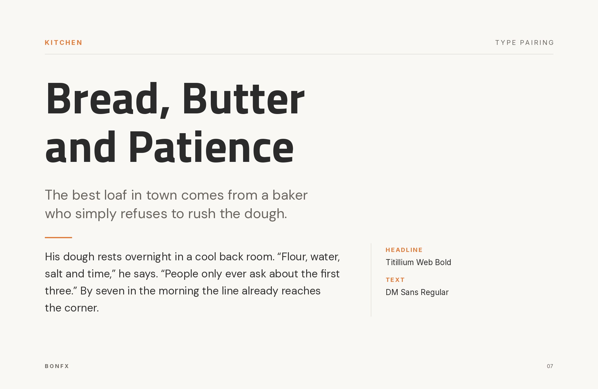
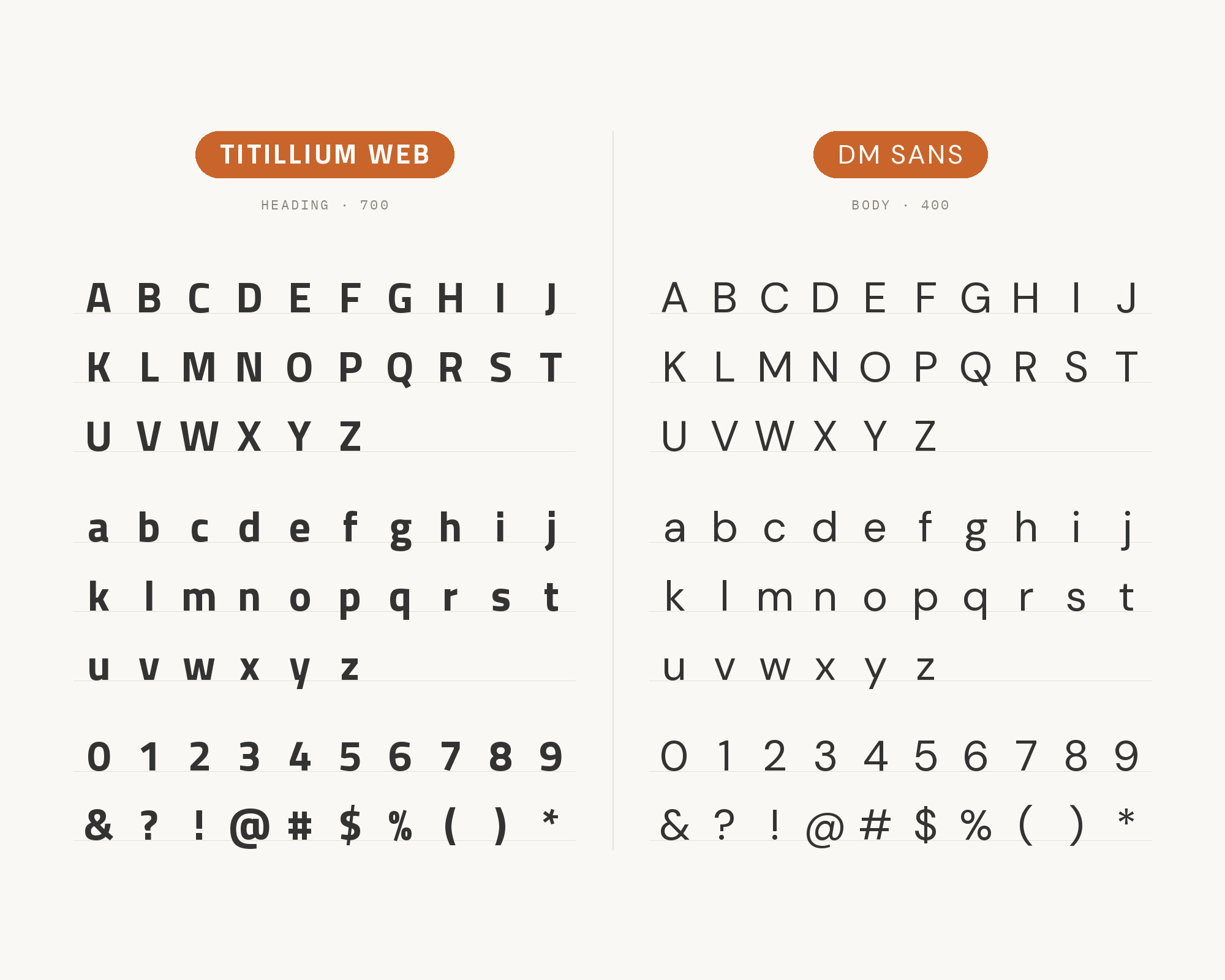
SAIT’s brand guide names two primary fonts, Titillium Web in black and bold weights and the DM Sans family. The hierarchy is spelled out: Titillium Web, black weight, all-caps for headings, and DM Sans, regular weight, for body copy. That is a smart use of both faces. Titillium Web at its heaviest is dense and blocky, which gives short capital headlines real presence. DM Sans is a low-contrast geometric sans with round bowls and generous spacing, so it reads more softly underneath than Titillium would. The result feels confident at the top and friendly in the text. Follow SAIT’s own lead: keep the heavy Titillium lines short, avoid all-caps on long headlines, and use DM Sans Bold, not a third family, for calls to action and emphasis.
5. Bebas Neue
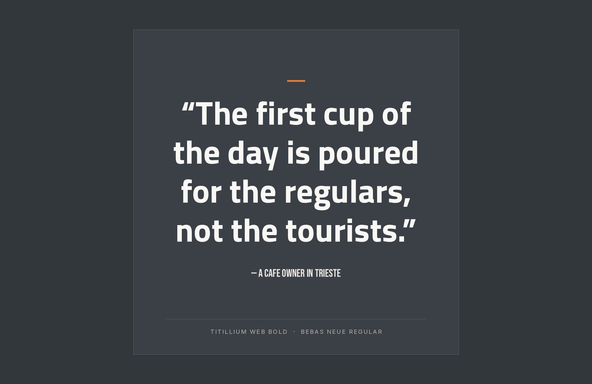
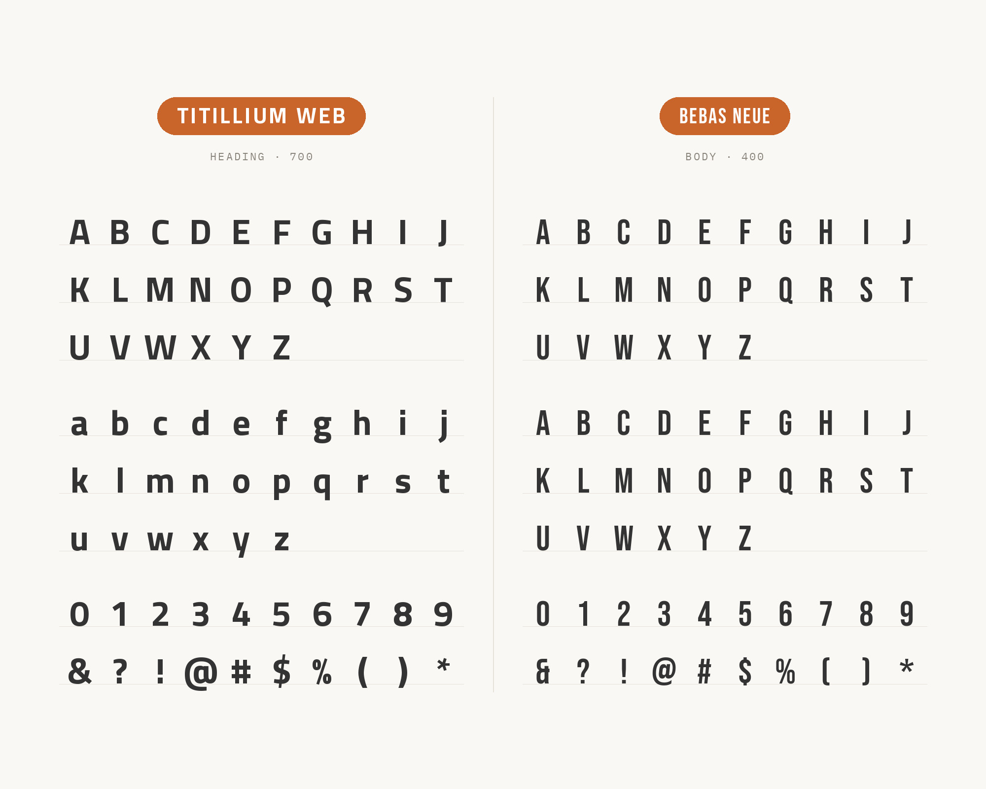
The SJN Academies style guide makes Titillium Web the main typeface in most applications. It reserves Bebas Neue for callouts and headlines, praising its condensed form. The Ukhamba Beerworx identity on Fonts In Use takes a similar route: its logo is customized from Bebas Neue, and Titillium is used for text at smaller sizes. Two different projects, same division of labor. Bebas Neue is all capitals, tall and tightly packed, so it does the shouting in very little width. Titillium Web then covers everything with lowercase, from subheads to paragraphs, in a range of weights Bebas does not have. Set Bebas Neue large with a little extra letterspacing. Keep the Titillium text at Regular or Light so the two do not compete for the same kind of density.
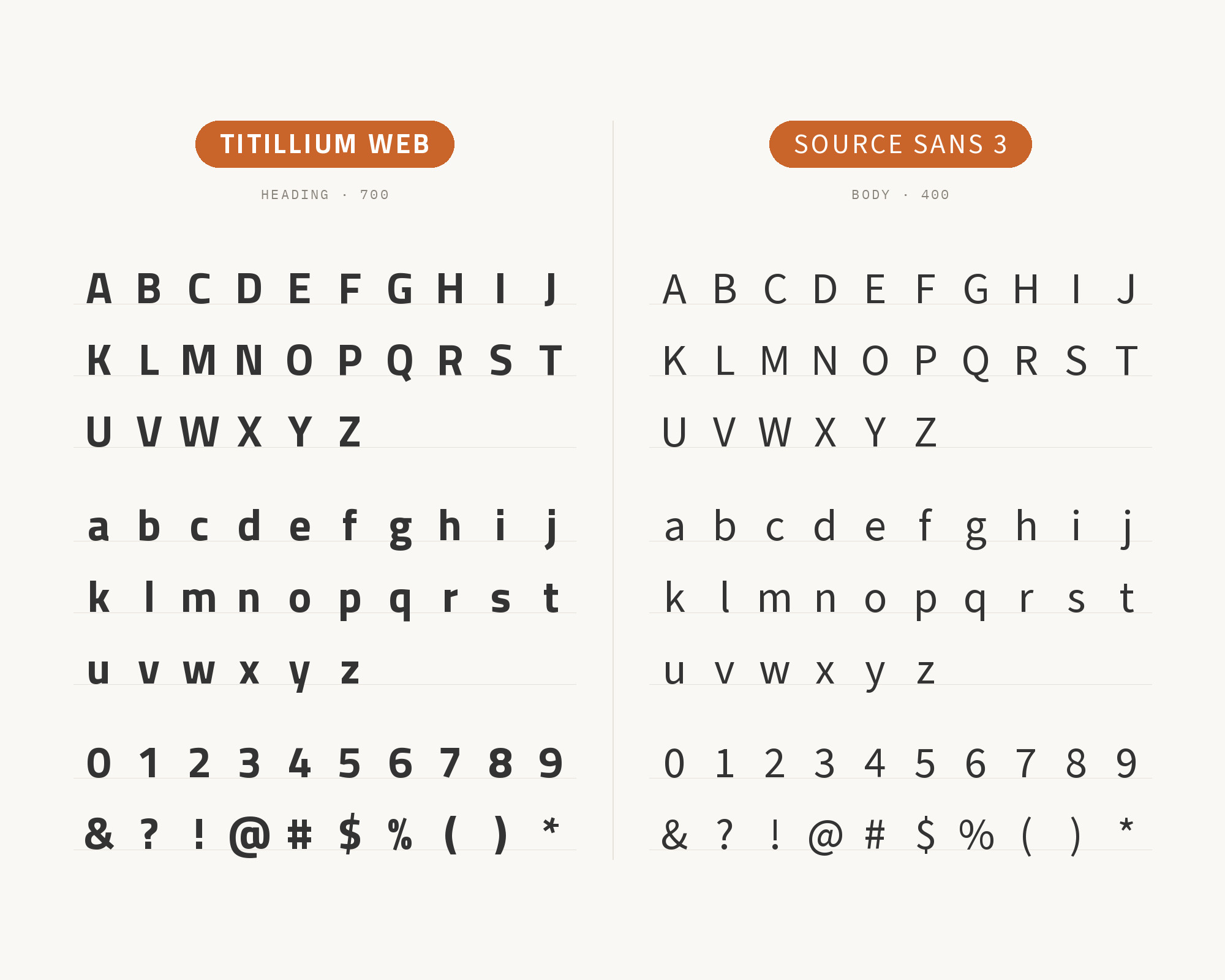
6. Source Sans 3
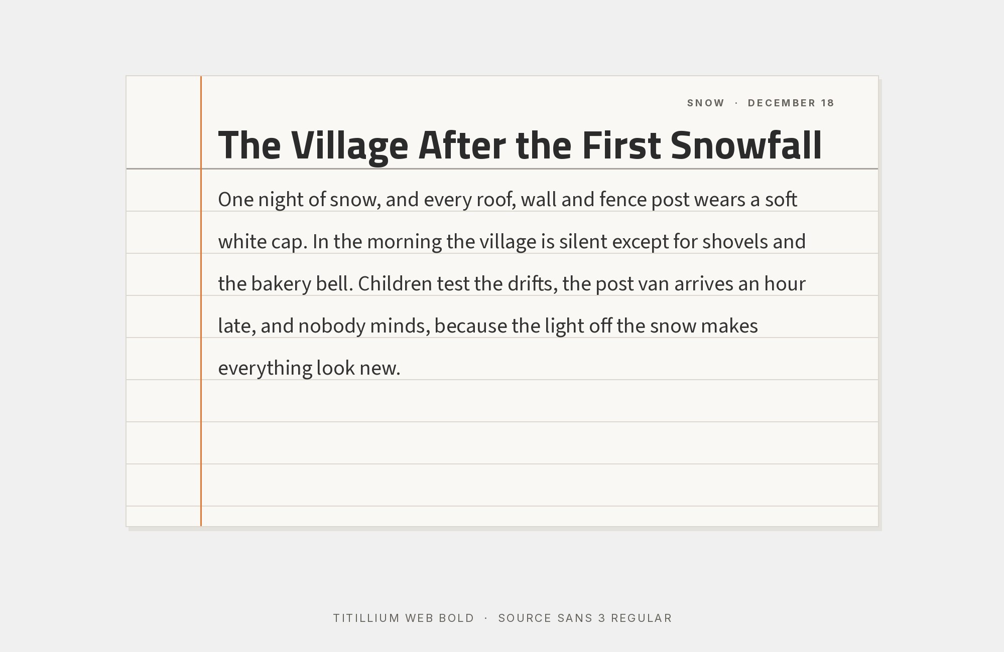
In the Colecciones Permanentes catalog on Fonts In Use, Titillium sets the title page while Source Sans handles titles and paragraphs. It is an interesting inversion. Here Titillium is the accent, and Source Sans 3 does the steady work. That makes sense in a printed catalog. Source Sans has a humanist skeleton, open counters and a slightly condensed but relaxed fit, so it stays readable across many pages. Titillium’s squared forms then feel special because they appear only in a few places. Try this when you like Titillium’s character but do not want it on every line: use it for section openers, covers and key numbers, and let Source Sans 3 carry the running text and captions.
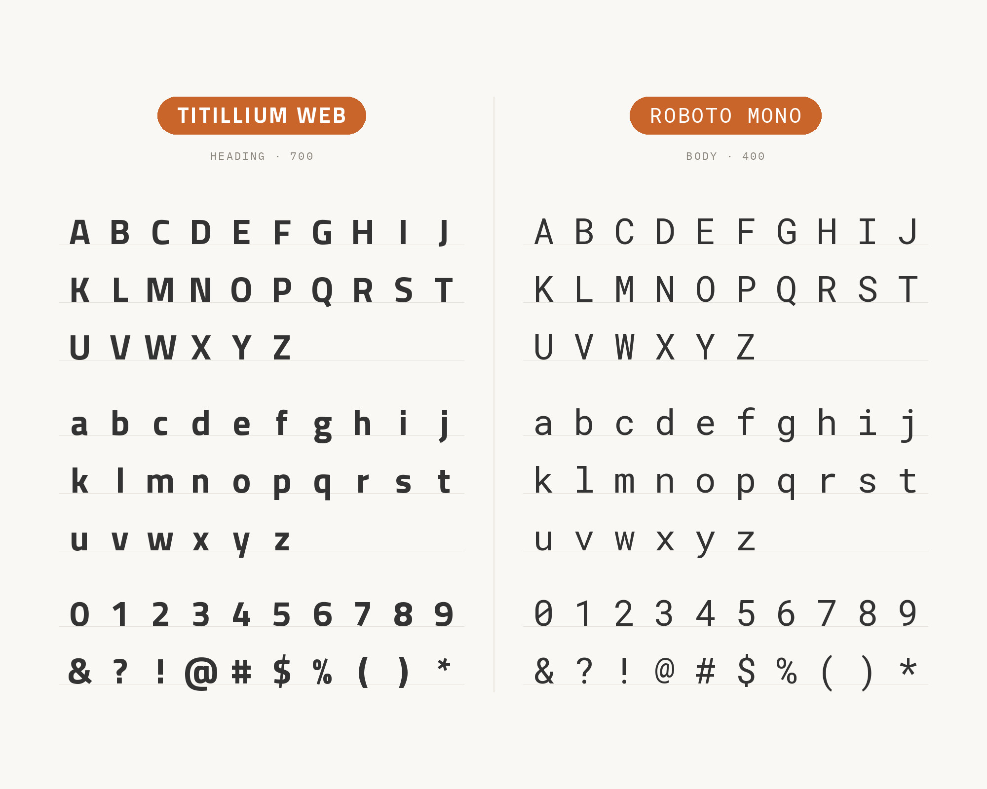
7. Roboto Mono
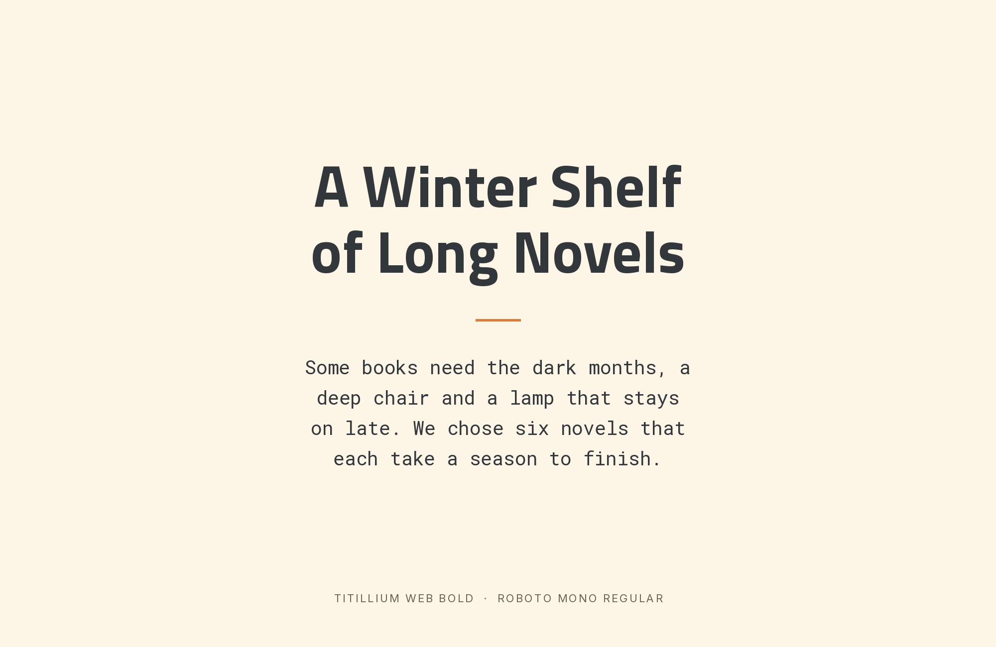
The same .italia system adds Roboto Mono for technical data such as numbers and code. The pairing works because Titillium Web and Roboto Mono are both engineered-looking, but only one of them is monospaced. In a tabular setting, fixed character widths keep digits aligned column by column, which a proportional face cannot do. Roboto Mono also has the squarish, rational details of the Roboto family, so it sits comfortably next to Titillium’s flat-sided curves instead of looking like an intruder from another system. Use it sparingly: data tables, code samples, reference numbers, form values. Headings and paragraphs stay in Titillium Web. This is an ideal third face for documentation sites and public-service dashboards that already use Titillium.
8. Helvetica Neue
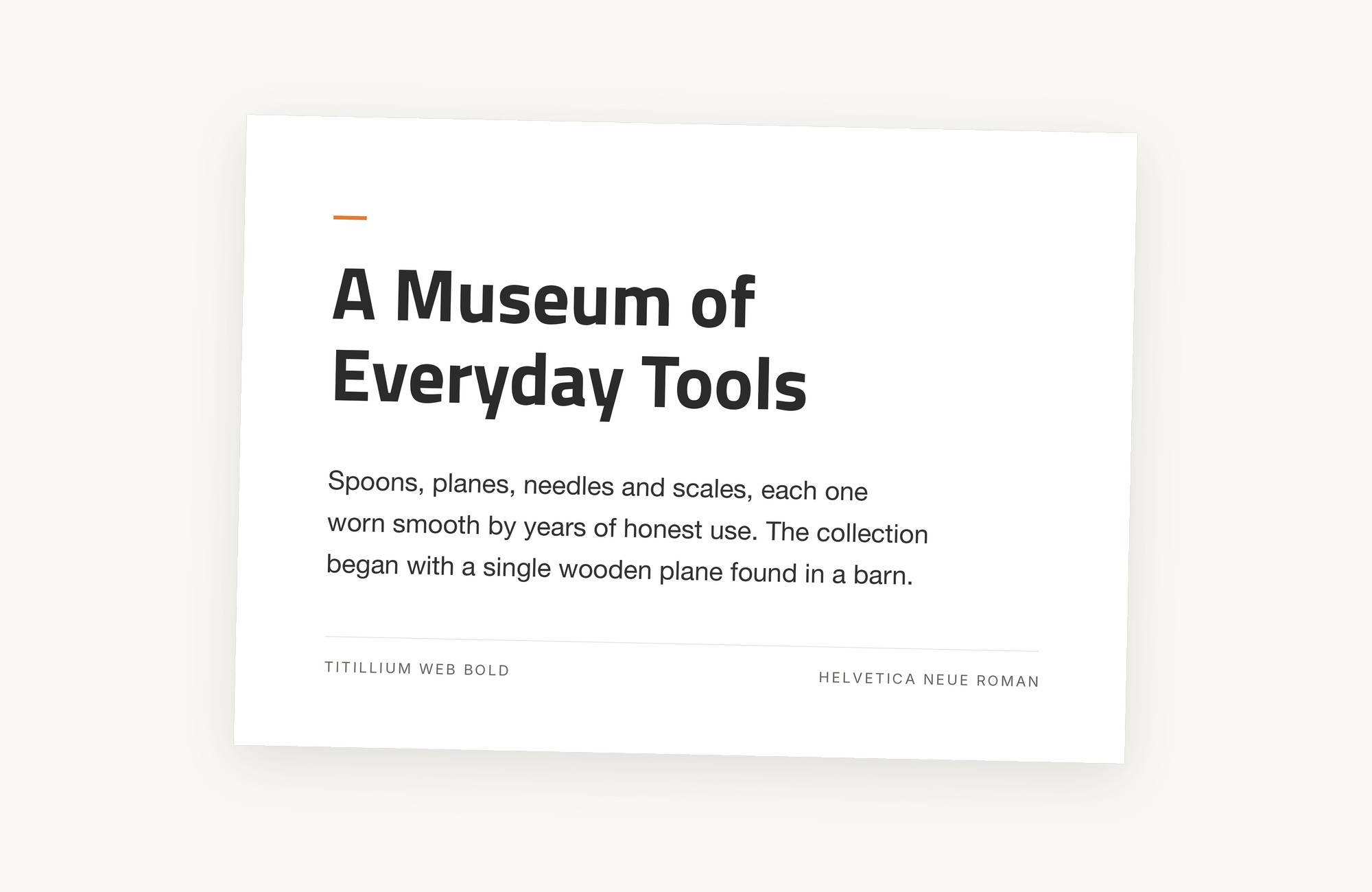
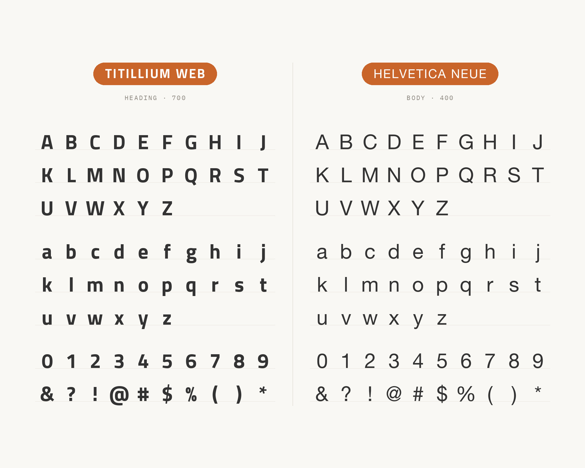
Typ.io records numer.ai, a finance and investing site, pairing Helvetica Neue with Titillium. Helvetica Neue is the neutral grotesque that asks for no attention. Its apertures are fairly closed and its rhythm is regular, so it gives the page a calm, institutional text layer. Titillium Web then becomes the only element with a clear personality, which is what you want when the brand is in the headlines. The two faces are close in tone, so the hierarchy must come from size and weight. Set Titillium Web large and bold for headings and data callouts, and use Helvetica Neue Regular for body text and small labels. It suits fintech, research and B2B pages where a crisp, serious look matters more than warmth.
9. Abel
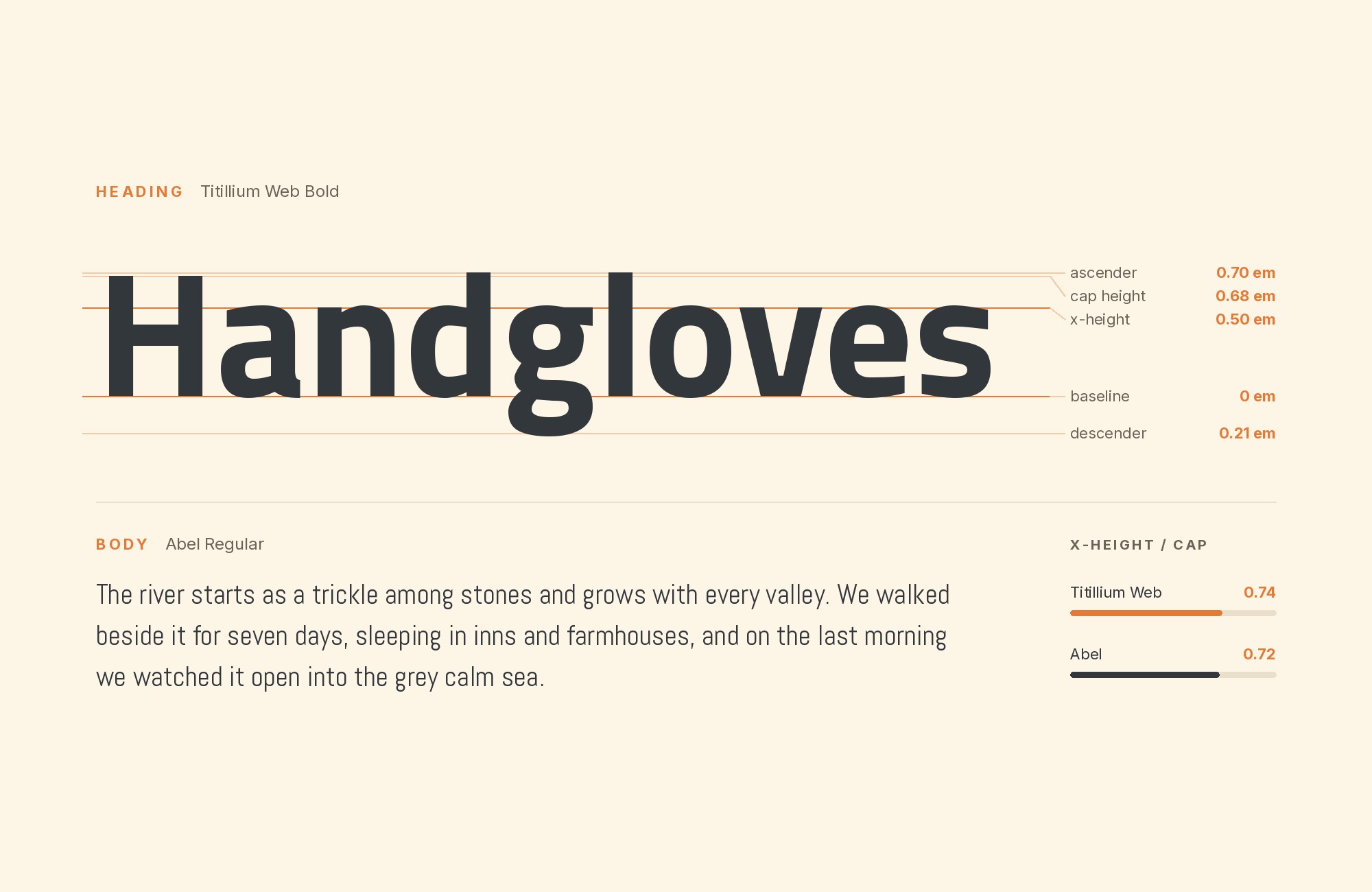
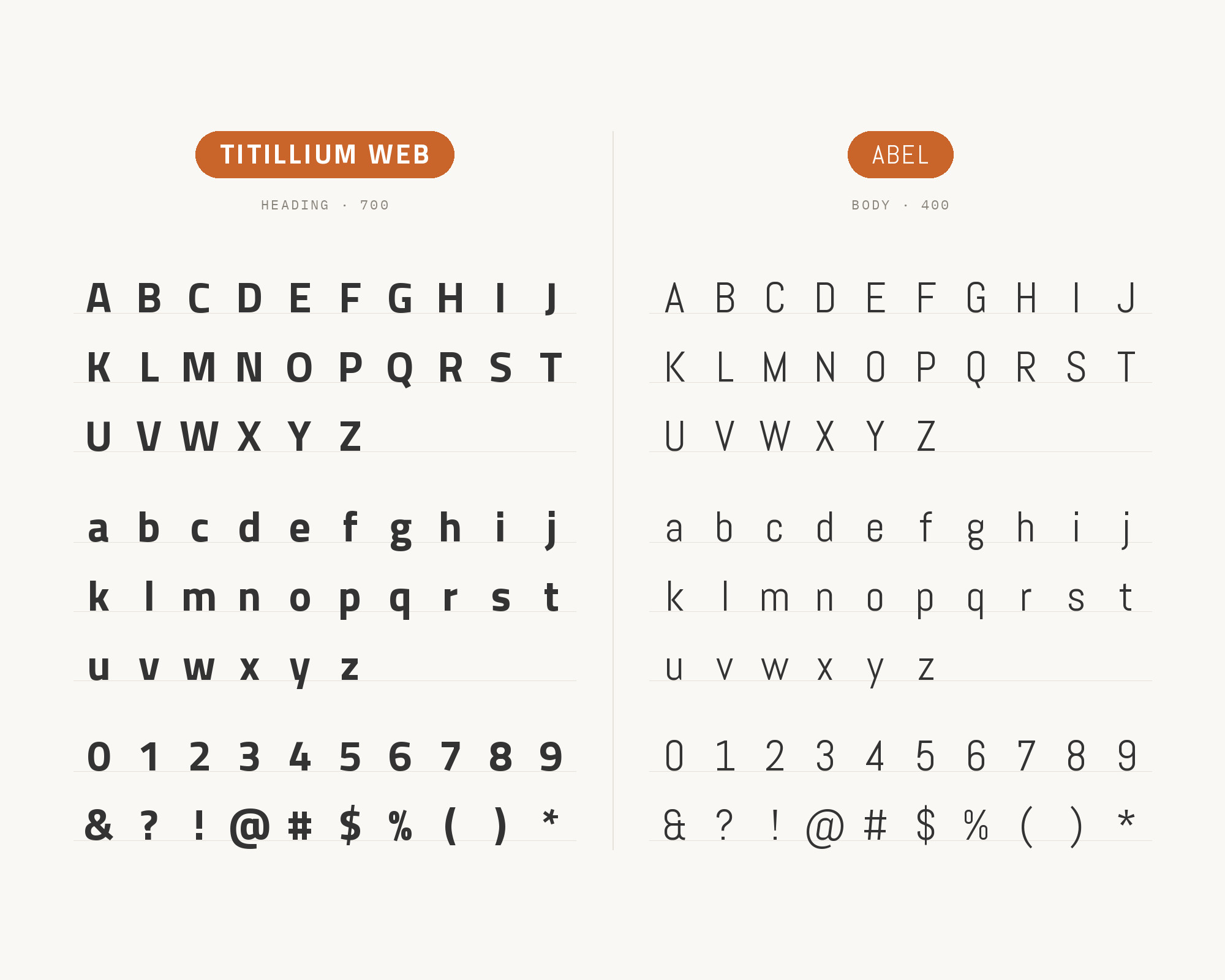
The MoTyF student festival in Warsaw used Titillium for its header and poster and Abel for its website, as Fonts In Use shows. Abel is a condensed, flat-sided sans. That gives this pairing a useful logic. Abel is narrower than Titillium Web and very even, so it can take a compact display line, a navigation bar or a date stamp. Titillium then gives back normal width and a full weight range for anything that needs hierarchy. Both have a squared, contemporary tone, so the pair feels related rather than contrasting. Use Abel for short, tall headline lines and labels. Use Titillium Web for text and subheads. It works for student projects, events and technical brands that like a slightly retro-futurist feel.
10. Crimson Pro
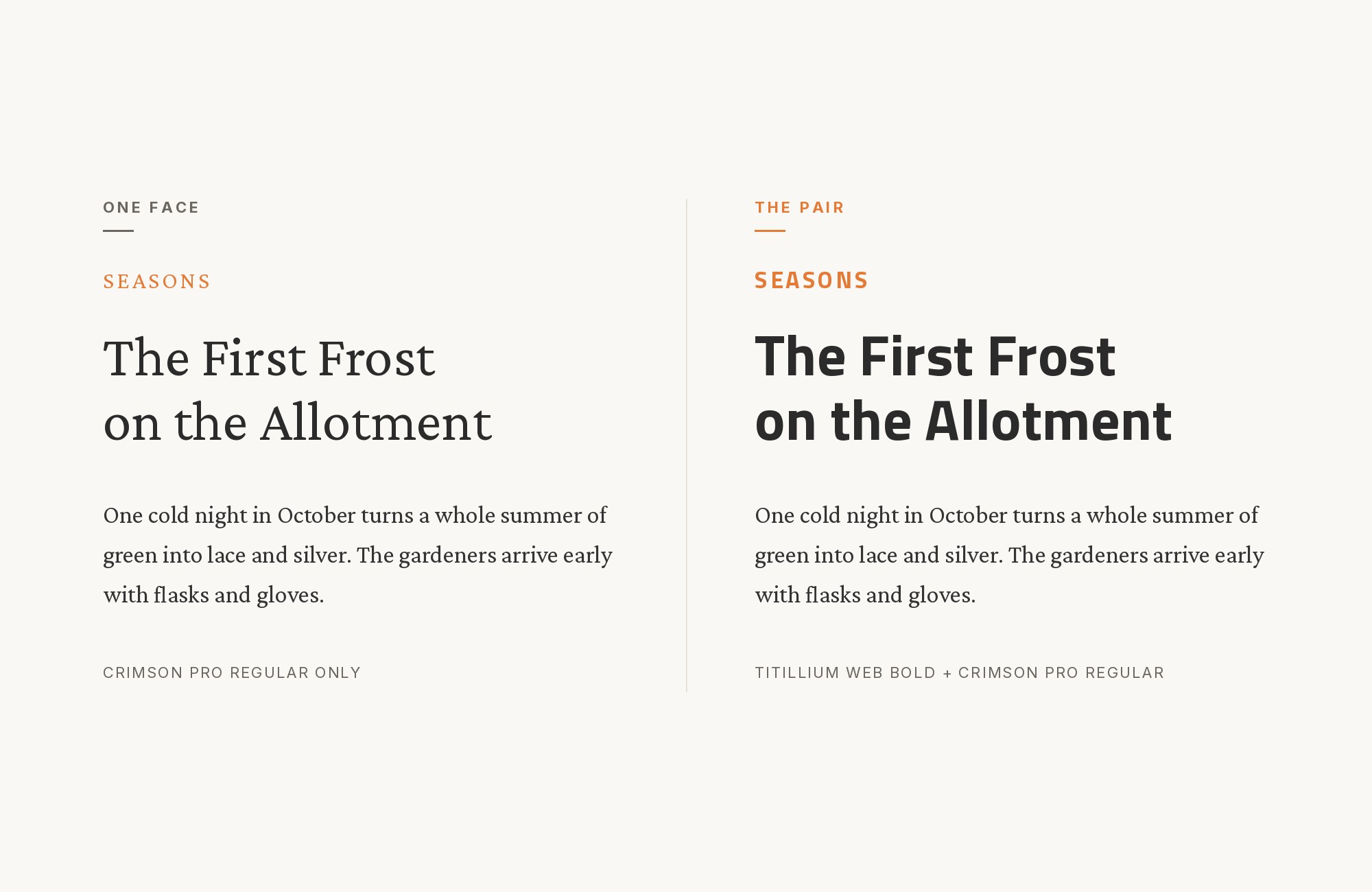
In the book design for Le Québec au cinéma, on Fonts In Use, Titillium covers the cover, intros and by-lines, next to a serif that the entry says appears to be Crimson Pro. The identification is tentative, so treat it as a lead, not a certainty. The combination itself is sound. Crimson Pro is a book serif in the old-style tradition, with a modest x-height, soft modulation and a classical rhythm. Next to it, Titillium’s squared, upright sans looks crisp and modern. That contrast suits a book: serif for reading, sans for the apparatus around it. Set Crimson Pro at a comfortable reading size with generous leading. Use Titillium Web for chapter openers, pull quotes, credits and captions.
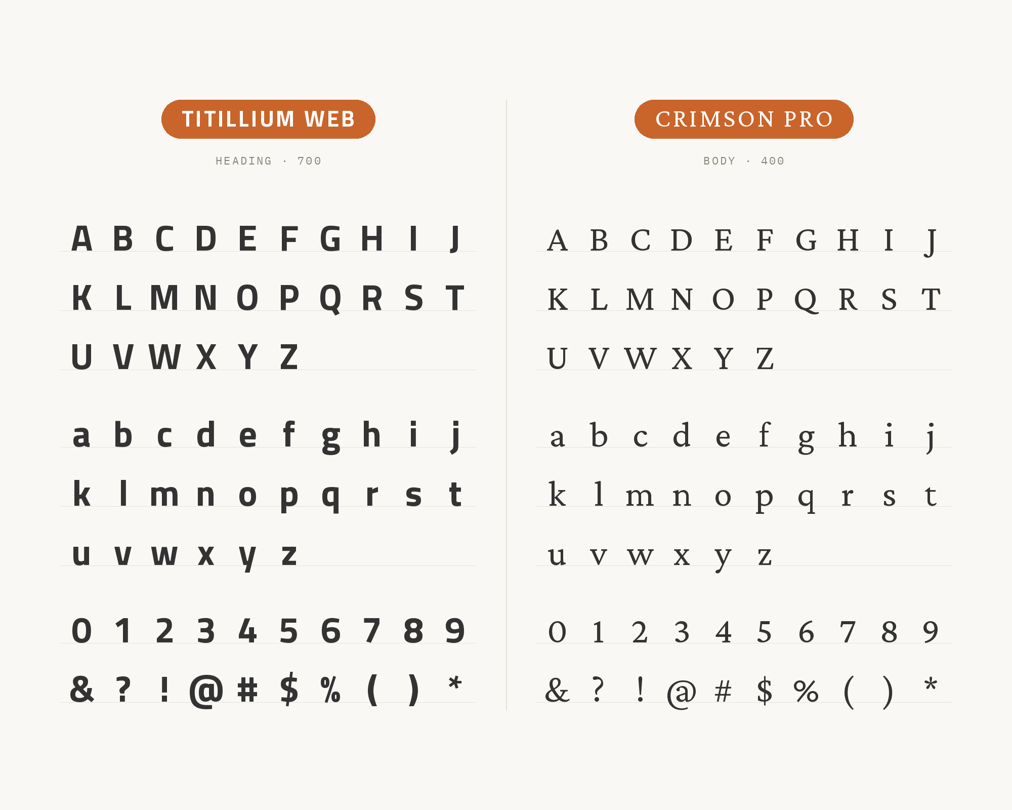
11. Dosis
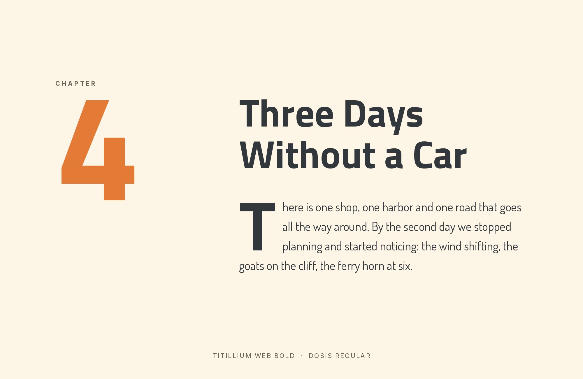
Hey Reliable’s collection of Google font pairings includes Dosis with Titillium as a ready-made pair. Flying Hippo’s list of web fonts features Titillium Sans and Dosis side by side. Dosis is a rounded, narrow sans with soft terminals, and its lightest cuts look almost like drawn wire. It shares Titillium’s narrow proportions but swaps the squared corners for rounded ends. That makes the pair feel coordinated but a little friendlier than Titillium alone. Use Dosis in a light or regular cut for big, airy headings, and put Titillium Web Regular underneath for text. The pair is good for creative portfolios, small studios and event sites that want a technical look without the cold edge. Keep the Dosis headings short, as its narrow forms get busy in long lines.
12. Amaranth
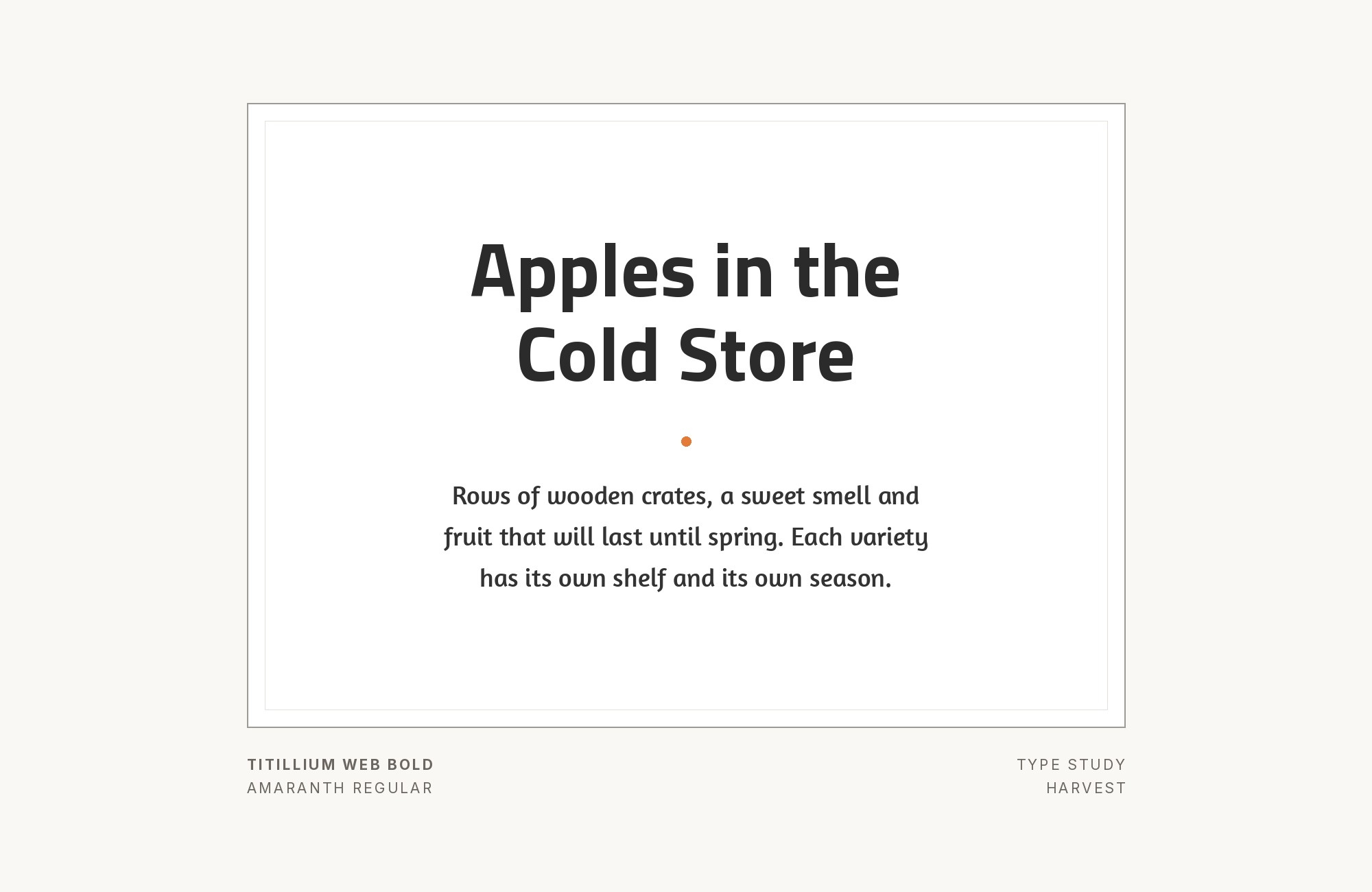
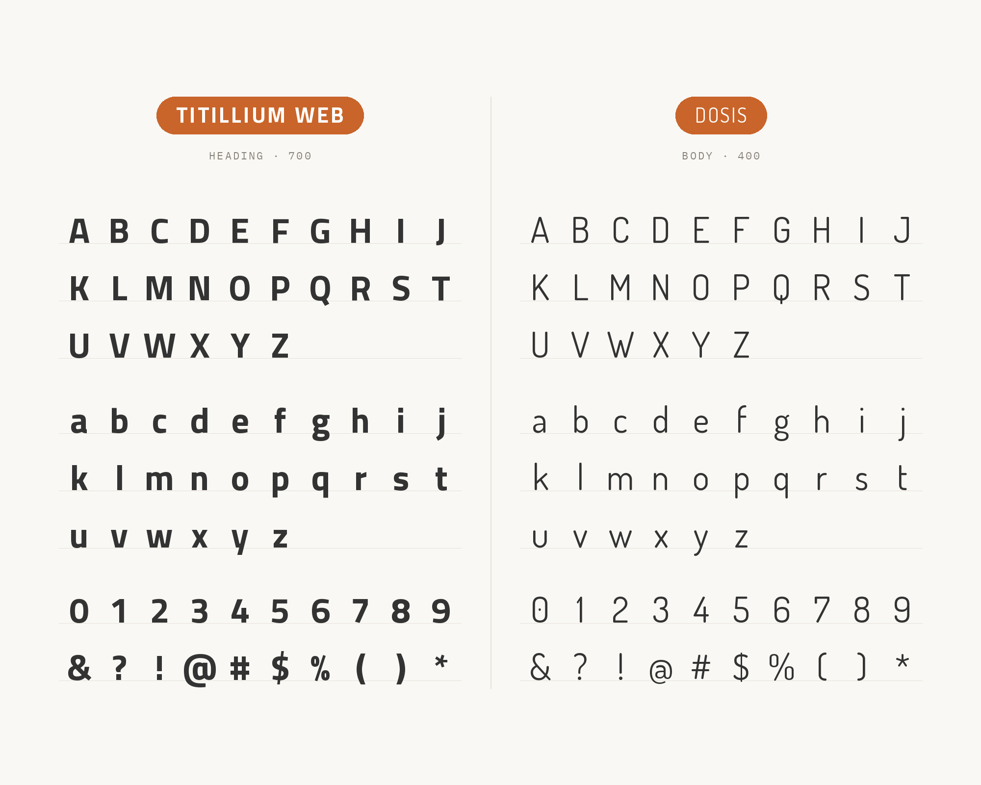
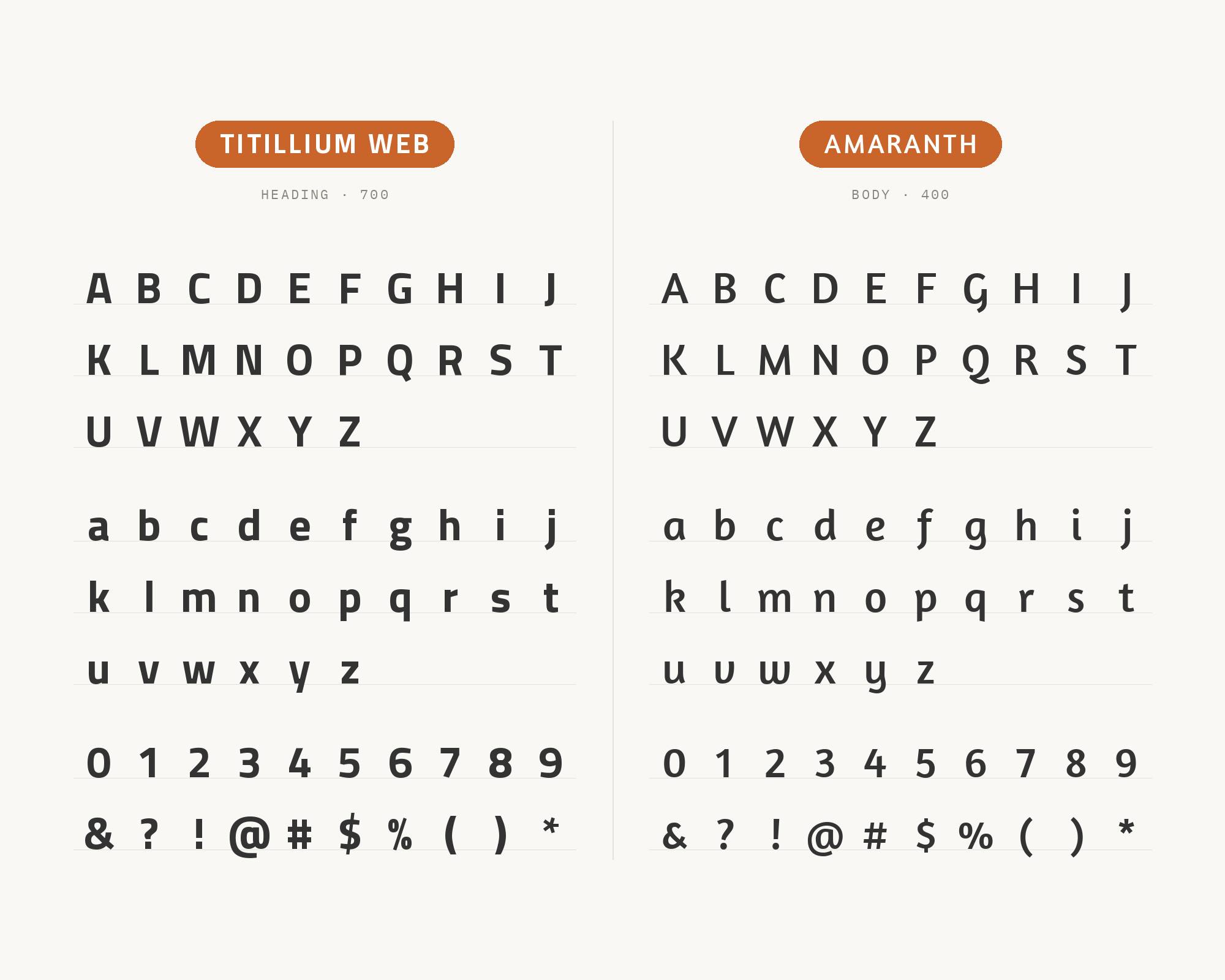
A design studio’s list of Google font combinations sets Amaranth as the heading and Titillium Web as the body. Amaranth is a sans with a calligraphic, slightly italic flavor and flared, lively strokes. Put it over Titillium Web and the page gets an expressive headline and a disciplined text layer. The two faces disagree in useful ways: Amaranth has movement and warmth, Titillium has squared, steady forms. Use Amaranth Bold at display sizes only, for titles and short section heads. Titillium Web Regular takes the paragraphs, lists and buttons. This pairing fits nonprofits, environmental projects and lifestyle brands that want personality at the top of the page but still need clean, modern text below it.
Conclusion
Titillium Web’s evidence points in a clear direction. When real teams build systems around it, they pick one calmer partner and assign strict roles. Italy’s public design system chose Lora for reading and Roboto Mono for data. SAIT chose DM Sans for body copy. Live websites set it with Open Sans, Roboto and Helvetica Neue. Printed projects flip the roles and let Titillium be the accent next to Source Sans or a book serif.
So start from the job. If Titillium carries the headings, pick a neutral sans (Open Sans, Roboto, DM Sans) or a text serif (Lora, Crimson Pro) for the reading. If you want Titillium in the text, give the headline to a condensed or expressive display face such as Bebas Neue, Abel, Dosis or Amaranth. Set a real paragraph at the size you will publish before you commit. Titillium’s squared forms look very different at 14px and at 72px, and the partner must work at both.
Sources
- Typ.io (Titillium)
- Fonts In Use (Titillium)
- Fonts In Use (MoTyF)
- Fonts In Use (Colecciones Permanentes catalog)
- Fonts In Use (Le Québec au cinéma)
- Fonts In Use (Ukhamba Beerworx)
- Designers Italia (.italia typography)
- Bootstrap Italia (typography)
- SAIT brand typography
- SJN Academies style guide
- Pimp My Type (Titillium Web)
- getillustrations font pairing tool
- Hey Reliable (Ultimate Google Font Pairings)
- Flying Hippo (10 web fonts)
- Think360 Studio (Google font combinations)
- SlidesCarnival (Titillium Web)
- Google Fonts METADATA.pb (Titillium Web)
- Google Fonts DESCRIPTION (Abel)
