Brush Script pairs great with Futura, Helvetica and Impact. All 15 pairings are shown below in real rendered specimens, with the reason each one works.
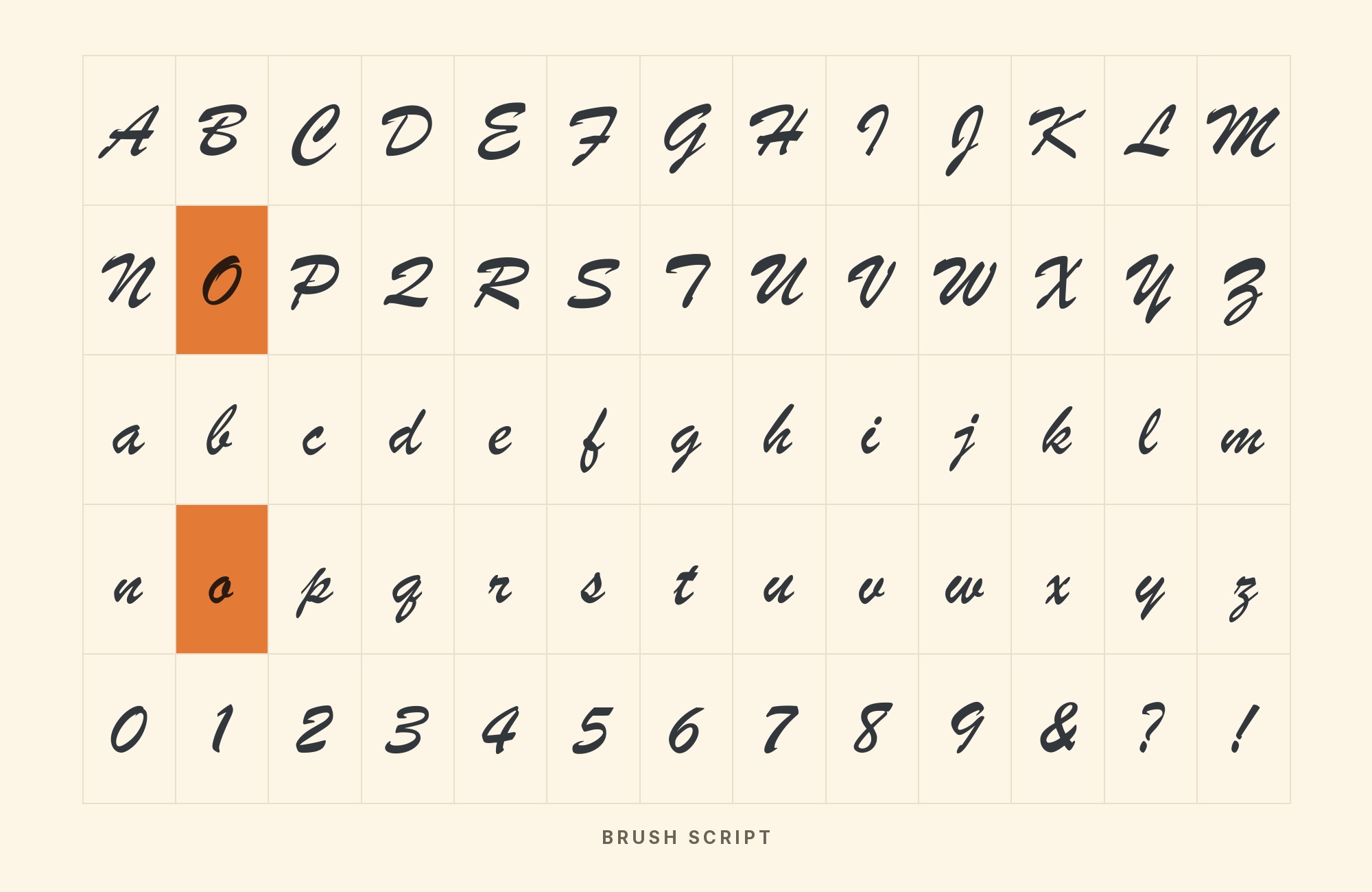
What fonts go with Brush Script? The face is all gesture — slanted, wet-looking, impatient — so its partners have to be the ones that hold still.
Robert E. Smith drew Brush Script for American Type Founders, and ATF released it in 1942 as a casual handwriting script with a heavy, brush-drawn stroke and slanted, connected-ish forms. Unlike formal copperplate scripts, it imitates handwriting done quickly with an ink brush: irregular baselines, blunt entry strokes, and moderate contrast that comes from brush pressure rather than broad-nib tradition. It saw near-immediate success with advertisers, retailers, and posters, remained popular through the 1950s, and still reads instantly as “someone wrote this by hand, quickly, with conviction.”
Most web writing about Brush Script offers alternatives to it rather than partners for it, which is no help to anyone who has already chosen the face. The honest evidence lives in the Fonts In Use archive, where real productions record exactly which faces designers ran beside it — from Futura and Univers to its own ATF sibling Kaufmann. The pattern is consistent: a firm, even, non-slanted partner takes the structural weight; the script supplies the motion. Here are 15 fonts that pair with Brush Script, every one documented in real use.
1. Futura

Fonts In Use records Futura beside Brush Script on several productions, including the Nicodemus album art, the Gonzaï journal and a 1949 Northwest Orient ad. Futura’s small x-height means the script should run visually larger than its point size suggests. Album covers, packaging, and posters are the documented ground.
Paul Renner’s 1927 geometric classic Futura shares several documented Fonts In Use productions with Brush Script, among them the Nicodemus album art where Futura, Brush Script, and Futura Black share one design. The pairing is the oldest trick in script layout: pure compass-and-ruler geometry as the cold frame around the hottest hand on the page. Futura’s even, unslanted strokes give the brush hand something to lean on, and the mid-century pedigree of both faces keeps the combination period-correct.

Taking it to the next level means cinematic visuals, faster turnarounds, and work that wins clients. Create with unlimited downloads of creative stock assets, and access to powerful AI tools to fast-track your workflow!
Subscribe2. Helvetica

The Lell identity shows the pairing in its cleanest form: Helvetica bold italic for technical structure, Brush Script for the human note. Keep the Helvetica layers tight — labels, specs, prices — and let the script carry exactly one expressive element per layout. Anything more and the brush hand starts reading as clutter rather than signature.
Max Miedinger and Eduard Hoffmann’s 1957 Helvetica appears with Brush Script on the Lell electronic instruments identity, where the Fonts In Use record describes “bold italic caps from Helvetica and Brush Script” working the same layout. Helvetica’s closed apertures and even color give the script’s wet, irregular strokes nothing to fight. Use it whenever the layout needs one face that never wobbles — prices, labels, legal lines — while Brush Script signs the headline.

3. Impact

The Cool and Strange cover shows the pairing in practice: the Fonts In Use entry calls Impact and Brush Script “familiar faces” among many lesser-known ones. Use Impact for the single loudest word and the script for the signature or tagline.
Geoffrey Lee’s 1965 poster heavyweight Impact shares a documented cover with Brush Script on the Cool and Strange Music Magazine issue #10, where the archive’s editors call them “familiar faces”. Both are mid-century display fixtures with opposite energy: Impact’s compressed vertical mass versus the script’s loose horizontal sweep. The pairing suits posters and record sleeves that need one voice shouting and one voice signing.

4. Arial

In the documented album campaign, Arial Narrow was the supporting typography, chosen because it is a standard font anyone can access. Replicate that division exactly. The pairing suits templates and campaigns where one hand sets the layout system and the script gets pasted into a reserved, generously sized slot.
Robin Nicholas and Patricia Saunders’ 1982 neutral Arial is documented with Brush Script on the Raquel Virgínia album art and campaign in the Fonts In Use archive. The pairing is the contemporary default: the invisible grotesque holds every structural element while the script performs. Where Helvetica’s Swiss discipline feels too styled for a project, Arial’s plainness disappears even further — useful in layouts where the script must be the only thing anyone remembers.

Pro from $14/mo, save $60 yearly.
Premium templates, vector export, and a commercial license on every paid plan.
See plans5. ITC Souvenir

Souvenir’s revival-era weight range lets it carry subheads as well as text, which suits layouts where the script sits above two levels of reading. Keep both faces warm — no condensed cuts, no tracking games — and the mid-century friendliness compounds instead of competing. Packaging for bakery and general-store brands is the natural habitat.
Morris Fuller Benton drew Souvenir in 1914. Ed Benguiat redrew it for Photo-Lettering in 1967, and ITC issued it as ITC Souvenir after the corporation formed in 1971. Fonts In Use records Brush Script with ITC Souvenir on the Cartoon All-Stars To The Rescue VHS packaging. The shared instinct is warmth: rounded terminals, gentle curves, no hard edges anywhere. Souvenir gives the layout a fully serif, fully steady voice with the same friendly temperature as the script — no contrast required.

6. Gill Sans

Gill Sans’s humanist spine means it can run slightly larger than a neutral grotesque would, which helps balance a heavy script above it. The documented co-usage is the Cannery Row first-edition cover — a place where the sans carries structure without coldness. Use its light weights for elegance and leave the bold to the script.
Eric Gill’s 1928 humanist classic Gill Sans shares a documented first-edition cover with Brush Script on Fonts In Use’s Cannery Row entry, which also names Monotype Baskerville. Gill’s letterforms grew from Edward Johnston’s calligraphic lettering, so the sans remembers the pen even though it never slants. That ancestry is what separates this pairing from a cold grotesque frame: Gill Sans sits between the script’s energy and a neutral’s silence, which suits signage, packaging, and institutional work with a human face.

7. Univers

A numbered Univers family pays off in layouts that need many weights — assign one weight to captions, another to subheads, another to emphasis, with Brush Script as the single voice above. The documented co-usage reads as print packaging, not poster work. Give the script one line and let the system carry the rest.
Adrian Frutiger drew Univers in 1957 as a numbered family with a comprehensive range of weights and widths. Fonts In Use records Brush Script with Univers on the Gato Preto paints packaging. The pairing is total order beside total gesture: Univers’s uniform, engineered strokes make the brush hand look even more alive by comparison. Use it when the layout needs many weights and one unbroken system, with the script reserved for a single expressive line.

Build free, plus 500 AI credits.
Design and publish a site at no cost. Paid plans double your credits the first month.
Start free8. ITC Lubalin Graph

The Cem Karaca release shows the division: Brush Script for the album title, ITC Lubalin Graph in all caps for the artist’s name below. Brush Script dates from 1942 and Lubalin Graph from 1974, so the pairing needs contrast in weight rather than mood. Keep Lubalin Graph above 12 points — its tight fit punishes small sizes — and let the script sit at its own comfortable scale.
Herb Lubalin designed ITC Lubalin Graph with Tony DiSpigna and Joe Sundwall in 1974, rounding the slab-serif tradition into the same warm mid-century American register Brush Script speaks. The Fonts In Use archive documents the two together on the Cem Karaca Merhaba Gençler ve Her Zaman Genç Kalanlar release. Lubalin Graph’s steady rounded slabs carry the structure while Brush Script supplies the cursive energy — two American-born, warmth-first voices thirty years apart, splitting the work by weight rather than by mood.

9. Kaufmann

Two scripts survive in one layout only with strict jobs: the Pelican Club cover runs Kaufmann and Brush Script together, with Skia and Pluto. Keep them far apart in weight and never adjacent in size. It is a documented, period-consistent move for nightlife and music contexts — and a warning against trying it with arbitrary script pairs.
Script beside script is a move the rulebooks warn against, but the archive documents it working: the Pelican Club single cover pairs Kaufmann with Brush Script (and Skia) in one design. The trick is that both are ATF scripts from the same American foundry generation — Kaufmann in 1936, Brush Script in 1942. If a project absolutely needs two script voices, this is the documented, period-consistent way to do it.

10. Times New Roman

The Heavenly by Nia identity uses Times New Roman Italic and Brush Script only for single glyphs in product names. Times New Roman at 11 to 12 points with generous leading carries the reading; the script sits above at two to three times the size. The pairing needs no other voice — its contrast is complete.
Stanley Morison and Victor Lardent’s 1932 newspaper serif Times New Roman appears with Brush Script on the “Heavenly by Nia” production in the Fonts In Use archive. The pairing reads as a formal-versus-casual contrast: the transitional serif’s bracketed, disciplined strokes supply structure, and the brush hand handles names and short accents. For invitations, menus, and editorial layouts, it is an old-world/new-world answer.

11. Hobo

The taco guide’s interior pages use Hobo, Brush Script and Futura Black as recurring headline faces, with Herbus on the cover. The lesson from the documented use is commitment: half-vernacular layouts fail where these succeed. Food, market, and festival graphics with a hand-made brief are where it lives.
Morris Fuller Benton’s curvilinear 1910 vernacular face Hobo shares documented interior pages with Brush Script in the Guía Domingo: Tacos CDMX book, alongside Futura Black and Herbus. Hobo’s art-nouveau curves and free-floating forms meet the brush hand’s loose energy in full vernacular agreement — no neutral in sight, both faces committed to warmth. Food packaging, market posters, and anything with a hand-made brief is where this pairing lives.

12. Skia

Fonts In Use documents Skia) with Brush Script on the Pelican Club single, alongside Kaufmann and Pluto. Skia’s upright, flared humanist forms give the slanted brush lettering a stable supporting line without dropping into the anonymous texture of a plain grotesque. Use Brush Script for the artist or title and Skia for the date, label, or short descriptor. Both faces can feel hand-shaped, so do not give them equal display weight. A smaller Skia line with restrained tracking lets the script keep the motion. The pairing works best in short music, event, or packaging layouts rather than long editorial text.

13. Optima

Fonts In Use documents Optima and Brush Script on a Backroom T-shirt. Optima’s flared, upright strokes stabilize the script without becoming a plain industrial sans, so both voices retain some hand-shaped character. Use Optima for the supporting name, location, or date and keep Brush Script for one energetic statement. Their distinction depends on posture more than weight: the script leans and connects while Optima stands open and separated. Give both enough space and avoid setting them at nearly equal prominence. This combination fits apparel, hospitality, and event graphics that need polish without losing an informal edge.

14. Cooper Black

The artwork around Kanye West’s Jesus Is King, archived by Fonts In Use, includes Cooper Black and Brush Script. Both are warm, emphatic display faces, so the system works through scale and job rather than stylistic opposition. Set Cooper Black as the compact block of authority and use Brush Script for a shorter, faster accent. Never ask either face to carry a paragraph; their dense shapes and strong personalities compete quickly. A restrained third face can handle details if necessary. The pairing suits music, food, and merchandise where the brief calls for full vernacular energy rather than a neutral corporate frame.

15. Franklin Gothic

Fonts In Use records Franklin Gothic Extra Condensed with Brush Script in a Stratocruisers “Coast to Coast” advertisement: Franklin sets the headline, while Brush Script appears in the airline logo; the promotional “Flash” line is a different face. For a new application, use Franklin Gothic for schedules, prices, destinations, and explanatory copy, then reserve Brush Script for the brand name or one short accent. Their shared American advertising history makes the transition feel natural, but their structures remain clearly different. Keep Franklin upright so it does not imitate the script’s motion. This combination suits travel posters and period-inspired packaging with real information to organize.

Conclusion
Brush Script pairs by division of labor: it moves, its partner holds still. The archive shows the same layout logic across eight decades — Futura, Helvetica, Univers, Arial, and Gill Sans all appear in real productions as the firm, unslanted frame around the brush hand, differing only in how much personality the frame itself is allowed. Souvenir and Lubalin Graph prove the warmer route: partners with the same mid-century friendly DNA who split the work by weight instead of by temperature.
The documented edge cases matter too. Kaufmann shows two scripts can coexist when they come from the same foundry generation with distinct formality levels, and Hobo shows two vernacular voices can share a cover when the brief is hand-made warmth. In the uses we checked, no second script of equal weight appears, and no delicate formal one — where a second script does appear, as Kaufmann does, it is a connecting script, not a second brush stroke. Give it one calm neighbor and the brush does what it was drawn to do.
Sources
- Fonts In Use (typeface page)
- Fonts In Use (Lell electronic instruments)
- Fonts In Use (Cool and Strange Music Magazine #10)
- Fonts In Use (Raquel Virgínia)
- Fonts In Use (Cem Karaca release)
- Fonts In Use (Pelican Club single)
- Fonts In Use (Heavenly by Nia)
- Fonts In Use (Guía Domingo: Tacos CDMX)
- Fonts In Use (Nicodemus album)
- Fonts In Use (Gonzaï journal Nº2)
- Brave Search
- Fonts In Use (Backroom T-shirt)
- Fonts In Use (*Jesus Is King*)
- Fonts In Use (Stratocruisers advertisement)
