BonFX

Typography & Graphic Design Blog

  • Blog
  • Books
    • The Preposterously Huge Book of Google Font Combinations
    • The Big Book of Font Combinations (Classic Fonts Edition)
  • Gallery
    • Monster Alphabet
    • Pen and Ink Cartoons
    • The Algorithm FX
  • Services
  • About
  • Contact
You are here: Home / Graphic Design / What Fonts Go With PT Sans?

The BonFX Letter

One good pairing.
Every Tuesday.

2-minute read · free

This week — no. 14

Quiet authority

Merriweather sets the tone in one line. Lato stays out of the way and lets it.

MERRIWEATHER 700  +  LATO 400

A font specimen, a pairing that works, and one line on why it works. That is the whole email.

Free. One click to unsubscribe. No sharing, ever.

What Fonts Go With PT Sans?

What Fonts Go With PT Sans?

August 15, 2026 by Douglas Bonneville

PT Sans pairs great with PT Serif, Lora and Open Sans. All 15 pairings are shown below in real rendered specimens, with the reason each one works. Every pairing below is checked against 12 published typography sources.

What fonts go with PT Sans? This widely-deployed humanist sans-serif, originally designed for the Russian Federation, combines exceptional linguistic coverage with approachable design that opens many pairing paths.

PT Sans holds a unique place in type history as one of the first public fonts commissioned by a national government for widespread use. Designed by Alexandra Korolkova of ParaType, it was created to establish a unified typographic identity across Russian public communications. The design balances humanist warmth with the clarity needed for official documents, featuring open apertures, distinctive letterforms, and remarkably thorough language support. Its neutral-yet-friendly character has made it popular well beyond its original governmental purpose.

Pairing PT Sans involves leveraging its approachable professionalism. It reads as trustworthy without being bureaucratic, friendly without being casual. Serif companions can add gravitas for formal contexts, while other sans-serifs can create modern systematic combinations. PT Serif offers an obvious family pairing, but exploring beyond the family often yields more distinctive results. Here are 15 fonts that pair well with PT Sans, selected for partnerships that enhance its balanced character.

Font Pairings for PT Sans

  1. PT Serif
  2. Lora
  3. Open Sans
  4. Rubik
  5. Adobe Garamond
  6. LTC Bodoni
  7. Steinbeck
  8. Space Mono
  9. Tenez
  10. Source Serif Pro
  11. Merriweather
  12. Playfair Display
  13. Crimson Text
  14. Libre Baskerville
  15. Roboto

1. PT Serif

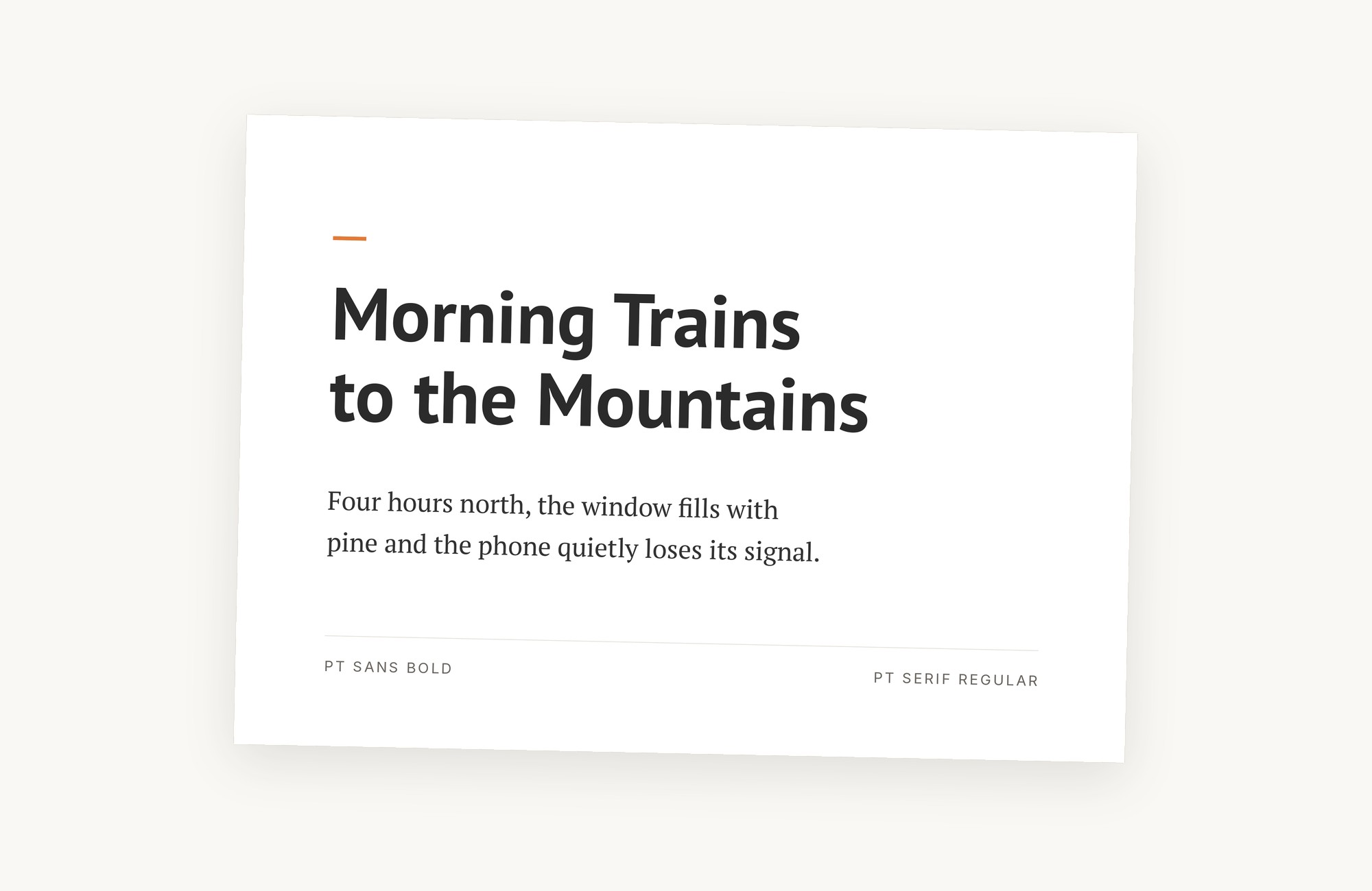
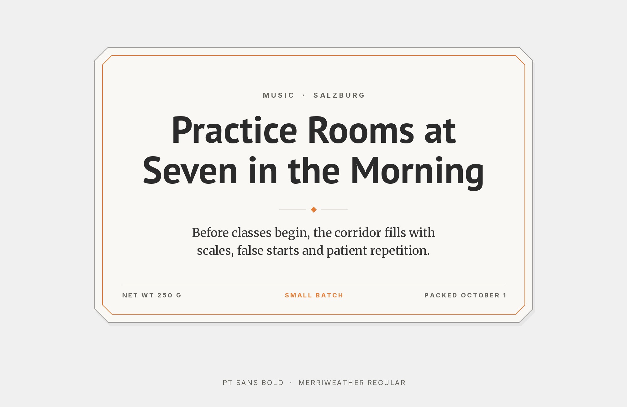
PT Sans paired with PT Serif - Style A showing headline and body text

A family reunion where everyone actually gets along. PT Sans and PT Serif share identical DNA in their proportions and x-heights, creating seamless typographic harmony without the usual friction of mixing fonts from different foundries. The serif brings gravitas to headlines while the sans handles body copy with quiet efficiency. This pairing feels inevitable, like it was designed for academic journals, corporate reports, and editorial layouts where credibility matters. The shared Russian origins give both fonts excellent Cyrillic support, making this duo essential for multilingual projects.
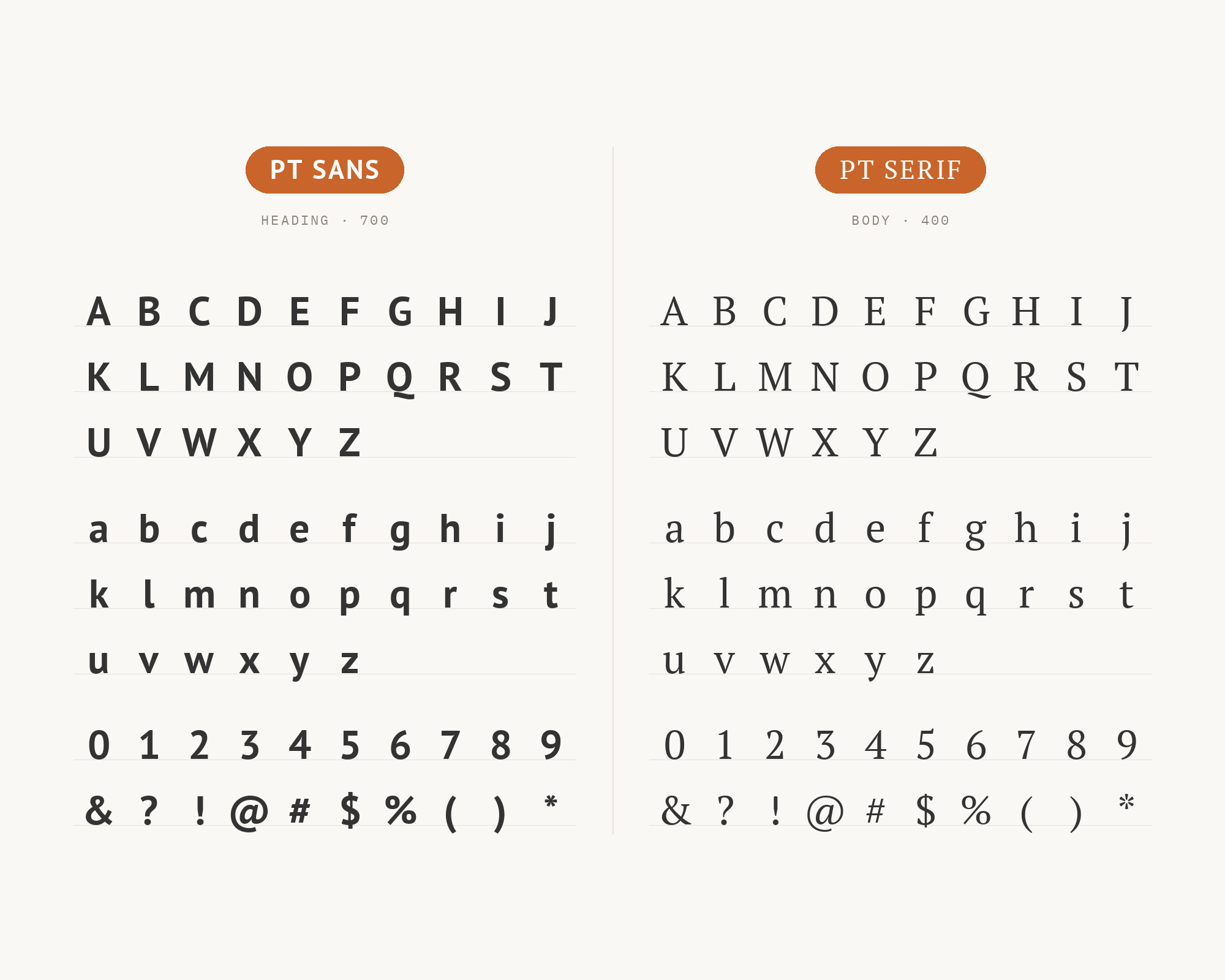
PT Sans and PT Serif - Style B layout Character specimen showing PT Sans and PT Serif alphabets

2. Lora

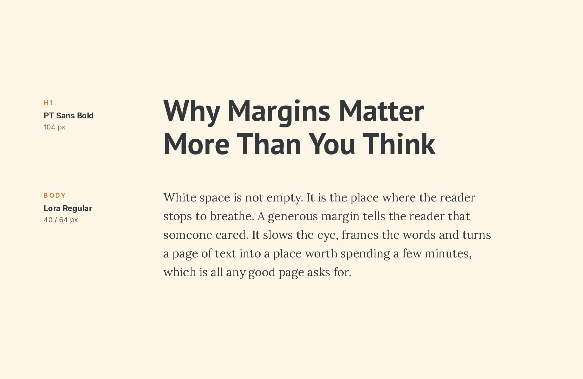
PT Sans paired with Lora - Style A showing headline and body text

Lora‘s calligraphic brushstrokes dance above PT Sans’s steady foundation like poetry floating over prose. The matched x-heights create effortless reading flow, while Lora’s subtle curves inject warmth into otherwise businesslike layouts. This pairing whispers ’boutique editorial’ without screaming for attention. Use it for lifestyle blogs, literary magazines, or any project where you want elegance without pretension. The contrast works because both fonts share humanist roots but express them differently: Lora through italic flourishes, PT Sans through understated geometry.
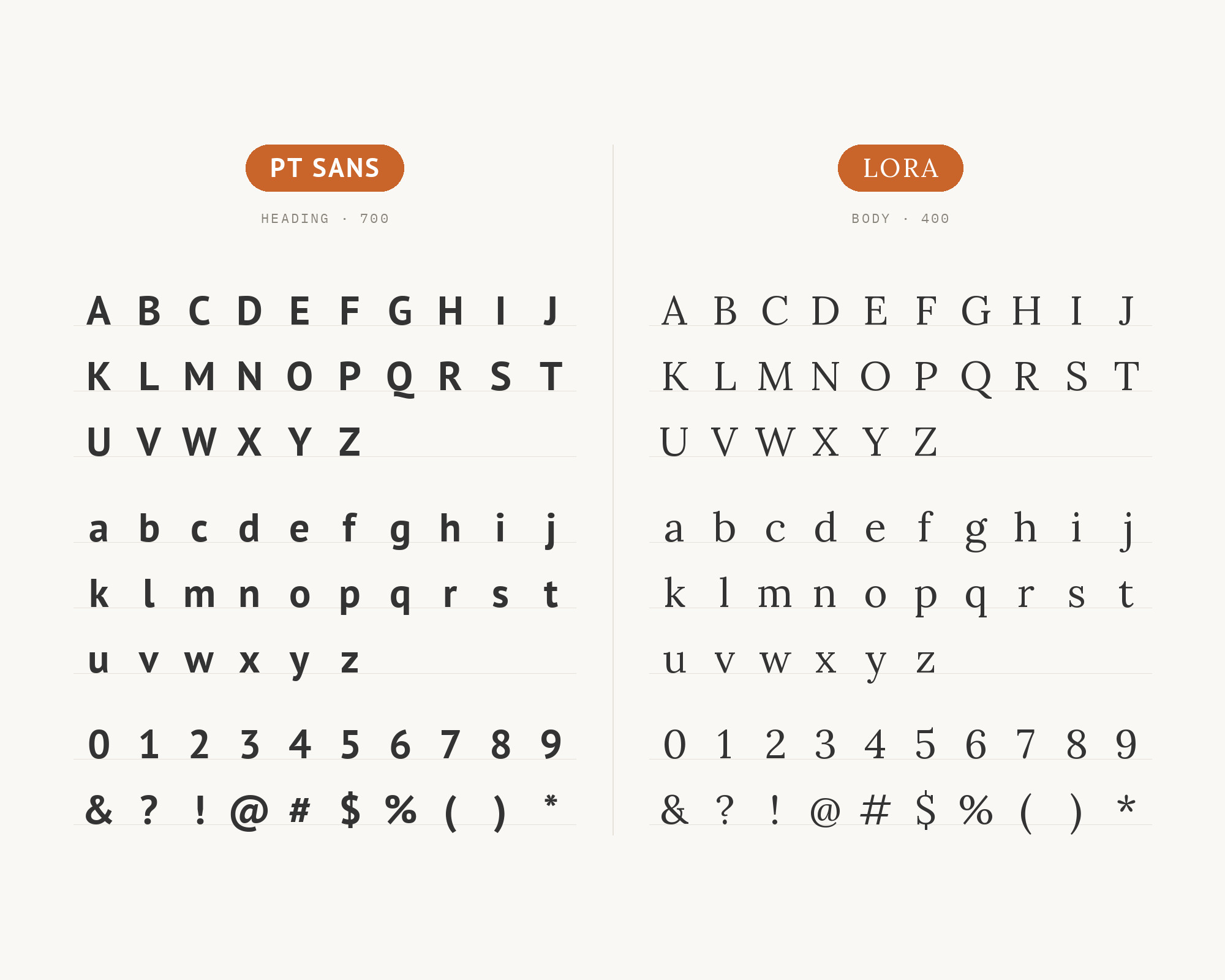
PT Sans and Lora - Style B layout Character specimen showing PT Sans and Lora alphabets

3. Open Sans

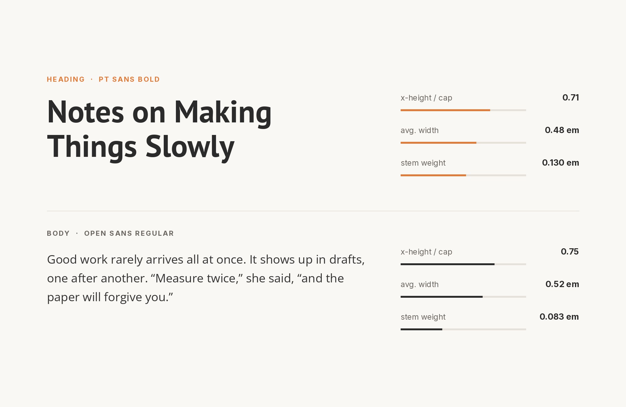
PT Sans paired with Open Sans - Style A showing headline and body text

Two humanist sans-serifs walk into a layout and somehow don’t fight. PT Sans brings slightly more personality with its distinctive letter shapes, while Open Sans provides neutral backup in supporting roles. This pairing works through subtle weight choreography: use Open Sans Light for whisper-quiet captions while PT Sans Bold anchors headlines. Perfect for government websites, educational platforms, and healthcare applications where friendliness meets accessibility. Both fonts excel at small sizes, so body copy remains crisp on any screen.
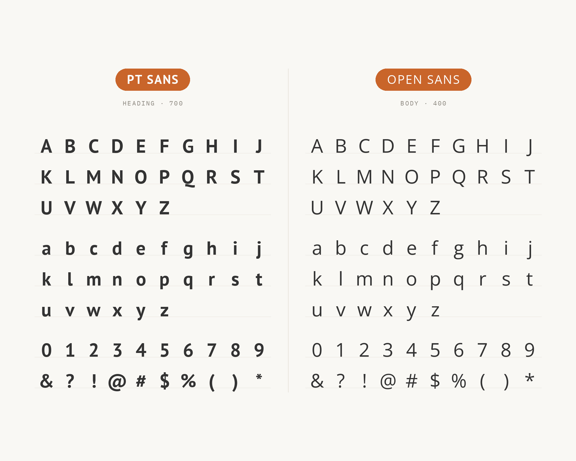
PT Sans and Open Sans - Style B layout Character specimen showing PT Sans and Open Sans alphabets
What Fonts Go With PT Sans - the book from BonFX, coming soon

4. Rubik

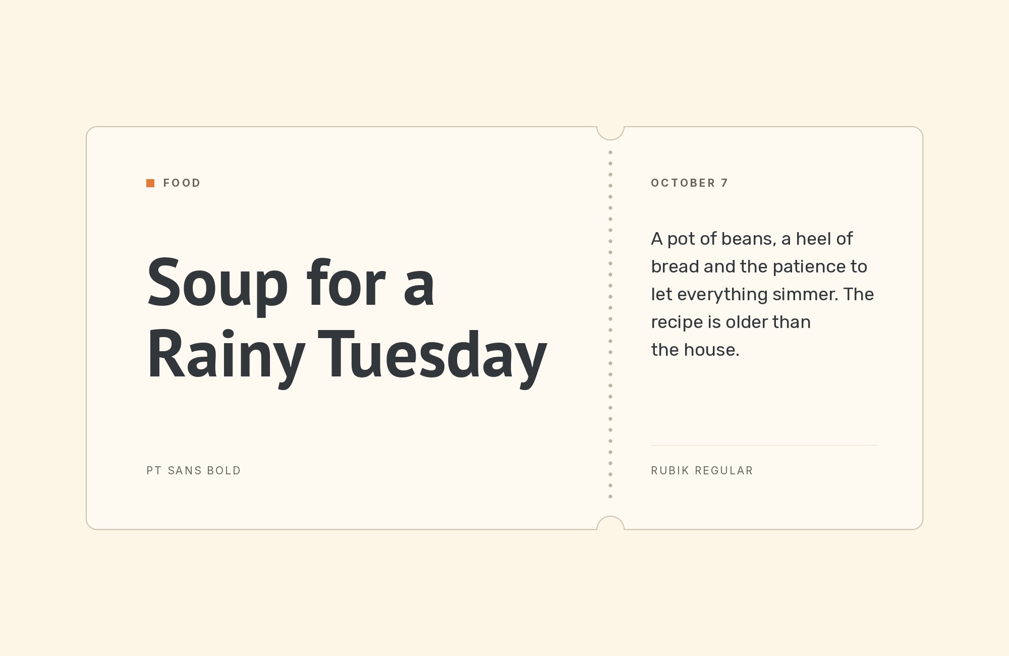
PT Sans paired with Rubik - Style A showing headline and body text

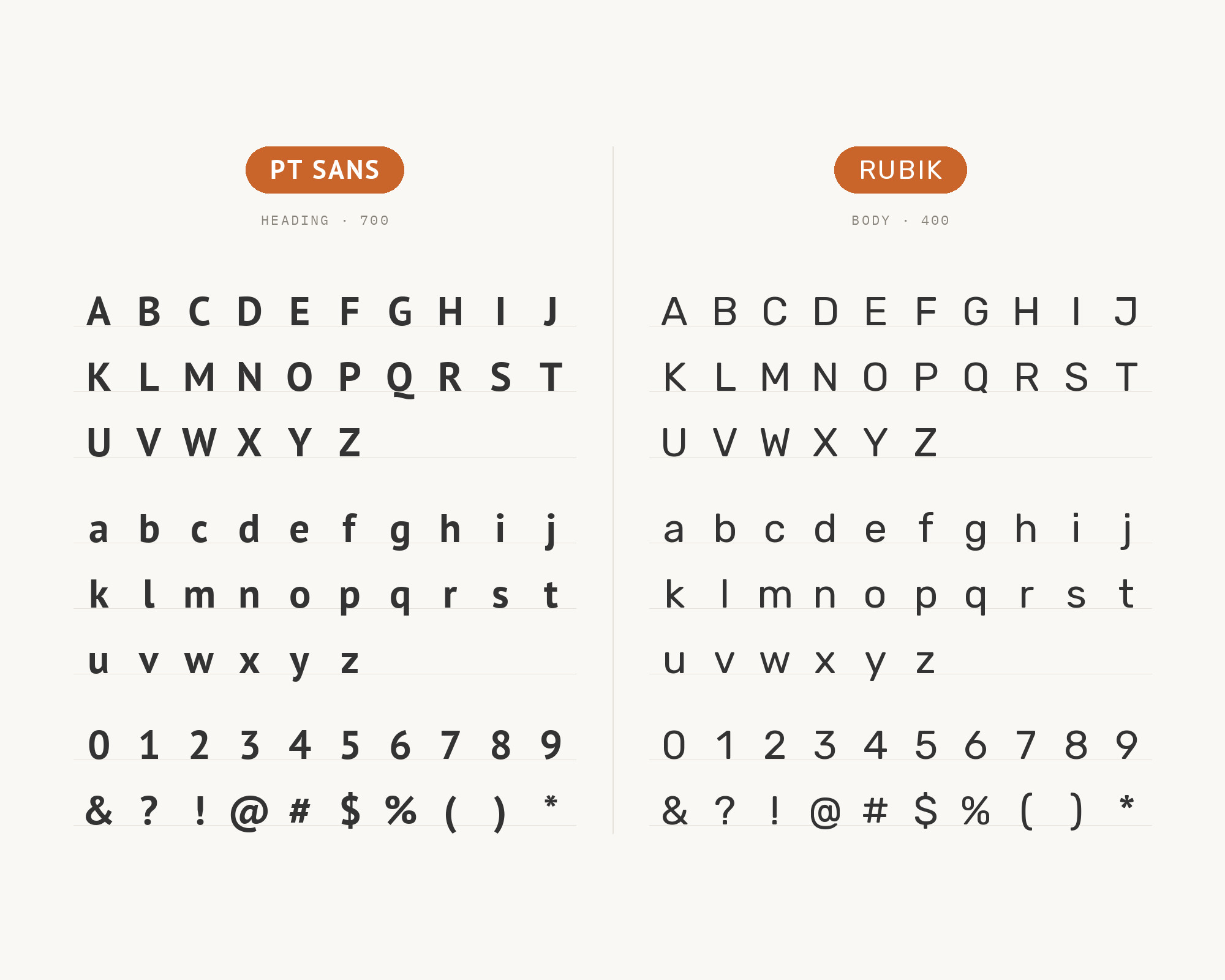
Rubik‘s rounded corners meet PT Sans’s more traditional humanist forms in a handshake that says ‘approachable professional.’ The slight warmth in both fonts creates cohesion, while Rubik’s geometric underpinnings provide just enough contrast to establish hierarchy. This duo thrives in app interfaces, startup landing pages, and any context where you need to feel modern without alienating traditional users. The similar x-heights keep paragraphs flowing smoothly across font switches.

PT Sans and Rubik - Style B layout Character specimen showing PT Sans and Rubik alphabets

5. Adobe Garamond

PT Sans paired with Adobe Garamond - Style A showing headline and body text

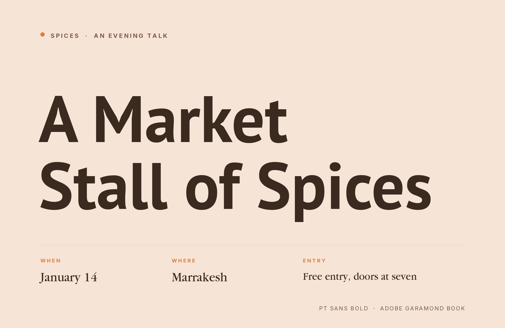
Adobe Garamond brings 16th-century Parisian elegance crashing into PT Sans’s contemporary Russian pragmatism, and somehow they find common ground. The serif’s delicate hairlines and refined contrast create headlines that demand respect, while PT Sans delivers body copy with unpretentious clarity. This is a pairing for book publishers, law firms, and anyone trafficking in serious ideas. The weight differential between Garamond’s refined strokes and PT Sans’s sturdy forms creates natural hierarchy without effort.
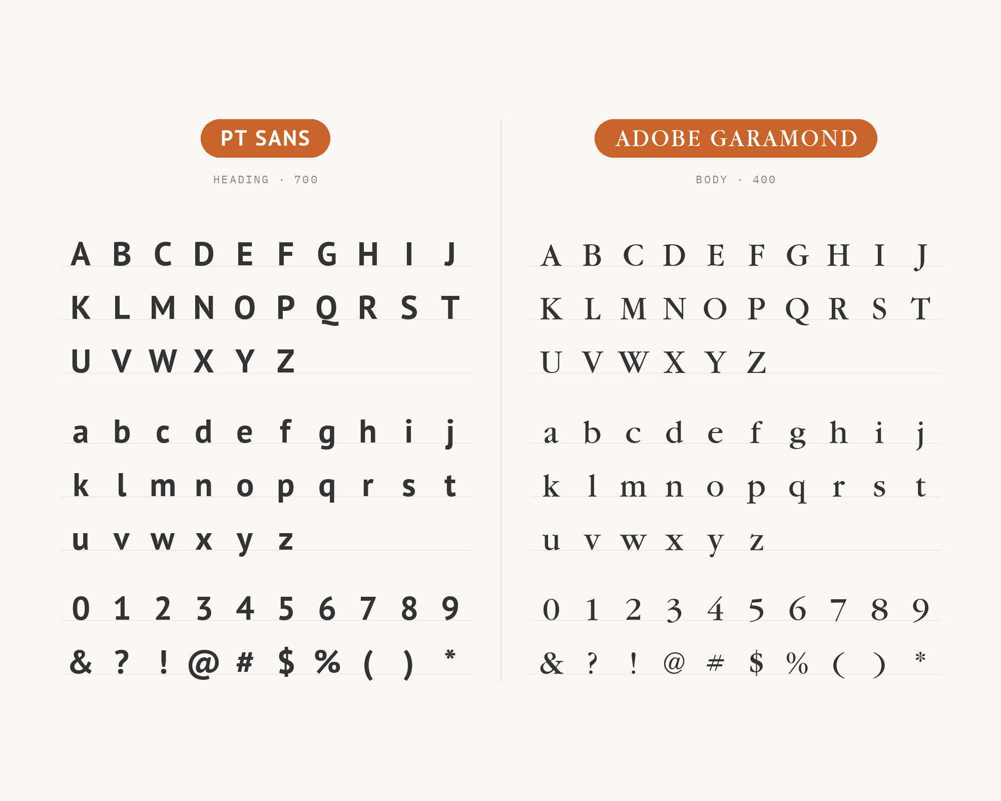
PT Sans and Adobe Garamond - Style B layout Character specimen showing PT Sans and Adobe Garamond alphabets

6. LTC Bodoni

PT Sans paired with LTC Bodoni - Style A showing headline and body text

LTC Bodoni‘s dramatic thick-thin contrast slices through the page like a headline from a 1920s fashion magazine, while PT Sans grounds everything in readable modernity below. This is a high-contrast pairing in every sense: Bodoni’s vertical stress and hairline serifs against PT Sans’s open humanist forms. Perfect for luxury branding, high-end editorial, and any context where you want to command attention then deliver information cleanly. Use Bodoni sparingly as display text; it’s too theatrical for extended reading.

PT Sans and LTC Bodoni - Style B layout Character specimen showing PT Sans and LTC Bodoni alphabets

Free download

The Typography Primer.
Yours, right now.

Adobe's classic · PDF · free

The Typography Primer — book cover

The guide to type that everyone learned from. Subscribe and it is yours instantly. The BonFX Letter follows.

Free. One click to unsubscribe. No sharing, ever.

UX for Cats book cover
Love typography?
You'll love this article!
50 UX terms. Illustrated beautifully.
A visual guide for designers.
Read the Visual Guide

7. Steinbeck

PT Sans paired with Steinbeck - Style A showing headline and body text

Steinbeck‘s literary character brings a handcrafted headline presence that pairs surprisingly well with PT Sans’s matter-of-fact body copy. Named after the author, Steinbeck carries storytelling in its bones, with irregular strokes that suggest a typewriter ribbon running low. PT Sans provides the utilitarian backdrop these expressive headlines need to shine. Use this pairing for memoir-style blogs, indie publishers, or documentary film credits. The contrast between Steinbeck’s personality and PT Sans’s neutrality keeps layouts from feeling generic.

PT Sans and Steinbeck - Style B layout Character specimen showing PT Sans and Steinbeck alphabets

8. Space Mono

PT Sans paired with Space Mono - Style A showing headline and body text

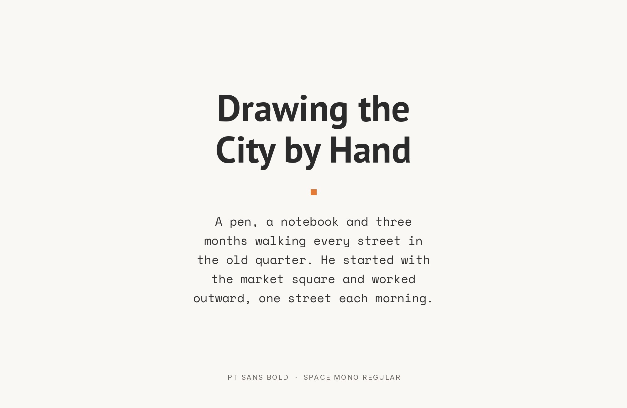
Space Mono‘s fixed-width characters inject a dose of technical credibility into PT Sans’s friendly humanist forms. This pairing speaks fluent developer: Space Mono handles code snippets, terminal output, and data displays while PT Sans keeps the explanatory prose approachable. The x-heights align close enough to prevent jarring transitions. Essential for technical documentation, developer blogs, and SaaS interfaces where you need to toggle between human language and machine language seamlessly. The contrast is functional, not decorative.
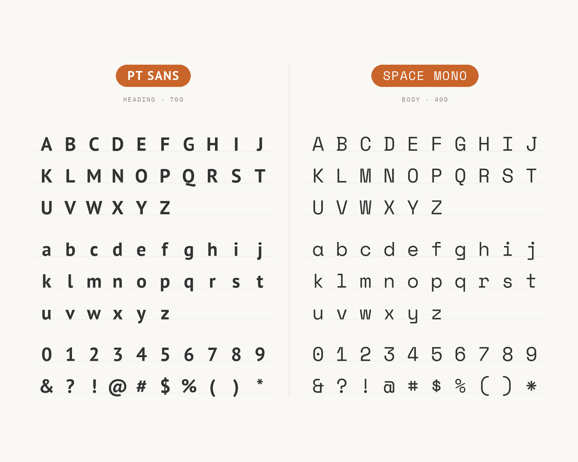
PT Sans and Space Mono - Style B layout Character specimen showing PT Sans and Space Mono alphabets

9. Tenez

PT Sans paired with Tenez - Style A showing headline and body text

Tenez brings contemporary display type swagger to PT Sans’s workmanlike reliability. The geometric underpinnings of Tenez create clean, architectural headlines that announce themselves without shouting, while PT Sans handles the paragraph-level communication. This pairing works for architecture portfolios, design studios, and any brand that wants to signal ‘we understand modern aesthetics’ without abandoning readability. The weight range in both fonts allows for sophisticated typographic systems with multiple hierarchy levels.

PT Sans and Tenez - Style B layout Character specimen showing PT Sans and Tenez alphabets

10. Source Serif Pro

PT Sans paired with Source Serif Pro - Style A showing headline and body text

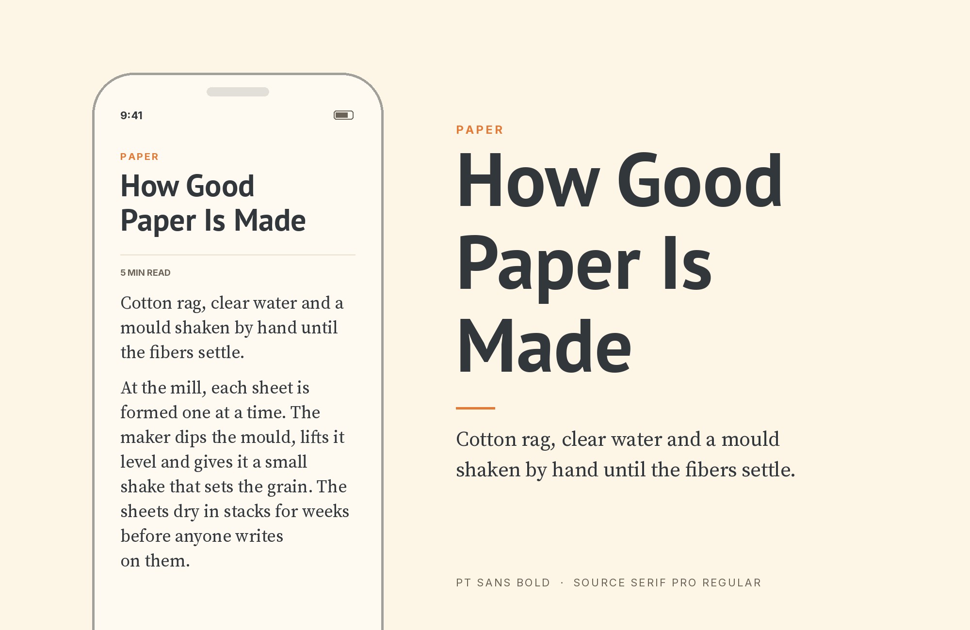
Source Serif Pro descends from the same screen-optimization philosophy as many of today’s workhorse fonts, making it a natural headline companion for PT Sans’s body copy. The serif’s moderate contrast and sturdy serifs hold up at smaller sizes than most traditional serifs, giving you flexibility in how you deploy the hierarchy. This pairing feels right for tech journalism, academic publishing, and any context requiring both authority and accessibility. Both fonts perform beautifully on screens, which is increasingly where type lives.
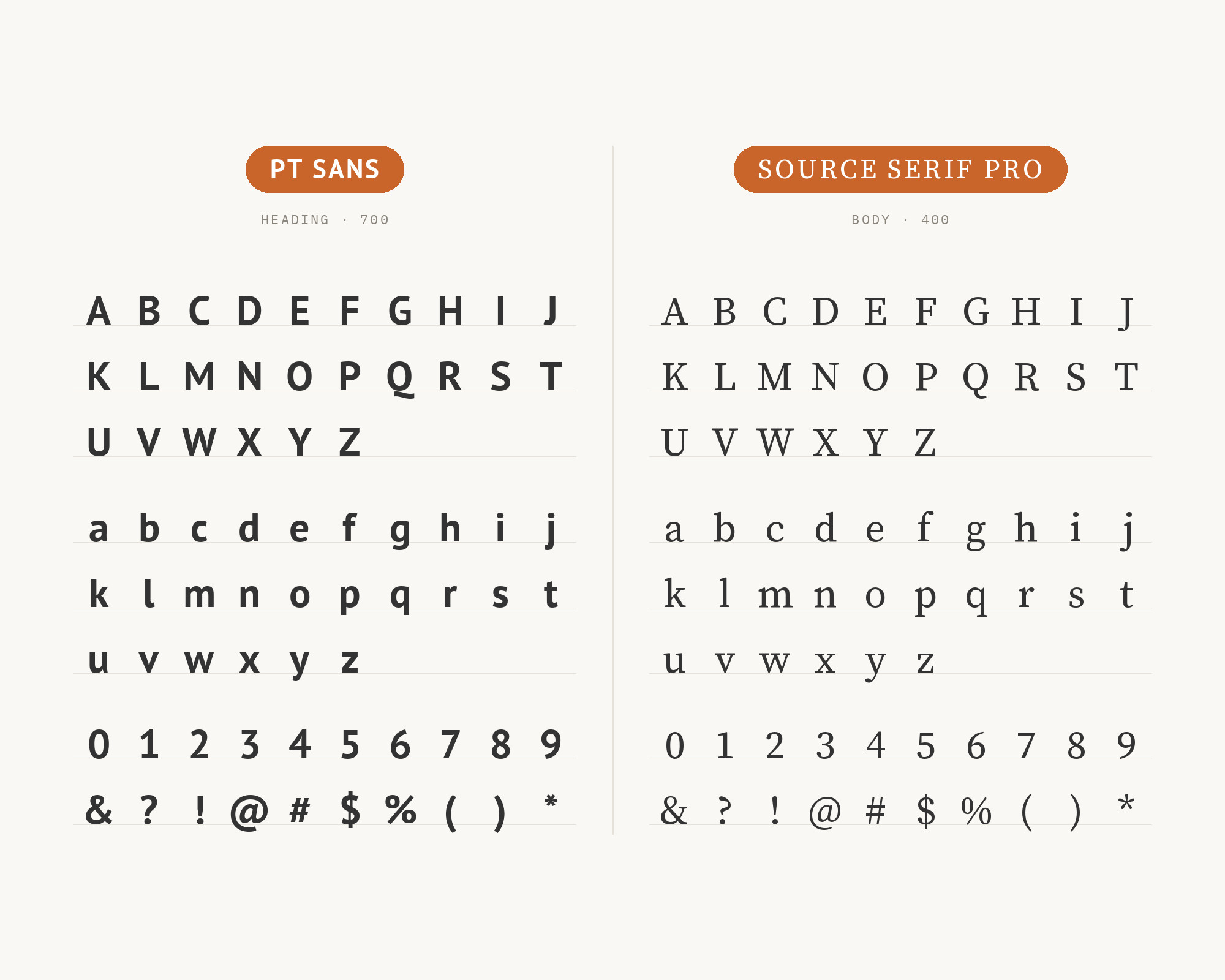
PT Sans and Source Serif Pro - Style B layout Character specimen showing PT Sans and Source Serif Pro alphabets

11. Merriweather

PT Sans paired with Merriweather - Style A showing headline and body text

Merriweather‘s tall x-height practically shakes hands with PT Sans’s similar proportions, creating one of those pairings where everything just clicks. The serif’s slightly condensed letterforms and robust details handle headlines with quiet confidence, while PT Sans delivers body copy with open, readable forms. This is a workhorse combination for news sites, long-form journalism, and educational content where readers spend hours with your text. Neither font demands attention for itself; both prioritize the reader’s experience.
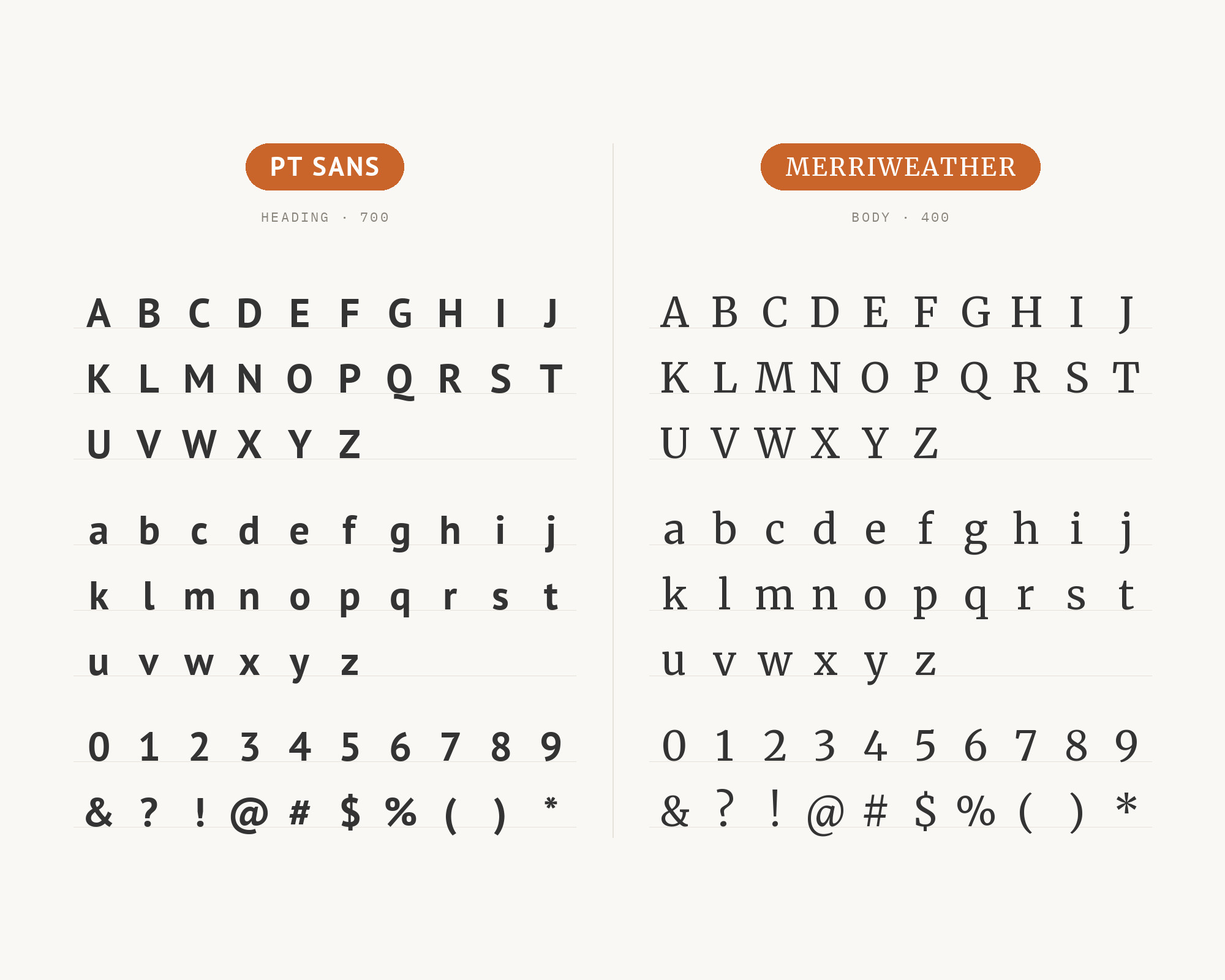
PT Sans and Merriweather - Style B layout Character specimen showing PT Sans and Merriweather alphabets

12. Playfair Display

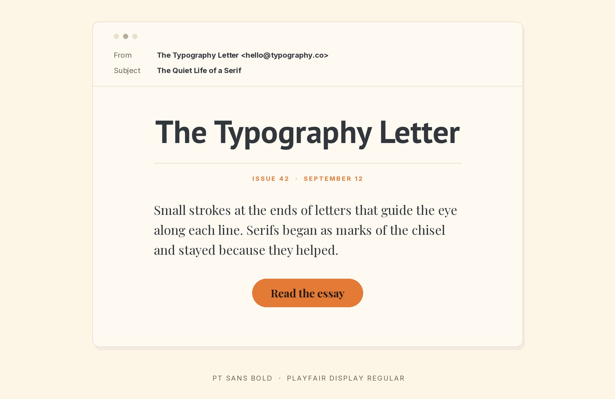
PT Sans paired with Playfair Display - Style A showing headline and body text

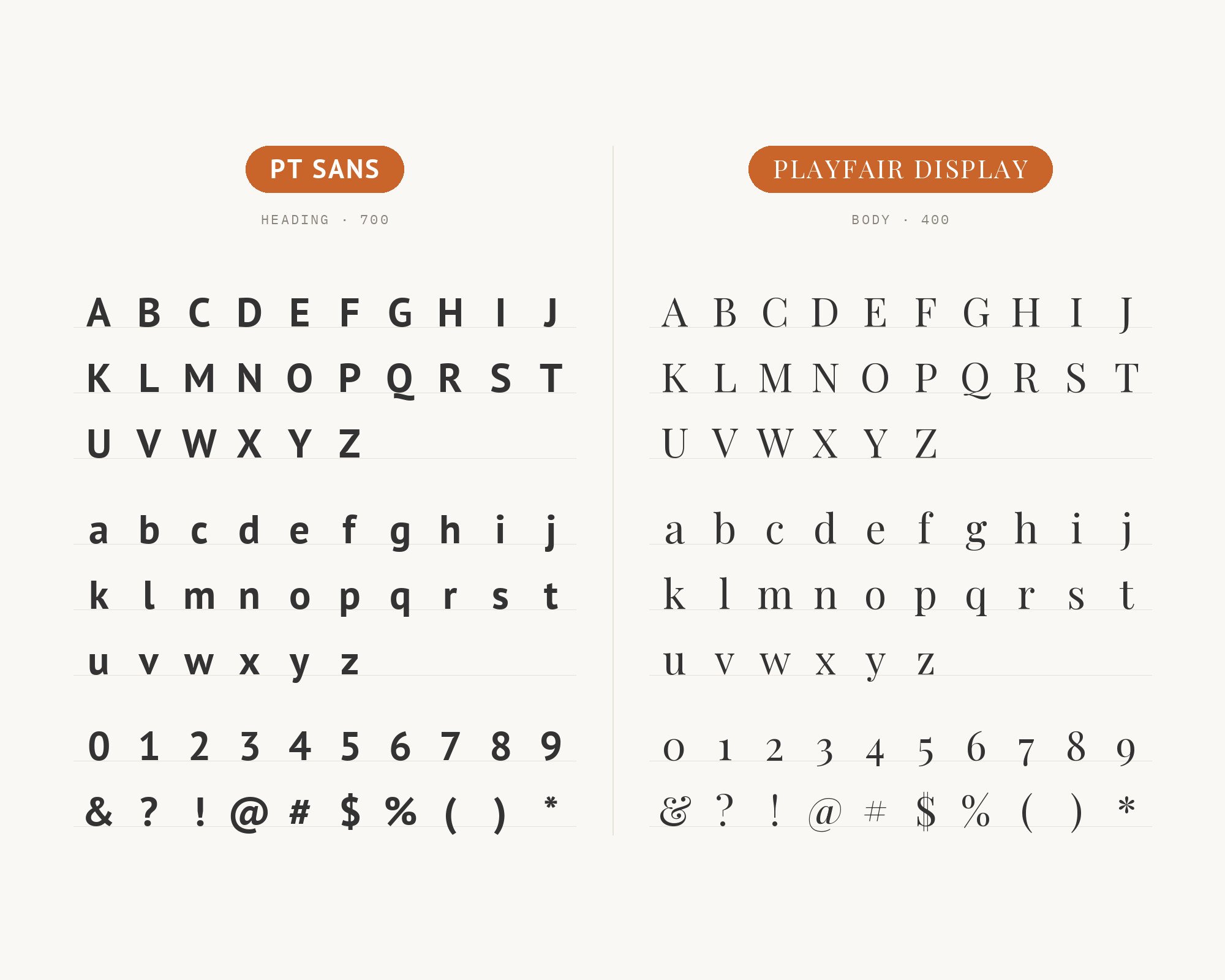
Playfair Display arrives in full 18th-century formal dress, its high-contrast strokes and delicate hairlines announcing importance, while PT Sans waits in sensible business casual to handle the actual communication. The contrast couldn’t be sharper: Didone-style elegance against humanist pragmatism. This pairing excels in wedding invitations, luxury retail, and any brand positioning that says ‘refined but accessible.’ Use Playfair exclusively for headlines; its hairlines will disappear at body copy sizes.

PT Sans and Playfair Display - Style B layout Character specimen showing PT Sans and Playfair Display alphabets

13. Crimson Text

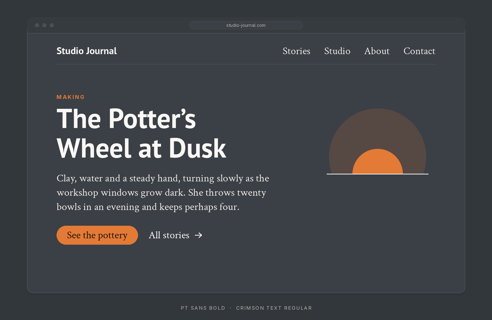
PT Sans paired with Crimson Text - Style A showing headline and body text

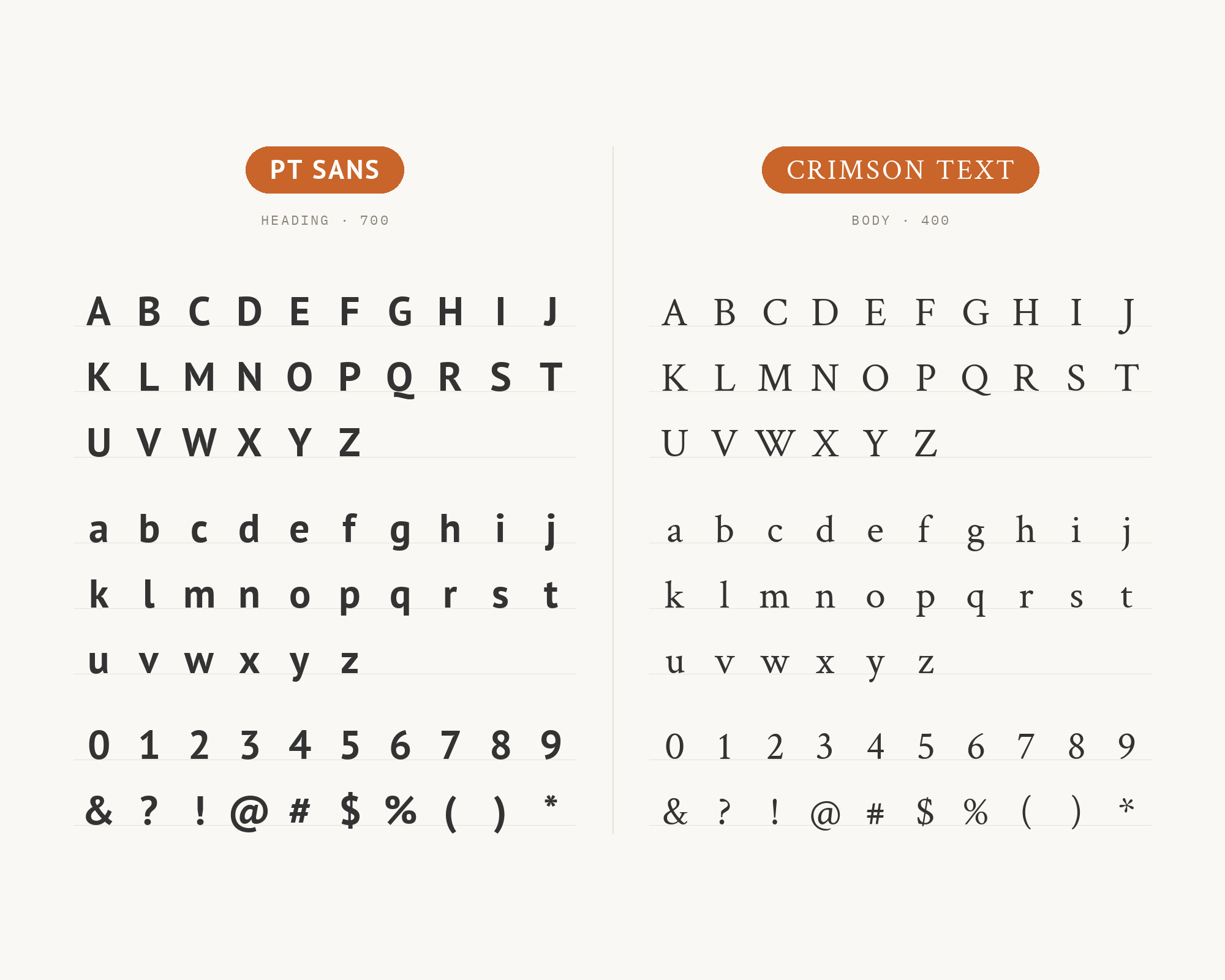
Crimson Text‘s old-style serif forms bring a scholarly warmth that complements PT Sans’s straightforward clarity. The serif’s calligraphic heritage shows in its slightly irregular letter shapes and humanist proportions, creating headlines with personality. PT Sans grounds everything in contemporary usability below. This pairing works for university websites, museum materials, and literary publications where tradition and accessibility need to coexist. The similar x-heights maintain reading flow across font changes.

PT Sans and Crimson Text - Style B layout Character specimen showing PT Sans and Crimson Text alphabets

14. Libre Baskerville

PT Sans paired with Libre Baskerville - Style A showing headline and body text

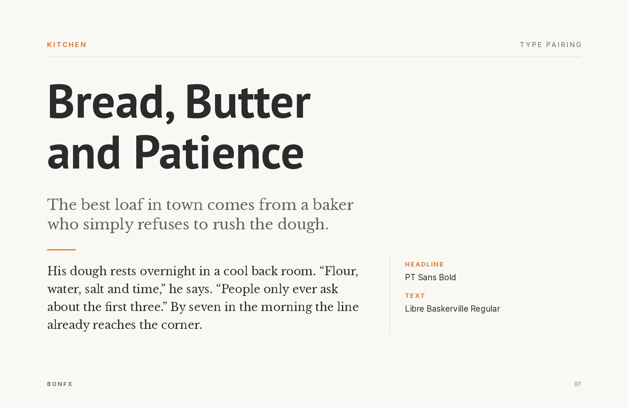
Libre Baskerville channels 18th-century English typography with its sharp serifs and refined proportions, creating a distinguished presence that PT Sans’s humanist forms support rather than compete with. The Baskerville’s transitional characteristics place it between old-style warmth and modern crispness, making it versatile for various headline treatments. This duo suits publishers, financial institutions, and anyone wanting to project established credibility. The weight contrast creates clear hierarchy while both fonts maintain strong screen performance.
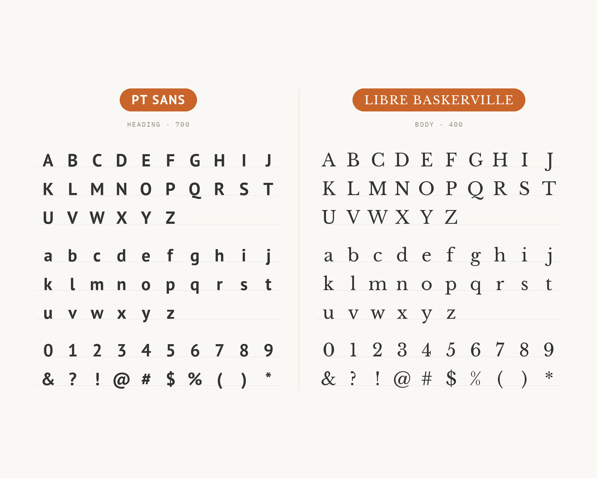
PT Sans and Libre Baskerville - Style B layout Character specimen showing PT Sans and Libre Baskerville alphabets

15. Roboto

PT Sans paired with Roboto - Style A showing headline and body text

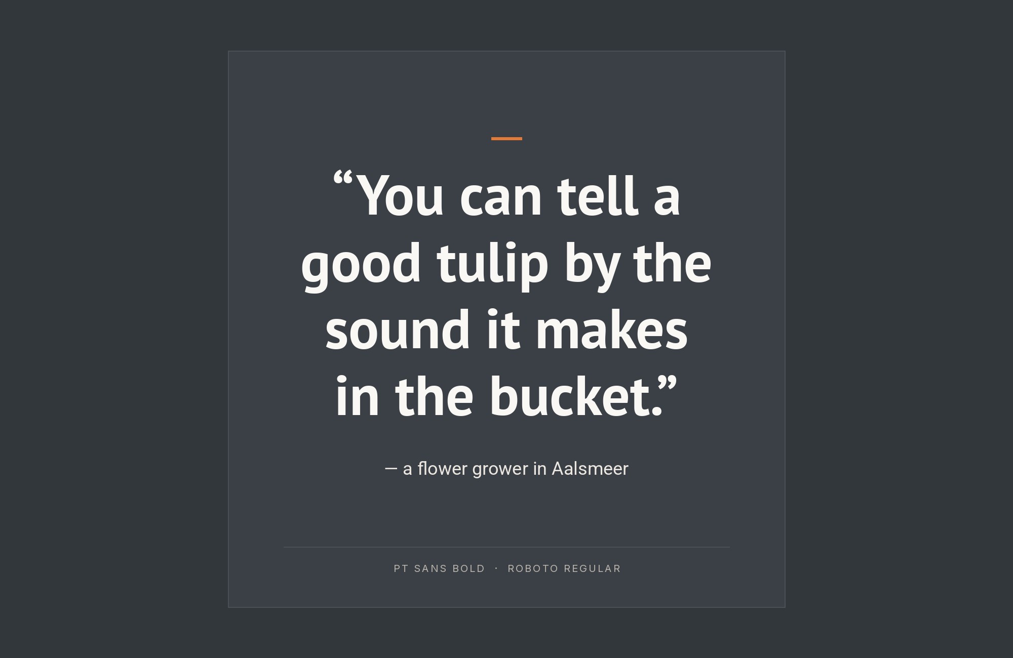
Two of Google’s typographic workhorses meet in a pairing that’s more practical than exciting. Roboto‘s mechanical precision and PT Sans’s humanist warmth create subtle contrast, with Roboto often taking headline duties due to its extensive weight range. This combination powers millions of Android interfaces and web applications where functionality trumps personality. Both fonts prioritize legibility at any size, making them safe choices for international audiences and accessibility requirements. Sometimes the boring choice is the right choice.
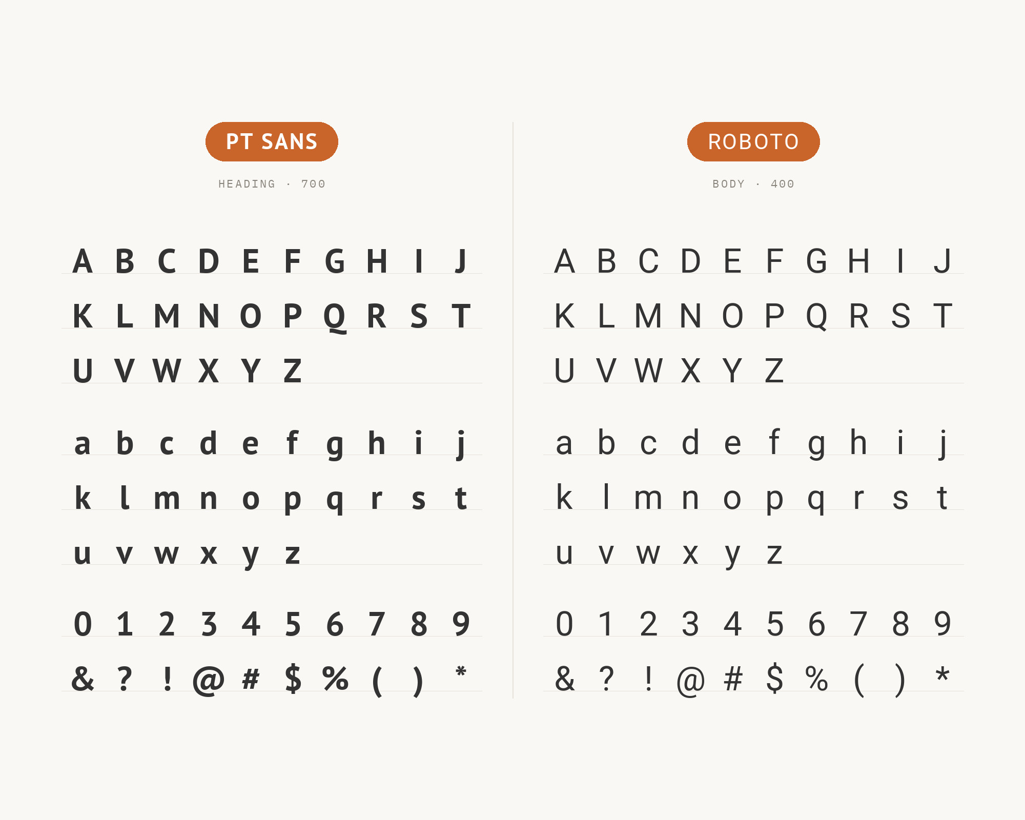
PT Sans and Roboto - Style B layout Character specimen showing PT Sans and Roboto alphabets
What Fonts Go With PT Sans - the book from BonFX, coming soon

Conclusion

There are no absolute rules for font pairing, just principles to guide you. The key is contrast—in weight, in style (serif vs. sans-serif), or in personality. PT Sans is versatile enough to play well with many different typefaces.

Trust your eye, experiment freely, and remember that the best pairing is the one that serves your content and audience. Typography should enhance communication, not complicate it.

More Font Resources

  • Types of Fonts
  • Best Fonts for Designers
  • Google Font Combinations
  • Fonts That Go With Century Gothic

About the Author

Douglas Bonneville is a graphic designer and typographer since 1992. He is the author of The Big Book of Font Combinations and has contributed to numerous design publications. His work focuses on making typography accessible and practical for designers at all levels.

Sources Consulted

The PT Sans pairings on this page were researched against published recommendations from typography sites, type foundries and working designers. Where sources disagreed, the disagreement is noted in the text above.

  • FontPair.co
  • Typ.io
  • Vandelay Design
  • Typewolf
  • The Brief (Amalia Madalina Pop)
  • Figma Google Fonts pairings
  • MyFonts
  • Canva
  • fontsinuse.com
  • ParaType (official specimen)
  • Google Fonts specimen
  • WeAndTheColor

Frequently asked questions

What fonts go with PT Sans?

PT Sans pairs great with PT Serif, Lora and Open Sans. All 15 pairings are shown in real rendered specimens with the reason each one works. Checked against 12 published typography sources.

Does PT Serif go with PT Sans?

A family reunion where everyone actually gets along. PT Sans and PT Serif share identical DNA in their proportions and x-heights, creating seamless typographic harmony without the usual friction of mixing fonts from different foundries. The serif brings gravitas to headlines while the sans handles body copy with quiet efficiency. This pairing feels inevitable, like it was designed for academic journals, corporate reports, and editorial layouts where credibility matters. The s

Does Lora go with PT Sans?

Lora's calligraphic brushstrokes dance above PT Sans's steady foundation like poetry floating over prose. The matched x-heights create effortless reading flow, while Lora's subtle curves inject warmth into otherwise businesslike layouts. This pairing whispers 'boutique editorial' without screaming for attention. Use it for lifestyle blogs, literary magazines, or any project where you want elegance without pretension. The contrast works because both fonts share humanist roots

Does Open Sans go with PT Sans?

Two humanist sans-serifs walk into a layout and somehow don't fight. PT Sans brings slightly more personality with its distinctive letter shapes, while Open Sans provides neutral backup in supporting roles. This pairing works through subtle weight choreography: use Open Sans Light for whisper-quiet captions while PT Sans Bold anchors headlines. Perfect for government websites, educational platforms, and healthcare applications where friendliness meets accessibility. Both font

Does Rubik go with PT Sans?

Rubik's rounded corners meet PT Sans's more traditional humanist forms in a handshake that says 'approachable professional.' The slight warmth in both fonts creates cohesion, while Rubik's geometric underpinnings provide just enough contrast to establish hierarchy. This duo thrives in app interfaces, startup landing pages, and any context where you need to feel modern without alienating traditional users. The similar x-heights keep paragraphs flowing smoothly across font swit

Does Adobe Garamond go with PT Sans?

Adobe Garamond brings 16th-century Parisian elegance crashing into PT Sans's contemporary Russian pragmatism, and somehow they find common ground. The serif's delicate hairlines and refined contrast create headlines that demand respect, while PT Sans delivers body copy with unpretentious clarity. This is a pairing for book publishers, law firms, and anyone trafficking in serious ideas. The weight differential between Garamond's refined strokes and PT Sans's sturdy forms creat

Does LTC Bodoni go with PT Sans?

LTC Bodoni's dramatic thick-thin contrast slices through the page like a headline from a 1920s fashion magazine, while PT Sans grounds everything in readable modernity below. This is a high-contrast pairing in every sense: Bodoni's vertical stress and hairline serifs against PT Sans's open humanist forms. Perfect for luxury branding, high-end editorial, and any context where you want to command attention then deliver information cleanly. Use Bodoni sparingly as display text;

Does Steinbeck go with PT Sans?

Steinbeck's literary character brings a handcrafted headline presence that pairs surprisingly well with PT Sans's matter-of-fact body copy. Named after the author, Steinbeck carries storytelling in its bones, with irregular strokes that suggest a typewriter ribbon running low. PT Sans provides the utilitarian backdrop these expressive headlines need to shine. Use this pairing for memoir-style blogs, indie publishers, or documentary film credits. The contrast between Steinbeck

Does Space Mono go with PT Sans?

Space Mono's fixed-width characters inject a dose of technical credibility into PT Sans's friendly humanist forms. This pairing speaks fluent developer: Space Mono handles code snippets, terminal output, and data displays while PT Sans keeps the explanatory prose approachable. The x-heights align close enough to prevent jarring transitions. Essential for technical documentation, developer blogs, and SaaS interfaces where you need to toggle between human language and machine l

Does Tenez go with PT Sans?

Tenez brings contemporary display type swagger to PT Sans's workmanlike reliability. The geometric underpinnings of Tenez create clean, architectural headlines that announce themselves without shouting, while PT Sans handles the paragraph-level communication. This pairing works for architecture portfolios, design studios, and any brand that wants to signal 'we understand modern aesthetics' without abandoning readability. The weight range in both fonts allows for sophisticated

Does Source Serif Pro go with PT Sans?

Source Serif Pro descends from the same screen-optimization philosophy as many of today's workhorse fonts, making it a natural headline companion for PT Sans's body copy. The serif's moderate contrast and sturdy serifs hold up at smaller sizes than most traditional serifs, giving you flexibility in how you deploy the hierarchy. This pairing feels right for tech journalism, academic publishing, and any context requiring both authority and accessibility. Both fonts perform beau

About Douglas Bonneville

Douglas has been a graphic designer since 1992, in addition to software developer and author. He is a member of Smashing Magazine's "Panel of Experts" and has contributed to over 100 articles. He is the author of "The Big Book of Font Combinations", loves cats, and plays guitar.

The BonFX Letter

One good pairing.
Every Tuesday.

2-minute read · free

This week — no. 14

Quiet authority

Merriweather sets the tone in one line. Lato stays out of the way and lets it.

MERRIWEATHER 700  +  LATO 400

A font specimen, a pairing that works, and one line on why it works. That is the whole email.

Free. One click to unsubscribe. No sharing, ever.

Free download

The Typography Primer.
Yours, right now.

Adobe's classic · PDF · free

The Typography Primer — book cover

The guide to type that everyone learned from. Subscribe and it is yours instantly. The BonFX Letter follows.

Free. One click to unsubscribe. No sharing, ever.

What Fonts Go With PT Sans - the book from BonFX, coming soon

Still Googling UX terms?

Stop. They're all right here.

UX for Cats book cover

50 terms. Illustrated.
So simple your cat gets it.

Get the Book →

Print & ePub on Amazon

350 font combinations you can steal.

The Big Book of Font Combinations

Every pairing shown in context — web, print, headings, body. Open it, find one that works, use it.

That's it. That's the book.

In print or ePub 40% OFF on Gumroad

Scrolling Google Fonts for "the right one"?

You've been at it for 20 minutes. You'll be at it for 20 more. There are 1,500 fonts in there.

Pocket Handbook of Google Fonts Combinations

We paired every useful Google Font.
7,500 pages. Done.

Get the PDF →

Instant download on Gumroad

Recent Inspirations

  • What Fonts Go With Abril Fatface? September 4, 2026
  • What Fonts Go With Cinzel? September 4, 2026
  • What Fonts Go With Cormorant Garamond? September 4, 2026
  • What Fonts Go With Anton? September 4, 2026
  • What Fonts Go With Quicksand? September 4, 2026
  • What Fonts Go With Vollkorn? September 4, 2026
  • What Fonts Go With Dosis? September 4, 2026
  • What Fonts Go With EB Garamond? September 4, 2026
  • What Fonts Go With Bebas Neue? September 4, 2026
  • What Fonts Go With Caslon? September 3, 2026
  • What Fonts Go With Helvetica? September 2, 2026
  • What Fonts Go With Bodoni? September 1, 2026
  • What Fonts Go With Calibri? August 31, 2026
  • What Fonts Go With Avenir? August 30, 2026
  • What Fonts Go With Garamond? August 30, 2026

Copyright © 2026 · BonFX

  • Blog
  • Books
    • The Preposterously Huge Book of Google Font Combinations
    • The Big Book of Font Combinations (Classic Fonts Edition)
  • Gallery
    • Monster Alphabet
    • Pen and Ink Cartoons
    • The Algorithm FX
  • Services
  • About
  • Contact