Roboto Mono pairs great with Roboto Slab, Times New Roman and Rubik. All 15 pairings are shown below in real rendered specimens, with the reason each one works.
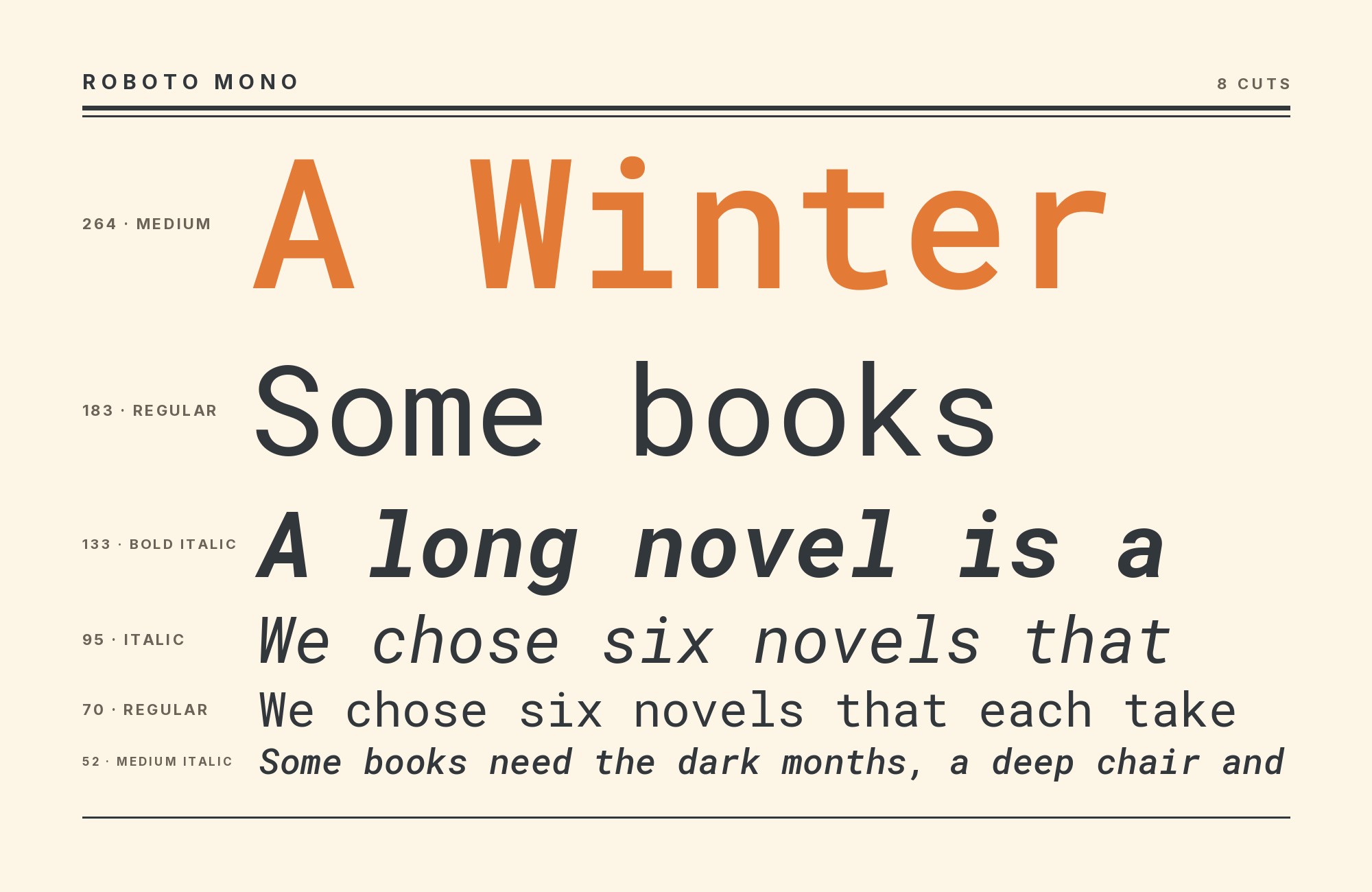
What fonts go with Roboto Mono? Start with what the face is actually for: it is not a paragraph font in typewriter clothing. It is the monospaced sibling of Roboto, drawn so code, data and editorial labels sit on a fixed-width grid without looking like leftovers from a terminal.
Christian Robertson designed Roboto Mono, and Google Fonts released it in 2015 as the monospaced member of the Roboto family — the same designer and the same geometric DNA as Android’s system sans, rebuilt so every glyph shares one horizontal advance. The letterforms keep Roboto’s geometric skeleton, and narrow glyphs like I, l and i have added serifs for a more even texture across the fixed grid. Distinguishing I, l, 1, 0 and O was a design requirement, not an afterthought; that is the quality that makes it a working programming font as well as a display accent. Current sources disagree in their summaries: Typewolf lists five weights with matching italics, while Wikipedia lists seven weights with italics. The current Google Fonts metadata supplies variable upright and italic files but does not establish an original five-weight release. Set it for code samples, timestamps, SKUs, captions and short display lines. Do not set it for long prose.
Pairing Roboto Mono is a role-split problem. The mono already supplies rhythm, a technical register and a mechanical grid; the partner has to supply either a proportional reading voice or a display voice that grid cannot produce. Real production systems follow three routes. The family route keeps Roboto or Roboto Slab on the same skeleton and hands labels to the mono. The serif-contrast route brings Times New Roman or Cooper in for historical texture. The neutral-sans route lets Work Sans, Rubik, Montserrat, Helvetica, or Sora carry interface and paragraphs. A second monospace — Space Mono — is legitimate only when the two grids have different jobs. Here are 15 fonts that pair well with Roboto Mono.
1. Roboto Slab

Christian Robertson designed Roboto Slab for Google and released it in March 2013, two years before the mono cut, as the slab-serif member of the same family. Roboto Slab is based on Roboto, and Typewolf names it as the suggested pairing for Roboto Mono. Their family relationship makes them a natural system to test; adjust size and spacing in the actual layout rather than assuming metric identity. Use the slab for titles and section heads, the mono for code, timestamps and captions. This is the default pairing for documentation sites, Google-adjacent products and any technical brand that wants one type family to cover every role. Keep both faces in the same weight band — Regular with Regular, Bold with Bold — so the family relationship stays visible.

Paid prompt-to-site tools are going to lock you in.
How can your studio escape this?
Find Out How2. Times New Roman

Times New Roman was commissioned by The Times of London, directed by Stanley Morison and drawn by Victor Lardent; the paper printed it from 1932 as a transitional serif cut to survive tight newsprint columns. Bracketed serifs, moderate stroke contrast and a narrow set width are everything Roboto Mono’s even, geometric, fixed-width strokes refuse to be. Typewolf records Times New Roman and Roboto Mono together on Elaine Lee. My recommended split is Times New Roman for running text and Roboto Mono for labels, dates, and other short technical accents. The pairing suits portfolios, journals and personal sites that want literary running text with a technical accent, not a code-editor aesthetic from edge to edge.

3. Rubik

Philipp Hubert and Sebastian Fischer of Hubert & Fischer designed Rubik for a Google Rubik’s Cube exhibition, and the face arrived on Google Fonts as a geometric sans with stout proportions, low stroke contrast and slightly rounded corners. Those soft corners add warmth beside the mono’s even, mechanical texture, even though one face is proportional and the other is not. Rubik therefore takes the headline and brand-line role the mono’s even glyph width cannot fill, while the mono stays on data, navigation crumbs and code. Typewolf records the combination on WORK, a June 2019 Site of the Day, where Rubik sits in the proportional layer beside Roboto Mono. Use heavier Rubik weights for short display lines if that hierarchy suits the project, and test how its rounded forms relate to Roboto Mono at the actual sizes.

4. Cooper

Oswald Bruce Cooper drew Cooper for Barnhart Brothers & Spindler in 1919, and in 1922 added the ultrabold Cooper Black, whose inflated bowls and soft, almost ink-spread serifs read as American advertising rather than as book type. That warmth is the entire argument against Roboto Mono’s mechanical grid: Cooper takes the masthead, the mono takes the figures, and neither face pretends to do the other’s job. Typewolf documents the MailChimp 2016 Annual Report running Cooper with Roboto Mono — a live, high-visibility proof that a jolly 1920s serif and a Google programming font can share a report without irony collapsing the page. Use Cooper large, and only for titles, chapter openers and short display phrases; its colour on the page is too dense for paragraphs. Let Roboto Mono set the captions, tables, URLs and any line that should feel tabulated. The combination suits annual reports, campaign microsites and brands that want a human, slightly retro shout over a precise, contemporary data layer.

5. Roboto

Christian Robertson designed Roboto in-house at Google and shipped it in 2011 as Android’s system typeface, a neo-grotesque with a mechanical skeleton softened by open, friction-free curves. Roboto and Roboto Mono share a family lineage and designer, while one is proportional and the other monospaced. Use that continuity as a starting point, then test apparent size and spacing in context. Typ.io recommends the combination and records it live on perspectiveapi.com and newsprovenanceproject.com. Use Roboto for body copy, UI chrome and navigation; use Roboto Mono for anything that should align in columns. This is the pairing for developer documentation, Material-adjacent products and any system that already ships Roboto and simply needs a native code face.

6. Space Mono

Colophon Foundry drew Space Mono for Google Design; Google Fonts published it in 2016, a fixed-width family that hangs slab-like serifs off an otherwise geometric monospace skeleton. Pairing two monospaces only works when they are not interchangeable. Space Mono is the quirky one — heavier serifs, odder punctuation, more display attitude — and Roboto Mono is the quieter, more Roboto-like grid. Typ.io lists them as partners and records the pair live on cvcompiler.com, a hiring product where two technical voices on one page is the brief, not a mistake. Give Space Mono the short display labels, section tags and poster-scale words; give Roboto Mono the actual code, logs and tabular data, where its plainer letterforms and clearer I/l/1 distinction earn their keep. Never run both at the same size in the same role; at equal size the two grids cancel and neither reads as the specification layer. The pairing suits developer tools, hiring sites and any brand that wants the mono register to carry both shout and specification.

7. Montserrat

Julieta Ulanovsky designed Montserrat in 2011 from the painted lettering of the Buenos Aires neighborhood of the same name, building a geometric sans with urban display character, a tall x-height and a wide stance in the capitals. That width is the contrast with Roboto Mono: Montserrat occupies as much horizontal space as a geometric sans reasonably can, while the mono’s even advance makes every line look counted. Typ.io names Montserrat among the faces that go well with Roboto Mono, which in practice means the poster-scale job goes to Montserrat and the caption-and-code job stays with the mono. Use Montserrat Bold or ExtraBold for headlines, decks and campaign lines; drop to Regular only for short subheads, never for paragraphs next to a mono that is already competing for texture. Track Montserrat slightly tighter at display sizes so its open counters do not feel sparse beside the mono’s denser rhythm.

Try Semrush free. No credit card.
Start on the $0 plan. Paid plans from $117/mo billed annually.
Try for free8. Neue Haas Grotesk

Christian Schwartz released Neue Haas Grotesk in 2010, a digitization based on printed settings of the original 1957 metal type rather than another Helvetica redraw, reinstating the tighter spacing and sharper terminals that later system cuts had flattened. That tightness is the handshake with Roboto Mono: both faces look counted, but only the mono is actually on a fixed-width grid. Fonts In Use documents the combination on The Boiler House identity, where Neue Haas Grotesk supplies the clean modern sans and Roboto Mono the fixed-width layer beside Tropiline’s display mark. Give Neue Haas Grotesk the identity lines — titles, menus, short statements — and keep the mono on times, prices, captions and anything that should look tabulated. The pairing suits venues, product sites and editorial brands that want a serious grotesque without asking the mono to carry the whole voice.

9. Work Sans

Wei Huang designed Work Sans and released it in 2015 as a grotesque optimized for on-screen text, drawing on early advertising grotesques — Stephenson Blake and their kin — then optically correcting the letterforms for pixels. Slightly wide, low-contrast proportions give body copy room without tipping into display width, and the family runs nine weights from Thin to Black with italics, which is the range Roboto Mono will never cover for prose. Typ.io documents Work Sans and Roboto Mono together on studiorise.eu. I would assign Work Sans the prose and interface work and reserve Roboto Mono for the mechanical accent. The pairing is a grotesque-plus-mono system rather than a geometric one, so it reads a little warmer and a little more editorial, which suits blogs, newsletters, agency sites and documentation that still wants a human voice in the paragraphs. If Roboto Mono should read as annotation, size and space it by optical comparison with Work Sans; no universal one-to-two-point offset is established by the source.

10. Futura

Paul Renner designed Futura for the Bauer foundry, released in 1927 from compass-and-straightedge geometry — circular bowls, pointed apexes, a single-storey a. That construction shares nothing with Roboto Mono’s even, slightly rounded, fixed-width skeleton, which is why the contrast reads as a decision. Fonts In Use documents it on Melt! music journal No. 1, where the issue number is Roboto Mono and the contents sit in Futura. Give Futura the section titles, cover lines and uppercase labels, where its geometry is crisp; keep the mono on numbers, running heads, captions and any string that should look counted. At text sizes Futura’s tight apertures can pinch; do not ask it to do the mono’s caption job, and do not ask the mono to impersonate a geometric display face.

11. Helvetica

Fonts In Use documents Helvetica and Roboto Mono in the Full Proof identity, where Helvetica supports subheads and supporting copy while the mono handles eyebrows, labels, navigation, and body copy. That is the useful division: a familiar proportional grotesque restores natural word shapes, and Roboto Mono marks the interface details that need a technical register. Keep Helvetica in regular or medium weights for reading, reserving the mono for short runs. If both faces appear in bold capitals, their similar low-contrast texture can flatten the hierarchy. Separate them by job and measure first, then adjust size so the fixed-width line reads as metadata.

12. Sora

The École Nationale d’Ingénieurs de Metz identity documented by Fonts In Use includes Sora with Roboto Mono among a broader supporting palette. Sora’s geometric but proportional construction gives headings and explanatory copy a smooth rhythm that the mono’s fixed advances cannot provide. Use Sora for the institutional name, navigation headings, or a concise introduction, then assign Roboto Mono to programme codes, dates, and technical labels. The pair shares a contemporary digital tone, so scale must carry the hierarchy. A large Sora heading over smaller mono metadata works; equal-size medium weights can look like two near-duplicates distinguished only by spacing.

13. Inter

Inter’s designer, Rasmus Andersson, recommends Roboto Mono as a monospace companion and notes their closely aligned vertical metrics. That makes code, data, and labels sit comfortably beside Inter’s proportional interface text without a distracting jump in apparent size. Use Inter for navigation and paragraphs, then switch to Roboto Mono only where fixed widths communicate function. The relationship is quiet rather than decorative, so hierarchy still needs weight, spacing, or color. This is a strong product and documentation pairing when code must feel integrated with the interface instead of pasted in from a separate visual system.

14. Spectral

Spectral supplies calligraphic serif movement and a comfortable reading texture; the mono provides a rigid technical layer for captions, data, or code. Use Spectral for the article, essay, or long description and reserve Roboto Mono for the elements that benefit from counted spacing. The contrast is substantial, so the two need no exaggerated weights. Keep the mono slightly smaller and give it room around dense strings. This pairing suits research publishing, technical editorial work, and reports where narrative prose and structured information share one page.

15. DM Serif Display

The display serif offers high contrast and soft, expressive curves, while the mono answers with an even mechanical grid. Use DM Serif Display for a short title or pull quote and Roboto Mono for metadata, navigation, code, or compact supporting lines. Neither is an ideal default for long interface paragraphs, so bring in this pair when the design is intentionally display-led. The combination works for portfolios, event pages, and editorial features that want a dramatic headline above a technical, measured information layer.

Conclusion
Roboto Mono often works well as a counted layer for code, labels, data, and short accents. Some documented projects use it more broadly: Fonts In Use says the text in Melt! is set in Roboto Mono, while Futura handles contents on the cover.
The family route is the lowest-friction answer: Roboto for interface and prose, Roboto Slab for headlines, Roboto Mono for anything that should sit on a grid. The serif-contrast route — Times New Roman for reading, Cooper for a warm masthead — is the editorial move, and it is real, including on shipped sites, whenever the page needs historical texture the Roboto family will not provide. Work Sans is the on-screen grotesque for paragraphs; Neue Haas Grotesk is the tighter revival when the sans has to carry identity; Futura is the geometric display counterweight, with Rubik or Montserrat when the headline still needs rounded or urban punch. Space Mono is the special case: a second monospace, used only when shout and specification both need a fixed-width voice. Set real copy at the sizes you intend to publish, keep the mono off long paragraphs, and check that the code and the captions still look counted once the prose is around them.
Sources
- Typewolf (Roboto Mono)
- Typewolf (Elaine Lee)
- Typewolf (WORK)
- Typewolf (MailChimp 2016 Annual Report)
- Typ.io
- Jukebox Print
- Fonts In Use (Roboto Mono typeface)
- Fonts In Use (The Boiler House)
- Fonts In Use (Melt! music journal No. 1)
- Typ.io (Work Sans × Roboto Mono)
- Wikipedia (Roboto)
- Google Fonts METADATA.pb
- GitHub — rsms/inter discussion
- Fontpair (DM Serif Display)
