BonFX

Typography & Graphic Design Blog

  • Blog
  • Books
    • The Preposterously Huge Book of Google Font Combinations
    • The Big Book of Font Combinations (Classic Fonts Edition)
  • Gallery
    • Monster Alphabet
    • Pen and Ink Cartoons
    • The Algorithm FX
  • Services
  • About
  • Contact
You are here: Home / Font Combinations / What Fonts Go With Palatino?

The BonFX Letter

One good pairing.
Every Tuesday.

2-minute read · free

This week — no. 14

Quiet authority

Merriweather sets the tone in one line. Lato stays out of the way and lets it.

MERRIWEATHER 700  +  LATO 400

A font specimen, a pairing that works, and one line on why it works. That is the whole email.

Free. One click to unsubscribe. No sharing, ever.

palatino font pairing

What Fonts Go With Palatino?

August 8, 2026 by Douglas Bonneville

Palatino pairs great with Avenir Next, Helvetica Neue and Open Sans. All 12 pairings are shown below in real rendered specimens, with the reason each one works.
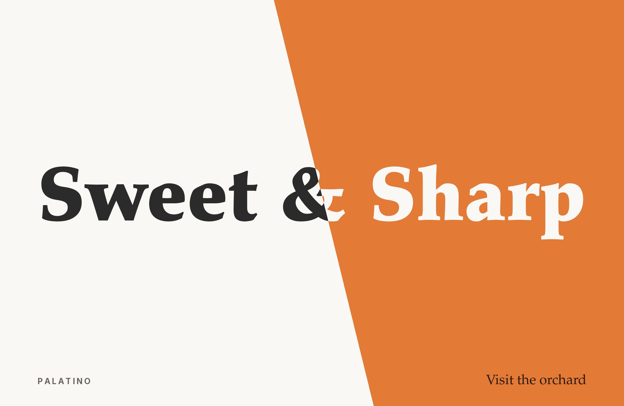
What fonts go with Palatino? 12 pairings are shown below, each with a reason it works.

Palatino is a working typeface, not a novelty. The combinations below were checked against published sources; they are the ones that actually show up in real work, not a random contrast exercise. Here are 12 fonts that pair well with Palatino.

Font Pairings for Palatino

  1. Avenir Next
  2. Helvetica Neue
  3. Open Sans
  4. Josefin Sans
  5. Nimbus Sans
  6. Inter
  7. Gill Sans
  8. Courier
  9. Bembo
  10. Optima
  11. Univers
  12. Futura

1. Avenir Next

Palatino paired with Avenir Next - Style A showing headline and body text

Palatino’s calligraphic, humanist serif forms and Avenir Next’s rounded geometric sans share a similar warmth, so headline-to-body handoffs feel gentle rather than jarring even though one is serif and one is sans.

Palatino and Avenir Next - Style B layout Character specimen showing Palatino and Avenir Next alphabets

2. Helvetica Neue

Palatino paired with Helvetica Neue - Style A showing headline and body text

A neutral, high-legibility grotesque absorbs long-form body or UI text, leaving Palatino’s more expressive, calligraphy-influenced letterforms free to carry headings and titling, where their personality actually reads.

Palatino and Helvetica Neue - Style B layout Character specimen showing Palatino and Helvetica Neue alphabets

3. Open Sans

Palatino paired with Open Sans - Style A showing headline and body text

Open Sans’s large x-height and even spacing stay comfortable at small interface sizes, leaving Palatino’s wider, more textured letterforms free to do display and heading work where their character can breathe.

Palatino and Open Sans - Style B layout Character specimen showing Palatino and Open Sans alphabets

4. Josefin Sans

Palatino paired with Josefin Sans - Style A showing headline and body text

A thin-stroked geometric sans with 1920s-30s proportions — a low x-height and tall ascenders, narrow apertures — adds a crisp, vintage-poster contrast to Palatino’s broader calligraphic flourishes, softening the jump from Palatino’s curves without borrowing its warmth.

Palatino and Josefin Sans - Style B layout Character specimen showing Palatino and Josefin Sans alphabets

5. Nimbus Sans

Palatino paired with Nimbus Sans - Style A showing headline and body text

A Helvetica-style neo-grotesque with even stroke weights and closed apertures — plain and mechanical by design. That plainness gives Palatino’s old-style serif detail a calm, unobtrusive stage, the same “invisible sans beside expressive serif” logic that made grotesques like Folio a common Palatino partner.

Palatino and Nimbus Sans - Style B layout Character specimen showing Palatino and Nimbus Sans alphabets

6. Inter

Palatino paired with Inter - Style A showing headline and body text

A tall x-height and tight, screen-tuned spacing make Inter a plain numerals-and-labels partner — built for UI legibility rather than editorial character. It stays out of the way while Palatino’s calligraphic curves carry the reading text.

Palatino and Inter - Style B layout Character specimen showing Palatino and Inter alphabets

7. Gill Sans

Palatino paired with Gill Sans - Style A showing headline and body text

Shares some of Palatino’s humanist warmth in sans-serif form, so the two read as a “family resemblance” pairing rather than an aggressive contrast — good for hospitality or heritage brands wanting old-world charm without going full serif-on-serif. *Real-world use: Villa Feltrinelli, 2015 (alongside Libre Baskerville).*.

Palatino and Gill Sans - Style B layout Character specimen showing Palatino and Gill Sans alphabets

8. Courier

Palatino paired with Courier - Style A showing headline and body text

Deliberately mechanical, single-width letterforms create a document/typewriter register that offsets Palatino’s warmer book-typeface personality — useful for captions, credits, or “typed note” accents. *Real-world use: Jamie Smyth, 2018.*.

Palatino and Courier - Style B layout Character specimen showing Palatino and Courier alphabets

9. Bembo

Palatino paired with Bembo - Style A showing headline and body text

Another Renaissance-rooted old-style serif; the two share a common ancestry in humanist calligraphy, so combining them reads as a deliberate historical statement rather than a mismatch. *Real-world use: “Design with Type,” 1967 (alongside Folio and Helvetica).*.

Palatino and Bembo - Style B layout Character specimen showing Palatino and Bembo alphabets

10. Optima

Palatino paired with Optima - Style A showing headline and body text

Designed by Hermann Zapf — the same hand behind Palatino — Optima’s flared, sans-serif “stroke without serifs” form gives a Zapf-authored counterpoint that shares Palatino’s calligraphic pen logic while staying visually distinct. *Real-world use: Thelonious Monk, “Monk’s Dream,” 1963.*.

Palatino and Optima - Style B layout Character specimen showing Palatino and Optima alphabets

11. Univers

Palatino paired with Univers - Style A showing headline and body text

A famously neutral, systematic grotesque; putting it beside Palatino’s calligraphic warmth is an “invisible sans plus expressive serif” strategy. *Real-world use: “I, etcetera,” 1979 (alongside Weiss).*.

Palatino and Univers - Style B layout Character specimen showing Palatino and Univers alphabets

12. Futura

Palatino paired with Futura - Style A showing headline and body text

Pure geometric construction (circles, triangles) sits at the opposite end of the spectrum from Palatino’s calligraphic pen strokes, so headlines in one and text in the other read as two clearly different registers. *Real-world use: Monopoly board game packaging, 1985 (alongside Kabel and Copperplate Gothic).*.

Palatino and Futura - Style B layout Character specimen showing Palatino and Futura alphabets

Conclusion

There are no absolute rules for font pairing, just principles to guide you. The key is contrast—in weight, in style (serif vs. sans-serif), or in personality. Palatino is versatile enough to play well with many different typefaces.

Trust your eye, experiment freely, and remember that the best pairing is the one that serves your content and audience. Typography should enhance communication, not complicate it.

Sources

  • Typ.io
  • Typewolf
  • Fonts In Use

More Font Resources

  • The Big Book of Font Combinations
  • 29 Principles for Making Great Font Combinations

About the Author

Douglas Bonneville is a graphic designer and typographer since 1992. He is the author of The Big Book of Font Combinations and has contributed to numerous design publications. His work focuses on making typography accessible and practical for designers at all levels.

About Douglas Bonneville

Douglas has been a graphic designer since 1992, in addition to software developer and author. He is a member of Smashing Magazine's "Panel of Experts" and has contributed to over 100 articles. He is the author of "The Big Book of Font Combinations", loves cats, and plays guitar.

The BonFX Letter

One good pairing.
Every Tuesday.

2-minute read · free

This week — no. 14

Quiet authority

Merriweather sets the tone in one line. Lato stays out of the way and lets it.

MERRIWEATHER 700  +  LATO 400

A font specimen, a pairing that works, and one line on why it works. That is the whole email.

Free. One click to unsubscribe. No sharing, ever.

Still Googling UX terms?

Stop. They're all right here.

UX for Cats book cover

50 terms. Illustrated.
So simple your cat gets it.

Get the Book →

Print & ePub on Amazon

350 font combinations you can steal.

The Big Book of Font Combinations

Every pairing shown in context — web, print, headings, body. Open it, find one that works, use it.

That's it. That's the book.

In print or ePub 40% OFF on Gumroad

Scrolling Google Fonts for "the right one"?

You've been at it for 20 minutes. You'll be at it for 20 more. There are 1,500 fonts in there.

Pocket Handbook of Google Fonts Combinations

We paired every useful Google Font.
7,500 pages. Done.

Get the PDF →

Instant download on Gumroad

Recent Inspirations

  • What Fonts Go With Caslon? September 3, 2026
  • What Fonts Go With Helvetica? September 2, 2026
  • What Fonts Go With Bodoni? September 1, 2026
  • What Fonts Go With Calibri? August 31, 2026
  • What Fonts Go With Avenir? August 30, 2026
  • What Fonts Go With Garamond? August 30, 2026
  • What Fonts Go With Work Sans? August 29, 2026
  • What Fonts Go With Times New Roman? August 29, 2026
  • What Fonts Go With Didot? August 28, 2026
  • What Fonts Go With Source Sans Pro? August 28, 2026
  • What Fonts Go With Rubik? August 27, 2026
  • What Fonts Go With DIN? August 27, 2026
  • What Fonts Go With Nunito Sans? August 26, 2026
  • What Fonts Go With Georgia? August 26, 2026
  • What Fonts Go With Neuton? August 25, 2026

Copyright © 2026 · BonFX

  • Blog
  • Books
    • The Preposterously Huge Book of Google Font Combinations
    • The Big Book of Font Combinations (Classic Fonts Edition)
  • Gallery
    • Monster Alphabet
    • Pen and Ink Cartoons
    • The Algorithm FX
  • Services
  • About
  • Contact