Gill Sans & Goudy Old Style
Here is a ready-made typeface pair. While I can’t say they were made for each other (Gill Sans was designed by Eric Gill in 1926 and Goudy Old Style was designed by Frederick W. Goudy in 1915—not too far apart) they come close. The generous and complimentary x-heights work well with their old-style roots. A close examination of Gill Sans reveals why they work so well: look at the lowercase “a”, “t”, and “r” for some quick visual insight into why Gill Sans works well with an old-style design like Goudy.
Gill Sans & American Typewriter
Sometimes, likely combinations are found in the most unlikely ways. When I was putting together the font combinations book, I had the opportunity to see a lot of typefaces on the same page that I would never, ever, have thought to put together. Kind of like cayenne pepper and dark chocolate. It’s reads wrong on the package, sounds wrong even suggest eating it, but when you take a bite (if you like spicy food and if you like chocolate), you have to step back in your mind and say, “Hey, that’s not too bad!” And so it is with these two typefaces. I think the playfulness of American Typewriter brings out the levity that is intrinsic to Gill Sans in the right setting. Gill Sans is the character actor of typefaces, is it not? Always odd, but somehow it works.
Bell Gothic & Gill Sans
Here we have a classic example of where contrast between two typefaces can be made to work really well. Both typefaces are sans-serif but they share practically nothing else in common. While Gill Sans is a very quirky and thus dominant personality in most settings, the even more unique Bell Gothic tames the otherwise-wiley Gill Sans into a more submissive role. I think this font pairing is very energetic, and keeps the eye moving and dancing around the text. There is potential here to explore in a more specific context.(Remember, all these examples are set generically, and need to be optimized in the context of a real design!)

Futura & Gill Sans
This is a case where two sans-serif fonts work pretty well together. Some of the more geometric shapes in Gill Sans compliment the classically geometric Futura. Also, the typefaces are different enough from each other that they don’t clash. They also have similar x-heights which helps create a sense of concord, or at least a friendly nod, between these two very distinct typefaces.
UPDATE: 3 more Gill Sans font pairings
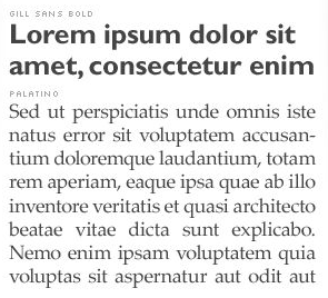
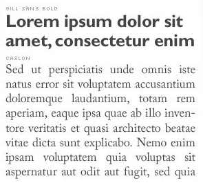
I grabbed a few more samples via screen grab from the Font Combinations App. Without any further commentary on these choice I’ll let the type speak for itself:Gill Sans & Palatino

Gill Sans & Chaparral

Gill Sans & Caslon

Is Gill Sans too versatile?
The versatility of Gill Sans and its unique personality can make finding a suitable typeface pair a challenge, but it’s doable. You might also want to check out a few articles below to help you with not only Gill Sans, but any other hard-to-pair typeface:Suggested Reading
- Best Practices of Combining Typefaces at Smashing Magazine


It’s one of those strange coincidences, Douglas, that you should publish this article on the day after I read this old piece by Ben Archer:
http://www.typotheque.com/articles/re-evaluation_of_gill_sans/
My head and my heart don’t quite agree regarding the thrust of his argument. Logically, I understand all of his individual criticisms; but emotionally, when I look at a chunk of text set in Gill Sans (as opposed to looking at details of individual glyphs), I find it very satisfying. Maybe it’s because I’m British, and because I was born in the late 1950s when there was a lot of it around. Its popularity over here then dwindled for a few decades (though it was never completely absent) but it strikes me that it is making something of a comeback in recent times, perhaps due to the BBC having adopted it as its corporate face in a rebranding a few years ago.
I love Gill Sans, and find myself constantly coming back to it when I want a sans serif with more warmth than its Swiss cousins. Thanks for your suggestions; I would never have thought of combining it with American Typewriter (a face I am fond of in its own right).
I have often paired Gill Sans as headline text with Gill’s own Perpetua (serif) for body copy. Gill didn’t design them as a pair, but they work well together to my eye.
I’m not sure I agree with that article either. It is a great warmer alternative to the usual Swiss options. While we know what Gill said about it, it was in relation to the aesthetics of his own day. We are talking nearly 90 years ago. A lot has changed! We could also critique Morris Fuller Benton’s Souvenir as well as his moustache (see my typographic portrait of Benton I just posted!), and only the criticism of the mustache would pass muster based on our current understanding of proper and professional facial hair. Look at the serifs he has on that ‘stache! 🙂
I like Gill Sans more now than ever, and I didn’t particularly like it that long ago. But after seeing and understanding Gill Sans in relation to the old styles that came before it and upon which it derives many of its shapes, I have a newly found appreciation and even admiration for it. I spent a lot of time with it in the Anglican Book of Common Prayer, “Common Worship” and simply fell in love with the typesetting job done on that. Dark grey, reddish orange, on a cream stock. Stunning, friendly, easy to read.
I just added a few more examples to the collection above. Enjoy!
I agree with your points on Gill Sans and context, Douglas. Another context and reason it probably resonates with many Brits is its use, over a long period of time, on the classic “three band” covers of Penguin paperbacks, as designed by Jan Tschichold. Everyone has seen them, and absorbed the typeface consciously or unconsciously.
I’ve put together a quick ‘n’ dirty example of it in combination with Perpetua; feel free to grab it if you like it:
http://img143.imageshack.us/img143/4575/gillperpetua.png
It looks good with Caslon, too.
(By the way, I did see and like your portrait of MFB in Souvenir. I’ve always liked Souvenir and I’ve had ITC Souvenir in the fonts folder for years, but never seem to find an application for it.)
@ Keith: The Gill Sans / Perpetua combination works really well! Thanks for posting that.
I agree with @Keith. On my walk home from work, there are a number of storefronts that use Gill Sans for the decals on their windows, and I always find myself surprisingly refreshed to read them. It gives the stores an undeniably modern look. And it’s more recognizable than something new and popular today like FF Dax, so it can make people think “modern” without going outside of their comfort zones.
Also, when I saw the headline “Futura and Gill Sans,” I wasn’t sure. But my eyes fought me because they told me it actually looked good. Way to go on this one.
@ Keith:
As much as I like FF Dax, it feels to me like it’s going to be dated before long. Perhaps its curves remind me too much of the “swooshes” that plagued logo design in the mid to late 90’s when it was brand new.
Do take a look at any of the PDFs here:
http://www.churchofengland.org/prayer-worship/worship/texts/common-worship-pdf-files.aspx
All Gill Sans, all wonderful, Anglican or not. Again, the printed version is just wonderful to look at. If you have a few bucks, order a used copy just to see it as a specimen 🙂
I am currently working on a logo for a customer who like Mad Men design.
This article helped me a lot ! THANKS
What do you think about Gill Sans and Georgia pairing? I rarely find the paired.
I think you could make that work, but Georgia is soooo overused, and there are so many other serif choices – surely there is a more interesting option?