Cambria pairs great with Calibri, Candara and Corbel. All 8 pairings are shown below in real rendered specimens, with the reason each one works.
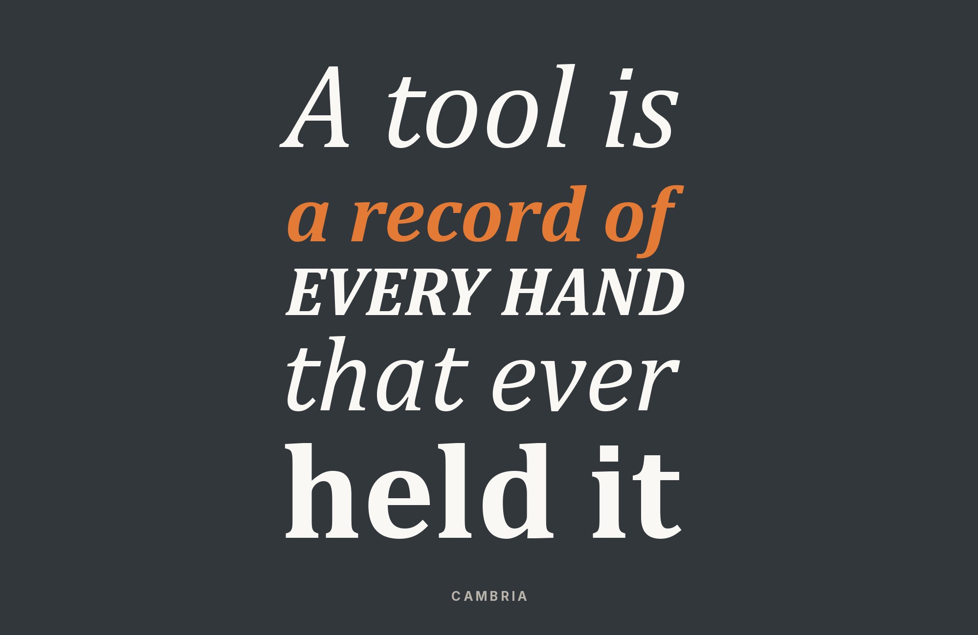
What fonts go with Cambria? 9 pairings are shown below, each with a reason it works.
Cambria is a working typeface, not a novelty. The pairings below come from Microsoft’s own font collection, independent research and documented real-world use, not a random contrast exercise. Here are 9 fonts that pair well with Cambria.
1. Calibri

Two anchor faces of Microsoft’s ClearType Font Collection, first shipped with Windows Vista and Office 2007, and Word’s default heading and body fonts — Cambria’s stubby serifs carry headings with just enough formality while Calibri’s soft, rounded sans keeps body paragraphs quick to read at length.

“My clients will build their own sites with their own AI.”
How are you supposed to navigate this?
Find Out How2. Candara

A humanist sans from the same designed collection, with softer entasis curves than Calibri’s — a warmer alternative body partner for Cambria when a document wants a friendlier tone than the Calibri-default look.

3. Corbel

The plainest, most UI-neutral sans in the collection — built for “uncluttered and clean” screen legibility, it stays out of the way as a caption or label face under Cambria’s heavier serif headings.

Webflow. Framer. Squarespace. Wix. Lovable. Not your future.
Your own AI CMS agent is.
Find Out More4. Consolas

The collection’s monospace was built for the same ClearType rendering goals as Cambria, so pairing them inside one technical document (Cambria for prose, Consolas for code samples or tabular data) keeps the whole page visually consistent instead of falling back to a generic system mono.

5. Caladea

Google’s metric-compatible open-source clone of Cambria — the practical partner when a document needs to render identically on a machine without Microsoft fonts installed (Linux, LibreOffice, web embedding); using it “alongside” Cambria really means treating it as the drop-in continuation of the same layout across platforms.

Unlimited fonts from $16.50/mo.
29 million fonts, templates and stock assets. One subscription, unlimited downloads.
See the plan6. Source Sans Pro

A contributor on a Typography.Guru forum thread devoted entirely to finding “a sans serif font for headers and titles that makes a good pair for Cambria” first considered FF DIN Pro Medium, then changed to Adobe’s Source Sans, calling it “almost a sans serif version of Cambria” and pointing to a side-by-side Identifont comparison. In our reading, the two share a close enough x-height and stroke weight that a Source Sans Pro heading sits on top of Cambria body text without a jump in visual color — a rare case of someone actually arguing a Cambria pairing rather than just listing Cambria as a safe default.

7. DejaVu Sans

On the same thread, a second contributor proposed DejaVu Sans, an open-source sans included by default in Linux distributions such as Ubuntu, Debian and Fedora, and a third contributor said DejaVu Sans Condensed tracks Cambria’s proportions more closely than the standard width. Because it ships free and cross-platform, it plays the same practical role for a heading font that Caladea already plays for Cambria’s own body role: a pairing that survives on a machine without Microsoft’s C-fonts installed. Source records forum discussion/debate rather than a single settled recommendation; reasoning about the visual fit is ours, built on the thread’s own comparison..

8. Georgia

cssfontstack.com’s canonical web-safe fallback chain for Cambria is `Cambria, Georgia, serif` — meaning any browser or email client unable to render Cambria falls through to Georgia, another screen-optimized serif that Matthew Carter designed for Microsoft in 1993, before the generic serif catch-all. This is a substitution relationship rather than a heading/body contrast — the same kind of practical continuation as Caladea — but it is the standard, citable answer to what actually renders in Cambria’s place in any web or email context.

Conclusion
There are no absolute rules for font pairing, just principles to guide you. The key is contrast—in weight, in style (serif vs. sans-serif), or in personality. Cambria is versatile enough to play well with many different typefaces.
Trust your eye, experiment freely, and remember that the best pairing is the one that serves your content and audience. Typography should enhance communication, not complicate it.
Sources
- Microsoft Typography (ClearType Font Collection + individual font pages)
- Wikipedia (Cambria typeface article)
- Practical Typography (Matthew Butterick)
- Monster.com (resume fonts)
- Typography.Guru (forum thread)
- Journal of Linguistics, Culture and Cognition
- Medwin Publishers
- Journal of Technology Management and Information Systems (DergiPark)
- cssfontstack.com
- Typ.io — `/search` and popular-fonts list
- Fonts In Use — `/search/advanced` + direct typeface-URL guess
- Adobe Fonts
- St. Mary’s College of Maryland Brand Style Guide (2025 PDF)
- ChristineAFowle.com (PowerPoint theme fonts)
- presentitude.com (“Six C-fonts”)
- Office-Watch, PCWorld, Microsoft Support (Aptos transition)
- W3Schools (CSS web-safe fonts)
- Envato Tuts+ (“Fonts Similar to Cambria”)
- TypeType Foundry (“Fonts similar to Cambria”)
- La Trobe University LibGuide (Word formatting)
- Canva Learn, designhub.co, onefoxyblogger.com (Canva font combinations)
- ResumeGenius (prior pass)
