Helvetica pairs great with Garamond, Georgia and Baskerville. All 15 pairings are shown below in real rendered specimens, with the reason each one works.
What fonts go with Helvetica? Few faces carry that question with more disagreement attached: designers cannot even agree on what Helvetica needs from a partner, only that it needs one.
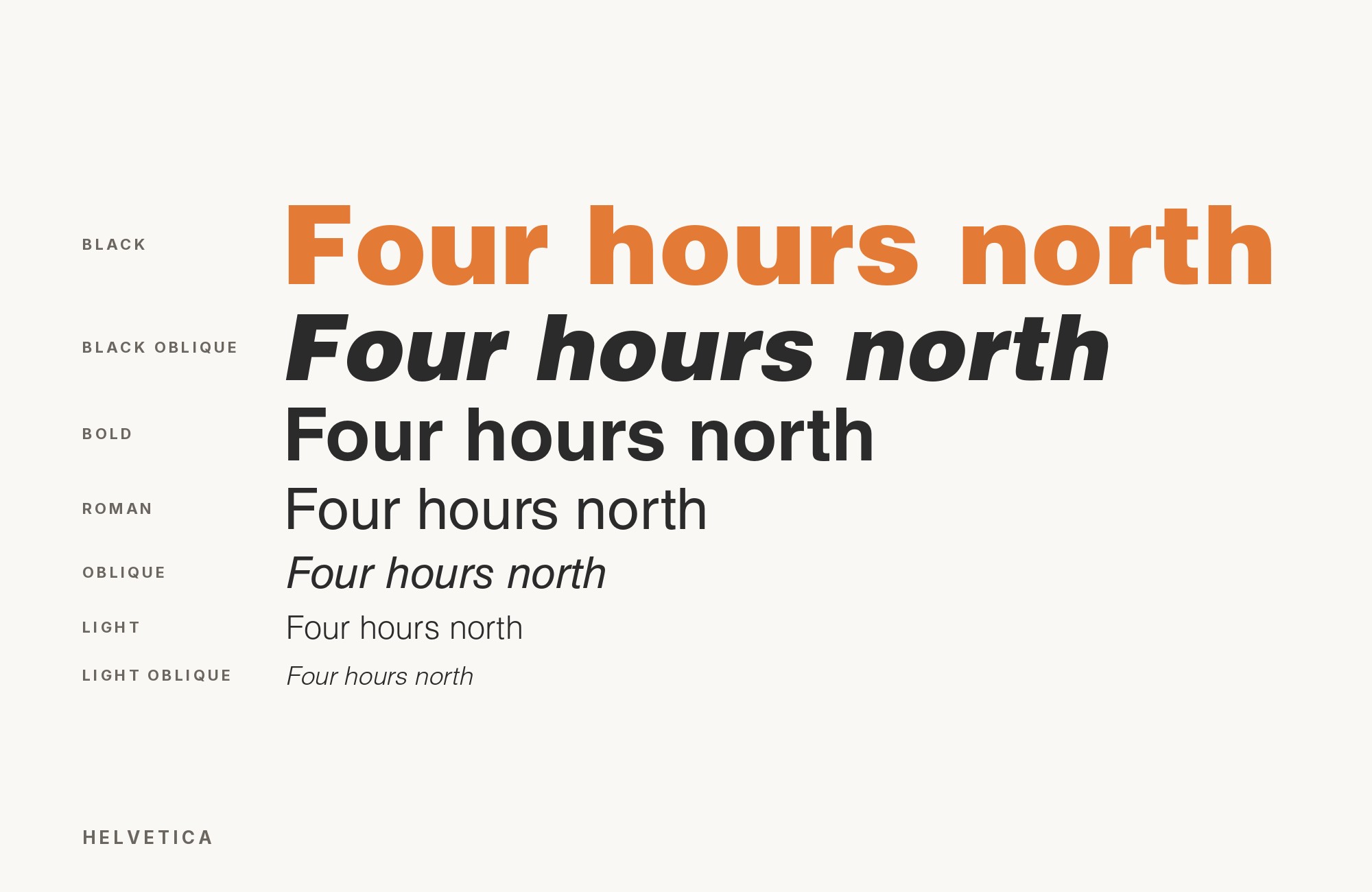
Max Miedinger drew the original at the Haas Type Foundry in Switzerland in 1957, under the direction of Eduard Hoffmann, the head of the foundry; it was renamed Helvetica, Latin for “Swiss”, when Stempel adapted it for Linotype machines in 1959, and the first Linotype matrices were issued in 1960. As a neo-grotesque, it strips the eccentricities out of 1890s grotesques like Akzidenz Grotesk: even stroke weight, closed apertures, a squared-off structure with almost no personality of its own by design. That neutrality is the whole achievement and the whole difficulty — Helvetica does not tell a partner what to do.
The research on this turns up a genuine split. Foundries recommend loading Helvetica with high-contrast serif drama, such as Didot and Migra, treating the sans as a plain stage for an ornate partner. Working designers argue the opposite: Helvetica is the neutral you add to a serif that already has character, not the face you decorate. Both camps are right about different jobs. Here are 15 fonts that pair well with Helvetica, ordered from the most easily obtained to the most specialized, spanning both arguments.
1. Garamond

Claude Garamond’s 16th-century French romans gave the type world its template for old-style serifs — calligraphic stroke variation, angled stress, small humanist proportions — and none of that vocabulary exists anywhere in Helvetica’s engineered grid. That total mismatch is why the pairing works: Garamond supplies the historical warmth and readability Helvetica’s neutrality deliberately withholds, while Helvetica handles headings, navigation and anything structural. It is the single most cross-confirmed pairing in this research, recommended independently by multiple sources rather than just one. Google Fonts carries free Garamond-derived cuts such as EB Garamond and Cormorant Garamond, so licensing is not a barrier. Set Garamond for paragraphs, Helvetica for everything around them.

Don't start with a blank page. Shutterstock Unlimited: endless downloads of premium human-made assets plus powerful AI tools.
Sign Up2. Georgia

Matthew Carter designed Georgia in 1993 for screens that rendered type badly, and the choices still hold up: sturdy serifs that survive rasterisation, a large x-height, and open counters that resist blurring at small sizes. Against Helvetica it produces an unglamorous, dependable division of labour — Helvetica for interface chrome and headings, Georgia for the paragraphs readers actually settle into. Georgia ships on both major operating systems, so the pairing is available everywhere with no webfont to load. It is a workhorse combination rather than a striking one, well suited to documentation, blogs and long-form content sites where legibility matters more than drama.

3. Baskerville

Baskerville’s transitional structure — sharper terminals, higher contrast, more rational proportions than an old-style face — reads as refined and historically rooted next to Helvetica’s modernist neutrality. Kittl and Monotype pair the two directly under Helvetica’s original name, Neue Haas Grotesk, recommending Grotesk for a steady body-text grid while Baskerville’s sharp, unbracketed serifs carry the headings with typographic authority. The two occupy different centuries and different logics entirely, which is exactly what keeps long text comfortable underneath a Helvetica heading: nothing about Baskerville competes with the sans for the same visual job. A version ships with some Microsoft software, so it is easy to test before licensing a fuller cut. Suited to editorial layouts, reports and any document where a reader needs to spend real time in the body copy while Helvetica handles wayfinding above it.

4. Times New Roman

The Times of London commissioned Times New Roman in 1931; Stanley Morison conceived it and Victor Lardent drew it for maximum legibility in cramped newspaper columns at small sizes — and that newsprint pedigree still shows in its sturdy, ink-trap-friendly forms. Set beneath Helvetica, it carries dense body text with real authority while Helvetica takes subheads, captions and side notes. The combination is about as available as a font pairing can be: both faces ship on essentially every operating system, with nothing to install and nothing to license. Ordinary, dependable, and for that reason still one of the most-used pairings in everyday documents.

Taking it to the next level means cinematic visuals, faster turnarounds, and work that wins clients. Create with unlimited downloads of creative stock assets, and access to powerful AI tools to fast-track your workflow!
Subscribe5. Century Schoolbook

Morris Fuller Benton drew Century Schoolbook for American textbooks in 1919, engineering it specifically for readers who could not afford ambiguity: heavy strokes, wide open counters, generous spacing. Set beneath Helvetica’s light or regular headlines, it carries long paragraphs without the weight mismatch thinner serifs suffer next to a neo-grotesque sans. The pairing has an academic, institutional steadiness — reports, educational material, anything that needs to read as considered rather than fashionable. It is bundled with common office software and available through several digital libraries, so it is easy to reach for without a special licensing conversation.

6. Rockwell

Rockwell is a geometric slab from 1934, built on the same rounded, near-circular bowls that show up across many mid-century sans faces, with heavy rectangular serifs bolted on for weight. Fonts In Use records the pair on the posters and promotional material for the 2024 film Challengers, where Rockwell carries the display type and Helvetica sits in the same documented typeface set. That shared geometric logic means it moves in step with Helvetica’s own even, disciplined structure, so a headline can shift from sans to slab without the layout feeling like it changed its mind. The slab adds blunt authority Helvetica cannot supply on its own. Strong for editorial headers, outdoor and sports branding, and any print work that needs impact at large sizes without reaching for a full display face.

7. Source Serif

Frank Grießhammer designed Source Serif at Adobe as a text companion to Paul Hunt’s Source Sans, and it carries real calligraphic character — moderate contrast, warm curves, a personality Helvetica does not have and was never meant to have. This is the pairing that captures the working-designer’s argument directly: choose a serif with genuine character first, then let Helvetica sit underneath it doing the quiet, structural work rather than trying to add drama of its own. Open source and free through Adobe and Google Fonts alike, so there is no cost barrier to testing it. Good for editorial sites, essays and any project where the serif is meant to be the voice.

8. Fraunces

Fraunces is a variable serif built around warm, slightly wonky old-style curves — springy terminals and a deliberately imperfect rhythm that reads as handmade rather than engineered. Set against Helvetica’s rigid neutrality, the split is total: character on one side, restraint on the other, with nothing in between to muddy the contrast. That cleanliness is the appeal for brand systems that want an expressive display voice without abandoning a neutral, legible workhorse for body copy and interface text. Fraunces is free on Google Fonts and ships as a variable font, so a single file covers a wide range of optical sizes and weights.

9. Newsreader

Newsreader is a serif built specifically for on-screen article reading — moderate contrast, a generous x-height, and proportions tuned to hold up at the sizes people actually read on a phone or laptop rather than in a print specimen. Under a Helvetica interface, it functions as the reading layer: Helvetica for navigation, bylines and metadata, Newsreader for the article body itself. The pairing suits news sites, essay platforms and any product where long-form text needs to feel considered rather than default. It is free on Google Fonts and was designed for continuous on-screen reading in content-rich environments.

10. Bodoni Moda

Bodoni Moda is a variable digitization of the classic Didone, carrying the same razor-thin hairlines and extreme thick-thin swing in a free, web-ready package. Set large against Helvetica’s even strokes, the contrast is immediate: display type turns loud and editorial while Helvetica keeps body copy and interface elements calm and legible. This is the foundry argument in its purest form — Helvetica as the plain stage a dramatic serif performs on. Keep Bodoni Moda strictly to headlines and short pull quotes; its hairlines are illegible at paragraph size, and Helvetica should carry everything below the display line.

11. Futura

Futura and Helvetica are both sans-serifs, but Paul Renner’s 1927 geometric construction — circles, triangles, straight lines with contrast sanded flat — has almost nothing in common with Helvetica’s 1957 neo-grotesque forms. Fonts In Use documents the two together on Tatsuro Yamashita’s 1982 album For You: the catalog number runs in Futura while the back cover’s body text is set in demi-bold and bold Helvetica. Set together, they separate cleanly rather than blurring into one generic sans, which makes the pairing useful specifically when a brand needs two distinct sans voices without introducing a serif at all. Reserve Futura for headlines and short display settings where its geometry reads clearly, and let Helvetica handle body copy and interface chrome where its narrower apertures behave better at small sizes. Available through Adobe Fonts and comparable professional libraries.

12. Didot

Firmin Didot’s late-18th-century hairlines and extreme contrast are inseparable from fashion editorial — the register of glossy mastheads and perfume advertising — and pairing that drama with Helvetica’s neutrality is one of the longest-established combinations in this list, which Monotype calls another classic Helvetica pairing. Set Didot large for headlines and let Helvetica carry captions and body copy where Didot’s thin strokes would otherwise disappear. The contrast in stroke modulation is the entire argument, and it collapses below display size. Display only, and budget for a professional license for Frutiger’s Linotype cut; free revivals such as Theano Didot exist but are less refined.

13. Bodoni

Giambattista Bodoni’s late-eighteenth-century Didone carries the same extreme thick-thin contrast as Didot, though slightly heavier and more architectural in its proportions, with flat, unbracketed serifs and a strict vertical stress. Against Helvetica’s uniform strokes, headlines carry all the drama while body copy stays completely calm — a clean division that does not require any negotiation between the two faces. Massimo Vignelli built decades of work on a few typefaces that included both Bodoni and Helvetica, which suggests the combination has staying power rather than being a passing trend. Display and short-setting use only; Bodoni’s hairlines break apart in dense paragraph text.

14. DIN

DIN traces back to the German industrial standard for road signs and technical drawings, later refined into digital families with the same engineered, narrower grotesque shapes and mono-linear strokes. Against Helvetica it reads as a sibling rather than a contrast — related enough in construction that the two can share a system, distinct enough in width and detail that labels and technical callouts stay visually separate from headlines and body copy. It is a useful third voice in interfaces that need Helvetica for general text but something tighter for data tables, specification sheets or wayfinding. DIN is a retail release in most of its digital forms, so check licensing before committing to it.

15. Walbaum

Justus Erich Walbaum cut this Didone in the early nineteenth century, a generation after Bodoni and Didot, and it shares their vertical stress and stroke drama while trading some of the severity for slightly softer curves. That shared skeleton means it aligns structurally with Helvetica’s own even proportions in a way the sharper Didones do not, so the pairing feels coordinated rather than merely contrasted. Use Walbaum for display headlines where its stroke contrast can register, and let Helvetica carry the interface and body text beneath it. It is a specialist retail face without a well-known free equivalent, best treated as the final option on this list rather than a first reach.

Conclusion
There is no single correct answer to what pairs with Helvetica, because the disagreement in the research is real: add drama with a high-contrast serif, or add a serif that already has its own character and let Helvetica recede. Both produce good work. The wrong move is picking a partner for its reputation rather than for the specific job — a masthead needs different drama than a documentation site.
Test at the sizes you will actually publish. Didot and Bodoni are unusable below display size, DIN and Walbaum need licensing budgets that Garamond and Georgia do not, and a pairing that looks decisive in a specimen can go flat the moment it meets real paragraphs. Set the actual copy, at the actual sizes, before deciding.
Sources
- Monotype Fonts
- Typ.io
- Pangram Pangram (2 posts)
- Kittl × Monotype
- Insanity Works
- Typewolf
- ManyPixels
- Fonts In Use, Fraunces (17 uses; direct site blocked here, read via search)
- Fonts In Use, Bodoni* / Bodoni Moda (1 use)
- Typewolf, Fraunces
- Typewolf, Bodoni Moda
- Typ.io search for Fraunces
- Pimp my Type, Fraunces
- SlidesCarnival, Fraunces
- Wayback CDX, Fraunces on Fonts In Use
