DM Sans pairs great with DM Mono, Adobe Garamond and DM Serif Text. All 15 pairings are shown below in real rendered specimens, with the reason each one works.
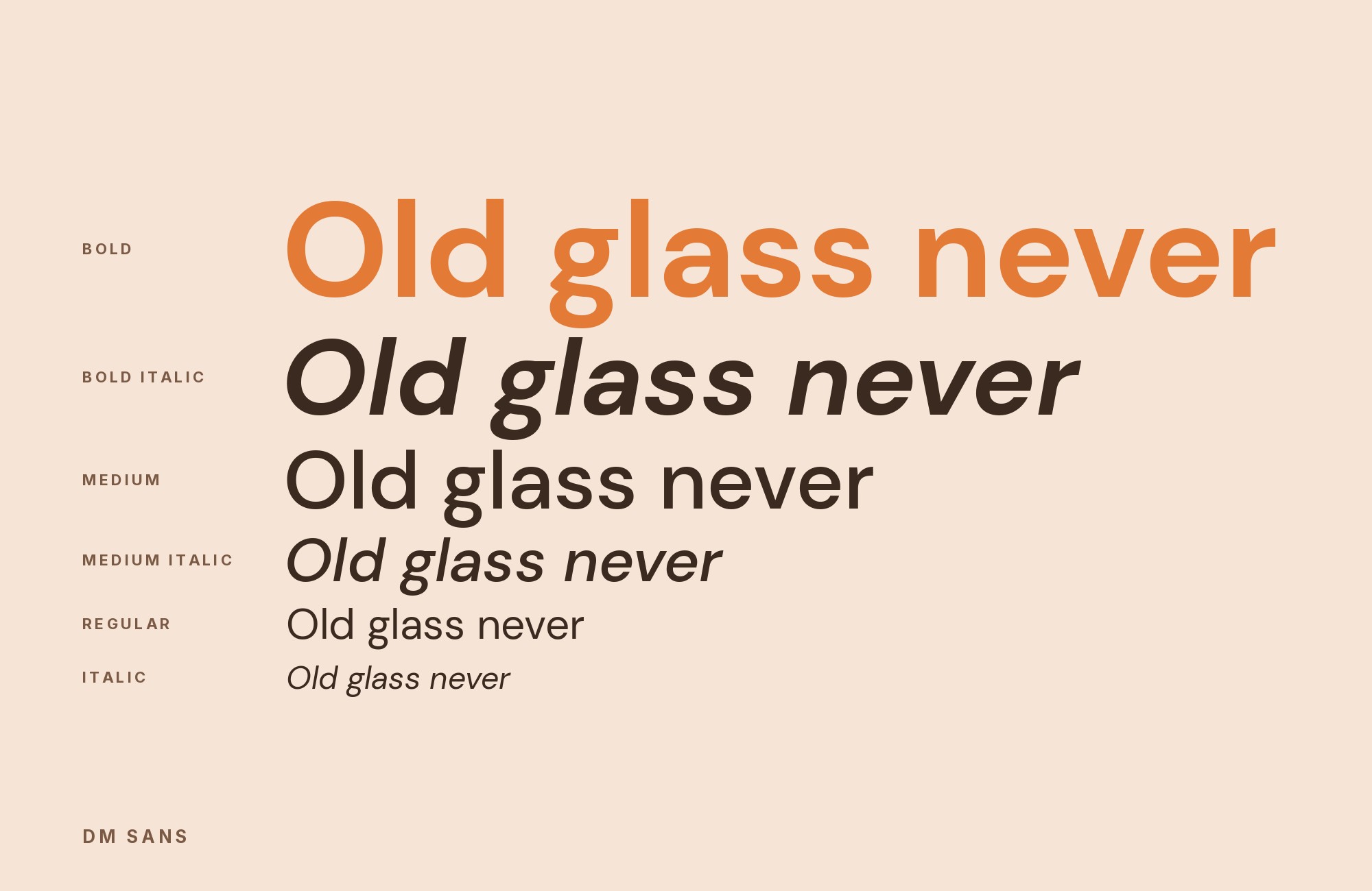
What fonts go with DM Sans? Treat it as a small-size geometric sans first. Colophon drew it for text, not for a poster, so the partner usually supplies either a serif reading texture or a more emphatic display line while DM Sans holds the interface, the caption, and the paragraph that has to stay even on a phone.
Colophon Foundry designed DM Sans from the Latin portion of Indian Type Foundry’s Poppins. Google Fonts commissioned the family; it arrived in 2019 as three weights with italics, and a May 2023 update opened the weight axis from Thin to ExtraBlack (100–1000) and added an optical-size axis. The construction is low-contrast and geometric, meant for smaller sizes, with Latin Extended coverage. GitHub’s dm-fonts notes credit MultiAdaptor and DeepMind for creative direction. A related mono and two serif optical sizes exist as separate families; they are not automatic stand-ins for this one.
Because the sans is quiet, role split matters more than a clash of categories. A text serif (Adobe Garamond, Spectral, Gelasio, DM Serif Text) takes continuous reading. A louder grotesque or slab (Darker Grotesque, Archivo, Aleo) takes the title. A mono (DM Mono, Space Mono, Nova Mono) marks data. Two geometric sans faces in neighboring weights will look like a mistake unless size and function stay stubbornly different. Published co-usage shows these families in the same projects; it does not guarantee every stack. Here are 15 fonts that pair with DM Sans.
1. DM Mono

Colophon designed DM Mono for DeepMind as a three-weight, three-style fixed-width family, loosely based on DM Sans with less contrast and less geometry. That reduction is the pairing: the proportional sans stays friendly at text size, while the mono announces a different kind of information. Typewolf records both on Zenchef, with Tiempos Headline; Fonts In Use also lists them on Third Ear Studio. Keep DM Sans on sentences and DM Mono on prices, SKUs, or a short code sample. Because the mono looks large at a shared pixel size, start it a step smaller, and do not run a whole paragraph in it under a sans heading — the grid becomes the design. Zenchef also uses Tiempos Headline; if you do not have Tiempos, do not invent a substitute serif just to copy the screenshot. Two families with a hard job each will hold a menu or a dashboard.

2. Adobe Garamond

Robert Slimbach designed Adobe Garamond in 1989 as Adobe’s first historical revival, interpreting Claude Garamond’s romans and Robert Granjon’s italics. Those modulated old-style strokes are everything DM Sans’s nearly even geometric lines are not. Typ.io records the pair on darleyanderson.com, a publisher’s site, which is the right kind of job: Garamond for the book description, DM Sans for the shop chrome. Size the serif for the reading measure; its smaller apparent x-height will look timid next to DM Sans at the same point size. Use the Granjon italic inside the serif text rather than italicizing the sans to fake emphasis. Slimbach’s revival is darker in the capitals than DM Sans is in a medium weight, so a title in Garamond Bold over a sans paragraph can work if you keep the serif large enough for the hairlines. On a product page, that usually means the book title in Garamond and the cart UI in DM Sans.

3. DM Serif Text

DM Serif Text is Colophon’s lower-contrast serif counterpart to high-contrast DM Serif Display, intended for subheads and smaller text, Regular and Italic only. It is not a cut of DM Sans. Fonts In Use lists both on the Jarrolds identity, and again on a 2024 infographic, which is enough to treat them as documented co-usage rather than as a guessed family bundle. Let the serif take editorial headings or a short introduction and DM Sans take navigation and body UI. The serif’s delicate terminals need more size than the sans at the same weight; if you match them in a table, the serif will look thin. Do not swap in DM Serif Display for this pairing — that is a different optical size with higher contrast. Colophon built the serif from Source Serif Pro, not from DM Sans, so the shared “DM” prefix is a suite name rather than a promise that the letters were drawn as one system.

4. Spectral

Production Type designed Spectral as a seven-weight roman and italic serif with small caps, aimed at long, screen-first reading. That is the paragraph job DM Sans can do but does not specialize in. Fonts In Use lists Spectral with DM Sans in White Fungus issue 17, a magazine that also uses other display faces in the same issue. Assign Spectral the articles and DM Sans the department labels, folios, and site UI. Spectral’s text color is darker than DM Sans at a given weight; start the sans a step lighter in the chrome so the serif still looks like the reading face. Collection-level co-usage means you should still test a real article opener, not a single word from the type list. Issue 17 also uses other display faces, so treat Spectral as the text partner that actually resolves locally rather than as a license to dump the whole magazine palette into a website.

Don't start with a blank page. Shutterstock Unlimited: endless downloads of premium human-made assets plus powerful AI tools.
Sign Up5. Darker Grotesque

Gabriel Lam designed Darker Grotesque as a contemporary grotesque with post-modern and brutalist leanings, with Vietnamese contributions from ViệtAnh Nguyễn, in weights from 300 to 900. It has more display posture than DM Sans’s even geometric text. Typ.io records the two on limlondon.com, a music-and-courses site, which fits a loud title over a quiet explanation. Set Darker Grotesque large and a weight or two heavier than the DM Sans paragraph. If both sit in medium weights at nearby sizes, they collapse into one anonymous sans. Check the densest Darker Grotesque letters in the actual headline; brutalist grotesques change color fast as weight increases. A 2023 update to Darker Grotesque fixed some issues and made the font variable. Keep DM Sans on the course description at a steady text size so the title’s extra weight has something even to sit on.

6. Aleo

Alessio Laiso designed Aleo as a slab-serif companion to Lato, with semi-rounded details and a structure meant to stay readable. The slab’s horizontal terminals are a clear change from DM Sans’s geometric sans, so the pairing can put Aleo on the name and DM Sans on everything that has to work at UI size. Fonts In Use lists the two on Reality House, a relatively clean two-family record. Keep the slab out of long paragraphs unless you size it generously; its serifs darken a column faster than DM Sans. A June 2023 expansion added weights, which helps you leave Regular for text-adjacent lines and a heavier cut for the title without reaching for a third family. Reality House is a two-family record, which is rarer than the crowded FIU pages elsewhere on this list: you can copy the split without also importing a script or a second mono.

7. Space Mono

Colophon designed Space Mono for Google Design as a fixed-width family for editorial headlines and display, mixing grotesque and geometric cues. Next to DM Sans it is a technical accent rather than a second text face. Fonts In Use lists both on the Modena FC 1912 identity, alongside a custom Modena Sans. Use Space Mono for squad numbers, a fixture code, or a single credit; keep DM Sans on the sentences. The custom sans in that project is a reminder not to treat every co-listed face as interchangeable. If you only have these two, the mono should occupy a small, repeating role so the geometric sans can still feel like the club’s reading voice. Space Mono was drawn for editorial display as much as for code, so a single all-caps mono line can work as a fixture label; a paragraph of it will look like a terminal.

Unlimited fonts from $16.50/mo.
29 million fonts, templates and stock assets. One subscription, unlimited downloads.
See the plan8. Archivo

Omnibus-Type designed Archivo as a grotesque for highlights and headlines, with a late-nineteenth-century American flavor and axes for weight and width. That display bite is useful over DM Sans’s calmer geometric text. Fonts In Use lists Archivo with DM Sans and DM Mono on the Ginger Rudolph identity. Give Archivo the name or a short statement and DM Sans the bio and contact block. Condensed Archivo will look nervous next to DM Sans’s wider geometric proportions if you use it for body copy; keep the width axis closer to normal unless the lockup is a poster. This is not Archivo Narrow: the evidence names Archivo. Ginger Rudolph also uses DM Mono, so a larger stack is documented, but start with Archivo plus DM Sans and add the mono only for a datum. Headline grotesques from the American nineteenth century read darker than Colophon’s geometric text; leave air under the title.

9. Gelasio

Eben Sorkin designed Gelasio as a serif that is metrics-compatible with Georgia in Regular, Bold, and the italics, inspired by a French Transitional sample in the Romain du Roi line. Under DM Sans it behaves like a familiar screen serif that still has more contrast than the geometric sans. Fonts In Use lists Gelasio with DM Sans, DM Mono, and Futura Black on the Copi fish rebrand. Let Gelasio take packaging copy or a short story; keep DM Sans on the brand’s UI and Gelasio off the buttons. Because it shares Georgia’s metrics, it will look larger in the lowercase than Adobe Garamond at the same size — useful on screens, crowded if you also keep a high-contrast display serif in the same stack. Copi also lists Futura Black, which does not resolve here; do not treat that extra display line as part of this pairing. Gelasio’s vertical stress is still stronger than DM Sans, so a short pack story in the serif under a sans brand line is the cleanest test.

10. Nova Mono

Wojciech Kalinowski’s Nova Mono began as a stone-inscription alphabet of capitals and digits and gained lowercase when he digitized it around 2010. It is a single style with a carved, irregular mono rhythm, not a programming face in the DM Mono sense. Typ.io records it with DM Sans on justsimply.dev. Use Nova Mono for a wordmark fragment or a single decorative data line; keep DM Sans on the reading. The inscription texture will fight a long string of code. If you need a workhorse mono for a product, DM Mono is the closer cousin; Nova Mono is the accent that should stay rare. Justsimply.dev is a writing site in Typ.io’s sample, which is a hint: a carved mono word as a kicker, then DM Sans for the essay, will read more clearly than a whole mono article. There is only one style, so emphasis has to come from size and spacing rather than from a bold cut.

11. DM Serif Display

Toulouse School of Law’s official identity guide uses DM Serif Display as its secondary face for headings, hooks, and short text, while DM Sans handles headings, introductions, body copy, and the wider communications system. The serif brings sharp thick-thin contrast and dramatic display proportions; DM Sans supplies the even, low-contrast texture needed below it. Use DM Serif Display only where its fine details have room to survive: a hero, article title, or short quotation. Keep DM Sans on paragraphs, navigation, captions, and controls. The related names give the system continuity, while the official role split shows how to create a practical hierarchy rather than relying on the family connection alone.

12. Marcellus

Hearten Made presents Marcellus with DM Sans as a worked modern pairing. Marcellus draws attention through broad Roman inscription proportions and flared serif details, while DM Sans settles into a smaller geometric rhythm beneath it. Let Marcellus take short titles, chapter openers, or a refined wordmark; its capital-driven voice becomes tiring across long text. DM Sans should carry the sentences and UI at regular or medium weight. Match apparent size rather than point size, because Marcellus’s capitals command more space than the sans lowercase. The combination suits architecture, hospitality, galleries, and premium service brands where the heading should feel established but the supporting experience must remain clean and current.

13. Noto Serif

The Manus brand system uses DM Sans alongside Noto Serif for serif applications in Asian scripts. That makes this a practical multilingual system as well as a visual one. Noto Serif introduces modulated strokes and a firmer reading texture, while DM Sans keeps Latin interface text and utility labels compact and neutral. Assign roles consistently across languages: the serif for editorial passages or formal headings, the sans for navigation, metadata, and controls. Avoid setting both at the same size and weight, where their large text color can compete. The pair is strongest for research, technology, and global organizations that need script coverage without letting fallback fonts dismantle the intended hierarchy.

14. Bricolage Grotesque

iceConnect’s guidelines assign Bricolage Grotesque to titles and DM Sans to paragraphs, labels, captions, UI text, and buttons. The display face contributes irregular shapes and a more assertive silhouette; DM Sans stays even and legible through repeated functional roles. Use Bricolage Grotesque boldly and briefly, then create a clear size drop into the sans. Since both are sans serifs, the contrast depends on personality, width, and scale rather than on serifs. A medium DM Sans body usually recedes better than a heavy one. This system fits technology, creative services, and product marketing where the hero needs a distinct voice but every interaction below it must remain orderly.

15. Cambria

Dukal’s brand guide names DM Sans as its core typeface and permits Cambria as the only serif, used sparingly in headlines. Cambria’s transitional structure and visible stroke modulation create a formal register above DM Sans’s rounded, geometric body. Keep the serif large and limited to a title or short callout, then let the sans handle all repeated communication. Because Cambria was built for screen and document use, it holds up well in presentations and office files where a webfont workflow is awkward. The pairing suits healthcare, professional services, and reports that need a restrained note of authority without turning the entire page into a traditional serif document.

Conclusion
DM Sans is the low-contrast geometric layer in most of the systems documented here, not the loudest voice. Adobe Garamond, Spectral, Gelasio, and DM Serif Text add a reading serif; Darker Grotesque, Archivo, and Aleo take the title; DM Mono, Space Mono, and Nova Mono mark a change of information.
Build a heading, a paragraph, and one data line before adding another family. Check the 2023 optical-size axis at the actual UI size, and keep sibling DM families in the roles their names describe rather than mixing Display, Text, and Sans as if they were weights of one file. A geometric sans this even will disappear if you give every line the same size; the partner has to occupy a job the sans is not already doing. For more practice balancing quiet geometric sans faces against serifs and monos, see The Big Book of Font Combinations. The test is whether DM Sans still recedes into the text once the partner is on the page.
Sources
- Typewolf (typeface page)
- Typewolf Site of the Day
- Typ.io (typeface page)
- Typ.io with pages
- Typ.io with pages
- Fonts In Use (typeface page)
- Fonts In Use search
- Google Fonts about / DESCRIPTION
- Google Fonts metadata
- GitHub dm-fonts README
- Figma font library
- FontsArena (27 June 2019)
- Fontpair pairing URLs
- Jukebox Print
