
Red Hat Display pairs great with Red Hat Text, Inter and Avenir. All 15 pairings are shown below in real rendered specimens, with the reason each one works.
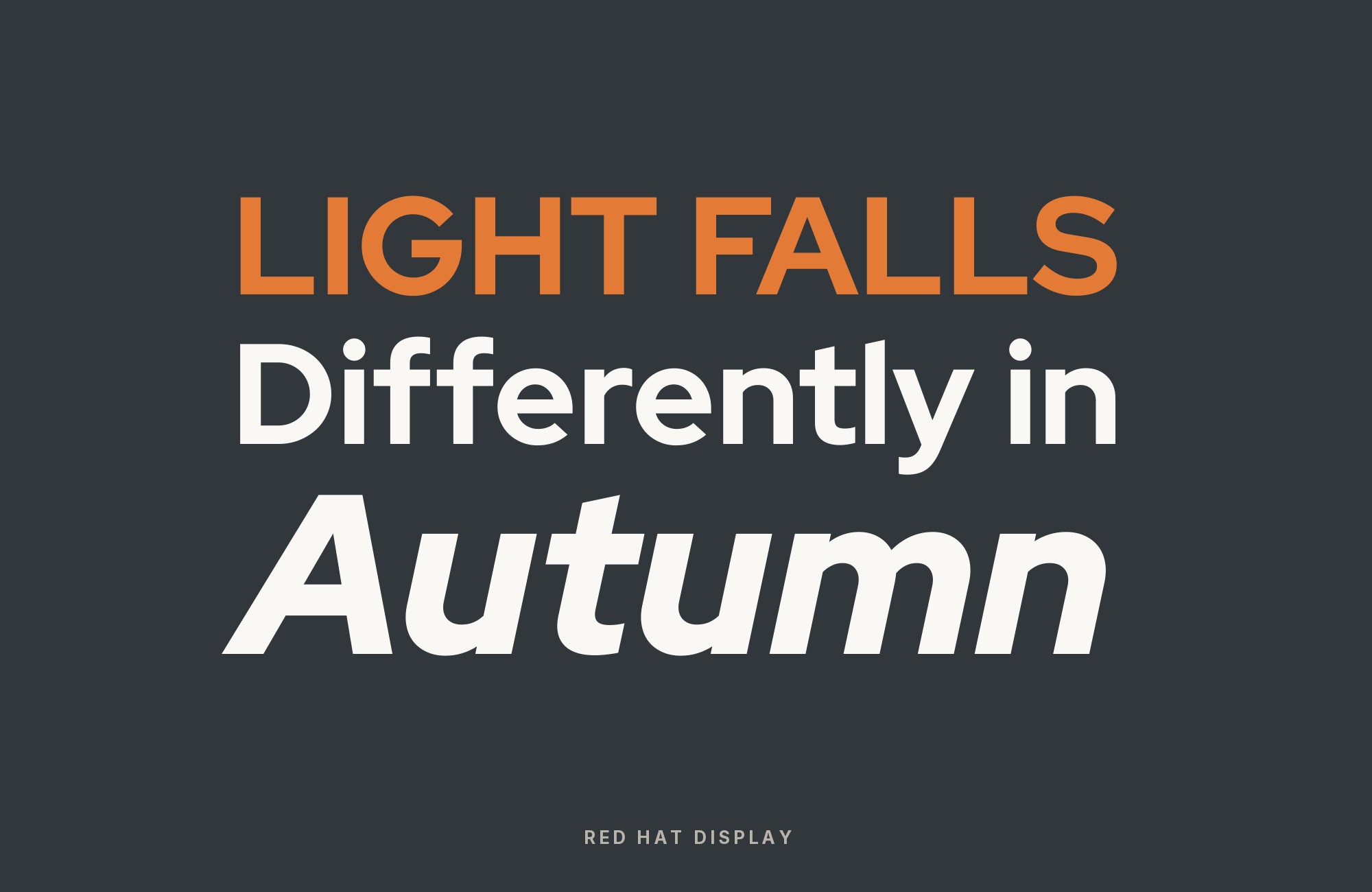
What fonts go with Red Hat Display? The honest first answer is that it already came with one, which makes this a different pairing problem from most: the face was drawn as half of a matched pair, and every choice below is either the other half or a deliberate decision to leave the system.
Paula Scher of Pentagram commissioned the Red Hat typeface and Jeremy Mickel of MCKL drew it, releasing it in March 2019 as part of Red Hat’s Open Brand Project. It is a fresh reading of the American geometric sans, taking cues from Tempo and Highway Gothic, and it is the face in the Red Hat logo itself. The Display styles are tuned for headlines and big statements: low contrast, tight spacing, a large x-height and open counters. Red Hat Text, the second optical size, drops the x-height slightly, narrows the width, spaces more generously and thins the joins so the same design survives at paragraph sizes. Red Hat released the whole superfamily — Display, Text and, from 2021, Mono — under the SIL Open Font License.
That built-in solution shapes everything else. Because Display is engineered for size and Text is engineered for reading, the optical size split is the default answer and a very good one, and brand systems from Red Hat’s own standards to UW–Madison to Louisiana’s Office of Technology Services all specify it. But documented productions show independent designers doing something else entirely: pairing Red Hat Display against warm, irregular or historical faces to stop a brand reading as pure software. Those two patterns are the structural fork in this list. Here are 15 fonts that pair well with Red Hat Display, covering both routes.
1. Red Hat Text

Jeremy Mickel drew Red Hat Text in the same 2019 commission as its display sibling, as the second optical size in one superfamily rather than as a separate typeface. The two share a skeleton, so nothing clashes; what differs is everything that governs small-size performance. Text carries a slightly smaller x-height, a narrower width, more generous sidebearings and thinner joins where strokes meet, which keeps counters from filling in and letters from touching at 14 or 16 pixels. Red Hat’s own brand standards, the PatternFly design system, UW–Madison’s brand guide and Louisiana’s OTS brand guide all assign Display to headings and Text to body copy. Louisiana is the guide that draws the size line at roughly 18 pixels or 10 points: Display above that, Text at or below. Brand systems cite this split more often than any other pairing here.

Webflow. Framer. Squarespace. Wix. Lovable. Not your future.
Your own AI CMS agent is.
Find Out More2. Inter

Rasmus Andersson released Inter in 2017 with a single objective: disappear cleanly on a screen at small sizes. Its tall x-height, open apertures and deliberately unexpressive forms make it a near-perfect load-bearing neutral, which is exactly the counterweight Red Hat Display’s tightly spaced, logo-derived headline forms need. The pairing is not a style-guide guess — the agency Digital Silk documents selecting Red Hat Display as the primary headline face and Inter as the secondary body face for the Best Wire and Cable identity, choosing it for the fit against the logotype and the approachable, readable result. Reach for this when Red Hat Text is not available in the stack, or when a product already standardises on Inter for its interface and only needs a distinct brand voice above it. Keep Inter at body, label and data sizes and never let it take a headline.

3. Avenir

Adrian Frutiger drew Avenir from circle-and-stroke geometric construction in 1987 and Linotype released it in 1988, decades before the term “geometric sans revival” existed. Avenir and Red Hat Display share that construction logic but separate on spacing and temperature: Avenir sits looser, with gentler curve transitions and a more humanist feel, while Red Hat Display runs tighter and reads engineered. Digital Silk records the combination in production for Raw Cereal, arguing that Avenir’s even proportions and crisp corners reinforce the forward-looking tone Red Hat Display already sets. The practical value is that this keeps a whole identity inside one typographic philosophy while still producing a clear hierarchy. Set Red Hat Display for headlines and any line that needs to echo a logotype, and let Avenir carry subheads and body copy where its looser fit helps reading.

4. Crimson Pro

Sebastian Kosch initiated Crimson in 2009 as a Garamond-inspired old-style serif; Google later commissioned Jacques Le Bailly to synthesise it with Crimson Prime into the variable Crimson Pro, first released in January 2019. It matters here because it is the only serif any brand system in this research formally authorised beside Red Hat Display: UW–Madison names Red Hat Display and Red Hat Text as its two primary faces and Crimson Pro as the single supplemental typeface, recommended for long body copy, publications and small print sizes — and explicitly not for websites. The structural argument is straightforward. Old-style proportions, bracketed serifs and moderate stroke contrast produce a reading texture that no monoline geometric sans can generate, so the serif handles sustained prose while the sans keeps every heading crisp. Use it in print, where UW–Madison actually authorises it.

Try Semrush free. No credit card.
Start on the $0 plan. Paid plans from $117/mo billed annually.
Try for free5. Overpass

Delve Fonts — Delve Withrington, Dave Bailey and Thomas Jockin — designed Overpass as an interpretation of the Highway Gothic letterforms from the U.S. Federal Highway Administration’s Standard Alphabets for Traffic Control Devices, and released it open source. The project is hosted under Red Hat Official. The relationship with Red Hat Display is documented succession rather than co-usage: PatternFly, Red Hat’s own design system, introduced Red Hat Display and Red Hat Text specifically to replace Overpass, and shipped both families in parallel so teams could migrate gradually. Two faces engineered to occupy the same slots in one system pair by construction. The difference is interpretation — Overpass is the wider, flatter, more literal Highway Gothic reading, with squarer bowls and a plainer voice, while Red Hat Display compresses the same source into something tighter and more branded. Use Overpass for dense interface text, legacy documentation and tables under Red Hat Display headings.

6. Urbanist

Corey Hu launched Urbanist in 2020 as a low-contrast geometric sans-serif conceived from elementary shapes, now available as a variable font with a weight axis. Google Fonts added it in 2021. It earns a place here because of a documented inversion: the Golden Software brand and style guide sets H1 through H5 in Urbanist and assigns Red Hat Display the H6 line and all body copy between 13 and 17 points. That is worth knowing because it proves Red Hat Display can take the text role when something else owns the display line — its large x-height and open counters hold up well below the sizes it was drawn for. The two sit close enough in construction that the system reads as one temperature throughout, with weight and size rather than style doing the hierarchy work. Choose this arrangement when Urbanist’s rounder geometry better fits the brand’s tone at large sizes.

7. Cooper Black

Oswald Cooper designed Cooper Black for Barnhart Brothers & Spindler in 1922 as an ultrabold display serif that quickly became a standard advertising face. Fonts In Use documents the Razorfish identity and website running Red Hat Display together with Bitstream’s cut of the same design, and the reason the combination works is total opposition. Cooper Black is all softness and no structure; Red Hat Display is even strokes, ruled curves and a flat industrial calm. Put them in one system and the roles are unmistakable — Cooper Black is the warm, loud voice that grabs the page, Red Hat Display the cool, engineered one that carries every supporting line. Keep Cooper Black at display sizes only, where its closed counters stay legible, and never let it near running text.

8. ITC Souvenir

Morris Fuller Benton drew the original Souvenir at American Type Founders in 1914. Ed Benguiat redrew it for Photo-Lettering in 1967, and when ITC formed in 1971 it issued the design as ITC Souvenir with additional weights by Benguiat — the version most designers recognise. ITC Souvenir has soft, rounded serifs and very little stroke contrast, which give it warmth without the formality of a book face. Cobra Studio’s identity for Museo Civico San Rocco, documented on Fonts In Use, pairs it with Red Hat Display, and the pairing gives the museum identity a historical, hand-warmed voice beside a clean contemporary one. The two agree on low contrast, which stops the pair from looking accidental, and disagree completely on terminal treatment. Use Souvenir for titles, pull quotes and exhibition text, and Red Hat Display for wayfinding, labels and interface.

Paid prompt-to-site tools are going to lock you in.
How can your studio escape this?
Find Out How9. Kanit

Cadson Demak designed Kanit as a formal loopless Thai and sans Latin family, published on Google Fonts. Its Latin is noticeably squarer and more compressed than Red Hat Display’s, with flatter curve segments and narrower bowls, and that width difference is what makes the pair legible as a pair. Fonts In Use records the two together on Palme Design Co.’s site for Julie Ciatti Photography. Because the separation comes from proportion rather than from weight or style, the two can share a page at similar sizes without the headline and the supporting text blurring into each other. This is the pairing to reach for on a multilingual product that needs Thai coverage, or on any layout where a condensed supporting voice saves horizontal space.

10. Averia Serif Libre

Dan Sayers built Averia Serif Libre by averaging the 725 Google Web Fonts available under the SIL Open Font License as of 9 November 2011, which is why it has slightly unsteady stems, irregular serifs and a texture that reads as drawn rather than constructed. That irregularity is the entire argument for pairing it with Red Hat Display, whose ruled geometry withholds any trace of the hand. Cobra Studio used the combination for the Agricola Ridolfi identity, documented on Fonts In Use, for a peach grower that wanted to convey quality, territory and summer. Handle it carefully: Averia’s wobble is charming at headline and short-caption sizes and tiring across long paragraphs. Set it for product names, labels and display lines, and keep Red Hat Display underneath for specifications, addresses and anything a customer has to read accurately.

11. Oxanium

Fantom Factory’s brand manual includes Oxanium for selected display headings alongside Red Hat Display as its title family. Both are sans serifs, so the useful contrast lies in their construction rather than in adding serifs: Oxanium’s angular, technological shapes can establish a more insistent display voice while Red Hat Display provides calmer supporting headings. Keep the Oxanium statement short and give the two families noticeably different sizes. Matching their weight and scale too closely makes the hierarchy harder to read. This is an option for a technical campaign or product announcement where a single expressive line needs a quieter frame.

12. Montserrat

Fantom Factory’s brand manual assigns Red Hat Display to titles and headlines, then Montserrat to editorial and body copy. That gives this combination a clear reading order even though both families use geometric forms. Let the heavier Red Hat Display title introduce the subject and use Montserrat for the explanation below it. Test their apparent lowercase sizes independently; a shared nominal point size does not guarantee equal texture. Keep the supporting text comfortably spaced, and avoid using equally prominent weights in both families. The result works through consistent roles and measured changes of scale, rather than a dramatic contrast between serif and sans.

13. Red Hat Mono

Red Hat’s own brand standards prescribe Red Hat Display for prominent text and Red Hat Mono for code snippets or technical headlines. This is a functional companion rather than a decorative contrast: fixed character widths identify machine-readable material inside a system whose surrounding headings remain proportional. Use Mono for a command, a short configuration example, or an actual code block, then return to Display for the section heading. Resist extending the mono treatment to every caption simply because the subject is technical. Its distinctive spacing is most helpful when it tells the reader that this passage has a different job.

14. Segoe UI

TCG Digital’s brand portal names Segoe UI as its corporate document face and Red Hat Display as a secondary font. That establishes a shared identity across media, rather than proving that the two belong together in every paragraph. Segoe UI can provide the practical document layer while Red Hat Display introduces a stronger display voice. Use clear changes in size and weight when the families do appear on one page: two similar sans-serif lines at equal scale can make the difference look accidental. This approach suits an identity that must feel related across office documents, presentations, and more expressive promotional work.

15. Poppins

California Regional MLS’s official 2025 brand standards list Red Hat Display Black and Poppins Regular within the same campaign system. The contrast is subtle: both are geometric sans serifs, but Poppins is rounder and more evenly constructed while Red Hat Display carries a firmer enterprise voice. Use Red Hat Display for the main statement and Poppins for lighter supporting lines, labels, or campaign details. Separate them with scale because similar weights can make the change look accidental. This pairing suits property, finance, and technology brands that want a friendly secondary voice without leaving the clean sans-serif register.

Conclusion
Red Hat Display is unusual among display sans faces because its designer already answered the pairing question. Red Hat Text exists, it is free, and it is drawn on the same skeleton. Red Hat, PatternFly, UW–Madison and Louisiana OTS all assign Display to headings and Text to body; Louisiana is the one that draws the line at roughly 18 pixels or 10 points. If a project has no reason to deviate, that is the answer, and Inter or Overpass covers the case where Red Hat Text is not in the stack.
Partners outside the Red Hat family offer a way to leave that closed system, and the documented productions show why designers do it. Red Hat Display carries a strong association with enterprise software, because it carries the Red Hat logo. A museum, a farm brand, a photography studio and an agency identity all paired it with a face from outside the family, a second voice with a history or a hand in it. Cooper Black, ITC Souvenir and Averia Serif Libre all work by supplying exactly the quality Red Hat Display was engineered to exclude.
Sources
- Red Hat brand standards — Fonts and typography
- RedHatOfficial/RedHatFont (GitHub)
- Fonts In Use — Red Hat Display typeface page
- Fonts In Use — Razorfish identity and website
- Fonts In Use — Museo Civico San Rocco
- Fonts In Use — Julie Ciatti Photography website
- Fonts In Use — Agricola Ridolfi
- Fonts In Use — L’Art du Quotidien branding
- Fonts In Use — Fichi Caramellati
- Fonts In Use — Red Hat Text typeface page
- Fonts In Use — quoted phrase search
- Typ.io — Red Hat Display
- PatternFly 4 — Red Hat font
- UW–Madison brand guide — Typography
- UW–Madison KB — A Guide for Fonts
- UW–Madison KB — Typography Guidelines (CUE)
- Golden Software brand and style guide
- Louisiana OTS brand guide — Typography
- Digital Silk — best font pairs
- TypePairs
- FontsArena
- RedHatOfficial/RedHatFont README
- Google Fonts DESCRIPTION (Red Hat Display)
- Google Fonts METADATA (Red Hat Display)
- Wikipedia (Inter)
- Wikipedia (Avenir)
- Wikipedia (Cooper Black)
- Wikipedia (Souvenir)
- Google Fonts DESCRIPTION (Crimson Pro)
- Google Fonts DESCRIPTION (Overpass)
- Google Fonts DESCRIPTION (Urbanist)
- Google Fonts METADATA (Urbanist)
- Google Fonts DESCRIPTION (Kanit)
- Google Fonts DESCRIPTION (Averia Serif Libre)
- Fantom Factory brand manual
- TCG Digital brand portal
- CRMLS 2025 brand standards
