BonFX

Typography & Graphic Design Blog

The, ahem, “League of AI Artists”, 2022 edition

ai art dalle of an apple with an eye in it

“Apple of My Eye”, Douglas Bonneville using DALLE-2

(EDIT: Artist list already added to!)

AI art arrives, and is the apple of everyone’s eye. Well, not quite everyone.

There is no question that 2022 has been the year of the arrival of AI art (#aiart), or image synthesis (#imagesynthesis), or AI infused art (#aiia), or any of several other hashtags that have come to denote this new art form.

Mini-mini history lesson

There has been excitement, confusion, exploration, astonishment, advancement, rancor, scandal, and lots of dopamine. We barreled into 2022 riding the crest of Disco Diffusion mostly through Google Colab notebooks, which itself piggybacked on VQGAN through the fall and winter of 2021. And then all craziness broke loose in March 2022 with the arrival of DALL-E 2 which blew the doors off of everyone’s expectations of what diffusion based models would be capable of so quickly. And almost simultaneously, we saw an explosion in popularity of the Discord-based MidJourney and it’s novel take on diffusion, which took “beauty in AI art” to new levels. But DALL-E 2 was stealing all the air out of the room until August with the arrival of Stable Diffusion. Stable took everything we new about the possibilities of AI art, put it in a little box, and the blew the roof off the house with its open model. A month later in September 2002, Stable diffusion had been integrated into Photoshop via 3rd party plugins, Canva, multiple Colab notebooks, and DreamStudio from Stability.AI, the maker of Stable Diffusion. Stable Diffusion as of writing this, is going everywhere all at once.

A move towards Stability

Huge advancements and innovations in inpainting, originally pioneered by DALL-E 2, have poured into Stable Diffusion from every direction. Since SD was released as open source, as well as making SD available through API for integration into any project anyone wanted to come up with, the pace of invention is currently speeding up and mushrooming throughout all the digital tools in art workflows across the planet.

A temporary controversy

ai art controversy

“The Cat, The Horse, The Train” Douglas Bonneville with Stable Diffusion

As what I hope becomes a simple footnote in the history of AI art (a simple, short, boring one), there was a bit of controversy as to whether or not AI art is even art, whether or not it’s able to be copyrighted, and whether or not it will devour art jobs across the planet. The was controversy with some well-established artists, and controversy at the Colorado State Fair, and every major tech magazine has now published something on the topic. But hopefully everyone will have outgrown their Luddite-like proclivities by the end of the year (it’s already happening). That seems all but inevitable. The cat is out of the bag, the horse has fled the barn, and the train has left the station. Even the feathers from the pillow have been scattered into the winds. All at the same time. There is no going back.

This was the big year

It looks like 2022 will be (already is) the biggest watershed period in history since the invention of Photography. And nobody knows what is next, though some have some inklings about the possibilities.

Let’s name names

popular ai artists

“Diverse Artists at a Party #1”, Douglas Bonneville with Stable Diffusion

But, what about the artists? This article was not supposed to be a mini history lesson, but it turned out that way as much as I wanted to just list some artists and be done with it. We need just a little bit of context to understand exactly what is happening. So what I’d like to do now is simply list artists who have established and maintained an active presence on Twitter, which seems to be the main place the earlier movers congregated, and where they post their art. A few AI art subreddits have also been very popular, but in a different way than Twitter. The twitter experience has been one of visuals, thought leadership, debate, argument, passion, beauty, ugliness, cliche, and plenty of ad hominem. The reddit communities have been more focused on the images, and less about the artists themselves, and brand building for those artists. But that said, let’s get to brass tacks. On July 28th, 2022 the Twitter user Surrealabs posted a serious (with a pinch of humor) take on the current lay of the AI artist landscape. Basically, they took all of the Twitter AI artists they were following and mapped them in a quadrant grid according to how they handled their prompts. The vectors were between creation methods: prompt-driven or process-driven, and then prompt privacy: secrecy or transparency. Here is that quadrant chart: AI Artists 2022 But without the twitter handles, the original chart is a little less interesting. Enter Bokar N’Diaye and a lot of leg work to attach Twitter accounts to all the handle images. So as of a few months ago, here are all those labels in the next image: ai artists Personally, I like to think of this “snapshot” of names and places collected by one artists among many, to be kind of a candid Polaroid shot at a big party. Now it’s permanently attached by a large magnet to the refrigerator in the big kitchen of the Internet, forever! Surrealabs has gone on to say that they are surprised that something created as a bit of fun and bit of a meme has grown such long legs!

The big list of links

popular ai artists

“Diverse Artists at a Party #3”, Douglas Bonneville with Stable Diffusion

And for fun, I’ve added direct links to the Twitter accounts. Not all these accounts may still be active. Some might be deactivated or taking a break, so your mileage may vary. But, here they are, for better or for worse, for posterity. Starting from the top left as best I can: And here is a space just for the other artists who were in nearby latent space, just not in frame when the polaroid was taken: That’s it. That’s the list.

CODA…

popular ai artists

“Diverse Artists at a Party #2”, Douglas Bonneville with Stable Diffusion

If you are reading this, I mean, if you read this far, you are seriously dedicated. I mean, I’m impressed. So kudos to you. But, I want to say here, that if you know of any mistakes, omissions, exceptions, or anything else interesting to add of fact check, pu-lease let me know. You can get me at @dbonneville on Twitter, or add a comment to the tweet that brought you here so that others can see it too. Thanks for reading!

Oh, BTW: AI Art is…

Art. Even though… I spent <10 min on the new art for this post.

DALL-E, pixel art, and a silly story

Pixel art is very time consuming to create by hand, but with the advent of text-to-image AI tools like DALL-E, we can kind of cheat and get great output with very little effort. The following images are from a silly story I quickly put together soon after getting DALL-E access in early 2022. On close inspection of any of these images, you’ll see where pixels sizes are implied rather than actual, and they kind of drift in places, get rounded corners in others. Just don’t look to close but still marvel at what DALL-E is able to create in seconds. Astonishing! All concerns aside, this was just a very fun piece to work on, putting some prose together in an entertaining & comical story simply meant to showcase the ease with which DALL-E can create serviceable art. So let’s get on with our story!

The New Kodank “Livestream Pix Cam”

(1/8) “CHECK THIS OUT! Kodank released their new Livestream pixel art camera “PIX CAM” with built-in 5G! Demo live in 3…2…1… OK it’s open, and on. How does this thing work? Ooops, we are streaming already!!…didn’t mean to take that!”   (2/8) “Let me try and read what the little thing here…oh shoot took another one. how am I doing this?”   (3/8) “Oh, I see. Capacitive picture button, ok. Let’s see…here is my lunch! Instagram eat your heart out…”   (4/8) “Now let’s flip this…oops DAAANNGG it just took a hard fall..C’mere you little thing…kinda slick there aren’t you…”   (5/8) “Let me try and show you what I’m working on, got a great new arti…HONEY! PERFECT TIMING geee I told you I was doing a shoot! Get going…go!”   (6/8) “Ok, we are going to get some good shots. Ah, here comes Felix! So cute right in my face, this will be a good shot…hold it Felix. Felix. Felix wait…oh Felix…”   (7/8) “Great, now there is someone at the door. I think it’s the UPS guy. Might have to sign for this BRB 5.”   (8/8) “I’m back, yeah had to sign for something expensive. K, last shot. Let me show you an apple tree in full bloom ready to harvest! 1…2…WWHHATTT!! What are the chances of getting a shot of lightning striking my tree!!! Gotta go!! Will post again ASAP!”   (9/8) “BONUS: Here is the box. My apple tree is gone forever but thanks for stopping by.”  

FIN

Make a traditional illustration using AI image generators

Using DALL-E to create a traditional hand-drawn #illustration. A micro-micro-micro-documentary about #dalle and #me. Step 1: Let’s look at the finished illustration for a “caption contest” cartoon. Looks legit. Step 2: Time travel to before the above image was created. Start putting prompts in #dalle to get assets we can composite. As an experienced DALL-E user, I already know I can’t get the composition I want in one pass, nor can I within painting. Instead, I’m looking for elements: Step 3: DALL-E is getting stuck on the concept of a dog with a jar on its head. No worries, I knew it was a tough one. I’m thinking more about reference, and “close” even if mangled. You can also see #dalle doesn’t do well with cartoons. Thin margin of error with thin lines… Step 4: But we’ve got some great shots and some ideas I’m going to grab and composite from these images out of the 20 I generated from the prompt and variations:   Step 5: Composite everything in #Procreate sloppily. The rough #illustration doesn’t have to be perfect. It does have to have the composition, or the gist, of the story: Step 6: Turn everything light blue so I can #draw over the top, but draw my own interpretation of what I see, and bring the necessary elements and changes to what #dalle originally provided: Step 7: #draw draw draw. Tweak, move, edit, redraw. Evaluate the raw new drawing and decide it’s good for the next step of adding #watercolor. At this point you can see the original #dalle elements are gone, replaced by properly rendered #Procreate pencil: Step 8: Add shading in #Procreate with a #watercolor brush, and then pull a few highlights out with an eraser: Step 9: The final step is to push the background further into the background to improve the focus of the #illustration on the dog and cat…and the jar. And there we have it: Therefore: we have a lil. working example of how #dalle was used to “source” reference material and how the output was composited into a rough concept, which was then rendered in #Procreate. If you are an #illustrator…get on the DALL-E waitlist. It will be worth it. BIG TIME.            

Edward Gorey’s…Cat?

Edward Gorey was a very popular illustrator known for his distinctive pen and ink work and quirky dark topics, all with a sense of humor. Perhaps you remember the animated pen and ink style animated opening to PBS’s “Mystery” back in the day? He was also known for having a bunch of cats, and for drawing lots of them in his artwork and books. Gorey passed in 1999. We visited the Edward Gorey museum last week out on the Cape in Port Yarmouth. The museum is basically his old house without much modification from how he left it. His famous fur coat is on display. Even the kitchen is as he left it when he died. But this post is about a cat. The upstairs where his studio was located, which I really wanted to see, was not open to the public. But as we passed the stairwell to the upstairs, this is what we saw (see below). Which, of course, is exactly what one would expect to see in Edward Gorey’s house. It is the house caretaker’s cat obviously. But this cat knows the roll he’s playing. I added a little Gorey drawing of a cat looking through a window that was very oddly similar to the photo I took…of a cat looking through a window. I can’t imagine Gorey would have had it any other way! Visit Edward Gorey House  website to see his work and find out museum hours/exhibition schedule. It’s absolutely worth a trip if you are in the western area of Cape Code. And if you can’t make it to the Cape, check out Old Possum’s Book of Practical Cats by T.S. Eliot, which Gorey illustrated, to get your pen and ink cat fix.

Grid Use In Graphic Design

Grid Use In Graphic Design

Grids; the foundation for a cohesive design

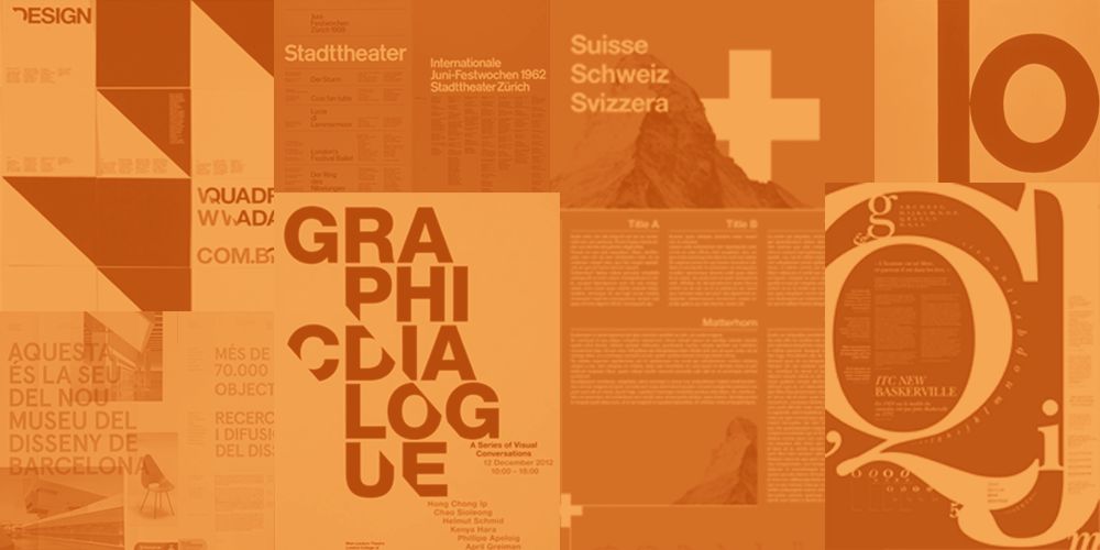
What’s the purpose of grid use in graphic design? In order to develop a striking and organized design piece, it’s crucial to build a good foundation. One who builds a house would never consider skipping the foundation. Nor would they “wing it” in order to get to the next step. A good builder simply wouldn’t proceed without a detailed plan of the overall project. The foundation of a good design is its grid. There are many layout possibilities that allow artists to create balanced designs in any amount of space. By using grid systems as a framework, a composition can be designed that directs the eye with ease along an appealing hierarchal order. The importance of using a grid as the basis of your graphic design can not be overstated. And learning to work with one is worth the effort for any serious graphic designer. They provide organization, consistency, and balance to your design. Surprisingly, a grid will often make way for more creativity rather than fence you in as some might assume. Before using a grid for your graphic design, there are several factors you should consider:
  • Purpose or focus of design piece Intention is important. You need a clear purpose or message before laying down a grid. Without it, design elements may be constrained by thoughtless or forced decisions. The grid should serve the designer, not the other way around.
  • Priority of content Consider all of your content and prioritize your text and elements in terms of hierarchy. This allows designers to guide the viewer’s eye through the design, drawing attention to key elements and creating a sense of visual flow. Without hierarchy, a design can become cluttered and confusing, making it difficult for the viewer to understand the message or purpose of the design.
  • Size of your design Determine the size of your design and various elements, and how the grid will fit within the space.  If you’re designing a magazine layout, you might need a more complex grid to accommodate your content. While a smaller design might only need a simple grid.
  • Flexibility for use Consider how flexible the grid needs to be to accommodate different types of content in a layout. A more flexible grid might be necessary if you’re designing a website or an app that will have multiple pages.
  • Branding enhancement Be mindful of your brand identity and how a grid can help reinforce your brand’s visual style. Using a consistent grid across different designs can help create a cohesive look and feel for your brand.

Single-Column Grid

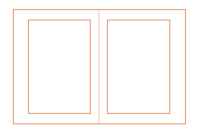
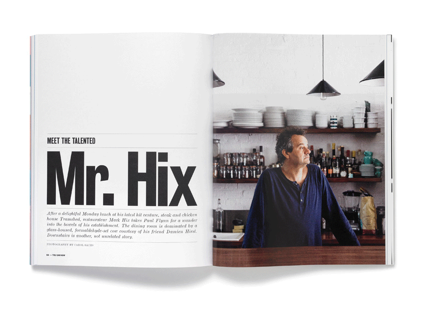
When presenting large quantities of text, the single-column grid is a classic approach for providing a simple framework. Typically the interior margin is half the size of the outer, and the given space of a page is defined by the width of the margins. Be sure to think about your design elements and typeface size for readability and adjust the margins for ease. Most often, the pages in the spread mirror one another. For a more contemporary feel, repeat the column position on the following page to create an asymmetrical layout.

Multiple Columns and Modular Grids

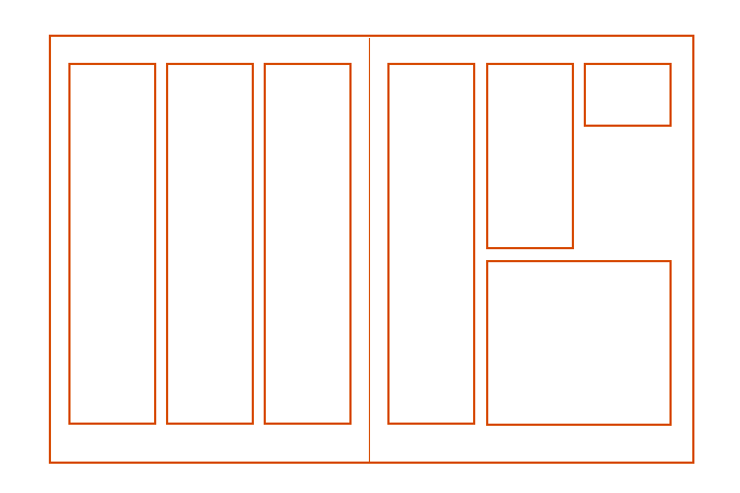
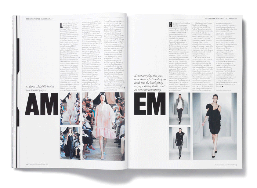
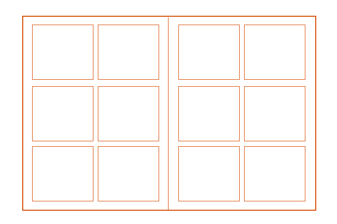
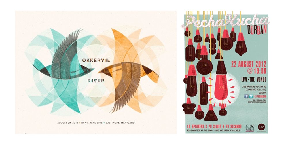
You can arrange endless compositions when you increase the number of columns on your page spread. Consider your visual elements as well as the length of copy to determine your arrangement. Multiple columns are typical in newspapers, magazines, or any layout where you need lengthy text and or multiple graphics.  Playing around with a several-column grid allows for the creation of rhythm, movement, interaction, and tension of elements. When designing with a grid framework, color fields that run off the page and images that span multiple columns become effortless.   Divide vertically as well as horizontally creating “bite-sized” spacial units allowing more component variation. The flexibility gained by the designer increases as the units or modules do. Again, assess the length of text, image, and element sizes to determine the scope of the grid. Oftentimes, multiple unit modules are used for complex, several-page publications where lots of designers are involved. The grid gives a solid, easy-to-visualize base that makes it easy to incorporate various needs and complex designs.
Grid Use In Graphic Design

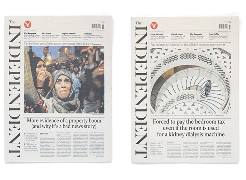
Independent Newspaper


Symmetry and Asymmetry

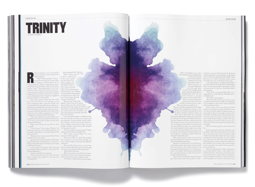
You can make a design symmetrical by using grids with an equal division of space creating a natural balance of parts. Two common types of symmetry in graphic design are Bilateral and Radial. You can produce Bilateral Symmetry (a butterfly’s wings for example) by placing a mirror reflection on a central axis.  An arrangement of uniform elements which rotates around a central point creates Radial Symmetry. The outcome is a proportional 1:1 ratio, comparing one surface area to another. Asymmetry, on the other hand, is a complete lack of symmetry. A design is asymmetrical when you disperse elements roughly around the axis point. While balance and beauty can be found in asymmetrical designs, it takes a good eye and practice. You can balance your design by highlighting the focal point with size, and color, or adjusting text and images according to size and weight proportionally on opposite sides of the page. Always be sure to keep in mind the hierarchy of information, of course!

Breaking “Rules”

None of the grids that you develop are absolute, but simply guidelines for providing options for design. “Breaking the grid” can take place thoughtfully to create contrast with its proportional elements. Breaking the grid is not the same as disregarding the uniform divisions of the layout altogether. The underlying structure should remain virtually intact. Be careful, however, if you take too many liberties, the design will become cluttered, sloppy, and imbalanced. So, the key is understanding the logical structure of the grid and proportional systems, then learning how to modify them with confidence and freedom. On the flip side, if a designer rigidly binds themselves to the grid, the piece will surely reflect it. When used properly, the framework will effectively drive the informational hierarchy and create a flowing integration of type, color, and graphic components.

Intro to The Golden Section and Golden Rectangle

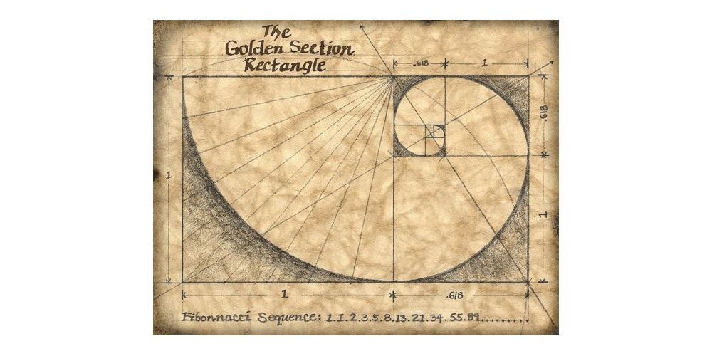
The Golden Section, also known as the Golden Ratio or the Divine Proportion, is a mathematical concept that describes a ratio that has been observed in many natural phenomena, such as the spiral patterns of shells and the branching patterns of trees. The ratio is approximately 1.618 to 1 and is often denoted by the Greek letter phi (?). It is a rectangle whose sides are in the Golden Ratio. This means that if the length of one side of the rectangle is a, then the length of the other side will be approximately 1.618 times a. Viewers consider the proportions of the Golden Rectangle to be aesthetically pleasing as artists and architects have been using it in their work for centuries Take a look at the following tutorial by Adobe Illustrator on How to Design a Logo With Golden Ratio: To incorporate the Golden Ratio into grid design, divide your grid into sections using the ratio of approximately 1.618:1. Then, place your content within these sections, size elements using the ratio, and experiment with different layouts to find a pleasing balance. Remember that the Golden Ratio is a guideline and not a strict rule, so don’t be afraid to adjust things to fit your needs. Although grids and proven frameworks are powerful tools for creating a harmonious design, they are not a goof-proof guarantee for total success. Whether your design is minimal or complex, you not only need an understanding of layout and proportions but a firm grasp of typography and hierarchy as well.

About BonFX

Douglas Bonneville has been a graphic designer since 1992 and has written about type here since 2009. BonFX is a blog about typography and design, and the books that came out of it.

More about BonFX →

Start Here

Contact

Questions about the books or the site? Contact us.

Follow @dbonneville on X.

The BonFX Letter: one good pairing every Tuesday, free. The signup is in the sidebar of every page.