Dosis pairs great with Open Sans, Lato and Roboto. All 15 pairings are shown below in real rendered specimens, with the reason each one works.

What fonts go with Dosis? The rounded geometric sans is light in colour and built from very open, circular forms — friendly rather than authoritative, which means most of the fonts that pair well with it exist to supply the gravity Dosis was never designed to carry.
Dosis was drawn by Edgar Tolentino and expanded by Pablo Impallari and Igino Marini at Impallari Type (2011; remastered as a variable font in 2019), a seven-weight family from ExtraLight 200 to ExtraBold 800, built on a geometric skeleton of near-circular bowls with soft, rounded terminals rather than cut or squared ones. Its counters stay unusually open at every weight, which keeps the letterforms airy but also thins out its stroke colour on the page — it never gets visually heavy, even at its darkest weight. That lightness is deliberate and it is also a limit: the pairing guides we found treat Dosis as a headline face, not as body copy. Nobody sets long paragraphs in it.
Because of that, pairing Dosis is less about finding a contrasting shape and more about deciding how much of its personality the rest of the page should keep. One path stays inside the same geometric family — a companion sans built from a similar circle-and-line skeleton, so headline and body read as one coherent system. The other reaches for textural contrast — a serif or a plainer, more clinical sans that supplies the authority Dosis’s soft roundness gives up. Here are 15 fonts that take one path or the other, ordered from the strongest and most obtainable toward the more specialised.
1. Open Sans
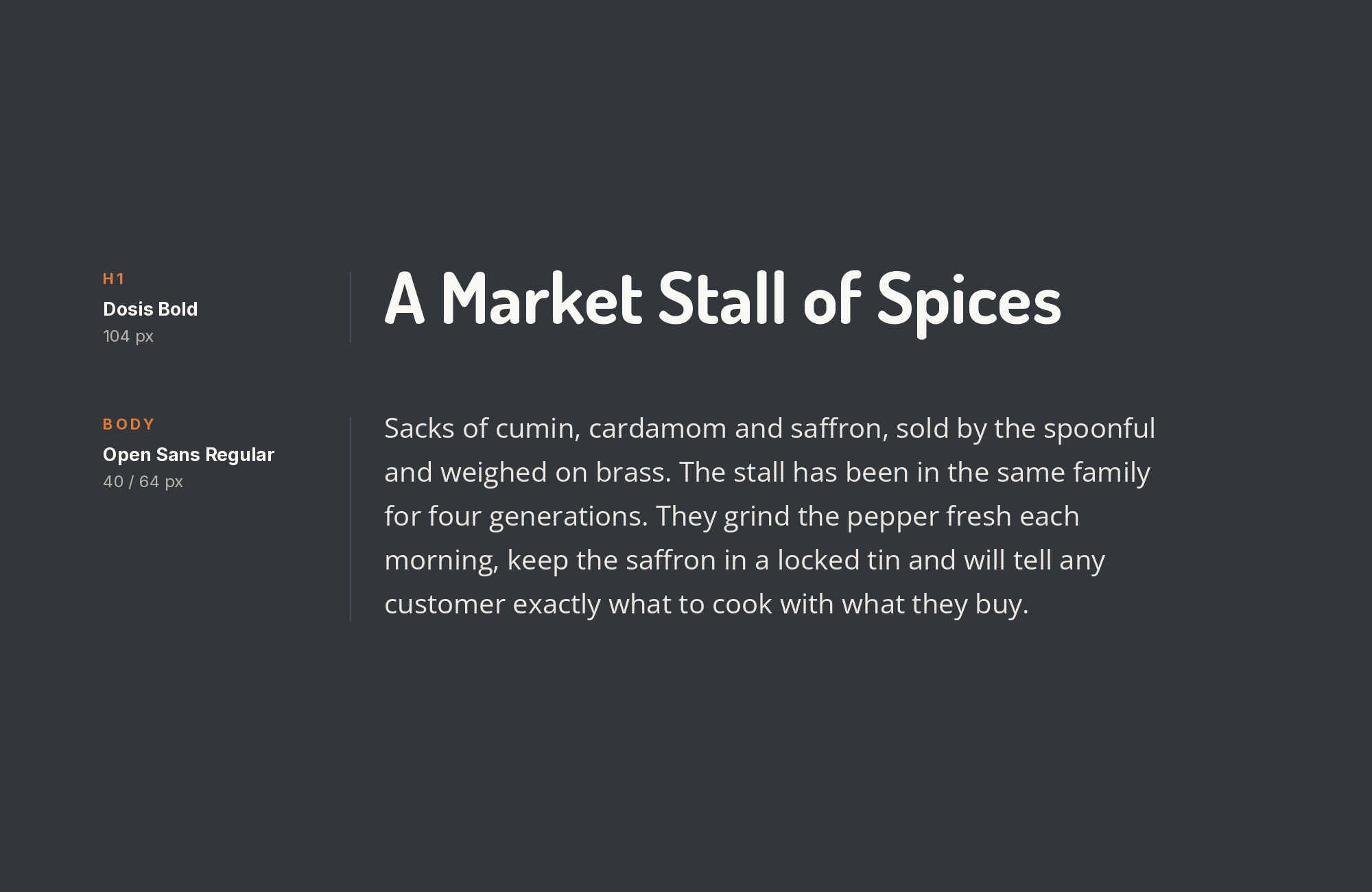
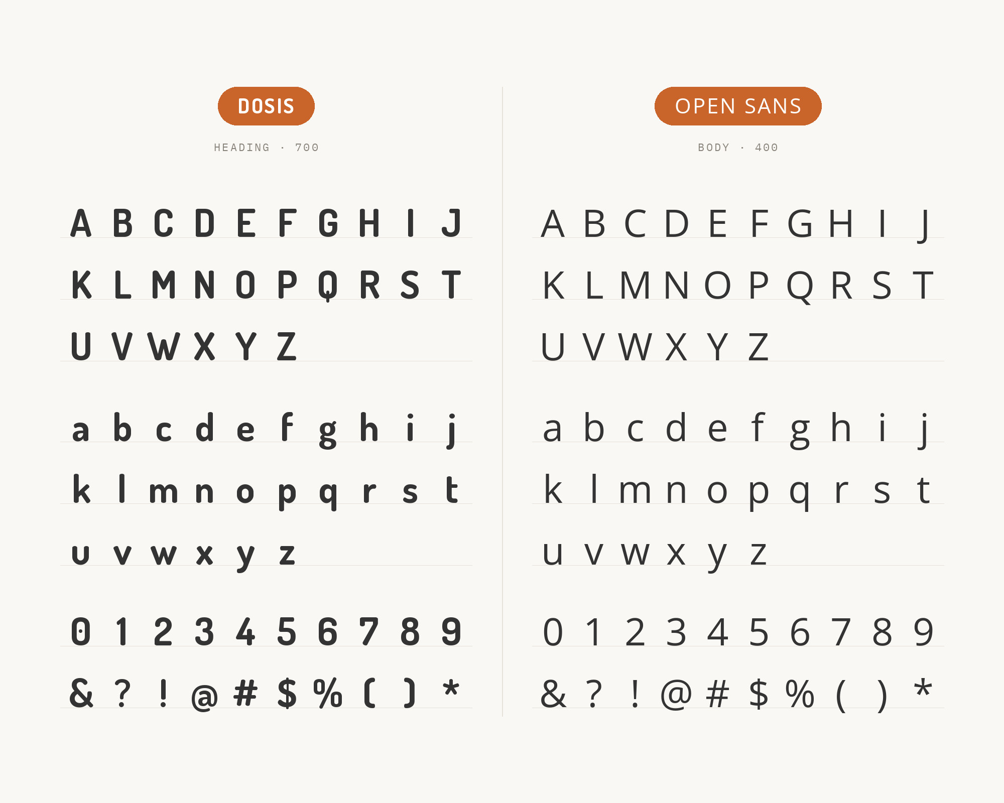
Open Sans is about as road-tested a UI and body font as exists on the web — neutral, upright and legible even at small sizes, with none of Dosis’s roundness to compete with. That plainness is the whole point: it recedes exactly where a Dosis headline needs the contrast, letting the display type keep all the personality while Open Sans quietly carries every paragraph underneath it. Free on Google Fonts, it is a near-default choice for the titles-versus-reading-experience split that defines most Dosis layouts. Set it 16–18px for body copy.
Paid prompt-to-site tools are going to lock you in.
How can your studio escape this?
Find Out How2. Lato
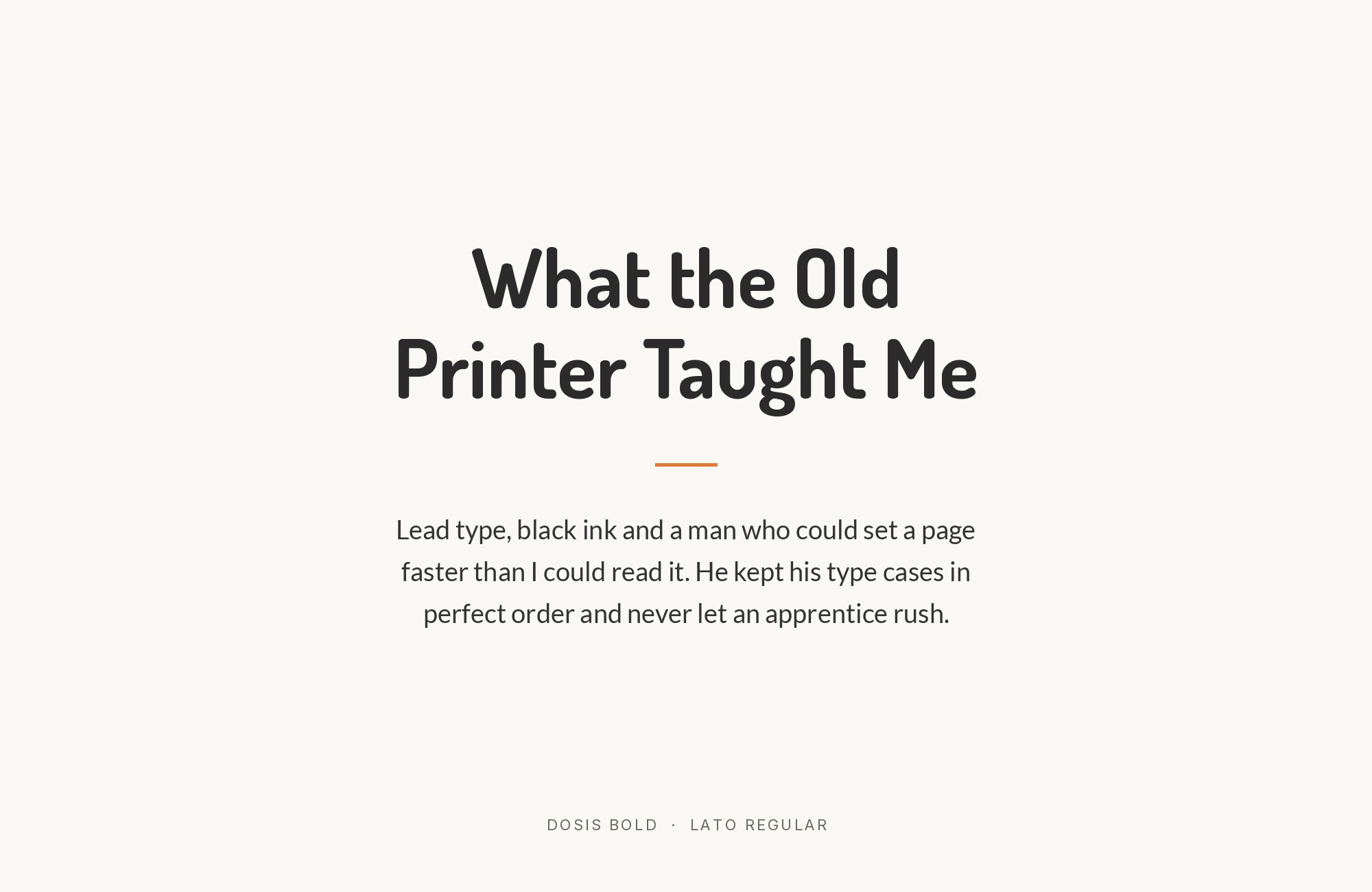
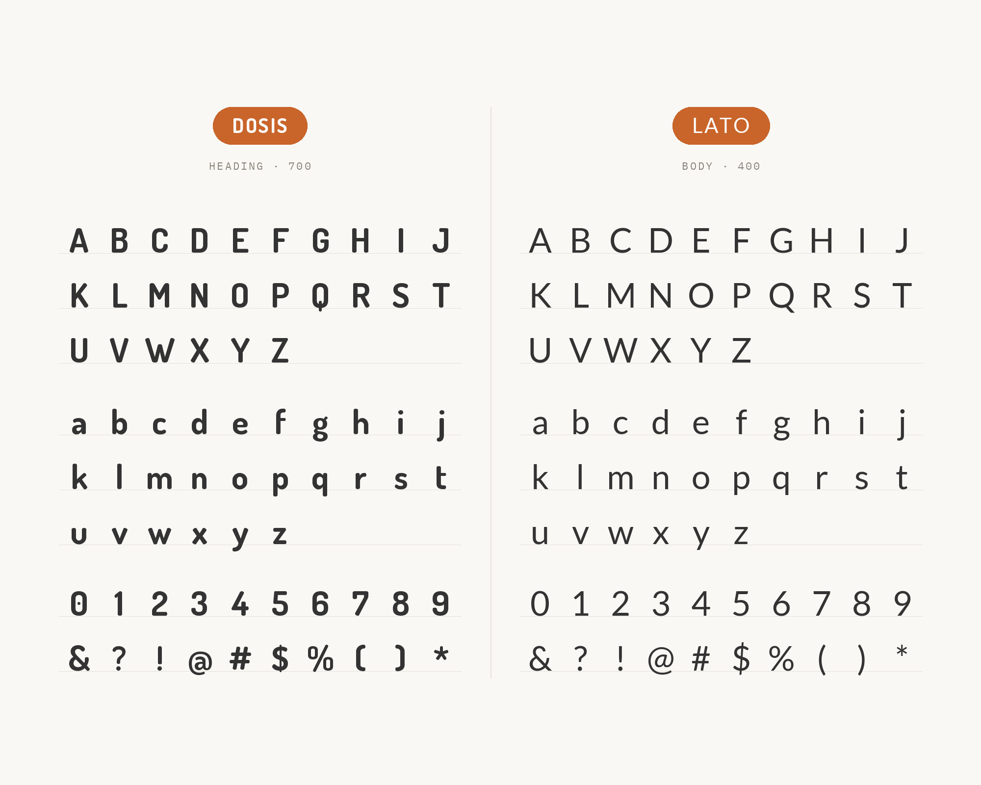
Lato’s warm humanist curves sit at a visual weight close enough to Dosis’s rounded headlines that the page never feels like two unrelated systems stitched together. Its letterforms are still conventional enough, though, that long body copy reads normally rather than carrying the stylised quality Dosis would introduce at paragraph sizes. Its details are only semi-rounded rather than fully rounded off like Dosis’s, so a line of Lato reads at a more ordinary, even colour. Lato’s conventional skeleton holds paragraph sizes that Dosis’s open, light colour cannot, so the friendliness stays in the headline and the reading stays ordinary.
3. Roboto
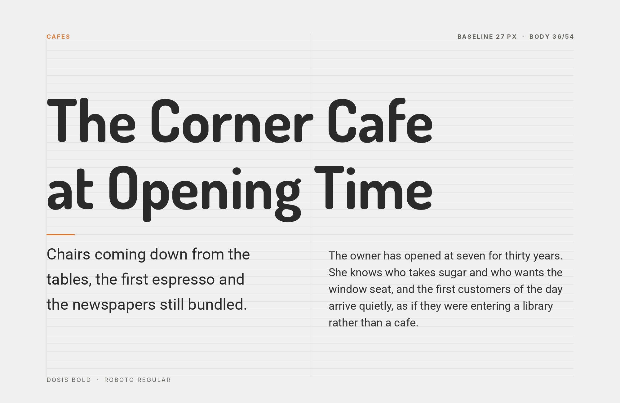
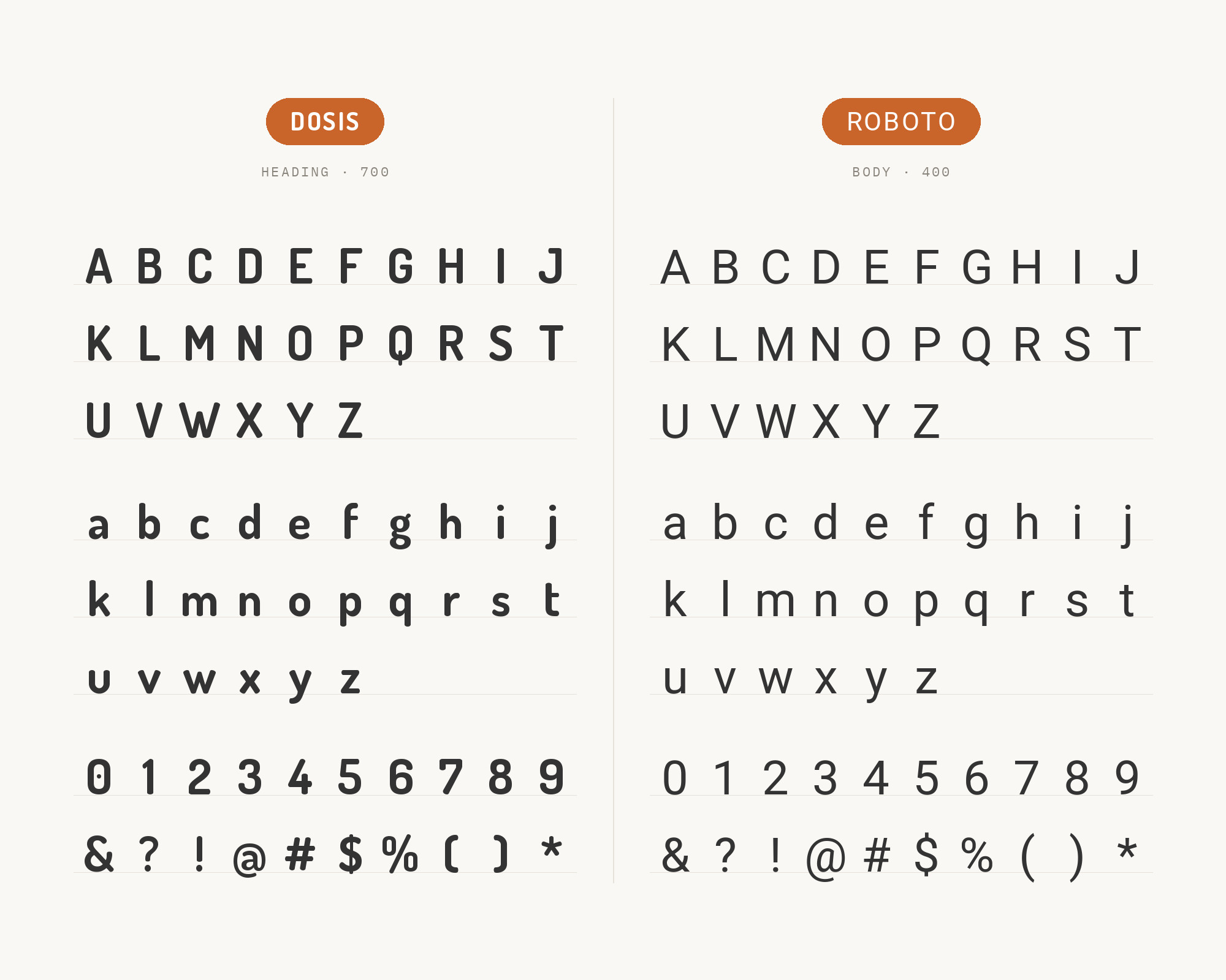
Roboto’s mechanical, slightly squared letterforms sit about as far from Dosis’s rounded softness as a mainstream UI sans gets, and that distance is useful: the contrast keeps a Dosis headline reading as distinctly friendly rather than blending into whatever comes beneath it. Roboto itself carries dense body copy or interface text without asking for any attention of its own — it has been dashboard-tested for exactly that job. Its ubiquity in interface work is the practical argument: nothing in it surprises a reader, which is what you want beneath a headline that already has a voice.
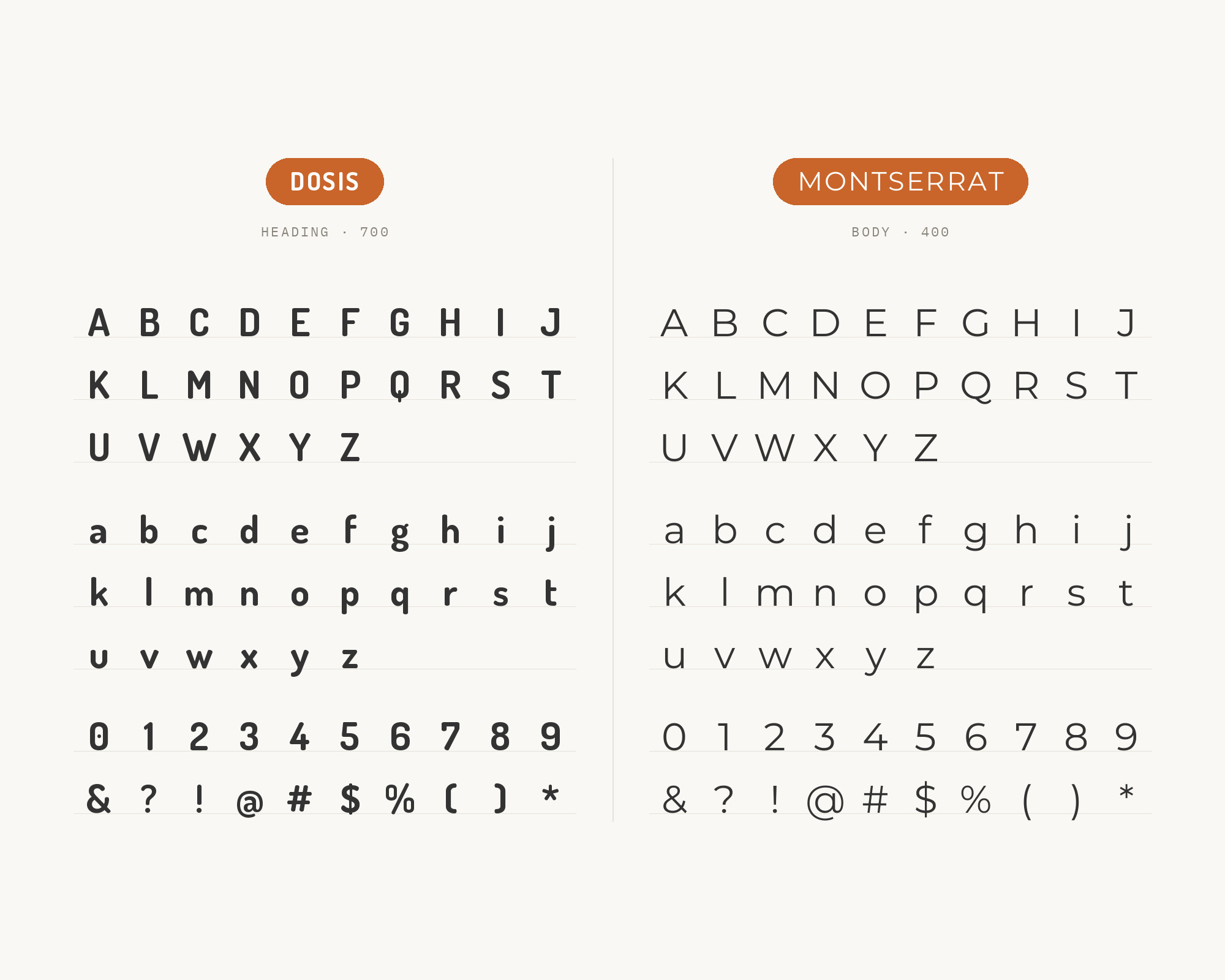
4. Montserrat
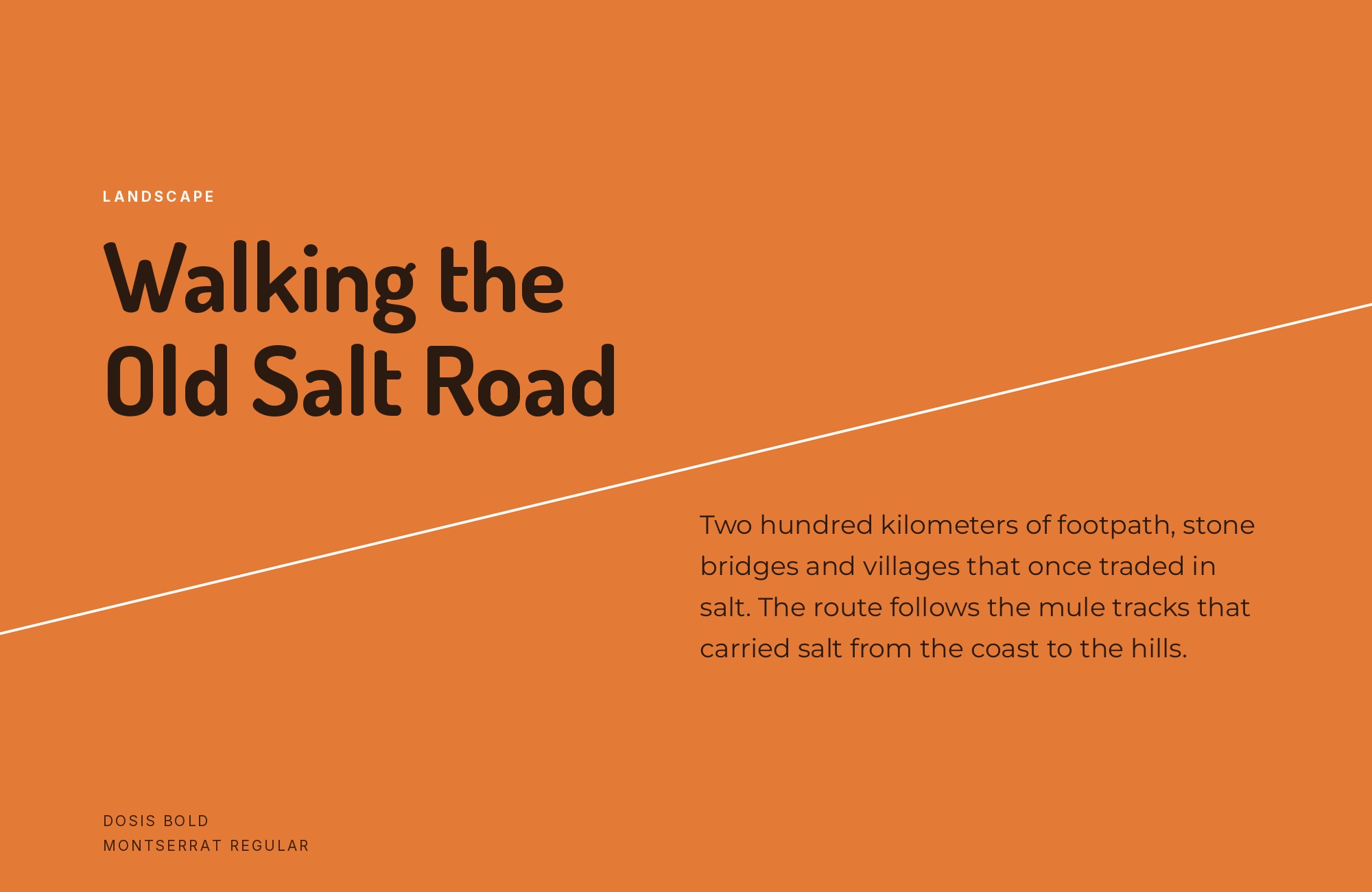
Both faces are built from the same circle-and-line geometric skeleton, so the family resemblance between Montserrat and Dosis is real rather than superficial. What keeps a Montserrat headline from reading as a mere weight variant of Dosis is a difference in terminals — Montserrat’s are cut cleanly rather than rounded off — which is enough of a detail shift to separate the two even at similar sizes. That closeness makes the pairing useful for brand systems that want one coherent geometric identity running through headline and subhead alike.
Webflow. Framer. Squarespace. Wix. Lovable. Not your future.
Your own AI CMS agent is.
Find Out More5. Nunito Sans
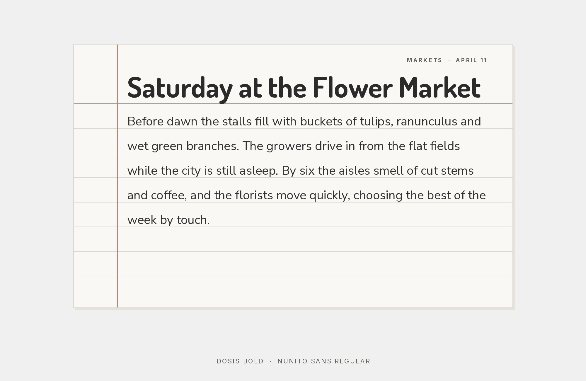
Softer than Roboto but more restrained than the original rounded Nunito, Nunito Sans occupies a middle ground that keeps the whole page inside one soft-geometric family while still separating display from text. Under a Dosis headline it reads as calm, legible support rather than a second competing personality, which suits brands wanting an “all-rounded” visual system without every element fighting for the same warmth. It holds its shape at both UI and editorial body sizes, so a single soft-geometric system can run from interface labels through to long text.
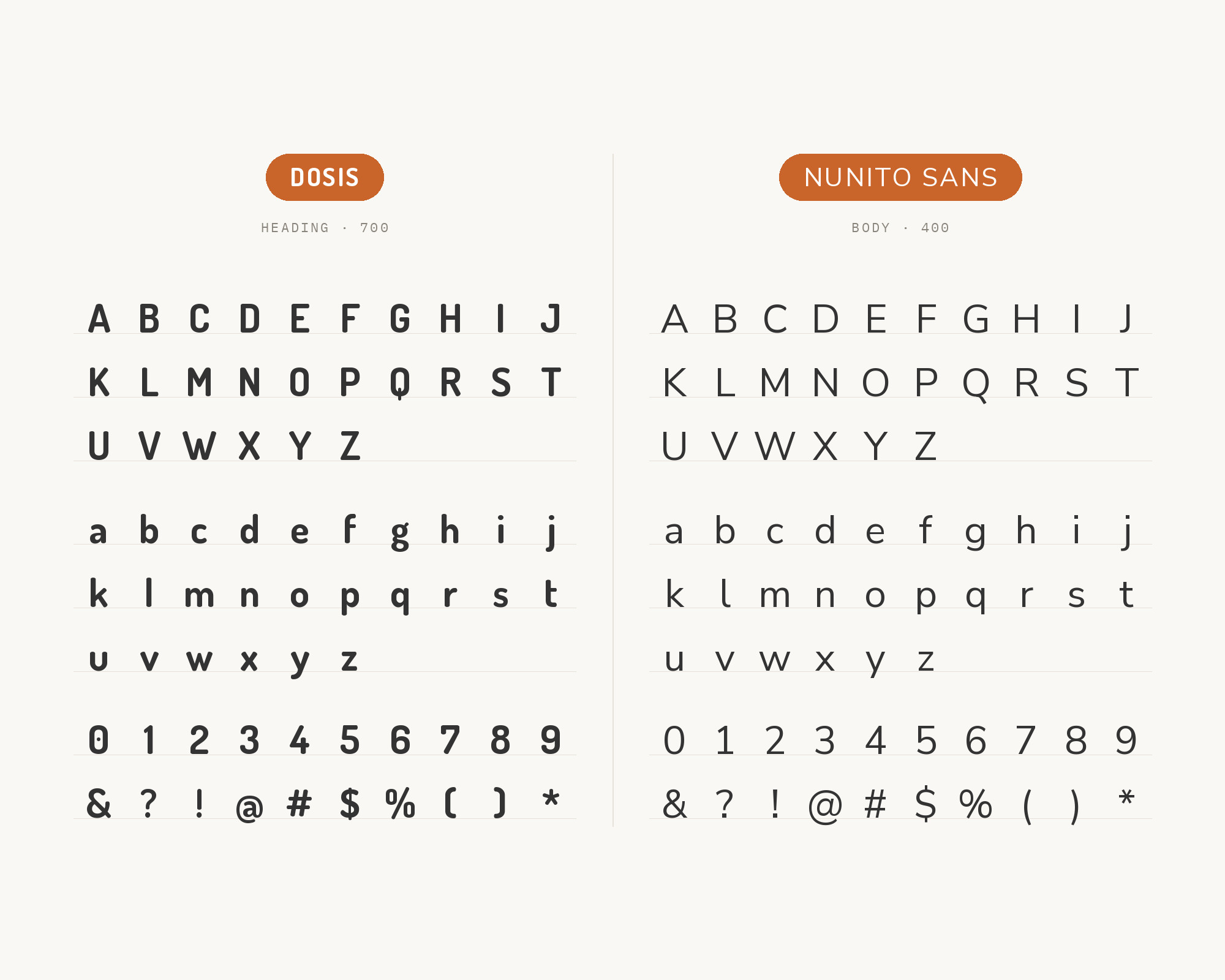
6. Lora
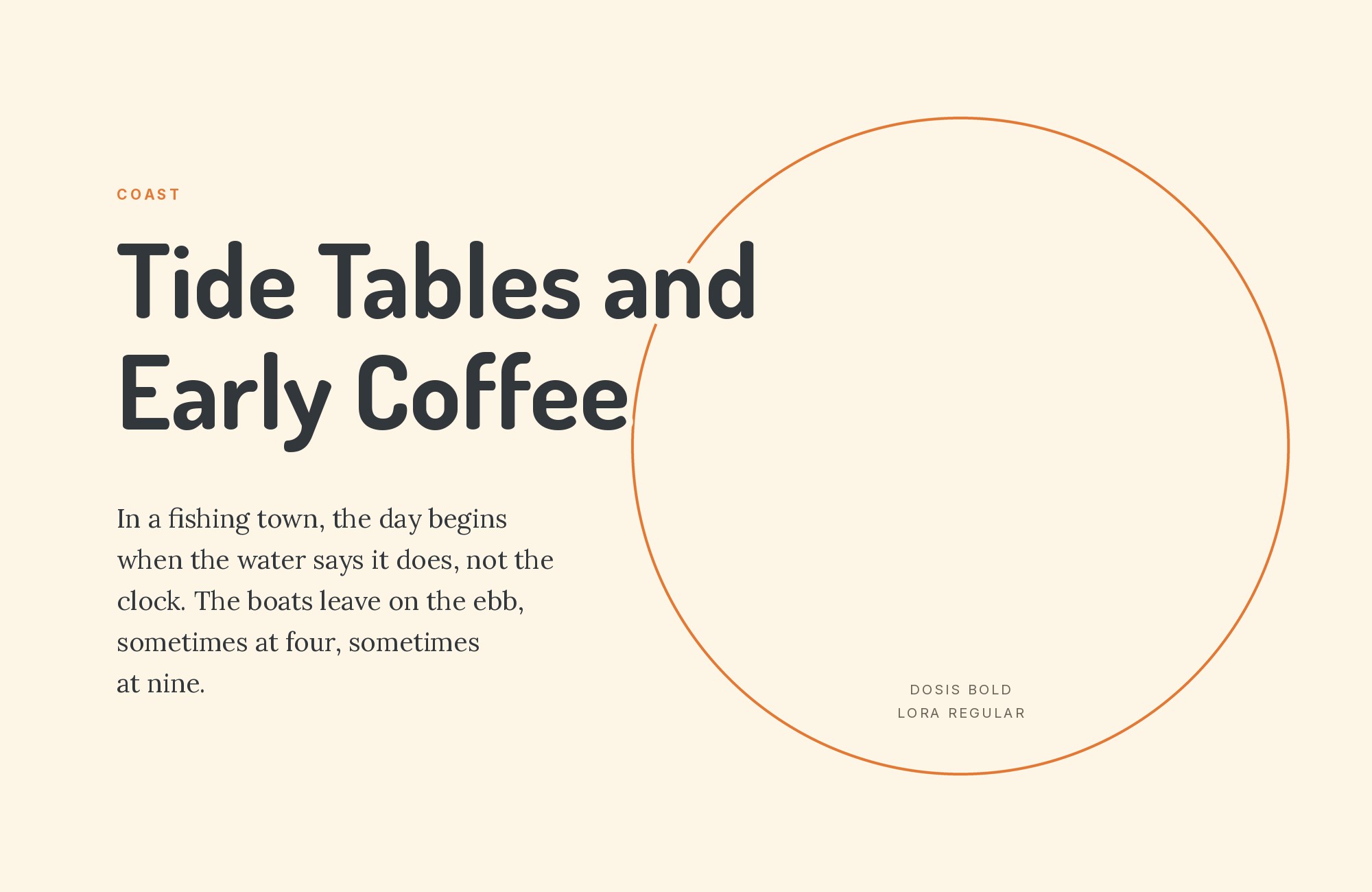
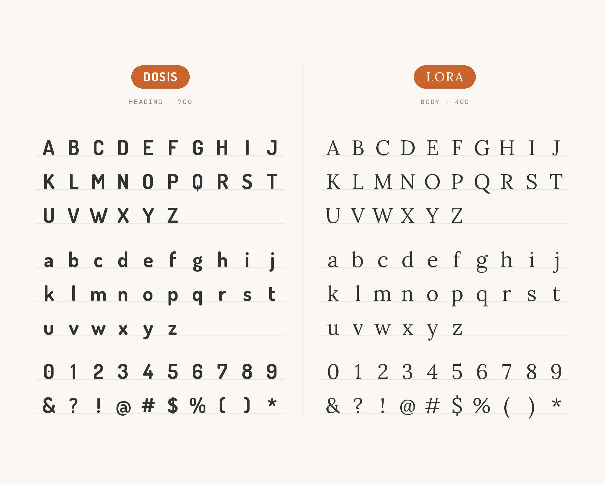
Lora is a moderate-contrast serif built with brushed, calligraphic curves specifically for comfortable long-form screen reading, and those curves echo Dosis’s own roundedness closely enough that the shift from headline to body does not feel abrupt. What it adds beyond that resemblance is a literary, editorial register Dosis cannot supply on its own. The combination suits blogs and content sites that want a friendly, approachable headline over body copy that still reads as considered rather than casual, set at a comfortable size for extended scrolling.
7. Bitter
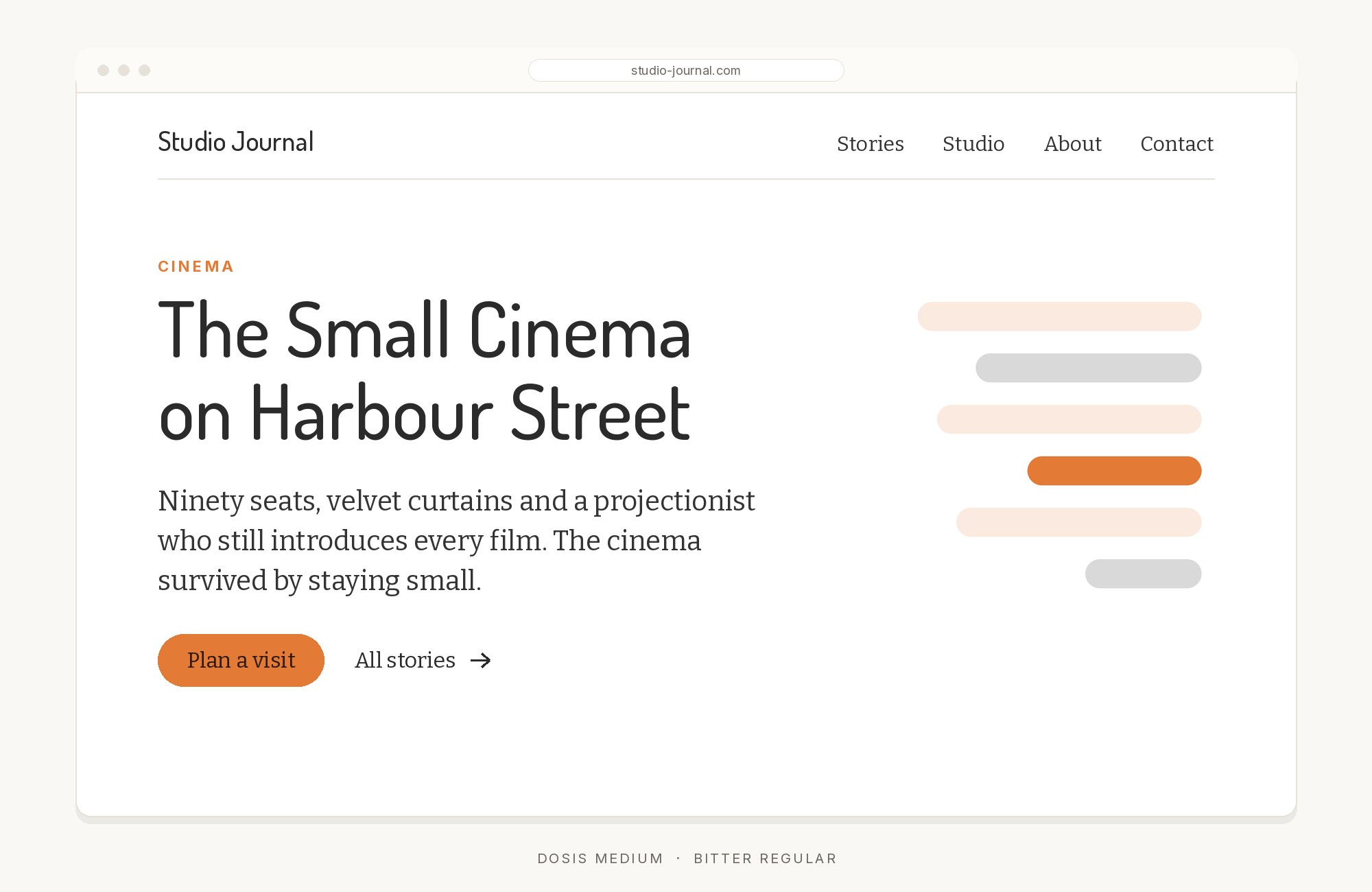
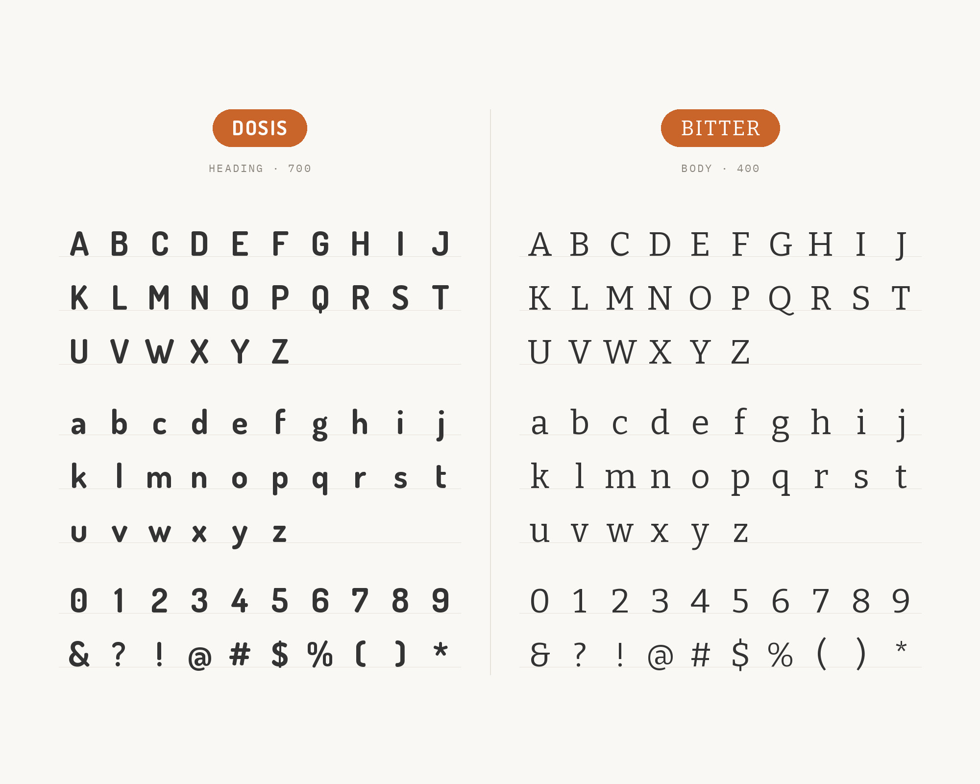
Engineered specifically for screen legibility, Bitter carries sturdy, low-contrast slab strokes that give long text a grounded, dependable feel — a useful counterweight to Dosis’s lighter, more playful display character. The squared-off weight does not clash with Dosis’s roundness so much as anchor it, keeping a page from feeling insubstantial once the reader moves past the headline. For blogs and editorial sites, that trade is the point: friendliness up top, real gravity in the reading experience. The slab strokes also hold their shape at small sizes, where Dosis’s thin, open forms start to disappear.
Taking it to the next level means cinematic visuals, faster turnarounds, and work that wins clients. Create with unlimited downloads of creative stock assets, and access to powerful AI tools to fast-track your workflow!
Subscribe8. Oswald
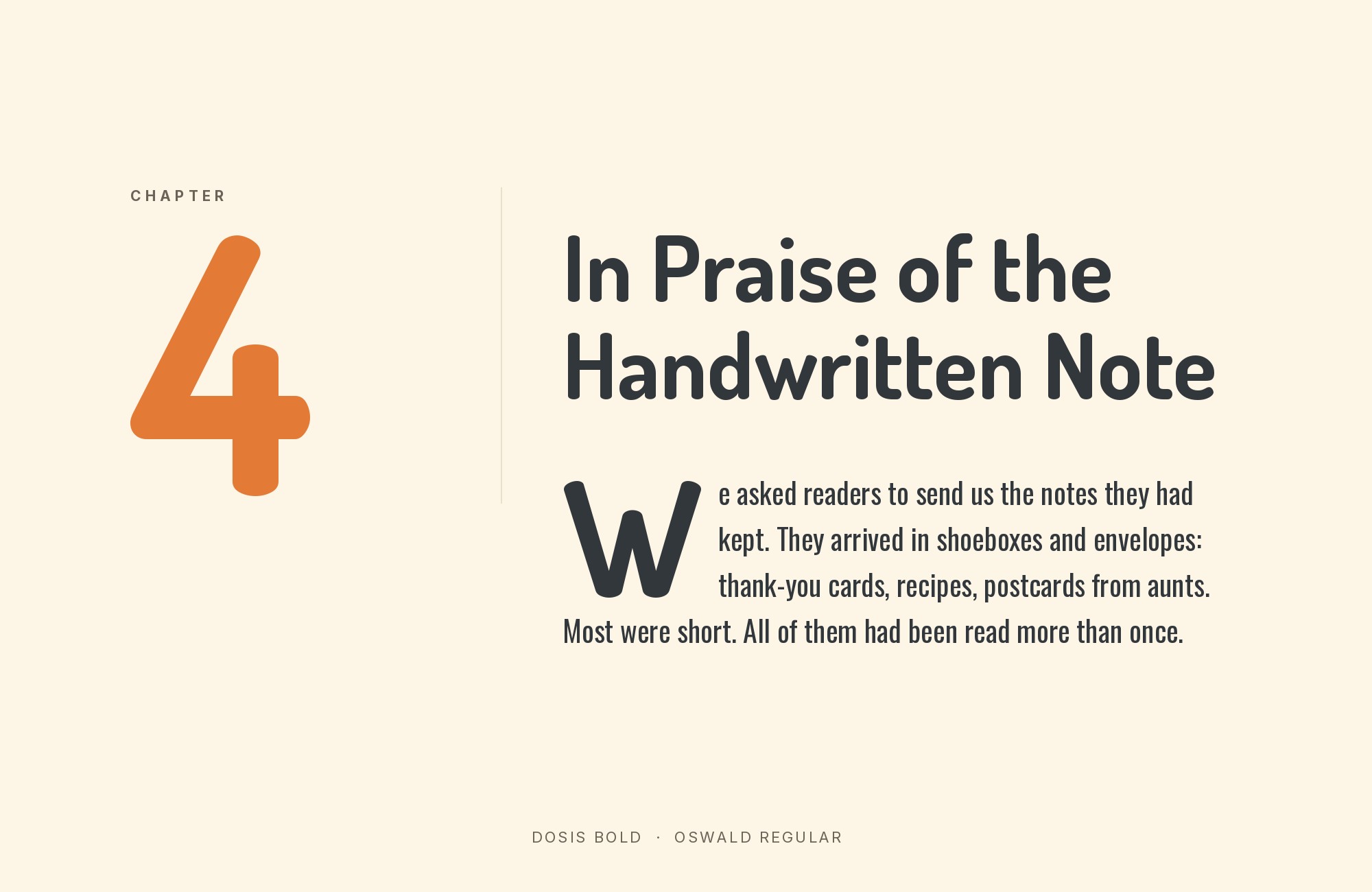
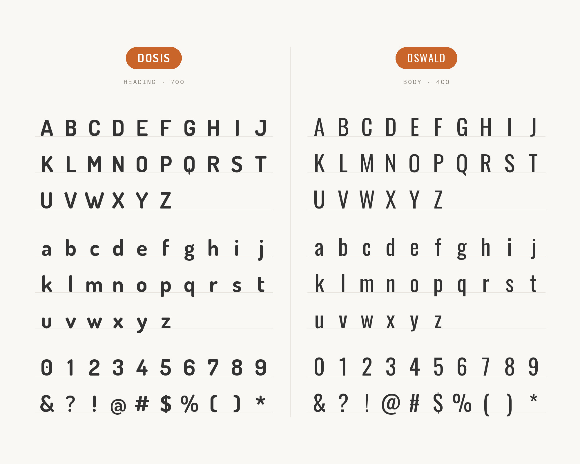
A condensed grotesque descended from classic gothic sans forms, Oswald sits in direct contrast to Dosis’s wide, low-contrast, rounded letterforms — narrow against wide, angular against soft. That contrast gives a layout two clearly different jobs to assign: Oswald for tight eyebrow text, labels or metadata, and Dosis for the friendlier display headline underneath it. Keep Oswald to short, small-scale text; it was not built to carry long paragraphs any more than Dosis was, and the two together read as one deliberate system rather than a mismatch.
9. Raleway
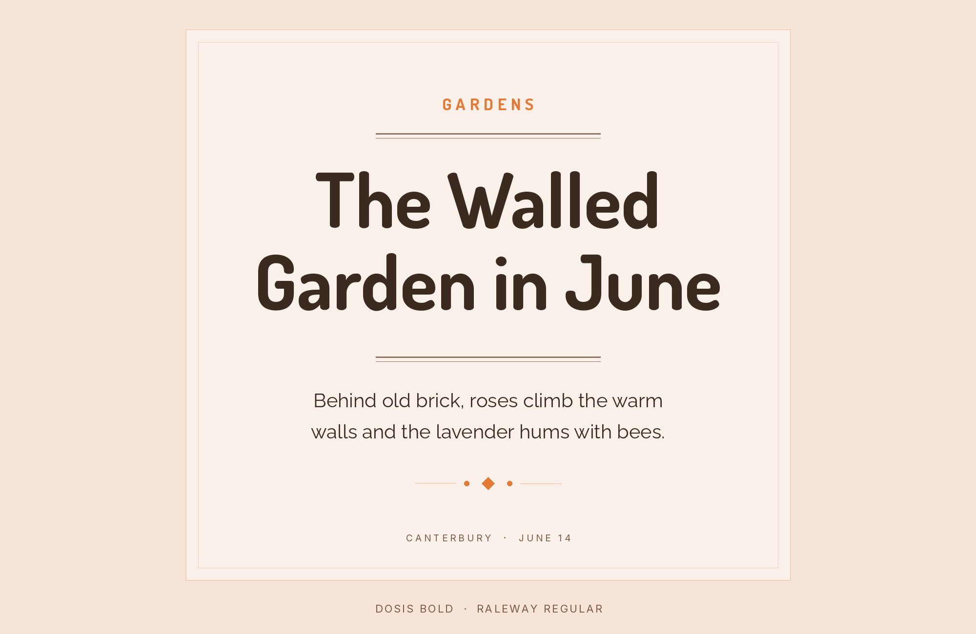
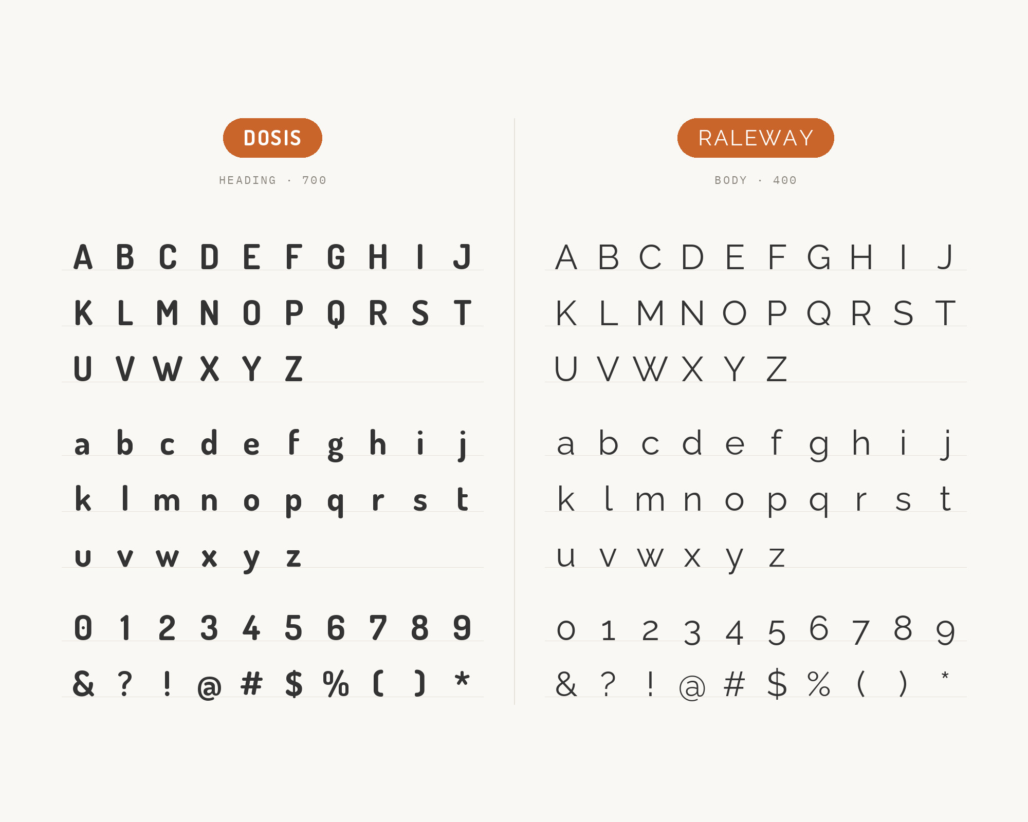
Raleway’s default letters are neo-grotesque in origin, with only a stylistic alternate set that leans geometric like Dosis, and its thin-to-black weight range gives it more angular display detail than Dosis’s soft curves ever show. That difference keeps the two from reading as interchangeable even when set at similar sizes. Raleway is happiest reserved for display sizes rather than body text, which makes it a natural subhead partner in fashion, architecture and portfolio work built around a Dosis headline, where restraint matters more than warmth.
10. Exo 2
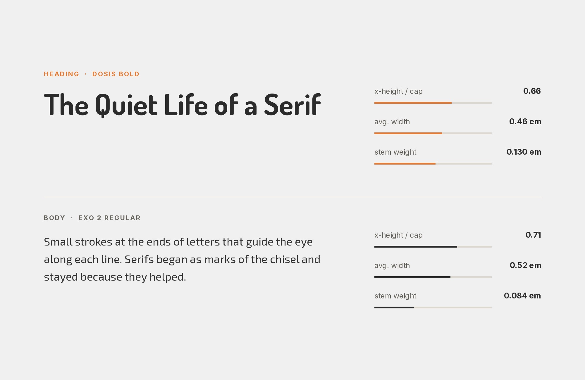
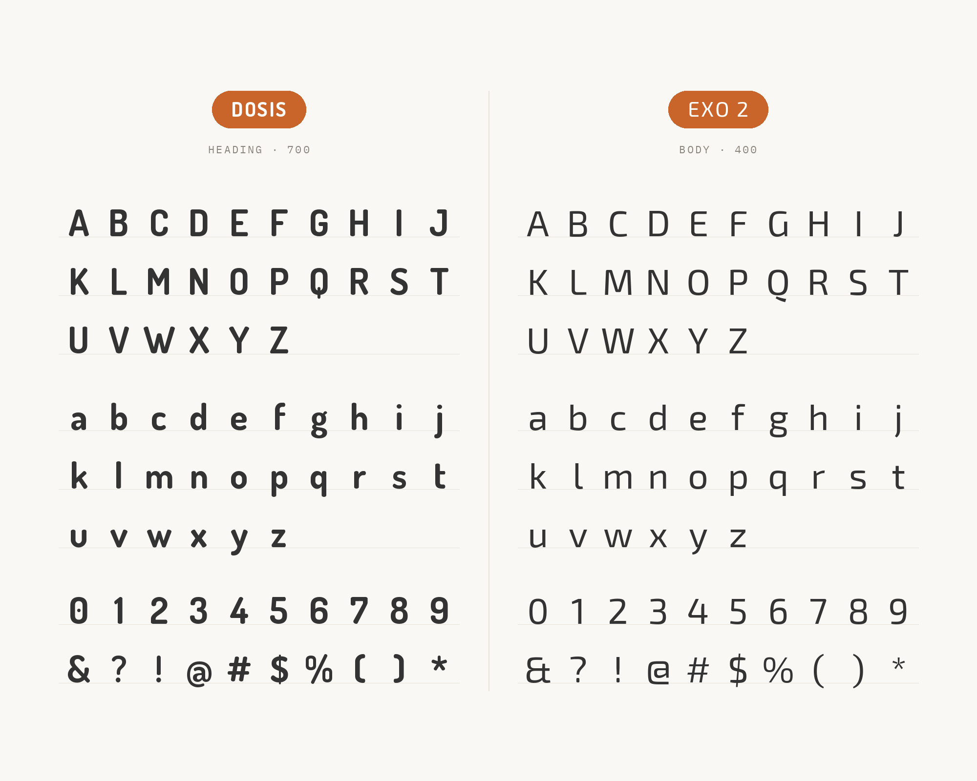
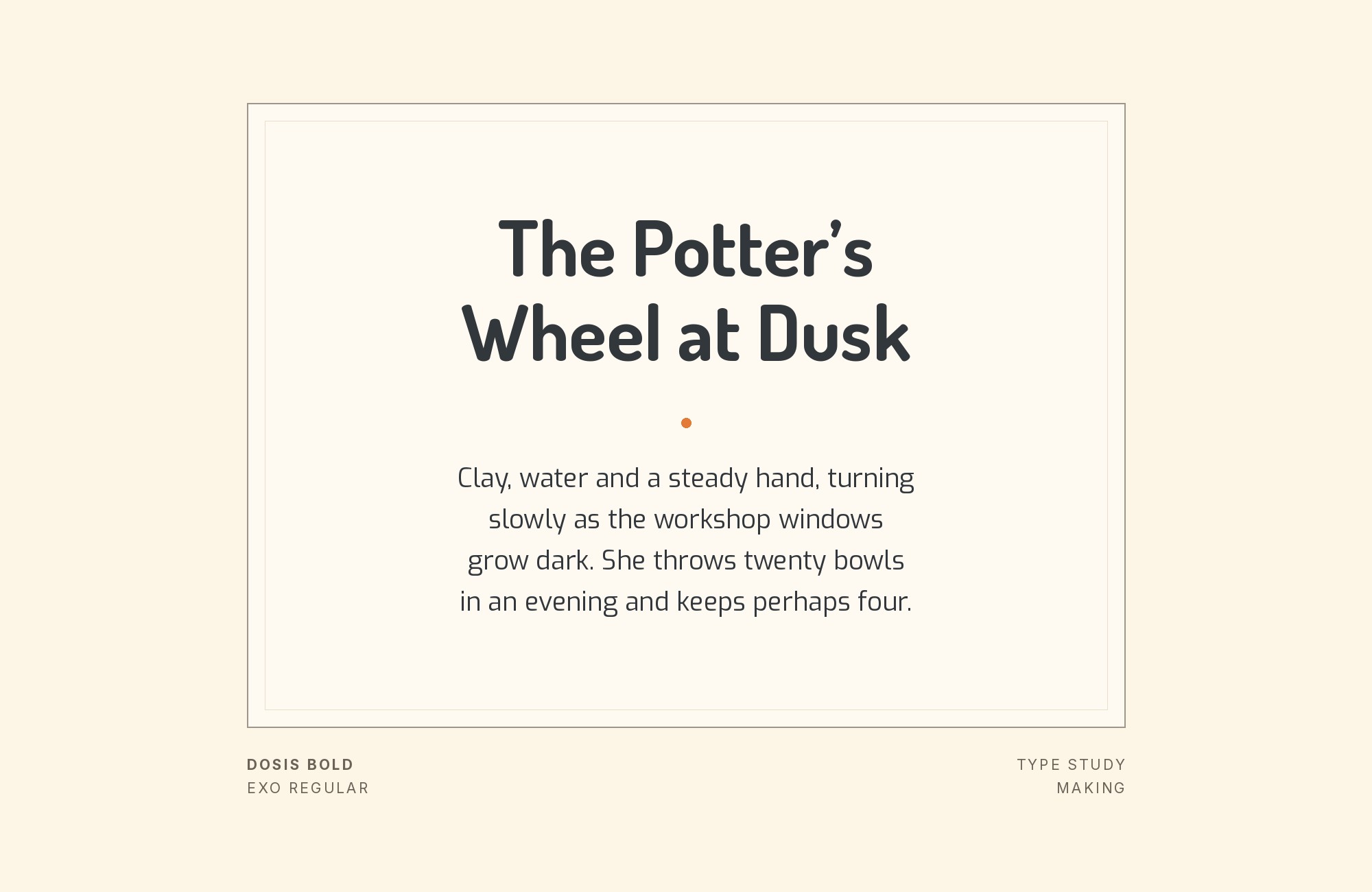
A later, calmer release from the same design lineage as Exo, Exo 2 settles its proportions down into something more neutral — which is exactly why it works as a body partner rather than a second display face. Set beneath a Dosis headline, it lets the display type keep all its rounded personality while Exo 2 carries the actual reading without competing for it. Free and variable, it is a practical choice for tech and product pages that want restraint at body sizes.
11. Exo
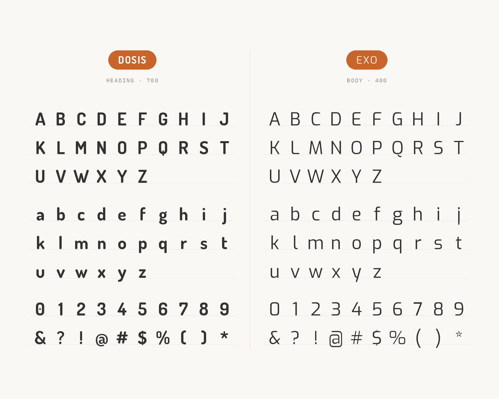
Exo shares a technology-flavoured geometric skeleton with Dosis closely enough that heading and body can stay inside one visual family rather than reading as two separate decisions. Real-world use bears this out on tech and startup pages, where the pairing carries a coherent geometric voice from headline through supporting copy. Choose Exo over its calmer sibling Exo 2 when the brand wants that shared personality to extend further down the page rather than settling into neutral text, and the product itself trades on a technical, forward-looking identity.
12. Titillium Web
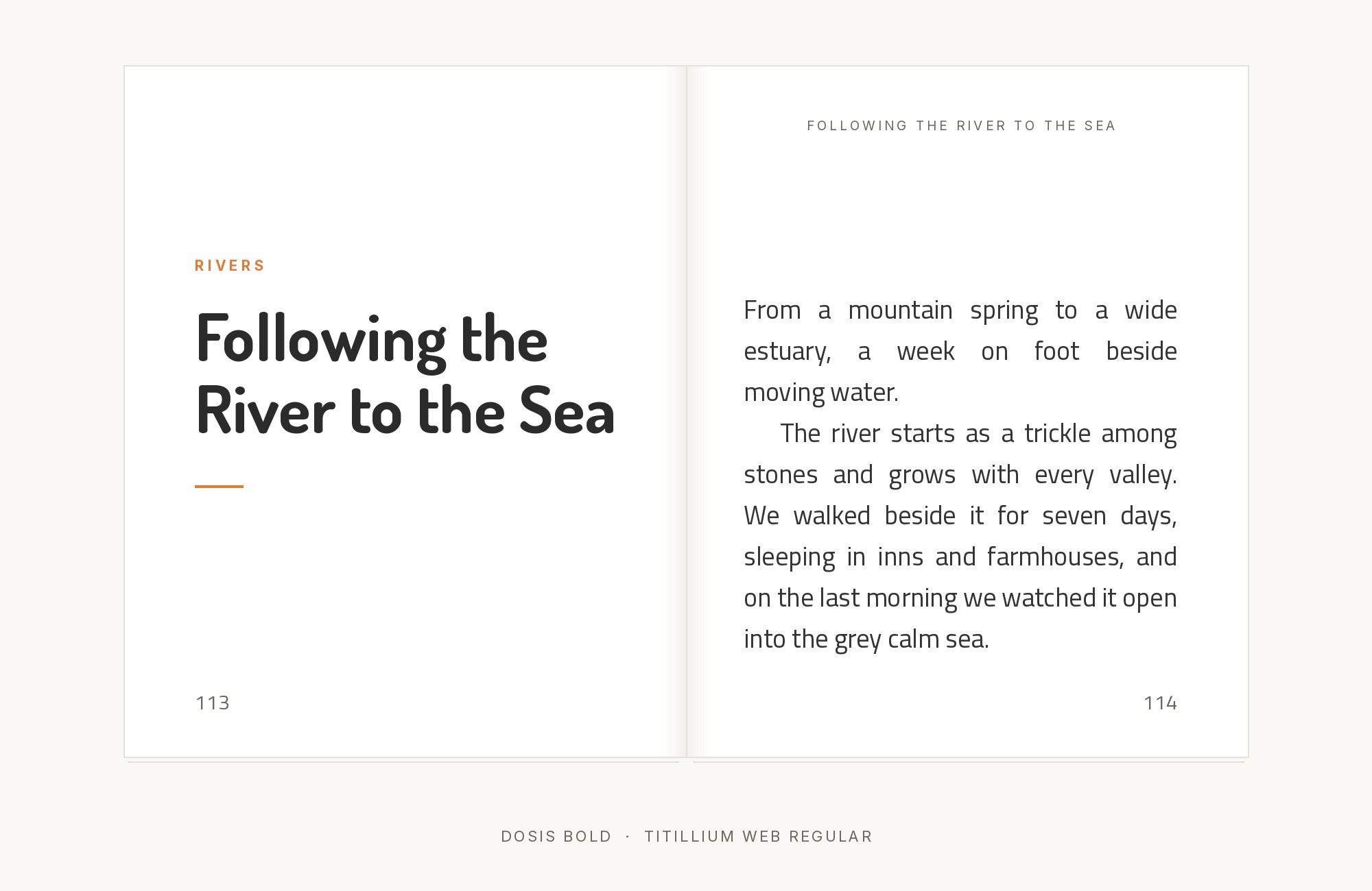
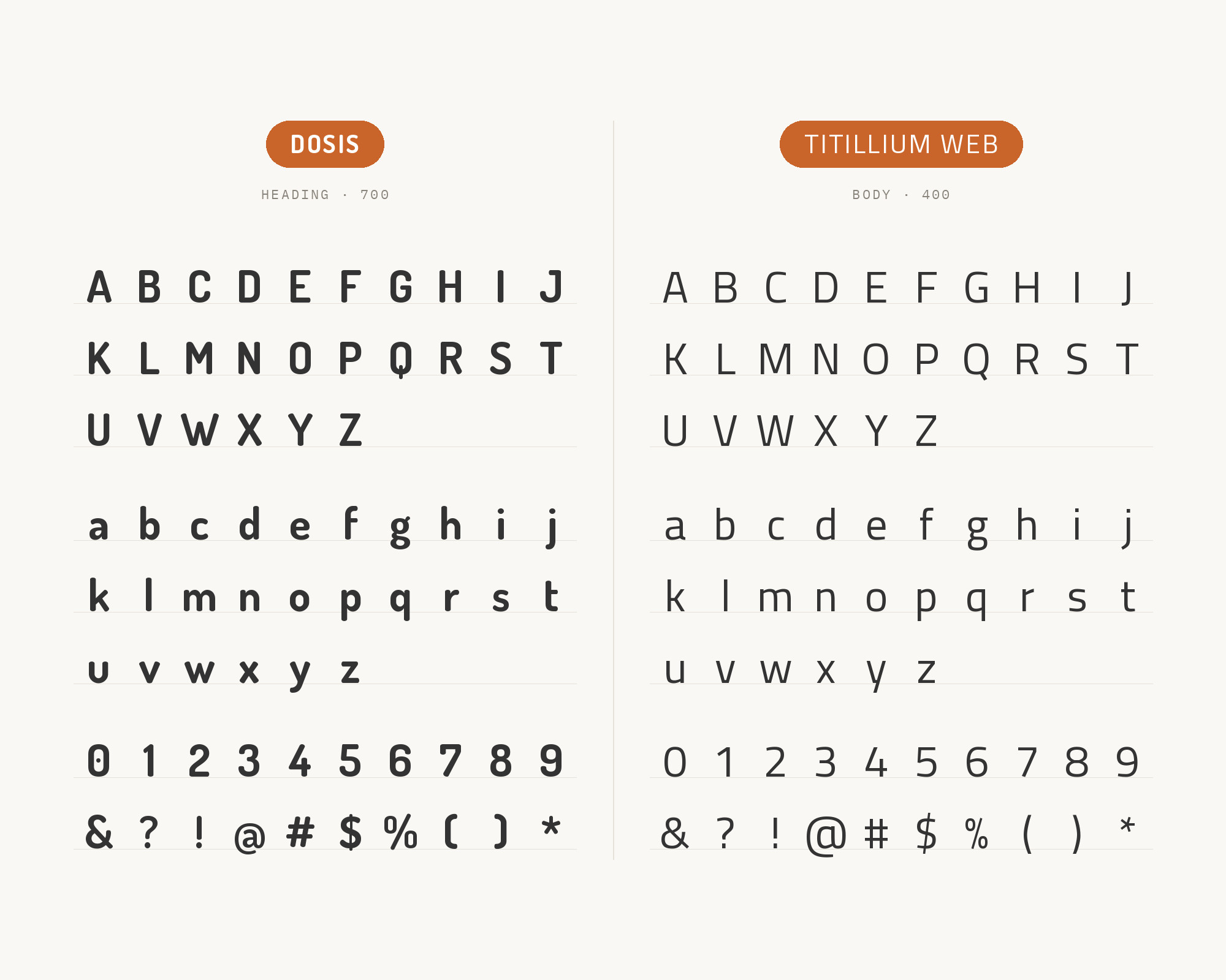
Titillium Web grew out of a collaborative type-design-school project and carries an engineered, slightly technical feel that shares nothing stylistically with Dosis’s soft, rounded display forms. That distance is the value: it supplies a neutral, no-frills body voice under a Dosis headline rather than trying to match its warmth. Free on Google Fonts, it suits technical, educational or institutional sites that want Dosis’s friendliness at the top of the page without carrying that tone into the reading copy underneath it.
13. IBM Plex Serif
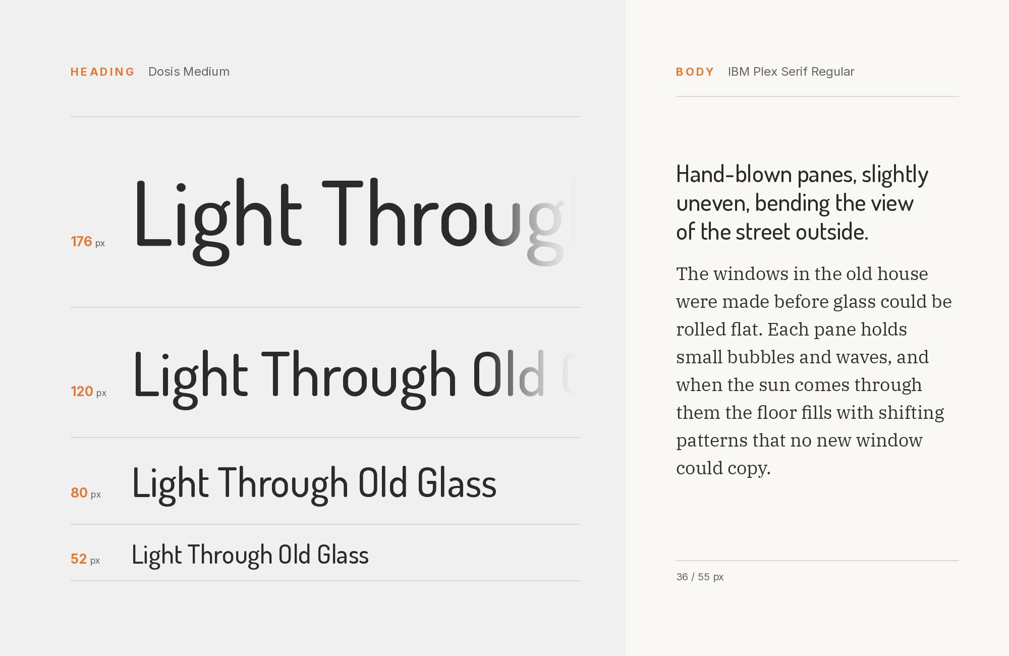
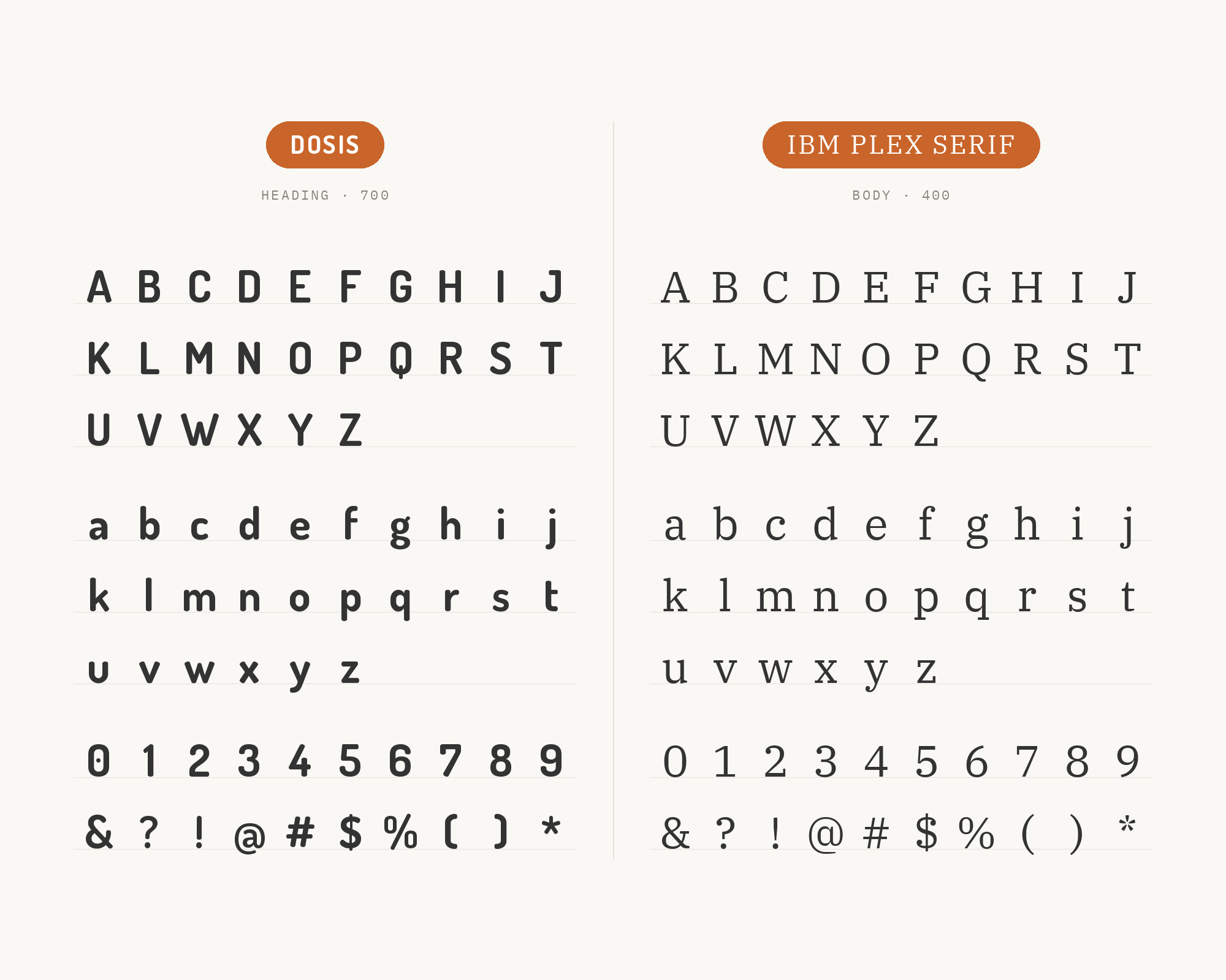
Designed at IBM with Bold Monday for all of IBM’s brand material, IBM Plex Serif carries an engineered, slightly technical feel even as a serif, which reads as calm and highly legible set below a Dosis headline. It gives the display type’s softness a more neutral, corporate-friendly reading partner than a purely decorative serif would offer, without abandoning the serif register entirely. Free and open-source, it suits product documentation, technical content and any brand wanting a serif body voice that still feels current rather than nostalgic.
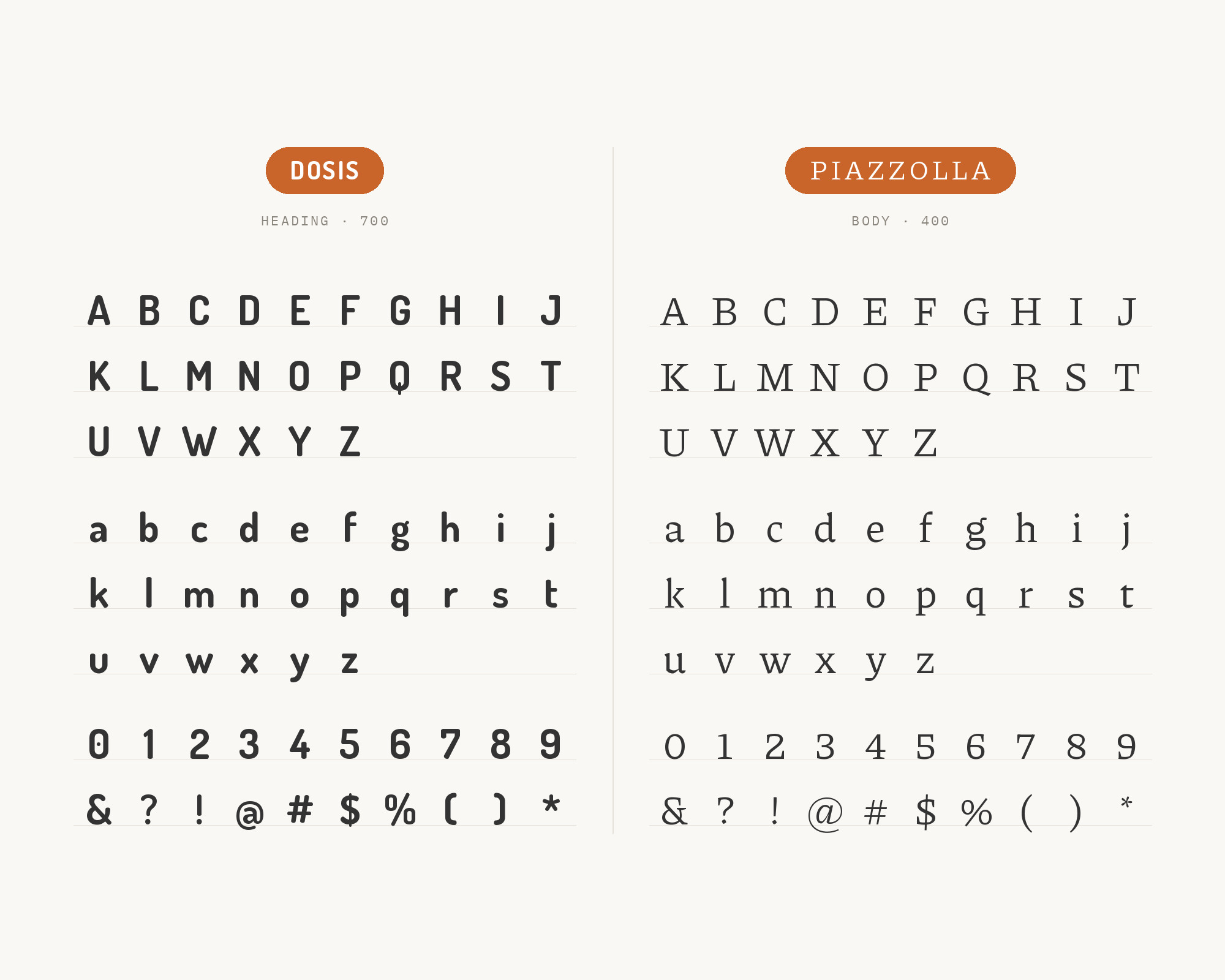
14. Piazzolla
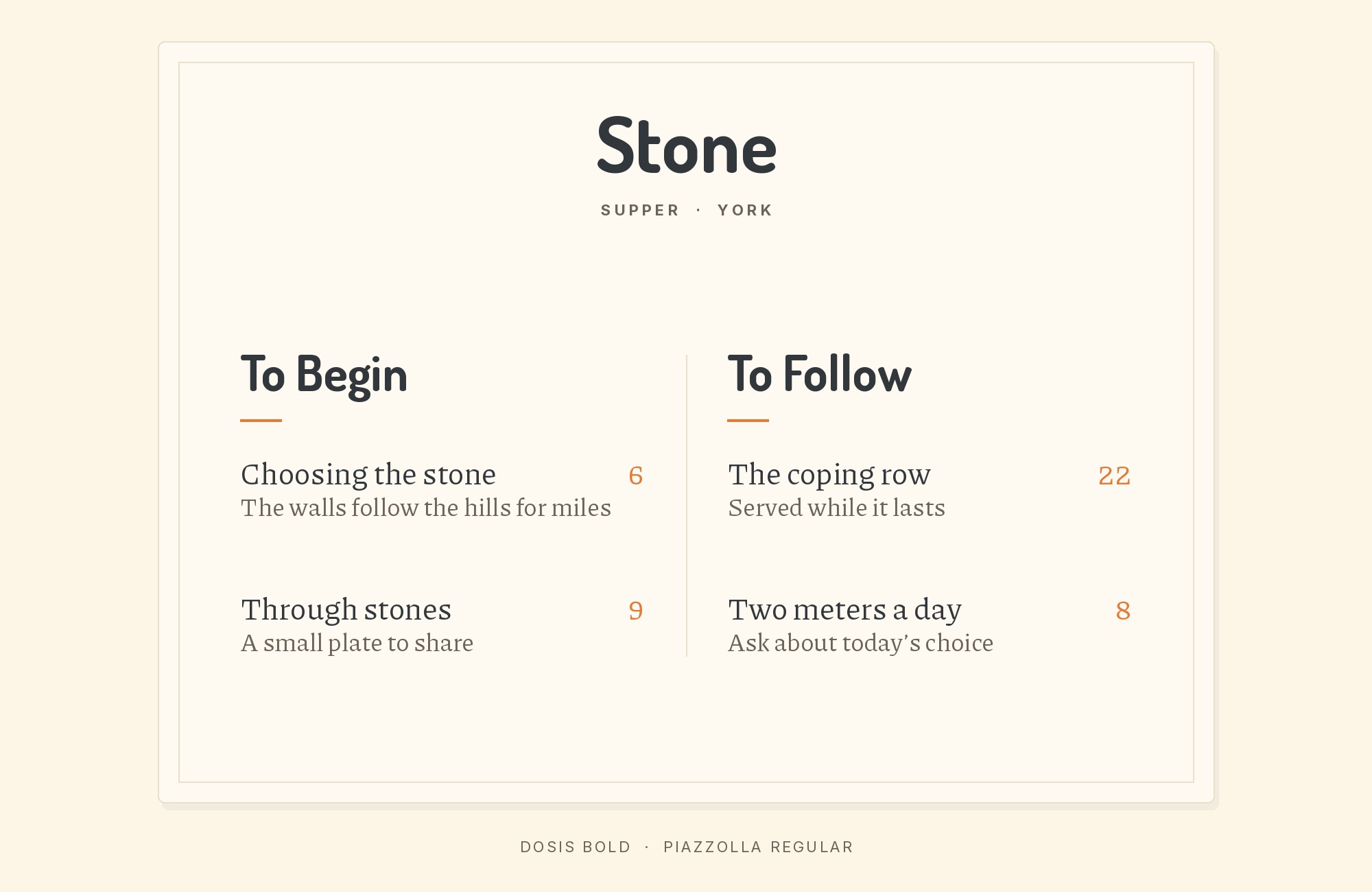
A compact serif built for press and publications, Piazzolla avoids the clash a rigid, high-contrast Didone would create against Dosis’s roundedness. Instead, the pairing lets a gentle serif-and-sans split carry the page’s hierarchy without any real tension in mood between the two. Free and variable on Google Fonts, it suits editorial and long-form content where the brand wants a literary reading experience beneath a friendly, approachable display headline, set at a comfortable size for sustained reading. Its serifs stay substantial enough to hold a line together at text sizes, which is the job Dosis’s light colour cannot take on.
15. Spartan
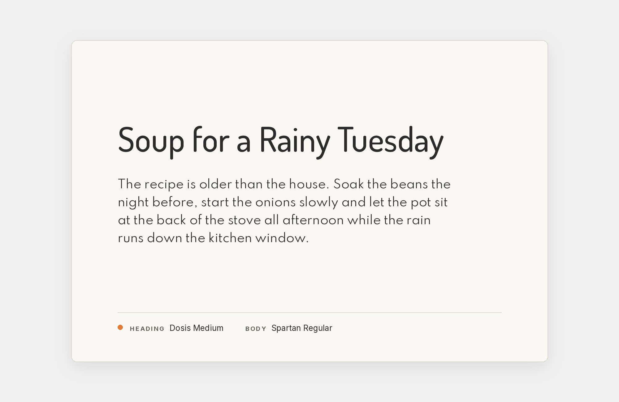
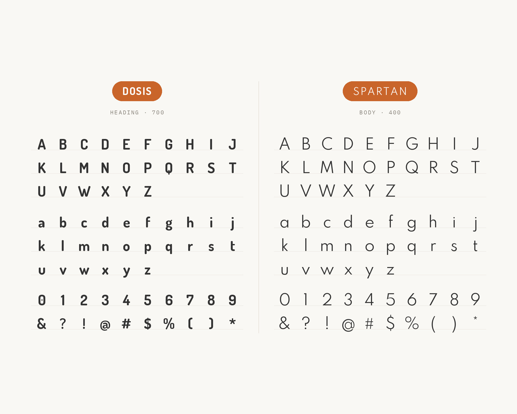
A tall x-height, clean geometric sans, Spartan reads as steady and credible in a way that balances out Dosis’s rounded, friendly display forms rather than echoing them. League Spartan, The League of Moveable Type’s interpretation of Matt Bailey’s Spartan, is the obtainable cut; ATF/Linotype Spartan (1939) is the historical Futura competitor, not this pairing. The combination lets a page open with approachable warmth and still carry real authority once the reader reaches the body copy — useful for brands that want Dosis’s personality without losing all seriousness underneath it. Reserve it for body and UI text rather than competing with Dosis for display attention.
Conclusion
Dosis’s own research splits into two honest camps rather than one rule: keep the whole page inside its geometric-sans family for a coherent, single-voice system, or bring in a serif or a plainer, more clinical sans to supply the gravity Dosis’s light colour and open counters give up on their own. Neither choice is wrong — it depends on whether the brand needs to feel unified or needs to feel more serious than a rounded display face can manage by itself.
Test the pairing at the sizes you intend to publish. Dosis thins out fast below display size, so treat it strictly as a headline face and check the partner at real reading sizes — Oswald and Raleway in particular hold their character only when kept short and small-scale, not stretched into paragraphs.
