Space Grotesk pairs great with Space Mono, Inter and Jost. All 15 pairings are shown below in real rendered specimens, with the reason each one works.
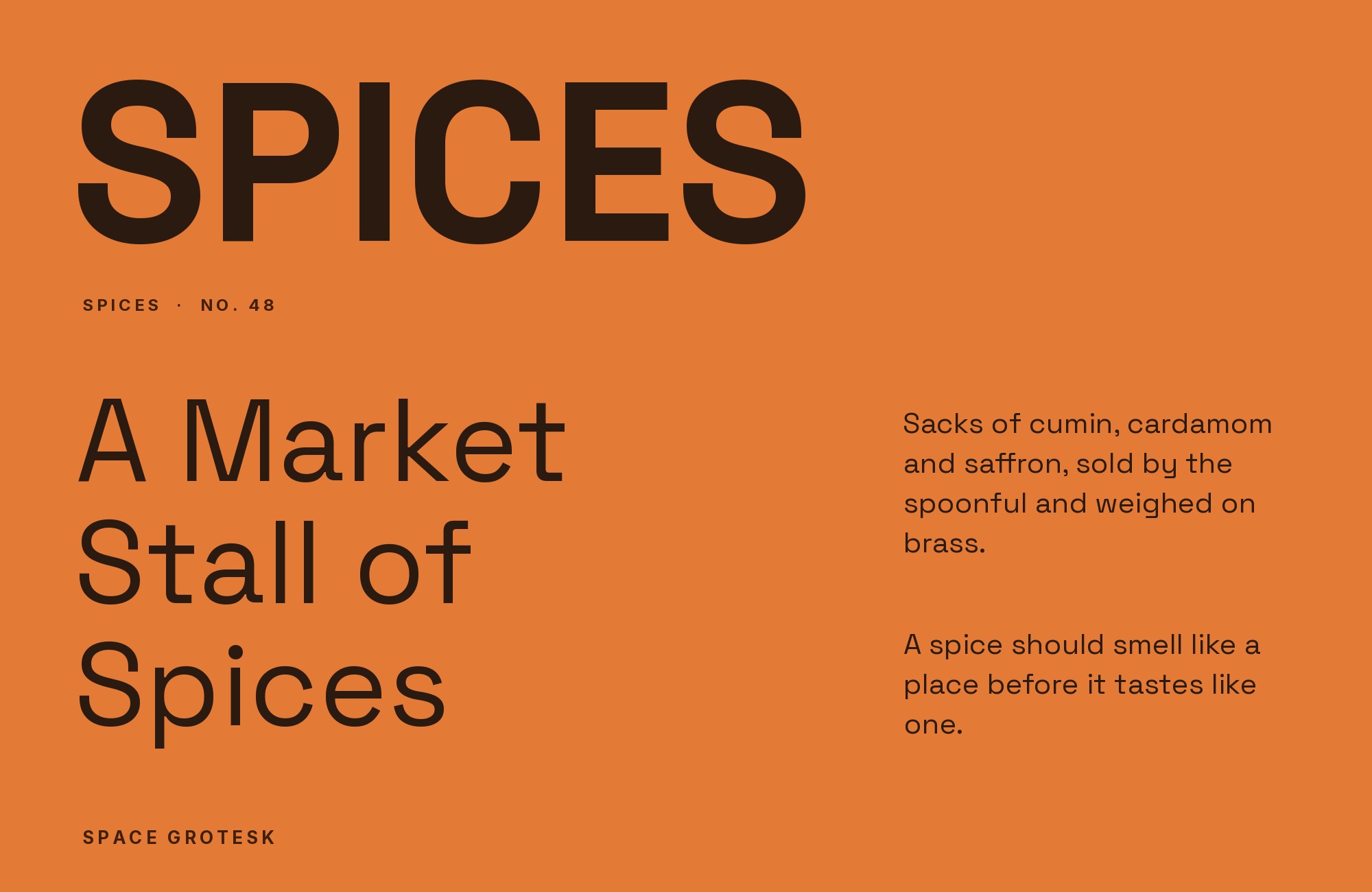
What fonts go with Space Grotesk? The answer depends on whether you treat it as a neutral grotesque or as a display face, and it is emphatically the second. Space Grotesk carries too many peculiar details to stay quiet underneath anything, so a partner’s job is to hold everything Space Grotesk cannot.
Florian Karsten drew Space Grotesk as a proportional variant of Colophon Foundry’s Space Mono, the fixed-width family Colophon made for the 2016 relaunch of Google Fonts. Fonts In Use and Typewolf date the design to 2017; Karsten’s own description dates the original design to 2018, with version 1.0 that January. Typewolf lists five weights without italics. It went out under the SIL Open Font License and reached the Google Fonts library in October 2020. What makes it distinctive is what Karsten refused to normalize: Space Mono’s angled terminals, its flat-sided bowls, the curled leg on the R and the low, hooked ear on the g all survive the move to proportional widths. The result is a low-contrast monoline grotesque with the silhouette of a neutral workhorse and the details of a display face.
That mismatch drives every pairing decision. Space Grotesk’s documented use in shipped work — tech branding, crypto and startup identities, design portfolios, festival systems — nearly always puts it in the display and short-text role, with a second family carrying the paragraphs. Two families of partner do that job well. A neutral sans with no personality of its own keeps the system in one voice and lets Space Grotesk’s quirks read as intentional. A reading serif creates the wider gap that editorial and long-form work needs, and it stops a technical brand from feeling cold. Here are 15 fonts that pair with Space Grotesk, ordered by how much real evidence supports each one.
1. Space Mono

Colophon Foundry designed Space Mono for the 2016 relaunch of Google Fonts, releasing it as a monospace-first family combining grotesque and geometric influences. It is not merely a compatible partner — it is the parent design Space Grotesk was derived from, which means the two share a skeleton and differ almost entirely in metrics. Fonts In Use records the pair shipping together in several productions, including CPS IT, Artoid Studio and Othernity, more than any other combination involving Space Grotesk, and those projects converge on one arrangement. Space Grotesk takes headlines and running text where proportional widths keep the rhythm readable; Space Mono takes navigation labels, data tables, timestamps, product codes and anything that benefits from a visible fixed-width grid. Because the letterforms match, the grid reads as a deliberate mode switch rather than a second typeface. This is the safest pairing on the list and the one to start from.

2. Inter

Rasmus Andersson designed Inter and released it in 2017 with a single objective: legibility at small sizes on a screen. Its tall x-height, open apertures and near-mechanical neutrality make it the most self-effacing sans in wide use, and that is exactly the quality Space Grotesk needs beneath it. Typ.io names Inter first in its own pairing list for Space Grotesk and backs it with live-site data, which matches what the pairing looks like in practice: Space Grotesk carries the logotype, hero headline and section headers, where its angled terminals and odd ear on the g register as brand character, and Inter runs every button, form label, tooltip and paragraph without drawing a glance. Use this combination for any product interface where the brand voice lives above the fold and the work happens below it.

3. Jost

Owen Earl designed Jost for his indestructible type* foundry as an open-source geometric sans in the Futura tradition, adding it to Google Fonts in 2020. Its value next to Space Grotesk is diagnostic. Jost is built from real circles and straight lines with almost no optical correction, so setting it alongside Space Grotesk exposes how little of Space Grotesk is actually geometric: the flat-sided bowls, the cut terminals and the compressed apertures all become visible as choices rather than accidents. Two independent records confirm the pairing: Typ.io’s weeeze.com and a role-playing booklet, Dragon Reactor, that sets Jost* beside Space Grotesk. Give Jost the subheads and pull quotes, and keep Space Grotesk for the primary display line, where the comparison flatters it most.

4. Source Serif 4

Frank Grießhammer designed Source Serif for Adobe in 2014 as a text companion to Source Sans, reworking it into the variable, optical-size family Source Serif 4 in 2021. Its strokes are restrained and structural rather than calligraphic, giving it a cool, precise voice that suits Space Grotesk far better than a warm book serif would. A documented identity system uses exactly this split, with Source Serif carrying reading text under Space Grotesk display type, and published compatibility indexes rank it among the strongest serif partners available. The pairing works because both faces are disciplined: neither introduces flourish, so the contrast lands entirely on stroke modulation and serif presence rather than on mood. Reach for it in technical documentation, research reports, and B2B or fintech pages where credibility matters more than warmth.

Webflow. Framer. Squarespace. Wix. Lovable. Not your future.
Your own AI CMS agent is.
Find Out More5. Work Sans

Wei Huang designed Work Sans, released through Google Fonts in 2015, as a grotesque optimized for on-screen text at middle sizes, with open apertures and a deliberately plain construction. It contains none of Space Grotesk’s eccentric details, which is the entire argument for it: the two faces never compete for the same job because only one of them has anything to say. A shipped identity documents the split cleanly, with Work Sans holding neutral text while Space Grotesk supplies the display voice. Compared with Inter, Work Sans reads slightly warmer and less mechanical, so it is the better choice when the brand sits closer to culture than to software. Set it at reading sizes for body copy and captions, and never promote it above a subhead.

6. IBM Plex Serif

Mike Abbink designed the IBM Plex family with Bold Monday, releasing IBM Plex Serif in 2017 as IBM’s corporate typeface — a serif that grafts Bodoni-influenced detail onto the same engineered skeleton as Plex Sans. That origin is why it works here. Most serifs soften a technical brand; Plex Serif adds serif texture while keeping the register unmistakably engineering-minded, because it was drawn for a computing company under the same constraints. Fonts In Use documents it alongside Space Grotesk and Space Mono in a single real system, which is the pattern to copy: grotesque display, monospace data, Plex Serif for the paragraphs that need gravity. Use it where a developer-facing product needs editorial weight without pretending to be a magazine.

7. Newsreader

Production Type designed Newsreader and released it through Google Fonts in 2020 for on-screen news reading, giving it sturdy, low-contrast strokes and a variable optical size axis that thickens hairlines as the type gets smaller. Sam Corijn’s book design for The Collective Spark documents it inside a multi-family system built around Space Grotesk, carrying the long reading passages the grotesque is far too mannered to hold. The structural fit comes from x-height: Newsreader sits close enough to Space Grotesk’s that the two can share a baseline grid and a caption scale without optical adjustment. Use it for articles, chapters and any text long enough that a reader’s eye needs a serif’s stroke rhythm to stay on the line.

8. Spectral

Production Type drew Spectral, added to Google Fonts in 2017, as a screen-first serif with generous sidebearings and an unusually even colour on the page. It appears in the same documented book system as Newsreader, and it makes a different argument. Where Newsreader has news-page sturdiness, Spectral is calm and widely spaced, which is the quietest possible counterweight to Space Grotesk’s angled cuts and tight apertures. That spacing matters: Space Grotesk set large and tracked tight produces a dense, insistent headline, and Spectral’s airy text block gives the eye somewhere to rest immediately below it. Choose Spectral over Newsreader when the page has more white space than content and the tone should read considered rather than urgent.

9. Rubik

Hubert and Fischer designed Rubik for the Chrome Cube Lab project, releasing it through Google Fonts in 2015 with slightly rounded corners across the whole family. Those rounded corners are the reason to pair it here. Space Grotesk’s own curves are softened where they meet the stems, and Rubik repeats that softening at a smaller scale, so the two grotesques read as siblings rather than competitors — a rare case where similarity is the point. It appears alongside Space Grotesk in the same documented book system. Use Rubik for secondary headings, interface chrome and callouts when the design needs a second sans that extends the voice rather than contradicting it, and keep a clear size gap so the family resemblance never becomes confusion.

10. Barlow

Jeremy Tribby designed Barlow, added to Google Fonts in 2017, as a slightly rounded low-contrast grotesk drawn from Californian public-signage vernacular and shipped in three widths across a deep weight range. That range is its practical value beside Space Grotesk, which offers five weights and no italics and no condensed cuts at all. Barlow covers everything Space Grotesk structurally cannot: condensed captions, tight table columns, dense legal text, small metadata labels. The same documented book system uses it in exactly that supporting capacity. Treat Barlow as the utility layer of the type system — the family you reach for when a layout problem is about width rather than voice — and let Space Grotesk keep every position where the type is meant to be noticed.

11. Sabon

Jan Tschichold designed Sabon, released in 1967, as a Garamond-based old-style face engineered to set identically on Linotype and Monotype machines and in handset foundry type. Putting a 1967 revival of a 16th-century design against a 2017 grotesque opens the widest historical gap on this list, and the French film magazine La Septième Obsession documents it working in a real editorial system alongside Space Grotesk and Space Mono. The pairing succeeds because Sabon’s warmth and pronounced stroke contrast are so far from Space Grotesk’s flat monoline that no one reads the combination as an accident. Use it for criticism, essays and cultural publishing, where the serif signals literary seriousness and the grotesque keeps the design contemporary.

12. Americana

Richard Isbell designed Americana for American Type Founders in 1965 as a flared serif that reads, to the eye, as wide and open at display sizes. Americana earns its place next to Space Grotesk on proportion rather than period: its open, generous forms hold legibility at the same optical size as the grotesque, so the two can share a scale without one looking shrunken. Typewolf documents the pair running together on a live agency site. The flared stems — serifs that swell out of the stroke instead of bracketing off it — give the combination a distinctly American display character that matches Space Grotesk’s confidence without imitating its geometry. Keep Americana at subhead and pull-quote sizes where the flaring is visible.

13. JetBrains Mono

JetBrains released JetBrains Mono in 2020 as a coding typeface, built with a deliberately tall x-height, increased lowercase letter height and exaggerated differentiation between characters that confuse easily in source code. Published compatibility scoring ranks it the second-strongest Space Grotesk combination after Space Mono, and the reasoning holds structurally: it is a fixed-width face with the same contemporary, engineered temperament, but with clearer character separation than Space Mono’s more mannered forms. Use it when the fixed-width text is real code a reader must parse; use Space Mono when the monospace is there for texture. Set JetBrains Mono for documentation snippets, terminal output and API references under Space Grotesk headings.

14. Literata

TypeTogether designed Literata for Google Play Books, releasing it in 2015 and later rebuilding it as a variable family. Literata is a reading serif with more weight in the strokes and sturdier, nearly slab-like serifs than a traditional book face, drawn specifically to survive backlit screens at small sizes. Its role beside Space Grotesk is the warm alternative to Source Serif 4: where Grießhammer’s face reads cool and technical, Literata reads solid and comfortable, which suits consumer publishing, education and any long-form page that should feel welcoming rather than clinical. This is the least documented pairing here — it comes from compatibility indexing rather than a shipped project — but the structural logic is sound. Set it at 18px or larger and let its stroke weight balance Space Grotesk’s dark display lines.

15. IBM Plex Mono

The City of Břeclav’s visual identity manual lists Space Grotesk and IBM Plex Mono among its example secondary typefaces. The mono turns technical strings, labels, and small data into an unmistakable functional layer while Space Grotesk carries the larger civic voice. Use the grotesque for headings and public-facing statements, then switch to IBM Plex Mono for codes, coordinates, dates, or compact supporting details. Both families have a constructed texture, so separate them by role and size rather than stacking similar medium weights. The pairing suits wayfinding, developer products, and information-heavy identities that need a modern headline with a visibly systematic secondary voice.

Conclusion
Space Grotesk is a display face wearing a workhorse’s silhouette, and every successful system built on it acknowledges that. The pattern documented across shipped identities, portfolios and editorial work is consistent: Space Grotesk holds the logotype, headlines and short interface labels, and exactly one other family carries everything a reader has to spend time with. Choosing the partner is really choosing which gap you want — Space Mono and JetBrains Mono keep the system inside one technical register, Inter and Work Sans erase themselves so the grotesque stays the only voice, and Rubik and Barlow extend the sans family sideways into weights and widths Space Grotesk never shipped.
The serif options are the more consequential decision. Source Serif 4 and IBM Plex Serif keep an engineering tone; Newsreader and Spectral optimize for reading on screen; Literata adds warmth; and Sabon and Americana push the contrast far enough that the page reads as editorial design rather than product design. Whichever direction you take, set the partner at its real reading size before judging it, because Space Grotesk’s idiosyncrasies grow more assertive as the type gets larger and more invisible as it gets smaller. A pairing that looks balanced in a specimen can go badly out of proportion once the headline is 72px and the body text is 17px.
Sources
- Typewolf (Space Grotesk)
- Typ.io (Space Grotesk)
- Fonts In Use (Space Grotesk typeface page)
- Fonts In Use (exact-phrase search)
- Fonts In Use (CPS IT brand identity)
- Fonts In Use (La Septième Obsession #24)
- Fonts In Use (Artoid Studio)
- Fonts In Use (Othernity)
- Fonts In Use (The Collective Spark)
- Fonts In Use (seekicks)
- Fonts In Use (Dragon Reactor)
- FontAlternatives (Space Grotesk pairings)
- Google Fonts metadata
- Adobe Fonts (Sabon)
- MyFonts (Americana search)
- Typewolf (Space Mono)
- City of Břeclav visual identity manual
