Lexend pairs great with Kalam, Zilla Slab and Lora. All 14 pairings are shown below in real rendered specimens, with the reason each one works.

What fonts go with Lexend? Lexend is unusual because it was built to solve a reading problem, not to express a style. That changes the pairing question. You are not looking for a partner that adds personality to a plain sans. You are looking for one that keeps the page as easy to read as Lexend itself.
Lexend fonts are intended to reduce visual stress and so improve reading performance. Bonnie Shaver-Troup, creator of the Lexend project, first had dyslexia and struggling readers in mind. She worked as an educational therapist in Silicon Valley, and Fonts In Use records that Lexend was designed by Bonnie Shaver-Troup and Thomas Jockin in 2018, based on the Quicksand project from Andrew Paglinawan. The name covers a whole system. The first set of Lexend fonts by Thomas Jockin (Deca, Exa, Giga, Mega, Peta, Tera and Zetta) becomes wider and more openly spaced, and plain Lexend is now a variable font with a weight axis. This article is about plain Lexend, the standard-width member. Its forms are simple and geometric, its spacing is generous, and its letters are clearly separated, which is exactly why it reads so easily in long text.
That makes Lexend a very good text face and a fairly quiet display face. Most of the published advice uses it one of two ways: as a clean, friendly headline over a serif text face, or as the body text under something with more character. The documented real-world uses add a third option, a handwritten or display accent on top of Lexend’s plain reading voice. Whatever you choose, protect what Lexend is for. Keep the partner readable, keep the contrast clear, and do not tighten Lexend’s spacing to make it fit. Here are 14 fonts that pair with Lexend.
1. Kalam
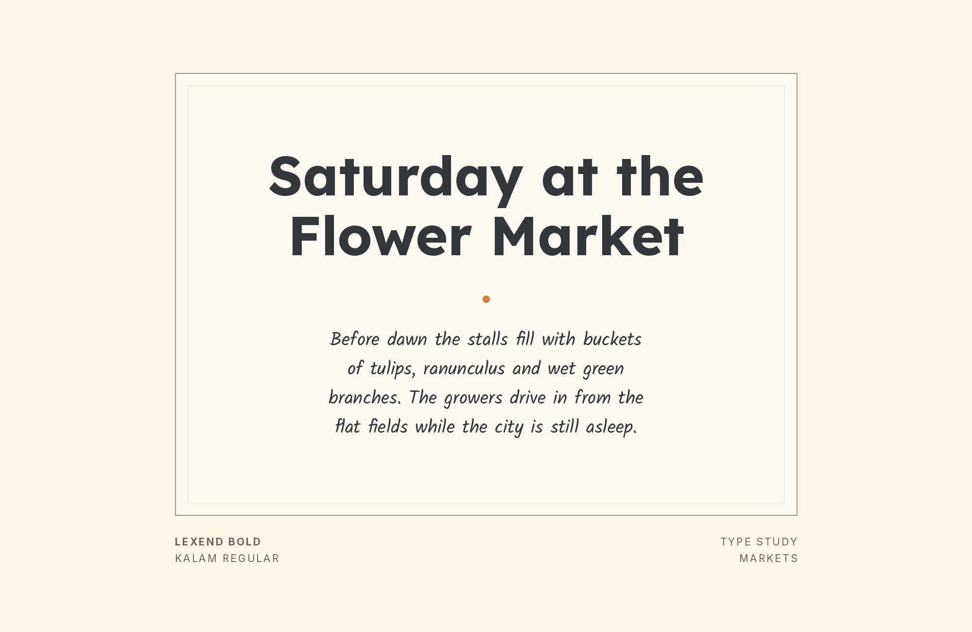
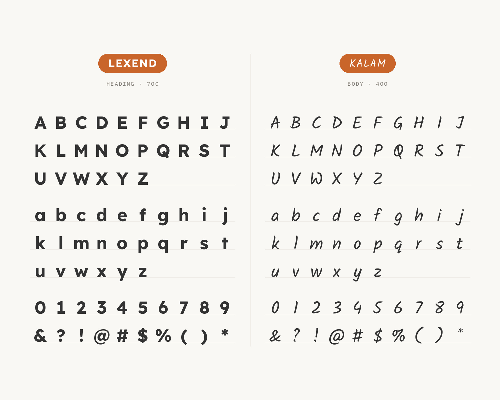
Kalam comes from a real deployment of Lexend in education. Oak National Academy says its slide decks and worksheets use Lexend and Kalam, and describes both as accessible fonts chosen so everyone has the same experience. Kalam is a handwriting-style typeface first published by the Indian Type Foundry in 2014, and its letterforms feature a very steep slant from the top right to the bottom left. That combination makes sense for a classroom. Lexend carries the instructions, questions and reading passages in its clear, evenly spaced forms, and Kalam adds a teacher’s handwritten note: a label, a hint or a highlighted word. Keep Kalam short. Its slant and informal strokes are friendly in a caption but tiring in a paragraph, and Lexend should always do the real reading.
2. Zilla Slab
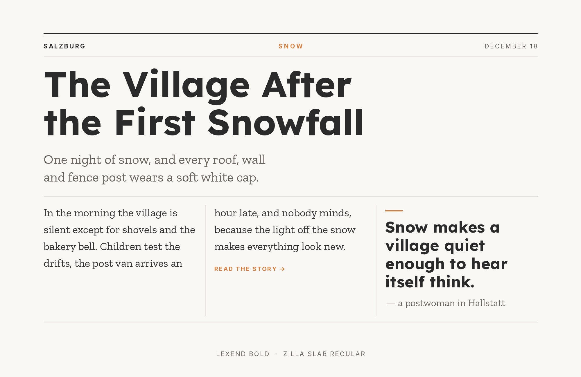
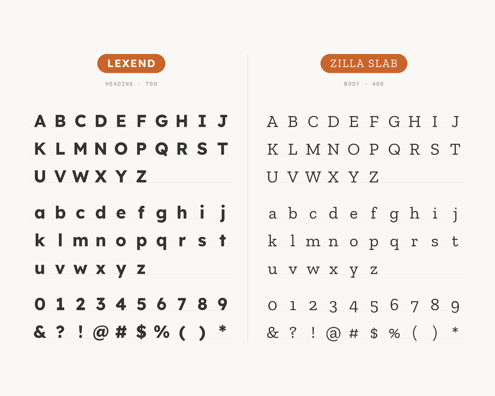
Zilla Slab is recommended with Lexend by Leadpages, which uses Lexend as the headline font and Zilla Slab for paragraphs, and by a Bootcamp article on UI pairings. Zilla Slab is Mozilla’s core typeface, a contemporary slab serif based on Typotheque’s Tesla. The pairing works on shared geometry. Lexend’s rounded, open forms and Zilla Slab’s smooth curves have the same friendly construction, while the slab serifs give the text a firmer, more editorial texture than a second sans would. Set Lexend in a medium or semibold weight for headings, and let Zilla Slab run the body at a comfortable size. It suits product blogs, documentation and technical publishing where you want warmth and structure without the formality of a classic book serif.
3. Lora
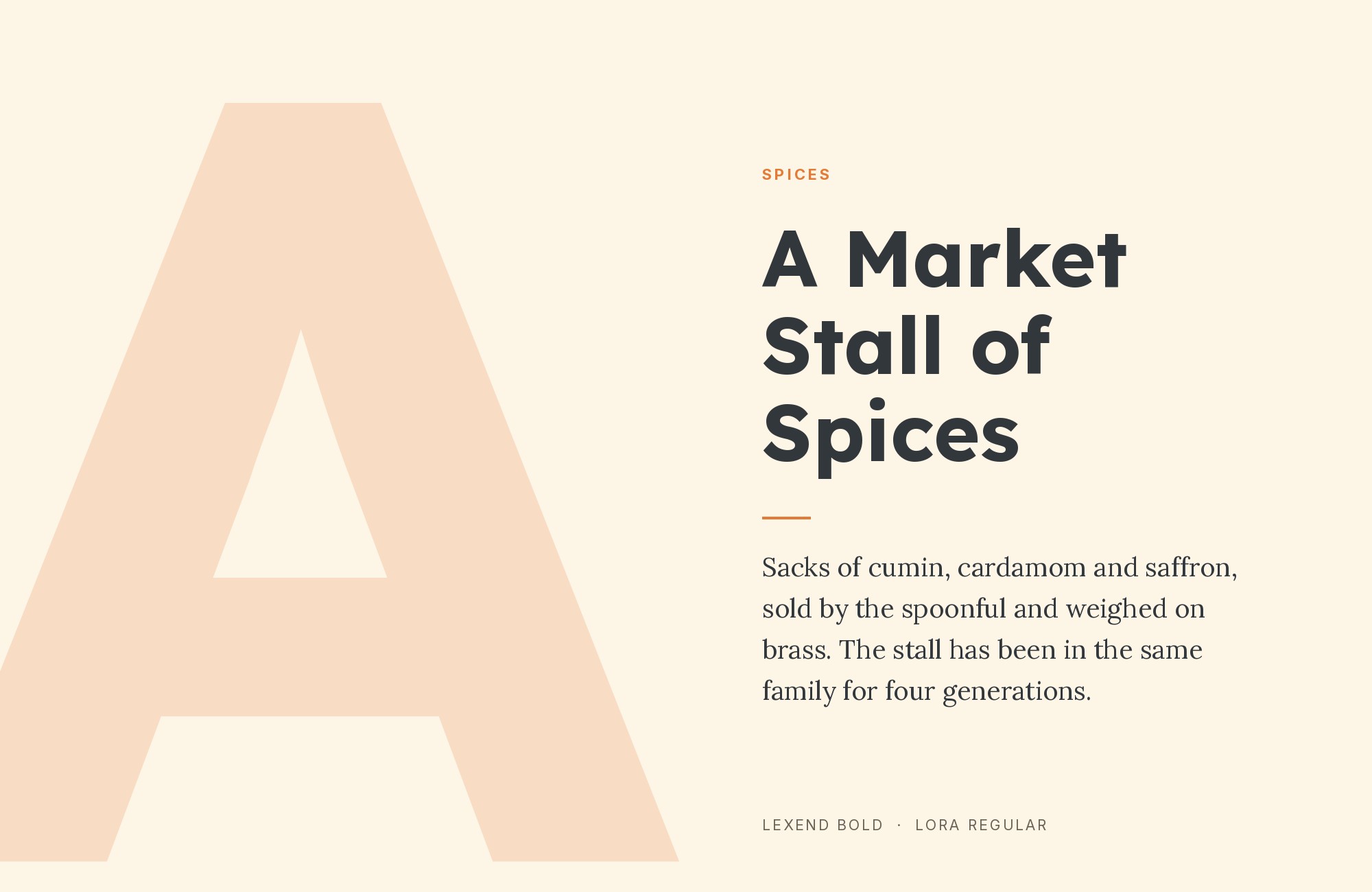
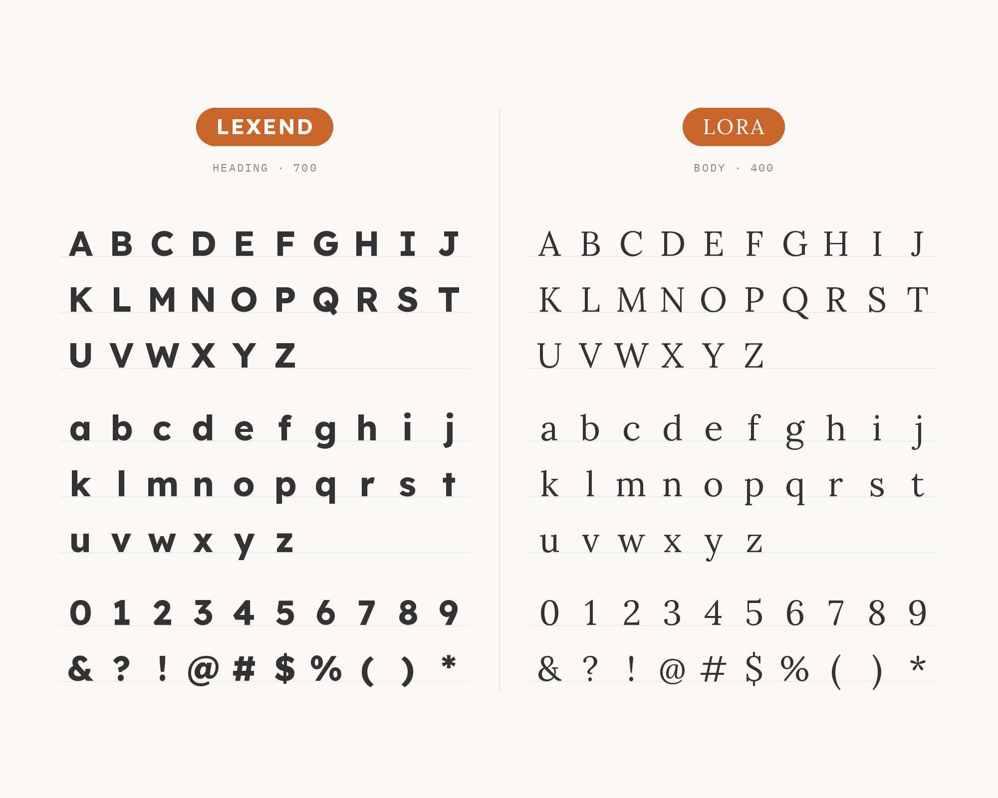
Lora is DiverseKit’s pick for Lexend in education and nonprofit work, where the article suggests pairing it with Lora for warmth. Lora is a well-balanced contemporary serif with roots in calligraphy. It is a text typeface with moderate contrast well suited for body text. The contrast with Lexend is clear and gentle. Lexend is upright, geometric and evenly spaced, while Lora brings brushed curves and a slight calligraphic movement. Use Lexend for headings, navigation and interface text, and Lora for long reading. The pair keeps an accessible, modern frame around content that still feels human. It works well for charity sites, course material, and any layout where you want the headings to feel clear and the stories to feel personal.
4. Merriweather
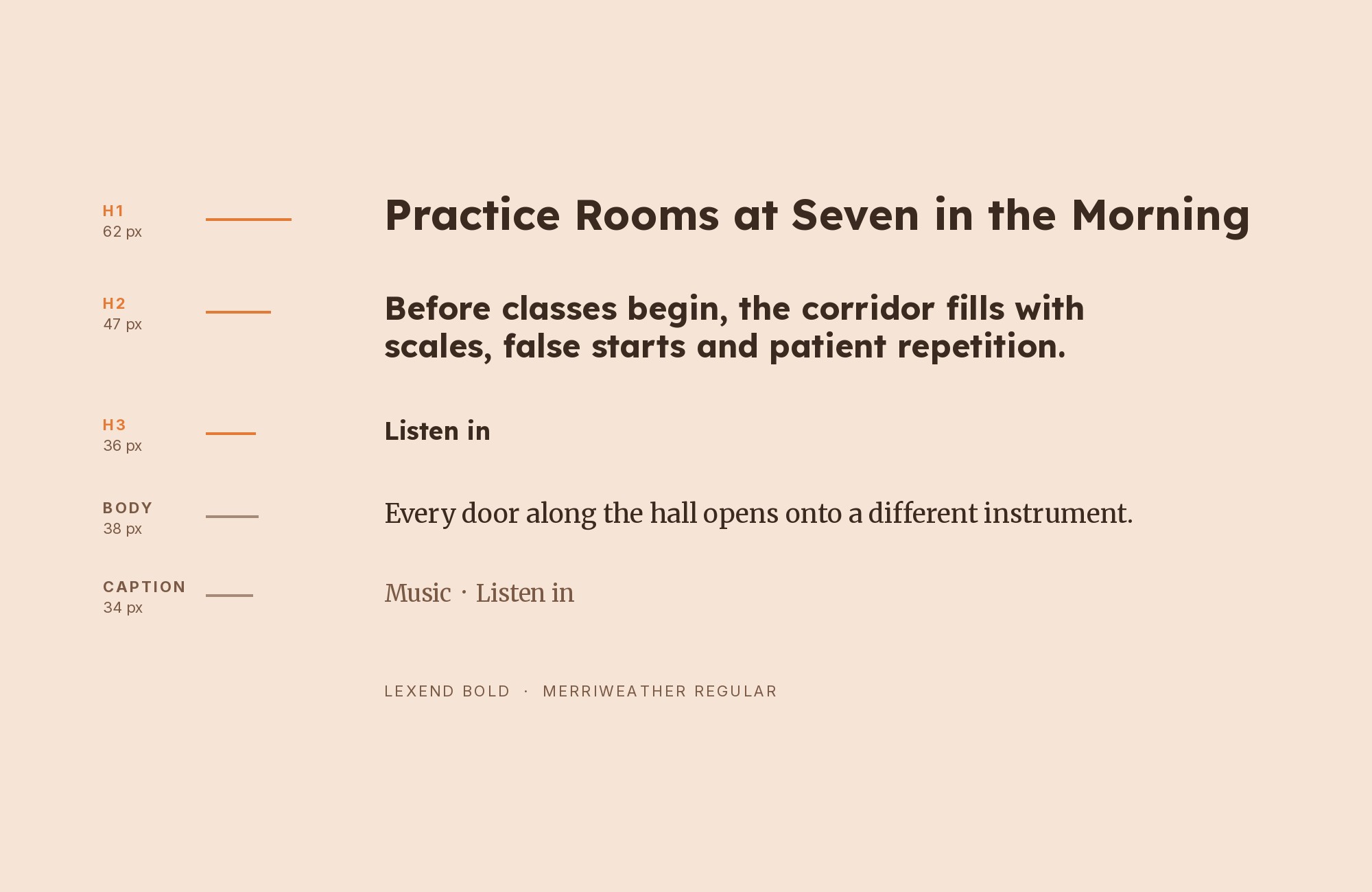
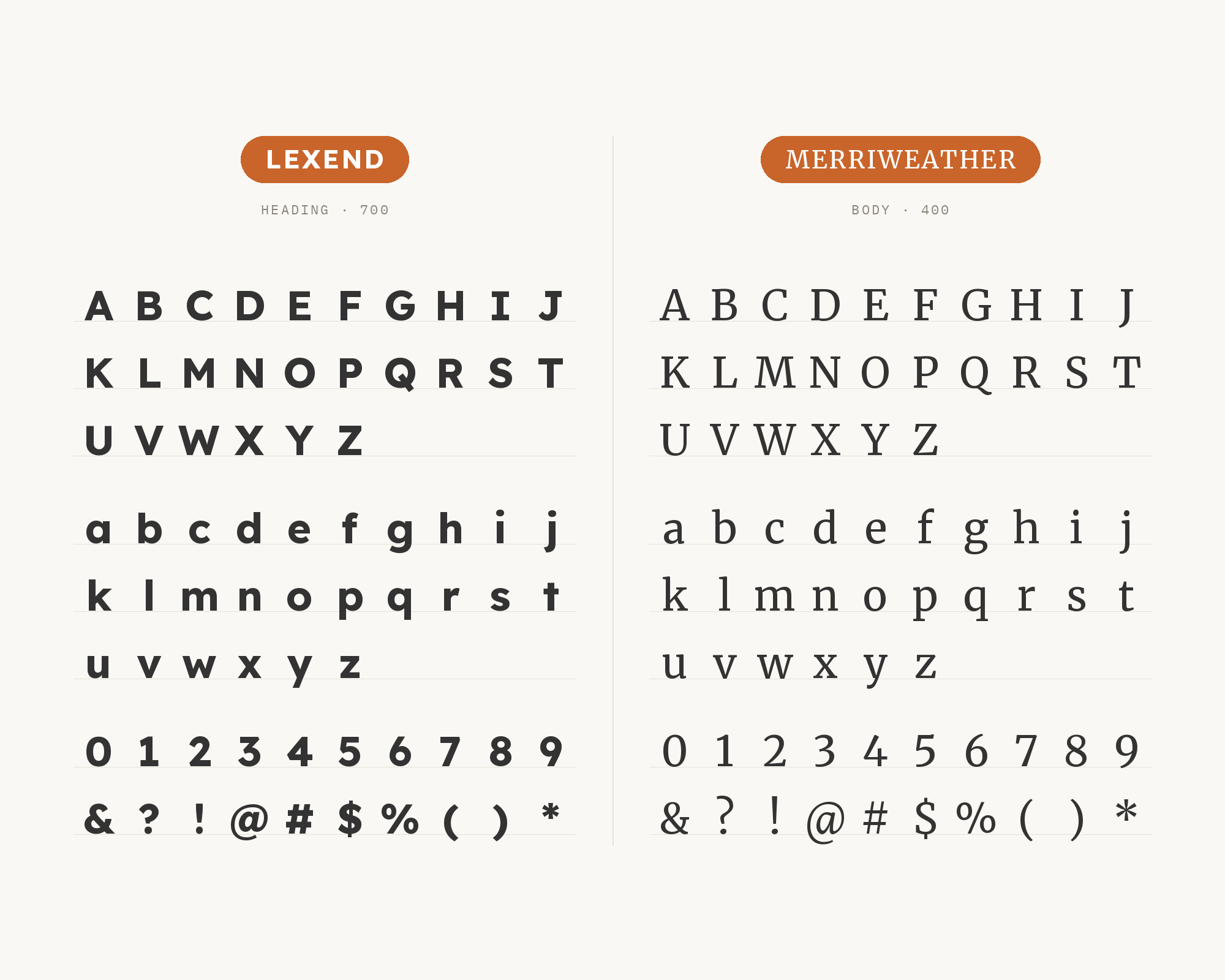
Merriweather appears beside Lexend on a real site. One Page Love lists the typefaces on the HAUS portfolio site as Lexend, Merriweather and Urbanist. Merriweather was designed to be a text face that is pleasant to read on screens, with a very large x-height, slightly condensed letterforms, a mild diagonal stress, sturdy serifs and open forms. That makes it one of the most natural reading partners for Lexend. Both faces were built with screen reading in mind, both have large, open lowercase shapes, and Merriweather’s sturdy serifs hold up well at small sizes. Lexend works best on top, in headings and labels, with Merriweather in the running text. Because Merriweather is slightly condensed, it also sets a little more text per line than Lexend, which helps on long pages.
Don't start with a blank page. Shutterstock Unlimited: endless downloads of premium human-made assets plus powerful AI tools.
Sign Up5. Roboto
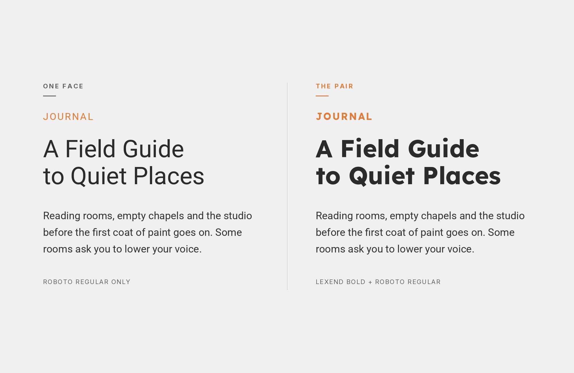
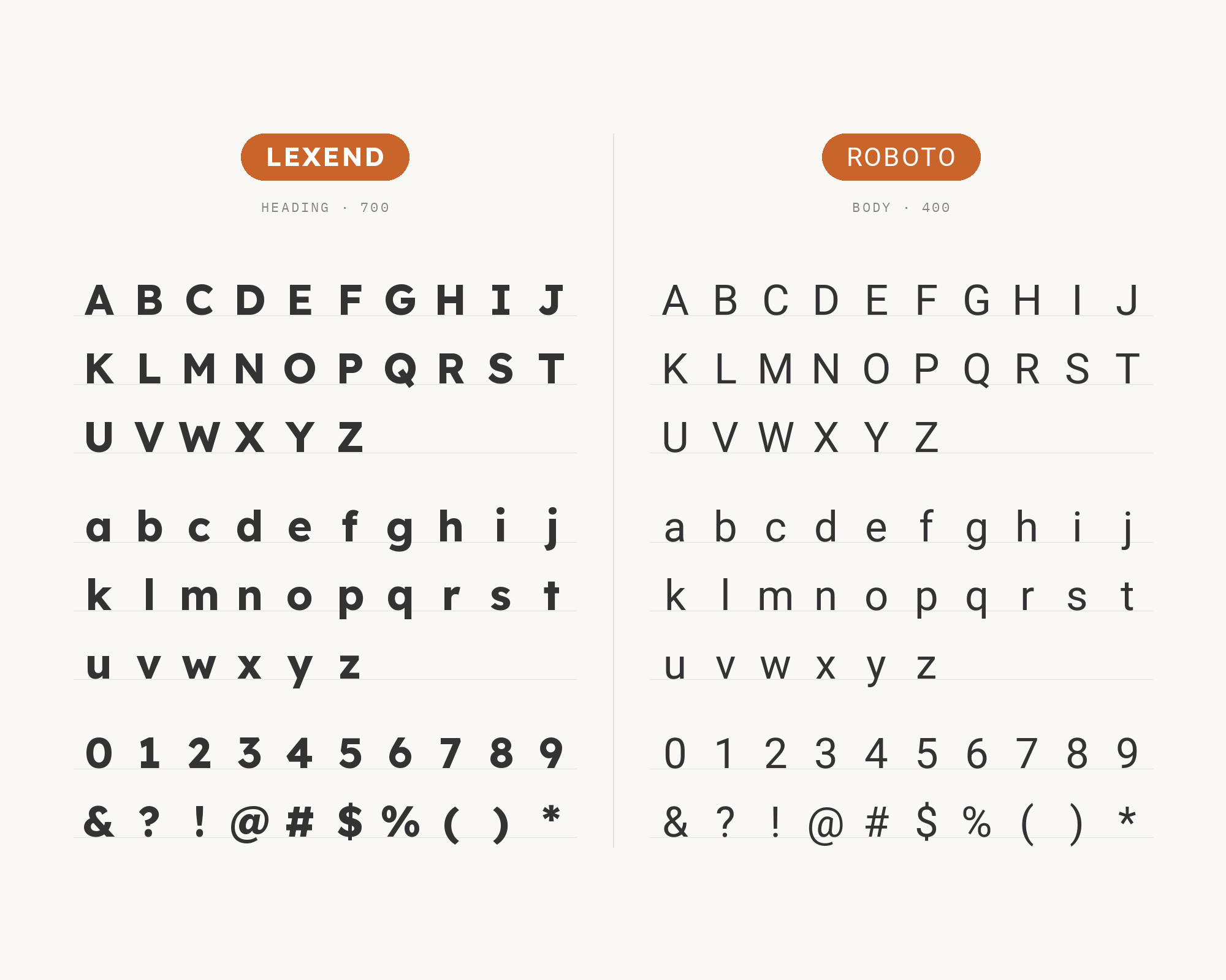
Roboto is Magezon’s example of a pair with a balanced mood: the combination of Lexend and Roboto, it says, balances aesthetics and functionality. Google describes Roboto as having a mechanical skeleton with largely geometric forms, while the font features friendly and open curves. Next to Lexend, Roboto is the tighter, more neutral sans. Lexend’s wider spacing and simpler shapes make it the more readable of the two for long passages, so a useful split is Roboto for interface chrome, buttons and data tables, and Lexend for headings and reading text. Roboto’s familiarity also helps in apps and dashboards, where users expect a system-like face for controls. Keep the weights clearly different so the two sans serifs do not look like a mistake.
6. Quicksand
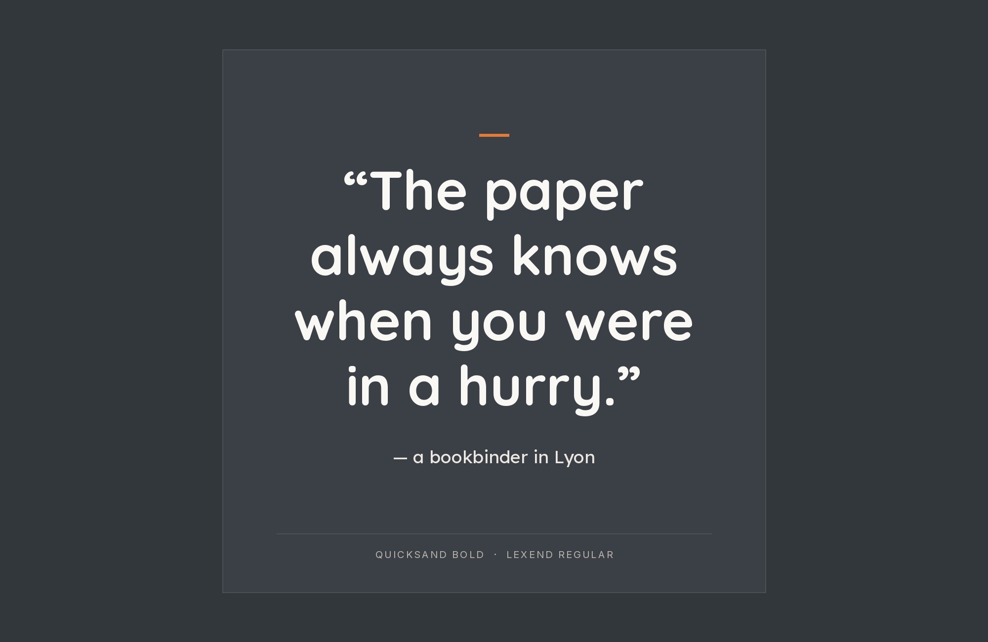
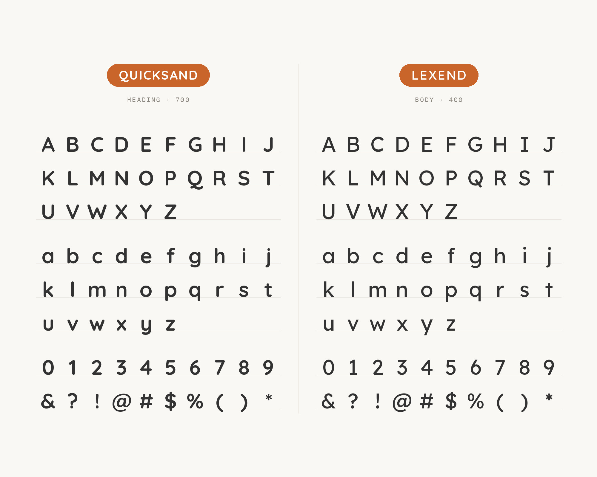
Quicksand is a family pairing in the historical sense. Fonts In Use notes that Lexend’s design is based on the Quicksand project from Andrew Paglinawan, and Todaymade pairs Lexend and Quicksand for educational content, explainer pages and infographics. Quicksand is a display sans serif with rounded terminals, initiated by Paglinawan in 2008 using geometric shapes as a core foundation. So the two share a skeleton, but Quicksand’s rounded ends and lighter, softer texture make it more playful. Todaymade’s advice matches the structure: Lexend for body text, Quicksand for friendly headlines. Keep Quicksand large, because its rounded, light forms are made for display, and let Lexend do all of the reading below it.
7. Noto Serif
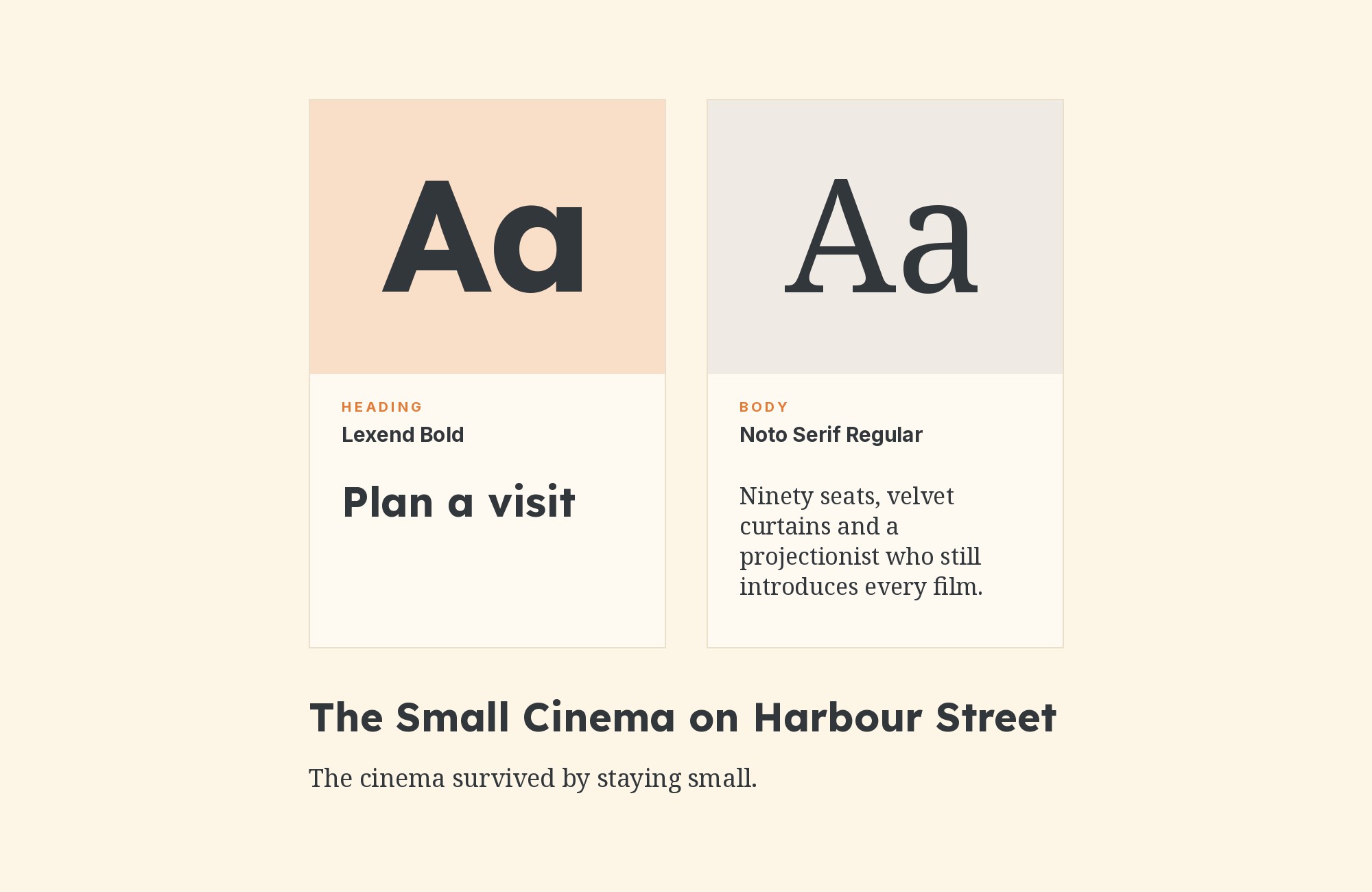
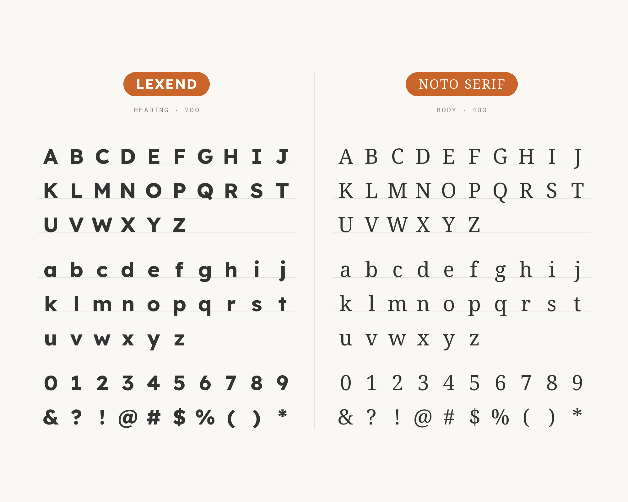
Noto Serif is the example Imperavi’s book on user interface typography gives for a sans heading over a serif body: Lexend for heading, Noto Serif for body text. Noto Serif is a modulated serif design for texts in the Latin, Cyrillic and Greek scripts. It is a sturdy, conventional text serif, and that is its strength here. It adds the familiar texture of book typography without calling attention to itself, so Lexend’s simple, generous forms stay the most distinctive thing on the page. The Noto family’s wide language coverage also makes this a practical choice for multilingual products, where the serif text can follow the reader into other scripts. Use Lexend SemiBold for headings, and give Noto Serif a generous line height.
Unlimited fonts from $16.50/mo.
29 million fonts, templates and stock assets. One subscription, unlimited downloads.
See the plan8. Public Sans
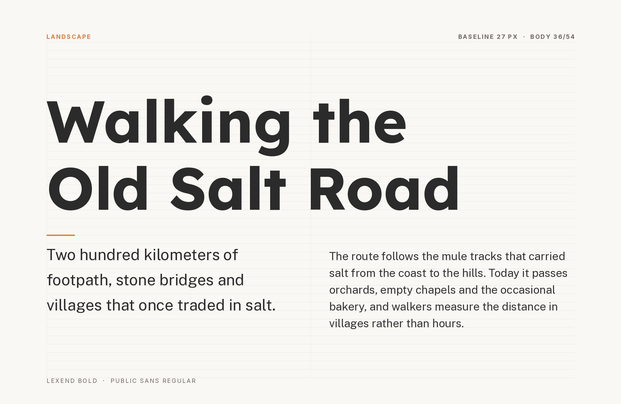
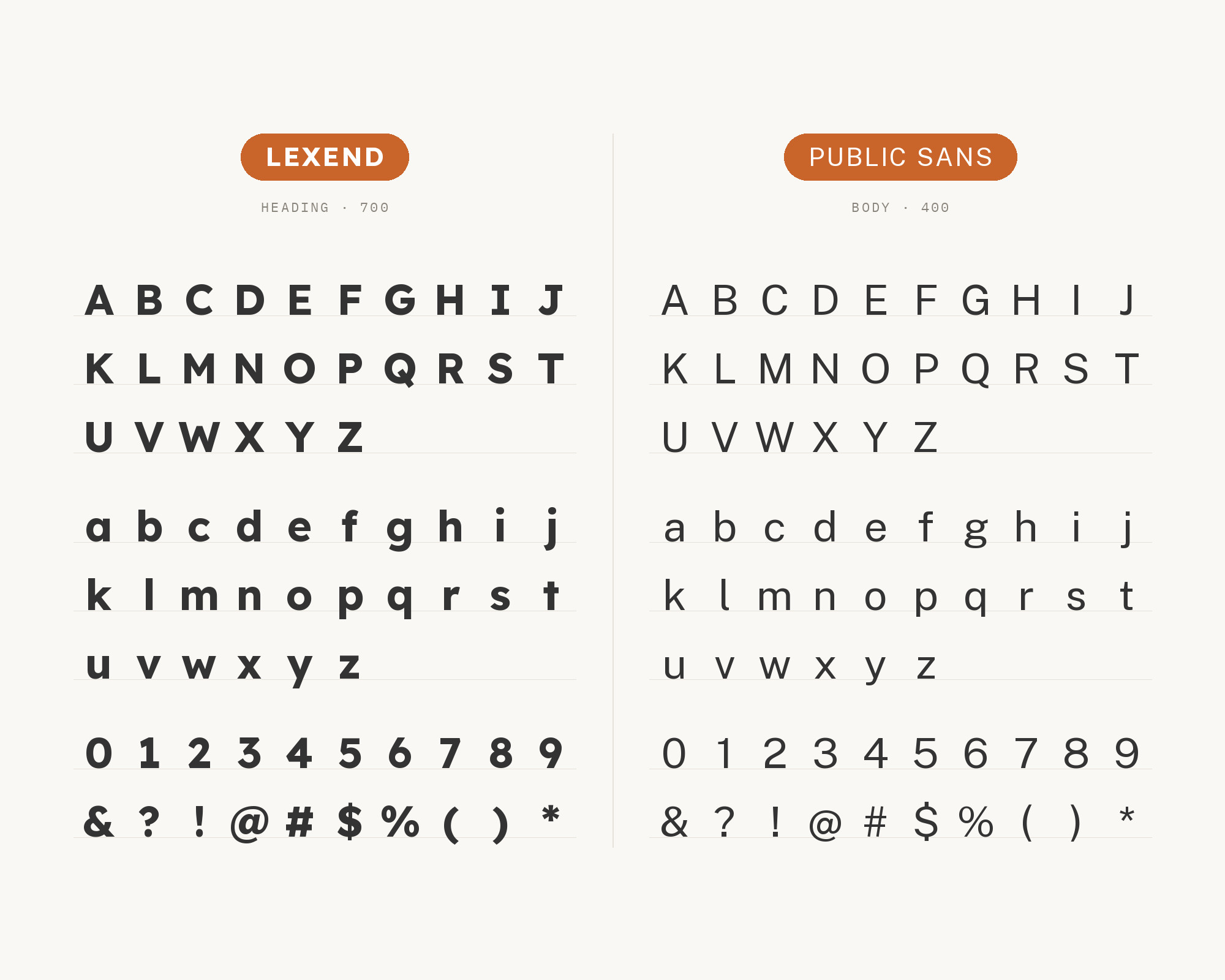
Public Sans is Rossul’s recommendation for Lexend headings, with Public Sans for body text on educational websites, accessibility-focused platforms and content-heavy websites. Based on Libre Franklin, Public Sans is a strong, neutral typeface for interfaces, text and headings, developed by the United States Web Design System. This is a sans-with-sans pairing that works because the roles are clear. Lexend’s rounded geometry gives headings a friendly, approachable tone, and Public Sans brings the steady, institutional neutrality of a government design system to the text. That combination fits public services, forms, health information and any interface where trust and plain reading matter more than style. Keep a clear size and weight step between them.
9. Literata
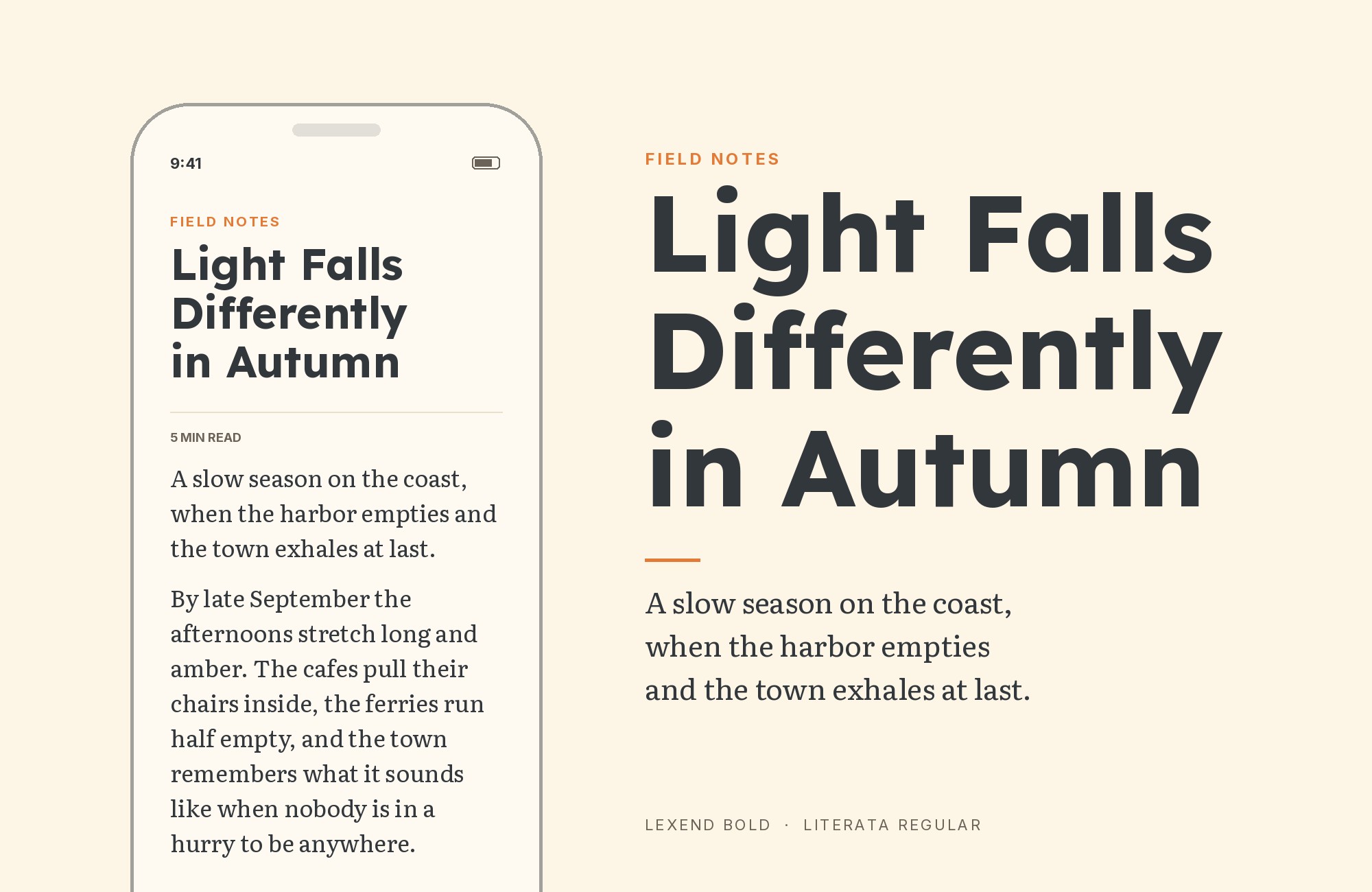
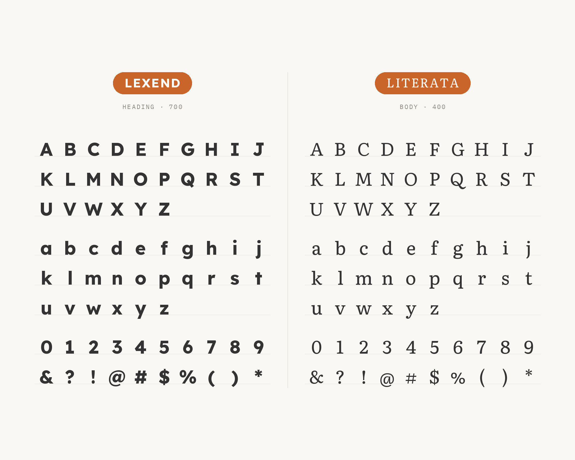
Literata is paired with Lexend in the tasteful-pairings package for the Typst typesetting system, where Stephen Waits lists it as “legible – Reading-focused Lexend and Literata”. Literata was originally created as the brand typeface for Google Play Books, and it was designed by TypeTogether. Both faces were made for reading on screens, which makes this one of the most coherent pairings on the list. Lexend takes headings and short labels. Literata handles long text with a calm, bookish texture that holds up at small sizes and on low-quality screens. The pair suits e-books, reports, long-form articles and study material, anywhere a reader will spend real time with the text.
10. Crimson Pro
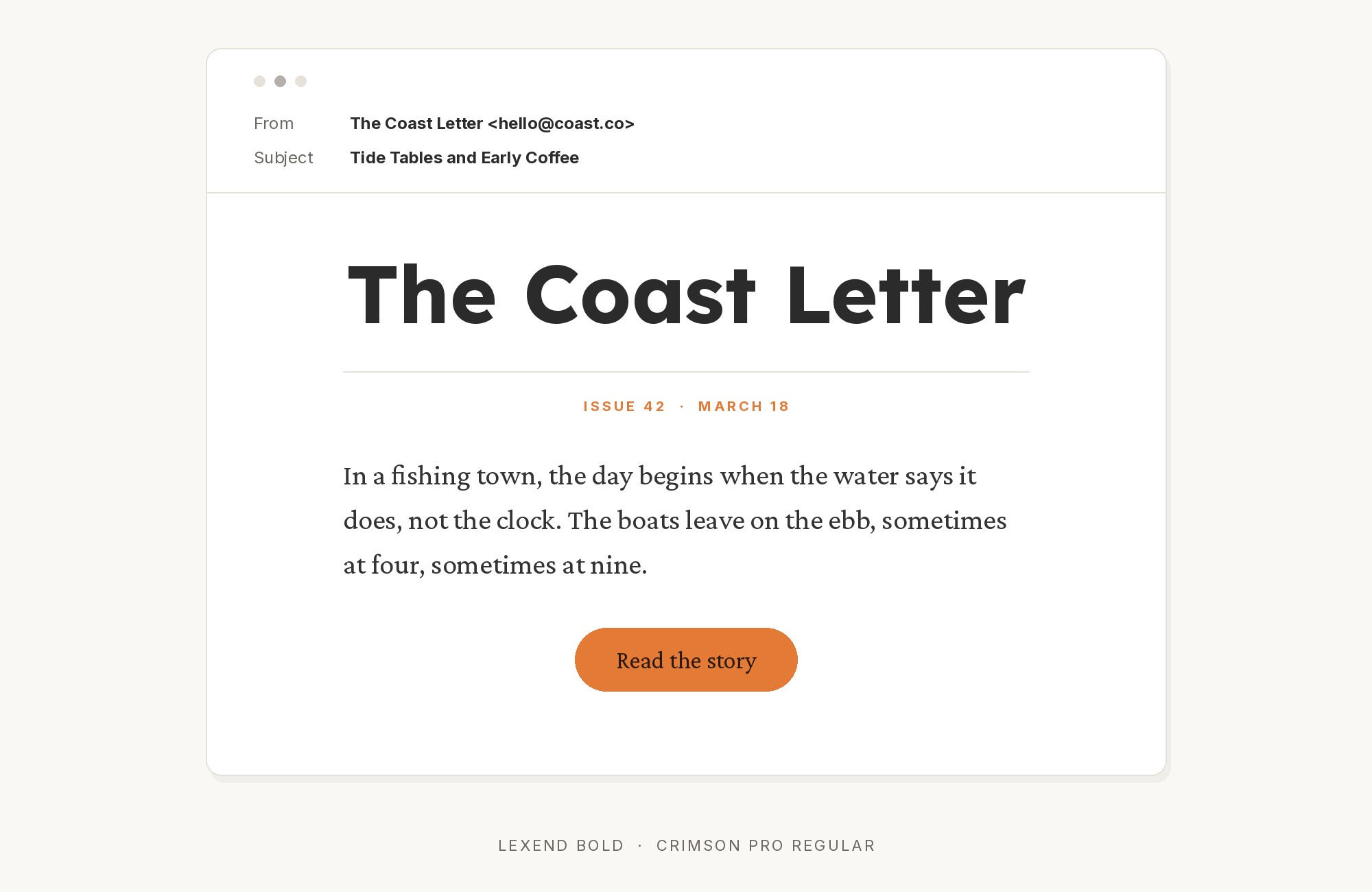
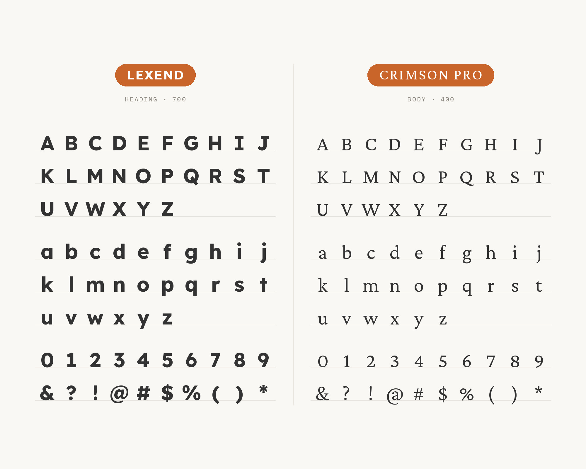
Crimson Pro is Magezon’s choice for a more scholarly tone: Lexend Bold with Crimson Pro, suggested for podcast episodes, research reports, or blogs with data visualizations. Crimson Pro is a Garamond-inspired serif, and Google commissioned Jacques Le Bailly to develop it as a new design that synthesises both earlier Crimson designs, first released in January 2019. Its old-style proportions and gentle contrast bring a classic literary feel that Lexend does not have. Use Lexend Bold for headings and labels, where its clear geometry organises the page, and Crimson Pro for body text and quotations. The contrast between a modern, even sans and a warm old-style serif is strong but calm, which suits academic and editorial content.
11. Bodoni Moda
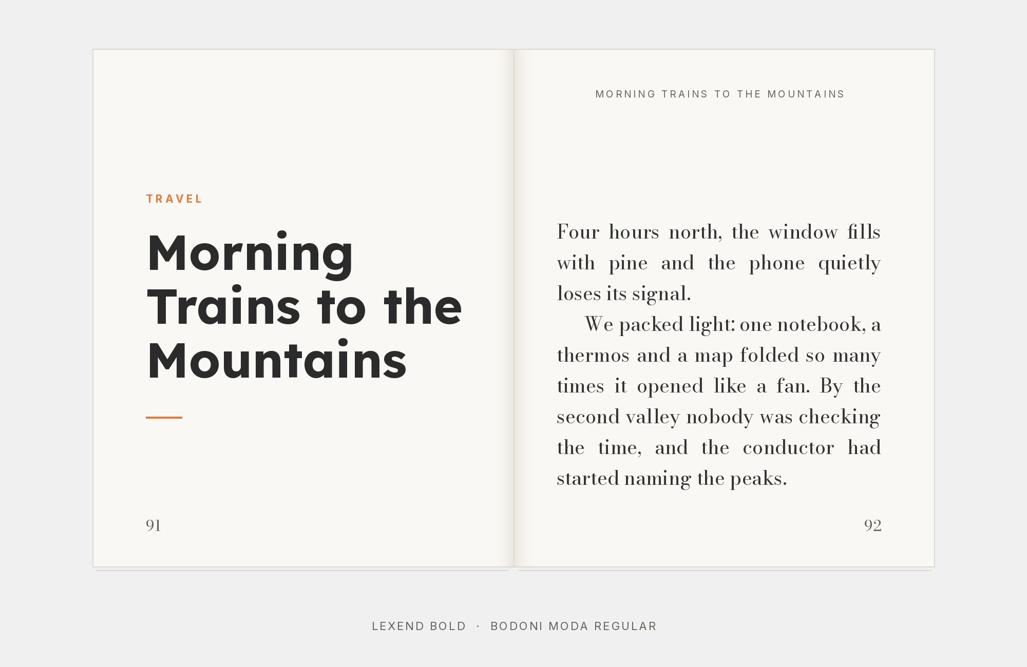
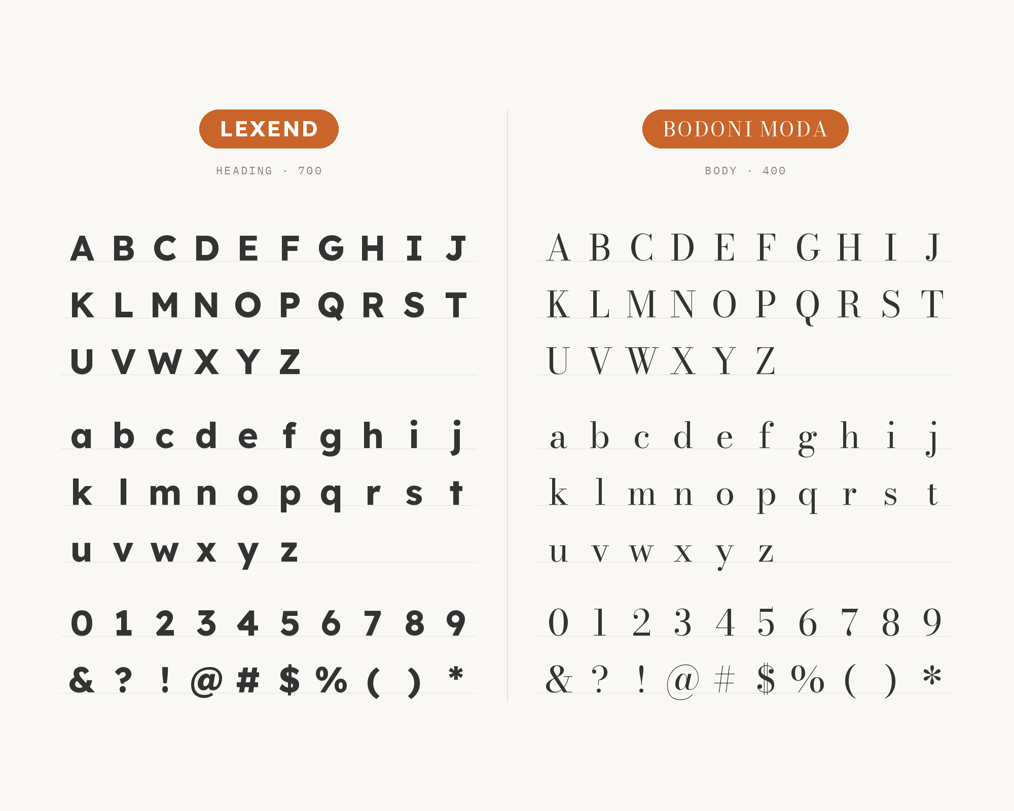
Bodoni Moda appears with Lexend on a real site. Typ.io records the pair on magdalenerhof.it, a hospitality site. Bodoni Moda is a no-compromises Bodoni family built for the digital age, designed by Owen Earl. This is a high-contrast pairing. Bodoni Moda’s hairlines and thick stems belong in large headlines, where they look elegant, while Lexend’s even, low-contrast strokes handle the text that a Didone should never set at small sizes. The effect is a fashionable, hotel-brochure look with a very readable body. Keep Bodoni Moda at display sizes, and let Lexend handle menus, booking details and descriptions. This is the most stylish pairing on the list, and it depends on a strict size hierarchy.
12. Urbanist
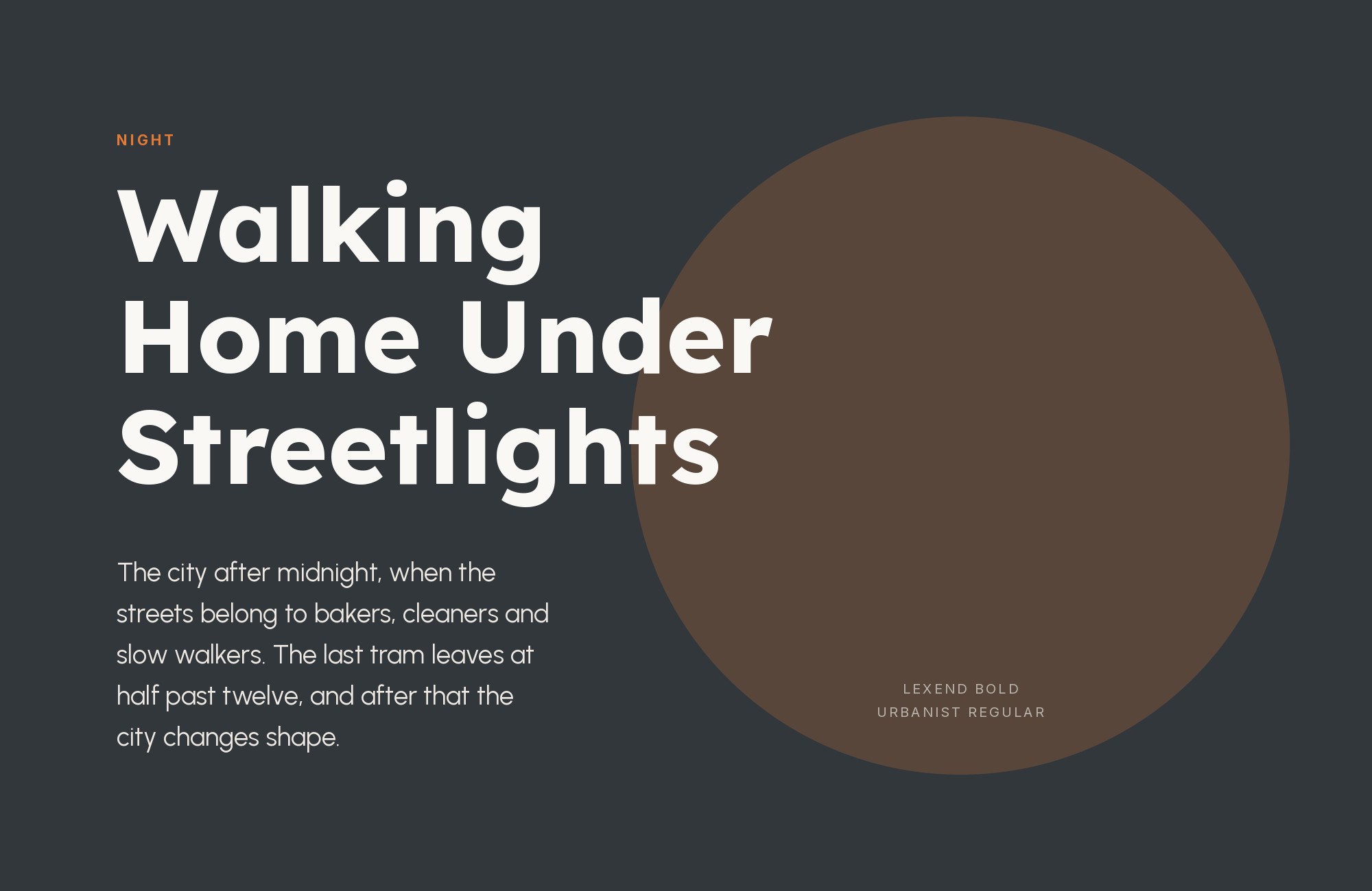
Urbanist is the third face on the HAUS site listed by One Page Love, alongside Lexend and Merriweather. Urbanist is a low-contrast, geometric sans-serif inspired by Modernist typography and design, launched by Corey Hu in 2020. It is closer to Lexend than most partners here, so the pairing depends on role rather than contrast. Urbanist’s tighter, more stylised geometry works well for large display headlines and short statements, and Lexend’s wider spacing takes over for readable text. If you use both, keep them far apart in size and weight so the reader never has to guess which one is which. Add a serif, as HAUS does with Merriweather, when the page needs long reading.
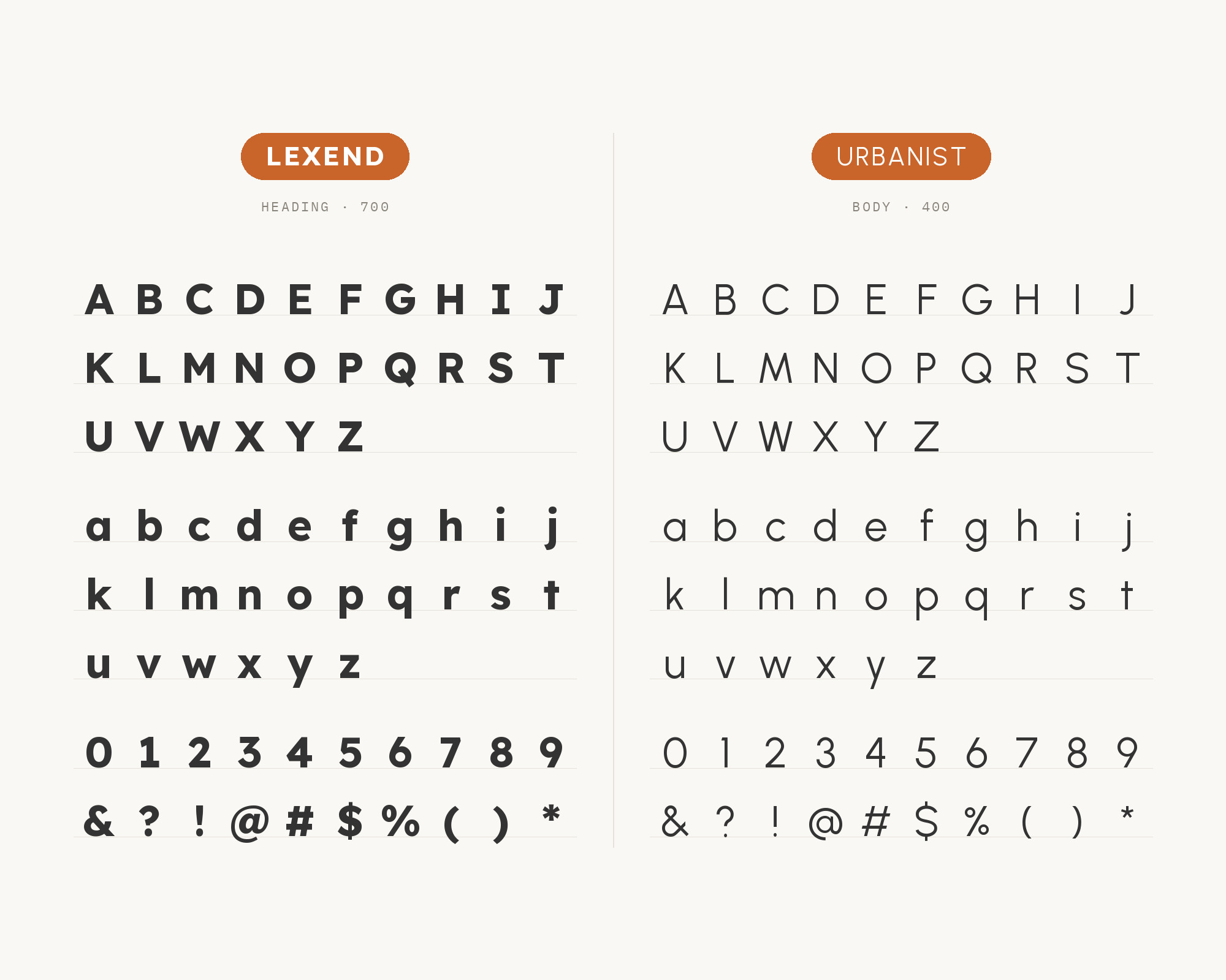
13. Caveat
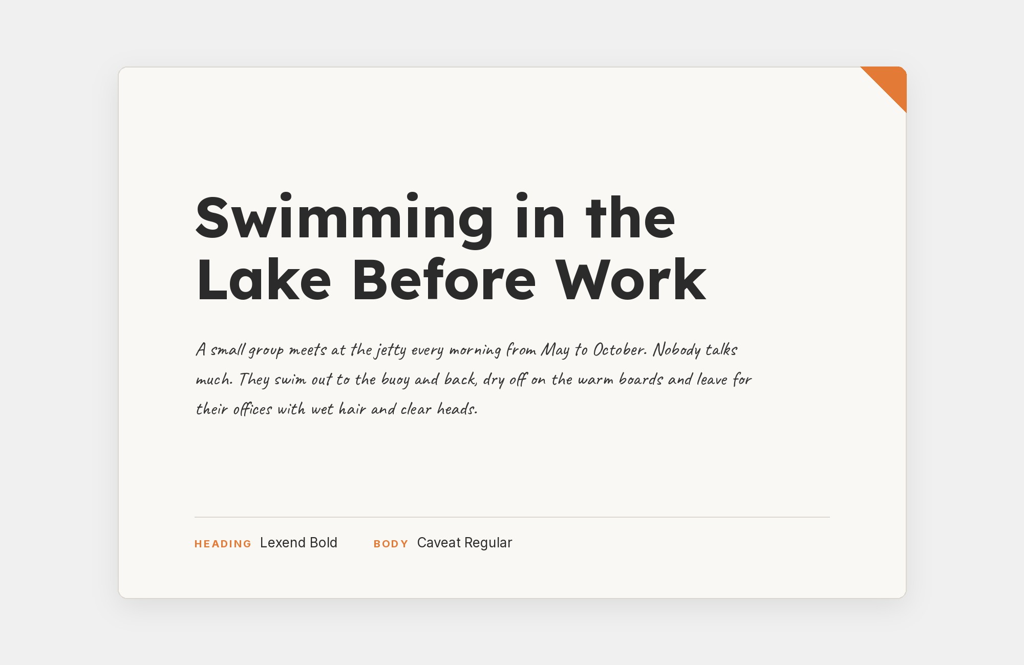
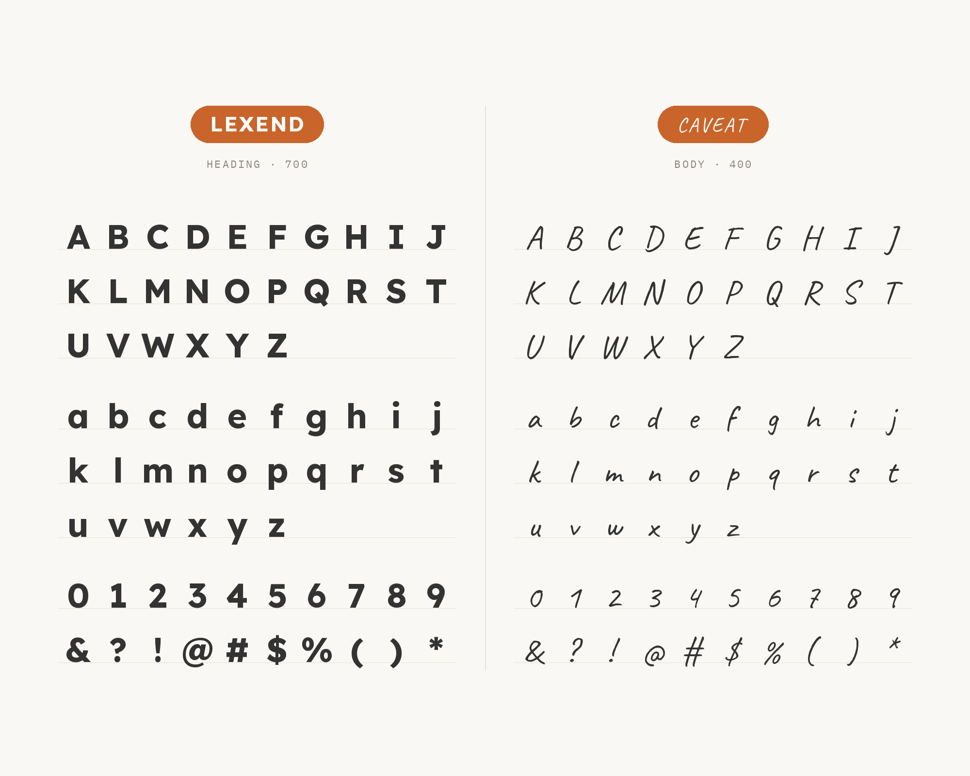
Caveat is on the All You Can Design site, which One Page Love lists with the typefaces Caveat, Lexend and Recoleta. Caveat is a handwriting type family designed by Pablo Impallari, and it is designed for both short annotations and body text usage. Like Kalam, it gives Lexend a human note. Use it for small handwritten asides: an arrow label, a price note, a quick comment next to a product screenshot. Lexend stays the reading voice, and Caveat’s natural, slightly varied letters bring the informality. Caveat is more relaxed and upright than Kalam’s steep slant, so it suits product and design-service sites better than classroom materials. Keep it short and let it break the grid a little.
14. Alfa Slab One
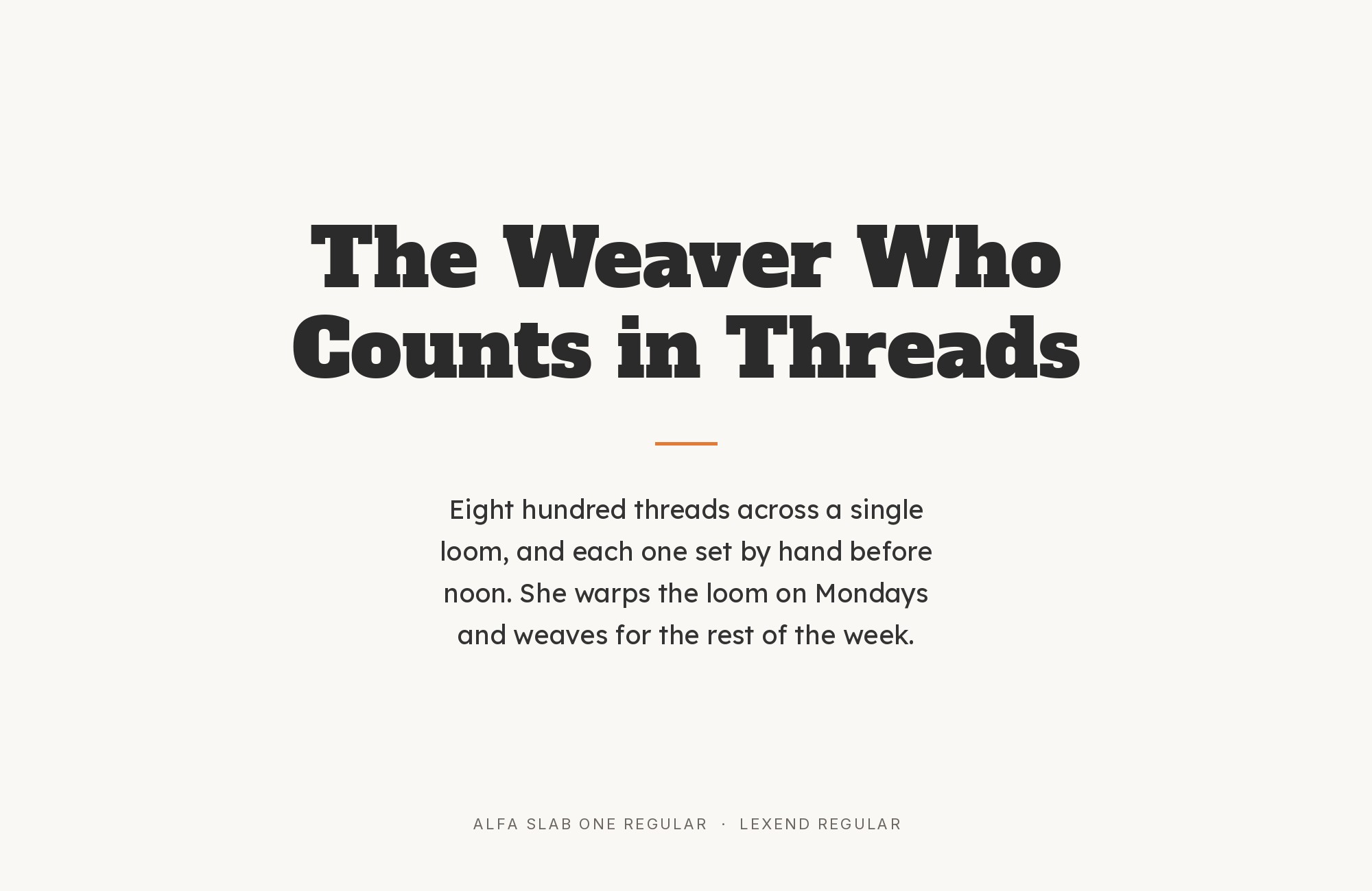
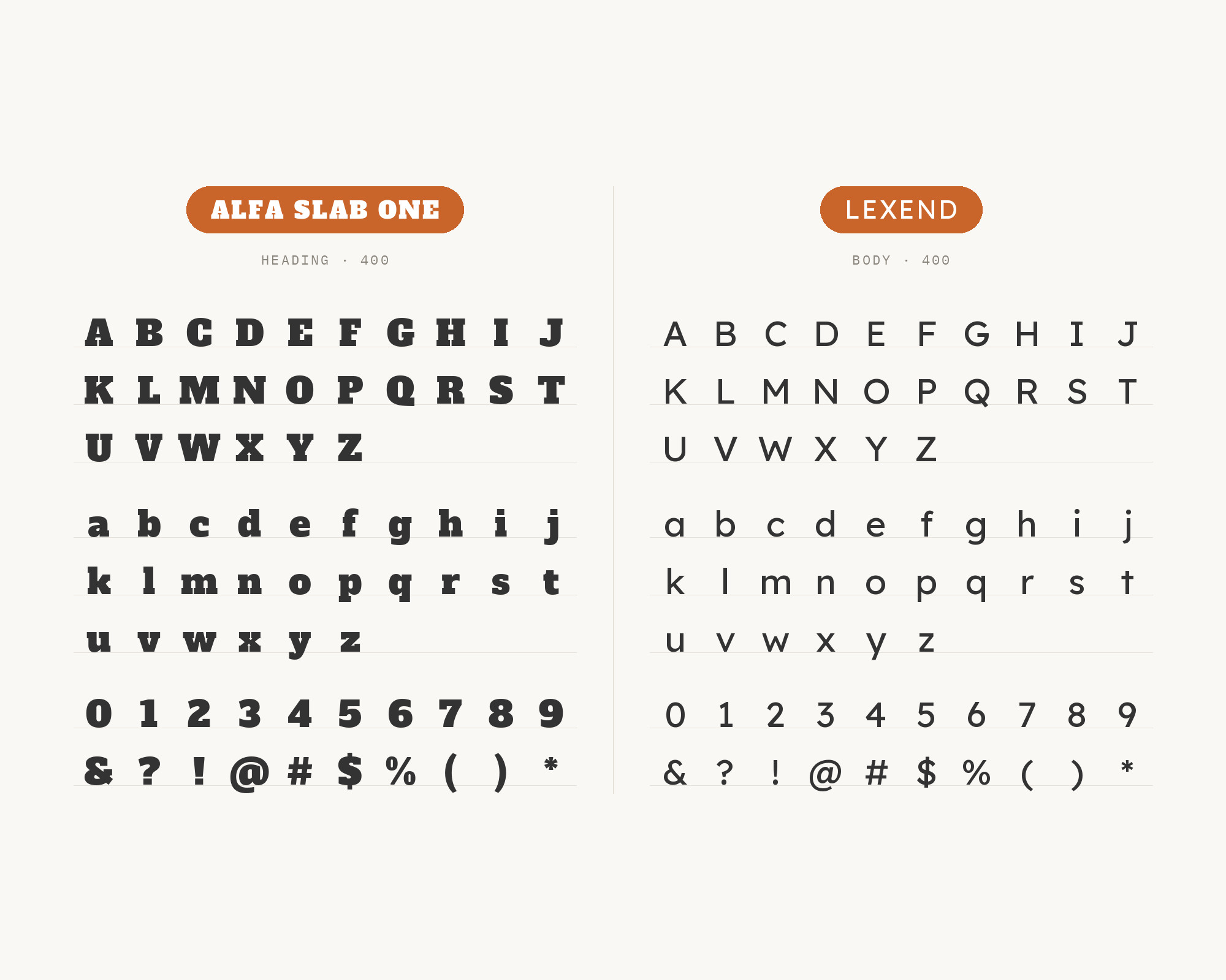
Alfa Slab One is the bold outlier, suggested by Notebook and Penguin’s Lexend pairing guide as one of its other Google Fonts to pair with Lexend. Alfa Slab One was designed with an extreme stem weight, big serifs, more stem contrast and gradual terminals with a single serif, and it comes in one heavy style. That makes it a pure headline face. Next to it, Lexend is the calm, readable body, and the weight contrast is extreme. Use Alfa Slab One only for a few large words, a poster title or a section header, and set everything else in Lexend at a regular weight. The pair works for posters, event pages and playful education material that needs one loud moment.
Conclusion
Lexend was designed to make reading easier, so every pairing above is a decision about how to protect that job. The most common answer puts Lexend in the headings over a steady serif: Zilla Slab, Lora, Merriweather, Noto Serif, Literata or Crimson Pro. Public Sans, Roboto and Quicksand keep the page all sans, with clear roles. The real sites add personality from outside: Kalam and Caveat as handwritten notes, Bodoni Moda and Alfa Slab One as display voices, Urbanist as a sharper geometric headline.
One practical warning. The Lexend name covers several widths. Google Fonts notes that Lexend and Lexend Deca are currently the same, but Exa, Giga, Mega and the wider members are not. If a tutorial or tool shows a much wider “Lexend”, check which member of the system it is using before you copy the pairing, and test the pair at the size your readers will actually read.
Sources
- Google Fonts (Lexend)
- Fonts In Use (Lexend)
- Oak National Academy help centre
- Typ.io (Lexend)
- One Page Love (HAUS)
- One Page Love (All You Can Design)
- Leadpages
- Bootcamp (Medium)
- DiverseKit
- Magezon
- Todaymade
- Imperavi, UI Typography
- Rossul
- Typst Universe tasteful-pairings
- Notebook and Penguin
- Google Fonts (Merriweather)
- Jukebox Print
