Nunito Sans pairs great with Playfair Display, Lora and Merriweather. All 15 pairings are shown below in real rendered specimens, with the reason each one works.

What fonts go with Nunito Sans? This clean, well-balanced sans-serif brings modern approachability that demands companions capable of complementing its friendly character while providing meaningful visual variety.
Nunito Sans was created by Vernon Adams (and later expanded by Jacques Le Bailly) as a sans-serif companion to the rounded Nunito family. Unlike its sibling, Nunito Sans features standard terminals instead of rounded ones, giving it a more neutral, professional appearance while retaining warmth and excellent readability. The family is a variable font with weight, width, optical size and ascender axes, giving designers options for both UI design and long-form reading.
Pairing Nunito Sans means finding fonts that either enhance its friendly neutrality or provide meaningful contrast through serif elegance or display drama. Its balanced proportions and open apertures make it a welcoming partner for many typeface styles. Here are 15 fonts that pair well with Nunito Sans, each chosen to extend its capabilities across different design contexts.
1. Playfair Display
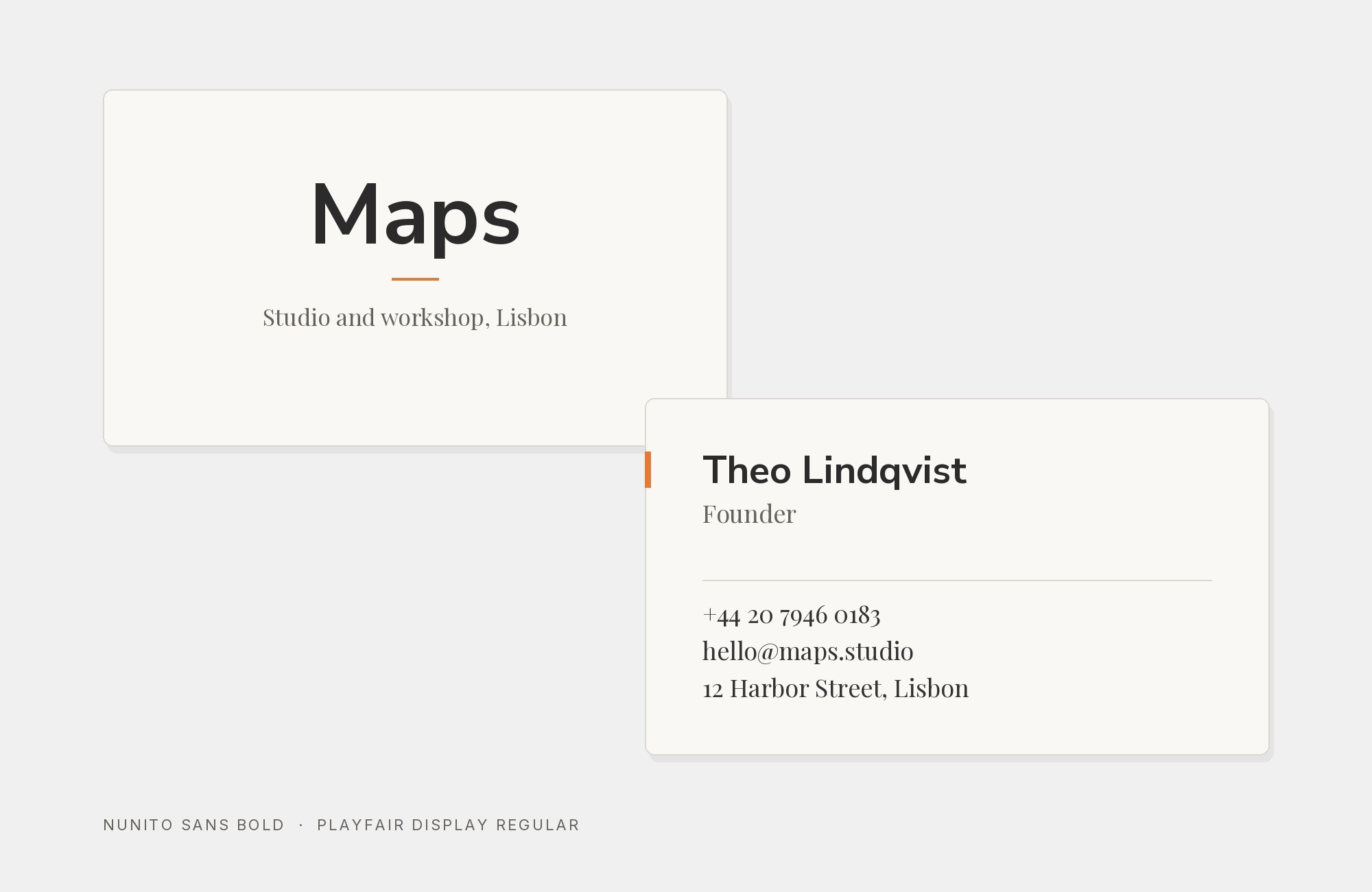
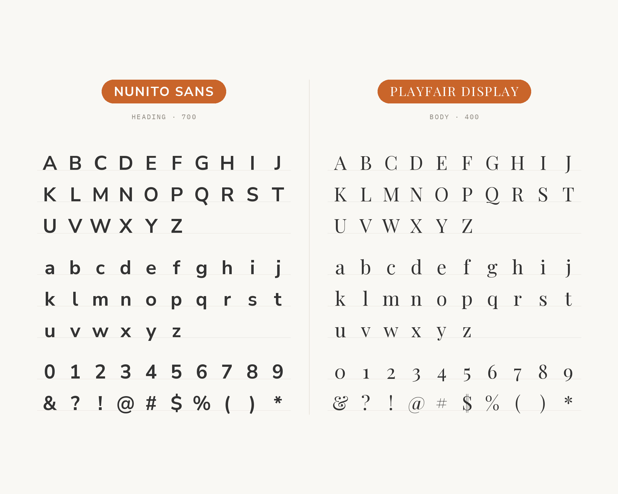
Playfair Display creates elegant contrast against Nunito Sans’s friendly practicality. Claus Eggers Sørensen’s high-contrast serifs bring editorial sophistication that elevates Nunito Sans’s humble character into something more refined. The dramatic hairline strokes dance beautifully against Nunito Sans’s uniform stroke weight. This pairing excels in lifestyle blogs, boutique branding, and any project where approachable body text needs headlines with gravitas.
2. Lora
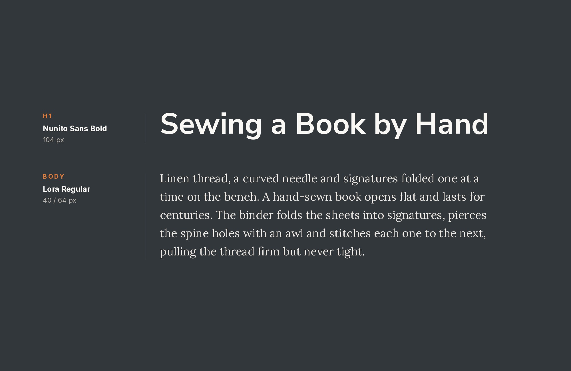
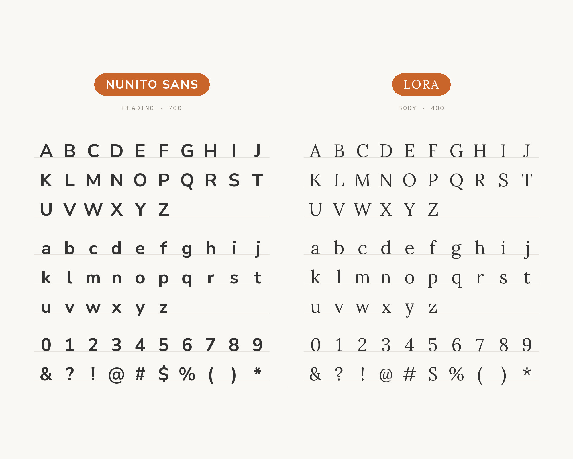
Lora brings calligraphic warmth that harmonizes with Nunito Sans’s friendly disposition. Those brushed curves and moderate contrast create visual dialogue between traditional elegance and modern clarity. Cyreal’s contemporary serif shares Nunito Sans’s commitment to screen readability while adding classical depth. This pairing suits publishing platforms, literary blogs, and content-heavy sites where warmth serves the user experience.
3. Merriweather
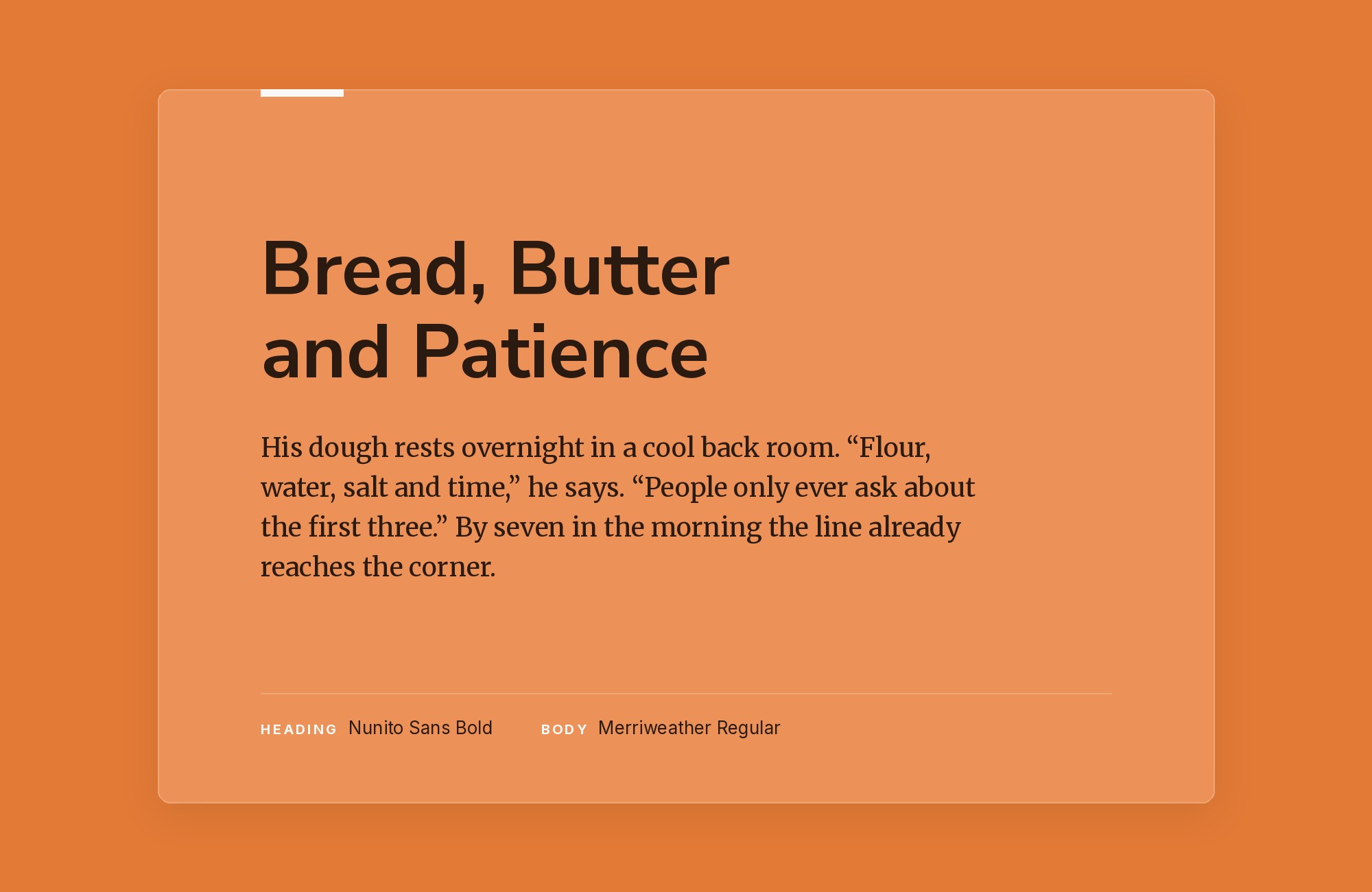
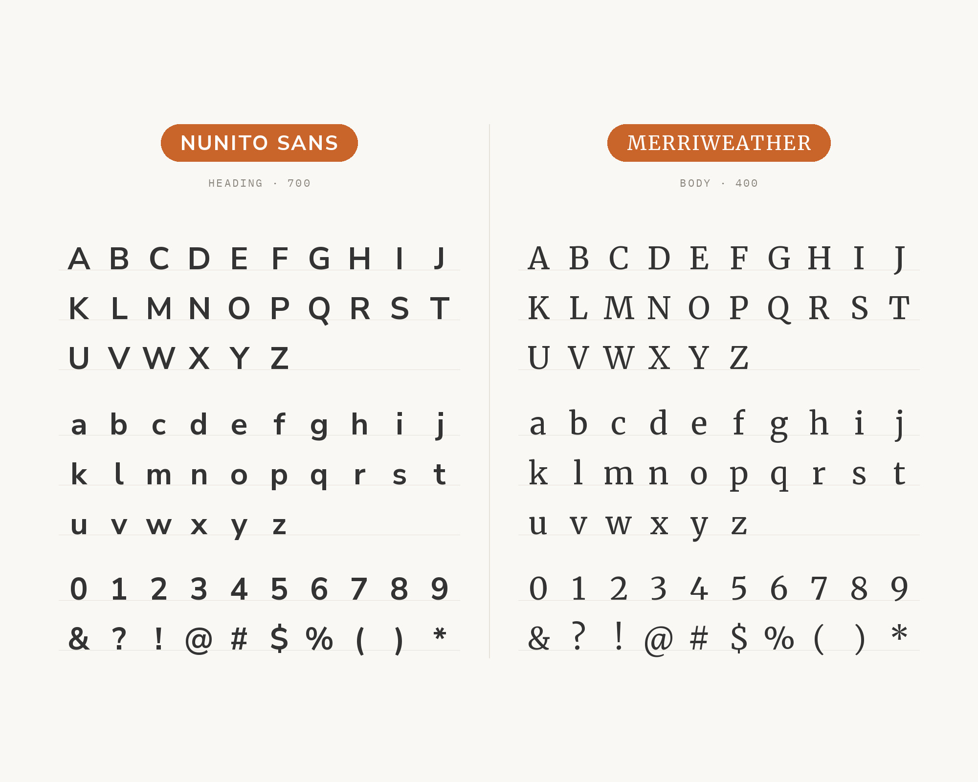
Screen-optimized serifs meet screen-friendly sans when Merriweather pairs with Nunito Sans. Both fonts were engineered for digital reading, sharing commitment to legibility across devices. Sorkin Type’s sturdy serifs provide anchoring headlines while Nunito Sans handles body text with approachable clarity. This pairing works beautifully for blogs, news platforms, and educational content where readability trumps everything.
4. Alegreya
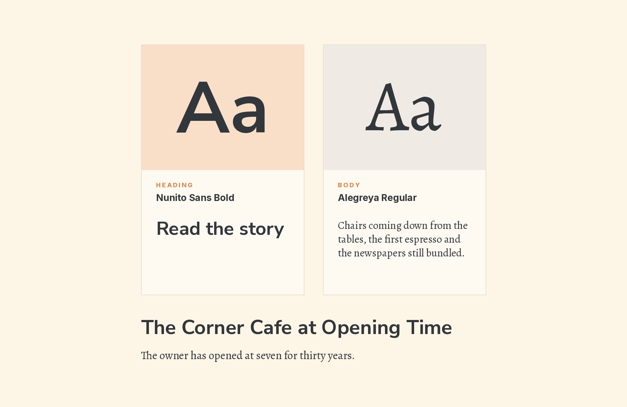
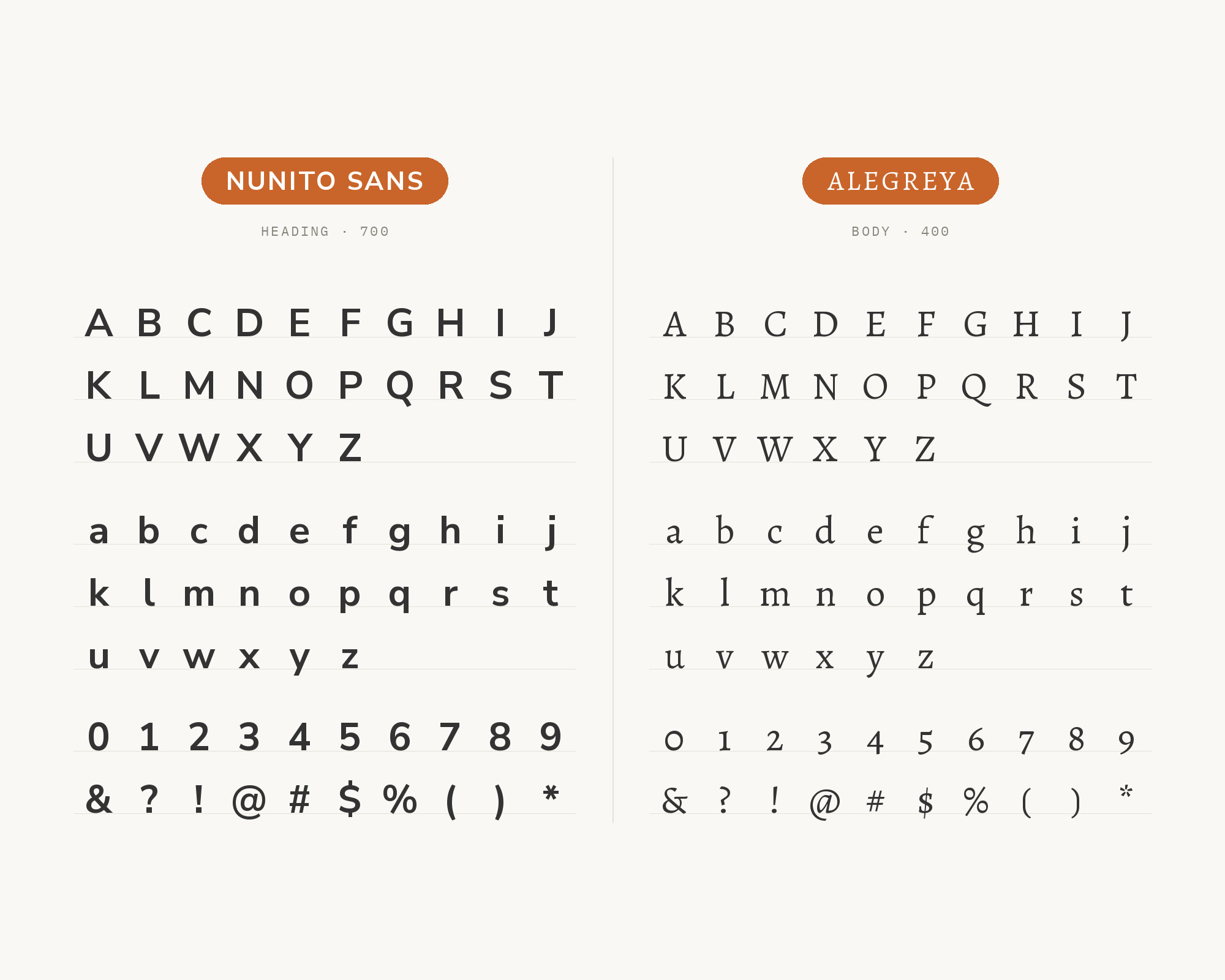
Alegreya brings dynamic rhythm that enriches Nunito Sans pairings. Juan Pablo del Peral’s calligraphic design features flowing forms that create lively contrast against Nunito Sans’s stable geometry. The result is typography that feels both literary and contemporary—ideal for book publishers, cultural magazines, and storytelling platforms where text deserves to feel alive.
Pro from $14/mo, save $60 yearly.
Premium templates, vector export, and a commercial license on every paid plan.
See plans5. Libre Baskerville
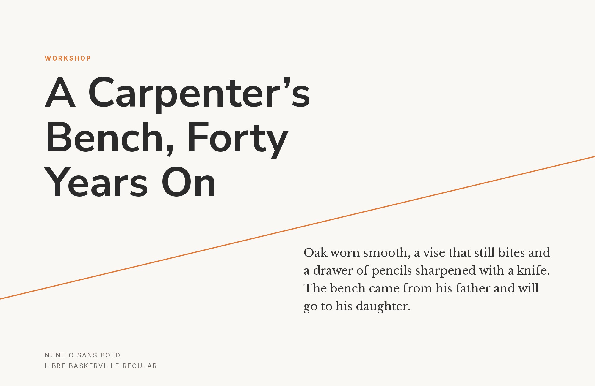
Libre Baskerville introduces Enlightenment elegance to Nunito Sans’s modern friendliness. Impallari Type optimized this Baskerville interpretation for screens while maintaining classical refinement. The transitional serifs provide intellectual authority that Nunito Sans’s neutrality welcomes. This pairing excels in academic publishing, professional blogs, and any project bridging traditional credibility with digital accessibility.

6. Roboto Slab
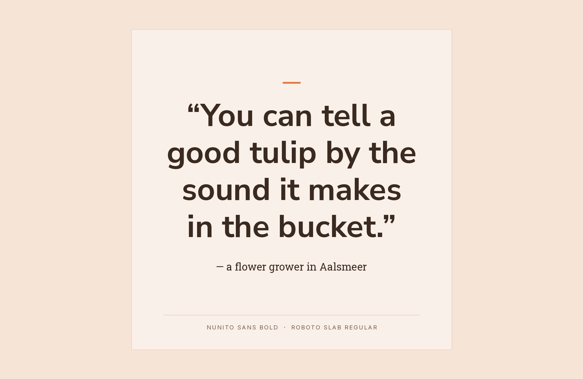
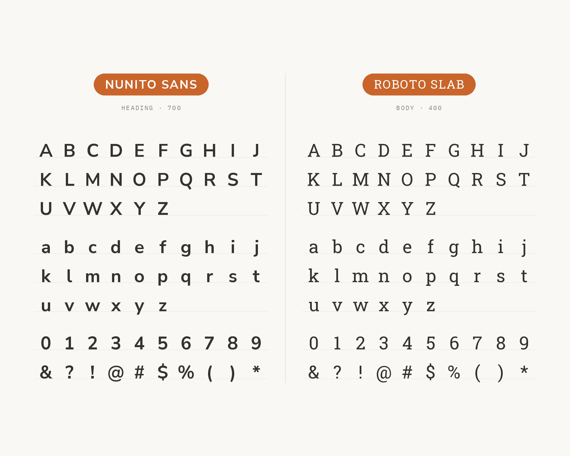
Roboto Slab shares similar design DNA with Nunito Sans—both fonts balance geometric foundations with humanist touches. Christian Robertson’s slab serif provides sturdy headlines that complement Nunito Sans’s body text capabilities. Together they create cohesive systems that feel both contemporary and grounded, ideal for tech companies, news platforms, and applications where mechanical precision needs warmth.
7. Poppins
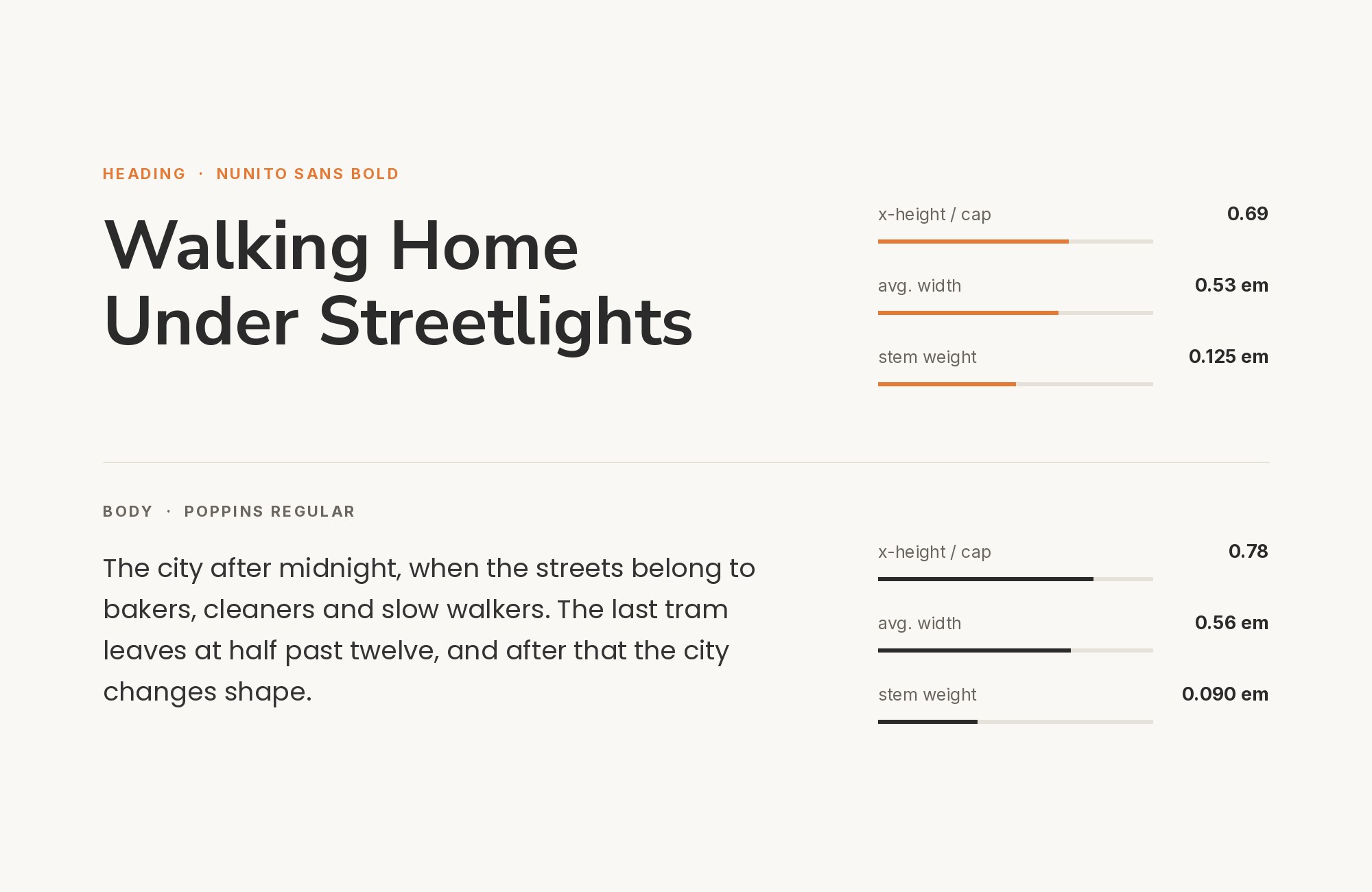
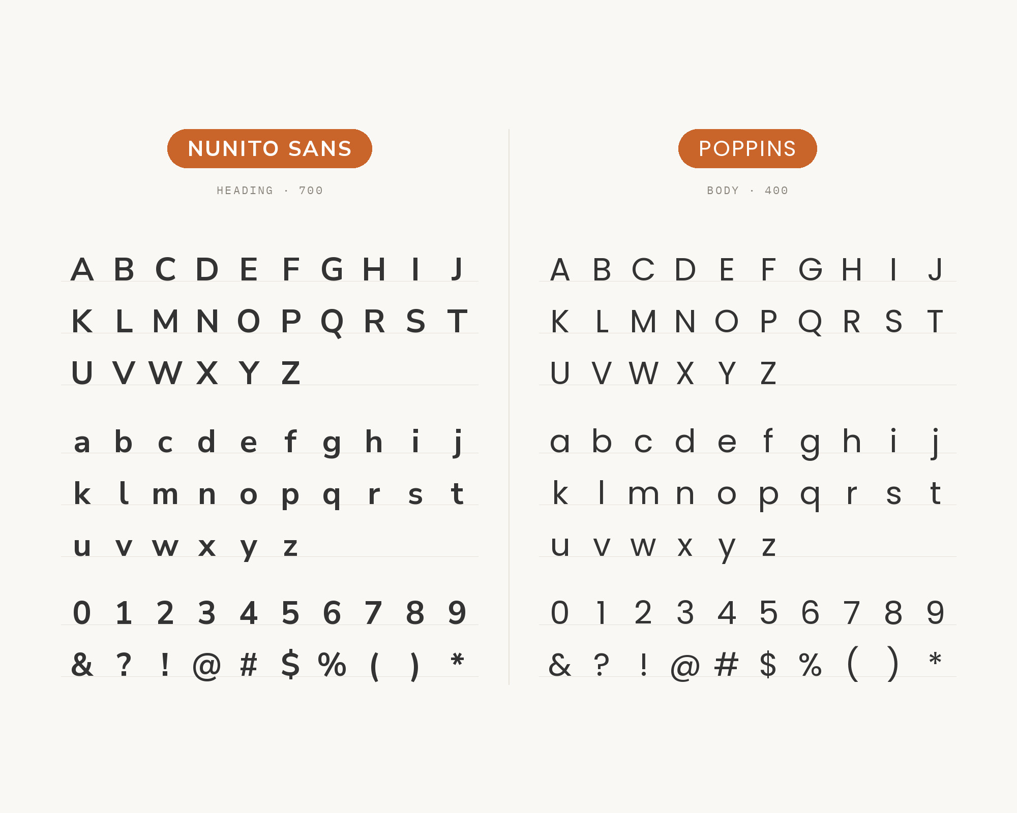
The geometric precision of Poppins provides clean contrast against Nunito Sans’s softer character. Indian Type Foundry’s creation brings circular geometry that sharpens layouts without creating visual conflict. Both fonts share commitment to friendly readability while expressing it differently. This pairing suits SaaS products, startup branding, and digital interfaces where modern aesthetics serve user experience.
8. Open Sans
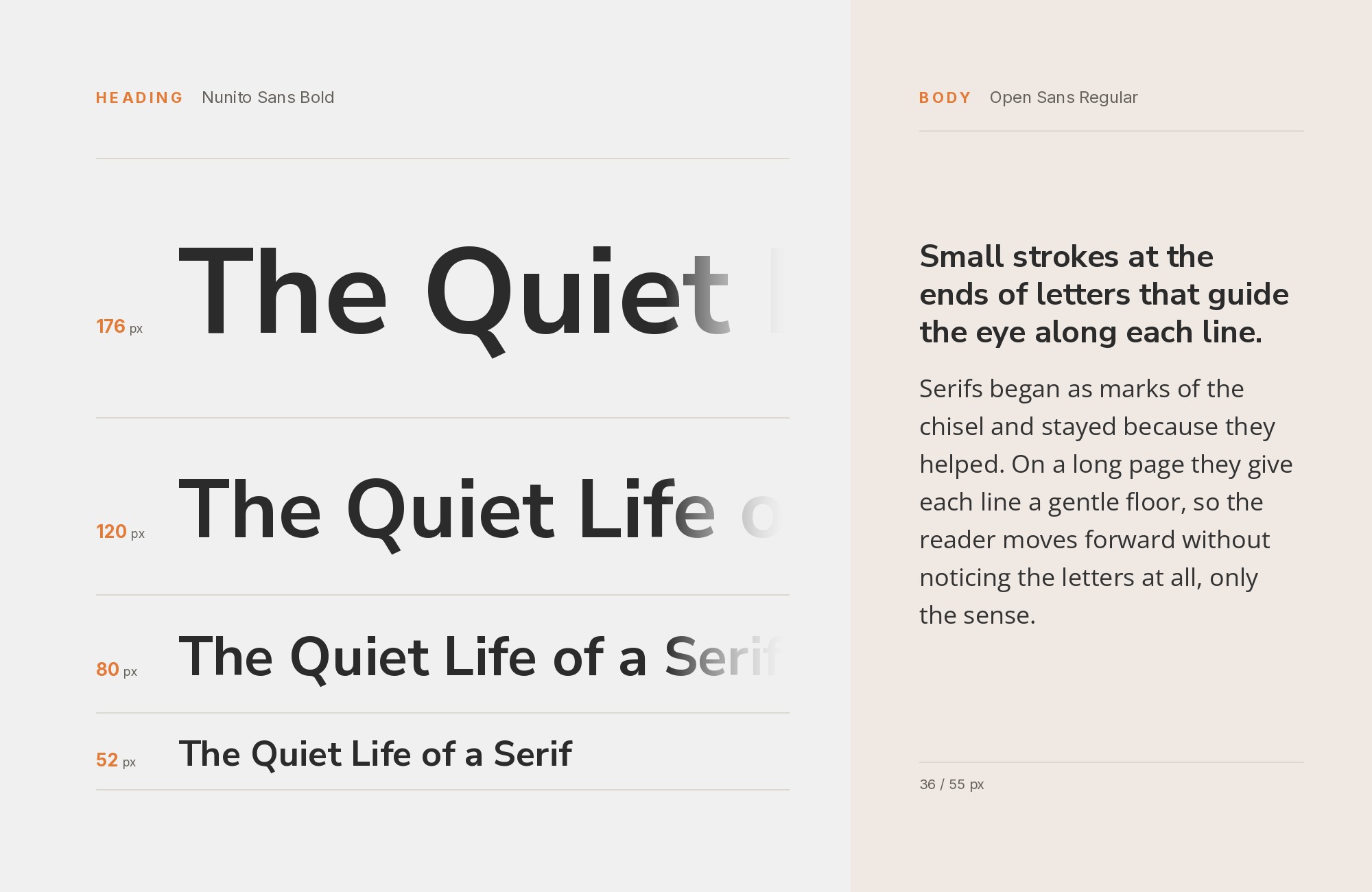
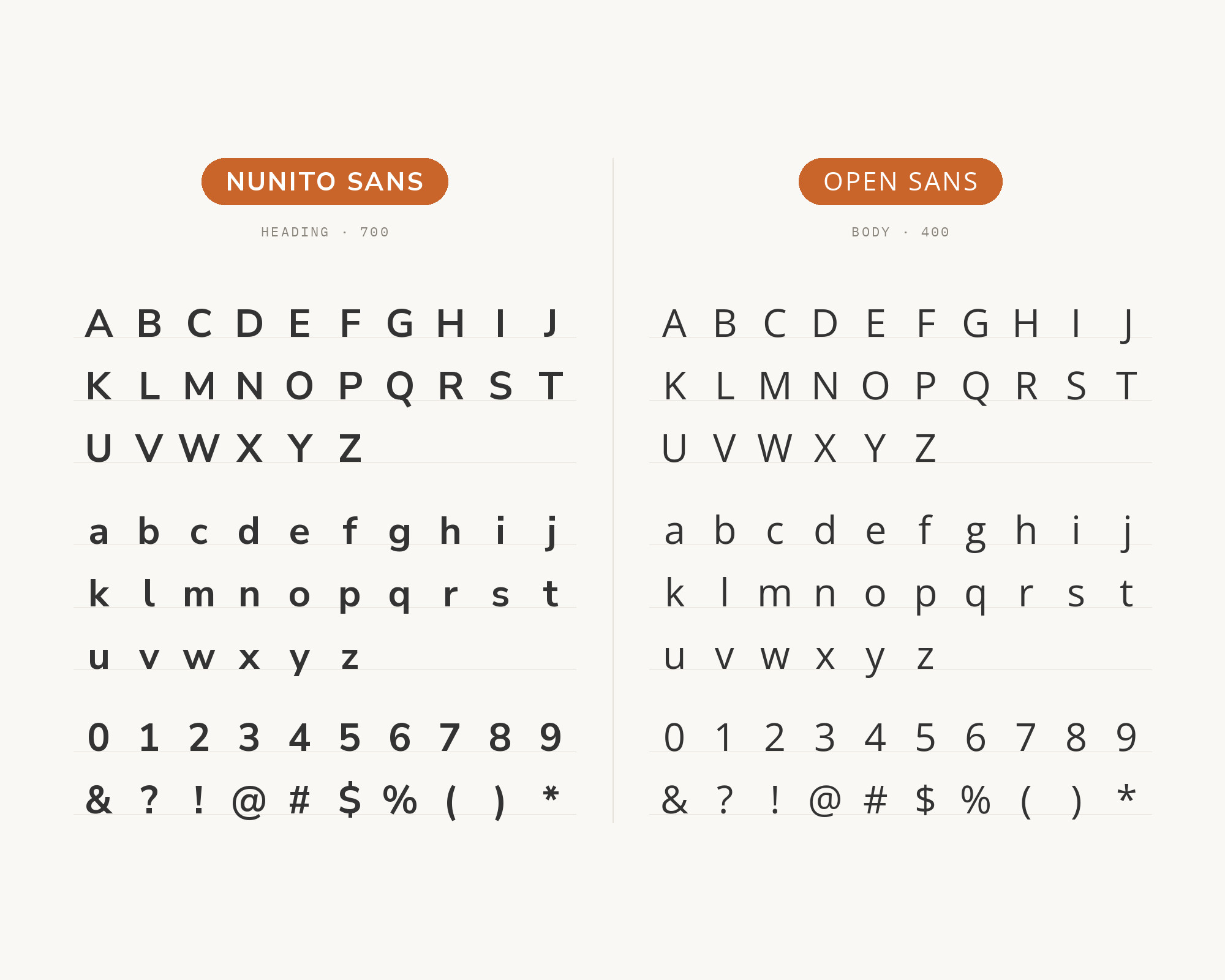
Open Sans and Nunito Sans speak similar typographic languages—both humanist sans-serifs optimized for clarity. Steve Matteson’s design provides neutral contrast that lets content shine. While similar in purpose, subtle differences in letterforms create enough distinction for hierarchy. This pairing works everywhere—corporate communications, educational platforms, and any project serving diverse audiences who need comfortable reading.
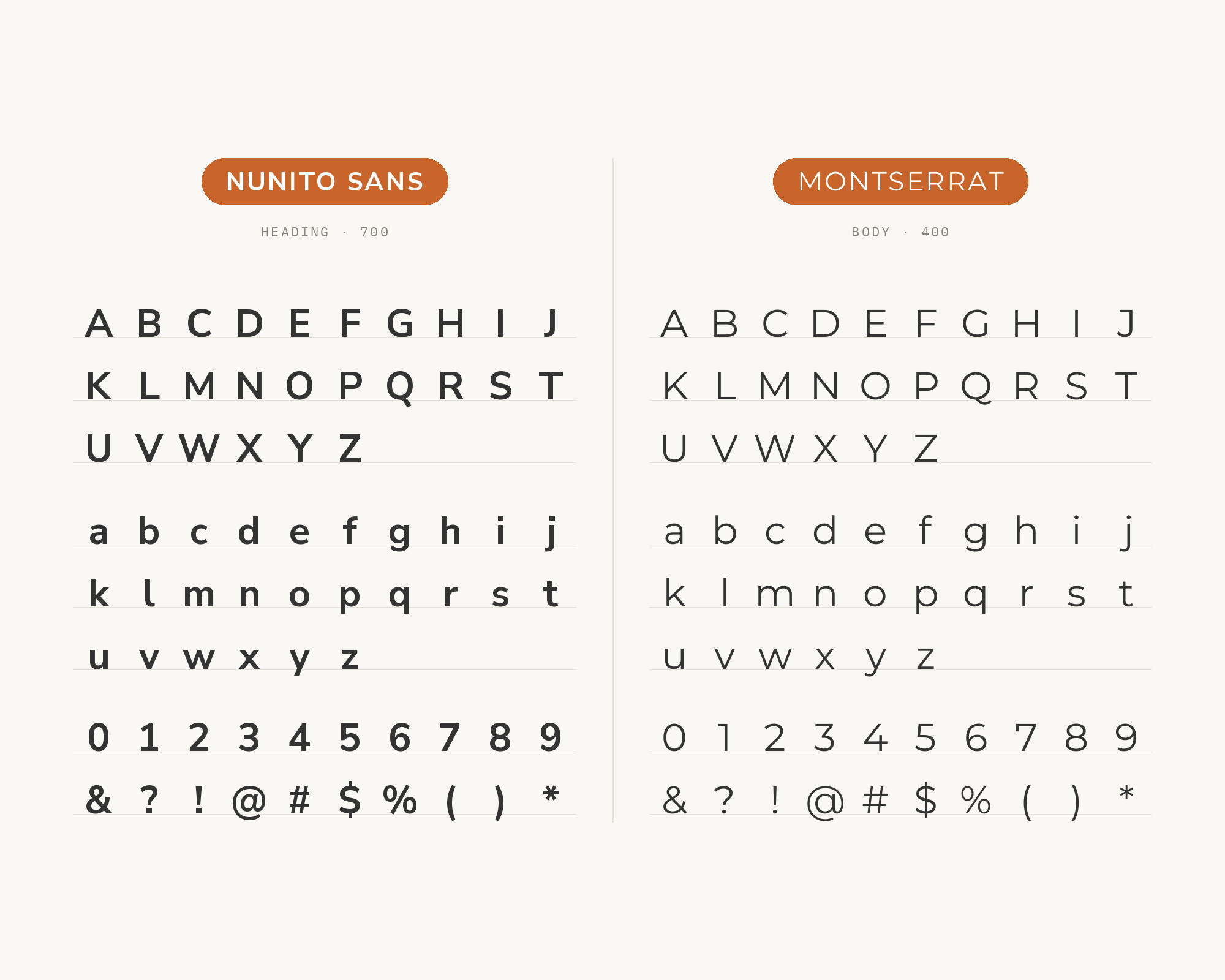
9. Montserrat
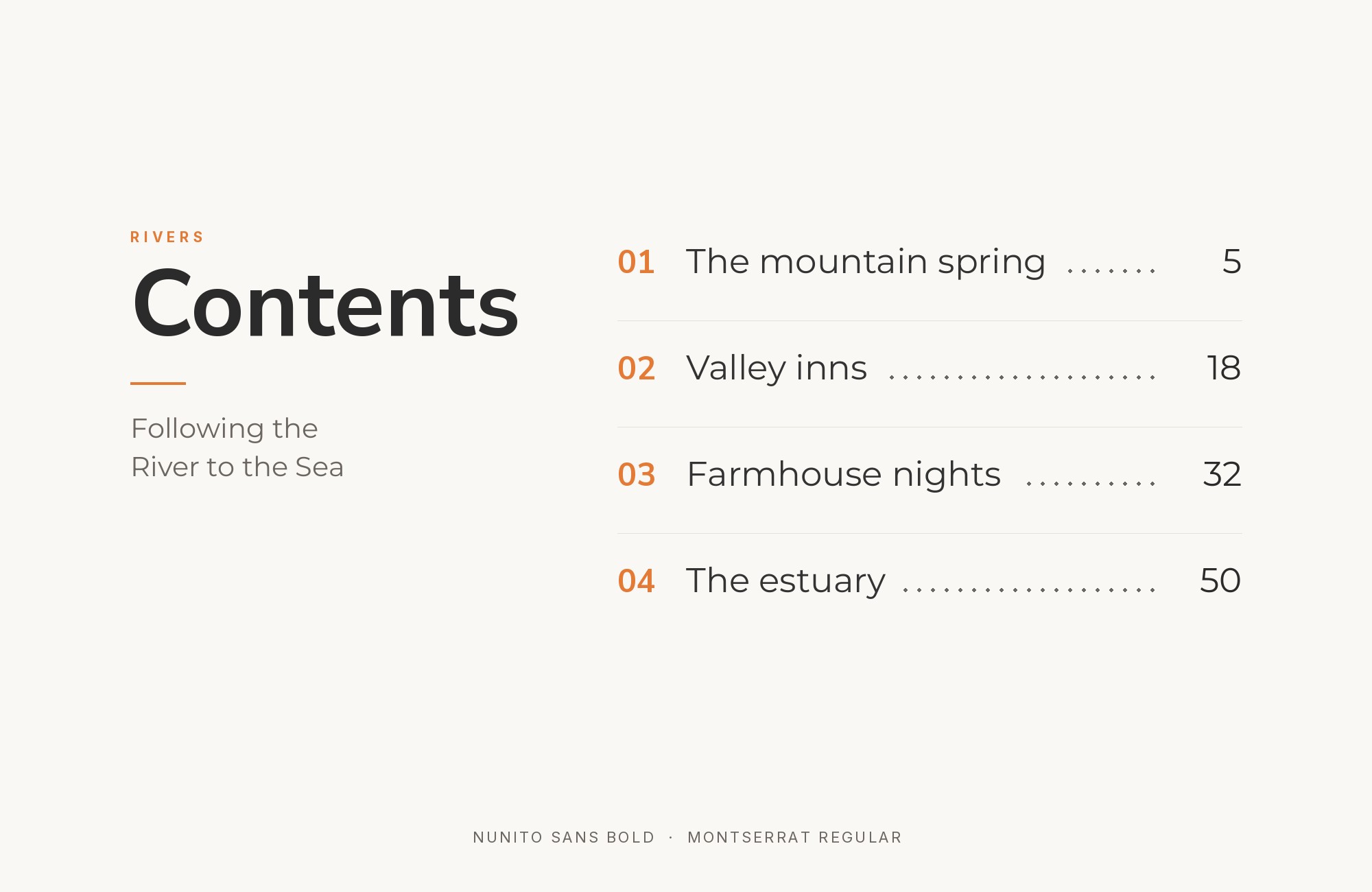
Montserrat‘s geometric heritage creates visual interest when paired with Nunito Sans’s humanist forms. Julieta Ulanovsky’s tribute to Buenos Aires signage brings urban precision that energizes friendly layouts. The contrast between geometric display and humanist text creates natural hierarchy. This pairing excels in creative portfolios, tech branding, and design-forward projects wanting personality without sacrificing readability.
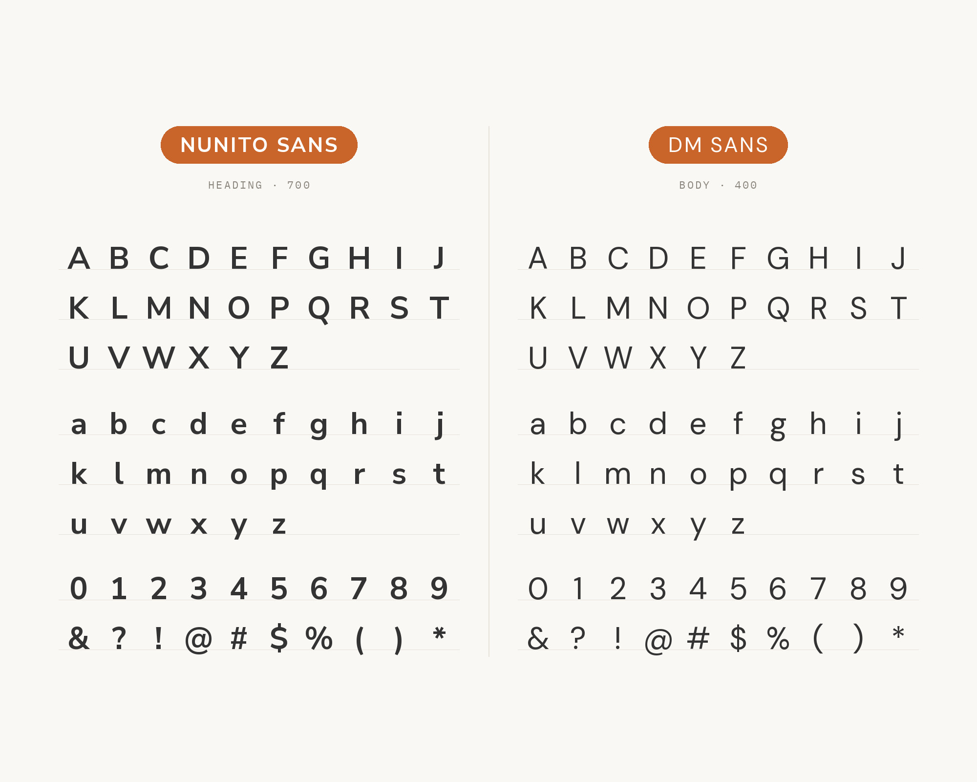
10. DM Sans
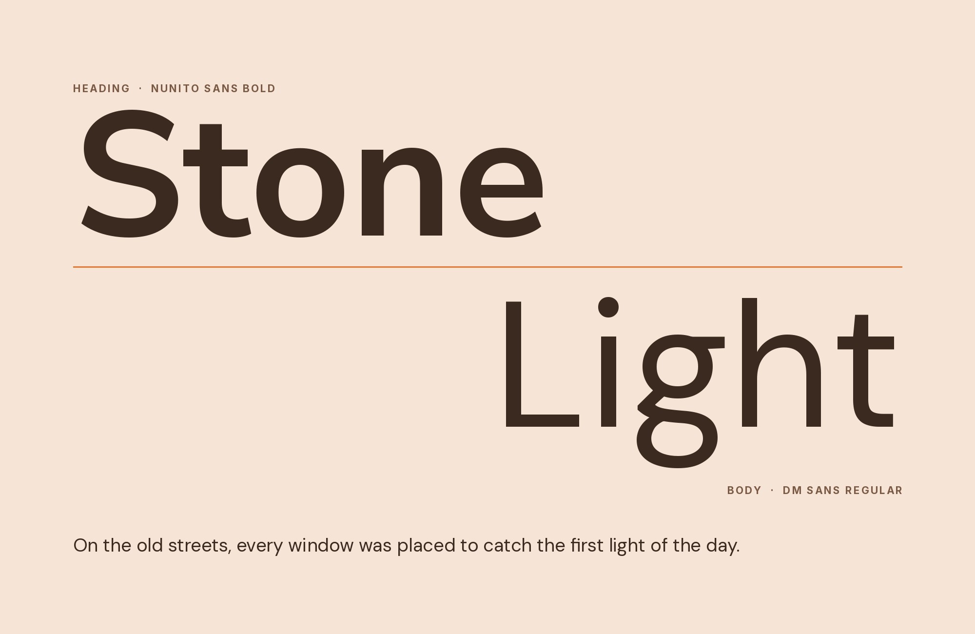
DM Sans brings geometric sophistication that complements Nunito Sans’s practical friendliness. Colophon Foundry’s design features optical sizing and low contrast that make it equally comfortable in headlines and interfaces. Against Nunito Sans’s warmer character, DM Sans provides contemporary edge. This pairing suits fintech applications, modern dashboards, and digital products where clean aesthetics meet functional design.
11. Inter
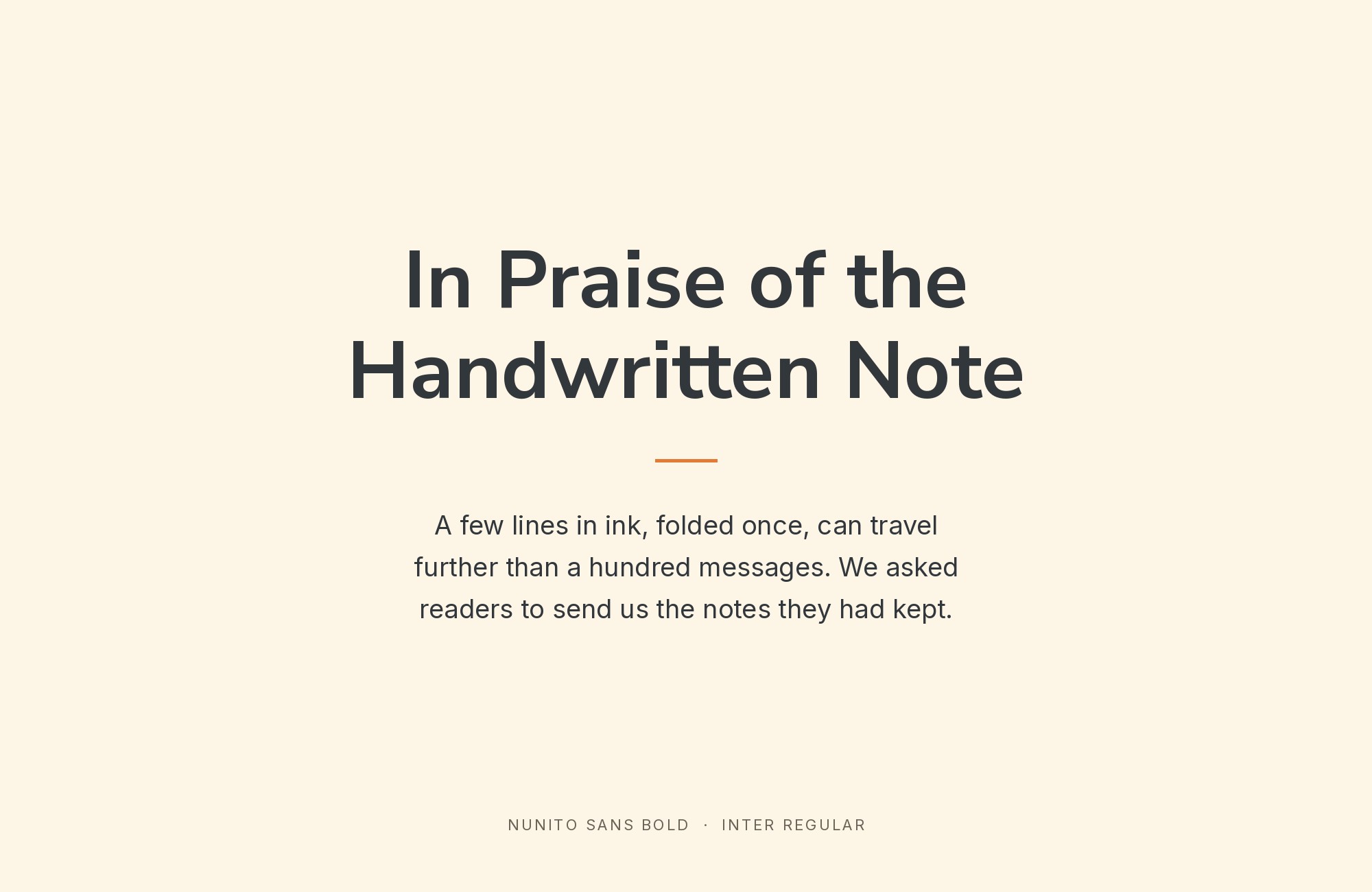
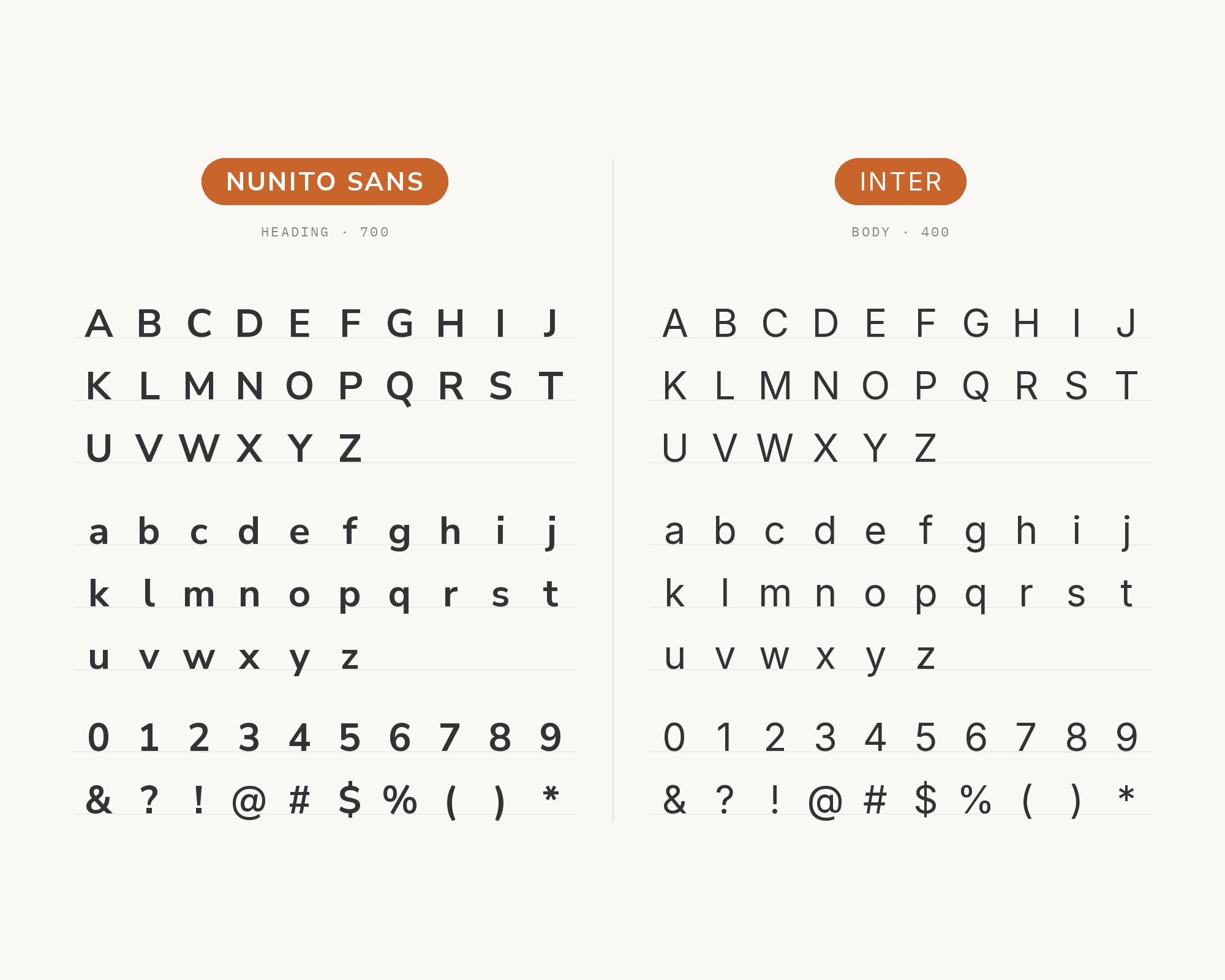
Screen-first perfection meets approachable warmth when Inter pairs with Nunito Sans. Rasmus Andersson’s meticulously crafted sans-serif shares Nunito Sans’s commitment to digital readability. Both fonts represent modern typography engineering—making their pairing ideal for applications, design systems, and technical products where typographic quality signals software quality.
12. Bebas Neue
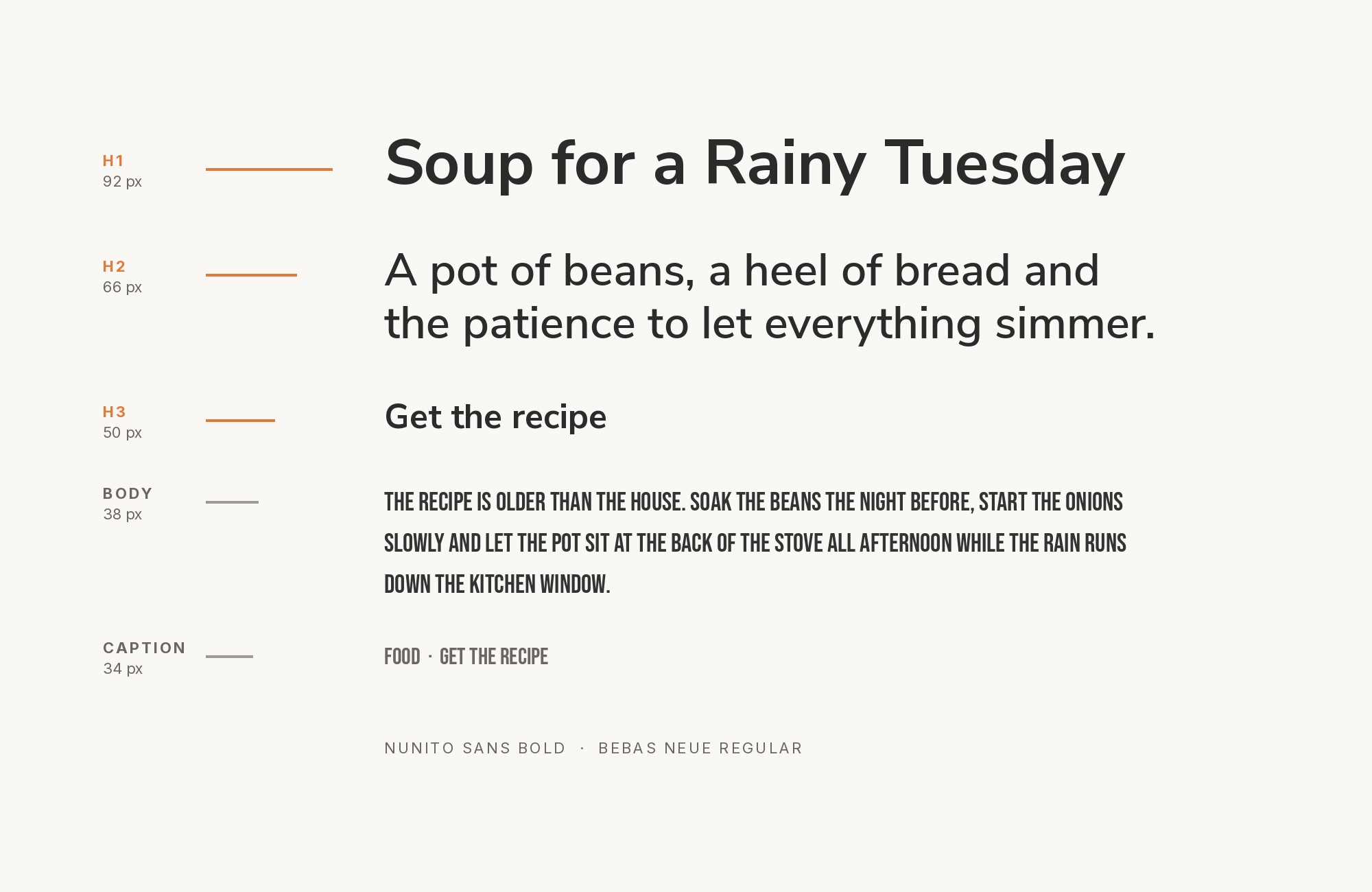
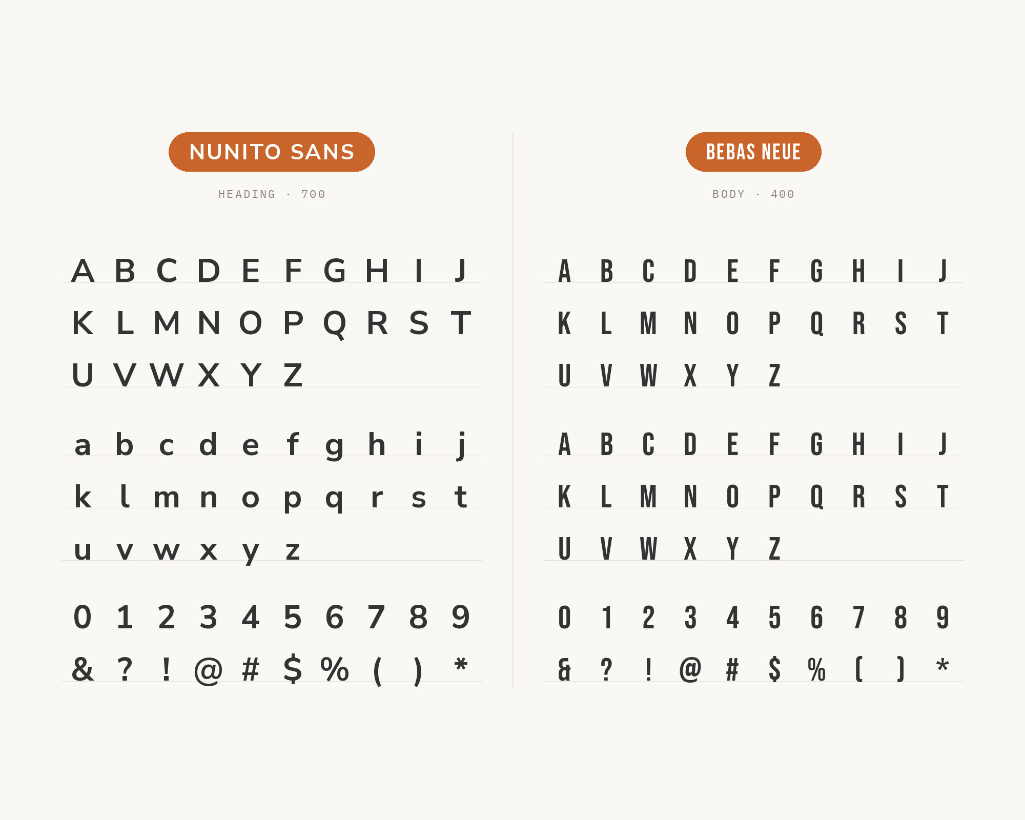
Bebas Neue brings condensed drama that transforms Nunito Sans layouts. Ryoichi Tsunekawa’s all-caps display face commands attention in headlines while Nunito Sans maintains comfortable reading in body text. The extreme contrast—narrow and bold versus comfortable and balanced—creates hierarchy that stops scrolling. This pairing suits promotional materials, event branding, and any project where headlines need maximum impact.
13. Oswald
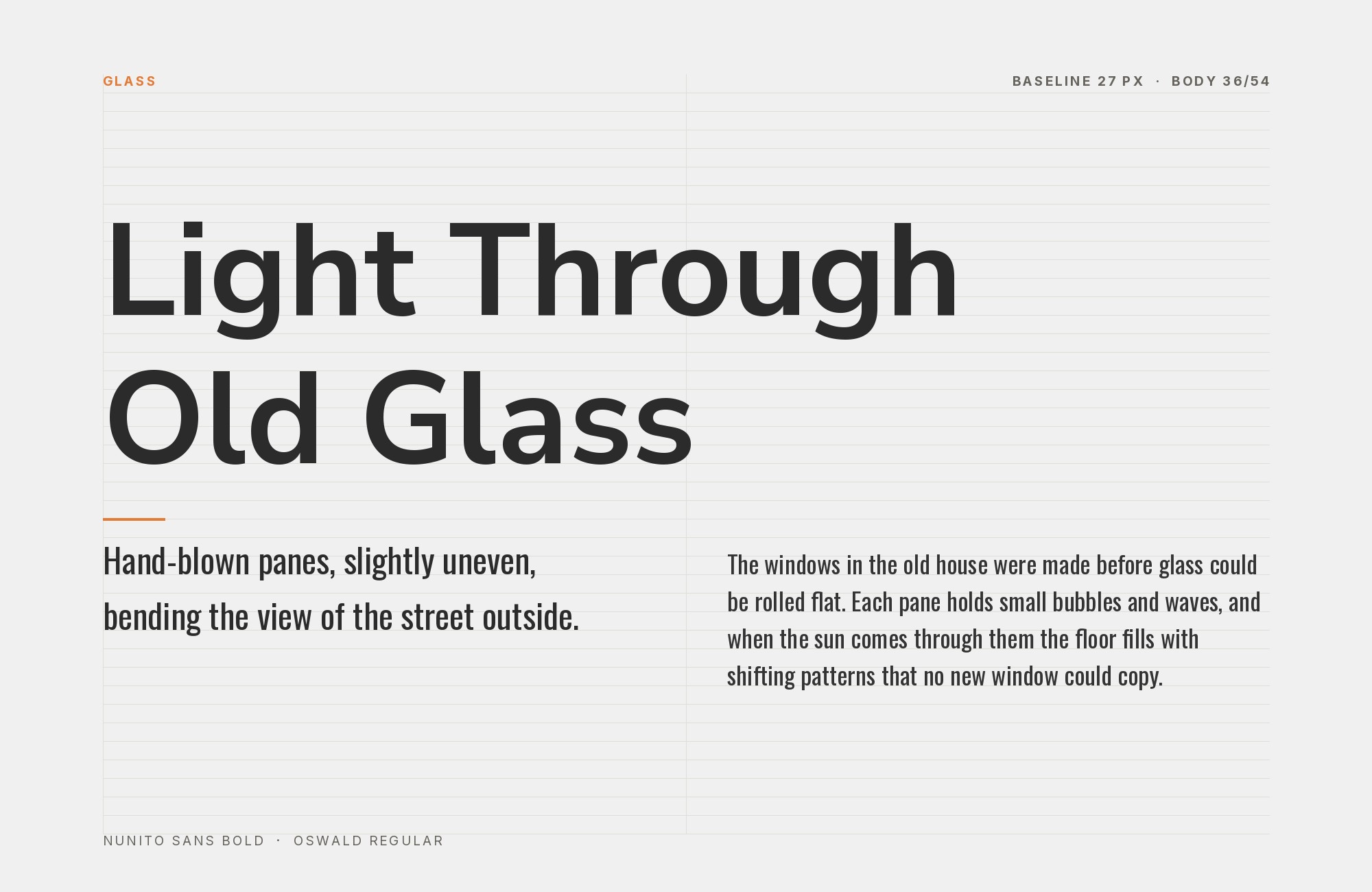
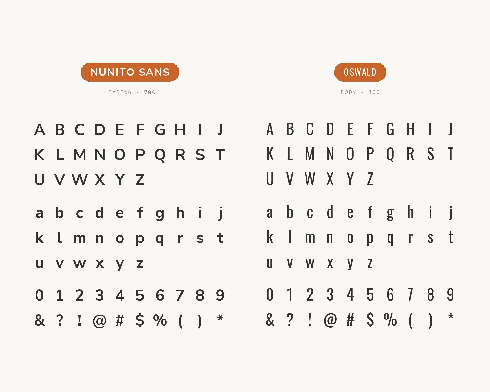
The condensed proportions of Oswald provide space-efficient headlines that complement Nunito Sans’s generous body text. Vernon Adams redesigned this classic gothic for digital screens, creating display type that works beautifully above Nunito Sans’s comfortable paragraphs. This pairing excels in news platforms, promotional design, and any project where headline real estate is precious.
14. Domine
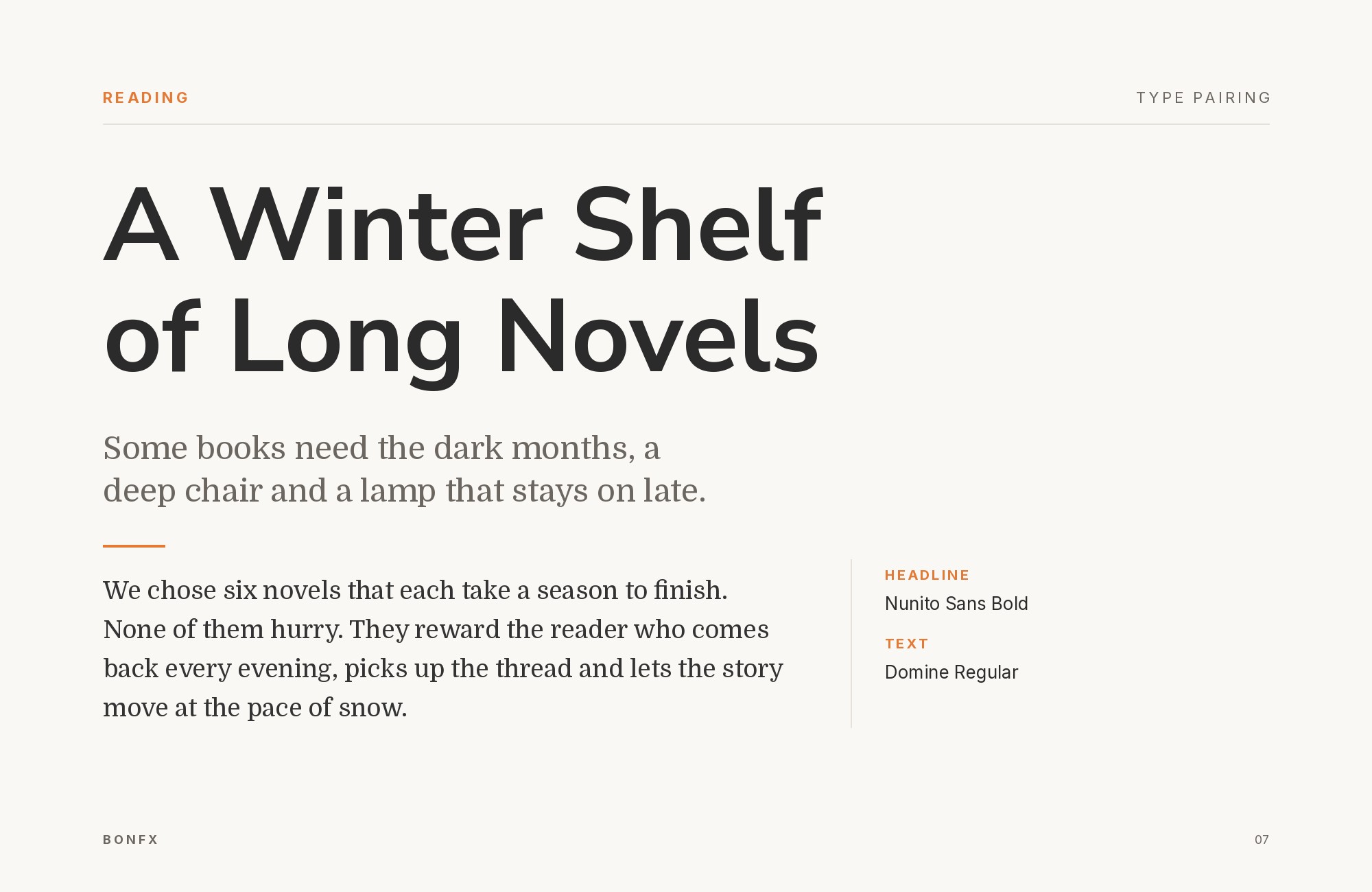
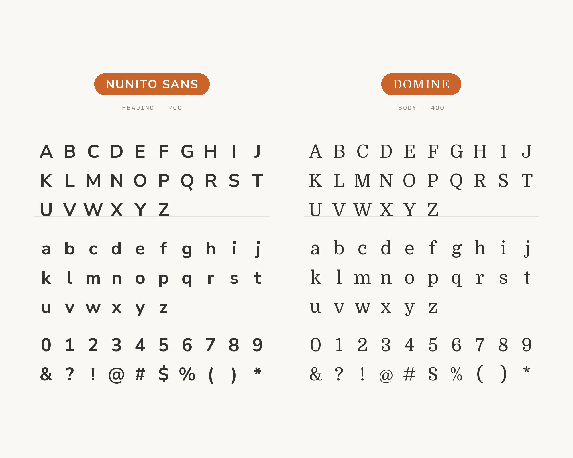
Domine brings newspaper-inspired authority that grounds Nunito Sans’s friendly neutrality. Impallari Type’s design carries editorial credibility optimized for screens, with sturdy serifs that anchor headlines while Nunito Sans handles the body text. This pairing suits news publications, content platforms, and professional blogs where typographic authority enhances content credibility.
15. Source Serif Pro
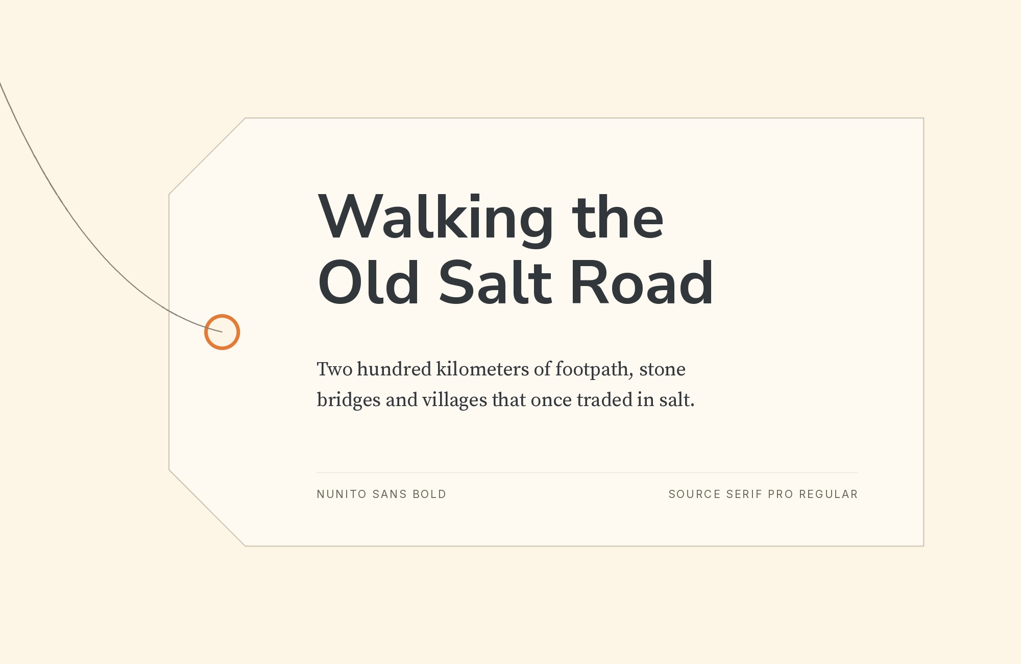
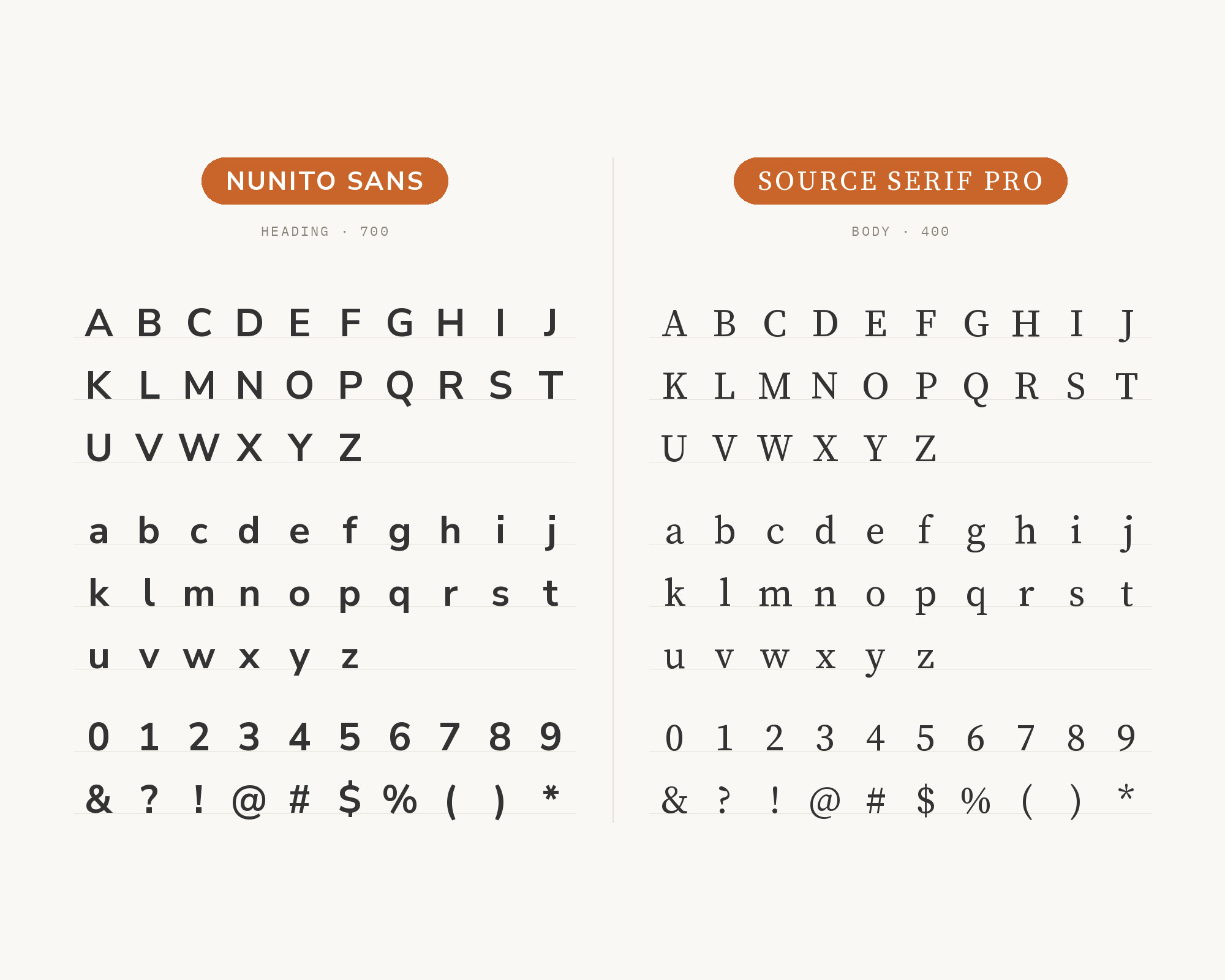
Source Serif Pro creates systematic harmony with Nunito Sans. Designed by Frank Grießhammer, it adds classical structure without overwhelming Nunito Sans’s approachable character. The transitional serifs provide classical contrast without overwhelming Nunito Sans’s approachable character. This pairing excels in documentation sites, publishing platforms, and any project where systematic design thinking serves content delivery.
Conclusion
There are no absolute rules for font pairing, just principles to guide you. The key is contrast—in weight, in style (serif vs. sans-serif), or in personality. Nunito Sans is friendly enough that it welcomes many different partners while maintaining its approachable character.
Trust your eye, experiment freely, and remember that the best pairing is the one that serves your content and audience. Typography should enhance communication, not complicate it.
Sources
- FontPair.co
- Typ.io
- Vandelay Design
- Google Fonts / GitHub OFL (first-party)
- Adobe Fonts
- Fonts In Use (search, standard query)
- Fonts In Use (search, quoted phrase)
- Fonts In Use (typeface search by slug)
- Fonts In Use (typeface direct URL)
- GitHub code search
- Wayback Machine (5-URL sweep)
- Typewolf (font-specific page)
- Typewolf Google Fonts roundup
- Google Fonts Knowledge
- Google Fonts specimen
- Shopify Polaris
- IBM Carbon Design System
- Atlassian Design
- Figma (Google Fonts pairings)
- FontPairings.com
- Design Your Way (Bogdan Sandu)
- MyFonts
- Kittl × Monotype
- WeAndTheColor
- DesignShack
- Fontjoy
- Pimp My Type
- Canva
- Elementor
- -font-pairings/” target=”_blank” rel=”nofollow noopener”>Figma Google Fonts pairings, all 15 article-partner pages
- %22+font+pairing” target=”_blank” rel=”nofollow noopener”>DuckDuckGo HTML search
- Brave Search
