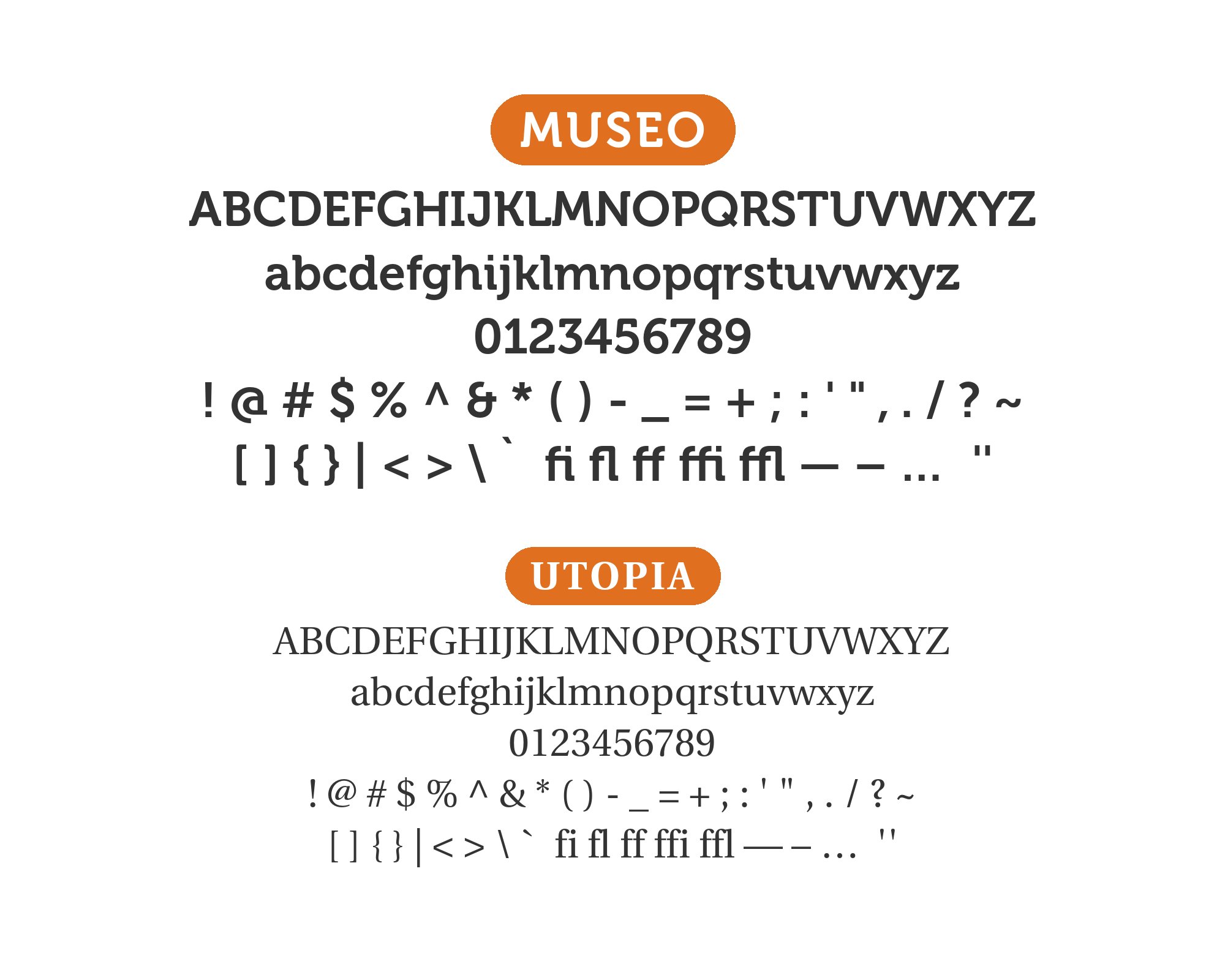
Museo pairs great with Open Sans, Quicksand and Futura. All 12 pairings are shown below in real rendered specimens, with the reason each one works. Every pairing below is checked against 16 published typography sources.
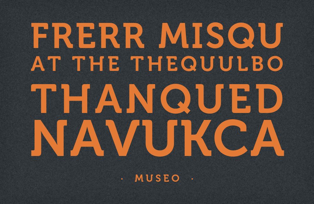
What fonts go with Museo? Start with what it is not: it is not a slab serif, and it is not a calligraphic script. Museo sits between the two — a semiserif whose rounded, slab-inspired serifs grew out of a calligraphic hand, and any partner font has to resolve that in-between quality rather than fight it.
Jos Buivenga designed Museo for his Dutch foundry, exljbris, and released it in 2008. The origin story is now part of type lore: the design began with Buivenga’s love for the uppercase U, whose stems bend inward into semi-slab serifs — an image he described as arriving in a daydream. The family shipped in five weights from 100 to 900, and three of them — 300, 500 and 700 — were released as free downloads under the exljbris Free Font EULA, a licensing decision that put the face on a great many sites that would never have licensed it. Open apertures and a generous x-height give it a friendly, open voice that reads clearly at both headline and text sizes.
Every pairing below is judged against Museo’s core tension: calligraphic warmth carried on a slab-inspired skeleton. Real co-usage data across Museo, Museo Sans, and Museo Slab converges on two working patterns — the neutral-sans route, where Open Sans or Noto Sans runs the body while the Museo-family face holds the personality up top, and the contrast route, where a serif or display face with a different temperament splits the duties by role. exljbris also sells Museo Sans and Museo Slab, sans and full-slab companions drawn on the same skeleton, and those family pairings are the zero-friction answer whenever the license allows. Here are 12 fonts that pair well with Museo, covering every approach.
1. Open Sans

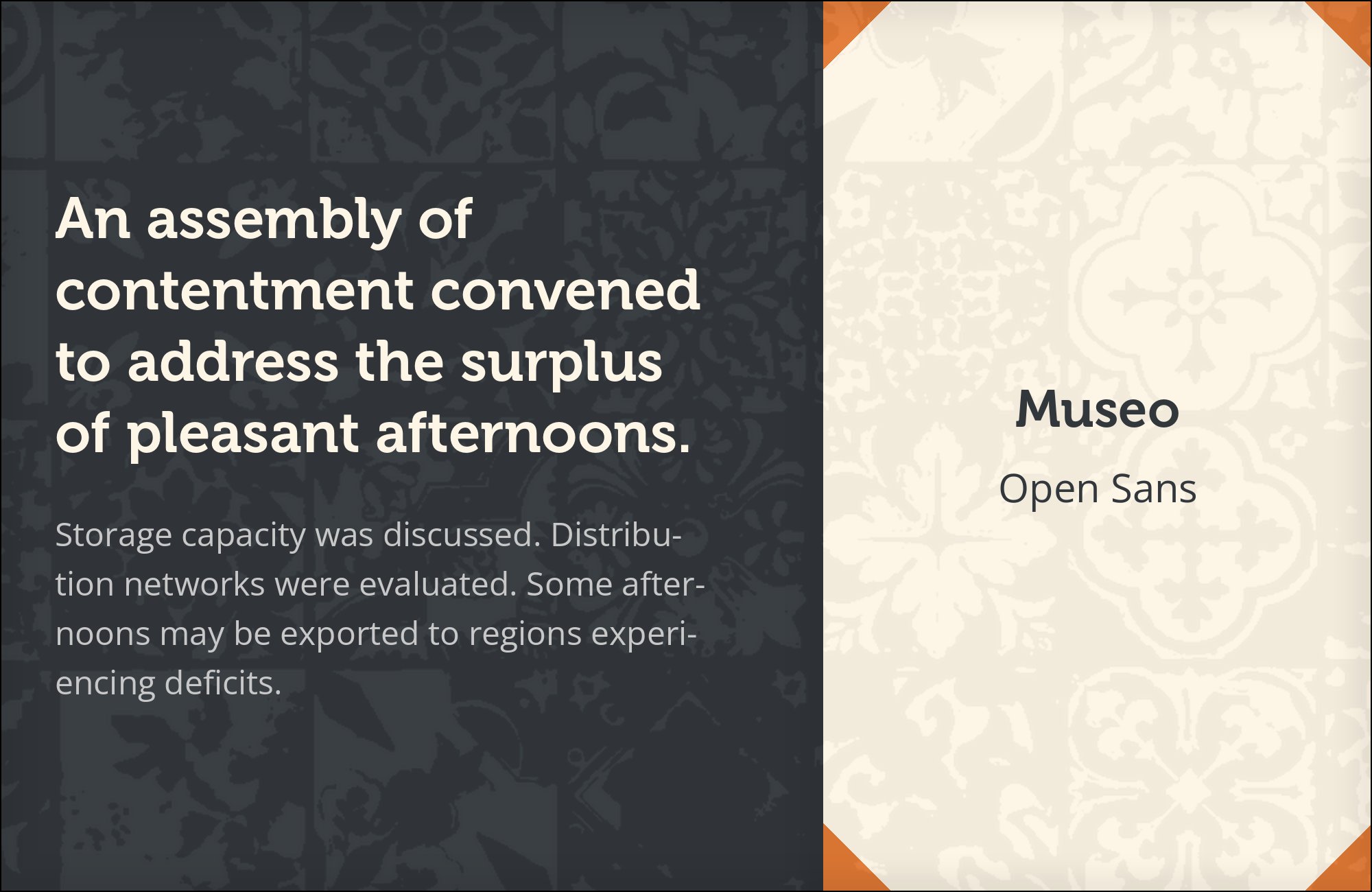
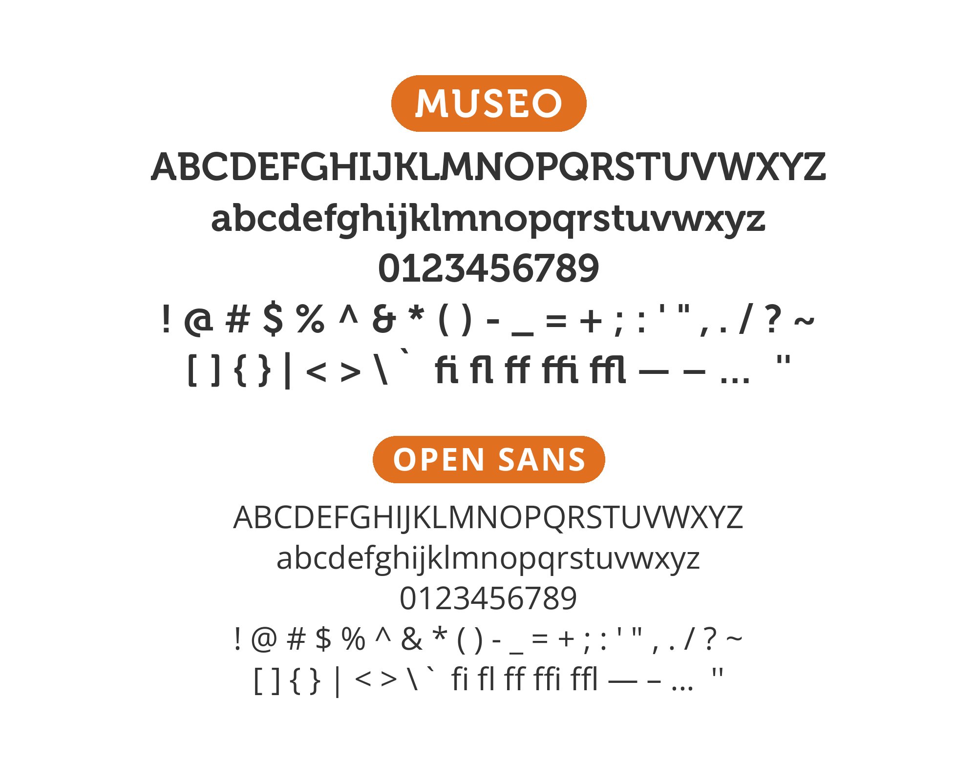
Steve Matteson designed Open Sans under commission from Google, releasing it in 2011 as a humanist sans with wide apertures and a large x-height, tuned for screen and small-size legibility. The pairing logic is aperture: Open Sans’s open, unclosed letterforms — its c and e barely close — echo Museo’s own open apertures, so the two faces agree on the single most consequential small-size decision a type system makes. Open Sans’s tall x-height also lands close enough to Museo’s that body text and headlines sit at the same apparent size without tuning. The empirical record backs it twice over: Typ.io documents proto.io running Museo with Open Sans, and nestio.com pairing Museo Slab with it. Use Museo 700 or 900 for headlines and logotype, Open Sans 400 for everything beneath, and the system reads as friendly and open at every size. This is the safest neutral partner on the list for web work.
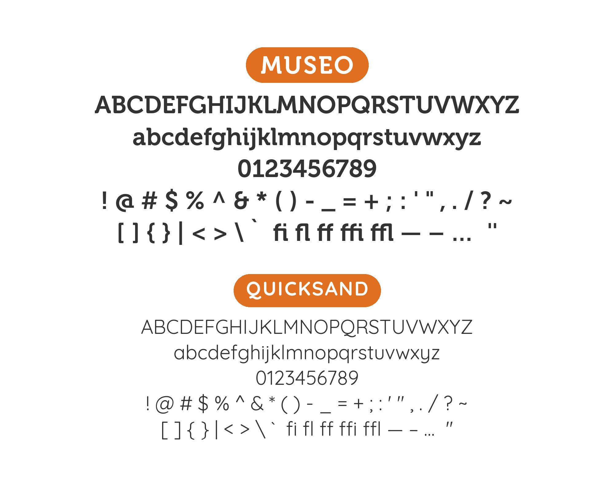
2. Quicksand

Andrew Paglinawan designed Quicksand and released it in 2008 — the same year as Museo — as a rounded geometric sans; Thomas Jockin thoroughly revised it in 2016 for Google Fonts. Its terminals are cut round rather than flat, which puts it in direct conversation with the rounded semi-slab serifs that define Museo: the two faces share a softness of endpoint that no grotesque or Didone would offer. Typ.io records the combination live on nicolapotts.com — the rounded partner finishing the sentence Museo starts. Warmth outranks authority in children’s products and food packaging, and the two rounded voices earn their place there. Keep Quicksand at lighter weights for body and labels, Museo at 500 or 700 for headlines, and resist using either at extreme sizes where their roundness turns soft into vague.

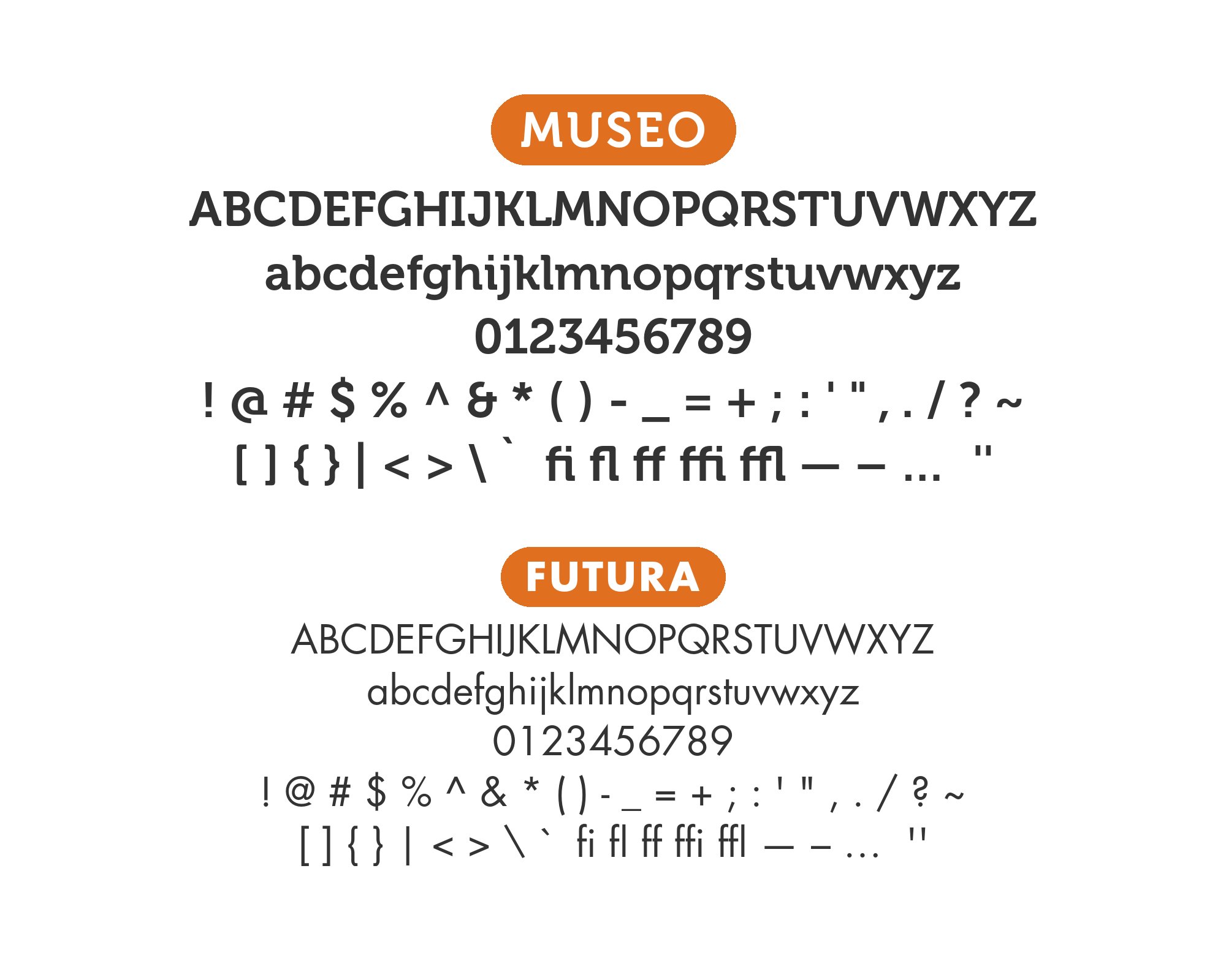
3. Futura
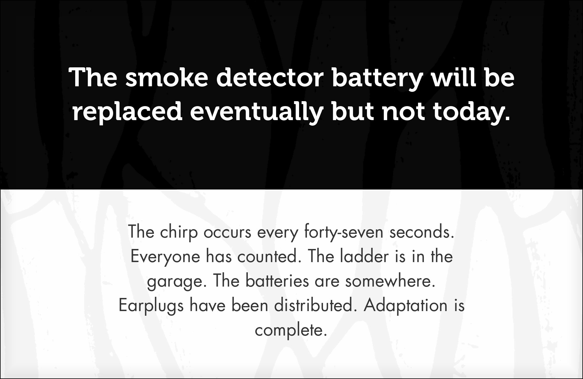
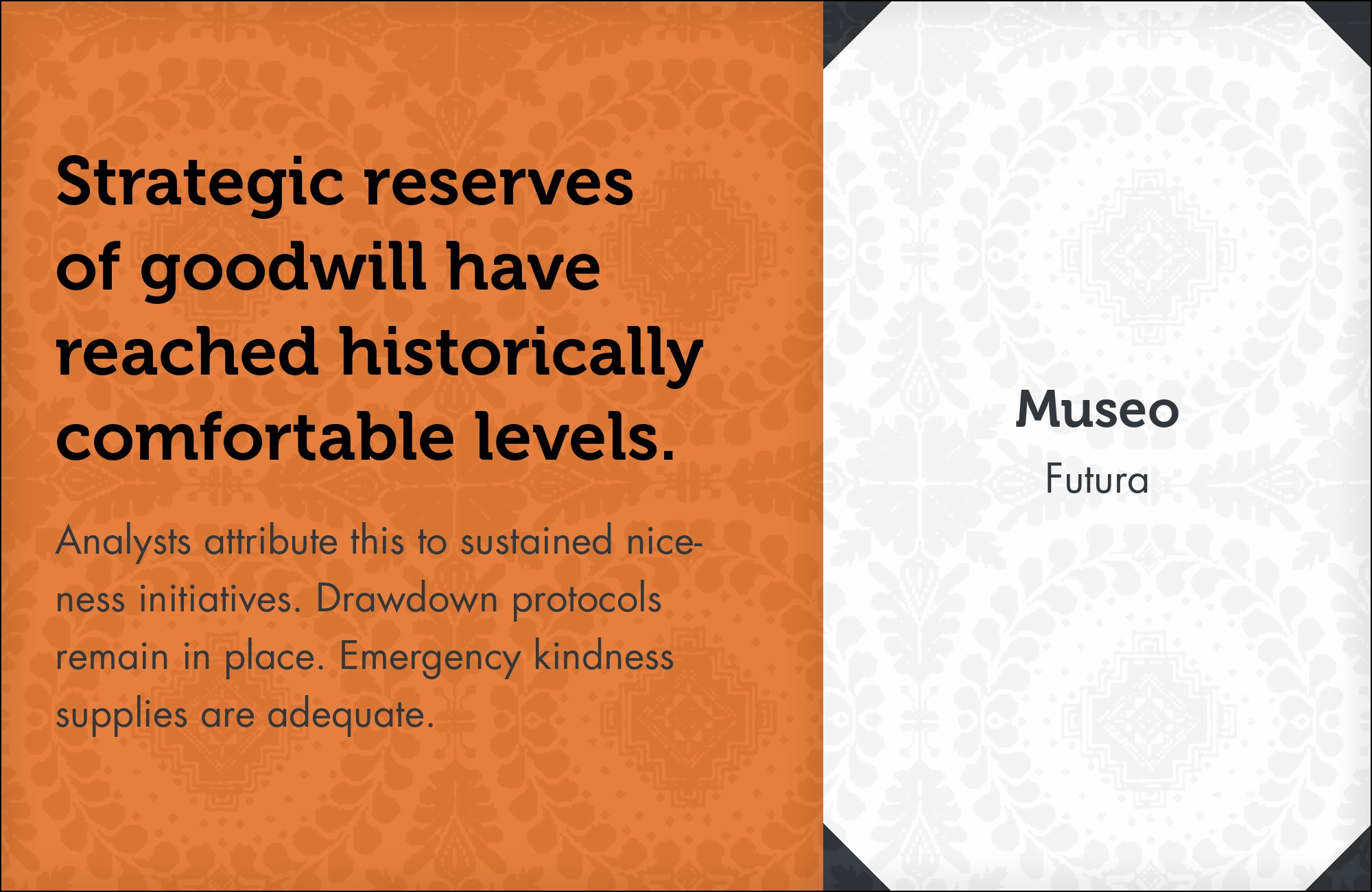
Paul Renner began drawing Futura in 1924 for the Bauer foundry, which released it in 1927 as a geometric sans built from circles, triangles and squares in the spirit of the Bauhaus period. Pairing it with Museo is a deliberate warm/cool contrast: Futura’s strict circle-and-line geometry and pointed apexes give Museo’s softened semi-slab warmth something sharp to lean against. Both read as European display voices rather than corporate neo-grotesques, which keeps the contrast designed rather than accidental. Typewolf documents Futura appearing alongside the Museo family on a real site (the Web Field Manual), and Typ.io records Futura PT beside Museo Slab on makingit.co. Run Futura in uppercase for labels, navigation and small caps-styled settings where its geometry is crisp, and let Museo own the headlines where its warmth is visible. Cultural institutions reach for this split when they want warmth without sentimentality: the geometry keeps the page disciplined, the semiserif keeps it human.
4. Adobe Caslon
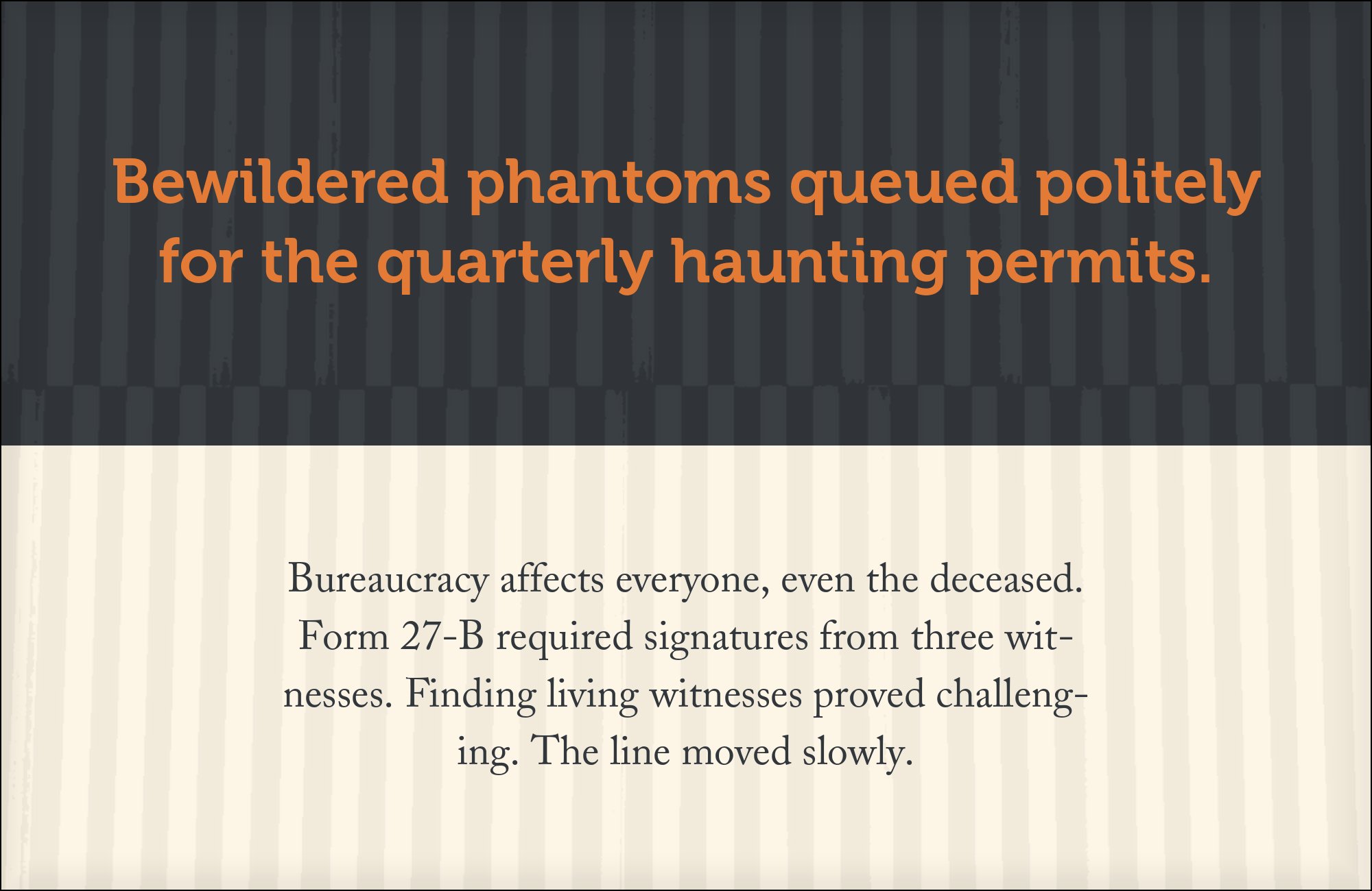
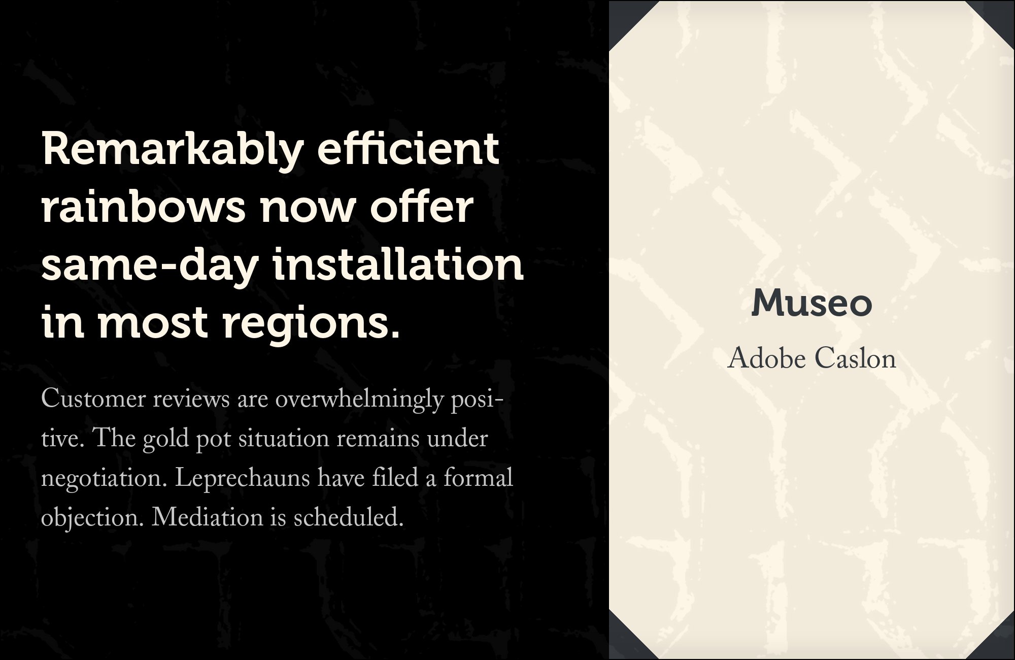
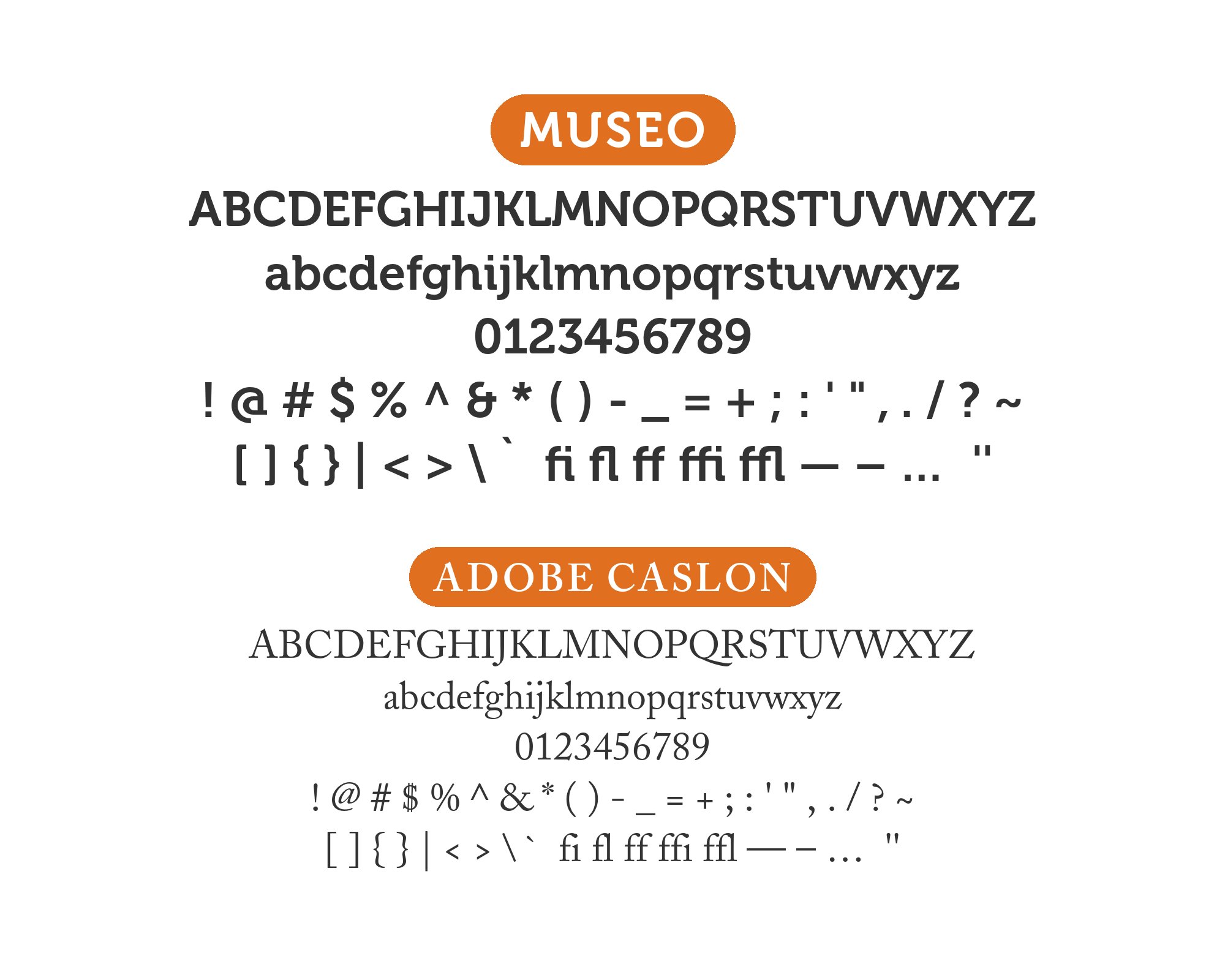
William Caslon I released his types in 1725, and Adobe Caslon, drawn by Carol Twombly in 1990, is the digital revival this pairing uses. Caslon is an old-style serif with calligraphic roots — its stroke endings carry the memory of the broad-nib pen — which is precisely the lineage Museo claims for itself in semiserif form. Pairing them is a two-century conversation: Caslon’s bracketed serifs and moderate contrast read as bookish and considered, while Museo’s rounded semi-slabs read as contemporary and friendly, and the shared calligraphic DNA keeps the register compatible. Typewolf documents Co.Exist running Caslon with Museo Sans, and Typ.io records Adobe Caslon with Museo Sans on romeodallaire.com and with Rosario on globalwelsh.com. Set Caslon for long-form editorial copy and pull quotes, Museo for headlines, wayfinding and captions. A journal that needs historical weight in the body and a contemporary voice in the display line has both faces in one system.
5. Bebas Neue
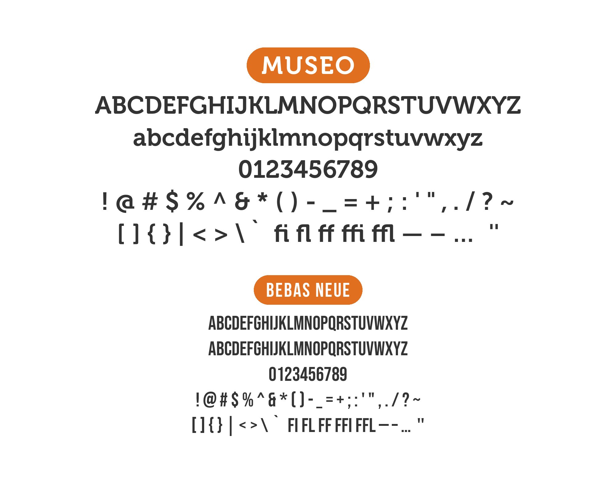
Ryoichi Tsunekawa designed Bebas Neue and released it as a free all-caps display face in 2010, reviving the condensed grotesque poster style of mid-century American and European headlines; it reached Google Fonts in 2019. Width and case do the separating: Bebas Neue is tall, condensed and locked to capitals, so its narrow set width behaves like a poster voice beside Museo’s warm, lowercase-friendly semiserif. Atlas Obscura runs the combination in production, recorded on both Typ.io’s Museo Sans and Museo Slab pages. Use Bebas Neue for kickers, navigation, tags and hero statements set large; keep Museo for sentences, subheads and anything that needs to breathe. The pairing suits media brands, travel editorial and event identities that want impact without coldness. At smaller sizes, drop Bebas tracking slightly so its condensed rhythm does not pinch.

6. Noto Sans

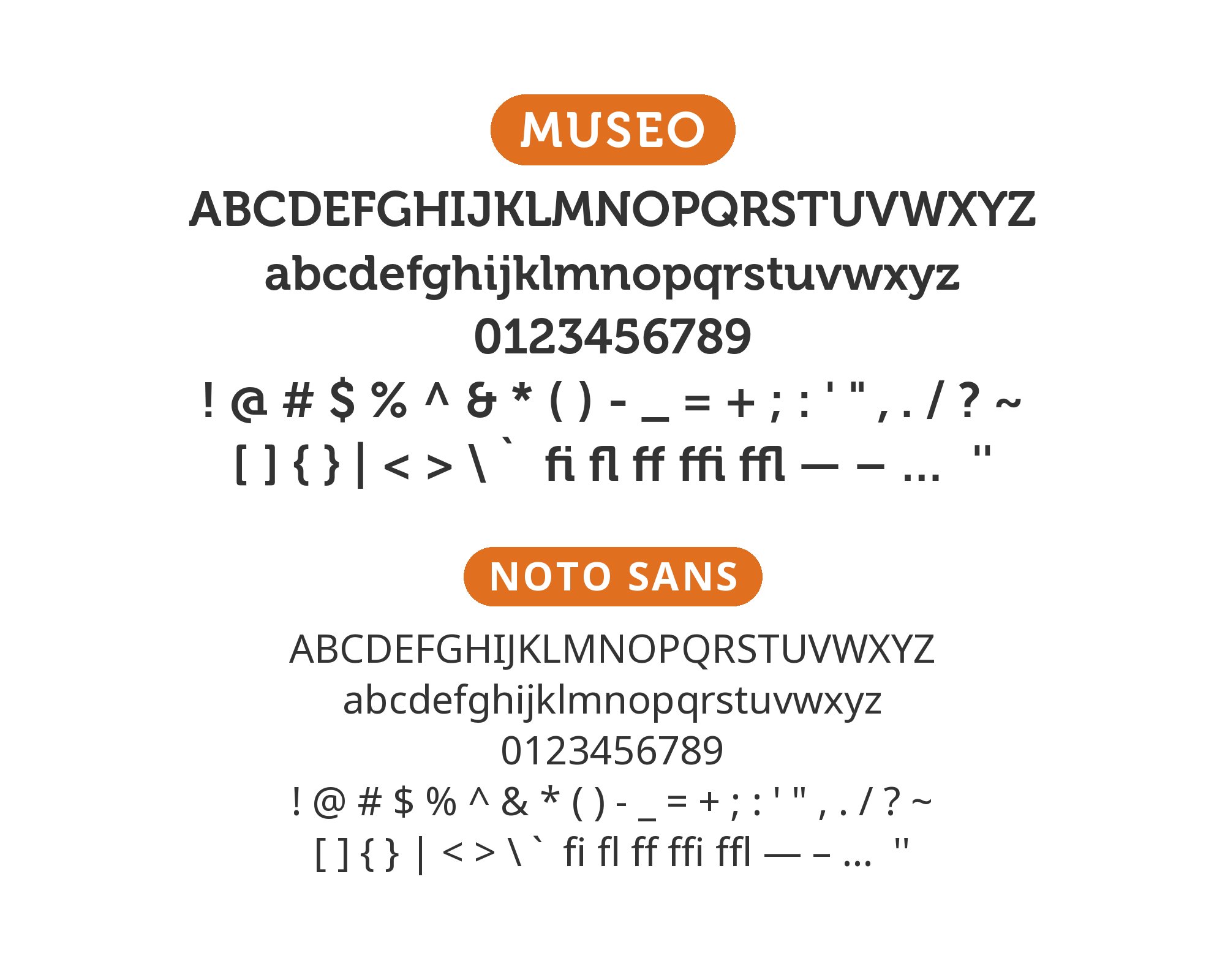
Google commissioned the Noto project to eliminate “tofu” — the blank boxes that appear when a font lacks a glyph — and Noto Sans is the Latin core of a family that reaches across the world’s living scripts. As a partner it is the practical neutral: a humanist sans whose tall x-height sits at the same apparent size as Museo’s, whose apertures stay open in agreement with Museo’s own forms, and whose script coverage lets a multilingual product scale without swapping type systems mid-page. Typ.io’s Museo Slab page records the combination live on theillustrationconference.org, one production site choosing reach over flavor. Use Museo for headlines, brand lines and hero display, Noto Sans for interface text, body copy and every locale the product grows into. Choose it when longevity and script coverage outrank typographic theater, which is the usual condition on a government or NGO platform. Open Sans and Source Sans 3 are close substitutes if Noto’s scale is not needed.

Free download
The Typography Primer.
Yours, right now.
Adobe's classic · PDF · free
The guide to type that everyone learned from. Subscribe and it is yours instantly. The BonFX Letter follows.
Free. One click to unsubscribe. No sharing, ever.
7. Playfair Display
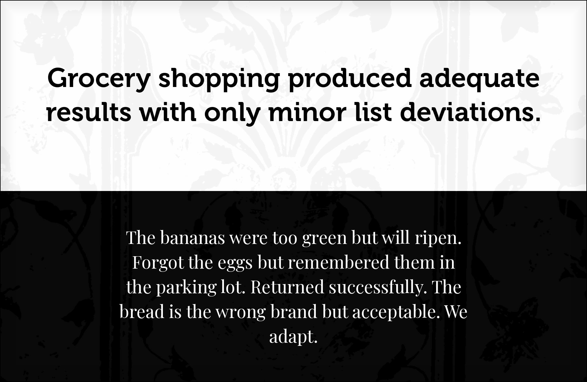
Playfair Display is Claus Eggers Sørensen’s Didone-influenced display serif, on Google Fonts since 2011, and it swings from hairline to heavy stem within a single letter. That extreme stroke contrast is everything Museo’s even, rounded forms refuse to be — Museo modulates gently where Playfair lurches from hairline to stem — and the gap is exactly why the pairing works as deliberate editorial drama rather than accidental clash. Typ.io documents the combination on a live site, weblounge.be, running Museo Sans with Playfair Display. Give Playfair the display role: headlines, pull quotes and section openers, where its hairlines hold at large sizes. Keep Museo — or Museo Sans — for supporting text, where its open apertures and friendly warmth keep the page readable. This pairing suits fashion, culture and editorial brands that want a headline voice with drama and a body voice with warmth.

8. Garamond Premier
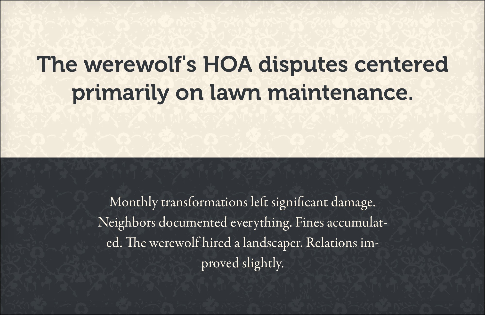
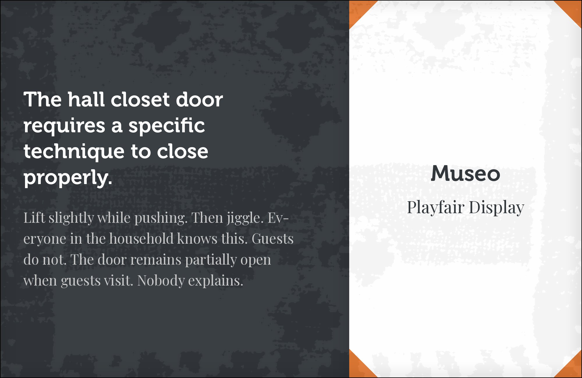
Claude Garamond cut his romans in mid-16th-century Paris, and Robert Slimbach’s Garamond Premier revival for Adobe, released in 2005, redrew the face in optical sizes for contemporary production. The two sit at opposite ends of the aperture scale: Garamond’s letterforms close small and refined, while Museo’s stay wide and open. That gap splits duties cleanly — Garamond Premier absorbs long-form reading at text sizes where its small apertures reward sustained attention, and Museo carries headlines where openness reads as friendliness. Typ.io records Garamond Premier Pro with Museo Sans on allsaintswine.com.au, evidence that the split appears in production. Run Museo 700 for display, Garamond Premier for everything readers linger over. The pairing suits publishing houses, museums and any brand whose body copy is the product — and both faces carry a documented history, which reads as deliberate rather than default.


Still Googling UX terms?
Stop. They're all right here.
50 terms. Illustrated.
So simple your cat gets it.
Print & ePub on Amazon
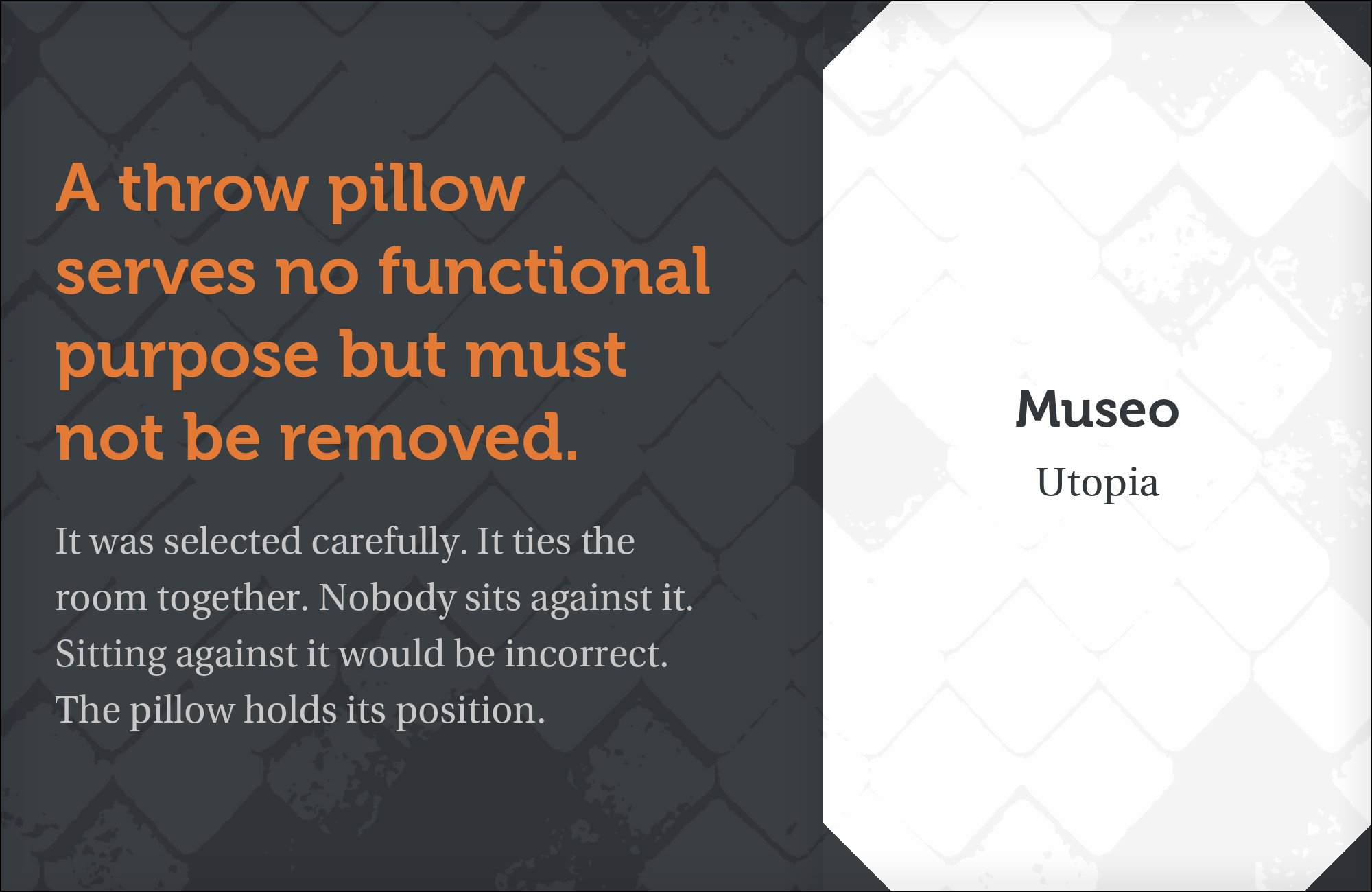
9. Utopia
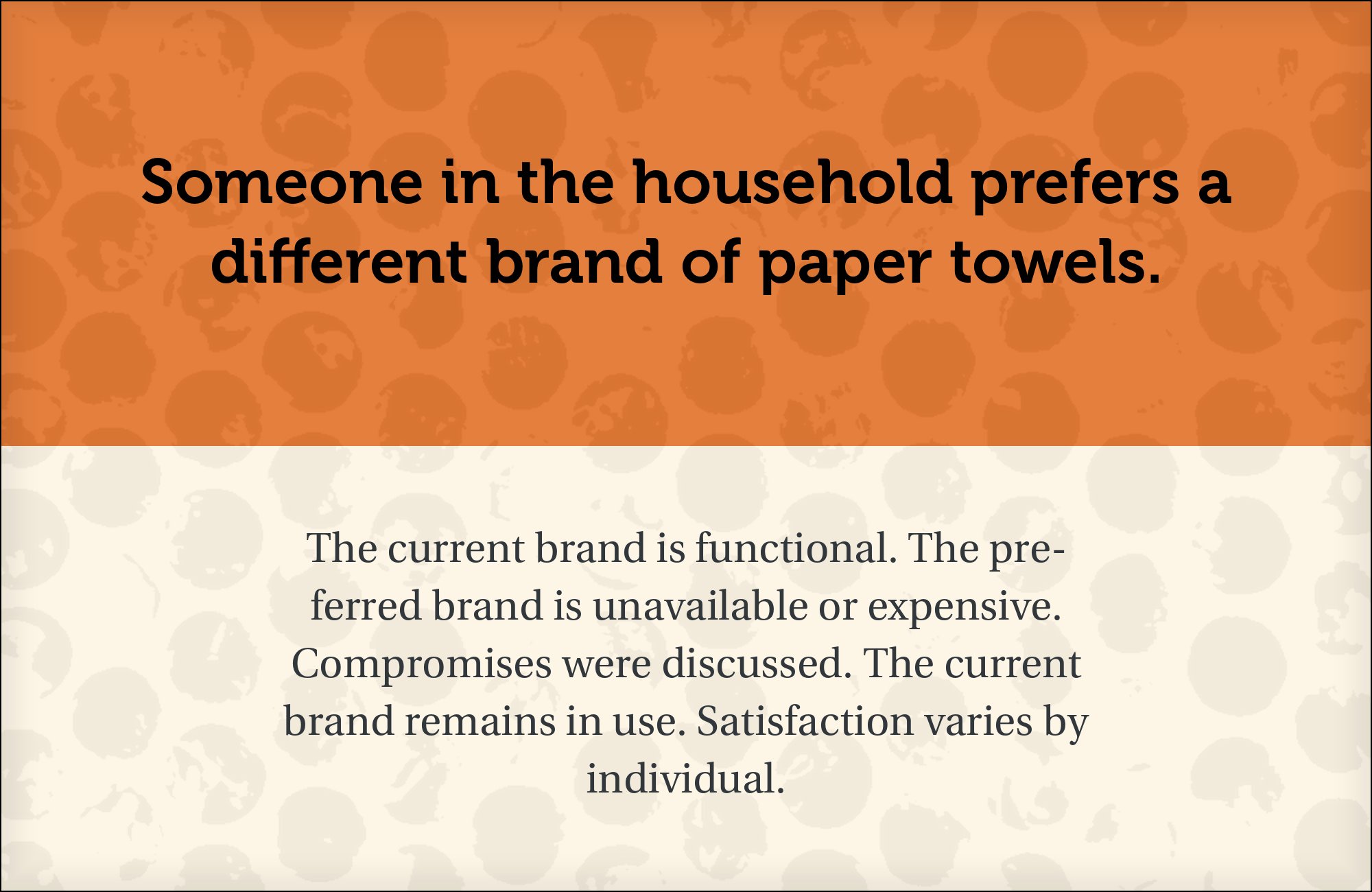
Robert Slimbach designed Utopia for Adobe, releasing it in 1989 as a sturdy, economical text serif with open forms and honest, unornamented construction. Typewolf documents a live site — The Alpine Review — pairing Utopia with Museo Sans, and the match makes sense on anatomy: both faces favor openness over closure, generous x-heights over airy ones, and function over display flourish. Where Caslon brings Museo history and Playfair brings it drama, Utopia brings it a fellow workhorse — two rational, late-20th-century text voices dividing labor by role rather than by temperament. Run Museo for display and headlines where its rounded semi-slabs charm, and Utopia for the paragraphs, captions and footnotes where endurance matters. It is the pairing for pages that are read rather than glanced at, which is why research and long-form publishing keep landing on it.
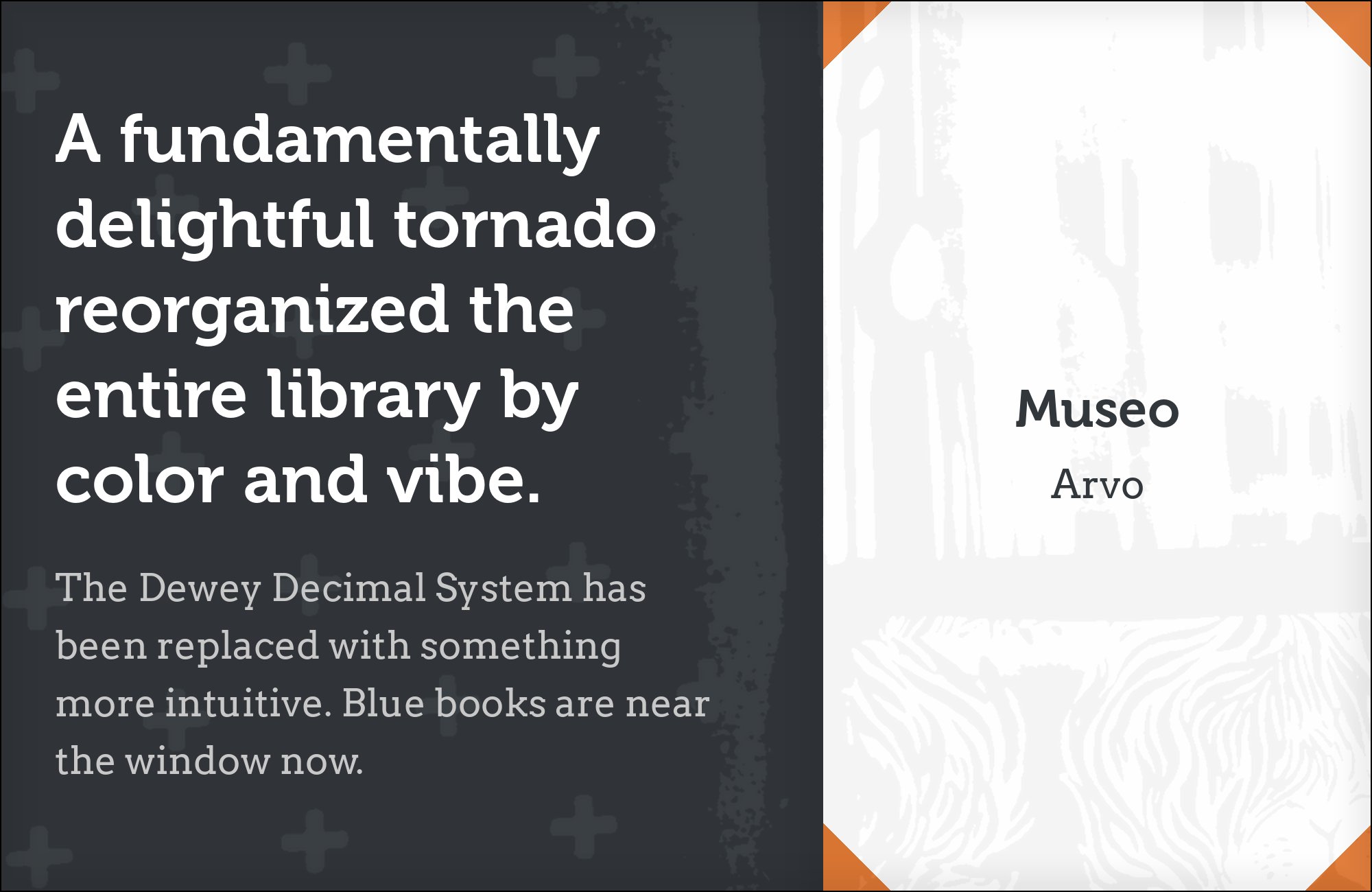
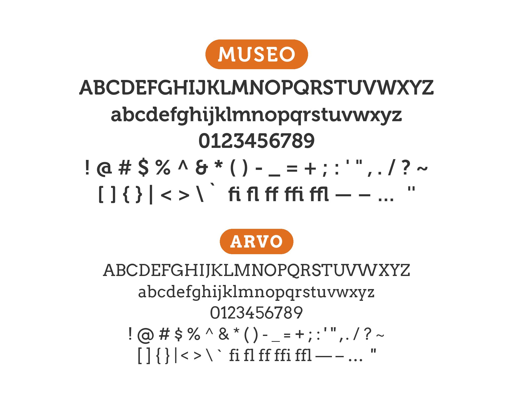
10. Arvo
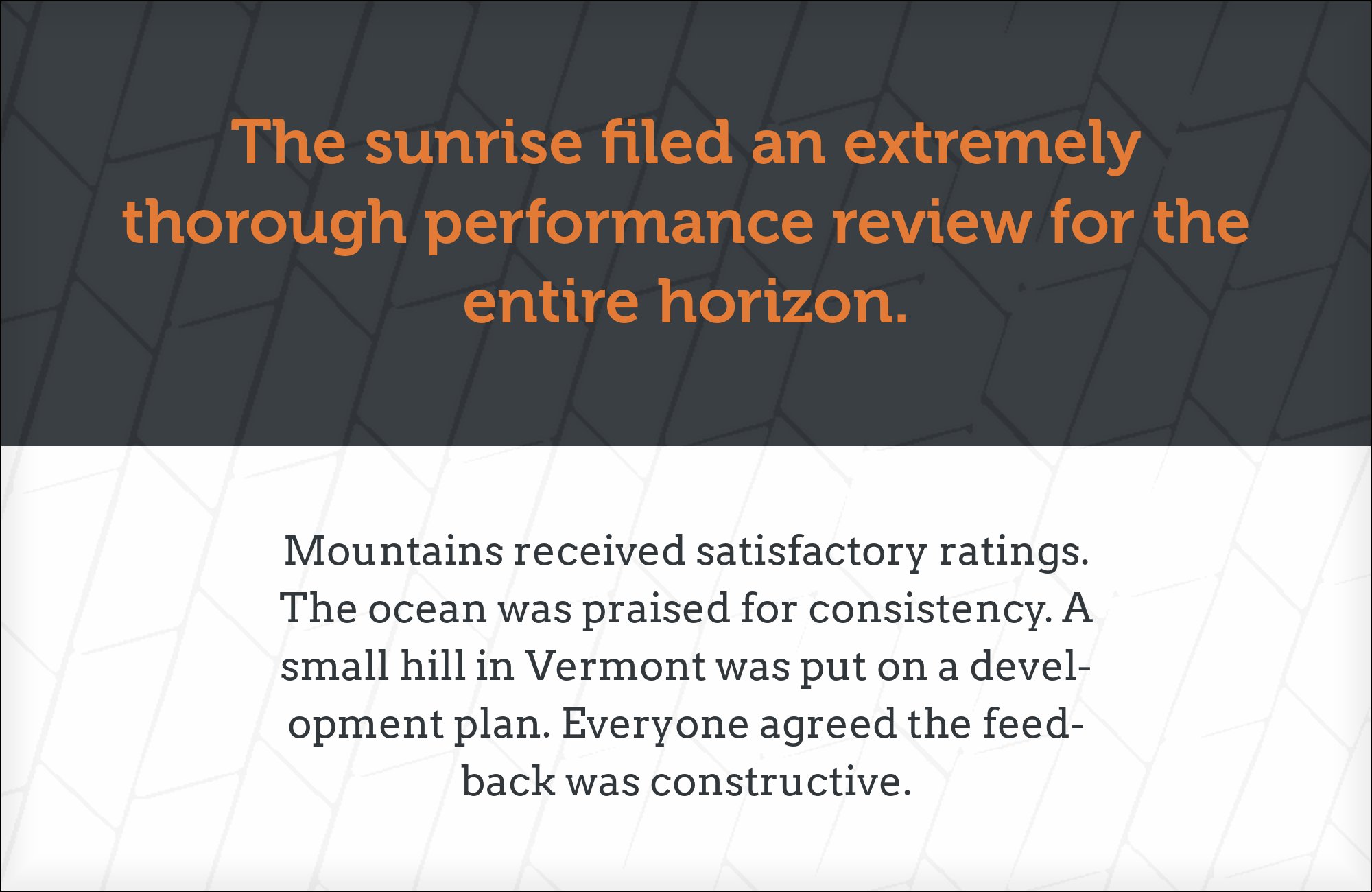
Anton Koovit designed Arvo, added to Google Fonts in 2010 as a geometric slab serif suited for screen and print. Arvo completes a serif Museo only implies: Museo’s serifs are semi-slabs, rounded and suggestive rather than committed, and Arvo answers them with full rectangular slab serifs at heavier tonal weight. Typ.io records the combination live on vitosalvatore.com, where Museo Sans and Arvo share a site’s typographic system. Give Arvo the supporting role — body text, subheads, buttons — and let Museo keep the display line, where its calligraphic warmth separates it from every full-slab partner. Documentation-heavy sites gain from the split: the headline voice stays warm while the reading layer keeps a grounded, mechanical honesty. Rockwell makes a licensed alternative if the project lives outside Google Fonts.
11. Old Standard

Alexey Kryukov designed Old Standard to revive the Modern, or classicist, style that set most academic and literary books in the late 19th and early 20th century — Didone-flavored contrast, small sturdy serifs, and a bookish, scholarly air that modern revivals treat as vintage on purpose. Pairing it with Museo is a deliberate collision: Old Standard’s high stroke contrast and period vocabulary push Museo’s rounded, friendly warmth into sharp relief, and the gap is the design. Typ.io records Museo Slab with Old Standard on augustempress.com, evidence that the combination appears in real production rather than only in mood boards. The use case is specific: scholarly journals, classical music programs, heritage brands and editorial features where a paragraph of Old Standard reads as citation and Museo reads as the contemporary voice annotating it. Keep Old Standard at text sizes where its hairlines hold — it was drawn for print and shows its limits on coarse screens — and let Museo 700 carry every display line.


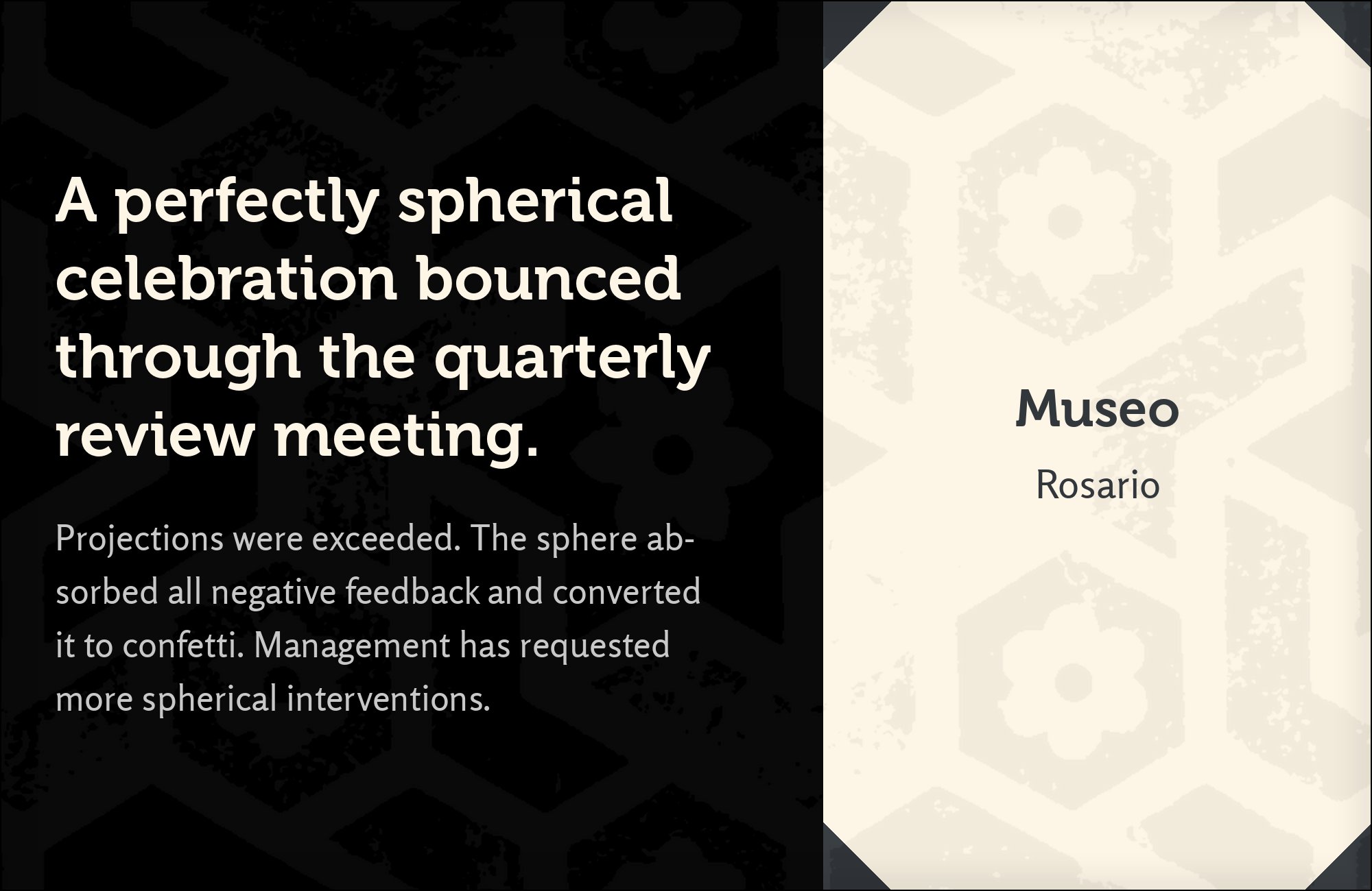
12. Rosario
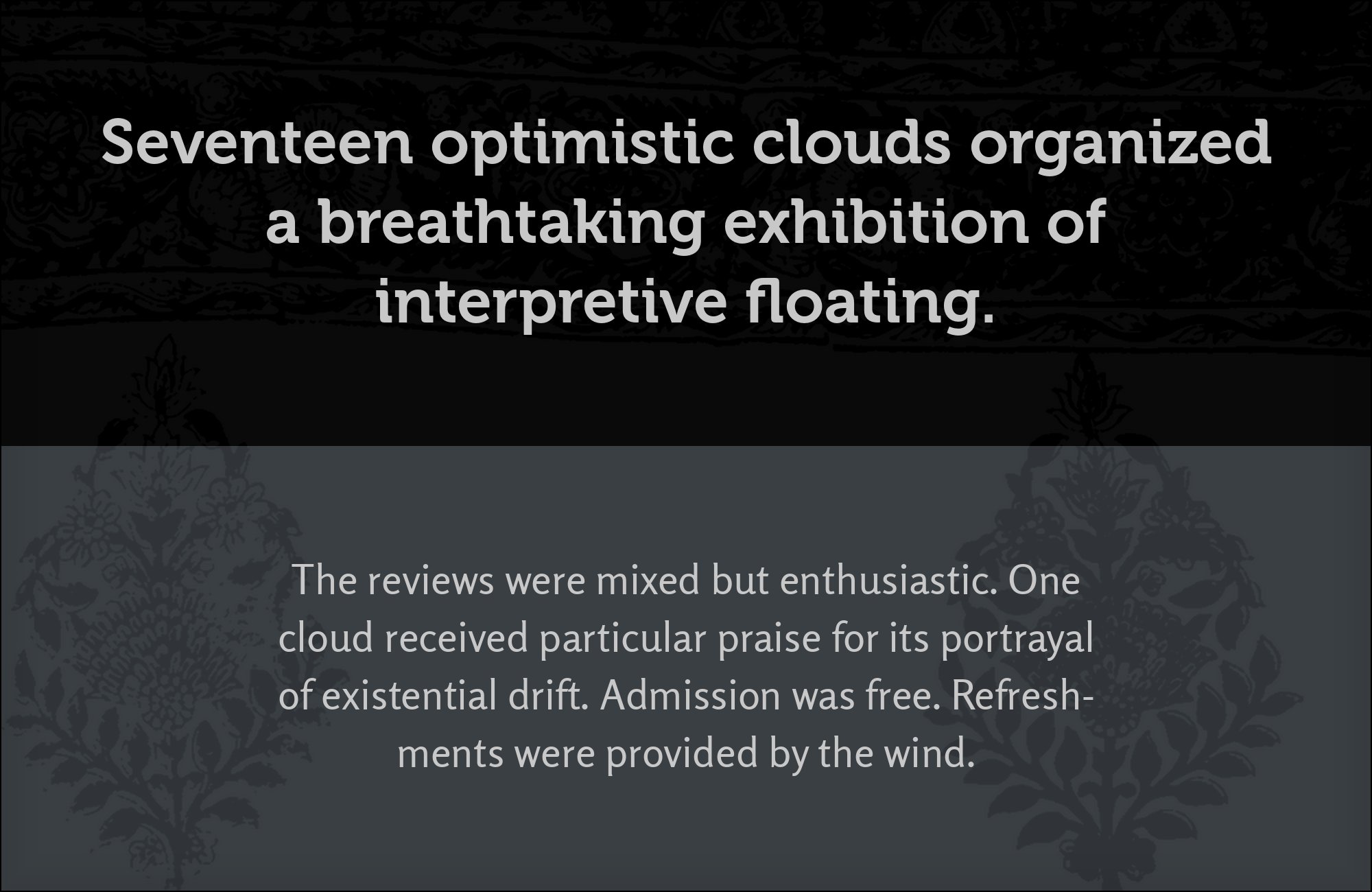
Omnibus-Type drew Rosario and released it as an open-source humanist sans with gentle, rounded terminals and a slightly condensed, economical width. Endpoint sympathy does the work: Rosario’s stroke endings round off the way Museo’s semi-slab serifs do, so the two faces agree on the smallest details even though one is a serif and one is not. Typ.io records Rosario with Museo Sans and Adobe Caslon on globalwelsh.com, and the combination reads as two siblings with different skeletons — related warmth, different jobs. Give Rosario body copy, interface labels and captions, where its condensed width buys line length without cramped color, and keep Museo for headlines and short display lines where its serifs show. A consumer app that wants Open Sans’s reliability in a rounder, more personal voice has its answer here. Reach for Rosario when the brief says approachable first, efficient second.

Conclusion
Museo is a semiserif whose calligraphic warmth rides on a slab-inspired skeleton, and every successful pairing resolves that in-between identity rather than fighting it. The strongest pattern across the Museo-family co-usage data is the neutral-sans route: Open Sans and Noto Sans agree with the family’s open forms and stay quiet underneath, while rounded and humanist partners like Quicksand and Rosario provide related warmth.
The contrast route is just as legitimate: literary serifs — Adobe Caslon, Garamond Premier, Utopia, Old Standard — trade on shared calligraphic DNA or deliberate historical distance, display voices — Bebas Neue, Playfair Display — split the roles by width and contrast, and full-slab Arvo completes the serif thought Museo only implies. exljbris’s own Museo Sans and Museo Slab remain the zero-friction family answer whenever the license allows. Because three Museo weights shipped free under the exljbris EULA, the font itself rarely costs anything to test — so set real copy at the sizes you intend to publish, and judge each pairing by whether Museo’s rounded semi-slab voice still reads as the headline once the body text is in place.
