Clarendon pairs great with Futura, Trade Gothic and Helvetica Neue. All 14 pairings are shown below in real rendered specimens, with the reason each one works.
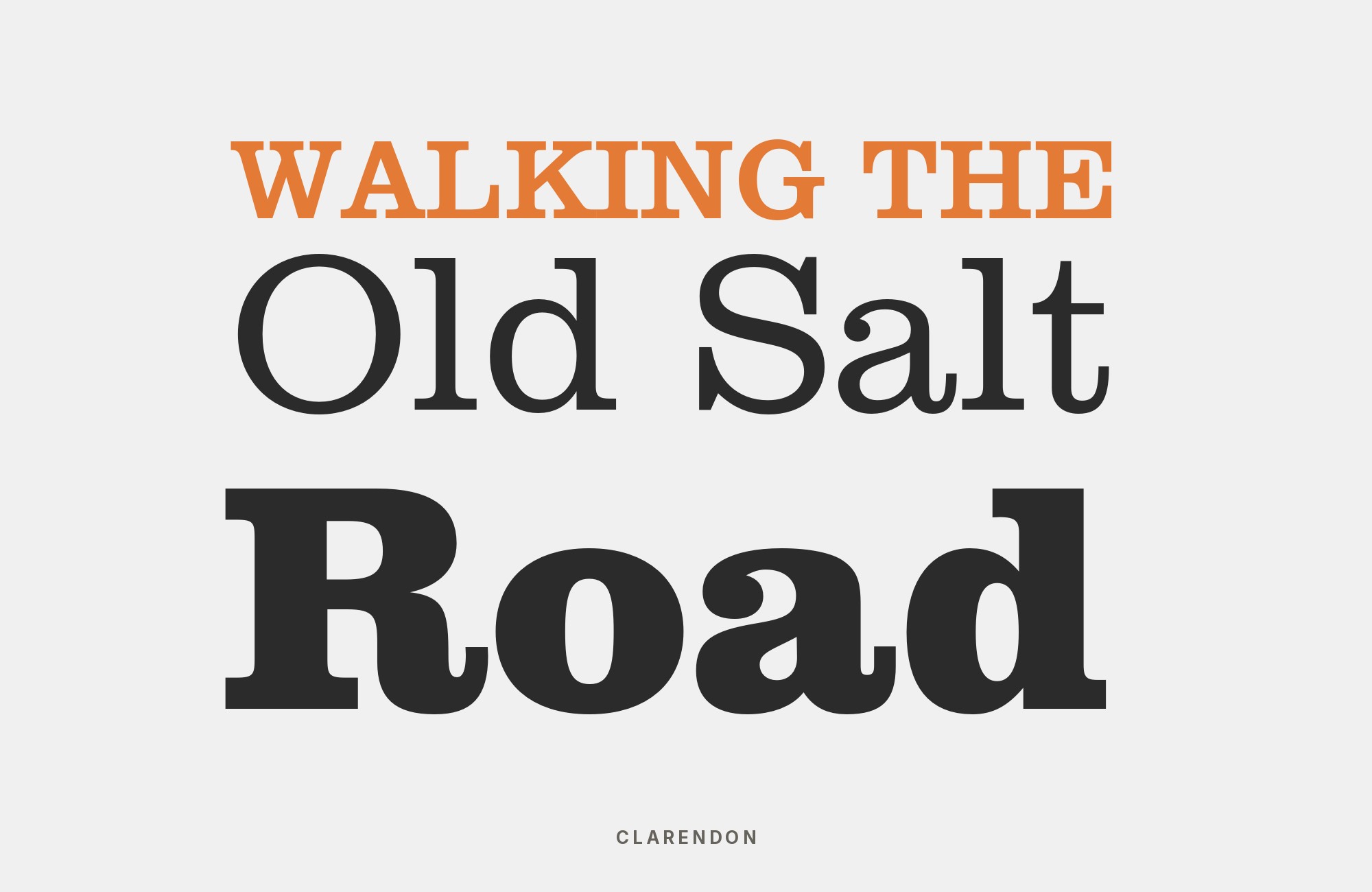
What fonts go with Clarendon? The 1845 London slab serif that gave its name to an entire category of type is instantly recognizable from wanted posters and National Park signage, with bracketed serifs, strong ball terminals, and a sturdy warmth that reads as authoritative without ever feeling cold.
Clarendon’s defining feature is its bracketed serif construction: the serifs flare smoothly into the stroke rather than meeting it at a sharp angle, which is what gives the typeface its rounded, slightly soft feel despite being a heavyweight slab. Its ball terminals, small rounded finishes on letters like the lowercase “a” and “c”, add to that warmth, and its even, moderate stroke contrast keeps it legible even at the display weights and sizes it is usually set at. The combination reads as sturdy and trustworthy rather than severe.
Because Clarendon carries so much character on its own, the pairing question is really about what role a partner should play beside it. Some combinations aim for maximum contrast, with a plain geometric sans that steps entirely out of the way, while others use another historically rooted face for a deliberately old-fashioned, cohesive feel. The right choice depends on whether the brand wants Clarendon to stand alone or to sit inside a matched historical register. Here are 14 fonts that pair well with Clarendon.
1. Futura

Paul Renner designed Futura for Bauersche Gießerei, released in 1927. Its circle-and-triangle geometry sits at the opposite pole from Clarendon’s bracketed slab serifs, and the contrast holds at a matched, confident weight. Where Clarendon is rounded and historical, Futura is circular, triangular and unmistakably twentieth-century. Fonts In Use records the pair on The Black Panther newspaper and on Snoopy and the Red Baron. Use Futura for supporting text, captions or a secondary headline, and let Clarendon’s slab weight anchor the primary display line.

Build free, plus 500 AI credits.
Design and publish a site at no cost. Paid plans double your credits the first month.
Start free2. Trade Gothic

Trade Gothic is a bold, no-nonsense grotesque that separates cleanly from Clarendon’s bracketed slab serifs while matching its confidence and weight, so it can hold its own in headings without ever competing for the same visual register. It is Typewolf’s suggested pairing for Clarendon, and Clarendon / Trade Gothic also appears in Douglas Bonneville’s top combinations list. The two work well split across a hierarchy — Clarendon for the primary headline or logotype, Trade Gothic for supporting labels and navigation. Suited to editorial branding, packaging and any layout that needs plainspoken authority beneath a warmer display face.

3. Helvetica Neue

Pairing Clarendon with the most neutral grotesque available isolates Clarendon’s personality — its bracketed serifs and ball terminals — as the sole carrier of character on the page, since Helvetica Neue contributes none of its own. This is a safe, default hierarchy move: Clarendon for headlines, wordmarks or short display lines, Helvetica Neue for everything that needs to simply be read without commentary. Because Helvetica Neue ships with macOS, it is also a genuinely practical choice for documents, presentations and design systems rather than a purely theoretical one. Effective anywhere Clarendon’s warmth needs a completely quiet, opinion-free foundation underneath it.

Taking it to the next level means cinematic visuals, faster turnarounds, and work that wins clients. Create with unlimited downloads of creative stock assets, and access to powerful AI tools to fast-track your workflow!
Subscribe4. Oswald

Oswald is a tall, tightly condensed grotesque designed as a web-friendly reworking of the classic Alternate Gothic style, which lets it handle dense supporting copy in tight spaces while Clarendon’s wider slab serifs carry the visual weight above. The contrast in width does most of the work here — Clarendon is comparatively open and rounded, Oswald is narrow and upright — so the two rarely compete even at similar sizes. This suits retail signage, menu systems and any layout with limited horizontal room for secondary text. Keep Oswald to labels and short lines; its condensation is not built for long paragraphs.

5. EB Garamond

EB Garamond is a delicate old-style revival with light stroke contrast and calligraphic curves, considerably lighter in personality than Clarendon’s blocky Victorian weight. Set beneath a bold Clarendon headline, it creates hierarchy through genuine weight and character contrast rather than through shared historical DNA — a serif-on-serif pairing that still reads as two clearly different voices. This works well in editorial and publishing contexts where the body text needs classical warmth of its own rather than a neutral sans stepping entirely out of the way. Keep the weight difference pronounced; EB Garamond set too heavy will start competing with Clarendon instead of supporting it.

6. Nunito

Nunito is a rounded, even-geometry sans with soft terminals that gives the pairing a friendly, contemporary feel rather than corporate stiffness. It reads as more modern than rustic, but its roundness still echoes Clarendon’s own ball terminals just enough to feel related rather than arbitrary, tempering the slab’s blockier Victorian weight for a warmer overall brand voice. This combination suits food and beverage branding, boutique retail and lifestyle products where Clarendon’s sturdiness needs softening rather than sharpening. Use Nunito for body copy and packaging text, and reserve Clarendon for the logotype or headline where its character carries the most weight.

7. Zilla Slab

Zilla Slab is a slab serif with softer, more humanist curves than Clarendon’s blocky Victorian forms, which keeps the page in a single slab-serif register while still separating hierarchy clearly through weight and scale. Because both fonts share the same basic serif construction, the pairing reads as a family relationship rather than a contrast — a heavier, more historical slab above a lighter, more contemporary one below. This suits editorial and documentation contexts that want visual consistency across headline and body rather than a deliberate stylistic break. Keep Zilla Slab noticeably lighter in weight than Clarendon so the hierarchy stays legible at a glance.

Paid prompt-to-site tools are going to lock you in.
How can your studio escape this?
Find Out How8. Inter

Inter is a plain, contemporary grotesque built for screen interfaces, with no period pretension of its own, which makes it a neutral modern workhorse for body copy beneath a Clarendon display line. Set this way, Clarendon becomes the layout’s one historical voice while Inter handles everything that needs to read cleanly at small sizes on a screen. The pairing is close in spirit to the Helvetica Neue combination above, but Inter’s screen-native metrics make it the stronger choice specifically for web and app interfaces. Use it for UI chrome, body copy and captions, and let Clarendon carry branding and headline moments only.

9. League Gothic

League Gothic’s extreme condensation lets it sit as compact, signage-style labeling beside Clarendon’s wider display forms without competing for horizontal space — the pairing Typewolf and Typ.io both catalogued on Grinders Coffee. Where Clarendon’s rounded slab serifs demand room to breathe, League Gothic is built to be narrow and efficient, so the two rarely fight for the same visual territory even set close together. This works well for price tags, menu boards and packaging where space is limited but a secondary typographic voice is still needed. Keep League Gothic to short labels; its condensation is not intended for extended reading.

10. DIN

DIN’s engineered, technical letterforms give a neutral, utilitarian counterpoint to Clarendon’s heavier bracketed serifs, which makes it useful for labels, metadata or fine print sitting beneath a bold Clarendon headline. Where Clarendon reads as historical and warm, DIN reads as contemporary and systematic — a contrast in temperature as much as in construction. This suits technical documentation, product packaging and signage systems that need a dependable, characterless supporting voice beneath a more expressive display face. Reserve DIN for small, functional text and let Clarendon do all the emotional work in the layout.

11. Caslon

Caslon’s old-style warmth and long publishing pedigree balance Clarendon’s chunkier Victorian trade-catalogue feel, producing a “heritage display plus classic text” formula that shows up often in editorial design. Both faces carry genuine historical weight, but from different centuries and different registers — Caslon calm and literary, Clarendon blunt and industrial — so the pairing reads as two eras of English typography in conversation rather than a mismatch. This suits publishing, heritage branding and print work that wants depth rather than stark contrast. Set Caslon for body text and reserve Clarendon for headlines, mastheads or short display lines above it.

12. Minion

Minion is a restrained old-style text face made for body text and extended reading, and it recedes politely as body copy beneath a heavier Clarendon headline, keeping the display face the clear focal point of the layout. Its moderate contrast and comfortable proportions make it dependable at typical paragraph sizes, without any of the flourish that might compete with Clarendon’s already-considerable presence above it. Because Minion is widely available through Adobe’s own font library, it is also a practical, low-friction choice for professional print and editorial work. Suited to any layout that needs a quiet, capable reading face under a bold, characterful headline.

13. Bookman

Bookman and Clarendon are both nineteenth-century-rooted serifs, but Bookman’s rounder, friendlier curves soften Clarendon’s blockier industrial character when used in a lighter supporting role — body copy or captions beneath a Clarendon display line. Because the two share a general period and a family resemblance in their sturdiness, the pairing feels cohesive rather than contrasted, more like two related voices than a deliberate clash. This suits vintage-inspired branding, packaging and editorial spreads that want a consistently old-fashioned feel across the whole page. Keep Bookman notably lighter in weight than Clarendon so the hierarchy stays clear.

14. ITC Franklin Gothic

Franklin Gothic’s sturdy grotesque forms date from 1902, but the two still read as cousins rather than clashing styles despite one carrying serifs and the other none. This is useful whenever a brand wants gravitas and historical weight without an obvious serif-versus-sans culture clash. Fonts In Use records ITC Franklin Gothic with Clarendon on Knopwood Tasmanian Single Malt Whisky packaging. Use Franklin Gothic for body text and secondary labels, and let Clarendon’s bracketed serifs remain the layout’s single most distinctive mark.

Conclusion
Clarendon carries enough built-in character that the pairing decision is really a choice between two strategies: reach for maximum contrast with a plain geometric sans like Futura, or lean into a shared historical register with something like Bookman or Caslon. Neither approach is more correct than the other — it depends on whether the brand wants Clarendon to stand apart or to sit inside a matched historical register.
Whichever direction you choose, test it at the sizes you will actually publish. Clarendon’s warmth and weight read very differently in a large headline than they do shrunk down into a caption, and a pairing that looks settled in a specimen can still feel unbalanced once real copy and real hierarchy are on the page.
