
Univers pairs great with Helvetica, Montserrat and Georgia. All 10 pairings are shown below in real rendered specimens, with the reason each one works.
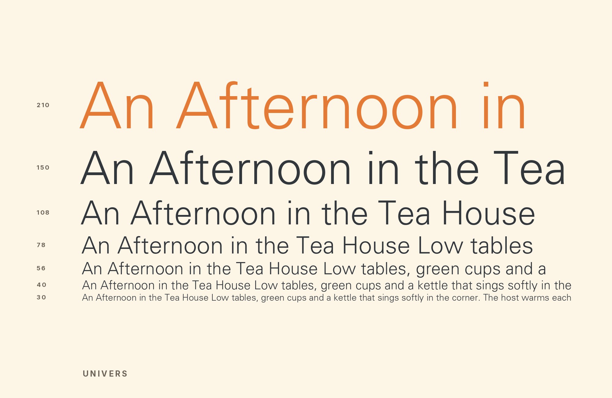
What fonts go with Univers? Adrian Frutiger’s 1957 neo-grotesque was one of the first typefaces planned as a complete family of weights and widths, and the first to use his numbered naming system, which is exactly why finding it a partner outside its own family is a genuinely hard question.
Frutiger built Univers around a numbered weight-and-width matrix: every cut was available together from the launch, as one family of consistent, related designs. That discipline is what made Univers a landmark: a designer could move between Univers 47 and Univers 65 and stay inside one consistent typographic voice. It is also why the obvious answer to “what pairs with Univers” is Univers itself: the family already contains its own contrast, its own hierarchy, its own headline-to-body relationship, engineered in from the beginning.
That completeness is precisely what makes an external partner worth choosing carefully. Bring in a font that shares Univers’s rational, evenly-toned construction and the two blend almost too well, offering no reason to leave the family in the first place. Bring in something with real historical texture or stroke contrast — a serif, a slab, a face from a different era entirely — and Univers gets to do what it does best: hold the structural roles (labels, UI, navigation, captions) with total neutrality while the partner supplies the warmth or drama the system was never built to provide on its own. Here are 10 fonts that pair well with Univers.
1. Helvetica

Univers and Helvetica were both released in 1957, and setting them side by side is a study in how two designers solved the same neo-grotesque problem differently. Univers is the more mechanical of the two, built on Frutiger’s numbered system with rigorously consistent curves; Helvetica’s letterforms are slightly warmer and more irregular, the product of Max Miedinger working without that same systematic grid. The two appear together in period design literature: the 1967 edition of Carl Dair’s Design with Type sets its cover in Helvetica and its spine and title page in Univers. Handle with care at matched sizes — they are close enough in register to compete rather than complement, so let one lead and the other appear only in supporting text.

2. Montserrat

Montserrat’s letterforms are built from near-true circles, giving it a rounder, more overtly geometric personality than Univers’s rationalized, evenly-spaced grid. That extra warmth makes it a useful headline or logotype voice in contexts where Univers’s numbered-weight neutrality would read as too cold for marketing copy — packaging, consumer branding, marketing landing pages. Set Univers for body text, labels and UI chrome, where its discipline is an asset, and let Montserrat carry the more expressive, brand-facing type above it. The pairing works because the two fonts never ask to do the same job at the same time.

3. Georgia

Georgia was drawn for screens at low resolution, with sturdy serifs and a large x-height that hold up at small sizes and on ordinary displays. Set as running text beneath a Univers headline and UI system, it carries long paragraphs comfortably while Univers handles the structural layer above and around it — navigation, labels, numbered-weight hierarchy. The two share no stylistic ground at all, which is the point: Georgia supplies the historical serif texture Univers’s engineered grid was never meant to offer. A dependable choice for documentation, editorial sites and any layout mixing a rational system with readable long-form text.

4. Oswald

Oswald is a tall, tightly condensed grotesque that sits at the opposite end of the width spectrum from Univers’s more open, evenly-spaced default cuts. That contrast is useful precisely where Univers’s wider weights run out of room — dense navigation bars, compact labels, data-heavy tables that need to say more in less horizontal space. Because both fonts are grotesques, the pairing does not introduce a serif-versus-sans culture clash; it simply adds a second, more compressed voice to a system built mostly on open proportions. Reserve Oswald for tight utility text and let Univers’s numbered weights carry everything else.

Turn your ideas into repeatable creative workflows - no code required. Create with ready-made templates and AI-powered tools in Picsart Flow.
See details5. Fraunces

Fraunces is a soft, old-style-inflected serif with rounded, slightly irregular terminals — a deliberately warm, almost hand-finished counterpoint to Univers’s cool, mechanical precision. Set at display sizes above a Univers body and UI system, it introduces personality and warmth without fighting the sans for neutrality, since Fraunces is doing an entirely different job. The pairing suits editorial branding, food and lifestyle projects, and any layout that needs one moment of character sitting on top of an otherwise disciplined, systematic foundation. Keep Fraunces to headlines and short display lines; its irregularity is not built for dense paragraph settings.

6. Bodoni Moda

Bodoni Moda is a contemporary variable revival of Bodoni’s Didone drama — hairline serifs, vertical stress, and extreme thick-thin contrast — which gives Univers’s uniform, even-toned letterforms something genuinely theatrical to frame in a headline role. The two sit at opposite poles of stroke contrast: Univers has almost none, Bodoni Moda has more than nearly any other text-capable serif. That distance is the whole argument for the pairing, and it reads as fashion-editorial or luxury rather than utilitarian. Keep Bodoni Moda large and set Univers below it for captions, standfirsts and body copy, where its neutrality supports rather than competes with the drama above.

7. Bembo

Bembo descends from a 1495 Aldine roman, carrying calligraphic roots and moderate contrast that read as historical and literary — a direct counterweight to Univers’s twentieth-century engineered rationalism. Set Bembo for extended body text and let Univers’s numbered-weight system handle headings, captions and any structural or navigational type around it. The contrast here is temporal as much as formal: four centuries of typographic history against a grid built from a mid-century design brief. Publishing, museum and academic contexts suit this pairing especially well, where the implied provenance of Bembo’s letterforms is part of the message.

8. Eurostile

Eurostile shares Univers’s square, engineered, mid-century European sensibility, but pushes it further toward pure geometry — rounded-square letterforms that feel machined rather than drawn by hand. The two speak a related visual language, which makes Eurostile a display partner rather than a true contrast: it amplifies Univers’s rational character instead of countering it. Use Eurostile sparingly, at large display sizes for logotypes or section headers, while Univers’s more measured proportions carry everything that needs to be read continuously. Suited to technology branding, automotive and industrial contexts where a mid-century futurist mood is the goal.

9. Glypha

Glypha is a slab serif built on proportions close to Univers’s own, so headline and body can share a skeleton even though one carries slab serifs and the other does not. That structural kinship lets the two alternate without a visible seam — a heading in Glypha over Univers body copy reads as one system with a shared texture, not unrelated typefaces forced together. The slab adds a boxier, more grounded feel that plain Univers cannot supply on its own. Good for editorial headers and any print or web project that wants slab-serif warmth without abandoning Univers’s underlying rational grid.

10. TeX Gyre Schola

TeX Gyre Schola is an open revival based on URW’s Century Schoolbook L, a replacement for Morris Fuller Benton’s 1919 Century Schoolbook: wide-set, sturdy strokes and a large x-height engineered purely for legibility rather than style. Set as body text beneath a Univers headline, it reads as steady and unpretentious, a deliberate old-to-new contrast between an early twentieth-century schoolbook tradition and a twentieth-century systematic sans. It has none of the flourish of a display serif, which keeps the pairing quiet and functional. A practical choice for technical documentation, textbooks and reference material where dependable reading matters more than personality.

Conclusion
Univers is unusual among grotesques because its own family already answers most of the pairing question — the numbered weights and widths were built to work together, so an external partner earns its place only by supplying something the system genuinely lacks: historical warmth, stroke contrast, or theatrical drama. Choose based on which of those gaps your project actually has, not on habit.
Then test the pairing at the sizes and weights you will actually ship. Univers and Helvetica in particular are close enough to clash rather than complement at matched weights, and a combination that looks resolved in a specimen can still fall apart once real copy and real hierarchy are set on the page.
