 Update 1/2019: We shut down our tracking stats! Sorry to see it go, but we moved on to other projects! We are tracking nearly 2000 of the most popular web fonts across 10,000 of the most visited websites ranked by Alexa. Head on over to Fonts of the World to see and explore the data, and click some examples to see what you are missing! The data is very interesting. Arial has the lions share of usage. Will Arial be the most popular font…forever? And look at how widespread the usage of icon fonts has become: as of today, the fifth most popular web fonts in the world is an icon font.
What are the most popular web fonts in the world?
Update 1/2019: We shut down our tracking stats! Sorry to see it go, but we moved on to other projects! We are tracking nearly 2000 of the most popular web fonts across 10,000 of the most visited websites ranked by Alexa. Head on over to Fonts of the World to see and explore the data, and click some examples to see what you are missing! The data is very interesting. Arial has the lions share of usage. Will Arial be the most popular font…forever? And look at how widespread the usage of icon fonts has become: as of today, the fifth most popular web fonts in the world is an icon font.

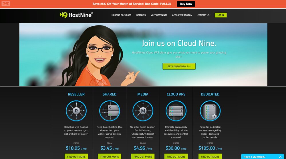
 It’s time to give a healthy dose of credit where it is due! With so many places to buy shared hosting, reseller hosting, and various VPS services, and with wildly-crazy levels of service and value among the myriad choices, I know it’s helpful to read reviews about web hosting companies from trusted sources.